CONTEXTUAL STUDIES 1 – practice

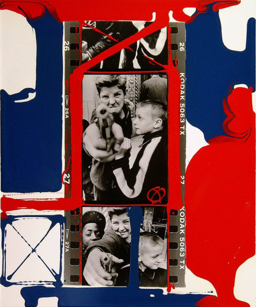
The artist I have chose to study is William Klein and looking at his interview with David Campany, from his book ‘So present, so invisible‘.
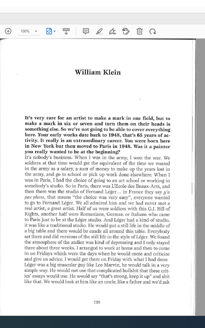
my chosen quotes from his interview that I thought were interesting;

in the interview William didn’t talk about the image I have chosen but I think they were interesting as they fit into his work as he has previously photographed children during a war as well as many photographs of famous models or individuals for when he worked for Vogue.

“we didn’t know too much about the war in Vietnam, it was horrible”

“when i was in the army i won the war”

” i had one camera and two lenses”

  1. TECHNICAL, VISUAL, CONTEXTUAL, CONCEPTUAL 

Technical- the lighting in Williams photograph of the two boys is natural and taken in daylight, as you cant see any set up lighting or flash to capture the picture. He used a nice level of control to show the contrast between the dark and light areas in his photo, as you can see some very dark, basically black tones (like their clothes) and then very light grey-white tones mostly seen in the background and the two main boy’s skin. Their positioned in the centre of the image to make them the main focus on the image and very little background activity which makes the viewer directly aware of the boys and the gun one is holding as the gun is positioned right in the middle and in front of the two boys which makes it stand out. I would say the image is slightly over exposed as it has such a sharp tonal range which makes the image appear sad as it’s in black and white and gives it quite a gloomy/sad atmosphere. The shutter speed must have been quite high as the image isn’t blurry which quickly captured the image. Using his quote and what he said “i had one camera and two lenses” shows that even with such little camera equipment he still captured a powerful image to try tell a story of two boys during a war, as he has a lot of experience being in one.

Visual- This image isnt taken in colour, it’s in black and white which fits the atmosphere of the image a lot and makes it more dull as it was taken during a horrible event, therefore using colour most likely wouldnt be appropriate. It has a range of light and dark tones to create a nice sharp contrast and as its a photo telling a story there isnt any texture, lines or shapes to it as its a portrait photo.

Contextual- I think this image adds a lot of value in Williams work, as he himself was involved in a war which he mentioned in his interview and he said “we didn’t know too much about the war in Vietnam, it was horrible”. This explains why he probably wanted to photograph two little boys during one , holding a gun which can make the viewer slightly uncomfortable to look at as it’s not everyday you see a young child holding such a violent object. It contrasts between an innocent human and a violent object which makes you question why he’s holding one. In some way maybe William wanted to show his young self through taking this image as he spent such a huge time of his life at war.

Conceptual- I think William wanted to show his experience at war , “when i was in the army i won the war”, through photographing two innocent boys holding a gun, which shows that during these horrible times even children got influenced , and in the image you can see the boy smiling and laughing when holding the gun as he probably doesn’t know the harm it can cause or what the true intentions of a war is. This creates this really strong contrast between the two things as you don’t see children just casually holding guns. It can also show that these boys look up to men, like William at war as they’re fighting for them and they’re just trying to be like them. However during this war, that might have been the last image took of the boys before the war begun , which William maybe wanted to do.

personal study- statement of intent

What you want to explore?

For my personal study , I want to focus on portrait photography, as in year 12 it was my favourite part of photography. I really enjoyed having a set up and how professional the images looked with the lighting. I think portraits are a very strong way of presenting ideas as you can interpret them in any way and when it comes to editing them you can basically transform them in any way. I think by doing portraits it will present the theme of identity perfectly. For my personal study, I want to focus on capturing different emotions and feelings through portrait photography and look into how mental health can be presented and shown through photography. I think it plays a massive part in the theme of identity, as it’s a personal aspect to everyone, and everyone goes through different emotions.

Why it matters to you?

It matters to me as I think mental health is a really important and key factor through my teenage years. I want to try present it through taking portrait photographs.


How you wish to develop your project?

By taking portrait images, and editing them afterwards to show different emotions.
When and where you intend to begin your study?

I will use the studio to take all my images as it’s a professional set up and get it started as soon as I have free time in school and get a model to photograph for this project.

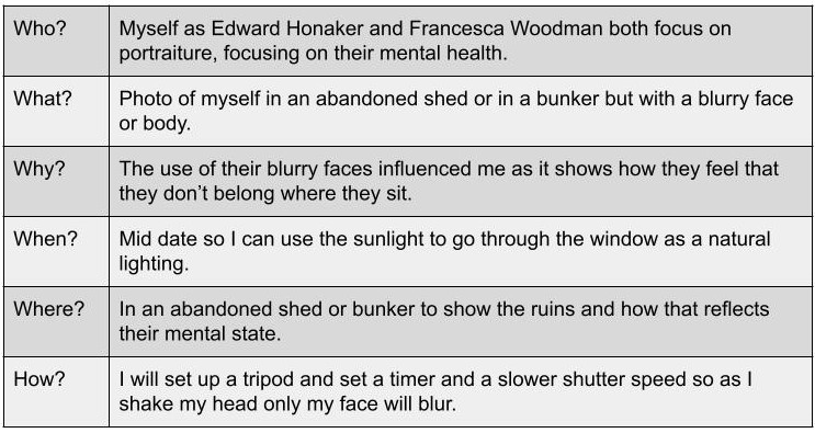
My chosen theme is identity, as I think mental health can identify an individual massively as it’s a very personal matter. The final outcome I want to have and achieve by the end of this project is a photobook. The artists I am going to take inspiration from are Gabriel Isak and Edward Honaker. They both focus on photographing mental health through different ways. Gabriel includes loads of blue tones in his images, and takes them out in an open environment as well as mainly capturing the silhouette of the individual instead of a clear face shot. Whereas Edward focuses more on his editing and blurs the faces out using different techniques which shows he focuses more on editing his images rather than taking them in a certain way. I think by using both of them it will give me a nice overview of both sides to this project

Personal Investigation – Reviewing and Reflecting

1. Describe which themes, medium (photography, film), approaches (documentary, tableaux, conceptual), artists (incl contextual references to art history, movements and isms) and photographic skills, processes, techniques and methods (incl learning new software) inspired you the most and why.

2. Include examples of both previous and current experiments and imagery to illustrate your thinking.

3. Produce a new mind-map and mood-board based around how you interpret one/ or both theme(s) of IDENTITY & COMMUNITY using new artists inspirations and visual references etc. Reflect on the Island Identity project and also consider themes more broadly (see below)

Inspirations throughout the course;

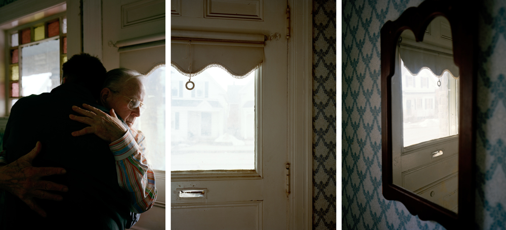
During the photography course, in both year 12 and 13, we have learnt a considerable amount of photographic techniques around portraiture, landscapes and abstract images. My favourite medium to use is taking still shots on a camera, although I have enjoyed learning about film making and taking moving shots I believe my skills lie more in the world of static photography. I believe I do well in portraying a certain storyline or narrative with my images, it is something I wish to continue in my personal investigation – I was very inspired by the work I created in response to photographer David Hilliard during my Identity and Place project. I enjoy the way he captures naturalism in his images, they connote a sense of normality and honesty that I really loved recreating. I have taken lots of inspiration from the documentary technique of photography, I believe it allows the observer to understand the subject more within their storyline. I really enjoy using natural lighting in my images, I have used it during the course a lot more than artificial lighting and am therefore more confident photographing with it.

More on how Hilliard inspired me.

My Response to Hilliard

Additionally, I was inspired by our year 12 abstract photography project, specifically studying repetition, pattern and rhythm. The photographer Ernst Haas was one I really enjoyed looking at, I enjoyed his use of repeating lines and shapes to create movement and rhythm in his images. I gained inspiration from the abstract unit as I loved experimenting with how different shapes and patterns could represent meaning and themes – I want to continue learning about how I can manipulate an image in terms of geometric aestheticism, using symmetry and repetition to connote ideas of memories being re-lived. I also really enjoyed studying Saul Leiter during the abstract unit, his use of colour and distorted aperture settings were really interesting to experiment with. I found inspiration with how Leiter captured windows and reflections in his images, I like how the abstract elements are still recognisable as everyday sights and objects – a sense of normality is something I really hope to experiment with further in the course. Additionally, I was influenced strongly by colour during my Saul Leiter study, I wanted to exaggerate the bold colours I captured to create an expression of freedom and non-naturalism. Previously in the course I focused on black and white photography, however during this project I enjoyed working with colour and emphasising different emotions through tones and hues.

During the photography course I have enjoyed learning about different software, such as Adobe Photoshop, Lightroom, Premier Pro and InDesign. Creating a Zine during the course has inspired me to produce a photobook for my final assessment. I believe having a physical copy of my work, where I can layout sequences of images with narratives and meaning, allows me to better use my imagination. I have been influenced throughout the course by several different artists, photographers and creative individuals that demonstrate ideas through different mediums – I look forward to experimenting further with the compositional elements of photography in this Identity project. The three areas of study that I have mentioned and shown evidence of above have been my most enjoyable parts of the course – I have been inspired by creating meaning and speaking out on prominent topics during year 12 and 13, this is something I wish to continue working on during my new project.

ARTIST REFERENCE; MAGDA ADAMCZAK

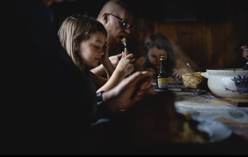
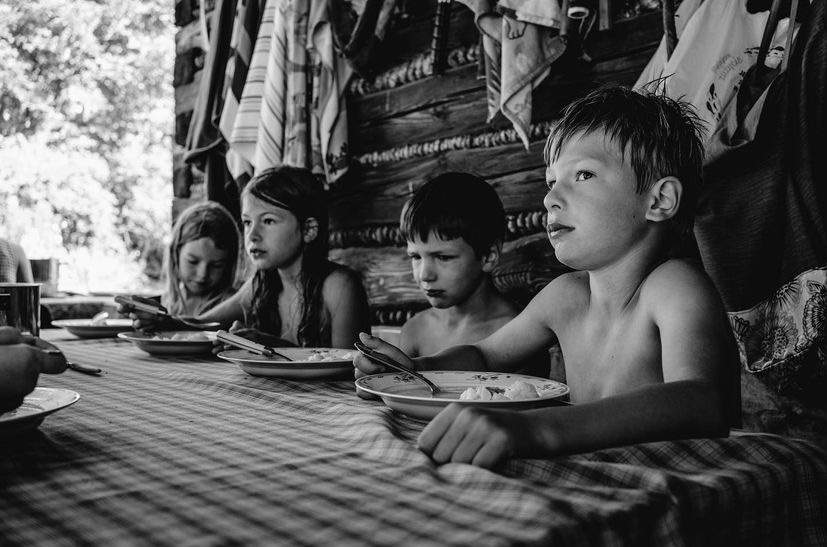
As a relatively unknown artist it is hard to find much to any information on photographer Magda Adamczak. At time of writing she currently has 2,232 followers on Instagram where she posts her photography multiple times a day. her work often features her family, specifically her young children and consists of candid photos. The photos are very raw and look barely editied and offer an insight into Adamczak’s idyllic family life. In 2019 her work was featured in a spread by National Geographic, focusing on the topic “Explore authentic food cultures around the world” https://www.nationalgeographic.com/travel/article/your-shot-photos-food-culture-around-world The piece, submitted through National Geographic’s amateur photographers program YOUR SHOT, featured her children eating together at a dinner table. The image description reads “A simple lunch brings generations together. Adamczak writes that she stayed in this vacation house as a child; now her own children visit to eat apples collected from the trees outside.”

The photo, taken from National Geographic magazine features Adamczak and her young children eating dinner at the table. Some of the children look up at the camera in feels very natural and candid despite the children looking into the camera inquisitively while others carry on with their meals in peace. The photo has an almost dirty feeling due to the rawness of the photo, lack of editing and nostalgically evocative setting. The placing of the crockery on the very rectangular table works to create sharp lines that direct to each character in the photo.

conversations on photography: la toya ruby frazier

Quotes from interview with David Campany

The new neo-liberal narrative for the “creative class” omits the conditions of the working class and refuses the perspective and creativity of a subject like myself

Yet, despite their harsh criticism they also felt that photography could liberate a new way of seeing and a radical consciousness. ‘The Notion of Family’ responds to that call to suspend the passive aestheticism that turns abject poverty into an object of enjoyment

It’s imperative we tell our own stories, controlling the framework, context and narrative

Select one image from the photographer and analyse in depth following this method: TECHNICAL, VISUAL, CONTEXTUAL, CONCEPTUAL – focus on the last two aspects of analysis to achieve highest marks

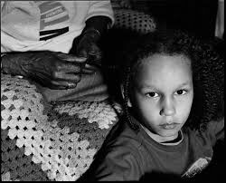
La Toya Ruby Frazier- ‘The Notion of Family’

Frazier, who is very close to her grandmother and namesake Ruby often incorporates imagery of her grandmother in her subversion of traditional white social documentary photography she criticises the way white artists ostracise emergent working class photographers, she says, “The new neo-liberal narrative for the “creative class” omits the conditions of the working class and refuses the perspective and creativity of a subject like myself” This image, taken from La Toya Ruby Frazier’s photobook ‘The Notion of Family’ shows a young girl having her hair done by her grandmother who’s face is out of frame leaving to an anonymity of her identity. The photo is in black and white which gives off a dramatic, gritty ambiance elevated by the young girl looking directly into the camera, unsmiling. This could possibly be Frazier’s response to the medias interpretation of black women as aggressive and stripping black people of their identity’s as she explains in her interview with David Campany, “It’s imperative we tell our own stories, controlling the framework, context and narrative” This quote highlights the importance of storytelling in art through your ow perspective rather than what other want you to do. Frazier employs the use of leading lines of the old woman’s hands to place more emphasis on the young girl and make her gaze more powerful. This gaze is an inversion on society as customarily black people are the ones constantly scrutinised not the other way round. Frazier manages to make the photo beautiful despite it’s dark messaging. This could be purposefully done to represent how blackness is aestheticised by the media as she writes “Yet, despite their harsh criticism they also felt that photography could liberate a new way of seeing and a radical consciousness. ‘The Notion of Family’ responds to that call to suspend the passive aestheticism that turns abject poverty into an object of enjoyment” The photo resonates with many other pieces of Frazier’s work as it is heavily connected to the idea of family, specifically her grandmother.

Personal Study: Shipla Gupta Artist Reference

Shipla Gupta

Shilpa Gupta is an artist from Mumbai, India. Gupta uses a range of mediums from manipulated found objects to video. She often responds to the topic of human perception and how information is received and internalised everyday. Gupta looks at how objects, places, people get defined and her work links to these where definitions like labels are used. She also responds to issues in India which include gender and class barriers and religious differences.

Gupta’s works relate to the highly mediated act of seeing, retrieving and remembering trying to get the viewer to see something different or get them to question what they are looking at.

Examples of her work:
Shilpa Gupta
100 Queues, 2007-2008, photo-based mechanical installation, 12,5 x 269 x 7,5 cm
The Giardini exhibition - 58th Venice Art Biennale 2019 | Inexhibit
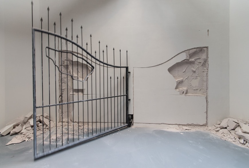
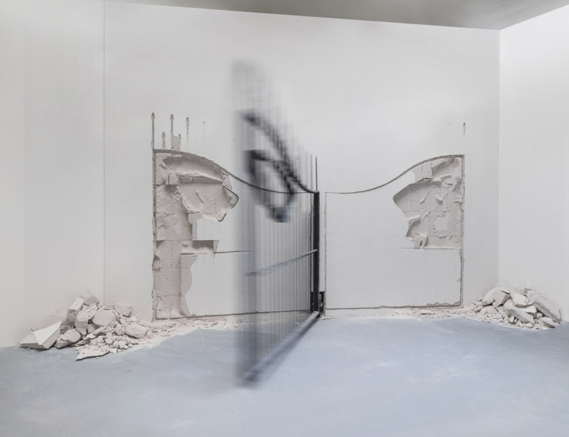
Shilpa Gupta, Untitled (metal gate)
Shilpa Gupta
Unnoticed, 2017, C-print mounted on dibond, fragmented spare motor parts, 123 x 172 cm each
Shilpa Gupta
Shilpa Gupta
Shilpa Gupta

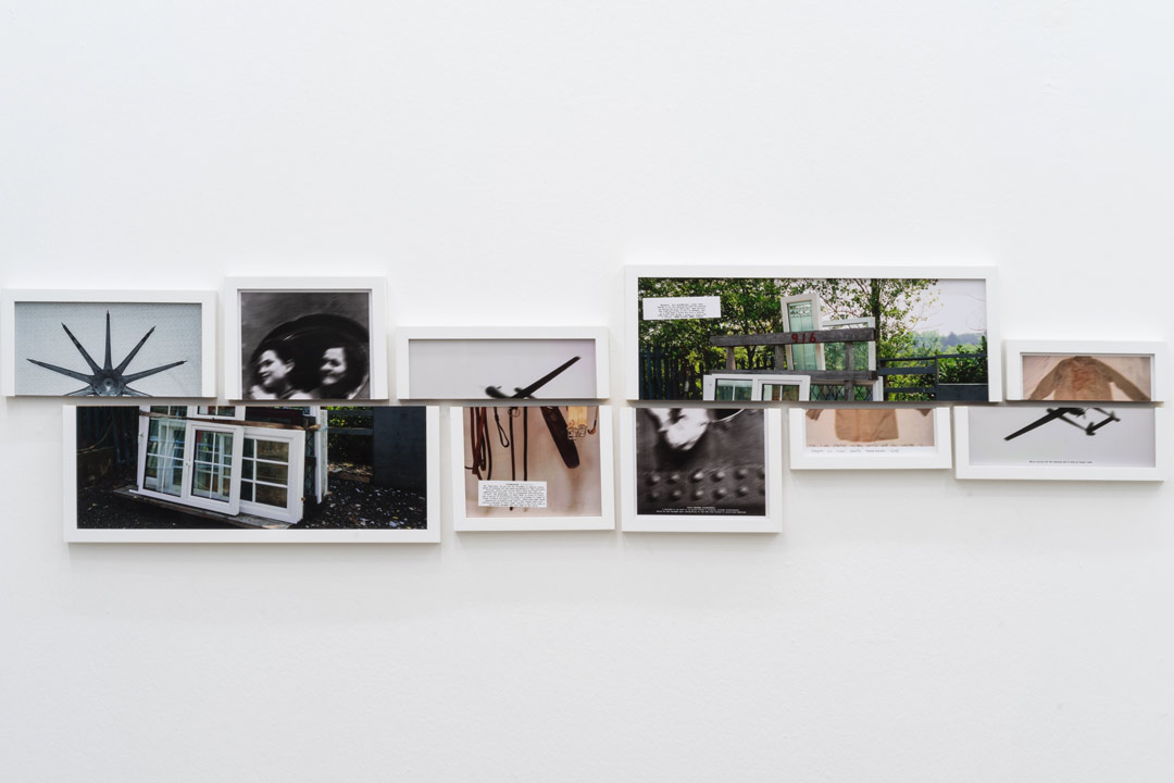
Altered Inheritances- 100 (Last Name) Stories

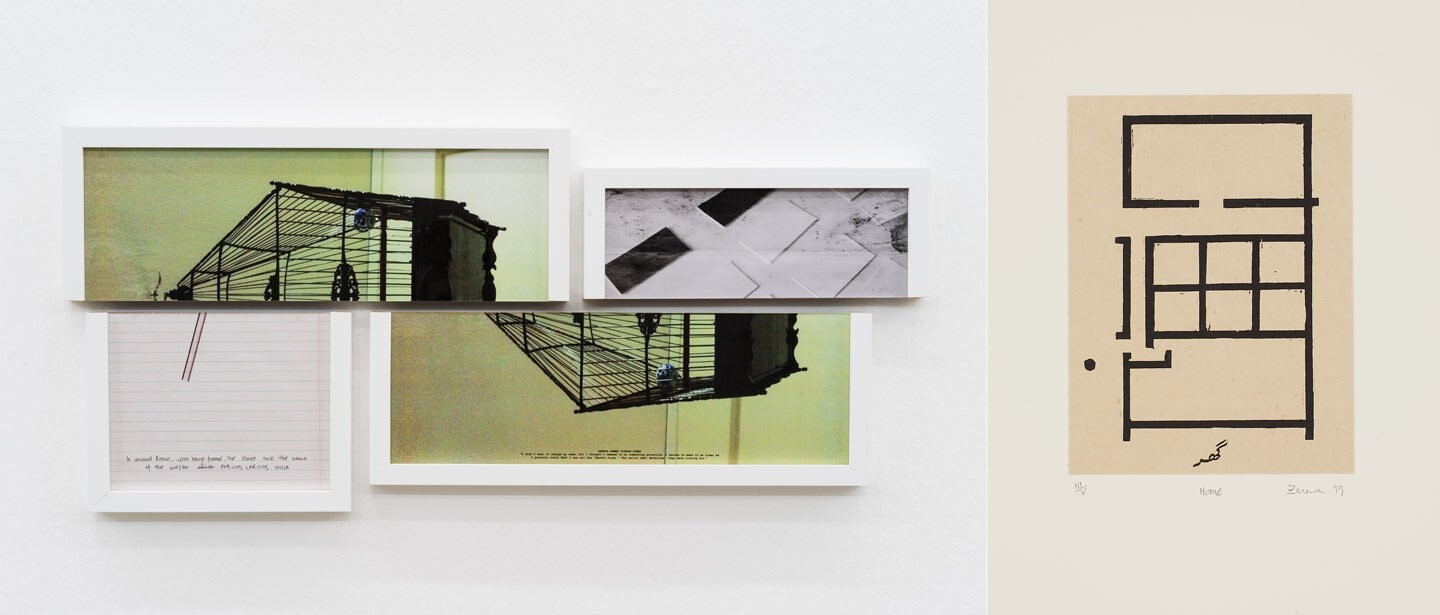
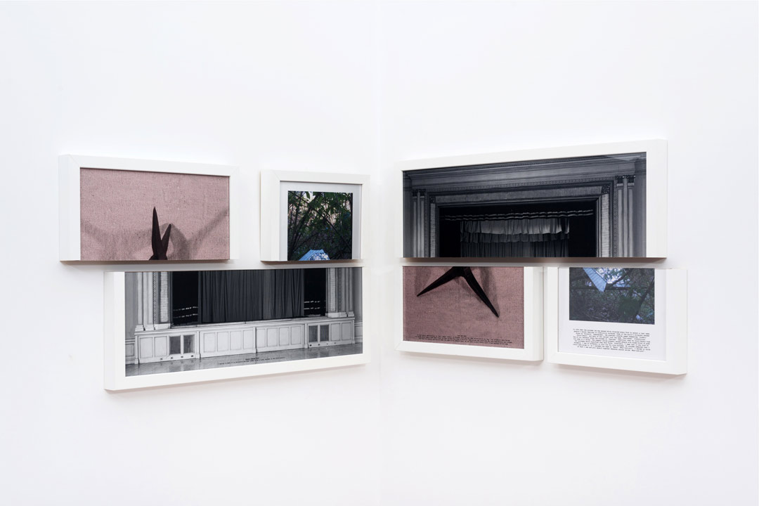
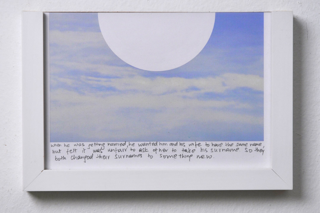
This exhibition is about how people from South Asia are treated in the Gulf. Gupta traced individual people who changed their names for survival or to succeed. The images also include the reasons behind why the names were shed. The splitting of images is showing a sharp break from the past. The words on each are “triggers for memory” in Zarina’s Home is a Foreign Place (1999), about a longing for a home she could not return to. The architecture in the exhibition is inspired by the floor plan of her childhood home. The exhibition also has a video of Zarina remembering leaving the house after the Partition in 1947 made by Sophie Ernst.

 Left: details from Shilpa Gupta, Altered Inheritances – 100 (Last Name) Stories, 2014. Installation, Site specific, pigmented inkjet prints in split frames. Right: details from Zarina, Home from Home is a Foreign Place, 1999. Woodcut with Urdu text printed in black on Kozo paper and mounted on Somerset paper.

https://www.e-flux.com/announcements/253858/shilpa-gupta-and-zarinaaltered-inheritances-home-is-a-foreign-place/

I really like the way that she splits her images in half and the presentation being misaligned, I would like to include this in my own work.

The images are also interesting, they have a sense of personality and Identity to each one whether it is an object, landscape or portrait photo. I would also like to take inspiration from these when taking my own photos.

Image Analysis

Shipla Gupta, from Altered Inheritance.

Key Themes – Shipla Gupta’s work is inspired by the issues with how south Asians are treated in the gulf and how they survived by changing their names, essentially changing their identity.

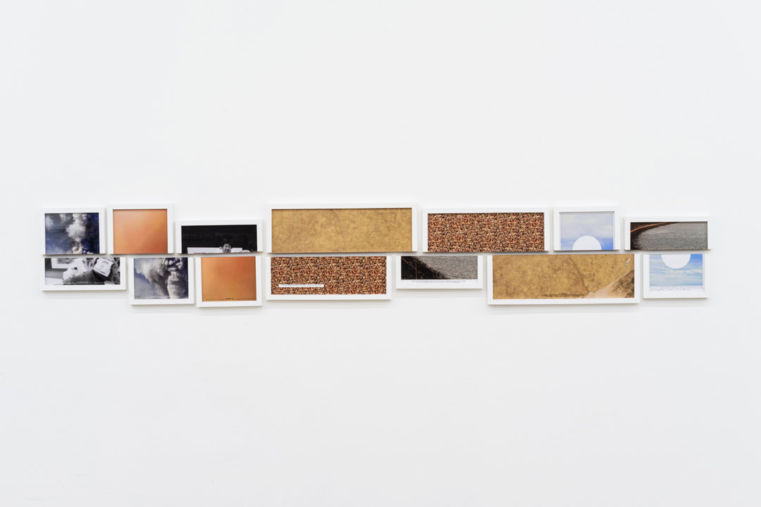
Content – Seven split images including pictures of surfaces, landscapes and one portrait image.

For the image analysis I will be focusing on the half-image at the end of the sequence, the picture of the sky, with the quote, ‘When he was getting married, he wanted him and his wife to have the same name, but felt it was unfair to ask her to take his surname. So they both changed their surnames to something new‘ hand written under the image.

Image from above sequence

Formal Elements – The image is quite monochrome and only has two colours, being white and blue. There is not much tonal range in the image creating a low contrasting image which is very soft in colour. The image is taken from eye-level, in level with the horizon capturing the whole sky as the sole image. The natural daylight from the sky adds to the soft, bright atmosphere to the image, this could be a metaphor as it is the end of the sequence so could symbolise a happy ending. Gupta has added a white geometric circle into the centre of the very organic image creating a contrast between them. In context to the quote under the image the blank circle could suggest an empty space or new beginning.

Mood – The image creates a sense of peace and calm as the colours and clouds are soft. Gupta could be trying to link the happy ending or to heaven where everything is pure and tranquil.

artist refernces

JIM GOLDBERG

Jim Goldberg is an American artist and photographer, whose work reflects long-term, in-depth collaborations with neglected, ignored, or otherwise outside-the-mainstream populations. Among the many awards Goldberg has received are three National Endowment of the Arts Fellowships in Photography, a Guggenheim Fellowship, the Henri Cartier-Bresson Award, and the Deutsche Börse Photography Prize. His project Raised By Wolves (1985-1995) focuses on two young runaway protagonists, Tweeky Dave and Echo. Their personalities, their histories, and their dreams were given equal attention, and were often presented in their own words. The sensitivity with which Goldberg approached these particular subjects reflects the affection they held for one another, a feeling which is not much shown to the homeless. Goldberg began speaking with and photographing Raised By Wolves’ subjects in 1985, and started assembling the book itself in 1991. Raised By Wolves is Goldberg’s most shambolic instalment, mirroring the experiences of its subjects. The book is made up of photographs, fragments of conversations, hand-written notes and drawings, home movie stills, Xeroxes of government correspondence, and more.

CAROLLE BENITAH

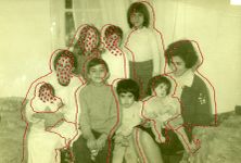
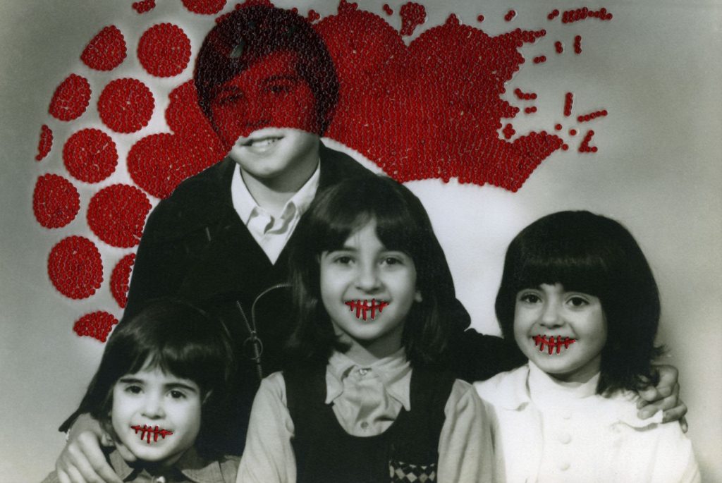
French Moroccan photographer Carolle Benitah, who worked for ten years as a fashion designer before turning to photography in 2001, explores memory, family and the passage of time.  Often pairing old family snapshots with handmade accents, such as embroidery, beading and ink drawings, Benitah seeks to reinterpret her own history as daughter, wife, and mother. The work of Carolle Benitah has been published in magazines such as Leica World, Shots Magazine, Photos Nouvelles, Spot, Center for Photography Houston, Foto Noviny, and Lens Culture, among others. The series Photos Souvenirs explores the memories of her Moroccan childhood and teenage years by reworking old family snapshots. In what the Benitah describes as “excavations,” photos are unearthed from albums, categorised, scanned, transposed onto new paper, and finally hand beaded and embroidered. This final step, accomplished with red, black, or gold thread and wire and glass beads is a revelatory act for the artist;  ‘To embroider my photograph, I make holes in the paper. With each stitch, I stick the needle through the paper. Each hole is a putting to death of my demons. It is like an exorcism. I stab the paper until I don’t hurt anymore.’

statement of intent

Write a Statement of Intent that clearly contextualises;
What you want to explore?
Why it matters to you?
How you wish to develop your project?
When and where you intend to begin your study?

For my personal study project, I will be exploring the theme of IDENTITY, more specifically the idea of childhood and adolescence. Identity is defined as the characteristics determining who or what a person or thing is. I have chosen this theme because I think it is the more interesting option, and I think that I will be able to better explore different mediums of photography, including studio portraiture (tableaux) and more candid, real life photography, as well as still life and object photography. Additionally, I think that I will be able to create a more meaningful project, as it will be relative to real people and their lives. My personal study will focus on myself and my group of friends , and our transition from children to teenagers. My aim is to capture as many candid images as possible, in order to show our lives as they truly are and to give the viewer a realistic perspective. I will also be incorporating old childhood photos and objects as a way of showing our transition through different types of photography. I have taken inspiration from various photographers, mainly Jim Goldberg and his project ‘Raised By Wolves’. This project captured by interest because of its real and uncensored images, which was an imperative part of Goldberg’s mission to give his audience an inside look into the underground culture of New York City. My aim is to create a photobook for my final presentation, which will be filled with my images, both old childhood photos and the new ones I will have captured during this project.