To mount my boards, I had to decide whether I wanted them to appear raised and stick them onto foamboard before finally putting them onto black or white mount board, or to keep the images on just foam board or just mount board. For my street photography images I decided to use foam board first and then mount board. To do this I used spray glue to stick my images onto foamboard, I then cut the images out using a paper cutting knife to achieve sharp and neat edges.
Once my images had been cut out onto foam board, I decided the placement of the images and then used double sided tape to stick the foam board onto the mount board. I decided to use black mount board as it makes the black and white contrast appear harsher.
Once the images had been stuck I used the paper cutting knife again to trim the board to have a black border around the images.
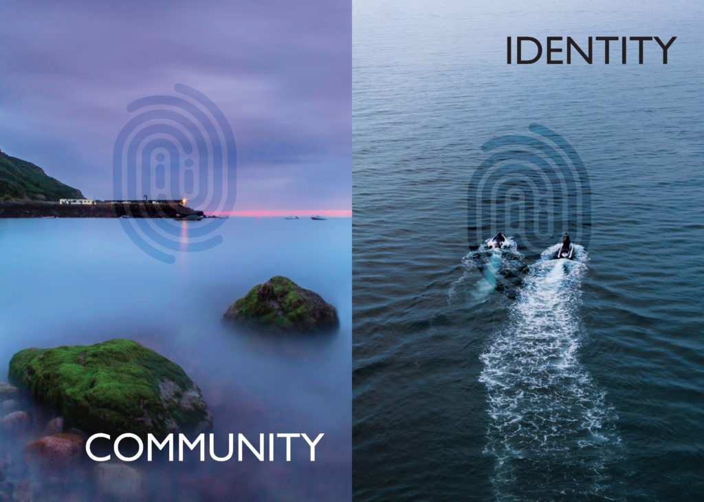
The images seen on the pages of this newspaper supplement are extracted from a variety of projects and final outcomes produced over a two-year academic programme of study by a group of A-Level photography students at Hautlieu School. In their final year the themes of Identity and Community offered a specific focus and through a series of creative challenges students developed a body of work that were inspired, partly from visiting heritage institutions to learn about aspects of Jersey’s unique history of immigration and exploring migrant communities and neighbourhoods in St Helier in a series of photo-walks. In the classroom additional inspiration was provided from workshops on NFTs (non-fungible token) and digital art, embroidery and textile art, animation and film-making, zine and photobook design led by professional artists, designers and teachers.
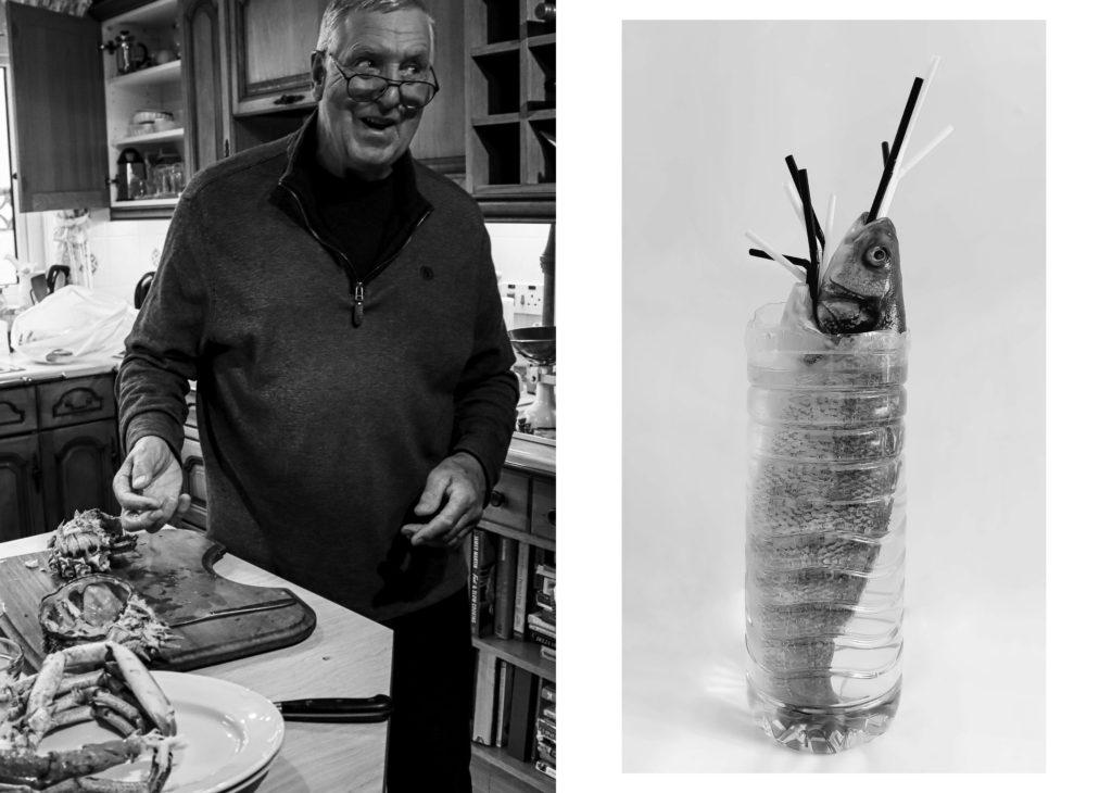
As part of the research and contextual studies students were asked to engage with some of the key questions raised by the Government of Jersey’s Island Identity project and explore through their own photographic studies how they interpret and identify distinctive qualities of island life. What can we learn from looking at a set of photographs produced by young islanders? At first sight they show us a seemingly random set of images of places, people and objects – some familiar, others surprising. On closer inspection each image is a visual sign and also a conundrum. For example, a fish stuffed in a plastic bottle may ask us to consider more closely our marine environment, commercial fishing or food consumption. As a combined sequence of images they represent different views that in many ways comment on a wider discussion on some of the primary objectives explored in the Island Identity project, such as ‘how we see ourselves’ and ‘how others see us.’
The newspaper was kindly sponsored by Deputy Carolyn Labey, Minister for International Development and Assistant Chief Minister who in her foreword shares her personal thoughts on what makes Jersey special to her in context of the Island Identity project led by her department. She says, ‘identity involves searching our soul, engaging with difficult issues, and asking not only who we are, but how others see us and what a vision for the future might look like. The perspective of students and young people in this debate is critical. Identity is a broad and far-reaching concept, one unique to all of us. This collection of images recognises both our differences and our commonalties. These times may be uncertain, but in my view the topic – ‘what Jersey means to you’ – is a fundamentally optimistic and forward-looking one.’
The Identity and Community newspaper is the fourth supplement produced in collaboration between Hautlieu School Photography Department and Jersey Evening Post. In 2018 the first issue was The Future of St Helier and last year the themes of Love & Rebellion explored experiences of isolation and lockdown during the coronavirus pandemic. Photographer and teacher Martin Toft, comments: ‘The question of ‘what makes Jersey special’ matters a great deal to every islander and as visual signs, the images printed on these pages are an attempt – not so much to provide answers – but rather asking questions about the essence of this island we call home, and how it actively will overcome current challenges in shaping a prosperous future for all.’
Various workshops and school trips for inspirations, recording and experimenting with new images and ideas of making
Evaluation:
My image on the right
My image on the right
My image on the right
My image on the left
Task: Write an evaluation, reflecting on the experience of being part of making a newspaper and working on IDENTITY & COMMUNITY project and put it here at the top of the blog post, titled: IDENTITY & COMMUNITY. Specifically, select your images and spreads for comments.
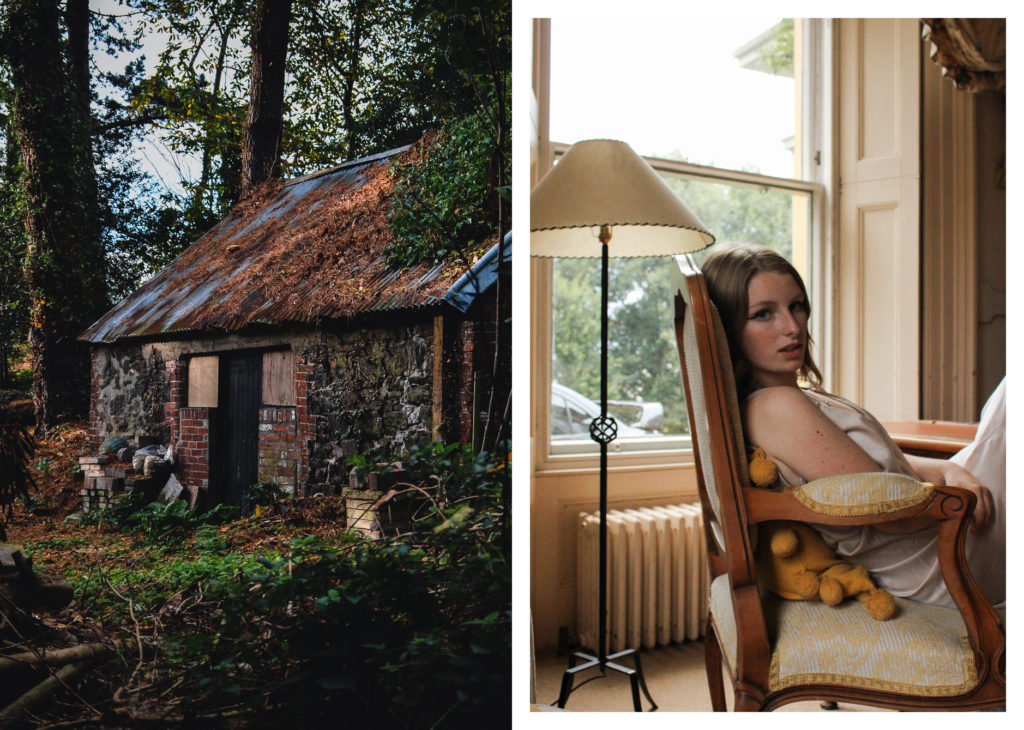
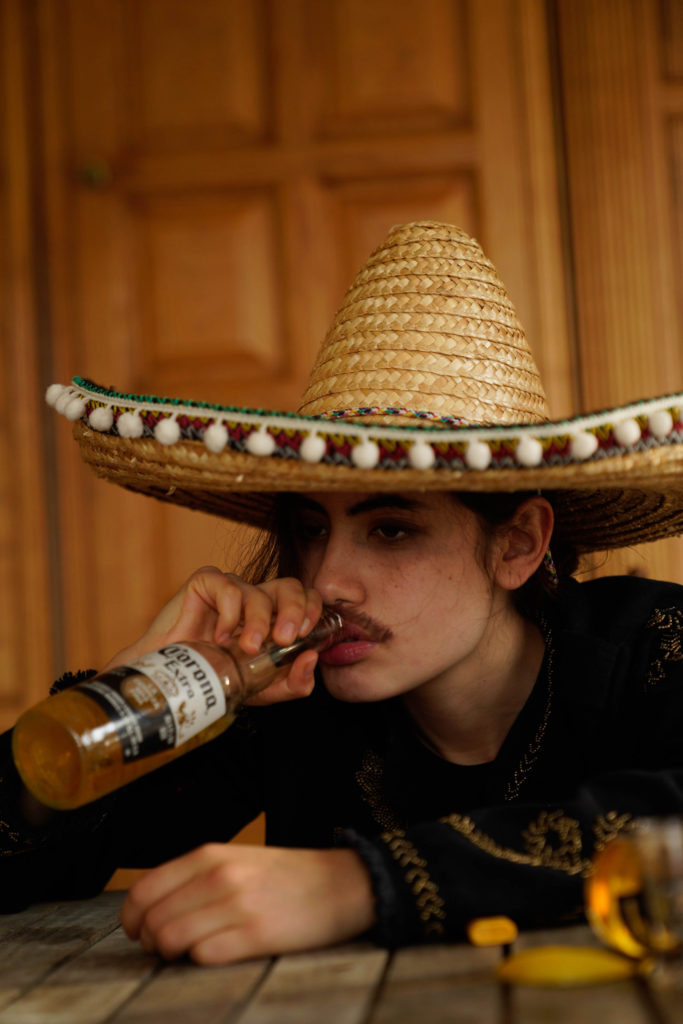
The 4 of my images that have been used in the newspaper are placed in contrast next to other students work. I really like how the first spread hints towards ideas of our environment being tampered with and destroyed, the juxtaposition between a lighter and a flower implies themes of global warming and climate change. Additionally I think the contrast is strong due to texture and colour, with the other students image on the left being harsh and focused compared to my Pictorialism style – it connotes ideas of the fragility of nature, being something we need to keep safe. The second spread, with my image on the right, has an atmosphere of power – contrasting old and new, abandoned and governed. I like the way the spread shows the power of nature compared to ‘man’, yet the irony of a strong independent woman by its side – parodic representation of ‘the human power’? There are similar warm tones in both images, yet a darker and colder atmosphere surrounds the image on the left, juxtaposing the content mood of my photograph. Altogether I really like how this image has been displayed next to one so different, yet holding subtle similarities. The third spread uses an image of a greenhouse which I took during our Year 12 Anthropocene project, displayed next to another students image of bricks. There is a clear contrast in colour with these images, the left holding red and orange hues juxtaposing with the desaturated greens and blues of my image – implying a sense of nature vs man. The abandoned nature of both images creates the impression of being forgotten, desolate landscapes disrupted by mans creation – yet my image hints towards nature fighting back, this contrast strongly shows the power of nature even when hope seems lost. The final spread uses an image of a tree branch from my most recent project on the left, placed next to two images from another student of expansive landscapes. All images on this spread hold strong orange tones and display features of the natural environment – yet there is a sense of looming fear and destruction. Each image is a sort-of hint towards a more industrialised environment, my image starting the set with a dark mysterious atmosphere around nature, moving across to an image showing mankind within natures freedom, then finishing with a futuristic display of when this ‘nature’s freedom’ no longer exists.
Here we see the final layout for my photobook within Lightroom. On this app I have spent a couple weeks revisiting the layout and making small adjustments to ensure the book looked how I wanted. I decided to add a slight grey tint to the pages as I found that having white pages quite bright and seemed quite bold, this concerned me as it could have drawn attention away from the actual images.
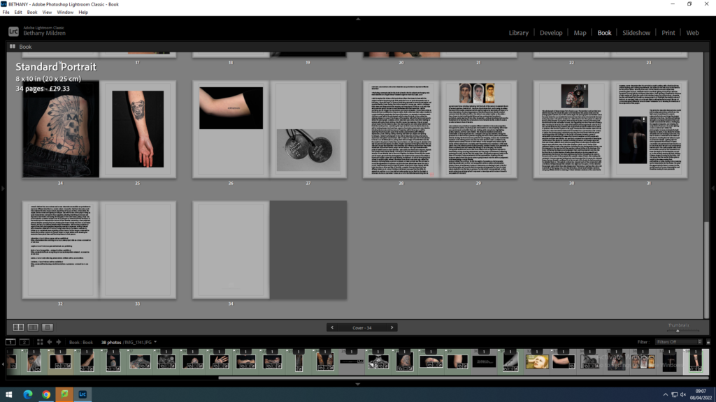
I concluded my photobook by adding my essay to the back pages. I took this option as my photobook doesn’t contain a lot of text. Having the essay helps add context to the project and it supports the ideas presented about identity through body art.
To finish our project we needed to print our final images and frame them like we did in year 12. We could choose as many images as we wanted and we had the choice between A3, A4 and the smallest A5. I personally chose to print images from my latest project “not so cholo” project plus two images I printed last year. I chose four images in A3 because they were in landscape format, I thought they would look better enlarged to see the details and decided to print my portraits in A4. After printing, we needed to frame them. In the framing part we also had different options for framing. These are the results of my impressions.
Overall I am very happy with the outcome of my photobook. I feel my photobook represents the theme of identity and community well.
Front
Cover
Within my photobook I used a few different designs however keeping the same designs consistent throughout. I used different layouts throughout to make it more interesting and avoid repeating the same design too much. It took a lot of experimenting with different images to see what worked well together and what looked better as a full bleed image compared to a smaller image. I am very happy with the outcome and layout of my book as I feel it is not repetitive but also not over complicated. At the end I created a polaroid page of all the images within my book and more. I wanted to do this as polaroids are a old way of taking images and my book is all based off old childhood images. I also felt it wrapped up my book nicely and was like a flash black like the book was a flash back of my childhood.
With the prints I had from the Anthropocene project I decided to use an innovative and more original way of framing than just a boring white foamboard as I felt the colours of the photos needed something more create to stand out. I mounted the photos in a clockwise rotation on foam board and then cut around so that no board was visible to create an interesting display. I really like how the display turned out as it was intriguing to see how every time the frame was turned a photograph would be upright.
I arranged the images in accordance with rainbow colour theory in order to maintain a visually pleasing set up to allow the colours to compliment each other
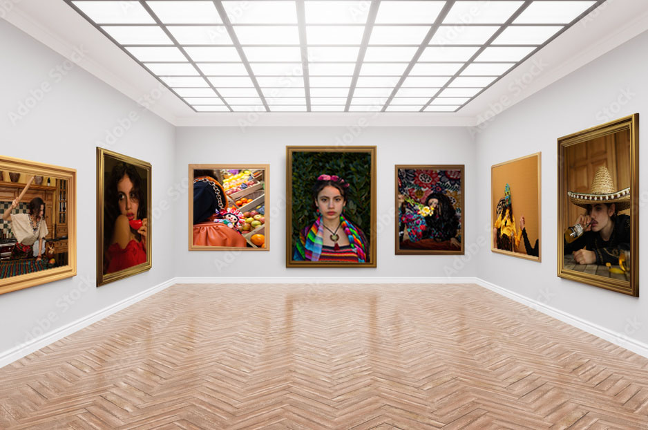
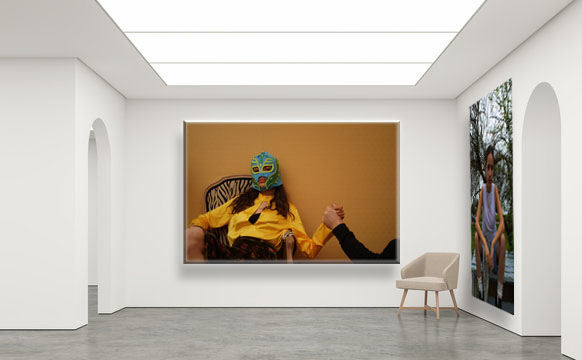
Our task was to put our final prints in an internet gallery. To begin, one has to look for an empty gallery on the internet and be careful and determine if the proportions of the paintings are adequate. Then you open photoshop and start modifying your images. To make your image fit into the boxes, you play around with the transform utility to transform your image. You have to obviously make it smaller, distort it and rotate it that should do the trick. To finish, it is a recommended option is that you put a shadow below your image so that it looks more real. To put a shadow on your image, you press the blending options button and there you can play with the shadows, that is, put the darkest shadow further away… Also if you want you can put texture on your image or whatever you want. And this is how I create my gallery.
The last prints I needed to frame were of teacups I took when experimenting abstract photography and new objectivity, exploring artists such as Albert Renger-Patszch, Keld Helmer-Petersen and Jaromir Funke.
Albert Renger-Patszch
Jaromir Funke
Keld Helmer-Petersen
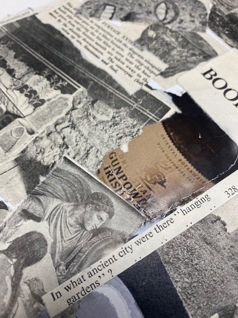
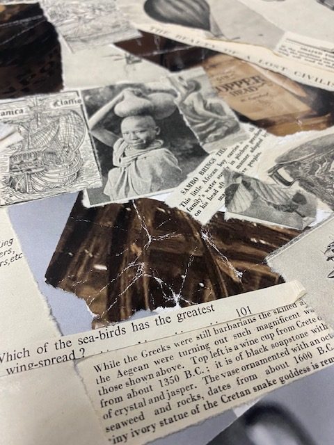
I used adhesive spray to stick the three main photographs in a diagonal line but was disappointed at how boring and bare the piece looked when put together. I was stuck with inspiration when looking at the smaller prints that I had intended on throwing away and decided to turn the piece into a montage. I crumpled the photos to create a more dated- vintage feel, and ripped them into smaller pieces to cover more surface area. After sticking them down I noticed an improvement however there still was a lot missing. Upon finding an old encyclopaedia I decided to use the photographs and illustrations from the book to complete my montage. Initially I only used photographs of pottery from the book to link with my original photos however I moved away from that by using a general theme of advancement of human culture which connects with the projects I have been undertaking throughout my A-level course of identity, community and culture. Instead of cutting, I gently ripped the illustrations to make them look distressed and on theme connecting to the vintage book. The encyclopaedia, which appears to be from the early 20th century, is very colonial in nature and is accordingly racist with photographs of African ‘Primitive’ ‘Savages’ and Eurocentric praise of the Aryan race. Using this I created a paradoxical message to look at the end result with a post-colonial lens.
sections of the montage containing colonial outlooks on race, innovations and artifacts
I believe that these pieces best capture the essence of my photobook and the narrative as a whole since these prints show the aim of producing personal work as a way of coping and healing which this project, for me, is exactly what it was.
This project was produced at one of the worst moments of my life, a point when I had school work, family issues, situationship issues, personal issues, drama between friends and a lot going on and I do indeed believe these prints provide a sort of “blurb” to the photobook.
For example,
With this image, for someone reading it, it doesn’t seem like a big deal. Just a random stranger who goes to your gym asking to get intimate with you. No big deal. Problem is, it’s not just from one person, it’s several, and it comes to a point you start to feel like that’s all you’re there for.