

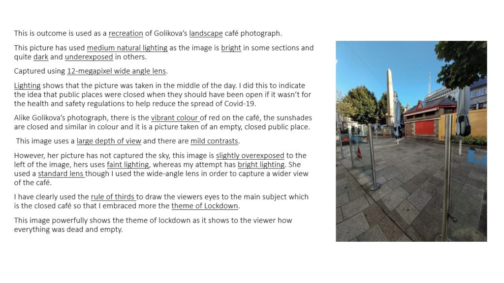
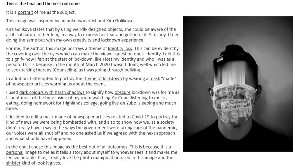
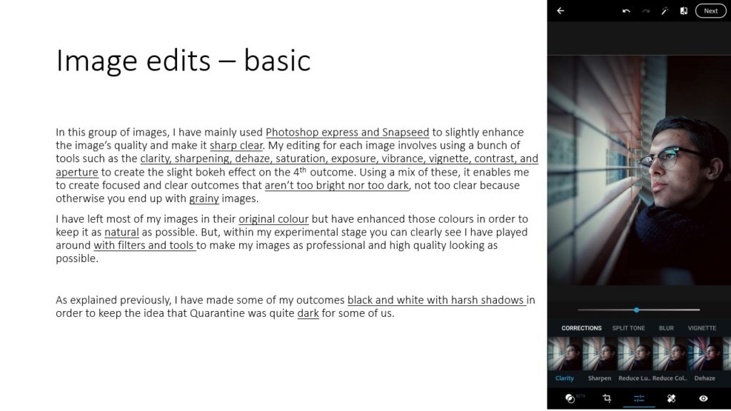
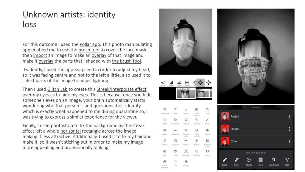



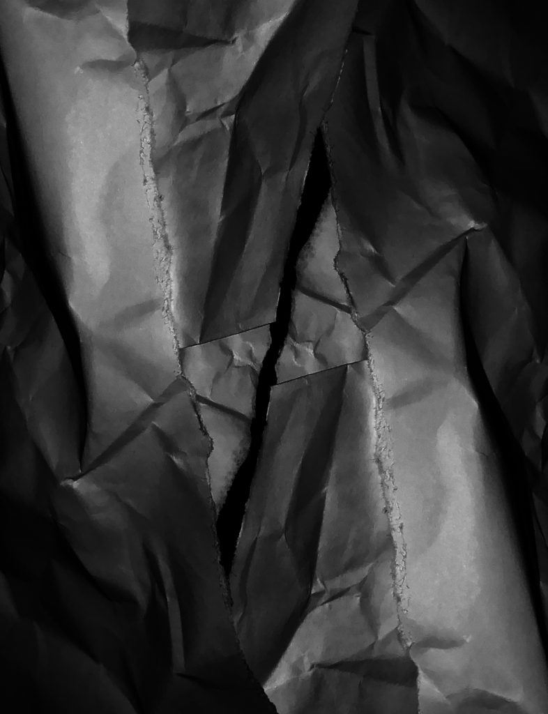
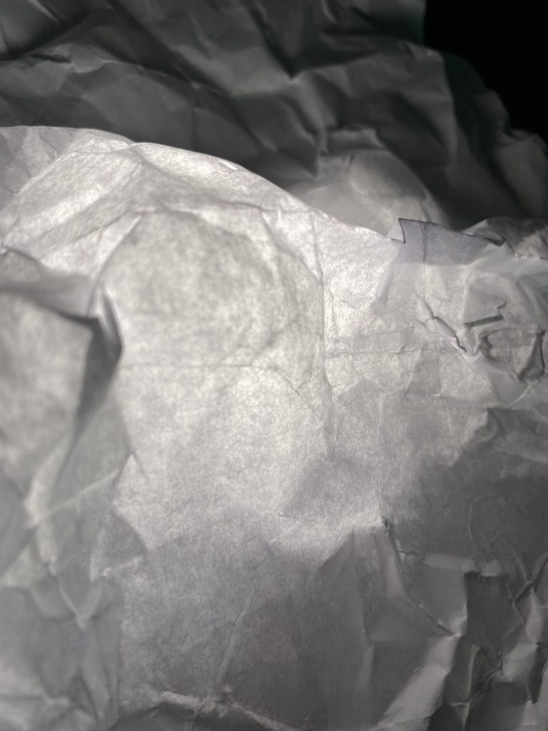
In this photograph, i shot a folded and ripped piece of paper.
Originally in the raw image the paper was only on the right hand side of the image, with unused, black space to the right of the image. In Photoshop i cut out the paper, duplicated it and flipped it over to create an upside down mirror image overlapping the original on the other side of the image to fill up the empty space. This also adds more layers and depth to the image.
I made the image black and white to further show the black and white tones and shadows.
I decreased to the exposure of the image and increased the shadows to even out the whites and the darks, and to emphasize the shadows created by the creases and folds in the paper. I changed the curves to darken the overall image without losing quality and details. These changes also bring out the rough texture of where the paper has been ripped.
The edges of the image have more shadows and darkness than the rest of the image, drawing the viewer to the center of the image where the pieces of paper are no longer overlapping and there is black negative space, which contrasts to the busy outer parts of the image.
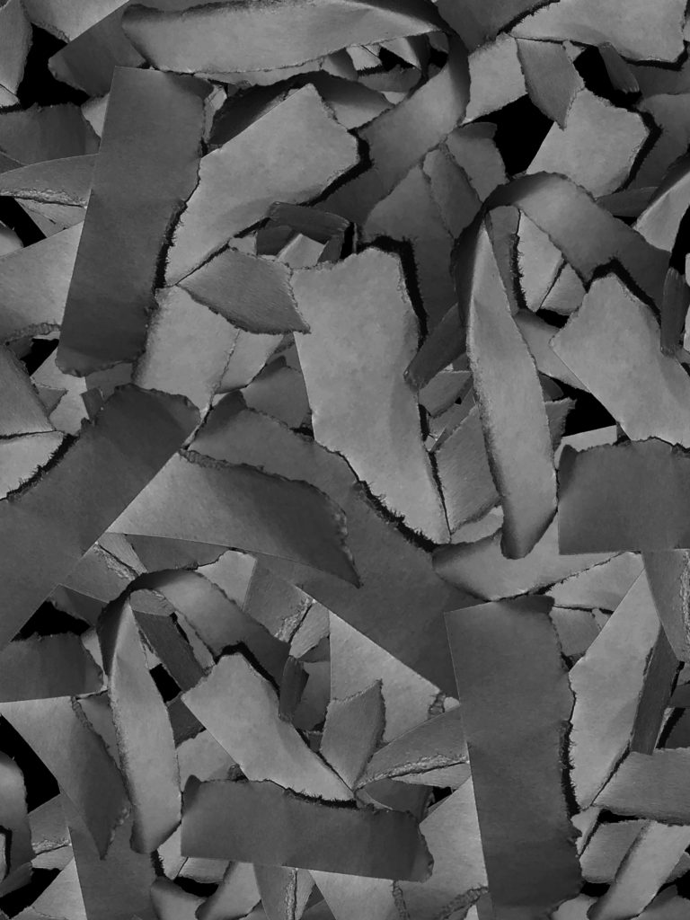
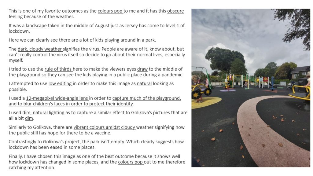
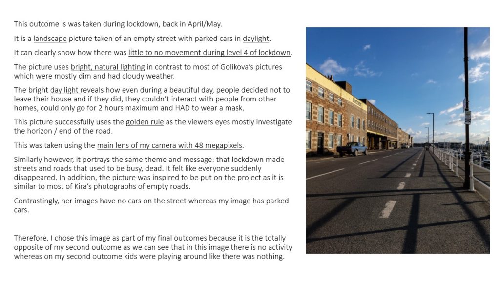
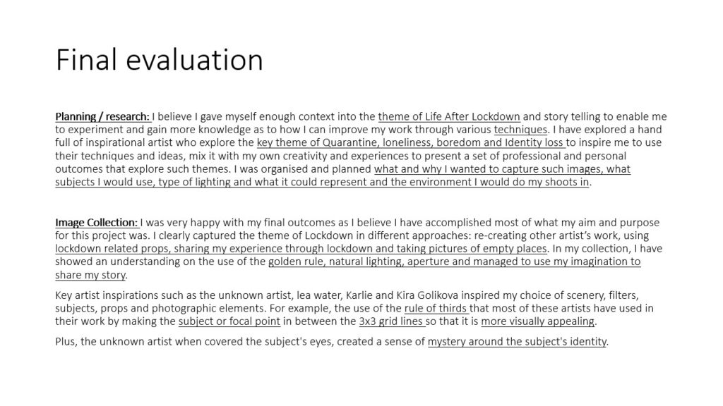
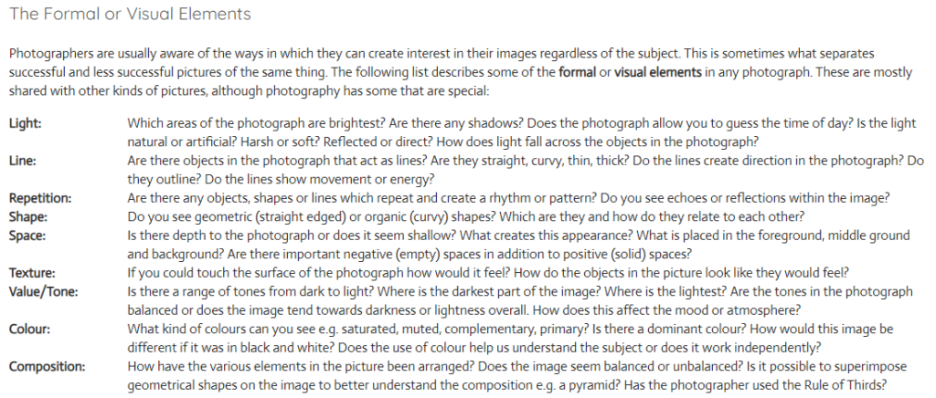
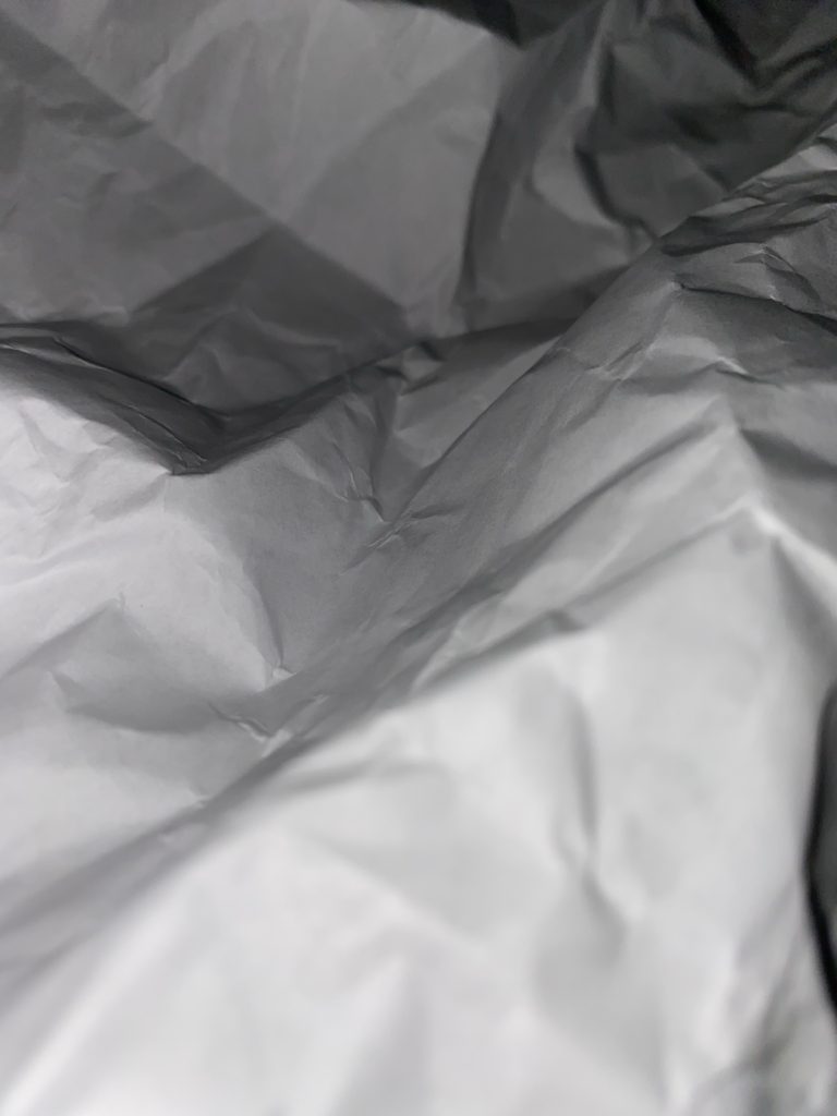
In this image i shot multiple small ripped up pieces of paper.
The original composition of this image was a small pile of strips of ripped paper. In Photoshop i cut out this group of paper and duplicated it multiple times behind the original pile, at different sizes and orientations. This is to add depth to the image and to take up negative space.
I also converted the photo to black and white to focus on the shadows and textures created by the multiple layers of paper.
I decreased the exposure, increased the darks and decreased the lights to make sure there was no over exposed parts of the photo. The darkened shadows also add depth as well as give emphasis to the rough textures where the paper had been ripped.
There is repetition of the same shapes and shadows where i have duplicated the paper to add depth and layers.
I used the curves feature in Photoshop to further bring out the darks and shadows whilst retaining detail and texture of the paper.


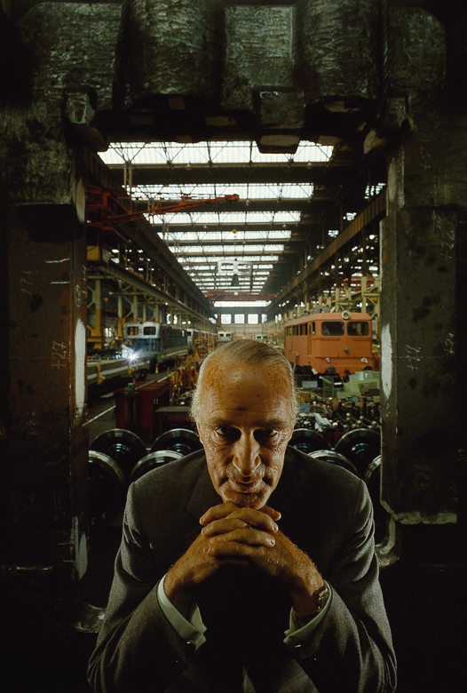
Arnold Newman | Portrait of Alfred Krupp | 1963
Alfred Krupp is positioned in the center of the frame in the foreground, looking directly into the lens of the camera, with his hands clasped under his chin. This is to make him seem intimidating to the viewer. He has been lit from above and from both sides, this creates dark shadows by his eyes, making him seem evil and provoke a negative feeling for the viewer.
Behind him is the entrance to a train factory which he owns. He is positioned in front of the entrance, as if he is blocking people from entering it. The walls and ceiling of the entrance is dark and draws the attention of the viewer to the center of the image, towards Alfred Krupp, making him seem like a powerful figure. In factory in the background is naturally sky lit through big windows in the ceiling, similar to those in a church or a cathedral.
The overall feel of the picture is negative with dark tones and mostly earthy colours. The lines of the roof in the background give the factory depth and size.
He is wearing a formal suit which contrasts from the hectic nature of the factory in the background. His hands are positioned in a triangular fashion which also shows power as a triangle is a strong shape.
Alfred Krupp has been portrayed in this negative yet powerful way because the trains his factory was making were used to transport Jewish people to concentration camps during the war.
INTRODUCTION
There are seven formal elements of photography which consist of: Line, Shape, Light, Repetition, Space, Texture, Value/Tone, Colour and composition. However in every photograph sometimes it can be challenging to find all seven elements. For example Martin Creed is a very well known artist for using light in several ways. To get inspiration for my photos I started off by looking at Martin Creed’s photograph of his paper ball, which personally I found very peculiar as it’s such a basic photograph but has several formal elements. However as it’s in black and white it allows more contrast to be shown which enhances the photo in several other ways. I then went on to try to recreate his photo which I feel worked to a certain extent.

PAPER SHOOT





























BEST IMAGES


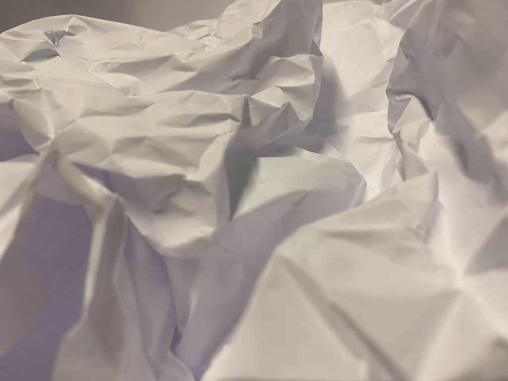
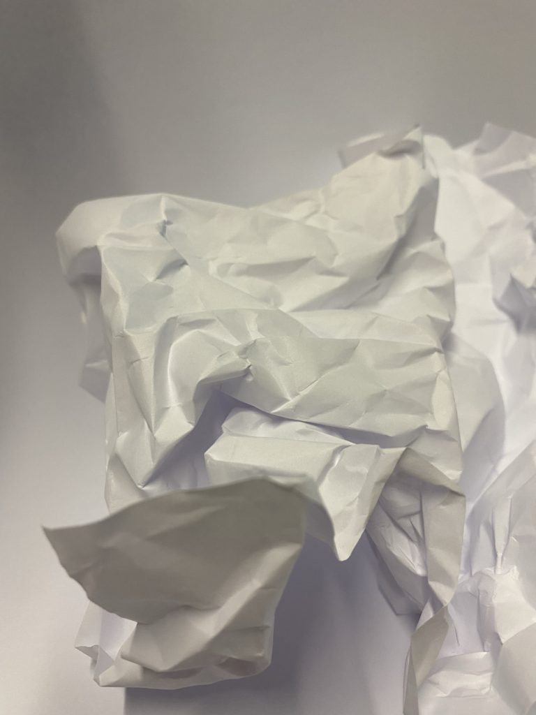
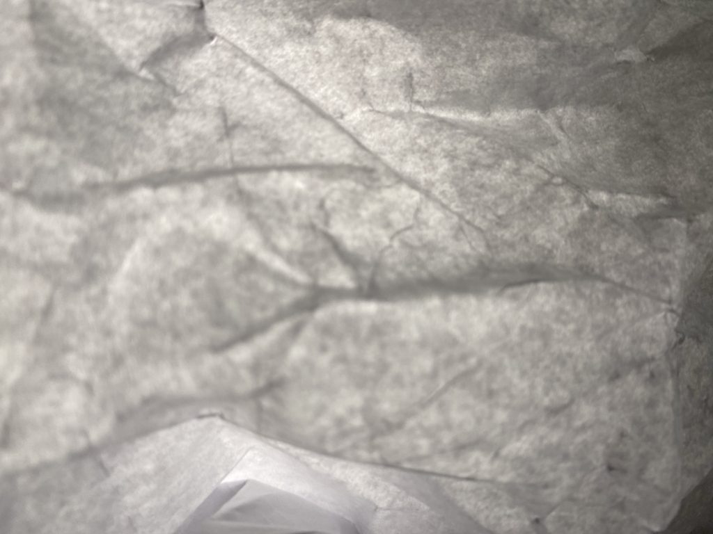
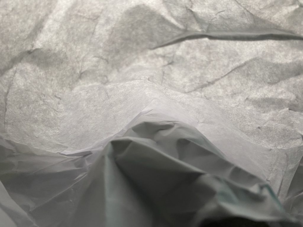
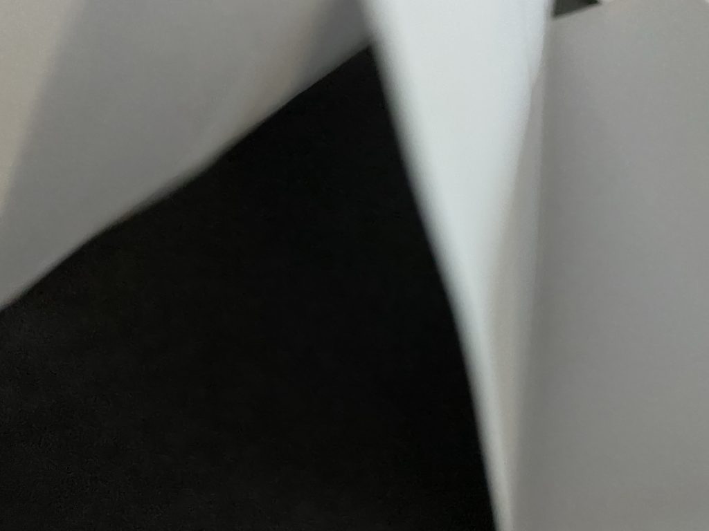
Light- The light in these photos are artificial as we used a torch to add harsh lighting to these photos rather than a soft natural lighting, which I feel enhances the texture of the paper. We can also chose the angle in which the light is coming from therefore we can adapt where the shadows are.
Line- I adapted the lines of the paper in different ways such as folding the paper in vertical lines as well as scrunching the paper up and then unfolding it to make a pattern of unorganised lines.
Repetition- In several of my photographs the lines and shapes are repeated this is due to the way I chose to fold them.
Shape- The shape of the paper is adapted throughout the photos as I decided to keep the paper flat whereas sometimes i decided to keep the paper scrunched up.
Space- As you can see I have rarely left space between the angle of the camera and the paper its self as I chose to take macro photos rather than distant photos.
Texture- The texture of my photos look very rough and uneven.
Colour- In my photographs I have chosen to adjust them to black and white as I feel that it enhances the photos and shows more details.
Composition- I decided to place the paper in the center so the photos didn’t look uneven.
Arnold Newman was an american photographer mainly known for his environmental portraits. The photo above is very unusual, This is due to the way in which he is the main focus point of the photograph as well as his eyes are looking up at the photographer making him feel intimidated by the view point of the photographer. Furthermore we don’t seem to pay as much detail to the background as its the non-focus however it looks like this photograph was taken in a train station of some sort which adds details to the overall mood.
Additionally I also feel that the way the lighting comes from above adds extra detail and contrast to the photo as the lighting adds harshness creating more tones. Overall this photo may make the viewer feel very sympathetic towards Alfred Krupp as he looks concerned due to the way he is looking up. secondly the mood of the photo is very unpleasant as the dark tones have a drastic effect on the mood overall.
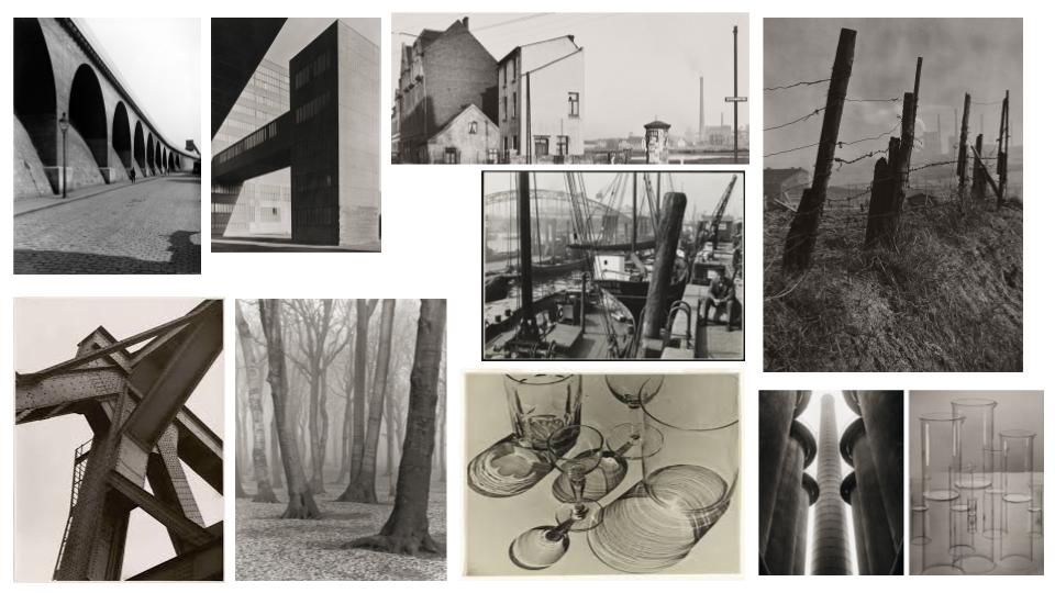
Albert Renger-Patzsch was a German photographer associated with the New Objectivity.
After military service in the First World War he studied chemistry at Dresden Technical College. In the early 1920s he worked as a press photographer for the Chicago Tribune before becoming a freelance in 1925 he published a book, The choir stalls of Cappenberg.
A second book followed in 1928, Die Welt ist schön (The World is Beautiful). It is a collection of one hundred of his images in the theme of natural forms, industrial buildings and objects.
Renger-Patzsch used a variety of formal elements in his work. examples being; repetition, line, light and rhythm. He used film media to achieve these as it was before digital cameras were made. This is why they are also in black and white.
He believed that the value of photography was in its ability to reproduce the texture of reality, and to represent the essence of an object.
https://www.tate.org.uk/art/artists/albert-renger-patzsch-2709
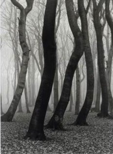
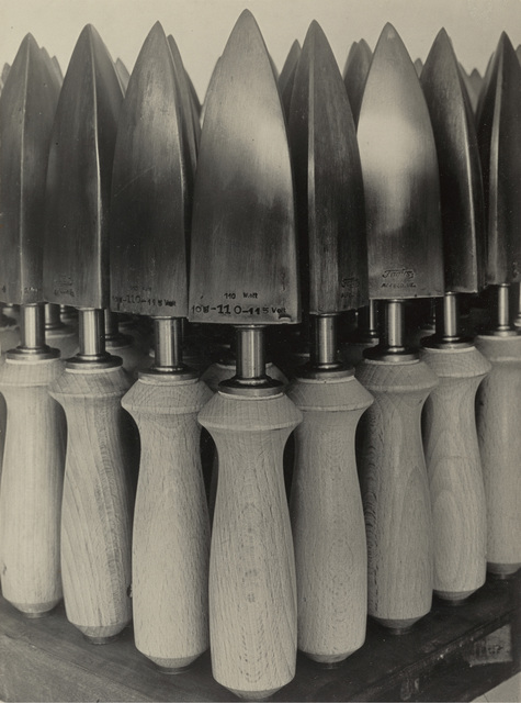
Picture of the trees:
The trees are earthy and organic in the sense they are part of nature and are grown from the earth. In this image there is also depth as past the first main trees it goes further and further into the forest creating depth. Also in this photo the light is focused towards the background and the front is darker with shadowing. The image is cropped normally in the sense the trees are not too close but are still the subject of the image, however the photo has been framed in a way that the picture still continues outside of the frame.
Picture of the shovels:
The irons are a man made object which sticks to the industrial theme in Renger-Patzschs’ photos. There is not much depth in this image as it seems very 2D, however the light reflecting off the irons creates some depth as it continues the photograph further. The image is cropped quite close to the center of the subject (the irons) but is framed in a way where the image does not continue and stops at the edges.
Similarities of both:
The repeated pattern of vertical lines in both images creates a sense of rhythm as it is repeated throughout the image and makes it interesting and satisfying to view. Both photos are photographed with natural light rather than studio light. Both images have a triangular shape at the bottom of the photo, this points your eyes into the picture.

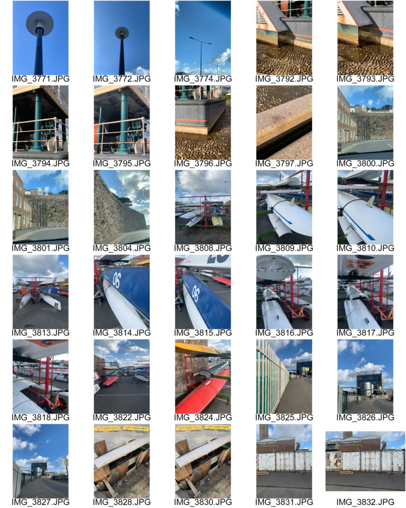

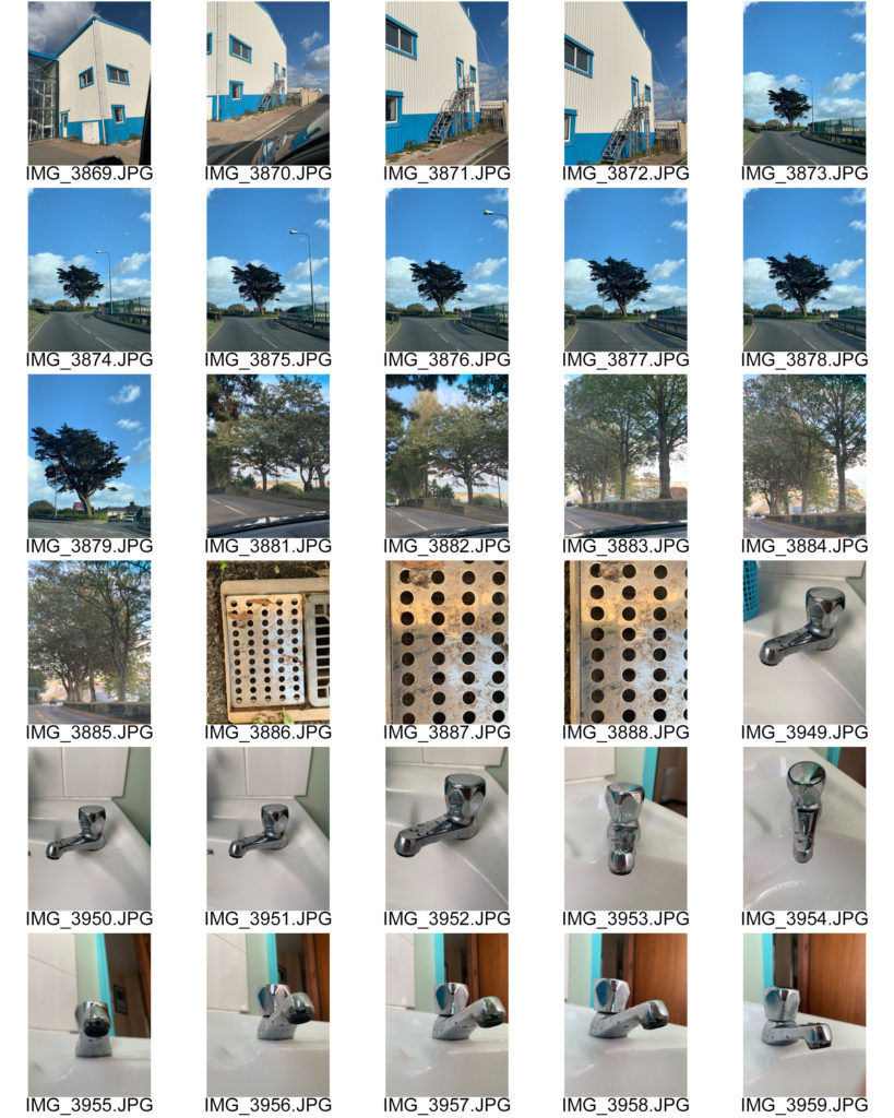
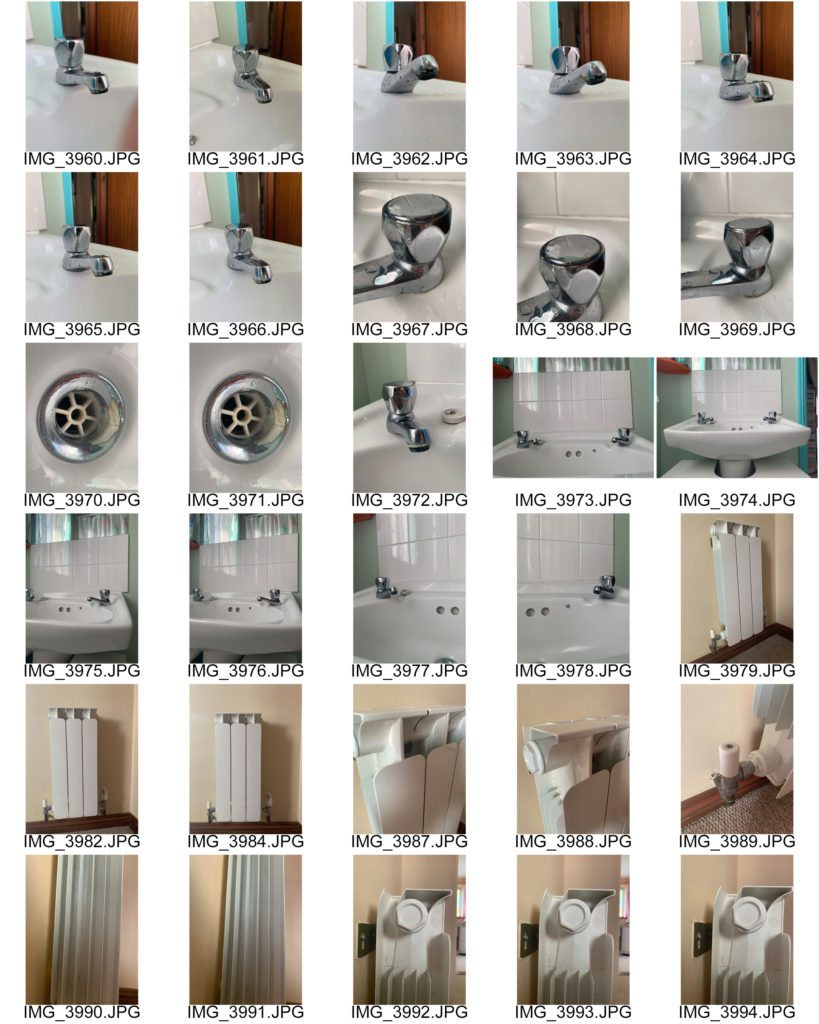

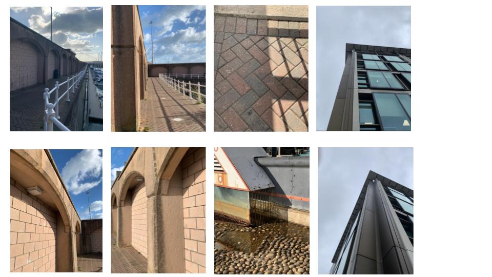
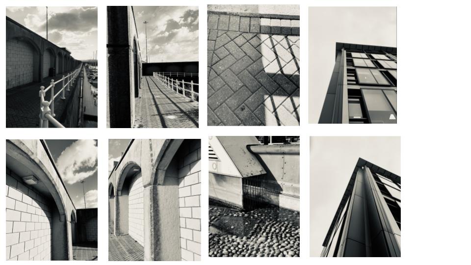
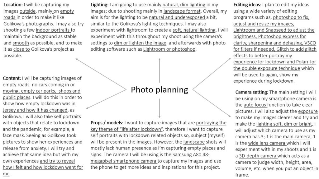
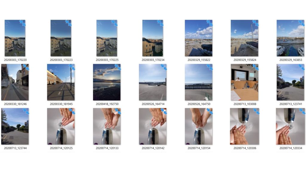
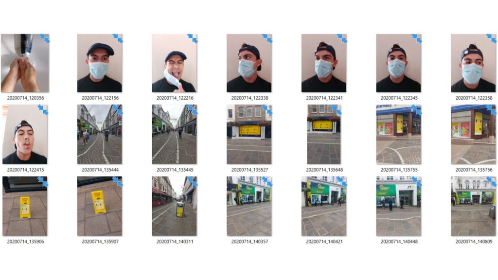
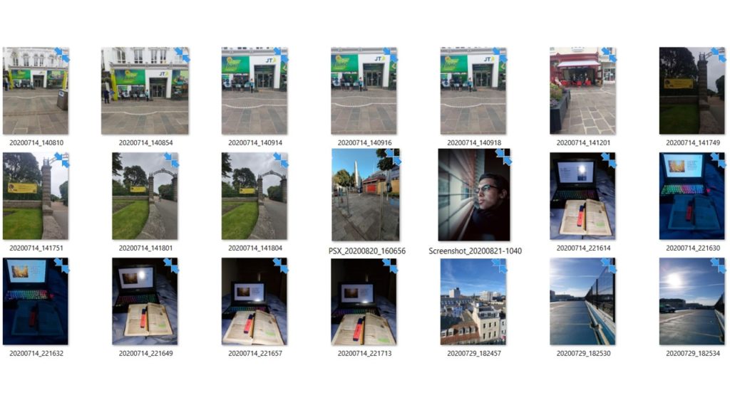
This selection of photos were taken using a phone. I edited them into black and white and made sure the contrast between light and dark was high and that the images included sharp edges. When taking the photos I looked for things that were structural and included rhythm throughout them. i used natural lighting in them because they were taken outside and they are architectural man made objects/buildings.
Task
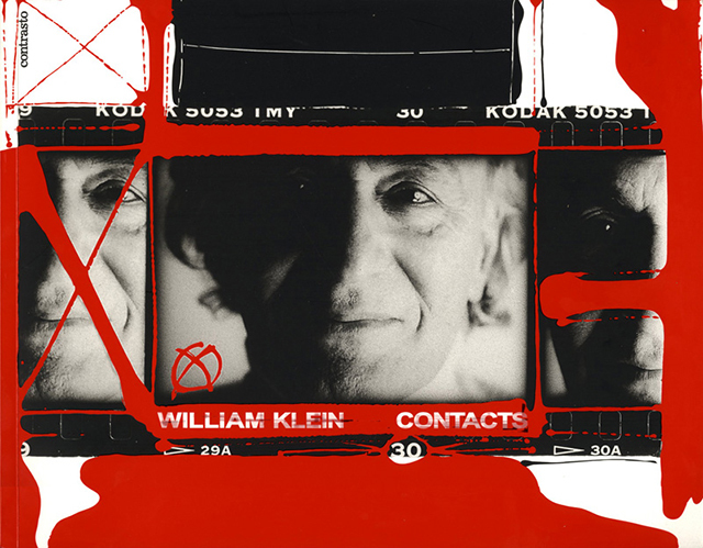
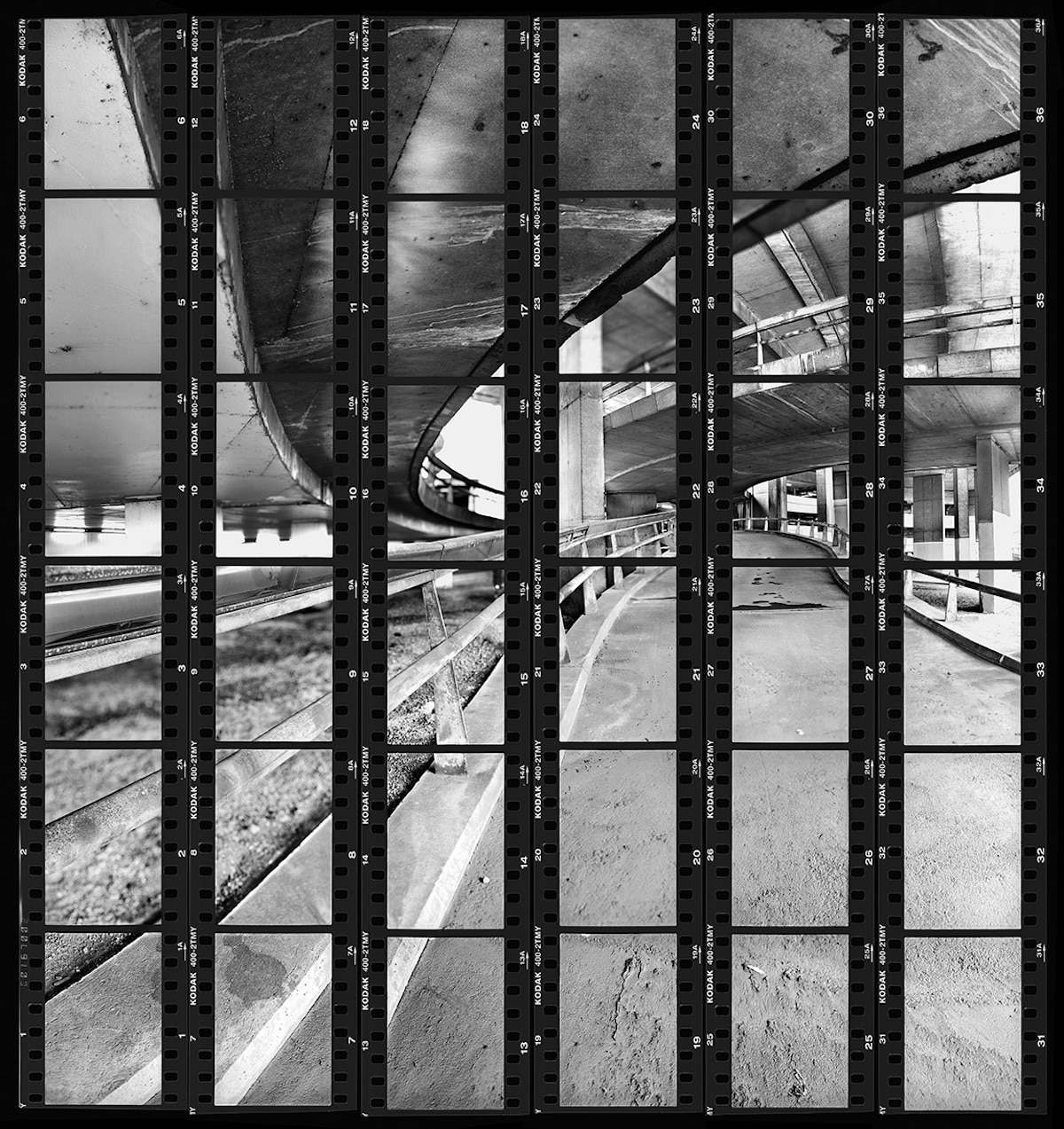
Contact sheets were an incredibly important tool and an inevitable part of the photographic process until digital photography rendered them obsolete. As Lubben notes, they constitute “a record of one’s shooting, a tool for editing, and an index to an archive of negatives.” Indeed, she continues, the contact sheet “embodies much of the appeal of photography itself: the sense of time unfolding, a durable trace of movement through space, an apparent authentication of photography’s claim to transparent representation of reality.”
Contact sheets also represent the economy of the roll of 36 frames, as opposed to the limitless numbers of shots that digital photography affords today. As such, they provide the physical marker of an era when each frame had a value, and was therefore more precious.
Then develop and publish a blog post that tackles the following…



At the forefront of the photograph an old man can be seen. Natural light floods the background leaving dark shadows rising from beneath the man. He is looking menacingly down the lens of the camera while his hands, clasped together, help to hold up his tanned face. The camera has been positioned to be looking directly through the center of two dark grey pillars. The light from the back surrounds his face and is reflected along the side of his cheeks and down to his chin with dark shadows peeking from the creases of his mouth. In the background the symmetry is elongated with two trains on either side of the image. Dark grays and black can be seen dominating the bottom half of the photograph whereas brighter colours such as white, red, orange and blue can be viewed in the upper half. There are also leading lines that can be viewed coming up through Krupps arms leading to his eyes, this creates a triangular shape. These can also be seen leading from the edge of the light coming through the top of the photograph.
The man in the photograph looks cold and frightening but in reality he is harmless in that moment. His name is Alfred Krupp and During WWII him and his family helped the Nazis move people to concentration camps. This photo captures the man that he is, cold, dark and frightening.
