Image Analysis – Alfred Krupp

The man in this photograph is Alfred Krupp. Alfred was as an ammunition and steel manufacturer who supplied products to the German Nazis during the war and was later sentenced to prison for war crimes. The Photographer, Arnold Newman, was a Jewish American who traveled to Germany as he felt he needed to know more about the horrific oppression of Jewish people. The dramatic irony behind this photo is that a Jewish Photographer got a Nazi sympathizer to pose for this iconic image.

In this Image, slightly below the centre of the shot, is a medium shot of a Caucasian man who looks to be in his late sixties. He has a balding head with slight tufts of grey hair sprouting near the back of his scalp. He has fairly dark coloured skin littered with wrinkles. He has bushy brown eyebrows, a long pointed nose and large, deep, brown eyes. He is gazing straight at the lens and has a serious and sinister expression on his face. He is dressed in a dark grey blazer with a white shirt bearing silver cuff links underneath. He is aslo wearing an expensive looking metal watch tucked underneath his blazer. In the background there is two large concrete pillars eaither side of the man. There is a blue train to the left of the man and a rust coloured one to the right. There are two rows of metal beams above the trains running paralell to eachother leading to a set of windows positioned directly above the mans head. There are also multiple columns of ceiling windows running along the roof of the builing. Also in this buidling are a series of moving metal machines/parts.

The lighting in this image is a combination of natural and fabricated light, the natural light is coming from above and behind the subject. The natural light coming from the windows give the subject a glow above his head almost like a halo. The fluorescent light is coming from behind the camera. This light brightens the outside of the subject but creates deep shadows in the centre of the subjects face and body which make him look mischievous. The image has quite a narrow portrait crop on it. Arnold used quite a high aperture as both the foreground and background are very clear. The image is slightly underexposed and has been given a vignette around the edges to create a mysterious feel. The image has a warm tone and a dark tone. the texture of the image is quite rough which is not created by grain but is rather associated with the old mysterious man and his surroundings. There a large depth of field aided by the metal beams running longitudinally down the factory roof in this image. The photographer has also framed the subject between the two pillars.

PHOTO ANALYSIS

Arnold Newman | Portrait of Alfred Krupp | 1963

Image result for arnold newman alfred krupp
Picture

Background/context- The photographer, Arnold Newman,  was born in New York City in 1918, and attended high school in Miami. He studied painting at the University of Miami on scholarship for two years, before—having run out of financial support for his studies—moving to Philadelphia to work as a photographer.

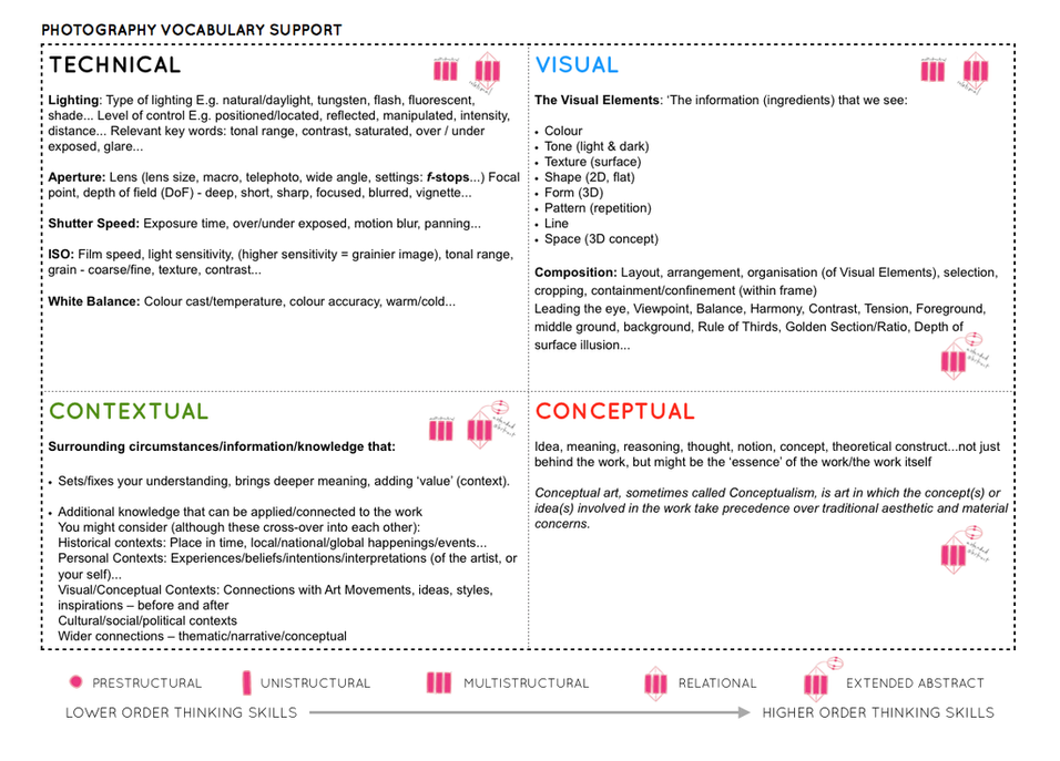
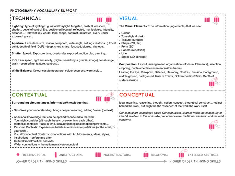
Technical – the lighting is not natural it looks more focused on Krupp and the background behind him to make him the main focus/subject. The light surrounding Krupp is much darker than the rest of the photo which creates a mysterious atmosphere around him and portrays him as someone evil as the trains and entertainment behind him are very lit up.

Visual- The photograph is in colour. The background around him is quite symmetrical and the photo is taken from a higher viewpoint which shows that the photographer is looking over him. This creates an idea that the photographer thinks he’s better than Krupp. The background behind him is getting smaller as it goes on which draws attention to Krupps face right away .

Conceptual- Arnold Newman was a Jewish American photographer who wanted to tell the world that Alfred Krupp was an evil person as he was very powerful due to being a German Nazis. The angle at which the photo was taken indicates that Arnold Newman wants to create the idea of him being more powerful and in control.

The formal elements research-

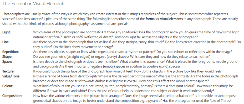
Many of the most famous and influential photographers are successful because they instinctively use these formal elements to create the best photograph they can whilst in front of the camera. This can be because the compose image with precision or that they recognize the perfect moment to press the shutter.

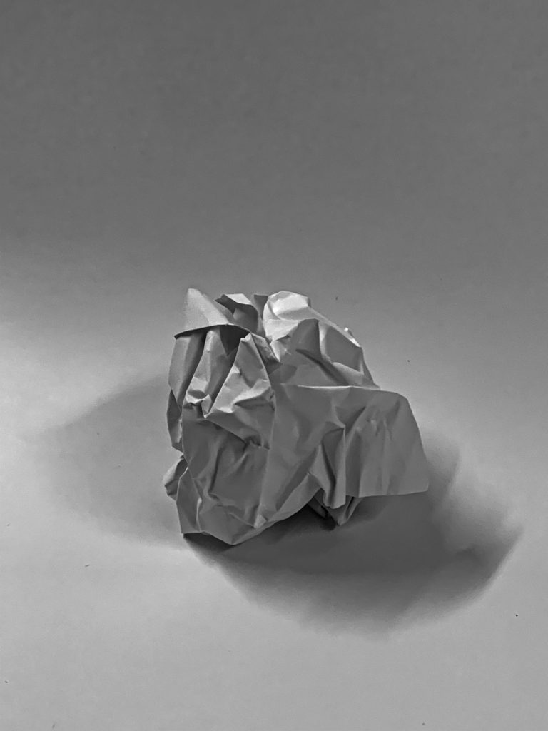
During one lesson, we took photos of paper in different lighting to show how the tone changes drastically and the darker tones become much more sharp. The photos were then uploaded on Photoshop and edited.

Analysing the elements for all my photos;

Line/ shape- because the photos are of paper there isn’t a lot of straight lines. Most are jagged and very unnatural. The shape of all the paper is very unsymmetrical and there’s not really a shape that can be seen in any photos apart from the one that’s a paper ball.

Light- there are some light parts and some very dark parts of the paper. This is due to the light being off which made the sharp sections very dark and there were shadows created. By editing the photographs further it made the edges more harsh.

Repetition– there’s not a lot of repeated lines or shapes as all the lines are very different and the creases are all over the paper.

Space- I photographed the paper quite close to make sure all the creases are visible but I took one where you could see the whole paper ball because I wanted the shadow to be shown underneath it. By taking the photos up close the viewer is getting to see all the details.

Texture– when the lights were turned off and I edited the photos further you could really see the texture of the creases better as the texture became more sharp and it looks more harsh when its darker in contrast to when it’s light as it looks more soft.

Value/ tone– The photos contain a mixture of all different tones. Some areas of the paper are mid-tones but there’s a lot of dark tones surrounding the edges as well as a lot of soft tones.

Composition- The images look unbalanced as there’s a lot of different lines and creases all over the place. The elements have been arranged it a random order as the creases were not planned.

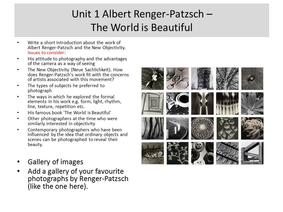
Albert render-patzsch – The world is BEAUTIFUL

INTRODUCTION:

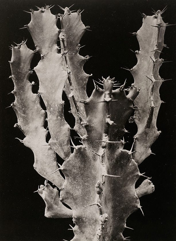
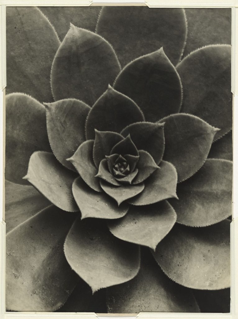
Albert Renger-Patzsch was a German photographer who began taking photos from the age of twelve. He mainly focuses on architectural photos, macro photos and object photography which he then puts into black and white adding more tones and details. His famous book which he published in 1928 ‘The World is Beautiful’ inspired several other photographers to start paying close attention to objectivity. Albert Renger-Patzsch also explored all seven formal elements such as: form, light, rhythm, line, texture, and repetition throughout his years.
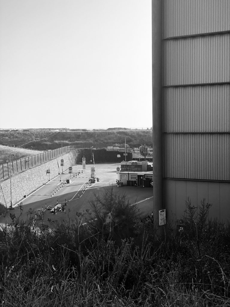
ANALYSIS:

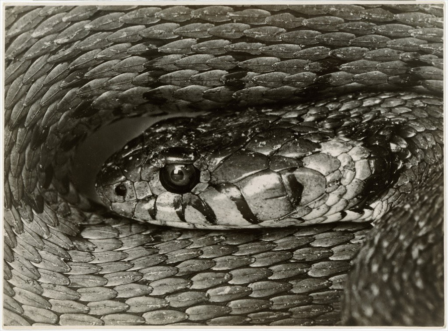
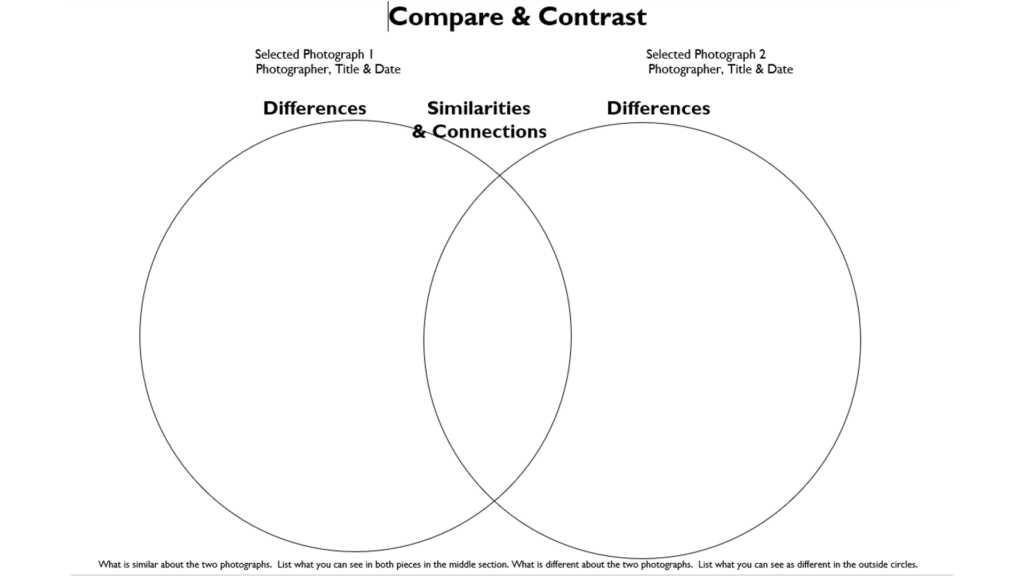
These photos are similar are different in several ways. The first thing I noticed when I started looking at these two images is that they are both in black and white showing different tones which enhances the textures. Secondly I also noticed that neither of the photographs show nature as one is architectural and the other shows a pattern which has been created by Albert Renger-Patzsch.

However there are also several differences, for example one of the photos have been taken from a close and straight angle whereas the other has been taken from a distance at a looking up angle which adds contrasts to both of the images in different ways. Another difference I noticed was the lighting tones as one of the photos have more of a warm tone compared to the other photo has more of a dark and natural tones.

MY RESPONSE

BEST IMAGES

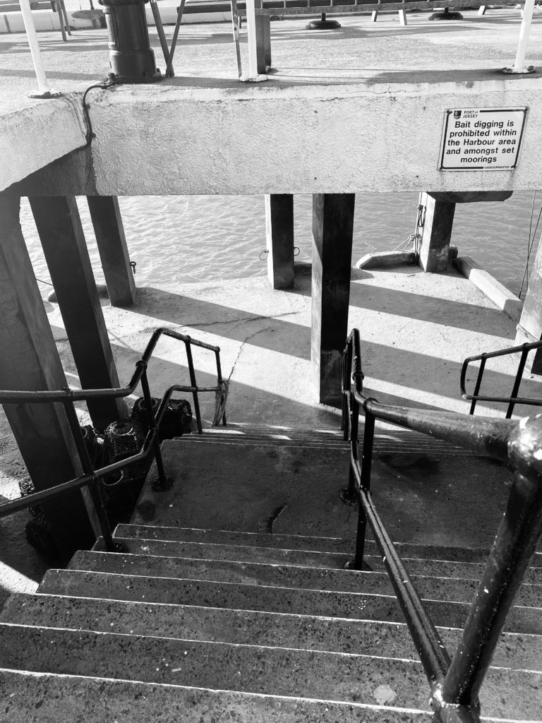
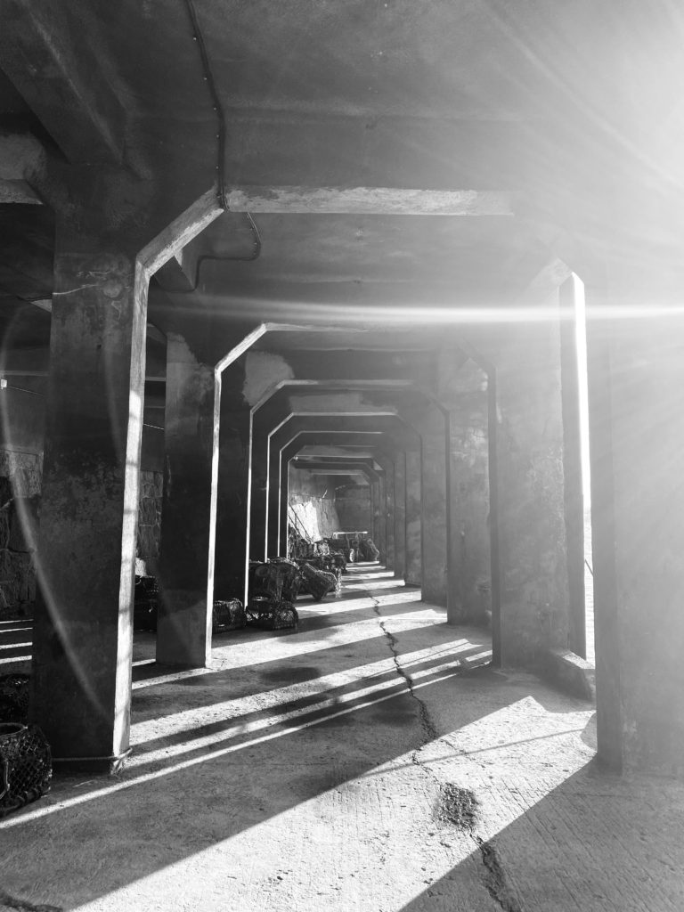
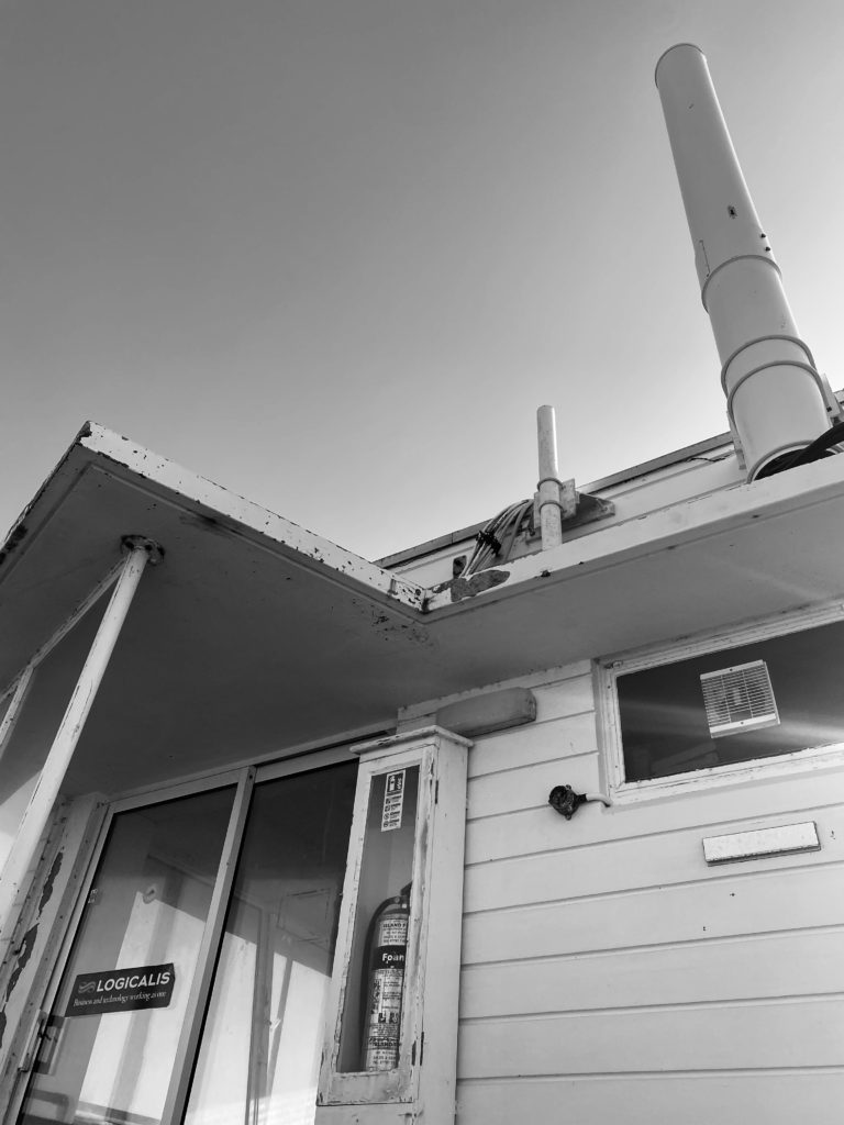
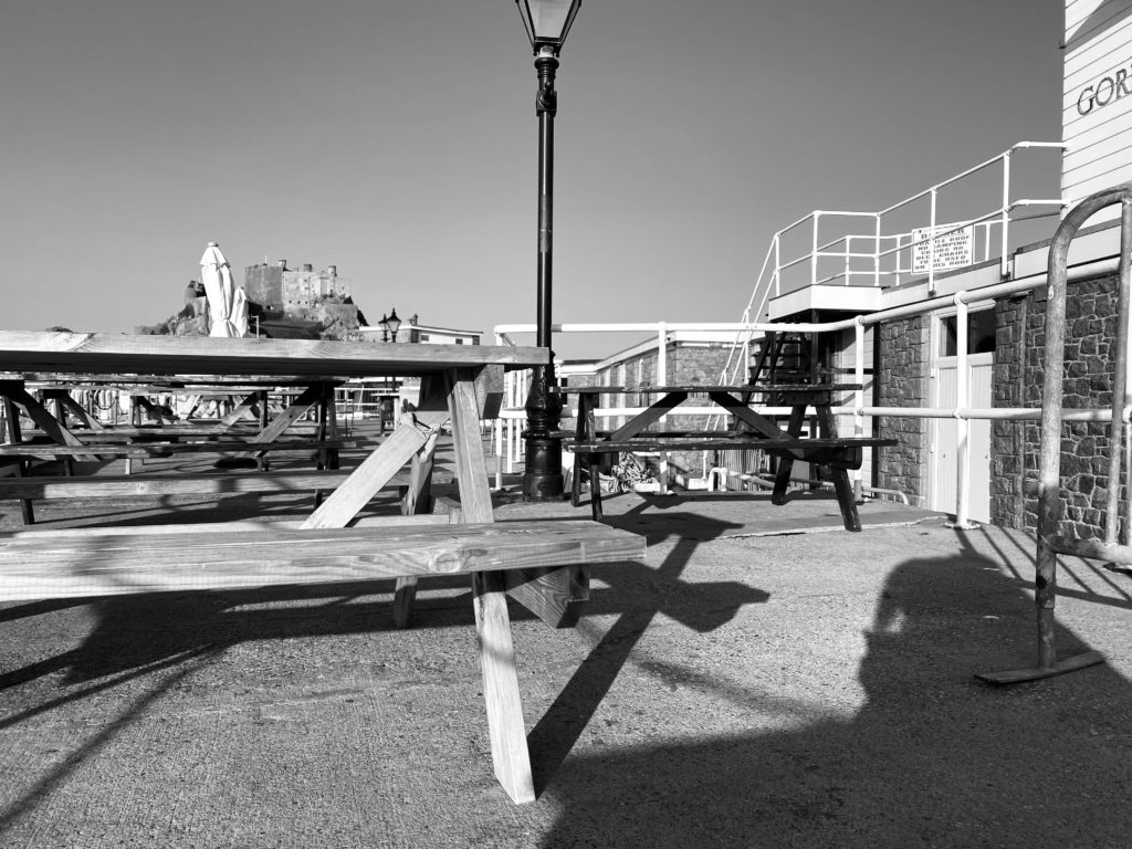
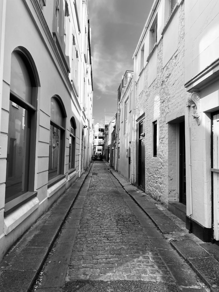
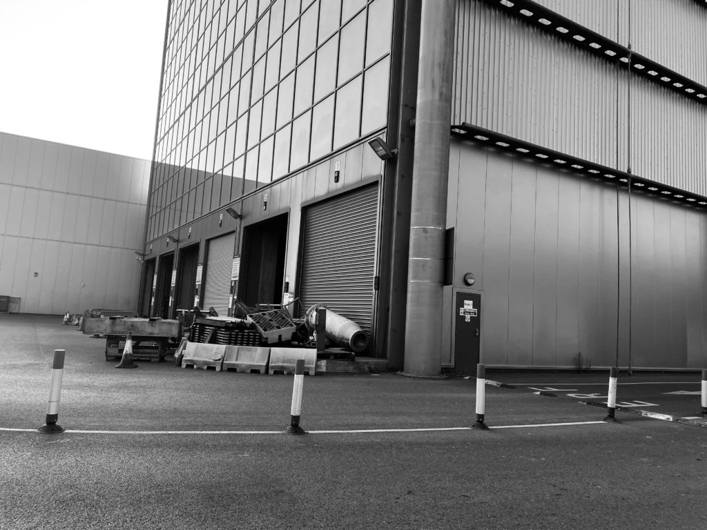
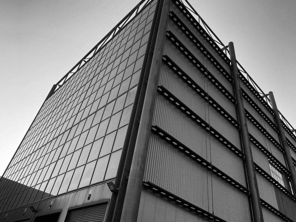
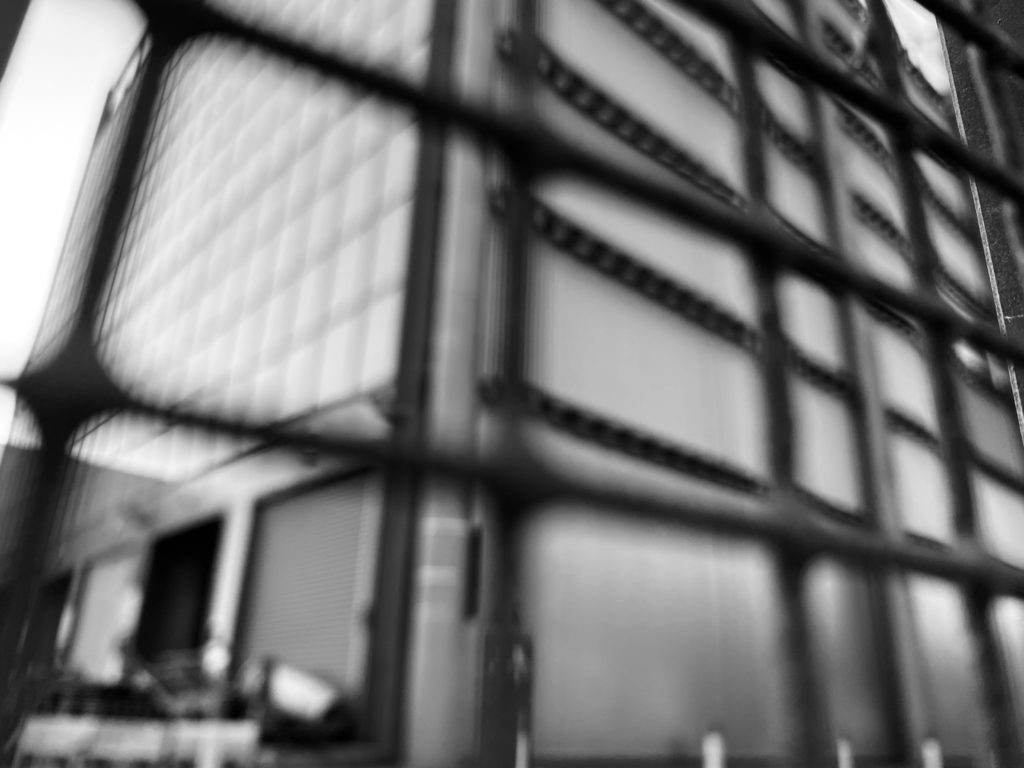
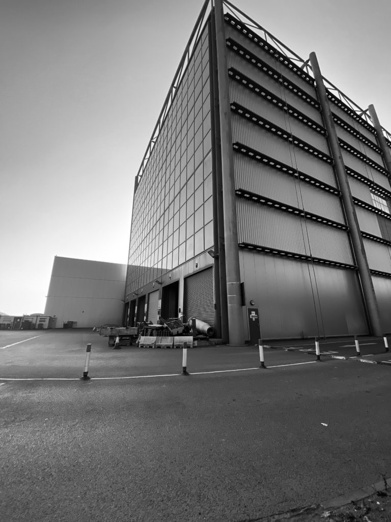
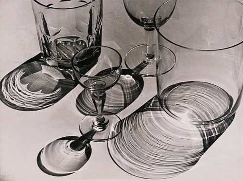
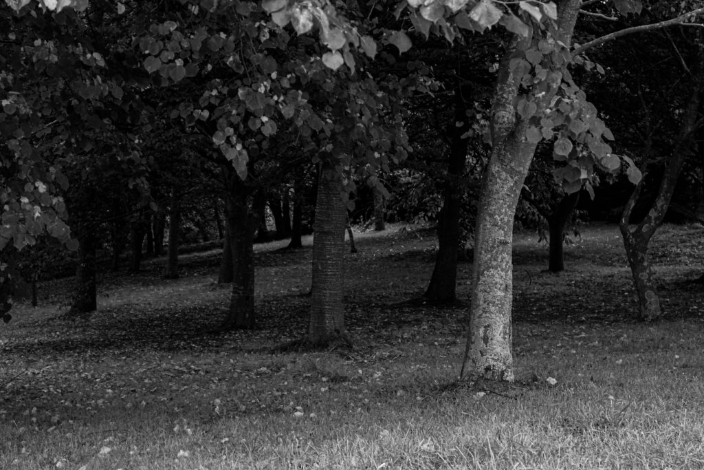
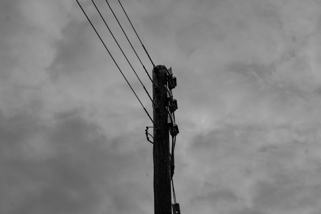
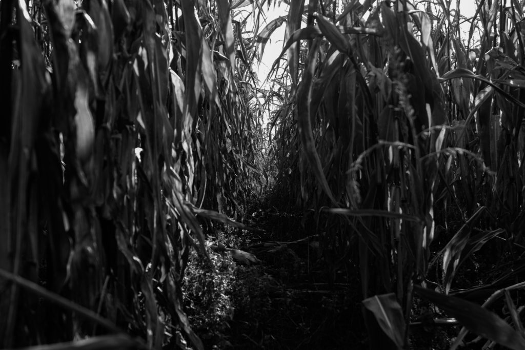
I personally believe that these are the best images I have took for this shoot, this is because I feel that they reflect Alberts Render – Patzsch as you can see clearly the direction of which the light was coming from. I started of by taking photos from a straight on angle then I later developed the idea of taking photos from a lower angle, which I think make the photographs more abstract.

Additionally I tried to avoid editing my photos in order to make them feel more realistic as this is what Albert Renger – Patzsch did throughout the majority of his photographs. The tones of the images are very different throughout due to the way in which the lighting is coming from which creates different shadows and shades.

The Formal Elements

Tiago De Sá 

Light:

The brightest part of the image is the center, the rest of the image is dark.

The background is pure black and there are dim shadows throughout the piece of paper.

The photograph has soft artificial lighting as a flash was used to take this photograph. The light starts brighter at the top and goes dimmer and dimmer down the paper.

The way the paper is set-up acts as a leading line towards the bottom.


Lines:

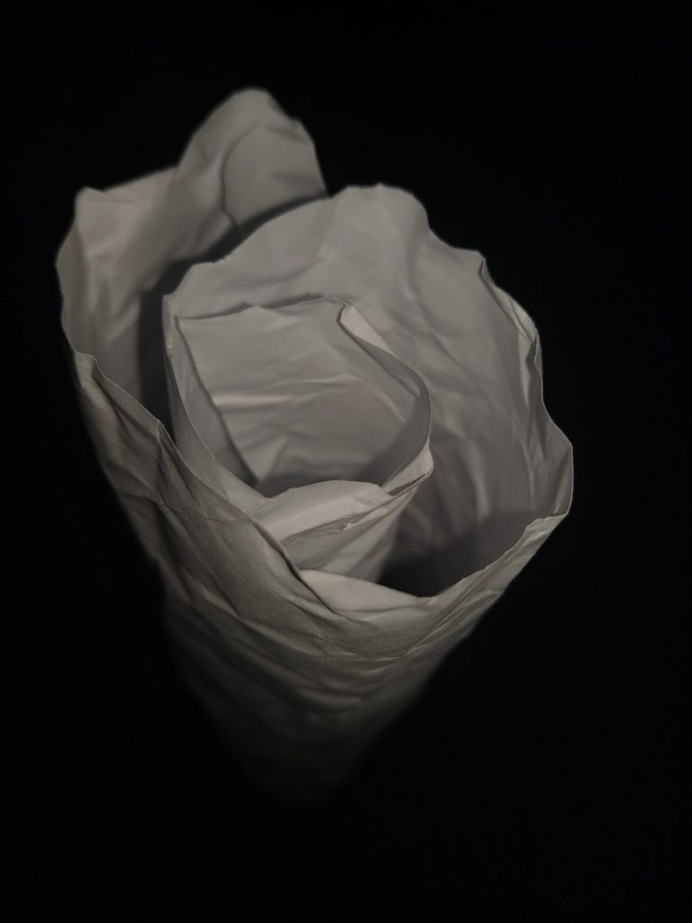
There are very scrunched and curvy lines throughout the paper. The paper is rolled into a paper binocular which creates a kind of cylinder leading towards the bottom / the dark “abyss”.

The lines show the image to be still.


Repetition:

The paper in itself forms a circular pattern almost like a scrunched paper binocular or a paper rose.


Space:

The space in this image appears quite centered on the subject. It seems as if the photographer took the picture using a wide angle lens as it is close to the subject but seems as if the paper goes into the “abyss” forever.


Shape:

These circular and wavy texture throughout the photograph create these organic shapes throughout the photograph.


Texture:

The texture of this image appears to be wavy, curvy and curly. This is evident by the fact that the paper seems to be scrunched up then rolled to form this object.


Value / tone:

The image contains a range of tones from very dark to natural lighting. There are harsh and dark shadows and backgrounds but also dim and bright tones. The image is in “black and white” as the only main colours in this coloured digital image are black and white.


Composition:

The focal point in this image is the paper as the photographer has used the rule of thirds to successfully set the subject in mid-center.

The photographer has clearly balanced the colours in this image so that it is only white in contrast to the black background.


Paper Paper Paper

In this image I shot pieces of folded, crumpled and ripped paper.

I shot this image using harsh, unnatural, flash lighting. The light is positioned closely above and to the right of the paper which creates extreme shadows and opposing bright white elements in the composition. This gives the image a lot of contrast and tonal range. I also de-saturated the image to accentuate the negative background and the highlights.

I used a large aperture to make the paper stand out from the background. I used a low ISO to prevent grain and to prevent my image from being blown out sue to the unnatural light. The image has a satisfying repetition of horizontal lines created by the way I folded the paper. I also used pieces of ripped and crumpled paper to frame my image. This framing also gives the image some nice depth of field as it adds layering to the composition. The ripped and crumpled paper used to frame my image has also given the image a horizontal line of symmetry.

The world is beautiful – Albert Renger-Patzsch

Albert Renger-Patzsch was born in 1897 and died in 1966 and was a German photographer who mostly shot in black and white and was associated with the New Objectivity

New Objectivity was a movement in German art in the 1920’s as a reaction against expressionism. It was a return to focus more on the objective world, instead of abstract or romantic. Some other artists that were associated with New Objectivity were Max Beckmann, Otto Dix, George Grosz, Christian Schad, Rudolf Schlichter and Jeanne Mammen.

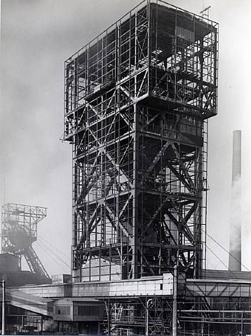
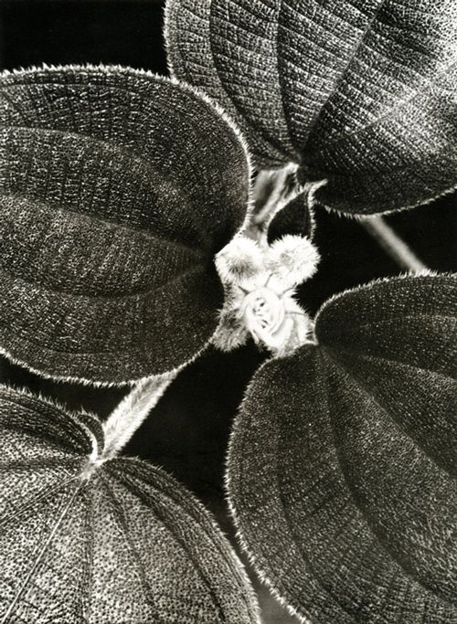
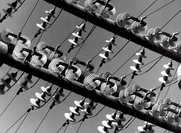
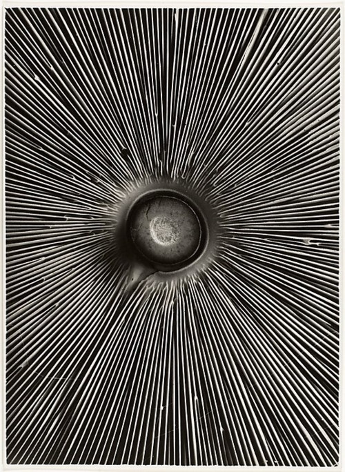
He made a book in 1928, ‘Die Welt ist schön‘, which translates to The ‘World is Beautiful’, which is a collection of hundreds of his photographs of industrial buildings and areas, mass produced objects and natural forms. These were all in black and white, usually with great contrast between the darks and lights in the image. Lots of his images also focused on geometric shapes and repetition throughout the image.

Image Analysis

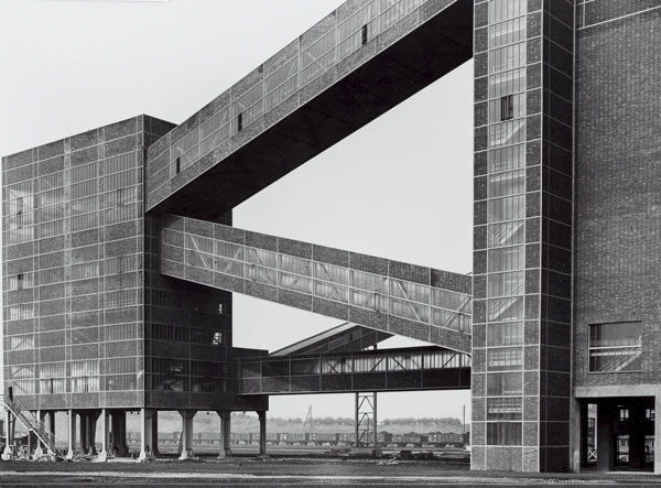
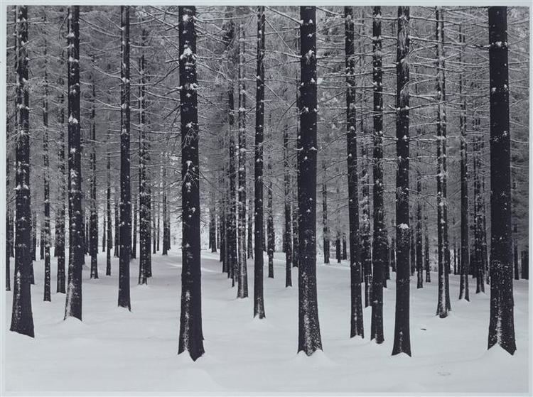
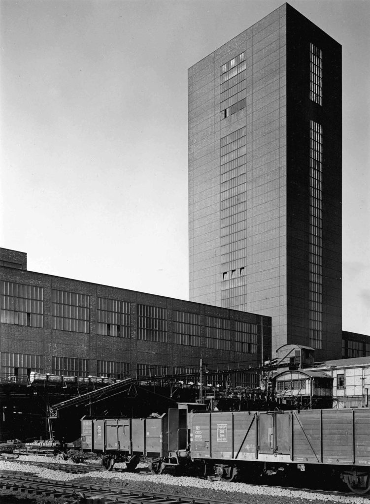
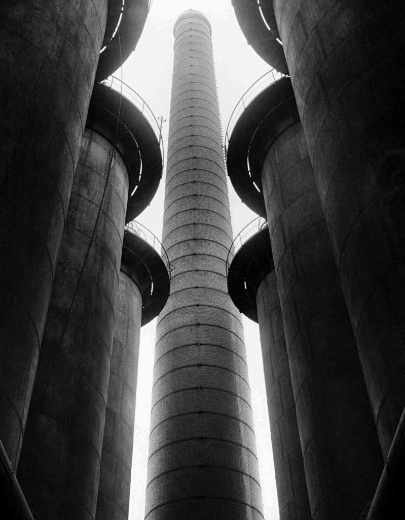
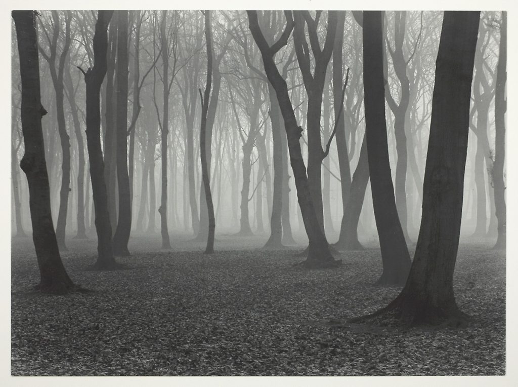
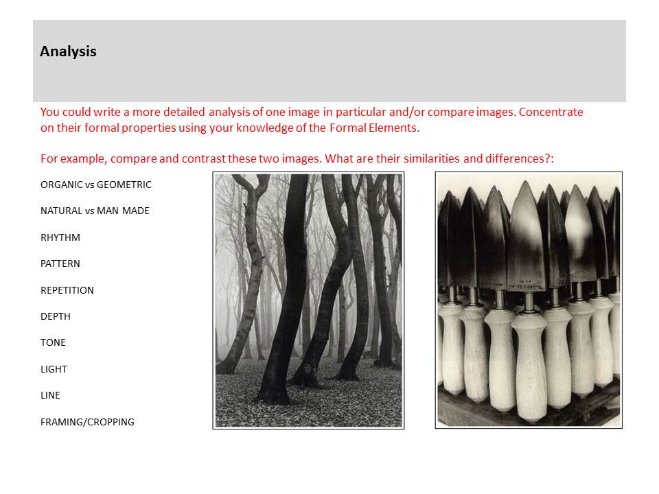
These are both images that Albert Renger-Patzsch took as a part of his ‘The World Is Beautiful’ collection.

One is an image of an industrial building, and one is an image of a deep natural woodland area, but they have many similarities aswel as differences.

Both images are taken in black and white which emphasizes the shadows created by the objects in the frame. This is seen in the dark shadows underneath the tops of the towers in the image on the left, as well and the gradient from light to dark grays on the rounded edge of the towers. These dark shadows are similar to the natural image on the right as the darkness of the trees create a silhouette against the light, foggy background, creating a high contrast between the focus objects and the background, which is also seen in the image on the left. The image on the left is very geometric with the towers and buildings completely vertical and straight in the frame. Where as the image on the right is more organic as the trees are all varying at the angle they are leaning, with different bumps and curves on each of them. The framing of the image on left is so that the image is almost completely symmetrical, which links to the idea of a man made factory creating hundreds of the same product. The image of the right is much less symmetrical and uneven, which shows the randomness of nature. Both images use layers and camera positioning to create a sense of depth. In the image on he left, the camera is focusing on a taller building behind 6 other smaller buildings which create a ‘tunnel’ towards the larger one. The bigger tower also has a lighter tone showing that it is further away from the camera than the other towers. Although both images are in black and white, the one on the right has more warm tones than the image on the left. The left image also has a higher contrast between the buildings and the sky because the whites of the sky are brighter with a higher exposure. This makes the right image more inviting as it gives off more warm as well as natural feelings. The photograph on the right was shot at chest height looking parallel to the ground to see into the woods through the trees, but the photograph on the left was shot from the ground looking up up at the buildings. This angle accentuates the size and scale of the buildings giving them more depth, as well as creating an immersive feeling of being surrounded by the buildings.
My images – Contact Sheets

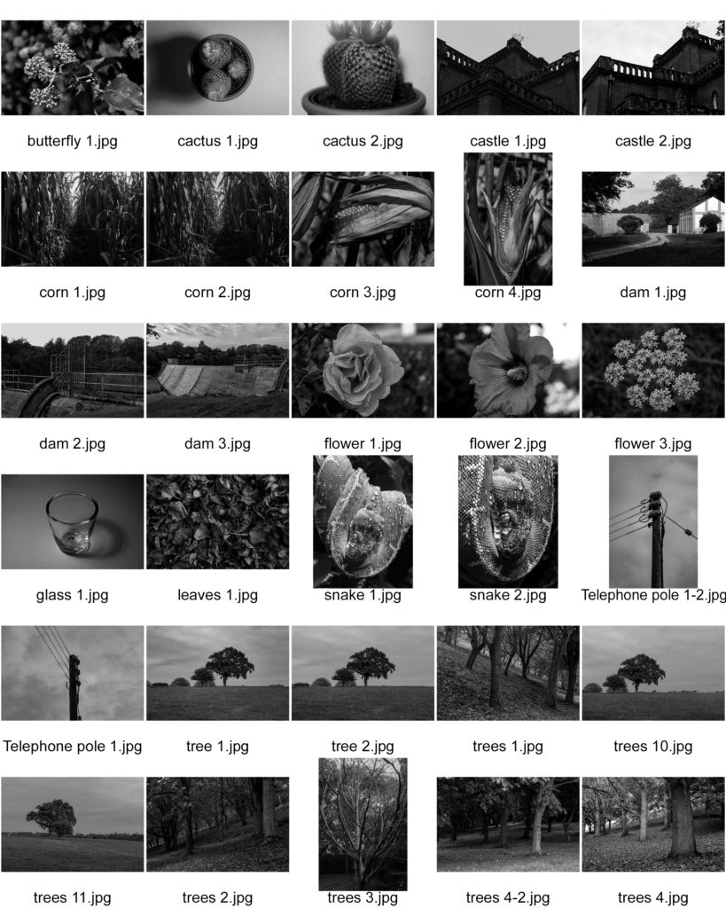
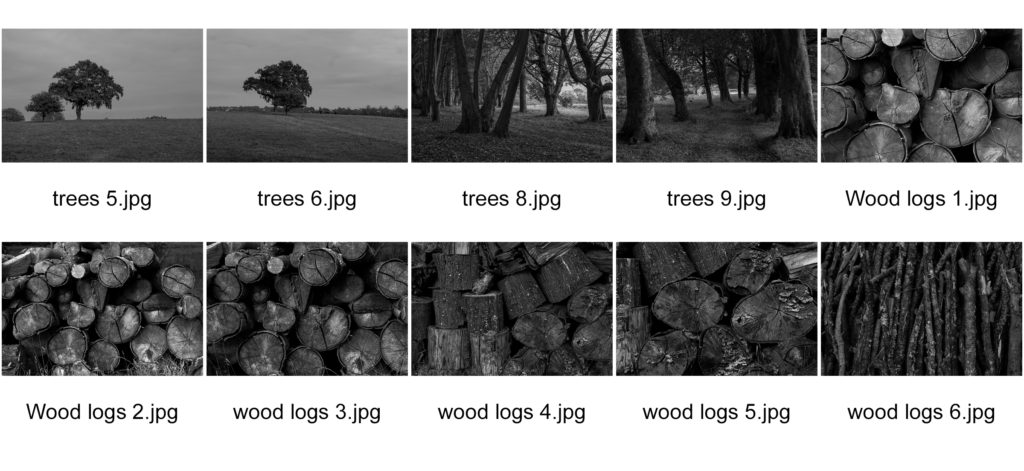
A contact sheet is a way of displaying images from when film photography was commonly used. It is a sheet of printing paper that displays a whole shoot of multiple images. They provide a quick way to look at lots of images quickly in the same place.

Contact sheets were originally useful to quickly scan through a group of photographs to find the best ones to enlarge. Now it is used to quickly find the best ones to further edit and improve.

Favorite Images

the world is beautiful

Task Practical / photoshoot-homework

Respond to Albert Renger-Patzsch 1897-1966

We will aim to expand our approach to photographing things around us…whilst responding to influential approaches in the development of modern photography.

By responding to Albert Renger-Patszch and The New Objectivity you will be able to classify a greater range of your images whilst learning more about the Formal Elements and Adobe Photoshop techniques including :

  • Cropping
  • Image Adjustments
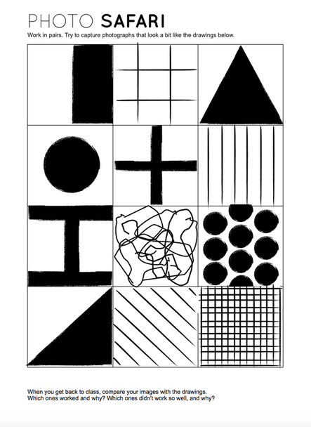
Photo Safari

Remember to : Describe, explain and evaluate your process carefully.

Homework Due Date = Wednesday 23 September