





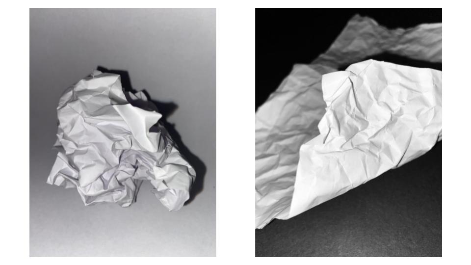
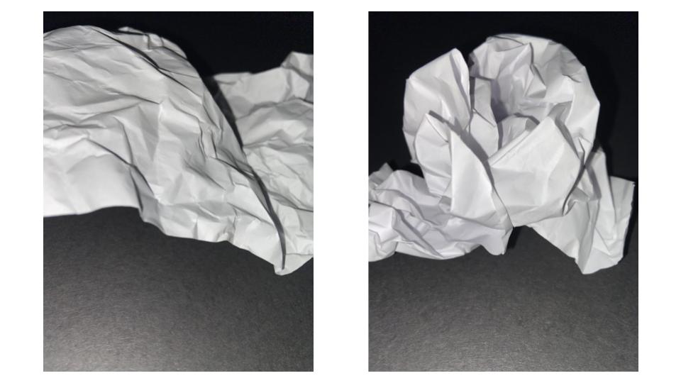
Light – The light in all of these photographs is artificial as it is coming from the torch feature on a phone. I wanted the lighting to be harsh so that you could see the clear lines in the paper made by the folding. I also wanted to include some shadows so that the white paper would appear to contrast it. I wanted the brightest part of the photograph to be the closet part to the camera, so I directed the light onto that specific place.
Line – I made the lines in the paper by folding and scrunching. I wanted there to be a mixture of both straight, harsh lines and soft, curved lines.
Repetition – In some of my photographs, there are lines and shapes that are repeated, as I folded the paper symmetrically several times.
Shape – There are a lot of geometric shapes in my photographs. For example, in the fourth picture, you can see several triangle shapes made by the straight edges of my folding.
Space – In the last three photographs, they appear shallow as the paper is very close to the camera. However in the first photograph, the paper is sat at a distance, creating a deeper look with the shadows behind it. There is also a lot of negative space in the background which has been left empty and bare.
Texture – The scrunched and folded paper would create a rough and coarse feeling.
Value/Tone – The paper is the brightest part of all my photographs, as the artificial light from the phone illuminates it against the black background. For the first picture, although the background is white, it isn’t as bright as the paper itself.
Colour – I chose to keep my photographs in simple black and white because I think that it shows the contrast between light and dark more clearly. I also think that if I had introduced any sort of colour, the creases in the paper wouldn’t be as apparent.
Composition – I placed the object mostly in the centre of my photographs so that it would appear even and balanced.
Albert Renger-Patzsch, a German photographer born in 1897, appropriated the New Objectivity movement, which occurred during the 1920s, using his photography skills to produce many infamous post-expressionist photographs. With creating these images, he viewed how he used his camera as a faithful recording of the world. Using these photos, he released his book containing one hundred images of industrial subjects, natural forms and mass produced objects. With this movement of New Objectivity came many artists, including people such as George Grosz, Otto Dix, Max Beckmann, and many more. These artist however mainly focused on abstract or conceptual portraits of ordinary people, as opposed to Patzsch who focused on buildings or objects. Photographers operating in similar styles as Patzsch, in the New Objectivity movement, include Karl Blossfeldt and Aenne Biermann. These artists and photographers snubbed the art forms of expressionists and romantic idealism, and instead took photos of the more dull realities of the world. Patzsch did this by taking images of mundane objects and architecture, often looking for repetition and bold lines.


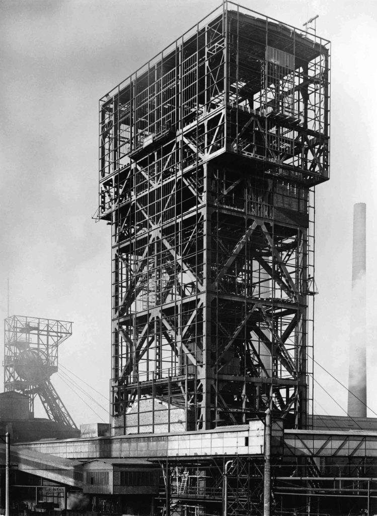


Image Analysis
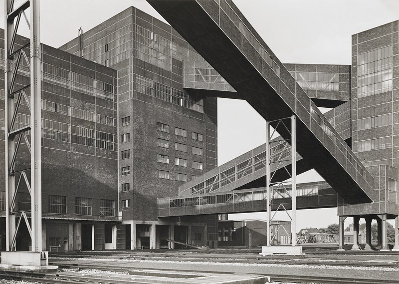
This black and white photograph taken by Patzsch showcases an industrial subject including many leading lines, created by the bridges in between each building. These bridges lead your eye across and around the image whilst also creating a geometric photograph. The tone of this piece is quite light, due to the white overcast sky and the lack of many harsh shadows. In addition, the light grey sky strongly contrasts with the sharp lines of the dark building. Patzsch has framed this image to foreground one of the bridges, located in the center, as the focal point.
Furthermore, you can see that the lighting of this photo is natural as Patzsch took this image outside, this is also signified by the natural shadows cast on the side of the building. This image was taken with most likely a fast shutter speed as it is clear and not blurry, however due to the time period we can say that the image was taken on film, which is the cause for the slight grain on the photo.
Moreover, Patzsch took this photo of this building in particular as part of the New Objectivity movement. This building was chosen to allow no room for any romantic idealism, and to simply display ordinary every day life for what it truly is. Giving commonplace architecture recognition and a place in the arts.

In addition, this other photograph from Patzsch’s series The World is beautiful is similar to the previous image, in the sense that they both share the quality of sharp directional lines. This again results in a geometric image, with this dark structure as the focal point contrasting with the light foggy background.
However, this image also differs from the previous photograph, due to the fact that in this piece you are able to see other structures in the background, as well as the foreground, although in the first image Patzsch has only allowed for one building in the frame.

In this lesson we took a series of photographs of pieces of paper. We did this by folding, ripping and scrunching it up to create interesting lines, shadows, patterns and shapes. For this photoshoot we took the images in hard lighting, created by our phone torches, resulting in harsh shadows strongly contrasting with the white of the paper.


For these edited images in particular I rolled up two pieces of paper and carefully placed them on a scrunched up piece of paper to create an almost sculpturesque piece.
Light: In both these photographs the artificial light originates from the torch at an angle above, lighting up the top piece of rolled paper, casting a harsh shadow on the bottom one and the scrunched up paper.
Lines: The lines in these images are varied as, in the base layer of scrunched paper the lines are short, thick, jagged and interrupted, producing an almost chaotic energy in the images. I believe that these act as a guide that lead your eye towards the focal point, being the stacked rolls of paper. This differs completely from the long, curved, thin lines created by the rolled pieces of paper, resulting in a contrasting calming energy.
Repetition: As an aspect of repetition I chose to include two rolled pieces of paper.
Shape: The lines created by the scrunched paper could be said to create geometric like shapes.
Space: I believe the focal points of the rolled paper add depth to these images, drawing focus to them and slightly blurring out the background. However, as I took these with my phone it was more difficult to control the aperture than it would be with a camera, which would have added to the depth of field.
Texture: The scrunched paper would produce a rough texture to this photograph, although the rolled paper adds a smooth texture to this piece also.
Value/Tone: I think there is a range of dark to light tones in this photo, as there are areas in which there is little to no shadows at all, and then there are other areas which are completely darkened by the harsh shadows.
Colour: By editing these photographs in black and white I have created a monochrome images, although I think that the white tones dominate these images due to the white paper being in most of the frame.
Composition: I arranged each piece of paper in these photos carefully to showcase the curved paper as the focal point. In the first image I placed the rolled paper in the centre creating what I believe to be a balanced photograph.
Albert Renger-Patszch was a German photographer born in 1897 and later died in 1966. Renger-Patszch began his photography career at the early age of twelve, and got his first job in photography in the early 1920’s for the Chicago Tribune. He opened his first photography exhibition 1927 and produced his second book, “The World is Beautiful”, in 1928. This book focused on the aspect of New Objectivity, a German movement as a reaction against expressionism. “The World is Beautiful” displays one hundred of Renger-Patszch’s best photographs which focus on natural forms, industrial subjects and mass-produced objects. Like Edward Weston, in the United States, Renger-Patszch believed that the value of photography was in its ability to reproduce the texture of reality, and to represent the essence of an object.
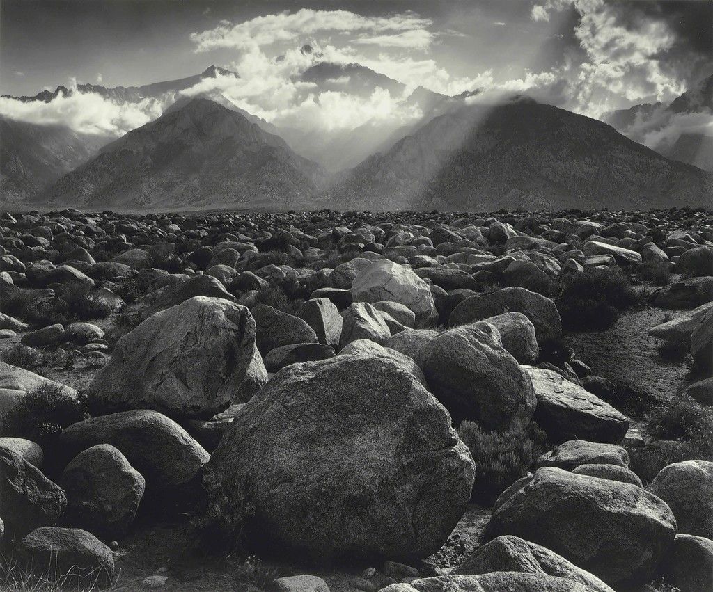
Albert Renger-Petzsch’s iconic black and white work could be compared to the work of Ansel Adams, who’s career in photography was also relevant at the time of Renger-Petzsch’s work. The main similarity they share is the uniformed, black an white theme, which allows the viewer to focus on the shape, pattern and lighting rather than the colours.
Contextual:
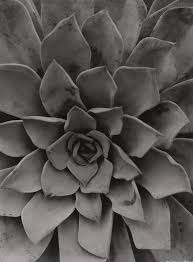
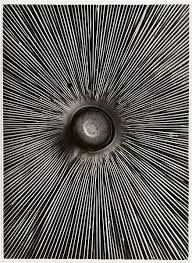
This image, named “Fungi Lepiota Procera” was featured in Albert Renger-Patszch’s famous book: “The World is Beautiful”. It is a photograph from his botanical study is of the underside of a mushroom found in woods and pastures within the northern hemisphere.
Conceptual:
“Fungi Lepiota Procera” was taken as a part of Albert’s famous publication in 1928 which contained 100 of his best images that focused on the New Objectivity movement. The purpose of this publication as a whole was to disregard old-fashioned expressionism and to explore the universality of both natural and man made life throughout the world. Essentially, the Renger-Patszch’s idea was to capture the mundane everyday objects and bring their beauty to light by cropping sections of the image and adding a sleek monochrome tone.
Technical:
I believe artificial lighting was used for this image as the photo is of high quality and bold shadows are created. The harsh lighting creates a clear contrast between light and dark within the lines which is exaggerated by the monochromatic effect. the lighting is coming from straight ahead as the shadows aren’t cast in a particular direction and they are all rather even around the surface. The photo is quite flat as there is no background to compare depth against the focal point, and the whole image is in focus, so it is hard to tell if there is a narrow or large depth of field.
Visual :
A pattern of repetition is the main focus of this image, with the repeating lines pointing towards the centre of the mushroom to create a focal point, that being the stalk of the mushroom. the focal point is in the centre third of the image and the other two thirds are taken up by the fine lines leading from the stalk. There is no colour in this photo which accentuates the intense shadows in between the contrasting, white lines
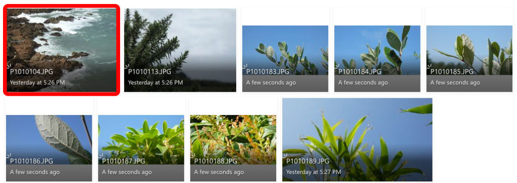
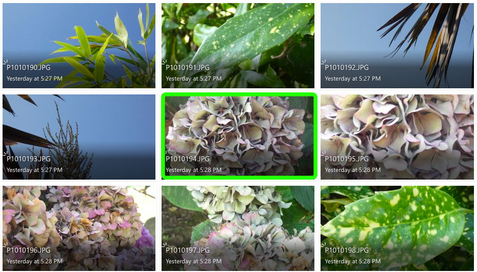
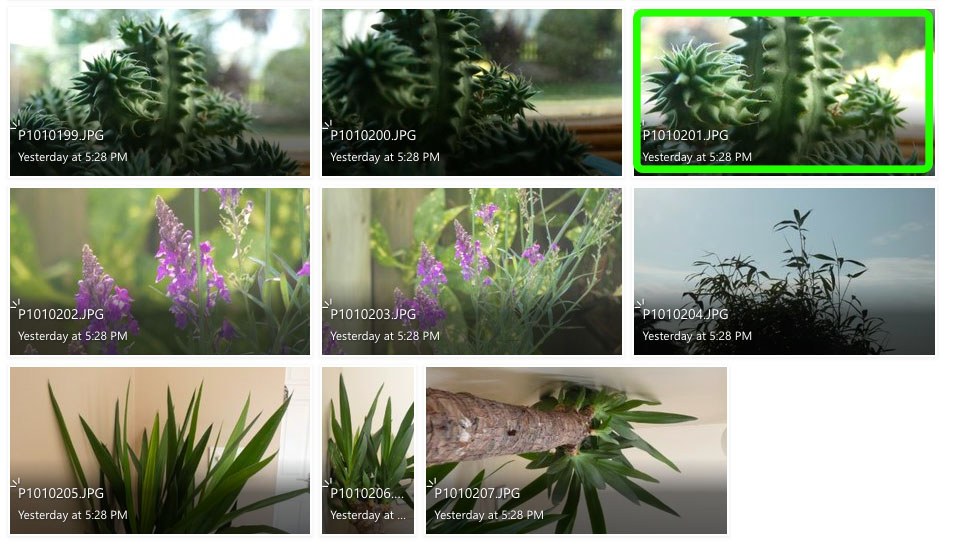
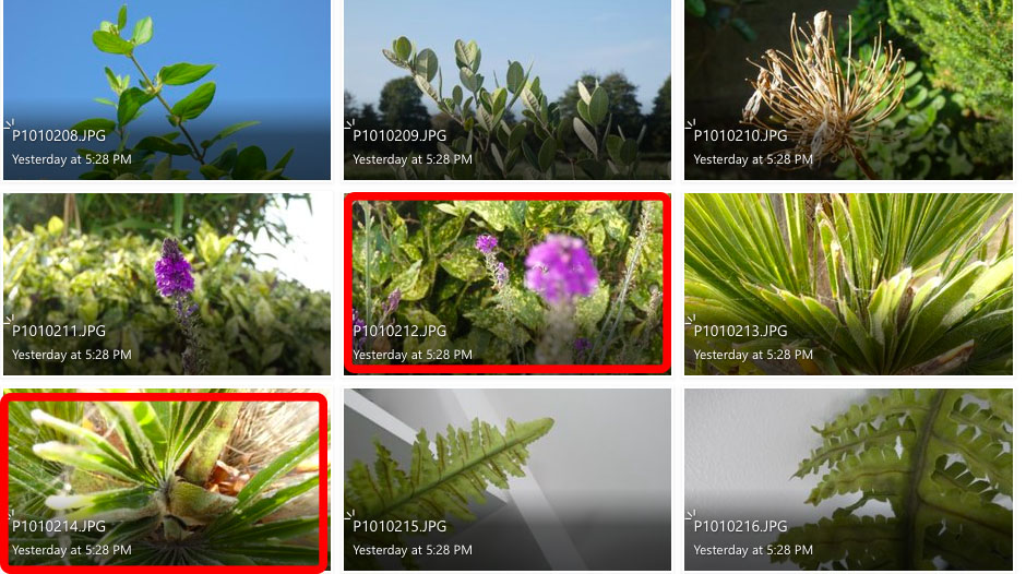
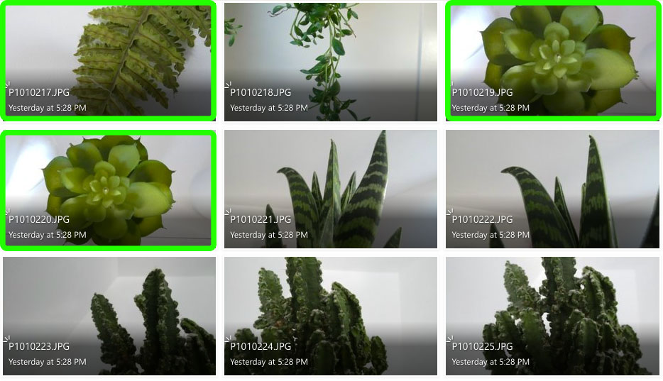
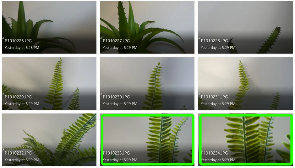
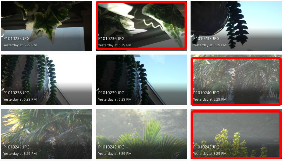
I feel like the images in green are my more successful photos as they display better patterns of line and repetition, like the ones seen in Albert Renger-Patszch’s work.
I don’t feel like the images highlighted in red are as successful as my other images because they don’t show repetition or patterns of lines like the work of Renger-Patszch, and for a couple of the images the lighting is too over-exposed. I think these images are less relevant to the subject of “New Objectivity”.
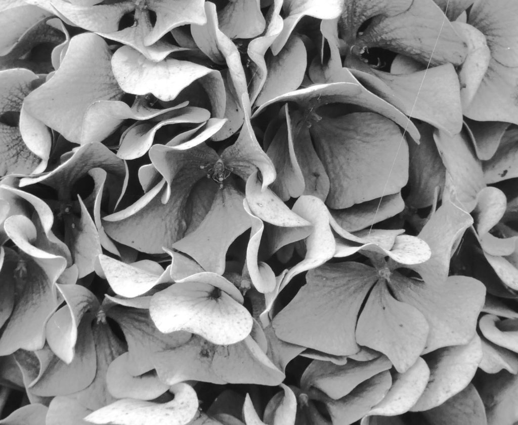

For the first edit, I took a close-up photo of a hydrangea and cropped a section that I felt was the most interesting, with a repetition of curved lines. I used the invert tool to change the shadows and highlights and then changed the image to fit the monochromatic theme of Renger-Patzsch’s work.
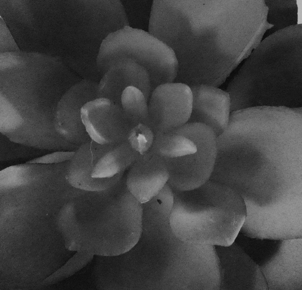
For the second and third edits, I cropped what I felt like was the focal point of two succulents and used the monochrome filter to fit Renger-Patzsch’s black and white theme. These two photos are more relevant to the theme of New Objectivity as they display clearer patterns, texture and repetition.
I used natural lighting in these photos to prove the true, natural beauty of the subjects in their natural form. I chose to focus on Renger-Patzsch’s photographs on natural forms, as I felt the patterns and repetitions produced by nature are more interesting to the viewer as they are not man-made, therefore there is less explanation to the way they look which, in my opinion, makes them more beautiful.
How a simple plain A4 sheet of paper and be transformed into digital art, using formal elements.
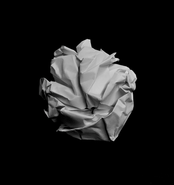
In this photo is scrunched up the paper into a ball shape, and then placed it on a black background and used a low exposure to blend the shadows on the ball into the background, which creates a higher contrast and brings the shadows out more.
I edited it black and white, to remove a yellow hint from the artificial light in the room.
The camera is positioned close to the subject to add more definition and to improve the image quality.
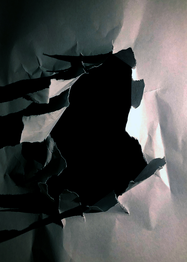
I ripped a hole in the centre of the piece of paper then put it on top of a black piece of card, to make it seem that the hole is deep.
The shadows add more detail as there is artificial light to the right of the hole. I pulled the tears up to create more depth and definition, as it increases the shadows as the light is at the same level as the subject.
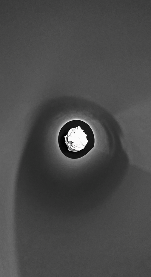
I used a piece of rolled up paper to frame the paper ball, by putting my camera at one end of the tube, and the ball at the other end. This focuses your eye on to the ball at the end of the tube.
This image has a lot of different emotion as there are curved lines, then sharper straight lines on the ball itself. The paper that I used to frame the ball softens the image, which is contrasted by the randomised, chaotic shadows on the paper ball.

I creased up a sheet of paper and added two lights on the left and right, I used two phones and used the screen light on full brightness with two different colour pictures to create a coloured glow. The shadows show every small crease in the image, which adds more detail and definition.
The clash between the two colours creates unique shadows. It works well as red and blue as they aren’t complimentary colours.
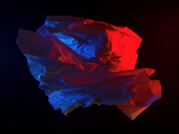
I randomly scrunched up a ball shaped object and lit it up with two phones. It created a random cast of shadows, and a nice depth with the red illuminated paper in front of the blue illuminated paper. It seems like the blue light is inside the subject but it is not, this created a layered effect, which i didn’t plan, but worked out well.
The random shape of the subject adds a unique effect as it can’t really be replicated.
The image is underexposed and has a high black point to create a gloomy effect.
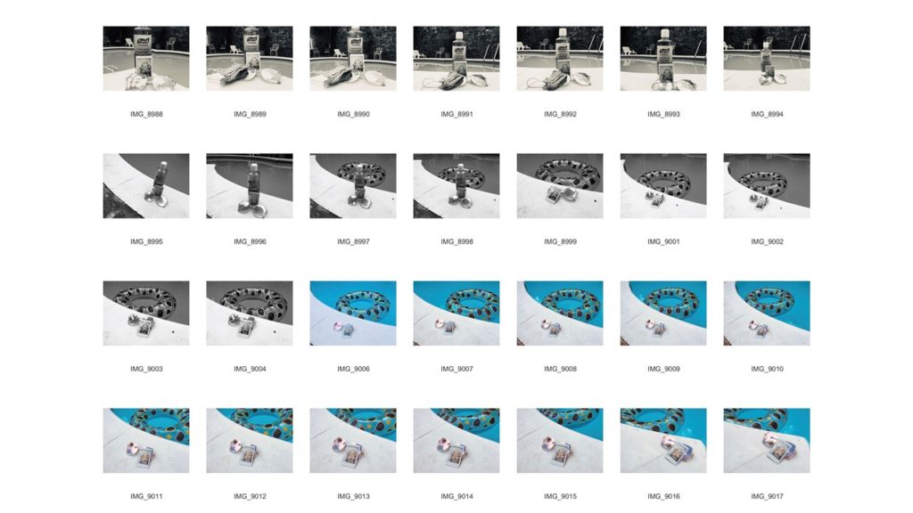
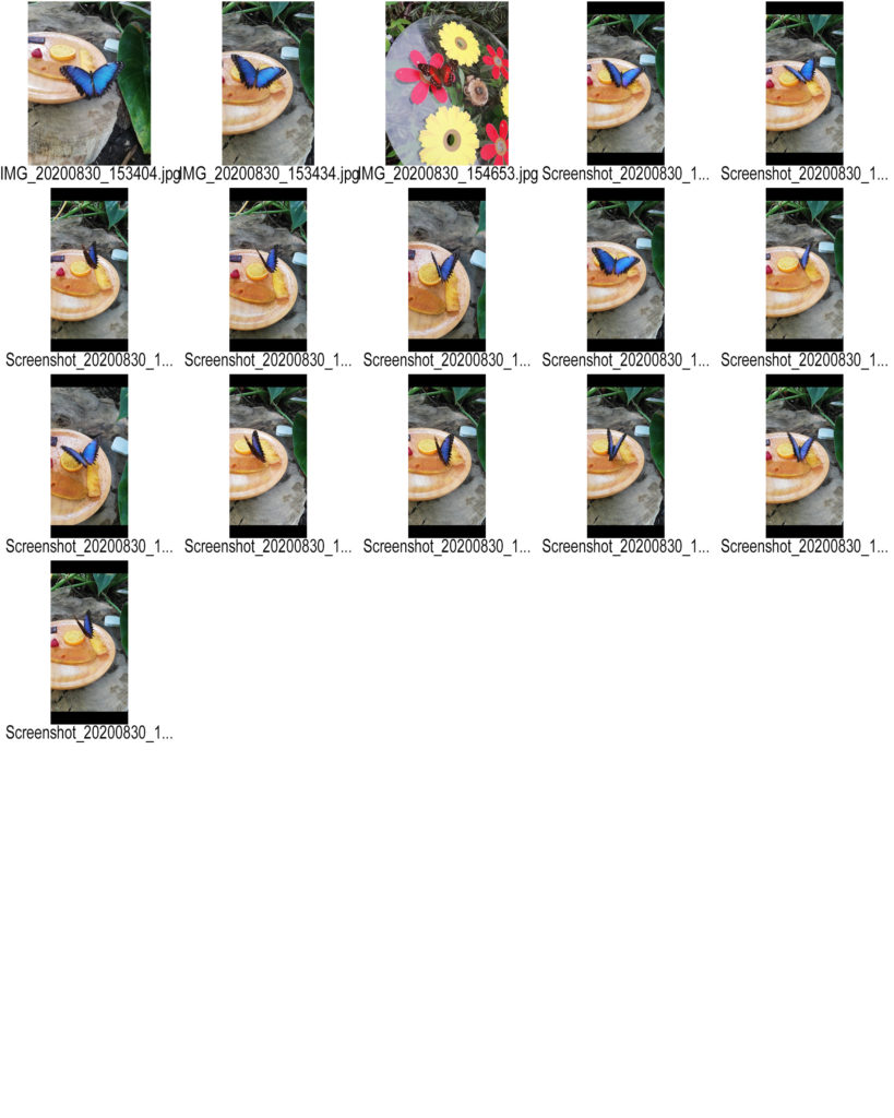
Contact sheets date back to when you took images on film. Now they aren’t used a digital cameras have a SD card in them.
A contact sheet is all the developed negative images laid out onto photographic paper. They aren’t full size, instead they are used to give the photographer an idea on how the images look.
Contact sheets are helpful as they allow the photographer to see all the images, select the best quality images and then develop the images they want without wasting resources.
William Klein
William Klein is a photographer who was born on April 19th 1928. He was born in New York, however during WW2 he was stationed in Germany and later France, where he would later settle after being discharged in 1945.
He sometimes used his contact sheets to tell a story. However he mainly used them like others, to decide which images he wanted to use.

My Own contact sheet
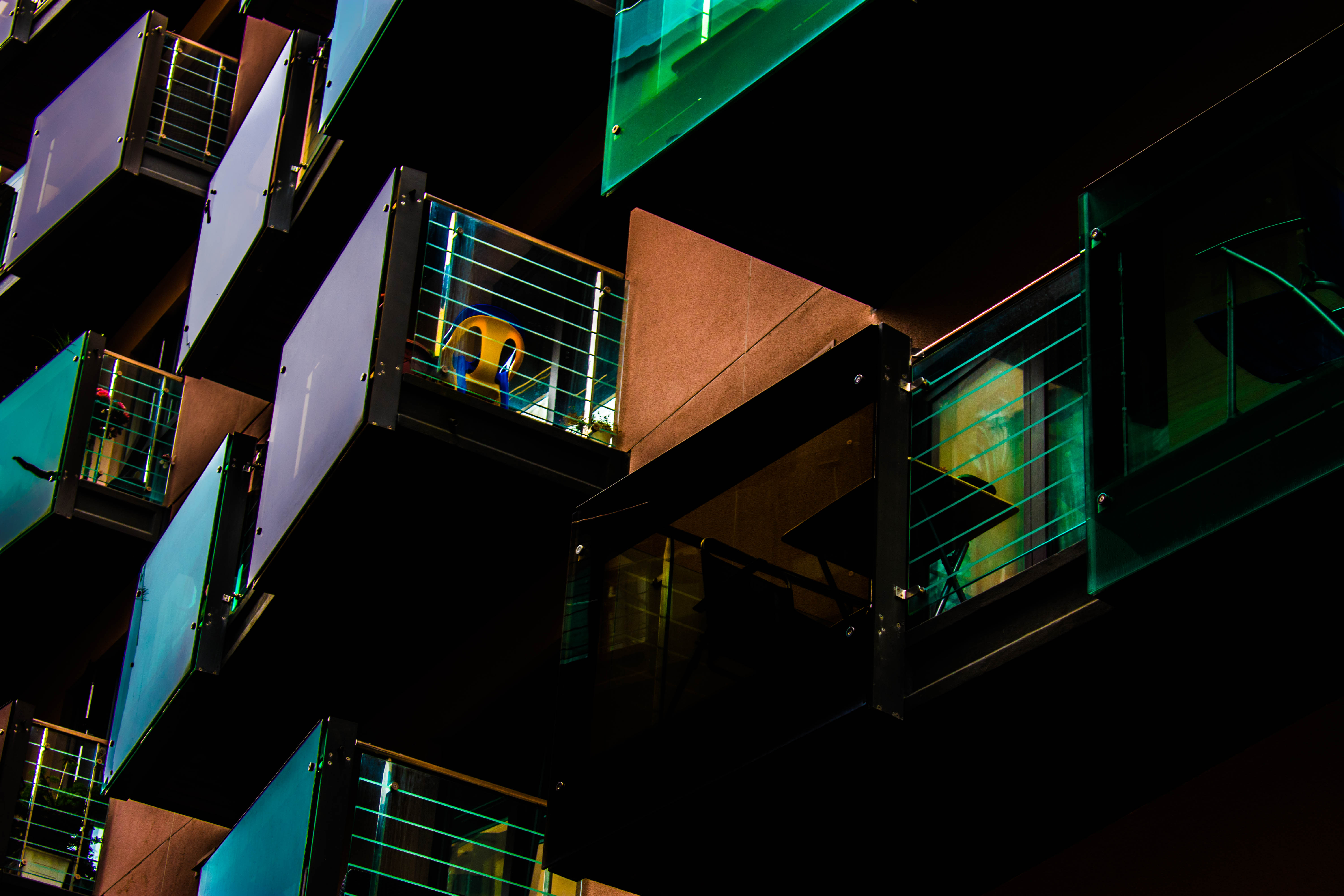
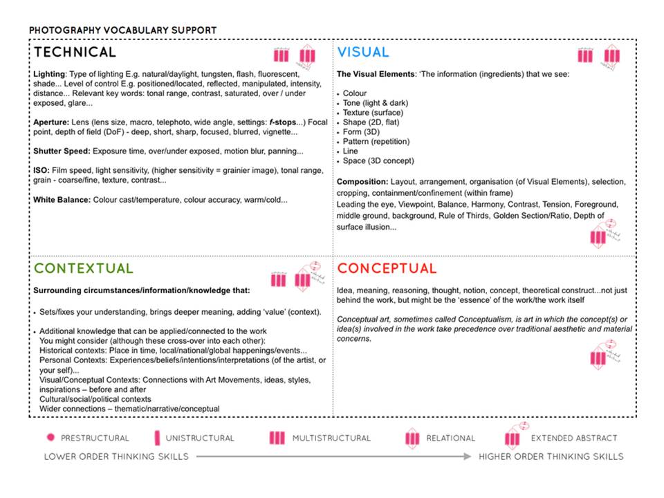
You must experiment with ease of these skill areas and produce a blog post on each key skills that includes evidence of your experiments and successes over the next few weeks…
The images should be of an abstract nature, and show an appreciation of abstract qualities such as line, shape, colour, form, texture, pattern, repetition, symmetry (the formal elements)
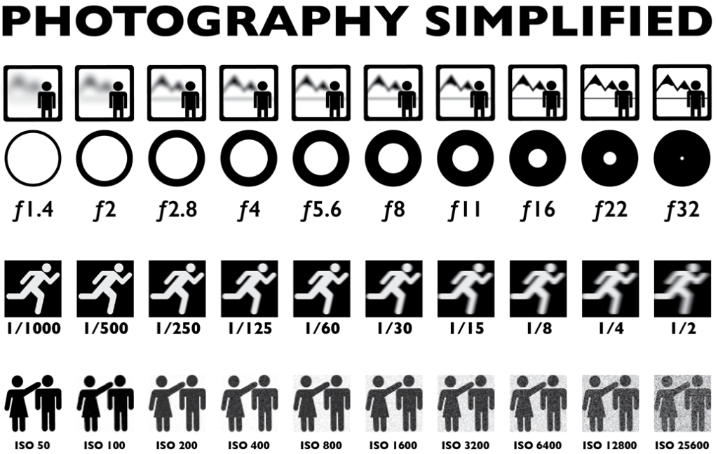
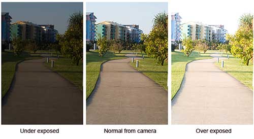

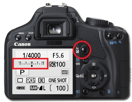
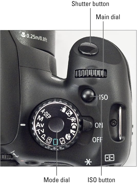
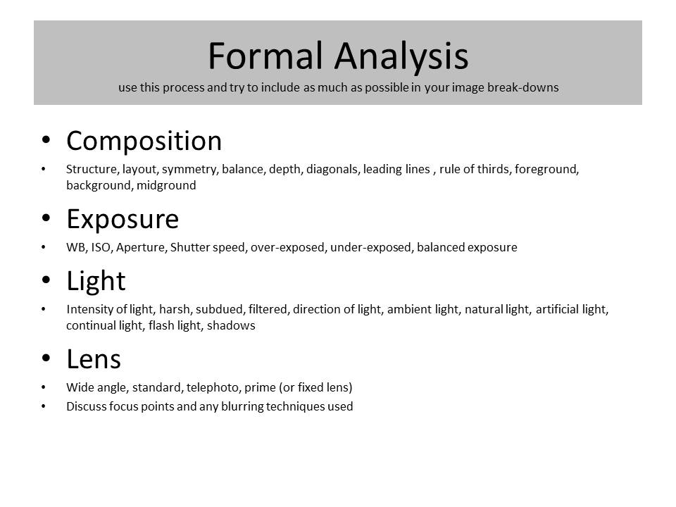
Use this method to analyse key images
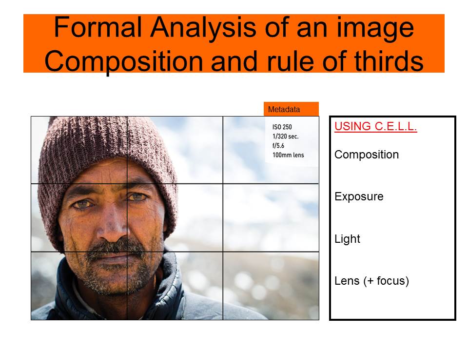
Rule of Thirds
Homework | Practical / photoshoot
Due in WEDNESDAY 30th September
Minimum Expected frames/ exposures = 150-200 images
Choose from a range of camera skills that you have learned in Week 3 and 4 to complete a new photo-shoot…
We want to see that you can explore and extend your handling of
INSPIRATION >>> choose from the following to inspire your ideas.Look carefully at the examples and aim to produce similar images that work well as a group…together.
Ralph Eugene Meatyard:
‘No Focus’
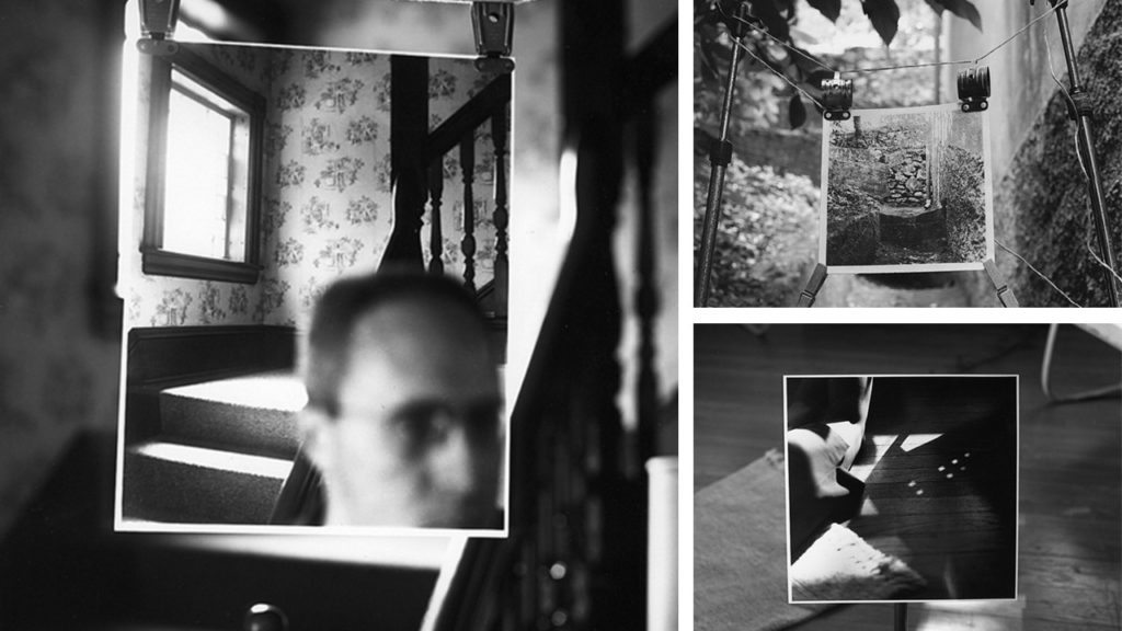
Meatyard made his living as an optician. He was a member of the Lexington Camera Club and pursued his passion for photography outside the mainstream. He experimented with various strategies including multiple exposures, motion blur, and other methods of photographic abstraction. Two of his series are particularly concerned with focus and depth of field, both stretching the expressive potential of photography, film and cameras when looking within the ordinary world.
Follow the 10 Step Process and create multiple blog posts for each unit to ensure you tackle all Assessment Objectives thoroughly :
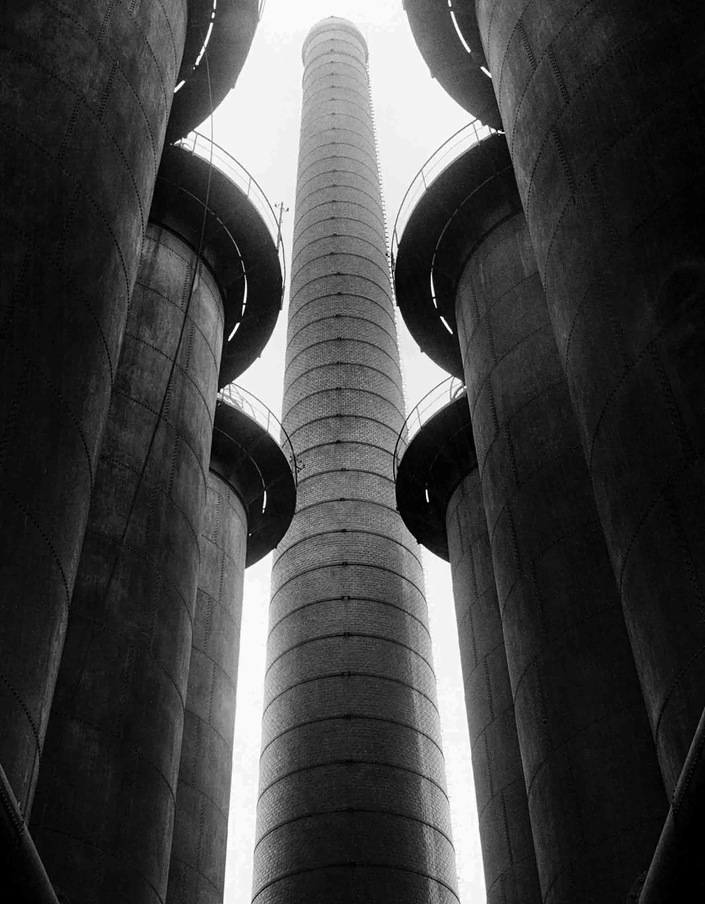
Albert Renger-Patzsch
– Renger-Patzsch was born in Wurzburg, on June 22nd, 1897. He was German photographer who began making photos at the age of twelve.
– In 1928 Reger-Patzsch published The World Is Beautiful, a collection of 100 images, which had lots of detail, mostly patterns in nature and man made structures.
– He likes to take photos of highly detailed and complex flowers and other nature plants. Additionally, he prefers to take photos of unique architecture.

– His nature photography captures what the eye can’t see. He captures each fold in and every detail in each picture.
– Renger-Patzsch makes his images black and white, which gives the image a high contrast, and reveals the tones more.
– The black and white makes it so that you focus on the geometric patterns rather than the colours.
– Lots of Renger-Patzsch’s images use leading lines, framing, repetition and rhythm. Which gives off a more visually pleasing image.
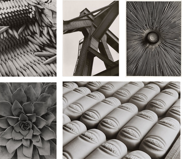
Image Comparison
– Both these images were taken by Albert Renger-Patzsch.

My Photos
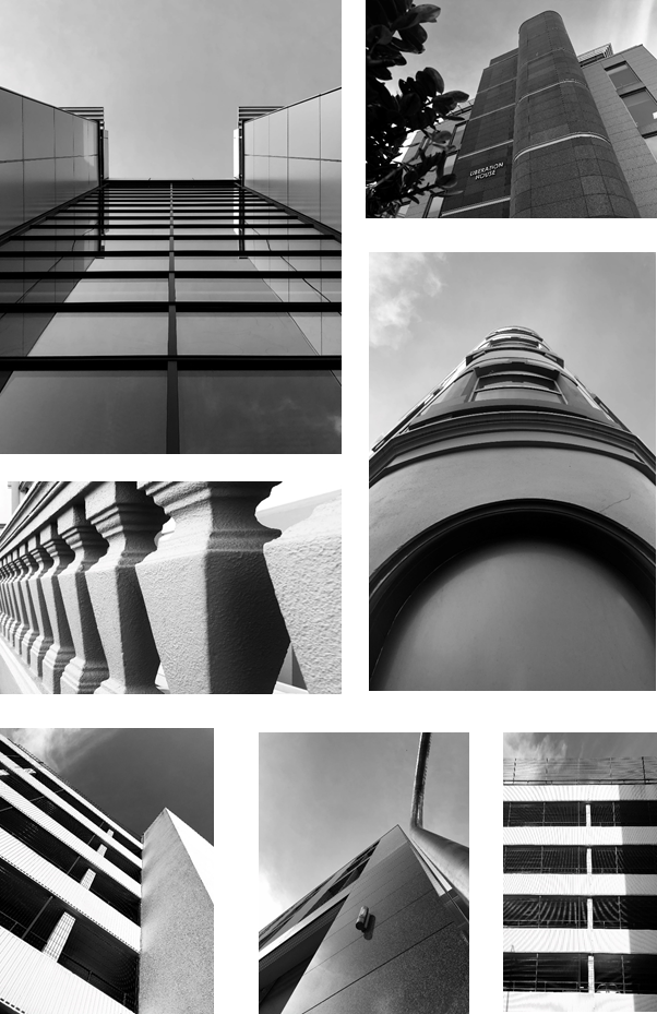
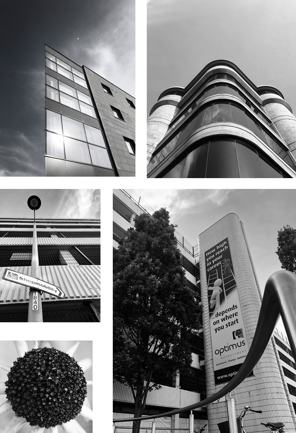


Architectural Photos
– Firstly, I took photos of buildings that have detailed symmetry and patterns from the windows.
– I made sure that the sky was in all of them and i commonly used the line of thirds technique to make them to create a unique appearance.
Nature Photos
– I used a macro lens to get a close up shot of the objects I photographed. It made it so you can see every detail on the focus.
– It created a shallow depth of field, as I used a low f/number. This makes us focus on a specific object as the background is blurred.
– I took lots of photos of leaves as there have many natural patterns. Also, I took a close up of a feather, which as a repeated pattern with smaller lines coming off the central line.
Overall I made all the photos black and white, as it is in the style of Albert Renger-Patschz. The black and white effect, created a high contrast and made all the patterns more visible.
What is a contact sheet?
A contact sheet is basically a series of photos the same size and of them same object or thing you have photographed. These photos are small on a page for photographer after a photoshoot to look at and choose the best images from the shoot. Contact sheets can typically be scanned over quickly with are eyes. That way we can selected out the best photos compared to those which ay have not turned out the way we wanted. This is why contact sheets are useful as photographers don’t have to analysis photos one by one though a camera or on a computer.
My contact sheets will be based off Albert Renger’s work.
Contact Sheet One:
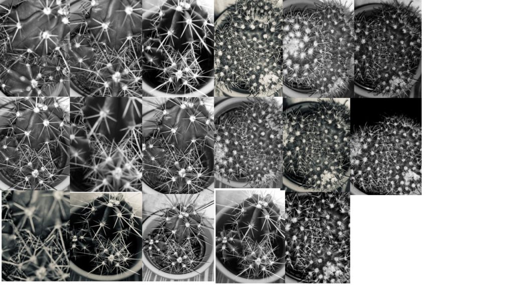
This is my first contact sheet of a mini cactus. My images relate to Alberts work as the repetition of the spikes are natural and unique. Some images I have edited to create a stronger contrast between the dark and light elements in the plant.
Contact Sheet Two:
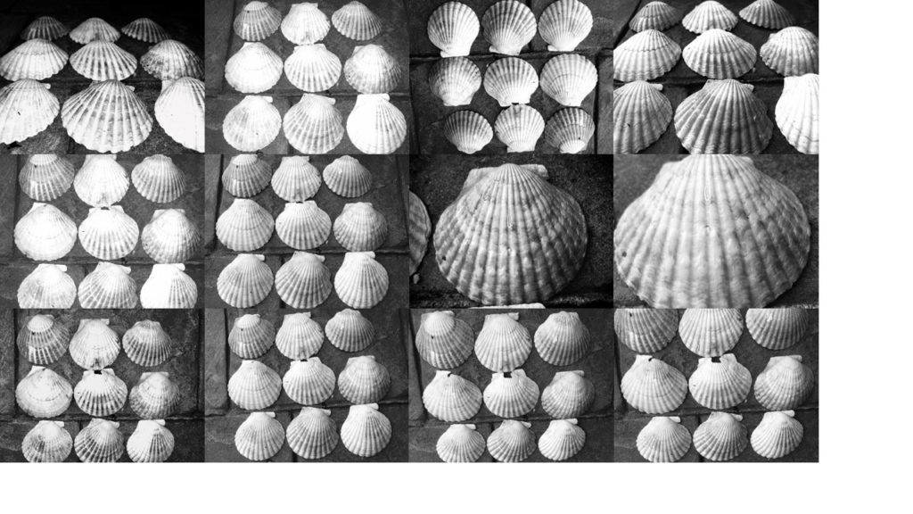
This is my contact sheet two of shells from St.Ouens. Personally this is my favourite Contact Sheet as the shells and are all equal to each other and the lighting is perfect to identify the crevasses and little details on the shells individually. I have edited a few of these photos myself on my phone to bring out the highlights and darker shadows.
Contact Sheet Three:
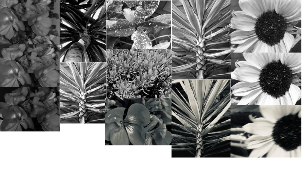
In my contact sheet three i have roughly recreated the macro photography work Albert Renger does with flowers and plants. These are just flowers and palm trees in my garden. I particularly like the palm tree photos as one I have edited to stand out and have a good tonal range of light to dark.
Contact Sheet Four:
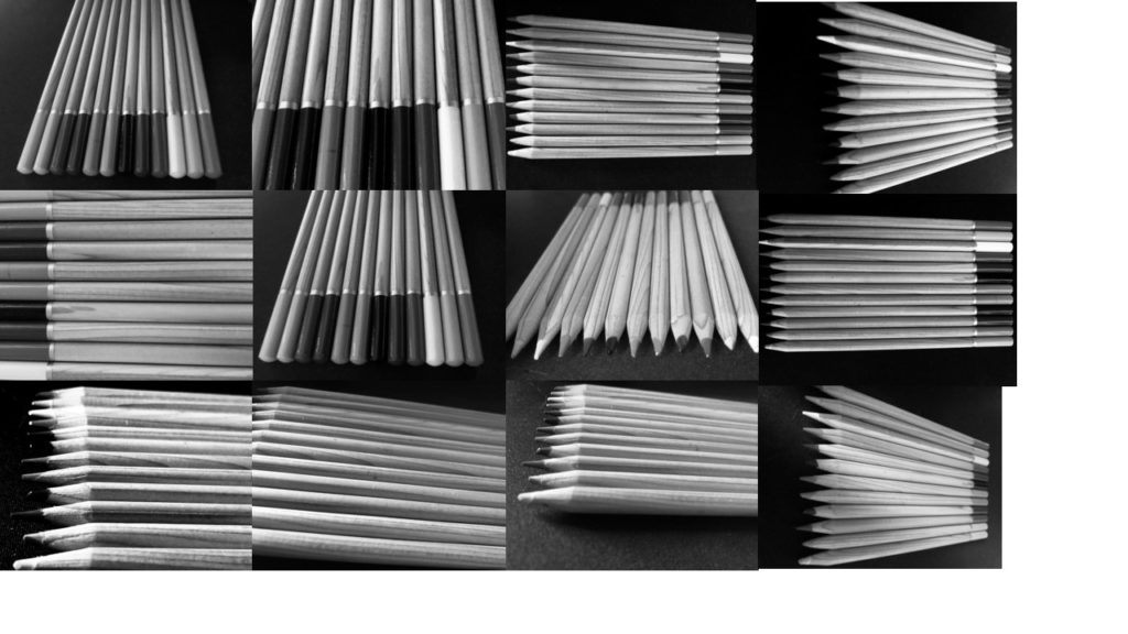
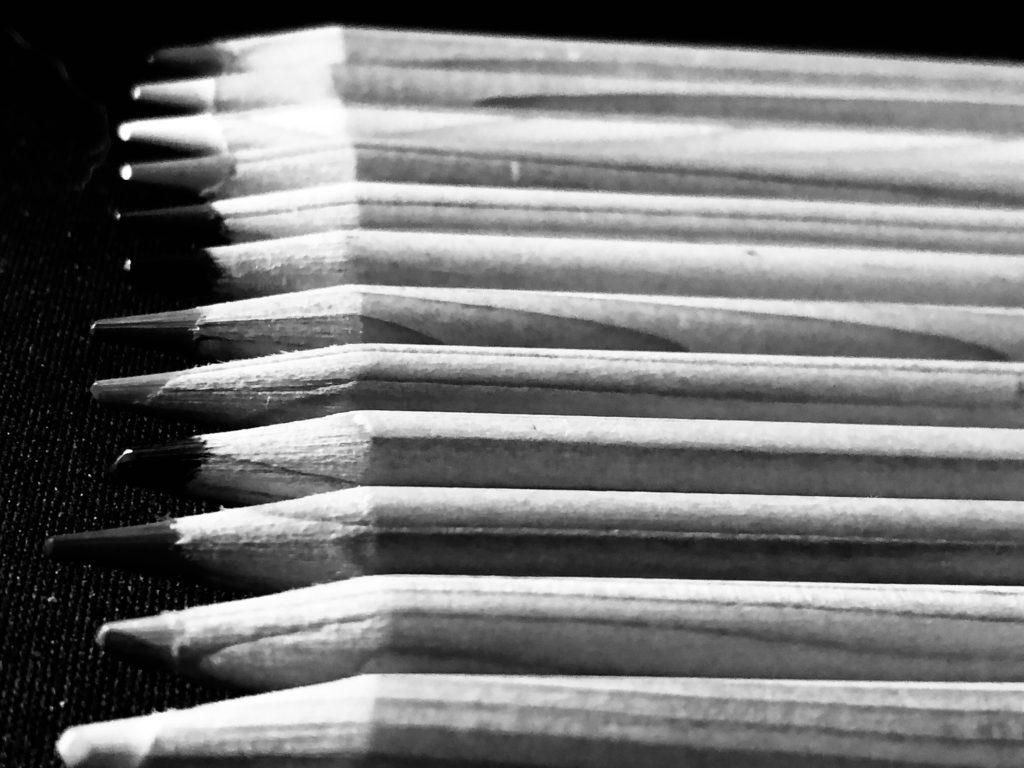
My final contact sheet are photos of basic colour pencils. Lined up evenly and with a back based background these photos came out well when turned into black and white.
Best Photos:

