Ralph Eugene Meatyard




Introduction
Albert Renger – Patzsch was a German photographer whose photography was cool, detached photos forming a photographic component of the New Objectivity.
In 1925 Albert starting his career in photography as a full-time photographer as a freelance documentary and press photographer. He rejected Pictorialism and experimentation photography who relied on startling technique. In his photographs, he recorded the exact detailed appearance of objects reflecting his early career in science. He felt that the underlying structure of his subjects did not require any enhancement by the photographer. In his book “The World Is Beautiful” he took pictures of architectural and nature to show his clear transparent style of photography.
Alberts photography is black and white which shows the era in which he was taking photos in. Even though the pictures are simplistic being black and white, it can still make an amazing photo as the shadows are enhanced in the pictures making them stand out from the objects moreover, it gives people a focus point on the pictures he has taken as there are no colours involved.

Looking at his pictures, it makes someone think that even the most unattended things in the world that people don’t really pay attention to, can be a mesmerizing photo if you take a focused picture on that object. This is shown in one of his published pieces called “The World Is Beautiful”.
Contact Sheet

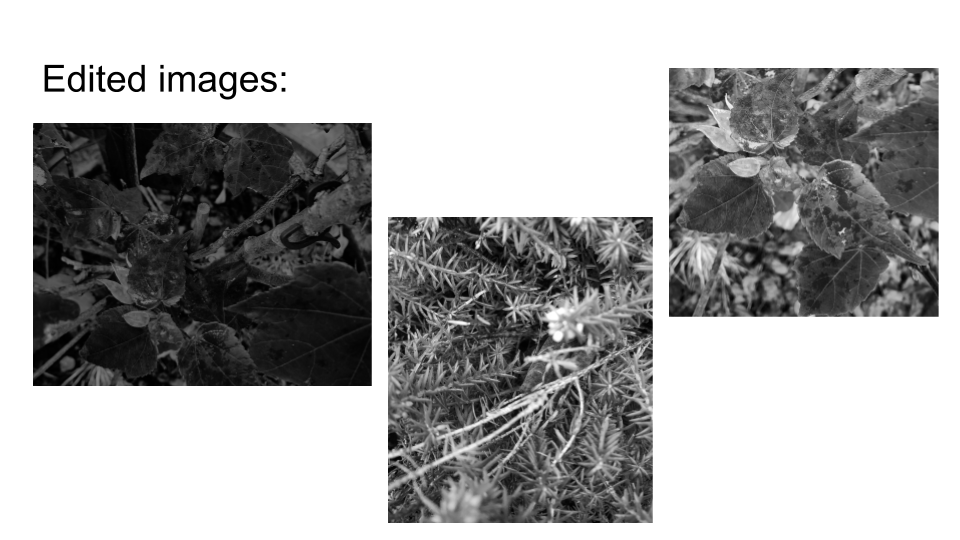
Edited Work

Evaluation
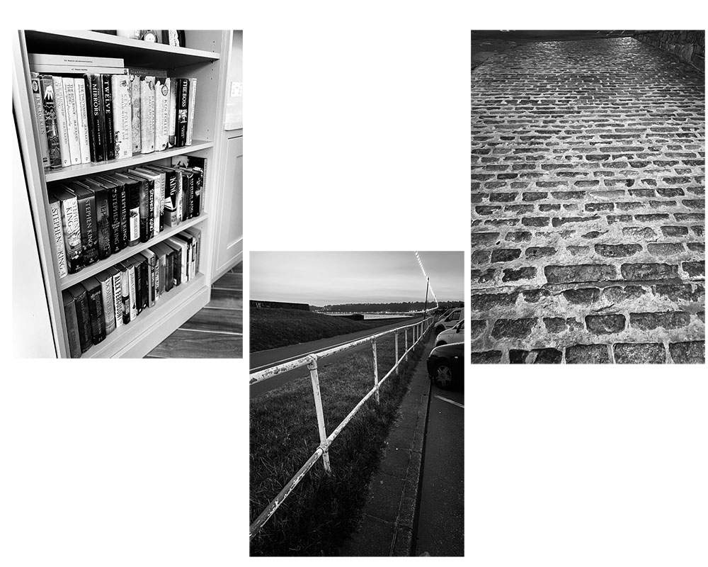
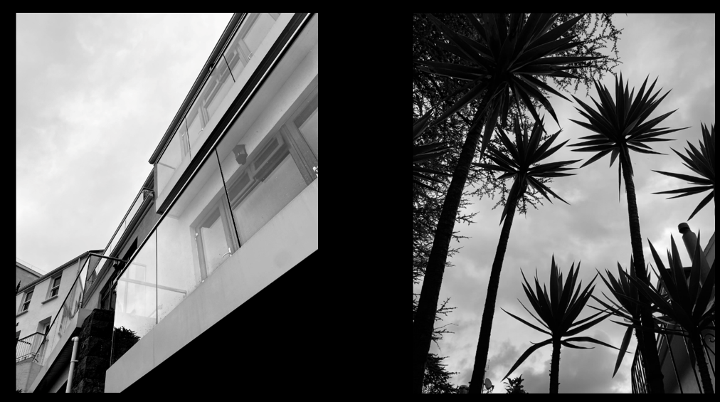
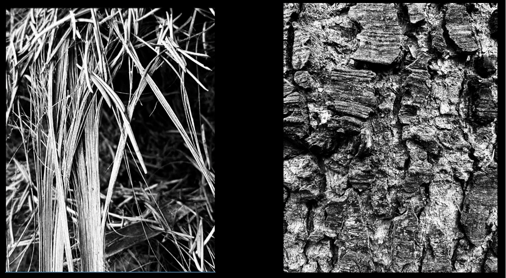
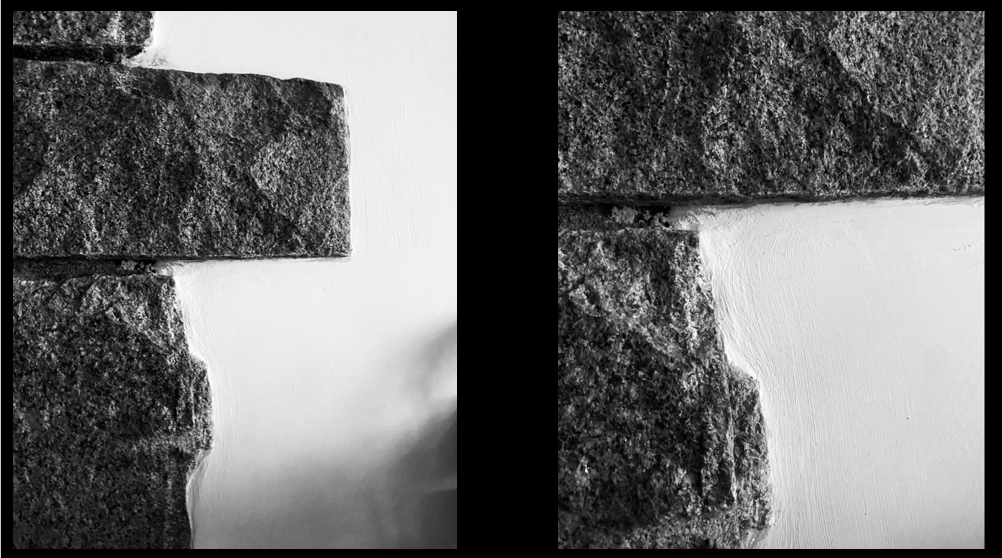
I have succeeded in the craft of taking pictures like Albert Renger – Patzsch because, I have taken pictures in which I edited on making them black and white moreover, the scenery in which I choose where man made and they where repetitive for example, the picture I took with a big layout of bricks that are cemented together.
Looking over my pictures, I can see that their are patterns within my pictures and the arrangement of the certain objects in the Frame. Adding onto this, with the contrast of black and white both elements stand out from each other creating an appealing contrast visually.
Uta Barth
Barth is a contemporary German-American photographer who’s work addresses themes such as perception, optical illusion and non-place, “inverting the notion of background and foreground”. Her work is as much about vision and perception as it is about the failure to see, the faith humans place in the mechanics of perception and the precarious nature of perceptual habits.
Ralph Eugene Meatyard
Meatyard is an American photographer known for his photographs in which family members and friends appear wearing grotesque masks. His photography reflected the connection between nature and humans. His Zen Twigs series, close-up detailed images of thin tree branches set against an out of focus background is the most obvious manifestation of his interest in Zen.

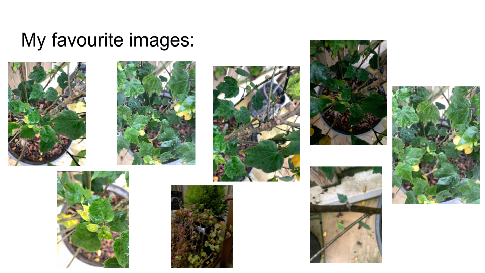
My photo shoot inspired by Meatyard
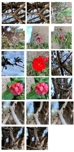
Final images
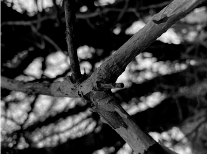
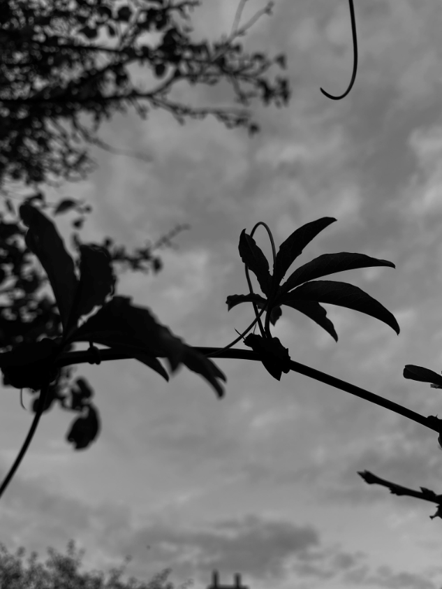
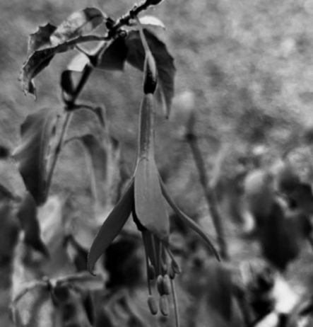
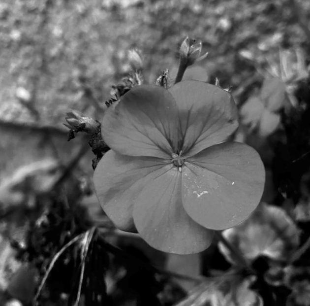
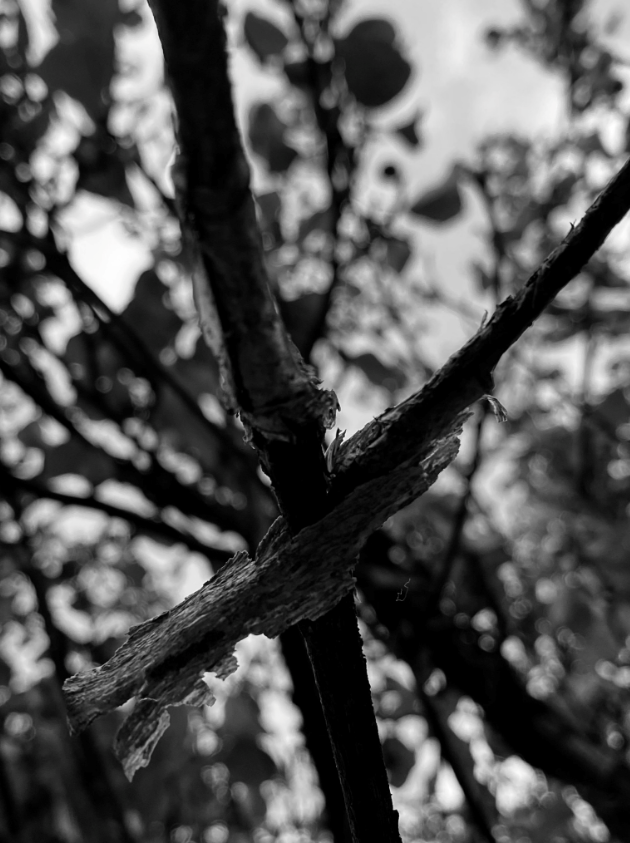

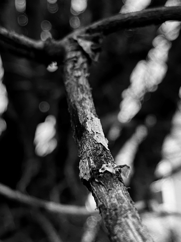

Certain images create a silhouette as the contrast between light and dark is so strong, what I like most about these photographs is the variety of black and white tones and the focus, high aperture is used to blur certain parts of the image to create a focus on the main part of the photo.
Saul Leiter’s photographs

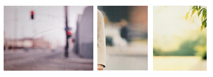
My photos inspired by Leiter

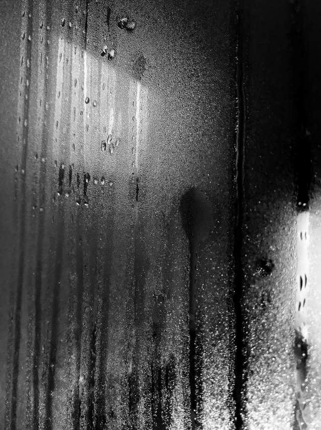

Saul Leiter’s images can use vibrant and unique colours. The photographer uses a high aperture to blur certain parts of the image to create a focus on the main part of the photo. Abstract photography occurs when a photographer focuses in on a part of a scene, blurring out the background and focusing in on the colour, texture, shape, line, geometry, reflection or symmetry.
Leither captured contemplative moments in New York City in his warm and intimate photographs. He often shot in colour, a rarity for the era, often resembled abstract paintings, taken from unexpected angles and concerned primarily with the use of colour and geometric composition.
My photos inspired by Leiter
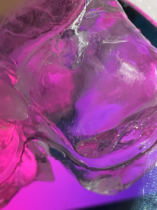

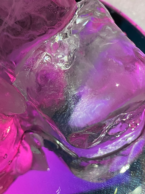


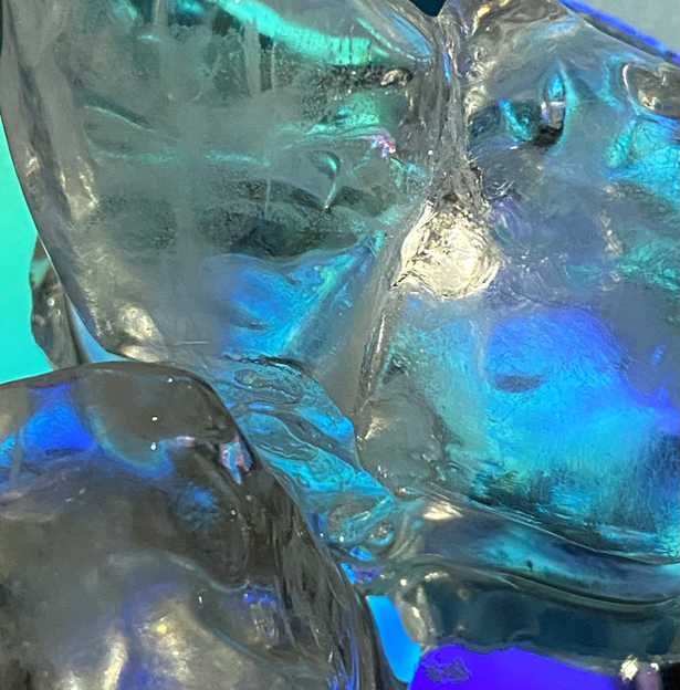
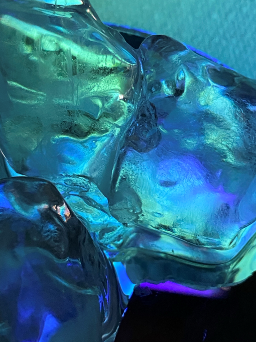
I like the vibrant, saturated colours in these photographs, the highlights and shadows contrast together creating depth, bringing out the brightness of the blue and pink tones.
Ralph Eugene Meatyard (1925-1972) was an American photographer and made his living as an optician while creating an impressive and mysterious body of photographs. Meatyard’s photographs explored many genres and experimented with new means of expression, from dreamlike portraits; often set in abandoned places, to multiple exposures, motion-blur, and other methods of photographic abstraction. Meatyard has two series where he experiments with depth of field and focus, below is his work ‘No Focus’ where he has photographed figures without a specific focal point, creating a blurred effect.

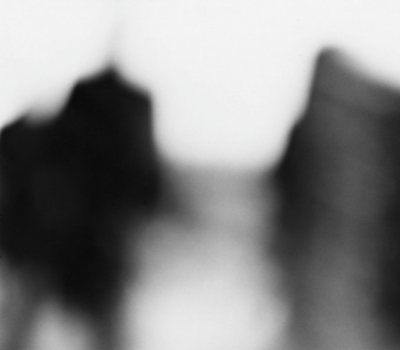

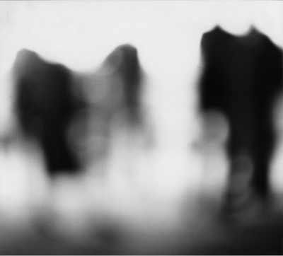

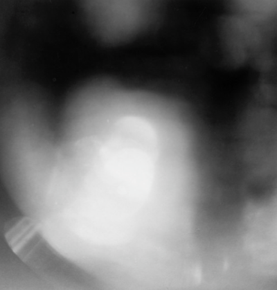
Meatyard’s series ‘No Focus’ is very abstract and ambiguous as you cannot tell what the blurred figures are. I really like this approach to photography as I believe it makes the observer think and be imaginative which their conception of the images. These photographs hold lots of dark, light and mid-tones which create a mysterious atmosphere and a sense of obscurity. The texture of these images is very soft and relaxed as the unfocused camera lens does not capture any sharp edges that may reside in the shot. Meatyard may have used a slower shutter speed, such as 1/2, to capture these unclear images so that more light could enter through the lens while it was open for a longer amount of time.
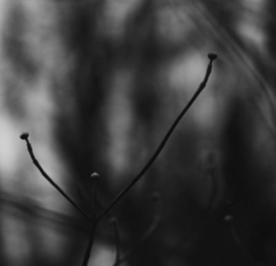
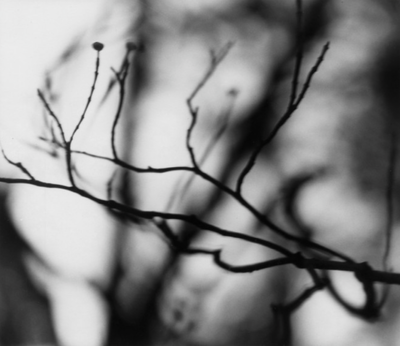
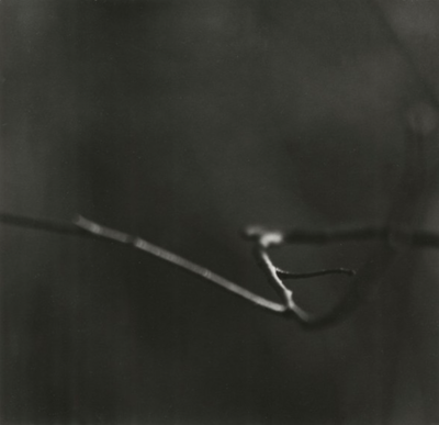
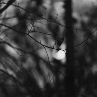
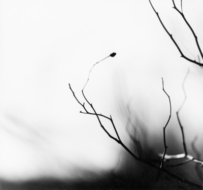
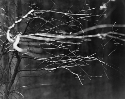
Meatyard also has a series called ‘Zen Twigs’ where has has experimented with the aperture settings on his camera. He has photographed twigs and tree branches in black and white, focusing clearly on specific points of the branch to create a shallow depth of field and a smaller focal point. For this series of photographs, Meatyard has most likely used a small aperture, such as F/2, to blur the background and areas surrounding the branch in order to create abstract images with depth. Meatyard’s work also consists of many harsh dark shadows which contrast with the bright highlights creating a range of tones and enhancing the silhouette-like outline of the branches. In these images we can see natural curved, jagged and straight lines in the foreground which form a rough texture, however the blurred shadowed branches in the background produce a softer texture as there are no defined lines drawing attention.
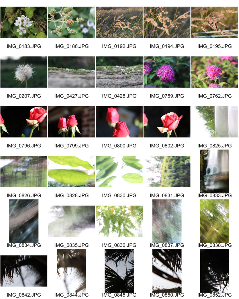

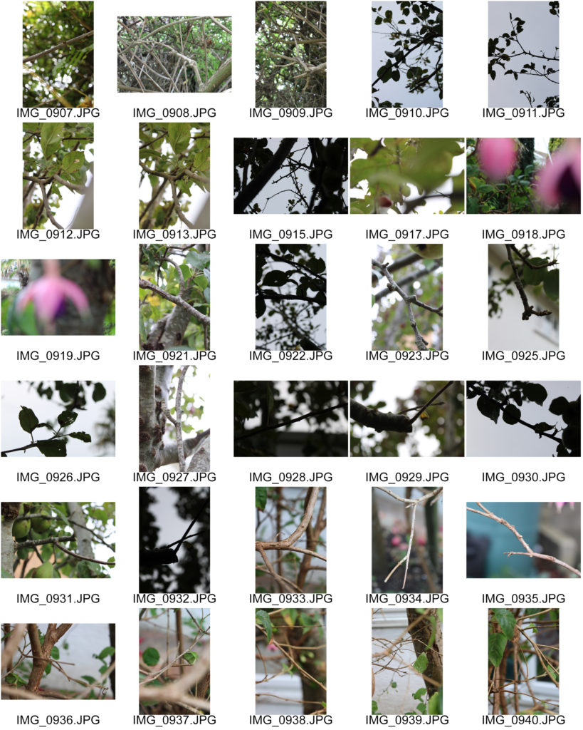
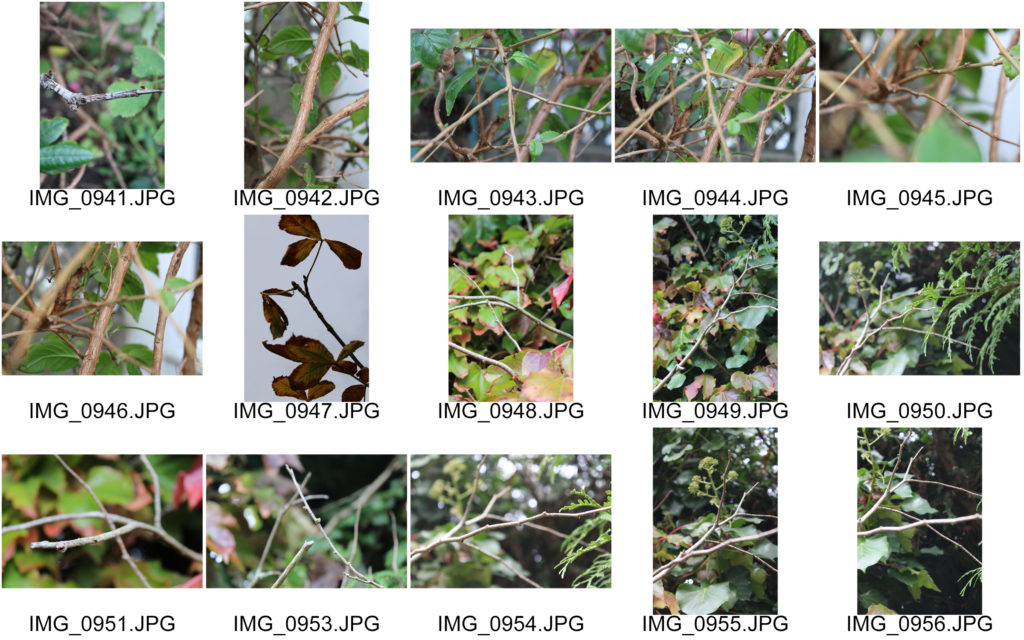
In my photo shoots I experimented with photographing natural forms such as leaves, twigs, flowers and trees. I was inspired by Meatyard’s ‘No Focus’ and ‘Zen Twigs’ series, therefore I used a range of aperture sizes and shutter speed lengths. I plan on editing my images to black and white in order to reflect Meatyard’s work, while also using my own experimentation with contrast and exposure.
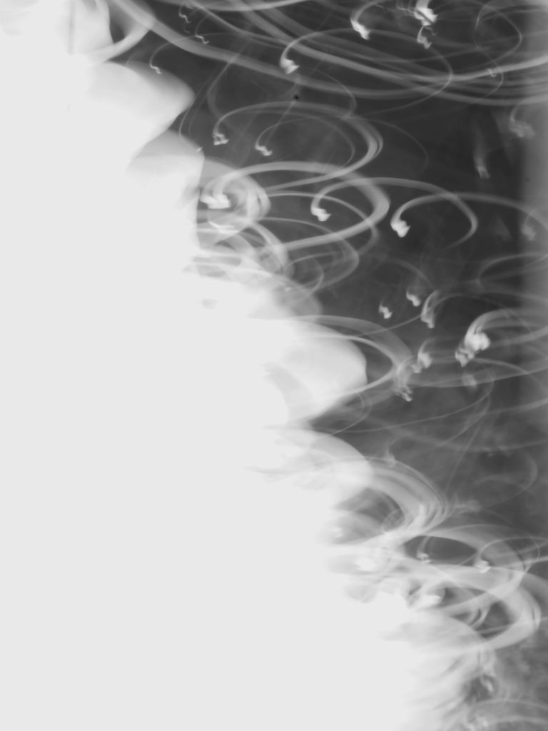

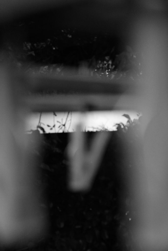
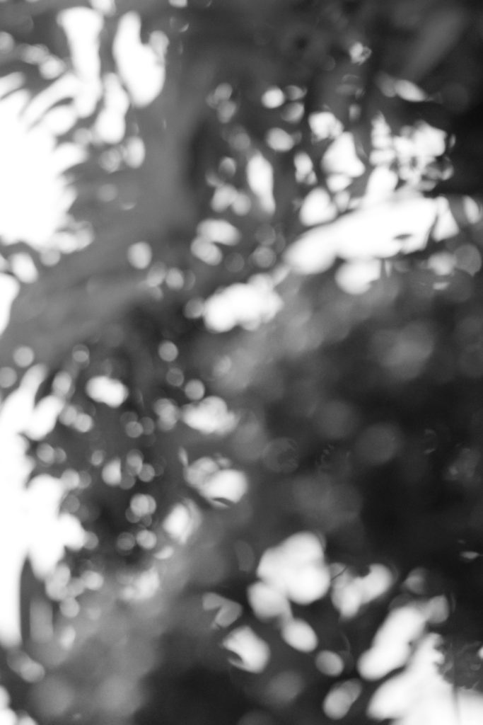

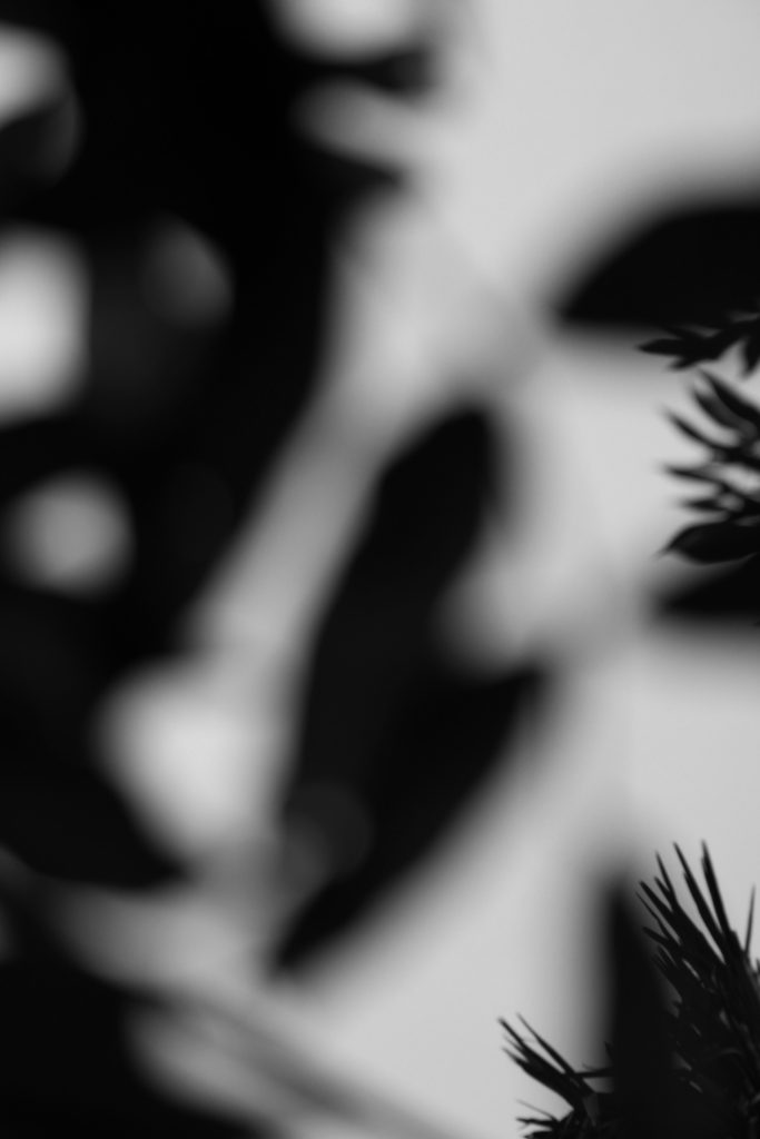
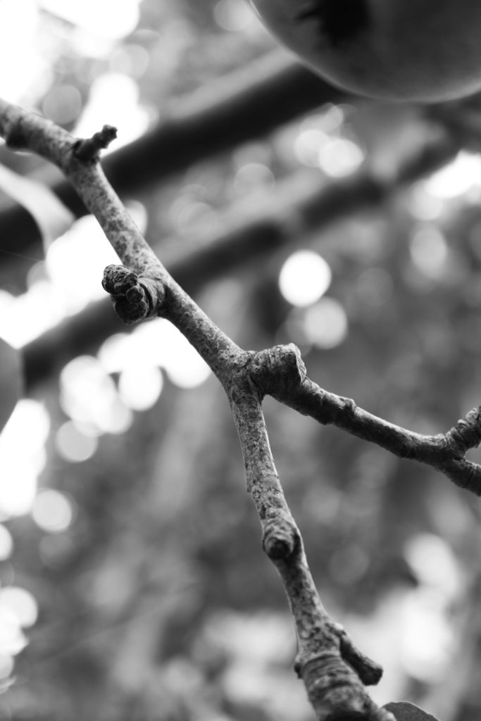

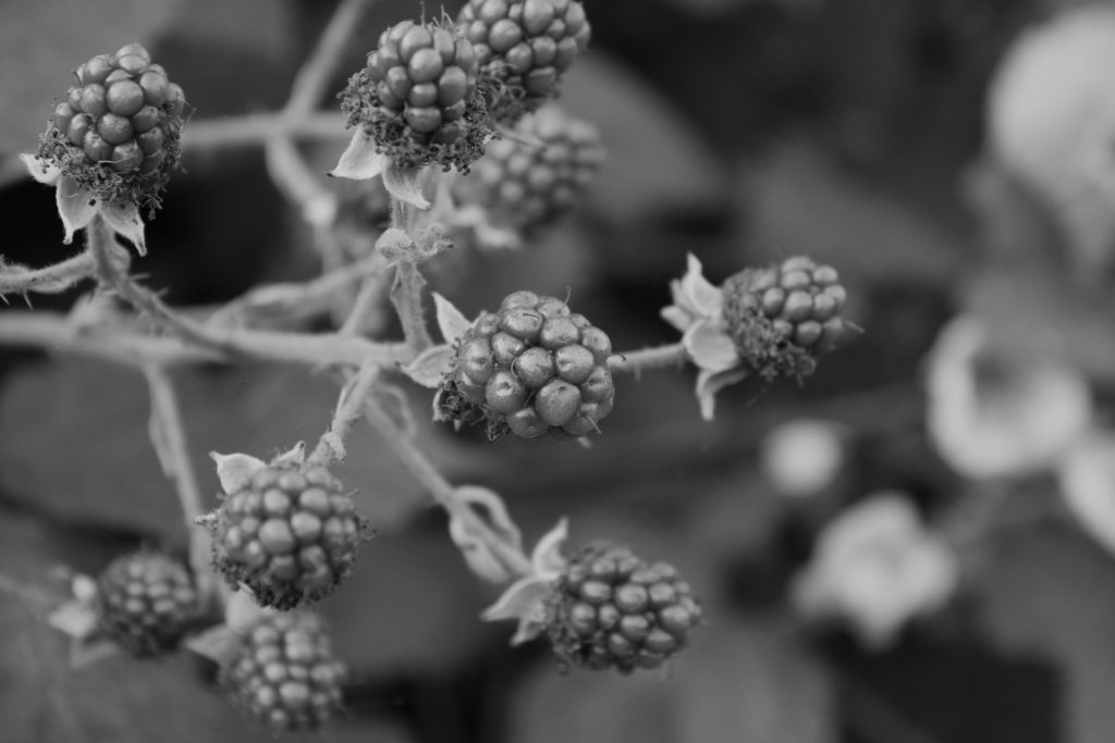


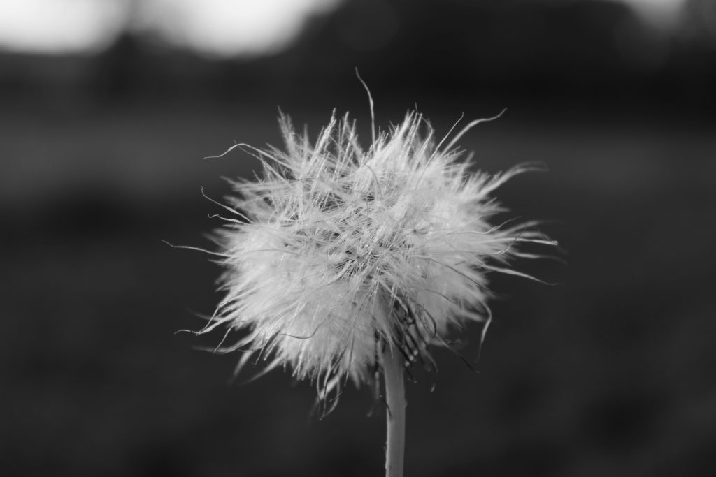

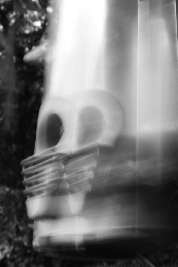

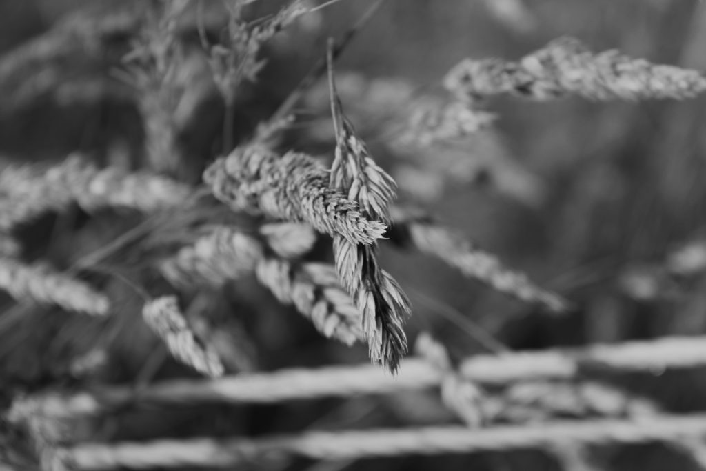
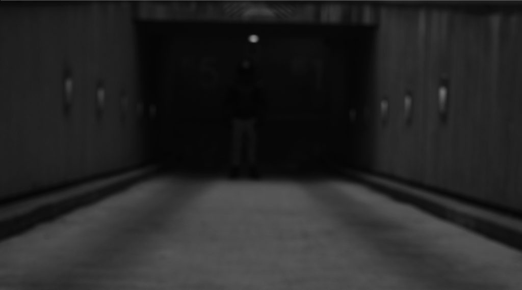
I have chosen these 5 photos as my final images as I believe they explore the strong dynamics of depth of field and focus. In the first two images I was inspired by Meatyard’s ‘No Focus’ series. I experimented with a slower shutter speed, which allowed more light to enter my camera lens and created a blurred image. In the first image I used a low angle shot to capture a silhouette-like photograph. My highlights were in the background which enhanced the dramatic shadows of the subject in the foreground. I enjoy the ambiguity of this image as I believe the blurred black objects have no specific geometric shape, therefore it is up to the observer’s interpretation as to what the image is really of. Furthermore, I experimented with under exposing this image to add to its mysterious dark mood, I believe it created a more heavily shadowed image with harsh black tones contrasting greatly with the soft grey highlights in the background. I also really like how the second photo came out, I think the slow shutter speed produced an abstract image containing a motion blur and repetitive effect. In addition the image of a birdfeeder looks almost unrecognisable because of its echoed pattern overlapping the original subject which creates quick movement and rhythm in the photo.
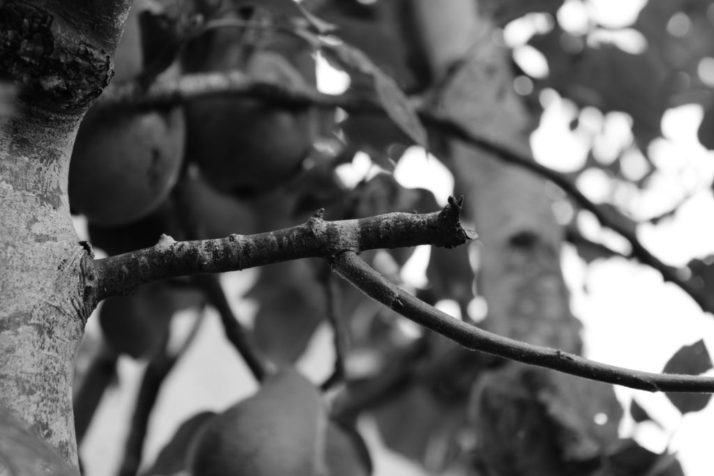
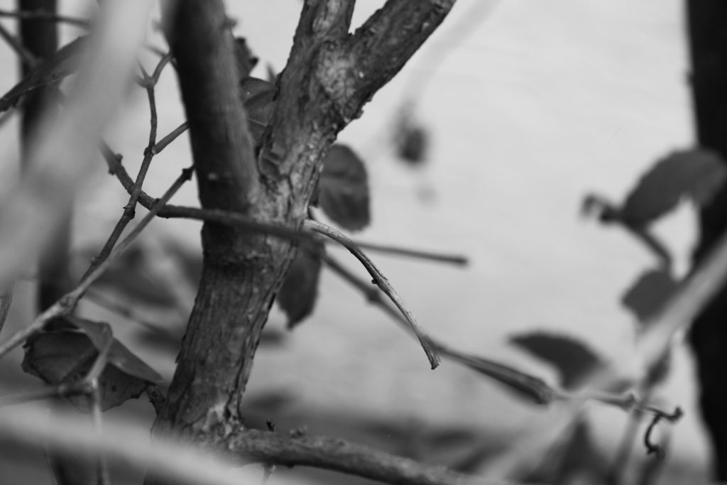
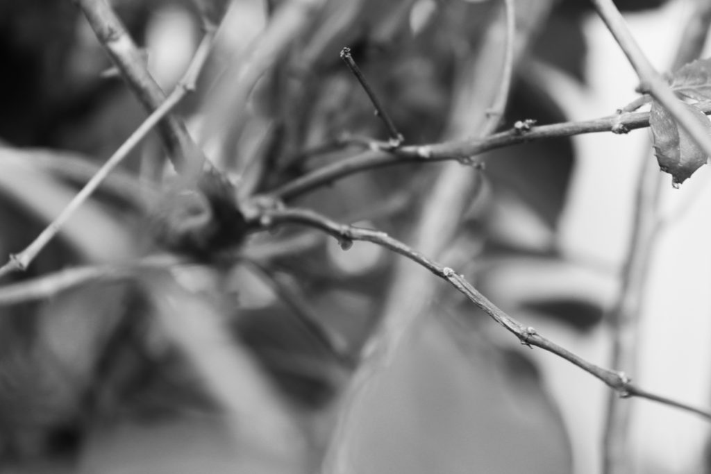
In the last three photos I experimented with aperture, similar to Meatyard’s ‘Zen Twigs’ series. The first twig image has a clear focal point in the foreground as the twig is sharp and is the only focused element of the photograph. Additionally, I really like the strong highlights in the background of this image as I believe they enhance the focus on the twig by surrounding it with bright light and drawing the observer’s attention to its rough texture. In the second twig image the focal point is not central, but a little to the bottom right. This creates an abstract photo as moments of the foreground are unfocused which again draws focus to the clear branch. The image also contains many repeated natural shapes, such as leaves, which add to the busy texture and composition of the piece. Personally, I believe this benefits the photo as it shows the frequent power of nature and the natural world as it is untouched. The final image holds lots of natural repetition and has a strong central focal point. I enjoy its subtle highlights and shadows, which mixed with the soft texture created by the blur, creates a balanced calm image. Finally, I love the shallow depth of field created by the short aperture size in all of these final three images as it creates a dramatic focal point for the observer and reflects the abstract nature of Meatyard’s work.
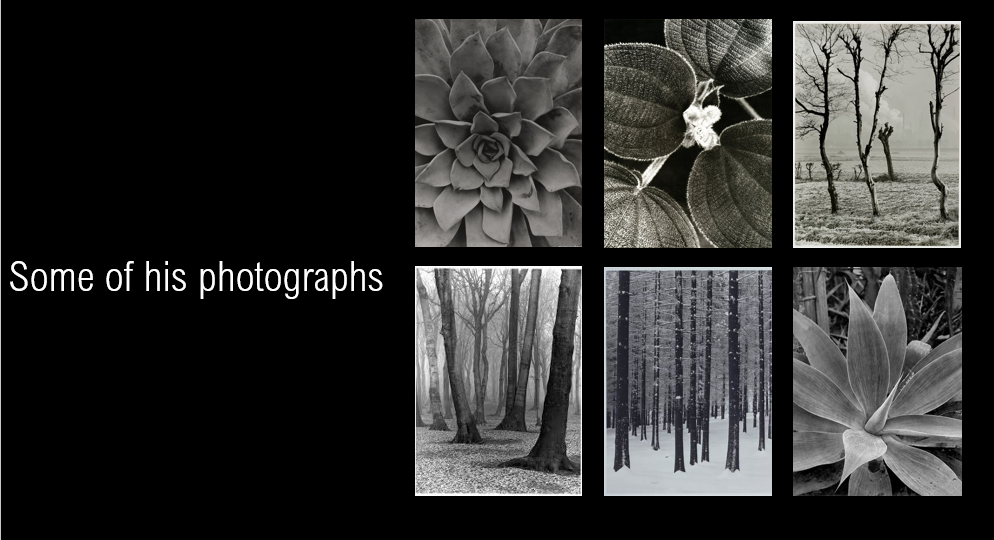
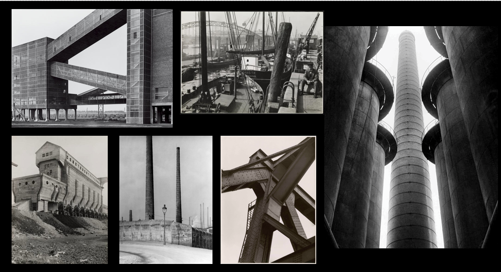
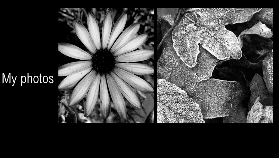
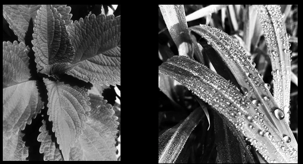
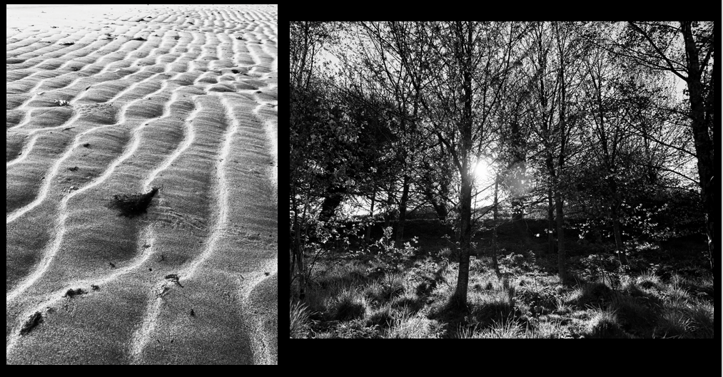


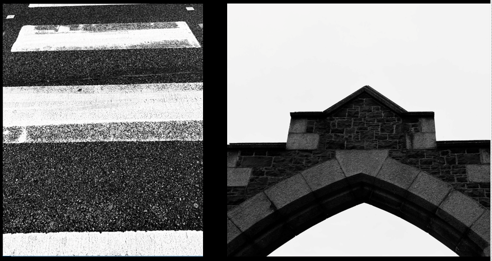
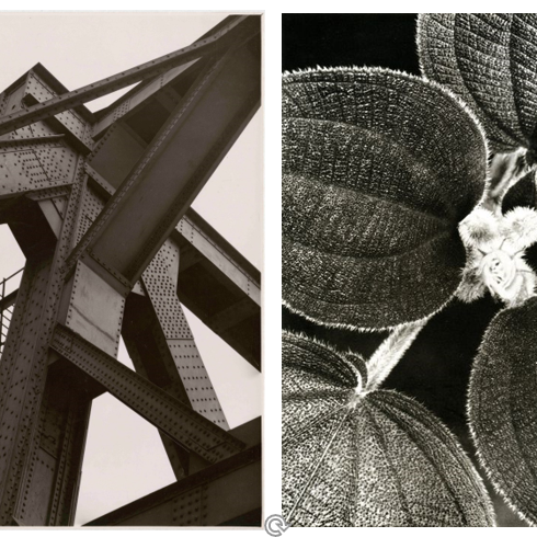
These photographs were both taken by Albert Renger-Patzsch as part of his ‘The World is Beautiful’ collection.
The image on the left is of an industrial building and the photograph on the right is of a natural form. Both photos are in black and white with extensive contrast between the light and dark tones, the contrast emphasises a gradient from light to dark on parts of the metal.
The photo on the left is very geometric with the straight, hard, man-made metal, whereas the photo on the right is natural in its own way as the leaves have different patterns and details compared to another.
Both images use camera positioning, however the photo on the left is taken from below and has a lot of the object in the frame, whereas the one on the right is taken from a birds-eye view and has been cropped, it focuses on a small part of the object up close to admire minor details.
The photo on the left has sharp lines created by the building, these contrast with the background of the image, the sky, which is light toned and grey without any shadows. This photograph was taken in natural lighting as of the deep shadows on parts of the building such as the underneath.
Albert Renger-Patzsch
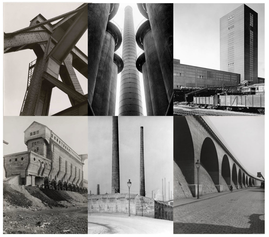
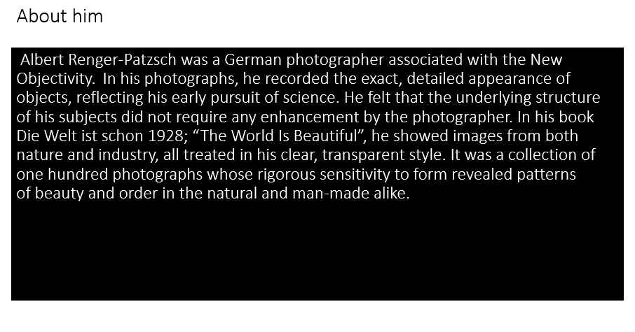
Albert Renger-Patzsch was a German photographer associated with the New Objectivity. The ‘New Objectivity’ emerged as a style in Germany in the 1920’s as a challenge to Expressionism. As it’s name suggests, it offered a return to unsentimental reality and a focus on the objective world, as opposed to the more abstract, romantic, or idealistic tendencies of Expressionism.
Image Analysis
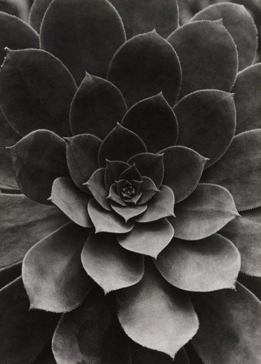
This image taken by Albert Renger-Patzsch shows a plant of some sort. This shows off his macro photography. Macro photography is extreme close-up photography, usually of very small subjects and living organisms like insects, in which the size of the subject in the photograph is greater than life size. This image shows that he uses various styles of photography in his work. He also takes images of industrial type buildings and settings.
My Response
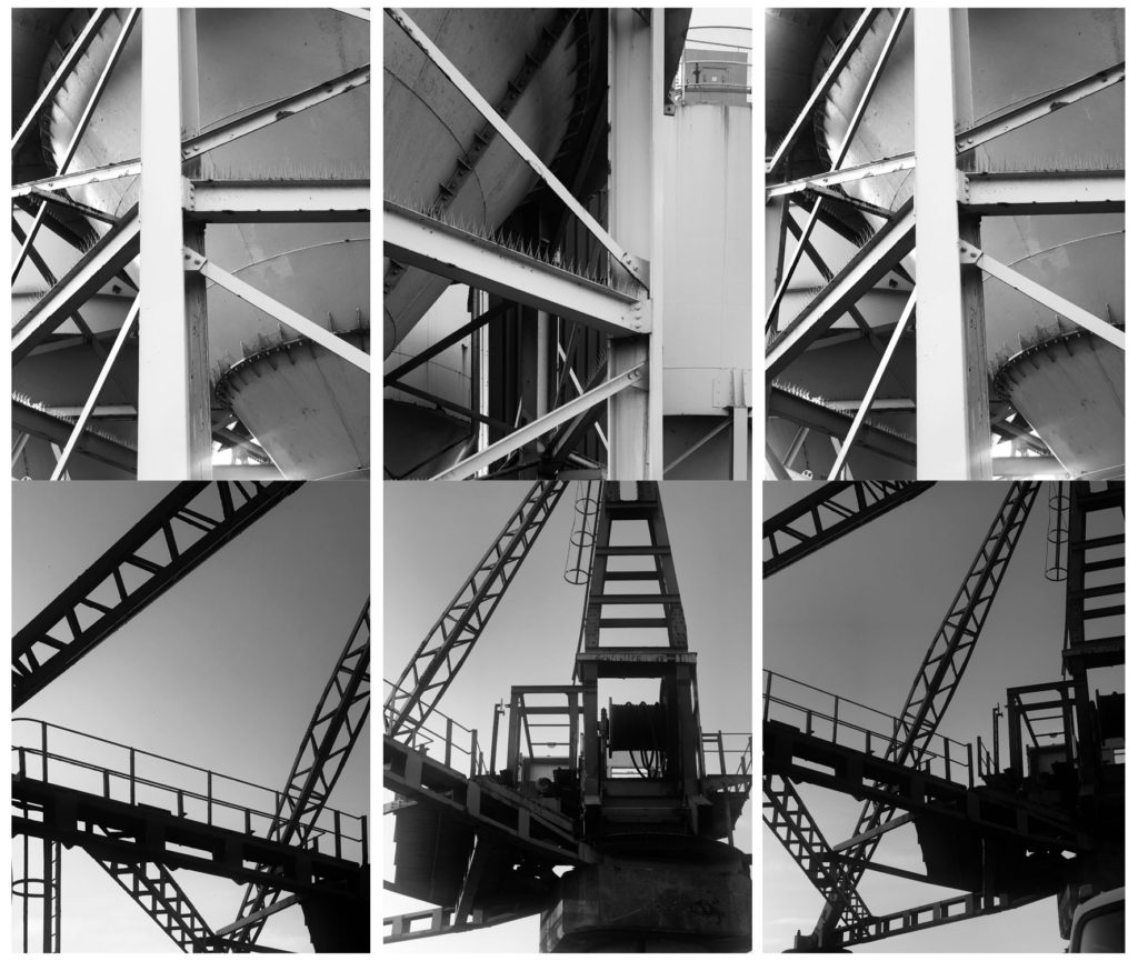
For this photoshoot inspired by Albert Renger-Patzch I went out and took images of industrial style buildings to try and mimic his work as best as I could. I then chose my favourite images from the shoot and converted them to black and white the same way Renger-Patzch has done.
Ralph Eugene Meatyard
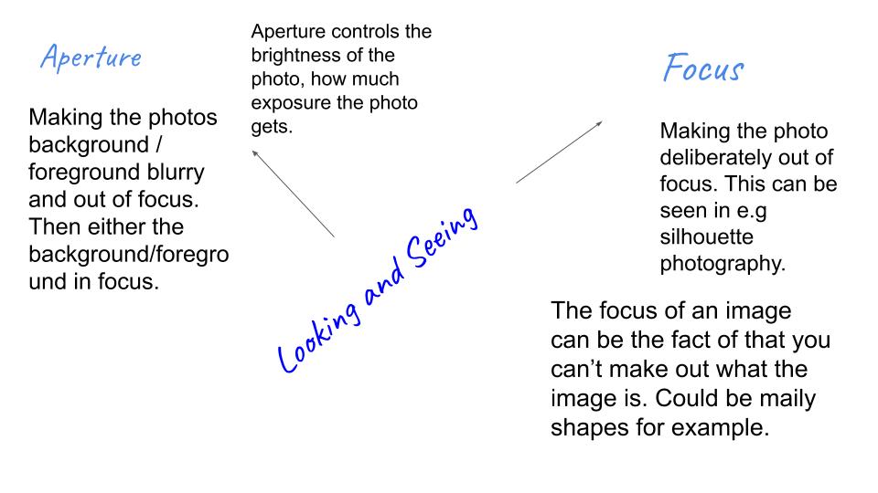
Ralph Meatyard was an American photographer who had an eye for out of focus and aperture photography. He liked to work in black and white to emphases the images he was taking. Meatyard was inspired by Zen Buddhism and jazz, this inspired him to take photos of otherworldly faces on human bodies, to the ambiguous and unknowable in human nature. He liked experimenting with framing, multiple exposures, and blurring to produce haunting, abstracted images of natural and manmade environments.
Mood board of Ralph’s work that has inspired me for my photoshoot:
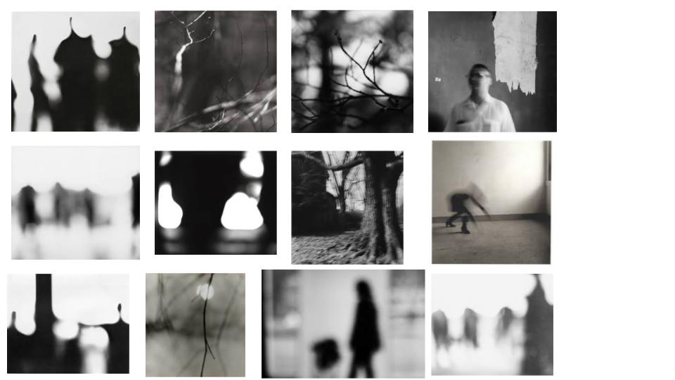
Ralphs images above focus mainly on the aperture of the image. The blurred images define the shapes of nature and human bodies. The high quality focus in the foreground of the twigs and the out of focus background creates a cool method of aperture in his photography.
Here is my photoshoot based of Ralph’s work.
Contact Sheet 1

How to use Photoshop:
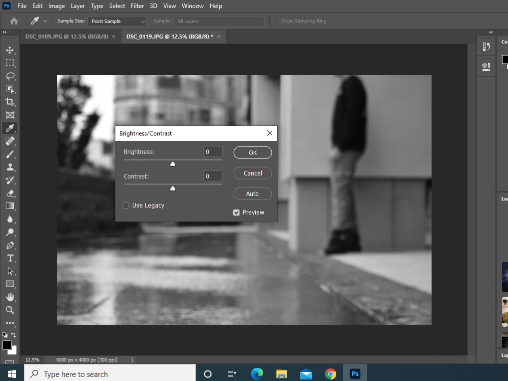
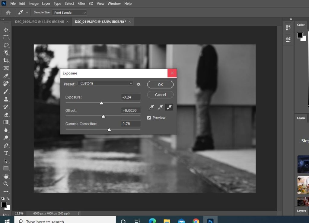

These are the main features of photoshop I used for my final photos for each contact sheet I have done. Changing the photo first into black and white then playing around with:
Exposure
Brightness/Contrast
Highlights/Shadows

Contact Sheet 2

Best images from contact sheet 2 that is edited on Photoshop:
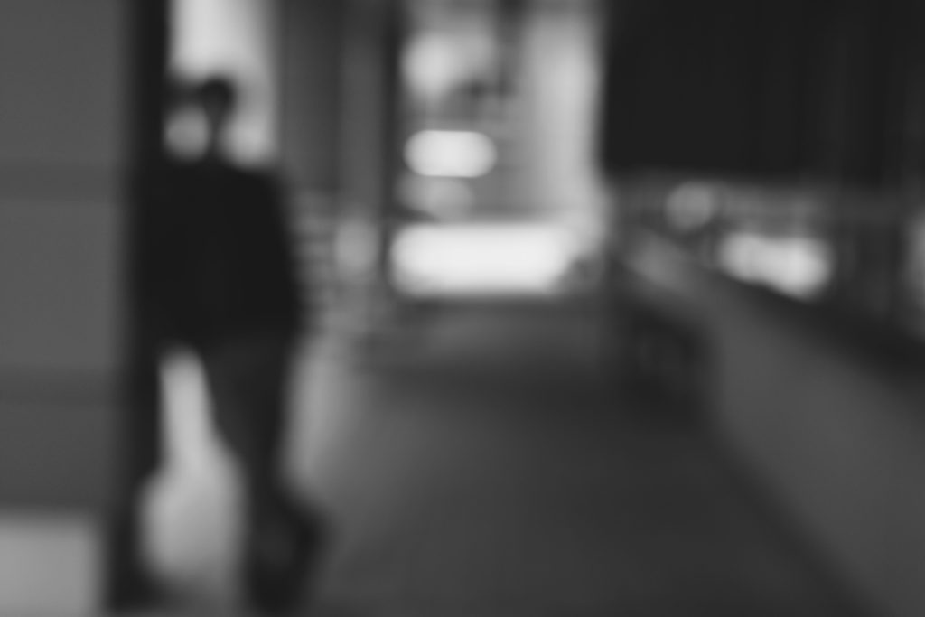
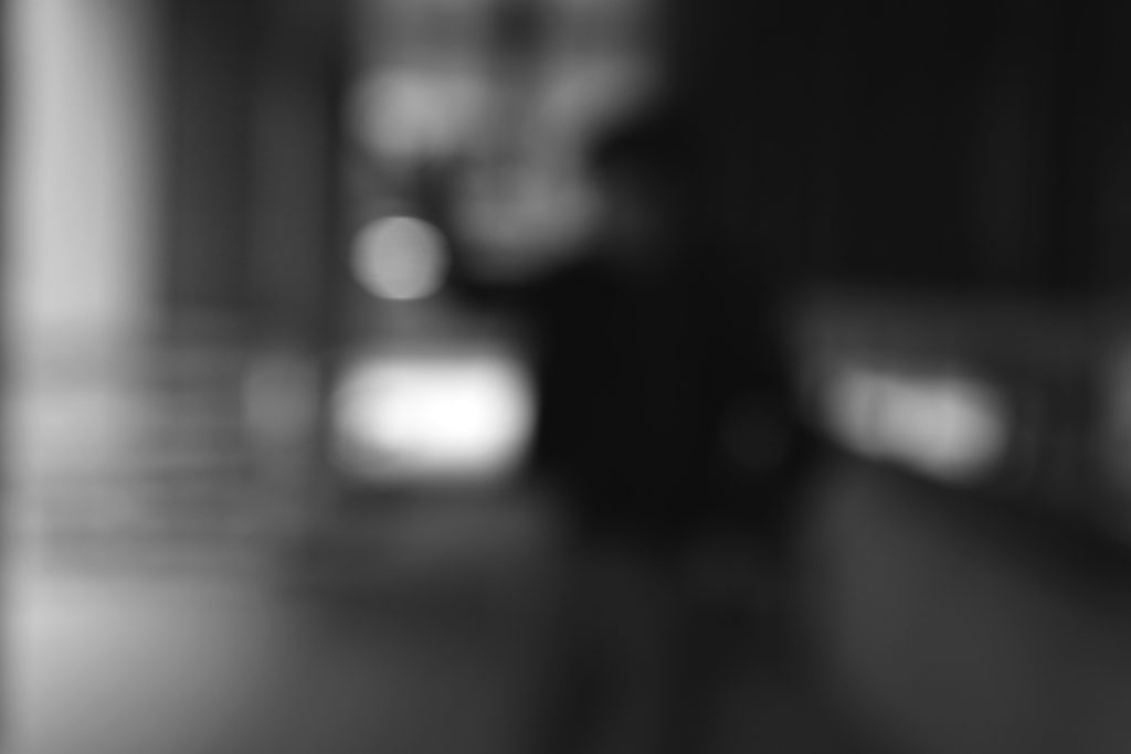
Contact Sheet 3
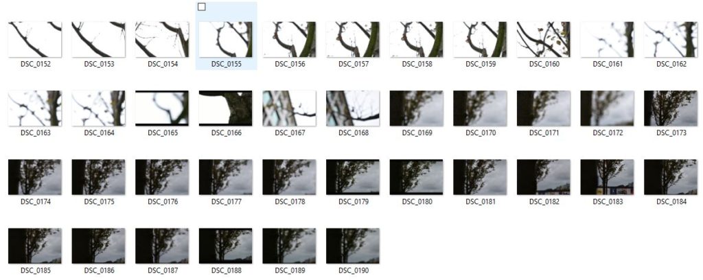
Best image from contact sheet 3
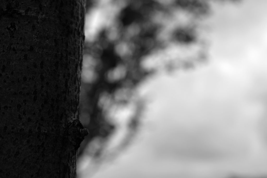
Contact Sheet 4

Best images from contact sheet 4
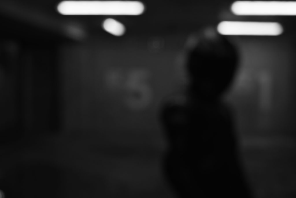
Keld Helmer Peterson
Keld Peterson was a Danish Photographer who had an interest in abstract photography in the 1940’s – 1950’s. His photography involves strong contrast levels between white and black. His work manly evolves around building structures and defined shapes. He was greatly influenced by the industrial machines/architecture during his time.
A mood board of Keld Helmer Peterson’s work:
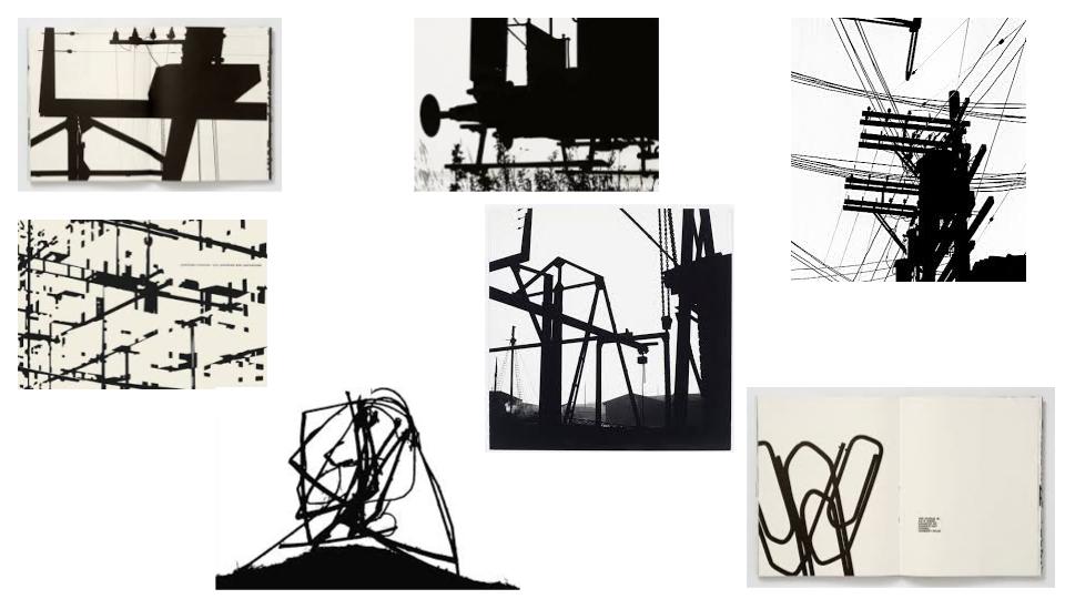
As you can see his work has great depth in his tonal range of light to dark. he almost captures just shapes that you can barely make out what they are. His work is almost the definition of abstract black on white composition images.
Here is my work before editing on photoshop. I chose to take images of sides of buildings and rails in town as for Keld’s work I thought it would link well with shape and abstract photography.

Adobe Photoshop / Best 4 Photos

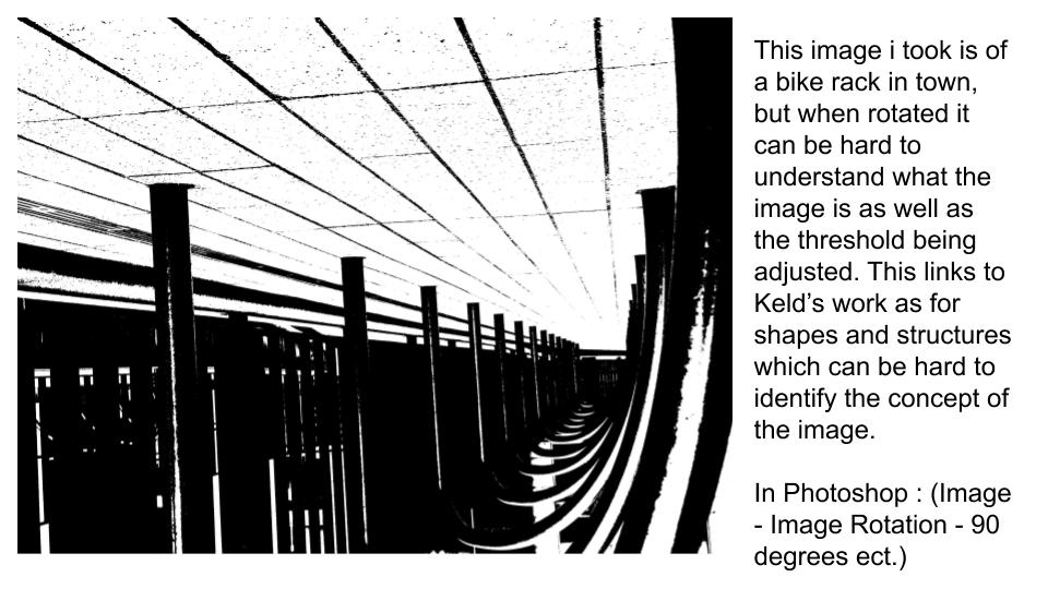
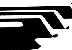
Using the threshold icon (image – adjustments – threshold) in photoshop I can create an image inspired by Keld Peterson. This first image can be found in my next four images I took below;

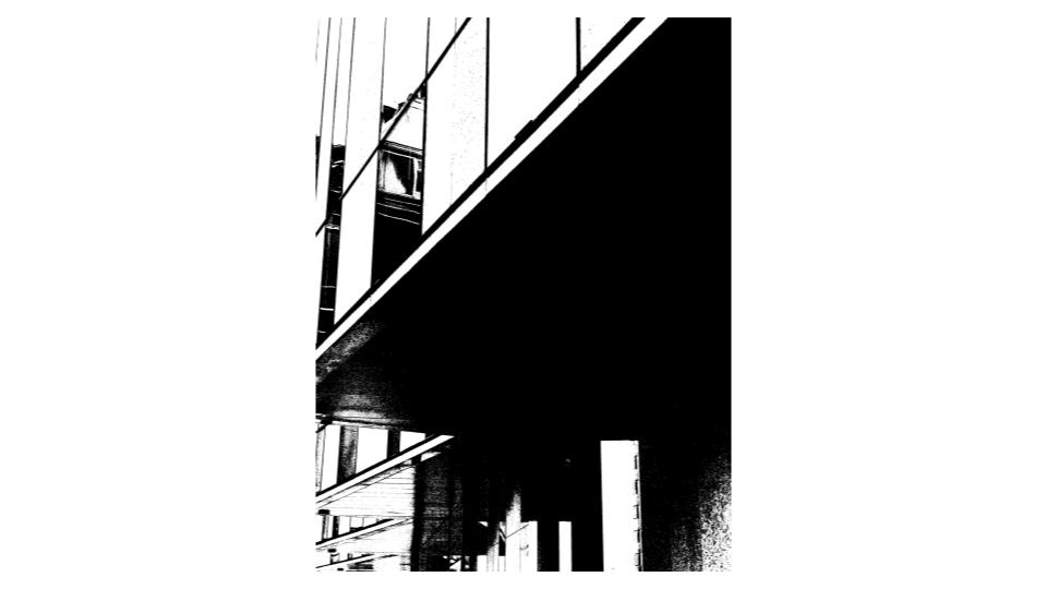
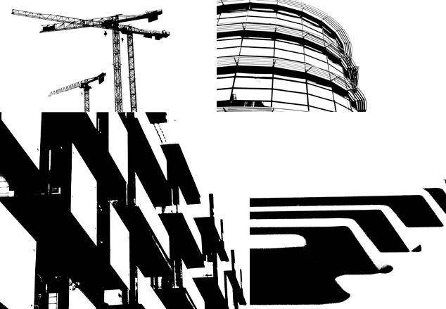
Blacklight photography is a series of black and white images that have quite harsh contrasts and tones.
Born in Danish on the 23rd August 1920 and dying on 6th March 2013. He was most known for his abstract colour photographs in the 1940s and 50s. Interestingly, he became part of the US Camera Annual in the 1940s and gained interest with German Inter-war photography (New Objectivity movement).
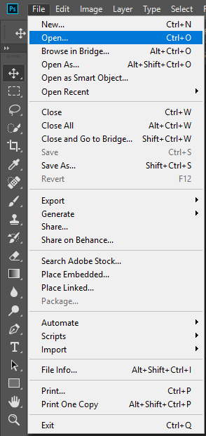
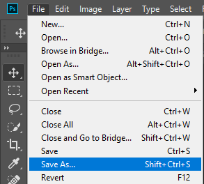
Firstly, we start by opening up the image we want to use by going to File > Open and then look for the image you want to use. For purpose of this project i will use this image:

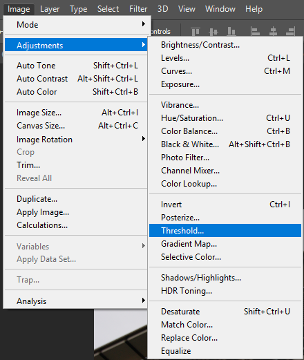
We then go to Image > Adjustments > Threshold:
As a result, this threshold window should pop up:
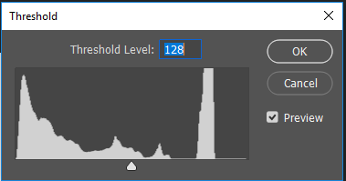
As you can see, there is a little arrow at the bottom; drag it along and you will be experimenting with the threshold tool. Adjust it appropriately. For example:
Once you are happy with your result, go to File > Save As and save your image.
Abstract photography – Abstract photography is the method of depicting a visual image that does not have an immediate association with the object world and that has been created, it often takes a second glance to recognise the object being photographed.

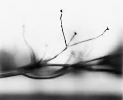
Born in Illinois, in 1925, Ralph Eugene Meatyard used a multitude of methods to achieve his experimental, expressionist photographs. These include multiple exposures, motion-blur, and other methods of photographic abstraction. Meatyard derived inspiration from poets he adored and his fellow members of the Lexington Camera Club, combined with his own creative flare and the influence of others Meatyard successfully formed his career in photography with his own form of expression. He took these unique photos where he lived in Lexington, Kentucky, before he later passed away in 1972.
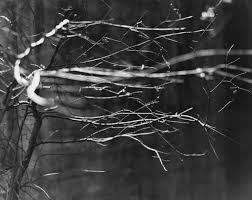
Light- The natural lighting of this image softly illuminates the focal point of the image, that being the twig in the foreground of the image. There are no harsh shadows in this image as the lighting is soft.
Line- The thin, jagged lines of the branches lead your eyes towards the middle of the image, and then to the right-side edge.
Repetition- The repetition of line is present in this photo, as the pattern of irregular lines in the foreground direct your eyes along the screen, from left to right.
Shape- The organic shape of the branches are unorganised and random, therefore they have little relation to each other in terms of shape and regularity.
Space: There is a very narrow depth of field in this photograph. The branches in the foreground of the image are in focus, whereas the background is blurred out. I believe the photo was taken with an aperture of f4 or below.
Texture- The spiked branches in the image give the photograph a rough texture, as the lines in the image are ridged and sharp.
Value/Tone- There is a varied tone to the image, as the background to foreground fades from dark to light. The branches in focus are highlighted amongst the background, which makes them the focal point for the viewer. The branches are lightest part of the image and they are contrasted against the dull background.
Colour- The muted, monochromatic tone of the image accentuates the contrast between light and dark. There is a cold hue to the image, which highlights the juxtaposition of light and dark further.
Composition- The image has a very unorganised composition, the shapes are organic which makes it harder to understand the composition. There is also regularity to the image, which makes the composition more complicated and uneven.
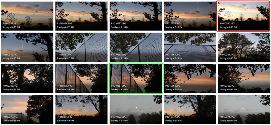
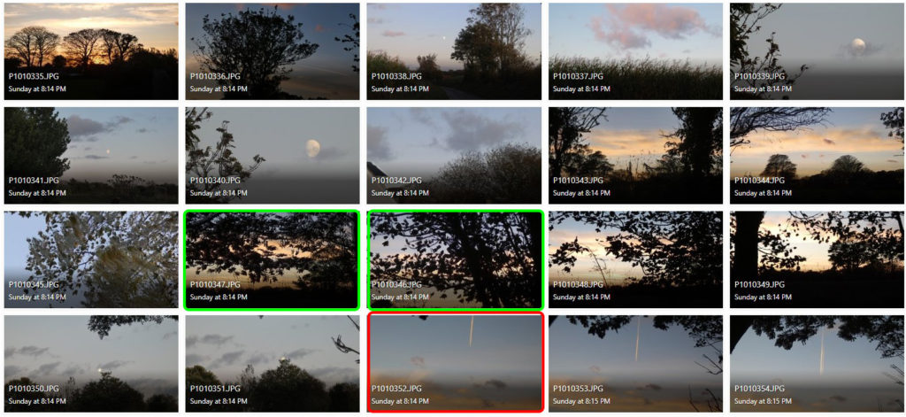

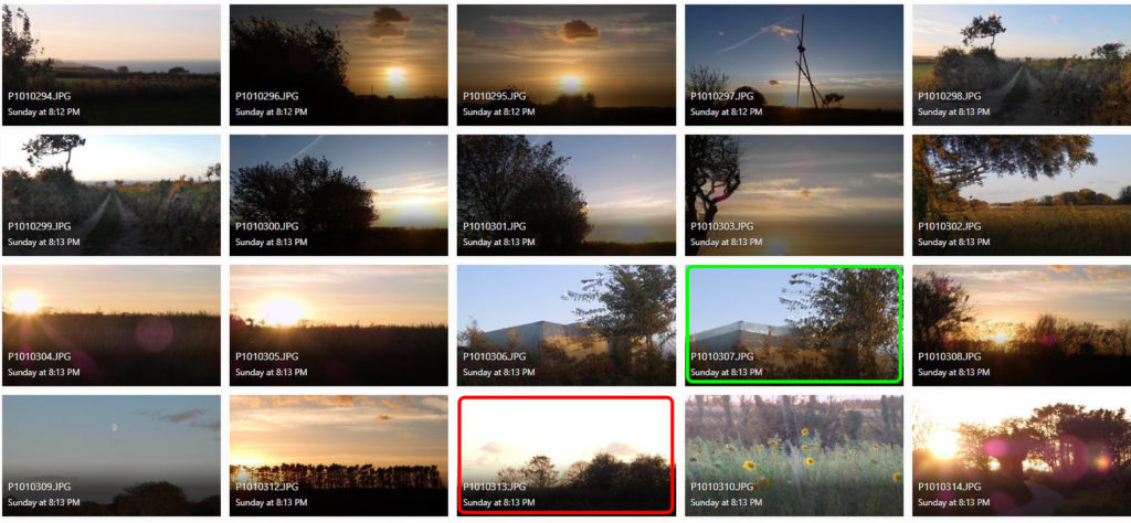
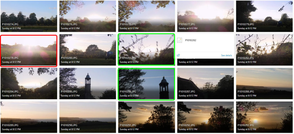
I believe the images highlighted in green are my most successful photographs for this shoot. I think this because they either relate to the artist’s theme of contrasting light and dark the best, or they use the artist’s method of blurring the image with change in shutter speed.
I think the images highlighted in red are my least successful images purely because they have the least relevance to the artist I have studied, or because the light in the photographs is too over-exposed.
To take the ‘Out of Focus’ images, I used an ISO of 400, and changed the shutter speed settings on my camera to achieve a ghost-like effect.
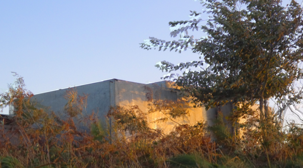
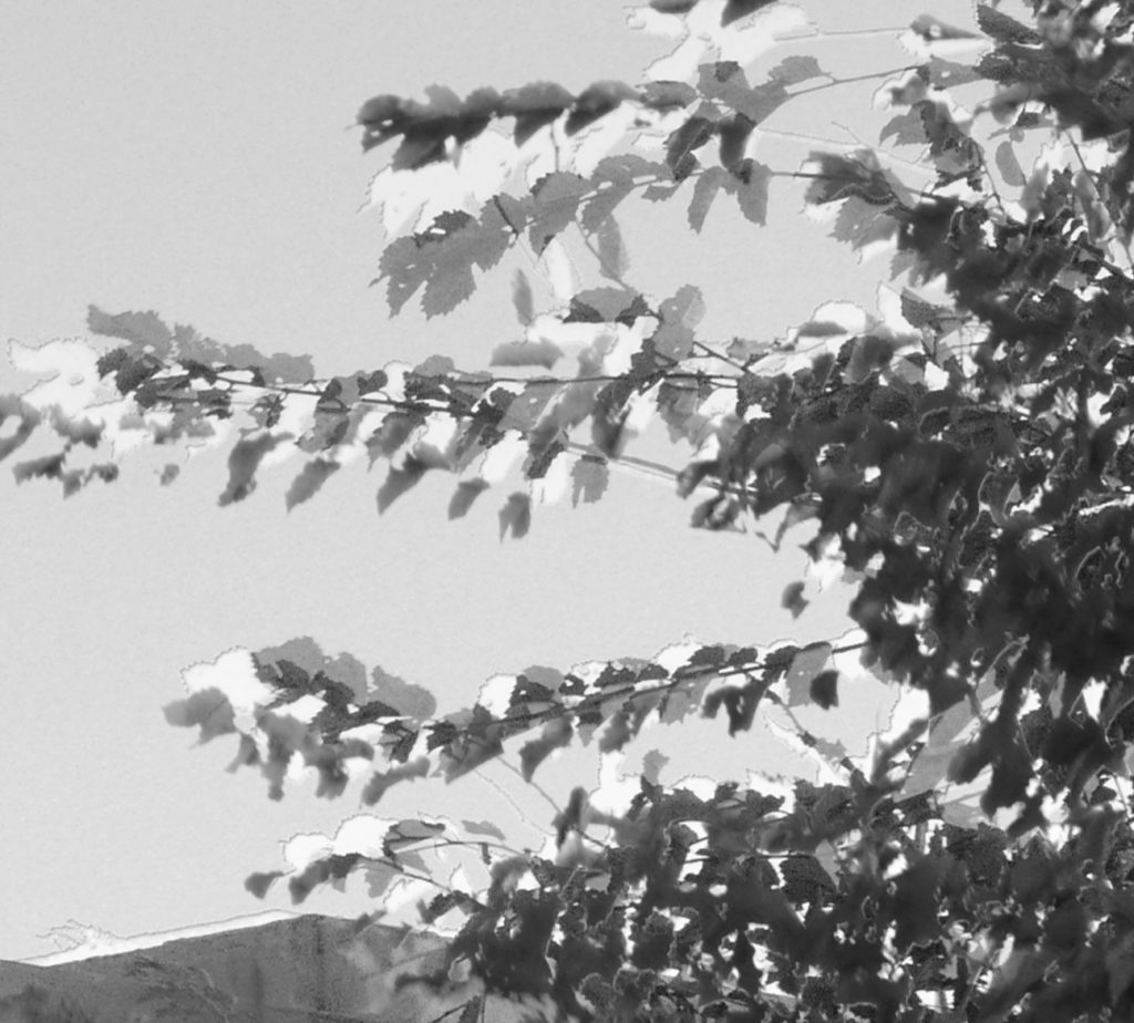

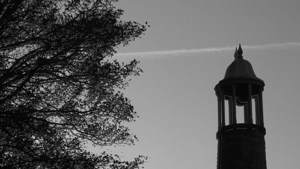
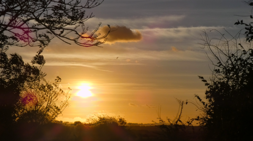

Overall, I think the biggest similarity between Ralph Eugene Meatyard’s and my own work is the use of juxtaposing black and white tones that create a contrast against each other. However, I think to improve my photos in the style of Ralph Eugene Meatyard, I need to change aperture settings, etc on my camera so that the lens focuses on the twigs and branches rather than the area around them.
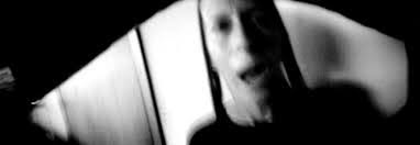
Born in 1956, Ann Hamilton is an American artist best known for her large-scale multimedia instillations. Hamilton received a BFA in textile design from the University of Kansas in 1979, and then lived in many states in Canada, before deciding to achieve an MFA in sculpture at Yale in 1983. Ann Hamilton then produced several series of works between 1984-2018, but her work in the 1980’s is what brought the artist to light. While teaching at UC Santa Barbara, Hamilton began experimenting with photography, which she would often combine with other elements involving her current work with textiles. This began her work in photography and helped to evolve her successful career.

Light: The soft, natural lighting gently illuminates the actual photograph, however harsh lighting could have been used around the image to create the
Line: The curved lines around the edges of the image act as a border to the photograph, these can be seen as leading lines that lead to the figure in the middle third of the photograph. The lines start of thicker at the corners of the image but begin to thin out as they reach the middle.
Repetition: There is little repetition in the photograph as the image focuses on the aspect of portrait rather than patterns and repetition. On the other hand, there is a slight echo with the use of shutter speed, which gives the figure a ghost-like affect.
Shape: The shapes in the image are organic and natural, because of this they have little relation to each other, the image is not artificially set up therefore it is hard to find comparable shapes.
Space: I believe there is a narrow depth of field in this image as the background is slightly more blurry than the foreground. However even the foreground is slightly blurry due to the use of slow shutter speed.
Texture: The image has a rough texture because of the jagged edges around the border and the wrinkly features of the face on the figure.
Value/Tone: There is a range of tones in the image, due to use of soft lighting which creates the contrasting shadows and highlights. The darkest part of the photograph is the shadows cast under the trees. The lightest part of the image are the illuminated features of the lady.
Colour: The photograph has a monochromatic filter to exaggerate the echo affect from the slow shutter speed.
Composition: The composition of the image is natural and not artificially set up, therefore it is difficult to superimpose geometrical shapes onto the image in order to understand the composition better.


Ann Hamilton and Ralph Eugene Meatyard both focus on the use of depth of field in different ways. Meatyard uses a narrow depth of field in order to draw the viewers eyes onto the focal point. Hamilton uses a slightly wider depth of field in order to keep more of the image in focus, but keeps the foreground as the main focal point. However Hamilton uses a slower shutter speed in order to achieve an echoed affect.
Both photographers use a monochromatic theme in these photos in order to accentuate the beauty of light and dark rather than colour. Hamilton and Meatyard use softer, natural lighting in these photos so the shadows and highlights are less harsh.
Although both Hamilton and Meatyard use the theme of focusing in their style of photography, they almost use them in an opposite way, which exemplifies the contrast in shutter speed photography.