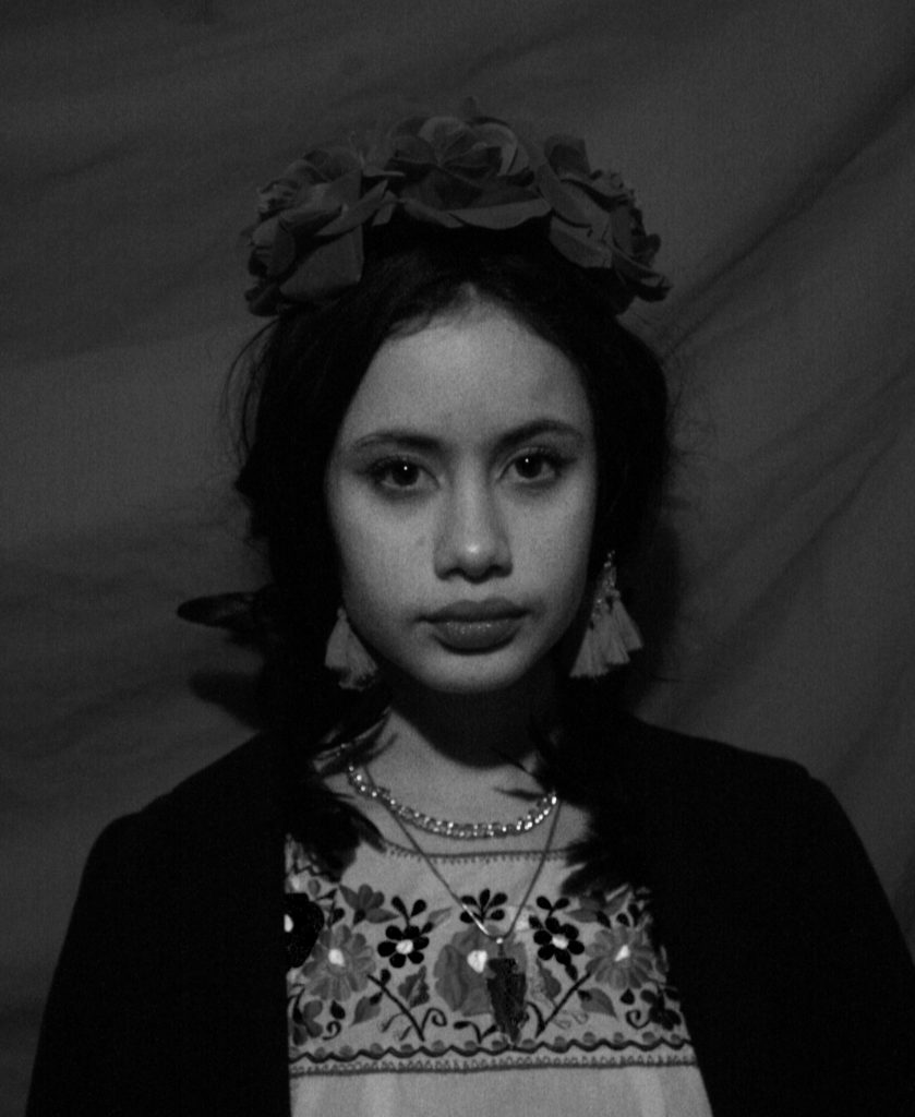
Claude Cahun and Carole Benitah – Identity and place

Claude Cahun

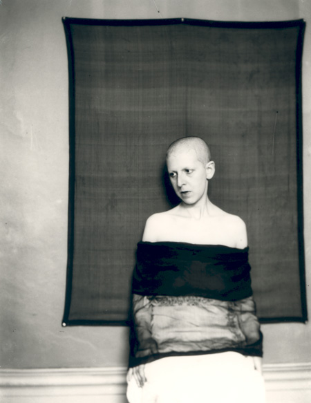
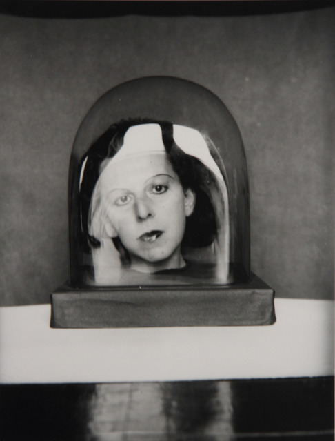
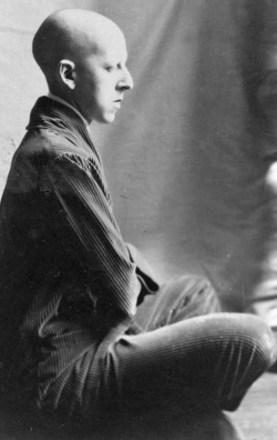
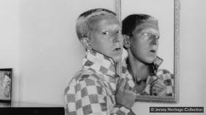
Claude Cahun, a French photographer, sculpture and writer born in 1894 to the name Lucy Renee Mathilde Schwob, was best known for their self-portraits, which often showcased a range of personalities. Cahun first began producing self portrait photographs at the age of 18 in 1912, and later took on the sexually ambiguous pseudonym in 1917, as she continued to combat the ideals of gender norms in her photography. Later moving to Paris alongside her longterm partner Marcel Moore, who she often collaborated with, Cahun continued to work on her surrealist portfolio.

In 1937 Cahun and Moore migrated to Jersey, just before the start of World War Two and the island’s German occupation. During this time the two soon became activists, in the effort to spread reports of Nazi crimes by creating anti-German fliers, criticising their authority, and placing them around the island. However, due to this they were later arrested and sentenced to death for their actions in 1944, although this was never carried out fortunately. Ten years later Cahun sadly died due to bad health, caused by her treatment in prison.

https://www.jerseyheritage.org/collection-items/claude-cahun

Analysis

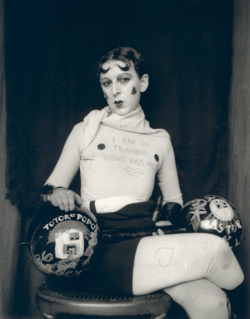
Claude Cahun – 1927

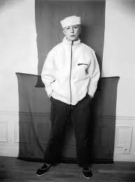
This black and white photograph, taken by Claude Cahun in 1927, displays a self-portrait of the photographer in which she has taken on the persona of a strong man or body builder that you may find at a circus or fair, during that time period. Here the pale white clothing, that matches the colour of her skin, contrasts dramatically with the dark black background behind her. This contrast between light and dark is also creating from the use of the dark dumbbell prop. The framing of this image by Cahun can be said to appear confining, as Cahun has placed herself so that she takes up most of the frame leaving little empty space.

The lighting used for this self-portrait appears to be two-point lighting, this is as there are only a small amount of shadows in the image but still a strong contrast between light and dark. Furthermore, it could be said that Cahun used a low aperture for this photograph, due to the fact that the foreground and background seem to have the same amount of focus placed on them. The ISO used for this image appears to be on a medium setting, allowing for there not to be too much light flooding in from the harsh lighting, but enough for the dark contrasting background to be visible.

In addition, this persona of a strongman or body builder does not portray all the masculine stereotypes that are associated with this type of person, but however showcases a more effeminate one. This is displayed through the Oscar Wilde type parting in the hair, the crossed leg pose and the hearts painted on the cheeks. This only further shows how Cahun challenged gender normativity by showing that she was able to switch her apparent gender at will comfortably.

Carolle Benitah

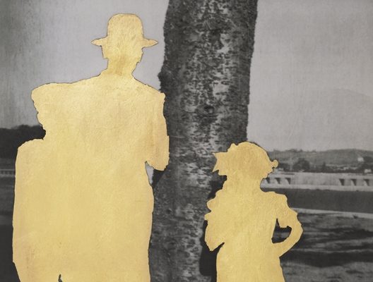
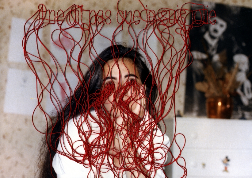
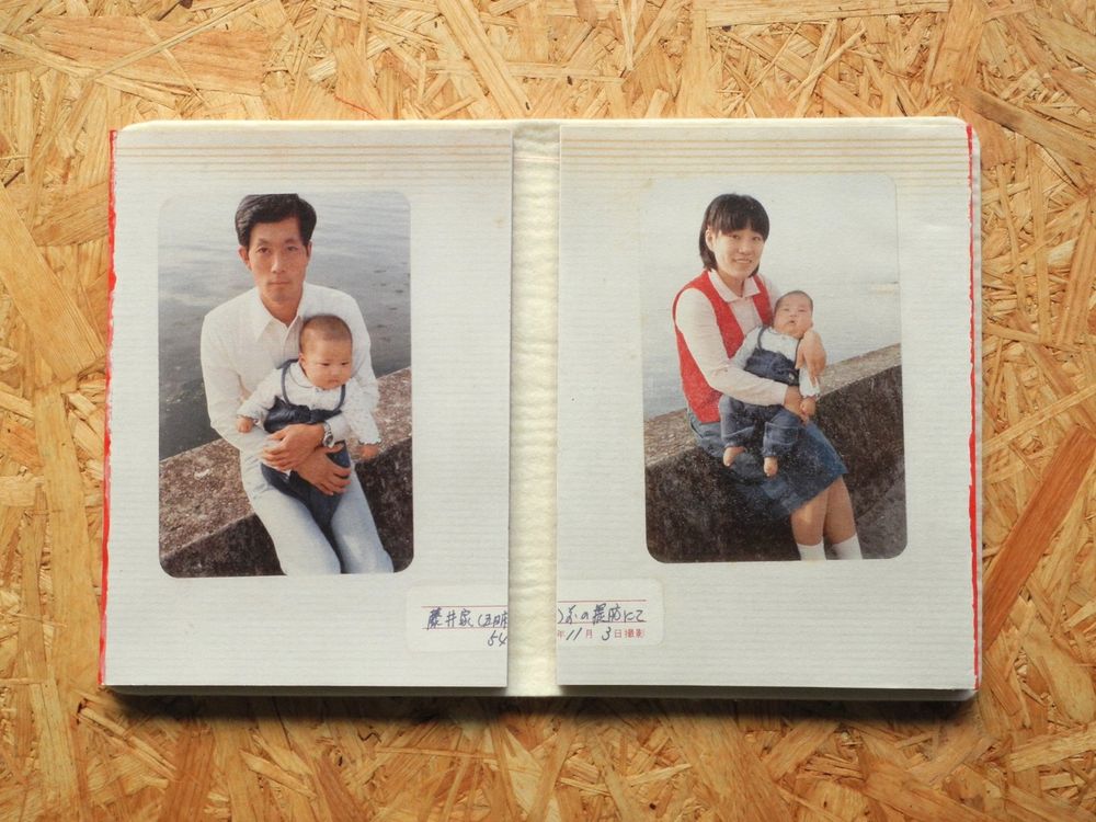
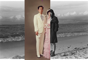
Carolle Benitah, born in 1965, is a French photographer best known for using her old family photographs to tell the story of her identity. Benitah does this by embroidering and cutting out certain sections of the portrait images. Benitah sees this style of work as allowing herself to expose the failings of her life and identity, and reinterpret her history. This acts as a sort of therapy for Benitah as she claims “I make holes in paper until I am not hurting any more”.

https://www.carolle-benitah.com/

https://www.lensculture.com/articles/carolle-benitah-photos-souvenirs

Comparison
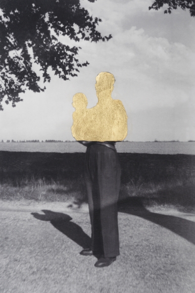
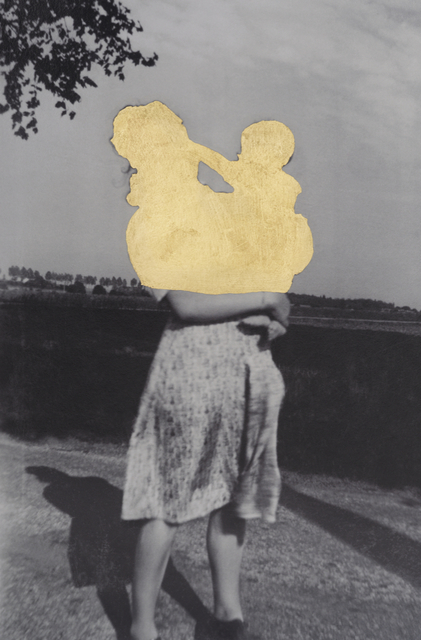
Carolle Benitah – 2018

This sepia and, black and piece created by Carolle Benitah displays an old family photo of Benitah’s containing the subject positioned in the centre of the image, which is similar to the way in which Cahun placed herself in her self-portrait. Leading lines in this photograph are created by the horizon line, the line dividing what appears to be a wall and the see, and also the split created by the contrast in tones on the subject. These allow for your eyes to be drawn horizontally across the image. Dissimilar to Cahun’s photograph, there is a large amount of empty space around the subject of the portrait, meaning more attention is allowed for the background, which is a landscape rather than a studio backdrop seen in Cahun’s image.

Whereas Cahun used what appeared to be two point studio lighting, here Benitah has chosen an image taken with natural lighting, which you can tell due to the outside location. In addition, it appears that this photograph was taken with a low aperture like Cahun’s, due to the fact that the foreground and background hold a similar amount of focus. The ISO used to capture this photograph can be said to be lower than the ISO used in Cahun’s portrait, this is due to the fact that the natural light would flood the lens, causing the image to be over exposed, if it were higher.

Conceptually this piece differs largely from Cahun’s on the theme of identity, as it seems to show a loss, lack or even rejection of identity. This is due to the cut out sections of the subjects in the image, which could be representing an attempt to erase that part of her history. On the other hand, Cahun appears to take a completely different approach by doing what seems to be an embrace of her ability of changing identities.

Identity and Place

Identity can be defined as an individuals disposition or personality, or possessing a similarity or oneness with someone or something. A person’s identity can be influenced by a number of things, such as ‘place’, the environment that you live in, your upbringing or a sense of belonging. This means that the people or things you surround yourself with have large impacts on your life, and shape you into the person you presently are.

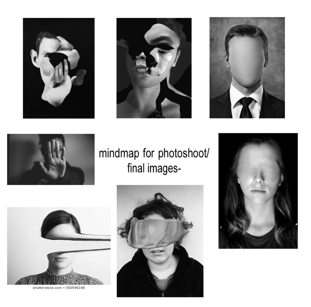
Mood Board

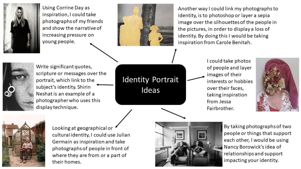
Ideas

photoshoot 2

photoshoot 2 plan-

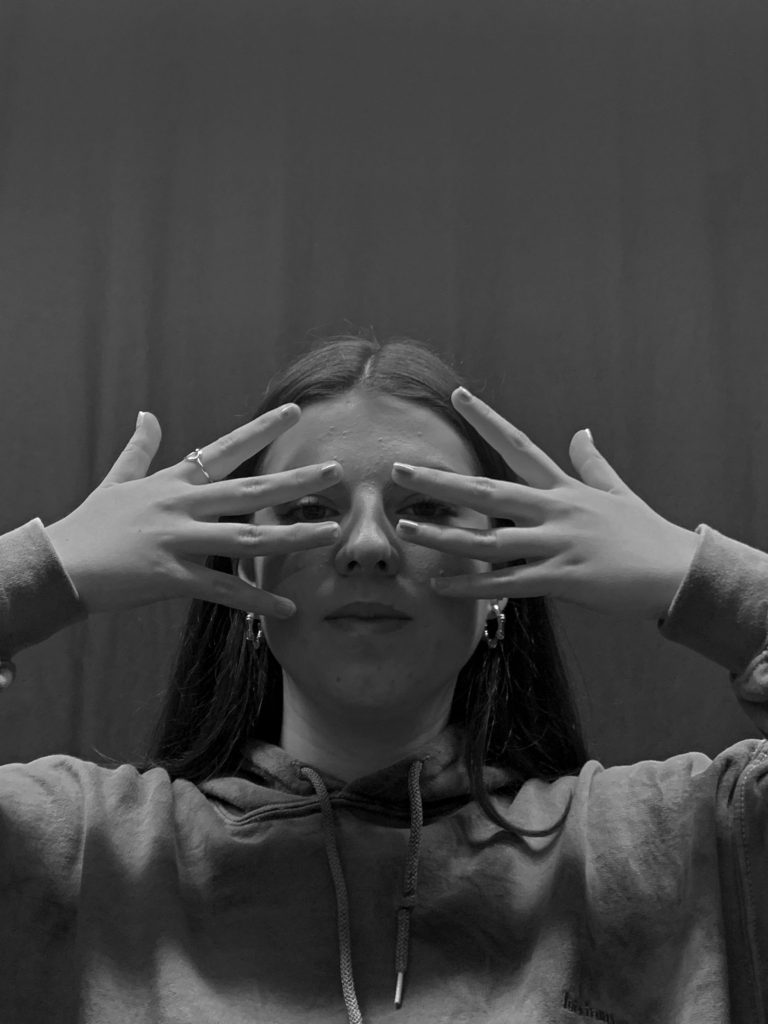
who- I took photos of my friend as I wanted a student or a young individual in my photos. when and where– in the studio using normal lighting as I’m going to edit my photos anyways so I’m not depending on the light. why- I want my friend to cover her face with her hands to make her identity and I can link it to my chosen photographer.

a link to my chosen photographers work

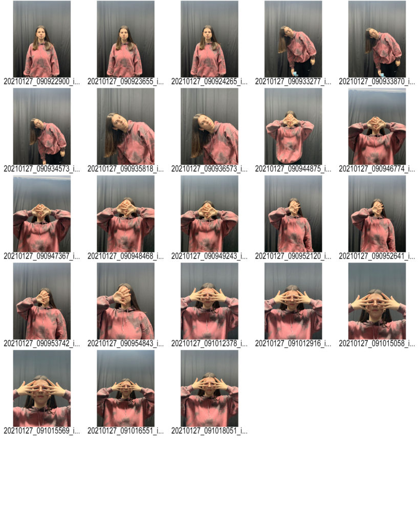
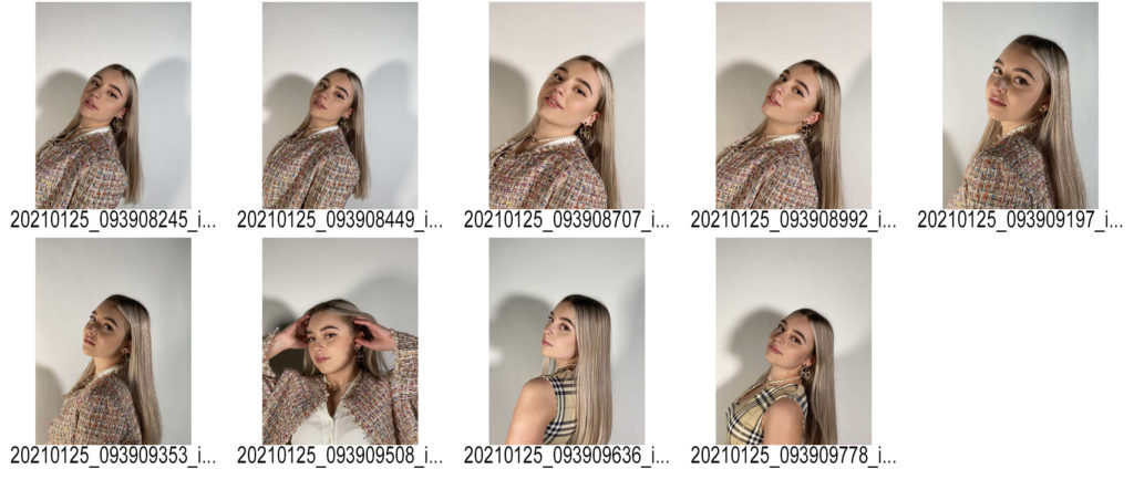
contact sheet;

I used one big main light when taking these photographs I didn’t need to use any flash heads or extremely artificial lighting as when I’m editing my images the lighting is going to change completely anyways. I photographed my friend from a direct point of view and in line with her view point. I took some images from a much lower angle to make it look like the viewer is looking up towards her and it helped when I got to editing as I had different angles. I got her to use her hands as a way to hide her face(identity) because Jack Davison-my chosen photographer , presents lack of identity through that way. My last photo shoot was very based on editing and hiding the identity digitally whereas for my second shoot I wanted to use hands and make it more natural.
editing my images-

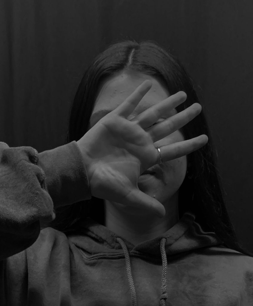
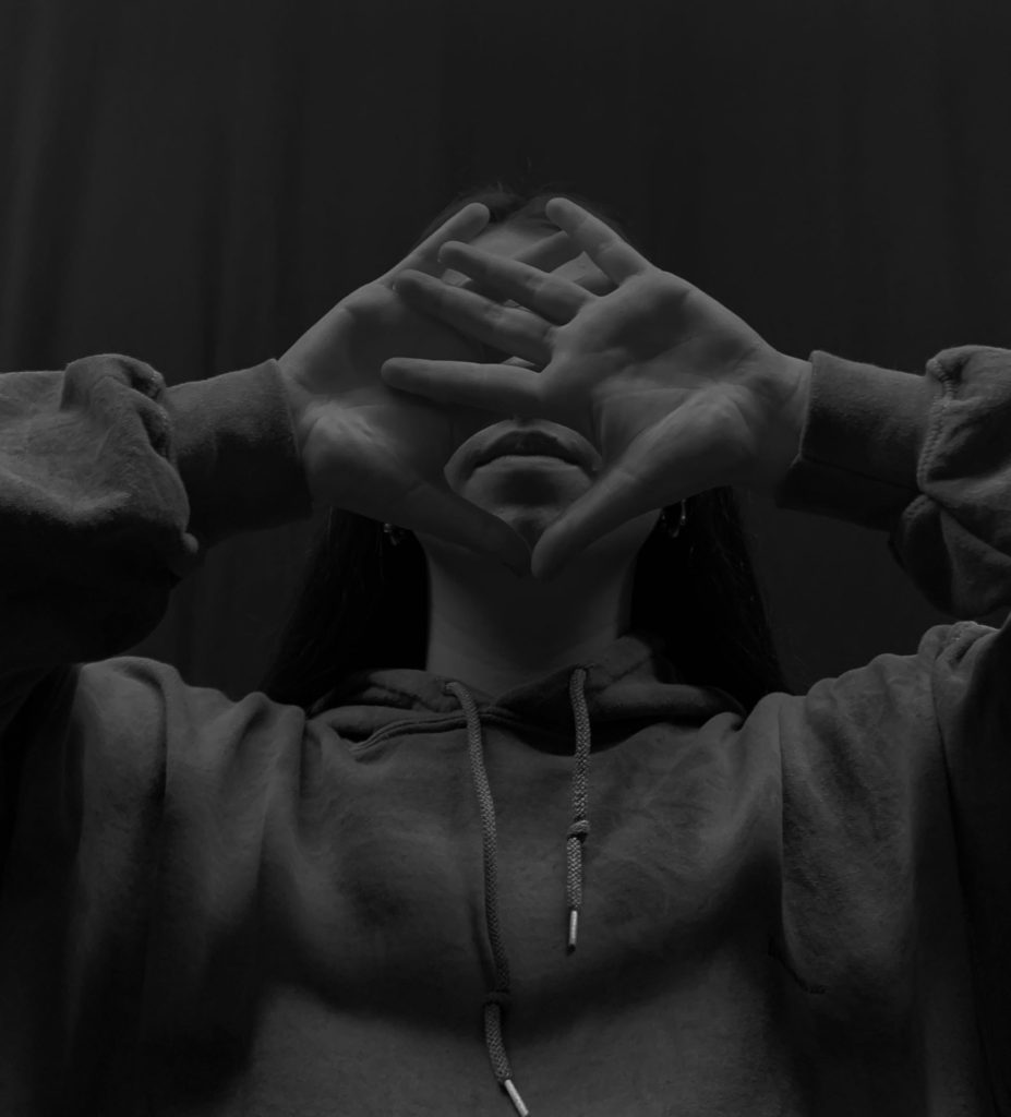
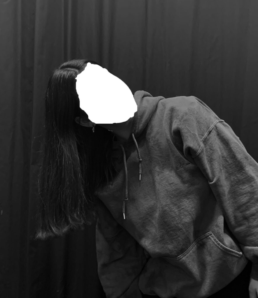
my 3 favourite images turned into black and white and that I’ll be working with to edit further.

I changed my images into black and white as that’s the style I want throughout this theme and I made sure the brightness was decreased by a lot as well as the contrast to create a variety of different black and white tones which all contrast well together. I cropped all my images down completely to get rid of most of the background as it wasn’t needed. By doing this is made her the focus of all images as the composition of the image changed – making her face in the direct center which draws attention.

using liquify tool to disguise the identity-

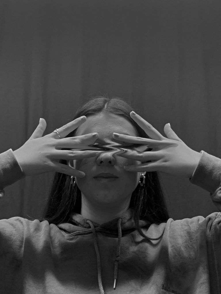
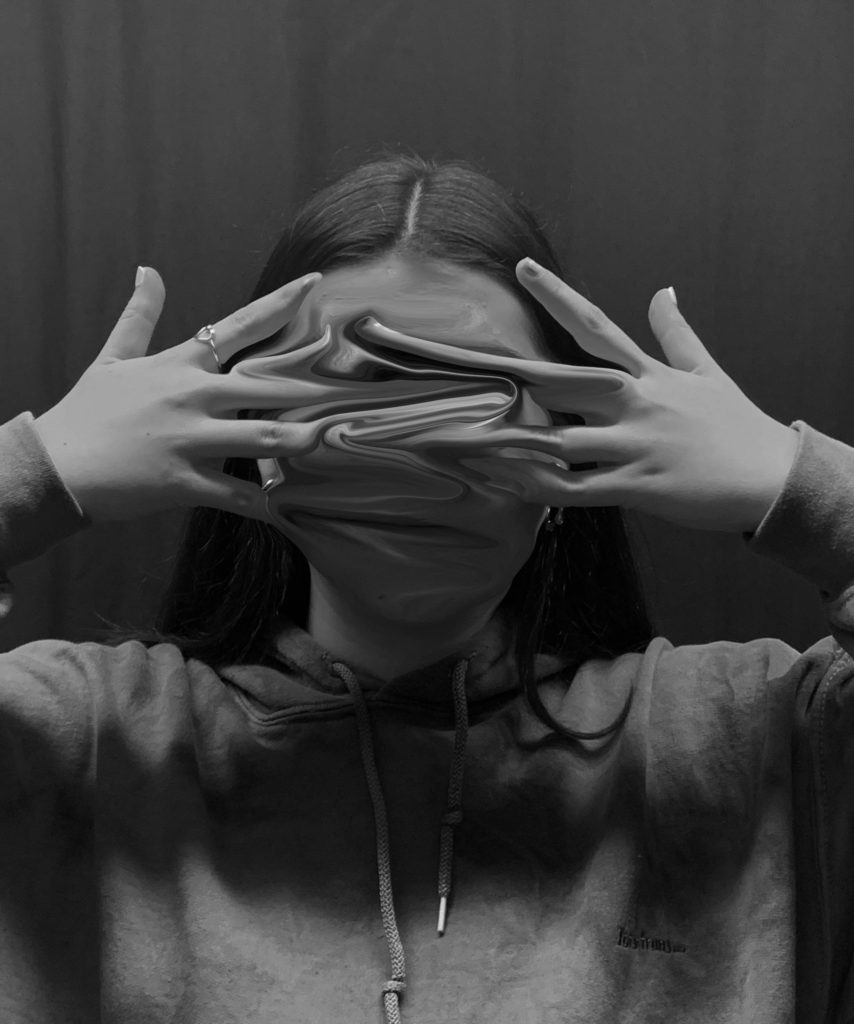
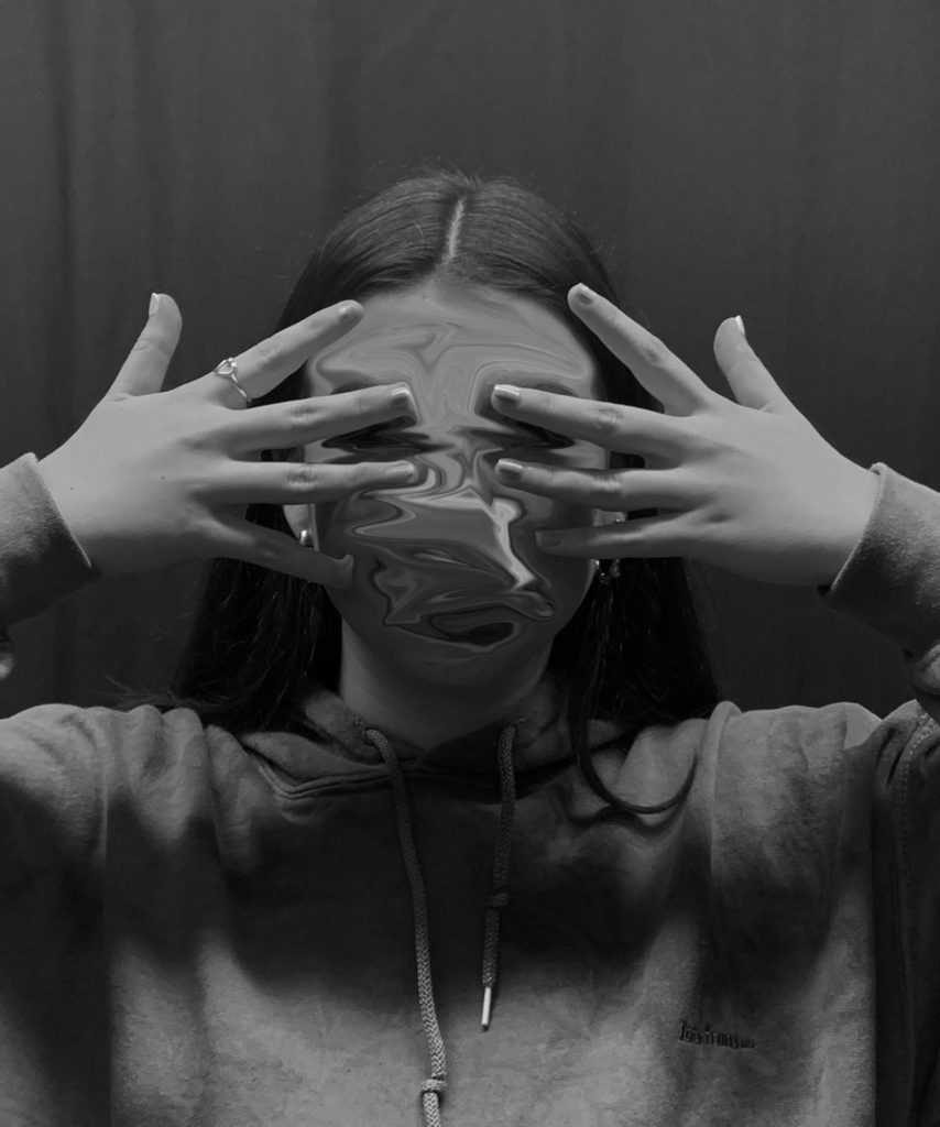
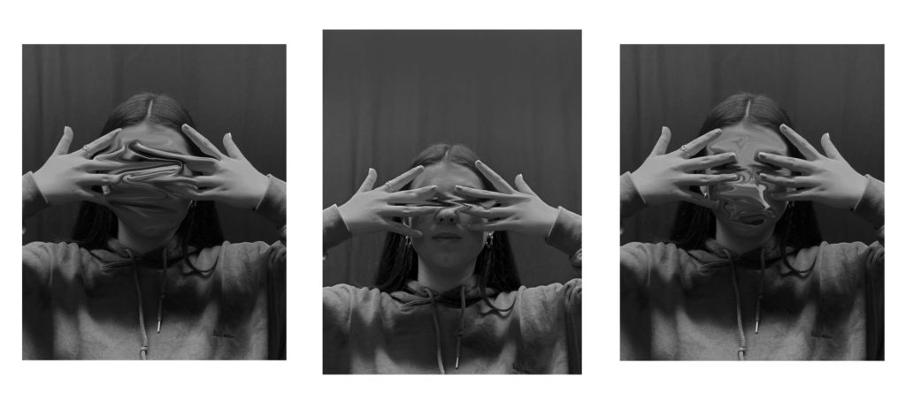
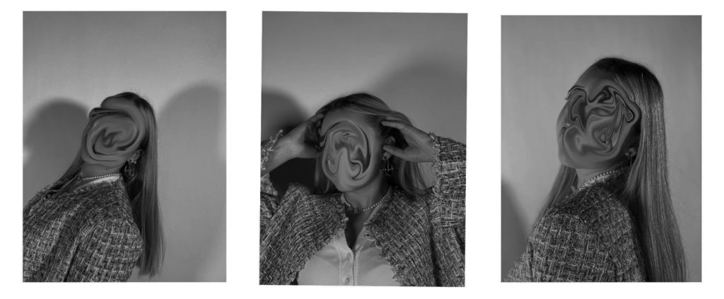
I used the ‘liquify tool‘ once again to smudge the eyes in the first image and then smudged all of her face in the 2nd and 3rd photo. I really like using this tool as it gets rid of her facial features in a very abstract way as well as erasing her identity. It creates a mysterious atmosphere as you cant tell what she looks like and I wanted to make the viewer question what he’s looking at.

cut outs-

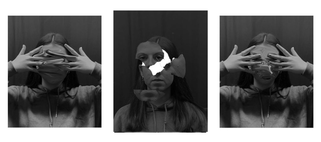
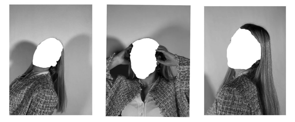
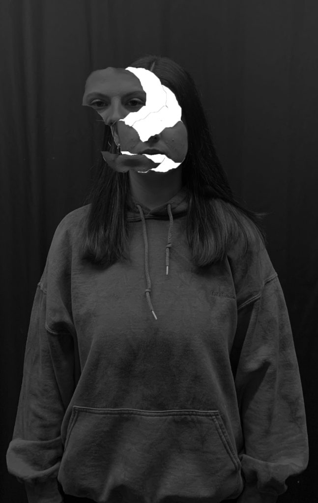
With the ‘quick selection tool’ I selected specific areas of her face that I wanted to cut out and drag out further across the image. I like how these edited images turned out because I think that by using the quick selection tool it completely gets rid of who she is whereas when I used the ‘liquify’ option you could still see something on her face but it was smudged around whereas on these images its just an empty face with nothing to look at. I left the cut out white as it stands out the most because the photo is in black and white. When you first look at the images the first thing you’re drawn to will be where I cut the face out as the white colour stands out so much in contrast. I wanted the edges to be slightly ragged and not perfect when selecting the shape of it because I wanted it to look as if the face was ripped out of the image rather than just perfectly circled out.

final images , analysis and personal response-

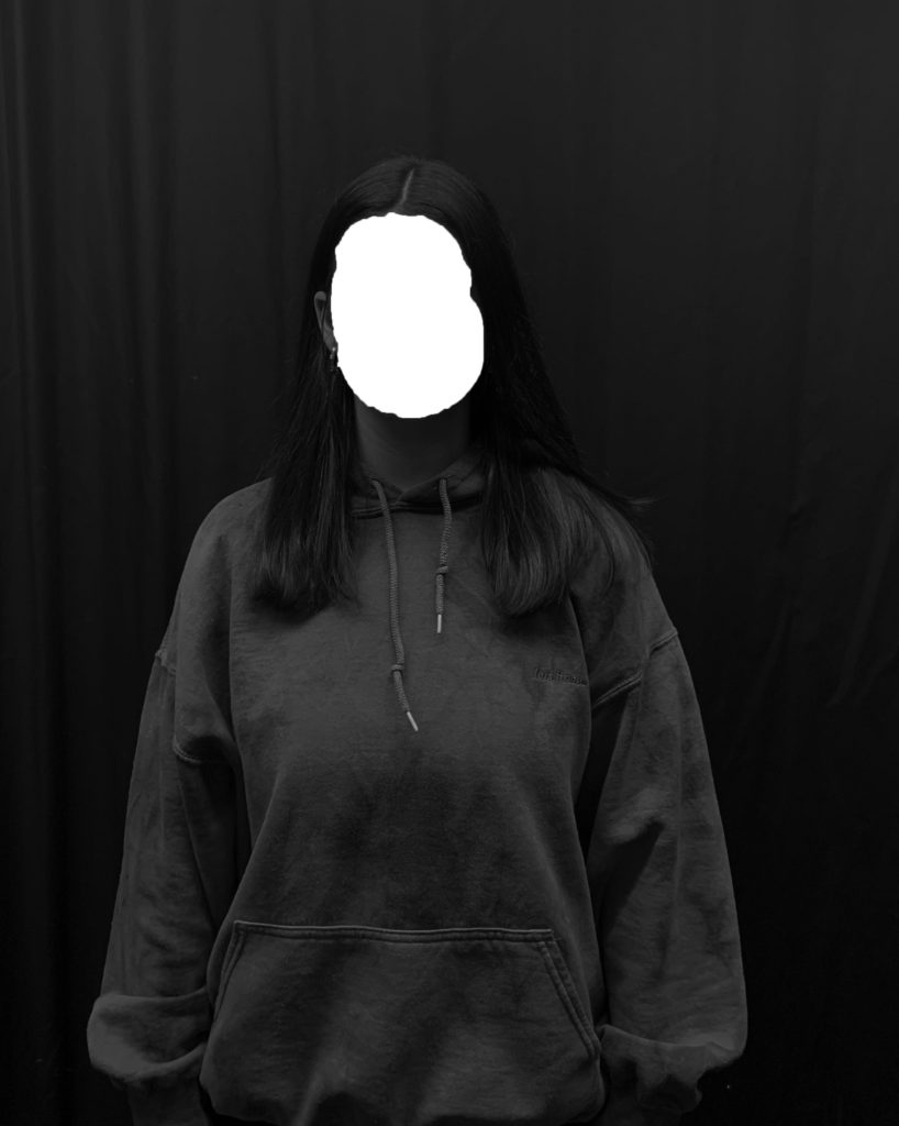
I selected 3 images once again for a final image. I wanted to pick 3 as I think it gives the viewer more to look at and analyse themselves. I also wanted to use 3 images because I knew that when I print them out they will look more clean and presentable rather than just one big image. Overall I think I achieved my ‘lack of identity’ idea very successfully and edited them in the way I wanted to. I changed them all into black and white which was inspired from my chosen photographer, Jack Davison, and I edited them in my own way with some inspiration from his work too. I wanted to use many different ways of editing my images so that I can select my favourite technique and make sure I have many different styles to pick out my favourite ones. I liked all the techniques I used but my least favourite were the cut out out ones which is why I didn’t use it for my final 3 , compared to my ones I liquified.
comparison-

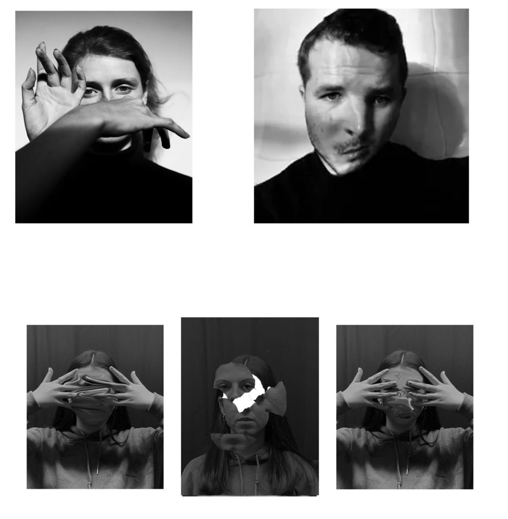
At the top is two photographs taken from Jack Davsion’s work, who was my chosen photographer, and at the bottom is one of my final photos. We both took our photos in black and white to create this contrast between the different tones, however Jack’s photos are more black and white whereas my images have a lot more grey tones and mid tones. This is because Jack’s models are wearing black clothing with a white background and I took my images in front of a black background which doesn’t achieve the same effect and the two tones can’ contrast as sharply. I took inspiration from his work by making my model cover her face with her hands too but I think my editing is a lot more advanced than what he did to his image which was just slightly distorting the face but still making it very easy to make out what the man looks like and I completely distorted my friends face.
editing TESTING

Test1

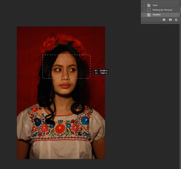
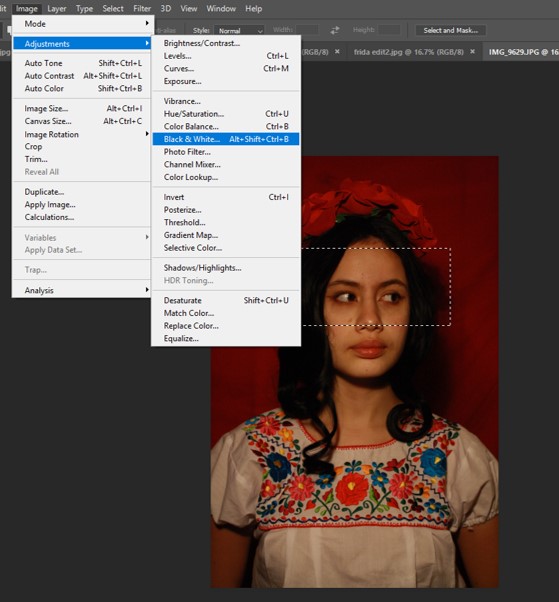
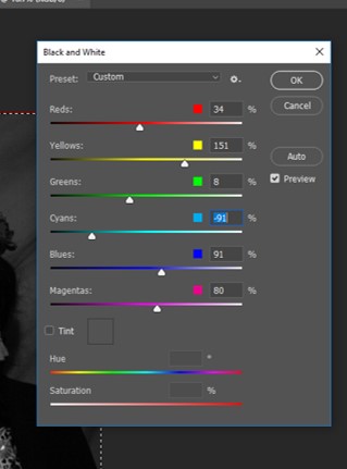
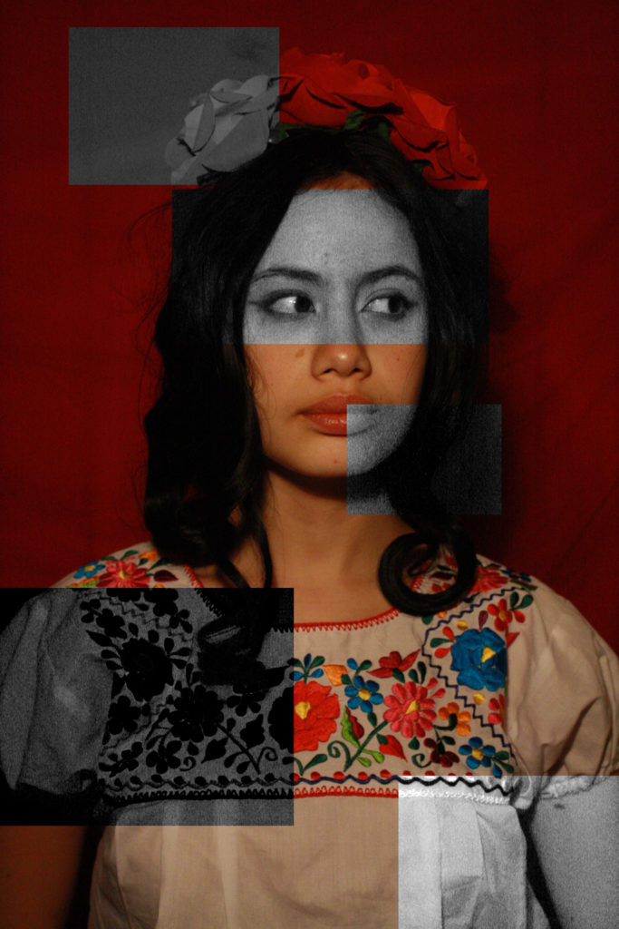
I decide to put some parts of my body on black and white because for me black and white represent my past, my ancestors…my heritage. The black and white parts makes it nostalgic. It was a fun way to see things differently, it looks like the future who meets the past what makes my identity.

Test2 B/W


Although I prefer my images on colours what I like about this experiences of putting it all in black and white is that this effect creates my pretty dramatic image. it also seems that my images come from the past which could defend my heritage in a way.

photoshoot 1-

Plan- As I’m looking at the theme of lack of identity I wanted my first photo shoot to be simple head shots and photographs with a lot of editing. I want to cut out the face of the model and blur it out to introduce ‘lack of identity’ through that way. I’m going to photograph my friend in the studio with very light and bright lighting in the studio.

contact sheet

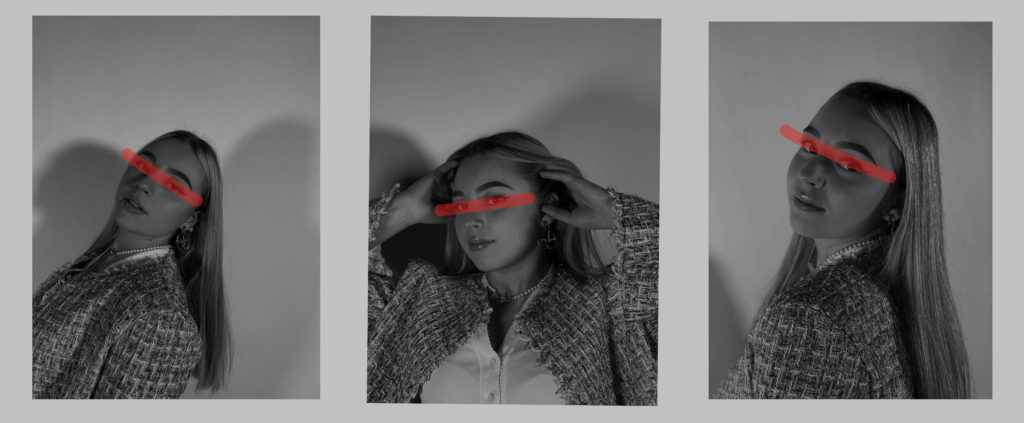
I picked out my best photos and wanted to edit them on Photoshop by turning them mostly black and white inspired by the artist I chose to study. I also overlayed my images with different watercolour backgrounds to disguise the face and I cut out each image and layered them on top of each other. I later edited the final edits and digitally drew a line over the eyes as it’s the way I wanted to present lack of identity which is the theme I chose.

different editing to help select my final image;

The first type of editing I wanted to try out is just simple drawing over the face by simply picking out my 3 favourite photos an draw red over the eyes with the ‘pencil tool’ to disguise the identity.

The second option for editing my images I wanted to try out is using the ‘liquify’ tool. I changed the brush to a small size and dragged the face face around till it created this swirl that looked right and completely changed her identity, if not erased it. I was happy with how my editing with this tool turned out because it got rid o her identity.

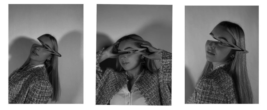
I wanted to combine the two for my last editing time. I used the ‘liquify’ tool again but this time I only selected and dragged her eyes which is similar to the first edit but dragging her eyes instead of drawing over them.

I used the quick selection tool and selected my friends face completely. I then used the ctrl+t option to select that part and I dragged it out of frame to create this lack of identity idea. I really like how these turned out as doing it digitally was quicker than printing my images out and cutting her face out. This makes the viewer think about what kind of face was there previously and why isn’t it there anymore. I wanted to present lack or loss of identity through loads of editing because as students it can be so hard to figure out who you are or who you want to be in the future as we’re still so young and have so much to yet experience and figure out about ourselves.

Final image and analysis+personal response

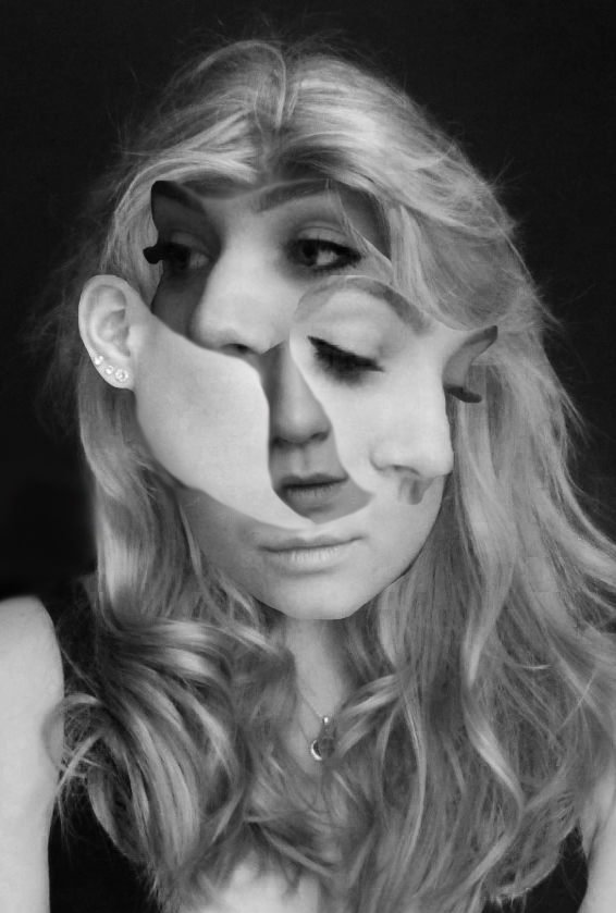
I used one-point lighting for these images and edited them in black and white as the photographer I chose (Jack Davison) to link my ideas to photographer their images in black and white. I feel like it makes it the photos look more dull and mysterious which fits perfectly with my idea of lack of identity. I tried to edit it in a way that shows different tones and shades of dark . My friends face is directly composted in the middle of the photo as I wanted her to be in the center and the main eye-catching subject. No distractions in the background helps with making her the only focus. I wanted to use 3 images lined next to each other as I think it gives you more to look at instead of just one image. By using 3 images I wanted to show that everyone has a view different personalities or even identities and it fits into my idea of lack of identity as people try to discover what they’re actually like and why we act different around others.

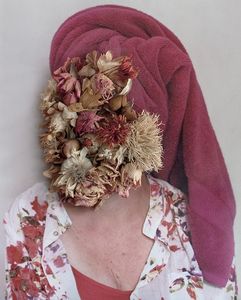
I like how I used the’ liquify tool’ because it links back to my chosen photographers work. I used more editing in my images whereas he uses more props such as hands and flowers to cover the face already. I only dragged the eyes out as I still wanted some of the face to be revealed, by erasing her eyes it took a big part of her identity away as you can’t really make out what she looks like anymore. I want the meaning behind it to be that sometimes we can be blind towards who we actually are and as young people or students we haven’t yet truly discovered our identity or who we yet will be.

I achieved what I wanted to do and I presented my idea of lack of identity very well through the way I edited my images. I think I linked my work back to my chosen photographer well, as Jack Davison also blurs his models faces out and cuts out parts of the faces into weird shapes. I cropped most of my images down so it’s just very focused on the face instead of the whole body and a background as it’s the style the photographer works with too.

CONTROLLED CONDITIONS Identity- Editing

Here I wanted to explore a few ways of editing my images to further convey the message I was trying to give.

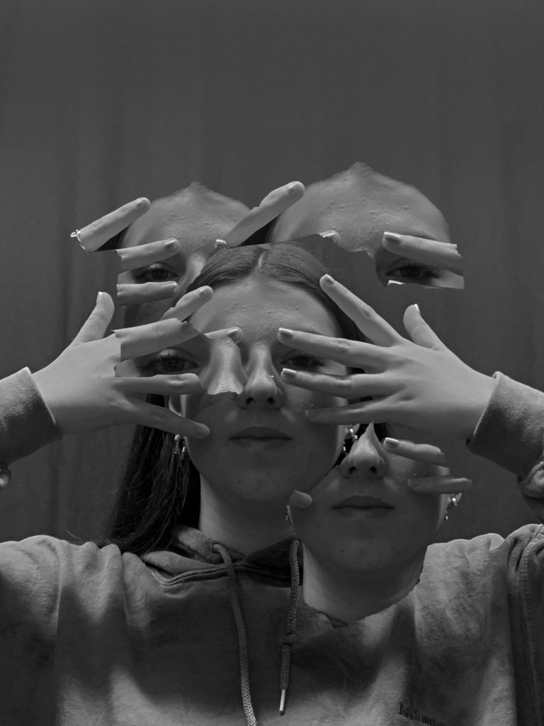
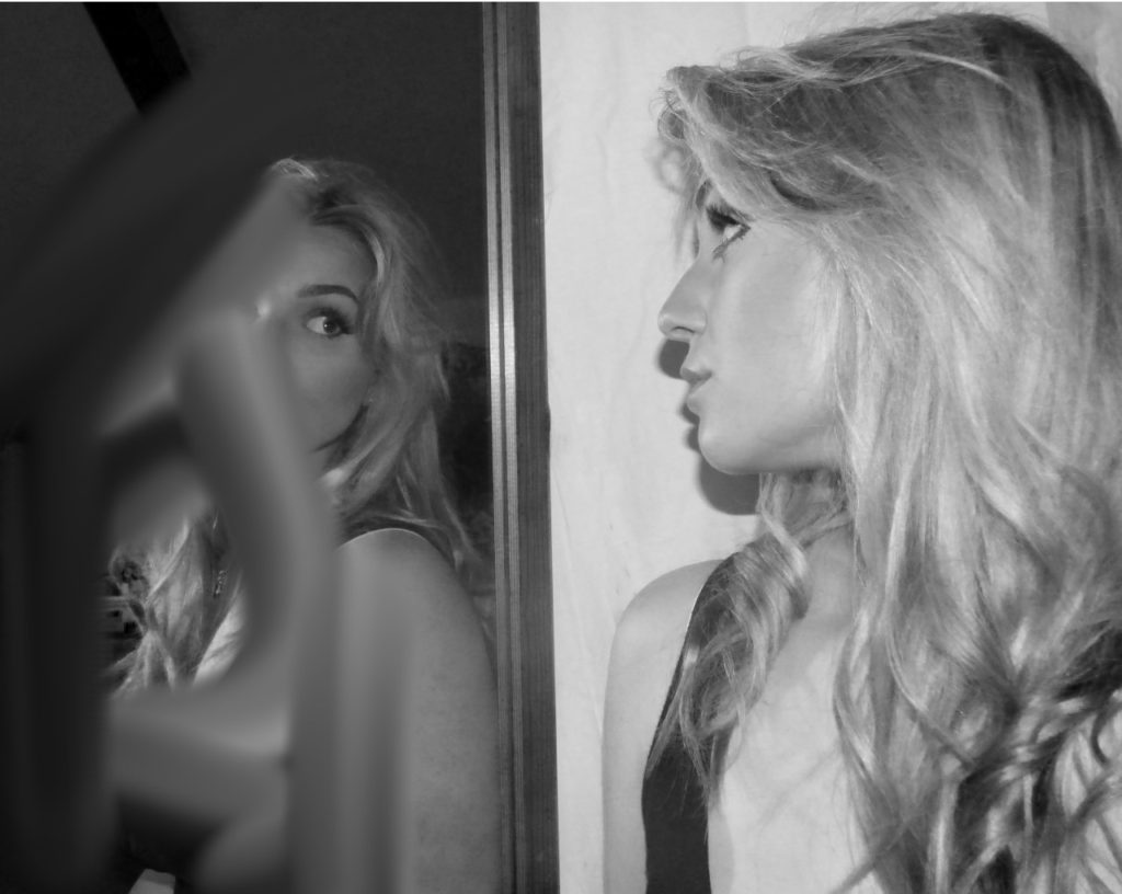
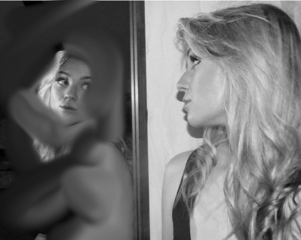
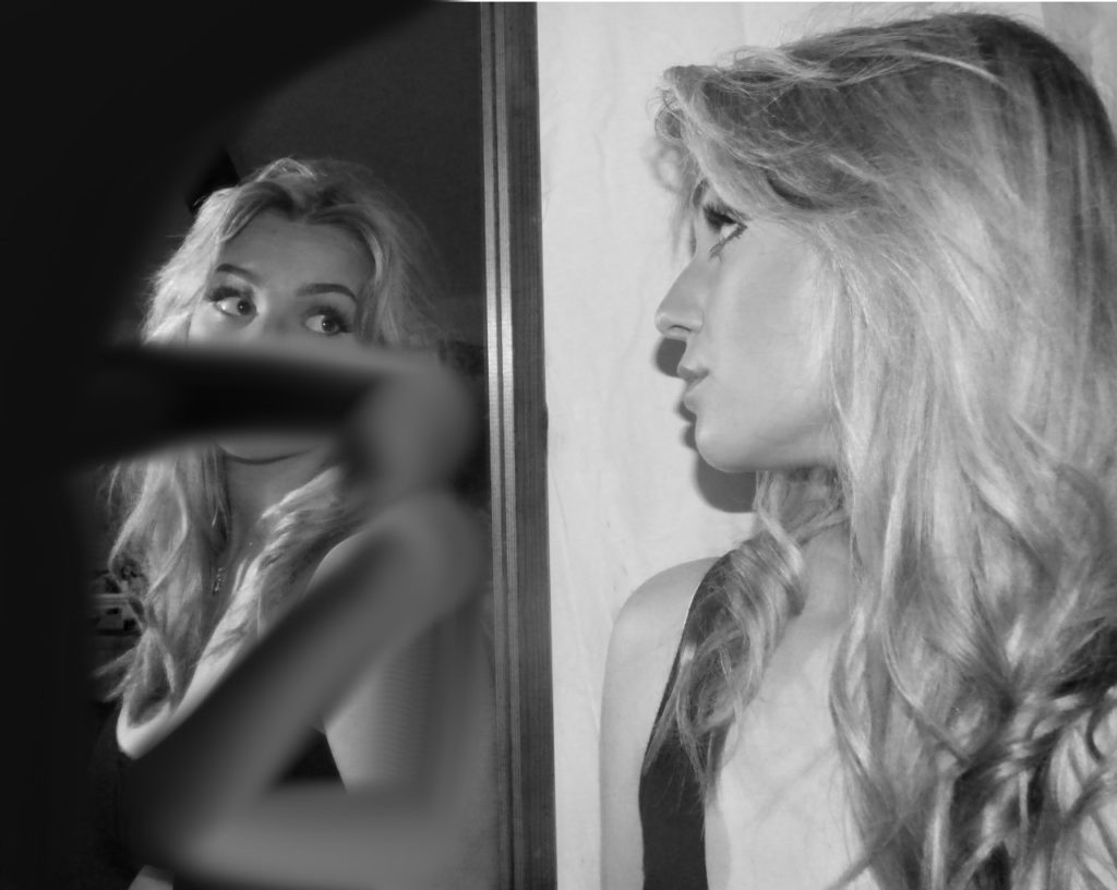
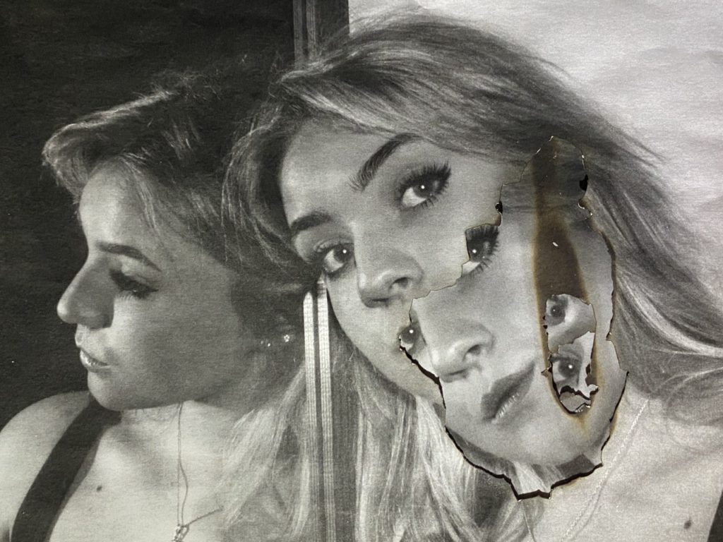
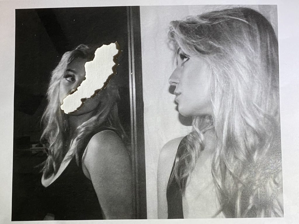
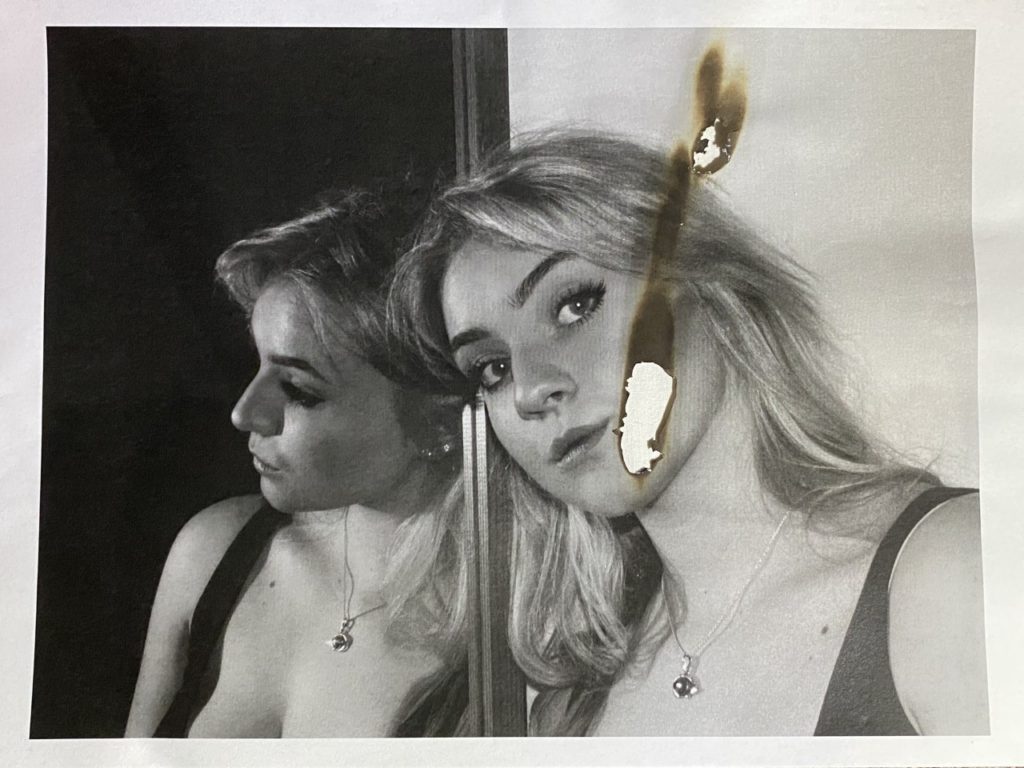
For the edits above, I used an app called procreate where I downloaded the same image a few times and used a smudge tool to create smudges in the reflection. I made sure to keep certain facial features to make it clear that this was a reflection of the subject in the mirror.

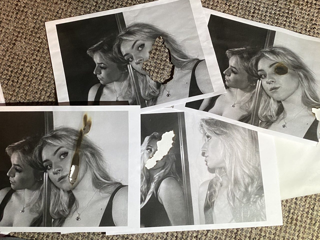
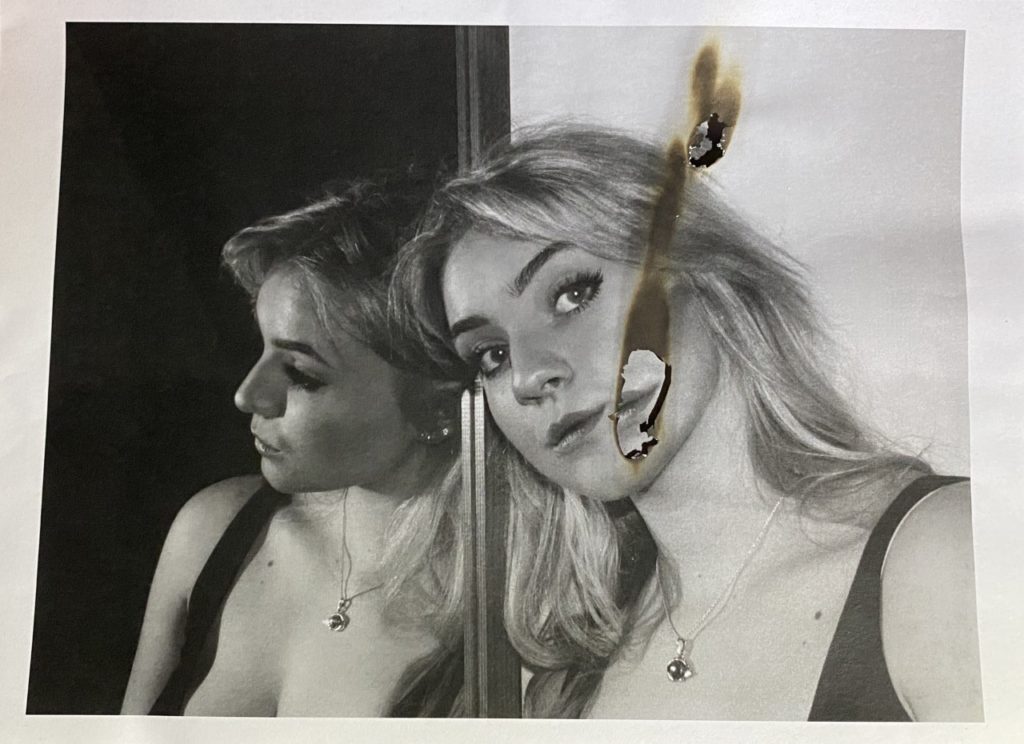
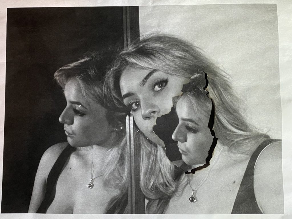
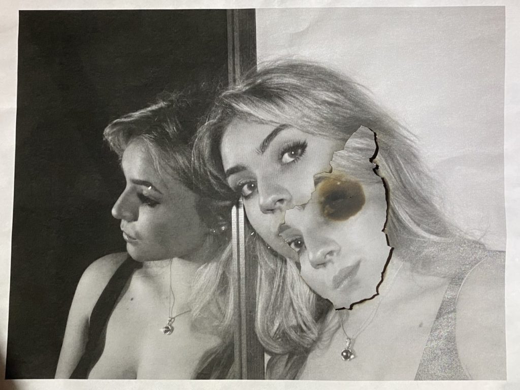
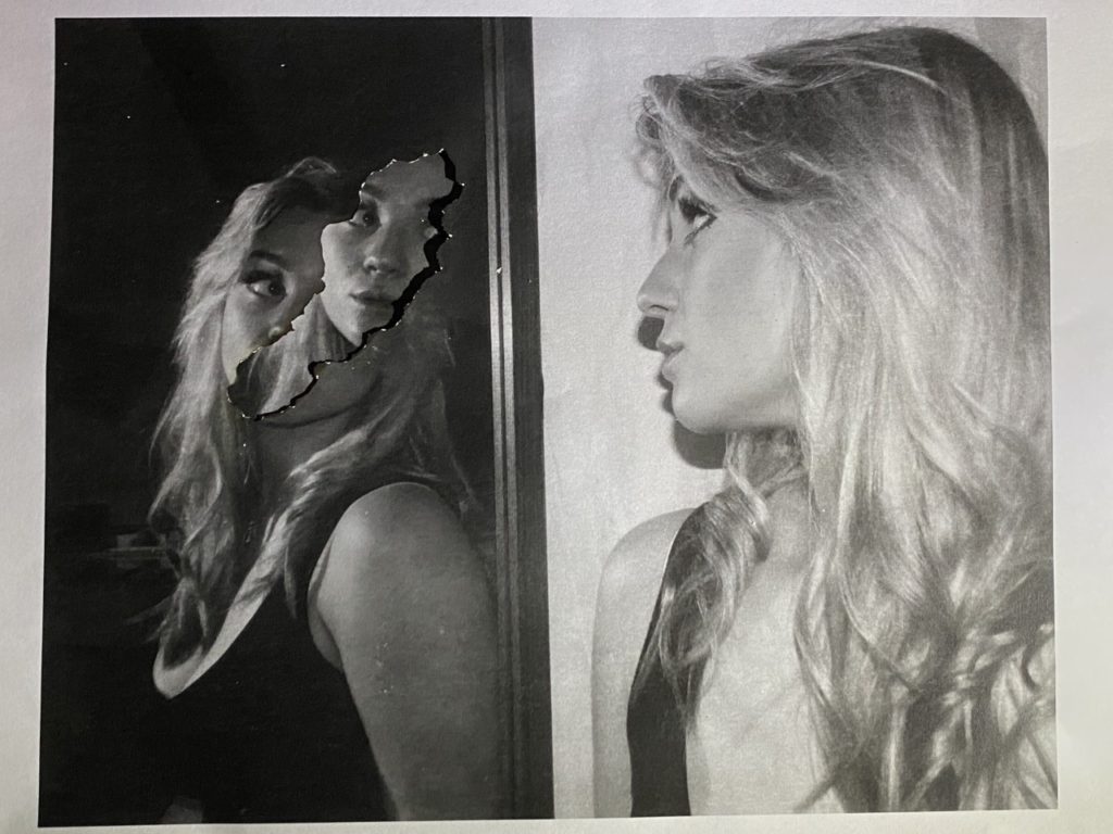
Above is a set of images which I printed on paper and attempted to burn in the style of Lucas Simoes. I places the lighter beneath the images and burnt them from a slight distance. The difference between mine and his techniques is that my images were not printed on photographic paper (which is what created the warm bright colours where his burns were).

I then took my pictures of the prints. I tried a variety of placements: some I placed on plain white paper to create a bright centre of where the burn was but then I also decided to layer the images on top of each other to create distortions . As the photographs were burnt, it created a dark line around the edges of the holes in the paper. This created a sense of shadow and that the images below were on top- whereas they were actually placed beneath.

In these images, The creation of distortions and burns were purposefully placed in both the reflection and the person. This is because the idea, that the way you are seen by others is not the same in which you see yourself, works both ways.

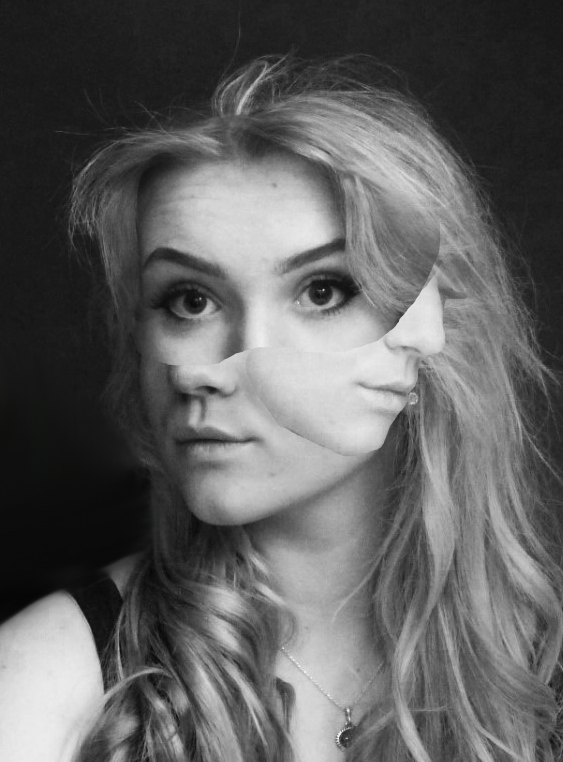
Above are my edits inspired by Jesse Draxler.

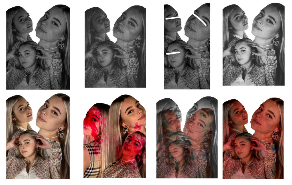
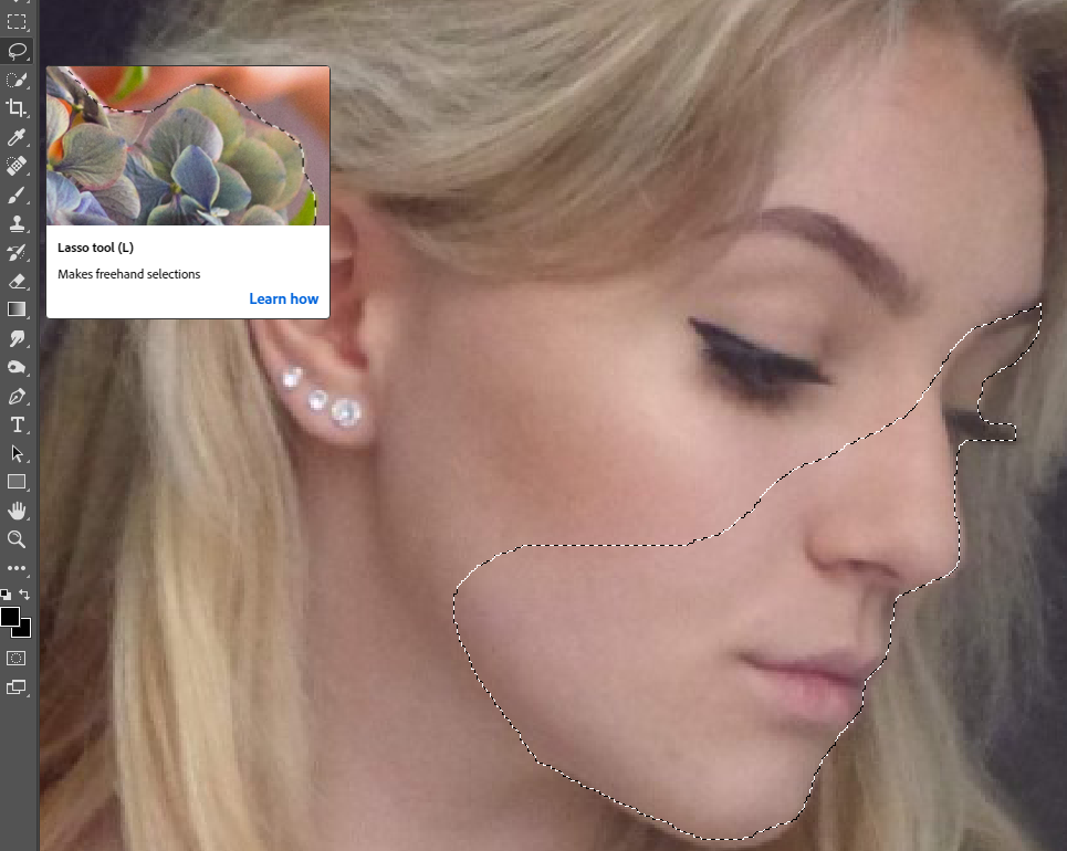
To create these photographs I used photoshop, and on there I used the lasso tool and by freehand cut out parts of all the portrait images for a variety of angles and placed them on one image in a way I though sat best. I turned the image black and white and increased the contrast for the image to stand out more like Draxler’s work.

IDENTITY AND PLACE – PHOTOSHOOT 1

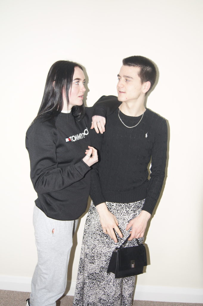
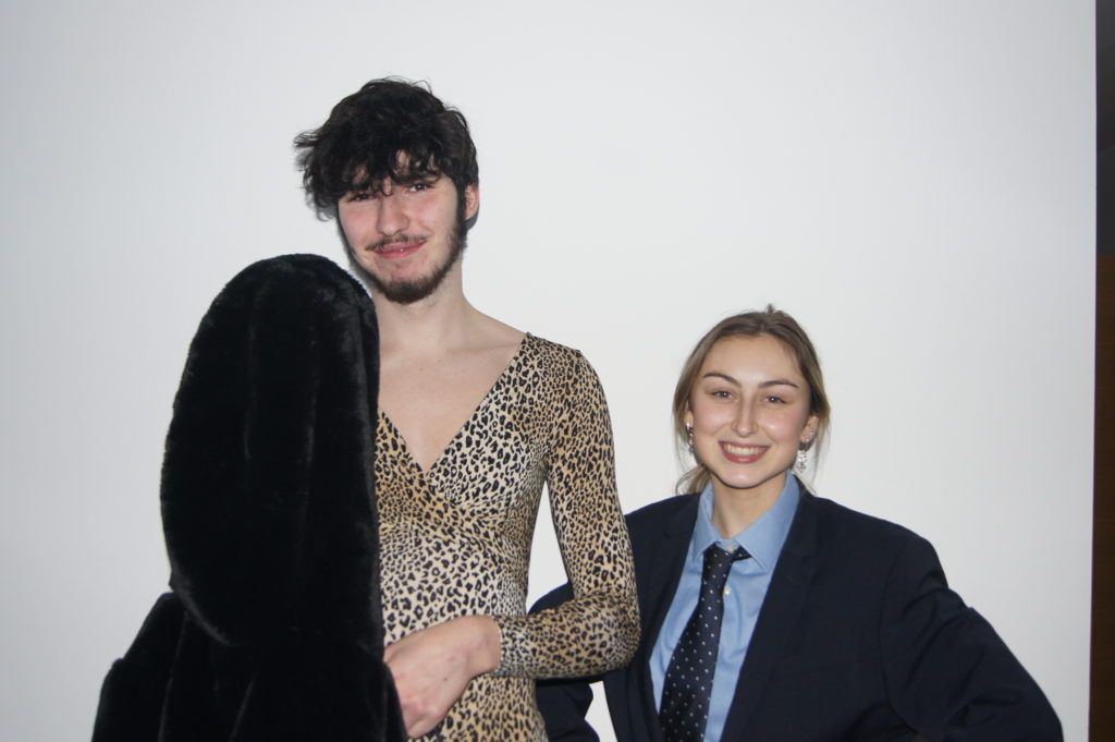
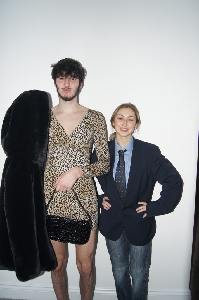
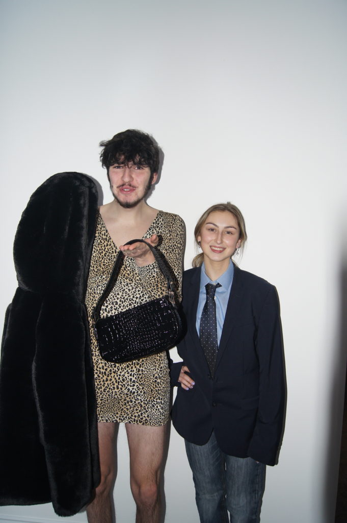
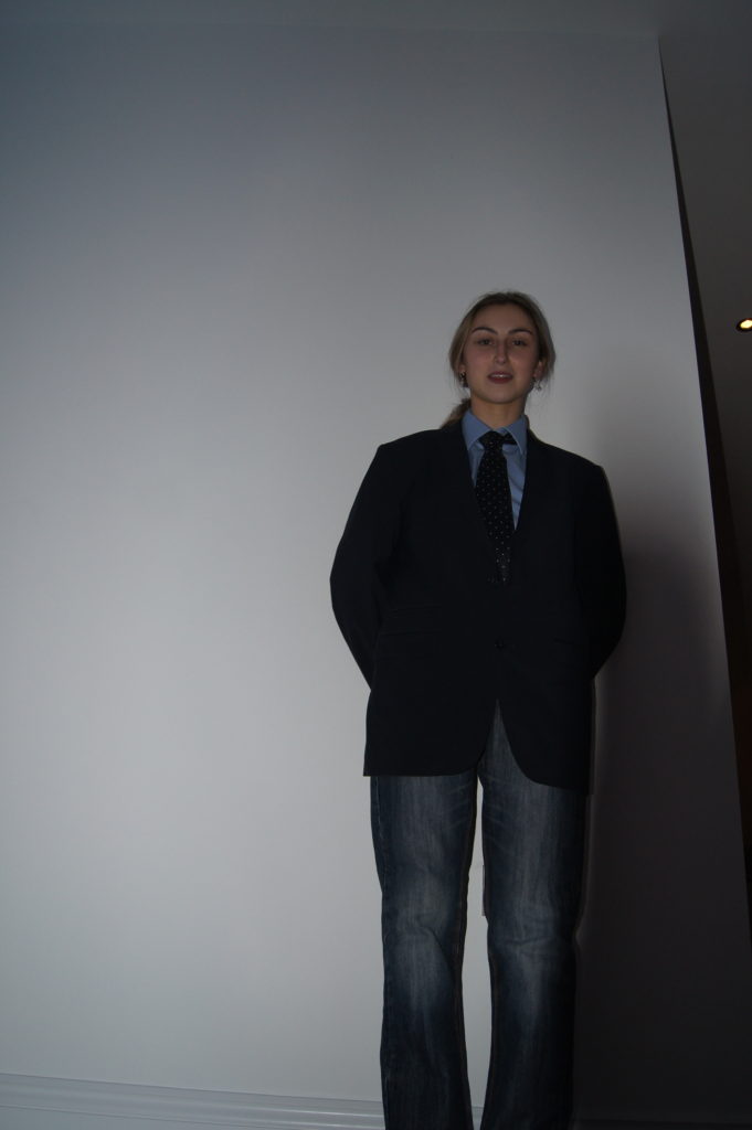
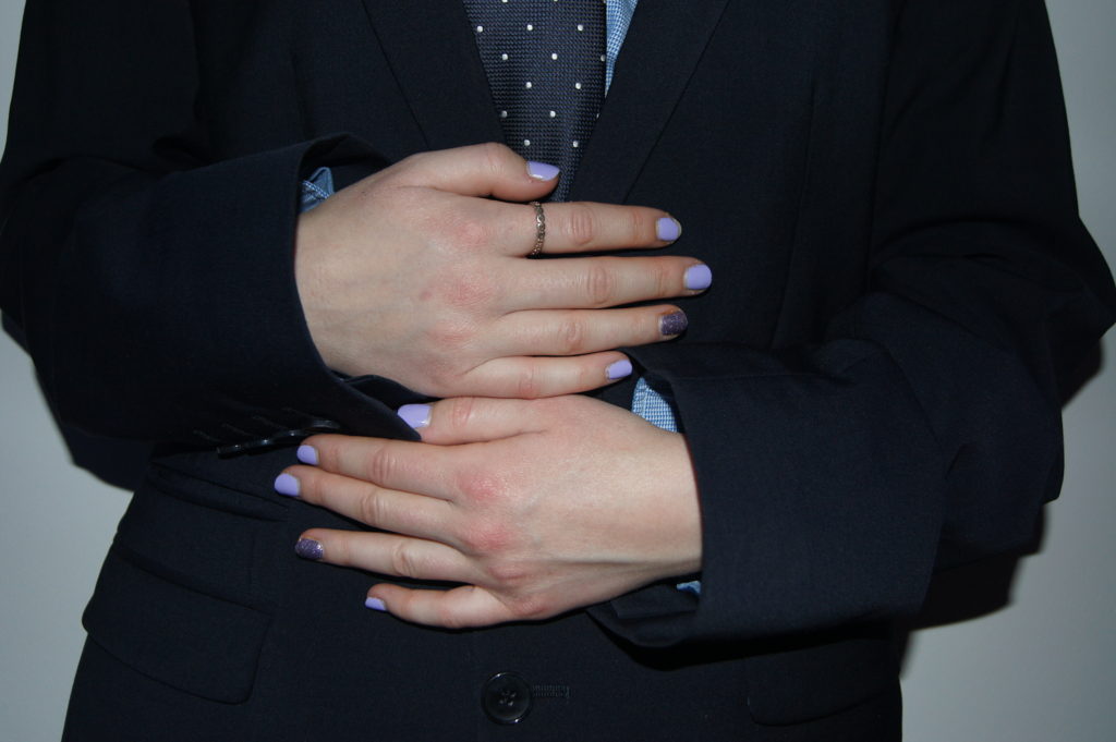
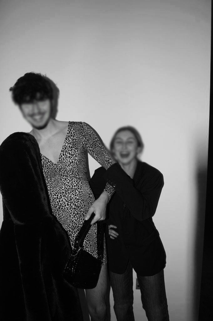
In this photo shoot I was highly inspired by the photographer Lissa Rivera’s as I like the way in which she made a males femininity to a strength rather than a weakness, whereas other people look at people wearing women’s clothing a negative attribute. I’m going to try and recreate some photographs similar to her work by asking a male model to wear feminine clothing as well as add my own idea of switching it to the other way round so that a female is wearing male clothing.

Later on once I have gathered the best selection of images I have i am going to use photo shop and desaturate some of the photographs. Once I have done that i’m going to use the blur tool to disguise the faces so it shadows and disguises there identity to a further extent. Furthermore i’m also going to leave several of the photos in colour and experiment with the saturation and contrast. After that I am going to use the eyedropper tool to get the exact colour of the models skin colour to then use the paintbrush to yet again disguise their identity.

Best Images:

I personally feel that these images worked best as they clearly show how clothes should not define your identity relating to the series called ‘beautiful boy’ by Lissa Rivera’s. Additionally I also believe that these photos may have worked better if I used natural lighting instead of artificial as it may of added depth to my work. However I do think that they still have a good reflection to identity and I like the way the black and white photos adds more contrast to the original shadows.

identity and place case study

CLAUDE CAHUN

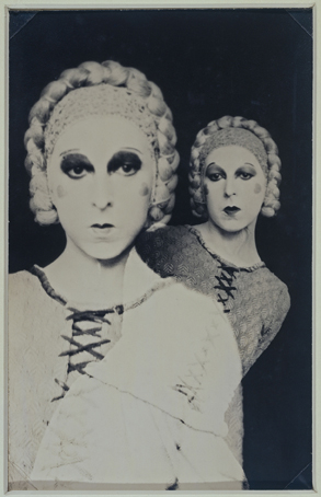
Claude Cahun (1894 – 1954) was a French surrealist photographer, sculptor and writer. Born Lucy Renee Mathilde Schwob, they adopted the pseudonym Cahun in 1917, and are best known for their self-portraits, in which they assumed a variety of different and eclectic personas. Cahun’s work challenged the traditional concepts of gender roles, and in their autobiography they state: ‘Masculine? Feminine? It depends on the situation. Neuter is the only gender that always suits me.‘ It is likely Cahun would have identified as non-binary today.

In 1937, they settled in Jersey with their partner Suzanne Malherbe (pseudonym Marcel Moore). Following the German occupation of the island in 1940, both Cahun and Moore became active as resistance workers and propagandists, working extensively to produce anti-German fliers, which they would place discreetly in soldiers’ pockets or in cigarette packages. Their resistance efforts were not only political, but also artistic; using their creative abilities to undermine and manipulate the authority they hated. In many ways, Cahun’s life was marked by a sense of role reversal, and like many early queer pioneers, their public identity became a commentary upon the public’s opinions of sexuality, gender, beauty, and logic. Their adoption of a gender neutral name and their androgynous self-portraits display a revolutionary way of thinking and creating, experimenting with the audience’s understanding of photography as a documentation of reality.

CINDY SHERMAN

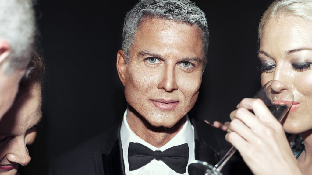
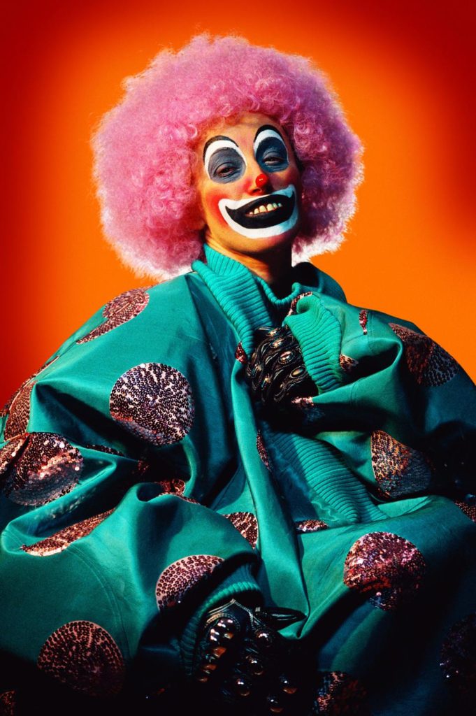
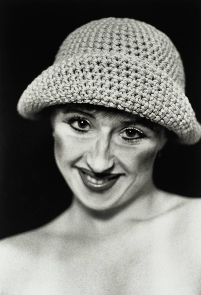
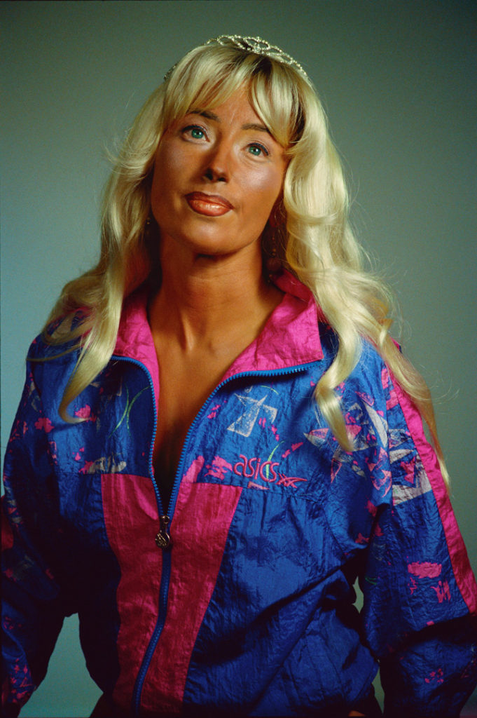
Cindy Sherman (1954 – ) is an American artist whose work consists primarily of photographic self-portraits, depicting herself in many different contexts and as various imagined characters. In 1972, Sherman enrolled in the visual arts department at Buffalo State College, where she began painting. During this time, she began to explore the ideas which became a hallmark of her work: She dressed herself as different characters, cobbled together from thrift-store clothing. Sherman works in series, typically photographing herself in a range of costumes. To create her photographs, Sherman shoots alone in her studio, assuming multiple roles as author, director, make-up artist, hairstylist, wardrobe mistress, and model. She explained to The New York Times in 1990, “I feel I’m anonymous in my work. When I look at the pictures, I never see myself; they aren’t self-portraits. Sometimes I disappear.” She describes her process as intuitive, and that she responds to elements of a setting such as light, mood, location, and costume, and will continue to change external elements until she finds what she wants.

Sherman’s work is often linked to feminism, since her photos call attention to the objectification of women in the media. Sherman’s 1981 series Centerfolds contains pseudo-voyeuristic images of young women. Her 2008 series Society Pictures addresses the obsession with female youth and beauty in American society. Her most recent series, the 2016 Imitation of Life, explores the glamour that can be found within mature women. By using stylized, vintage costumes and heavy makeup, Sherman is rendered as a subject that looks almost artificial, aside from her conspicuously-placed, aged hands, which point to the reality behind the illusion. Sherman has identified an uncertainty toward the Untitled series’ relationship with the male gaze.

IMAGE COMPARISON

Despite the fact that these two photographs were taken almost 50 years apart, the message behind each of them is strikingly similar; that identity can be whatever you want it to be. Both photographers explore what it means to be perceived and judged by others, and, perhaps more harshly, by yourself. They have stripped themselves of all things, both physical and emotional, in order to transform themselves into re-invented and more developed versions of their previous selves, with both of them taking on the roles of various different personas and characters. For the brief moments during which they are in front of the camera, they are able to let go of what they and society thinks they ‘should’ be, and express themselves through their art form. Both images have been shot in plain black and white tones, with Sherman adding the effect in order to accurately portray her character’s time of relevance. They have also both been shot against a black backdrop, which means we can assume that they were captured in a studio of some kind. The black backdrop also allows the viewer to see Cahun and Sherman clearly, with nothing in the background of the images becoming a distraction to the eye. Additionally, it strips the photograph of any depth, making both images appear flat and two dimensional. Furthermore, the two subjects have very pale complexions, which contrasts heavily to the dark background. As these pictures were captured in a studio, it is highly likely that artificial lighting was used to illuminate the subjects, and we can see that by the way the light is spread evenly over Sherman, we can assume that 3 point lighting was used. Another similarity is that both Cahun and Sherman have used makeup to exaggerate their features as a way to emphasise their respective characters. For example, we can see that Cahun has drawn on her bottom eyelashes in order to make her eyes appear larger and more doe-like, and Sherman has applied a heavy amount of contour to her cheekbones. This can be linked to the theme of identity as makeup is often used by people to create an entirely new face, or alter the one they had before.

Identity and Place case study

Claude Cahun was a french photographer whose work was both personal and political and often undermined traditional concepts of static gender roles. The majority of her photographs were self portraits which helped Claude Cahun develop her ideas of masculinity as well as femininity, and how she felt that it depends on the situation. She believed that Neuter is the only gender that always suited Claude Cahun, meaning that she did not believe in specific genders.

Originally her name was Lucy Schwob however she decided she would rather be called Claude Cahun as the name is more gender neutral. In French the name Claude could either refer to a man or woman which she was ambitious about. Additionally she also took her surname from her grandmother Mathilda Cahun.

In 1937 Claude Cahun moved to jersey along with her stepsister and lover Marcel Moore. They were imprisoned for activities in the resistance during the occupation, and decided to stay in jersey after the world war.

Lissa Rivera’s is a fine art photographer based in New York City who released a series of photographs called ‘Beautiful Boy’.

This involved the same male featuring in a variety of photos. This series shows the male dressed up in female clothes; this attire implies that the clothes and accessories do not define the identity of a person. The flowy garments assign a female label to them, with skirts and dresses being the main focus on what gender you are.

Lissa Rivera’s found that while taking her first photographs of her series ‘beautiful boy’ she found it very emotional as she could clearly tell how vulnerable her model was; who eventually became her romantic partner. Furthermore the model and Lissa Rivera’s began taking photos every weekend to continue her series, which lead to her winning the magnum photography award for several of her pictures in 2017.

She felt that it was of importance to show his femininity as a strength rather than a weakness, which helps the message across that the clothes you wear do not identify who you are as a person.

Image Analysis

Claude Cahun used black and white tones in his photograph which creates a dark environment adding several tones as well as depth. Additionally the background of her photos appear to be simple and empty, which creates more tension and focus to the model.

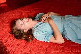
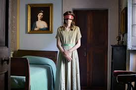
Lissa Rivera’s photograph is very different in comparison to Claude Cahun’s work as she has chosen to use colour within her photographs creating them to become eye catching and empowering. The way in which she has chosen to use feminine clothes and accessories on the model creates the idea that femininity shouldn’t be seen as a weakness and should be seen as a strength. Furthermore the background of her photographs are busy which may take the focus of the model itself.

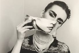
A similarity which both artist have taken into account is the way in which both of the models faces are disguised in certain ways as, Claude Cahun has used a cut-out of someone’s chin and asked the model to place it other hers which helps the idea of identity as it hides the models face. Lissa Rivera’s used a similar idea of disguising a section of the models face with a blindfold covering the eyes hiding a key feature of the models face, which impacts the way you view the photograph.

However the artists also have multiple differences in these two photos in particular as Claude Cahun’s photography was taken in the 1900s where as Lissa Rivera’s photography was taken in more recent years, therefore you can see a clear difference in where technology has adapted to have better quality photographs. Additionally Claude Cahun has chosen to take his photos in black and white creating harsh and dark tones whereas Lissa Rivera’s has chosen to use colour. However they both equally have a different selections of details in several ways.

what is identity?

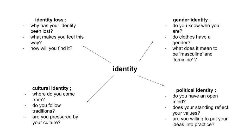
The term ‘identity’ is defined as the fact of being who or what a person or thing is, and a close similarity or affinity. An individual’s identity can be influenced by their environment and their upbringing, as well as social factors such as culture, political standing, friendships and relationships. Additionally, an individual’s identity may be defined by their loss or lack of it; if an individual is unsure about who they are or who they want to be, then this in itself is also their identity. An identity is something that everyone has, regardless of whether they know it or not.

MOODBOARDS

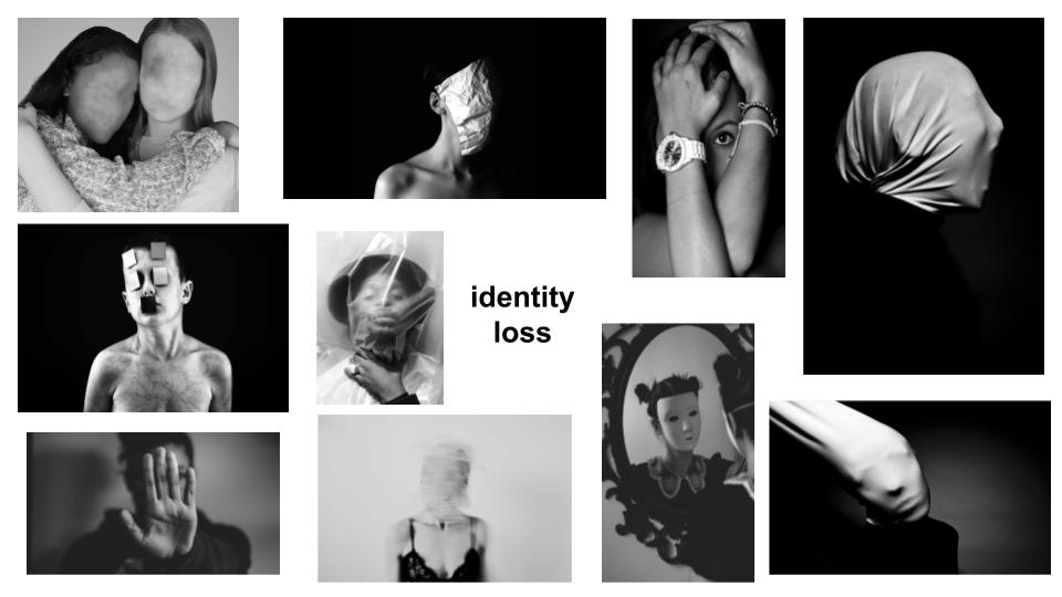
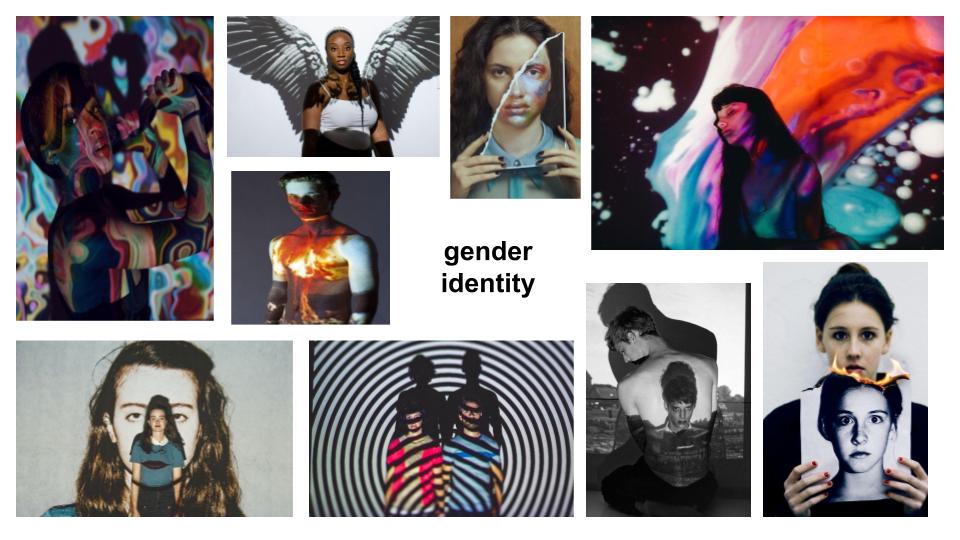
My first initial ideas for my two photoshoots were to explore the themes of identity loss and gender identity. I think that especially in recent years, society as a whole has learned to be a lot more open and accepting of people’s choices about how they wish to be seen, not only by themselves but by the rest of the world too. Additionally, social media and the internet has had a heavy influence on topics such as self-confidence and the idea of the ‘perfect’ life. This could be tied into the theme of identity loss as what is being posted online is not always the truth; these people have lost themselves in the world of perfection so much that they do not know who they are any more. With the LGBTQ+ community slowly but surely being widely accepted across the world, the strict, traditional gender roles which have been in place for generations are becoming less and less prevalent, allowing these lines of restriction to be blurred and crossed by all members of society. Freedom of expression is something which everyone is entitled to, and I think it would be interesting to document the different ways in which individuals achieve this.