Category Archives: Uncategorized

Filters

Author:
Category:

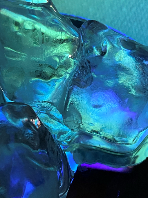
surface and colours

shoot 1shoot 2
whoN/AN/A
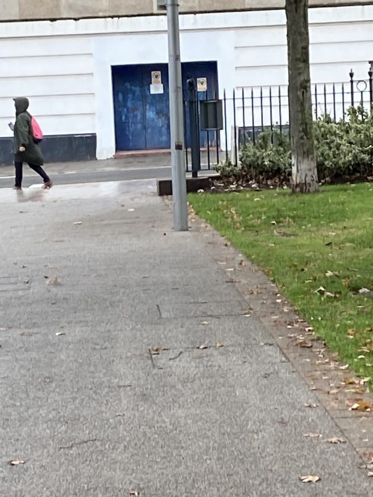
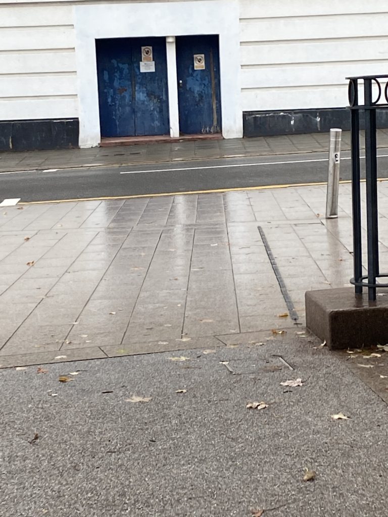
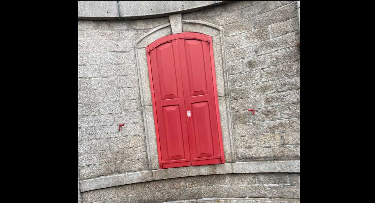
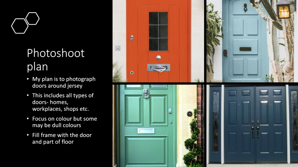
what doorsdoors
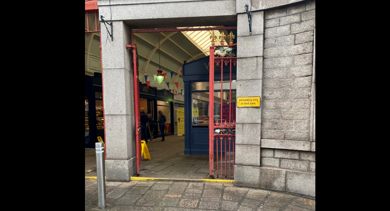
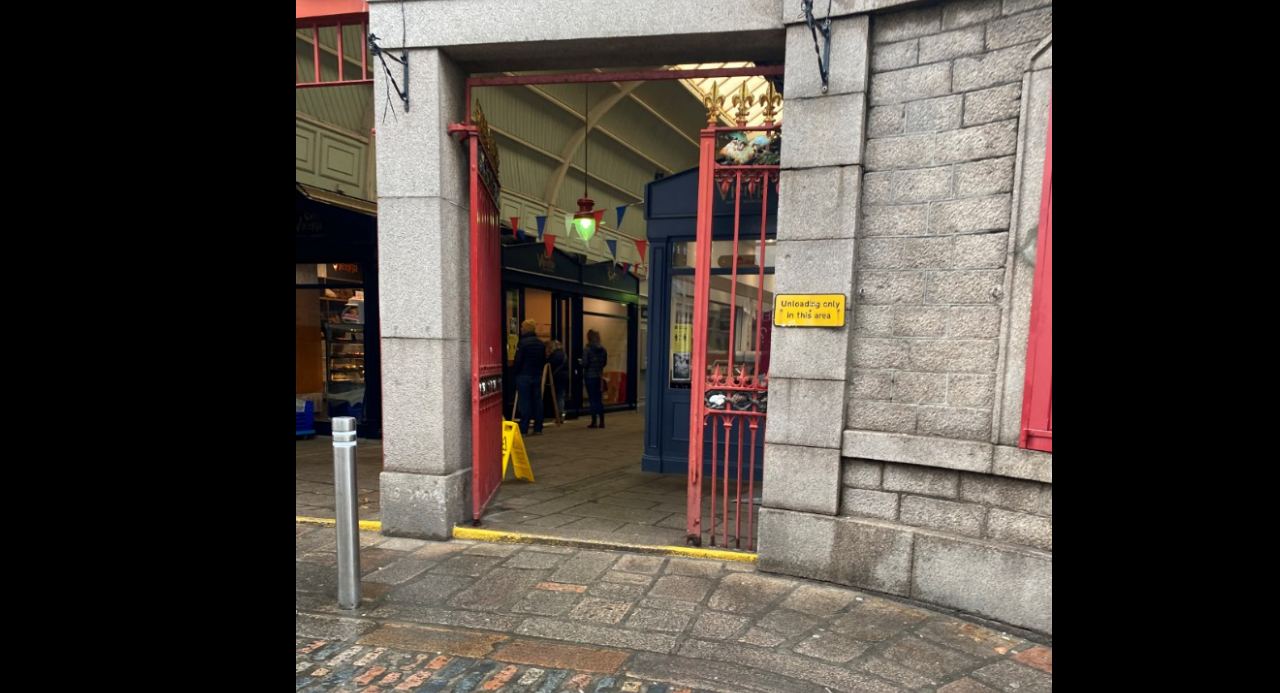
wheretownthe market
whenMonday after school Tuesday after work
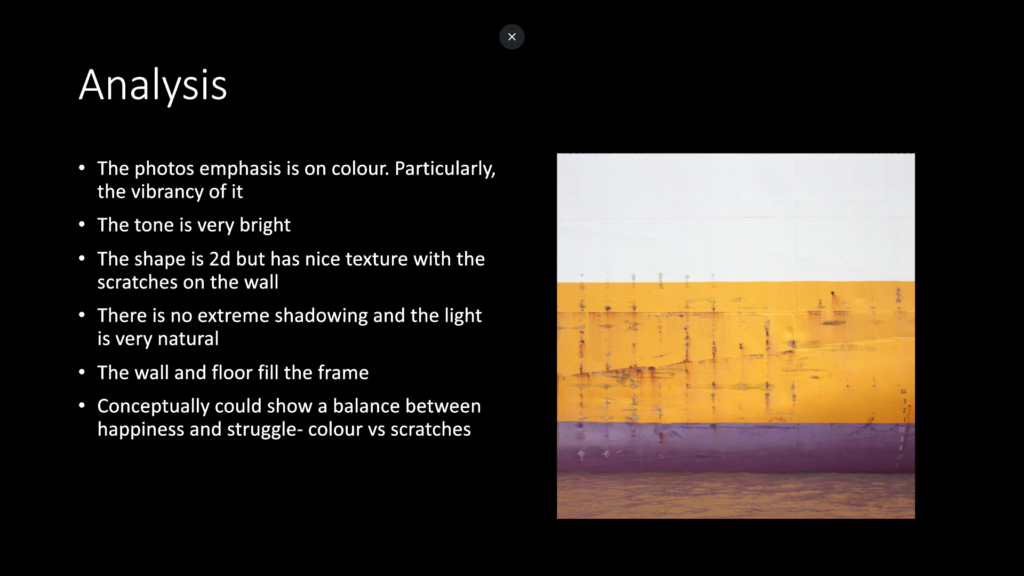
whyto replicate Hallam-Day’s photosto replicate Hallam-Day’s photos
howcamera on phonecamera on phone

SHOOT 1

I think that these photos stay true to Hallam-Days original images as they blend town life with busted doors. I would have liked to take more but I looked weird taking photos of people’s houses and shops in town so was limited to only a few photos 

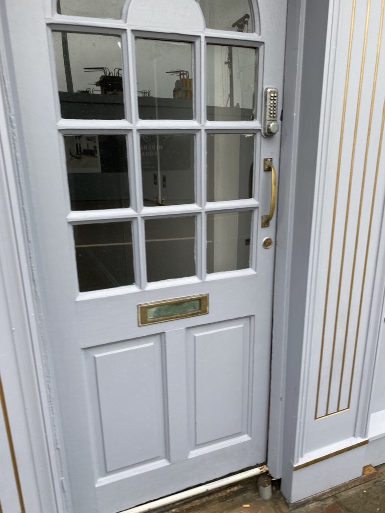
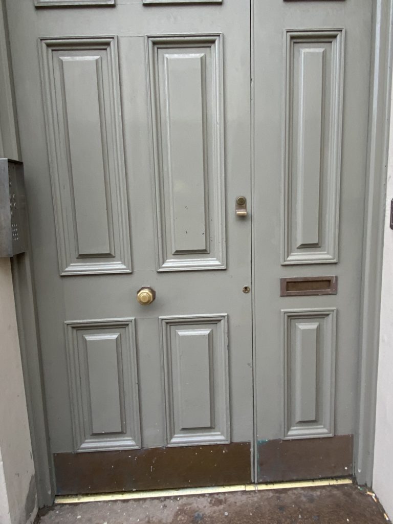
SHOOT 2
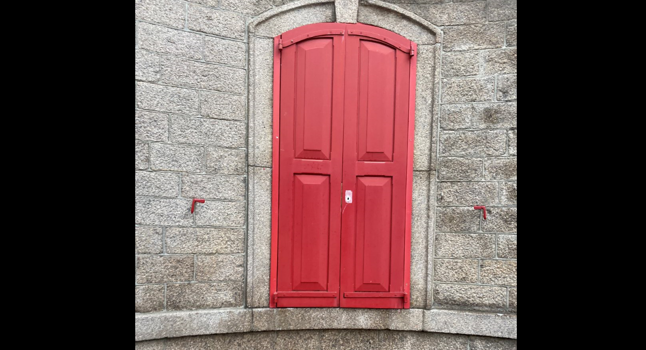
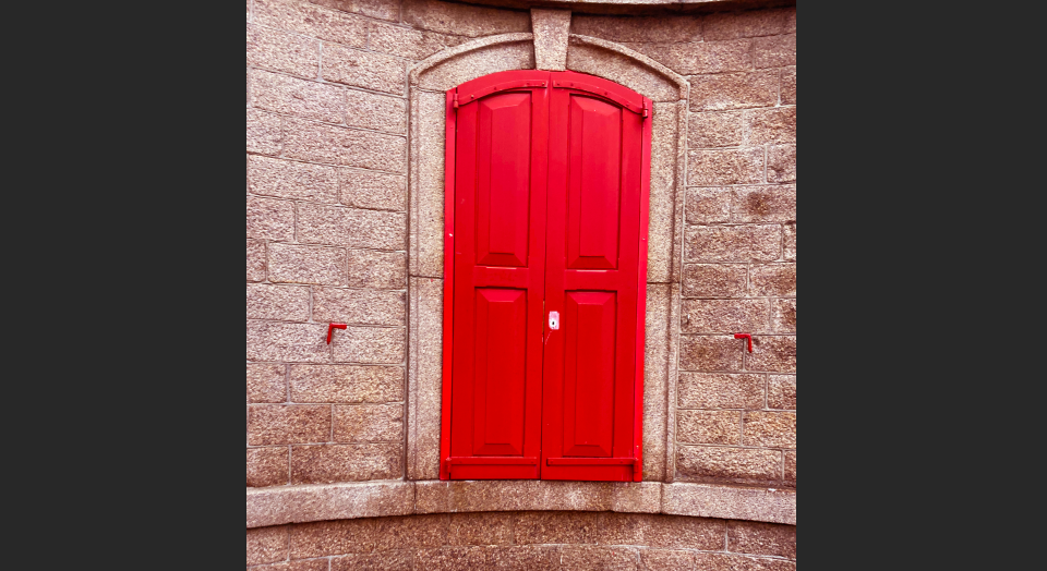
This is my favourite photo from this shoot. I really like the central composition .

This shoot produced a few nice photos however I had the same issue as the first photo shoot in which I looked really weird taking photos of doors in town so couldn’t take as many as I would have wanted.

EDITING
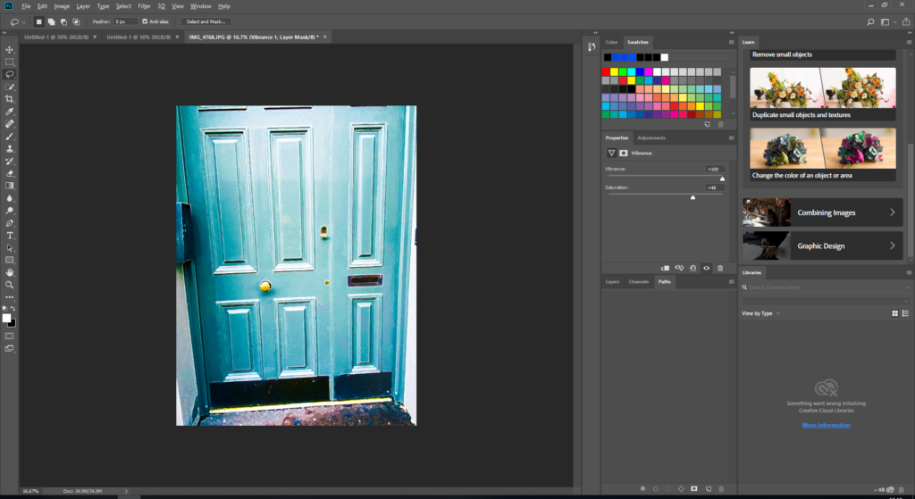
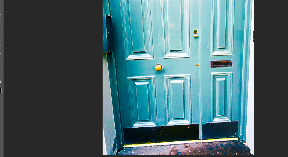
To make the photo more like Hallam-Days, I wanted it to be a really vibrant and blue so using Photoshop I made the vibrancy and saturation really high and also put the blue and cyan out of balance to make the colour really stand out.
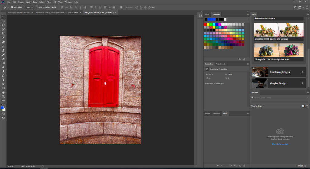
For the door in the market I used the same photo shopping techniques but with red instead of blue and cyan.

FINAL IMAGES
COMPARISON TO HALLAM-DAY’S WORK

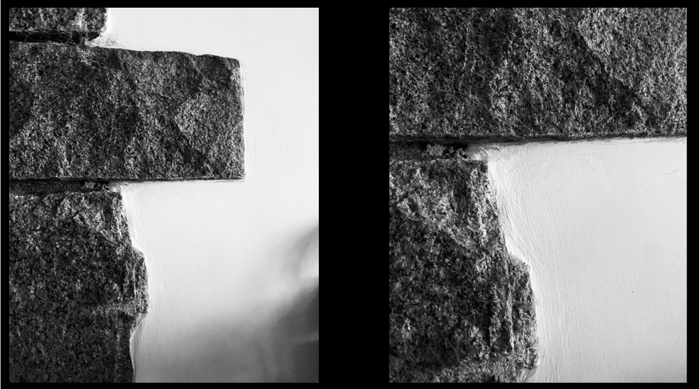
In conclusion, my photos had some similarities to Hallam-Days. The use of surfaces as the subject was one of these. I think that i managed to follow his grungy style but i think that his photos were more naturally colourful whilst I had to edit a lot of my colour in.

EVALUATION AND CRITIQUES

I really liked my photos and felt that the editing process really added a lot to them however it would have been better if I had more photos to choose from .Next time I will take more photos so that I have more photos to choose so will ultimately have better photos.

REPETITION, PATTERN, RHYTHM REFLECTION AND SYMMETRY – Classwork Blog Post 1

Nick Albertson

NICK ALBERTSON
White Light 17, 2017, archival pigment print

Compare

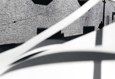
Both images show strong lighting from where the camera is pointing having a tonal range going from light at the front to dark at the back. Both photos use a fast shutter speed at the images are in focus and not blurry from movement, with Albertson’s and Metzker’s photos both use straight lines going across the photo of just making a rectangular or square shapes which all spaces are in a 2D layout making the image look flat. The photos produced by these photographers reflect the year/years these photos have been taken where Albertson’s image looks slightly futuristic whereas Metzker’s igmage looks old and in time frame.

Ray Metzker

This image has an empty alt attribute; its file name is screen-shot-2017-09-23-at-18-44-29.png
Pictus Interruptus series, made between 1976 and 1981

Contrast

In Albertson’s photo he bases his image on colour whereas Metzker uses black and white tones instead, the focus of the photo in Metzker is behind the white lines focused on the wall which is the opposite to Abertson’s as he focuses at the centre at the front. With Abertson’s photo he uses set lighting which he prepares for his photos which is different to Metzker as he uses natural lighting and doesn’t adjust the scenery except with an object to put in front of the camera such as a piece of paper to change the boring streets into something that is irregular whereas Albertson doesn’t block the camera and focuses on one centre object.

repetition, pattern, rhythm, reflection and symmetry.

Harry Callahan

Harry Callahan | Biography & Art Works | Huxley-Parlour Gallery

Alfred Stieglitz

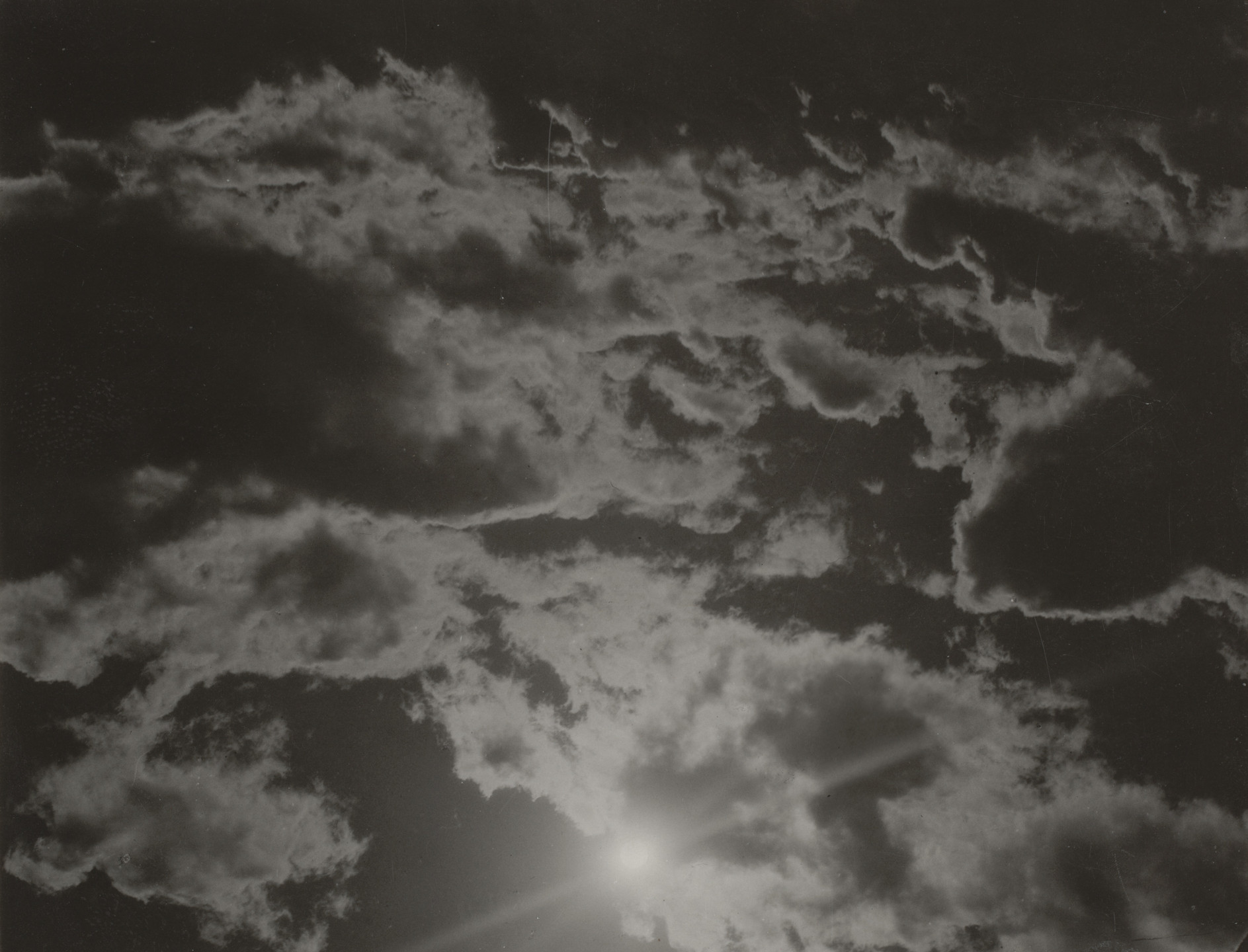
Alfred Stieglitz. Equivalent. 1923 | MoMA

Callahan’s primary subjects were landscapes, city-scapes, and varied, unconventional portraits.

Stieglitz pointed his lens toward the clouds above Lake George, New York. He eventually made more than two hundred photographs in the series he initially called Songs of the Sky and later Equivalents. 

While both photographs are in black and white, Callahan’s image has a harsh contrast between a bright white and a deep black, compared to Stieglitz’s photo, where there is a range of grey scale tones.

Stieglitz attempted to awaken in the viewer the emotional equivalent of his own state of mind at the time he took the picture and to show that the content of a photograph was different from its subject, similar to Callahan who once said “The difference between the casual impression and the intensified image is about as great as that separating the average business letter from a poem,”  in 1964. “If you choose your subject selectively, intuitively, the camera can write poetry.” Both photographers are implying how you view the image, emotionally, is very different to the subject of the photograph.

Both images are of natural forms in natural day light, both have repetition of the same natural form, Callahan’s being trees and Stieglitz’s clouds.

In Callahan’s photograph, the lighting is the same all over the image, compared to the lighting in Stieglitz’s image, where the clouds naturally create a darker shadow, then they break, letting a burst of bright sunlight enter the captured photograph and reflect against the lens of the camera.

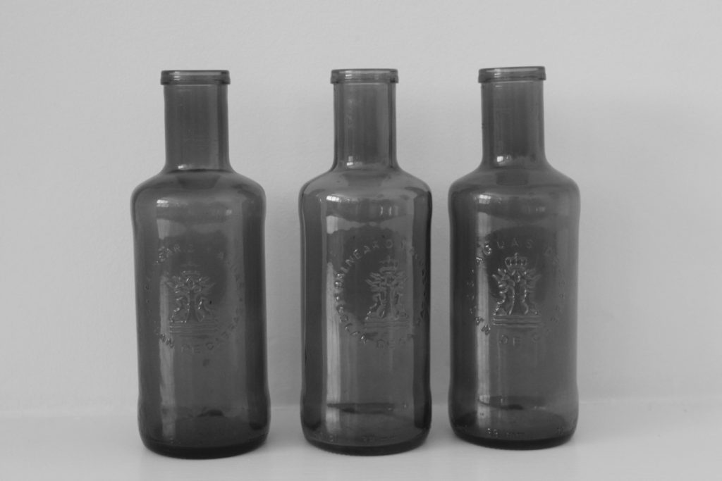
Black light

Keld Helmer-Petersen

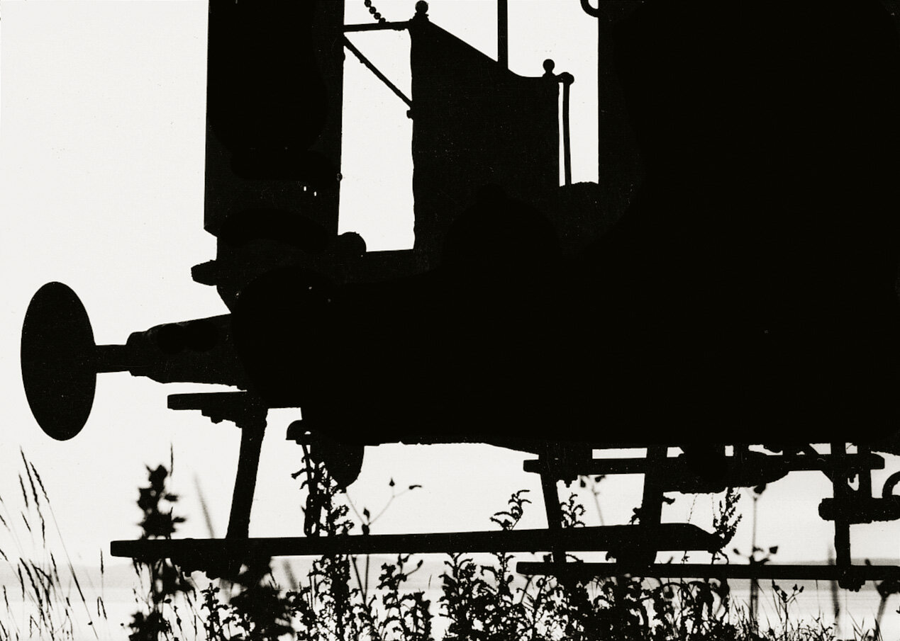
Keld Helmer-Petersen was a Danish photographer who became very popular and internationally recognized in the 1940’s and 1950’s. He was praised for his abstract and colour photographs and his career lasted about 70 years and he had a very strong interest in modern architecture. This included very industrial and structural areas. He contrasted the images to be very black and white which later in the project i will interpret myself.

KELD HELMER-PETERSEN
KELD HELMER-PETERSEN (1920-2013) | Architectural Studies, 1960s | Christie's
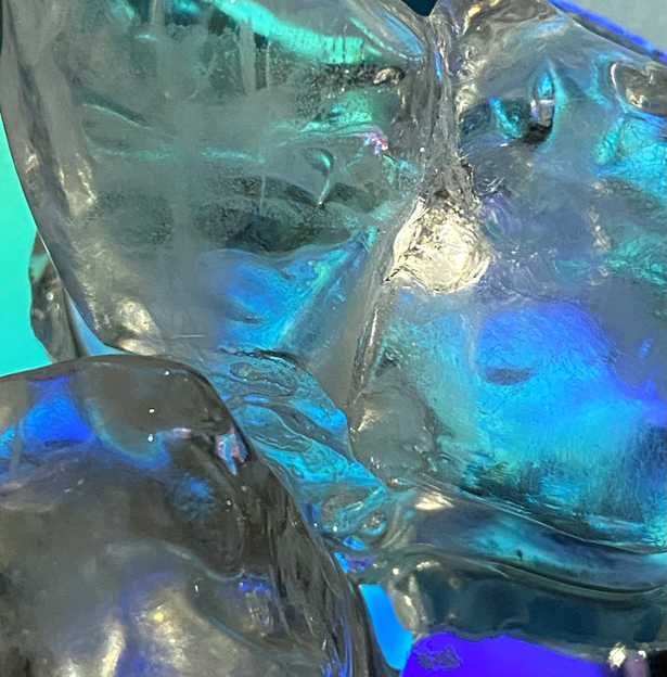
Original Images

My Interpretation

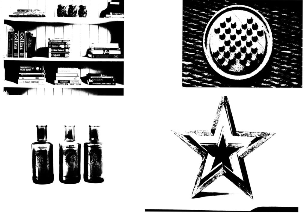
The vivid and opposing contrast of the black and white in the images creates a very dark and shadow filled world. It seems very ghostly and empty. The way the images have very distinctive edges and empty spaces reminds me of threshold artwork.

Threshold Printables - Altered Art, Assemblage Mixed Media & Workshops

Improved Interpretation – Originals

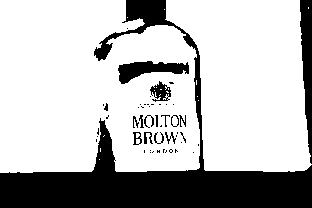
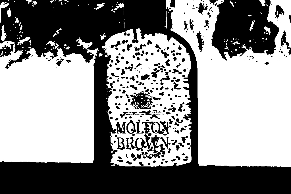
Improved Edit

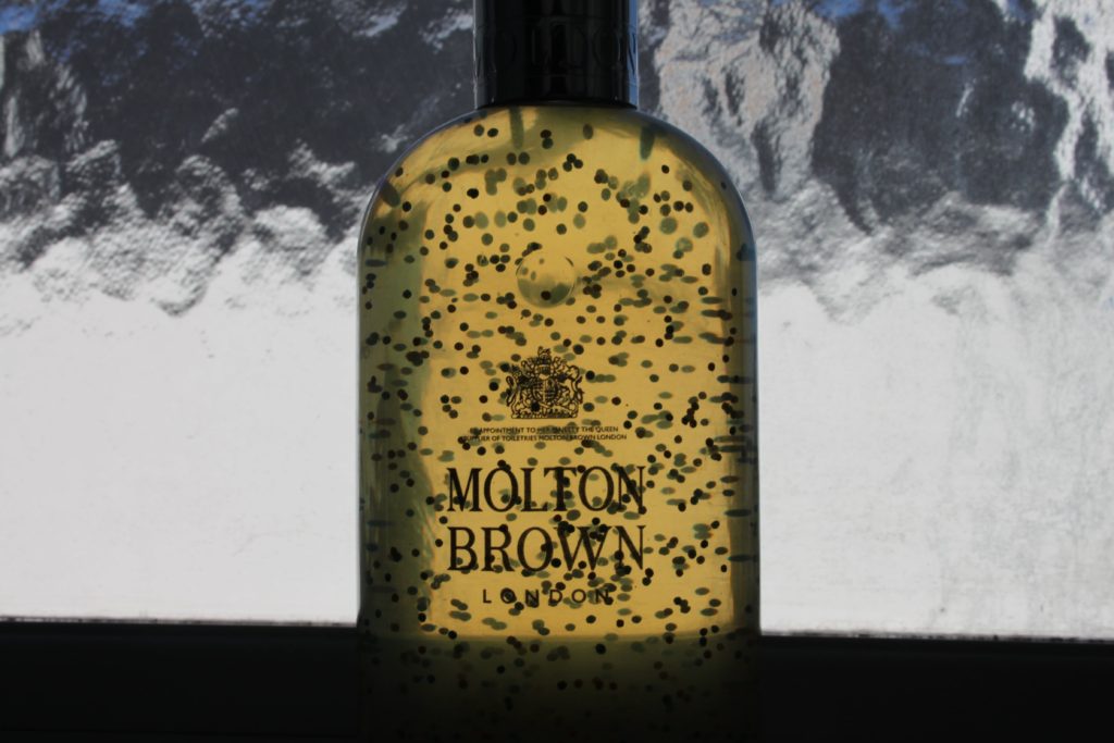
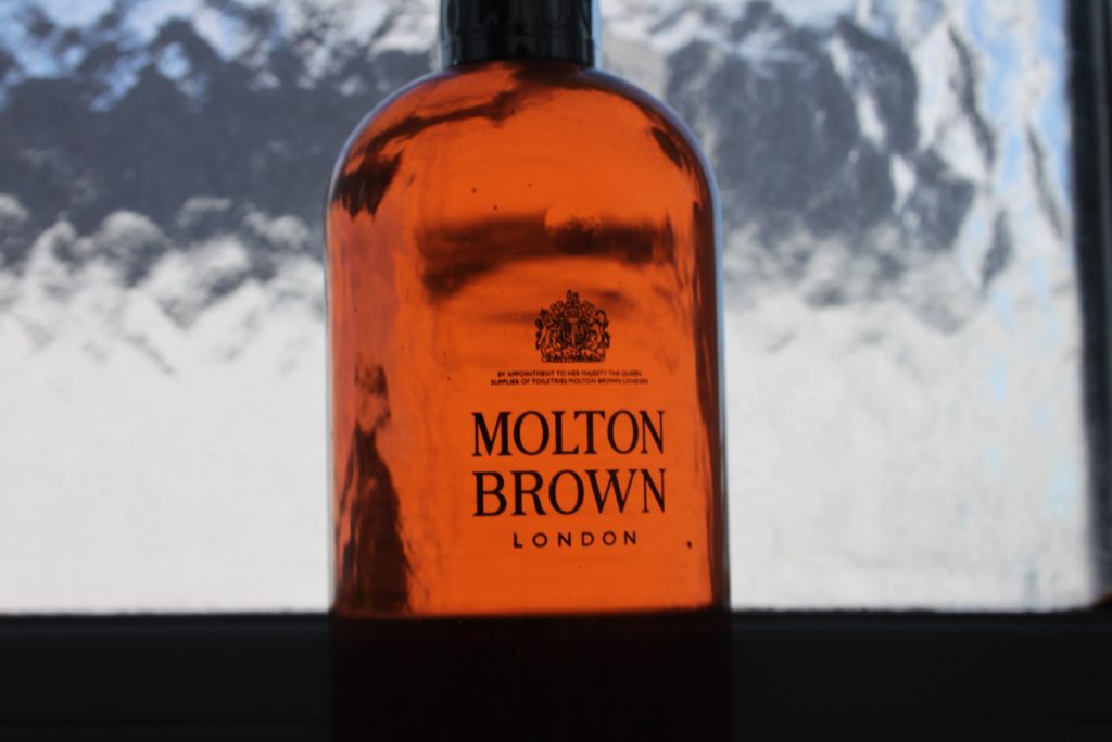
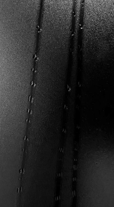
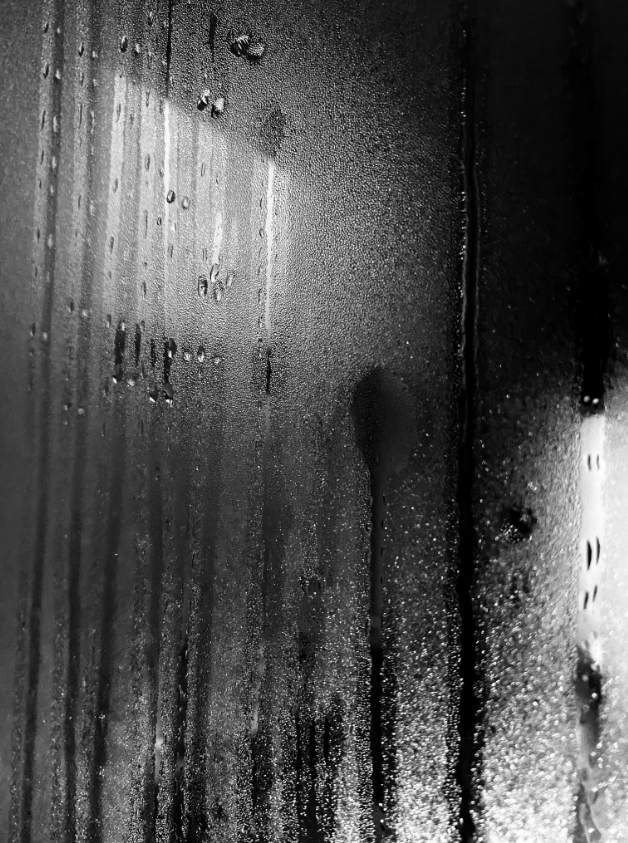
In my first interpretation, the edited images look very similar and still a lot like the original photos. In my second interpretation of the black light project, I have taken the images in a room in shadow looking at a bright window. This means that the background is more white and the contrast between the background and the object is very visible. This makes both images look very different to my previous images as they look very art like and similar to threshold artwork. In the image above, I have used more of the threshold tool to pick out and show the individual particles in the bottle of the soap bottle. By making the particles visible in the image, I have accidentally created a black patchy surface in the top third of the image.

looking and seeing

Uta Barth

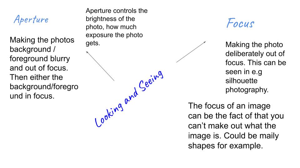
Barth is a contemporary German-American photographer who’s work addresses themes such as perception, optical illusion and non-place, “inverting the notion of background and foreground”. Her work is as much about vision and perception as it is about the failure to see, the faith humans place in the mechanics of perception and the precarious nature of perceptual habits.

Ralph Eugene Meatyard

Meatyard is an American photographer known for his photographs in which family members and friends appear wearing grotesque masks. His photography reflected the connection between nature and humans. His Zen Twigs series, close-up detailed images of thin tree branches set against an out of focus background is the most obvious manifestation of his interest in Zen.

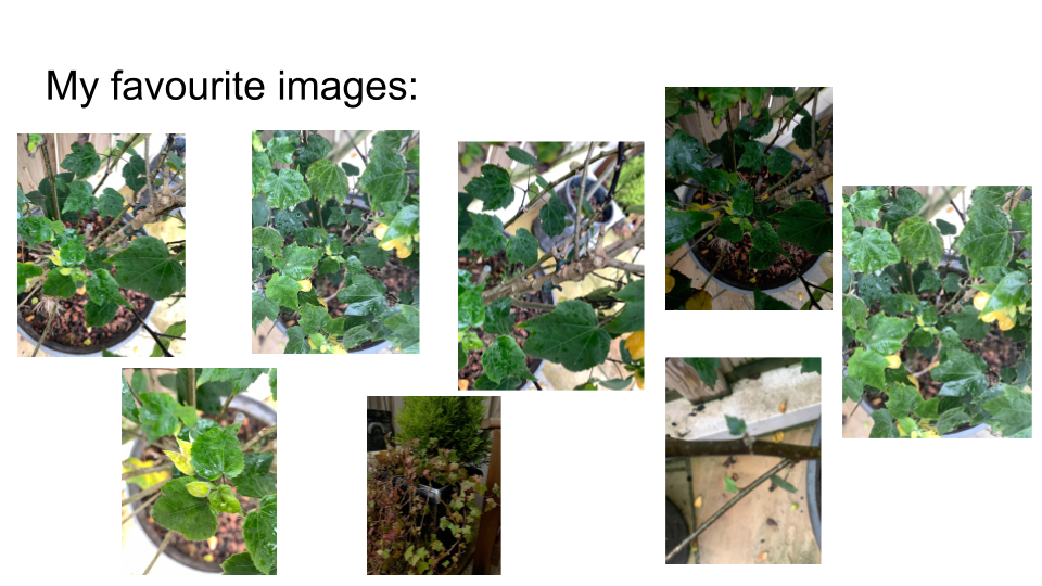
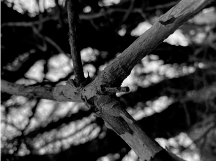
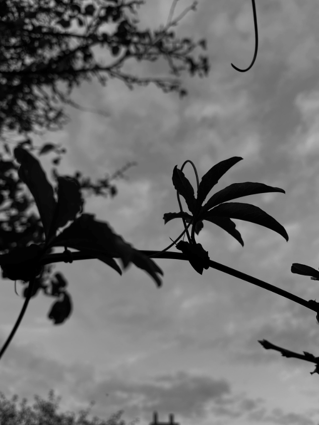
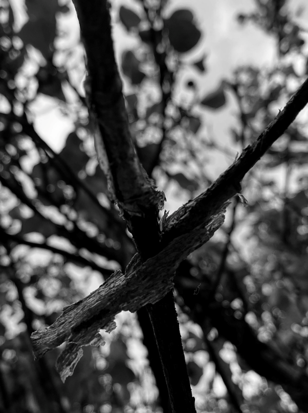
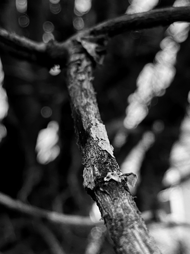
My photo shoot inspired by Meatyard

Final images

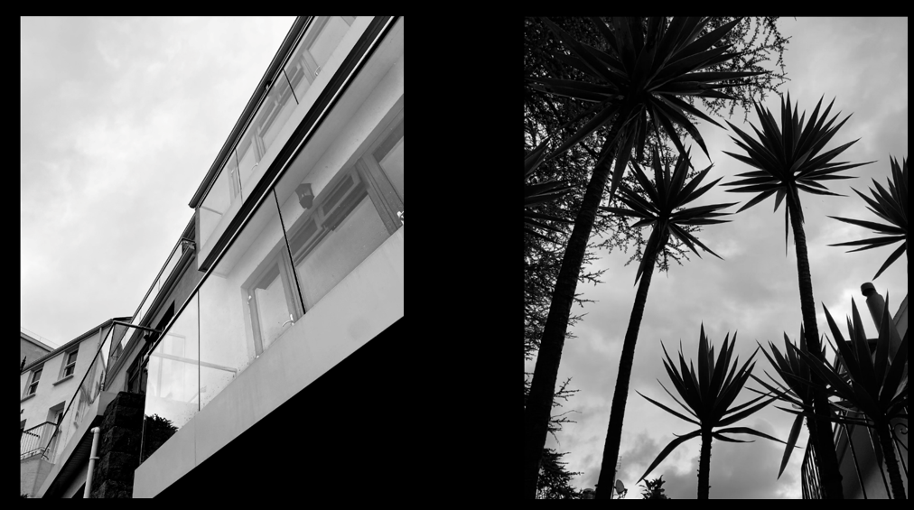
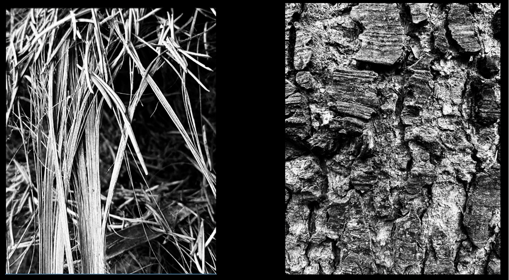
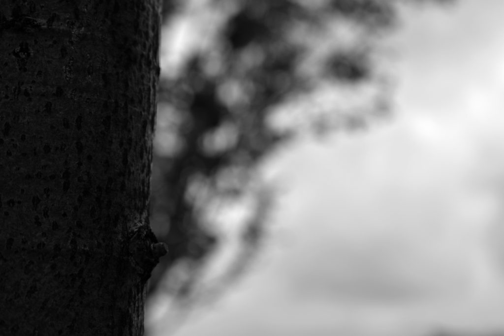
Certain images create a silhouette as the contrast between light and dark is so strong, what I like most about these photographs is the variety of black and white tones and the focus, high aperture is used to blur certain parts of the image to create a focus on the main part of the photo.

Saul Leiter’s photographs

My photos inspired by Leiter

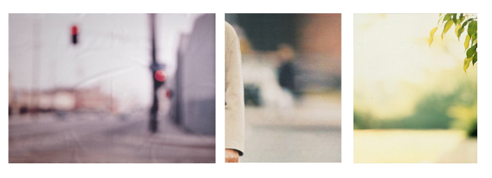
Saul Leiter’s images can use vibrant and unique colours. The photographer uses a high aperture to blur certain parts of the image to create a focus on the main part of the photo. Abstract photography occurs when a photographer focuses in on a part of a scene, blurring out the background and focusing in on the colour, texture, shape, line, geometry, reflection or symmetry.

Leither captured contemplative moments in New York City in his warm and intimate photographs. He often shot in colour, a rarity for the era, often resembled abstract paintings, taken from unexpected angles and concerned primarily with the use of colour and geometric composition.

My photos inspired by Leiter

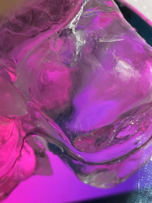
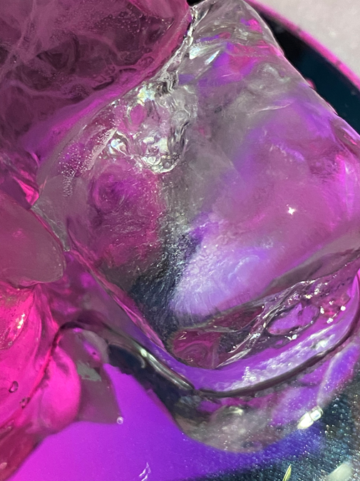
I like the vibrant, saturated colours in these photographs, the highlights and shadows contrast together creating depth, bringing out the brightness of the blue and pink tones.

albert renger-patzsch

IMAGE ANALYSIS

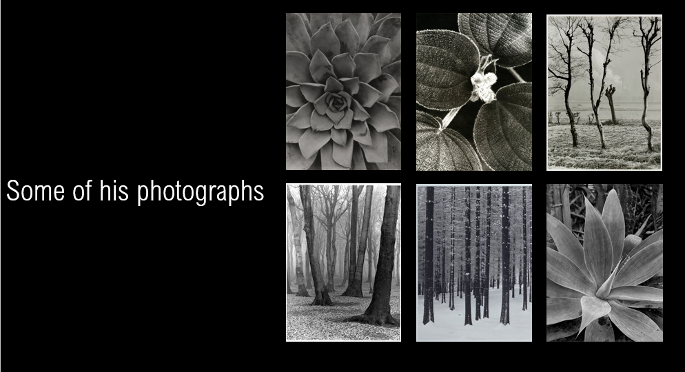
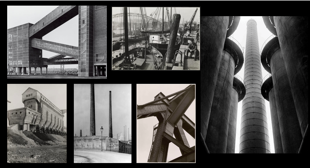
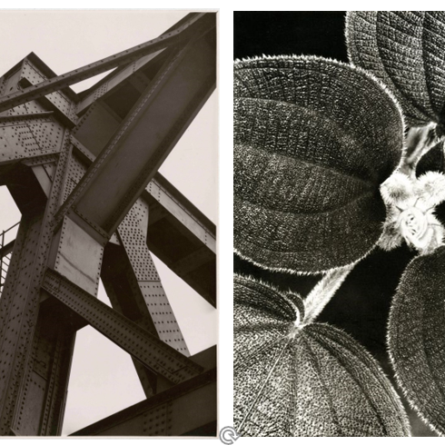
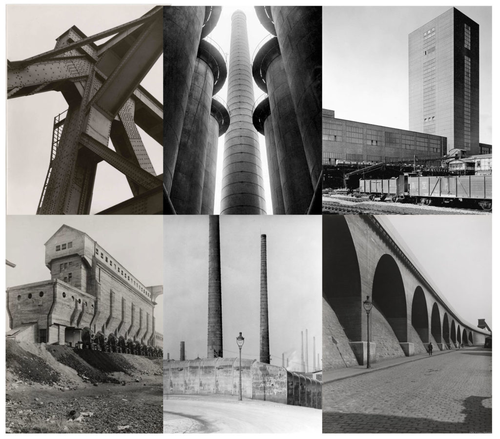
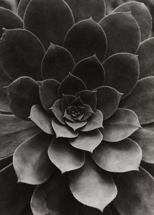
These photographs were both taken by Albert Renger-Patzsch as part of his ‘The World is Beautiful’ collection.

The image on the left is of an industrial building and the photograph on the right is of a natural form. Both photos are in black and white with extensive contrast between the light and dark tones, the contrast emphasises a gradient from light to dark on parts of the metal.

The photo on the left is very geometric with the straight, hard, man-made metal, whereas the photo on the right is natural in its own way as the leaves have different patterns and details compared to another.

Both images use camera positioning, however the photo on the left is taken from below and has a lot of the object in the frame, whereas the one on the right is taken from a birds-eye view and has been cropped,  it focuses on a small part of the object up close to admire minor details.

The photo on the left has sharp lines created by the building, these contrast with the background of the image, the sky, which is light toned and grey without any shadows. This photograph was taken in natural lighting as of the deep shadows on parts of the building such as the underneath.

The world is beautiful

Albert Renger-Patzsch

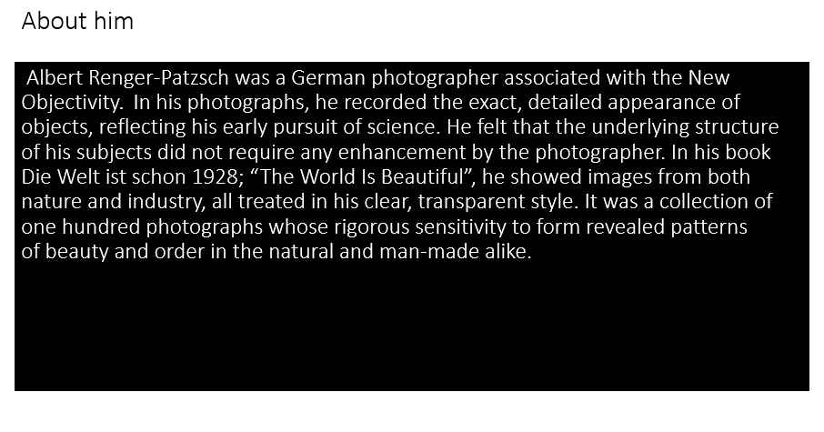
Albert Renger-Patzsch was a German photographer associated with the New Objectivity. The ‘New Objectivity’ emerged as a style in Germany in the 1920’s as a challenge to Expressionism. As it’s name suggests, it offered a return to unsentimental reality and a focus on the objective world, as opposed to the more abstract, romantic, or idealistic tendencies of Expressionism.

Image Analysis

This image taken by Albert Renger-Patzsch shows a plant of some sort. This shows off his macro photography. Macro photography is extreme close-up photography, usually of very small subjects and living organisms like insects, in which the size of the subject in the photograph is greater than life size.  This image shows that he uses various styles of photography in his work. He also takes images of industrial type buildings and settings.

My Response

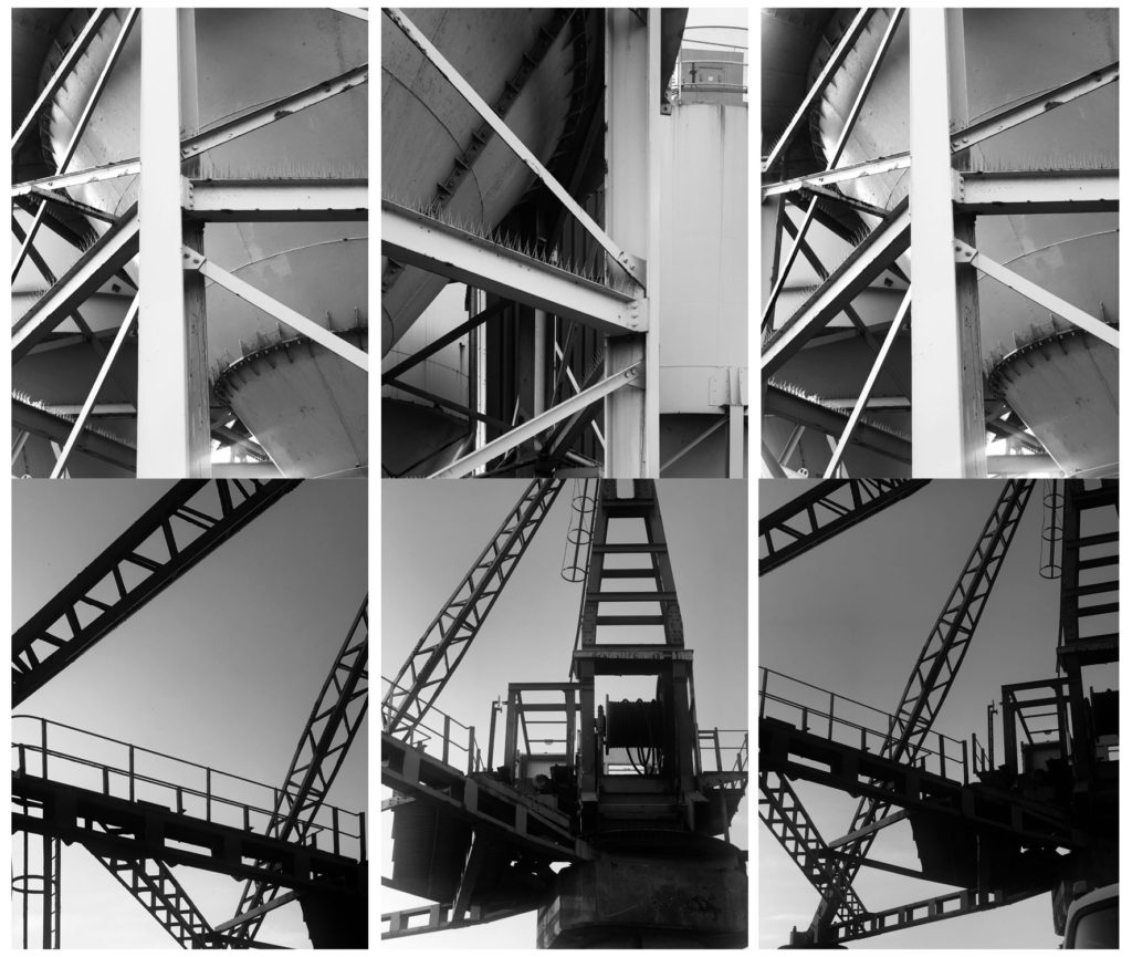
For this photoshoot inspired by Albert Renger-Patzch I went out and took images of industrial style buildings to try and mimic his work as best as I could. I then chose my favourite images from the shoot and converted them to black and white the same way Renger-Patzch has done.

Looking and seeing

Ralph Eugene Meatyard

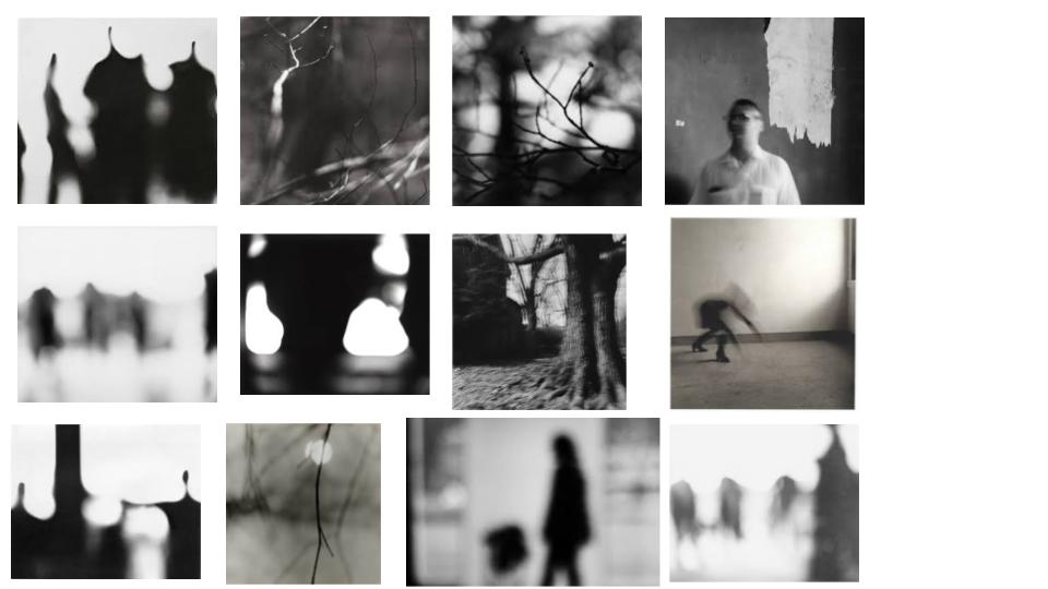
 Ralph Meatyard was an American photographer who had an eye for out of focus and aperture photography. He liked to work in black and white to emphases the images he was taking. Meatyard was inspired by Zen Buddhism and jazz, this inspired him to take photos of otherworldly faces on human bodies, to the ambiguous and unknowable in human nature. He liked experimenting with framing, multiple exposures, and blurring to produce haunting, abstracted images of natural and manmade environments. 

Mood board of Ralph’s work that has inspired me for my photoshoot:

Ralph Meatyard

Ralphs images above focus mainly on the aperture of the image. The blurred images define the shapes of nature and human bodies. The high quality focus in the foreground of the twigs and the out of focus background creates a cool method of aperture in his photography.

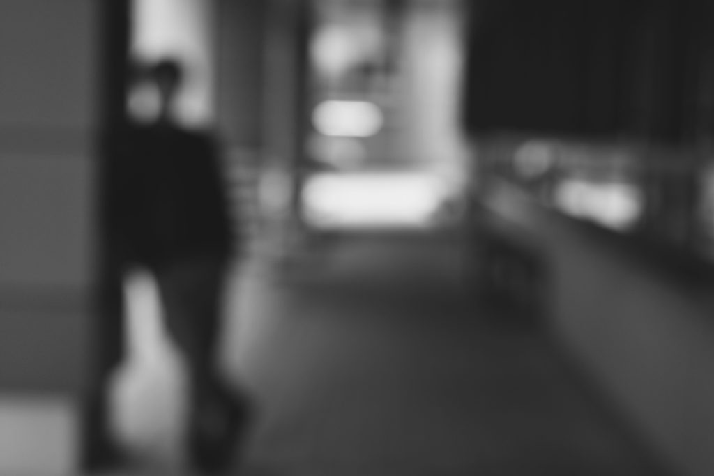
Here is my photoshoot based of Ralph’s work.

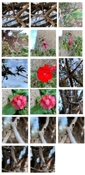
Contact Sheet 1

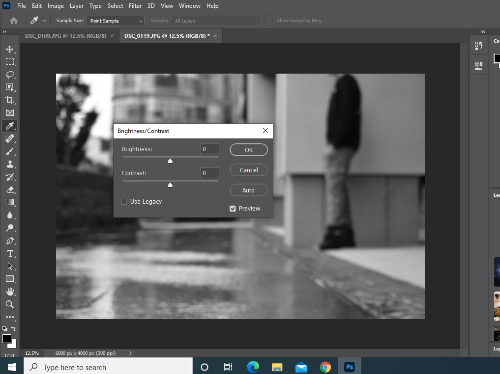
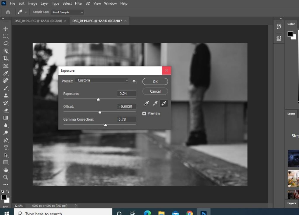
How to use Photoshop:

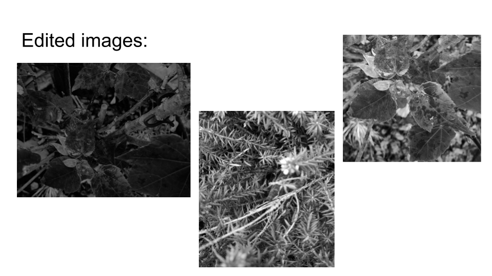
These are the main features of photoshop I used for my final photos for each contact sheet I have done. Changing the photo first into black and white then playing around with:

Exposure

Brightness/Contrast

Highlights/Shadows

Contact Sheet 2

Best images from contact sheet 2 that is edited on Photoshop:

Contact Sheet 3

Best image from contact sheet 3

Contact Sheet 4

Best images from contact sheet 4

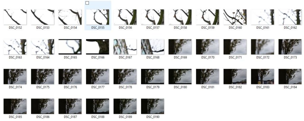
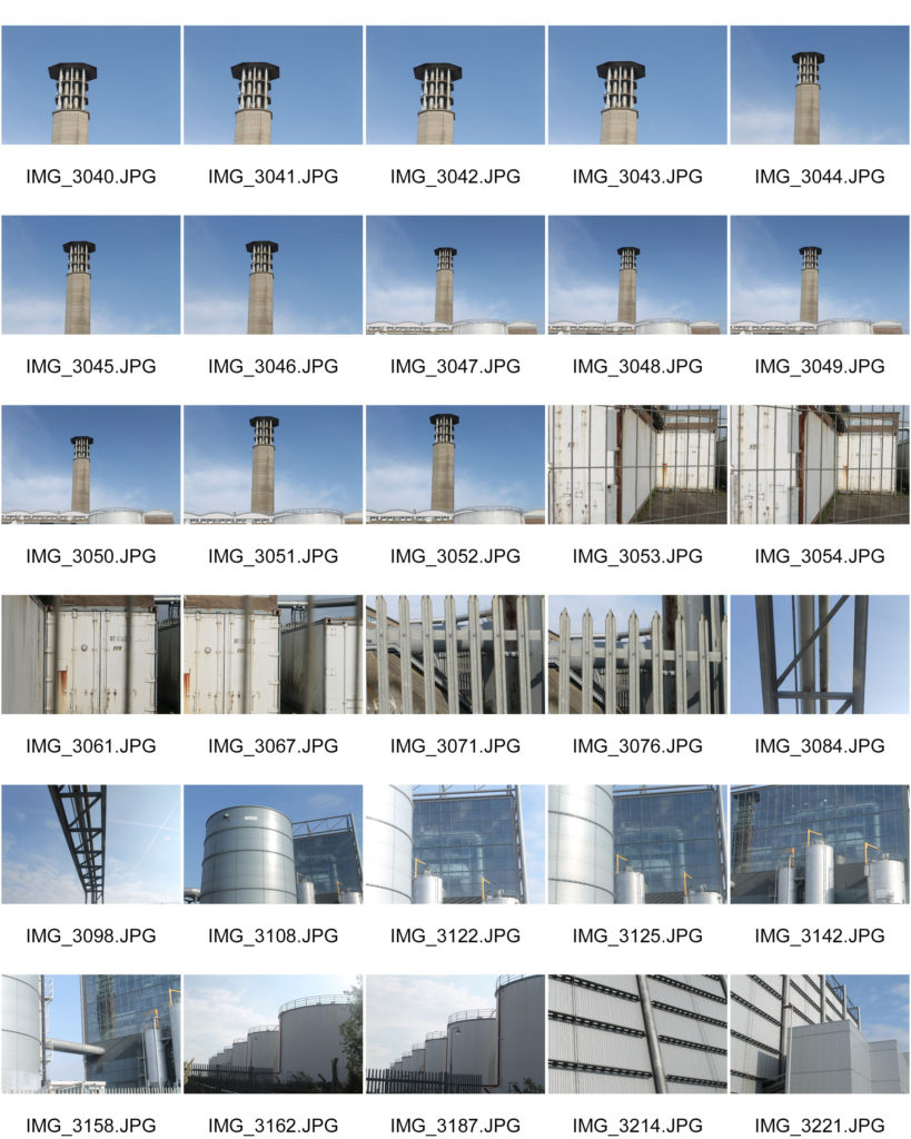
CONTACT SHEET

A contact sheet contains thumbnails of all images from a shoot. They are made to allow the photographer to view a mini – preview of all the film to determine their best photos that they want to print.

Contact sheets are useful because a photographer can quickly scan over a series of images to find their best ones saving them a lot of time. It is also helpful as a professional photographer can provide there clients with a contact sheet of there images and the client can pick their favourites.

MY CONTACT SHEET