Category Archives: Uncategorized

Filters

Author:
Category:

Image adaptation 1

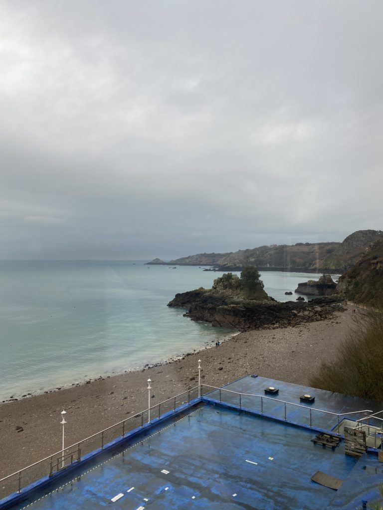
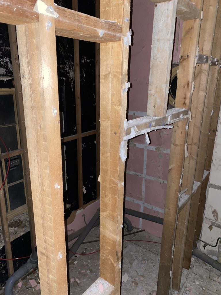
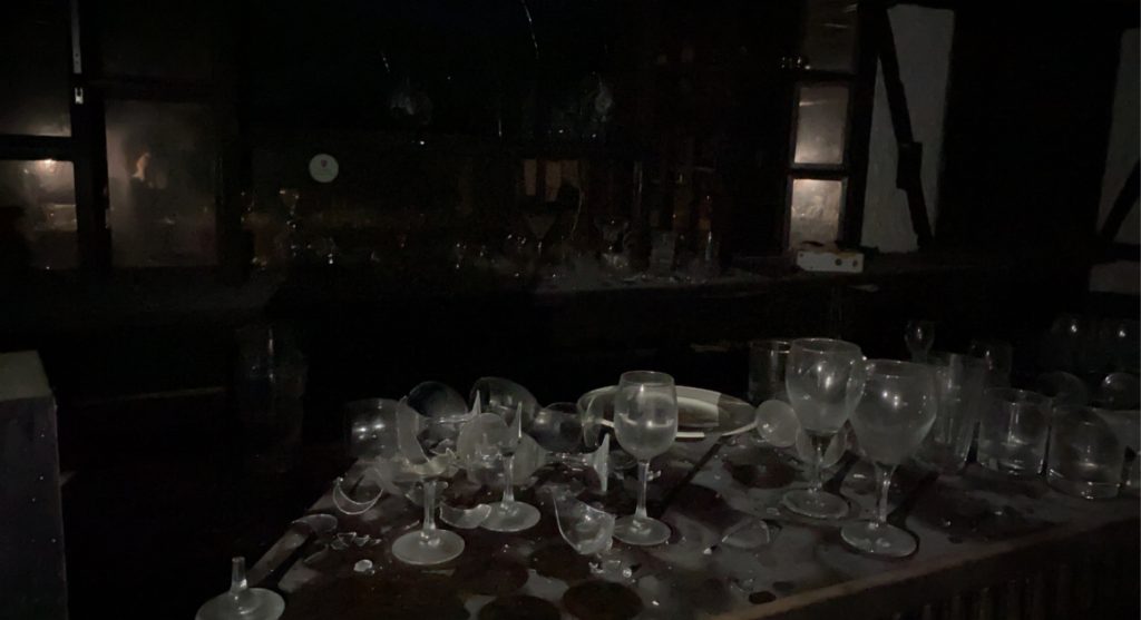
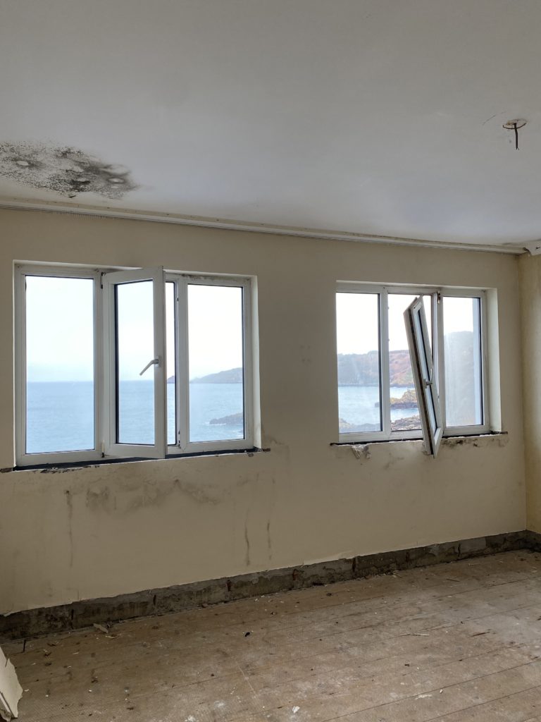
Photoshoot 1 – Water Edge Hotel

For the photographs that I took at the Waters Edge Hotel I’m going to adapt them to take out the bright tones and add darker, and harsher tones as I feel this will add more details to the photographs overall. Furthermore I also believe that this may change the opinions within the photograph in which people are seeing, as negative tones may affect the overall mood of the photo.


Editing process:

I decided to use the software on my laptop to edit and adapt the photographs I have taken. I first started by desaturating the images and then change the levels of the photograph to what each photo suits. Additionally I also adapted the white balance of each photo which added further contrast and detail.


I personally feel that these photos are the best outcomes of the waters edge hotel photoshoot, this is because each photo has specific detail. However although I have stated that I want three photos to have harsh and dark tones I also feel that several of my photographs may look better if they are in colour as they show different contrasts than to if they were black and white.


Photoshop ideas:

For this idea I decided that I’m going to use photoshop ti develop the levels of the photographs as well as change the overall colour. Im going to do this by using specific features in photoshop to create a “3D” effect. Furthermore I feel that I may also decide to experiment with photomontage and create a collage using photoshop.


I feel as these four images work well together as all the colours blend together as well as the image which I used as an extra layer adds significant details; as you can see the stairs at a different angle which creates a more interesting photograph overall. I think I’m going to include these four images across a page in my photo book or one print in my final outcomes.

Newspaper

I plan to use about 4-8 images which summarise my work from my previous projects and my photobook project. I want to use some images I took for the Anthropocene project as well as my photobook project.

Full Bleed

My full bleed image I want to use is from the Anthropocene project where I went to a reservoir and made the image black and white with high contrast with drama between black and white. I edited in the dark clouds at the top of the image to create further contrast

Montage

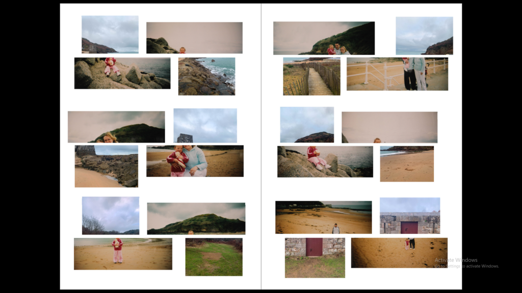
Above are two montages I made on photoshop from the images of my family albums I got from my grandmother. Before I put them on Lightroom I lowered the saturation to give them an older, retro feel so that it looks like a collage in a family album. I have included images of my Mum, Uncle, Grandparents, Great Grandparents and also my distant Cousins. I have mixed all of the family together and haven’t separated into different sides/ parts to show connection to family.

Photoshoot 1 – WaTER’S EDGE

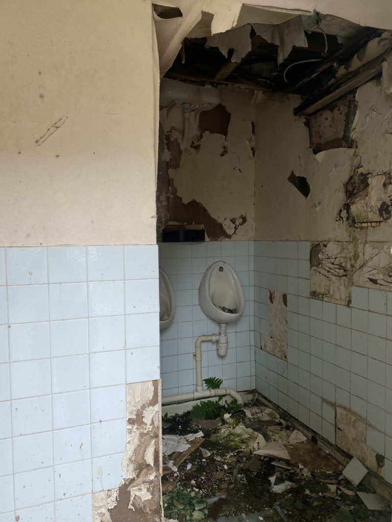
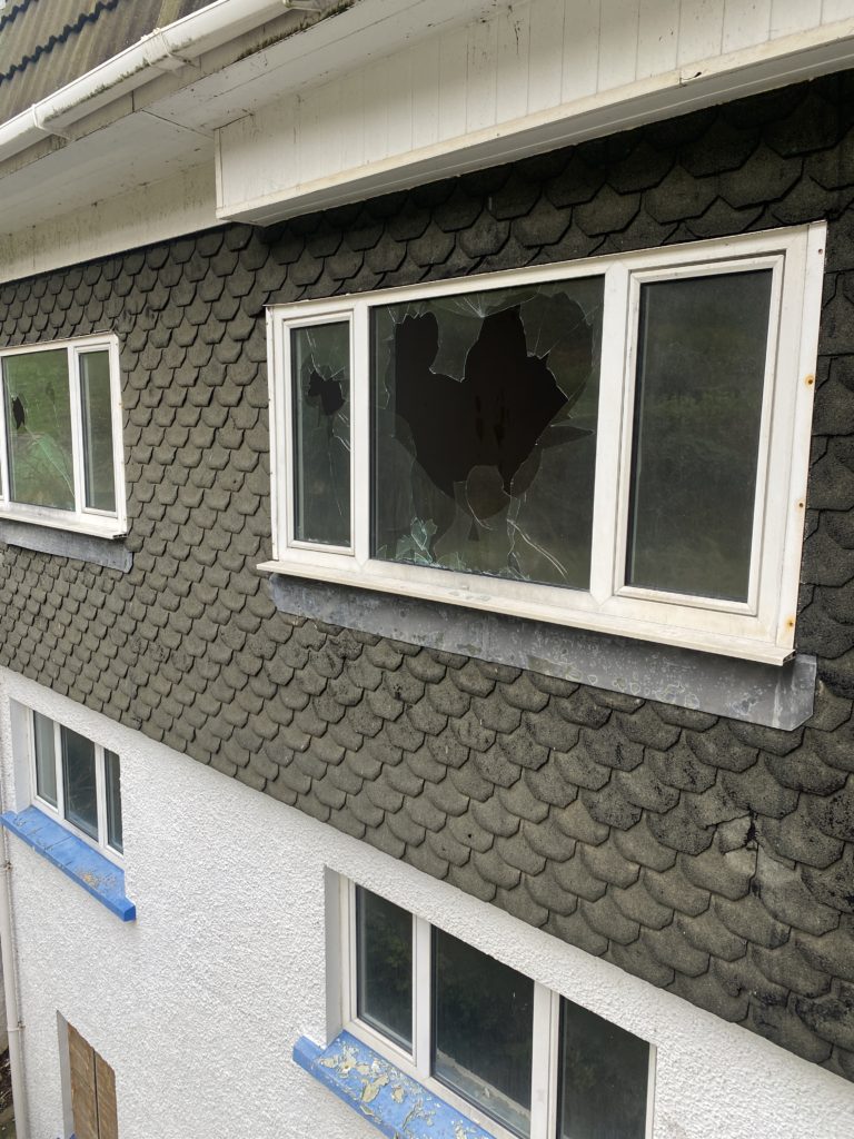
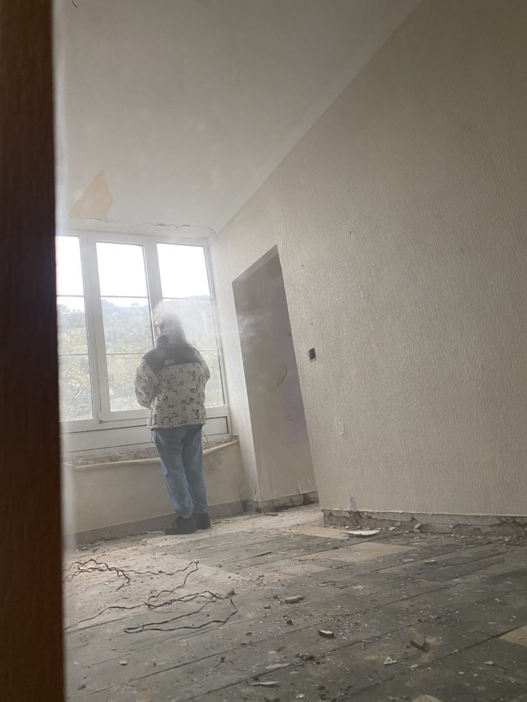
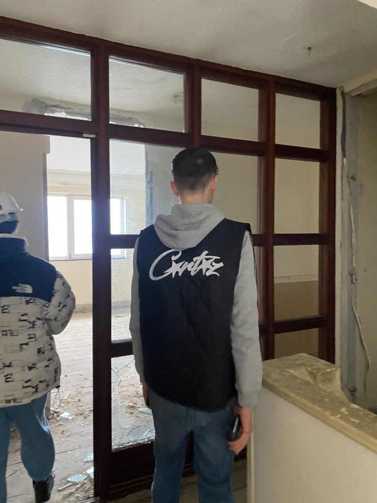
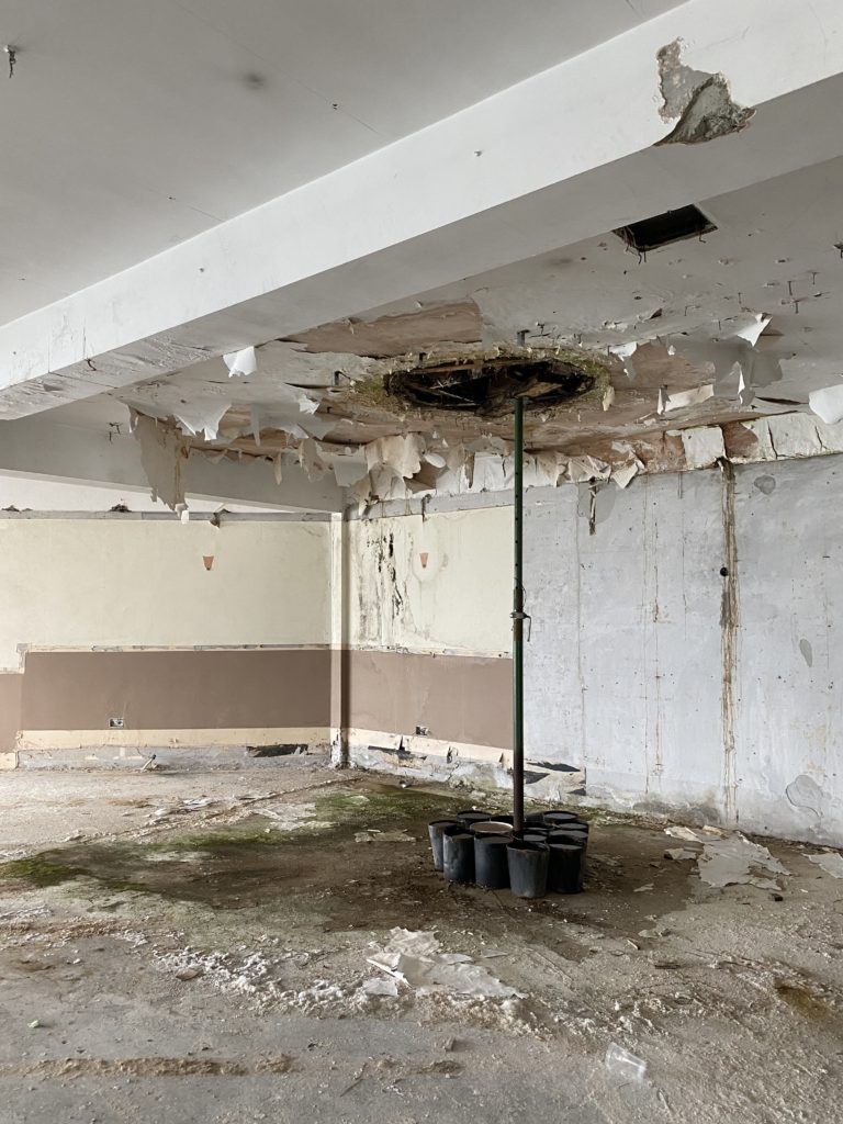
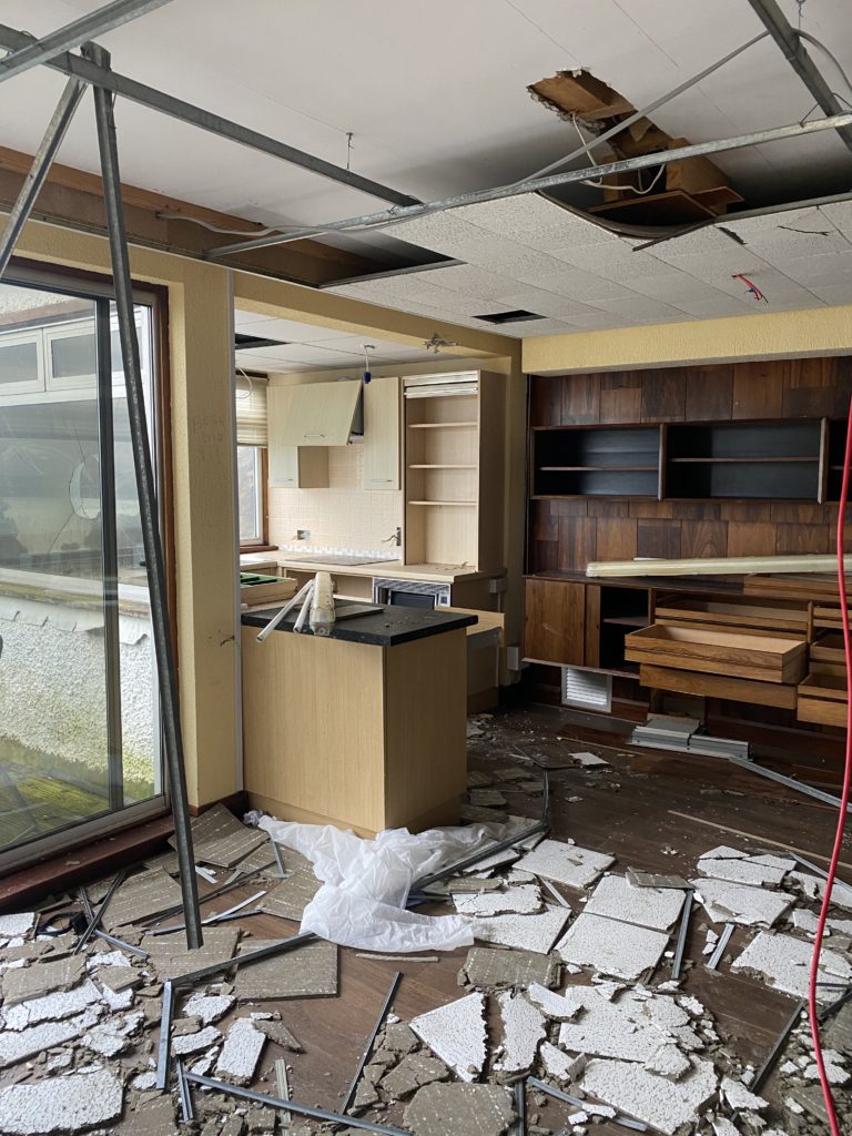
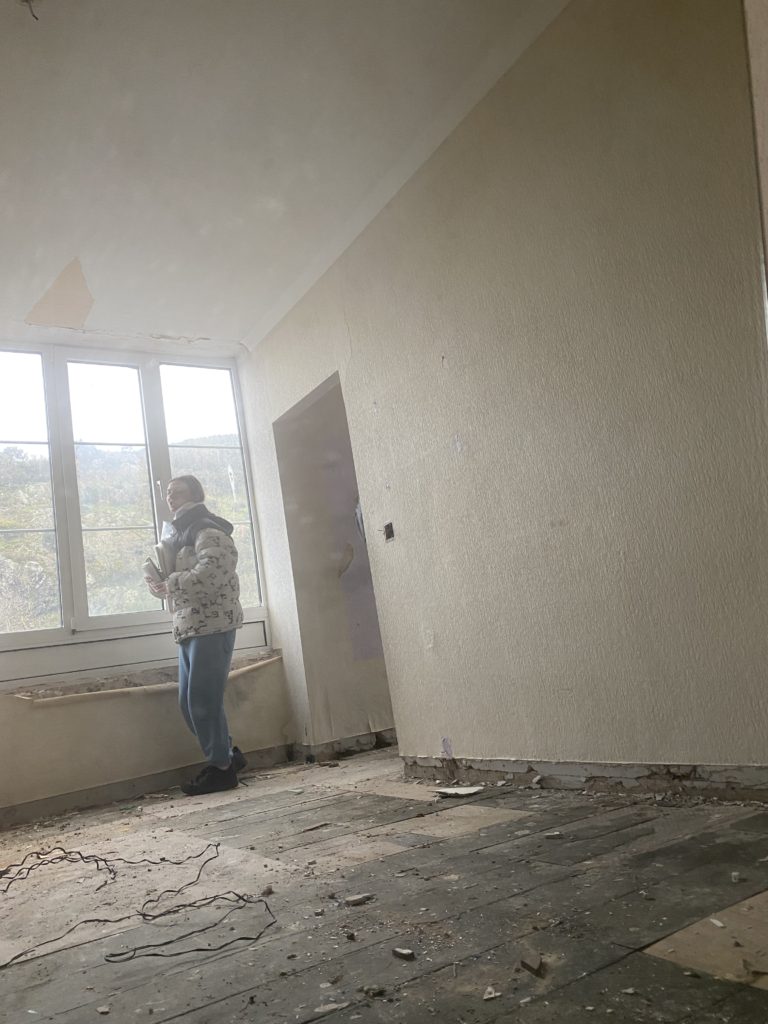
For this photoshoot I have decided to explore the ways in which specific abandonments can reflect the worth of communities which were there previously. I have decided to take photos on the abandoned hotel in bouley bay once called Water’s Edge Hotel which was once a place where so called ‘rich’ people gathered as a communities for holidays, birthdays, weddings etc. Furthermore now there is plans for one individual to knock down the old hotel and turn it into a multi billion pound house, this will therefore completely takeaway the minimal community from that area which there was left as well as memories which the hotel has connections with. I also feel that taking pictures of specific abandonments may refelct Yves Marchand and Romain Meffre’s project ‘The ruins of Detroit’

SHOOT 1 –

I’m going to use photoshop to adapt/manipulate several photographs in different ways as I feel they may add more detail if I neutralise the tones or adapt the photos to black and white. However I’m going to go back to the Water’s edge hotel to capture more pictures due to the fact that I feel that seeing it on a later date to these photographs which I have already taken may change my opinions and alter the way in which I take my photographs.

SHOOT 2 –

BEST IMAGES –

Overall I feel that within this shoot which I conducted I have successfully shown the power in which this hotel has within it and the abandonment which is clearly reflected by the way in which it has been left for several years. Additionally I also feel that the communities that used to go visit the hotel may struggle seeing one construct and demolish to rebuild a house for one superior individual.

Newspaper Spreads

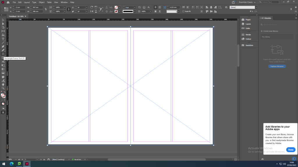
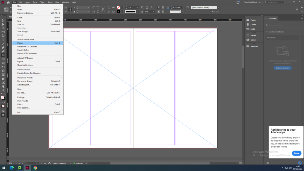
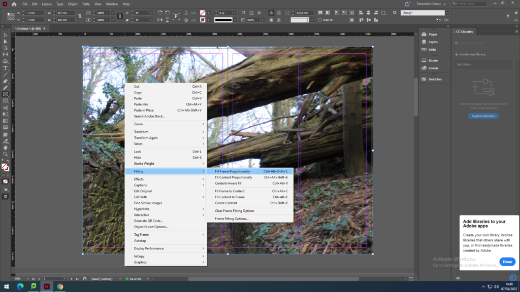
First we recapped on how to place the images on the page spreads by using the Rectangle Frame Tool to create the frame for the image I want to place. Then going into File, Place and with my media drive I pick out the photo to place in the frame. As the image won’t fit the frame proportionately I have to click on the image then go onto Fitting to click on Fit Content Proportionately to make the image fit the frame then to click on the other option Fill Frame Proportionately to have the image fit centre and contextually.

FULL-BLEED

I first explored full-bleed images by making the frame of the image full size with a small boarder going around the edges. I used busy images with a lot layers in the photo to show some depth in these spreads.

JUXTAPOSITION

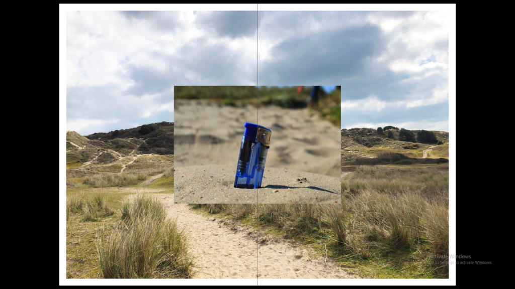
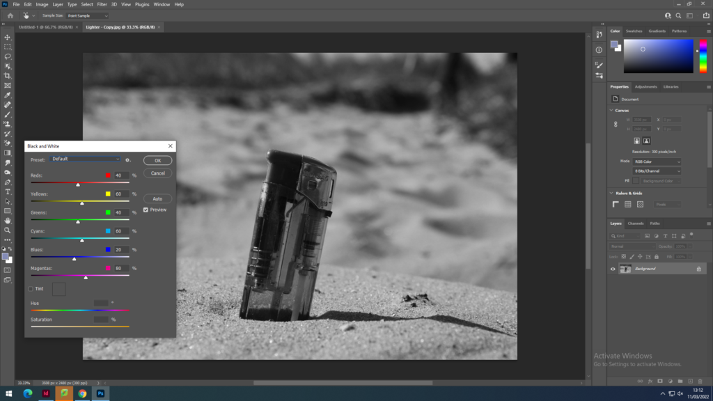
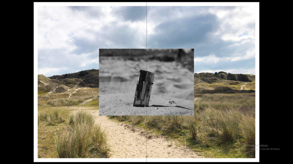
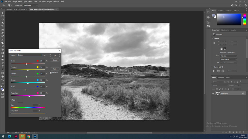
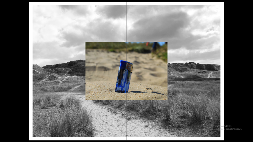
I also tried juxtapositions with two different size images next to each other to then try two images layered on top of each other and this that I then tried having the background image black and white or the foreground image black and white. To create these images black and white I used photoshop.
SEQUENCE

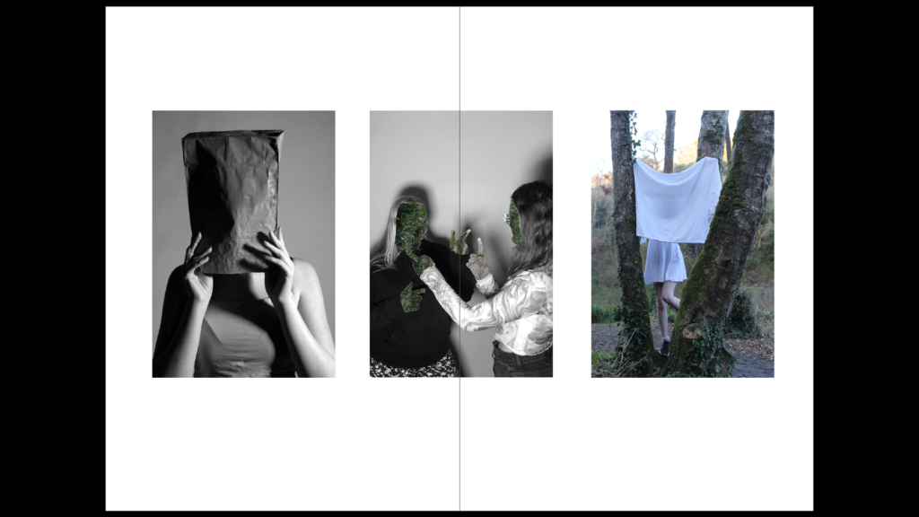
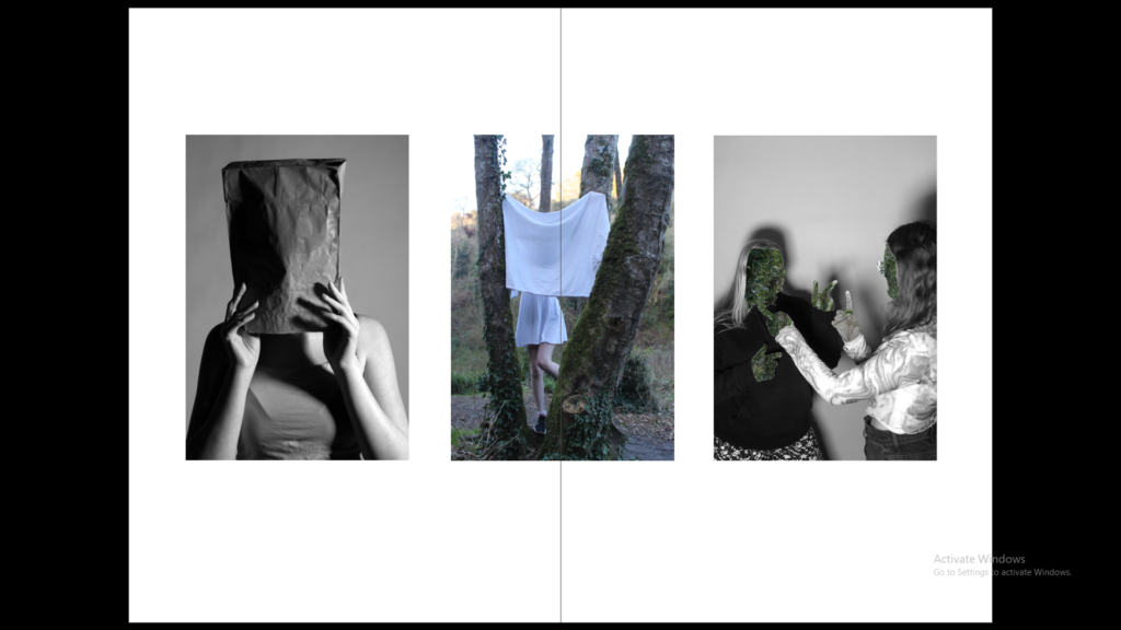
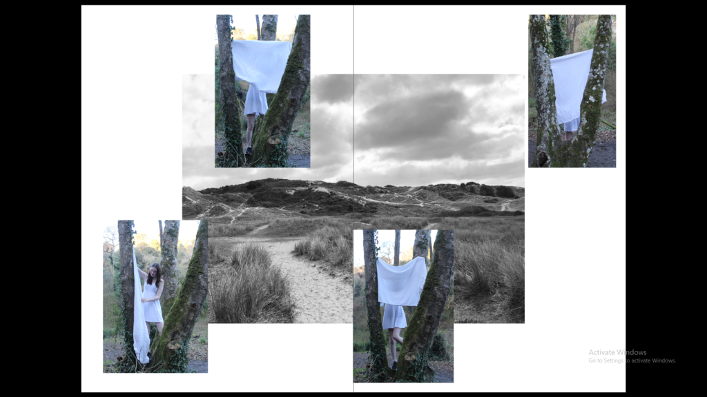
With the sequence I used 3 images with 2 black and white portraits and 2 that have the use of nature in them. These images create a sequence as they are all portrait images with the faces covered creating mood and atmosphere without the use of facial expressions.

MONTAGE

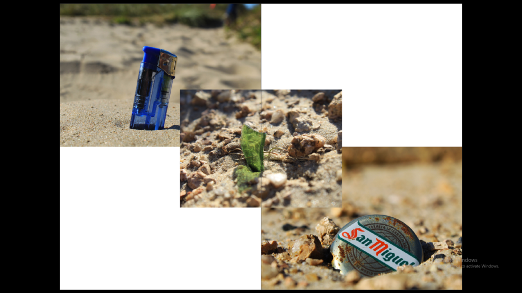
The montage was created with images which with the first montage all show litter being thrown away by people on the beach, the second shows a black and white image of the beach and then some portraits overlapping it.

Newspaper Spreads

Set up:
Dimensions: 400mm(h) x 280.5mm(w), 10 pages, Orientation: Portrait, 2 columns, Column gutter 5mm, Margins: 10mm, Bleed: 3mm
I used the rectangle frame tool to make the box so that I can import an image onto the page by pressing Ctrl D and selecting from files.

Juxtaposition: 2 images which contrast each other

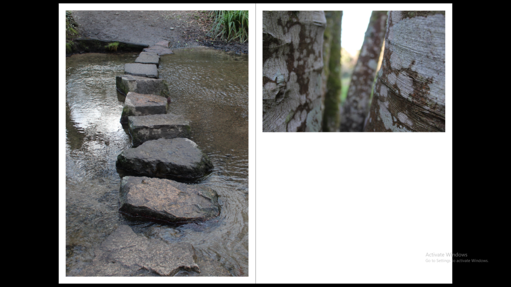
I have used these two images to contrast each other by the lighting and the overall atmosphere, but also compliment each other through composition and structure.

Sequence: A series of images (4-12) to create a sequence as a grid, story-board, contact sheet or typology.

1
2
3

I have included 3 different versions of a sequence because the first image may print out too small but I like the gap around the images and the shape this gives. The last composition has the images bigger on the page but the shape is lost and there is no white boarder on the edges of the page.

Montage: layering a set of images to create a new outcome.

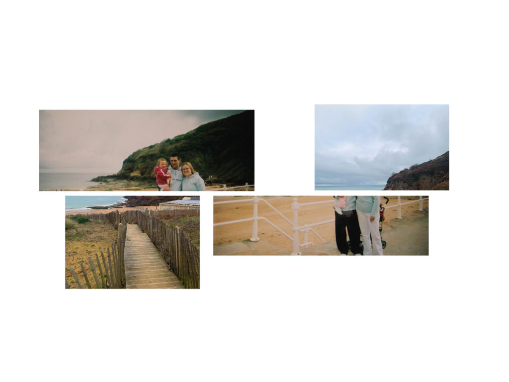
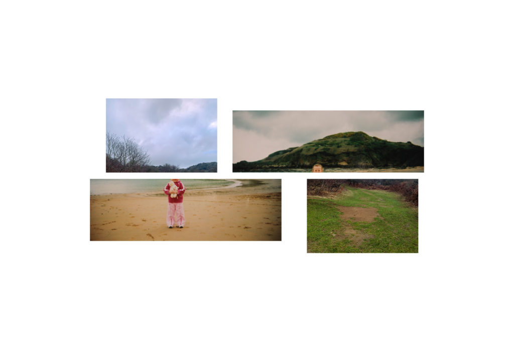
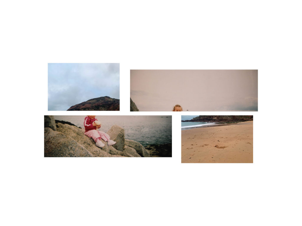
I chose to layer these to images as they are taken from the same location but in different years and with a different view and different photographic styles, one focusing on the land scape and one focusing on a person. Also the path in the image below matches with the shape of the rocks creating a synergy with the two.

Other Spreads

When creating these spreads I wanted to fill the pages with more images as it is for a newspaper. The previous spreads would have a lot of empty space which works well with the images but not for a newspaper.

Making the Newspaper

Selecting my photos

Through Lightroom I chose my best three images and edited out the imperfections such as smudges on the camera lens. Once the images were edited, I exported them into a sperate folder in order to export into InDesign.

My Final Images

Experimenting with layout

As my photographs were all portraits, I only used single page spreads to keep the dimensions of the image correct. For two of the images I kept a white border around the edge, and to create some juxtaposition I stretched one image out to the bleed of the page. I like this layout as it provides a sense of an old family photo album, which adds to the vintage aesthetic to the photographs.

Personal Study: Development of images from Shoot 2

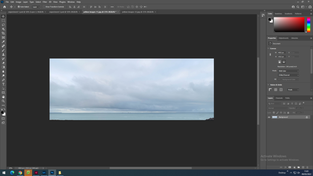
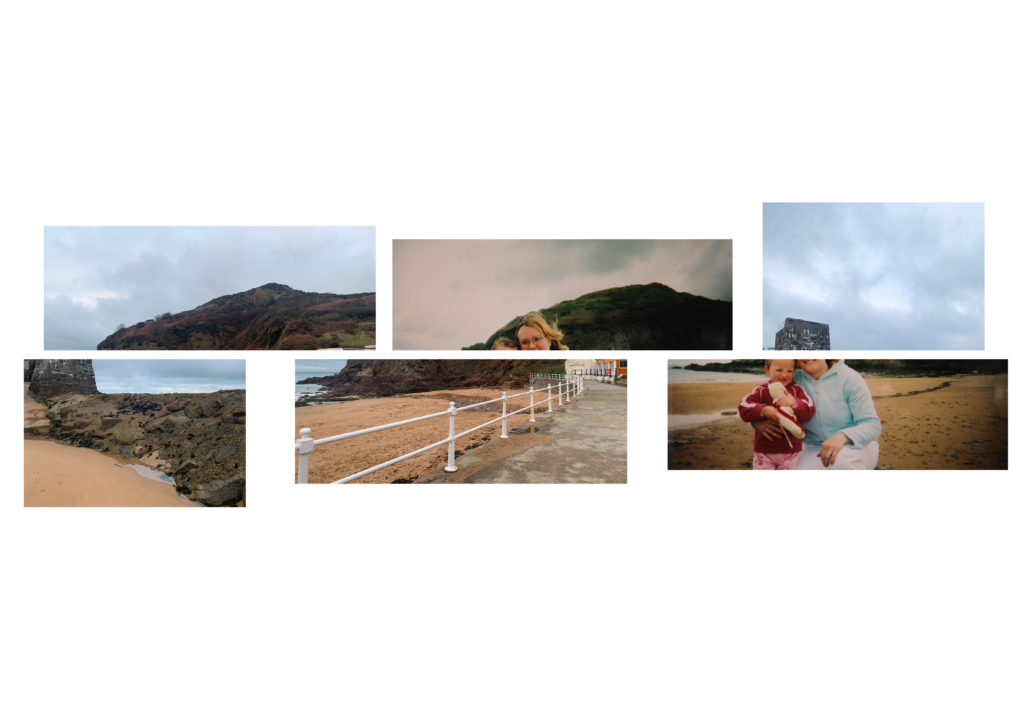
First I imported the image onto photoshop so that I could crop it in half perfectly by halving the height.
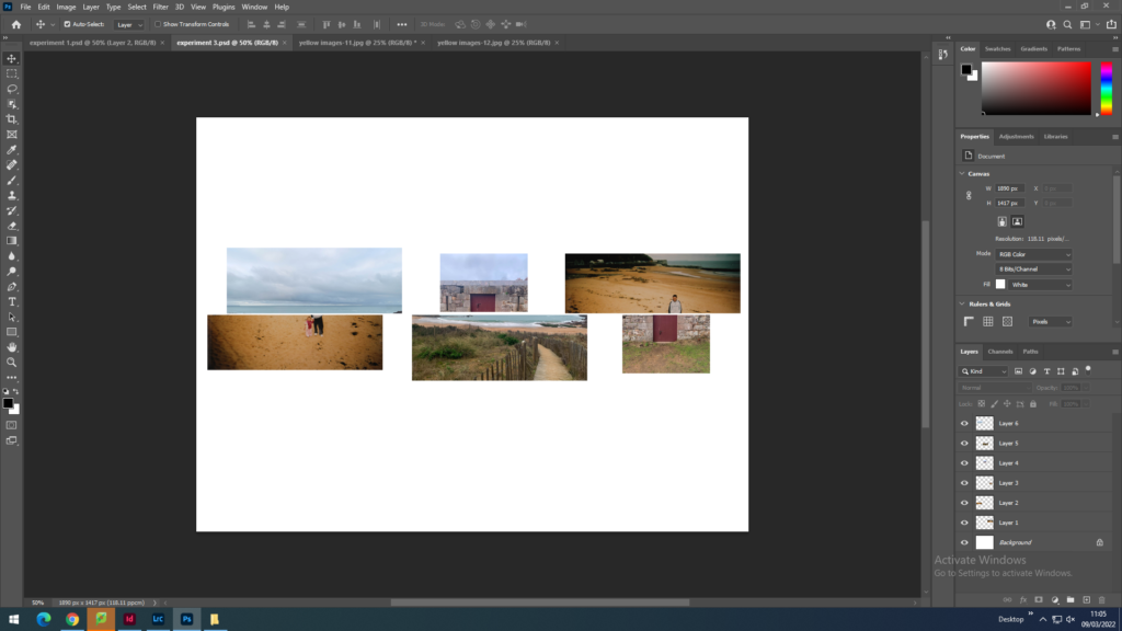
Then I dragged them onto a new file on photoshop and resized them by editing the width and the height in the properties toolbar and moved them around to get the right sequence.

Experiments

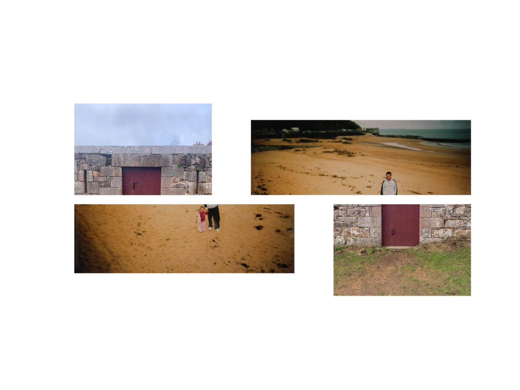
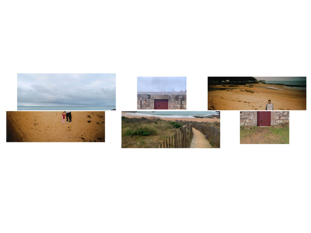
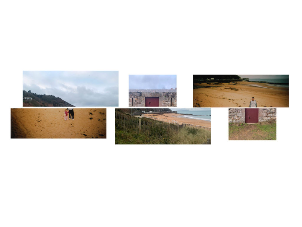
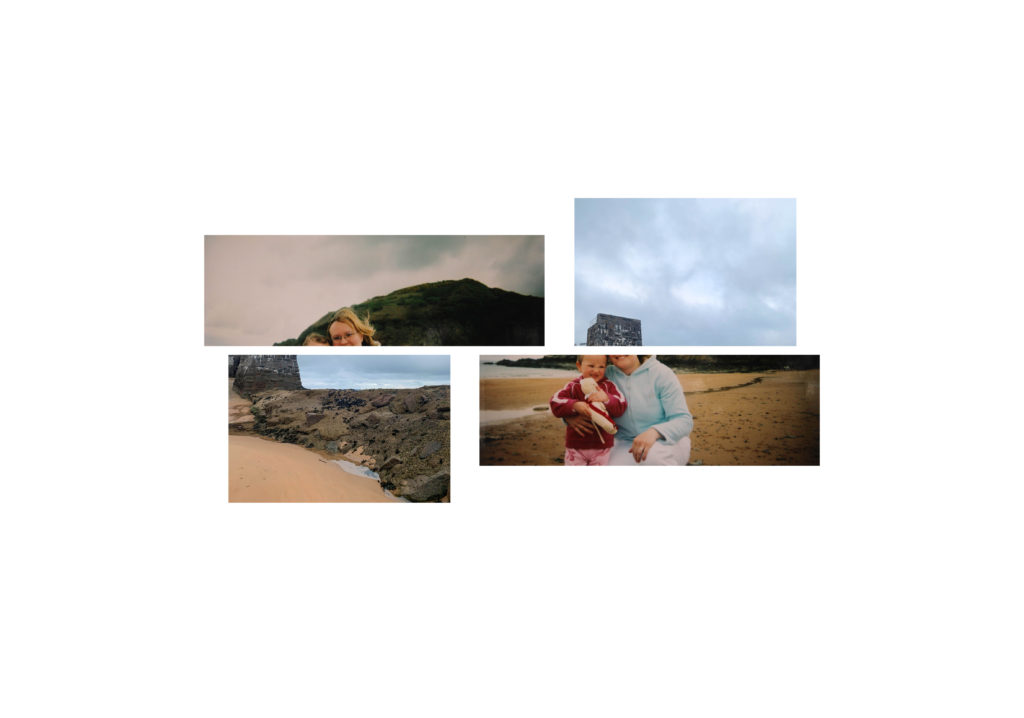
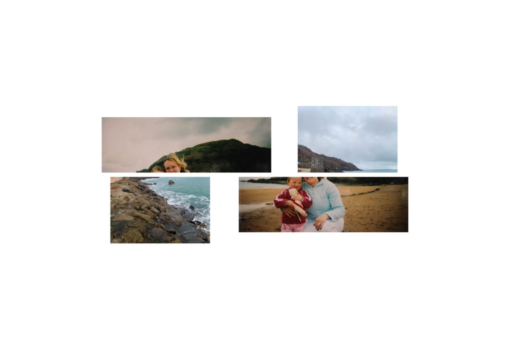
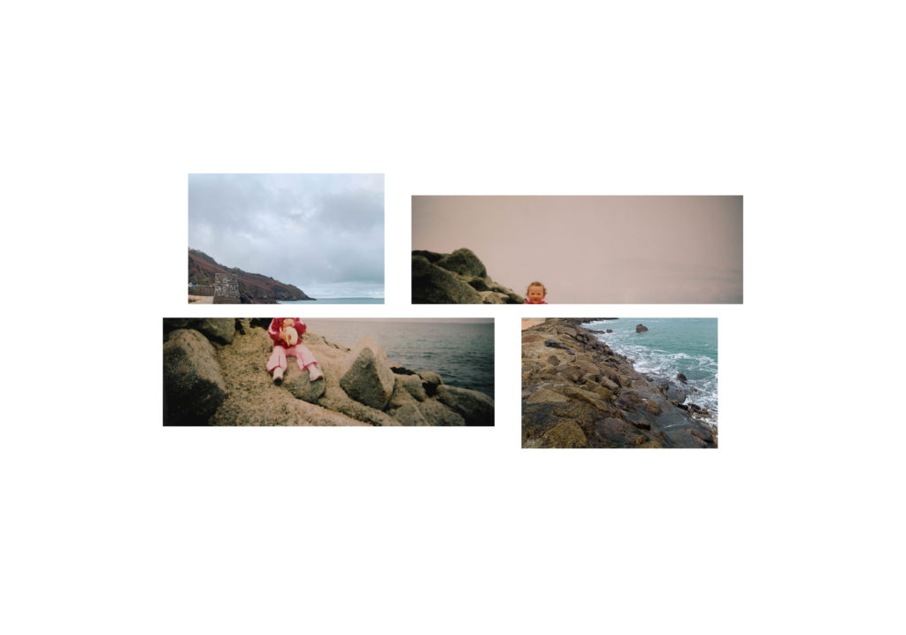
When creating these outcomes I wanted to make interesting compositions rather than having a perfect rectangular shape. I wanted to have the similar misaligned compositions as Shilpa Gupta and create a split between the old images and the new. I wanted to create some smaller sequences but also some longer sequences so that I had a variety of different shapes and lengths.

When choosing the images that would be in the same sequence I looked at the subjects, orientation and colour in each image and decided which ones would match or contrast well with others.

Experiment 1
Experiment 2
Experiment 3.1
Experiment 3.2

I decided to create a different version of experiment 3 because once I had cropped the images I realised that one was cropped as half sky and half land. I do not like how the sky was just a block of colour in the sequence therefore, I changed it to an image that had less of the sky in the top third, which makes the image more interesting and helps the sequence flow better.

Experiment 4.1
Experiment 5.1
Experiment 5.2
Experiment 6
Experiment 7
Experiment 8

newspaper design-

  1. FULL-BLEED: Select one image as a full-bleed spread.
  2. JUXTAPOSITION: Select 2 images and experiment with different combinations.
  3. SEQUENCE: Select a series of images (between 4 – 12) and produce a sequence either as a grid, story-board, contact-sheet or typology.
  4. MONTAGE: Select an appropriate set of images and create a montage of layered images. You may to choose to work in Photoshop for more creativity and import into InDesign as one image (new document in Photoshop 400mm(h) x 280.5mm(w) in 300 dpi)

we have decided to make a newspaper full of our old coursework and previous images and use them. I have decided to include images from my zine, summer project and natural landscapes.

I set up InDesign to start exporting my images and set out my layout for the newspaper. I will include a full-bleed, juxtaposition and a montage.

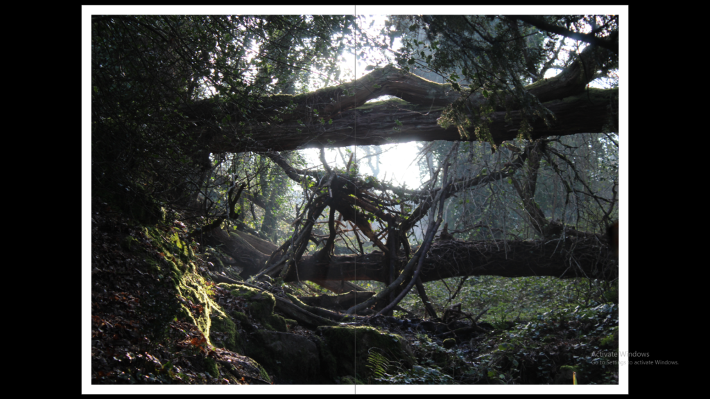
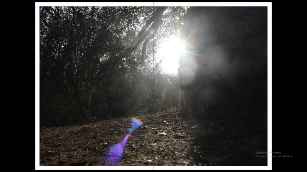
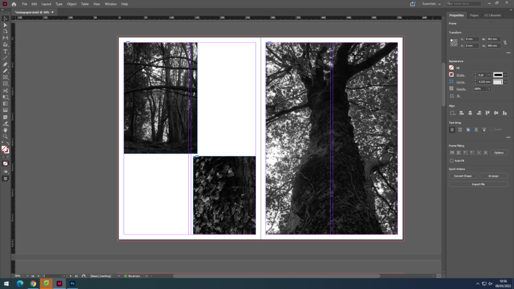
I found my previous work that I have used when exploring landscape photography, I used these three final images and wanted to include them together as they all set a mood and atmosphere by the use of dark tones, I thought these three would work well together so I decided to keep the best one and strongest image as one image on one page then put the two smaller ones together on the left page.

For my juxtaposition images I wanted to include two completely opposite images. Therefore I decided to use a very colourful image of the beach with very warm colours and tones and pair it with a very dark and gloomy image of the woods , both contrast very well between each other.

For my grid pages , I wanted to use my zine and jersey community photos as I had a few of them so I wanted to at least include four images. I chose my favourite ones mostly of tall buildings and old back streets with construction as I like how it shows how Jersey has both, very open and new office buildings as well as uncared roads and old broken houses.

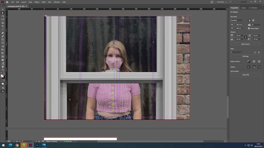
Finally, for my last page I wanted to use a double bleed and use images I took from the summer project at the start of year 12, the purpose of this shoot was to show how covid affected everyone’s lives.

Once I was done with my layout, I packaged my layout out and it was ready to go in the newspaper.

photoshoot 4 (seascape)

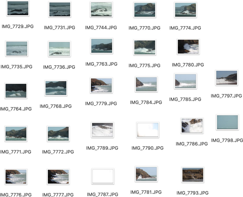
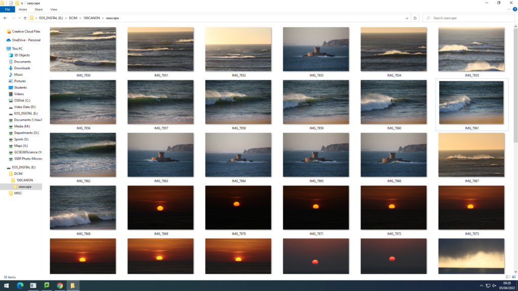
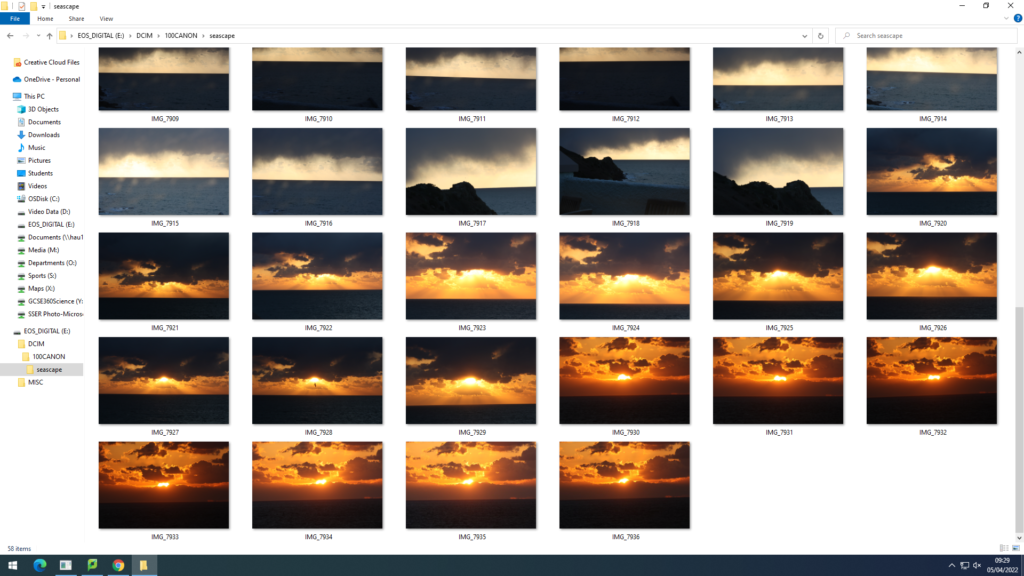
For this photoshoot I decided to base myself down Plemont bay. Using midday lighting and sunny/cloudy weather, I was able to capture more images relating to Jerseys identity involving seascapes. Plemont Bay is a good location to take images as for the cliff faces, caves, and swell. A slight on shore wind created choppy waves and white spray. Here is a contact sheet of the majority of images taken.

When photographing waves I always angle myself lower to the ground to create the illusion of the wave being above the camera. After arranging the best images from the shoot I started to edit in light room. Adjustments such as exposure levels, vibrancy, saturation, contrast, highlights and shadows where all heightened or lowered to create a much stronger and powerful image .

photoshoot 1/2/3 for seascape project (photobook)

Photo-shoot 1 and 2

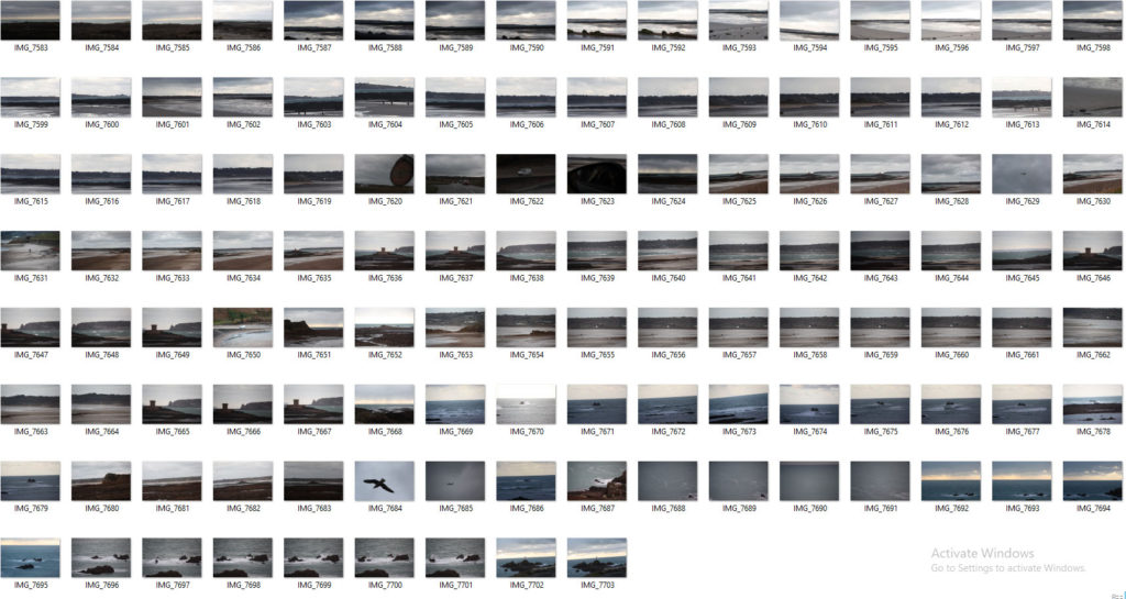
For my first two photo-shoots I have decided to take images down st.ouens bay and grev. I chose these places as for the biggest swell can be found in these areas. I used midday lighting as both days weather wise were not great but plan to take more photoshoots using the prime time of light being sunset and sunrise. My camera settings were known as a low IOS and fast shutter speed to capture the best quality of the quickly moving sea. My editing process so far has enhanced the beauty and colour found within the seascape images. Here are some contact sheets from the shoots…

Throughout the photoshoots I tried to capture the power and roughness that the sea had to provide. Whether that be against a cliff or simply the camera lens looking straight out, this would create a more successful seascape image as there is an intriguing foreground and background. It was difficult to keep the camera steady and in focus when using a larger lens as for the strong winds and spray from the waves. The storm at the time brought messy sets of waves which made it hard to have the correct exposure levels with a lot of movement surrounding the sea.

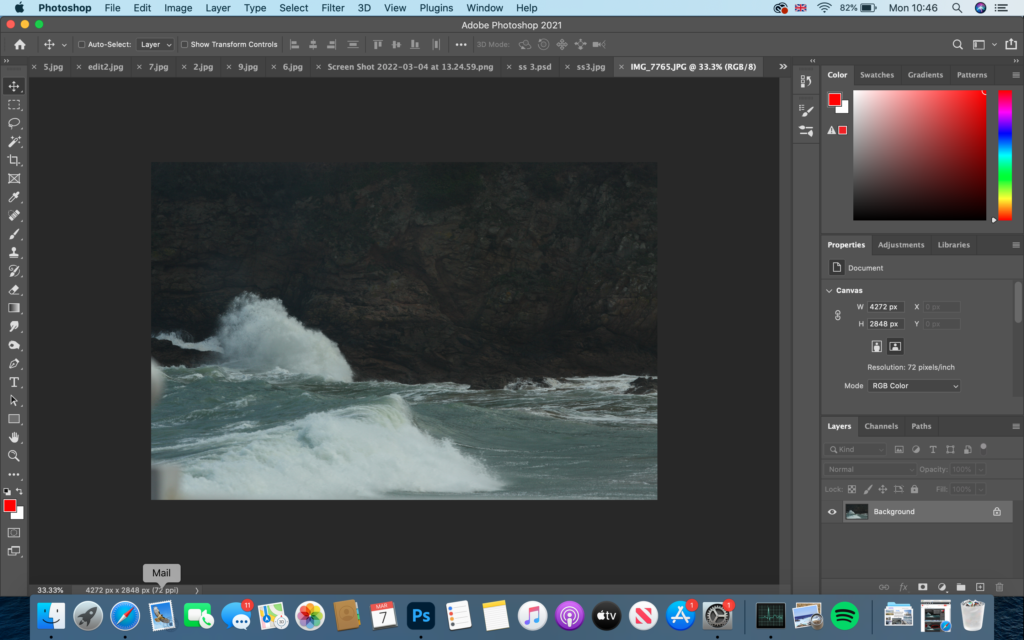
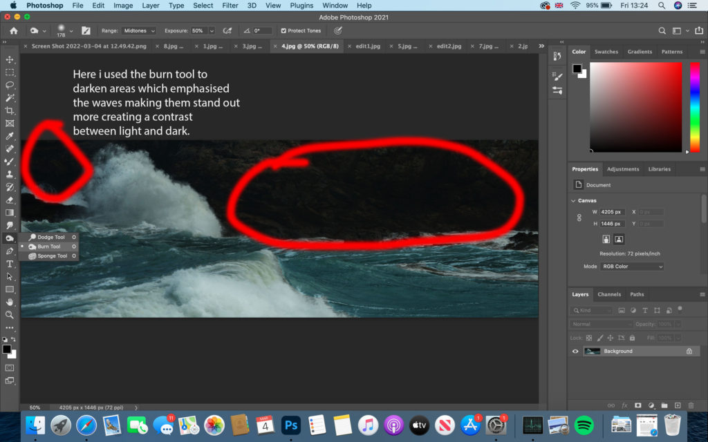
For my editing process of these images I have decided to use many tools and techniques within photoshop and Lightroom to make my photographs more inviting and noticeable to viewers. So far this is what I have come to…

Original photo before editing…

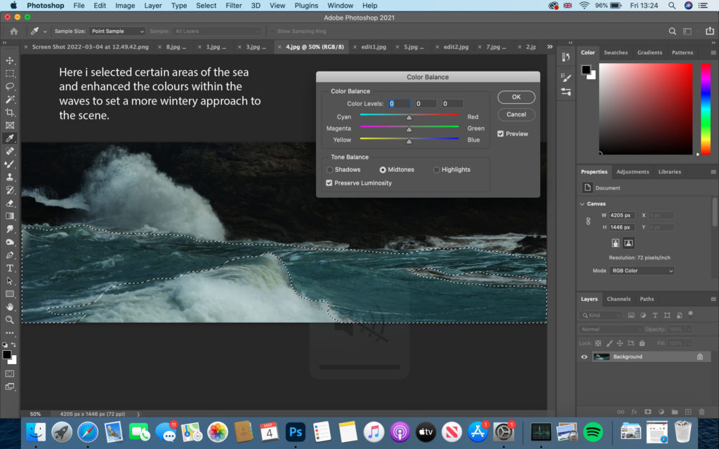
firstly, I decided to crop most of the bottom and up of the image off like I do with many of my own images to create a more panorama effect of the lens. I slightly changed the brightness and contrast levels then began on focusing on the colour use.

As well as using the burn tool I included the lighting tool to brighten up the white spray released by the waves and white web structure that floats on the surface. This creates a dynamic contrast between the cliff face and sea.

Photoshoot 3


For my 3rd photo-shoot I based myself in the same areas down St.Ouens bay as for the weather conditions being sunny rather than rainy and tidal range being high. I decided to capture some sunsets to make my photobook have a more abstract approach. these subtle images being relevant or not to my topic will fit in well against more powerful and moody images.


This image has an empty alt attribute; its file name is image-67-1024x576.png
This image has an empty alt attribute; its file name is image-68-1024x576.png