Category Archives: Uncategorized

Filters

Author:
Category:

Photo montage

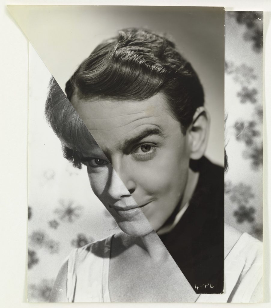
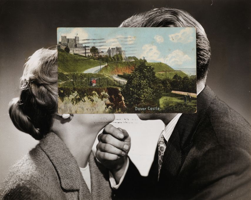
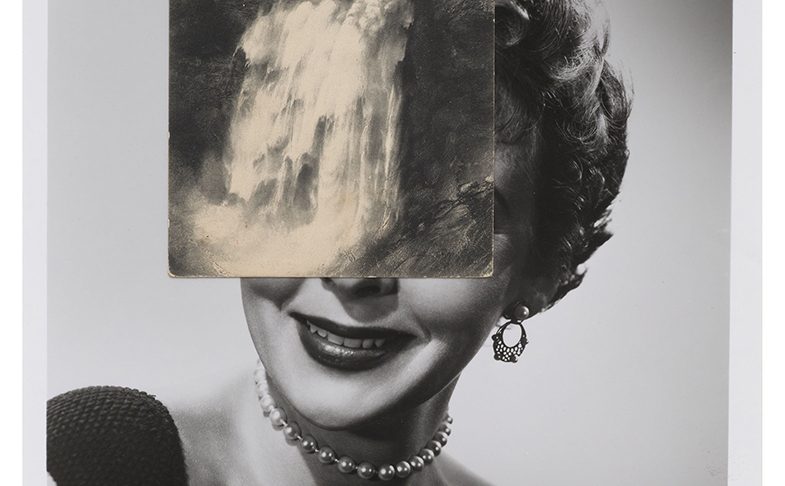
John Stezaker was born in England in 1949, and currently lives and works in London. He studied at the Slade School of Fine Art in London in the 1960s, and has since taught at Central Saint Martins School of Art. Stezaker is one of the leading artists in modern photographic collage and appropriation. Employing vintage photographs, old Hollywood film stills, travel postcards and other printed matter.
John Stezaker’s work re-examines the various relationships to the photographic image: as documentation of truth, purveyor of memory, and symbol of modern culture. In his collages, Stezaker appropriates images found in books, magazines, and postcards and uses them as ‘readymades’. Stezaker asserts that the images “find him,” not the other way around.

My take on photomontages:

PHOTO MONTAGE HISTORY

It was first used as a technique by the dadaists in 1915 in their protests against the First World War. It was later adopted by the surrealists who showed the possibilities of photo montages and the workings of the unconscious mind. In 1923 Aleksander Rodchenko , a Russian constructivist, started experimenting with photomontage as a way of creating striking socially engaged imagery concerned with the placement and movement of objects in space. Another person who experimented with photo montages was the German artist, John Heartfield. He reconstructed images from the media to protest against Germany’s regime. Aswell as Peter Kennard whose photomontages explored issues such as economic inequality, police brutality and the nuclear arms race between the 1970s and the 1990s.

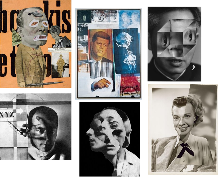
Mood Board

Photo montage 2

John Steazaker was born in England in 1949 and is currently working in London. Stezaker is one of the leading artists in modern photographic collage and appropriation. Employing vintage photographs, old Hollywood film stills, travel postcards and other printed images, he creates fascinating small-format collages that bear qualities of Surrealism, Dada, and found art. Stezaker overlays and conjoins distinct images to create new personalities, landscapes and scenes.  His works have been featured at The Museum of Modern Art in New York, the Tate Modern in London, Tel Aviv Museum of Art and many others.

Analysis of one of his photomontages

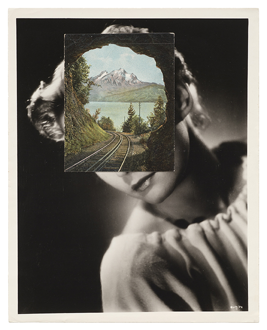
This image is called ‘Bridge’ and comes from Steazaker series , ‘Mask XIV’. Mask XIV is a collage created by superimposing a postcard on a black and white photograph. The photograph is a film publicity portrait of an unidentifiable actor taken during the 1940’s or 1950’s. The postcard is a colour image mounted over the actor’s face. This image shows a rocky cavern in which a sandy track curves around a central pillar. On the bottom left the card is captioned ‘Zig zag path, Folkestone’. Folkestone is a port town in Kent, the town lies on the southern edge of the North Downs at a valley between two cliffs. The postcard covering the actors face appears to have been taken from inside of a cave looking out through two openings towards the light.  Stezaker has positioned the postcard on the actor’s face so that the dark silhouette of the rocky openings and the natural curves of the cave line up with the contour and shape of the actor’s face making it look like his ‘eyes’. The way Steazaker has placed the postcard has created a humanlike approach to the image as the two openings of the caves create an eye shape look and the middle rock looking like a nose. This gives the viewer a very real view on the image and gives us a sense of the two images merging into one and framing a new person. The fact the actors face is covered makes the image feel more mysterious as we don’t know who this is and why he is being covered.

STREET PHOTOGRAPHY

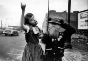
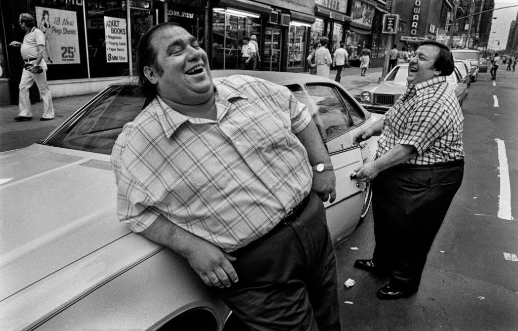
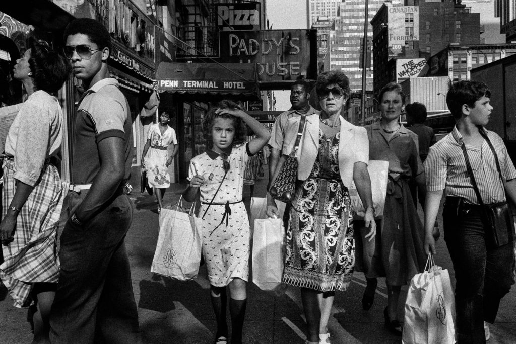
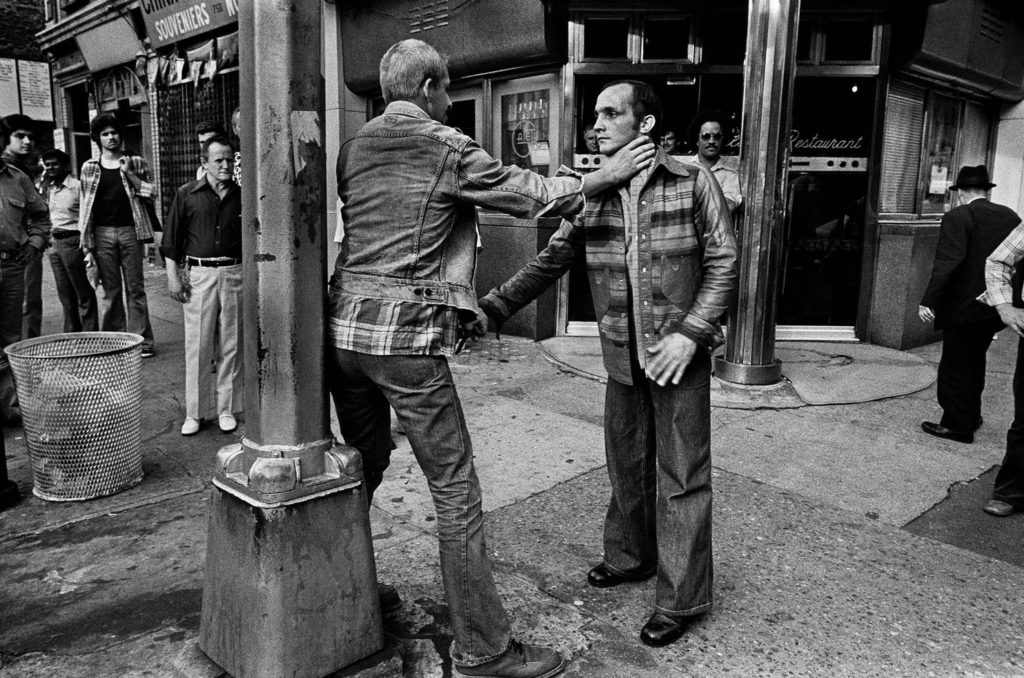
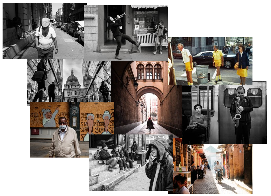
Street photography is a genre of photography that records everyday life in a public setting. The publicness of the setting enables the photographer to take candid pictures of strangers, normally without their knowledge. Street photography does not necessitate the presence of a street or even the urban environment. Though people usually feature directly, street photography might be absent of people and can be of an object or environment where the image projects a decidedly human character in facsimile or aesthetic.
Street photography also includes candid portraits, which is often used to refer to the type of portrait taken when the subject is unaware of the photographer.

Examples of street photography:

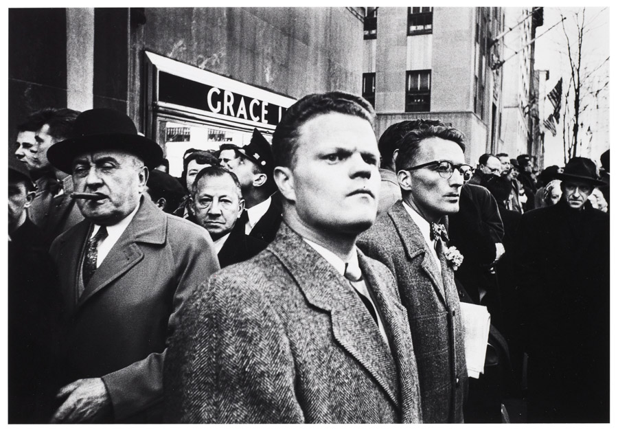
Here is a video of Bruce Golden , an American street photographer known for his candid close-up photographs of people on the streets of New York City, in action on the streets of New York.

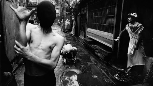
Street photography can tell a lot about a persons lifestyle, class and a lot about a persons existence. Street photography captures people in their rarest moments which can show a lot about a persons true emotions. Usually it’s a form of candid photography, when the person isn’t aware they’re being photographed, which creates more realistic and powerful images.

Mindmap of ideas

Self reflection post (CC)

Now that it’s over, what are my first thoughts about this overall project? Are they mostly positive or negative?

My first thoughts on the project are that I feel like it went quite well and I now have a further understanding of what a photography exam is like

If positive, what comes to mind specifically? Negative?

I think everything went well for example my research and photos etc

What were some of the most interesting discoveries I made while working on this project?

The amount of work needed to be put in and also what improvements can be done to take the photo shoot to the next level to improve my grades

What were the challenges?

Time management so how I used my time wisely giving myself enough time to explain and plan photo shoots, research and outcomes

What is the most important thing I learned personally?

That I needed to have a wider variety of photos/ photo shoots that needed to be taken with different lenses, effects, locations, weather and time.

How did I come up with my final best solution?

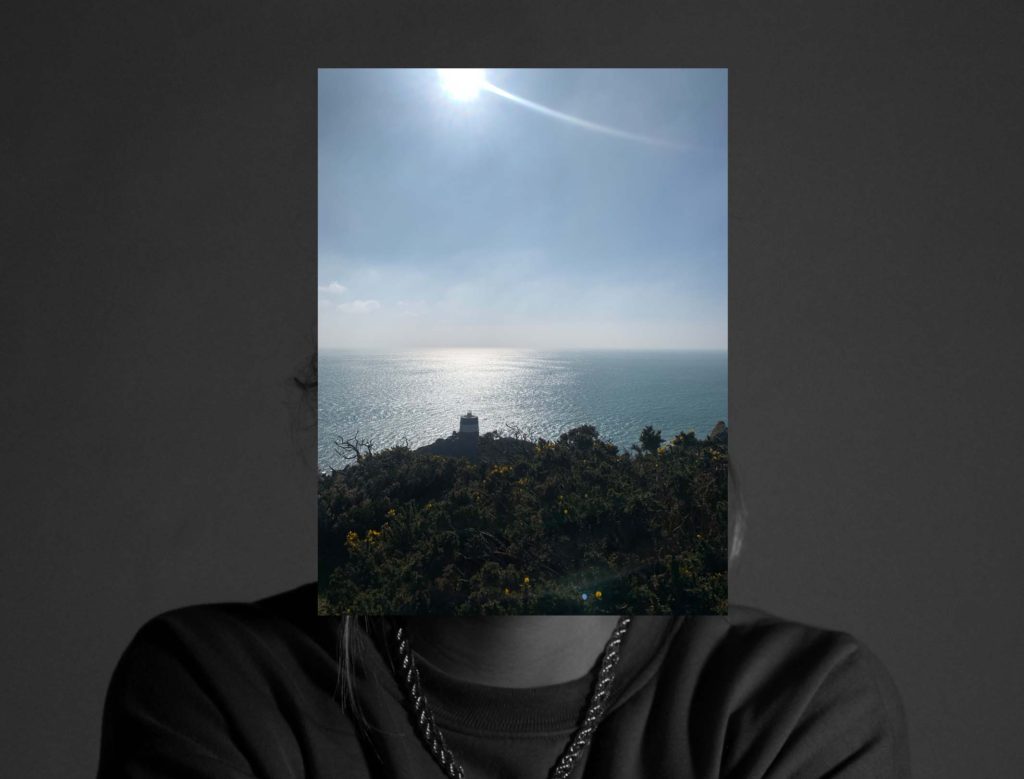
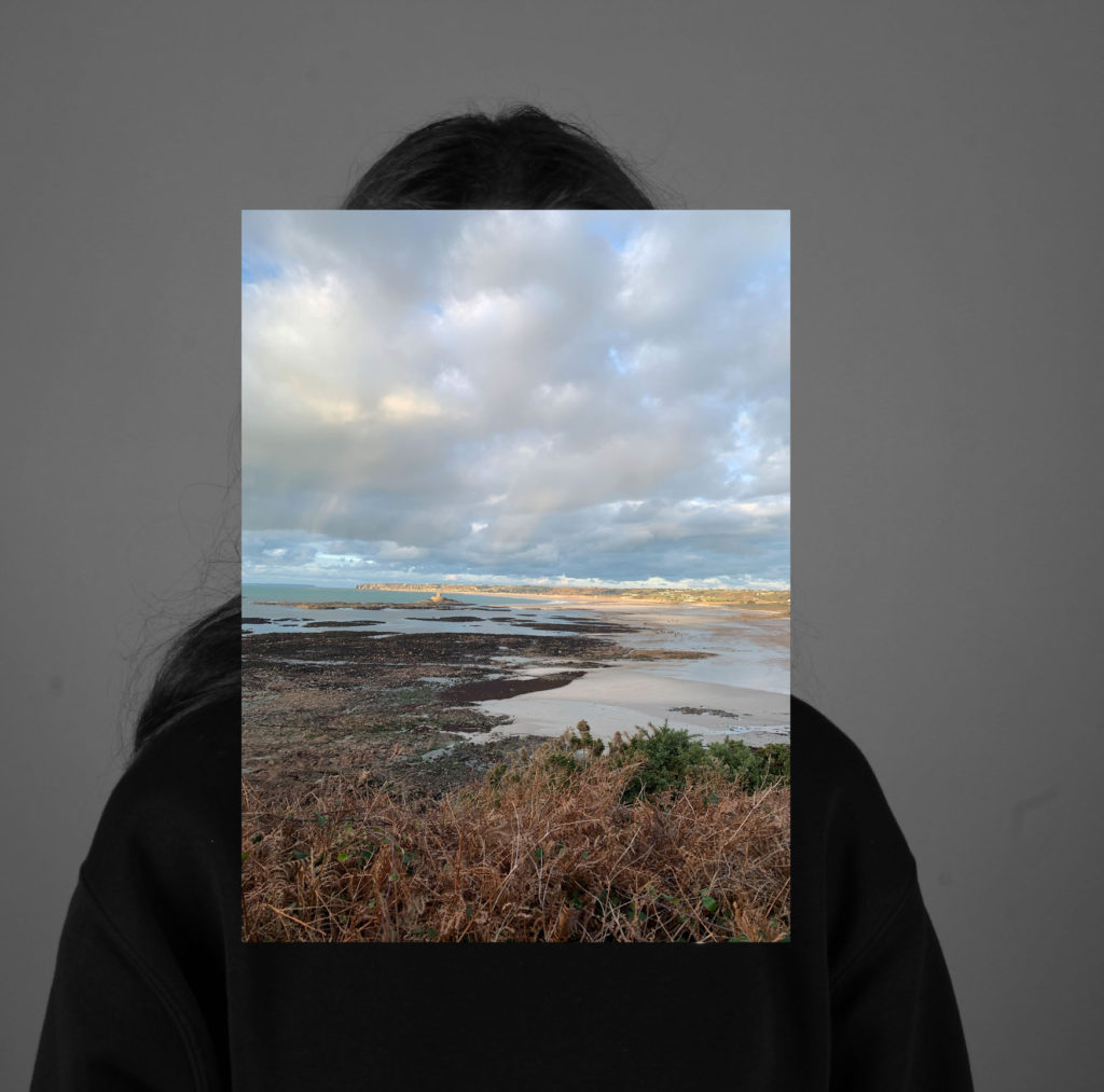
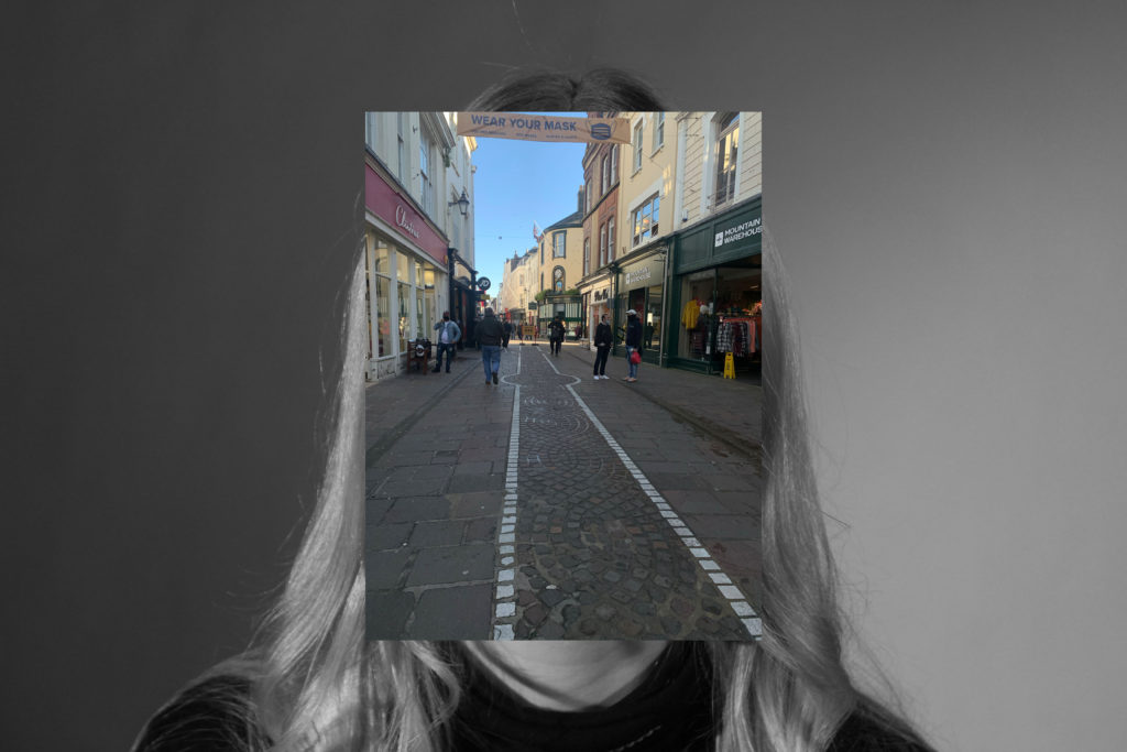
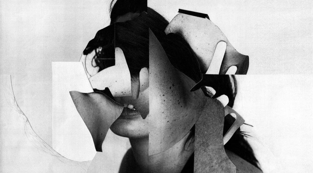
I saw on the blog a post about a guy called Kensuke Koike who used photography to edit photos and take snippets from different images and put them all together. This really changed my idea of how I could create identity because I could now make a final outcome that had loads of different images in one photo

What most got in the way of my progress if anything?

The time constraint as I didn’t realize how fast time goes when working

What obstacles did I overcome?

The edit I was trying to create was not working in Photoshop so I left it and came back and it brought a new light to the idea and i was able to overcome the obstacle

What did I learn were my greatest strengths? My biggest areas for improvement?

I completed everything I needed to during the time constraint. I also believe my Photoshop skills have improved and my way of showing photo shoot plans and contact sheets. I believe my areas for improvement are planning my photo shoots in advance so that weather and time aren’t problems. This would aid me in creating a wider variety of images that showcase different emotion, weather, light and feel

What would I do differently if I were to approach the same problem again?

As I have previously said, I would plan photo shoots in advance to collate a wider variety of images

What could I do differently from a personal standpoint the next time I work?

I would collect my best images to reduce the amount of time spent on going through my images to find the best

What can I improve?

I can improve knowledge on further Photoshop skills to help me create more complex images that could potentially bring my grades up and also to know exactly how to edit in certain ways so that I could explain in depth with use of screen shots how I did everything

How will I use what I have learned in the future?

Plan everything in advance and prioritize what is the most important and what should be done before the rest during the exam

WWW – WHAT WENT WELL

I believe my edits and outcomes from my 3 photographers went the best as I responded to my images and criticized and compared them to images by my photographers

What are your strengths and weaknesses?

My edits, outcomes and plan were my strengths

My time management, photos and research need to be improved

EBI – EVEN BETTER IF

I feel like I could improve my analysis, research and range of photos if I did this again or on a future occasion

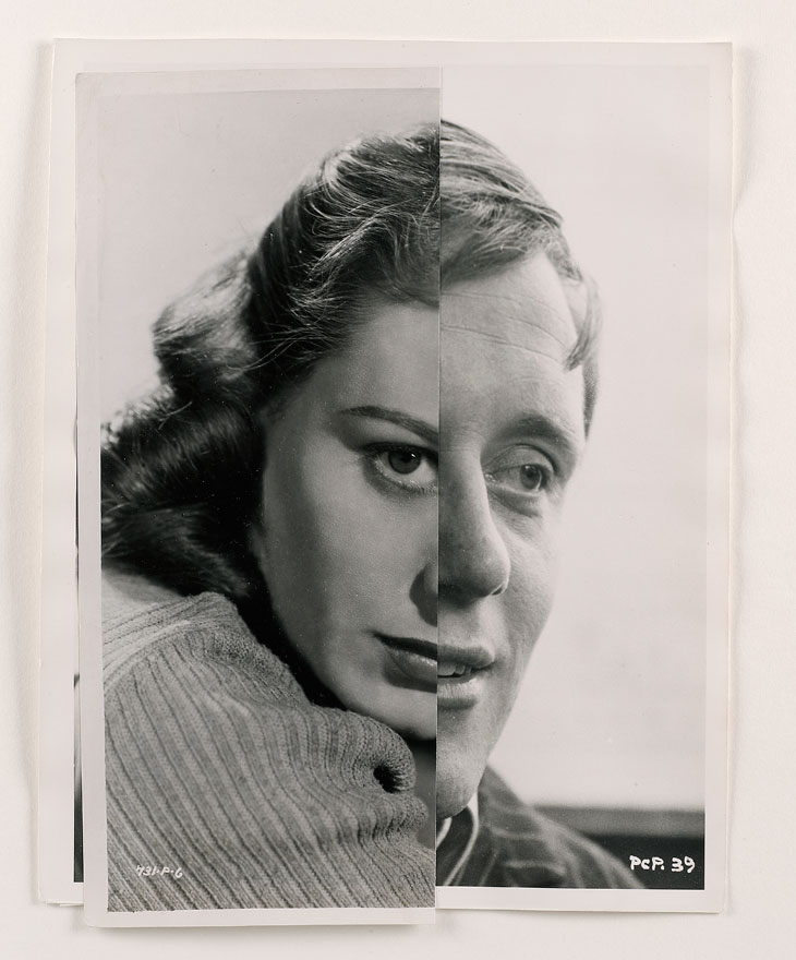
photo-montage

A photomontage is a collage constructed from many different photographs to form one new image. The technique has been used to make political statements and gained popularity in the early 20th century. (from world war 1 – world war 2).

Image result for joachim schmid

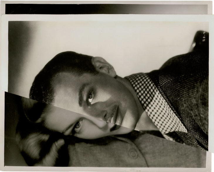
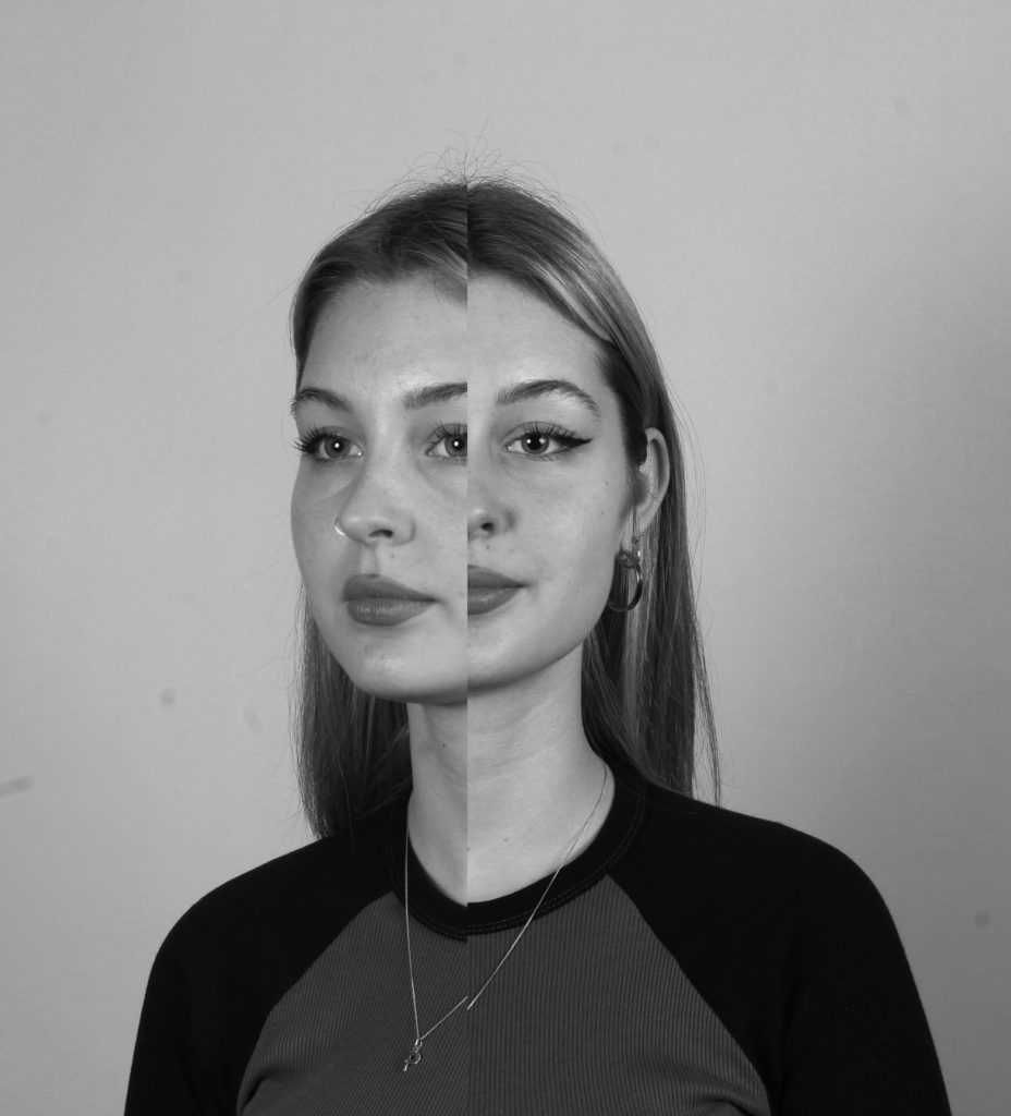
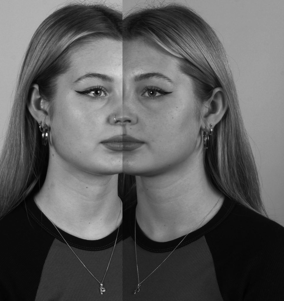
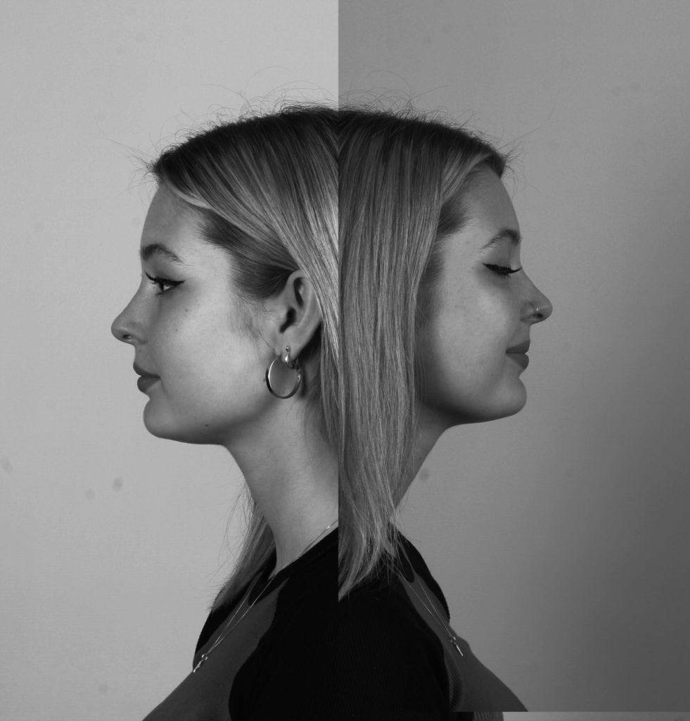
The inspiration for my photo montage I got is from Joachim Schmid. He cuts two images in half to form one. This makes the image more abstract and gives you more to look at. He uses a variety of different images put together such as opposite genders- half female and half male, a young child in contrast to a grown up or just simply the same person but from a different angle.

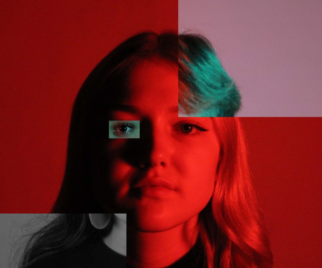
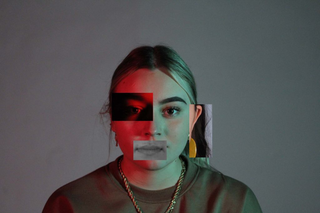
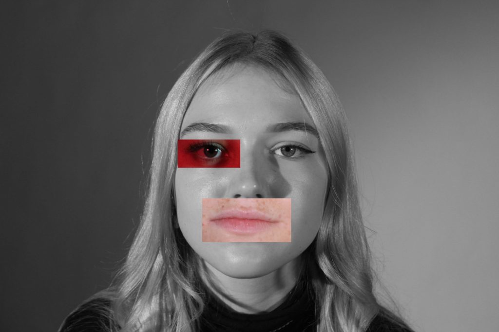
my photomontage images edited on photoshop-

Overall, I really like how my photo-montage images turned out as I think they turned out more interesting than the original photos. I like when photography is presented in an abstract form, personally I think it gives more character and meaning to the photos. For example I got inspired by Joachim Schmid because I think combining two images into one is more interesting than having just one plain portrait image. In this case by using two images I think it can show how every person has two sides of them or two faces in a way, which can be seen by using twos sides of an individuals face and combining them. I cropped one of my two images and just simply dragged it on top of the previous layer and later on cropped it , in order to just focus mainly on the face like my chosen photographer.

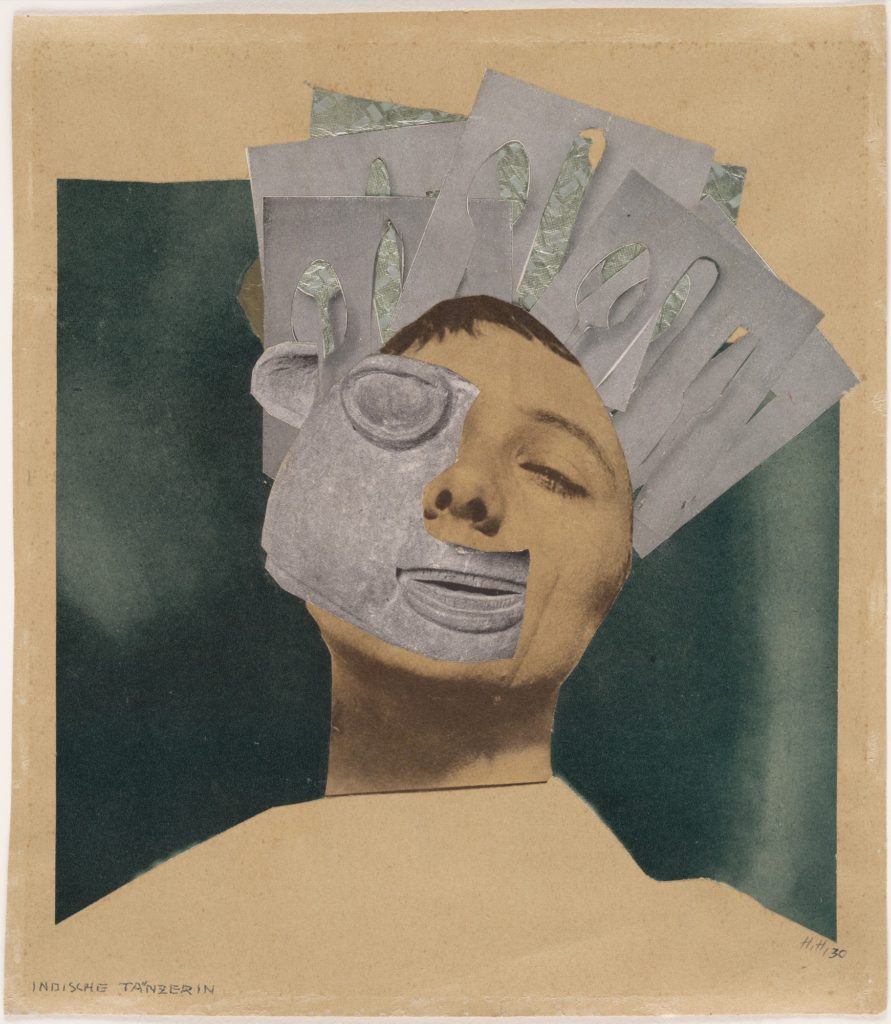
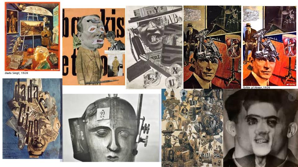
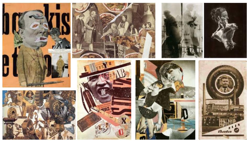
raoul hausmann – photo montage

Raoul Hausmann was an Austrian artist and writer. He experimented with photographic collages. Around 1923, Raoul would create montages of cut outs of magazines locally and stick them together. He believed war at the time to be a necessary cleansing of a calcified society. He would find portrait of soldiers, onto which he had glued photographic portrait heads of his son five times. Some would say he’s mentally unstable to the fact that he agreed with war. His feelings towards war and that time or era seemed to be all expressed into his art pieces.

Mood Board –

Photo Analysis –

Image result for Raoul Hausmann photomontage
Art piece by Raoul Hausmann – 1919

This image was probably anonymous figures cut from a magazine. Raoul’s work seemed to have a meaning behind why exactly he made this photomontages. As he believed war was a cleansing of a calcified society, using soldiers bodies from a poster or magazine and sticking others heads to it might suggest that he feels as if we should fight for ourselves, fight for rights. The fragment of a German banknote behind the neck of the anonymous figure suggests that he is controlled by capitalist forces. This is because German were invading berlin , where Raoul is from, and taking over the country. The words in the background are part of a poem poster made by Hausmann to be pasted on the walls of Berlin. As well as montages made he was a poet who sees poems to be an art that can link into his montage work. This is another way for Raoul to express his impressions of the time of the World War 1. This piece of art in particular was made with different materials that were assembled together.

History of Photo-montage

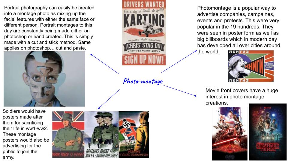
A photo-montage is a collage constructed from photographs. This photographs can be as abstract as can be from each other. Common photo montage creations are portraits such as mixing different parts of models faces with others. Montage photography can be created on photo shop and by hand. Historically, the technique has been used to make political statements and gained popularity in the early 20th century (World War 1-World War 2). It was first used as a technique by the dadaists in 1915 in their protests against the First World War. It was later adopted by the surrealists. This is where photo montage was open to possibilities for expressing the feelings of war soldiers and working communities.

Ideas Of Photo-Montage –

Mood Board –

Photo-Montage creations from WW1-WW2

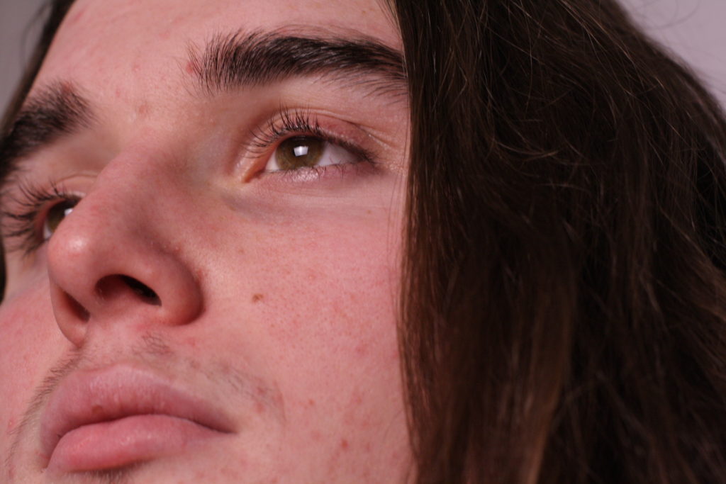
Photo-shoot – up close images relating to Satoshi Fujiwara

Plan-

I will be photographing my friend in the studio using a soft box light as a main light to project good lighting on my models face. With this light i can also change the level of warmth and cold. This means i can capture more color in the facial feature and more dynamic and contrasting lines of shadow in the face. More color in the face relates to Satoshi’s work as her work is seen with peoples faces to be colorful and bright. I used between a white and black backdrop to contrast the face between the two to capture different perspectives of the face. My camera settings were as such; exposure – 1/100 ISO – 400 and 200 (depending on the level of the soft box light) and i used a 50mm lens.

Contact sheet

Best Images –

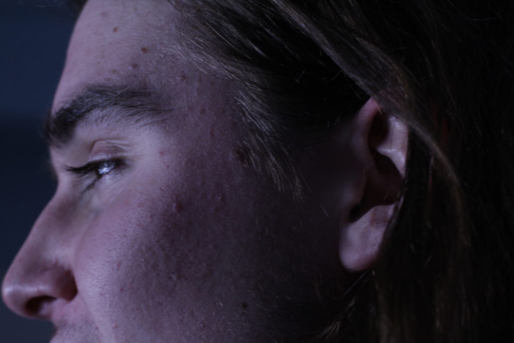
These images relate to Satoshi Fujiwara’s work as these ‘portrait’ photographs have a similar appearances towards them. For example, the dynamic shot from the bottom of the face upwards. Cutting out the rest of the image and only capturing some or even all facial features. This is what makes the image seen close up.

Image result for Satoshi Fujiwara
Image by Satoshi Fujiwara
Image by me

Evaluation-

This photo-shoot was a quick and easy shoot to do within 30 minutes or so. Using studio lighting made this an easy shoot for the focus of the Lens to be in focus on the face when really close up. Satoshi’s work seems to be using bright flash light and keeping the face bright with maybe just natural light such as a sunny day. If I was to do this shoot again i would choose to do a range of different people with using different scenery and lighting. I might get my model to not pose as much and make the photos captured to be more natural and content.

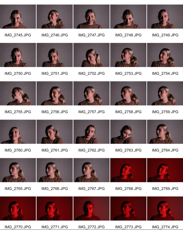
studio portraits – one point lighting

Studio portraiture is an incredibly versatile genre of photography images can be anything from bright, punchy, high-key images full of light and energy, to dark, intense images that draw the viewer to the subjects eyes. Studio photographers take pictures of individuals or groups of people. They may use set pieces, backdrops, lighting equipment and filters to create the appropriate effect for the photographs. To work as a studio photographer, you would need to have a sense of light and shadow, as well as patience and a keen eye. Creativity and a passion for art also are beneficial traits for aspiring photographers.

One point lighting involves just one light and is illustrated as the key light. The purpose of the key light is to highlight the form and dimension of the subject. The angled positioning of they key light produces shadows from the subject which is nullified by the light. A main purpose isn’t to eliminate the shadows completely from the frame but to ensure a soft transition of light from one side of the face to another. The light intensity can be softened by moving the light further away from the face, or closer for a harsher light as it bounces of the face.

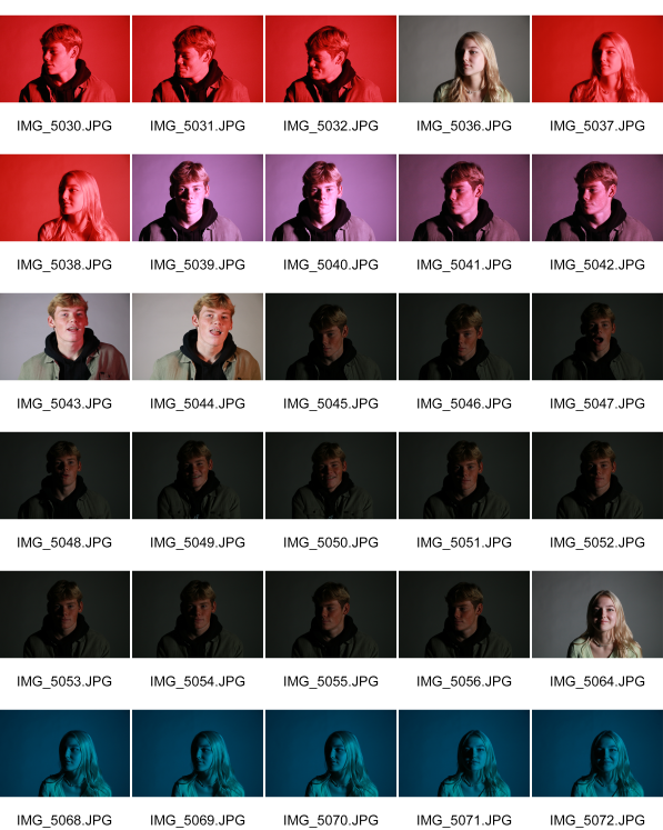
my photo shoot

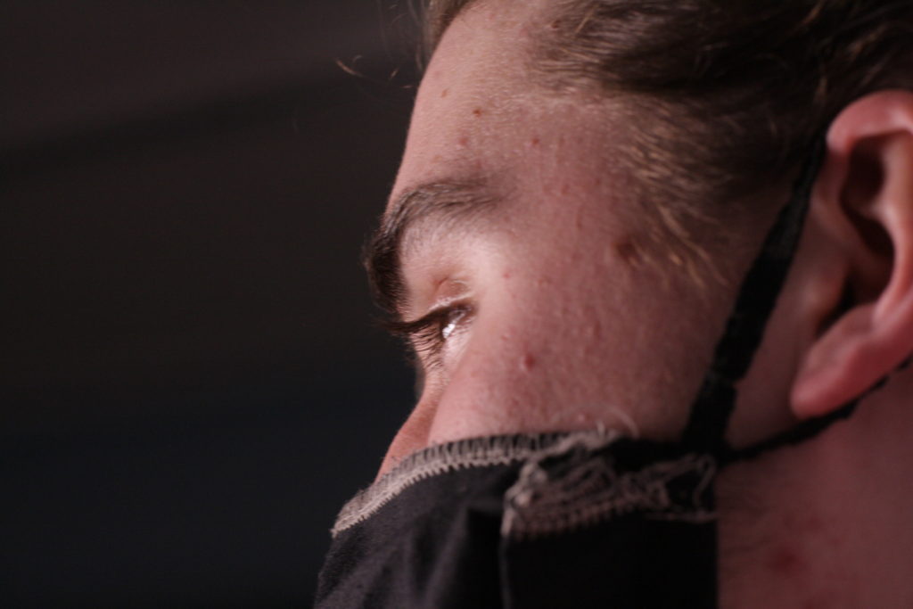
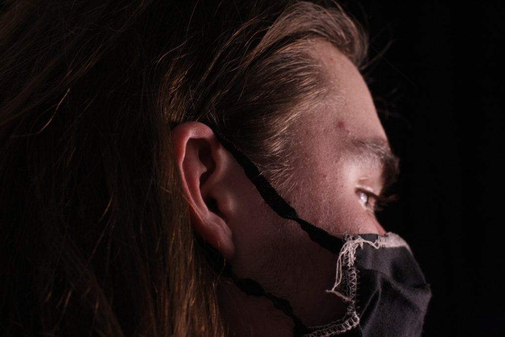
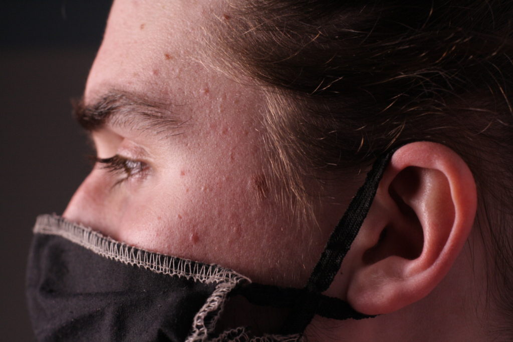
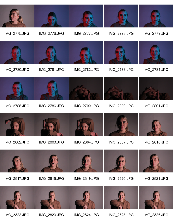
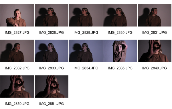
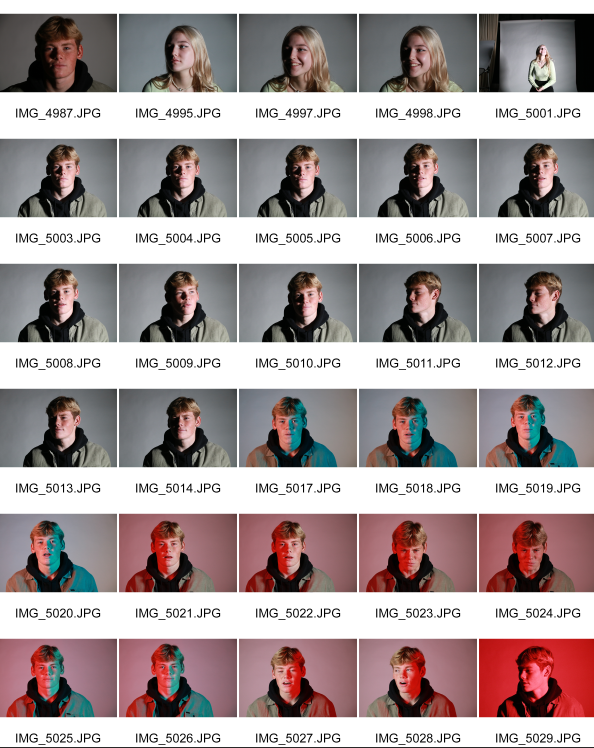
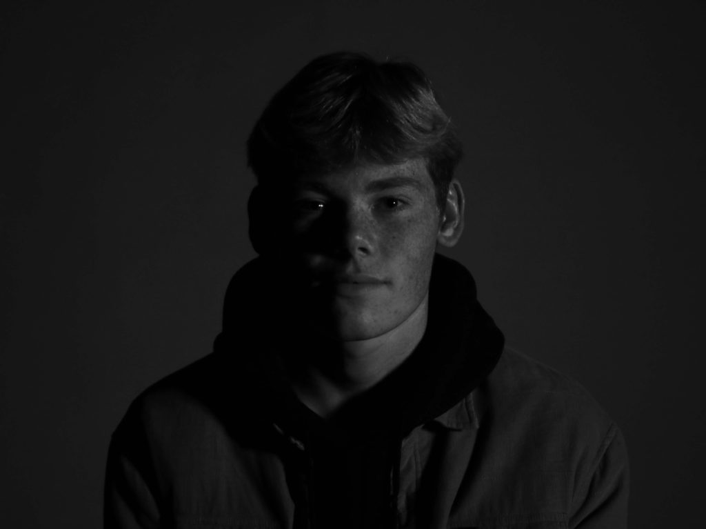
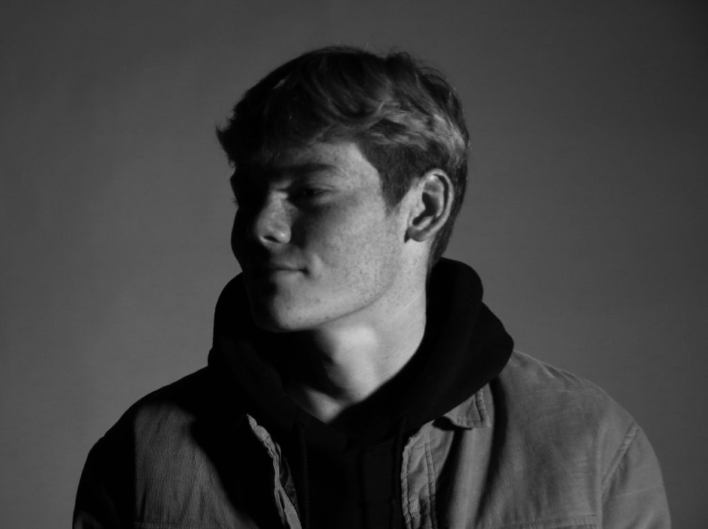
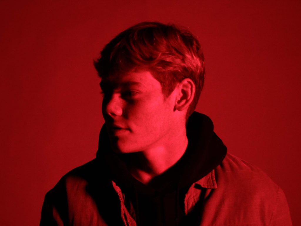
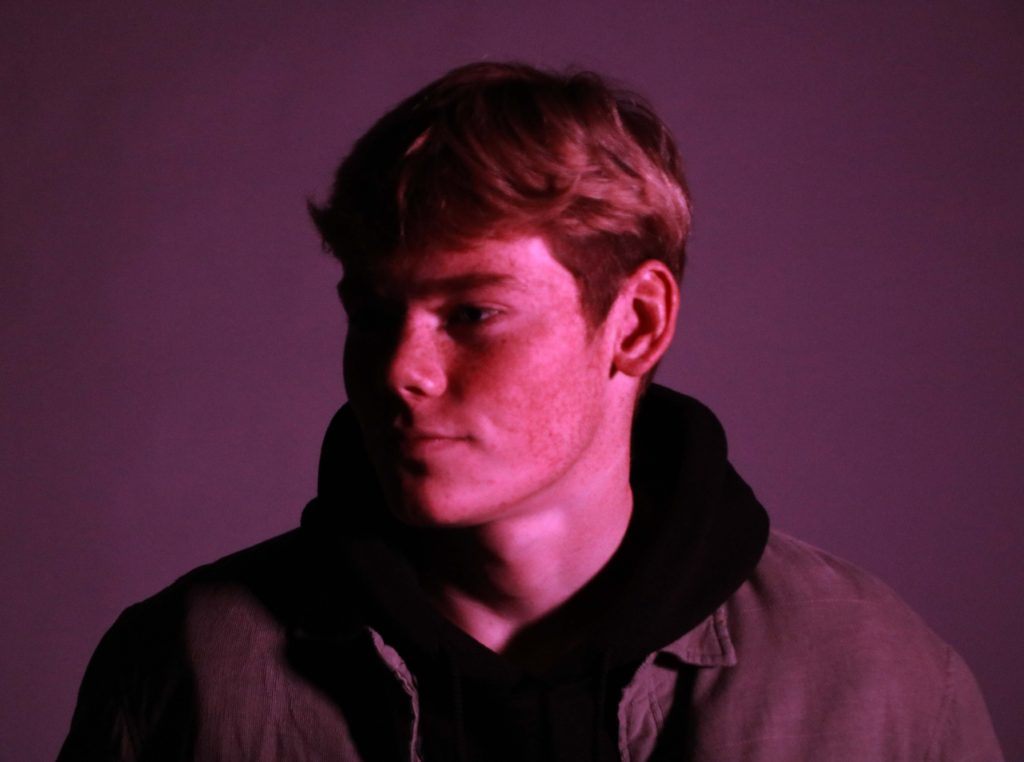
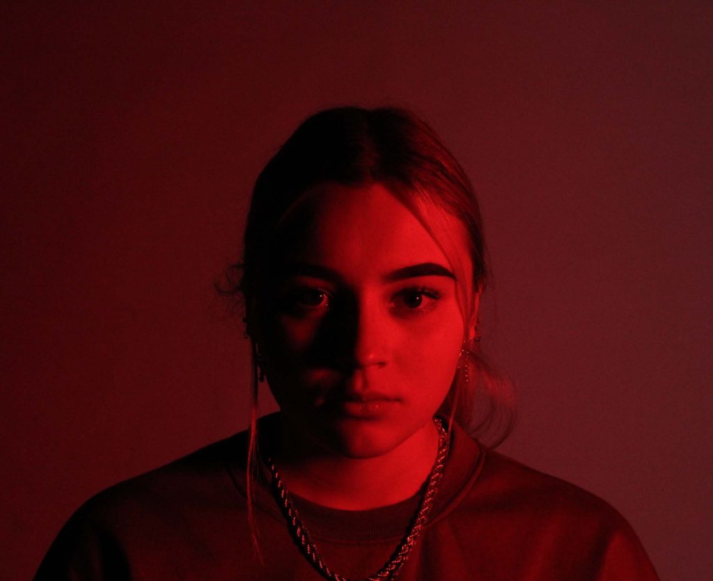
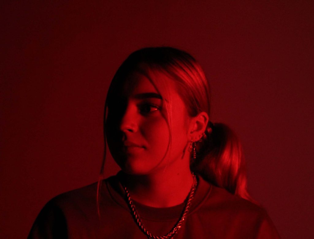
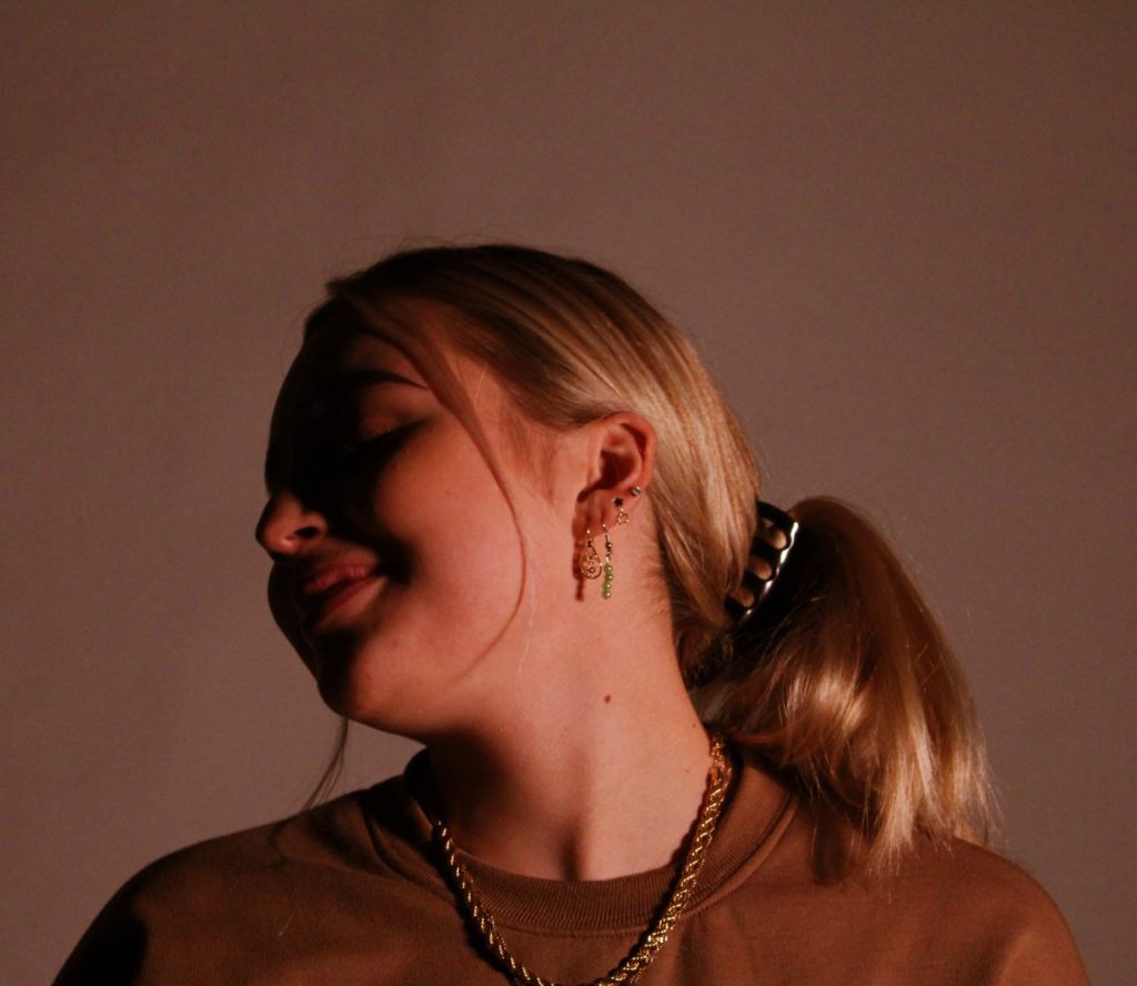
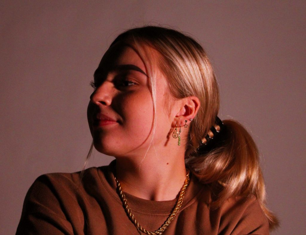
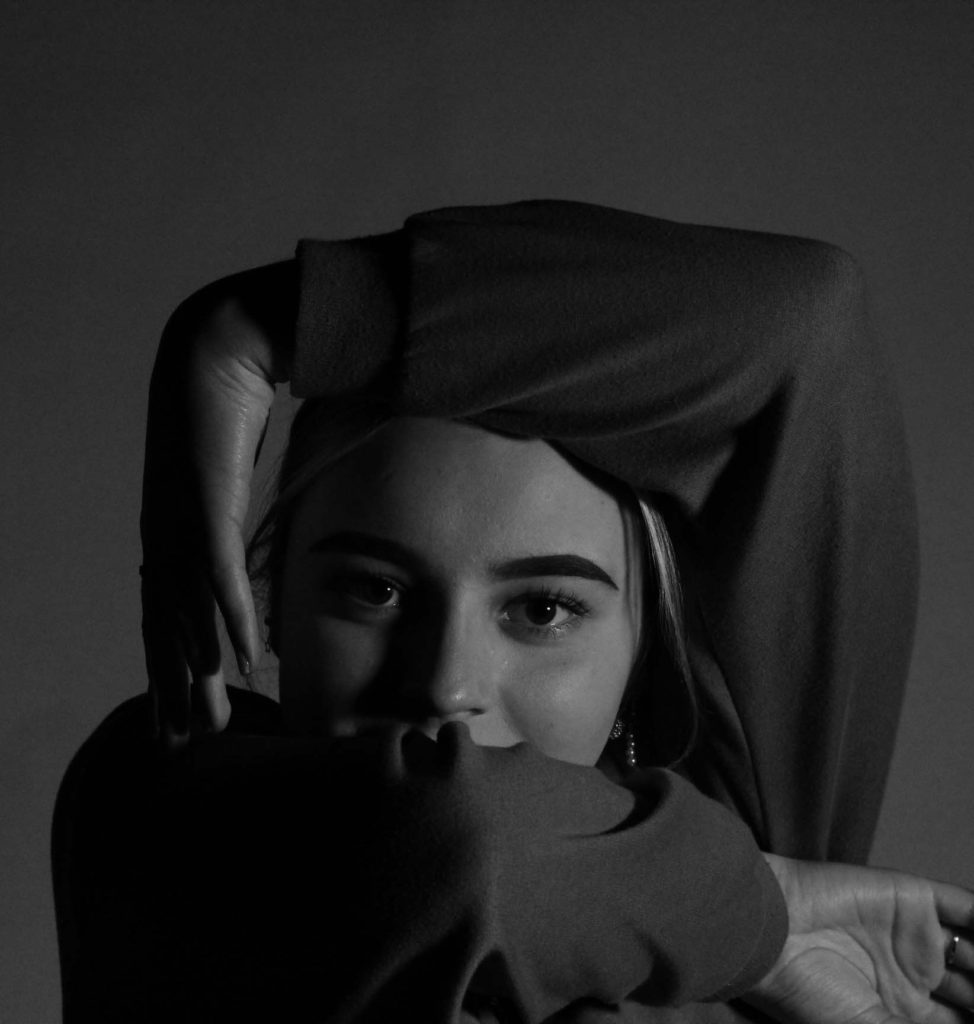
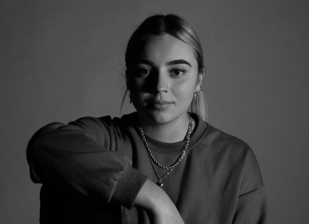
Final Images – one point lighting

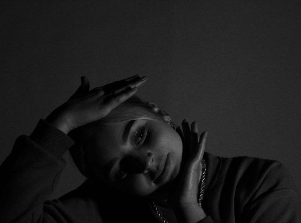
In a few of my final images, I used red, pink and orange transparent objects in front of the light to reduce the high intensity and colour temperature for a warmer lighting condition. My key light was placed on the right to bounce of the face and was placed further back to produce a softer image. In some of my photographs, where the light cant reach parts of the face, the shadow is so deep it creates a sharp contrasted line between the face and the background. However, in others, the shadows aren’t so harsh and features of the face can break through the cloud of shadow. What I like about one point lighting is how the key light highlights high-points of the face, creating different shades of red, pink or orange. In my black and white images, the one point lighting creates a variety of shadows and highlights. One light creates strong contrasts and highlights at different parts of the image and a range of grey scale tones.