Category Archives: Uncategorized

Filters

Author:
Category:

newspaper

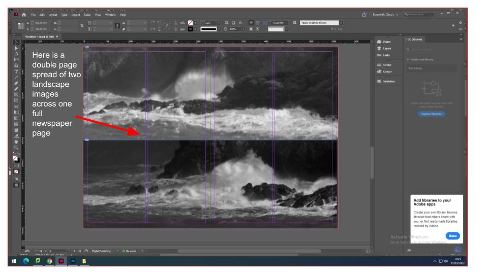
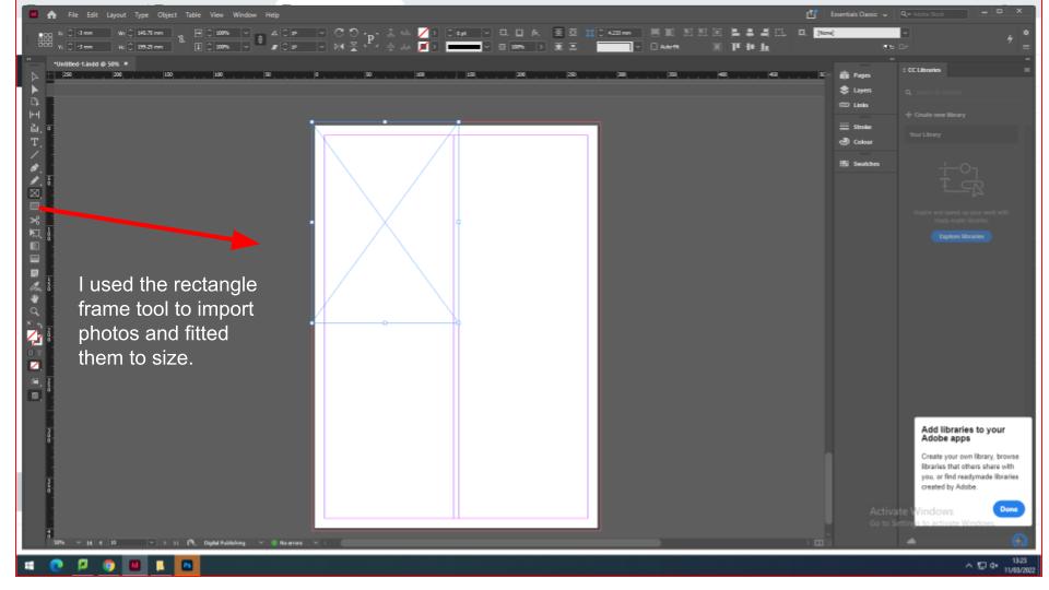
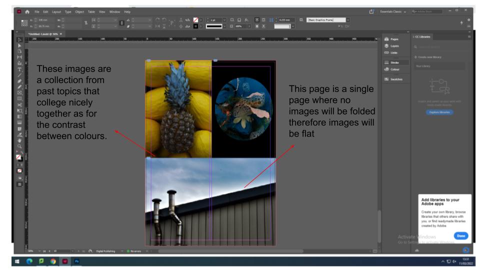
for the newspaper i have decided to add images for current topics and past topics. Firstly i created a spread sheet on InDesign that had the proportions of a Jersey Evening Post newspaper with multiple pages.
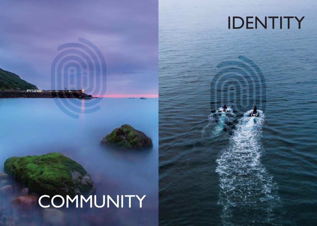
IDENTITY & COMMUNITY Newspaper

The images seen on the pages of this newspaper supplement are extracted from a variety of projects and final outcomes produced over a two-year academic programme of study by a group of A-Level photography students at Hautlieu School. In their final year the themes of Identity and Community offered a specific focus and through a series of creative challenges students developed a body of work that were inspired, partly from visiting heritage institutions to learn about aspects of Jersey’s unique history of immigration and exploring migrant communities and neighbourhoods in St Helier in a series of photo-walks. In the classroom additional inspiration was provided from workshops on NFTs (non-fungible token) and digital art, embroidery and textile art, animation and film-making, zine and photobook design led by professional artists, designers and teachers.

As part of the research and contextual studies students were asked to engage with some of the key questions raised by the Government of Jersey’s Island Identity project and explore through their own photographic studies how they interpret and identify distinctive qualities of island life. What can we learn from looking at a set of photographs produced by young islanders? At first sight they show us a seemingly random set of images of places, people and objects – some familiar, others surprising. On closer inspection each image is a visual sign and also a conundrum. For example, a fish stuffed in a plastic bottle may ask us to consider more closely our marine environment, commercial fishing or food consumption. As a combined sequence of images they represent different views that in many ways comment on a wider discussion on some of the primary objectives explored in the Island Identity project, such as ‘how we see ourselves’ and ‘how others see us.’
The newspaper was kindly sponsored by Deputy Carolyn Labey, Minister for International Development and Assistant Chief Minister who in her foreword shares her personal thoughts on what makes Jersey special to her in context of the Island Identity project led by her department. She says, ‘identity involves searching our soul, engaging with difficult issues, and asking not only who we are, but how others see us and what a vision for the future might look like. The perspective of students and young people in this debate is critical. Identity is a broad and far-reaching concept, one unique to all of us. This collection of images recognises both our differences and our commonalties. These times may be uncertain, but in my view the topic – ‘what Jersey means to you’ – is a fundamentally optimistic and forward-looking one.’
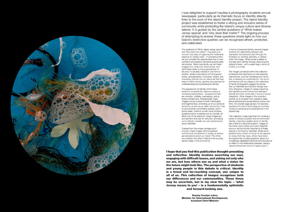
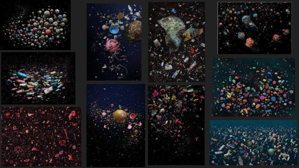
This is my image from a topic in year 13 were I based my photography around the photographer Mandy Barker. She invested her time in plastic that was released into the sea. She created chaotic scenes of abandoned plastic seeming to float in the vast open sea. Here is an example of her work….
This image has an empty alt attribute; its file name is mandy-2.jpg

I found being part of a local newspaper very exciting and interesting as I knew my work will be out for the public to view. As for my work relating to Mandy Barker’s work, this is a clear message of plastics used wrongly within the oceans. Expressing world wide situations and difficulties such as plastic wastage through photography will bring more awareness to the public.
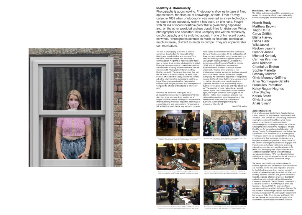
The Identity and Community newspaper is the fourth supplement produced in collaboration between Hautlieu School Photography Department and Jersey Evening Post. In 2018 the first issue was The Future of St Helier and last year the themes of Love & Rebellion explored experiences of isolation and lockdown during the coronavirus pandemic. Photographer and teacher Martin Toft, comments: ‘The question of ‘what makes Jersey special’ matters a great deal to every islander and as visual signs, the images printed on these pages are an attempt – not so much to provide answers – but rather asking questions about the essence of this island we call home, and how it actively will overcome current challenges in shaping a prosperous future for all.’
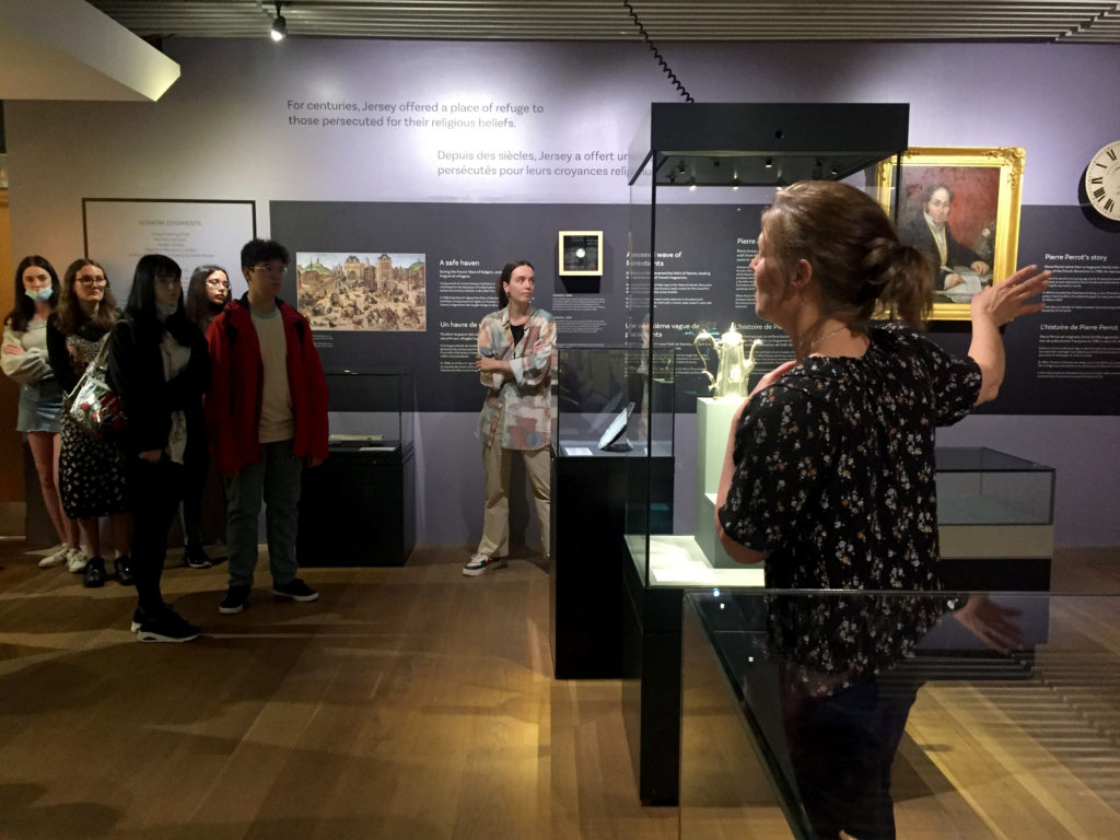
Various workshops and school trips for inspirations, recording and experimenting with new images and ideas of making

Final print layout experiments

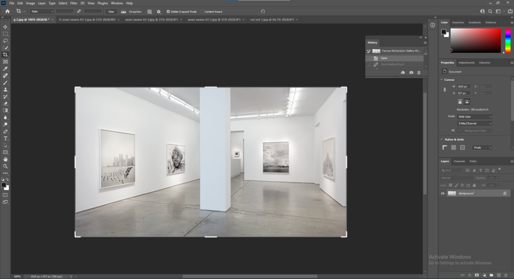
First I opened a picture into Photoshop of an art gallery I found on Google.

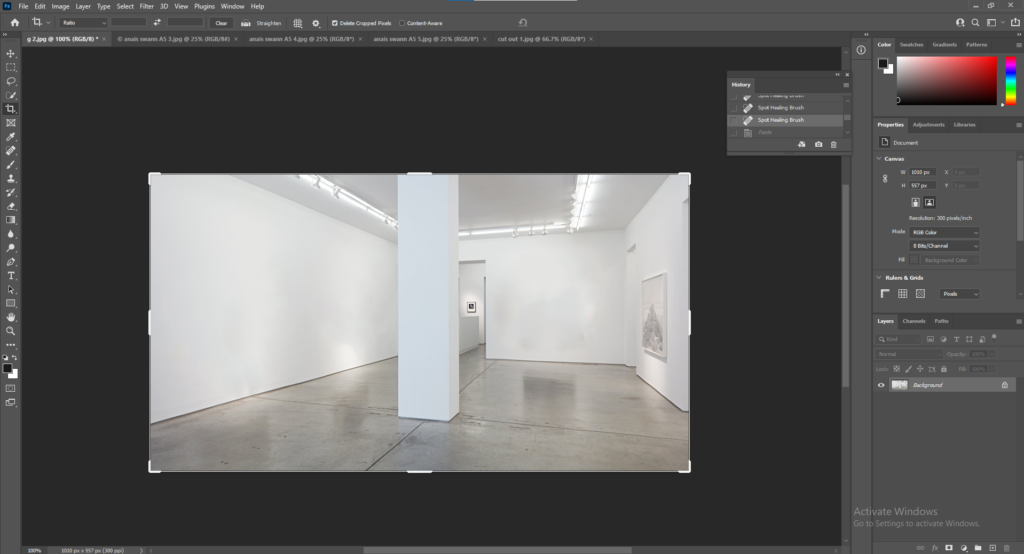
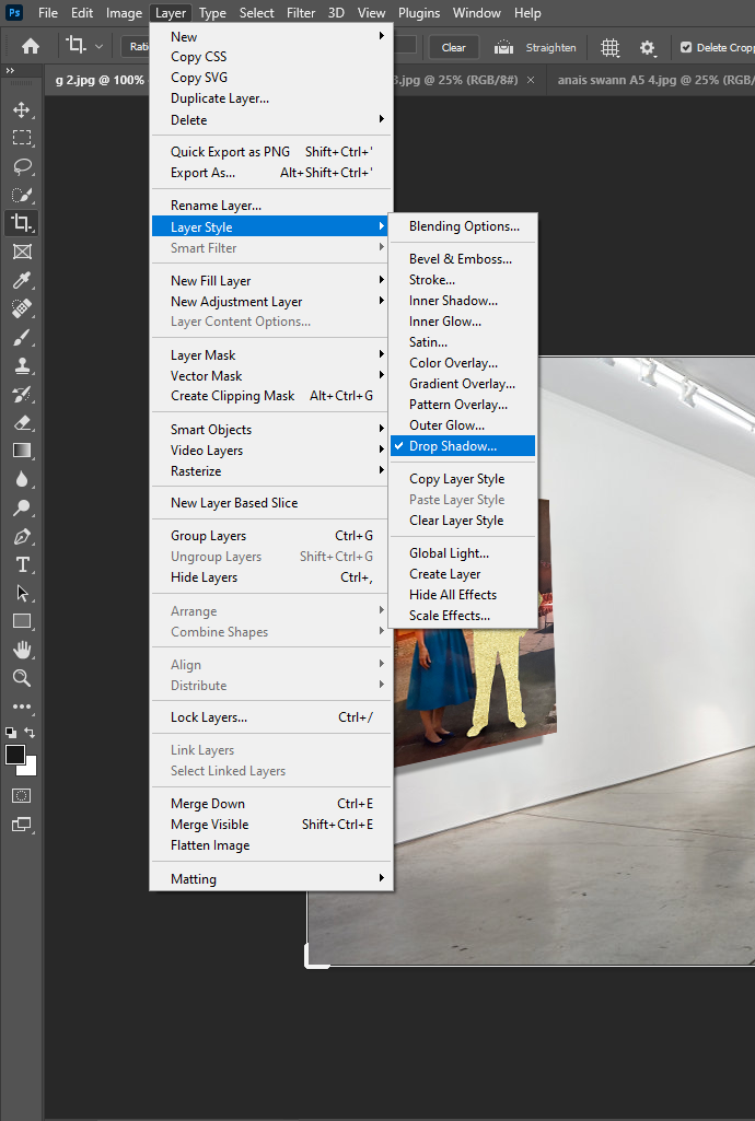
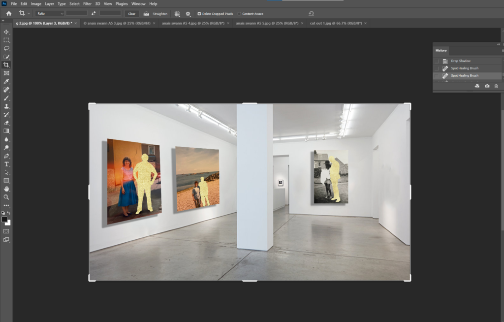
I used the Spot Healing Brush Tool to remove the canvases in the picture so I can add my own.

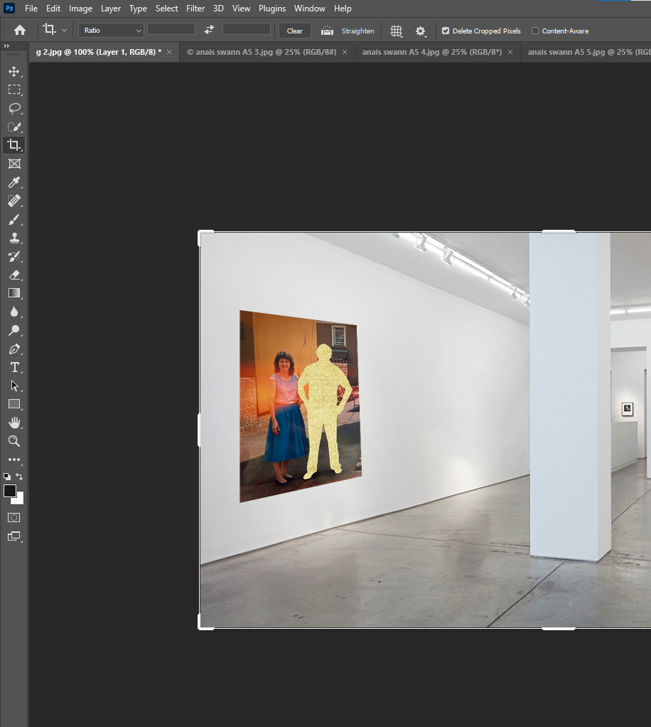
I opened the image I wanted to used and went up to Edit, Transform, Scale and Distort to fit the image correctly onto the wall at the right angle.

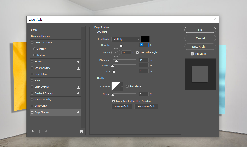
Next I wanted to add a shadow to make the gallery look more realistic. To do this I went up to Layers, Layer Style, Drop Shadow.

I adjusted the Distance, Speed and Size of the shadow.

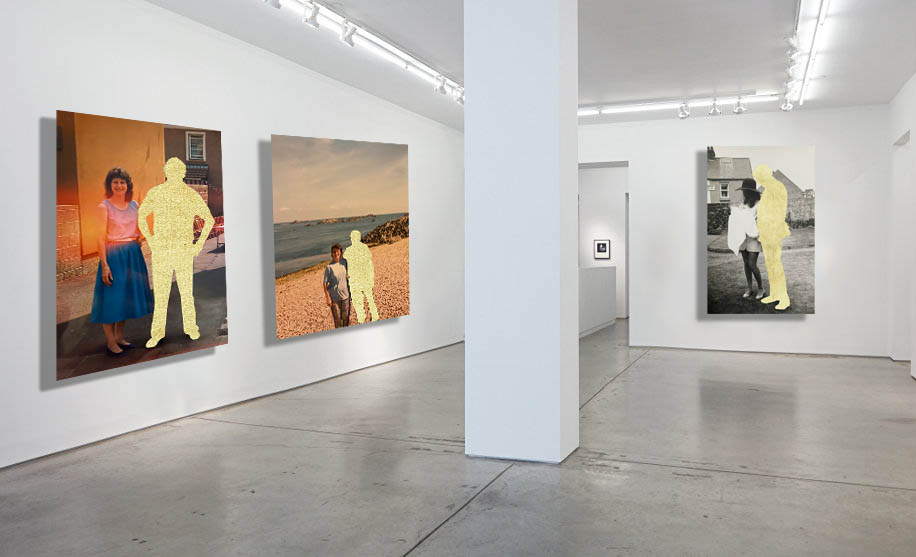
This is the final outcome.

Final Edits

Final images for Printing

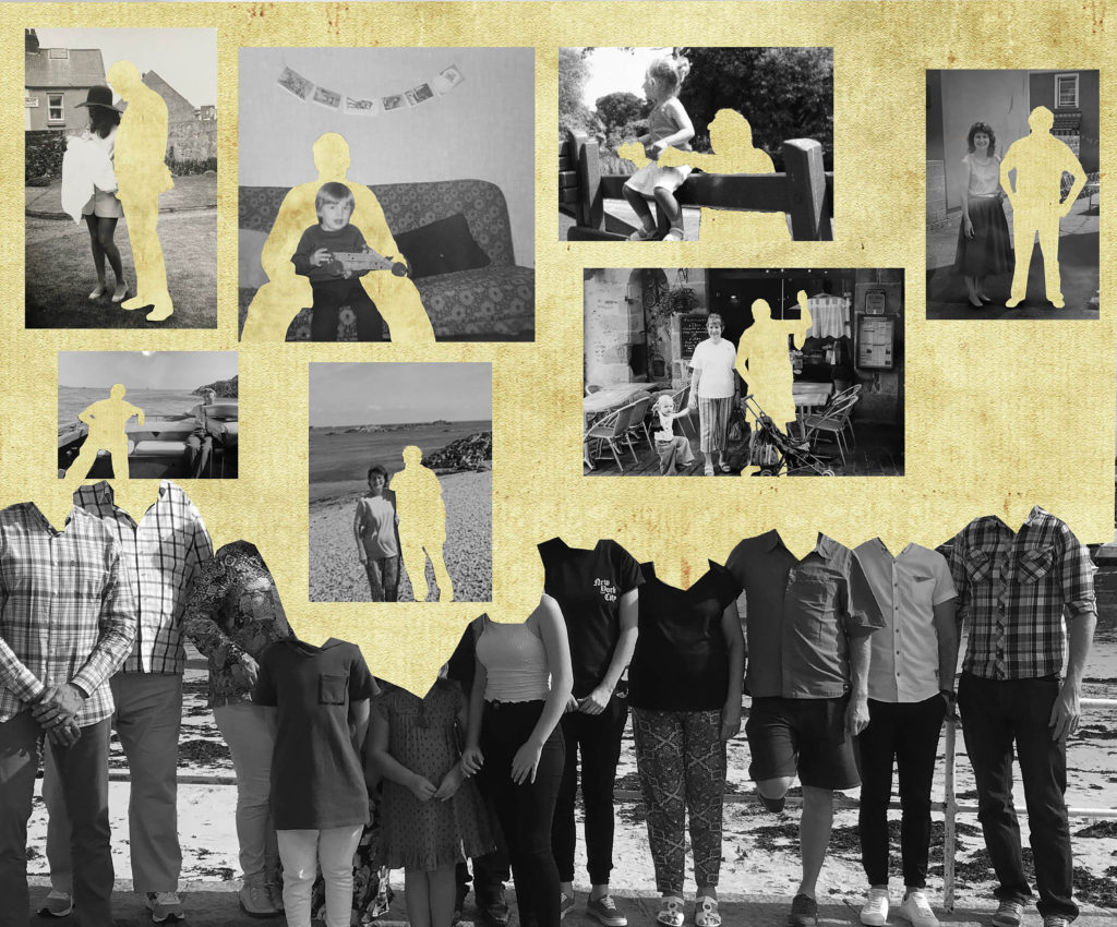
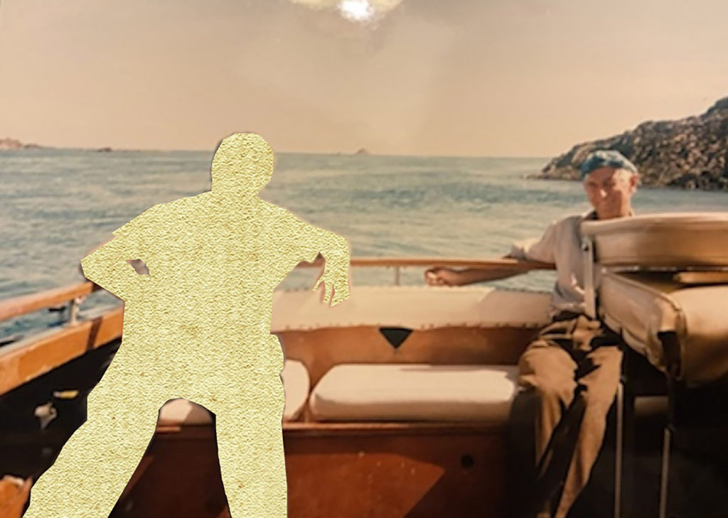
I chose the images above for my final prints because I think they are strong edits with a strong narrative. I took photographs of old family photos, the yellow cut-outs are to represent a loss in the family. The top edit is particularly my favourite, the yellow covering their heads is filled with memories we all had with the person we lost. I like how the warm yellow contrasts against the tones in the back and white image, along with the coloured images, they have a variety of warm tones that go well with the yellow which will look good as a series of 3 in my portfolio.

These 2 images I chose because they are fun and have a lot of life to them. They are filled with bright, positive colours and will add vibrancy to my portfolio.

I really liked these images, especially in black and white as there is no colour to distract from the deep shadows and bright highlights within the image. These 2 images fit well together and create a sense of curiosity, the viewer will create a narrative of their own to these images and everyone’s will be different, either positive or negative.

Overall these 3 sets of images contrast against each other and show a variety of my skills within my portfolio, the depth of the black and white images, the bright colours and the edits.

photobook layout

Photobook Process

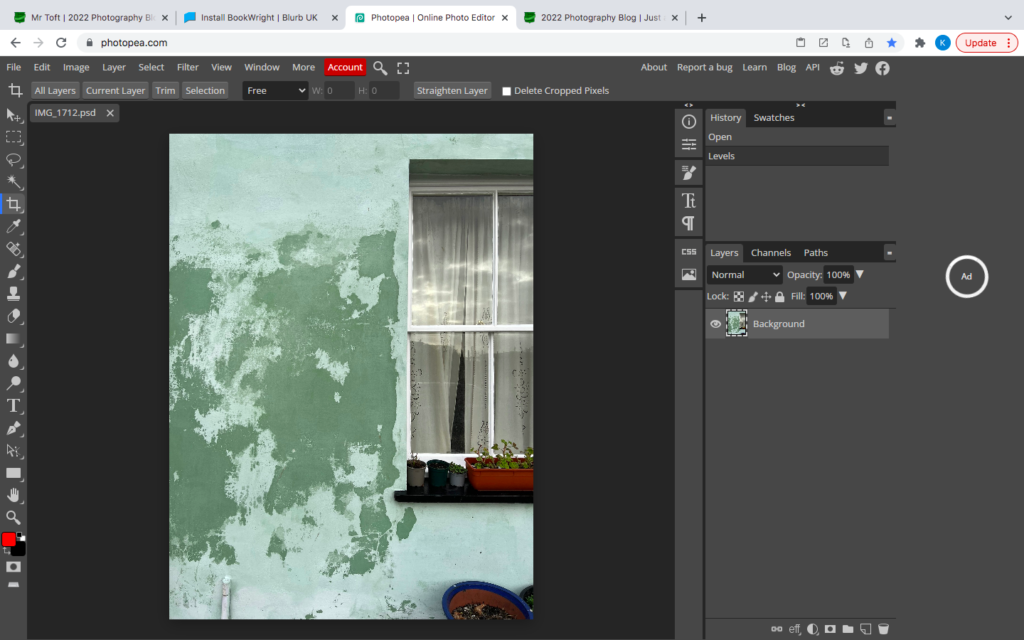
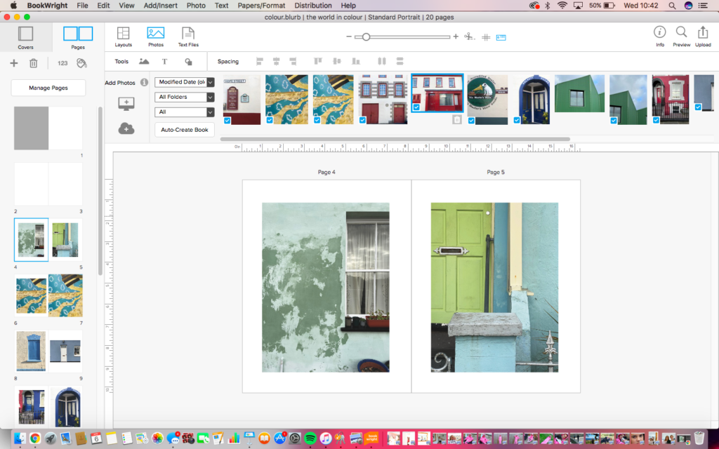
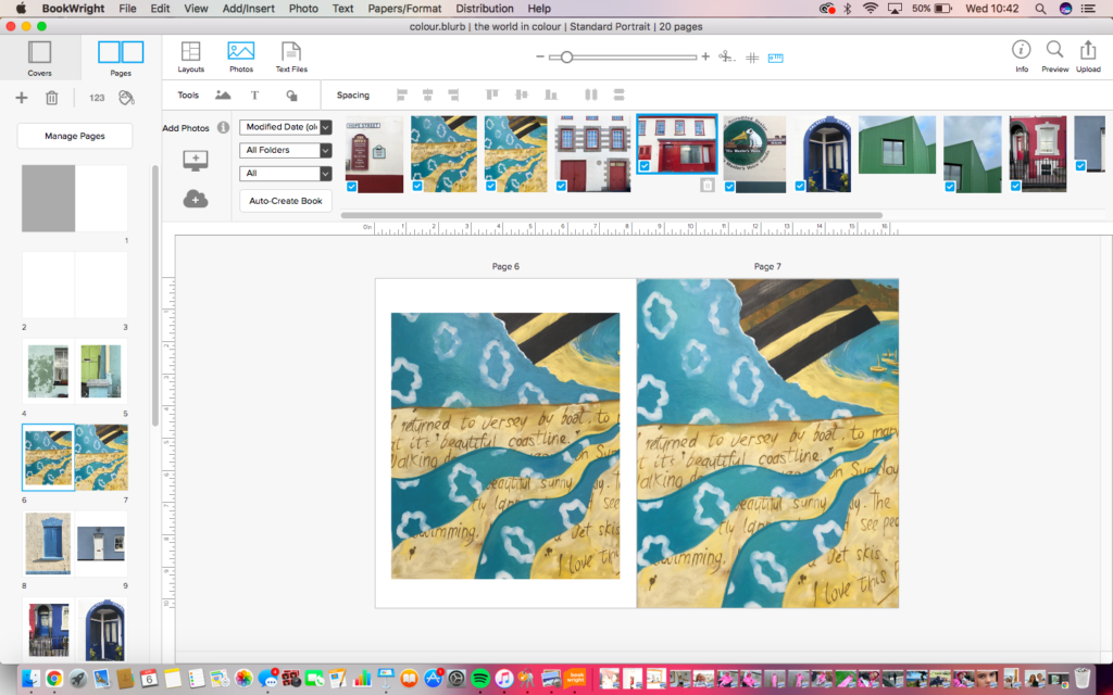
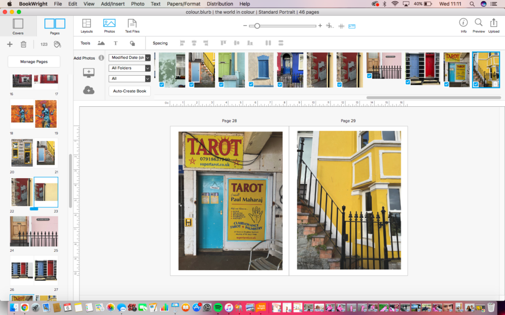
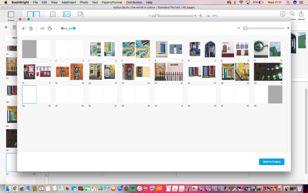
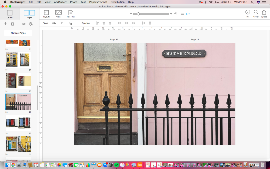
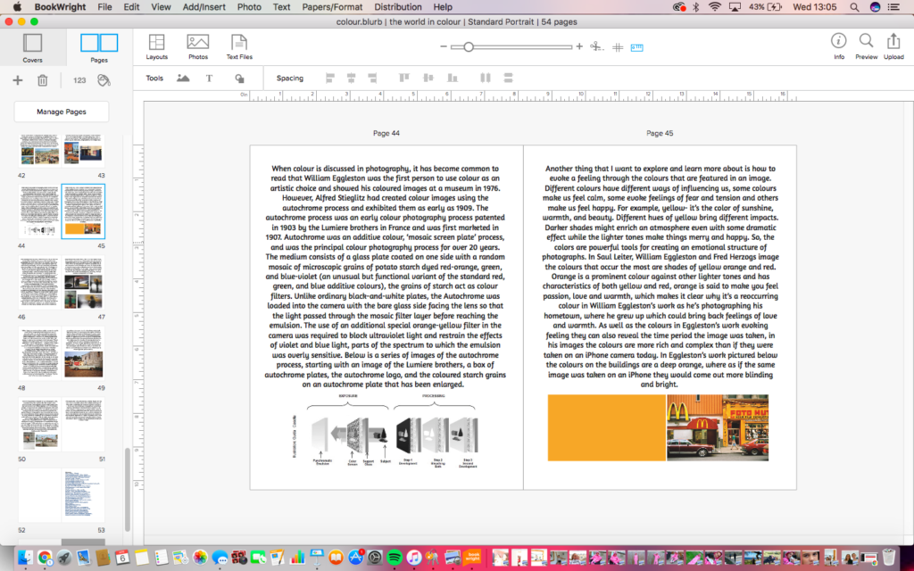
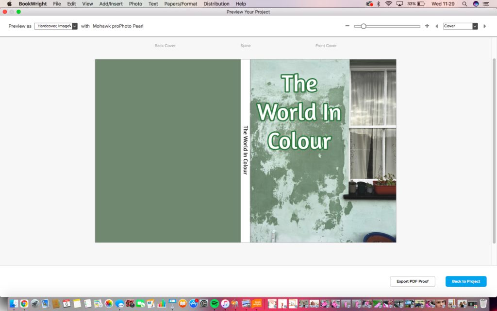
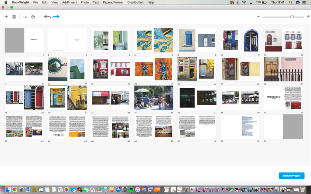
I started making my photobook on blurb by selecting the book type I wanted and the number of pages. I originally had 20 pages but ended up having to add around 30 more. I edited my images on photoshop before and decided which images I wanted to use by placing them on the photobook and moving them around to see if they fit the look I wanted. Most images that I placed next to each other were similar in colour as I liked the way it looked. To make the front cover of my photobook I chose one of my favourite images and enlarged it to fill the page, I then used the eyedropper tool on photoshop to match the colour of the dark green paint on the wall for the back cover. With the title I placed it to the side as I like the way the window frames the title.

Photo Book – Process

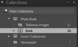
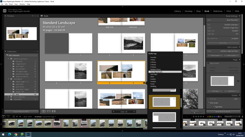
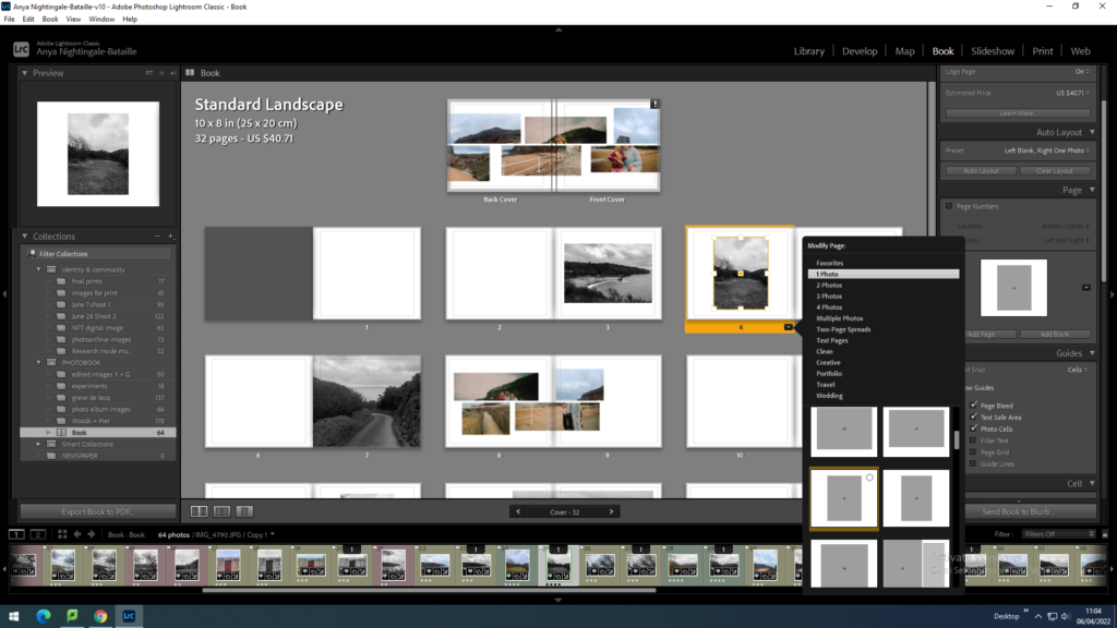
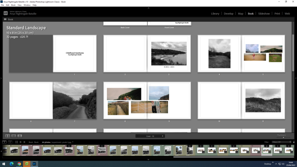
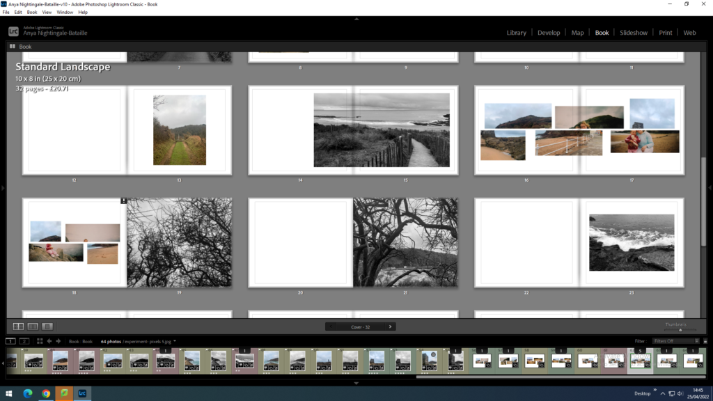
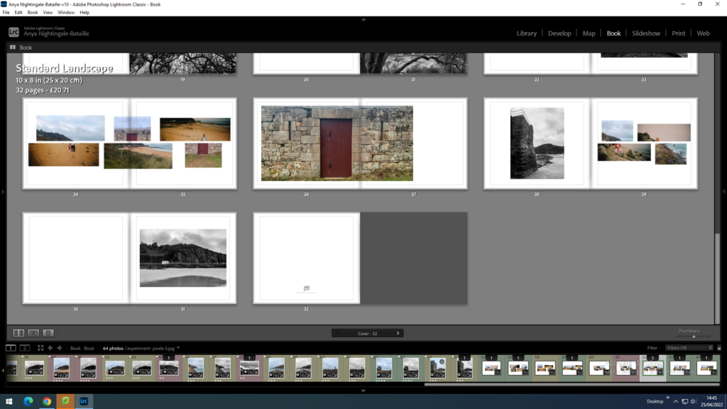
I created my photo book using Adobe Lightroom Classic. Firstly I created a collection named ‘Photo Book’ and put all of the images I wanted to include in that collection folder:
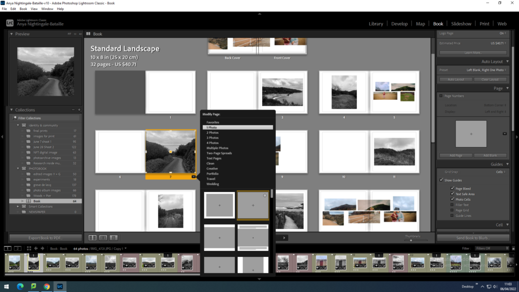
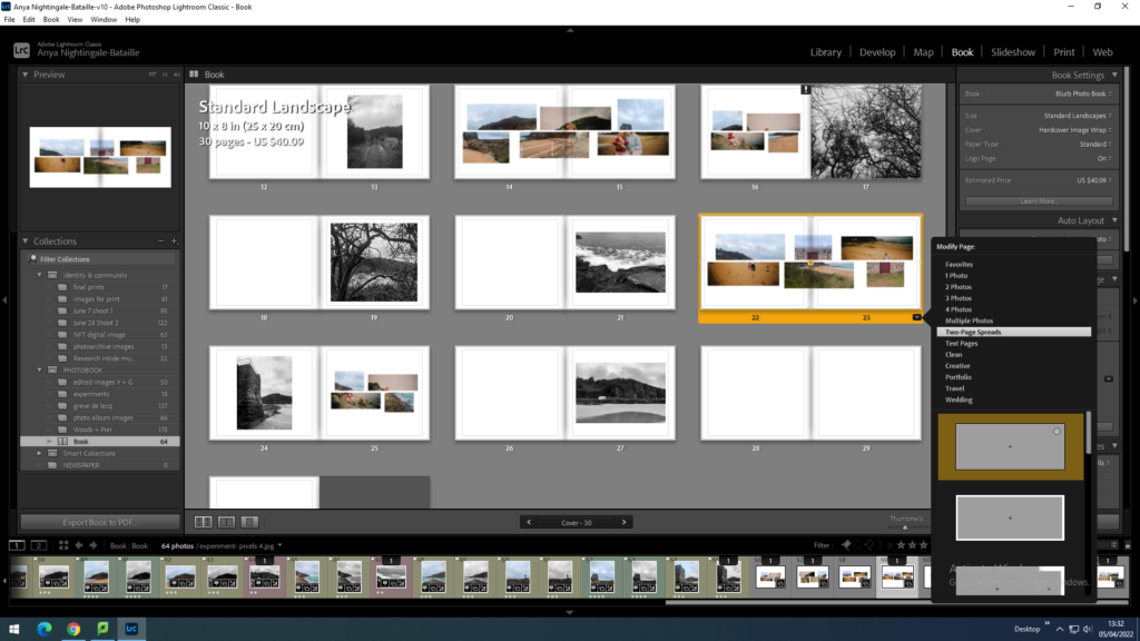
Next I put all these images into the ‘Book’ tab and ordered them in an aesthetic flowing order. I positioned the images in different places and in different sizes, as well as multiple and ingle images per double page to create variation throughout the photo book:

Photobook: Editing + Developing + Evaluation

When making my photobook I want to make sure the images flow into each other. I will make sure they do this by looking for things in common between images such as things that are inside the image, colour or textures. I will also look for contrasting attributes such as composition and the main subject of the image.

For the layout I want to create a balanced book which has double page spreads, singular images and pages with two individual images fitting the pages differently, some being full bleed and the rest with a white boarder.

Changing the page layouts:
This image has an empty alt attribute; its file name is image-122-1024x576.png
Double page spread
This image has an empty alt attribute; its file name is image-123-1024x576.png
Full bleed double page spread
Full bleed image
Image with white boarder around

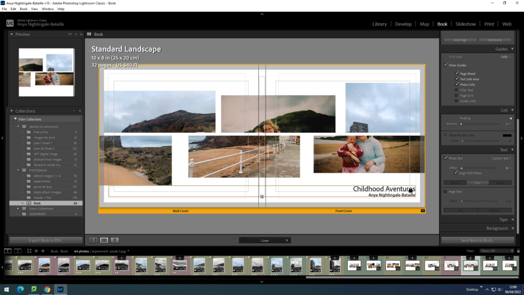
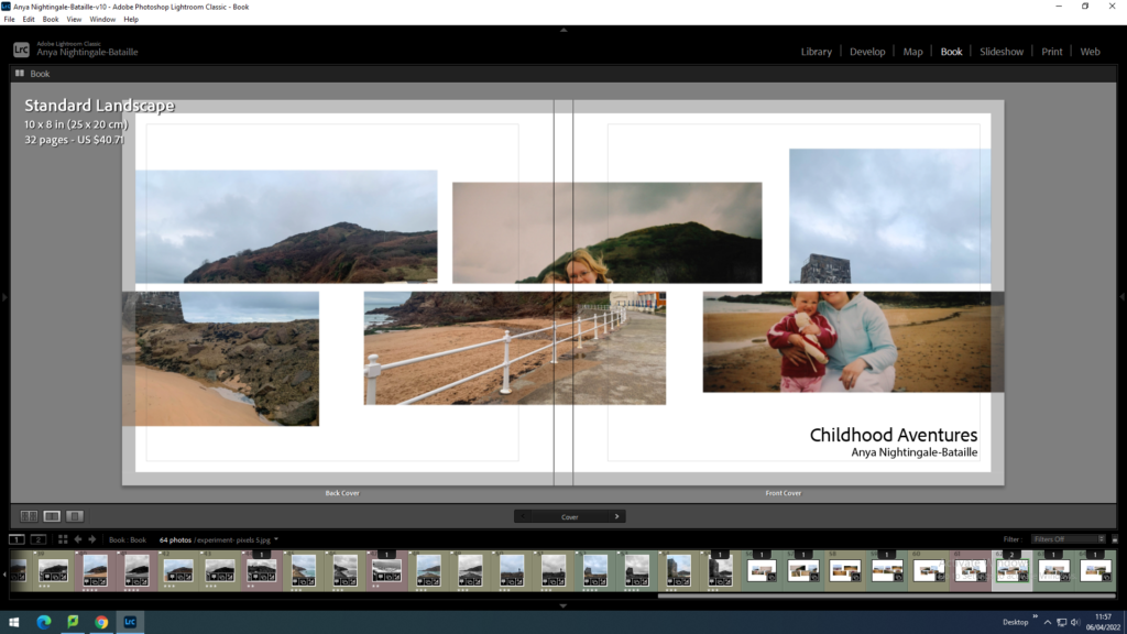
When constructing the front cover I wanted to make a wrap around cover meaning the image will follow onto the back cover too. I also wanted to have the cover image in the middle page of the photobook to link it together.

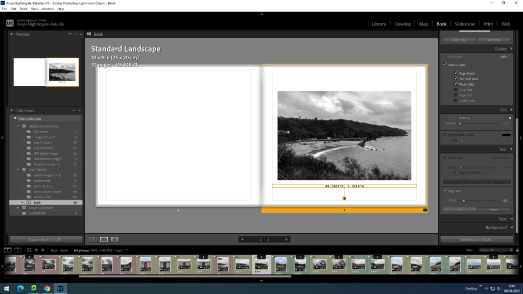
I added the title and my name to the front cover of the photobook. I also added the coordinates of Greve de Lecq to the first page under the image which sets the scene for the entire book.

Adding texts:

Final book layout

Back and front cover
Pages 1-11
Pages 12-23
Pages 24-32

Evaluation

I think that the photobook looks how I intended it to with different layouts and a clear flow of images throughout that link to each other. The images used are clear of where they are but also have different views of Greve De Lecq that is not photographed as much. The black and white contrasting the colour images works well with the look and message because the colour images include the old images from my childhood and black and white is often linked to the idea of old times which links to my project about re-visiting places I visited as a child and seeing things from a different perspective.

TABLEAUX PHOTO SHOOT 3 AND EDITING PROCESS

This shoot consisted of four different frames to produce four final edited images. Here is the contact sheet from the shoot:

Editing

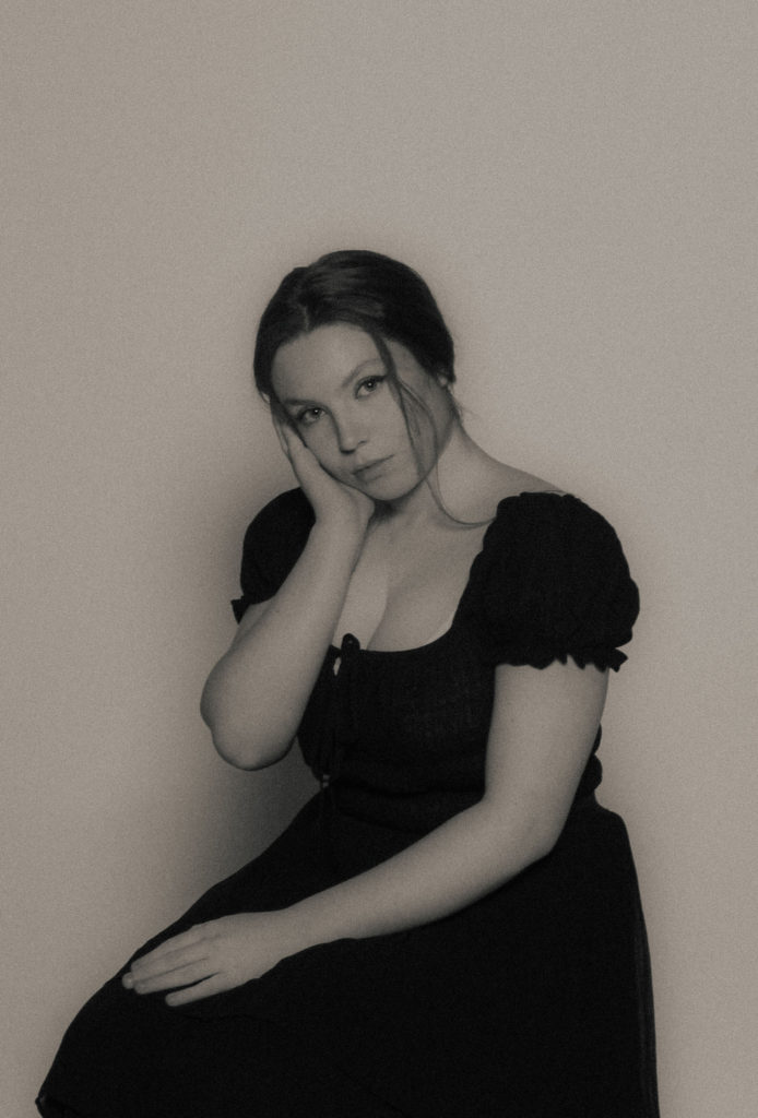
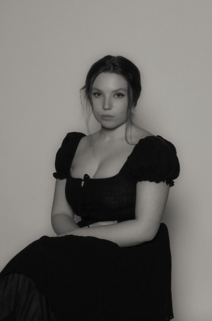
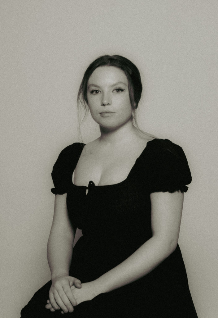
In the style of Paul M Smith, I edited these images similarly to the other tableaux photo shoots I have done so far, creating a washed, grainy film look to the final image.

Similarly to the previous shoots, I took multiple photographs of the same frame with the same subject in multiple different positions in the shot. I used the same process and stages of editing as before too:

Selection

Layering and Blending

Final Edits

I repeated this process for another three sets of images from the shoot to produce these final images:

Essay: Archives

How do archives function as repositories of knowledge? 

Archives are fundamental to humans’ culture as a connection to past, present and future. As philosopher George Santayana said, “Those who cannot remember the past are condemned to repeat it!” They are repositories of knowledge historic documents and photographs which are stored in archives are, themselves, knowledge. 

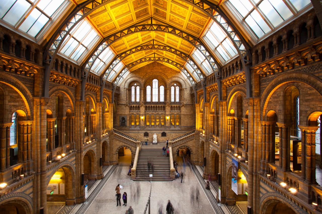
London Museums Not to Be Missed | London Vacation Destinations, Ideas and  Guides : TravelChannel.com | Travel Channel

In the modern day, pretty much everyone has an archive available to them in the form of a phone. These phones have made photography incredibly accessible for the ordinary person. By doing this, photographs have become less permanent and significant in contrast to photos from 100 years ago when barely any were taken, and they were treated as irreplaceable and treasured by those who kept them. In the digital age photos are just not seen as important, and often are not kept very long, deleted soon after being taken. In an era of cancel culture, social media has become an archive filled with images and messages that could, with a little digging, make or break a person’s career. The Société Jersiaise, founded in 1873 is a learned society with a focus on archaeology, providing efforts to preserve the islands heritage and identity. Their archives contain over 125,000 photographic images ranging as far back as the beginning of modern photographic history in the 1840s. In recent years, the group has led the excavation of early human and mammoth remains at la Cotte de st brelade which has allowed a greater understanding of the islands geographical past as well as its previous proximity to France 250,000 years ago. This archive is beneficial to the islands cultural heritage as the archive holds many jèrriais language documents, a language that is quickly becoming extinct. It could be argued that the elitist nature of membership only clubs such as The Société Jersiaise inhibit the sharing of knowledge and disregard the working class as the cost of membership to the club for an ordinary applicant is an annual fee of £60 which many everyday people cannot afford. In comparison the British government in a move to increase education made virtually all museum entry free, relying on donations and merchandise sales but mainly their government funding to stay active. This instance illustrates the detriment of privatisation of educative resources.

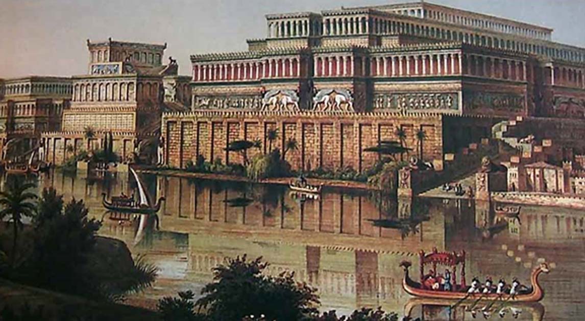
Ashurbanipal: The Oldest Surviving Royal Library in the World with Over  30,000 Clay Tablets | Ancient Origins

The oldest physical archive in human history is the Library of Ashurbanipal which was built in the 7th century BC and contains over 30,000 clay tablets, which includes the Epic of Gilgamesh, a historically significant poem from ancient Mesopotamia which is regarded as the earliest surviving notable literature and later influenced Homer’s own epics. Both the library and poem help to educate contemporary society, as The Epic of Gilgamesh is though to prove the great flood recorded in the book of Genesis. The oldest artefact discovered are the Lomekwi stone tools from Kenya which are 3.3 million years old and teach us the culture and lifestyle of our early ancestors.

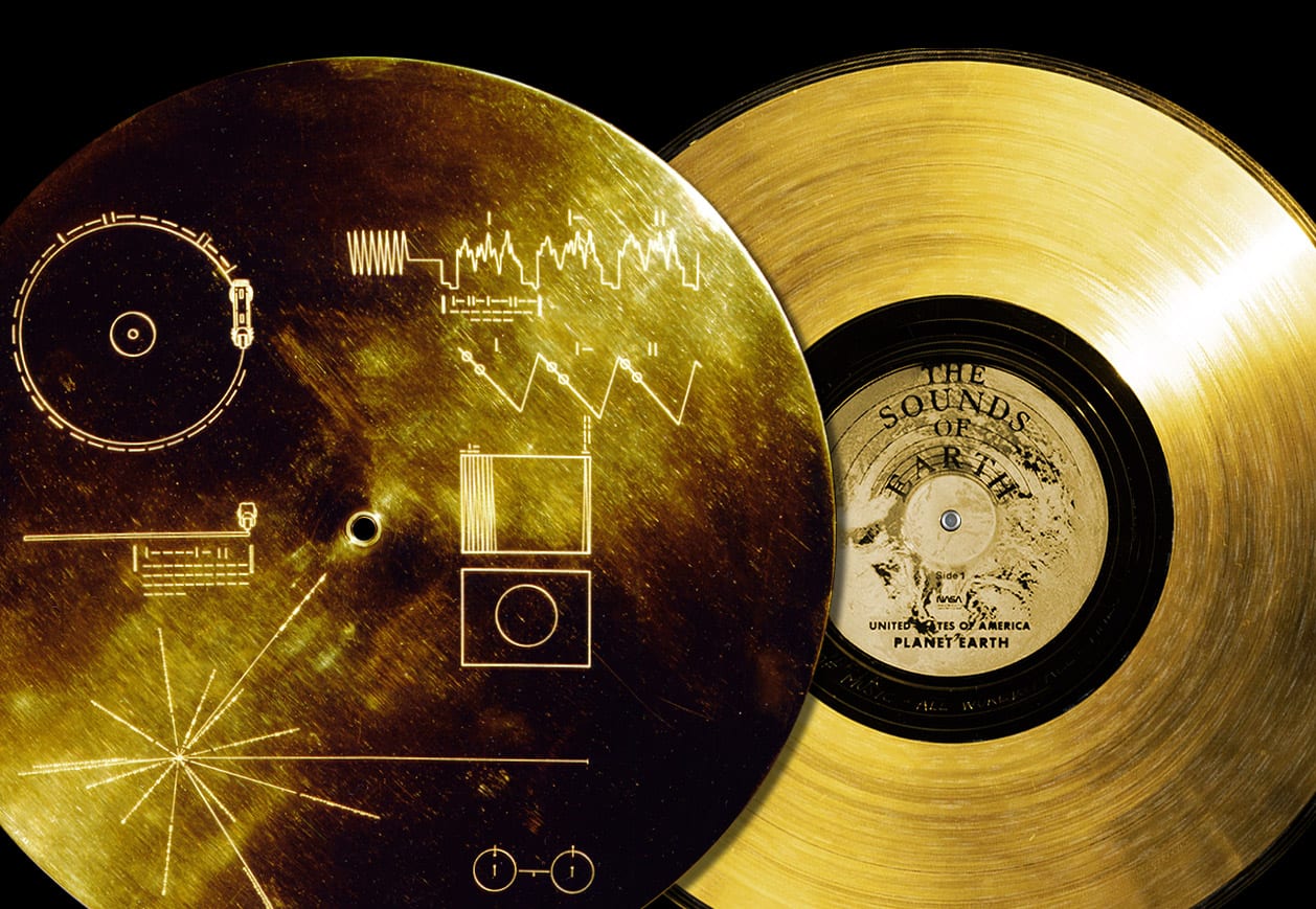
BLOG: Music that's Out of this World - Philharmonia Baroque Orchestra &  Chorale

Time capsules have been a means for depositing knowledge to share with the future for hundreds of years, being some of the most basic and rudimentary archives, available to all sorts of people. In 1977 Voyager 1 was sent on a never-ending mission to outer space with an phonographic record dubbed the ‘Golden Record’ which was inscription with diagrams to help extra-terrestrial lifeforms decipher it. The record contains a range of images, music, sounds and greetings to educate space farers about the humble human. Another example of time capsules and their use as archives is the Crypt of Civilisation which was built between 1937-40. The Crypt contains seeds, a typewriter and children’s toys as well as a toy gollywog among other objects to act as a microcosm for the 20th century. The brains behind the project were university founder Thornwell Jacobs who was inspired by the excavation of ancient Egyptian tombs and wanted to create a similar experience for future generations to help them understand society in the 1900s. The crypt is impenetrable and is set to open in the year 8113 A.D, 6000 years after it was built. It could be argued that ventures like this are pointless and that the funds dedicated to them would be better off helping people, especially in America where healthcare is a privilege and not a right however projects such as the ones mentions throughout this essay are vital to the ontogeny of the human race. Through the documentation of the past we learn from mistakes and successes which allow us to advance as a society.