Category Archives: Uncategorized

Filters

Author:
Category:

rural landscapes

Rural landscapes are photos with the soul purpose of showcasing nature and our natural surroundings. When photographers capture a rural essence, they usually romanticize the area shown to project their own sense of place they felt then in that location and reflect what they saw through the final photo. To the viewer, this gives them a sense of inclusion as the photographer is sharing their experience with them.

Romanticism was an artistic, literary, musical, and intellectual movement that originated in Europe towards the end of the 18th century. Romanticism was characterized by its emphasis on emotion and individualism as well as glorification of all the past and nature rejecting the precepts of order, calm, harmony, balance, idealization, and rationality.

Fay Godwin
Fay Godwin, born 1931 in Berlin, Germany, first became interested in photography in the mid-1960s as a result of taking pictures of her young children. Alongside early portrait work, she developed a sophisticated landscape practice, often collaborating closely with writers to produce in depth surveys of particular rural topics or regions. Her photography has sometimes been linked to a tradition of romantic representations of the British landscape, in the manner of Bill Brandt or Edwin Smith. But, as a socialist and active environmentalist, Godwin makes the land in her photographs reveal traces of its history, through mankind’s occupation and and intervention.

Photo analysis
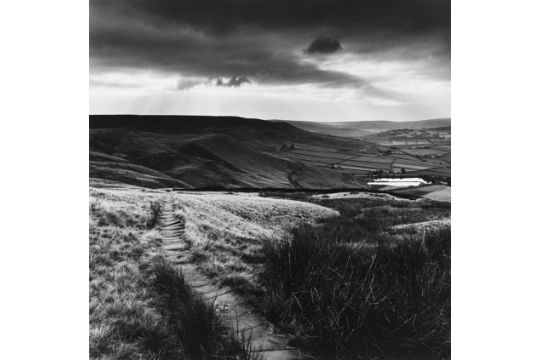
FAY GODWIN 1931-2005 Landscape c. 1980 Stampa fotografica vintage alla  gelatina sali d'argento.
Path and Reservoir. Lumbutts, Yorkshire, 1977

This black and white photograph taken by Fay Godwin shows a rural setting containing a mix of fields, paths and a reservoir. The main focus of Godwin’s work was to show off the countryside which was continuously becoming privatized and hidden from the public eye, to show the hidden beauties of England. I feel as this photo is the perfect representation of how we view a countryside. In the foreground of this photo, we see path leading down to the fields, found between rough and harsh stretches of both long and short grass. To me, this is a good contrast to the smooth hills and fields seen in the mid ground as it projects two different textures of the plain that can be easily interpreted by viewers.

At first view, my eye was drawn to the smooth and clean hill found in the middle ground leading to a white patch, after more research i found that the title of the photo is ‘Path and Reservoir’, this has now made the white space clear that is it a body of water within the fields.

The fact that this photo is in black and white shows me that the colours found in a countryside fall second to all the textures seen and emphasizes the contrast to a greater scale. Also, in the photo i see that Godwin has covered the whole of Ansel Adam’s scale, going from 0 being black through to 10 being white, displaying different shades.

How to Use the Ansel Adams Zone System in the Digital World | Fstoppers
The Ansel Adam zone system

Considering the time frame when this photo was taken, 1977, I reckon that this photo was processed in a darkroom and replicated. When taking the photo, i seems as if Godwin stood at a high point on the plane to capture as much content as possible. there is a chance that Godwin used a Hasselblad 500C/M camera fitted with a Planar f2.8 50mm lens or a Leica M6 camera fitted with a Summicron f2 35mm lens. As both of these cameras were used to produce some of the images included in the exhibition.

My Response

i carried out my photo shoots at different locations around the island, exploring my options of both landscape and coastal environments. I timed my photoshoots to correlate with different weathers and time frames to give myself different atmospheres to work with.

Edited photos

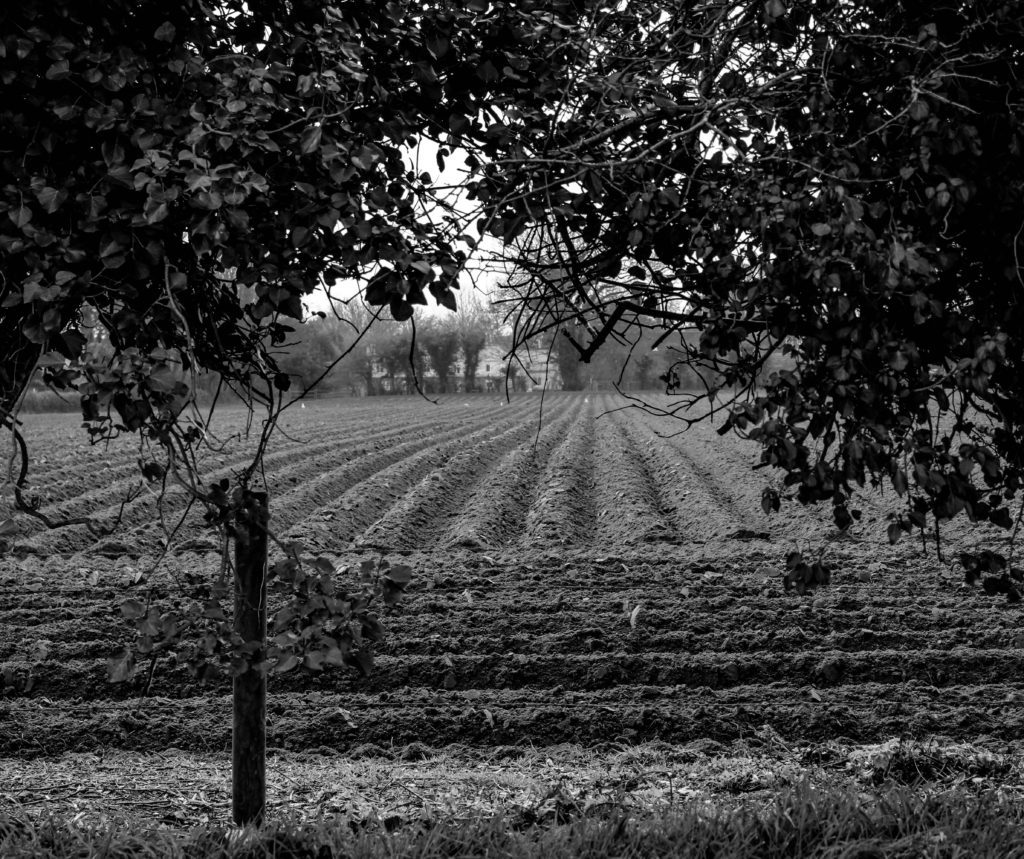
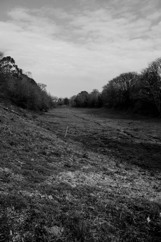
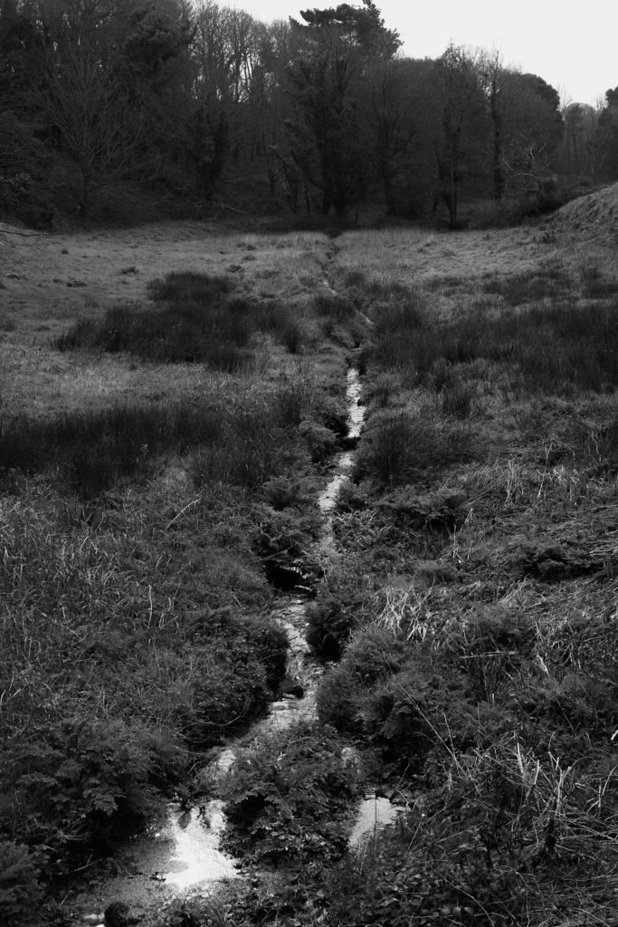
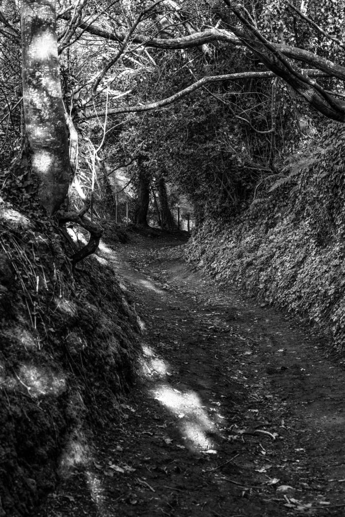
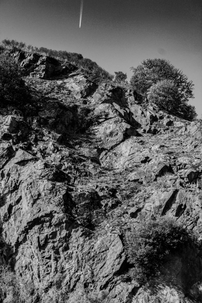
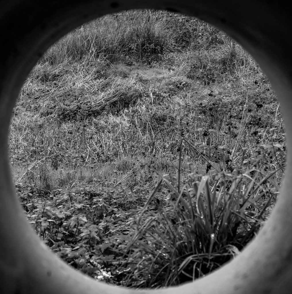
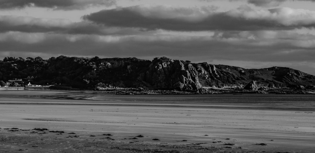
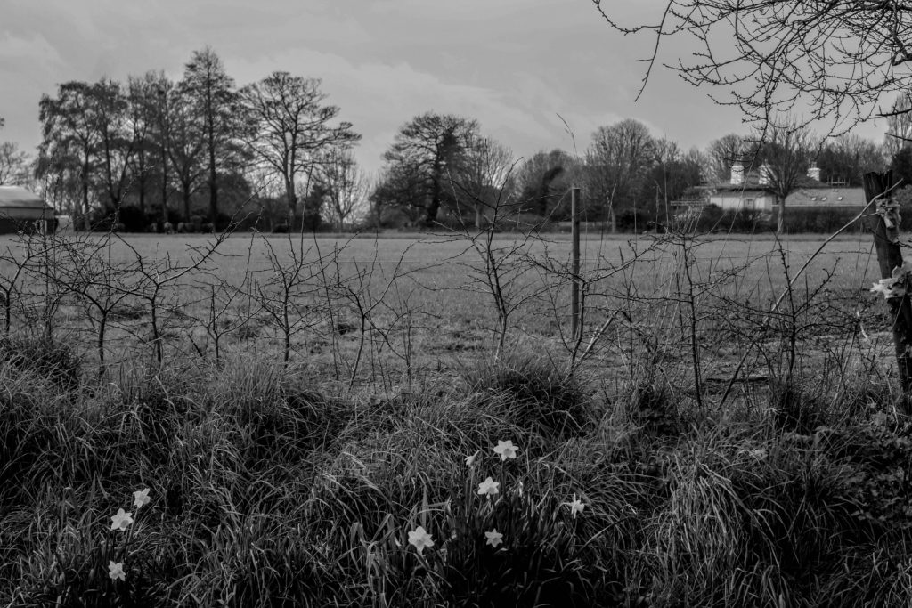
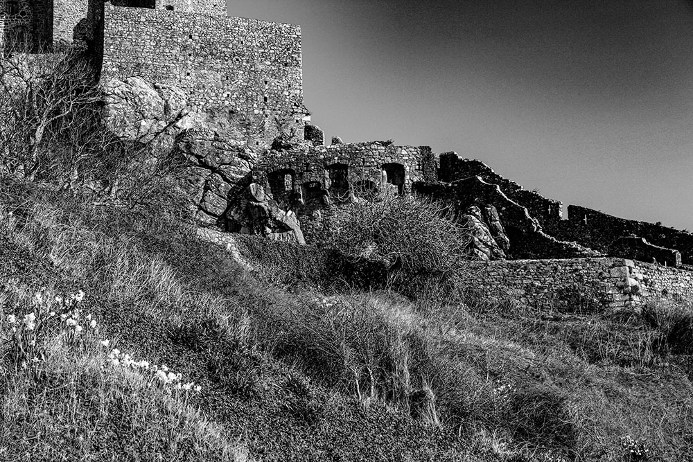
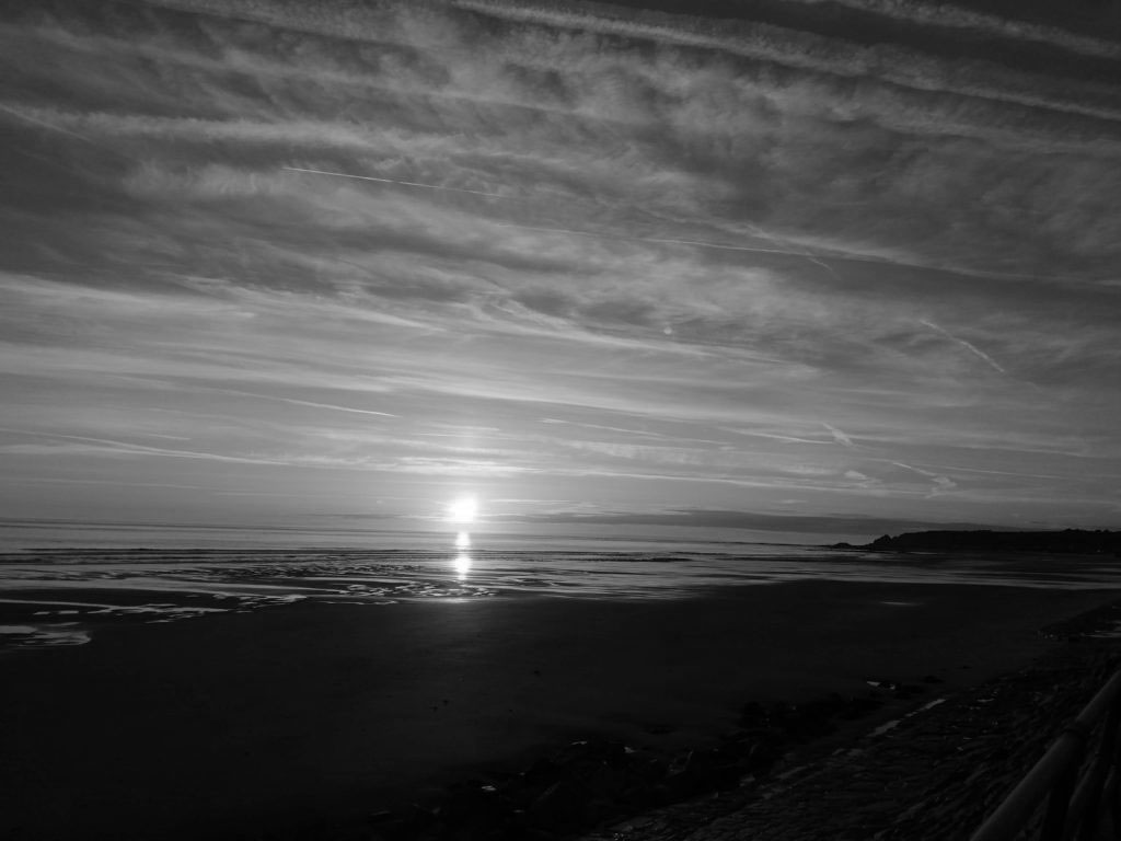
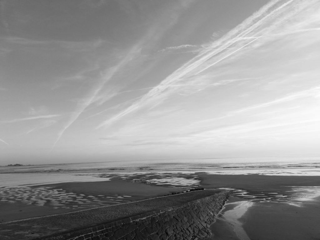
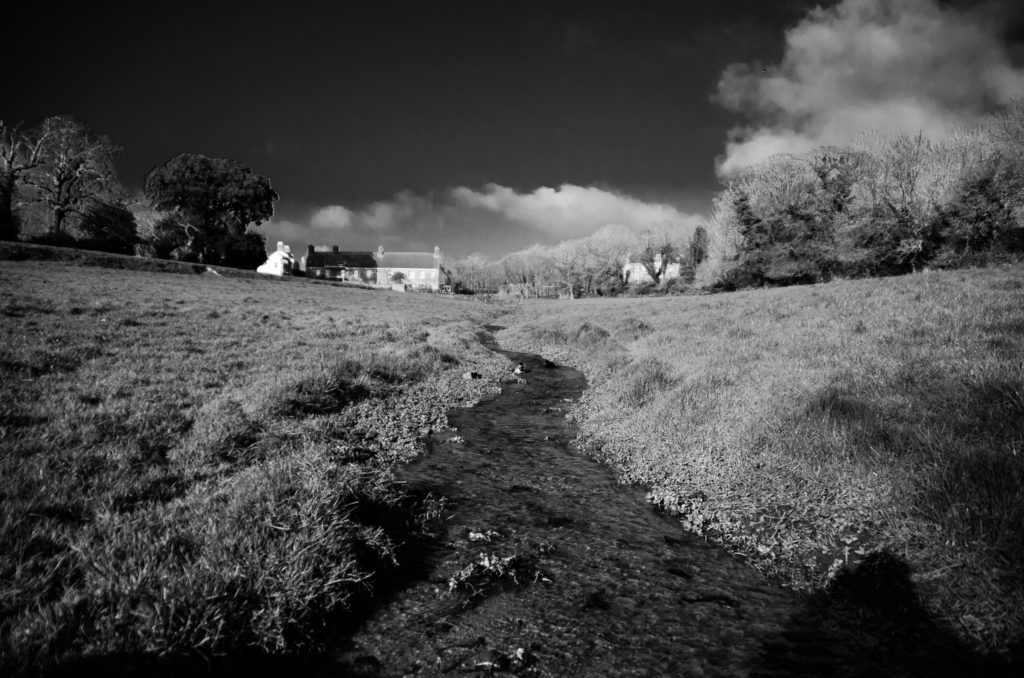
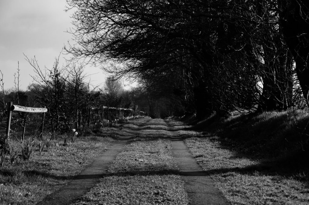
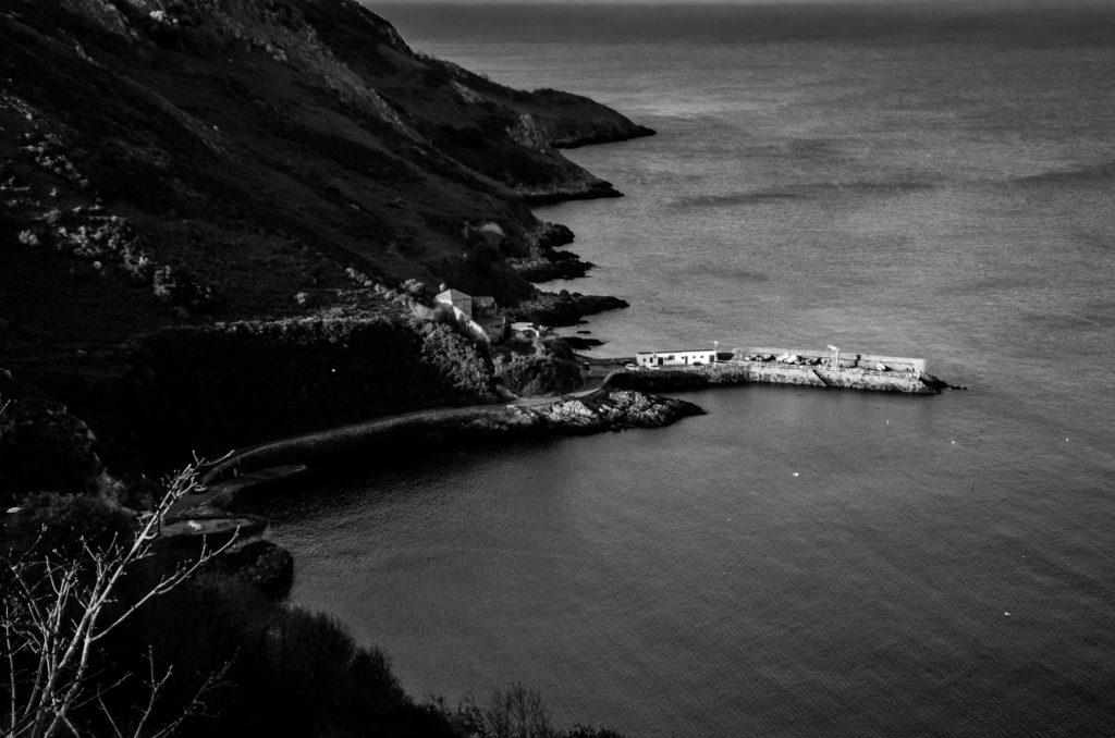
This selection of images contain photos which I believe are the best at showing how simplistic and beautiful nature is and aiming to romanticise a different view of nature without extreme weathers or elements. I edited all my photos to black and white to exaggerate the contrasts between highlights and shadows, giving a calm and collected moment for atmosphere. I think this was successful as it has made the photos more subjected as there are two main ways to view the images, those being the stillness and calmness of the plains or the harshness and depth of the textures within the photos. Whilst editing I considered Ansel’s zones, trying to include all aspects of the scale. As I was taking the photos, I positioned myself with intentions of capturing landscapes without including as many modern buildings/alterations in the photo. However in some photos, catching a small section of a building or one being in sight very far away was unavoidable when I was trying to photograph an eye grabbing photo in terms of composition.

Landscape Photography

What is Landscape Photography ?

Landscape photography shows spaces within the world, sometimes vast and unending, but other times microscopic. Landscape photographs typically capture the presence of nature but can also focus on man-made features or disturbances of landscapes.

Examples of Landscape Photography :

Shoots Plan:

Where: St Ouen, Plemont, forests

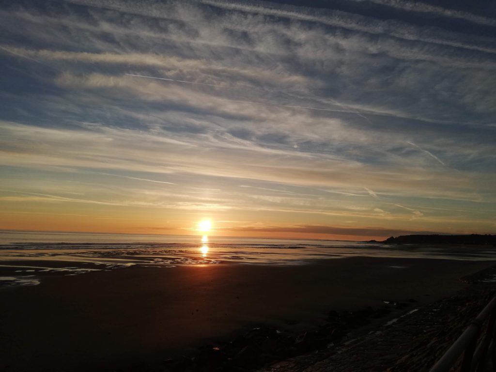
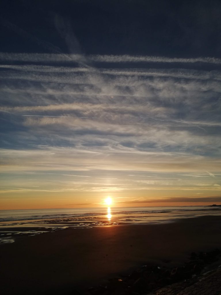
What: Sunset, Horizons, Cliff faces

When: Sunny Day, Sunset, Sunrise, Windy Days

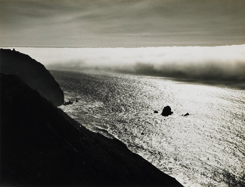
Inspiration: Minor White

https://collections.artsmia.org/search/artist:%22Minor%20White%22

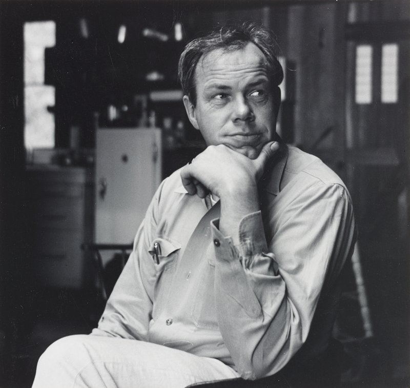
Portrait of Minor White.

Minor White was an American photographer known for his meticulous black-and-white prints of landscapes, architecture, and men. White’s interest in Zen philosophy and mysticism permeated both his subject matter and formal technique.

“At first glance a photograph can inform us. At second glance it can reach us,” -Minor White.

Rural Photography

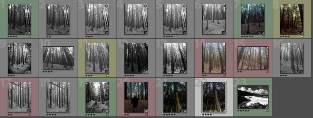
Contact Sheet 1 :

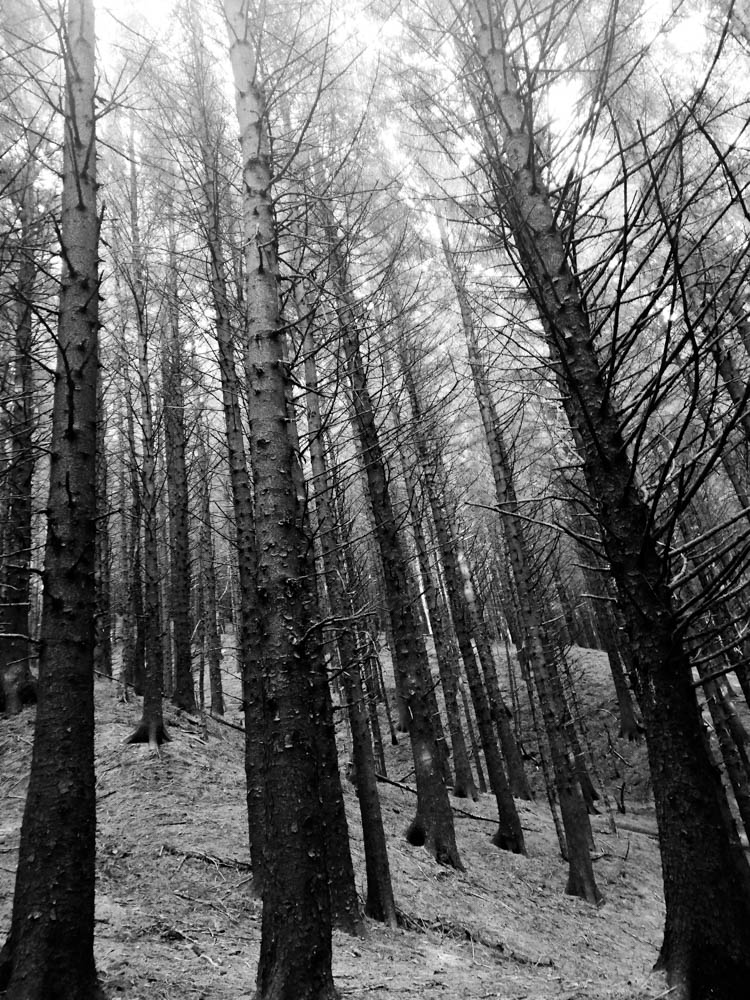
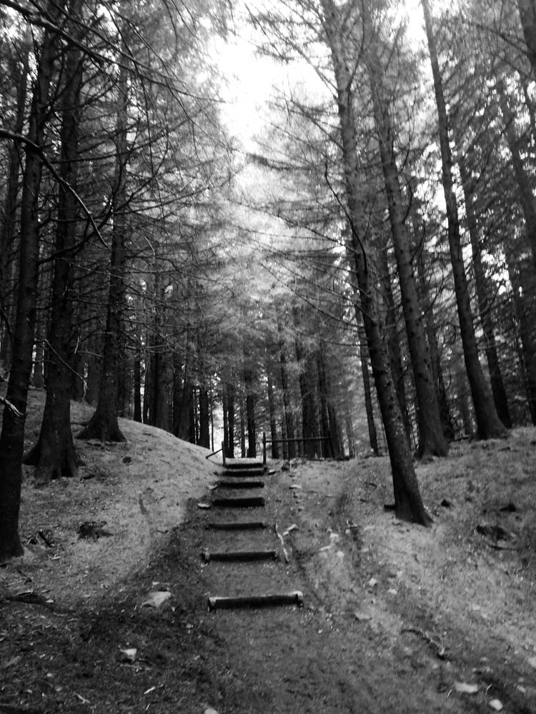
Shoot 1: High Contrast Black and white

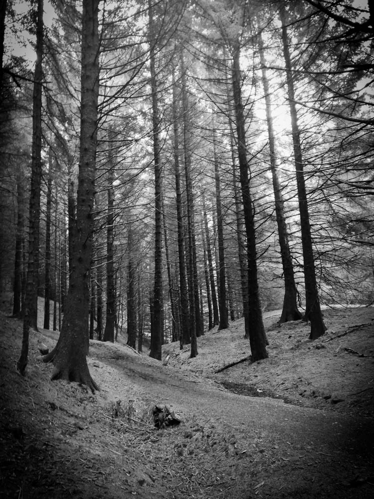
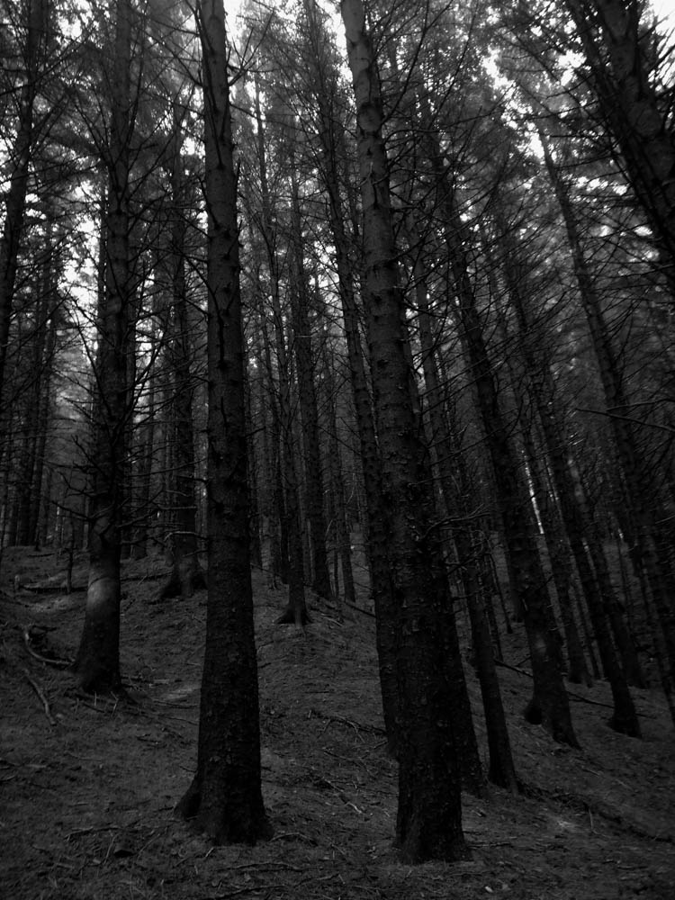
For these images I went into a forest that had very little light coming in through the trees. This allowed my images, when put into black and white, to have a high contrast with the shadows being very dark and the lighter areas then look a lot brighter than they were.

I think these images look better in White’s style. This is because the high clarity allows the viewer to see the details in the bark. The chips in the bark could emphasise the fact that as you get older you get scars but nothing changes who you truly are.

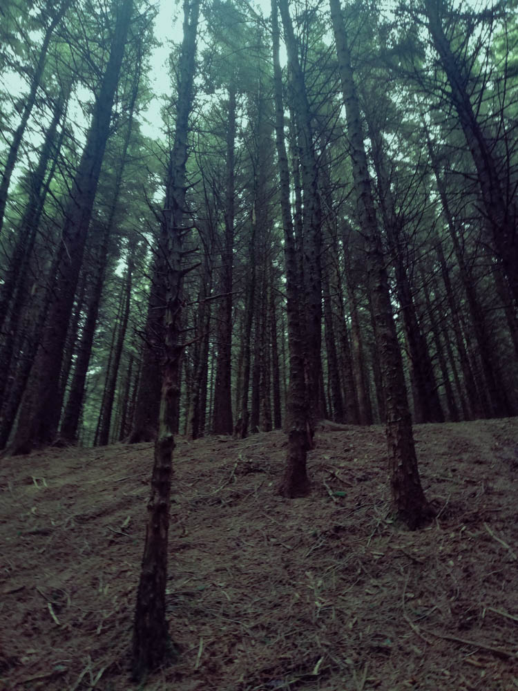
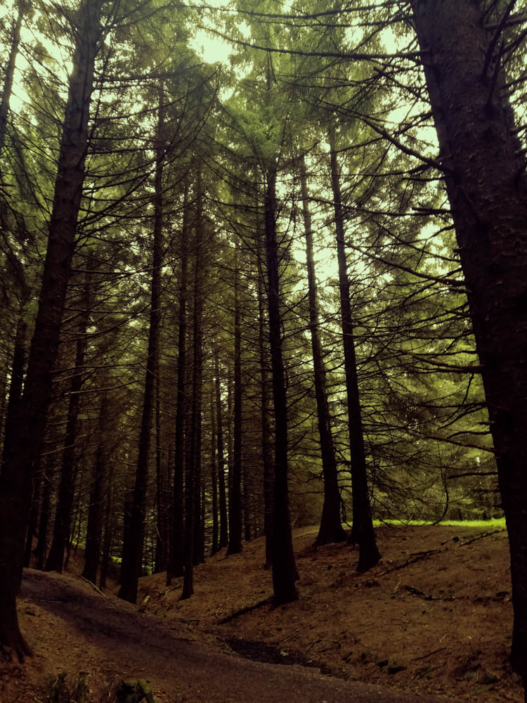
Coloured Images

I took this images at an angle looking up at the trees to emphasise the height of them. I also went into Lightroom and edited them in there. For the first image, I used a cool temperature filter to highlight the fact that the forest was dark and cold. The dark green/blue hue emphasises this further. The ground looks bare and there are no leaves on the trees till you get to a certain height. This could mean that nothing survives without light. We need to focus on the positives in life otherwise life will be boring and pointless.

The second image however has very warm tones. There is also a path in the centre of the image leading upwards. These leading lines can be used as a metaphor of life showing that what has been down must go back up .

Contact Sheet 2:

Shoot 2- Coastal Images (final images)

Black and White Coastal

Before and after editing:

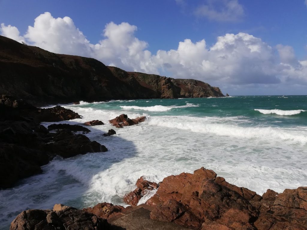
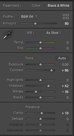
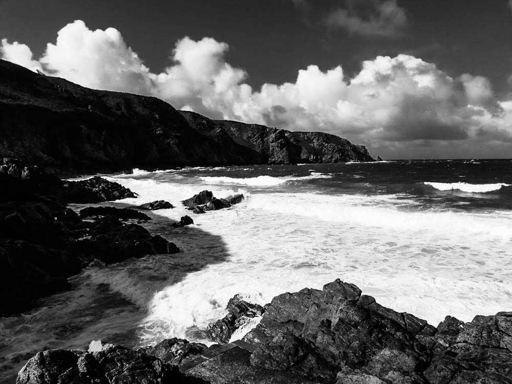
I edited this image in light room and focused on making the texture of the rocks at the front of the image more prominent. I did this by increasing the contrast and reducing the ‘whites’ in the image. I also reduced the shadows in the image to further enhance all the cracks and crevices of the rocks. Doing this also enhanced the cliff face in the background. The sun has shone on half of the cliff face which highlights the rough texture of the rocky cliff face. The other half of the rock however is covered by shade which makes it look black and gloomy. This could be an interpretation of the dangers of walking near a rocky cliff face and that the dark shades of the rock represents death and sadness.

The coloured image has a very positive and summery feel to it. This allows the viewer to see that the image was taken on a clear day. However the black and white image has a more sinister mood. The darkness of the ocean and clouds could make the viewer feel intimidated and think that the beach was a dangerous place to be. Whereas in the coloured image it looks like the beach in the image is a lovely place with a gorgeous blue sea to swim in. The black and white image makes the sea look rough because you can see that in the distance, as the sea hit the rocks under the water, the white foam that is created. This makes the ocean look choppier than it actually is.

Image Comparison:

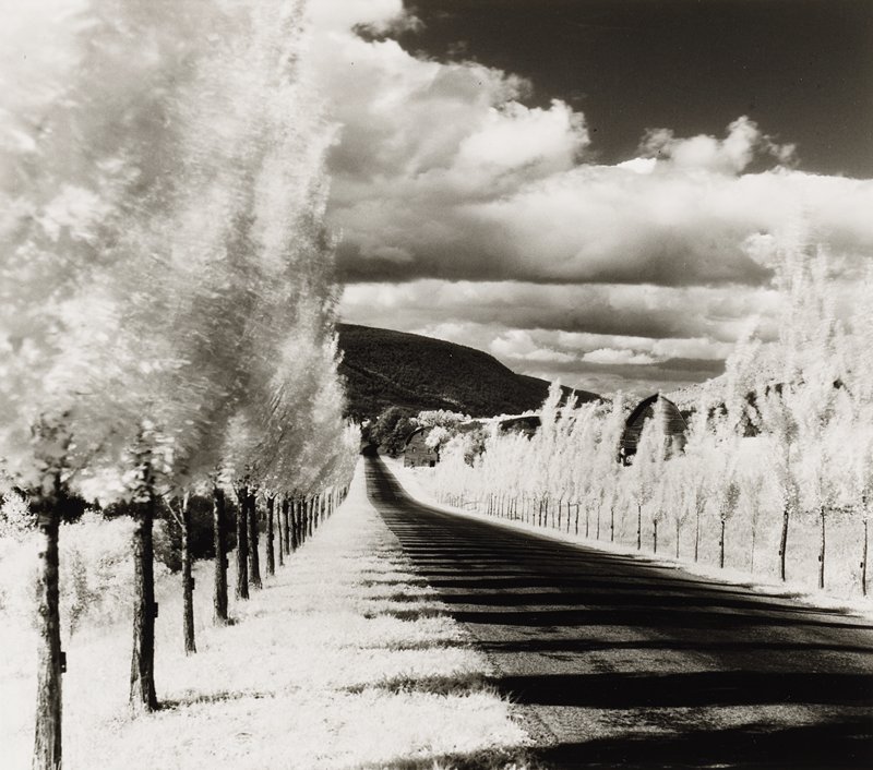
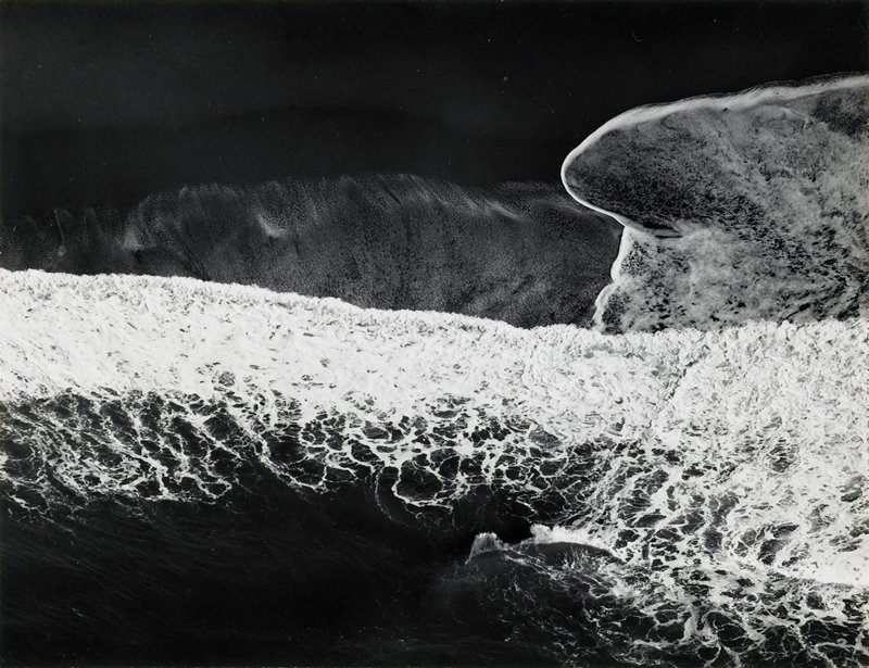
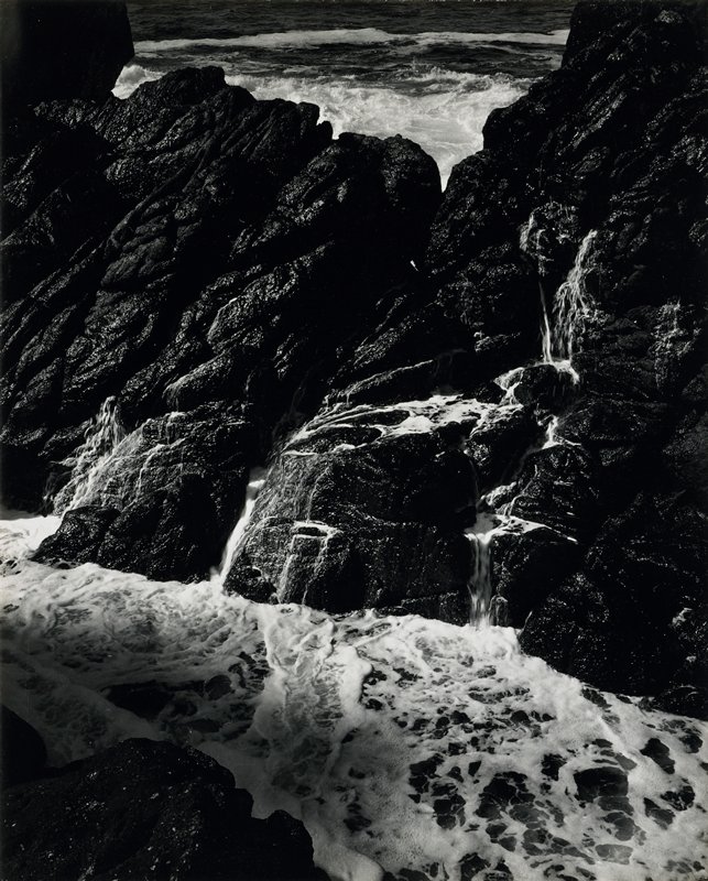
I chose this image for a comparison because it was similar to White’s. My image however focuses more on the landscape as a whole, whereas White’s image focuses on the rock and tide.

This is shown through the contrast in his image. White often used infrared lenses which allowed the image to look very sharp in terms of shadow and light. You can tell that he used an infrared lens for this image; if you look at the ocean and the foam it created due to the impact of it hitting the rock and the shoreline you can see the individual bubbles that had formed.

I used Lightroom to edit my image. I increased the contrast to make the highlights that were on the rocks stand out more. I also increased the clarity to make the whole image sharper and more refined.

To improve this image, I would crop it to make it more condensed like Minor White’s images and focus more on the rocks and the patterns they have.

Landscape photo-shoot – 2

Plan

Where – This photo-shoot is going to take place at the end of St. Ouens Bay , L’etacq.

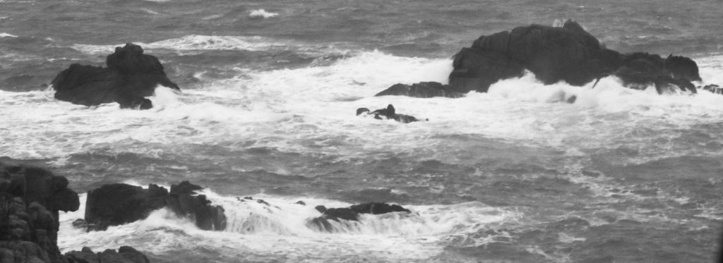
What – I will be photographing different areas of the sea and rock to get some different angles and dynamic photos. The wind and swell will be strong so this will create lots of white water which forms powerful waves.

When – This photo-shoot will be taking place on the weekend with the weather being an overcast of rain and heavy clouds making it seem darker than usual in the afternoon.

Why – I have decided eta do this photo- shoot to capture different parts of the sea at different angles and to also have a bunch of photos to play around with on Lightroom to edit and create an interesting piece.

camera settings will be as such – 800 ISO , Exposure – Between – 100/200

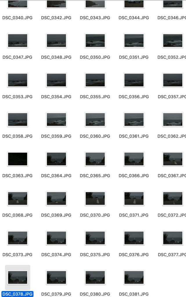
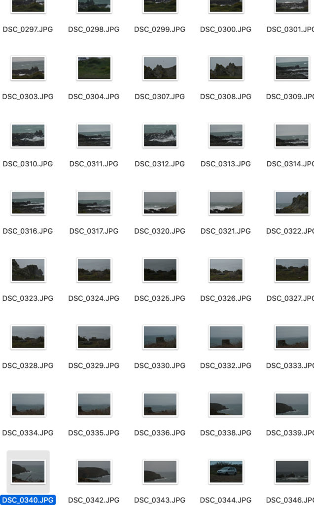
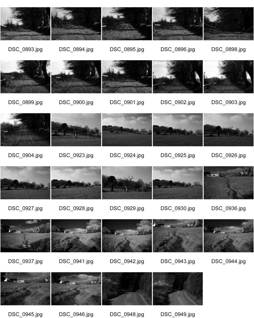
Contact Sheets

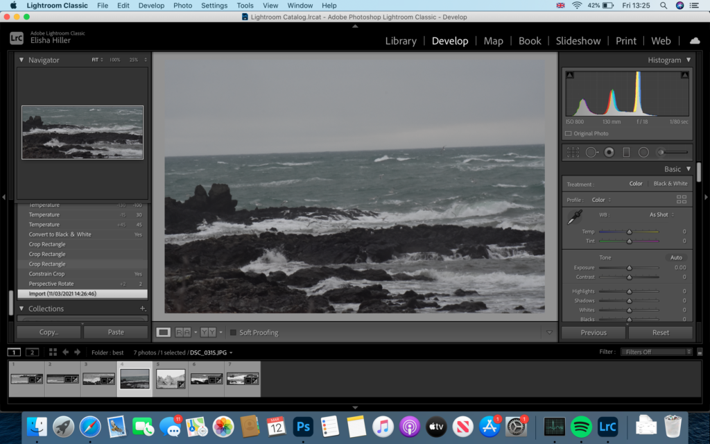
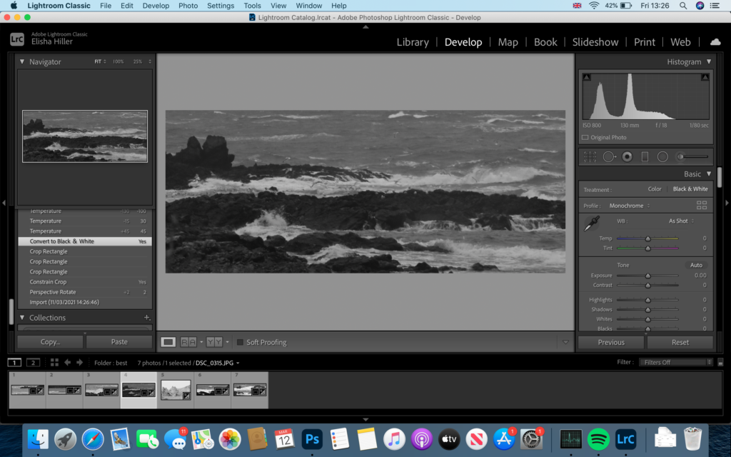
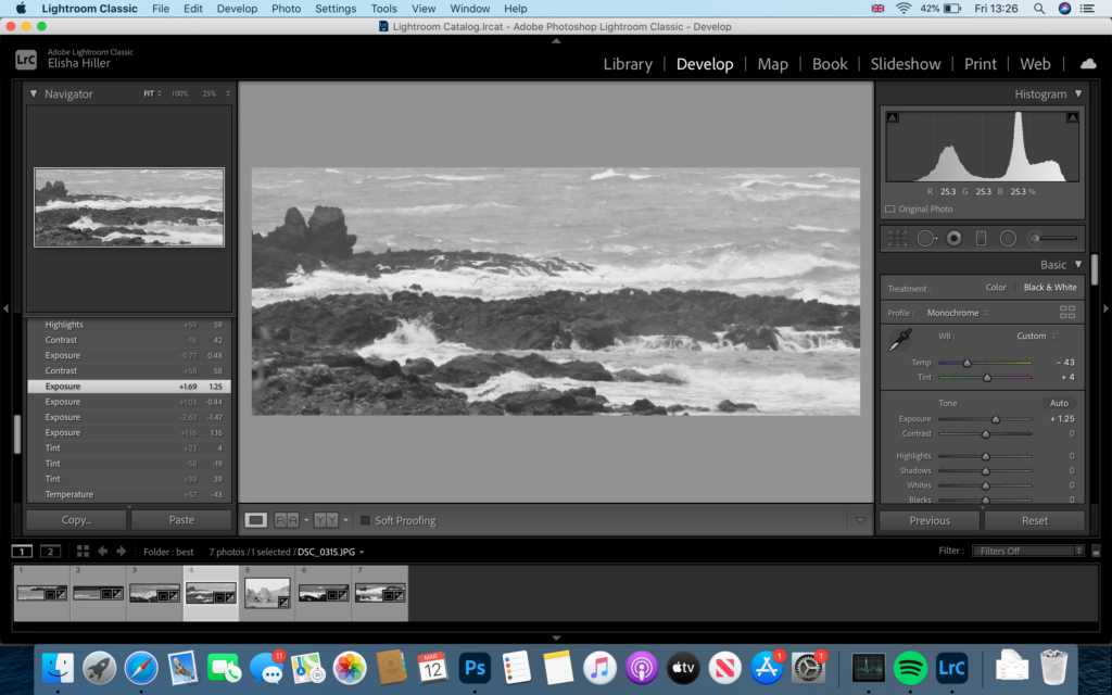
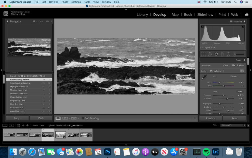
Editing

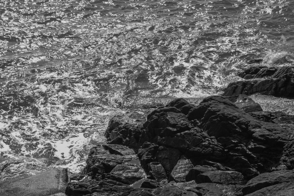
For my editing I firstly made the image straight and cropped out any sky and trimmed the bottom to create long rectangular photos. Next I decided to turn them into black and white and played around with the contrast, highlights and shadows. Finally I changed the levels of how much white and black was allowed into the image. Black being the rock and white being the foam from the sea. Setting these final 6 photos together and laying them out to seem as close as one image cut into 6, I came out with this…

Final Outcome

Evaluation

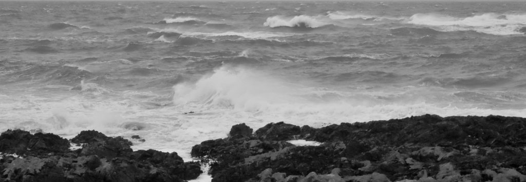
This type of photography is more seascape than landscape. I find this type of photography interesting as when capturing different angles of a rough sea smashing against rocks form great powerful images that can relate to romanticism. Editing these images to be black and white in my opinion give the photos more depth when put in a group as above. Cutting out the surroundings and trimming the images to fit as a long rectangle make these photos effective as you wouldn’t be able to identify where the images was taken. The surrounds are not to be seen, therefore more depth of thought goes in to the images when analysing them. If I was to do this photo-shoot again I would change the scenery a bit as capture images from completely different beaches and also go in different weather conditions to compare my images from now.

Coastal Landscape photoshoot/Luigi Ghirri Inspired

Photoshoot Plan

Coastal Landscape/Luigi Ghirri Inspired Photoshoot

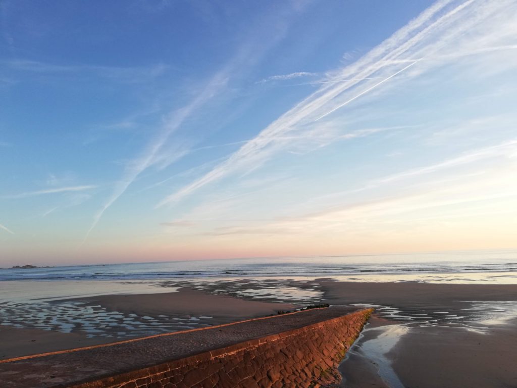
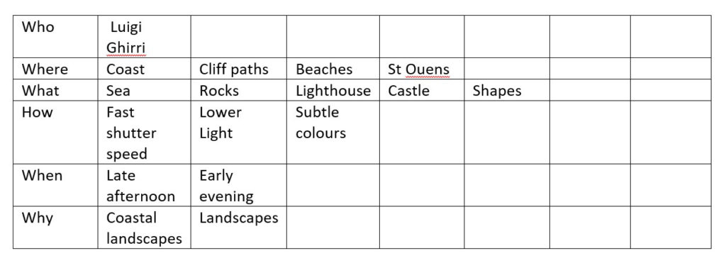
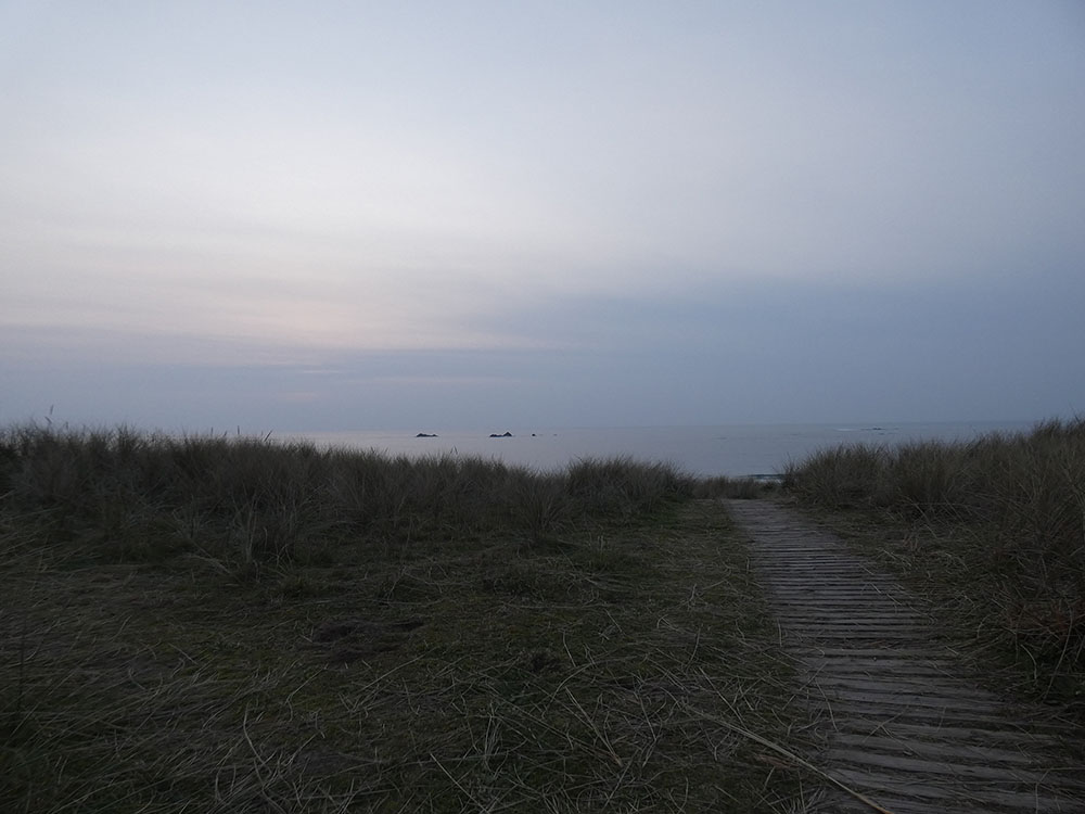
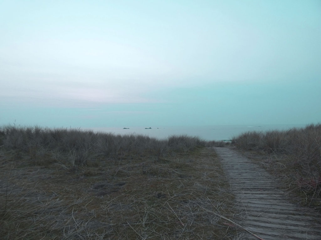
For this photoshoot the lighting and weather allowed me to capture the subtle tones that Luigi Ghirri famously represents in his own work, however my work has a much darker tonal palette. Ghirri also takes many of his photos at the beach, so I felt like using him as an artist reference ties in well with the topic of coastal landscapes.

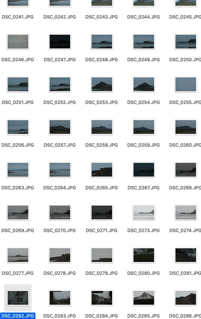
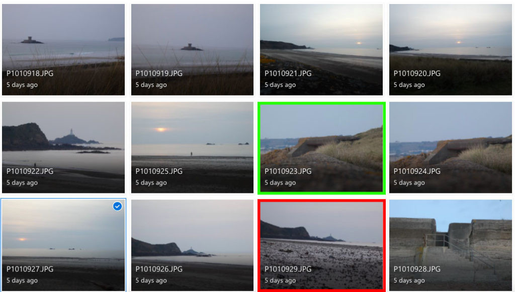
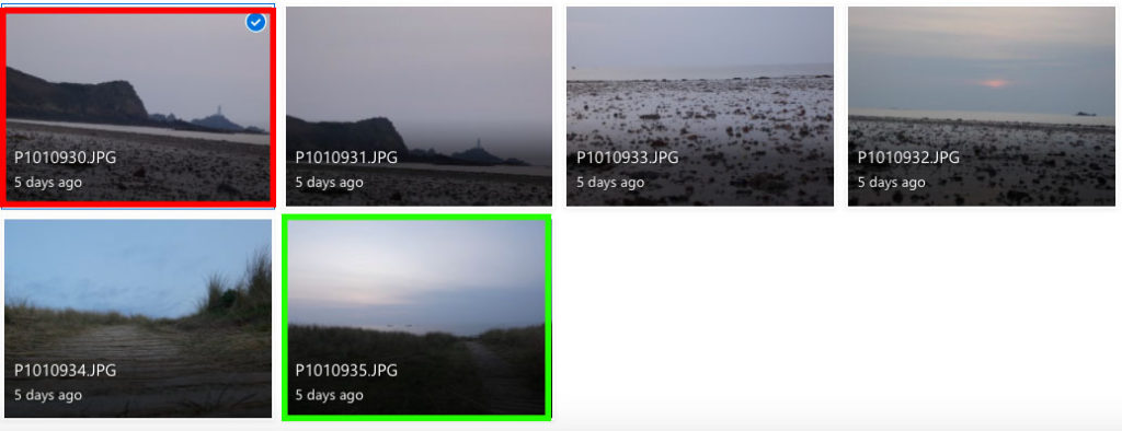
I believe the images highlighted in green are best photos because they capture the simple contrast of colours, shapes and the use of leading lines that is common in the works of Ghirri. To edit these photos I could use Lightroom or Photoshop in order to increase brightness and decrease contrast to make the tones lighter and more similar to those of Luigi Ghirri.

The photos highlighted in red are my least successful images because the horizon isn’t captured at a straight angle and in general I don’t think they represent Ghirri’s work as accurately.

Photoshop Development

Original Image
Edited Image
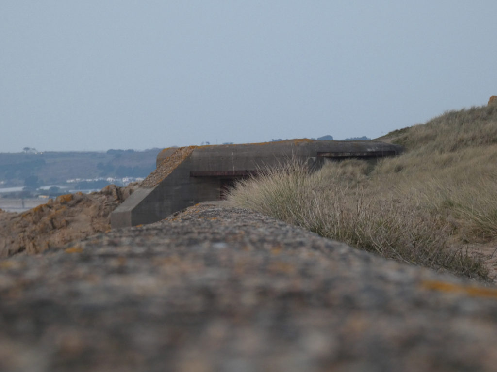
Original Image
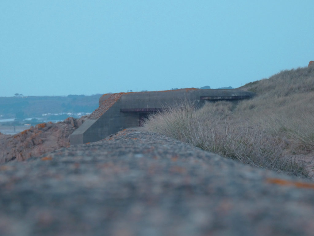
Edited Image

I used photoshop to edit these photographs in order to make them more similar to the work of Luigi Ghirri. I did this by increasing the brightness and adding blue-toned hues to give the image the pastel aesthetic that Ghirri achieves.

How I edited these photographs

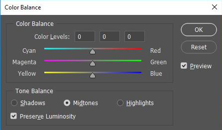
Firstly, I used the colour balance adjustment to add the blue tones and make the grey sky slightly more vibrant.

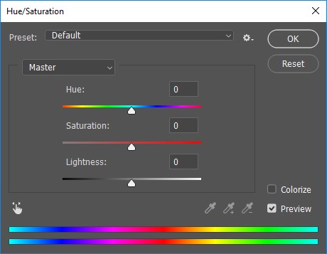
I then added a blue-green hue to the image to further accentuate the blue tones. I increased the saturation to highlight the pastel colours and increased the lightness to make the colours lighter.

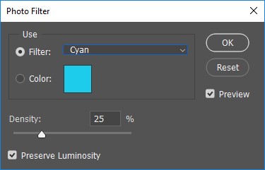
Finally, I added a cyan colour filter to make the blue tones even more prominent.

Juxtaposing Archive Images

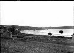
Archive images are images that are stored and kept away images for people to be able to see them in the future, for the purposes of learning about the history of an image or to see the difference of an image through out the years to analyse it.

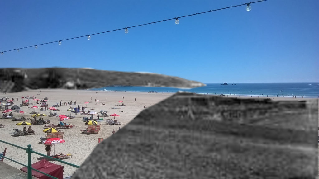
This is an archive image of St.Brelade’s that was taken with the view of the bay facing towards Ouaisne, in between the years 1850- 1920 as an assumption due to there being no information on when the image was taken.

Juxtaposed Image

Here is the image that I ended up editing by the use of two images of St.brelade’s bay from years ago and St.brelade’s bay today. The process i went through in creating this image was by getting up both of the images on photoshop, then cutting out certain parts of the old St.Brelade’s bay, then copying and pasting it onto the new one and adjusting the cut outs to fit in the image.

Urban + Industrial Landscapes: Introduction and Ideas

Industrial Landscape

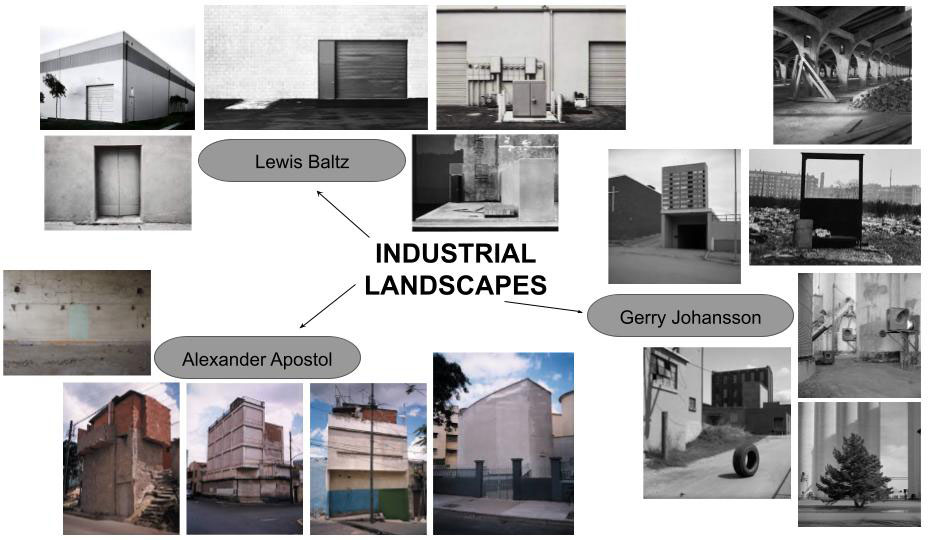
Industrial landscapes are man made landscapes which look very industrial, mainly construction sites, power plants, chimneys, and factories.

Industrial landscapes are rising in natural habitats and urban areas, changing the natural aspect of earth creating unique geometrical shapes.

The contrast between the sharp unique silhouette of a factory within our natural world. Photographers have made abstract shapes with industrial buildings. Monochrome photography is also popular for industrial photos to get the image to contrast more.

Examples Of Industrial Landscape Photography:

Urban Landscape

Urban landscape photography focuses on more culture and lifestyle.

Humans rarely appear in the photographs yet you can feel the presence of life and culture. Both cautionary and confessional, they also define challenges facing our global future.

Examples Of Urban Landscape Photography:

Photo Shoot Locations

When taking my photos I want to focus on the idea of dereliction, old and new, altered landscapes and car parks. With an overall look on change.

Locations around Jersey:

plan

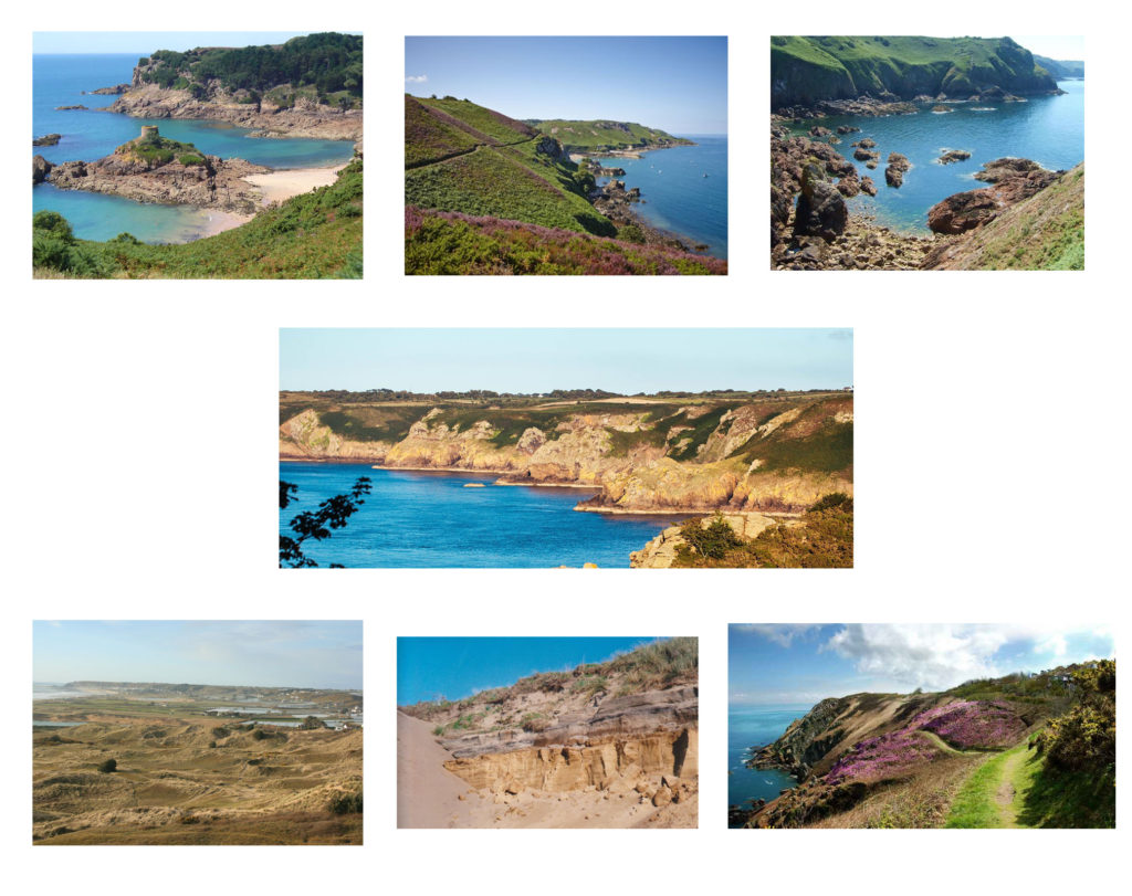
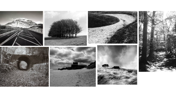
mood board for potential places i could take landscape photographs off in a romanticized way.

I mainly plan on photographing the coastal areas of jersey and cliffs + sand dunes in sunny weather to make sure the sea looks bright and sparkly.

photo archives- juxtaposition

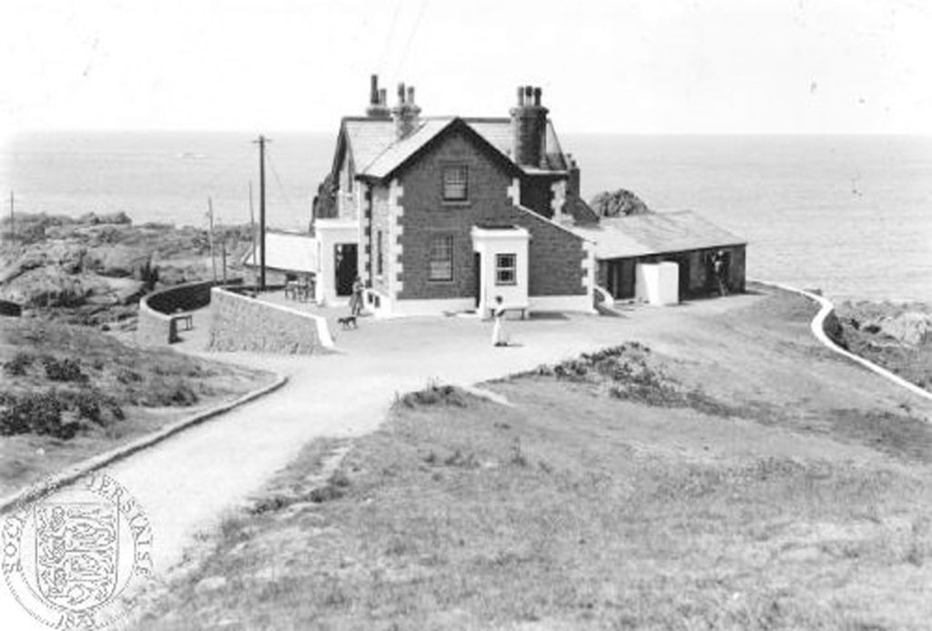
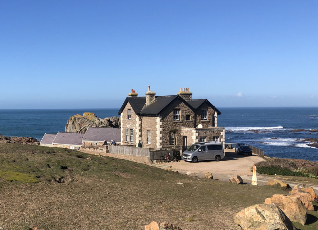
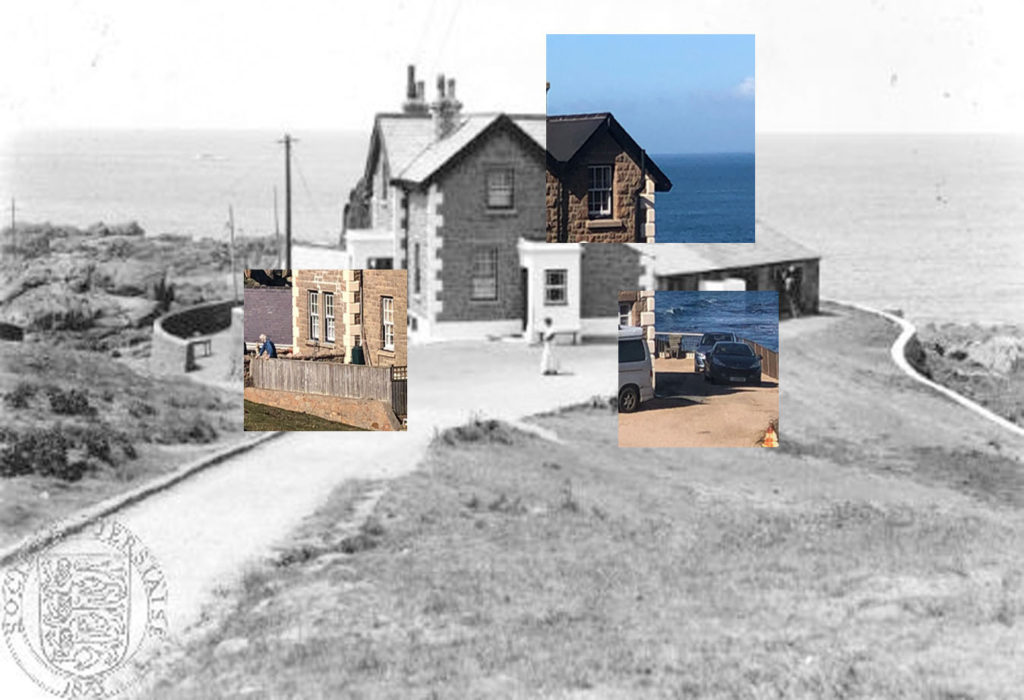
This image was taken by Edwin Dale of La Corbiere lightkeepers house with two ladies outside, a dog, a cat and a man on a ladder repairing gutters on the outbuilding.

Juxtaposing the images

To create this image I found a photograph that I had taken and liked of this house at Corbiere and then searched in the Jersey Photo Archives for a similar photograph. I then opened both images on photoshop, lined them up with my image on top and cut out squares using the rectangular marquee tool.

analysing an image

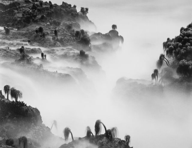
Wynn Bullock: Sea palms

Keywords: atmospheric, mysterious, illusion, calming, moody, dystopian, monochromatic, eerie, contrast. Form: This landscape photograph taken by Wynn Bullock in 1968 in the US depicts sea palms on rock forms, shrouded in mist which creates an eery atmosphere. This image is very monochromatic tones of black, grey and white. The lack of colour in this image adds to the drama and it is difficult to decipher what the scale of the image is, adding to the mystery of the image. Most of the sea palms in this image seem to be leaning to the left as if they are dying or have been blown over by strong winds or a storm. I feel that this image depicts a dystopian society that has no human connections/ has only been touched by the elements. Process: This photograph has been taken either looking across or slightly down on the landscape. The image was taken in daylight using strong light to enable the photographer to capture a strong range of tonal shades. Utilising Ansel Adams ‘zone system’ 1-10. I sense that Bullock would have waited for a specific time and weather conditions to capture his vision. Another process could be that he utilised a slow shutter speed to create the image. This could explain the lapping rock pool water becoming smoke/haze like in appearance due to its movement and some sea palms being blurred. Content: Bullock talks about how his photographs serve as visual metaphors for larger ideas, such as the passing of time and the inevitability of death. This particular image was taken in 1968 and during this time the US was going through a state of shocking assassinations, a much hated war and a spirit of rebellion through violent rioting and the dawn of the television age. Perhaps the drooping, dying sea palms in this image are a reflection of society at the time. The sea palms could also depict the US citizens at this time, or the US soldiers fighting in the war, with the surrounding fog and mist representing tear gas and the ruins of battlegrounds.