Category Archives: Uncategorized

Filters

Author:
Category:

LEWIS BALTZ – new topographics

Lewis Baltz was a visual artist and photographer who became an important figure in the New Topographics movement of the late 1970s. – Wikipedia

Lewis Baltz worked as a freelance photographer in California and his urban photographs took a very specific and unique form.

Many of his images are framed directly facing a wall, building or object. This gives a flat and almost 2D look to the photographs, but the strong contrast between the highlights and the shadows create the sense of depth that is lacking from the angle that the image is taken.

Icon of New Topography movement Lewis Baltz dies at 69 - The Washington Post
Lewis Baltz // New Topographics. – joshadamjonesphoto

Whilst most of his work has this format, some of his images are taken at different angles, usually 45 degrees from the object/building but sometimes differing. Although the angles are different, the same black and white tones and high contrast can be seen consistently throughout all of his work.

Bodies and Words: Lewis Baltz.

Photo Analysis

The photography of Lewis Baltz. Or: how to make minimalism work | by  Stephan Guttinger | Medium

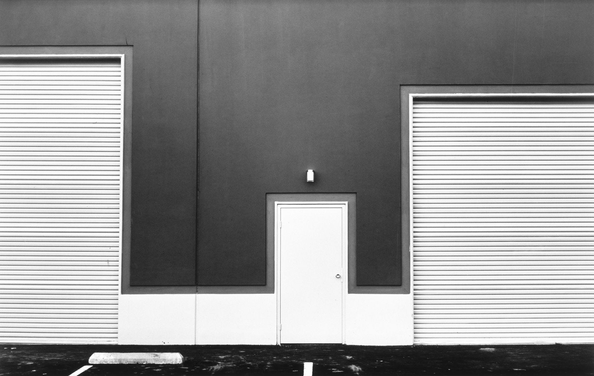
In this image, Lewis Baltz took the image on a bright day while it was cloudy. This is shown through the diffused lighting which is evenly lighting the shot and the lack of harsh shadows. He has used a fairly high aperture allowing the whole flat surface to be in focus, most likely f.8-10. The shutter speed could have varied depending on the exact aperture that was used and the intensity of the natural light at the time. The quality of the image is crisp, but crisp for the time that the image was captured in 1974, also using fairly low ISO.

The image was captured in black and white, allowing for the high contrast between the highlights and shadows, and the different colours of the wall to pop out more, such as the harsh difference between the dark material at the top of the wall, and the plain white door in the centre of the image. The image, much like many other photographs taken by Lewis Baltz, is taken looking flat directly towards the building, giving a 2D view to the surface. This emphasizes the geometric shapes and right angles created by the varying textures and objects.

The image is also taken at head height, almost giving a point of view perspective of what it would be like to actually be at the location of where the photograph was shot. The overall image shows the jagged and harsh lines which appear in urban and industrial areas/landscapes.

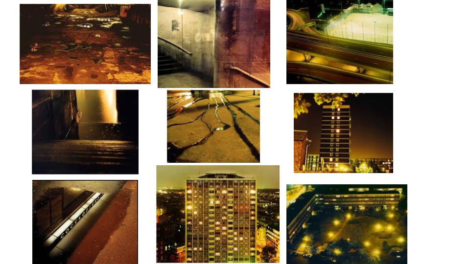
Rut Blees Luxemburg

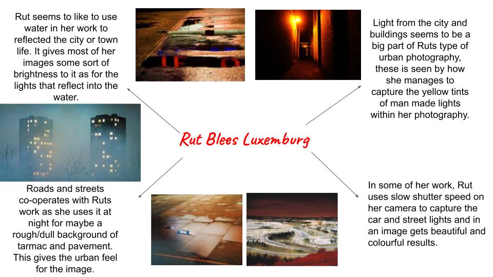
Rut Blees Luxemburg is a German-born photographer. Her technique is to take photographs at night, mostly exploring the urban landscape. Reflection, bright lights, and buildings all seek within her work with a theme of urban photography. Some examples of her work is below…

Ideas Of Where Rut Blees Takes Photos….

Analysis

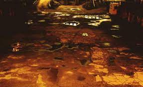
This photograph by Rut has been photographed in London streets. The orange glow and rough surface of street suggests this image was taken of a alley way. An uneven surface and gloomy setting suggests unease in the image, as if it was not a safe place to be. darker shadows surround the sides of the image with light reflecting from the puddles. More darker shades overall the light that floods in the image. In all Ruts photography there seems to be a theme of capturing a orange and yellow glow from the street light hitting different surfaces. This may be happening as for the light mode that he has set his camera on. As his work is always set at night with using street lights and no life to be seen in his photography, this indicates that he is expressing emptiness. This is seen with the image above as the alley way seems to be abandoned. A low exposure and average IOS balance captures the image nicely to the extent of not making it too dark but light enough for the cracks and bumps in the tarmac to be seen.

urban landscapes plan

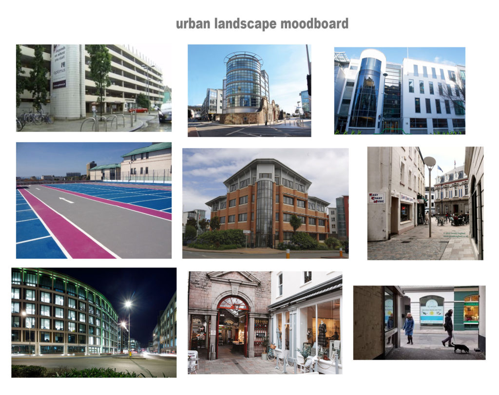
Places in Jersey I could possibly photograph; the new offices along St.Aubins, the back exits of shops, old roads in Jersey behind houses, any kind of flats that have loads of floors, glass and new office buildings, parking lots(inside and outside), damaged buildings, building sites.

moodboard of urban landscape ideas;

The title I’d like to focus on is Old and New, I want to photograph old Jersey and new Jersey and compare the images along side together in order to show the different areas of Jersey and compare the changes. I’d like to photograph modern buildings in Jersey and then some old roads or even damaged areas in Jersey.

Photoshoot Plan;

Where? im going to photograph old small lanes in jersey or abandoned places. Then I will photograph new buildings in Jersey such as new finance offices that are all glass or just some more modern houses around the island.

When? any time during the day time as I want my images to be in natural lighting and not in the dark. Taking them in day light will always help me edit them better.

What? New building and very old buildings.

How? using a normal shutter speed and from far away to capture the whole building , maybe some from a lower point of view.

Why? to display my way of showing that I know what urban landscapes are and show the difference between new and old Jersey and how the urban landscapes have changed over time by humans.

Portrait Photo-montage

David Hockney Joiner

David Hockney is an English painter, draftsman, printmaker, stage designer, and photographer. Hockney was an extremely important contributor to the pop art movement of the 1960s and considered one of the most influential British artists of the 20th century.

David Hockney "Joiners" - ASPhotoAlice
Image result for david hockney portrait photomontage

Hockney’s portrait photo-montages are both simple and effective which is what I would like to try and recreate with my rendition of portrait photo-montage.

My Outcome

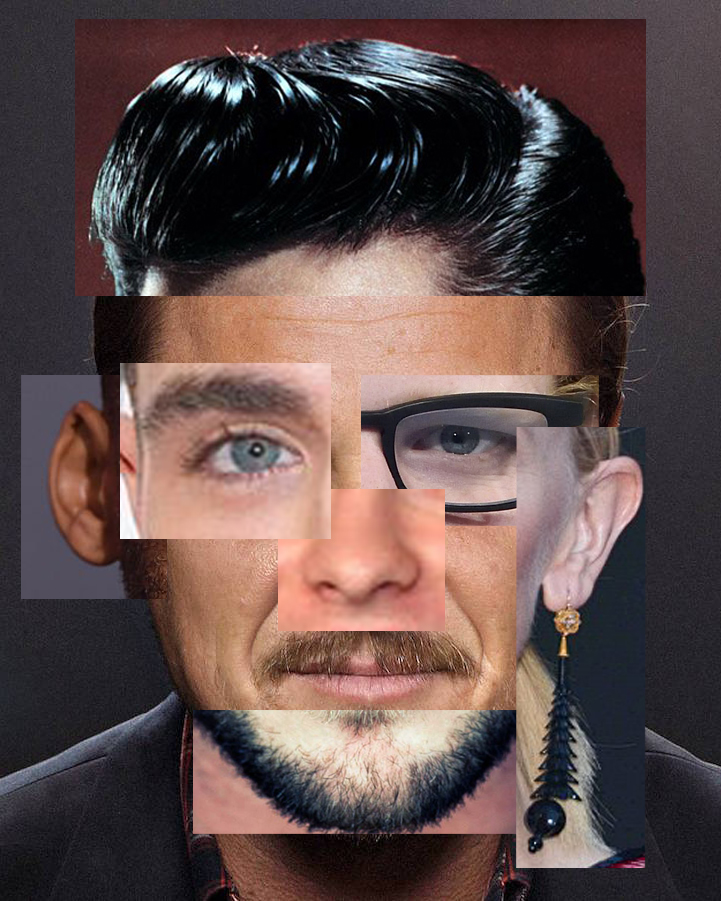
The image below is one that I made during the Christmas break. To create this image I had to collect images from different celebrities facial features from the internet. I took Elvis’s hair, Zac Effron’s eye, Ed Sheeran’s eye, Cate Blanchett’s ear, Chris Hemsworth’s chin, Will Smith’s ear and the background facial shape and mouth of Leonardo De Caprio.

I created the image above as a test run to see if my idea of cutting out facial features and merging different features from different people worked which it did. I really like my first attempt at portrait photo-montage because it is simple but effective and has features from different people of different countries, races and genders that overlap and don’t perfectly fit on the facial template. This creates a sense of imperfection which is similar to David Hockney.

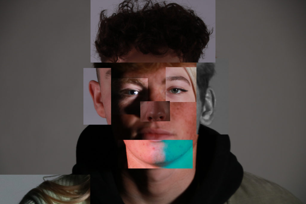
The image below is my second and third rendition of portrait photo-montage. For these images, I took photos of two classmates and myself and cut up the facial features from different angles and lighting. To make these images I collected many different images I previously took from a studio portrait project. I then took the images and cropped them so that only the facial feature I needed for the montage was showing. Next I got a base background image to use as a facial template and dropped the individual features onto the background creating the portrait photo-montage.

I like the outcomes of the portrait photo montage task because it shows a link to David Hockney Joiner with the idea of multiple pictures and identities within one person.

Extension possibilities

Eco-Active Challenge 2021

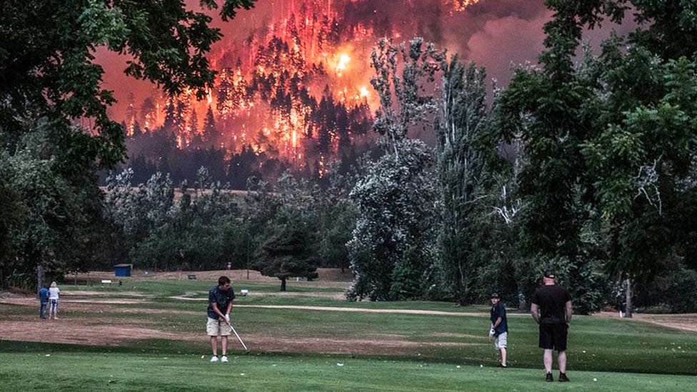
Beacon Rock Golf Course in Washington state shared this photo of golfers putting while a forest fire blazed in the background (Credit: Beacon Rock Golf Course/Facebook)
Photograph: Kristi McCluer/Reuters

Click on the link above to find the details of the Eco-Active Challenge…and have a go at entering some of your relevant photography (landscape images?)

Deadline

The deadline is Thursday 1 April 2021. An exhibition is planned in April / May 2021 (TBC).

Stimulus

  • what do you imagine when you think of climate change? 
  • what does climate change mean to you?
  • how have you been affected by climate change?
  • do you think climate change is impacting Jersey’s environment? If so, how?
  • do you think COVID-19 has impacted Jersey’s environment? If so, how? 
  • how are you helping the environment?
  • is there a place in Jersey that shows signs of climate change, or a place that is helping tackle climate change?
  • are there ways you can reduce the impact of climate change here in Jersey?

Good Luck !

Roaming Soundtrack

Click Here for more info…

Perfect for those of you who are interested in combining images and sound…

https://www.roamingsoundtrack.com/

Please have a look at this site that has been developed by ArtHouseJersey in collaboration with local photographers and international musicians…based on iconic Jersey Locations.

Plenty here to be inspired by!

Double Exposure

Double Exposure

Melissa Bissel

Melissa Bissel (bottom left) is an in-home documentary and lifestyle photographer who lives in Massachusetts. She states in her blog, “I take seriously the privilege of being welcomed into your home as your family documentarian.  Together we will capture the memories of what makes you, your family and the life you have created together, its very own kind of special.”

She has experimented with double exposure as shown on the top right.

Double exposure is the art of immerging two or more images and creating an overlay to create different abstract and creative images. Most artists use Photoshop for this art form as they are able to use blending, opacity and exposure levels to properly adjust each overlay.

Melissa clearly has explored this theme as her project powerfully show evidence that some layers are clearer than the others.

Planning

Contact sheets

This is my favourite outcome, I have called it “Madness” as it powerfully depicts different emotions; one is still, calm, the other is laughing and the other one seems to be between laughing and crying, sort of like the Pseudobulbar affect.

I have chosen this image as my final outcomes because it successfully relates to the mood board and Melissa as both our models are female; the image is in black and white and there is at least 3 evidences of multi-exposure.

This image was taken using a Sony Alpha 380 DLSR.

It was taken using 100 ISO and a 1/160 shutter speed.

These images were shot using 2-point lighting; one to the side of the subject and one facing the background in order to clarify, lighten and remove any shadows on the picture.

It has been edited using Snapseed and photoshop in order to:

•Sharpen and increase details so the image is clear.

•Turn the image in to black and white.

•Create the double exposure

case study -lewis baltz

Lewis Baltz (1945-2014) was a young photographer who soon became a central figure in the new topographic movement. Through his investigan on the crisis of technology as a means of human emancipation, the role of the artist and objectivity, Baltz contributed to the aesthetic shift that the exhibition, (New Topographics: Photographs of a Man-Altered Landscape), began provoking among a young generation of (mostly) European photographers. His body of work focused on the search for beauty in bleakness and devastation, a reflection of human control and power through the depiction of common architecture of factories, parking lots,offices etc.

Image Analysis

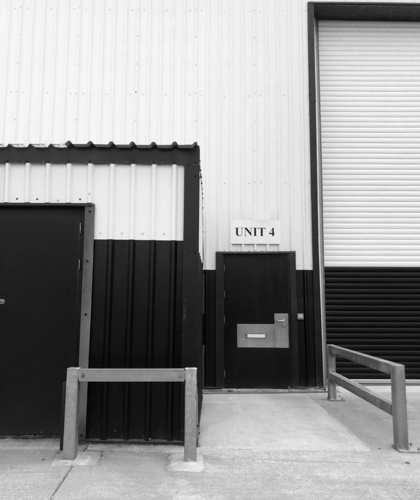
This image looks to have been taken in natural lighting as the top of the image behind the building is very bright as though there is sunlight behind the building. The contrasting tones in this image imply that it has been edited so that the darker tones contrast the brighter tones even more. This image has also either been taken in black and white or edited after being taken. This image is very sharp, although the image is simple, the way it has been captured brings out all the details; such as the marks on the garage doors and the different tones and marks on the tiles. The floor in this image is the biggest contrast as it is fully black and fully white, where as the rest of the image is just extremely dark grey tones contrasting with lighter grays. I am going to take inspiration from this image as I know a place similar that I can capture images of.

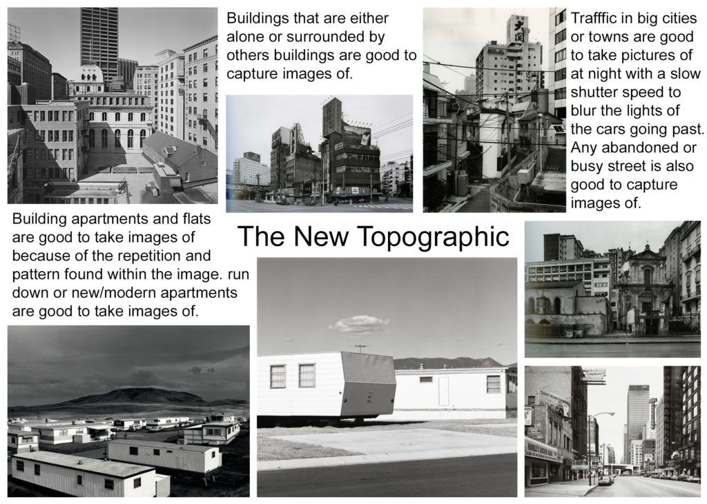
the new topographics

New topographics was a term coined by William Jenkins in 1975 to describe a group of American photographers (such as Robert Adams and Lewis Baltz) whose pictures had a similar banal aesthetic, in that they were formal, mostly black and white prints of the urban landscape. Many of the photographers associated with new topographics including Robert Adams, Lewis Baltz, Nicholas Nixon and Bernd and Hiller Becher, were inspired by the man-made, selecting subject matter that was matter-of-fact. Parking lots, suburban housing and warehouses were all depicted with a beautiful stark austerity, almost in the way early photographers documented the natural landscape.

Mood Board

What was the new topographics a reaction to?

Their stark, beautifully printed images of this mundane but oddly fascinating topography was both a reflection of the increasingly suburbanised world around them, and a reaction to the tyranny of idealized landscape photography that elevated the natural and the elemental. The new topographics was a reaction to the urbanization of natural landscapes.
Urban & Industrial Landscape photography -introduction

Industrial landscapes are all over the place. In fact, they’re so common, we often forget these construction sites, power plants, chimneys, and factories. can be extremely interesting photography subjects. Truth be told, industrial landscapes are rising in natural habitats and urban areas, changing the face of the Earth. They have intriguing materials, textures, and colours, and unique geometrical shapes. All photographers should practice seeing art in the common and mundane.

Mood Board

Mind Map

Task 4 ~ Isolation Photoshoot

Lewis Baltz

Editing process

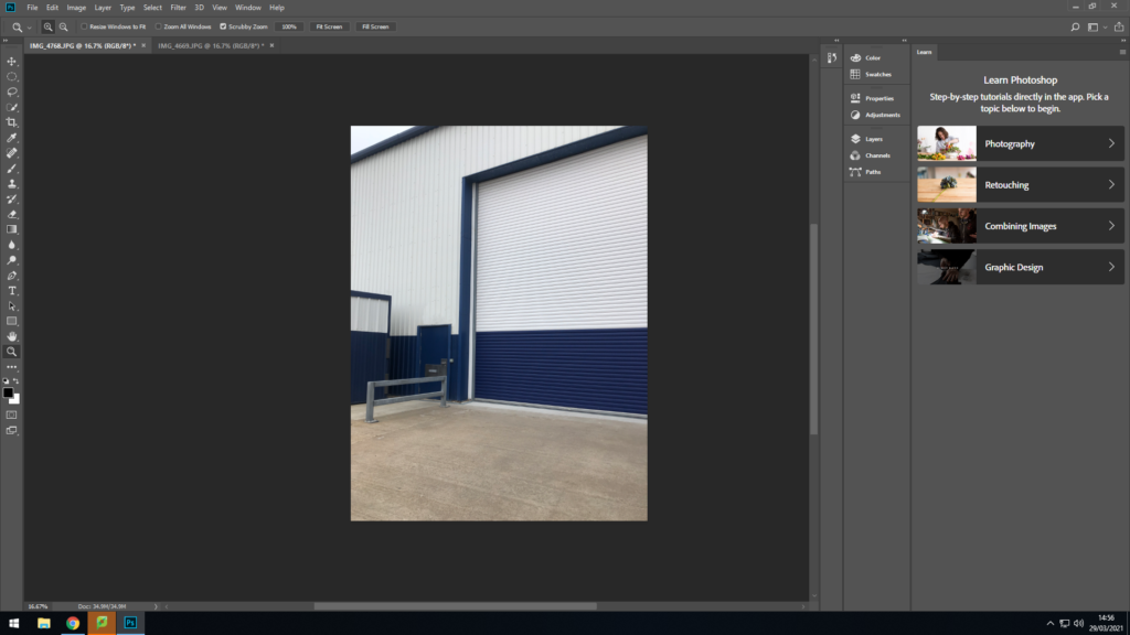
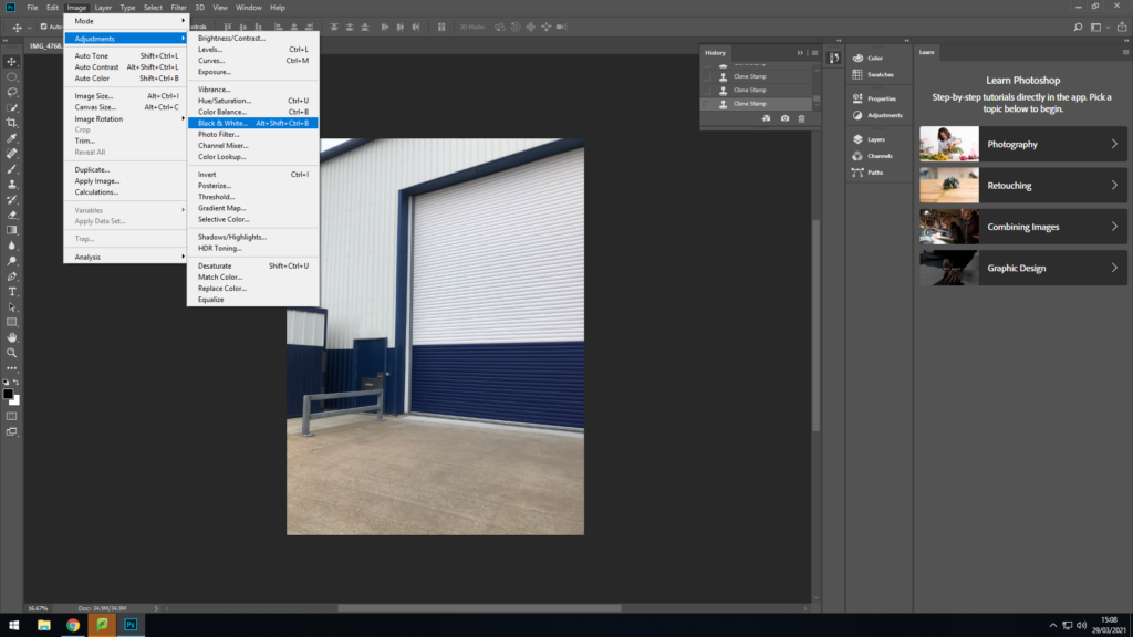
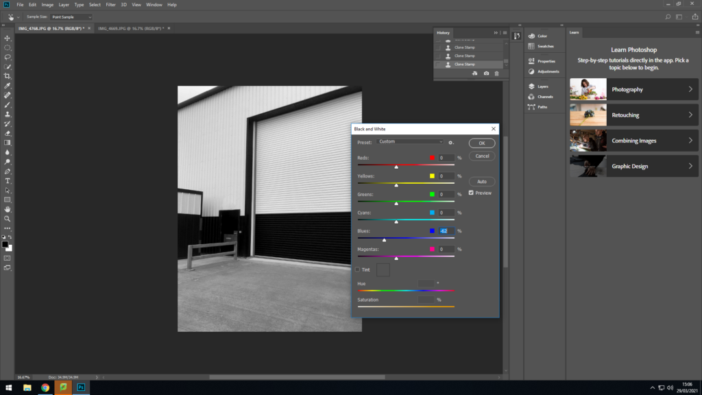
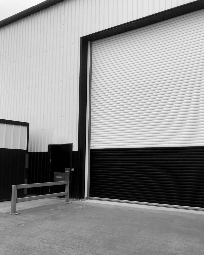
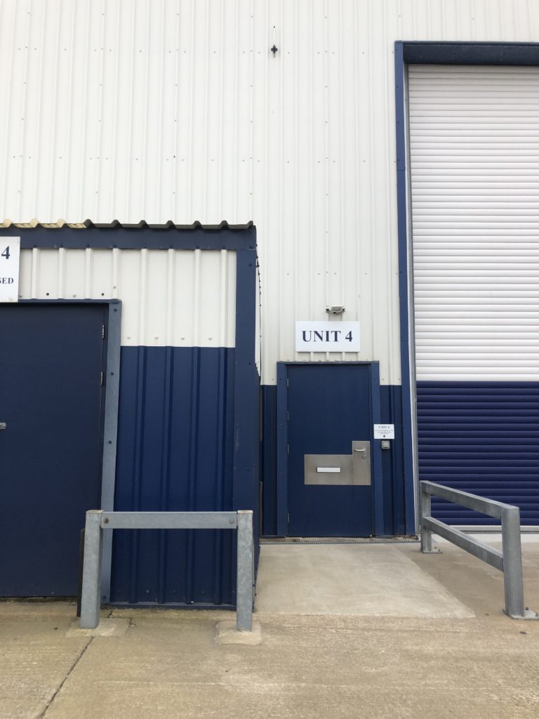
First I used the spot healing tool to delete the two signs above the door and next to it so image would be focused more on the whit and blue colour block. I then used the clone stamp tool to cover up the messy spots that were made when deleting the signs.

To made the image similar to Lewis Baltz I decided to change the image to black and white. then to finish odd I changed the canvas size to 40 inches by 50 inches.