Category Archives: Uncategorized

Filters

Author:
Category:

Ansel adams case study

Ansel Adams, born on February 20th, 1902 then later died on April 22nd, 1984, was an American photographer who was well known for his landscape photography due to it being very transparent in the detail that was portrayed in his images form the landscapes being very clear. Ansel began his photography carer not even knowing but at the age of 12 he got his first camera and took pictures of the Yosemite National park which was later used to show off his photography that was first published in 1921. Ansel work was starting to mature and become at its best in 1929 and 1942 and he became more established. The 1930s were a time in which he was experimenting and being more productive with his photography, expanding his photography technically by taking close up pictures of mountains, large forms and even detailed close ups with pictures of mountains to even factories. Moreover, this was when Ansel was getting his best landscape images from landscapes to close up images of leaves and flowers. In 1952, Ansel was one of the founders of the magazine Aperture which was a journal of photography, showing of its best practitioners and newest innovations in which he was also a contributor to Arizona Highways, a photo rich magazine. In June 1955, Ansel began his annual workshop at Yosemite which they continued to 1981, attracting thousands of students. During the final 20 years of his lifetime, the 6×6 cm medium format Hasselblad was his camera of choice.

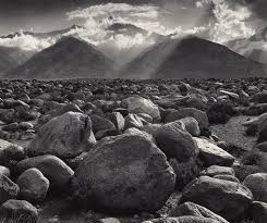
As you can see from Ansel Adams photography, the landscapes in which he has taken photographs of is very well defined to the point where you can see every single detail of the surroundings in the landscape. Moreover, in his images you can see the clear contrast in the compositions of black and white, which goes to show hoe well Ansel Adams understand the contrast between black and white as you can see from his images, making every detail stand out from textures and surfaces.

COMPARISONS

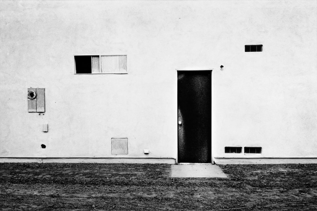
Lewis Baltz Image

Lewis Baltz | Art, Biography & Art for Sale | Sotheby's

My Image

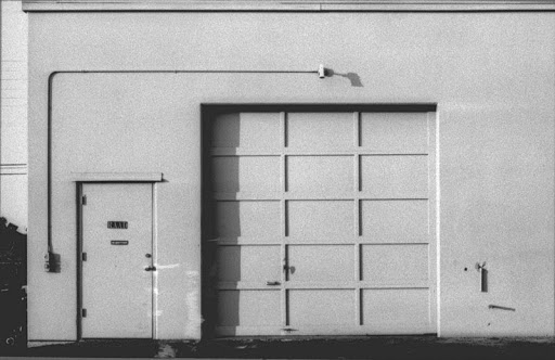
In both images, the lighting used is almost identical, Lewis’s image was lighted by natural light almost directly above the building being photographed. This is shown by the dark shadows being created on the door by the top of the door frame in both images. In my image, I used an aperture of f.9. This is to allow the whole door and texture of the surrounding surfaces to be in focus and sharp. Similarly to this, Lewis’s photograph appears to have been taken at a similar aperture because the door is in focus, as well as the texture on the surrounding surface, showing a moderately high aperture was used. The shutter speed i used was fairly high because if the bright natural light at the time the image was taken. Lewis Baltz may have used a similar shutter speed if the intensity of the light was similar to when i took my image. Also, the ISO is fairly low in both images, creating minimal grain within the image, making them more clear and crisp.

Both images use black and white to emphesise contrast. Lewis’s photograph was taken on a black and white camera with no post editing, where as i took my photo on a coloured DSLR camera, and edited it in post to appear in black and white. Both images have a large tonal range, with bright highlights on the walls and dark shadows at the top of the doors. The framing and shapes within both images are almost identical, the camera is facing directly towards the building at head hight, the floor takes up a very similar amount of space in each image and the right-angled shape of the door is in the direct centre of the frame. In my image, The texture of the surrounding wall is emphasised by being in focus through the use of a high aperture, aswel as increased contrast and shadows. In Lewis Baltz’s image, there is less texture on the building, but it can still be seen because of the large tonal range and high contrast of the image. Lewis’s image is very symetrical because of the plain surfaces and central framing of the doorway. Where as my image is less symetrical because off the added details/objects such as the door handle, circular light and sign.

Alltogether, both images are rather similar, using high contrast and tonal ranges, along with flat angles and geometyric shapes to create a good representation of the urban side of New Topographic Photography.

Shoot 2

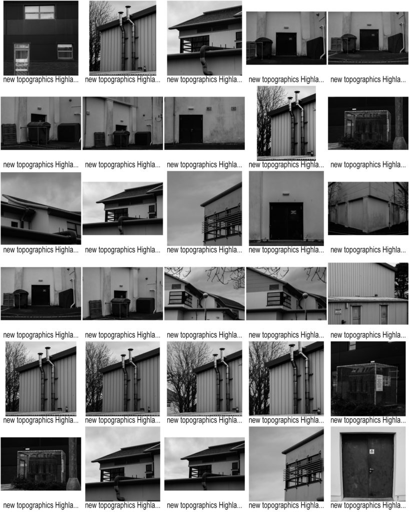
Contact Sheets

Favorite Images

These are my favorite images because i think they best show the New Topographic and urban photography style. This is by framing the photographs directly towards a building/object looking flat towards the surface. As well as this, one of these photos is taken at a slight angle to show the dark shadows being created by the objects in the image, much like some of Lewis Blatz’s images.

Inspirations

Many of Lewis Baltz’s photography incluse industrial/mechanical objects/buildings, such as pipes, electrical boxes, air conditioning etc. I used this information to respond to one of his images of the side of a building containing lots of el;ectrical appliances and boxes:

Lewis Baltz - 49 Artworks, Bio & Shows on Artsy

My Final Outcome

Here I took a photograph of some air conditioning units and wires on the side of a building. The angle the image is taken at is much like Lewis Baltz because the camera is facing flat towards the wall, showing the shapes and right angles created by the objects in the frame. A difference between my image and Lewis Baltz’s image is that the background of my image (the wall of the building) is darker than the objects in the main focus of the image, whereas in his image the objects in the foreground are darker than the background. Although these light and dark tones are ‘inverted’ in each image, the same effect is achieved, making the focus of the image stand out more through the use of contrast between the tones used.

Shoot 1

Contact Sheets

Favorite Images

These are my favorite images because i think they best display the New Topographic style of photography and urban photography through the strong tonal ranges, along with the ‘dirty’ and ‘raw’ feel to the images created through increased contrast.

Inspirations

As you can see, Lewis Baltz directly inspired many of these images, for example, the ones I took of the dark double doors against the lighter white all the building.

This is similar to some of Lewis Baltz work such as:

Icon of New Topography movement Lewis Baltz dies at 69 - The Washington Post

My Final Outcome

Here I darkened the darks of the image to create greater contrast between the door and building wall. This also emphasises the dirt and texture on the wall, much like in the top left of Baltz’s image above. My image is less exposed than Baltz’s image because i feel like it gives the image a more ‘real’ feeling as you can see the textures and dirt on the wall more clearly.

Urban landscapes


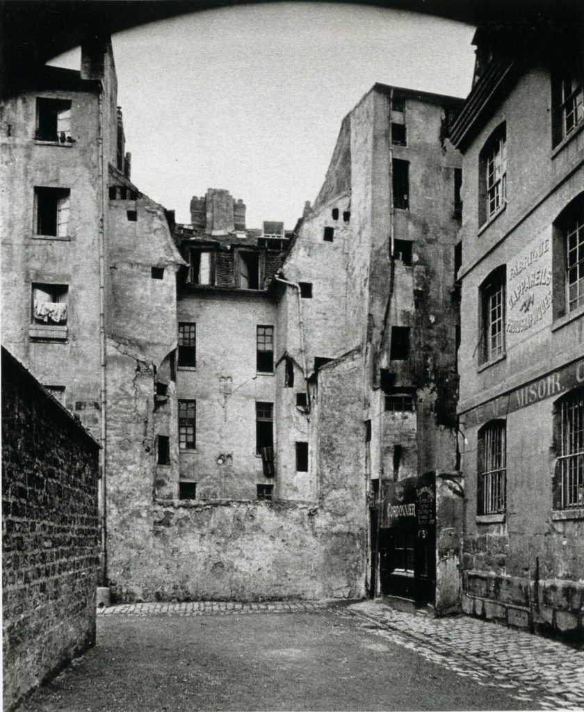
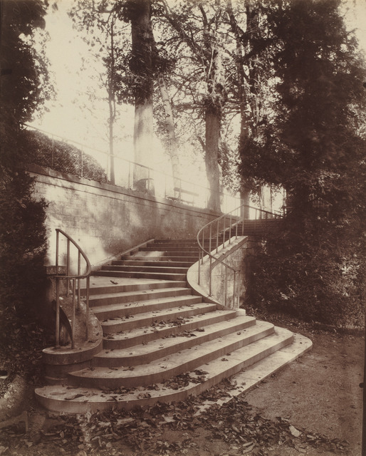
Eugene Atget was a French commercial photographer who specialized in photographing the architecture and associated arts of Paris and its surroundings at the turn of the 20th century. In  the late 1880’s, when Atget was in his early 30’s, he became interested in photography. The earliest known photographs by him seem to be made in the north of France. These works portray rural scenes, plants, and farming technology and they were presumably made as studies for painters and illustrators. It was his fortitude to document the entire architectural landscape and street views of Paris prior to its transformation to modernism. By the early 1890’s, Atget was working in Paris, but it was not until later into that decade that Atget changed the focus of his photographic business to concentrate on the city of Paris—a subject that proved of limitless interest, and one that continued to enrich his work for the remaining 30 years of his life.

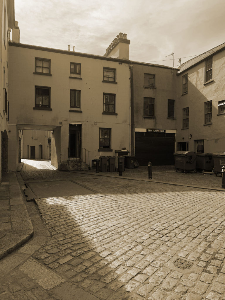
I did my urban landscapes photoshoot based off Eugene Atget and photographed cobbles lanes around Jersey.

Shoot plan:

My shoot:

My selected images:

My final edited images:

analysis

I like the final outcome of my images as I feel they represent Eugene Atget photos well. I created an ‘old’ look to my images by putting my images into black and white and then adjusting the hue/saturation according to how I wanted the final outcome of the images to look. I am really happy with the outcome of the edited images as I feel they relate well to what I was trying to represent. My images captured cobbled lanes throughout Jersey and old buildings.

Case study on Lewis Baltz

Lewis Baltz was born in Newport Beach, California, he studied at the San Francisco Art Institute. He worked as a freelance photographer in California and taught photography at various institutions, including the California Institute of the Arts, Yale and more. Baltz was a visual artist and photographer who became an important figure in the New Topographics movement of the late 1970s. His work is focused on searching for beauty in desolation (emptiness) and destruction. Baltz was one of a group of photographers (New topographics) who shared aesthetic – minimalist and detached, traditional landscape photography.  Baltz images describe the architecture of the human landscape, offices, factories, and parking lots. In the late 1980’s, Baltz switched from modestly scaled black-and-white photos to larger-scaled color prints, in order to capture the massive spaces of in France and Japan.

Image analysis

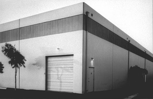
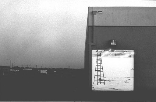
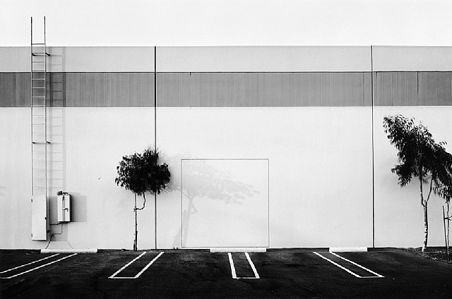
Lewis Baltz took this image of a car park at the south wall in Costa Mesa. There is a high contrast of black and white in this image. The use of the high contrast of the thin black trees against the white negative space of the warehouse, gives a haunting and lifeless feeling to this image despite being simply a photograph of a warehouse. The lighting looks as if it is taken during the day as you can see the shadows from the trees and ladder, however the image is transferred into black and white. Their is a strong tonal range of the white building and the car-park floor. Baltz uses the lines from the parking spaces as leading lines to draw in the viewer as it it directly in the eye line and looks inviting.

Baltz liked to photography his work in a ‘grid’ format with straight and geometrical lines and most his work is created using two tones to add to the meaning of his work. He focuses closely on lines and space to create a minimal looking image which still has meaning behind it. In this image Baltz took the image face on to make the most of the parking space lines and so that the viewer can clearly see the strong black and white contrast. Baltz wished to find beauty in his everyday surrounds rather than the new industrial world being created at the time, he has demonstrated this in this image as he has turned something so basic as a simple car park into a image with a meaning.

the new topographics

The New Topographics

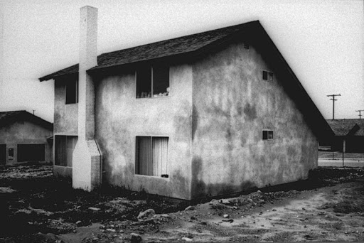
New topographics was a term coined by William Jenkins in 1975 to describe a group of American photographers (such as Robert Adams and Lewis Baltz) whose pictures had a similar banal aesthetic, in that they were formal, mostly black and white prints of the urban landscapes. The photographers associated with new topographics were inspired by the man-made surroundings, selecting subject matter that was all around. The collection includes photos from car parks, suburban housing and warehouses. These photos risen in response to the new postwar extensions.

Lewis Baltz

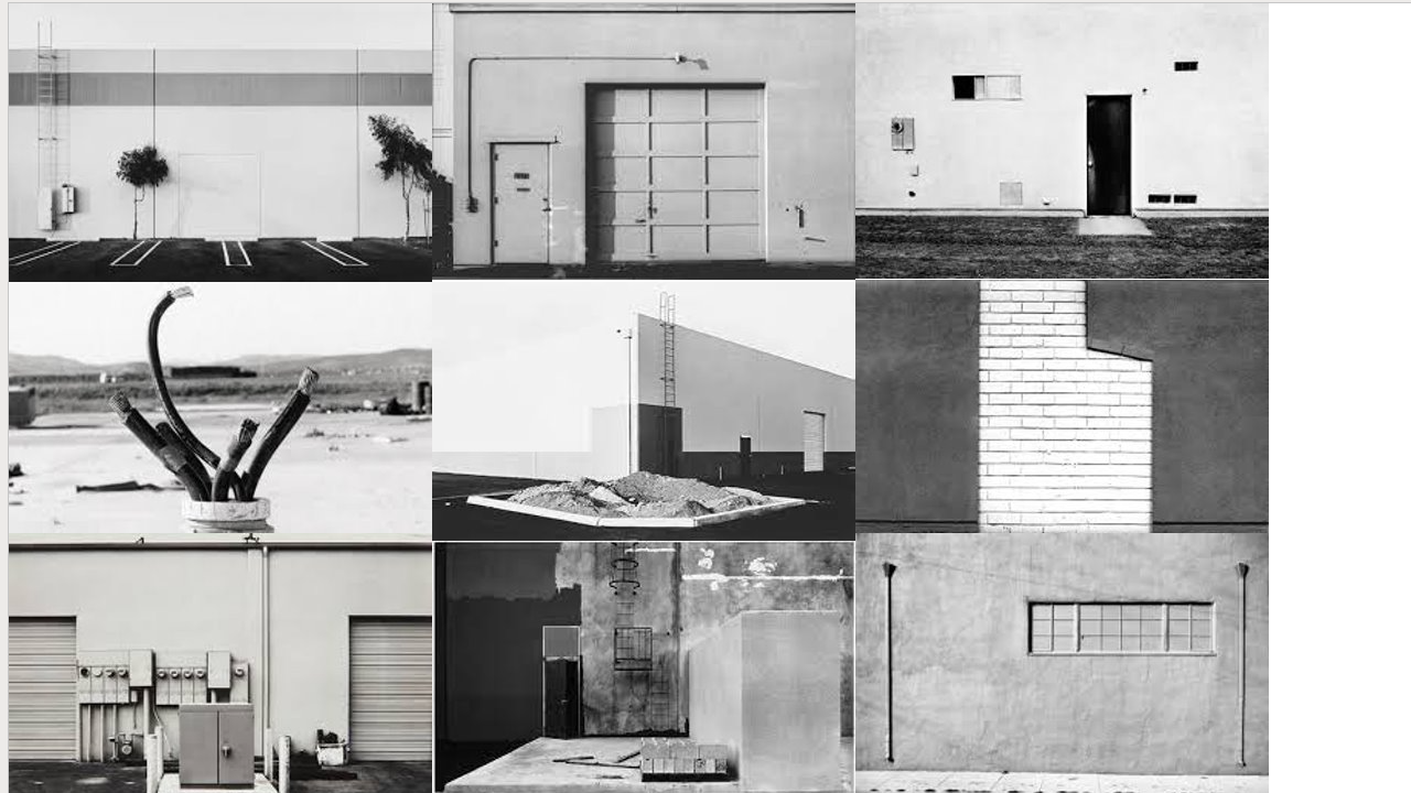
Lewis Baltz documents the changing American landscape of the 1970s in his series, “New Industrial Parks Near Irvine, California.” The project’s 51 pictures depict structural details, walls at mid-distance, offices, and car parks of industrial parks. Contrast and geometry are important in these pictures, but what marks them as uniform is Baltz’s attention to surface texture and lifeless subject matter. Often displayed in a grid format, it is important to Baltz that his pictures be seen collectively as a group or series. The series format suits his desire that no one image be taken as more true or significant than another, encouraging the viewer to consider not just the pictures but everything outside of the frame as well, emphasizing the monotony of the man-made environment. The pictures themselves resist any single point of focus, framed as they are to present the scene as a whole without bringing attention to any particular element within.

Lewis Baltz was born in Newport Beach, California in 1945. He holds a BFA from San Francisco Art institute (1969) and an MFA from Claremont Graduate School (1971). Baltz was awarded a National Endowment for the Arts grant in 1973 and a John Simon Guggenheim Memorial Fellowship in 1977. He has exhibited at the Centre Georges Pompidou, Paris; Stedelijk Museum, Amsterdam; and the Los Angeles County Museum of Art. His work is in the collections of numerous institutions, including the Metropolitan Museum of Art, New York; Whitney Museum of American Art, New York; Metropolitan Museum of Photography, Tokyo; Corcoran Gallery of Art, Washington D.C.; and the Art Institute of Chicago.

All photos by Lewis Baltz

image analysis

Lewis Baltz: In the Desert | Nevada Museum of Art

This photograph ‘In the Desert’ by Lewis Baltz, is apart of a collection of photos consisting of black-and-white photographs that Baltz took of construction sites and abandoned areas in the northern Nevada desert region between 1977 and 1986. This black and white photo perfectly demonstrates the growth and development of landscapes shifting from nature having control of the plain to man made objects being planted onto those plains.

At first look, the contrast between the dark cables and the light desert ground is very intense. This helps emphasise the cables in the foreground, showing the viewer that the change happening in America is inevitable. However, after looking for longer, i see more industrialised objects in the background. Perhaps trucks or shacks. These blurred objects secretly support the new topographics as its showing the viewer that there are changes happening all around, not just the work that the cables imply.

The natural lighting causes little to no shadows cast over the image, this makes the background more solid, helping emphasise the contrast between the ground and the grass.

My take on the new topographics

Editing

Wynn Bullock Image Analysis

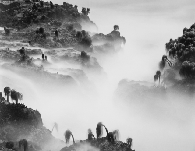
SEA PALMS -1968

Wynn Bullock was an American Photographer from Chicago, who was born in 1902. Bullock’s images often have a political meanings behind them. This image alone could have many meanings.

Sea palms are small plants that are often found near rock pools or small crevices by and/or on beaches. The image was taken at an angle to make the sea palms look like large palm trees that are on the edges of a cliff. The mist from the sea looks like a fog bank which helps further give the impression that the photographer took the image from a height.

The mist also is in the shape of a cross, and during the 1960s religion was a major part of society. However, religious views caused tension as many things that are accepted now were seen as inappropriate then. The image is quite sinister and the fact that the image is in black and white could highlight the fact that religion wasn’t always as it seemed. Christianity

The image was taken in America in 1968. During this year, America faced lots of civil unrest.

For example, America was in its 12th year of the Vietnam war. America was loosing and the number of fatalities was the highest out of the whole 20 years.

The Sea Palms could be seen as a representation of the fallen soldiers from the Vietnam war or they could be seen as the family members of the fallen men and be representing praying figures.

Juxtaposition

Plémont

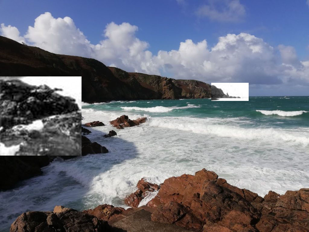
Both these images were taken at the bay in Plémont. One was taken between 1784-1786 by Earnest Baudoux and the other was taken in 2021 by me.

The main difference between both of the images is the rock face and how over time it has become more smooth due to the rock face falling and erosion.

Edited images

Plémont

For this edit, I noticed that I was stood near where the Baudoux was stood when he took his image. This is why I lined up both images so the cliff lines up with each other to make it look like one mountain. The tides are linked together as an attempt to make a clean line.

Plémont