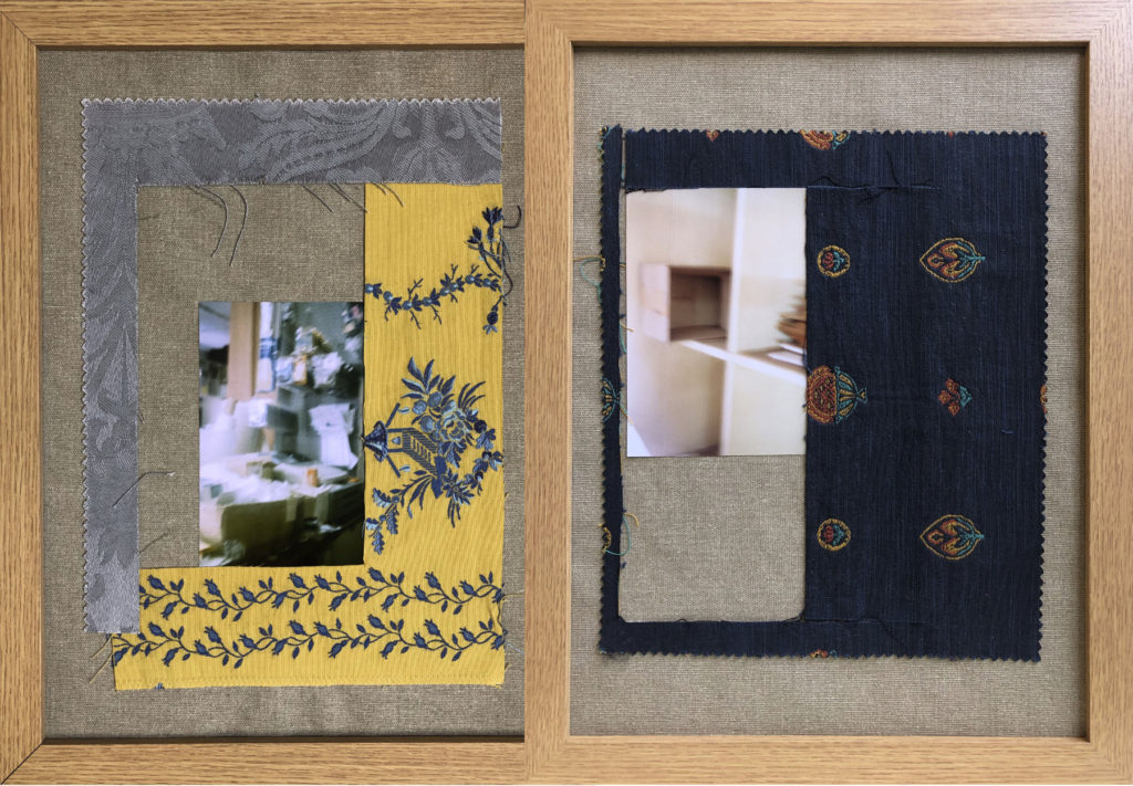
Category Archives: Uncategorized

Filters

Author:
Category:

Statement of intent

What will the future of Jersey look like as a community in the metaverse?

  1. Diverse Digital Immersive
  2. The future of jersey’s community as a metaverse will be unhackneyed and evolving.
  3. The future of Jersey’s community as a metaverse will already bring all social elements that are used in todays society to the digital platform, then evolve it through knew social norms/ understandings on a digital point of view. Islanders will be able to communicate to one another whenever they would like at any given location physically in Jersey or even across the globe! I would imagine this happening on high advances of technology potentially through Virtual Reality. I feel like the metaverse will be a very free, consistent and the modern way of people communicating to one another. In addition, I fell like this would be perfect for Jersey as the community could come out of this “bubble” that Jersey has hiding it from around the world, in order to potentially get glimpses of what the real world is like.

Reflecting and Reviewing Mind Map

The concept that we decided to go through with as a group to interpret the theme of community was social differences/norms through gender. The way that we will be interpreting this concept in the film will be done by having our male model, dressed up in masculine and feminine clothing, alongside feminine and masculine posses. In addition, the male model will be infront of a green screen that will be changing between the colours of blue, purple, pink and white in that specific order. For the blue background, our model will be in male clothing performing masculine poses. This will be showcasing to the audience the everyday stereotypes of men having to wear male clothing, being stiff in order to portray what society thinks is ‘masculine’. As for the purple background, our model will be in a crop top wearing jeans which will be portraying to the audience a slow transition of men being able to wear feminine clothes, being normalised in society. Moreover, the purple background is a mix between pink and blue, which is presenting men being able to merge the two types of clothing together to develop a slow transition with men being able to wear female clothes. In terms of the pink background, our model will be wearing a dress with make up on which will be displaying how men should be able to go all the way with how they would like to look in terms of being feminine or attaining that look. Finally, for the white background we would like to have a split of our model wearing the dress and wearing the male clothing. This will be portraying how men can look like whatever they want and still be comfortable in society, with the white background being a neutral colour there is no significant meaning behind it in terms of gender. However, the white background will exhibit hope/ faith in our community as a whole being more open minded in terms of how males would like to display themselves with there looks in terms of clothing, make up and even their sexuality.

In terms of the image, we will be having a split between our model wearing mens clothing and female clothing with a white background. This will be portraying our concept of social norms/ differences in men having to follow this stereotype of not being able to wear female clothing publicly because it doesn’t look masculine. Having the split of the masculine and what is ‘non masculine’ will be showing the audience men should be comfortable with wearing female clothing and they can still be masculine, men shouldn’t have to question there masculinity just because of a piece of clothing. As for the white background, this is essential because it is a neutral background which won’t be distracting, the audience can look at the focal point of the image which is the split between the masculine and feminine clothing that is portrayed. Moreover, the white background on the image displays faith and hope in our community moving forward in the direction of men being able to wear female clothing, feeling comfortable in society as well wearing these outfits and being more comfortable with their own sexuality as well.

Overall, as a group we thought the concept of social norms/differences had to be challenged. The reasoning behind this is because, in society today we still have people who haven’t been fully educated on understanding both genders being able to be comfortable with their own sexualities, due to stereotypes like men not being or looking ‘masculine’ due to wanting to use or wear female products in society.

https://commonreader.wustl.edu/why-women-can-dress-like-men-but-not-vice-versa/. On the link provided above is a Journalist who wrote down a piece on how, ‘Why Women Can Dress Like Men But Not Vice Versa’. A women with the name of Jeannette Cooperman wrote a journal about how men cant wear women clothing, yet it works vice versa. This caught an interest to me and helped me gain some ideas on how to interpret our concept into community as she challenges the topic of men not being able to wear women clothing. For example she mentions how the issue of these stereotypes could be happening because of men potentially having to prove their masculinity at all times in order to portray their sex due to ego and social stereotypes. Moreover, she preaches about how as a society we have established that men are suppose to be perceived as strong, big and had to gallop on horseback to be a man, for what appears to be to for to long of an amount of time to where men are and will struggle to be able to wear women clothing comfortably with their own sexuality or comfortability in general. This journal helped with overall ideas for our film and final image as we could gain questions in which we could ask our audience in order to make a change in society and move it in the right direction.

Here are a set of images of Billy Porter being comfortable of wearing feminine clothing in the eye of the public in order to display his sexuality and fashion.

Images the final film

Inspiration:

Mario Testino

Mario Testino

Mario Testino is a famous fashion photographer who has been nicknamed “[the] godfather of fashion photography”. He has had a very close relationship with the fashion magazine VOGUE, and He has photographed celebrities such as Kate Moss, Oprah, Serena Williams and also the late Prince of Wales with the Duke of Edinburgh and the Duke of Cambridge.

https://time.com/3840119/mario-testino-i-believe-men-have-changed/

Contact Sheet

taken by Ellie

Edited Images

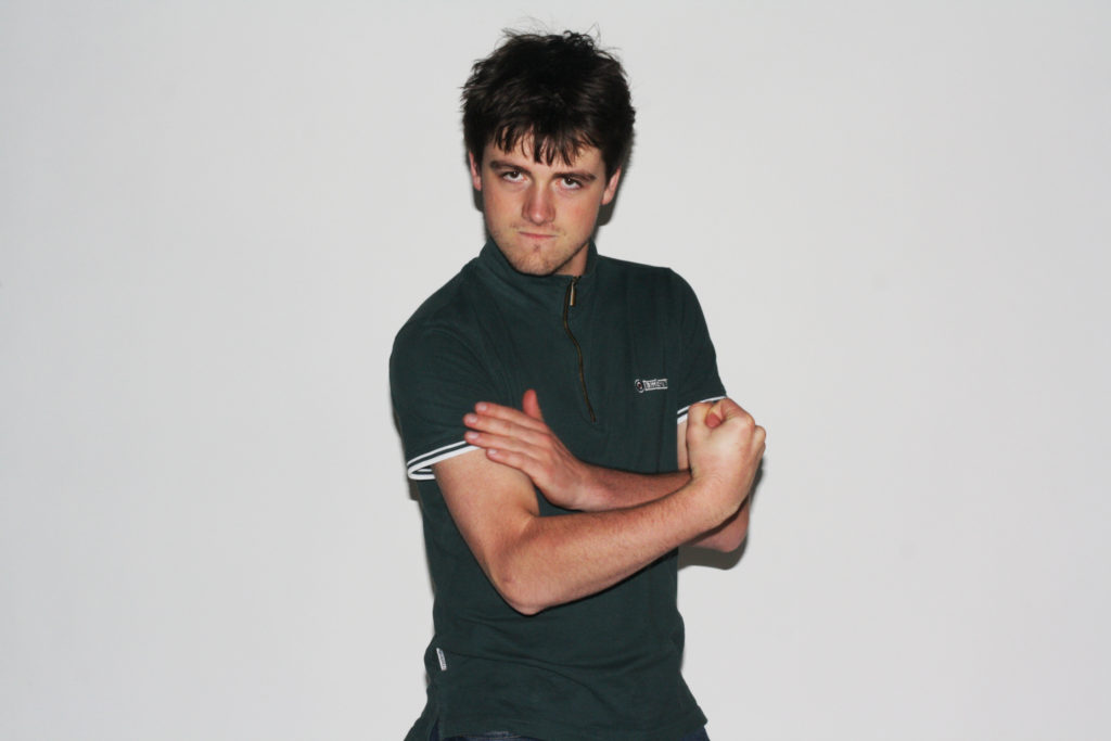
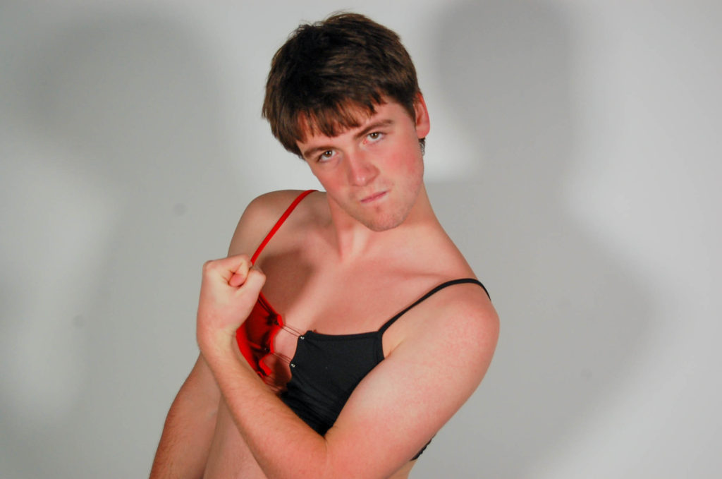
This first set of images is an over exaggeration of what men are stereotypically expected to be like. We added the pink background as the colour pink is often associated with femininity, we did this to emphasise the fact that anyone can do certain things and be perceived a certain way, and perseveration isn’t always correct.

Favourite image

This is my favourite images because it reminds me of the Uncle Sammy Propaganda that was used so that people would join the US army during the First World War.

This is a powerful pose because it makes the viewer feel as though that the model is looking and pointing at them. It shows that this issue needs to be fixed and we need to stop expecting people to be or act a certain way.

The image is black and white to represent the old fashioned ideas that many people have obtained due to the media. Media is the main for many generations. The media creates opinions and many readers are influenced by what is said.

The black and white could also represent a metaphorical prison. This shows that the model is trapped in a society where he doesn’t feel as though he belongs.

Shoot 2

Taken by Ellie

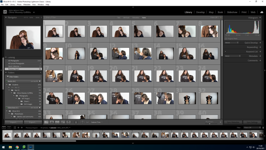
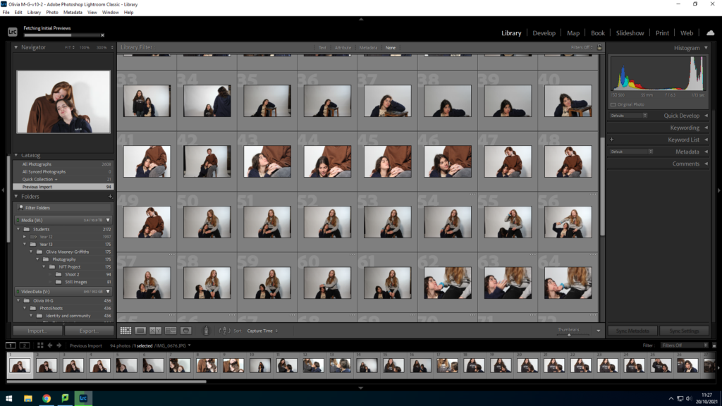
I believe that this shoot was more successful than the first shoot as I was able to get a range of different poses but also able to zoom in more closely to the model. For this shoot I had a lot more ideas for my model and I feel that this has been shown throughout.

Final Images:

Editing

I used a quick Shutter speed in attempt to capture as much of the model’s movement as possible. The quick shutter speed allowed me to get a lot of images that looked similar so that I could get a range of images for the same pose and then choose the sharpest image.

To edit the images I went onto Lightroom and changes the exposure, as the images were initially very bright, I then went and changed the levels of white and black in the image, once I had done that, I was able to change them to black and white. I kept the shadows quite prominent to highlight the fact that my model could be influencing others to express themselves and to not feel embarrassed.

Analysis

Men should be able to wear whatever they want without the fear of being judged by others . I asked the model to do this shoot as I knew he would be able to stay confident throughout the shoot. This was important to me because, I didn’t want to create a shoot that was specifically chosen to represent people feeling comfortable in their own skin, when my model felt self conscious etc.

I have kept the black and white images separate to the coloured images to highlight the fact that there is always two sides to everyone.

Favourite image

Editing

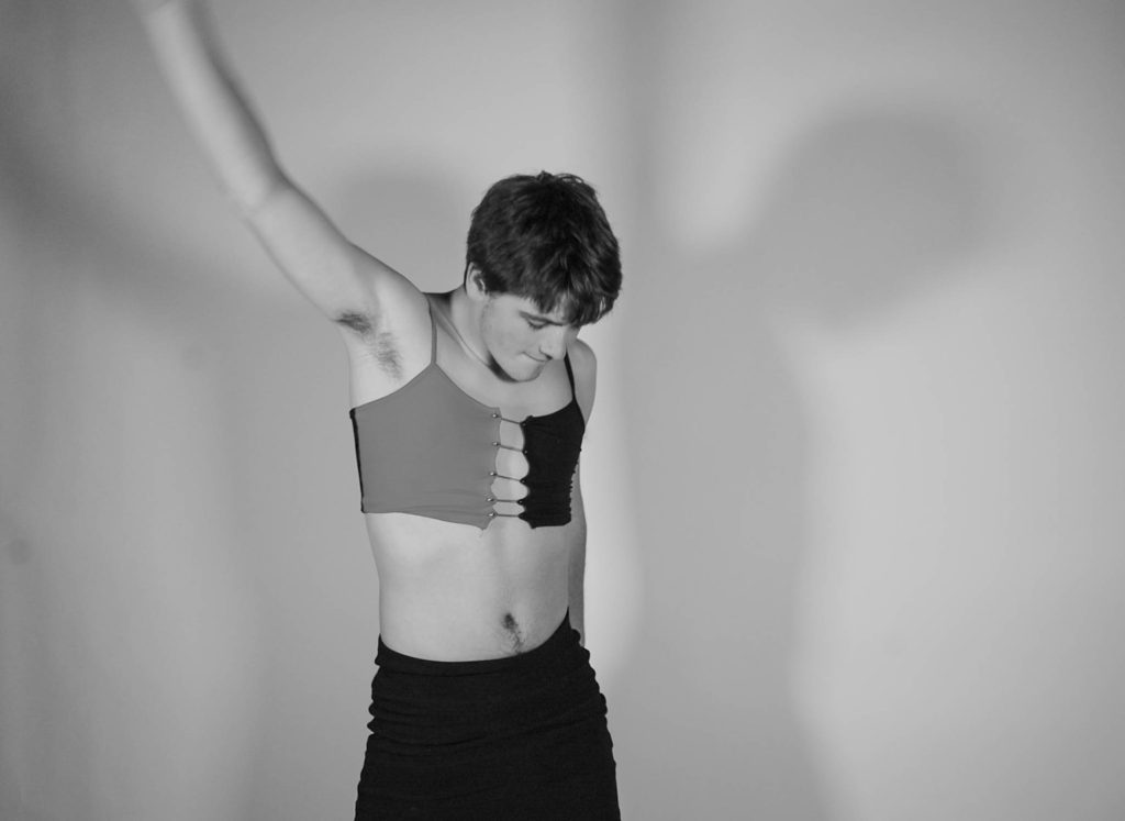
To take these images I used two harsh white lights to create the shadows on the background. I liked the fact that the lights created two shadows. I believe that it represents the fact that everyone has those personalities that we hide. It relates to the Novella, Dr Jekyll and Mr Hyde, by Robert Louis Stevenson. Stevenson writes about the fact that a very respectable Dr Jekyll, doesn’t always want to be the man everyone sees. This is where Mr Hyde comes in, Hyde is the evil side of Jekyll, he does all the things that if Jekyll was seen doing them, he wouldn’t be seen the same again.

I edited this image in Lightroom. I increased the level of black in the image because the lights created a slight shine on the skirt. It also made the safety pins that keep the shirt together more prominent.

I used a quick shutter speed to try and capture the majority of the movements that the model made. The image I have chosen does have some slight blurring around the arm; however I feel like it works well with the rest of the image. The blurry arm helps emphasise the change in people’s opinions and the fact that more and more people are beginning to accept others for who they are.

Analysis

This is my favourite image because the model has unintentionally replicated the iconic pose that Freddie Mercury adopted. Freddie Mercury didn’t care about what people thought about him, this is why I think this image is successful as our shoot was made to show that people shouldn’t care about what other people think about their appearance.

The fact that the image is in black and white, can represent the fact that some people have very old fashioned ideas, such as believing people should be limited to one style of clothing. The black and white image also represents the model’s fear of expressing himself whilst he is trapped in the male stereotype, which is often shown as a strong, emotionless and the support of the family.

The two tones of the shirt shows that there is never one explanation to something. You can always find a different way if you really need to. The fact that the image is black and white is quite ironic due to the fact we as a group are showing that nothing in the world is truly black and white.

Bayeux Tapestry

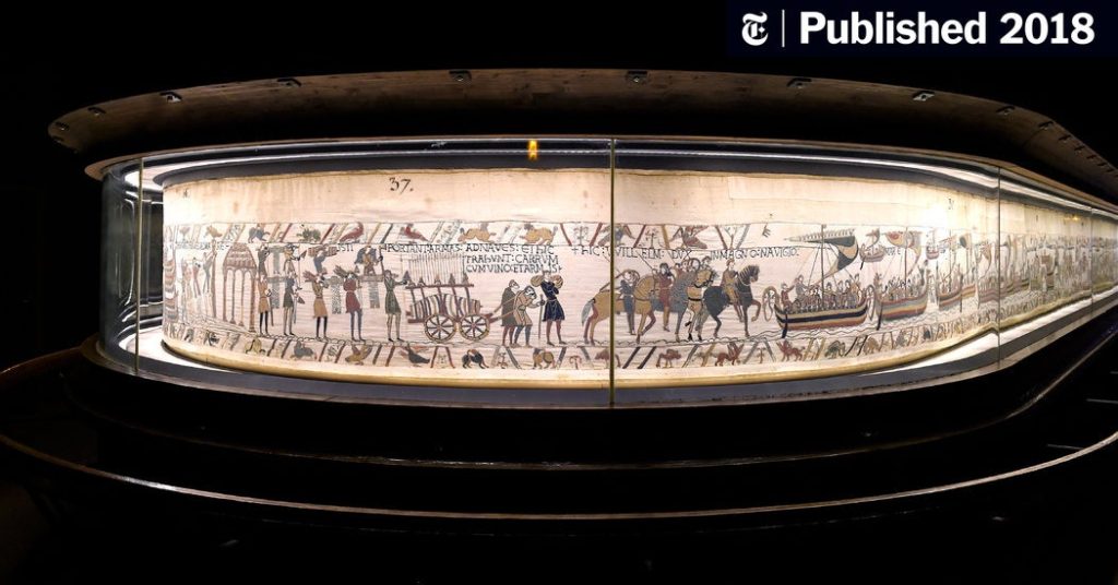
The Bayeux Tapestry tells the story , in wool thread embroidered on linen cloth, of William, Duke of Normandy who became King of England in 1066 after the Battle of Hastings. Crossing the sea in longships, long cavalcades on horseback, shields and coats of mail, fantastic creatures and battlefields. There are 58 scenes, 626 characters and 202 horses embroidered on the tapestry. This battle is told through the gruesome and detailed embroidery, displaying a bloody battle full of severed limbs, falling horses and the defeat of Harold caused by an arrow being shot in his eye, according to the Anglo-Norman tapestry.

Warriors from Jersey are rumoured to have fought in the battle beside Normandy, resulting in Jersey and the other channel islands joining the Anglo-Norman realm following the defeat of King Harold by William the Conqueror and won the English crown at the Battle of Hastings in 1066.

nft research

A NFT is a non- fungible token, the token is an object built on the Blockchain, non fungible means unique.  This allows people to share, trade and transport these NFTs through the metaverse. The metaverse is a virtual universe in which all online resources and products, such as the internet, augmented reality, NFTs and more, are in a shared space. The electronic platform allows more opportunities for artists’ work to be seen and sold on a wider scale. Due to the blockchain, the artists also get a percentage of profits in the metaverse.

The 2lives movement was created with this technology, with the purpose to promote the world of NFTs to the population of Jersey. Being open to everyone, from those artists who hope to further their viewings and platforms to the general public who enjoy trading and collecting art. Our class had the amazing opportunity to attend a zoom call with the creators of 2lives, Francesco Vincenti and Claudia Runcio, over in Italy. Where we got the chance to hear first hand the importance of opening up the metaverse , promoting what can be a global community and asking any questions we had.

https://2lives.world/

Identity + Community: NFT Film + Still Image Editing

Sound, Titles and Colour

Video: The video will have transitions in the title such as a gradient/fade. and montages/transitions like having multiple clips playing at the same time sharing a screen.

Title and credits: We will make the title page on photoshop then import it onto premiere.

Links to Royalty-free music: To get music from each decade we will use YouTube Audio Library and download that and import to premiere.

Sound effects: We will use M:\Departments\Media\Students\Sound FX to get the sound effect of a phone ringing and a dial tone for when the phone is put down.

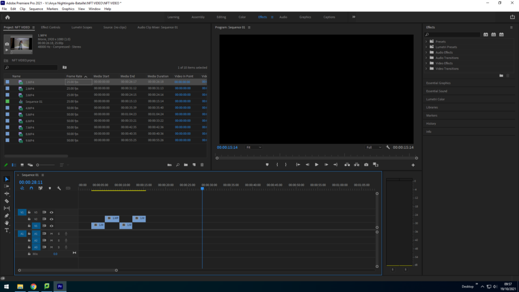
Premiere Video Editing Process

This image has an empty alt attribute; its file name is image-64-1024x576.png
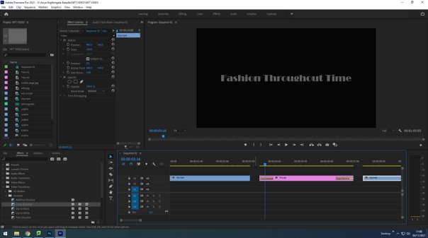
Importing files and cutting the right sections out of each long clip to make shorter ones.
This image has an empty alt attribute; its file name is image-117-1024x576.png
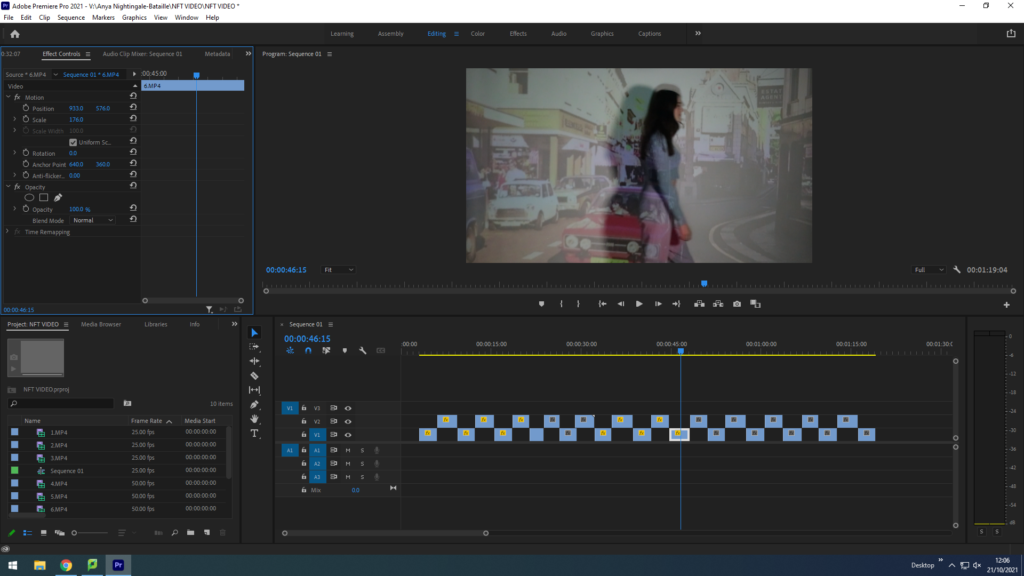
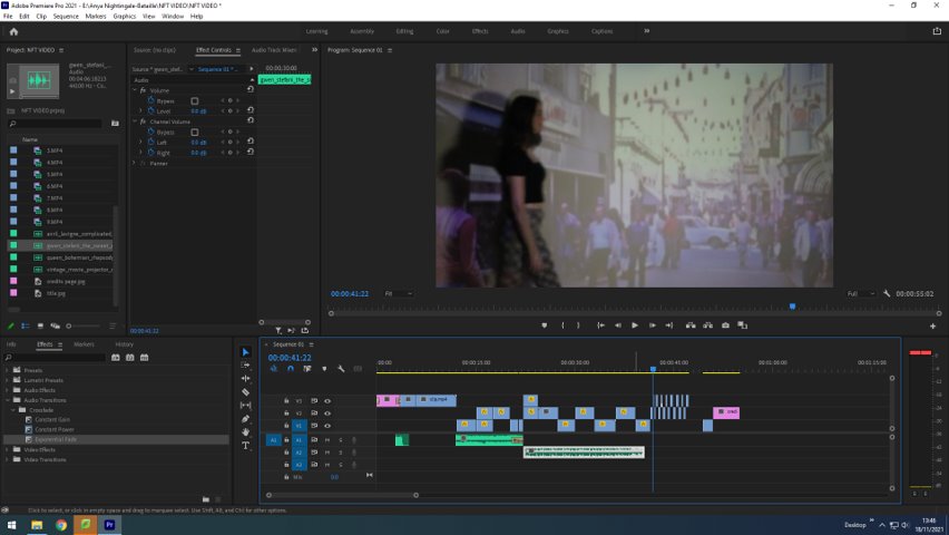
Positioning the videos to fit the frame by using the left hand panel and altering the ‘scale’ and ‘positioning’.
This image has an empty alt attribute; its file name is image-19.jpg
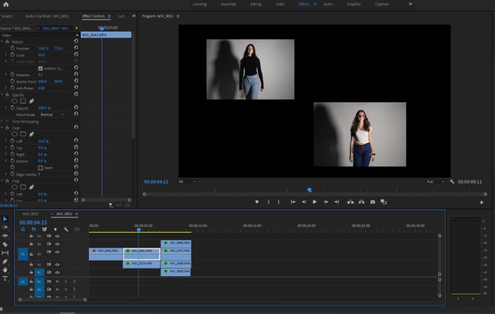
Layering clips to have multiple showing on screen at a time. Did this by changing the scale and position of the videos whilst layered over each other.
This image has an empty alt attribute; its file name is image-2.jpg
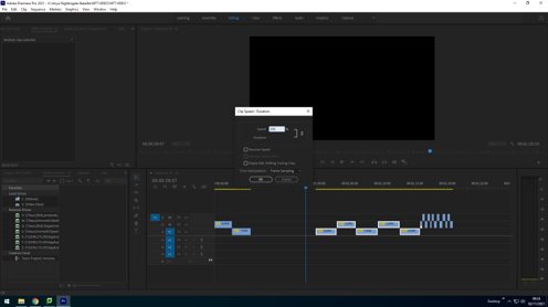
Changing the speed of the clips so they are faster by right clicking on speed/duration and changing the percentage.
This image has an empty alt attribute; its file name is image-7.jpg
Made the title page on photoshop using a black background. imported it into premiere and added a dissolve transition to the start and end of the title page.
Used a website on my phone to convert a YouTube video into an mp3 file so that we could add the sound onto our video.

Still Image Editing

This image has an empty alt attribute; its file name is image-10.jpg
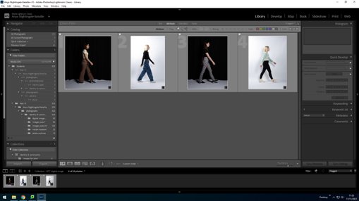
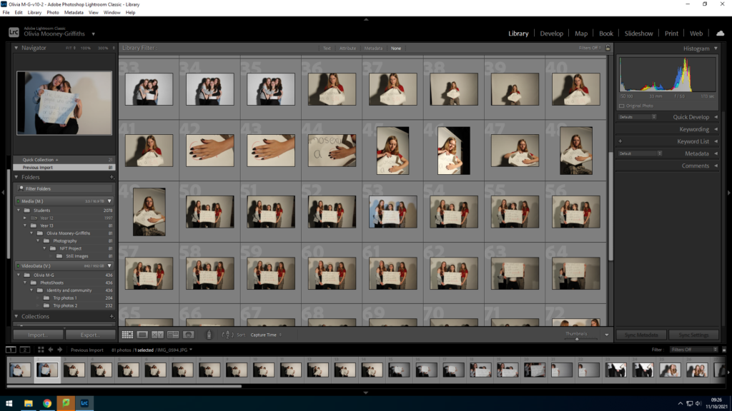
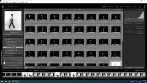
Imported all the images from the shoot onto Lightroom for selection.
This image has an empty alt attribute; its file name is image-11.jpg
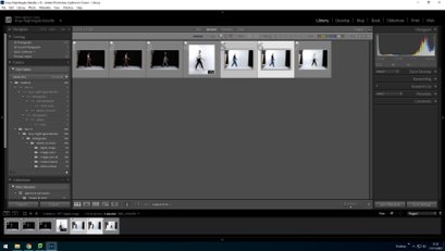
Flagged the images which were the best and used the side by side comparison tool to choose the individual best ones for each model.
This image has an empty alt attribute; its file name is image-12.jpg
Editing the lighting in each image so that the white was brighter and the dark was darker, but still keeping the clothes and people visible.
This image has an empty alt attribute; its file name is image-14.jpg
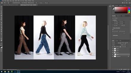
Imported the images to photoshop and cropped and edited the size of the L+W so they all fit together on the landscape background.
This image has an empty alt attribute; its file name is image-15.jpg
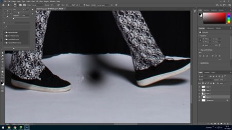
Used the clone stamp on photoshop to edit the floor of the black photos to be black.
This image has an empty alt attribute; its file name is image-16.jpg
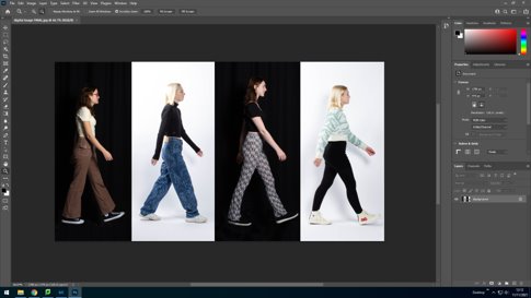
The final outcome.

Embriodery and Narrative

Recently we had a workshop presented by Yulia Makeyeva on embroidery, in which she fist taught us various stitching methods such as the running stitch, back stitch and satin stitch. Yulia is herself an artist who combines the medium of needlework ad photography in order to create her pieces of work.

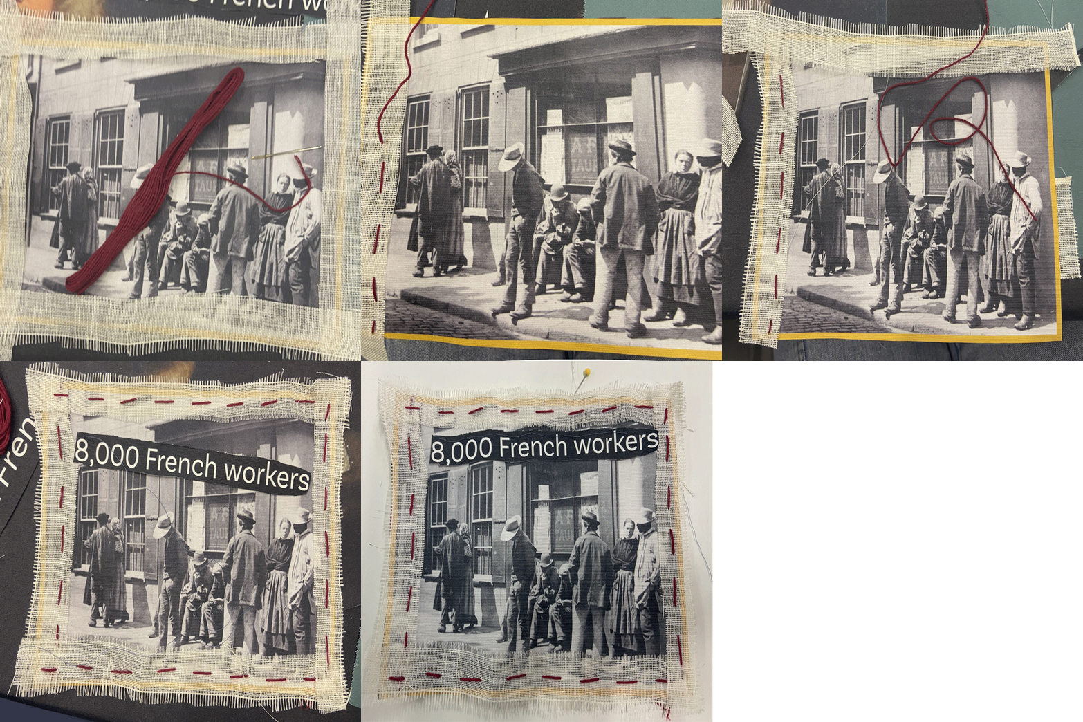
We did this by practicing first on a piece of paper and following the pattern given, then drawing a simple design of our own on a piece of fabric and using the skills just learnt to attempt to create an embroidered image. This allowed for a simple introduction to embroidery and an opportunity to develop these skills with our next task. Once we had gotten used to the different stitches, we then went around the room and collected pieces of material from the ‘People make Jersey’ exhibition at Jersey museum, that was donated to the school. With this we aimed to collect images, words and letters that told a story, potentially of migration. When collecting material, I aimed to gather pieces that linked to French migration in Jersey, such as images of well known French migrants in jersey and passages from the display that described the nature of work these French migrants moved to Jersey for. In addition, I also made sure to use red and blue thread with white frayed material for a border in order to incorporate the colours of the French flag. As well as learning how to embroider, we also got a chance to look at other artist that use thread or a type of needlework in their pieces, by looking through some of the books Yulia brought along.
When producing our pieces of embroidery we made sure to take photos during various stages of our work. This is as, after our multiple workshops we used these images to create short animation type GIFS. We did this using Photoshop: first layering all our images on top of one another, aligning them the best we could, opening a timeline from the Window drop down menu, selecting create frame animation, then on the drop down menu choosing to make frames from layers, selecting forever on the timeline and finally exporting it at the size of 720 by 720 pixels. Here I created two GIFS sowing different parts of my embroidery process, with the first displaying the sewing on of the white border and text, using a running and back stitch, and the second showing some of the extra satin stitching I used to fill in parts of the text.

Still Image shoots

Planning

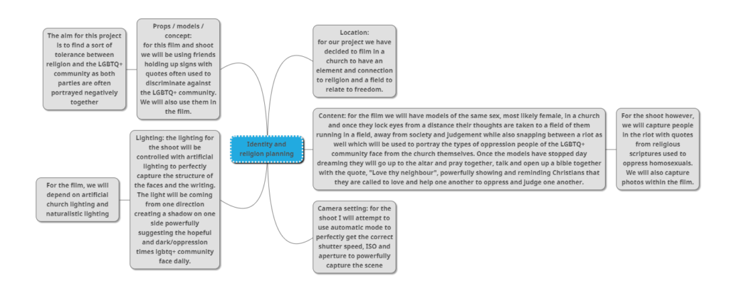
Here we have collected ideas for the group project as a whole, noting the concept of the film, locations for shoots, props, actors, lighting and the potential camera settings. This gives us an idea of how we are going to execute each shoot for both the still images and the film.

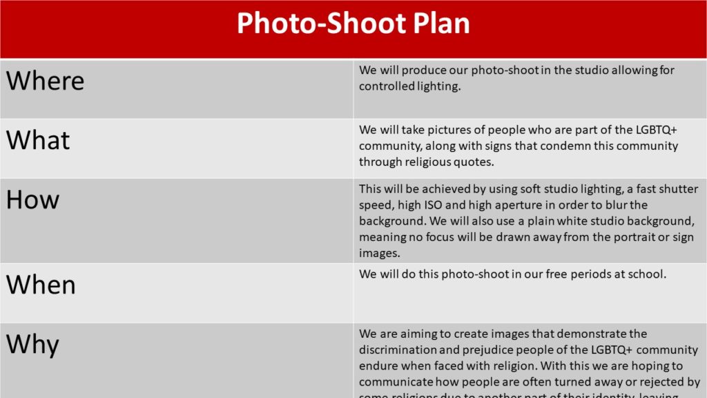
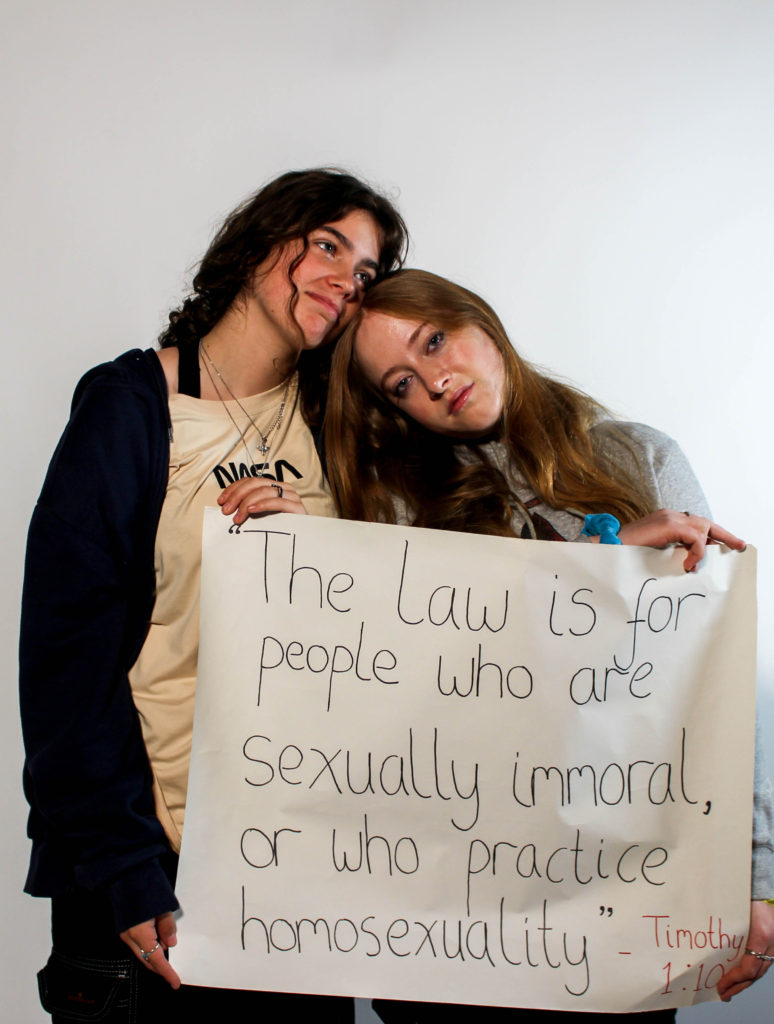
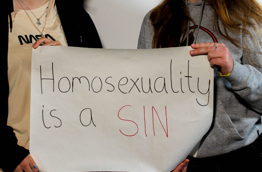
Then we went on to making a final plan for the still image shoot only, stating how we are going to produce our images that relate to our film. These will be made with the intention of creating a collage with the edited photographs. These images will look different to any stills from our film, however they will convey the same message of unity between the LGBTQ+ and religious community.

Shoot 1

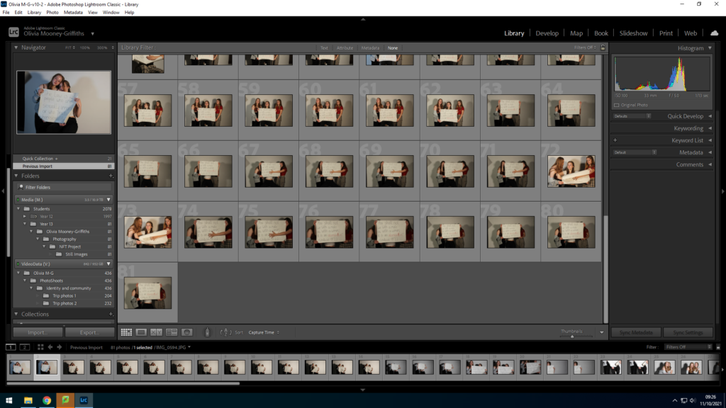
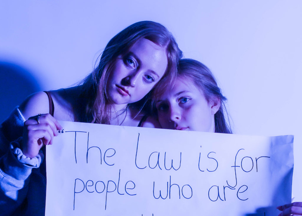
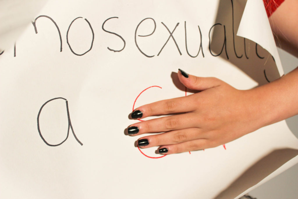
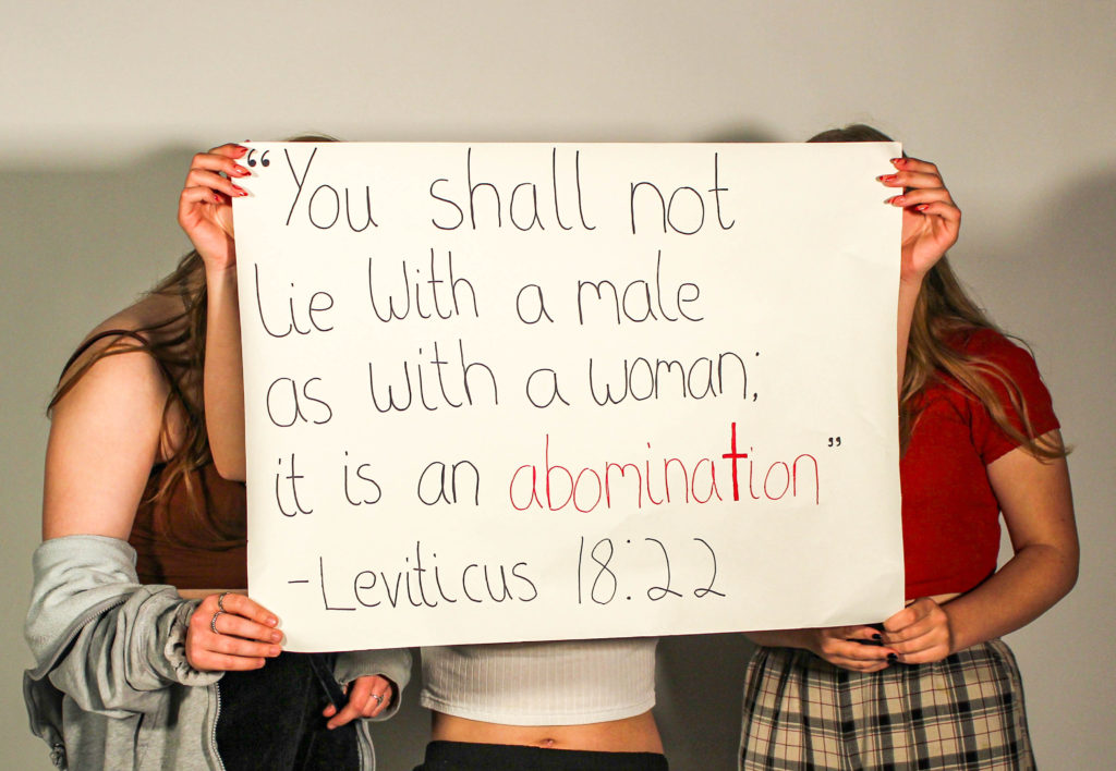
Here Bethany went through and flagged the images she was going to edit on Lightroom, selecting photographs that displayed the entire quote on the signs, and ones which helped express the message of turmoil between the two communities of LGBTQ+ and religion. In this shoot we took photographs such as close ups of the signs with hands covering discriminatory parts of the passages, in order to show rebellion of the heteronormative conventions of such religions. In addition, we also took photographs in which the models were standing behind the sign, showcasing how people also hide behind religion in fear of revealing their true identity. We took these in a dead-pan manner to show neutral expression between the two communities. However, with this shoot we also noticed how the shadows are very prominent in each image and ultimately decided to produce another shoot after this first one, to display softer lighting and background that does not distract from the portraits.
Shoot 2

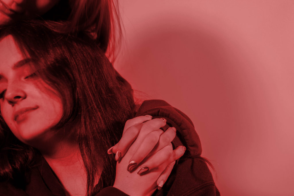
With this shoot we wanted to produce photographs that had softer or no shadows at all, as well as clearer and higher quality images. For this we re-made the previous shoot although this time with different and more people, allowing for a wider variety to choose from when in the editing process. Furthermore, in this shoot we also focused on producing standalone portraits, without the signs, showcasing images of couples with sense of fear or sadness towards the discrimination they receive, allowing for more emotion to be conveyed through these new photographs. With these images Bethany selected the photos that contained little amounts of shadow and a clear and in focus portraits in order to start editing them.

Editing and Developing

From both our photo-shoots, Bethany then edited these images with some having a colour overlay, increasing the saturation and vibrance also. This was done in order to present the colours seen on the LGBTQ+ flag. These will also be integrated with the normal colour images that mainly showcase the passages on the signs that condemn the LGBTQ+ community. These images will then ultimately be stitched together in a collage like manner, accompanied by embroidery over the top of the photographs that present positive meanings and passages that connote acceptance and a peaceful coexistence between the two communities. Examples of this could be passages such as “Love thy neighbour” from the Bible, also the name of our film, as well as embroidered hands that cover sections of the negative passages in the photos. By stitching together our images, it also creates a metaphor for the merging of the two identities that a person should be able to share without discrimination. In addition, this assortment of colours and images can also be linked to artwork seen in religious settings, such as stain glass windows seen in many churches.

artist references

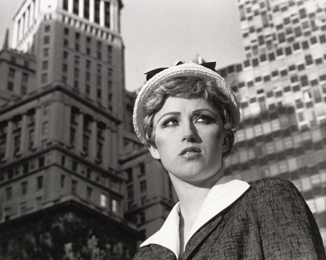
Cindy Sherman

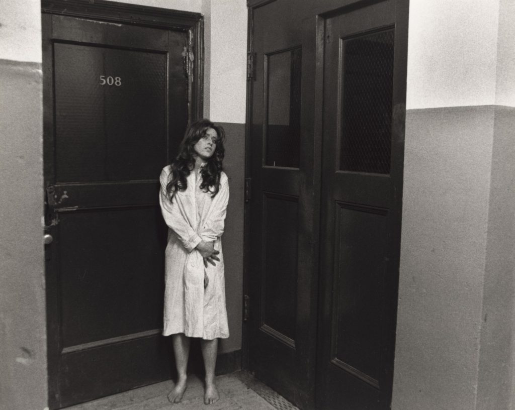
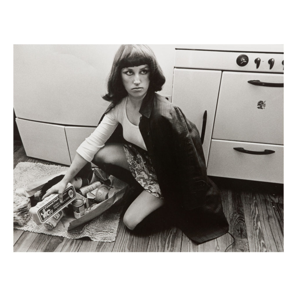
Cindy Sherman’s “untitled film reels” showcase female innocence and femininity from a satirical viewpoint. She works as her own model, morphing into different characters to represent all women. Like the name of the project, each photo looks like a film still, creating the idea that there is much more to the story and the narrative. In ‘untitled film still 21’ Sherman dresses in the style of a 1960s French new wave heroine. Like a majority of the stills, Sherman’s expression is reactive and she seems to be scrutinising something out of shot to express the contingency of women’s since of self by always regarding subjects out of the audiences frame of reference. The act of Sherman using herself consistently as her own model and masquerading as different personalities reflects the performance of womanhood and the many masks a woman wears to conform to society. By using such a variety of characters, Sherman presents the liberating and anti-essentialist idea that identity is not a fixed medium but a chosen path which connects to Judith Butlers ideas of gender and identity as your identity is not something which is culturally imposed, instead it is freely chosen. It is ironic that despite this anti-essentialist view Sherman’s roles in this particular series are all ultra-feminine and stereotypical who’s reactive expressions depict them as fragile. Working in tandem with the semantic field of cinema allows Sherman to establish her character to connote Hitchcock’s stock character of the blonde victim.

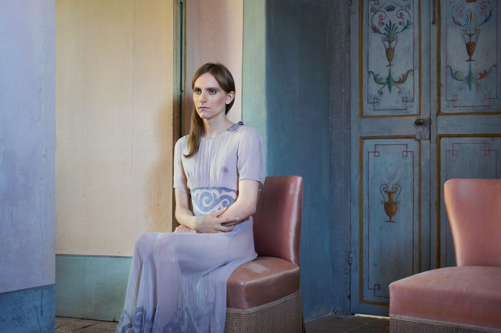
Lissa Rivera

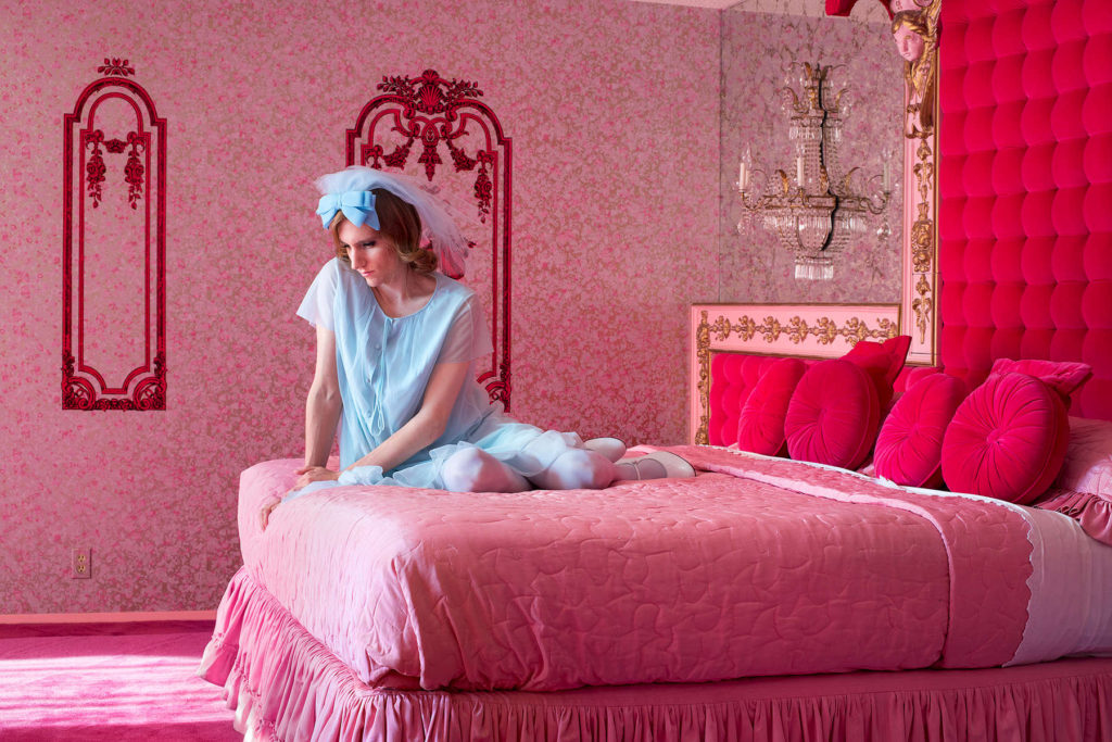
Lissa Rivera’s “Beautiful Boy” explores gender and sexuality through cross-dressing her model. The images are brightly coloured and evoke feelings of nostalgia, where the background connotes different eras. Rivera started the project to counteract the idea that femininity in western culture is less valuable than masculinity in both men and women. She uses the ideology that one “can’t deny the power of a glamourous image”. By making her model look beautiful and comfortable in his feminine identity she severs the idea that men who cross dress are being emasculated for amusement as a commodity, like the gag of cross dressing in mainstream media as an object of ridicule as by becoming a woman you are stepping down in society and losing agency. The power of glamour is very important to this project as it is a tool to inspire and gain acceptance rather than the parodic representations of gender expression seen in film and television over the last century.

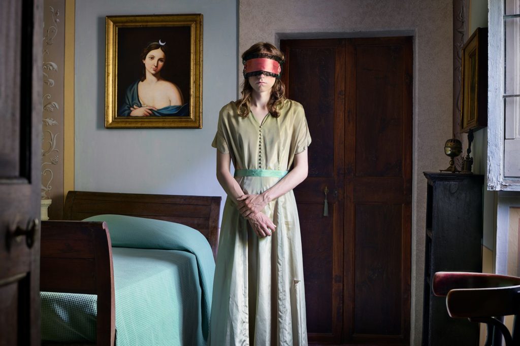
In this image Rivera uses a vintage aesthetic to challenge modern perceptions of gender identity. Her models gender fluid identity directly contradicts the hegemonic, heteronormative ideals of the 1960s mise-en-scene she is conveying. The use of solid colours shows deeper meaning in this photo as the bedroom, a persons most intimate place is completely pink, showing the stereotypically feminine personality and identity of the model while he wears blue to signify his biological identity and the identity that other perceive him as. This over the top use of colour creates a fantasy world or hyperreality of the models perception of their identity. Rivera’s photographs are often taken within the boundaries of an intimate and constricted space to show the rigidity of society’s view on gender and the desire to categorise a person based on their perceptions of outer appearances. Essentially, Rivera’s message is to stop being so closed minded and begin to make judgments based on character rather than physiognomy.

bayeux tapestry

The Bayeux tapestry depicts the battle of Hastings in 1066 and is over 900 years old but its embroidery still remains in tact and in good condition with popping colour. The tapestry is culturally important as it shows a piece of history that has determined the royal family who now rule over us and the way our country’s culture has grown.

The tapestry is thought to have been made by queen Matilda, wife of the victor of the battle of Hastings, William the Conqueror and is one of the most famous tapestry’s ever made, as well as the most longlasting. The tapestry is 70 metres long and intricately designed showing the battle of Hastings in vivid detail. Most recognisable is the killing of King Harold and the crowning of the New King William the Conqueror.

With the separate embroidery we each made, we plan to join together to create our own tapestry and put on display on exhibition

What is an nft?

An NFT (Non-Fungible Token) is a piece of data that represents ownership over a product in a modern technologically advanced way. This is most often used to sell pieces of art and is becoming an increasingly popular way for media personality’s to make money off pieces of media that made them viral e.g memes. Lots of money has been made throughj the selling of NFT’s, the most profitable NFT was the sale of piece “Everydays: he first 5000 days” by artist Beeple for $69.3 million

We are aiming to complete our own NFT to sell at an exhibition, with the profits hopefully going towards a newspaper displaying our work