Category Archives: Task

Filters

Author:
Category:

The Formal Elements

Tiago De Sá 

Light:

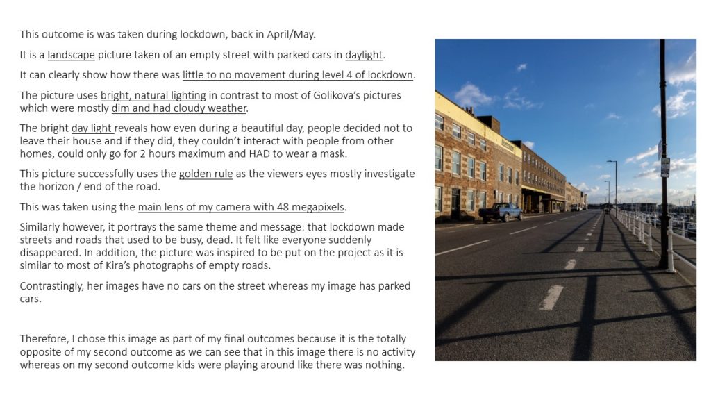
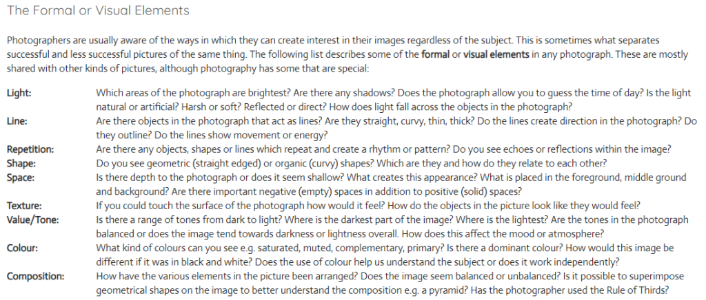
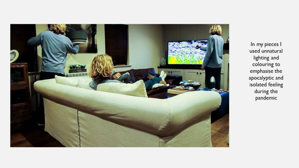
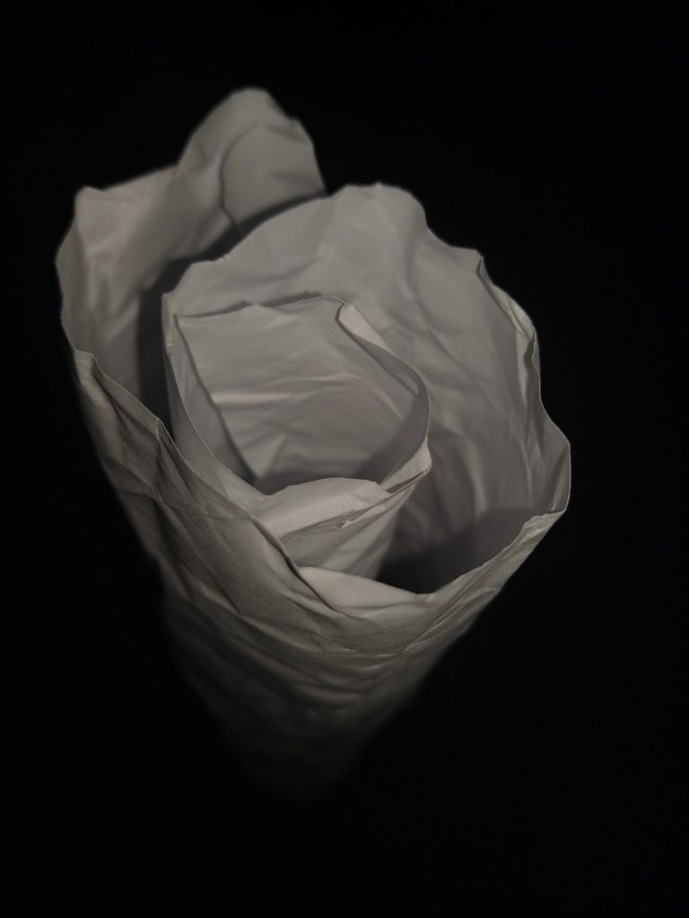
The brightest part of the image is the center, the rest of the image is dark.

The background is pure black and there are dim shadows throughout the piece of paper.

The photograph has soft artificial lighting as a flash was used to take this photograph. The light starts brighter at the top and goes dimmer and dimmer down the paper.

The way the paper is set-up acts as a leading line towards the bottom.


Lines:

There are very scrunched and curvy lines throughout the paper. The paper is rolled into a paper binocular which creates a kind of cylinder leading towards the bottom / the dark “abyss”.

The lines show the image to be still.


Repetition:

The paper in itself forms a circular pattern almost like a scrunched paper binocular or a paper rose.


Space:

The space in this image appears quite centered on the subject. It seems as if the photographer took the picture using a wide angle lens as it is close to the subject but seems as if the paper goes into the “abyss” forever.


Shape:

These circular and wavy texture throughout the photograph create these organic shapes throughout the photograph.


Texture:

The texture of this image appears to be wavy, curvy and curly. This is evident by the fact that the paper seems to be scrunched up then rolled to form this object.


Value / tone:

The image contains a range of tones from very dark to natural lighting. There are harsh and dark shadows and backgrounds but also dim and bright tones. The image is in “black and white” as the only main colours in this coloured digital image are black and white.


Composition:

The focal point in this image is the paper as the photographer has used the rule of thirds to successfully set the subject in mid-center.

The photographer has clearly balanced the colours in this image so that it is only white in contrast to the black background.


Paper Paper Paper

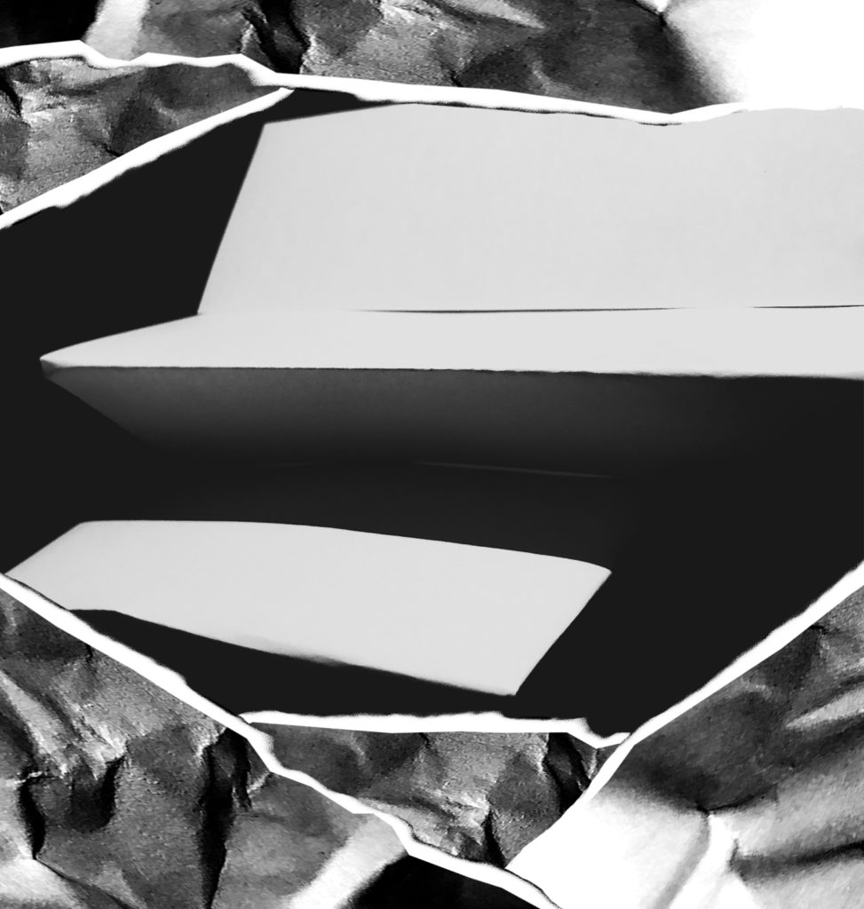
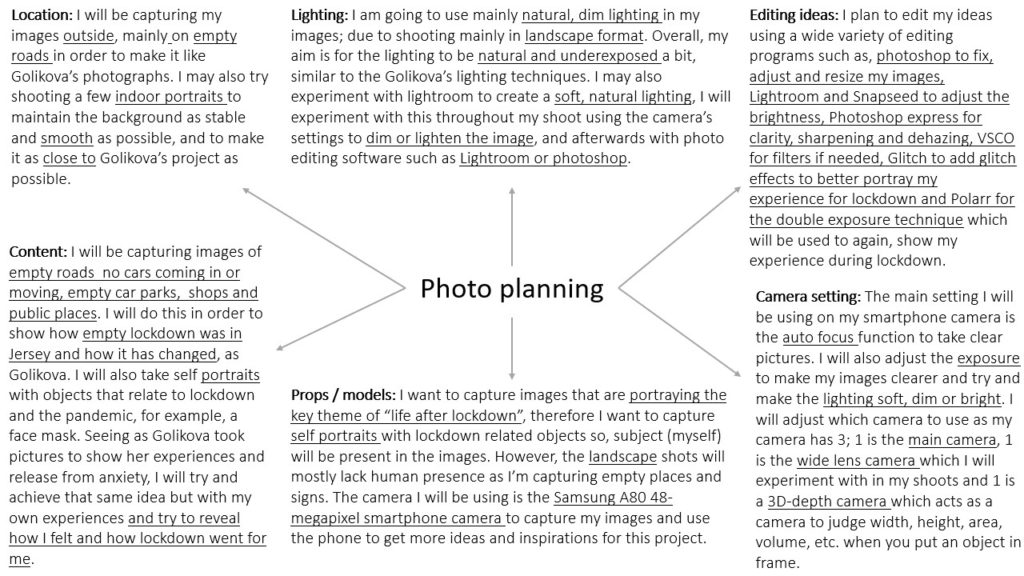
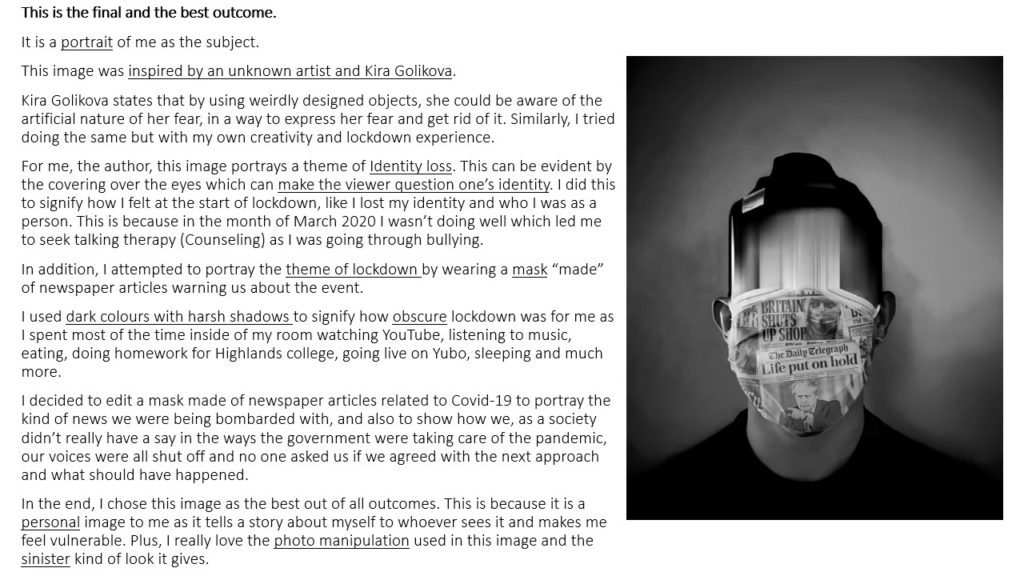
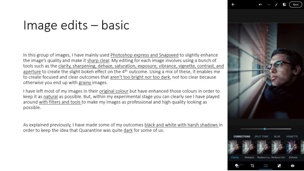
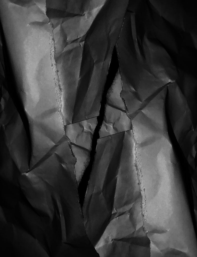
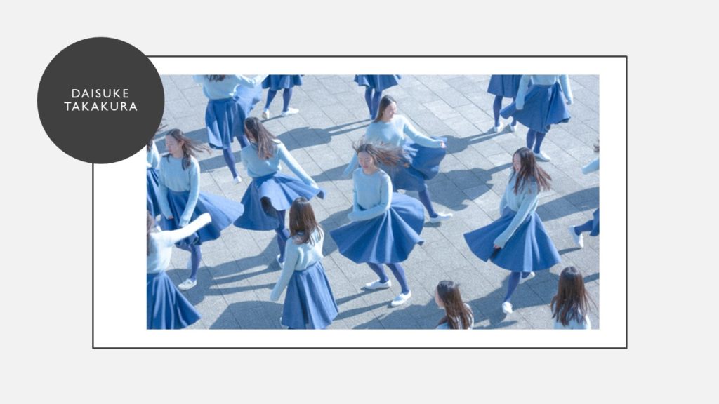
In this image I shot pieces of folded, crumpled and ripped paper.

I shot this image using harsh, unnatural, flash lighting. The light is positioned closely above and to the right of the paper which creates extreme shadows and opposing bright white elements in the composition. This gives the image a lot of contrast and tonal range. I also de-saturated the image to accentuate the negative background and the highlights.

I used a large aperture to make the paper stand out from the background. I used a low ISO to prevent grain and to prevent my image from being blown out sue to the unnatural light. The image has a satisfying repetition of horizontal lines created by the way I folded the paper. I also used pieces of ripped and crumpled paper to frame my image. This framing also gives the image some nice depth of field as it adds layering to the composition. The ripped and crumpled paper used to frame my image has also given the image a horizontal line of symmetry.
the world is beautiful

Task Practical / photoshoot-homework

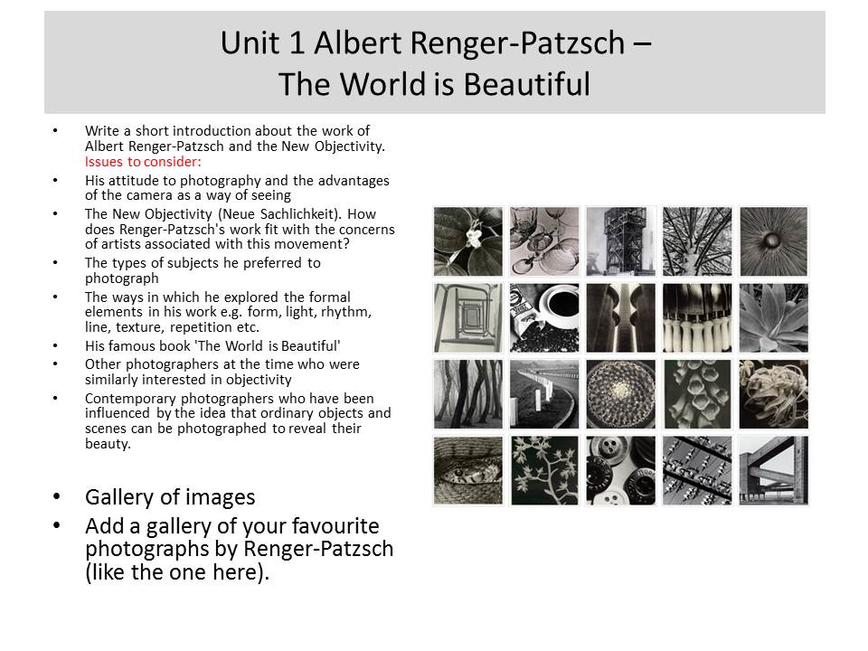
Respond to Albert Renger-Patzsch 1897-1966

We will aim to expand our approach to photographing things around us…whilst responding to influential approaches in the development of modern photography.

By responding to Albert Renger-Patszch and The New Objectivity you will be able to classify a greater range of your images whilst learning more about the Formal Elements and Adobe Photoshop techniques including :

  • Cropping
  • Image Adjustments
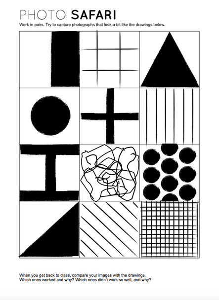
Photo Safari

Remember to : Describe, explain and evaluate your process carefully.

Homework Due Date = Wednesday 23 September

The formal Elements – Paper

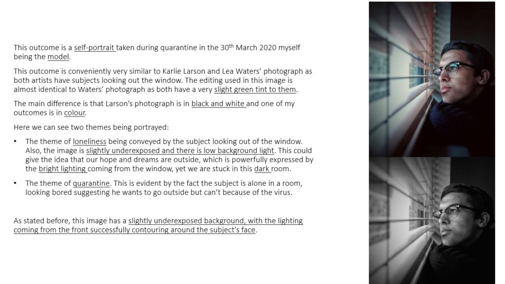
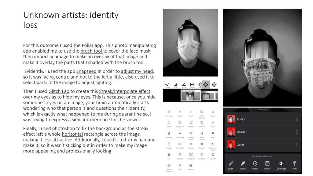
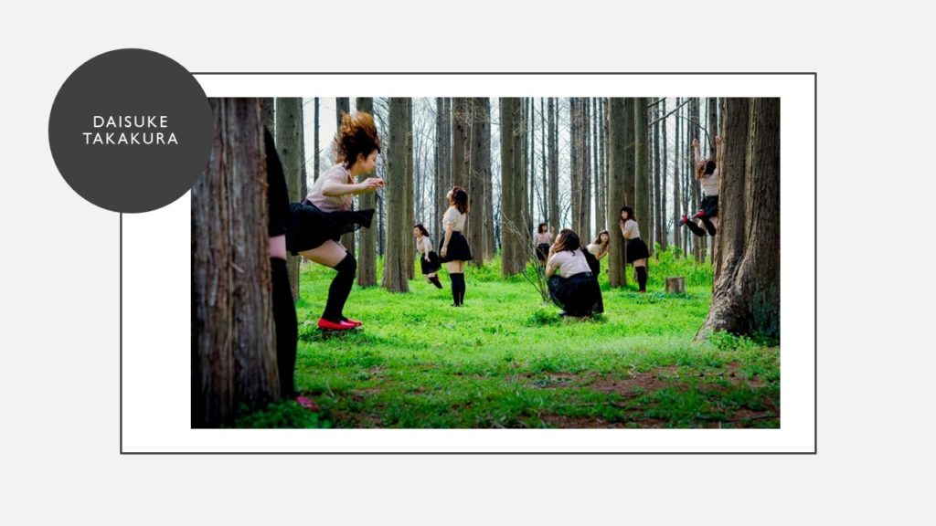
In this photograph, i shot a folded and ripped piece of paper.

Originally in the raw image the paper was only on the right hand side of the image, with unused, black space to the right of the image. In Photoshop i cut out the paper, duplicated it and flipped it over to create an upside down mirror image overlapping the original on the other side of the image to fill up the empty space. This also adds more layers and depth to the image.

I made the image black and white to further show the black and white tones and shadows.

I decreased to the exposure of the image and increased the shadows to even out the whites and the darks, and to emphasize the shadows created by the creases and folds in the paper. I changed the curves to darken the overall image without losing quality and details. These changes also bring out the rough texture of where the paper has been ripped.

The edges of the image have more shadows and darkness than the rest of the image, drawing the viewer to the center of the image where the pieces of paper are no longer overlapping and there is black negative space, which contrasts to the busy outer parts of the image.

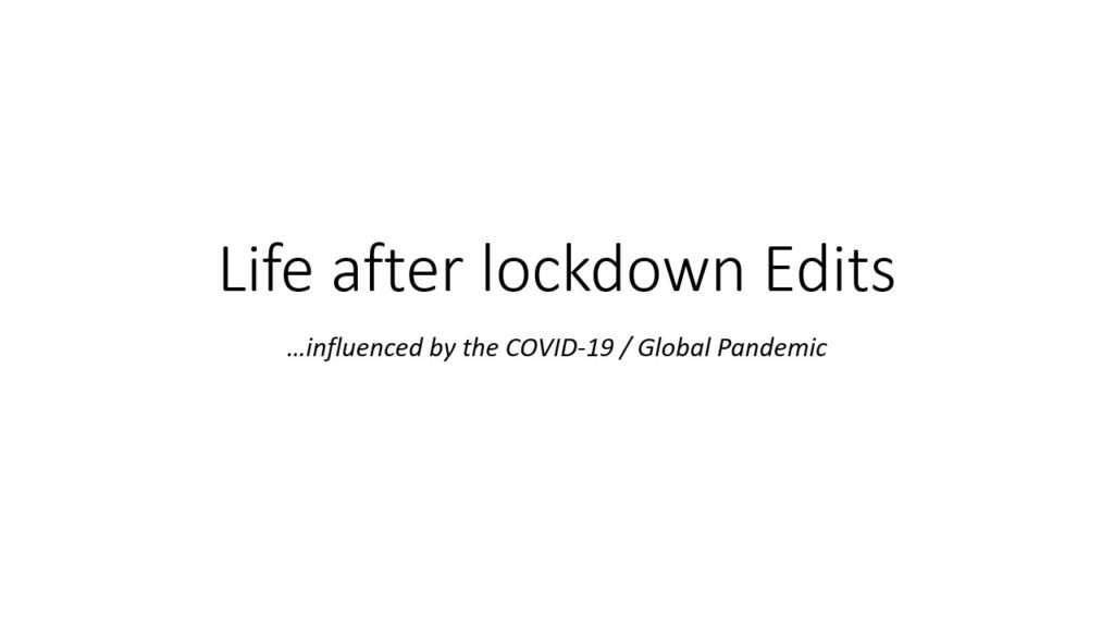
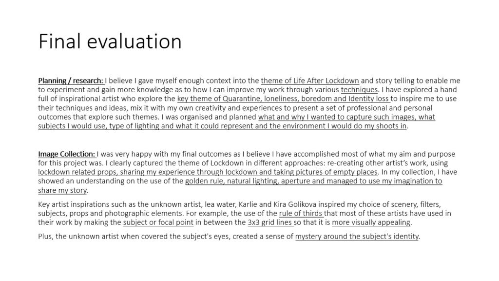
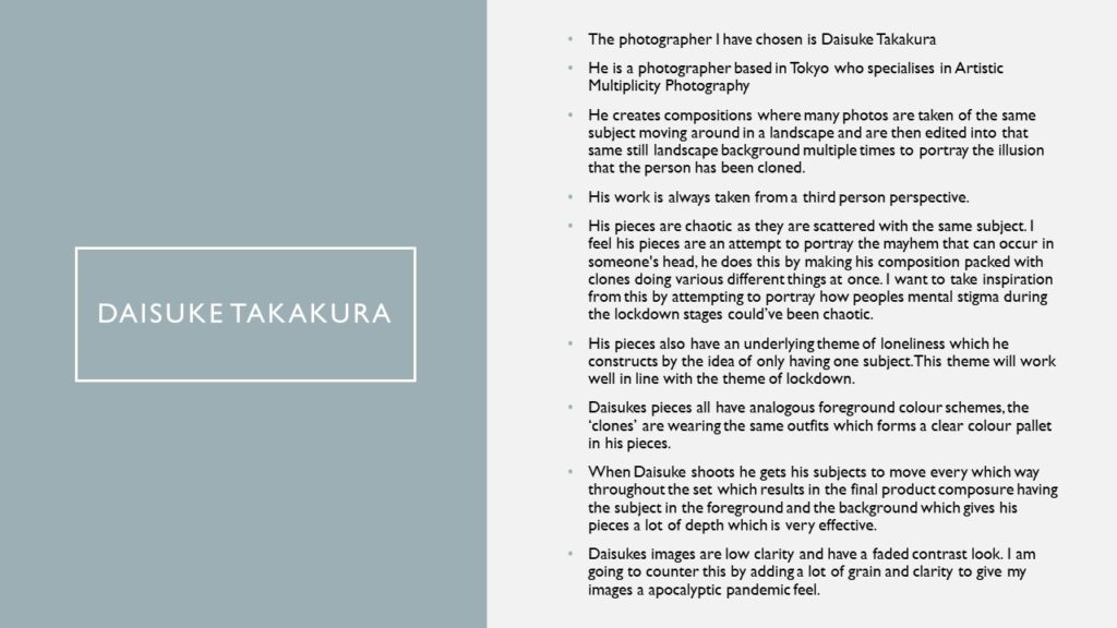
In this image i shot multiple small ripped up pieces of paper.

The original composition of this image was a small pile of strips of ripped paper. In Photoshop i cut out this group of paper and duplicated it multiple times behind the original pile, at different sizes and orientations. This is to add depth to the image and to take up negative space.

I also converted the photo to black and white to focus on the shadows and textures created by the multiple layers of paper.

I decreased the exposure, increased the darks and decreased the lights to make sure there was no over exposed parts of the photo. The darkened shadows also add depth as well as give emphasis to the rough textures where the paper had been ripped.

There is repetition of the same shapes and shadows where i have duplicated the paper to add depth and layers.

I used the curves feature in Photoshop to further bring out the darks and shadows whilst retaining detail and texture of the paper.

Image analysis and interpretation

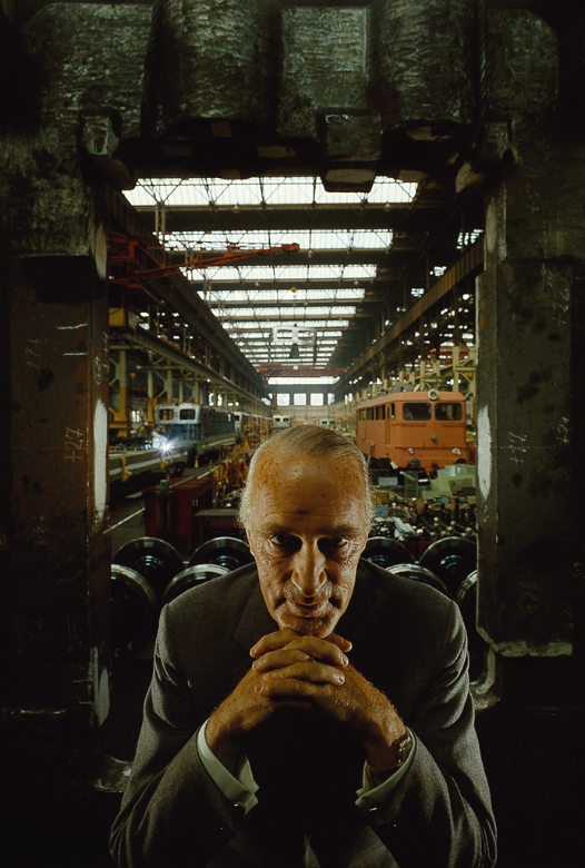
Arnold Newman | Portrait of Alfred Krupp | 1963

Substance:

  • This photograph was taken by Arnold Newman in 1963. Arnold Newman’s family was Jewish
  • The image is a portrait of a businessman as seen by the uniform and position of the hands, interlinking together supporting his head. This could suggest that he’s supporting this business or that he is the boss. This man is the business owner of Krupp industries.  
    • Krupp industries was a major weaponry supplier to the Nazis during World War II. 
  • Arnold Newman took this portrait for a sort of revenge as he was Jewish and Krupp industries supplied machinery and weaponry to basically kill thousands and thousands of Jews (Arnold Newman’s ancestors). 
    • In an interview, Arnold states that when someone suggested that he should do a portrait of Alfred Krupp he immediately said no, when asked: “Why not?” Arnold immediately replied with “I think he was the devil.” 
    • In this same interview, he says, “I wanted to use one of the rare times, I wanted to put a knife in his back.” In a way, Arnold succeeded in this as a few years after this photograph was taken, Krupp got imprisoned.

Composition:

  • The main focal point / where the viewer’s eyes draw to first is the man in the mid-centre of the image.
  • The rule of thirds has successfully been used. This is evident as the man would be between the 2 bottom points if the image was on a 3 X 3 grid.
  • The man is the main subject in this image as he is lowered centred in the photograph. The heavy machinery and materials are also subjects as they aren’t blurred out so the photographer clearly made the sharp and clear so the viewer has an idea of what the place was.
  • The photographer has purposely used the lighting technique to show the model’s face crystal clear with a sense of intimidation and fear as portrayed by the harsh shadows around his face and photograph in general. In addition, the photographer used the lighting technique to light well the background so other subjects like the trains being built are visible.
  • The main colours used in this photograph are mostly harsh shadows and the vibrant orange train.

Lighting:

  • The light is coming from the windowed rooftop.
  • It consists mostly of natural lighting with harsh shadows surrounding the subject and the surrounding around him.
  • The image is slightly under-exposed giving the impression of power, obscure and intimidation.
  • As the natural light seem quite bright, it may be assumed that this photograph was taken during midday hours.

Techniques the photographer used:

  • The photographer has used a quick shutter speed as movement and detail has been recorded to a crisp sharp focus.
  • It has a large depth of field as the majority of the image is in focus.
  • The author has purposely underexposed the are around the subject to create a sense of obscurity. On the other hand, the author underexposed the background in order to have the objects in focus and well lit.
  • The camera in this picture is shown to be stationary as it isn’t a moving image.

Editing:

  • The image is in digital format and could have been edited to adjust the light to make it more natural so it isn’t too bright but not too dark.

Atmosphere:

  • This photograph makes me feel lowered and intimidated by this businessman as his facial expression and the way he seems to be in control of the factory makes me (the viewer) feel relegated to him in a certain way.
  • The photograph appears to be showing a message of how the Krupp industries were evil in a certain way. I think this because the model has an evil grin on his face and taking into consideration the historical side of Krupp industries people may argue that they enabled/gave what the Nazis needed to kill thousands of people.

Response:

  • I like Arnold’s work as it has a significant meaning behind it and it’s quite personal to Newman having to photograph someone who to a certain extent took part in the killing of many Jews when Arnold himself is a Jew.
  • The image is successful to an extent as Arnold did indeed get revenge as Krupp went to prison after this picture and the meaning behind it were revealed.

Alfred Krupp Analysis

Picture

Arnold Newman | Portrait of Alfred Krupp | 1963

Alfred Krupp is positioned in the center of the frame in the foreground, looking directly into the lens of the camera, with his hands clasped under his chin. This is to make him seem intimidating to the viewer. He has been lit from above and from both sides, this creates dark shadows by his eyes, making him seem evil and provoke a negative feeling for the viewer.

Behind him is the entrance to a train factory which he owns. He is positioned in front of the entrance, as if he is blocking people from entering it. The walls and ceiling of the entrance is dark and draws the attention of the viewer to the center of the image, towards Alfred Krupp, making him seem like a powerful figure. In factory in the background is naturally sky lit through big windows in the ceiling, similar to those in a church or a cathedral.

The overall feel of the picture is negative with dark tones and mostly earthy colours. The lines of the roof in the background give the factory depth and size.

He is wearing a formal suit which contrasts from the hectic nature of the factory in the background. His hands are positioned in a triangular fashion which also shows power as a triangle is a strong shape.
Alfred Krupp has been portrayed in this negative yet powerful way because the trains his factory was making were used to transport Jewish people to concentration camps during the war.

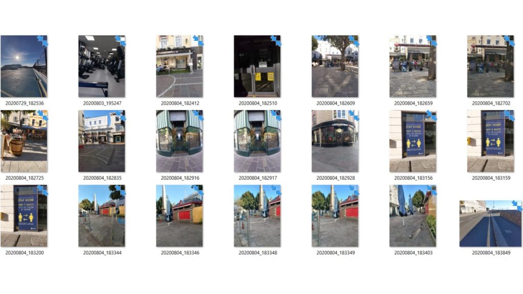
contact sheetS

Task

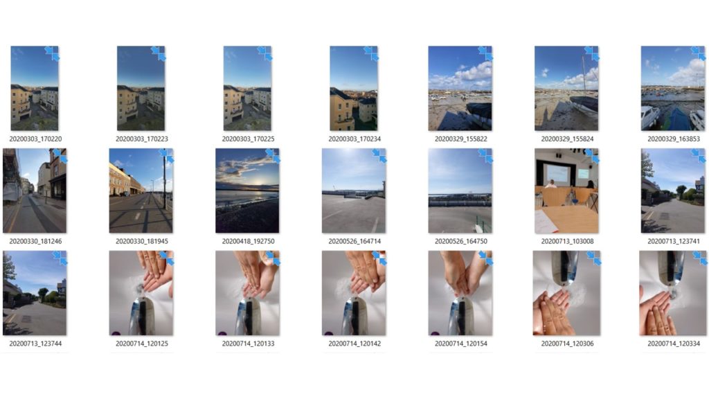
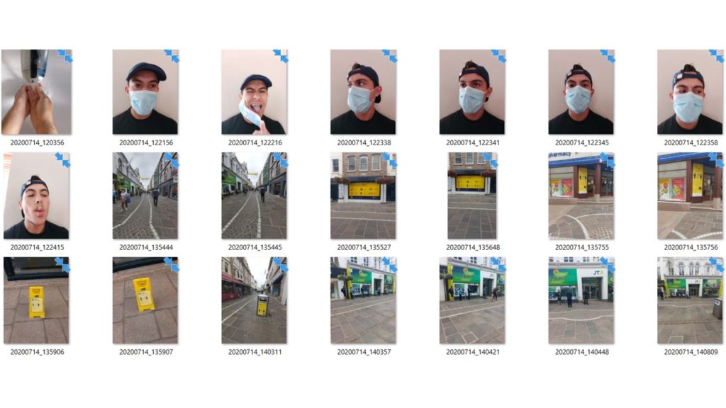
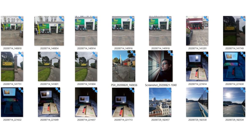
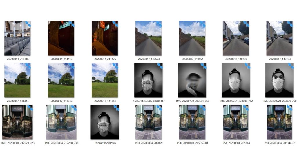
Create and publish a contact sheet (evidence of a photo-shoot)

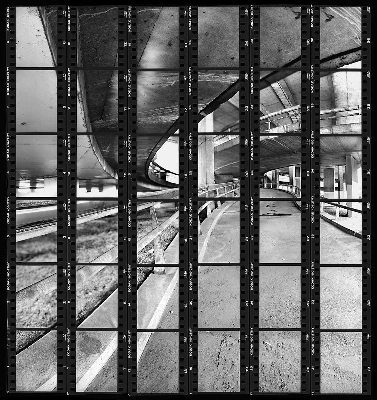
Contact sheets were an incredibly important tool and an inevitable part of the photographic process until digital photography rendered them obsolete. As Lubben notes, they constitute “a record of one’s shooting, a tool for editing, and an index to an archive of negatives.” Indeed, she continues, the contact sheet “embodies much of the appeal of photography itself: the sense of time unfolding, a durable trace of movement through space, an apparent authentication of photography’s claim to transparent representation of reality.”

Contact sheets also represent the economy of the roll of 36 frames, as opposed to the limitless numbers of shots that digital photography affords today. As such, they provide the physical marker of an era when each frame had a value, and was therefore more precious.

Then develop and publish a blog post that tackles the following…

  • Describe and explain what a CONTACT SHEET is…include examples like the ones provided below
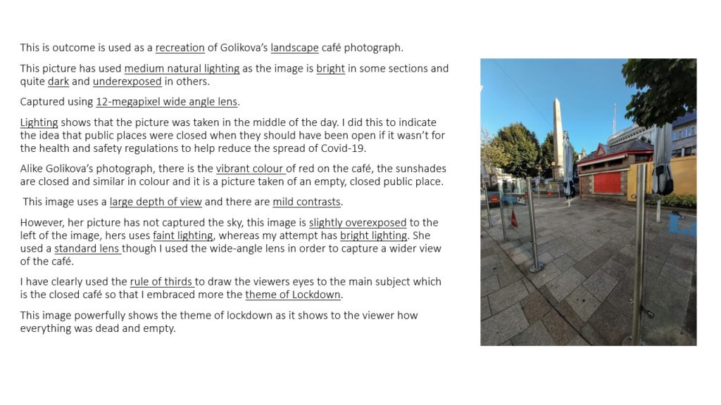
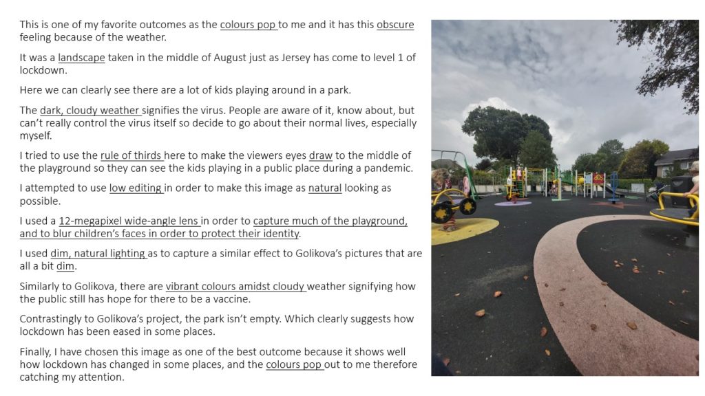
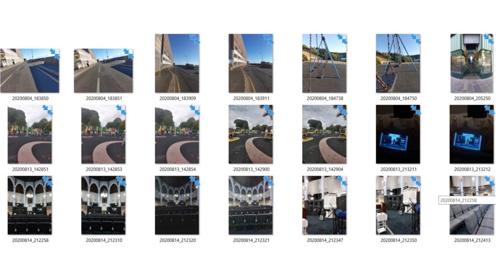
  • Then Create a gallery / grid of images from a recent photo-shoot and upload as a contact sheet to a blog post
  • Answer : Why are contact sheets useful / essential ?
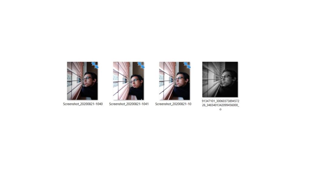
  • Try annotating / colour coding / cropping / arranging your contact sheet to show the start of a selection process
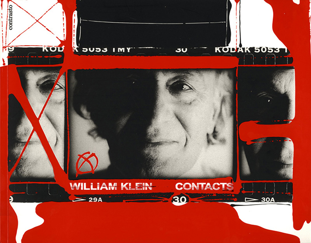
  • Look at the examples below which include work by William Klein and. This key photographer was known to include contact sheets as part of his final images as well as experiments.
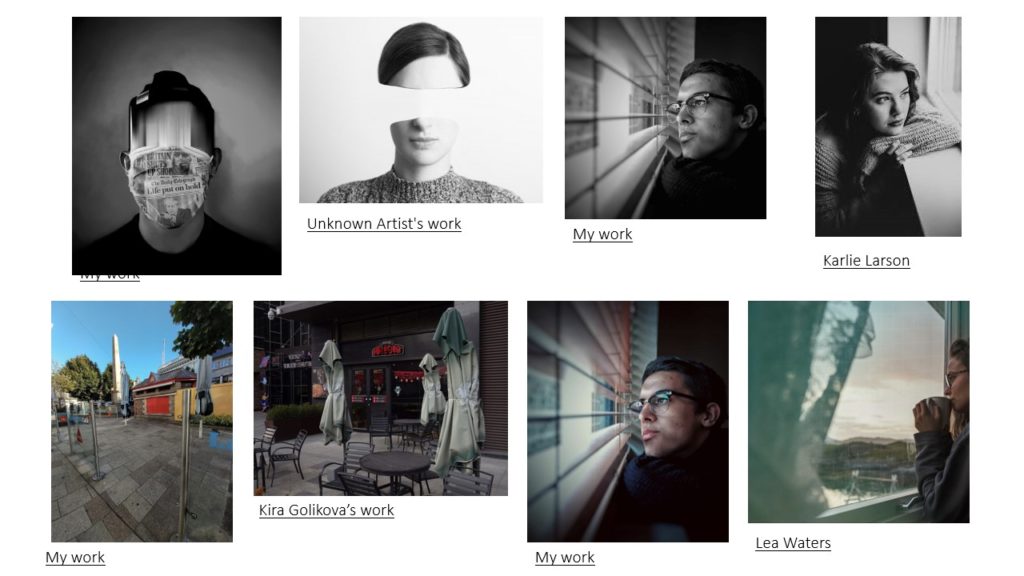
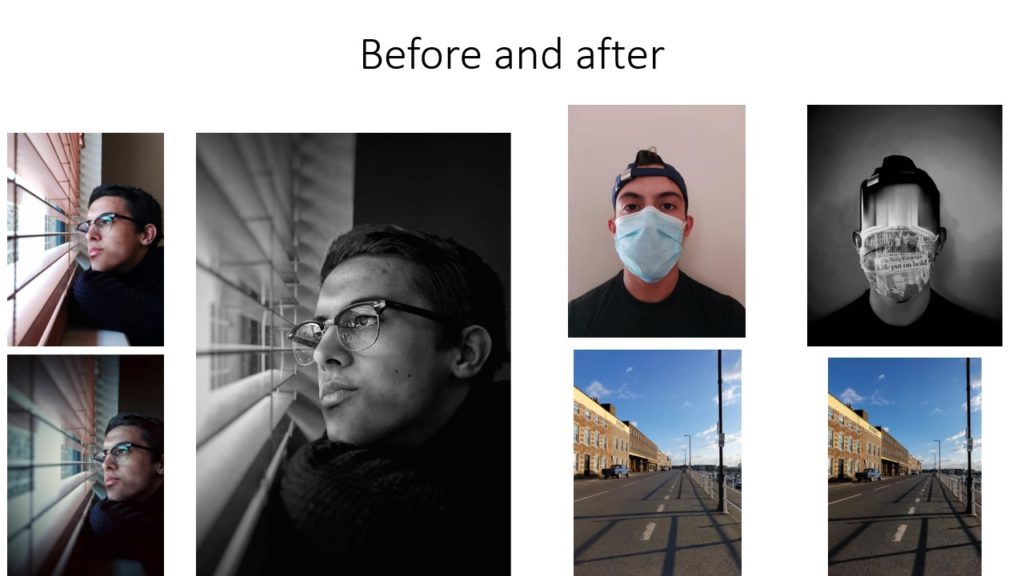
  • Remember…you can Add your images to a Powerpoint, then convert to a JPEG and upload to the blog using JPEG File Interchange Format or try creating them as screen shots.
  • You can make a contact sheet by using the Snipping Tool (Shift + Windows+ S) and copying a gallery of images from an image folder
  • Or create a Contact Sheet in Adobe Photoshop
William Klein
William Klein
A creative approach to how a contact sheet could be used…
Using Contact Sheet II in Adobe Photoshop