Category Archives: Task

Filters

Author:
Category:

the world is beautiful

 Albert Renger-Patszch
Albert Renger-Patszch was a German photographer born in 1897 and later died in 1966. Renger-Patszch began his photography career at the early age of twelve, and got his first job in photography in the early 1920’s for the Chicago Tribune. He opened his first photography exhibition 1927 and produced his second book, “The World is Beautiful”, in 1928. This book focused on the aspect of New Objectivity, a German movement as a reaction against expressionism. “The World is Beautiful” displays one hundred of Renger-Patszch’s best photographs which focus on natural forms, industrial subjects and mass-produced objects. Like Edward Weston, in the United States, Renger-Patszch believed that the value of photography was in its ability to reproduce the texture of reality, and to represent the essence of an object.

Albert Renger-Petzsch’s iconic black and white work could be compared to the work of Ansel Adams, who’s career in photography was also relevant at the time of Renger-Petzsch’s work. The main similarity they share is the uniformed, black an white theme, which allows the viewer to focus on the shape, pattern and lighting rather than the colours.
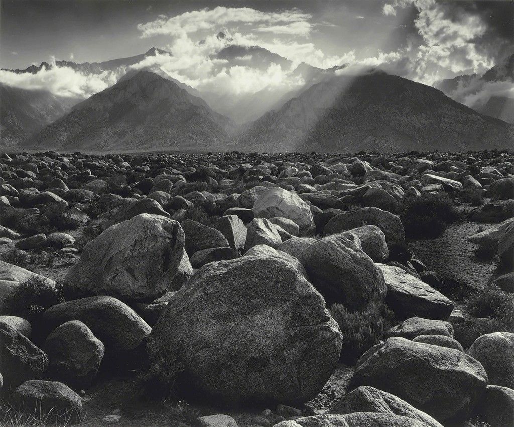
“Mount Williamson, Sierra Nevada, from Manzanar, CA” – Ansel Adams (1944)

Photo Analysis

Contextual:

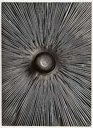
This image, named “Fungi Lepiota Procera” was featured in Albert Renger-Patszch’s famous book: “The World is Beautiful”. It is a photograph from his botanical study is of the underside of a mushroom found in woods and pastures within the northern hemisphere.

Conceptual:

“Fungi Lepiota Procera” was taken as a part of Albert’s famous publication in 1928 which contained 100 of his best images that focused on the New Objectivity movement. The purpose of this publication as a whole was to disregard old-fashioned expressionism and to explore the universality of both natural and man made life throughout the world. Essentially, the Renger-Patszch’s idea was to capture the mundane everyday objects and bring their beauty to light by cropping sections of the image and adding a sleek monochrome tone.

Technical:

I believe artificial lighting was used for this image as the photo is of high quality and bold shadows are created. The harsh lighting creates a clear contrast between light and dark within the lines which is exaggerated by the monochromatic effect. the lighting is coming from straight ahead as the shadows aren’t cast in a particular direction and they are all rather even around the surface. The photo is quite flat as there is no background to compare depth against the focal point, and the whole image is in focus, so it is hard to tell if there is a narrow or large depth of field.

Visual :

A pattern of repetition is the main focus of this image, with the repeating lines pointing towards the centre of the mushroom to create a focal point, that being the stalk of the mushroom. the focal point is in the centre third of the image and the other two thirds are taken up by the fine lines leading from the stalk. There is no colour in this photo which accentuates the intense shadows in between the contrasting, white lines

“The World is Beautiful” inspired photoshoot:
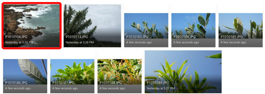
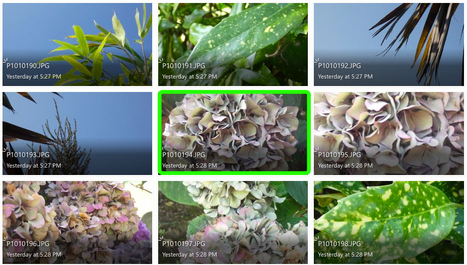
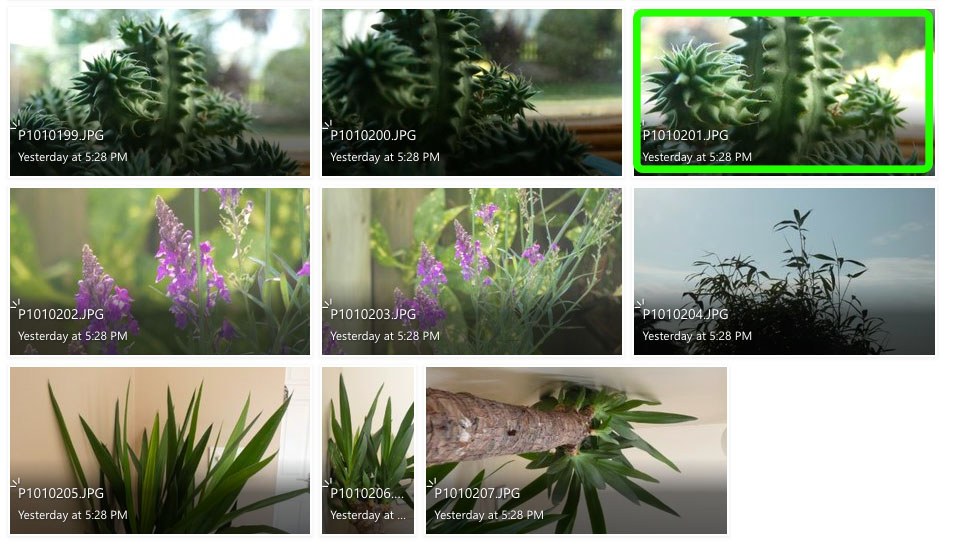
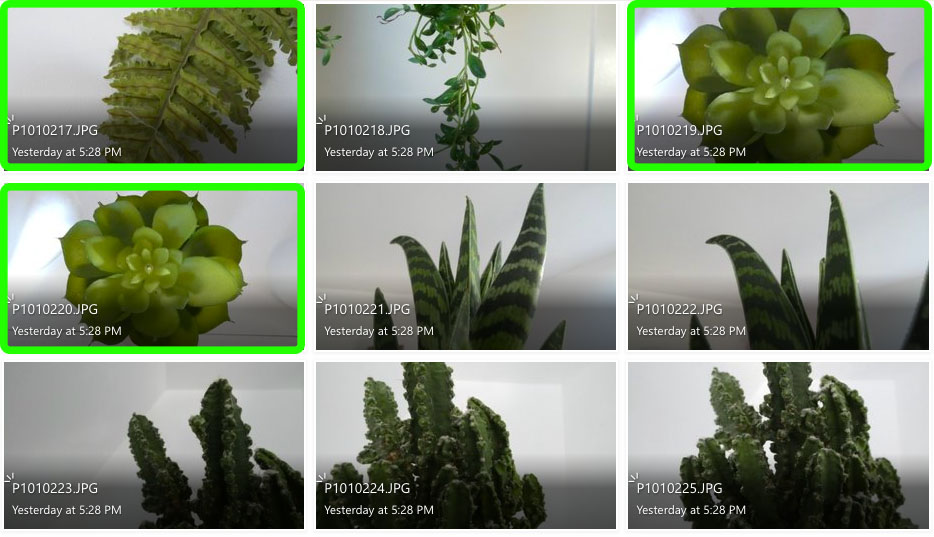
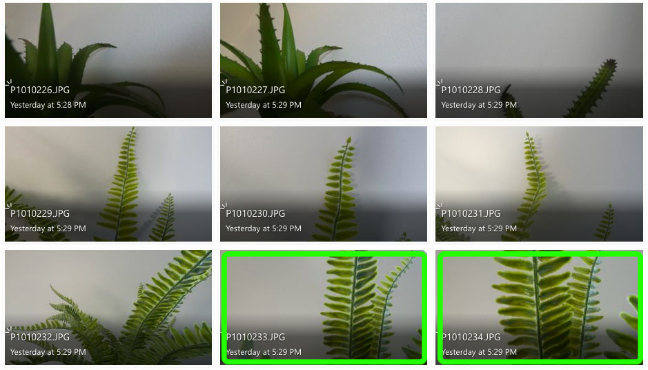
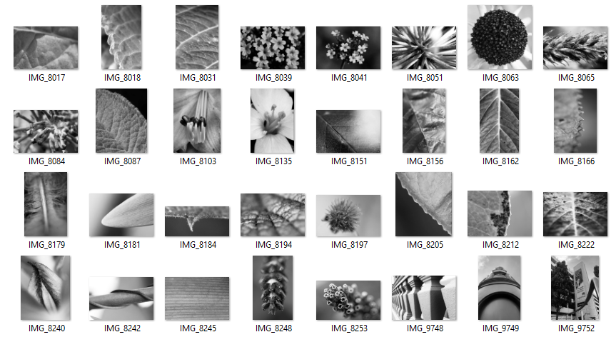
I feel like the images in green are my more successful photos as they display better patterns of line and repetition, like the ones seen in Albert Renger-Patszch’s work.

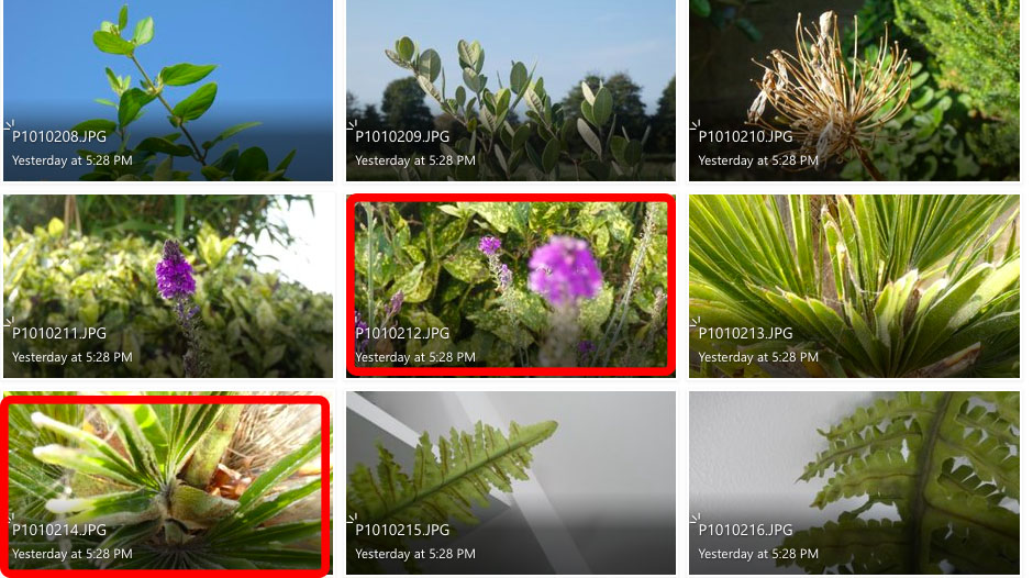
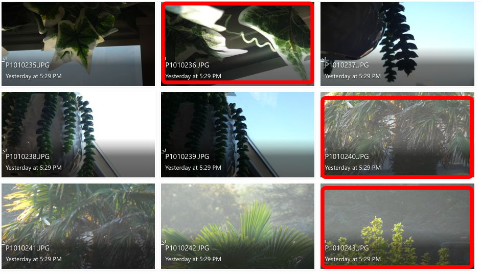
I don’t feel like the images highlighted in red are as successful as my other images because they don’t show repetition or patterns of lines like the work of Renger-Patszch, and for a couple of the images the lighting is too over-exposed. I think these images are less relevant to the subject of “New Objectivity”.

Photoshop Development:
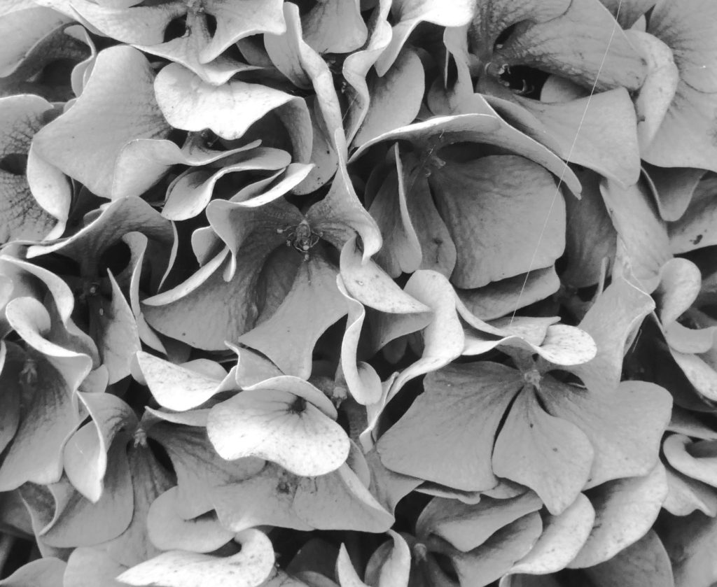
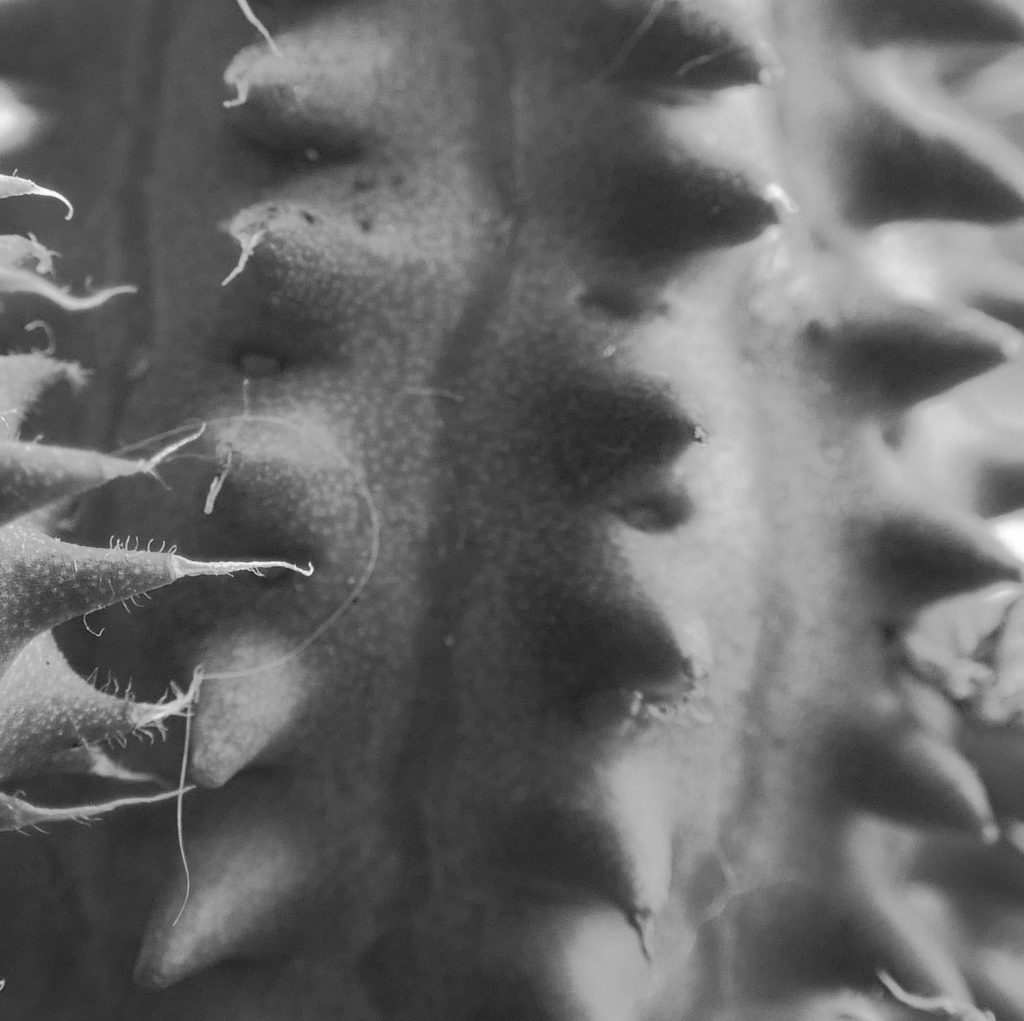
For the first edit, I took a close-up photo of a hydrangea and cropped a section that I felt was the most interesting, with a repetition of curved lines. I used the invert tool to change the shadows and highlights and then changed the image to fit the monochromatic theme of Renger-Patzsch’s work.

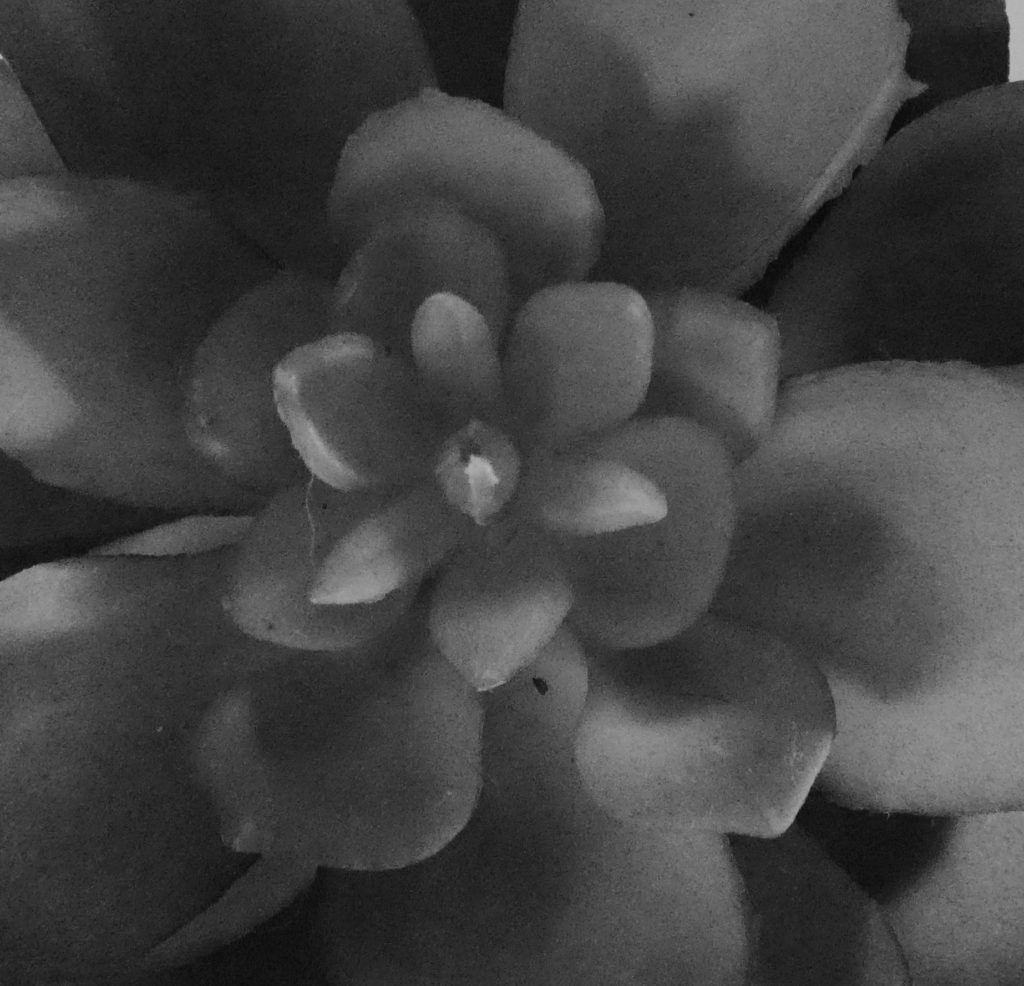
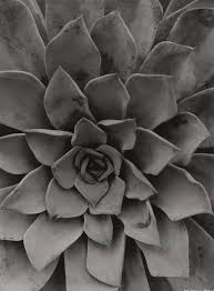
For the second and third edits, I cropped what I felt like was the focal point of two succulents and used the monochrome filter to fit Renger-Patzsch’s black and white theme. These two photos are more relevant to the theme of New Objectivity as they display clearer patterns, texture and repetition.

I used natural lighting in these photos to prove the true, natural beauty of the subjects in their natural form. I chose to focus on Renger-Patzsch’s photographs on natural forms, as I felt the patterns and repetitions produced by nature are more interesting to the viewer as they are not man-made, therefore there is less explanation to the way they look which, in my opinion, makes them more beautiful.


Formal Elements

How a simple plain A4 sheet of paper and be transformed into digital art, using formal elements.

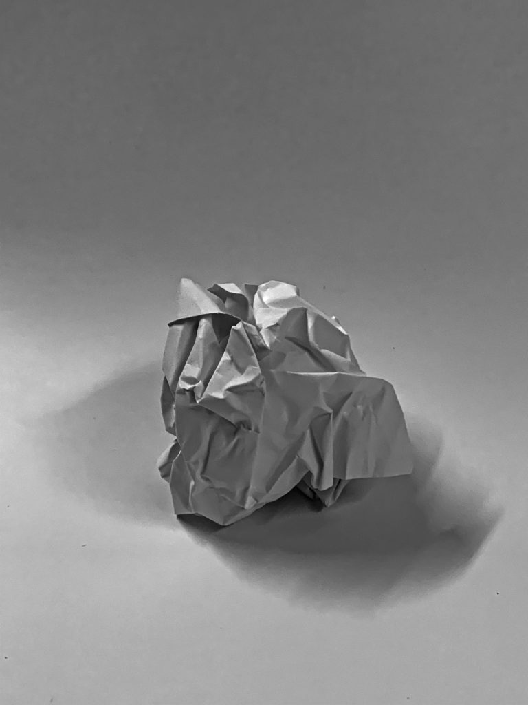
In this photo is scrunched up the paper into a ball shape, and then placed it on a black background and used a low exposure to blend the shadows on the ball into the background, which creates a higher contrast and brings the shadows out more.

I edited it black and white, to remove a yellow hint from the artificial light in the room.

The camera is positioned close to the subject to add more definition and to improve the image quality.

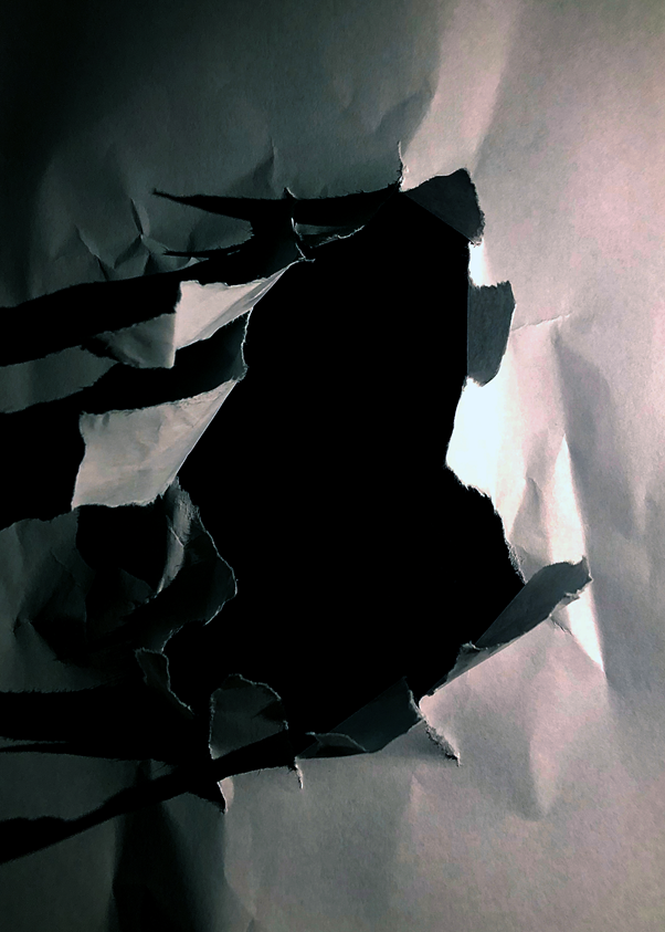
I ripped a hole in the centre of the piece of paper then put it on top of a black piece of card, to make it seem that the hole is deep.

The shadows add more detail as there is artificial light to the right of the hole. I pulled the tears up to create more depth and definition, as it increases the shadows as the light is at the same level as the subject.

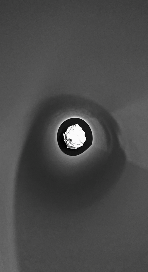
I used a piece of rolled up paper to frame the paper ball, by putting my camera at one end of the tube, and the ball at the other end. This focuses your eye on to the ball at the end of the tube.

This image has a lot of different emotion as there are curved lines, then sharper straight lines on the ball itself. The paper that I used to frame the ball softens the image, which is contrasted by the randomised, chaotic shadows on the paper ball.

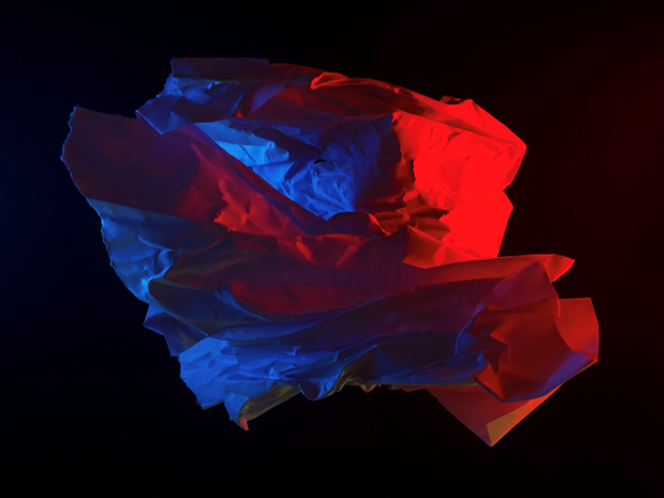
I creased up a sheet of paper and added two lights on the left and right, I used two phones and used the screen light on full brightness with two different colour pictures to create a coloured glow. The shadows show every small crease in the image, which adds more detail and definition.

The clash between the two colours creates unique shadows. It works well as red and blue as they aren’t complimentary colours.

I randomly scrunched up a ball shaped object and lit it up with two phones. It created a random cast of shadows, and a nice depth with the red illuminated paper in front of the blue illuminated paper. It seems like the blue light is inside the subject but it is not, this created a layered effect, which i didn’t plan, but worked out well.

The random shape of the subject adds a unique effect as it can’t really be replicated.

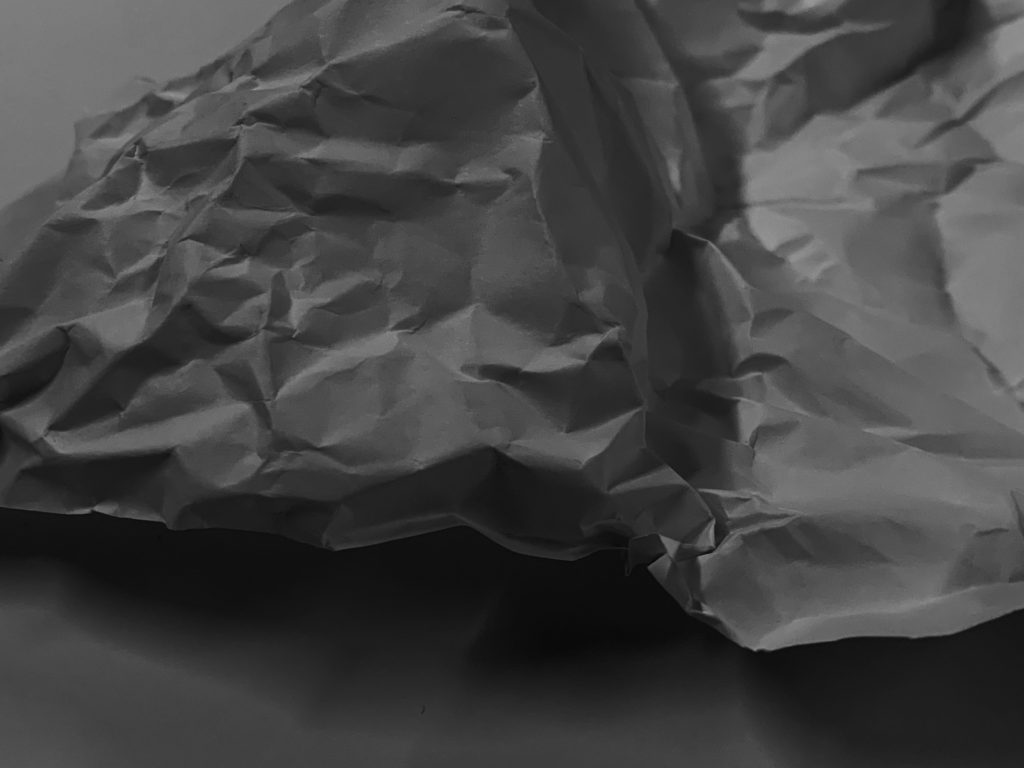
The image is underexposed and has a high black point to create a gloomy effect.

looking and seeing

Camera Skills

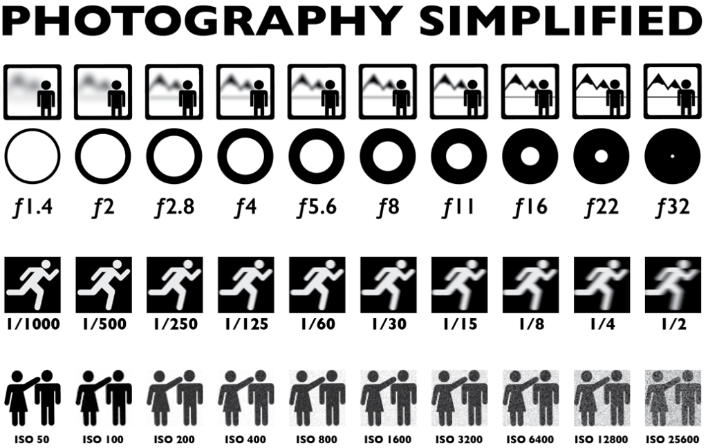
You must experiment with ease of these skill areas and produce a blog post on each key skills that includes evidence of your experiments and successes over the next few weeks…

The images should be of an abstract nature, and show an appreciation of abstract qualities such as line, shape, colour, form, texture, pattern, repetition, symmetry (the formal elements)

  1. Using Auto-Focus
  2. Using Manual Focus
  3. White Balance
  4. ISO
  5. Aperture
  6. Focal Length
  7. Depth of Field
  8. Slow Shutter Speed / fast shutter speed

Photoshop Skills

  1. Cropping
  2. Selections
  3. Adjustments and corrections
  4. Transforming an image
  5. Layer control
  6. Image size / canvas size
  7. Double + multiple exposures

Working towards a vision…

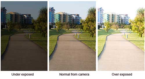
examples of different camera exposures
A Beginners Guide to Photography | Big Sam Writes Stuff
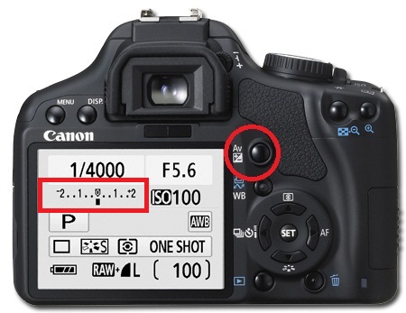
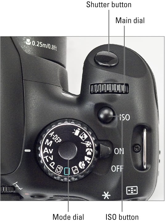
canon
Image result for canon camera control dial

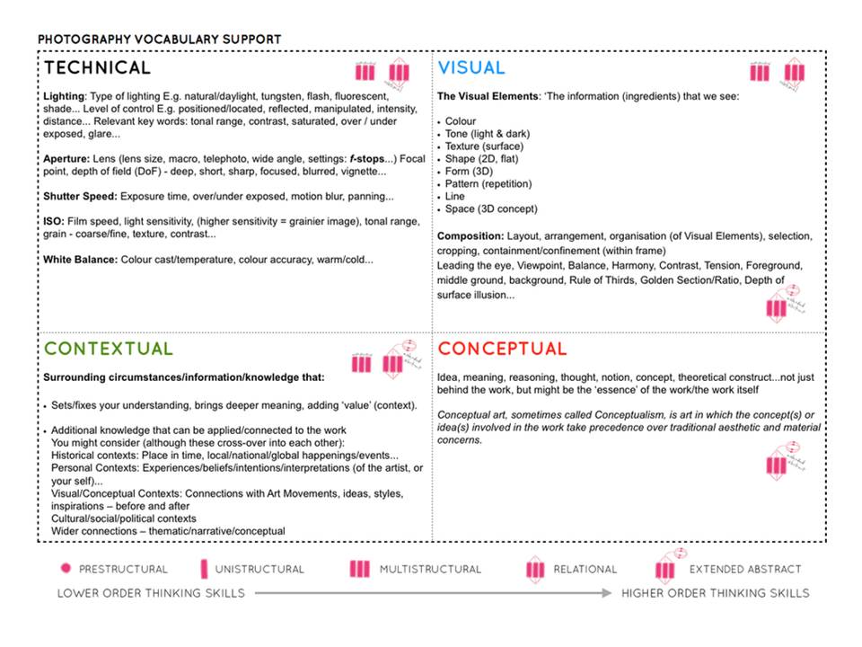
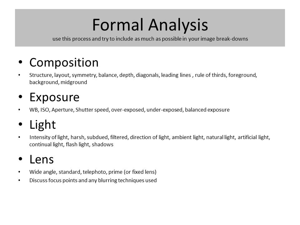
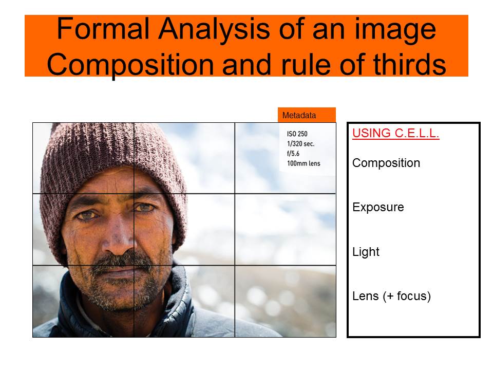
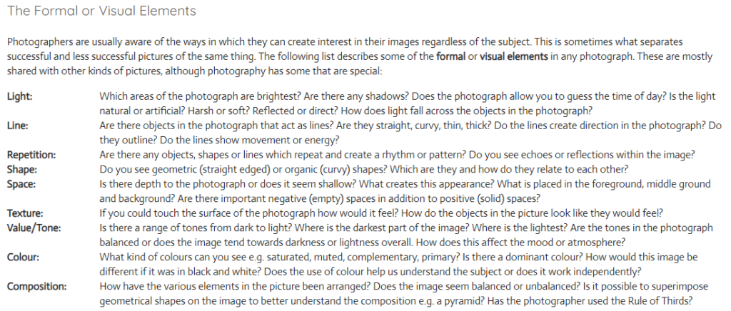
Use this method to analyse key images

Rule of Thirds

Homework | Practical / photoshoot

Due in WEDNESDAY 30th September

Minimum Expected frames/ exposures = 150-200 images

Choose from a range of camera skills that you have learned in Week 3 and 4 to complete a new photo-shoot…

We want to see that you can explore and extend your handling of

  • exposure settings
  • focus control
  • depth of field

INSPIRATION >>> choose from the following to inspire your ideas.Look carefully at the examples and aim to produce similar images that work well as a group…together.

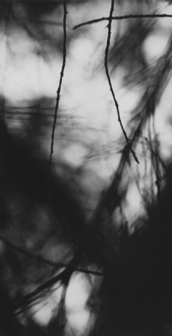
Ralph Eugene Meatyard: 
‘No Focus’

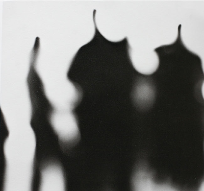
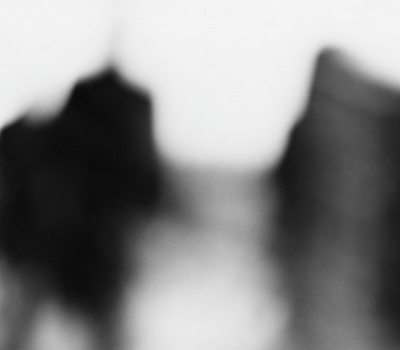
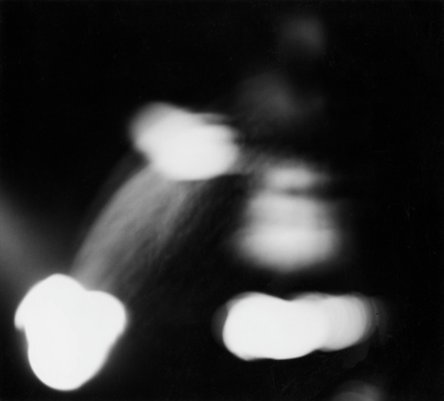
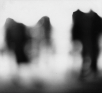
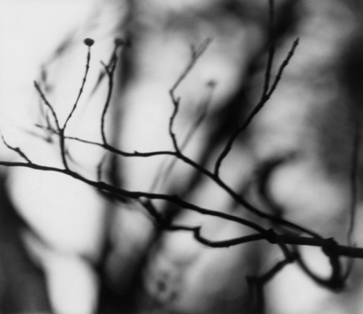
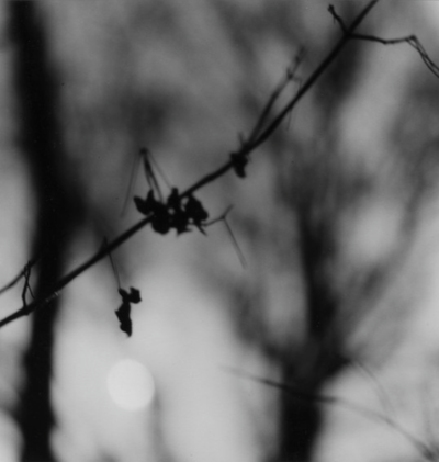
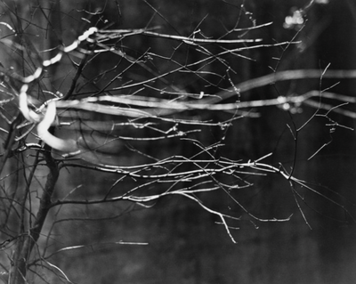
Meatyard made his living as an optician. He was a member of the Lexington Camera Club and pursued his passion for photography outside the mainstream. He experimented with various strategies including multiple exposures, motion blur, and other methods of photographic abstraction. Two of his series are particularly concerned with focus and depth of field, both stretching the expressive potential of photography, film and cameras when looking within the ordinary world.

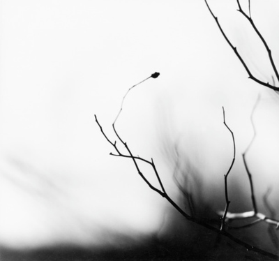
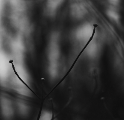
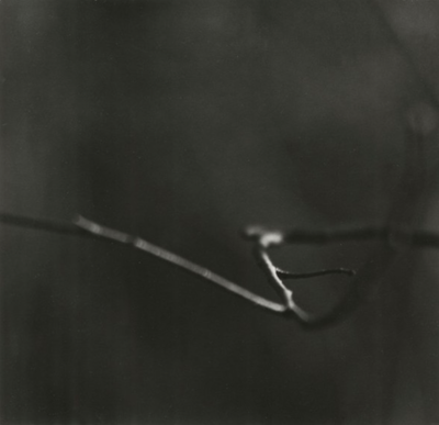
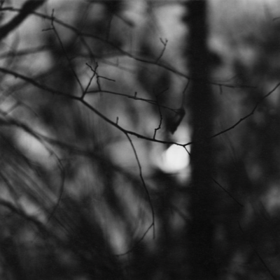
‘Zen Twigs’

You must:

  • Research the work of Ralph Eugene Meatyard, Saul Leiter and Uta Barth. How have they experimented with focus and depth of field in their work? Choose specific images to comment on in detail. You could also find other photographers who are interested in experimenting with focus effects.
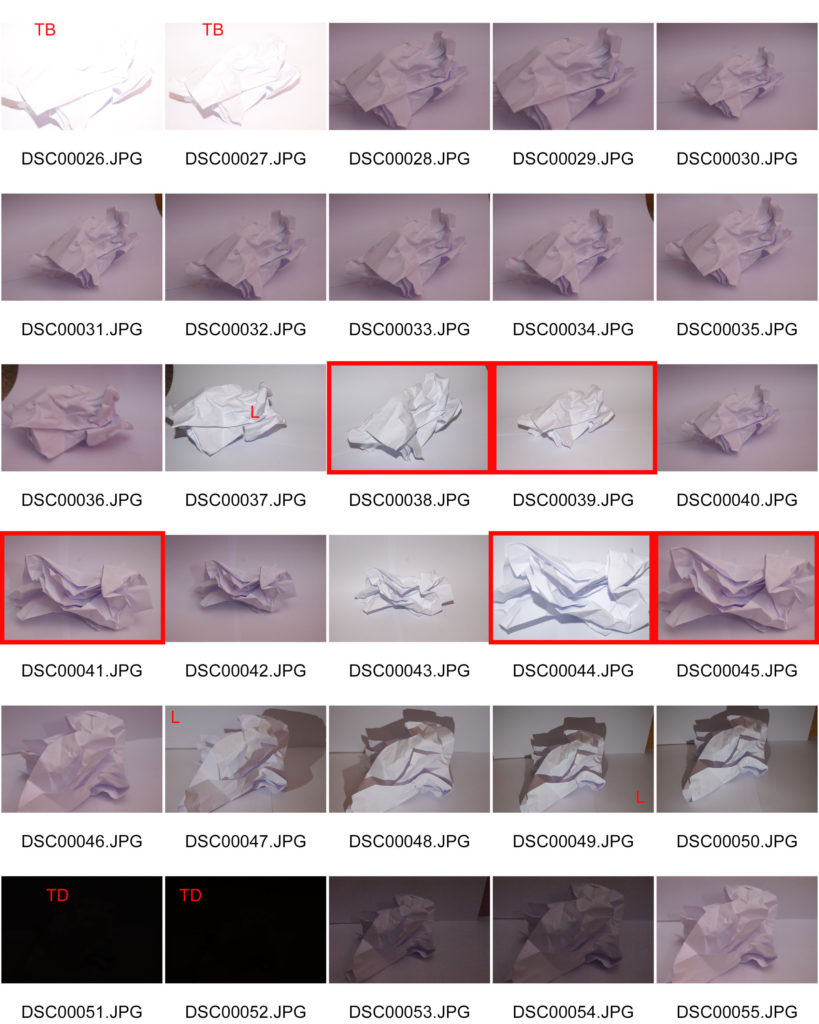
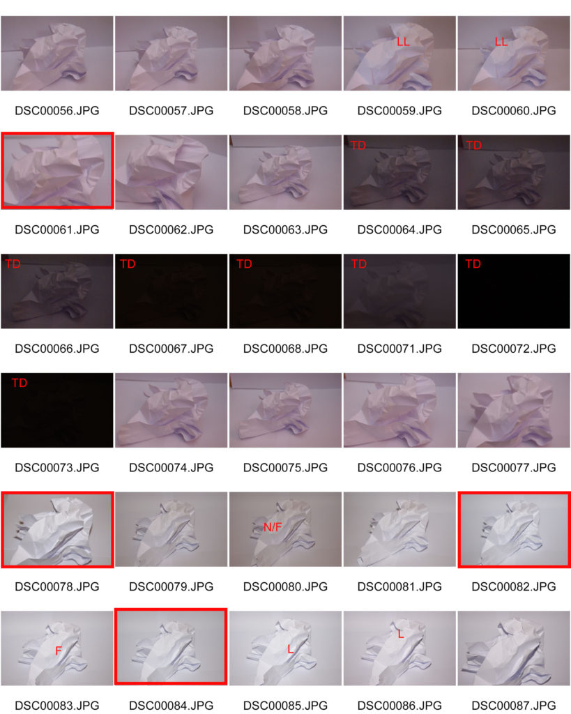
  • Explore the effects of changing the aperture settings on your camera to alter depth of field. You could illustrate this with a series of photos of the same subject shot with different aperture settings.
  • Create a series of deliberately out of focus images. Consider the degree of abstraction in the final image. How out of focus are the subjects and are they still recognisable? Experiment with colour and black and white. REMEMBER TO USE MANUAL FOCUS AND THE INFINITY SETTING
  • Create a series of images which explore dramatic depth of field (selective focus). Experiment with switching between foreground, middle ground and background focus. Remember, you will need to use a wide aperture (small number e.g. f2.8) and/or a longer lens for this. Remember to share all of the images you make (including those that you deem failures) in a gallery/contact sheet.
  • Curate your images into different groupings (see below). Experiment with editing the images in each set differently. Give each set a title and write a short evaluation explaining your editorial decisions.

Follow the 10 Step Process and create multiple blog posts for each unit to ensure you tackle all Assessment Objectives thoroughly :

  1. Mood-board, definition and introduction (AO1)
  2. Mind-map of ideas (AO1)
  3. Artist References / Case Studies (must include image analysis) (AO1)
  4. Photo-shoot Action Plan (AO3)
  5. Multiple Photoshoots + contact sheets (AO3)
  6. Image Selection, sub selection, review and refine ideas (AO2)
  7. Image Editing/ manipulation / experimentation (AO2)
  8. Presentation of final outcomes (AO4)
  9. Compare and contrast your work to your artist reference(AO1)
  10. Evaluation and Critique (AO1+AO4)

The World Is Beautiful

New Objectivity by Albert Renger-Patzsch (686PH) — Atlas of Places

Albert Renger-Patzsch
– Renger-Patzsch was born in Wurzburg, on June 22nd, 1897. He was German photographer who began making photos at the age of twelve.

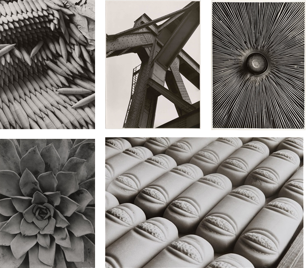
– In 1928 Reger-Patzsch published The World Is Beautiful, a collection of 100 images, which had lots of detail, mostly patterns in nature and man made structures.

– He likes to take photos of highly detailed and complex flowers and other nature plants. Additionally, he prefers to take photos of unique architecture.

– His nature photography captures what the eye can’t see. He captures each fold in and every detail in each picture.

– Renger-Patzsch makes his images black and white, which gives the image a high contrast, and reveals the tones more.

– The black and white makes it so that you focus on the geometric patterns rather than the colours.

– Lots of Renger-Patzsch’s images use leading lines, framing, repetition and rhythm. Which gives off a more visually pleasing image.

Image Comparison
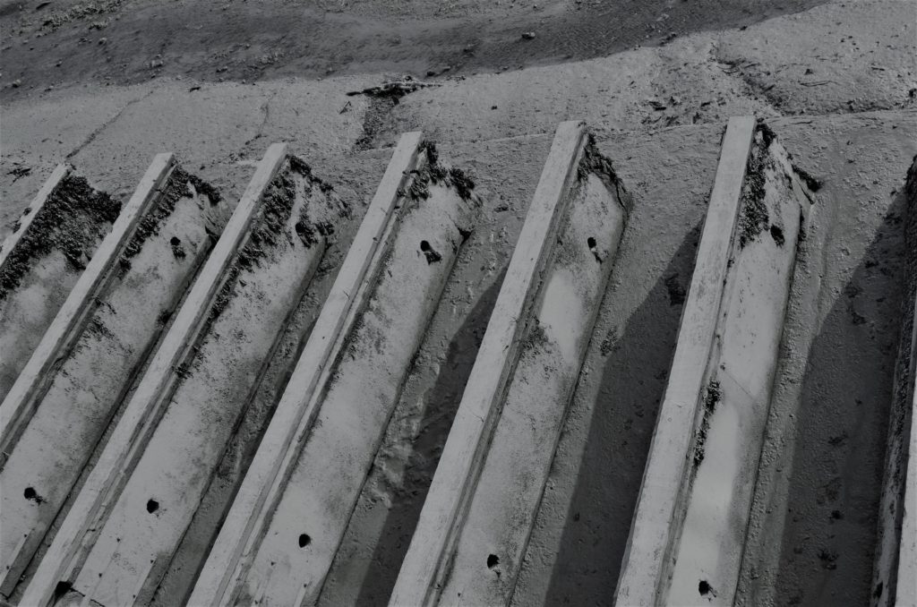
– Both these images were taken by Albert Renger-Patzsch.

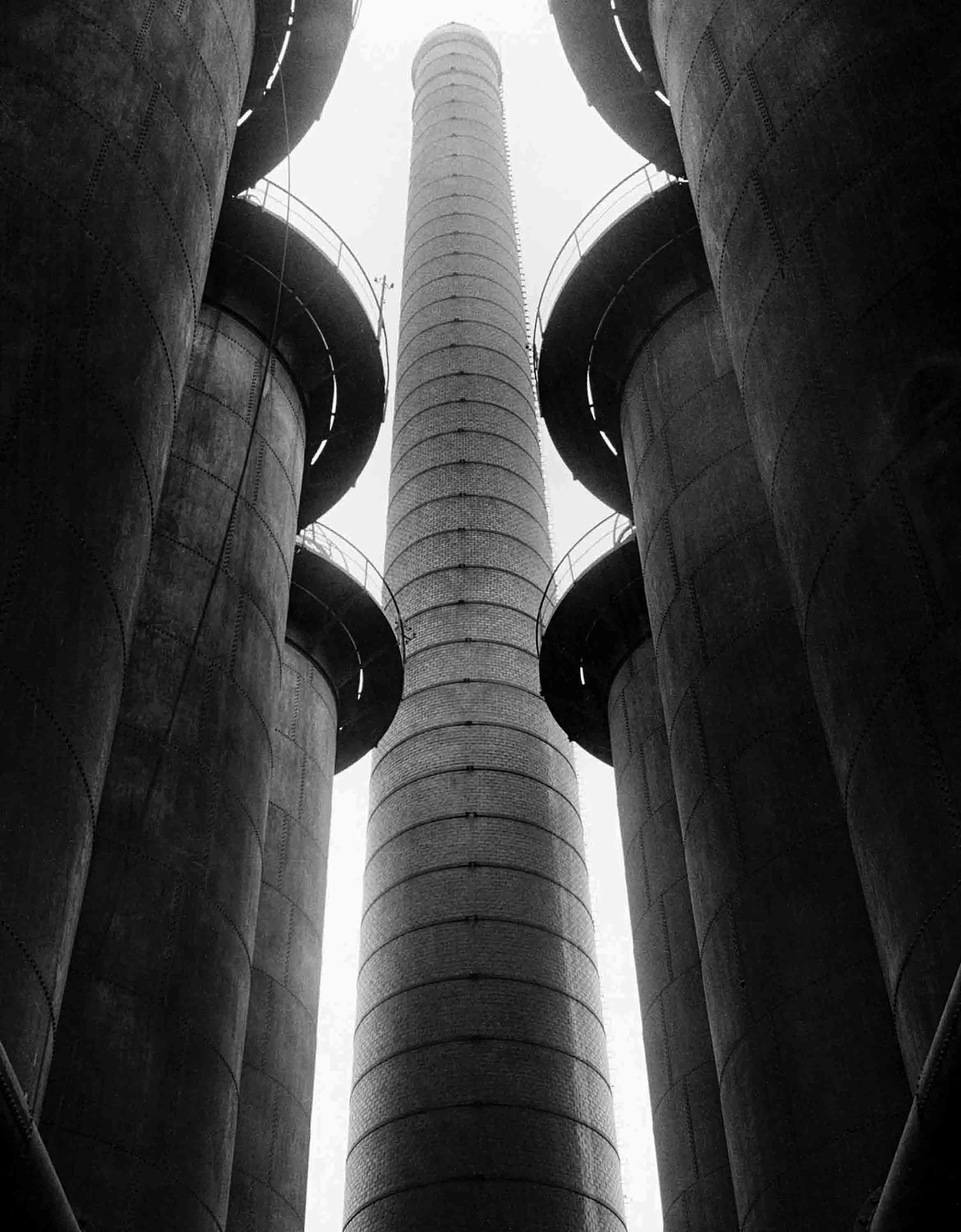
  • Firstly, the trees are natural and randomly positioned, where as the spades are carefully positioned.
  • There is more depth in the photo with the trees, as it fog makes the trees fade away.
  • The photo with the trees uses natural light, where as the photo of the spades is most likely artificial light.
  • Both photos have repetition of the subject.
  • The whole of each spade is in shot, however in the other photo, the top of the trees are cut off, this shows how big the trees are in comparison to the spades.

My Photos

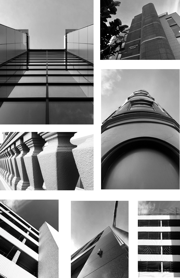
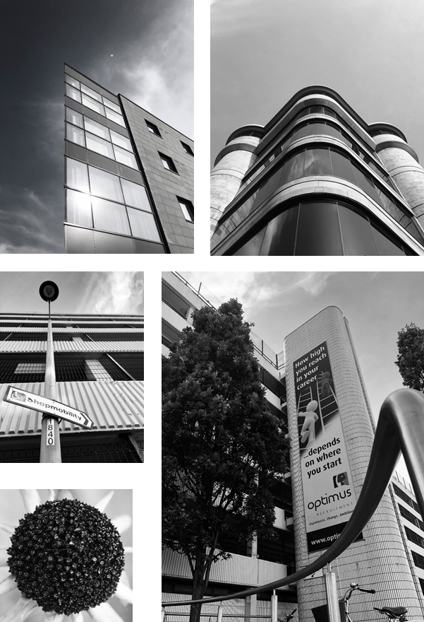
Architectural Photos
– Firstly, I took photos of buildings that have detailed symmetry and patterns from the windows.
– I made sure that the sky was in all of them and i commonly used the line of thirds technique to make them to create a unique appearance.

Nature Photos
– I used a macro lens to get a close up shot of the objects I photographed. It made it so you can see every detail on the focus.
– It created a shallow depth of field, as I used a low f/number. This makes us focus on a specific object as the background is blurred.
– I took lots of photos of leaves as there have many natural patterns. Also, I took a close up of a feather, which as a repeated pattern with smaller lines coming off the central line.

Overall I made all the photos black and white, as it is in the style of Albert Renger-Patschz. The black and white effect, created a high contrast and made all the patterns more visible.

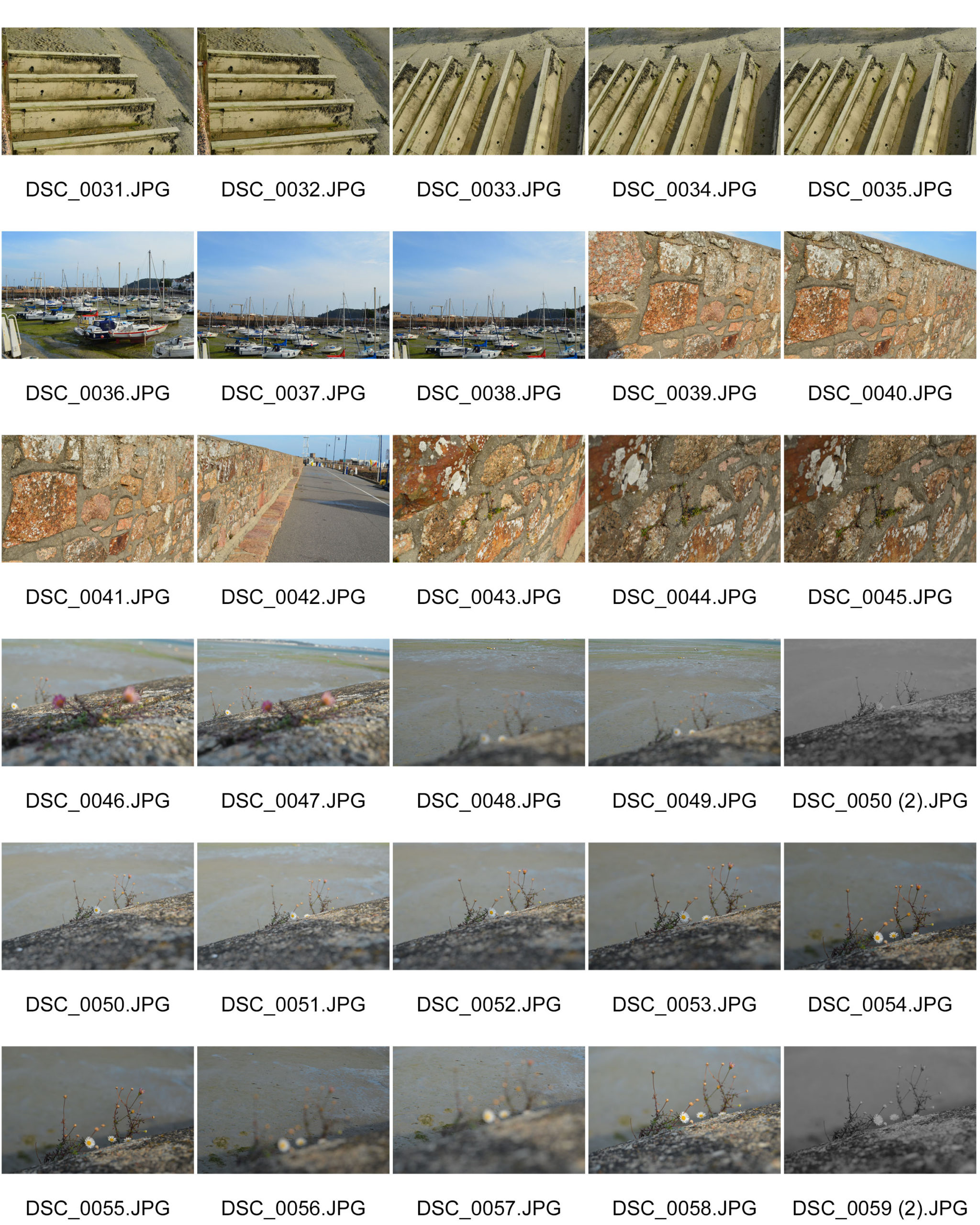
Contact Sheet

What are contact sheets?
– Contact sheets are a tool that dates back to the days of shooting on film, showing the whole roll of film on one sheet of photographic paper, to help the photographer select which images to print.
– They are now outdated as most photographers use digital camera.

Why are they important?
– You can quickly scan a series of images to find the good photos or the ones chosen to be enlarged. instead of wasting materials one bad ones

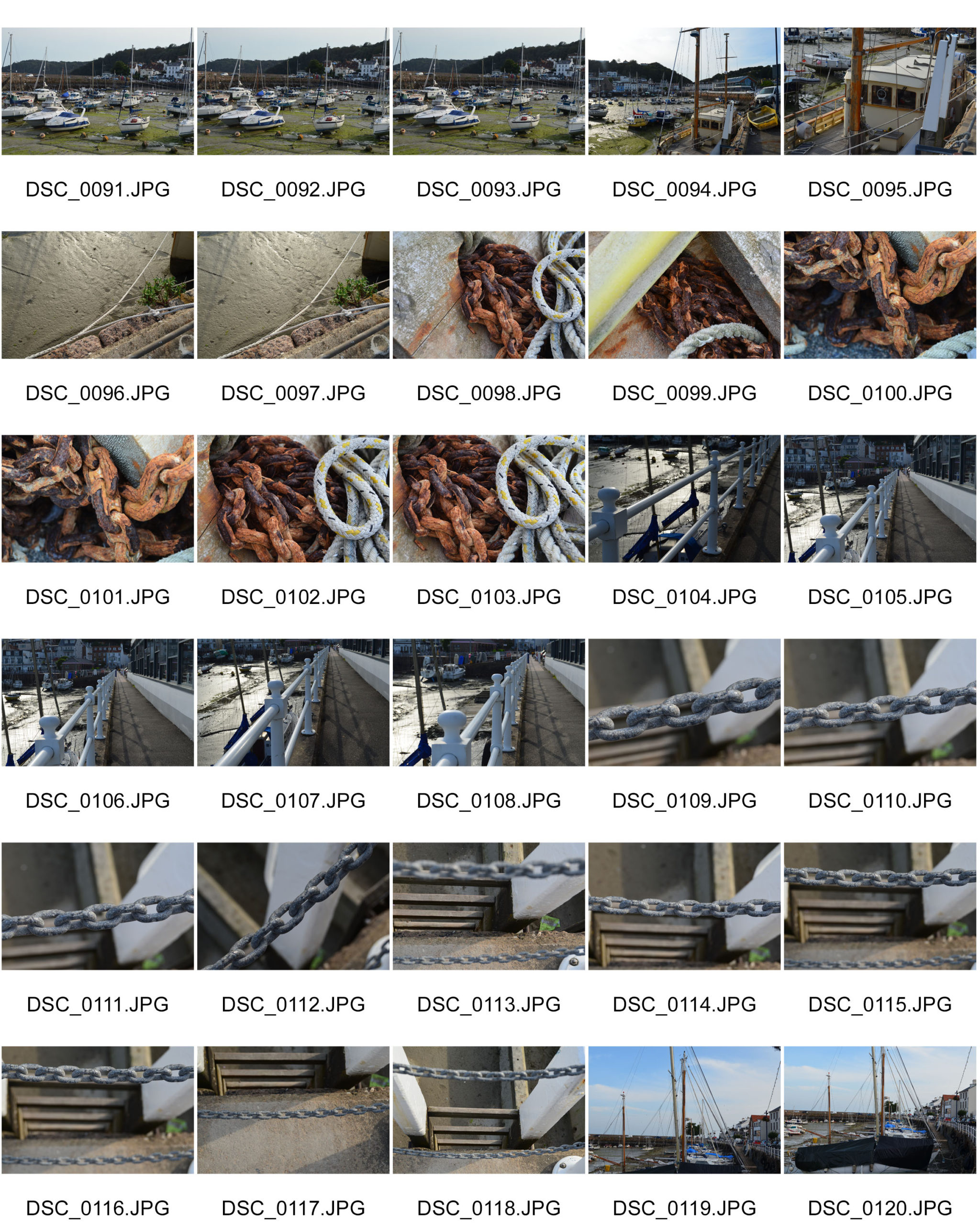
Contact sheet

What are contact sheets?

Contact sheets are a way for photographers to show proof of their work to clients. They consist of a sheet showing individual photographs with name or numbers of the image. They do this so it is easier to identify which photographs the client wants to produce.


Why are they important?

  • They help the photographer analyse and select the best photographs from his shootings and why.
  • Help the client select which images they want to be produced and edited.
  • Help the photographer reach a wider audience by showing their work to potential clients.

The formal elements – paper

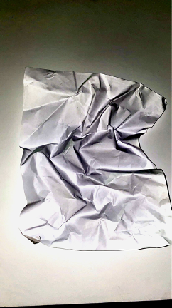
With this task that we were set for taking pictures of pieces of paper, I have 3 different pictures here in which I have selected out of 60 pictures, on the ones that I thought appealed to me the most.

Once I selected the three pictures, I decided to photoshop them in order to change the pictures and make certain aspects of the pictures stand out.

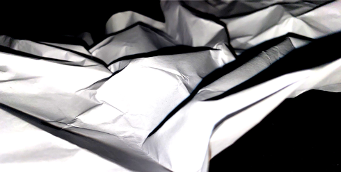
For the first picture I messed around with the exposure in order to make the shadows stand out from the picture having the tones of black and white bounce off each other as the differences in the tones are drastic compared to one another. With this edit I gained more interest into the picture as it doesn’t even seem like a piece of paper anymore but more like a landscape of some sort of rocky terrain.
As for the second picture I brought the exposure down in the achievement of having the picture become black and white. This caused the effect of the shadows in the picture to be heightened, making them a lot more visible compared to the original photo.
Finally, as for the last picture I edited it from the original and put the gamma correction up which brought out the few colours of the picture. This brings in some depth into the picture as you can see which parts of the paper have more depth than other parts moreover, the shadows in this picture also stand pout as you can see which shadows stand out more than the others like the more scrunched section in the centre of the paper. This picture looks more appealing than the original after editing it because it almost makes the picture seem like it was drawn giving it a cartoon appearance.

The world is beautiful

ALBERT RENGER PATZSCH

German photographer Albert Renger Patzsch was a pioneering figure in the objectivity movement, which sought to engage with the world as clearly and precisely as possible.

He focuses on black and white photography and noticed the changes that the world was facing during that period in time. The industrial revolution was still reasonable new at this stage so where lovely views once were, large buildings constantly creating smoke and smog replaced them.

In addition to this, he focuses on repetition of patterns and items so I will try and make sure that if I take a picture of one singular thing, it will have a pattern or texture that is repeated.

His project “the world is beautiful” looks at the way the camera interacts with things in the world. One of photography’s fundamental attributes is its capacity to adopt a range of relationships with its subject. Renger-Patzsch’s approach embodied his belief that ‘one should surely proceed from the essence of the object and attempt to represent it with photographic means alone’ (taken from the national gallery of Australia)

Image Analysis

The World is Beautiful
Albert Renger Patzsch

It looks like this image was taken in a natural light as there is no glare on the buttons from where the flash had hit it. In addition, the buttons have a slight shine from the sunlight.

Some of the buttons have a slightly rough texture causing the light to only make the first half of the button shine as the raised bumps are creating a shadow for the rest of the button.

The image has a playful and nostalgic mood as many people who went to haberdashery shops always saw 100s of buttons lay around in different places. The viewer may have played with the buttons on their shirts or cardigans causing happy memories to flood back.

Image Analysis

Biography: German photographer Albert Renger-Patzsch | MONOVISIONS
Albert Renger Patzsch

This image shows lots of loaves of bread all lined up on a wooden surface. They seem to be uncooked as there is no varying shades on the bread that the viewers can see. However there is a few different textures allowing the reader to focus on the ends of each loaf rather than the middle.

The fact that they are all an equal shape and are all in rows and columns allows the viewer to see that this was taken in a factory or bakery because not many civilians had the time to make that many loaves of bread.

However, the image creates a homely mood because even by looking at the image, the viewers could be able to imagine what the smell of the freshly baked bread would be like once this batch had come out of the oven.

The tones in this image are mainly light, except for the gaps in-between each loaf and also between the wood and the bread, where they block the raised parts of the bread block out the light for the loaves either side of it. This repeats throughout the whole image.

Images by Albert Renger Patzsch

Shoot One

Favourite Images (unedited)

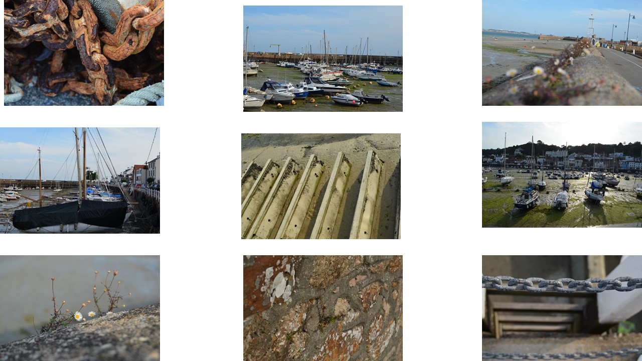
For my First shoot, I went out to St Aubin. I went there because it has so many things that repeat. For example, the boats that are parked in rows in the harbour; the ladders surrounding the harbour so people can get out, the chains attached to the anchors and also chains that are used as a barricade.

Favourite Unedited image

My favourite unedited image would probably be the rusty chain as it shows that they can be used for a very long time ; and was created in mass during the Industrial Revolution when Renger was alive.

Lighting: The natural light allows the copper colour to pop and also highlights the peeling of the corroded metal.

The shadows that are created on the floor by the coiled up chain allows the viewer to focus on something other than the rusty chain, it allows the view to wonder whether the dark patch has anything underneath or whether it is just an empty space.

The links in the chain allow the viewer to see a common pattern; however, the cracks that are created by the rusty chain allow the viewer to focus on the different shapes that the corrosion had created.

Edited Images

Favourite edited image

This is my favourite outcome from this shoot because I love the texture on the chain and how it’s beginning to corrode and therefore has chunks of each link missing. The chunks that are missing from the chain are a way to keep the viewer interested in the image because if it was just a normal chain it would be boring as most chains are the same. One could say the corrosion gave it some character.

The sunlight also hit the corners of each link causing there be be a shadow in the centre of the links as each link blocked another’s light.

The chain is a little off centre because I wanted to keep the drop from behind the chain in shot.

Shoot two

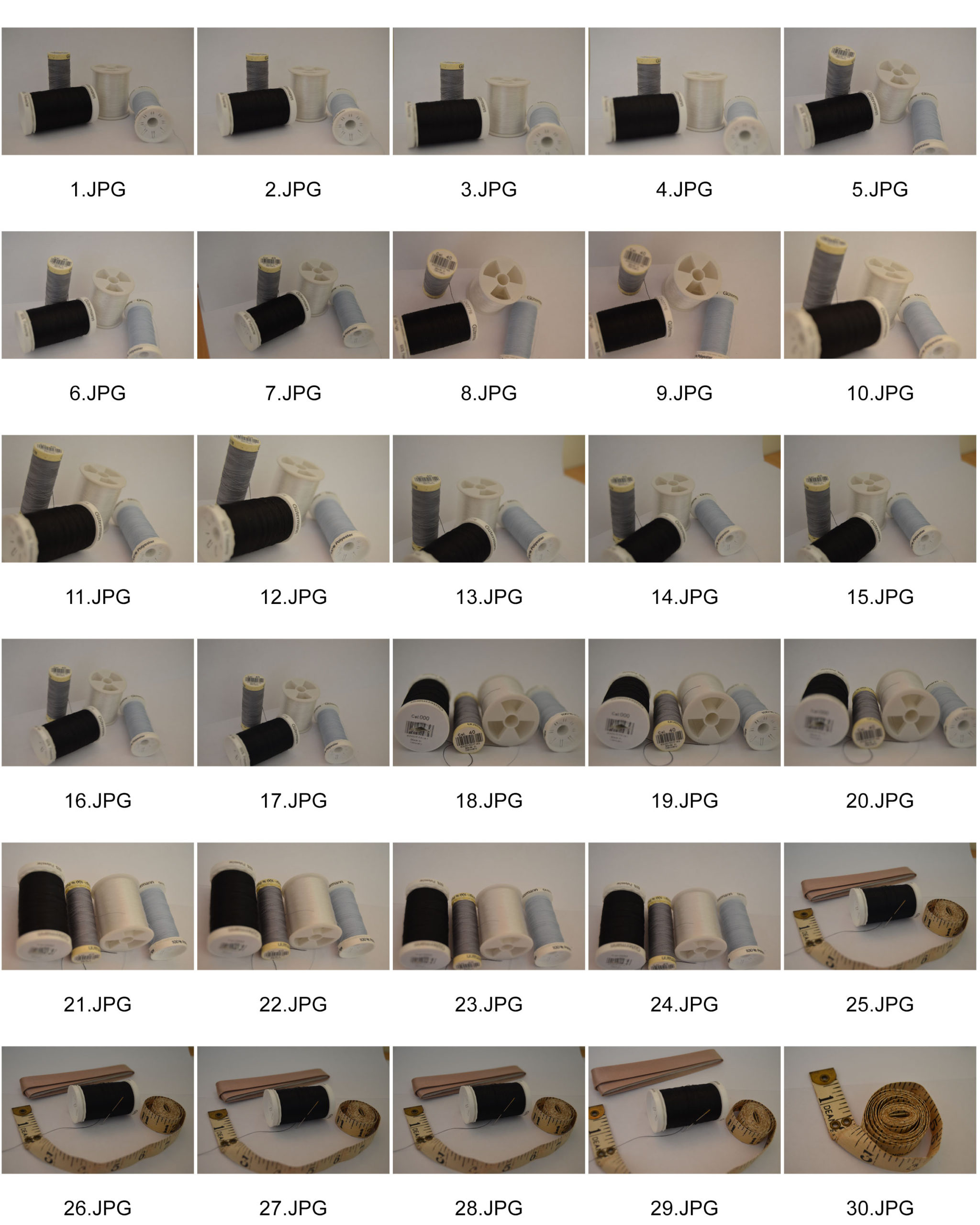
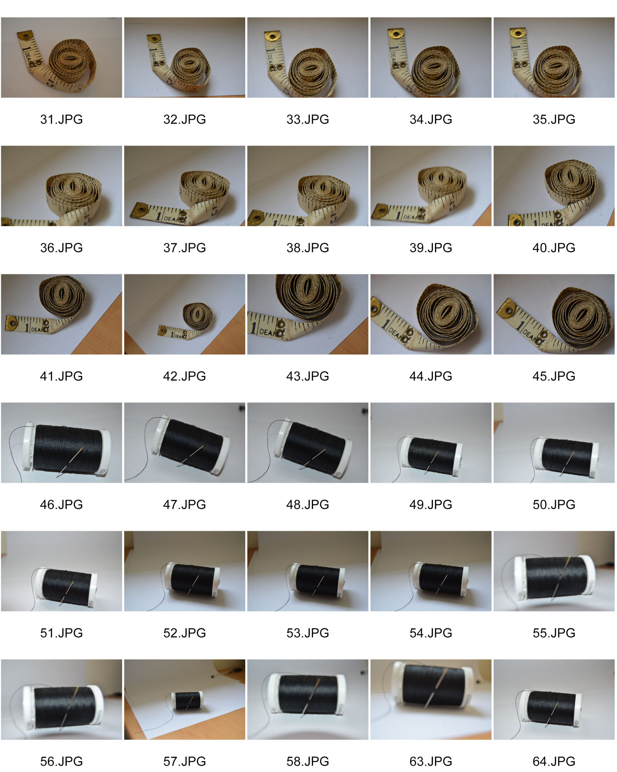
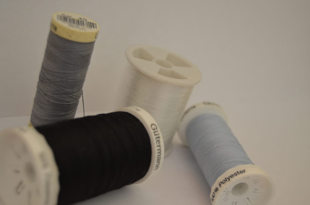
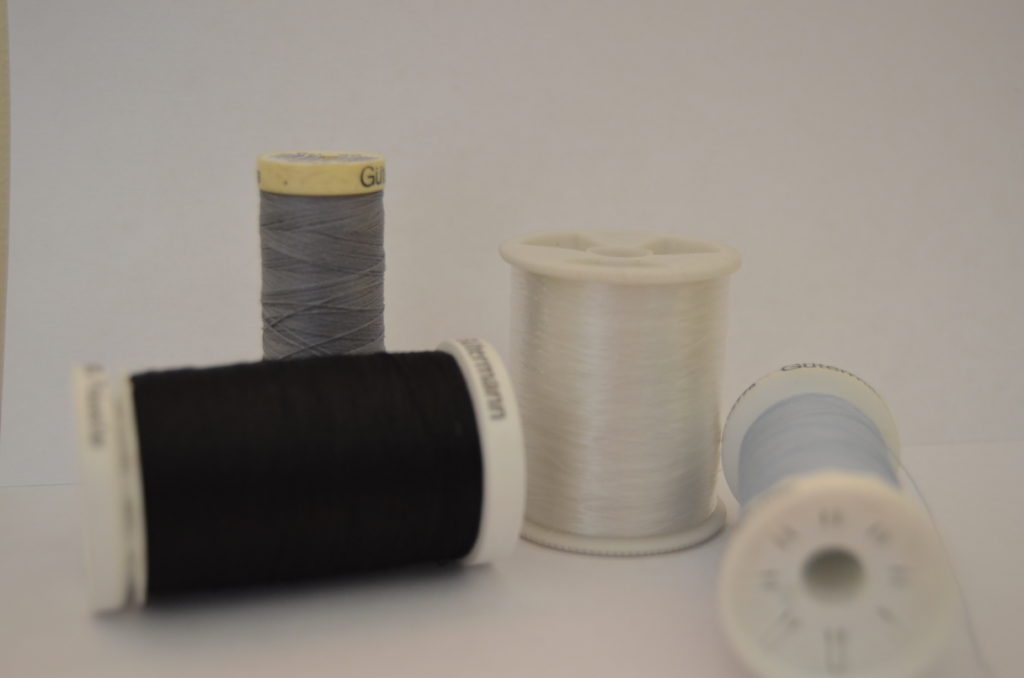
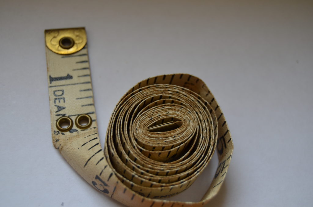
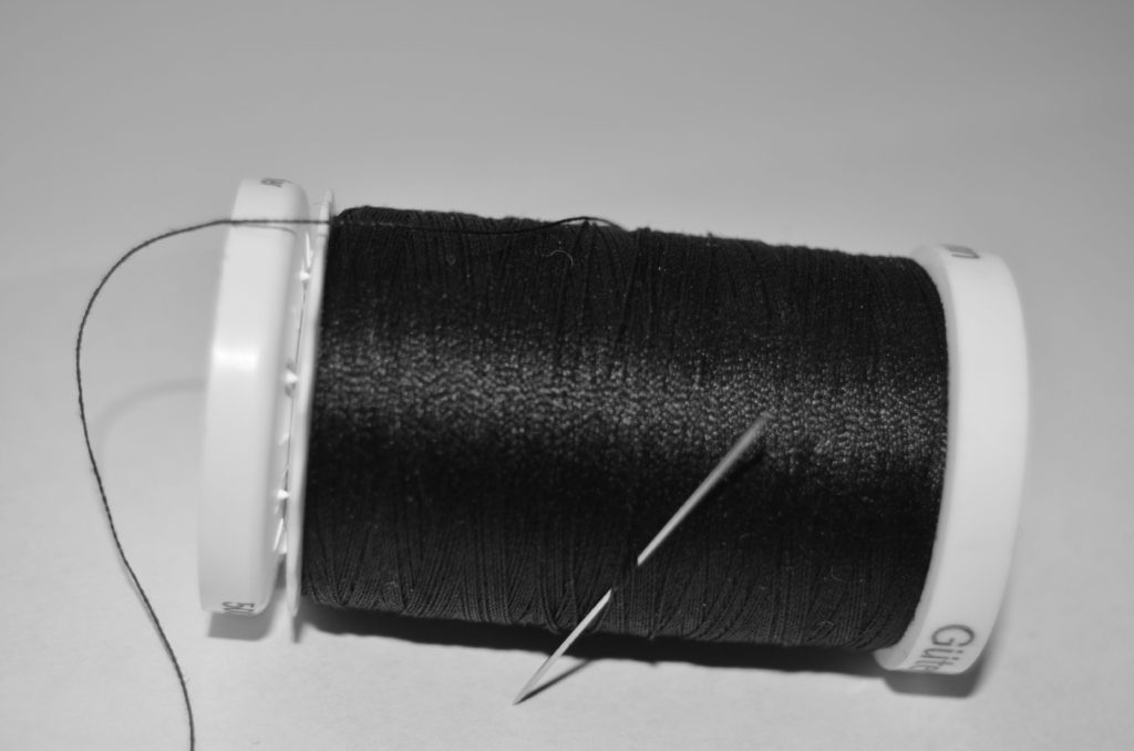
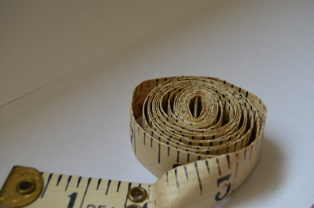
For my second shoot I was inspired by Patzsch’s image of five buttons on a plain white surface. My mum does a lot of sewing, so I took a few photographs of what was in her sewing box. The tape measure is between 80-90 years old as it was my Great Grandmother’s. I used the tape measure in particular because of its age, and the fact that Patzsch’s images were taken in black and white which is often associated with the past.

Successful unedited images

Successful Edits

These are my most successful edits. I prefer some of these images more than the first shoot I did. I loved taking the close ups of the tape measure and thread as individuals rather than in the group with other items.

Favourite Image

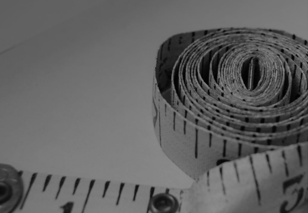
I cropped this image to make the tape measure be the focus of this image, however I didn’t make it central because I wanted to keep the end of the tape measure that was lose in the image as well.

I didn’t have the flash on my camera as I wanted the light to be smooth. So the light used was from the window just as the sun was above it, so it created a natural glow on my surface.

The tape measure, because of it age, has some dints in the fabric which creates kinks in the what seems like an infinite spiral. In addition, the tape measure’s paint has worn a bit which links with the main idea of things changing over time. This tape measure is very old, and I think it works well with the black and white filter.

Before and after editing

Image Analysis – Alfred Krupp

The man in this photograph is Alfred Krupp. Alfred was as an ammunition and steel manufacturer who supplied products to the German Nazis during the war and was later sentenced to prison for war crimes. The Photographer, Arnold Newman, was a Jewish American who traveled to Germany as he felt he needed to know more about the horrific oppression of Jewish people. The dramatic irony behind this photo is that a Jewish Photographer got a Nazi sympathizer to pose for this iconic image.

In this Image, slightly below the centre of the shot, is a medium shot of a Caucasian man who looks to be in his late sixties. He has a balding head with slight tufts of grey hair sprouting near the back of his scalp. He has fairly dark coloured skin littered with wrinkles. He has bushy brown eyebrows, a long pointed nose and large, deep, brown eyes. He is gazing straight at the lens and has a serious and sinister expression on his face. He is dressed in a dark grey blazer with a white shirt bearing silver cuff links underneath. He is aslo wearing an expensive looking metal watch tucked underneath his blazer. In the background there is two large concrete pillars eaither side of the man. There is a blue train to the left of the man and a rust coloured one to the right. There are two rows of metal beams above the trains running paralell to eachother leading to a set of windows positioned directly above the mans head. There are also multiple columns of ceiling windows running along the roof of the builing. Also in this buidling are a series of moving metal machines/parts.

The lighting in this image is a combination of natural and fabricated light, the natural light is coming from above and behind the subject. The natural light coming from the windows give the subject a glow above his head almost like a halo. The fluorescent light is coming from behind the camera. This light brightens the outside of the subject but creates deep shadows in the centre of the subjects face and body which make him look mischievous. The image has quite a narrow portrait crop on it. Arnold used quite a high aperture as both the foreground and background are very clear. The image is slightly underexposed and has been given a vignette around the edges to create a mysterious feel. The image has a warm tone and a dark tone. the texture of the image is quite rough which is not created by grain but is rather associated with the old mysterious man and his surroundings. There a large depth of field aided by the metal beams running longitudinally down the factory roof in this image. The photographer has also framed the subject between the two pillars.

The formal elements research-

Many of the most famous and influential photographers are successful because they instinctively use these formal elements to create the best photograph they can whilst in front of the camera. This can be because the compose image with precision or that they recognize the perfect moment to press the shutter.

During one lesson, we took photos of paper in different lighting to show how the tone changes drastically and the darker tones become much more sharp. The photos were then uploaded on Photoshop and edited.

Analysing the elements for all my photos;

Line/ shape- because the photos are of paper there isn’t a lot of straight lines. Most are jagged and very unnatural. The shape of all the paper is very unsymmetrical and there’s not really a shape that can be seen in any photos apart from the one that’s a paper ball.

Light- there are some light parts and some very dark parts of the paper. This is due to the light being off which made the sharp sections very dark and there were shadows created. By editing the photographs further it made the edges more harsh.

Repetition– there’s not a lot of repeated lines or shapes as all the lines are very different and the creases are all over the paper.

Space- I photographed the paper quite close to make sure all the creases are visible but I took one where you could see the whole paper ball because I wanted the shadow to be shown underneath it. By taking the photos up close the viewer is getting to see all the details.

Texture– when the lights were turned off and I edited the photos further you could really see the texture of the creases better as the texture became more sharp and it looks more harsh when its darker in contrast to when it’s light as it looks more soft.

Value/ tone– The photos contain a mixture of all different tones. Some areas of the paper are mid-tones but there’s a lot of dark tones surrounding the edges as well as a lot of soft tones.

Composition- The images look unbalanced as there’s a lot of different lines and creases all over the place. The elements have been arranged it a random order as the creases were not planned.