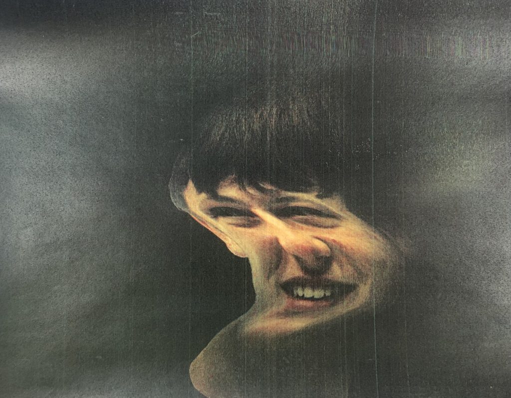
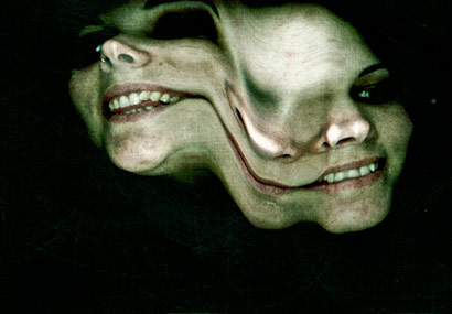
My first thoughts about the overall project are mainly positive as I believe I worked hard to achieve my final grade and am happy with my final images that I produced during this time. During this project I discovered how I am able to make my photography capture a deeper meaning and make it more personal to me. Although, I also found this aspect the most challenging out of the overall project as I found it difficult to focus in on one idea and theme of identity. The most important thing I learned personally is how photography can be used in countless expressive ways to get a certain message across. I think that I got in the way of my progress during the start of the project due to over thinking on how I could approach it. This, I think is one of the obstacles I must overcome to achieve a higher grade, through my research, development and analysis, which should make it easier for me in approaching the task. If I were to approach the problem again, I believe that by researching a wider range of photographers and artist to help me with ideas. In addition, I think I could also manage my time better during the controlled conditions by making a plan of how much time I would spend on each step, allowing me to finish everything and go back over my work and add to it. In the future I also want to be able to make my project even more personal to myself, which I think would improve my work, and spend more time on the photo-shoots allowing for higher quality images.
Category Archives: Task
Filters
Self-Reflection Controlled Conditions
Now that it’s over, what are my first thoughts about this overall project? Are they mostly positive or negative?
Now that its over, my first thoughts are that it went really well, and i was mostly consistent throughout all of my blog posts.
If positive, what comes to mind specifically? Negative?
I think that my final images were really strong, and linked back to the photographer I researched and referenced.
What were some of the most interesting discoveries I made while working on this project?
I discovered that i’m good at explaining the process and showing it in steps. I also found out that there were more steps involved then I intentionally thought, for example the work I did in the style of Evilsabeth Schmitz-Garcia, that involved printing out and taking photos of the scans.
What were the challenges?
Time was a big challenge, as I finished with 4 final images, I felt that the time spent to edit them, and explain them, as well as presenting it, took longer than i thought.
What can I improve?
I could of shown more ways of my exploration of ideas, as it was my weakest point. I did think about by didn’t write much about how, and why I chose to do what I did, which is a big part about the process and presentation, as it leads on to how i edited the final image.
How will I use what I have learned in the future?
I have a better understanding of what I can improve and what I need to go into detail about more. I also feel that my Photoshop skills are more consistent.
Identity and Place – self reflection
- Now that it’s over, what are my first thoughts about this overall project? Are they mostly positive or negative? My initial thoughts after the controlled conditions exam are both positive and negative.
- If positive, what comes to mind specifically? Negative? In terms of positive, I think my written work was good quality as I spent most of my time on those pieces, however I think my actual photographs could have been better.
- What were some of the most interesting discoveries I made while working on this project? I enjoyed learning about Francesca Woodman as she died at the early age of 22 so I think her life story was very interesting.
- What were the challenges? I think the hardest part of the project was capturing the photos themselves, as we had a timed limit and COVID made it difficult to take images of people.
- What is the most important thing I learned personally? I’ve learnt that I need to take my images earlier in case I don’t like the outcome and need to take them again. I also need to plan my final plan for my images in advanced.
- How did I come up with my final best solution? I decided to use Woodman’s simple method of long exposure and black and white for her study and I edited my images inspired by Carolle Benitah on photoshop rather than physically.
- What most got in the way of my progress if anything? COVID got in the way of my progress as the bus times were limited so travel was difficult and there was a lack of people I could take photographs of. Also the time limit made the project difficult.
- What obstacles did I overcome? I managed to finish my project within the 5 hour time limit.
- What did I learn were my greatest strengths? My biggest areas for improvement? I think my strengths are my written work and detailed analysis and my weakness was my photographs and editing.
- What would I do differently if I were to approach the same problem again? I would explore more ideas for my final photographs and prepare more in advanced with taking the photos.
- What could I do differently from a personal standpoint the next time I work? Manage my time better in the 2 weeks leading to the exam and become more motivated to go above my expectations.
- What can I improve? Taking physical photographs and exploring ideas.
- How will I use what I have learned in the future? I will plan my photoshoots in the weeks leading to the exam and practice photoshop techniques.
CC – FINAL OUTCOME IN THE STYLE OF Birthe Piontek
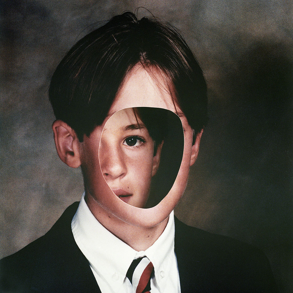
I wanted to create a set of images in the style of Birthe Piontek. This is the image that inspired me.
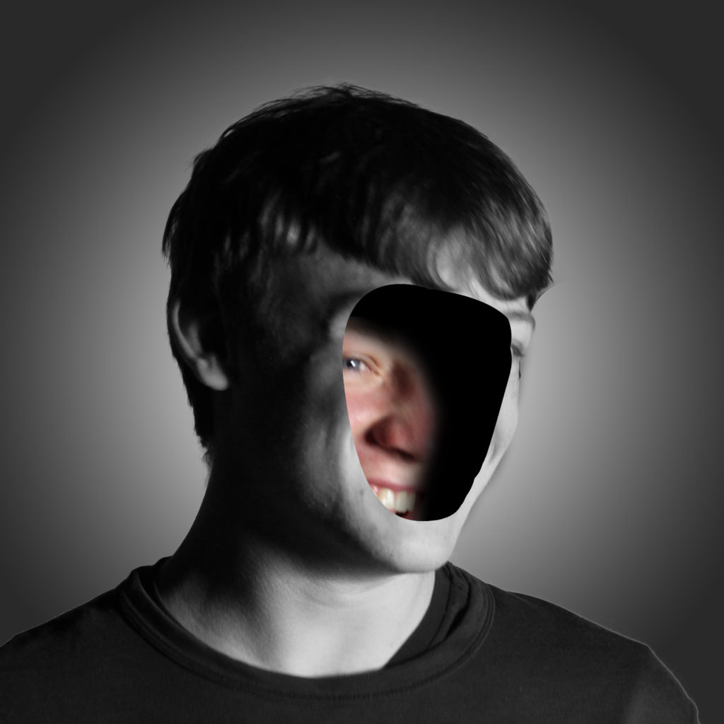
Firstly, I chose 2images to edit. I would edit 1 with no face, and create the hole in the head effect. And 1 of the face inside and 1 outside the head, as I think it relates to hiding your identity and the opposite showing your identity.
I chose these 2 images to edit :
Process of editing the hole in the head.
I started off by removing the background. I used the object selection tool then select and mask option then I refined the edges to make it smooth.
I then put the background in, which was a normal cloudy day. The problem was that the subject was a different colour to the background and it didn’t match. I used the curves adjustment and used the dark colour picker to select the darkest colour in the background then put that on the darkest colour on the subject. I did this for the mid-tones and highlights. This made it so both the subject and background matched. I added gaussian blur to the background.
I used the pen tool to create a smooth mask of the face then I deleted the selection, which made the hole in the face effect.
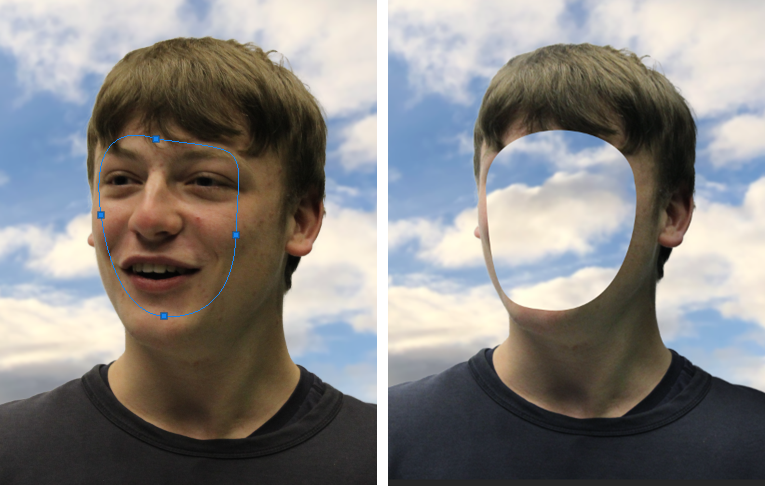
It didn’t look normal, so I used the pen tool again to create an edge, I changed the colour to a skin tone so it looked normal. Although the whole of the image was 3D except from the hole in the face.
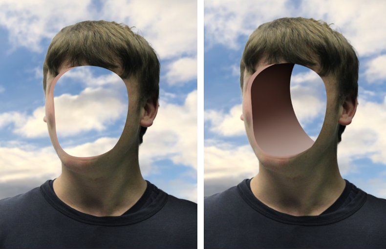
I used the pen tool to create the second layer which signified a 3D aspect. I added a shadow by creating a clipping mask, then using a black brush tool with 0% hardness. To contrast the shadow I added highlights by using a white brush tool with 0% hardness, after I added a soft light blend option, which made it more smooth.
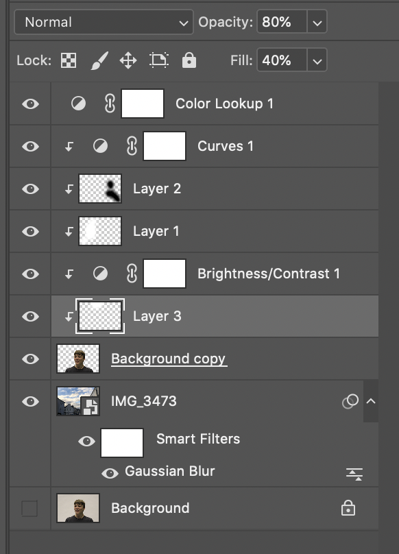
These were all the layers with adjustments, so you can see the structure.
Final Image – 1
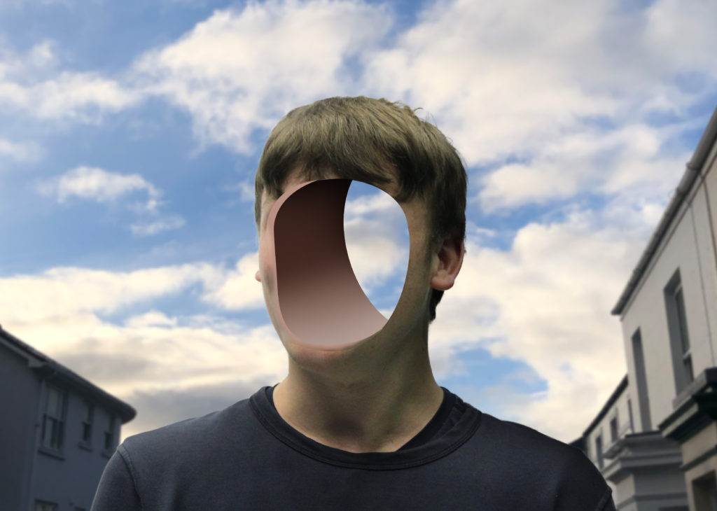
Reviewing my image, I really like how it turned out, as it is similar to Birthe Piontek’s image where he removed the face and you can see behind it. The background is clean and fits well.
I feel that the gaussian blur in the background makes you focus on the subject more.
I also like how you can clearly see through the background through the hole.
Critique
I don’t really like how the inside of the hole is fake, maybe I could of taken a sample of the skin off the face and textured the inside to make it realistic.

Birthe Piontek’s Image 
My Image
Process of editing face inside the head/off the head.
Firstly, I used the pen tool to create a clean mask selection of the face.
For the face inside I had to make sure that the mask wasn’t touching the edge. For the face outside the head I had to make sure that it was over the edge, to get all the side of the face. I moved the face outside the head to create the effect that it was coming off.
Next I used a black brush tool to create shadows and to blend the face into the shadows, which create a nice blend.
I used a black and white adjustment layer and put it on everything except of the mask of the face, because I think it gave a unique touch.
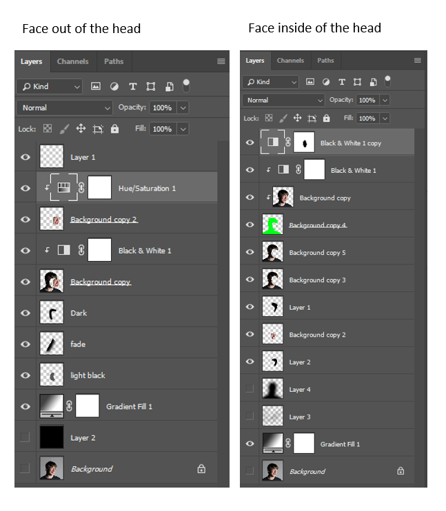
Final Images – 2
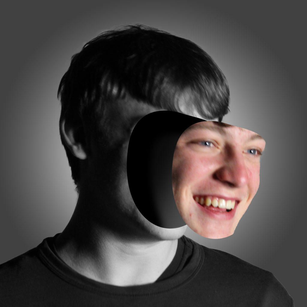
Evaluation
I like how this image turned out, as it unique and in the style of Birthe Piontek. I feel like the black and white filter works well, as the saying “showing your true colours” I think that it represents it as the face is the only coloured part in this image.
I think this image shows someone that is confident, and someone that “puts their face out there.”
Final Image – 3
Evaluation
I think this images composition, is better. Not only is it in the same style as Birthe Piontek, but I think it shows someone that is more shy, therefore hiding their identity. It shows that as the face is hiding behind in the head.
Critique
I think the original mask of the face could be smoother as there is some ridges in the image, such as the pointy chin in the image where the face is coming off.
Also if the photo was a bit more clear, and facing towards the camera, it would be easier to mask out, instead its at an awkward angle, therefore harder to accurately mask a selection of the face.
Birthe Piontek’s Image 
My Image 
My Image
You can see how similar they are side by side.
Identity and Place – Final Images and Evaluation
Carolle Benitah Inspired Photoshoot


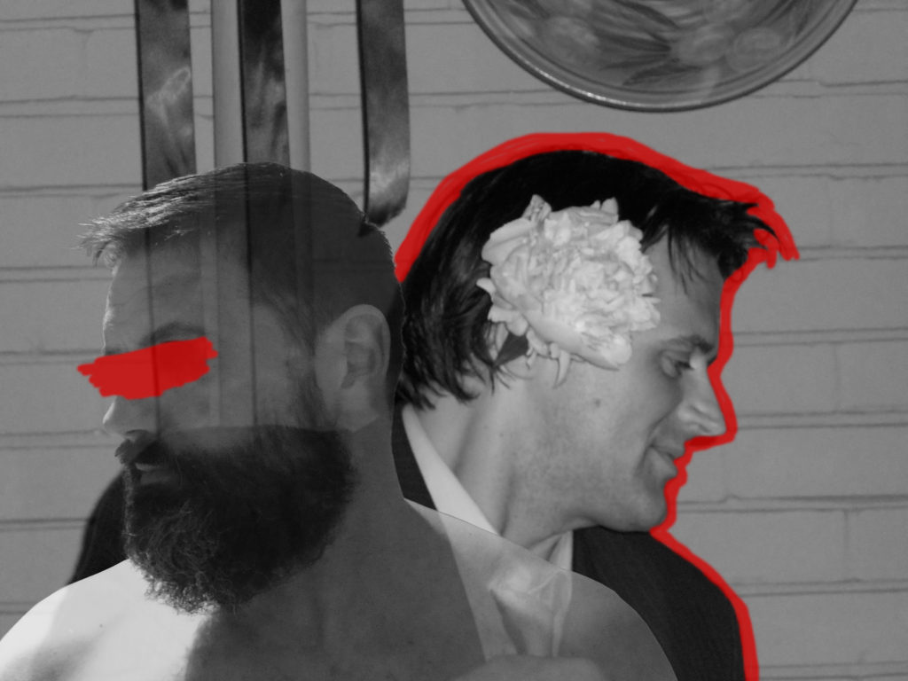
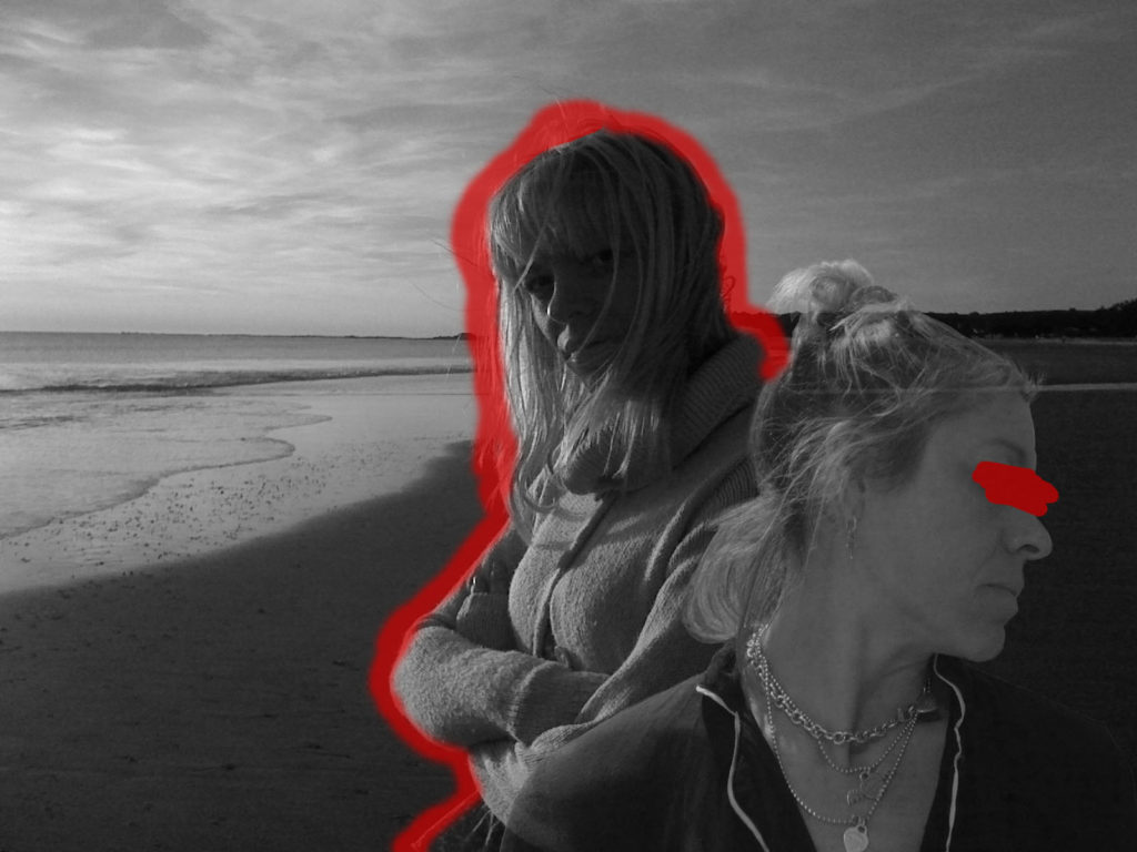
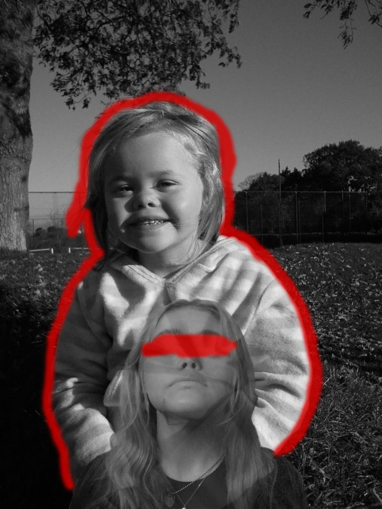
I believe my attempt at recreating Carolle Benitah’s work with the theme of identity and place was successful as you can see clear similarities between my work and the work of Benitah, and I think I executed my ideas clearly by using inspiration of Carolle Benitah but adding my own ideas and methods to the images. I decided to colour over the eyes in each image as Benitah, herself often does this and I believe it adds a sense of curiosity and mystery as to how the individual has changed throughout their past purely through their appearance, and removing the eyes removes the emotion from the face, which allows the viewer to focus on the blank expression and the change in appearance, rather than emotion or personality.
In terms of identity and place, I think my images represent this theme well as it displays the past of both my relatives and myself, and how this formed my identity. I decided to also show the past versions of my parents as they also helped to form my identity, and it also shows how their own identity has changed from their past.
Francesca Woodman Inspired Photoshoot

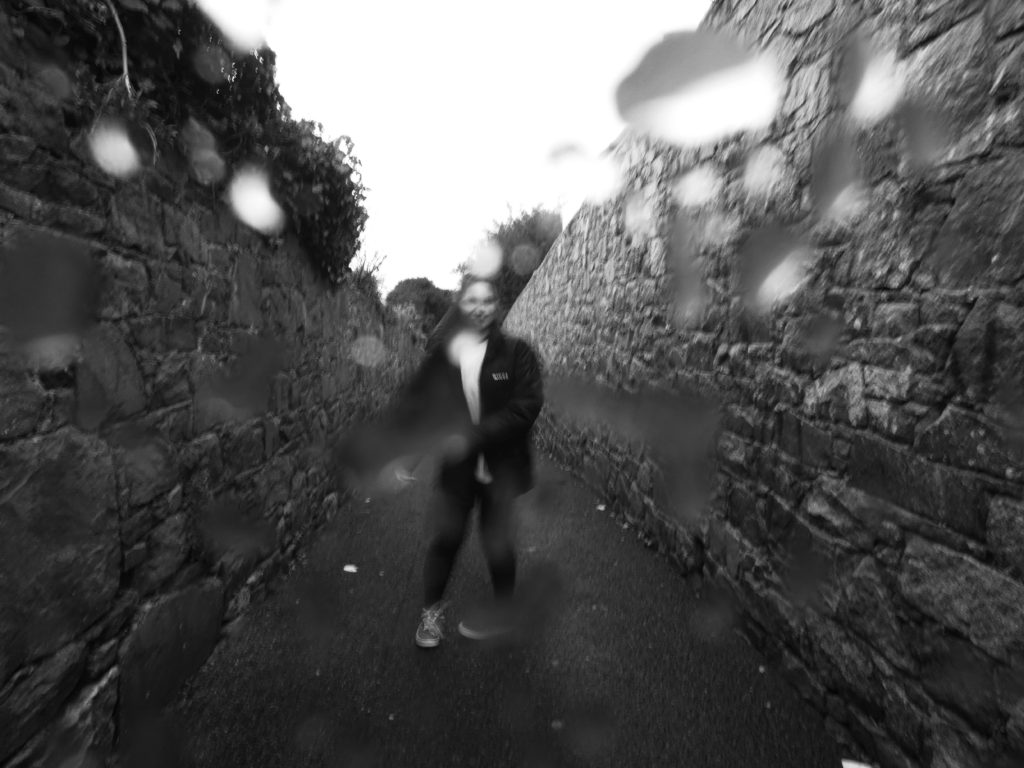
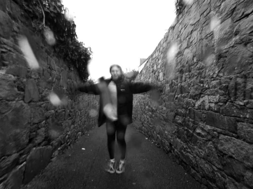
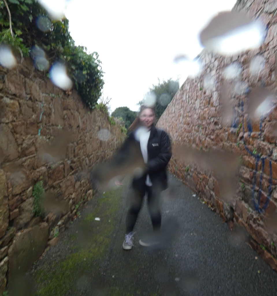
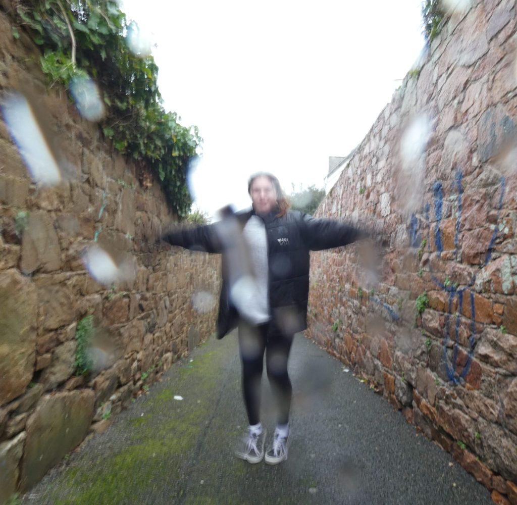
I decided to study Francesca Woodman’s work for this project as she focuses on the struggle of mental illness and especially depression. Myself and my family, as well as millions of others, have struggled with their mental health in different periods of time which is why I believe it is an important part of a person’s identity, as it can affect both physical and emotional aspects of someone’s identity. I decided to use Woodman’s common method of long exposure, I feel like this represents mental illness in the sense that it produces a ghost-like movement and some may say living with a mental illness is almost like a ghost living in the present world, as they can feel excluded and lonely.
I think my attempt at recreating Francesca Woodman’s work was successful as similarities can be identified, the main similarity being the use of long exposure to give the photographs an uneasy atmosphere. I also used Woodman’s theme of the monochromatic filters for the same reason.
There is also visual differences between my work and the work of Francesca Woodman, such as the natural lighting used by Woodman is slightly softer and not as bright. Her photos also contain a lot of empty space, whereas the only empty space in my images is in the sky.
If I was to re-shoot these images I would have done them in an empty building with natural, soft lighting in order to achieve the same sort of shadows that Woodman’s images display. I also believe the use of the negative space would have added to the ominous aesthetic of the images, so I would change my location in order to shoot these images again.
Identity and Place – Francesca Woodman comparison to my work
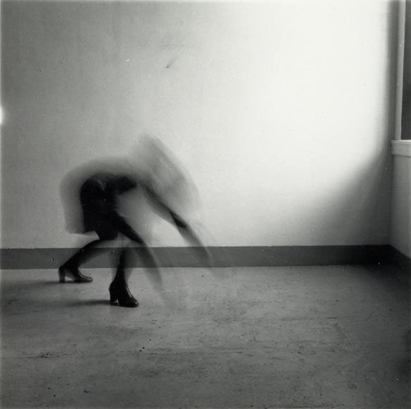

I believe my work is similar to the work of Francesca Woodman but they also have their differences. They are similar in the sense that they both use the method of long exposure to capture the movement of the model in the photo in an almost ghost-like way. They both also have a monochromatic theme, which adds to the ominous atmosphere, as well as the dark coloured clothing which features in my work and the work of woodman.
However, they are different in the sense that the natural lighting used by woodman is slightly softer than the one in my photo. The setting of Francesca Woodman’s photograph is also filled with empty, negative space whereas my image contains a lot of filled, positive space. The overall composition of Woodman’s images are a lot more simple than my own, as she takes her photographs in an empty room which I did not have access to within the time limit of the project.
Identity and Place – Carolle Benitah comparison to my work


My recreation of Carolle Benitah’s work has both similarities and differences to Benitah’s images, for example they are similar in the sense that the images are brought to life with thin lines of colour, which juxtaposes against the monochrome background. I chose to add colour through the paintbrush tool on photoshop, whereas Benitah uses the traditional method of embroidery.
I used old family photos in my final photographs, which Benitah also uses in her work. I chose to combine my own photography into my work so I took simple portrait headshots of my mum, dad, and myself.
The main difference between my work and the work of Carolle Benitah is that I digitally edited my photographs, and Benitah edits her images physically.
If I was to do this project again I would have attempted Benitah’s method of embroidery to add colour to my photographs, as I feel like digitally editing colour onto the images removes a sense of rawness from the images, and I think the contrast in textures and patterns would have created more interest to the viewer.
Identity and Place – Carolle Benitah photoshop development
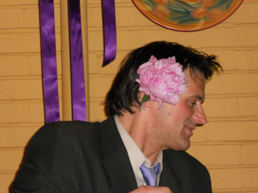

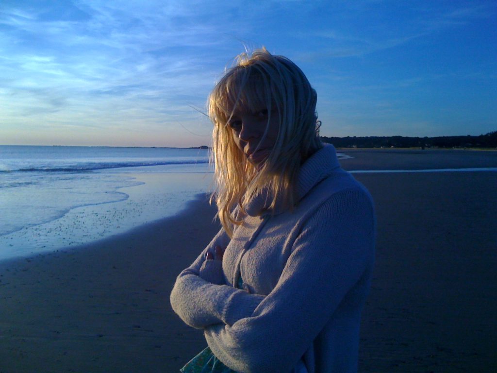
How I developed my photos
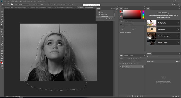
First, I cut out my face from a recent portrait of myself using the polygon lasso tool in order to remove the background.
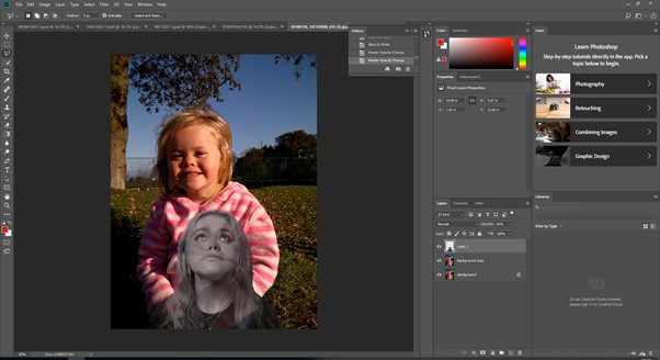
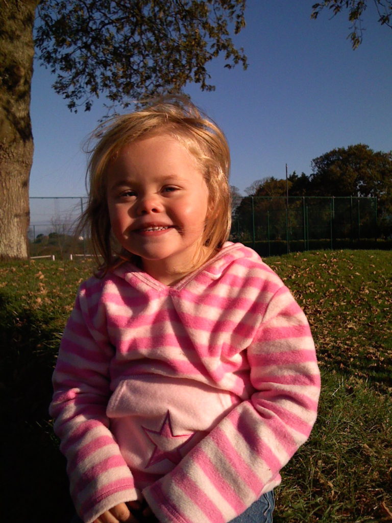
I then copied and pasted this onto an old, childhood photograph of myself and lowered the opacity of my newer cut-out.
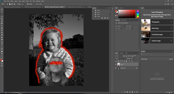
Finally, I turned both photos into black and white and added colour around and on the images, similar to the work of Carolle Benitah.
Identity and Place – Francesca Woodman Photoshop development
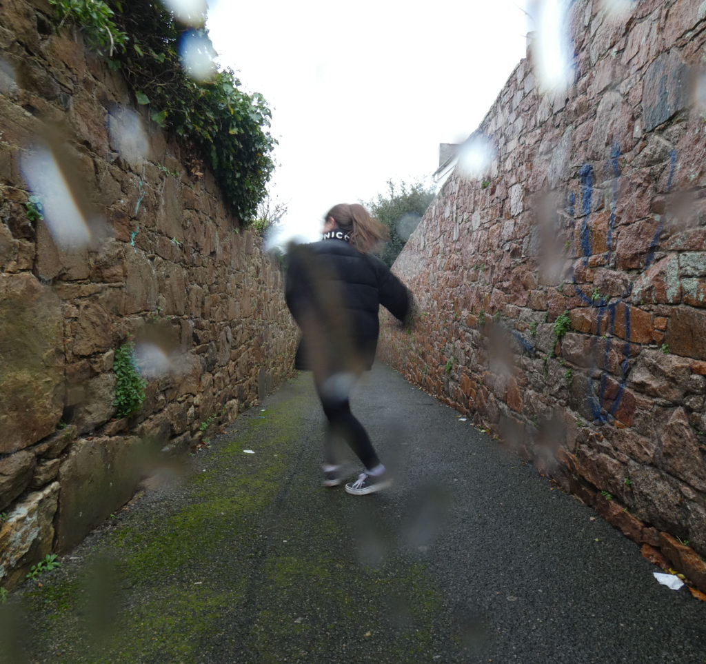


How I developed my photos
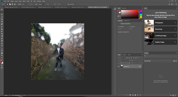
First, I cropped my chosen image in order to focus on the focal point and to make the image more central and even.
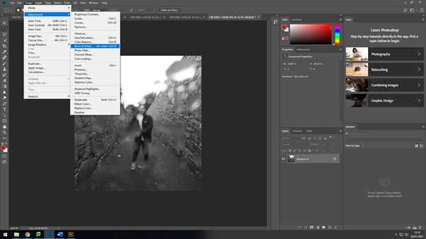
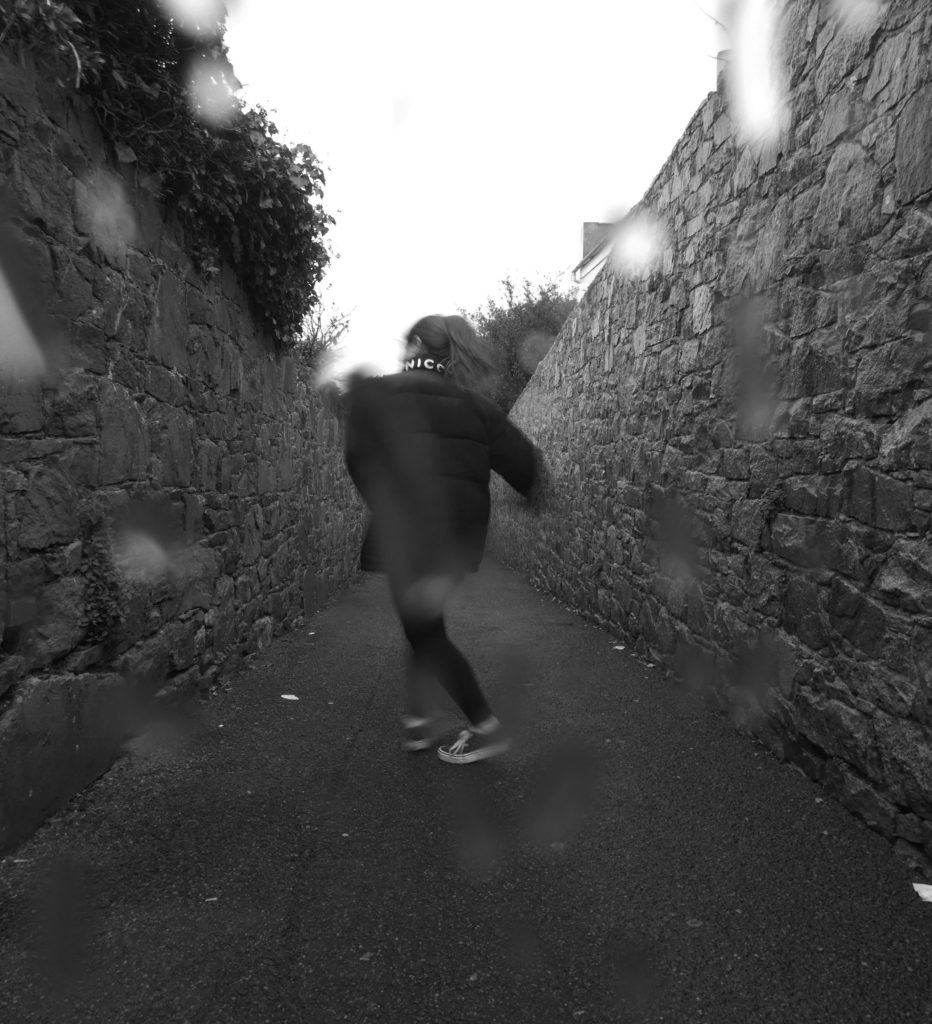
I then changed the colour of the image to black and white as Woodman’s work is mostly in black and white. This adds the eerie aesthetic of Woodman’s style of photography.
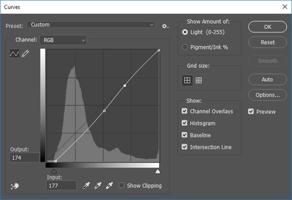
Lastly, I edited the curves adjustments to achieve the sombre darkness contrasting with the lighter areas.
CC – Final Outcome In The Style Of Evilsabeth Schmitz-Garcia
Firstly, I started out to create an image in the style of Evilsabeth Schmitz-Garcia.
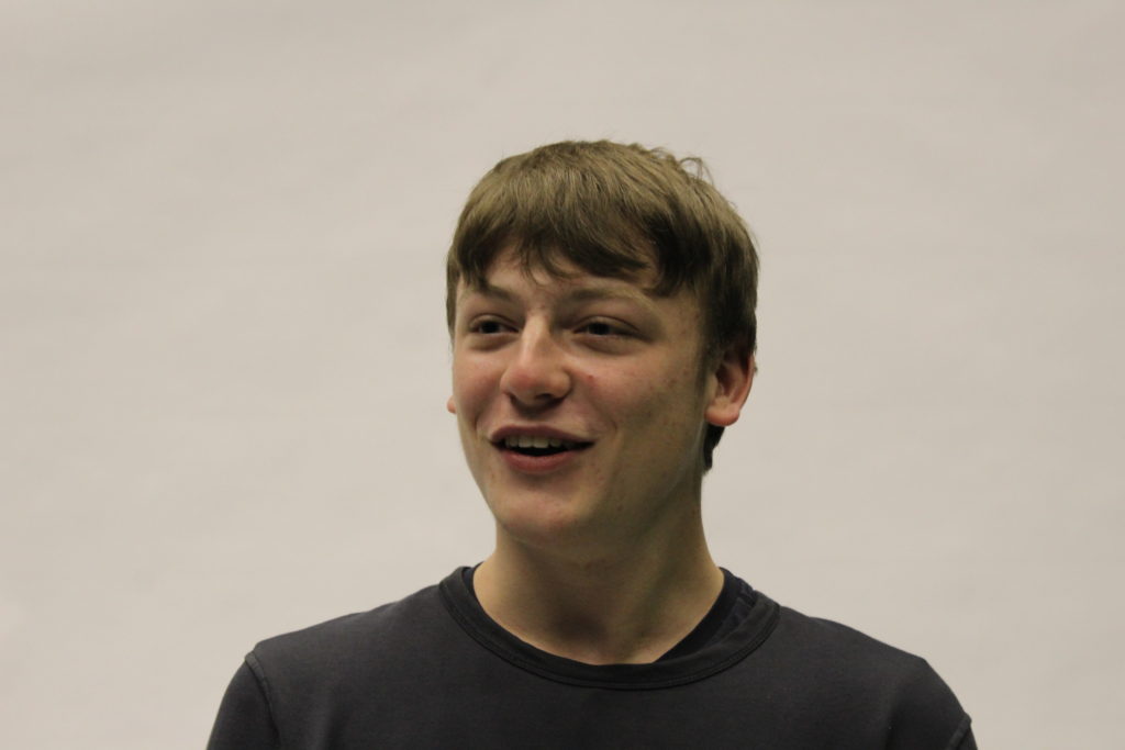
I would use the photographs from Photo Shoot 1. These were the photos that I took that were simplistic, and had a variety of facial expressions. This was because that was one of the key aspects of Evilsabeth Schmitz-Garcia’s work, other than the warped and manipulated effect.
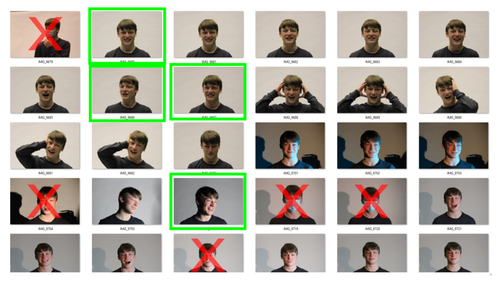
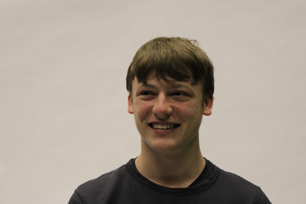
Overall, I chose the photo where the subject was smiling as most of Evilsabeth Schmitz-Garcia’s work has their mouth open or semi-open, as the manipulation effect works better.
This is the photo I chose to edit :
Process
In Photoshop I would need to :
– Edit the background black (as all of Evilsabeth Schmitz-Garcia’s photos have a dark background)
– Add some green/yellow particles into the background (In Evilsabeth Schmitz-Garcia’s photos there is always some colouration in the background)
– Add grain/noise (to get the scan effect)
– Experiment with overlays, such as the hands I took in Photo Shoot 3.
After Photoshop I would print out the image and place it on the scanner. Whilst it is scanning i would move the printed photo along, this is how the manipulation effect occurs.
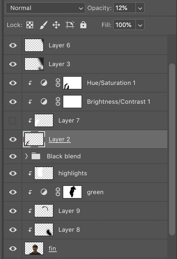
These are all the layers in Photoshop.
Firstly, I selected the object with the quick selection tool, then clicked the select and mask option. This would remove the white background so I could replace it with a black background.
To clean up the edges, I used the refine edge brush in the select and mask screen. This blurs the edges so any white space; cause by the lights, in the hair would get removed. This gave the cut out a clean look. After I outputted it onto a new layer then renamed it “fin”.
I created a black background layer under the “fin” layer, this made the edges of the face stand out too much and created a sharp line, which I didn’t want. To fix this I created a Clipping Mask then used the brush tool (black) with a hardness of 0% and smoothing of 0%. This made it so the brush wasn’t harsh and gave it a “gradient” effect, so it faded into the background.
On the left side of his face I added some “highlights” using the brush tool (white) at 0% hardness, I used a clipping mask then used the brush to create the shine effect, where the light was coming from. I had to turn down the opacity to 65%, otherwise the white was too overpowering.
I added a green tint to a part of the face, the layer named “green”. I used an adjustment layer then changed the hue to green. This made the whole face green, so I used the eraser tool with a hardness of 0% to remove the green from 70% of the face.
To add the background colours I used the brush tool with 0% hardness, the colours I used were green and yellow. I added motion blur to the colours, so they weren’t just block of colour in the background. I also turned down the opacity so the colours weren’t as bright to match the tones Evilsabeth Schmitz-Garcia used.
I experimented by adding a hand into the photo. I started by removing the background with quick selection and select and mask, which is the same process as the face cut-out. First of all, it seemed out of place as it was really bright, so I added an adjustment layer for brightness and contrast, which I turned down the brightness and turned up the contrast. After I turned down the opacity to make it so that was almost hidden, therefore not contrasting the main focus point.
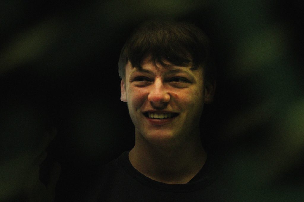
I printed the image, although it was a bit dark so the increased the brightness and reprinted it.
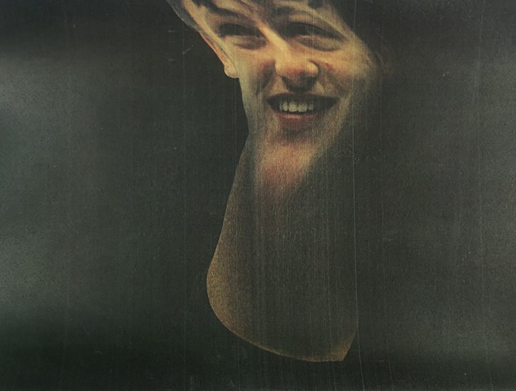
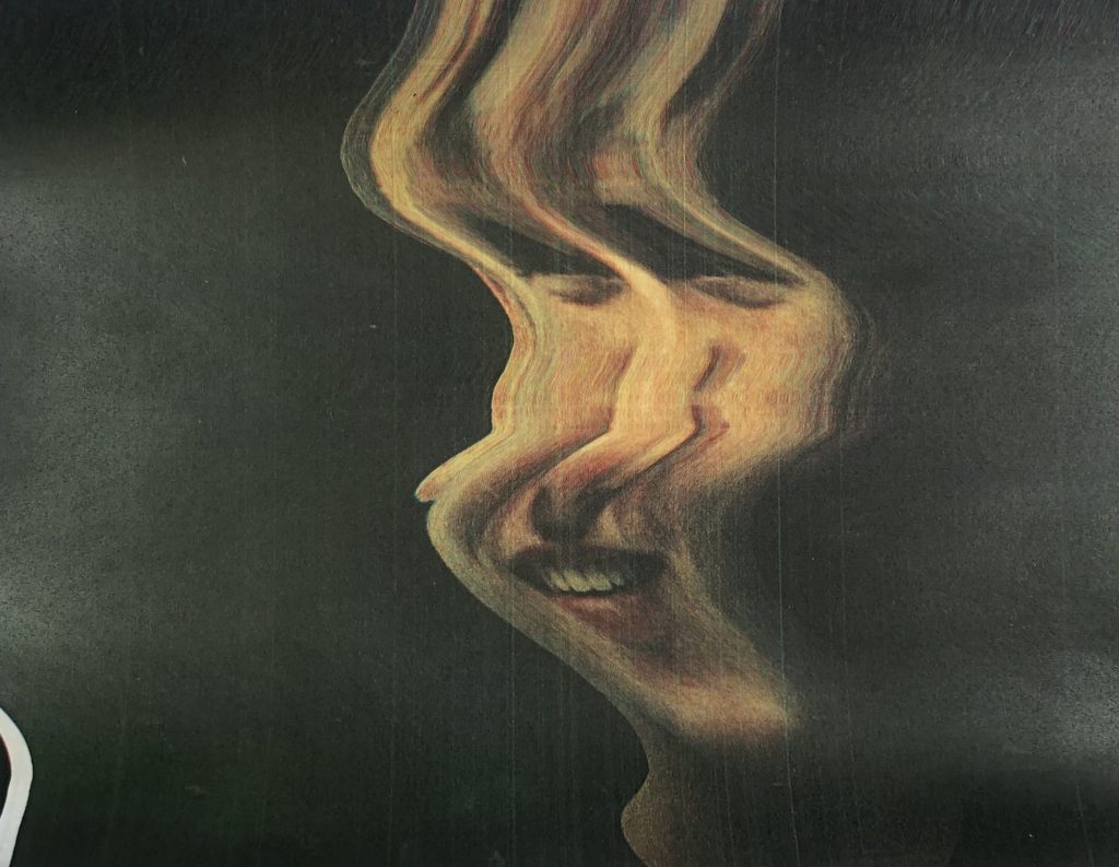
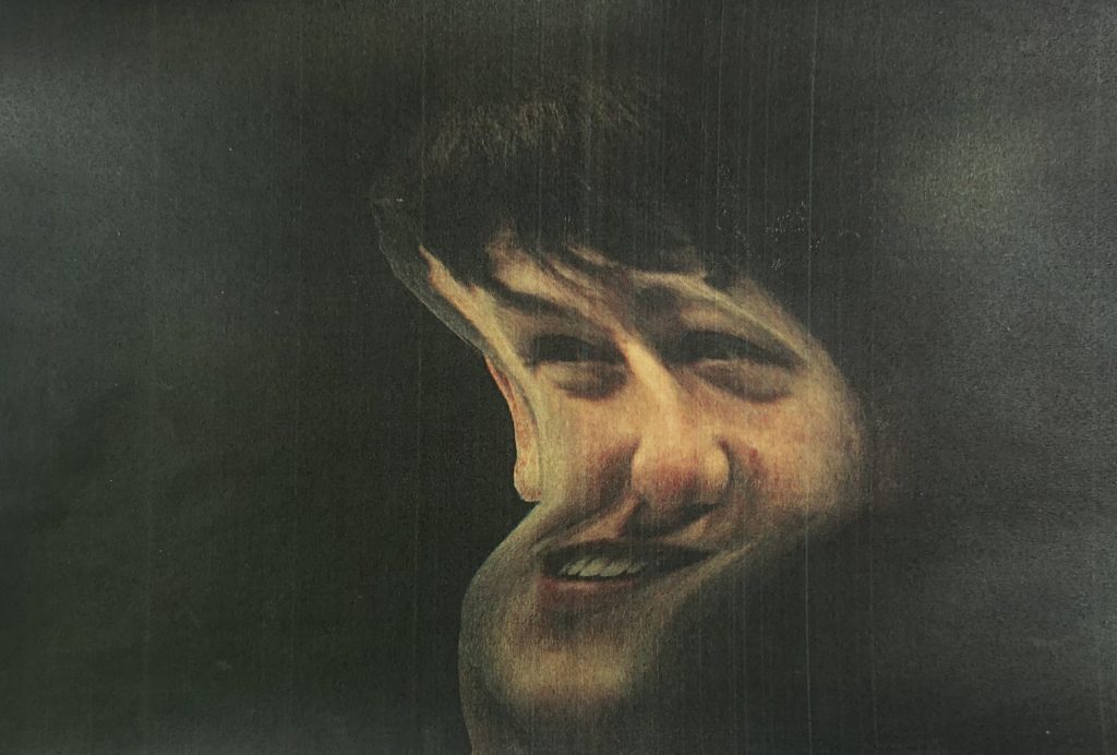
After, I placed the image on the scanner. As it started to scan I moved the image to manipulate the outcome. I did this about 20 times. I photographed the best 4 so I can take them into photoshop, and refine them. these were the 4 scanner outcomes:
I took these 4 images into Photoshop. Firstly I, found my base layer, which was the one in the top row far left in the selection above.
Then, I removed the background of the tall image with the eraser, then added it on top of the base layer. I used the eraser tool with a hardness of 0% to create a gentle gradient into the base layer.
Next, I only masked out the lips from the tall face, and made duplicate copies of it. I used the warp tool to change the aspect ratio of it to match the image so it would look like it is being stretched and pulled between the faces. After, I added motion blur to smoothen it out.
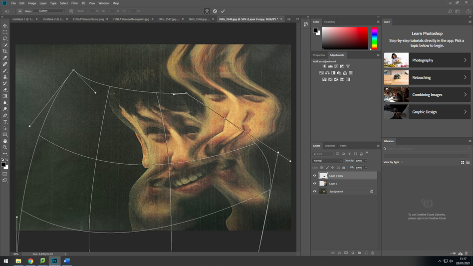
After it all matched, I added another face as Evilsabeth Schmitz-Garcia normally uses 3 faces. I removed the background then uses the eraser tool again to fade it into the base layer (middle face).
After, I masked out the right eye from the new face then used the warp tool the connect it to the middle faces eye. I would need to use the eraser tool to get rid of the sharp edges.#
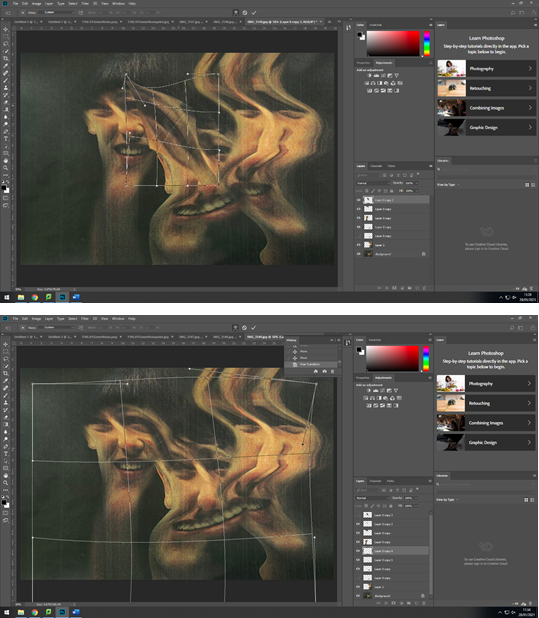
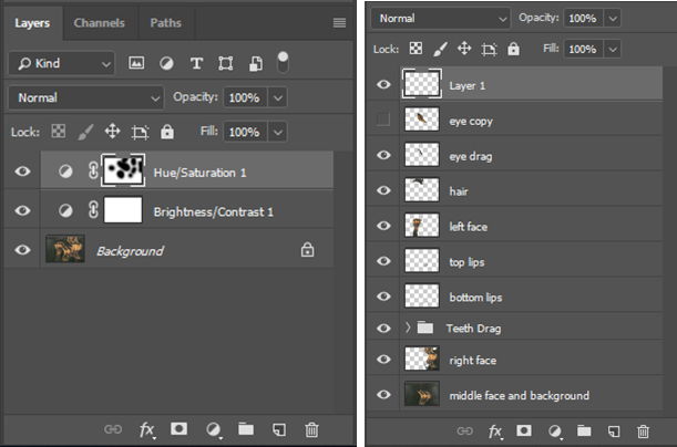
Once I had finished the composition of the image, I renamed all of the layers, then fattened the image. I added adjustment layers to make it more in the style of Evilsabeth Schmitz-Garcia.
I used a hue/saturation where I added the green effect that Schmitz-Garcia uses in here final images.
The brightness/contrast adjustment is a normal adjustment where I brightened the images and made the blacks more dark.
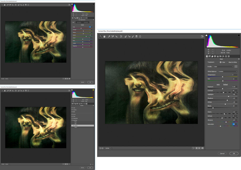
Finally I added a camera-RAW filter to touch up the final image. I started off by changing the tint, highlights, shadows, blacks, and the white. (right image).
Secondly, I changed the individual colours, but mostly the greens, yellows, and oranges. The greens I increased the most as it was one of the more distinguishable colours. The yellows and oranges I also increased to counter the green. As it was too strong in some areas.
After, I realised that the background was too shiny as I took the images of the paper with a camera. So, I decided to go over the background with the black brush tool and made opacity 75%. It fixed the problem and removed the lighter areas.
That is how I edited my image in the style of Evilsabeth Schmitz-Garcia.
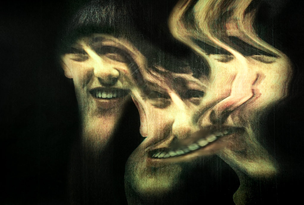
Final Image
Evaluation
Reviewing my image, I like how it turned out, and I feel that there is a strong connection between my image and Evilsabeth Schmitz-Garcia’s image.
The main reason she displayed her images in her style was to capture people with multiple personality disorder. I feel that the manipulation in my image shows that perfectly as there is no sharp interrupting lines between images, instead it looks like it is all one image.
The colours mostly match. I feel that the camera raw filter really helped me achieve this look.
The scanner produced lines on the my images similar to Evilsabeth Schmitz-Garcia image. This is because I actually used a scanner and was a good idea even though it was risky, and I didn’t think it would work.
This is my image side by side with Evilsabeth Schmitz-Garcia’s image that I based mine off, and inspired me.
As you can see they are fairly equal. Overall i think it turned out well.
Critique
Looking back it all went smoothly, except from when I went to print it and it turned out really dark. This is an easy fix, I could of printed it on higher quality paper or better printer. I fixed it by making the image really bright before printing, so when it printed it would be how it was on the screen.
Also if the printer saved a digital copy of the scan I wouldn’t need to take photos of the manipulated results, therefore getting a clearer version. Although, it did add more texture to the image, so it turned out better.
Originally, I was going the use the liquify filter in Photoshop to create the result. In the end I didn’t use it at all. Instead, I used the photocopier, which was a good idea.


