Category Archives: Task

Filters

Author:
Category:

CMK ROMANTICISM & RURAL LANDSCAPE PHOTOGRAPHY

Introduction to Landscape Photography – 2 week project

Go to

M:\Departments\Photography\Students\Planners Y12 JAC\Unit 3 Sept-Dec Landscapes

for resource pack

We will be looking at Romanticism as a starting point and if you click here you will have a better understanding of some of the roots of landscape in contemporary photography….

The focus of your study and research this week is natural landscapes and the notion of ROMANTICISM in Landscape  Art and then later, Photography.
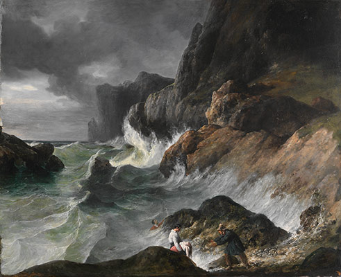
Working Title/Artist: Stormy Coast Scene after a Shipwreck
Department: European Paintings
Working Date: (1830)


RESEARCH

The Age of The Enlightenment (1700-1800ish)

VS

The Age of Romanticism (1800-1900ish)

“Writers and artists rejected rationalism for the same reason that rationalism was rejected by the movement as a whole- it was in rejection of Enlightenment, which had sucked emotion from writing, politics, art, etc. Writers and artists in the Romantic period favored depicting emotions such as trepidation, horror, and wild untamed nature.”

“The ideals of these two intellectual movements were very different from one another. The Enlightenment thinkers believed very strongly in rationality and science. … By contrast, the Romantics rejected the whole idea of reason and science. They felt that a scientific worldview was cold and sterile.”
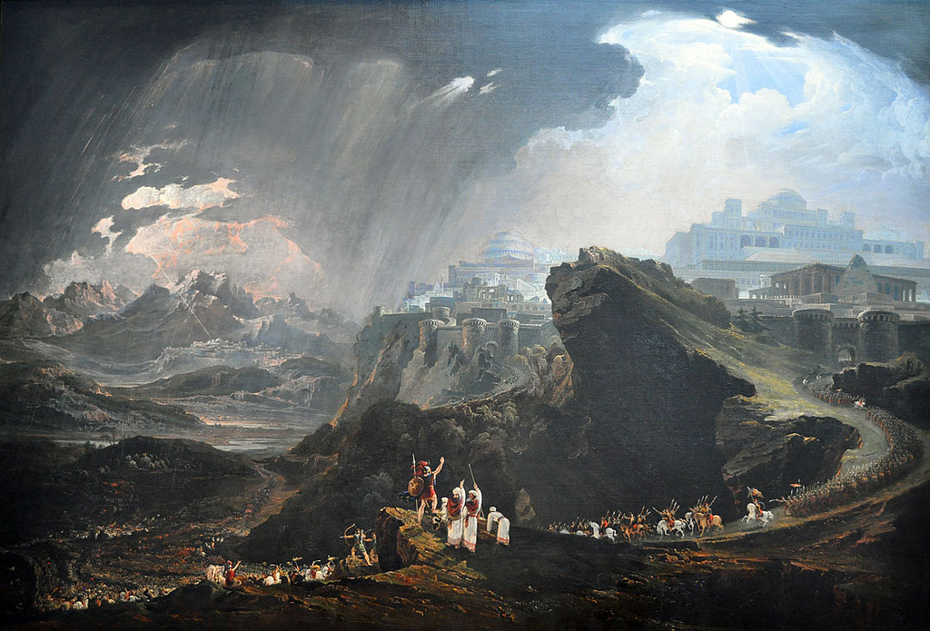
JMW Turner- Hannibal Crossing The Alps 1835

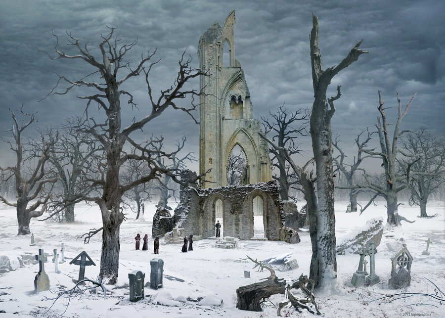
Caspar David Friedrich 1832 Germany

PAINTING VS PHOTOGRAPHY

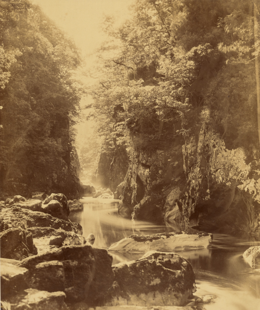
Roger Fenton inspired by nature and romanticism revisited a spot in Wales where previously Samuel Palmer had been inspired by the natural beauty of this river valley.
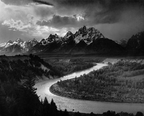
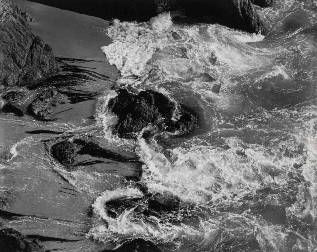
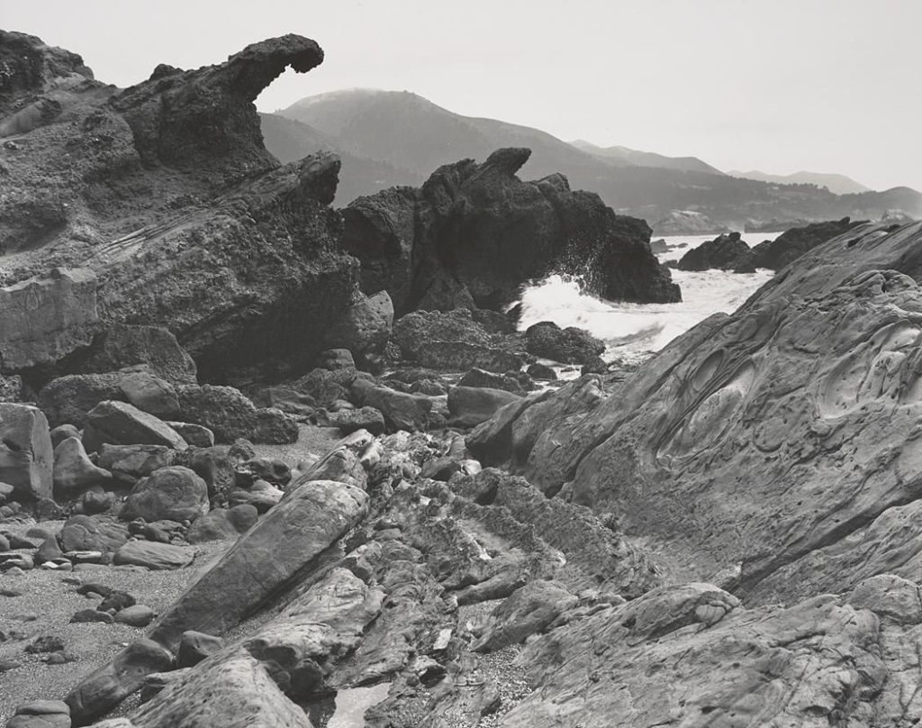
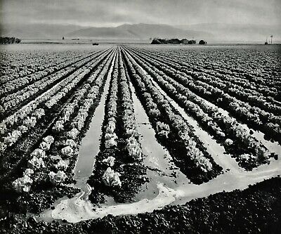
Ansel Adams 1942 USA

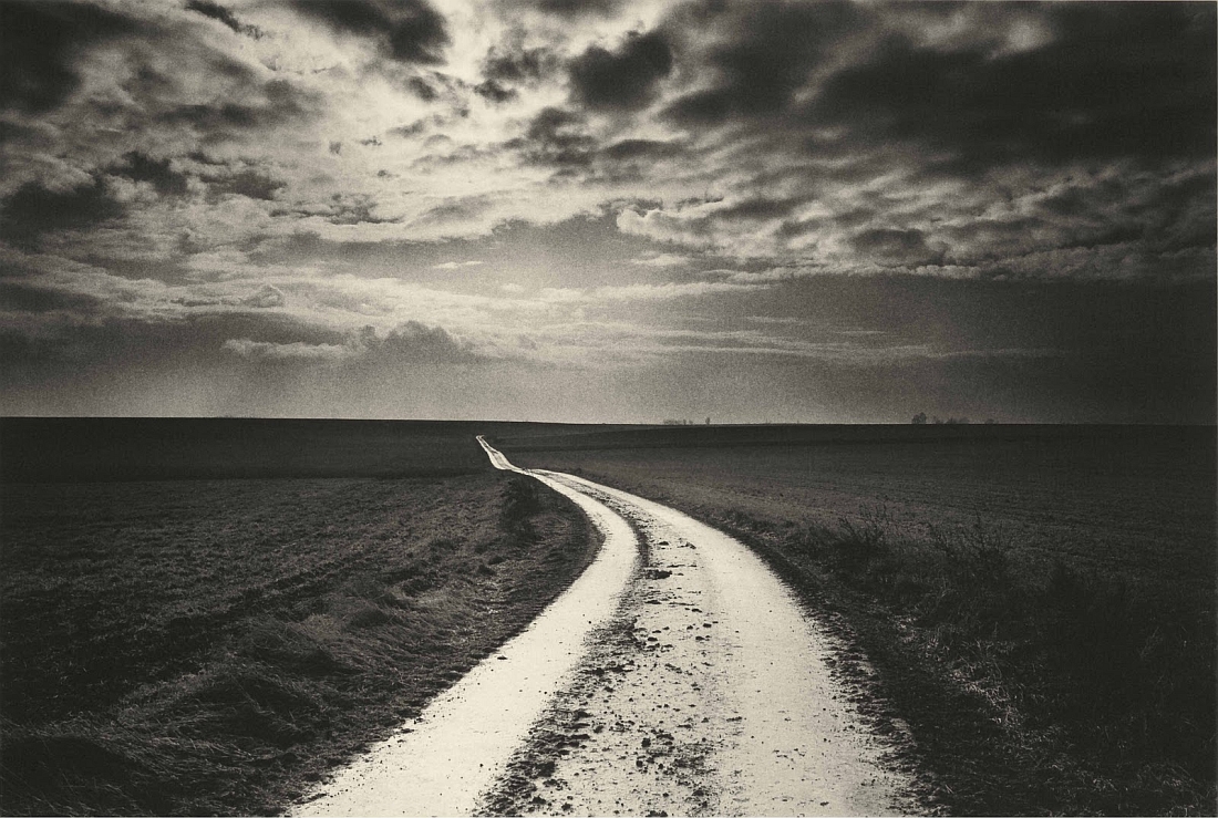
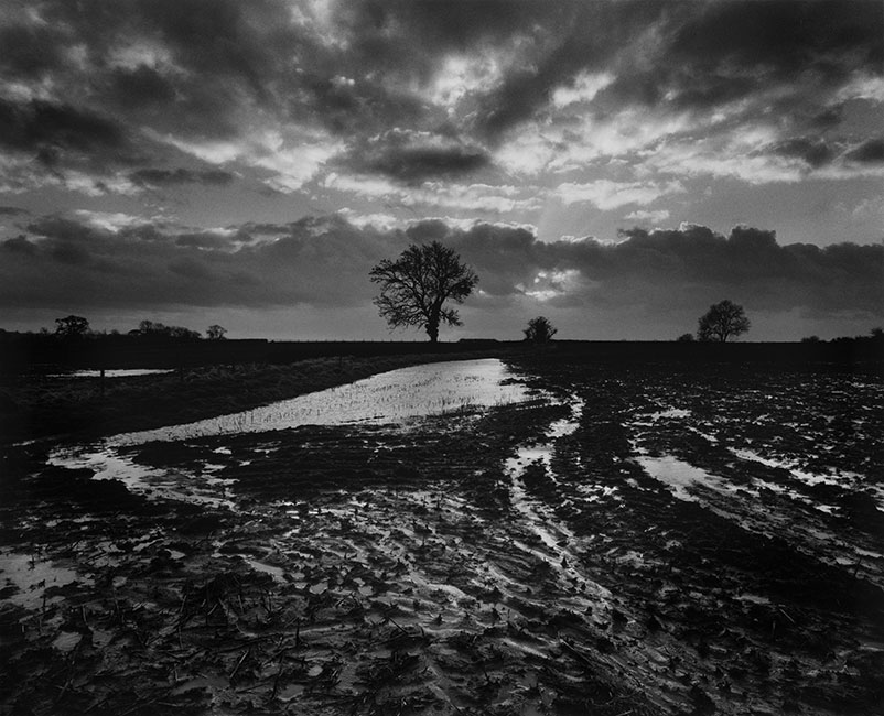
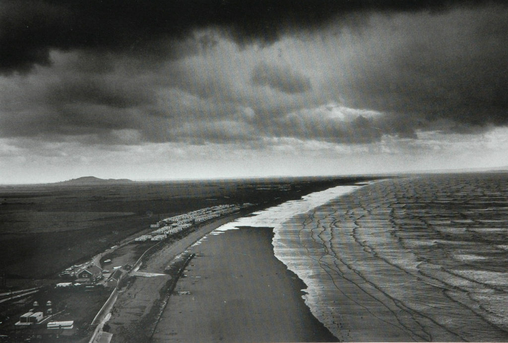
Don McCullin 2000 UK

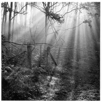
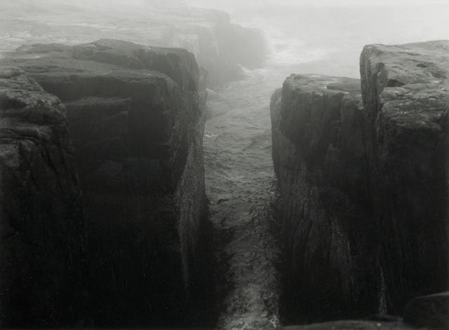
Fay Godwin 1985 UK

ANSEL ADAMS: Photography With Intention

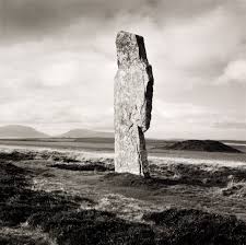
LANDSCAPE PHOTOGRAPHERS

Joan Fontcuberta

Richard Misrach

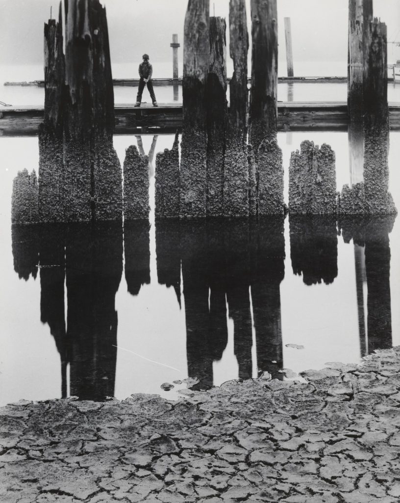
Wynn Bullock

Luigi Ghirri

Fay Godwin

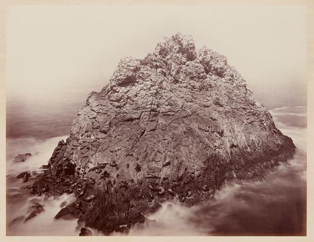
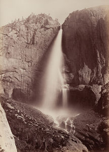
Carelton E. Watkins

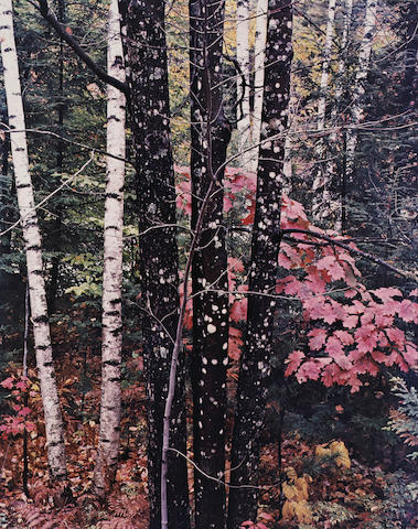
Eliot Porter

Edward Weston

Minor White

Don McCullin

Ansel Adams

BLOGS

  1. An introduction to rural landscape photography, including a definition and mood-board of influential images
  2. Create an in-depth case study that analyses and interprets the work of a key landscape photographer…EG: Ansel Adams or Edward Weston or Fay Godwin or Don McCullin (or similar)

3. Create a blog post that defines and explains what Romanticism is in Landscape Photography…include examples and make reference to Romanticism in other art-forms eg painting

4. Create a mind-map / mood-board of potential locations around Jersey that you could record and create romanticized landscape photographs of….look for extremes (either calm or wild, derelict, desolate, abandoned or stormy, battered and at the mercy of nature)

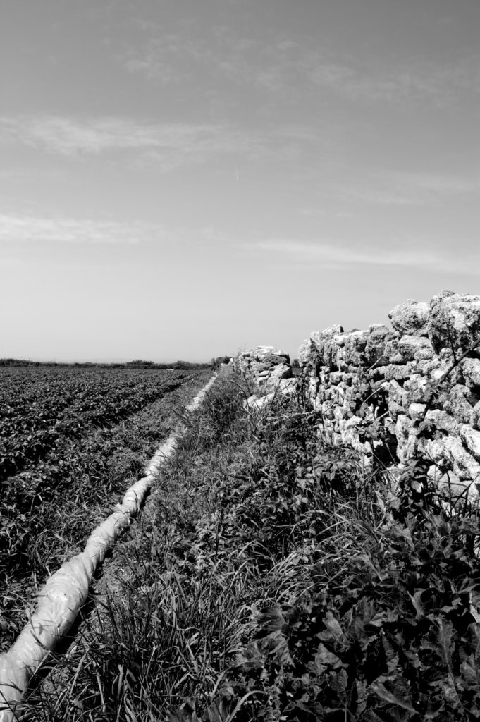
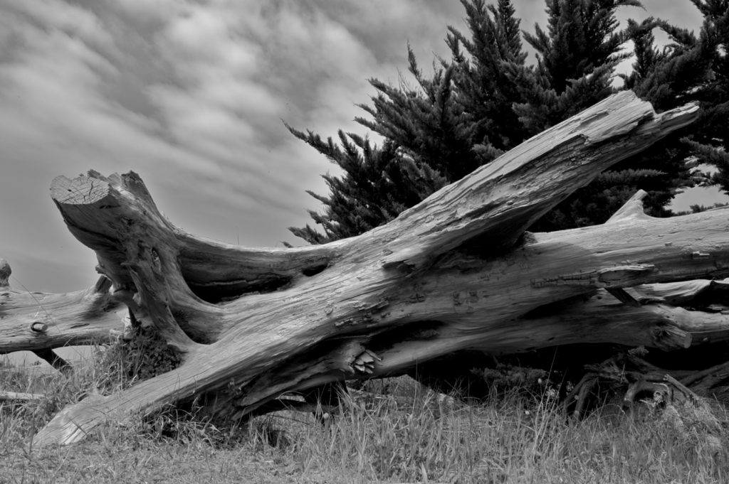
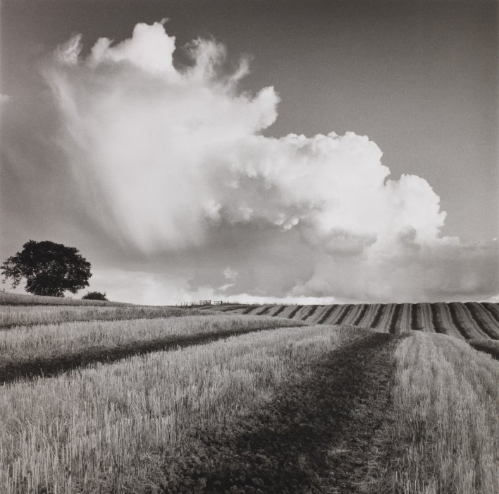
AIM to photograph the coastline, the sea, the fields, the valleys, the woods, the sand dunes etc.
USE the wild and dynamic weather and elements to help create a sense of atmosphere, and evoke an emotional response within your photo assignment.
PHOTOGRAPH before dark, at sunset or during sunrise…and include rain, fog, mist, ice, wind etc in your work.
LOOK for LEADING LINES such as pathways, roads etc to help dissect your images and provide a sense of journey / discovery to them.

5. Take 150-200 photos of romanticised landscapes. Show evidence of using exposure bracketing technique. Add your edited selective contact sheets / select your best 3-5 images / include edits and screen shots to show process.

6. Produce comparative analysis between one of your images and a landscape photographer – discuss similarities and differences.

REMEMBER you MUST use TECHNICAL / VISUAL / CONTEXTUAL / CONCEPTUAL to analyse effectively.

Ensure that you include the following key terms in your blog posts…

  • Composition (rule of thirds, balance, symmetry)
  • Perspective (linear and atmospheric, vanishing points)
  • Depth (refer to aperture settings and focus points, foreground, mid-ground and back-ground)
  • Scale (refer to proportion, but also detail influenced by medium / large format cameras)
  • Light ( intensity, temperature, direction)
  • Colour (colour harmonies / warm / cold colours and their effects)
  • Shadow (strength, lack of…)
  • Texture and surface quality
  • Tonal values ( contrast created by highlights, low-lights and mid-tones)
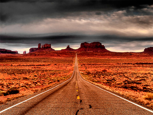
This image has an empty alt attribute; its file name is landscape-photography_using-lines-effectively-while-shooting-landscapes.jpg
Leading Lines
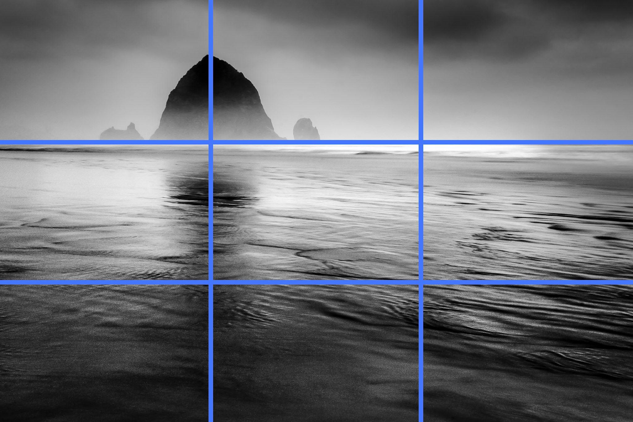
Image result for rule of thirds landscape photography
Composition : The Rule of Thirds Grid
Image result for fibonacci sequence landscape photography
Composition : Fibonacci Curve / Golden ratio
https://petapixel.com/2016/09/14/20-composition-techniques-will-improve-photos/

EXPOSURE BRACKETING

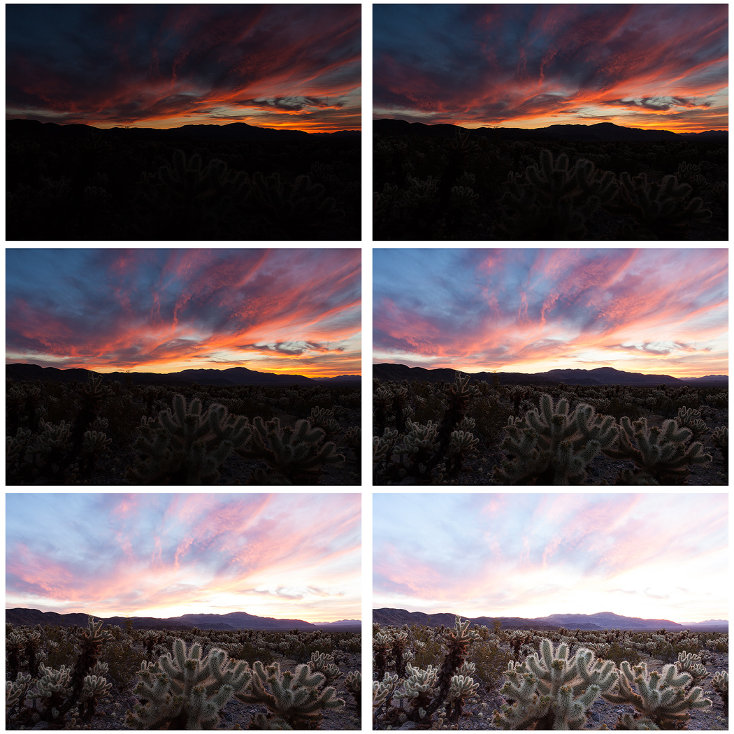
Exposure bracketing means that you take two more pictures: one slightly under-exposed (usually by dialing in a negative exposure compensation, say -1/3EV), and the second one slightly over-exposed (usually by dialing in a positive exposure compensation, say +1/3EV), again according to your camera’s light meter.

TASK : try a few variation of exposure bracketing to create the exposures that you want…you may already have pre-sets on your phone or camera to help you do this, but experimenting manually will help your understanding!

Exposure Bracketing

Many digital cameras include an Auto Exposure Bracketing (AEB) option. When AEB is selected, the camera automatically takes three or more shots, each at a different exposure. Auto Exposure Bracketing is very useful for capturing high contrast scenes for HDR like this…

…by taking the same photograph with a range of different exposure settings
bracketed-exposures

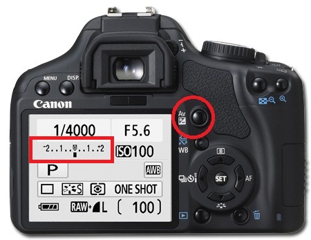
You can use Exposure Compensation to quickly adjust how light or how dark your exposure will be using these controls…
canon

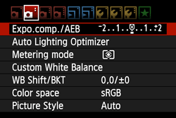
Or set the amount of “bracketing” like this…
g0101331

PAST WORK

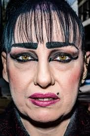
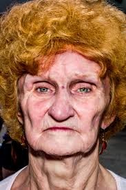
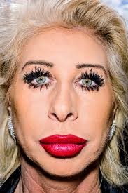
HEADSHOTS- up close

Bruce Gilden

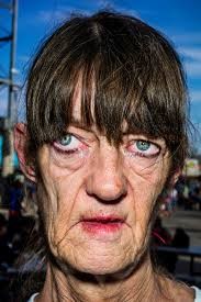
An Iconic street photographer with a unique style,  Bruce Gilden was born in  Brooklyn, New York in 1946. Although he did attend some evening classes at the School of Visual Arts in New York, Bruce Gilden is to be considered substantially a self-taught photographer. Gilden has received many awards and grants for his work, including  National Endowments for the Arts fellowship. In 2015, Gilden published Face.

My Images

Plan :

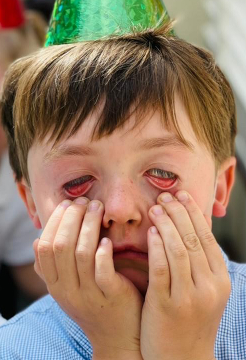
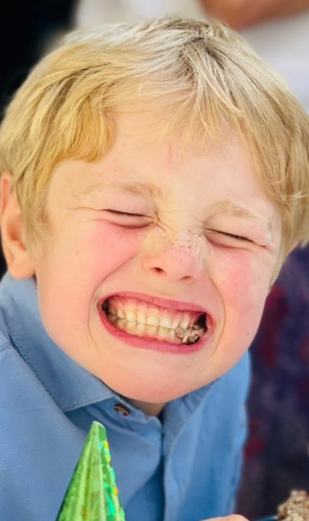
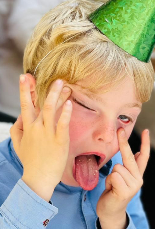
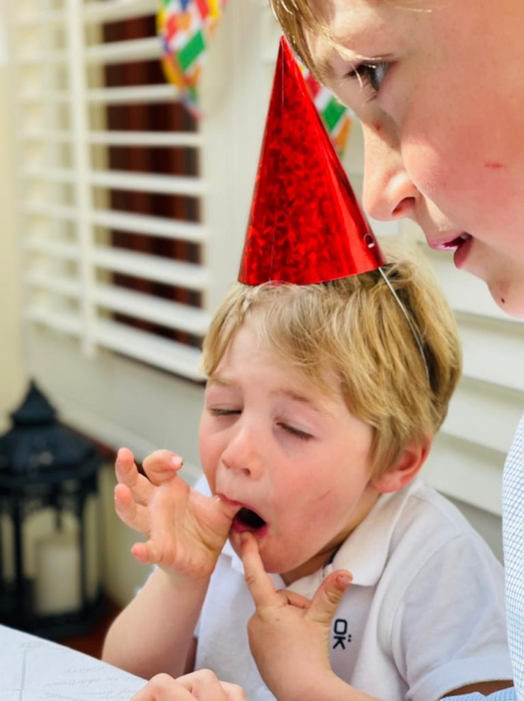
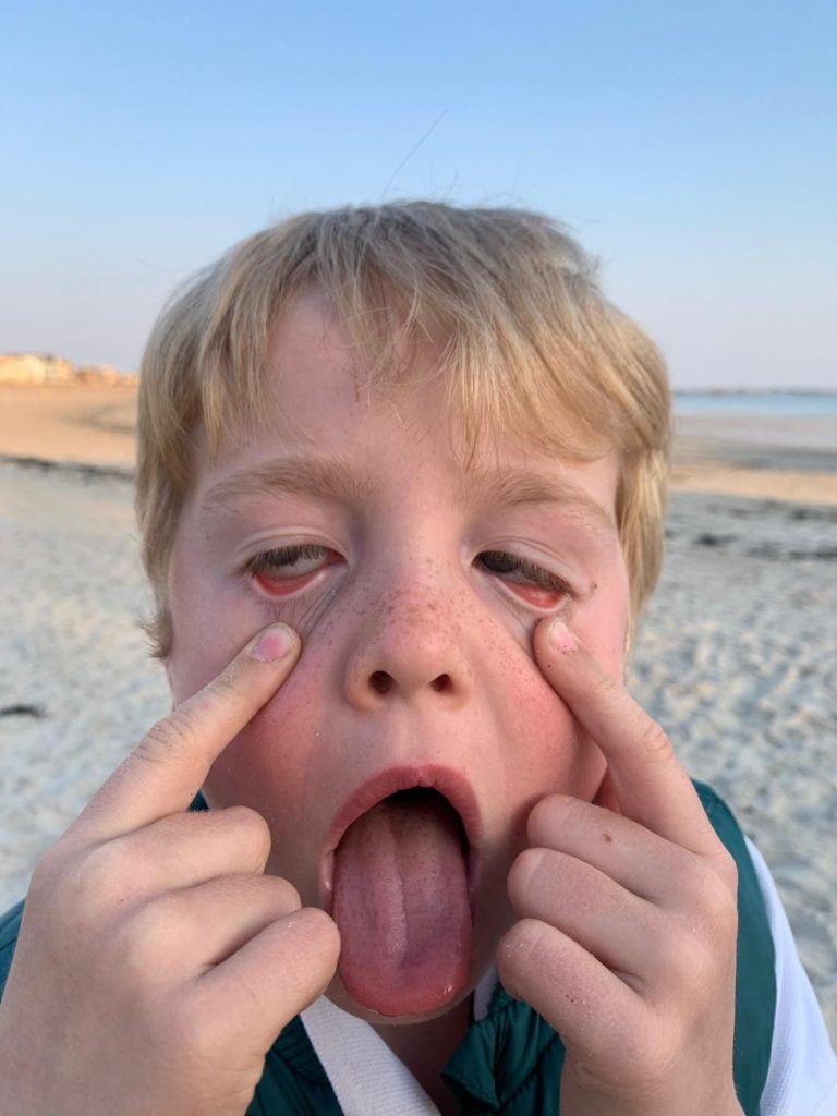
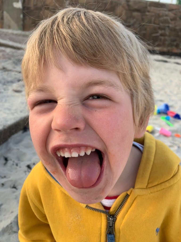
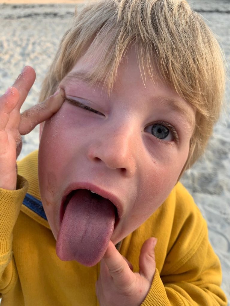
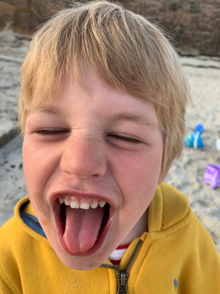
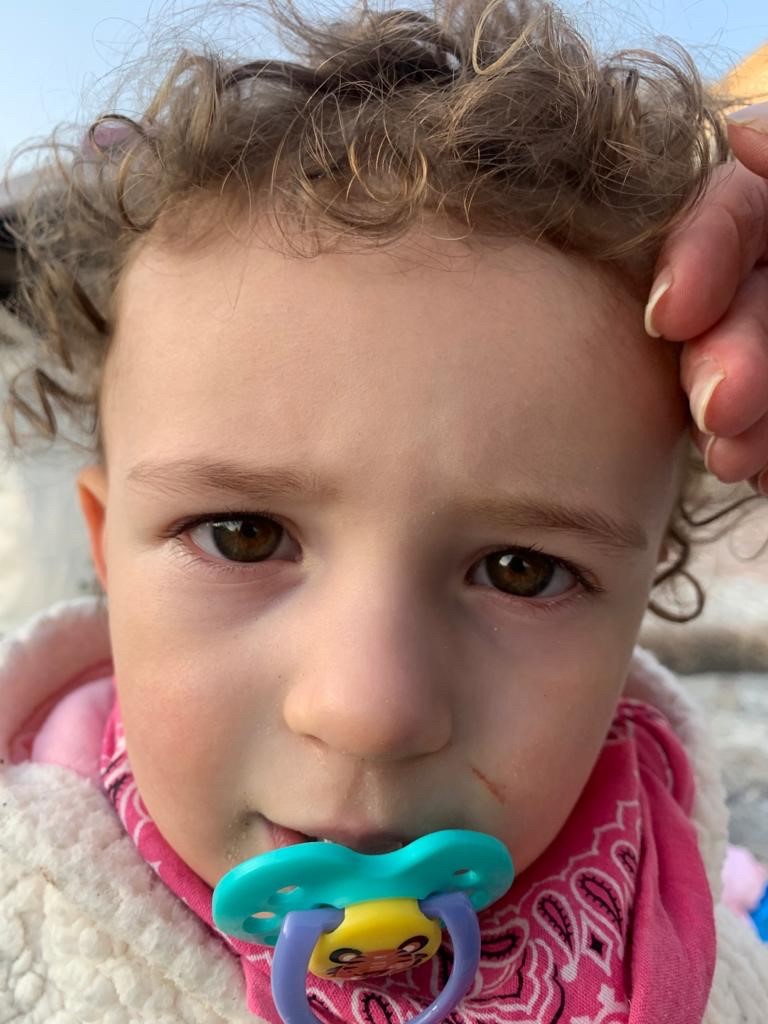
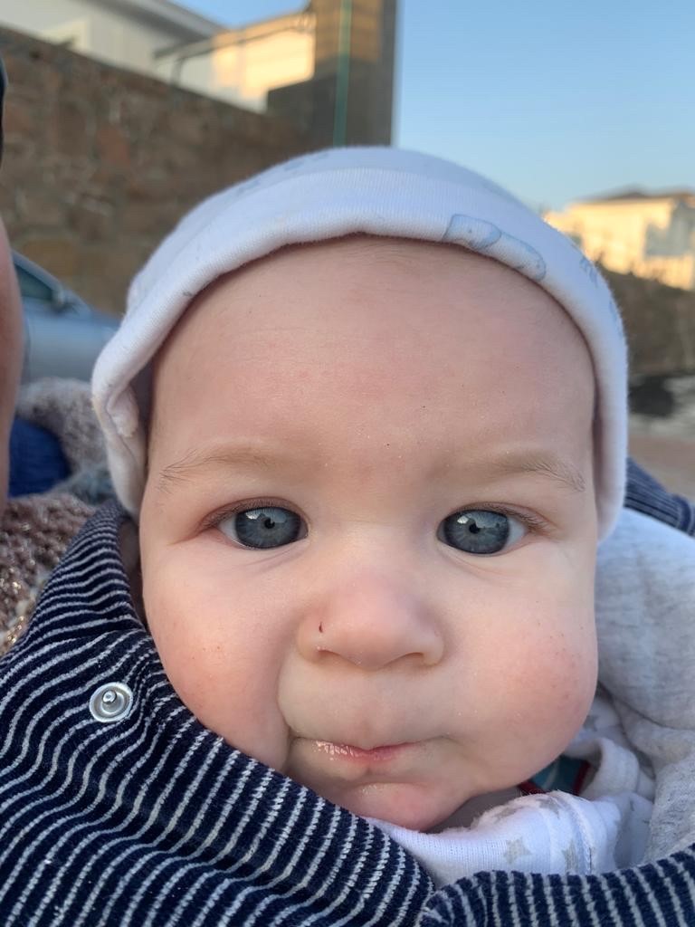
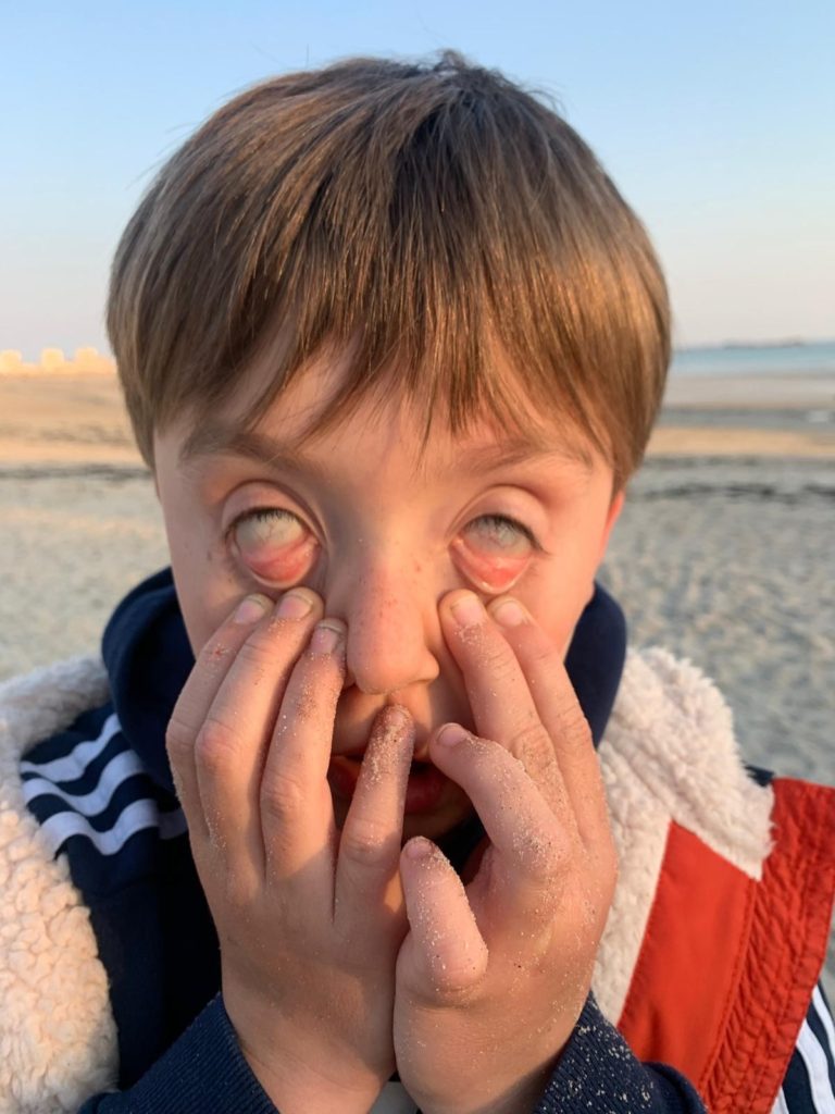
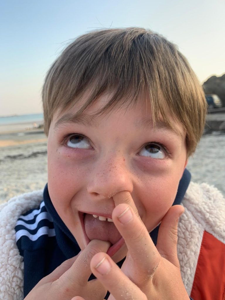
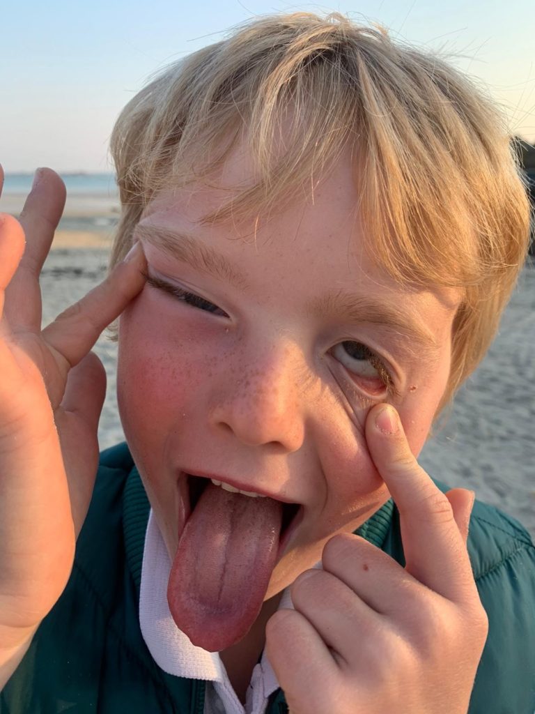
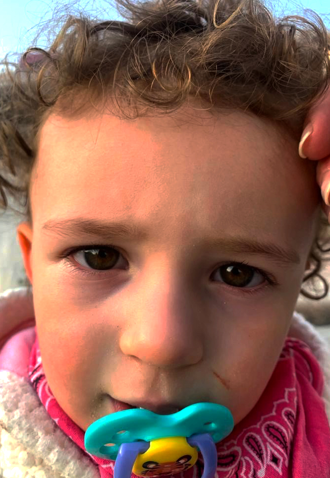
When/ where : Two different evenings , birthday party and a evening in the beach

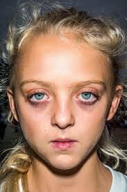
Who : I decided to take pictures of my cousins ​​because I think they are perfect for showing strange and funny facial expressions

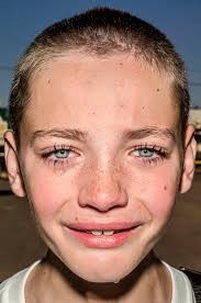
Final pictures (edited) :

In this shoot I was inspired by Bruce Gilden’s close ups. The image on the left (my image) is the one I find most similar to the work of Bruce Gilden. Since both subjects / models have similar blank facial expressions , which shows that the photo was taken unexpectedly – one can see the honesty in the faces as the models were not prepared. We can notice similar composition, eyes, mouth, forehead almost in the same place. At the hairline both have curly hair, which features organic lines and natural shapes – which are not artificial. There are small touches of similar colors that can be seen in both images like the blue of the dummy and the blue eyes of the girl. Another example is the pink in the clothes of one and the lips and under the eyes of the other.
In Bruce Gilden’s work we can see that he used a flash to take his photo since there are light reflections on the models’ faces. Unfortunately I did not take my photos with a flash but to make up for it I over exposed my photo to have the same effect. And finally the two images contain simple backgrounds, not a great depth of field because the images are very close.

Photomontage photoshoot/editing

Photoshoot plan

Photomontage Editing

Original Image
Edited Image
Edited Image
Edited Image

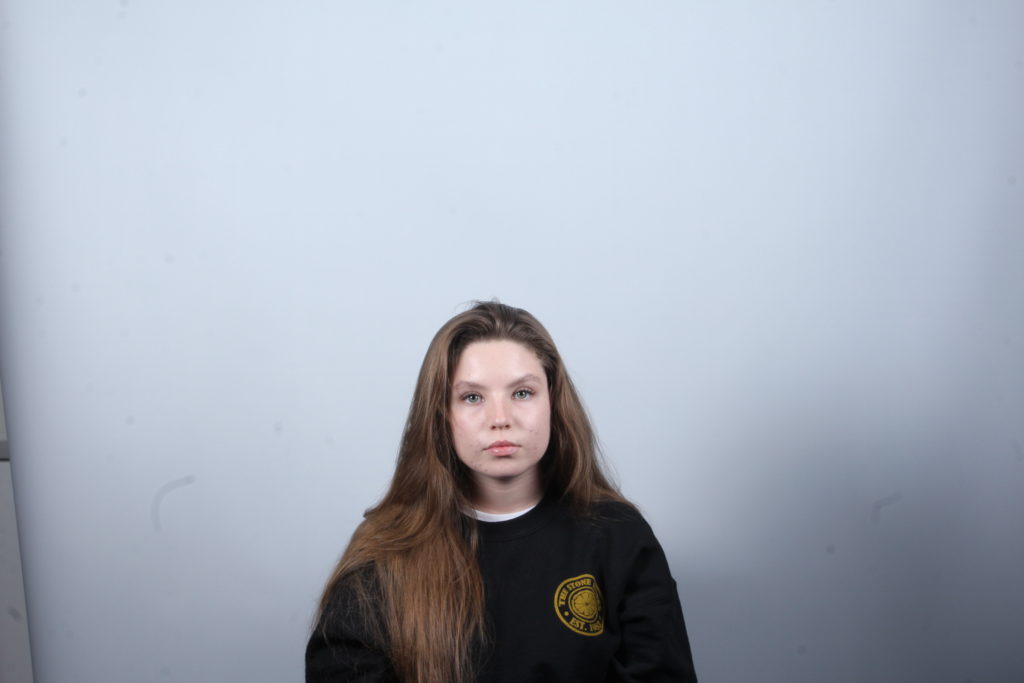
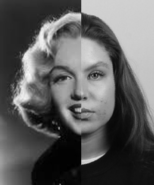
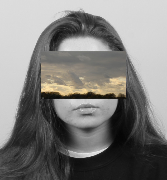
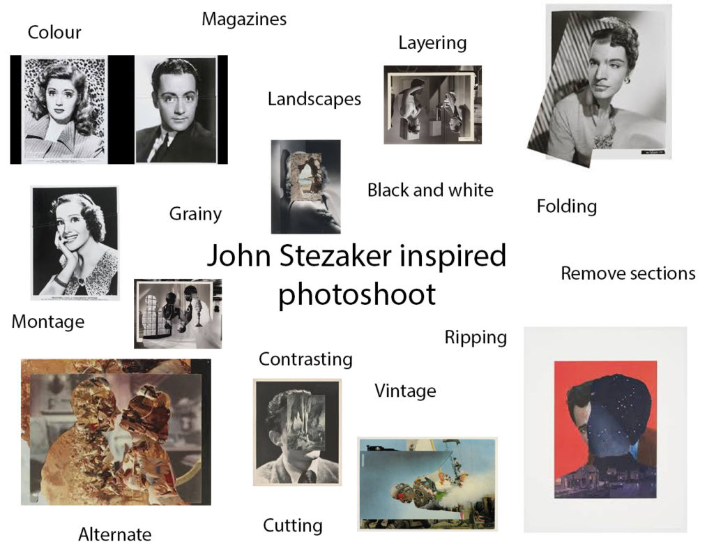
To edit the first image, I recreated John Stazaker’s method of layering images from vintage actress portraits, however I incorporated my own photography by taking portraits I took for the diamond cameo photoshoot.

For the second image, I attempted to recreate Stezaker’s common use of layering landscapes and portraits, so I used my own photos from my abstract and portrait photoshoots to recreate this.

For my last edit, I noticed Stezaker often crops and layers multiple images to distort the portrait’s original identity. Here I used my environmental portraits project and diamond cameo project to layer over one-another, and cut out some shapes similar to that in the work of John Stezaker.

PhotoMontage

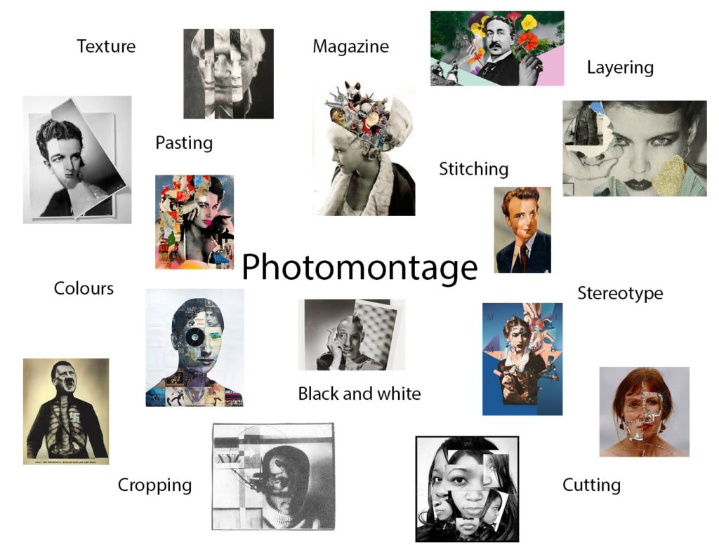
Photomontage is the process of copying, pasting and layering multiple photographs onto one photograph in order to create a new image. This can be done physically, for example printing and cutting, or digitally on photoshop. This process is typically done with portrait images to create an almost warped piece of art.

Examples of photomontage

Raoul Hausmann, ‘The Art Critic’ 1919–20
“The Art Critic” – Raoul Hausmann (1919-1920)
‘Cut With Kitchen Knife Dada Through the Last Weimer Beer Belly Cultural Epoch in Germany’  
“Cut With Kitchen Knife Dada Through the Last Weimer Beer Belly Cultural Epoch in Germany” – Hannah Hoch (1919)
“Marriage I” – John Stezaker (2006)

John Stezaker

John Stezaker. Marriage XV. 2006 | MoMA
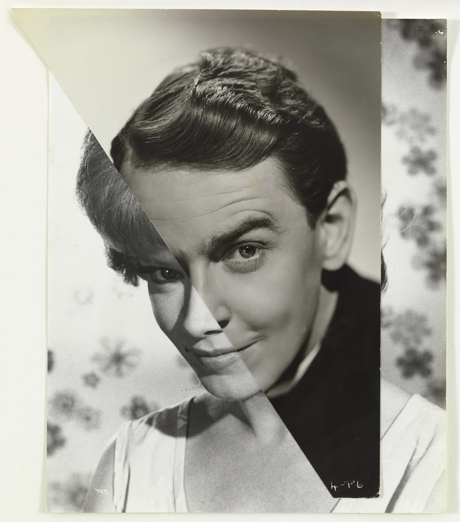
“Marriage XV” – John Stezaker (2006)

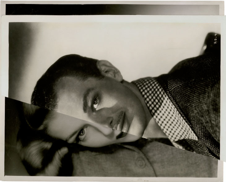
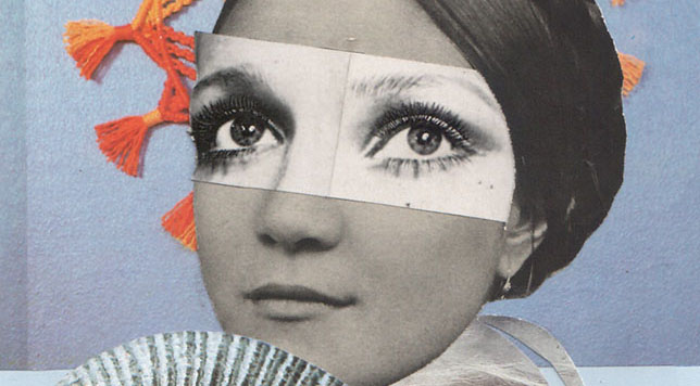
John Stezaker is a British conceptual artist born in 1949. Stezaker attended the Slade School of Art in London when he was in his early teens, and graduated with a Higher Diploma in Fine Art in 1973. He was best known for his work in photocollage, where he would take existing images from postcards, film stills, etc. in order to create juxtaposing artworks. John Stezaker was widely recognised for his photocollage series, “Marriage”, where he layered portraits of vintage movie stars to create a disjointed image for the viewer. Stezaker has had his work featured in exhibitions in The Museum of Modern Art in New York, the Tate Modern in London, the Tel Aviv Museum of Art and many more. Until 2006, Stezaker tutored in Critical and Historical Studies at the Royal College of Art in London, until he retired.

Examples of John Stezaker’s work

“Mask XIV” – John Stezaker (2006)
John Stezaker: 'I was trying to create a sort of photographic cubism'
“Kiss II” – John Stezaker (1978)
“Double Shadow II” – John Stezaker (2014)

Analysis of John Stezaker’s work

Image result for JOHN STEZAKER
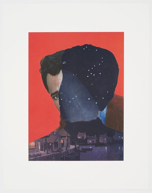
“Mother Night” – John Stezaker (2018)

This photograph, created by John Stezaker, is titled ‘Mother Night’. This piece of work companions another labelled ‘Father Sky’, which were part of Stezaker’s ‘Dark Star’ series. In these portraits, vintage film stars were photographed against studio backdrops sometimes involving illusionistic pictorial grounds.

The lightest part of the image can be found in the highlight of the actor’s face, especially seen in the forehead and around the eyes. The darkest areas are seen in the outlined figure-shapes night landscape, however the darkness is contrasted with the tiny dots of light seen in the stars of the scene or in the lit windows. In the portrait itself, it is most likely lit using hard, artificial lighting as the portraits are taken in a studio and have harsh highlights.

The outline of the night sky create a contrast between tones and colours as the darkness juxtaposes the light. It also provides a contrast in direction, as the two figures face different angles. There is also contrasting straight-edged lines that are found in the buildings of the night scene.

There is no use of repetition in this photograph, however there is a sense of reflection within the water of the night scene, as the stars and artificially lit buildings reflect against the water in rippled motions.

The majority of the shapes in this photograph are organic and curved, however these are contrasted against the geometric, straight-edged lines that are seen in the buildings of the night scene.

There is little example of depth within this photograph, although it can still be seen. For example the shadows and highlights in the actors face prove a sense of depth, and also the houses in the night scene slowly fade into the background creates a sense of depth that is still quite shallow. The solid background behind the actor lacks depth as it is a negative space. The night sky also contains a lot of negative space in the top thirds of this scene, however this is contradicted by the stars in the sky.

There is juxtaposing textures within this image, especially in the night scene. For example, the rippling water creates a smoother texture, whereas the brick house and cobbled roads create a rougher texture.

There is a large range of tones in this image from dark to light. The lightest tones can be seen in the highlights of the face of the actor as well as both artificial and natural lighting in the night scene. The darkest tones can be seen in the dull mountains in the background of the night scene, and the sky in the night scene also. Overall, the image tends towards darkness, as the night sky section of the image takes up a large amount of empty space with the photograph it has been layered over.

There is a range of both vibrant and muted colours within this piece by John Stezaker. The saturated red of the background portrait contrasts with the more dulled tones of the skin from the portrait. These colours are then juxtaposed again by the sombre tones of the night scene positioned over the models face. The dark blues and blacks of the night scene create an eerie atmosphere when placed against the vivid red.

The composition if the image appears to be somewhat balanced as the two silhouettes in their own tones are roughly the same size but are angled in different directions. There is also a fair balance between the light and dark tones which adds another element of balance. The rule of thirds is not used in this instance as there is no geometrical shapes that can be superimposed into this image which can be said to make the understanding of the composition difficult.

John Stezaker inspired photoshoot

CANDID PORTRAITS AND STREET PHOTOGRAPHY

IntroA candid photograph is a photograph captured without creating a posed appearance. … However, if the subject is absolutely unaware of being photographed and does not even expect it, then such photography is secret photography, which is a special case of candid photography.

Image result for robert frank
Robert Frank ; “Trolley — New Orleans,” 1955.

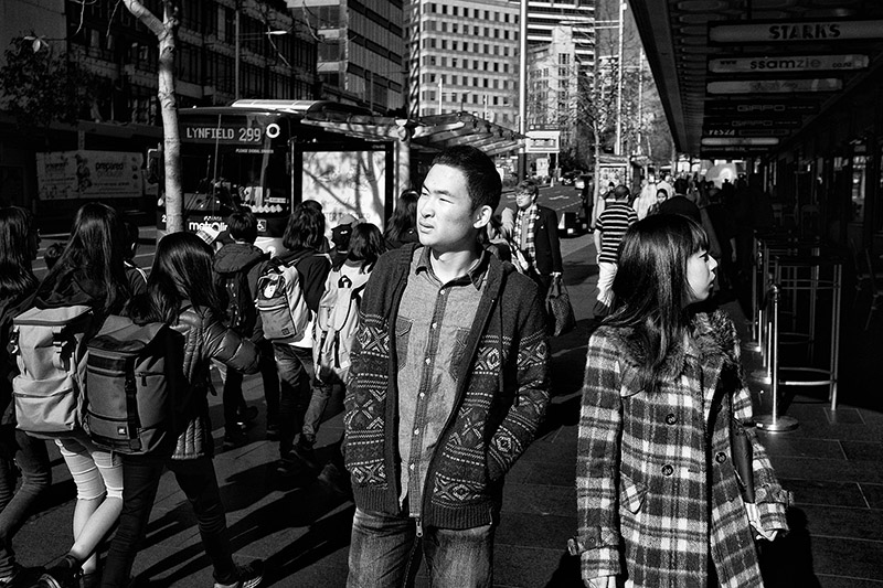
Street photography is photography conducted for art or enquiry that features unmediated chance encounters and random incidents within public places. It can capture everyday life of strangers without them knowing you took photos of them.

Urban & Street Photography – Auckland
unknown

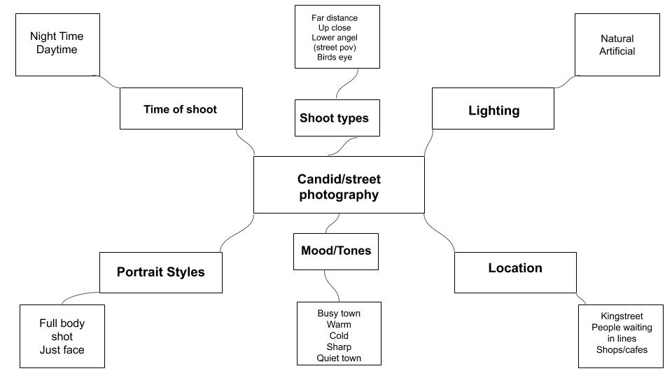
Mind map of ideas-

My photoshoot action plan

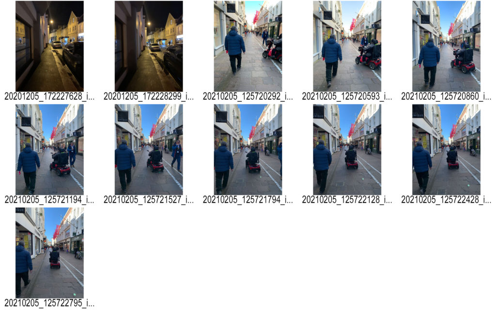
  1. who? strangers walking through town or someone working but unaware that they’re being photographed
  2. where? in King Street or any busy place
  3. when? after school just before it gets dark
  4. why? to show the everyday lifestyle of people walking through town and what street life is like when it’s filled with different individuals.
  5. how? on my phone during the day time

CONTACT SHEETS-

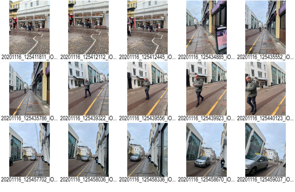
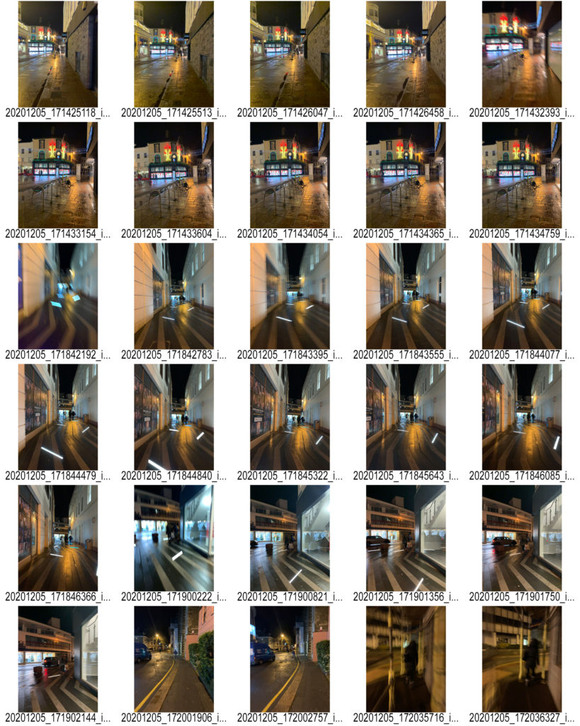
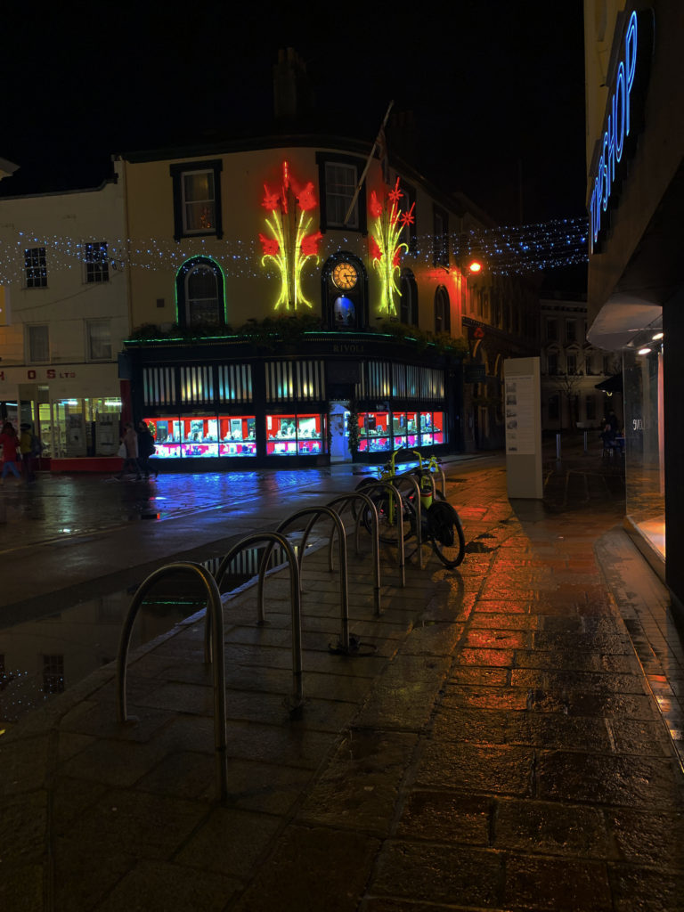
My favourite edited image- i increased the brightness levels as well as decreasing the contrast to make the christmas lights really stand out in the photo. I then increased the saturation slightly to get the red light on the street to reflect back. I chose this image as I like that it’s not busy and barely any people. This makes town look empty and create this feeling of being alone yet peaceful as not many people are around you.

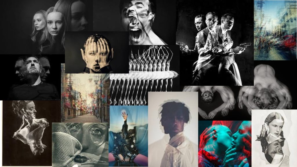
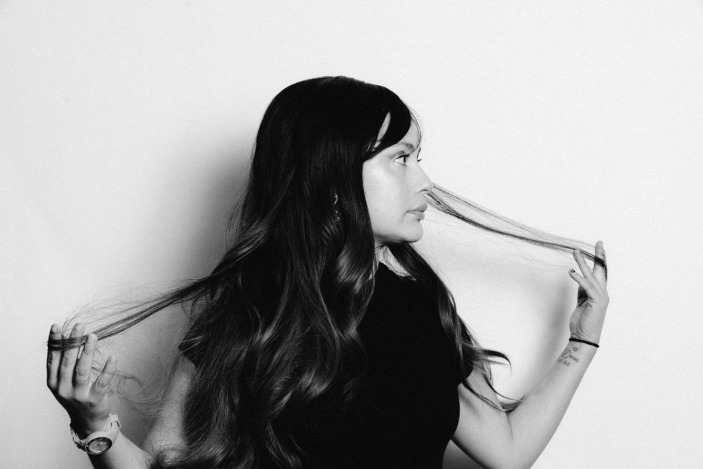
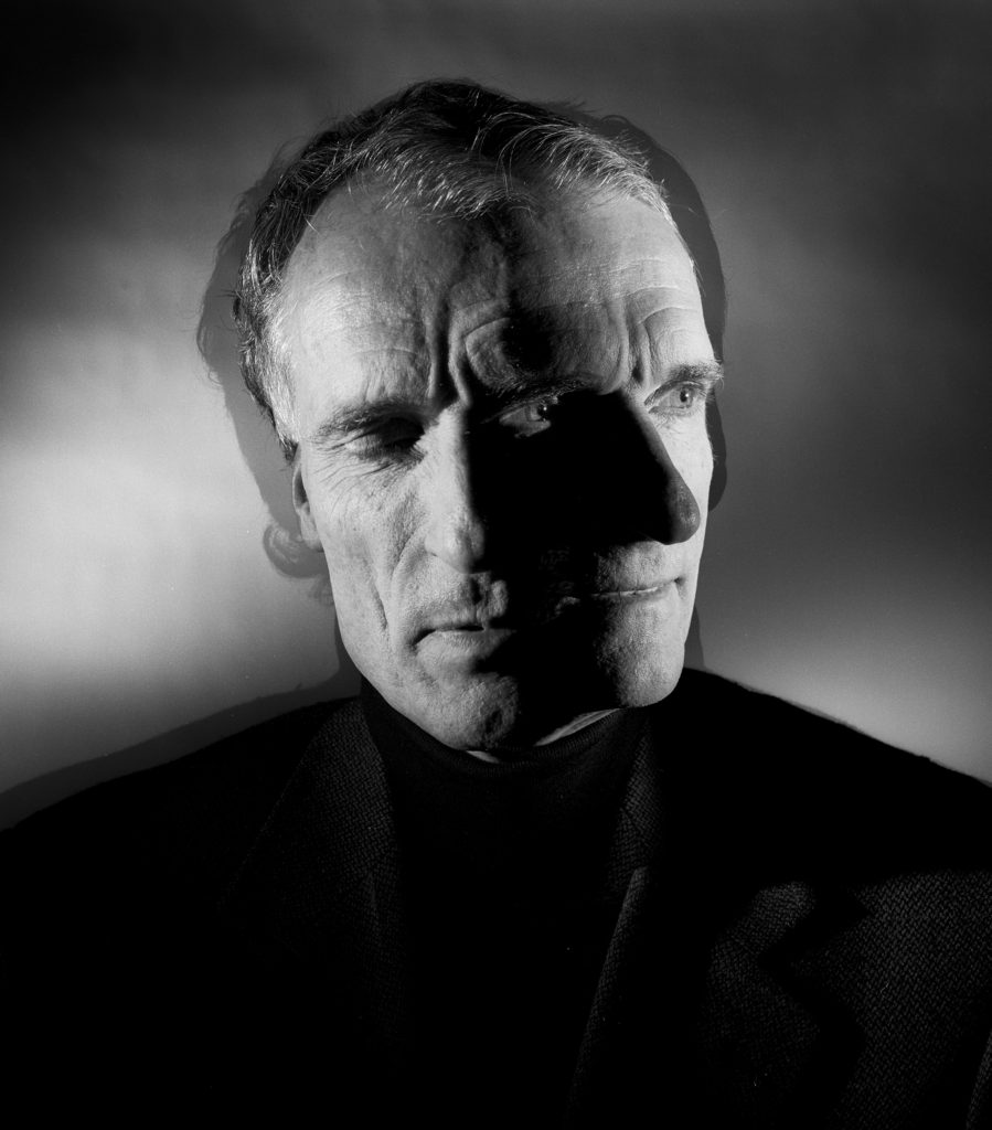
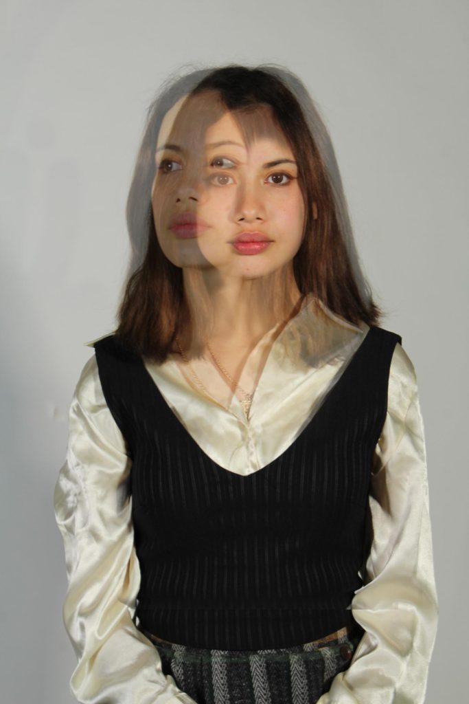
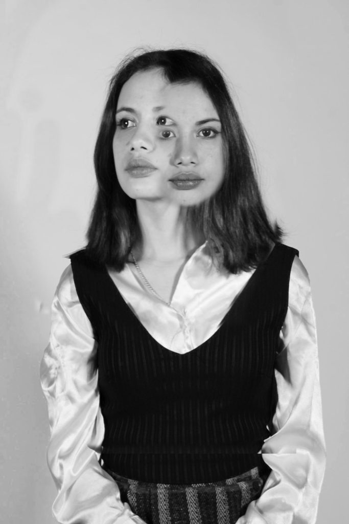
HEADSHOTS – DOUBLE / MULTI EXPOSURES

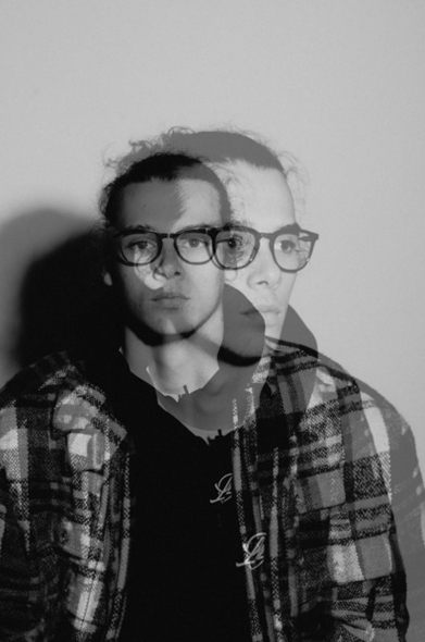
Double/Multi exposures


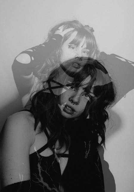
A double exposure is a combination of two images into one where one image is overlaid on top of another with an opacity less than full opacity. Often done with artistic intention. In digital photography, double exposures can be made in Photoshop specifically to achieve digital double exposures.

Selected

Plan

What:
Transform old pictures I took in double exposure.

When:
Monday 5th of February.

Where:
In a studio.

Why:

To try different effects with my pictures

Images:

Result:

Images:

Result:

Images:

Result:

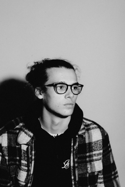
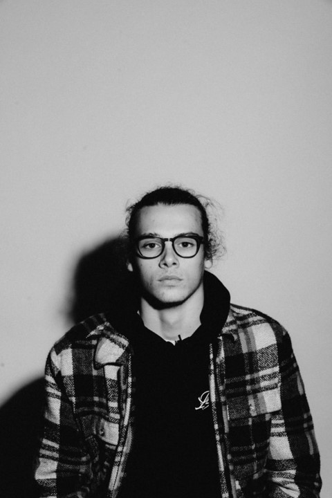
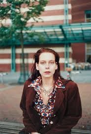
HEADSHOTS – DEADPAN / PASSPORT

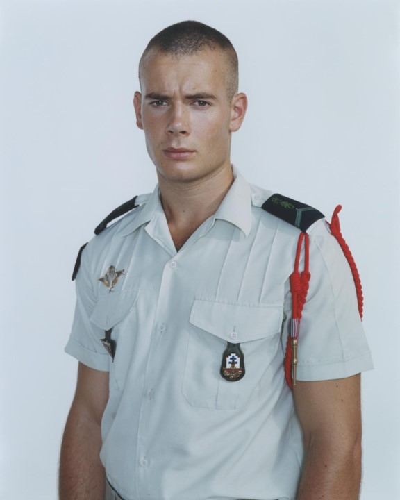
Deadpan/Passport

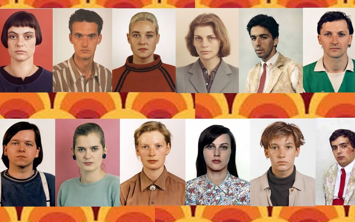
Deadpan as passport portraits show people in their natural state, typically not showing any sort of emotion. They aren’t posed, are not dressed up for the occasion, and seem completely honest. The color of deadpan photographs is commonly de-saturated. While not completely devoid of color, the colors tend to be muted. Some photographs that are recognized for their deadpan photography such as Rineke Dijkstra and Jitka Hanzlová.

Selected


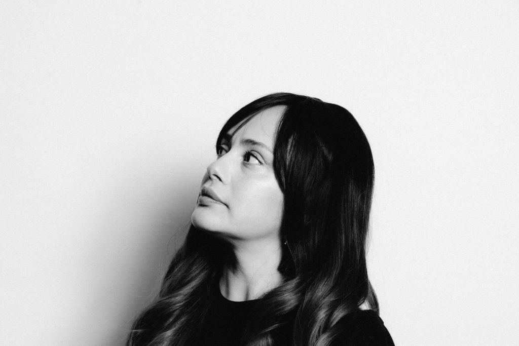
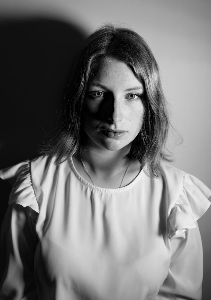
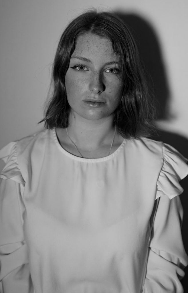
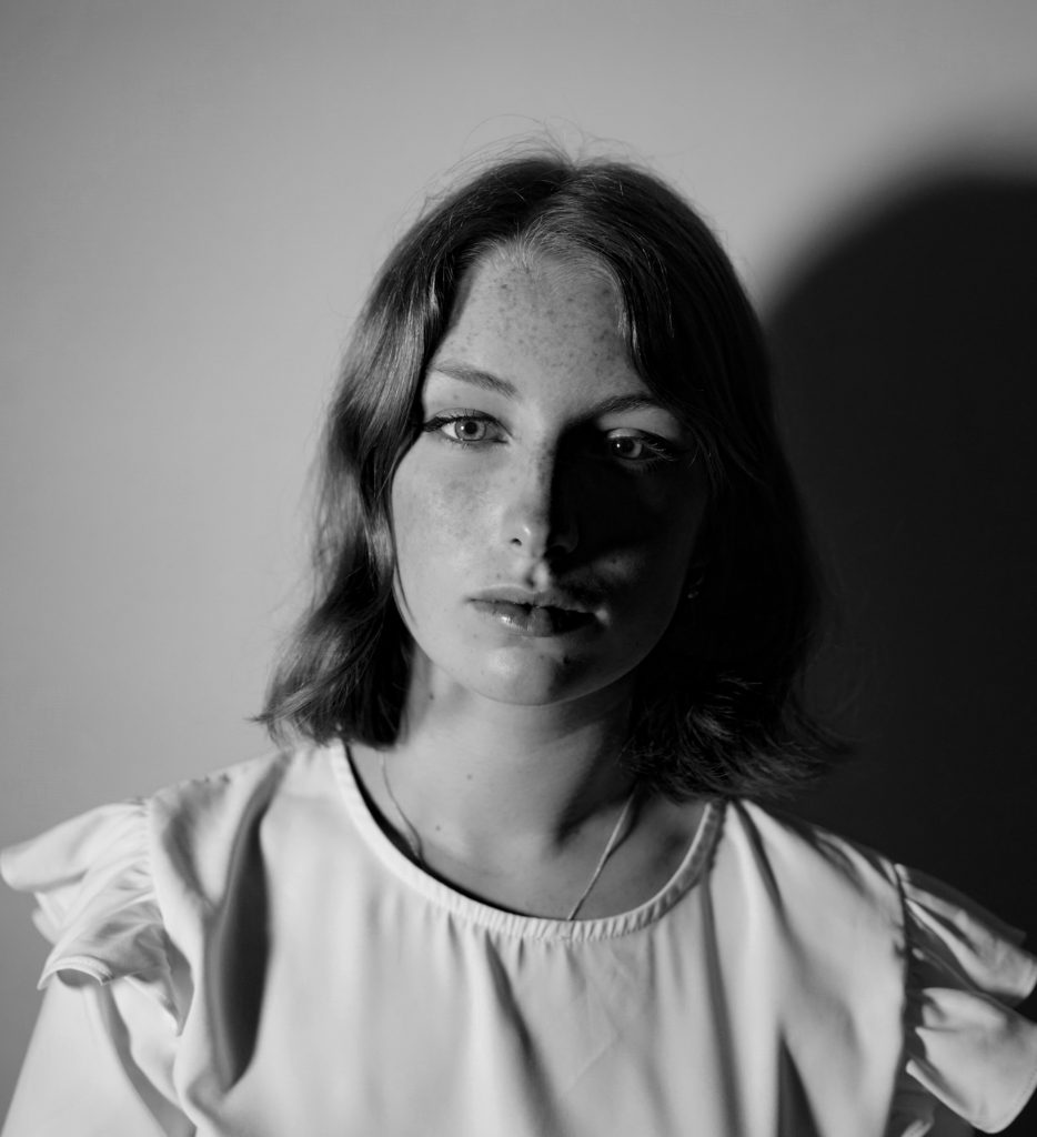
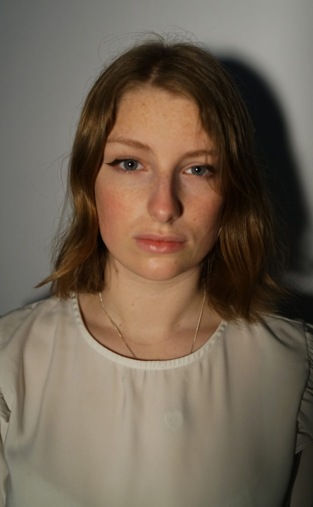
In the end I succeeded in creating what I wanted to do. My model has no expression, shows no emotions and is in its natural state and shows a honest facial expression. I decided to make the image in black and white because even if some photographers choice their deadpan images in color, the color of deadpan is commonly de-saturated.

Headshots- Photomontage

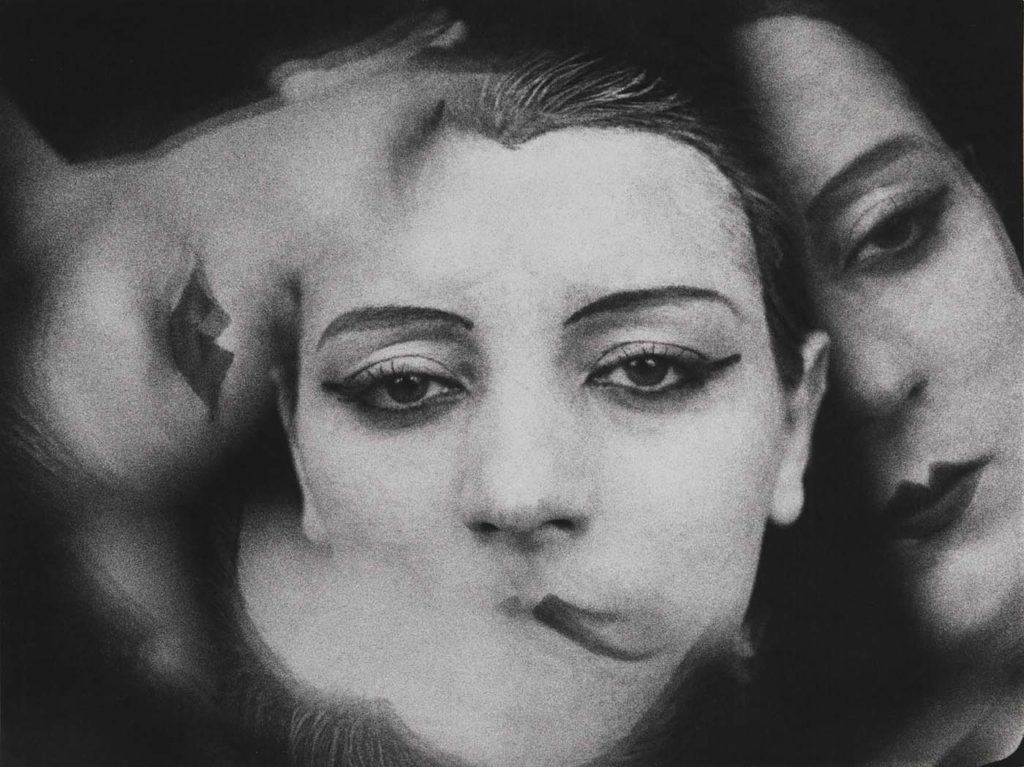
This image has an empty alt attribute; its file name is ModeArte-Man-Ray-Fashion-LisannaWallance-4-1024x767.jpg

Man Ray was an American visual artist who spent most of his career in Paris. He was a significant contributor to the Dada and Surrealist movements, although his ties to each were informal. He produced major works in a variety of media but considered himself a painter above all. (Wikipedia) Above is a multi exposure piece by him which I will be basing my image on.

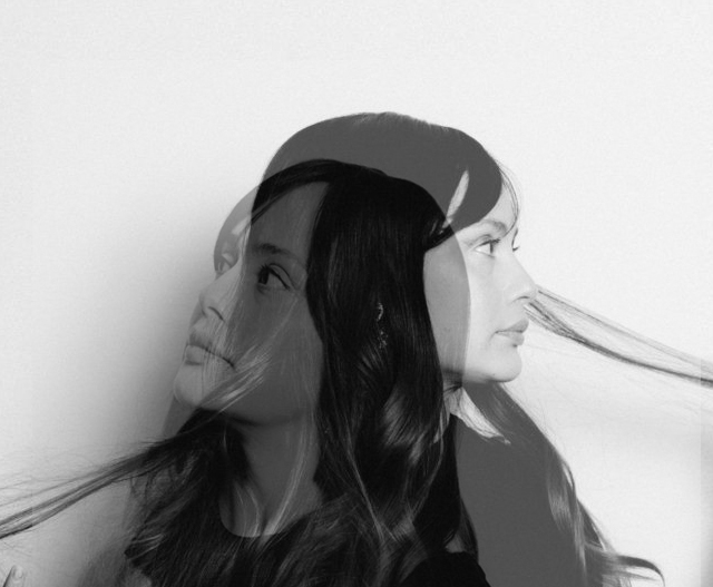
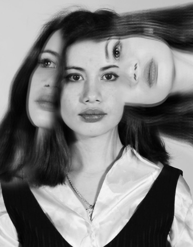
To get started I repeated the same steps as when I made my double exposure image on another blog, but I then turned the opacity right up, rather than leaving the layers at half opacity. I left the background as it was but then for the extra additions on the left and right, I doubled the cut-outs, turned the opacity down on the copy and placed it slightly off to create a sense of motion blur. Finally I turned the image black and whit and increased the contrast slightly.

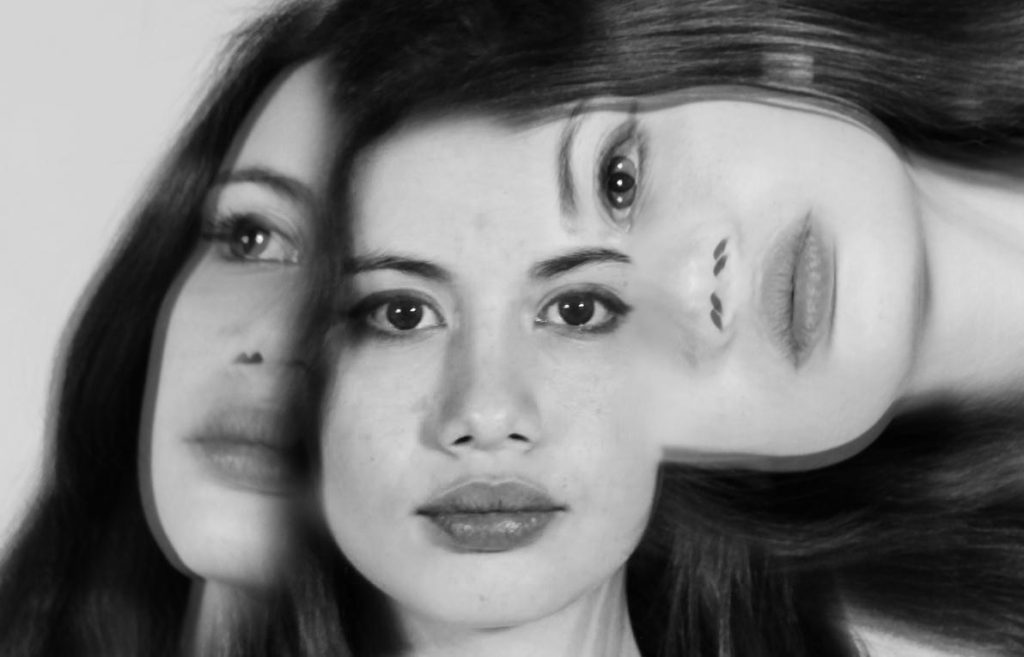
This is how it turned out. However, to complete this image I cropped it similarly to Man Ray’s.

This image has an empty alt attribute; its file name is multiexposure-2-cropped-1-1024x657.jpg

Photot-montage history

A photo. Montage is the process of making a composite photograph by cutting out segments of an image and rearranging them and gluing them once they are rearranged or oven overlapping two or more photographs into one new image.

 Author Oliver Grau in his book, Virtual Art: From Illusion to Immersion, notes that the creation of an artificial immersive virtual reality, arising as a result of technical exploitation of new inventions, is a long-standing human practice throughout the ages. Such environments as dioramas were made of composited images.

The first and most famous mid-Victorian photomontage (then called combination printing) was “The Two Ways of Life” (1857) by Oscar Rejlander, followed shortly thereafter by the images of photographer Henry Peach Robinson such as “Fading Away” (1858). These works actively set out to challenge the then-dominant painting and theatrical tableau vivants.

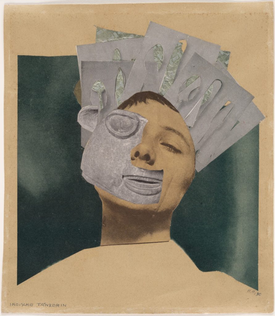
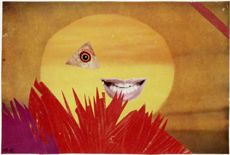
Examples of Hannah Hoch’s photography work.

Headshots- Multi-exposure

The photograph above is by an unknown photographer. The subject in the image is very central, and the background is symmetrical. However where you notice the double exposure, its a lot less symmetrical. It has high contrast and is in black and white.

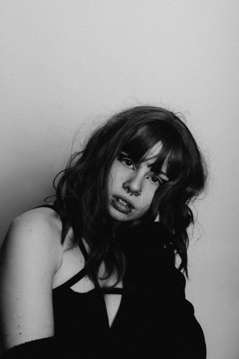
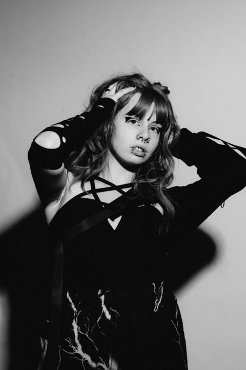
Using photoshop and the same images used for my diamond cameo, I placed one image on top of the other- I then lowered the opacity giving my view of the image underneath and erased unwanted parts of the image.

To make my photograph more relatable to the multi exposure image I found, I increased contrast, as well as opacity slightly. I made he image black and white.