The photograph on the left was taken in 1870 by Ernst Baudoux of the view through trees up to Princes tower with boarded windows and chapel at La Hougue Bie.
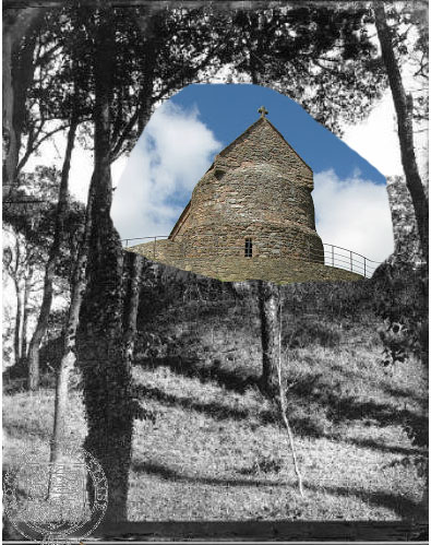
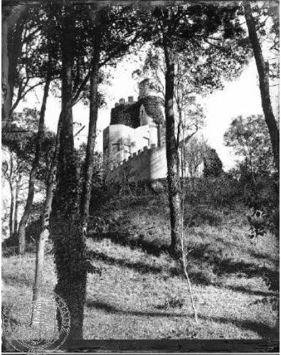
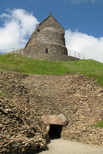
The photograph on the left was taken in 1870 by Ernst Baudoux of the view through trees up to Princes tower with boarded windows and chapel at La Hougue Bie.

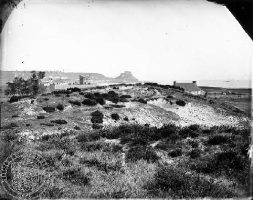
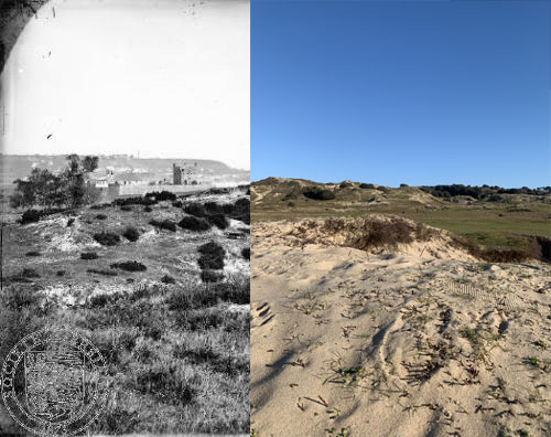
I used the old archive image of the sand dunes and pasted my image that I took and placed it over the old one. I tried to make it look like the headline is carrying on from one image onto the other. I like how this turned out because it shows you the difference in time.
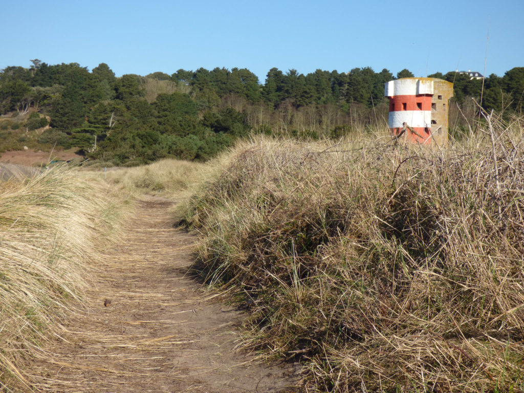
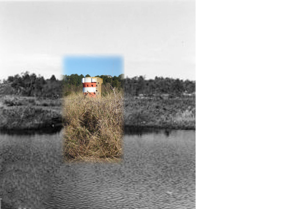
When taking my photographs for the landscape project, I captured one image that included the tower at Ouaisne. I figured that there must be at least one archive photograph similar to mine, and there was:
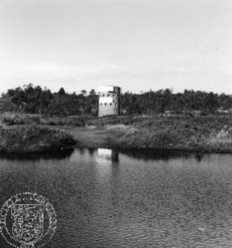

This images was taken by Mrs Dorothy E A Evans in an attempt to capture a beautiful, sunny day. It is a view of Queen’s Valley before flooding to make a reservoir there are trees in the middle distance and fern in the foreground. Evidently, the field is flooded but there are some parts that remain such as the trees and a few plants / fern.
I decided to make my image black and white to add to the theme of Juxtaposition; light vs darkness, past vs present and ancient vs modern.
There is evidence of leading lines in the photograph as the audience will look at the fields and trees and follow the lines to find the horizon. Also, the image is rich in colour which just adds to the idea that the artists wanted to resemble Queen’s valley beauty and majesty.
The lighting appears to be natural as it was a photo taken outside in nature. There are bright colours and harsh dark tones by the trees adding to the theme of juxtaposition and considering that eventually that exact field was flooded to be turned into a reservoir, the dark tones could suggest a “dark” will happen in that place in the future but will not ruin the valley’s natural beauty. In comparison to my photograph revealing the same place taken in 2021, we can see the use of the dark tones to display what was explained above.
In my opinion, this juxtaposition is successful as it powerfully shows the difference between an old image of Queen’s valley and my own image of that same place showing the difference and how places have changed through time.
Contact sheets

Editing
I have edited this juxtapositions in the following manner:
I have imported both images into Photoshop, then aligned the photo taken by Dorothy to the centre of mine and created a white border around it to act as a frame. I have also blurred the white border several times so that it looks like it is within the image. I did the same with Dorothy’s image so that it looks of a higher quality as it was a bit pixelated.
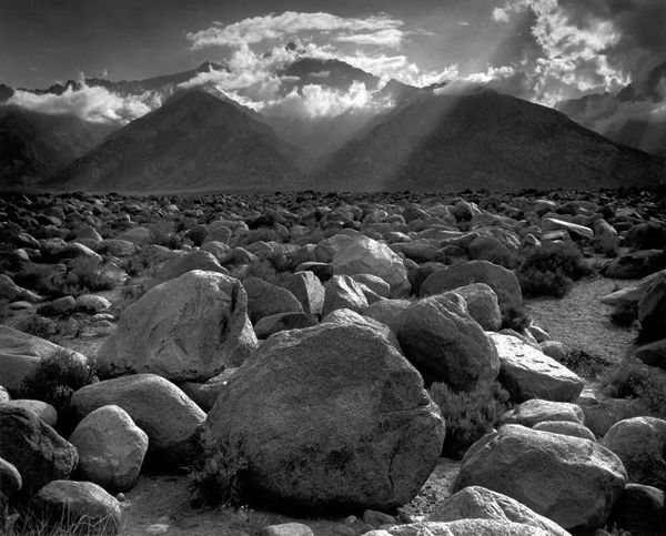
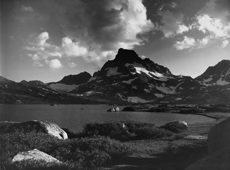
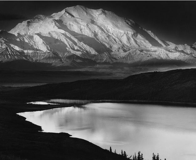
Ansel Adams (1902-1984) was an American photographer who captured dramatic black and white landscape images as a committed environmentalist. His love of nature, which led to him capturing some of the most influential landscape images in history, was sparked by his native area in California, Adams grew up in a house amid the dunes of the Golden Gate before the famous bridge linking the two headlands was built. The area around San Francisco was still wild then, and he would go on long hikes which helped him escape troubling aspects of his childhood, such as his unhappy schooling and his parents’ financial worries. Adams had so much appreciation for the natural world that he decided he wanted to capture it’s intense atmosphere through photography, it was important to him to show the drama and emotion he felt while exploring these beautiful areas.
The primary technique Adams used to photograph his greatest works was visualisation, the impact this concept had really changed the way photographers captured scenes and decided on their final images. The visualisation process included seeing the photograph’s final product in your mind, deciding the lighting, framing, tones, focus and all other aspects before actually taking the photo. Adams, when describing visualisation, said ‘We must explore what lies before our eyes for its significance, substance, shape, texture, and the relationship of tonal values. We must teach our eyes to become more perceptive.’ By using this technique, Adams has captured some of the greatest landscape images in history, clearly portraying a depth of emotions and connotations behind each photograph. An example where Adams used visualisation as his breakthrough was in 1927, when he wanted to capture the ‘majesty’ of the Half Dome rock formation at Yosemite National Park, but only had one plate left. Visualisation was used when Adams started picturing the image he wanted, ‘a brooding form, with deep shadows and a distant sharp white peak against a dark sky’, however he realised that a yellow filter would not capture the drama of the image as he saw it. Instead, he used a red filter with a long exposure to photograph the image he had imagined in his mind, he said he had achieved ‘my first conscious visualisation’, which allowed him to capture ‘not the way the subject appeared in reality but how it felt to me’. Furthermore, Ansel Adams (along with Fred Archer) formed ‘The Zone System’ where they were able to perfectly control the contrast in their black and white photos, Adams’ base rule was: “Expose for the shadows; develop for the highlights.” The Zone System consists of 0-10 tonal shades (0 being pure black, 10 being pure white) which Adams used to determine the final development of his images. This technique has allowed photographers to have control over the darkest and lightest points of their image, manipulating the meaning and effect portrayed through highlights and shadow.

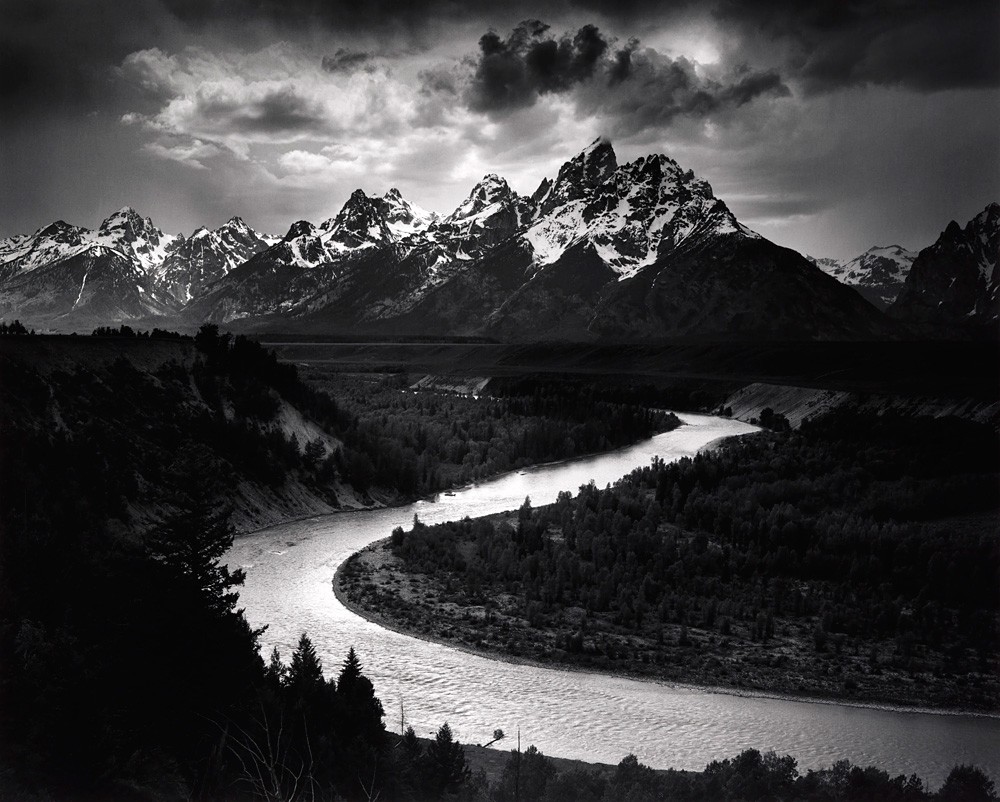
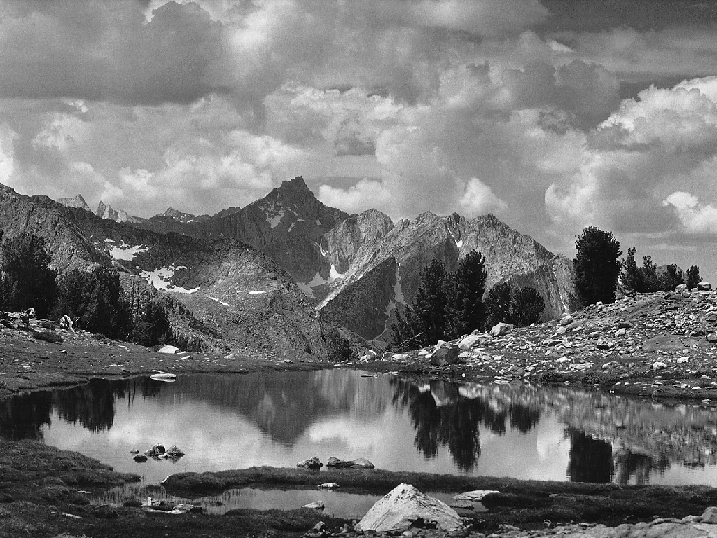
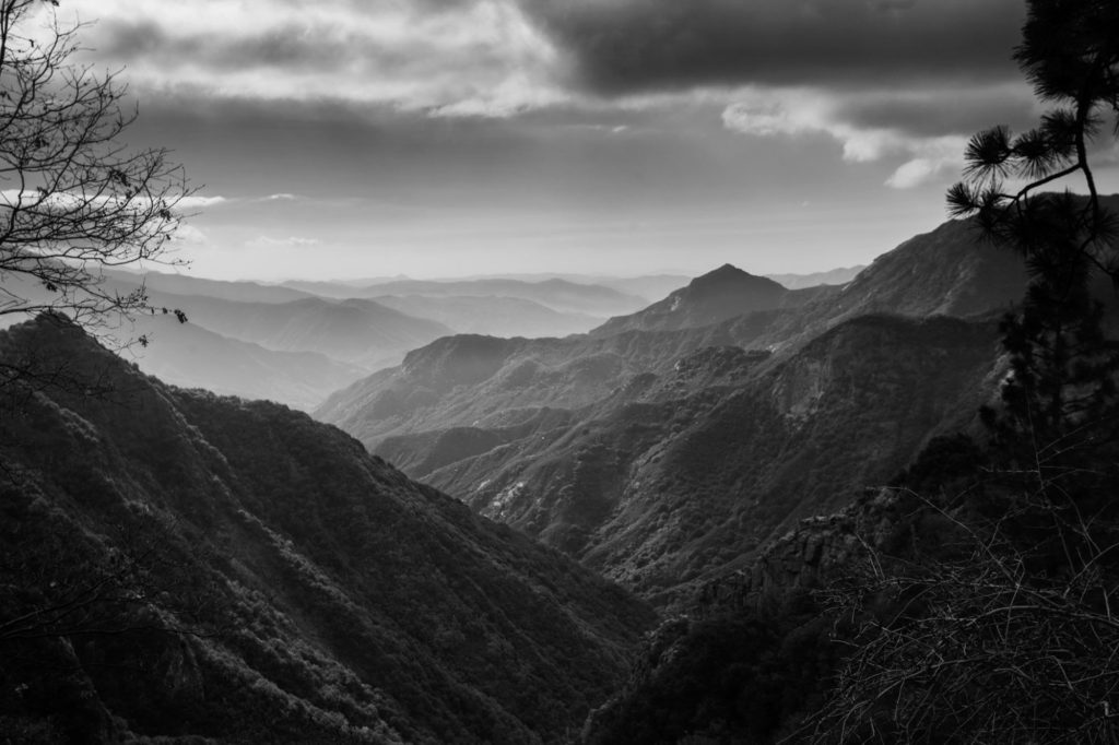
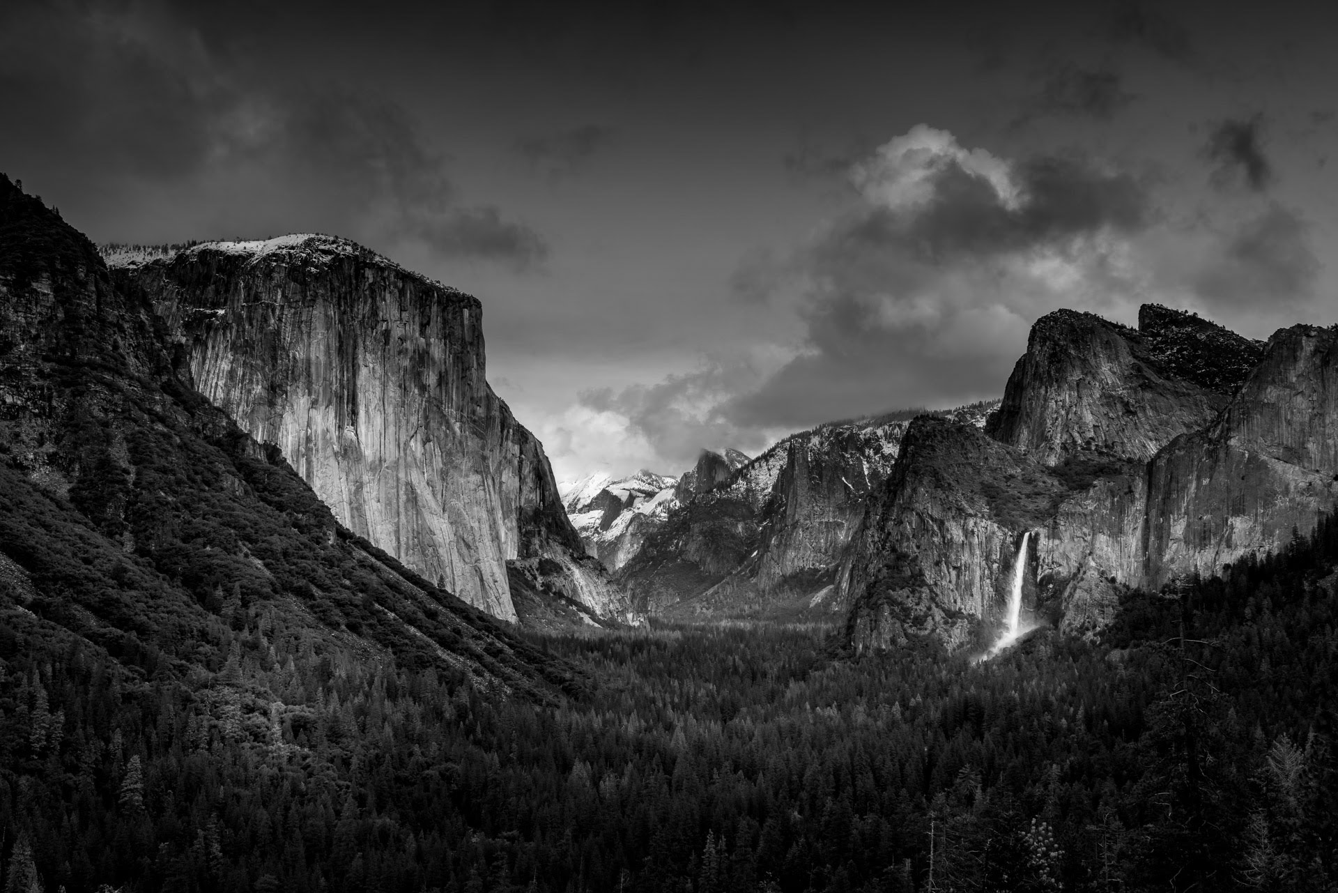
In this photograph Ansel Adams has captured the dramatic atmosphere of Yosemite National Park, with several dynamic features that really show the beauty of nature. The first element that really stands out is his use of the rule of thirds in the composition of this image. In the foreground we can see a dense forest forming 1/3 of the photograph, the middle of the image shows the colossal mountains and the last 3rd of the image depicts the clouded sky. Each section of the photograph holds a different tone, gradually getting lighter as the viewer’s eyeline moves up the photo. Adams has created an easily noticeable sequence through this technique, allowing the observer’s focus to travel through each section, appreciating every small detail of the beautiful nature Adams wanted to capture. Moreover, Adams has used his signature technique of ‘The Zone System’ to further the dramatic contrasts and establish a relationship between the darkest and lightest points of his image. For example, Adam’s has captured zone 0, the deepest tone, around the edges of his photograph which creates a vignette effect as the dark shadows gradient into the middle of the image. Additionally, we can see Adams has captured one of the brighter zones such as 9 or 10 in the centre of the image, highlighting the expanse of mountains going into the distance. This not only shows a wide depth of field, but also the use of this bright white tone connotes themes of biblical imagery, as if a God-like figure waits at the end of the mountains shining a white light to guide the way. It is clear that Adams used a higher f- number to capture this depth as the aperture would need to be larger in order for him to photograph every minuscule detail of the environment around him.
Furthermore, Adams has captured leading lines throughout this image, which act as outlines separating the jagged mountains from the sky. For example, in the mid-left of the photo the observer’s attention is brought to the dark, curved outline of the forest covered mountain which contrasts greatly with the brighter mountain wall behind it. Also, the range of shadows and highlights captured in each mountain’s peak really emphasises the emotion and astonishment Adams felt while taking in this natural environment, it exaggerates his feelings towards the beauty of nature. Another clear feature of this image that shows this dramatic contrast is Adams’ use of directing sunlight to highlight specific areas of his photo. In the mid-right of the image Adams has positioned his camera in a way to capture the bright natural light reflecting off of a waterfall- clearly creating a contrast between the dark shadows of the forest and the glowing water. In addition, there is a wide variety of textures created in this image that further Adams’ theme of the importance and elegance of the natural world. The harsh pointed lines of the mountain peaks form an irregular and spikey texture however the thick scope of trees below provides a more bristly feathered texture, as they all lie closely to each other forming a sort of blanket. This contrast and range in textures creates a powerful atmosphere as they exaggerate the breath-taking feeling, and contrasting emotions, Adams felt while admiring this surrounding.
Candid portraiture
By: Lexandr
About candid
Candid portraiture is a fun, anonymous topic as it gets the photographer to shoot various shots without the model being aware that they have been photographed. This may have ethical issues like consent but this issue can be overcome by asking the models if it’s alright to take a photograph. This may cause photographer bias as subjects may start acting out of their normal behaviour.
On the other hand, taking photographs without the subjects awareness can be called secret photography which is one of the main themes of candid photography.
Others may argue that “a great candid portrait is often made with the subject aware they’re being photographed.”
In conclusion, candid photography appears to be a type of art that allows the photographer to capture real-time events and turn that photograph into a sort of memory because in the due course the artist will look back and remember where and when that shot was taken, and for the subjects, if they ever get to see the photograph, it will open an unaware memory of what they were doing, with who and help them look back and reflect in life.
The fact candid photography might open up a memory that the subject might not even realise they had is very ironic since the theme around candid portraiture centres around the idea that people aren’t aware that they are being photographed.
Richard Billingham
Richard Billingham is an English photographer, film maker and art teacher born on the 25th September 1970 (50).
According to The Guardian, “The photographer made his name with a series showing his dysfunctional parents, Ray and Liz, in their squalid Black Country flat. Now he’s turned their story into an award-winning film.” This clearly shows that his worked has centered mostly on his family, but he’s also focused on other aspects of photography like landscapes and candid. For example:
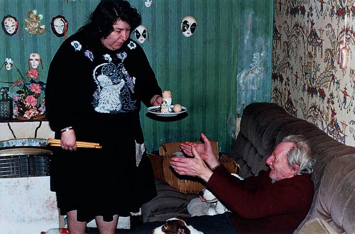
This image is part of his project where he turns something that has affected him into art and gets noticed for it. This project, Ray’s A Laugh (1996) documents his life with an alcoholic father, Ray, and overweight, tattooed, Liz who’s his mum.
He won the 1997 Citibank non-public Bank Photography Prize presently known as the Deutsche Börse Photography Prize and was shortlisted for the 2001 Turner Prize. His work is control inside the perpetual assortments of Allen Tate, the Victoria and Albert gallery, and Government Art Collection in London.
Noticeably, we can see that Richard was a very famous photographer from the 20th century.

Image analysis
Substance:
This image was taken while Billingham was still working on his Ray’s A Laugh during the 1996.
Obviously it was taken to document his life and environment around his parents . Knowing this, some appreciators may argue that this project may bring comfort to some people who identify with this project.
Composition:
This image’s focal point appears to be the parents / models. This could indicate that the author wants the audience to focus their attention to the parents before anything else.
The rule of thirds has been powerfully use to arrange the models to the center and the props like masks to the left hand side of the image. It may be argued the Golden Rule was also used seeing as the audience focus their attention firstly on the subjects then the props around them.
The subjects appear to be Liz and Ray themselves. The artist has purposely used them for Ray’s A Laugh project since it is about them.
The artist has used dark colours to compose this image. For example, he has used the green wall in this image which is a sign for life, greed and jealousy. The wall is obviously behind Liz which could indicate that she gets jealous of Ray or suspects he could be cheating on her with other women.
Mise En Scène:
Liz is holding bread sticks on her right hand and a plate with an egg with her other hand. This may show to the reader how fragile and emotional Liz (Richard’s mum) can get at times. The fact she’s holding food in her hand enforces the idea that she’s overweight as Richard stated in The Guardian.
Ray on the other hand has a red face strengthening the idea of an alcoholic father. Ray is sitting on a dark, brown sofa signifying his dark past and his unwillingness to do anything as Ray has his hands towards the food Liz seems to have made for him.
There are also mini masks across the green wall signifying the various facades Liz and Richard may use for the public.
There’s a plant in the background growing from a mistreated environment suggesting that Richard blossomed in an environment like this; giving hope for the audience.
Techniques and editing:
It appears that a fast shutter speed of 100/120 was used as details are fixed and sharp in detail.
The depth of field for this picture has all the earmarks of being very huge as a large portion of the picture is fixed. This was utilized to catch as much of the setting as could be expected while holding a fresh detail to the picture. This being said, we can also guess that a tripod was used to keep the camera used.
The shot appears to be in digital format as it’s a recent photograph. Also there are no debris which could suggest that it’s not a Lomography.
Atmosphere:
This image makes me feel somewhat calm and relaxed as it’s a semi-familiar environment; it gives me nostalgia to my grandparents and great-nan’s houses as they looked similar to this. The use of models and props also influence this effect.
Lighting:
The light in this shot appears to be coming from the back to the front successfully illuminating the subjects and props.
It appears a flash may have been used as there are bits of reflection around the image.
There are bright and dark tones throughout this photograph, specifically Liz’s dress suggesting that she could be going through a hard time in her life.
Response:
For this project I will attempt to create a sense of nostalgia to the viewer and create something the viewer may relate to.
Since the theme is candid I will have to plan out how to take secretive photographs without the participants being aware of it.
Richard attempted to story-tell a bit about his life through this photograph so I will see how I can achieve a similar outcome.
In my opinion, the photograph is very interesting due to its naturalistic, candid approach leaving the audience wondering what is happening and why was this image taken in the first place.
Planning
Location: Seeing as this a candid project I will shoot in various location such as home, work place (school) and public. I will do this to get a wide variety of images showing different types of people.
Content: I will capture images of my subjects in their natural environment capturing whatever it is they will be doing in real time, making sure they have no time to change their behaviour as this
Lighting:
I will be mostly using ambient lighting in order to make my photos as natural as possible.
My photos may include natural lighting since some of my photographs will be taken outside. Some may have artificial light due to them being taken inside.
Camera / settings:
I will be using 2 different cameras for this project:
Contact sheets
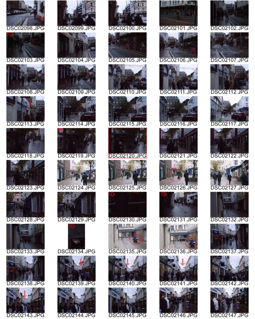
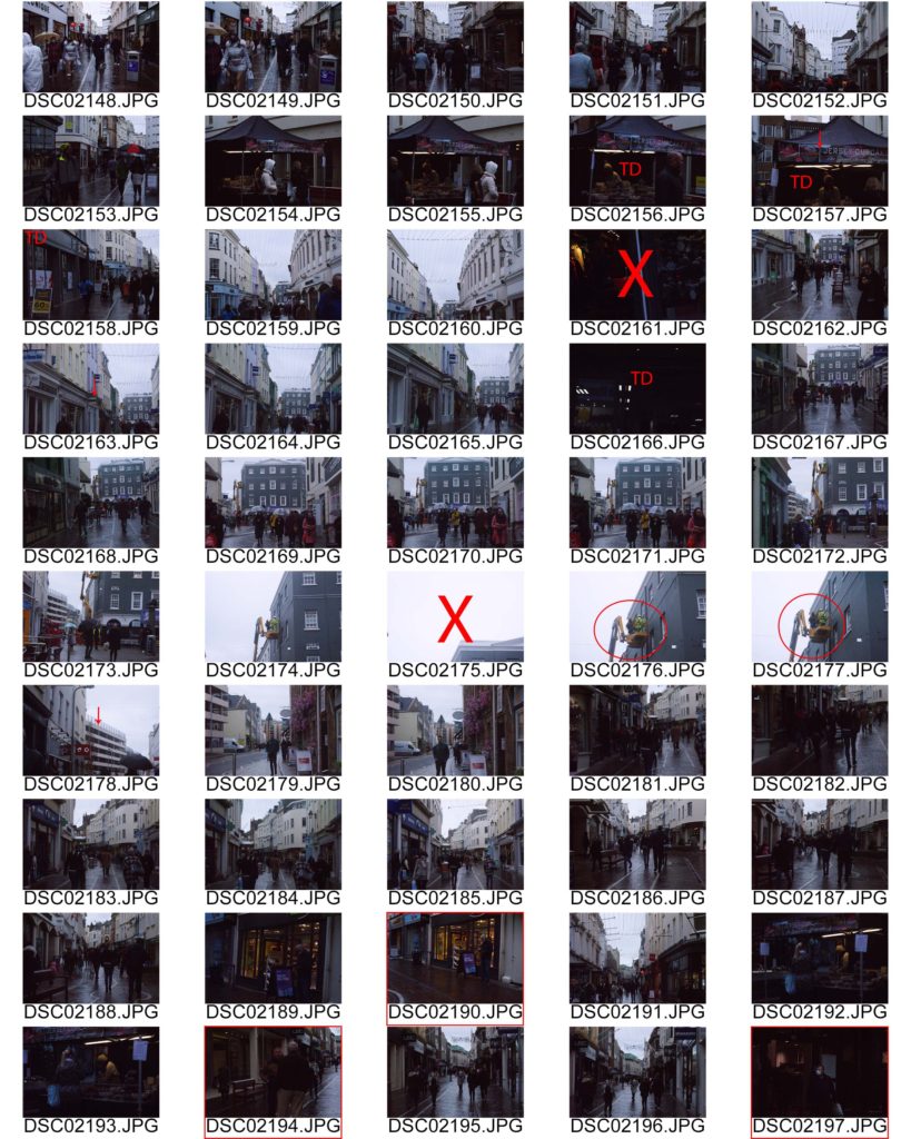
Outcome 1
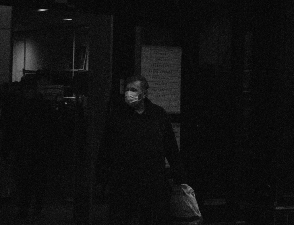
These series of images were intentionally grainy to relate to film photography and the context Ralph was in; film was mainly used.
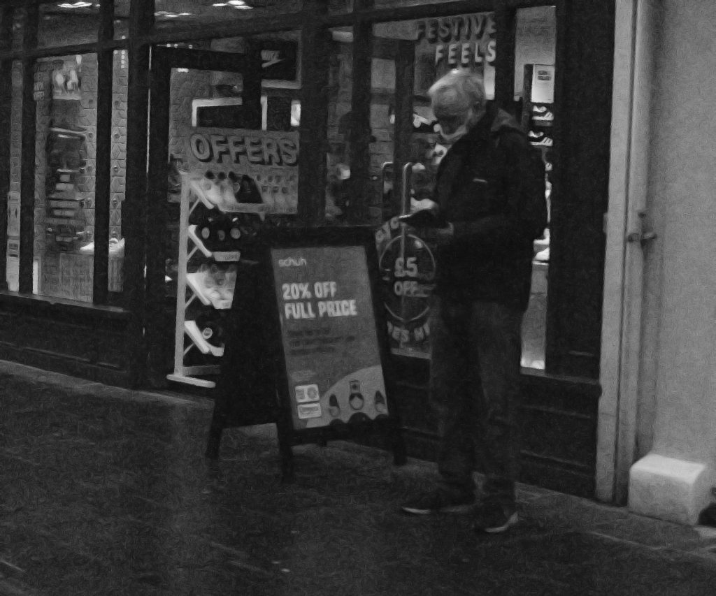
This image contain an individual with a mask on (due to Covid-19 pandemic). It is in black and white to relate to the 70s and also it makes it easier to edit. Also, due to my experimentation with ISO most images contain grain hence the inspiration to give a Lomography feeling.
The man is at the centre of the image therefore making him the focal point of this image. The individual appears to be looking to the side as if he’s thinking or looking for the next shop to go to as he’s holding a plastic bag suggesting the idea he went shopping.
The rule of thirds and centered composition have been used in this image to powerfully place the model to help make them the main focal point.
In relation to Richard, I took the inspiration of his birth year (1970) and made my photograph black and white as coloured film was expensive to produce. It is also a photograph taken without the model knowing making it candid.

Outcome 2
In this outcome, an adult lady is talking to what appears her friend. The lighting for this image is natural as it was taken outside with a harsh use of ISO.
The image is in black and white to relate to Richard and some of his black and white work.
I have used photoshop to reduce the colour noise and grain from this image but it has decreased the quality of the image along with it. However, the grain kind of works well with the idea of lomography.
There is a constant use of the rule of thirds in this photograph as the face of the model is centered close to the middle making her the main focus of the image and having the background behind her.
This photo and candid photography just come to show how un-attentive we humans can be not noticing someone is taking a photo of us.
Outcome 3
In this outcome the lighting is natural and quite dim due to the wheather (cloudy) and the low ISO used to try and freeze individuals in a way on a frame without them noticing and/or have the image with blurry movement.
The rule of space has been used to compose this image showing that the model has enough space to move to but is more entrigued by his phone.
This image can show how content we are with simple, minimalistic entertainment than what’s actually around us. For example, behind the man there is a show sale happening with a sign saying “20% off” but the model is too busy on his phone to appreciate the environment around him.

Outcome 4
In this outcome we can clearly see another example of an individual talking to their friend.
I have purposely used the centered composition to compose this image as the man is clearly centered.
It’s in black and white to relate to the other black and white images with naturalistic edited lighting.
In my opinion I have successfully achieved the purpose of this project which was to take portraits of people anywhere without their realisation so that we can capture their naturalistic form without photographer bias intervening.
This is powerfully shown by my 4 final outcomes where I have captured models talking to their friends, busy on their phones and not acknowledging a sale on a shop and much more. This energetically demonstrates and is an example of candid / covert photography.
I love how the images turned out as it gives this vintage look which was very common in 1970s (Richard’s birth year). On the other hand however, the photographs had noise grain and colour which was due to the low ISO being used along with a fast shutter speed. It may be argued that it adds to the vintage theme but with the amount of editing used to restore the images, the shots lost their sparkle by a lot.
Therefore, I will learn to use ISO and Shutter speed on manual mode in an efficient and clear way in order for the photographs to be as high quality as possible.
Fay Godwin, born in 1931, Berlin, is best known for her rural landscape photography. Growing up in many different countries, with a diplomat father and artist mother, and travelling most of her younger life, Godwin was conditioned to have a love for the arts from a young age. At the age of 21, Godwin had found a place to settle in London, where she worked at a publishers. This photographer’s fascination with photography first emerged in the 1960s, when she would often take pictures of her children, later looking at it as a more serious career choice. From this she started out as a freelance photographer, then moving on to selling her own books containing these countryside landscapes. It was Godwin’s book titled “Land” however, that gave her the most recognition, containing all her work from the past decade of her photography.
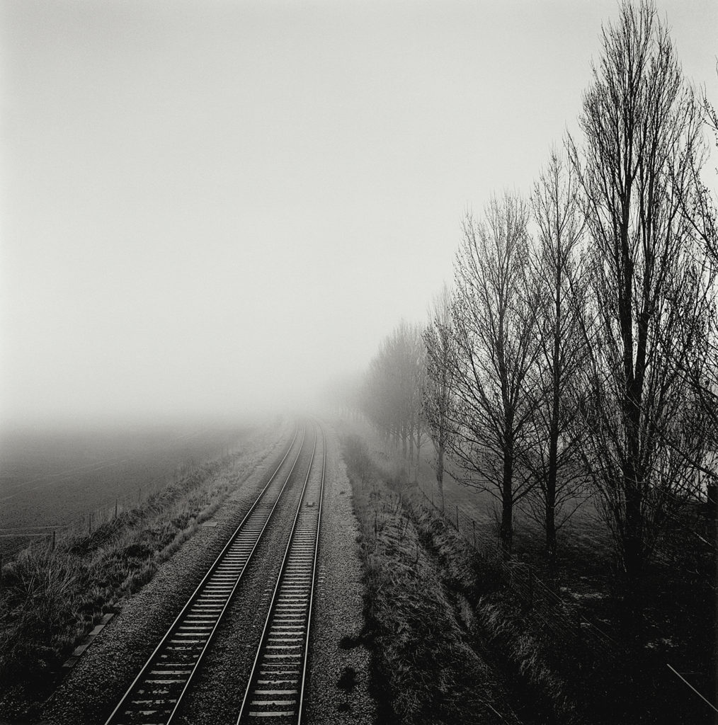
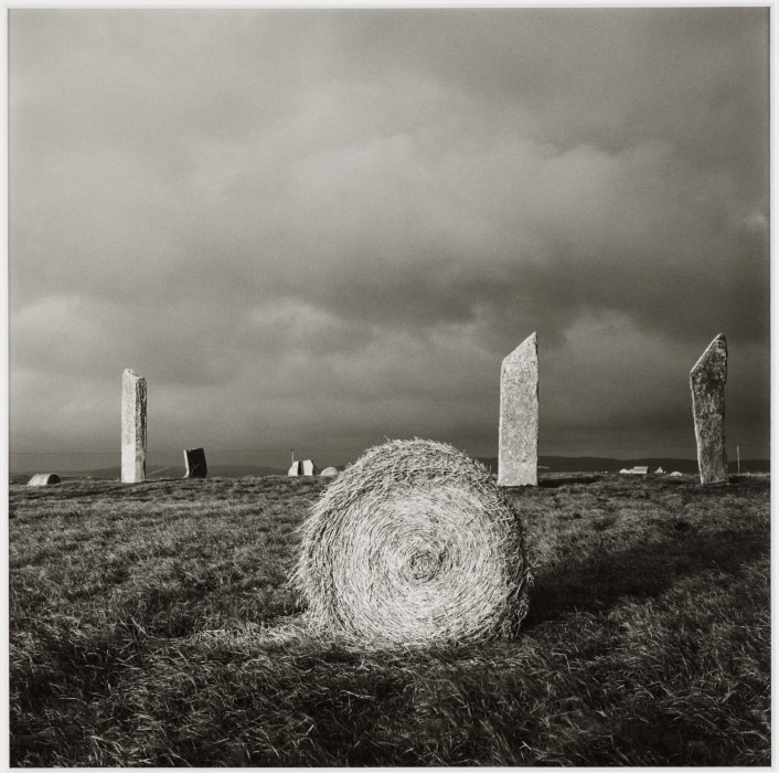
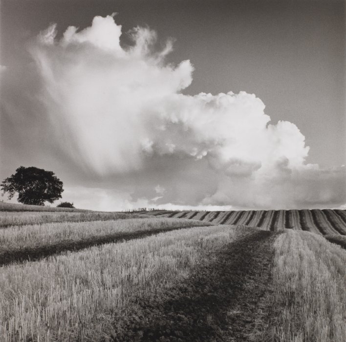
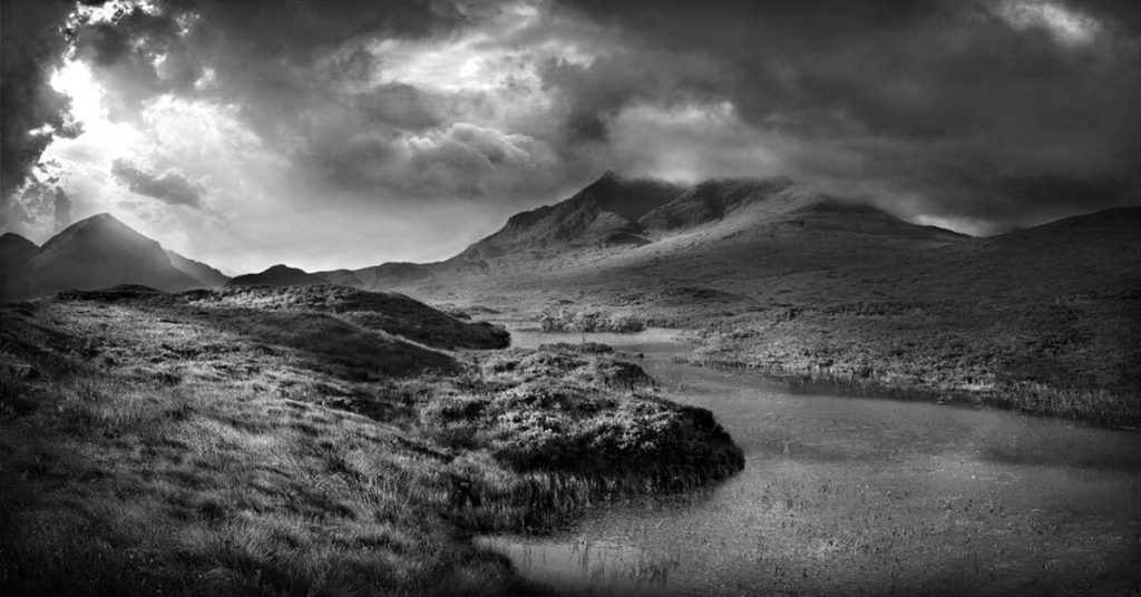


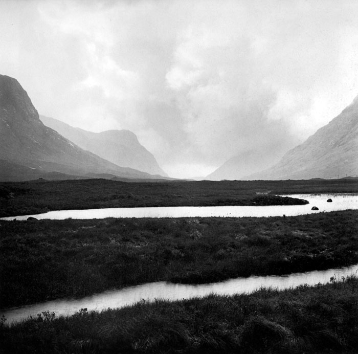
This atmospheric black and white photograph taken by Faye Godwin, displays a rural setting containing a valley, running through a mountain range. Leading lines in this image are created by the curved river, flowing in the foreground, drawing the viewers eyes towards the mountain range, in the background, slightly covered by mist. The jagged outlines of these mountains also aid the structure of this image, by gradually leading the viewers eye down into the valley. Here Godwin has clearly exhibited strong contrast between light and dark, with the luminous river highlighted by the sun, and the dark grassy lands that encompass it. These dark tones also contrast with the upper half of the image, past the horizon line, which contains light to mid-tones. There is a small amount of symmetry in this image, which is created with the center placement of the opening of the valley, seen in the background. It can also be said that the viewpoint in which this image was taken, was from head height due to the horizon line being in the center third of the photograph.
It is clear that the light used in order to take this photograph, was natural, created by a gentle, translucent haze over the mountains, as it is a rural landscape image, with no artificial light in the surroundings, as you might see in an urban landscape. It appears that Godwin took this image at midday, due to the evenly dispersed and soft light that does not create many harsh shadows in the landscape. For this Photograph Godwin most likely used a low aperture, allowing for a large depth of field, this is as the foreground and background in this landscape photograph have the same amount of focus on them. In addition, the shutter speed that Godwin used must have been on a fast setting due to the sharpness of the image. The ISO setting used to take this picture most likely was on a low setting, due to the large amount of light flooding the image, and highlighting the river.
As an avid walker, and a member of the Ramblers association, Godwin had great respect and admiration of nature and the preservation of it, even going as far as protesting for the cause. This later lead to her claiming that she was in fact a documentary photographer rather than a landscape photographer, stating that she acted as a reporter of the land. This appreciation can be seen in this image, as it can be said it the captures unbounded essence of the sublime and romantic genre, creating a photograph from a perspective, that allows you to be in awe of the grand scale of nature and its immense beauty.
Fay Godwin (1931 – 2005) was a British photographer known for her black and white landscapes of the British countryside and coast. She produced portraits of dozens of well-known writers, photographing almost every significant literary figure in 1970s and 1980s England, as well as numerous visiting foreign authors. After the publication of her first books he was a prolific publisher, working mainly in the landscape tradition to great acclaim and becoming the nation’s most well-known landscape photographer. Her early and mature work was informed by the sense of ecological crisis present in late 1970s and 1980s England.

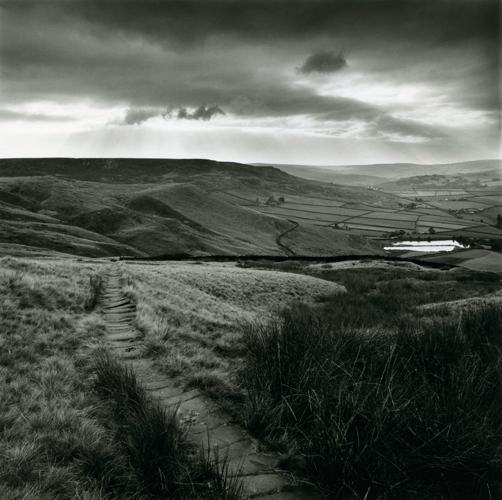
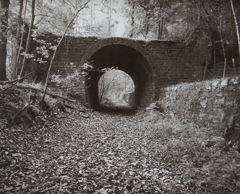

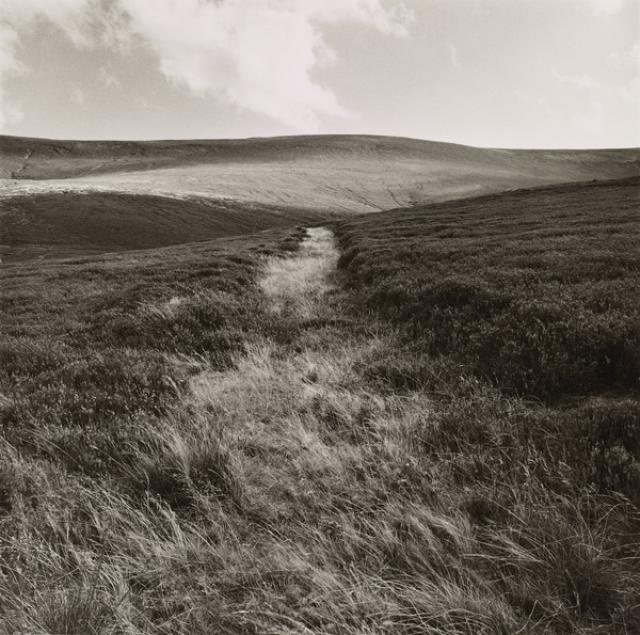
Godwin has used utilised the natural lighting available to her in this photograph, and has avoided using any form of artificial lighting as the image was captured in an outdoor environment. There is a range of tones in the image, varying from dark and almost black in the grass, and much brighter ones in the sky and clouds. Additionally, the photograph being captured in black and white adds to the contrast between them. However, the colours in this image are not entirely black and white as they fall somewhere in the middle, which still leaves the photograph feeling natural and untouched. Godwin has positioned herself in the middle of the pathway in the photograph, which has lead to leading lines being presented to the viewer, drawing their eyes to a singular focal point (where the pathway meets the hill in the background). This focal point is also in the centre and the middle ground of the photograph, which again draws the viewer’s eye to this particular point. We can see that there is repetition present in the photograph in the grass in the foreground as they are all positioned in the same way. The texture of the grass is also still clearly visible through the image, and the rough surface contrasts to the soft look of the clouds in the sky as well as the smooth look of the hill in the background.
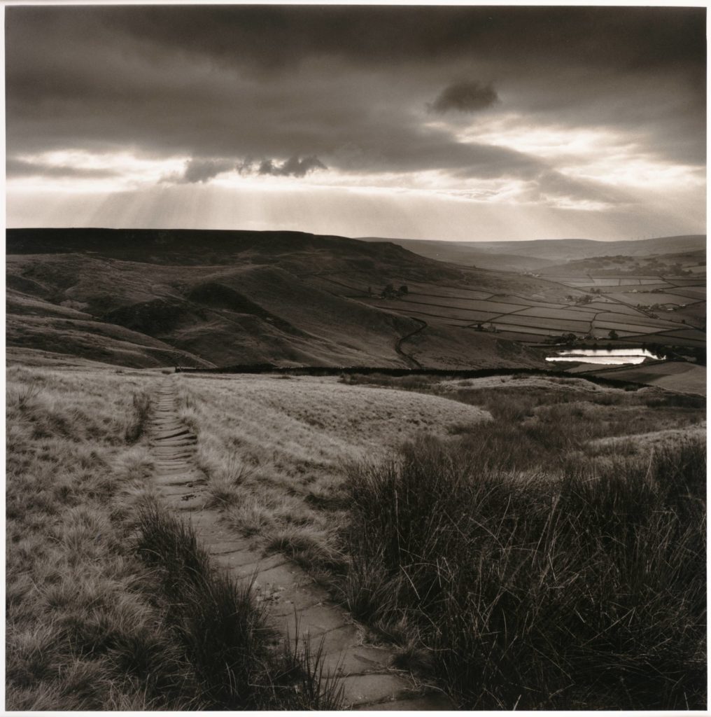
This photograph is of a path leading to a reservoir in the countryside and is aptly named ‘Path and Reservoir’. It was captured in Yorkshire in 1977 by Fay Godwin. Godwin was known for being a part of The Ramblers, which is Great Britain’s leading walking charity that celebrates the pleasures of walking and aims to protect the places people love to walk. They believe everyone, everywhere should be able to experience the joy of walking and have access to green spaces to walk close to home. It is very possible that Godwin took photographs such as this as a way to show her love for the countryside and her evident disdain at the growing privatisation of the environment by big businesses. In the foreground of the image there is a wooden path which leads to the middle ground of the photograph and draws the viewer’s eye to the dividing line in the middle of the image. Perhaps it was her intention to use the edges of the pathway as leading lines towards the middle of the photograph, thus creating a focal point for the viewer. which is the edge of the hill that the path is on. She appears to have kept the photograph as natural as possible, probably as a way to give the viewer a realistic depiction of the countryside that she is seeing. She has also captured this image in black and white, which may have been an artistic choice; this was taken in 1977 when, although coloured cameras were available, many photographers still chose to shoot in black and white. However, the photograph is not completely black and white, as different hues of tones can be seen in the grass and the hills in the background. We can tell she has used natural lighting as the photograph is of the outdoor environment. Godwin most probably placed herself in an intentional position when she took the image. There are multiple curvy and natural lines in the image, shown by the dividing lines of the fields in the background and the clouds in the sky. This could emphasise Godwin’s intention to show the natural landscape in an organic and raw way, as it has not been made straight, rigid or repetitive by humans. I think that Godwin wanted the viewer of this photograph to feel inspired and in awe of the natural beauty of the countryside.

Fay Godwin, born in 1931 and died in 2005, was a British photographer who was recognised for her intense landscapes, specifically her black and white work. Godwin began her photography career with portraits of well-known writers such as Ted Hughes and Clive James, however she broadened her love for photography when she found her passion for walking and the environment. Her early landscape work was created with the intent of bringing to light the ecological crisis within the late 1970’s to the early 1980’s, where she protested the English countryside being privatised. Later, in the 1990’s, Godwin was offered a Fellowship at the National Museum of Photography, Film and Television in Bradford, where she was pushed further with in the direction of colour and urban photography.


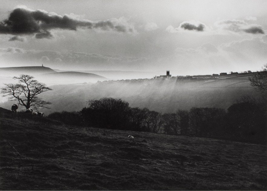
This image by Fay Godwin, titled “Path and Reservoir above Lumbutts” depicts exactly what it states within the title. At first glance, fields, ponds and moody clouds can be seen, complete with a winding pathway. This image was taken in the late 1970’s, at the prime of Godwin’s project to help preserve British public land from being privatised. This could prove Godwin trying to display both the beauty and the threat that the natural world holds over us. This is not a realistic depiction of nature as Godwin takes tonal values to the extreme to create an intense juxtaposition.
The lighting in this image is gloomy, overcast natural lighting. The lighting suggests the image may have been taken in the late afternoon, perhaps in autumn or winter. The lighting is natural yet harsh, meaning distinct shadows and highlights are created. The most well-lit sections of the image can be seen in the light reflected onto the reservoir water and the illuminated sky. The light is directed further towards the right of the image, as the majority of the left side of the image is in darkness.
There is representation of a leading line in this image, in the form of the path that winds into the distance of the image. This thick, curved line directs the viewers eyes into the left of the image. This provides a forwards movement to the photograph, although when the path comes to an end, the viewers eyes are directed to the other sections of the image. There is also representation of lines within the fields that are separated with subtle, thin lines. The line provided by the horizon also acts as a leading line that directs the viewers eyes from one side of the image to the other.
There is a subtle representation of repetition in this image, which can be seen in the repeated squares of fields in the background of the image, as well as repetition of line within the leading line and also the slightly indistinct lines separating the fields, however these lines do not create any sense of pattern or rhythm.
The majority of the shapes in this photograph are curved and organic, for example the clouds are very irregular with soft edges, also the leading line of the image is curved. The only visual geometric shapes are the square-shaped fields in the background.
There is a shallow depth of field in this image as the foreground of the image is in focus and the background is captured with a slight blur. The shadows produced by the clouds also create the sense of a shallow depth of field as the darkened areas are indistinct and indistinguishable. The entirety of the photograph is filled with positive space.
The aesthetic of this image has a rough texture due to the masses of sharp-cut grass. However this is juxtaposed with the exceptions of the soft, light clouds as well as the calm waters.
The range of tones in this image range from dark to light. The darkest areas of the photograph can be seen in the background towards the left, and also the clouds. These areas are contrasted with the lighter areas of the photo, for example the glistening water and the gleaming sky. Overall, the image tends towards darkness, especially in the top third with the near-black clouds.
There is a lack of colour in this photograph. I think this is because Godwin wanted to show the power and beauty of nature in it’s purest form, and the extreme contrasting tones adds a sense of intimidation to the aesthetics of the image. Metaphorically speaking, as Fay Godwin’s message in her work is to preserve the natural world, the use of the monochromatic filters could signify the death and destruction of the world, as the image provides a gloomy, depressing atmosphere.
There is a complex composition to this image, as it follows the rule if thirds in some sense, yet also follows it’s own unique composition. The rule of thirds can be seen to be used horizontally, as the image almost separates into layers of contrasting dark and light. However, there is no use of the rule of thirds vertically as the focal points, being the footpath and the reflected water are not located in the middle third. I think the composition is fairly balanced as the light and dark tones are rather evenly spread throughout the image.
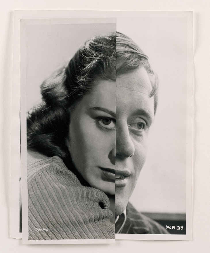

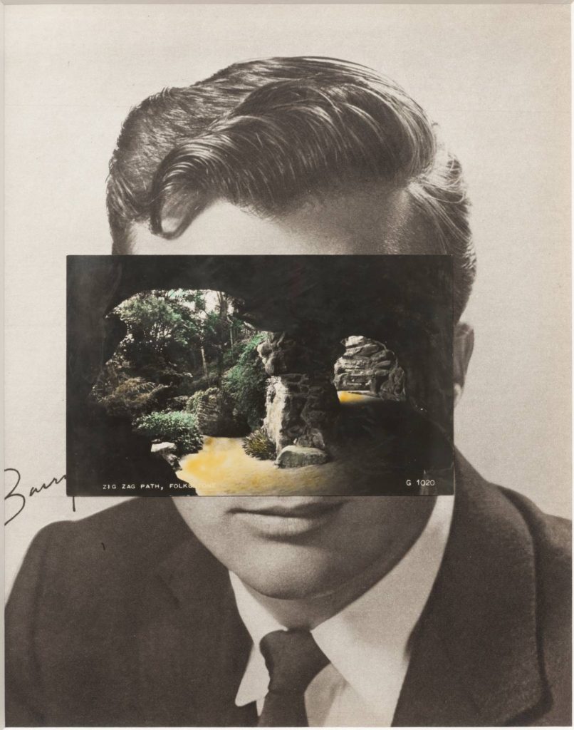
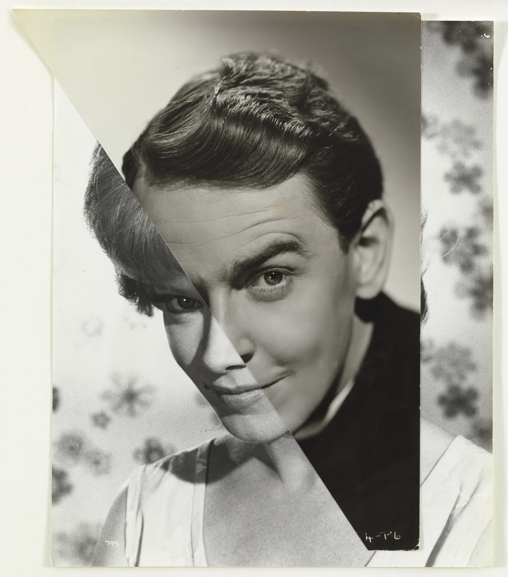
Stezaker is a British photographer born in 1949.
He is fascinated by the “lure”of images.
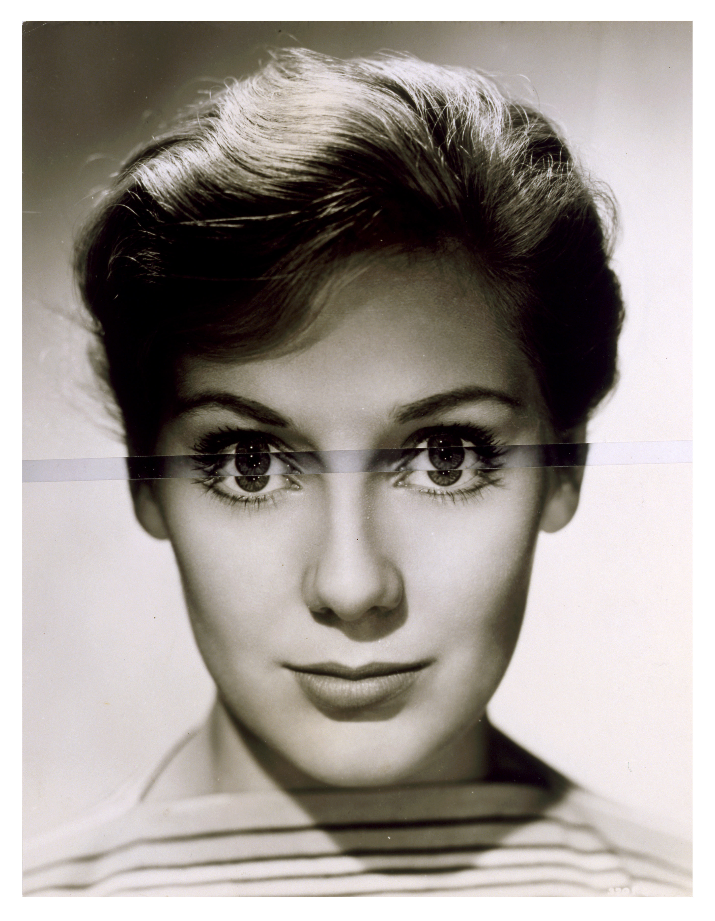
Stezakers’ works focus on photo montage to give old images a new meaning and add a creative surrealistic tinge to his photography.
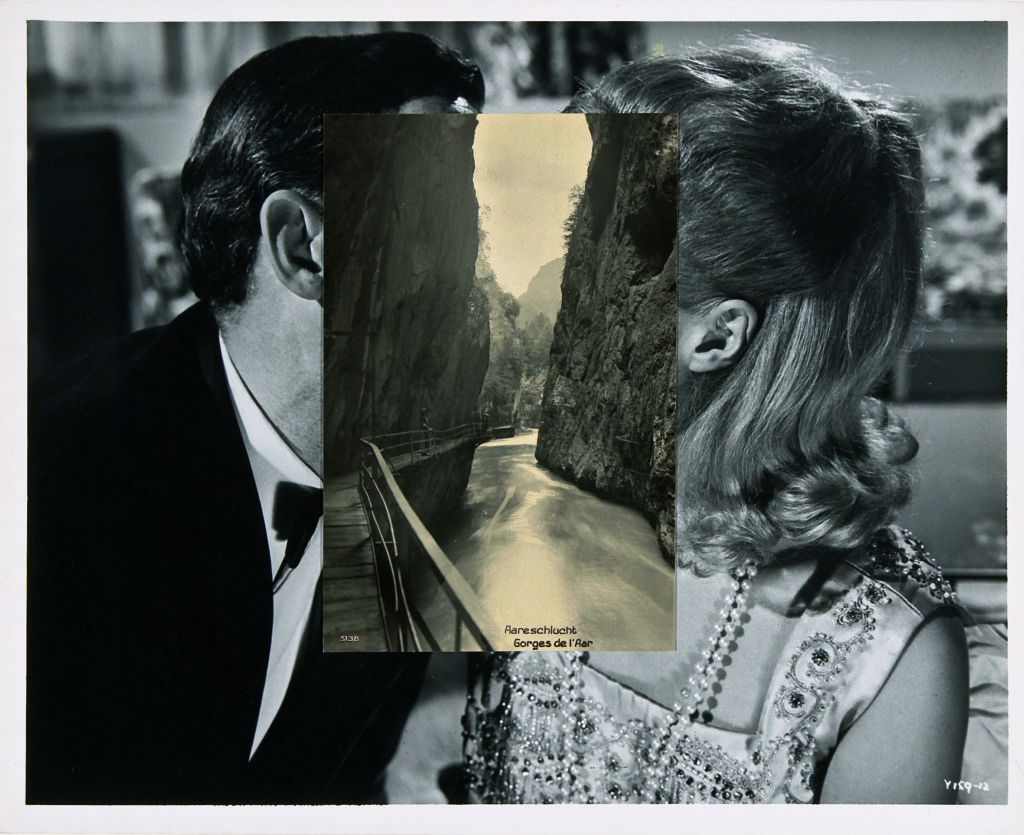
He focuses on the similarities of structural and compositional elements of an image and stitches them together in a seamless yet surreal fashion. For example in the below image he uses the structure of the cliff faces and relates them to the structure of the subjects faces in the background.
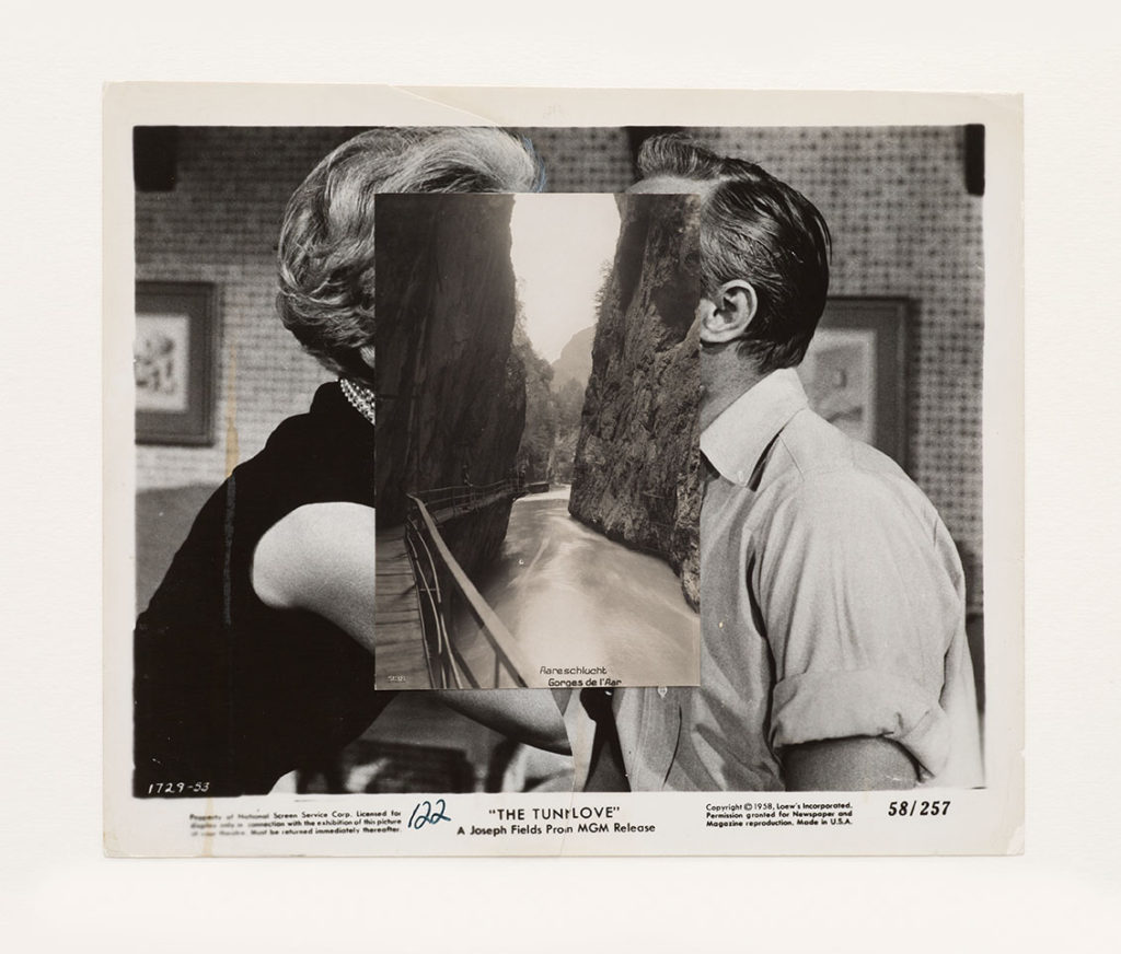
This image has quite a flat, monochromatic style which almost gives it a warm balance, soft texture and comfortable feel. The montaging of the cliff faces is visually appealing as it is framed in the centre of the image. The two layers to the image each have their own depth which creates this double up of depth in the image and the eye has a lot of elements to look at which would give it a chaotic composition however because of the montaging the additional layer fits seamlessly within the background which cancels out this chaos and rather satisfies the composition.
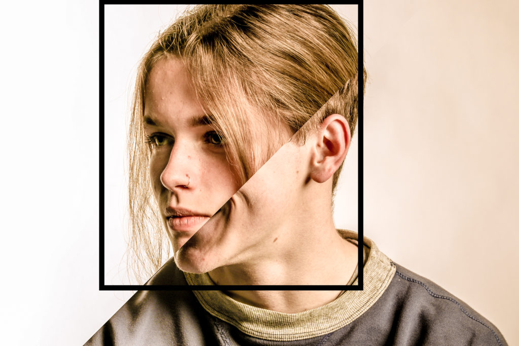
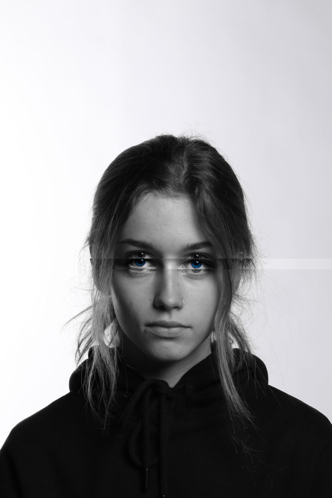
My response to Stezakers’ work:
