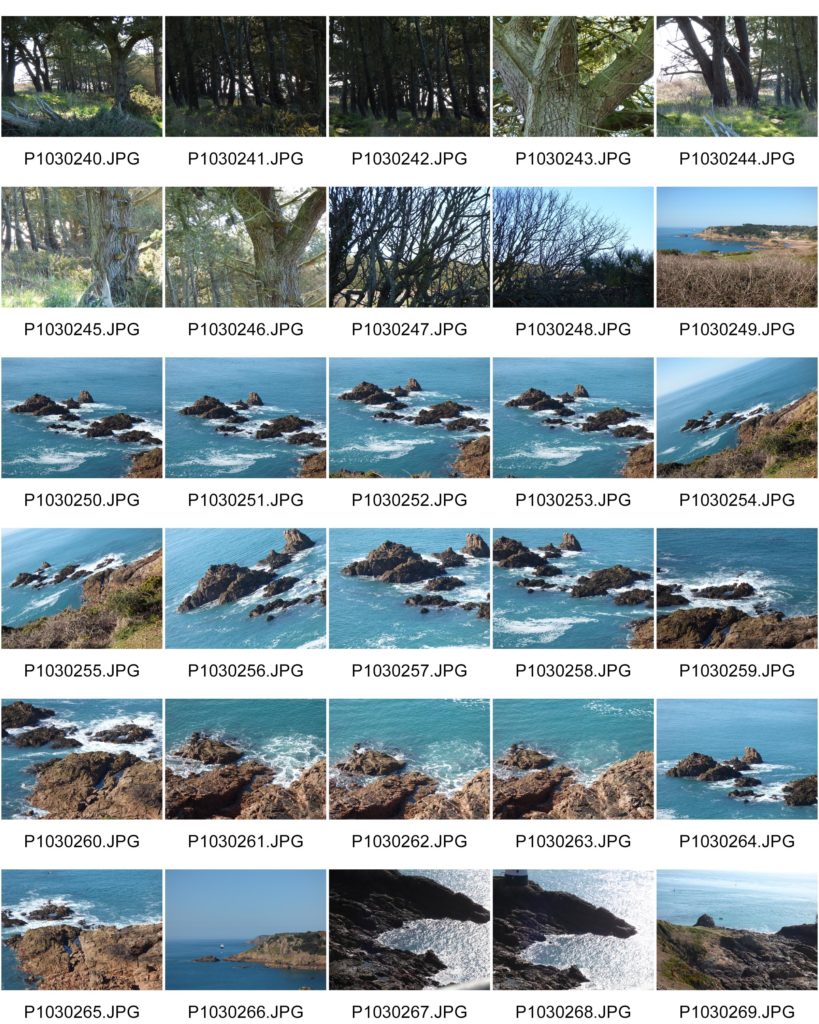
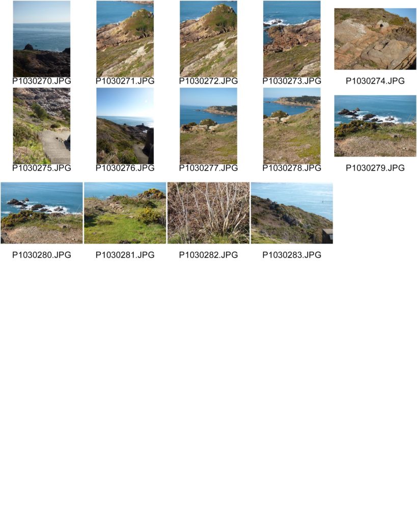
For this shoot, I took a few photographs above portlet beach.


For this shoot, I took a few photographs above portlet beach.
Contact Sheets


Final Compositions
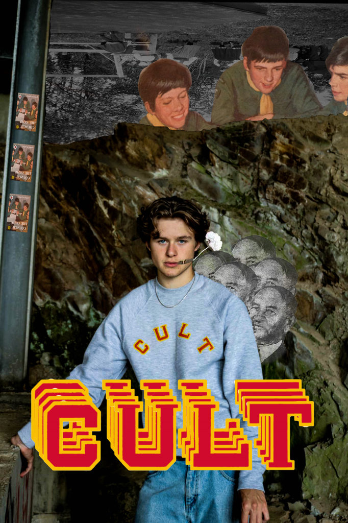
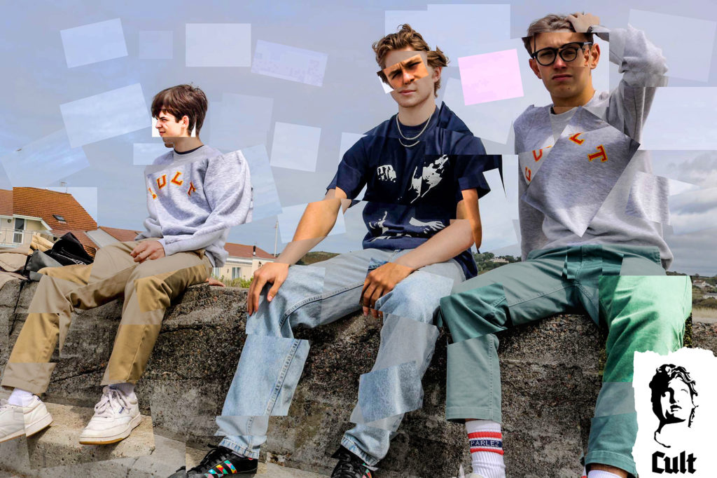
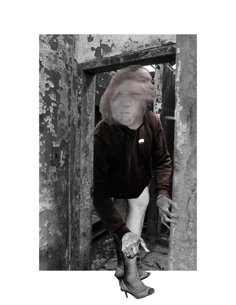
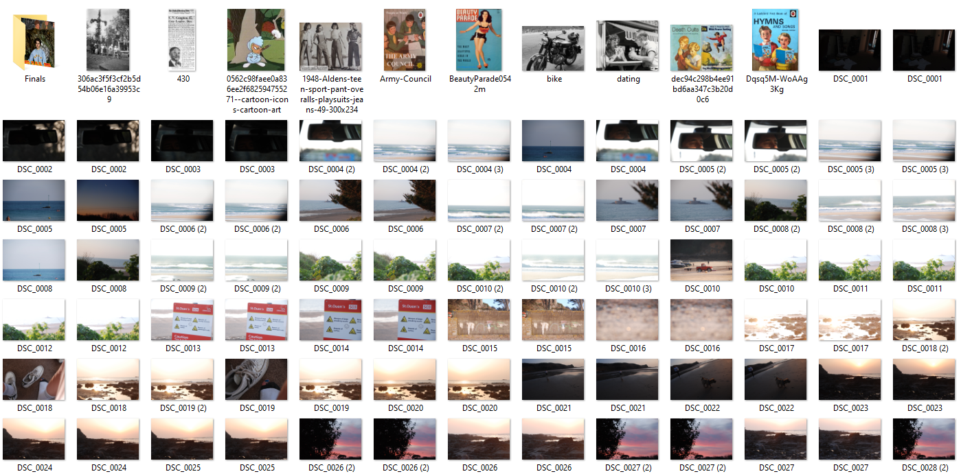
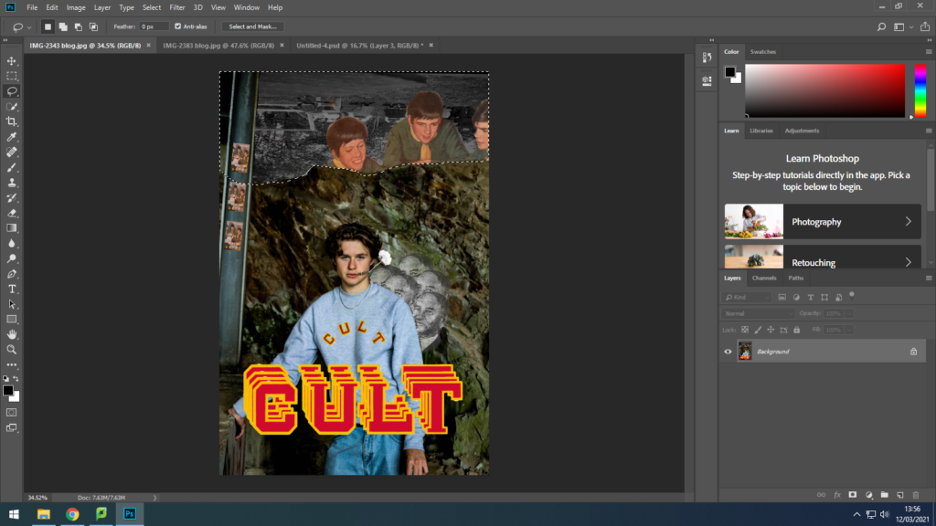
I used cutting tools in photoshop to separate various elements in the compositions to re-layer and reposition them.
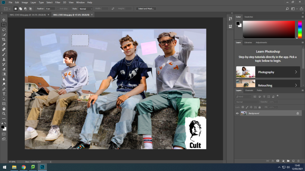
I also added archival imagery and repositioned them in a way where they would look surreal but still play to the form and structure of the original image. I used this vintage imagery on my recently taken street culture images to create an element of postmodernism.
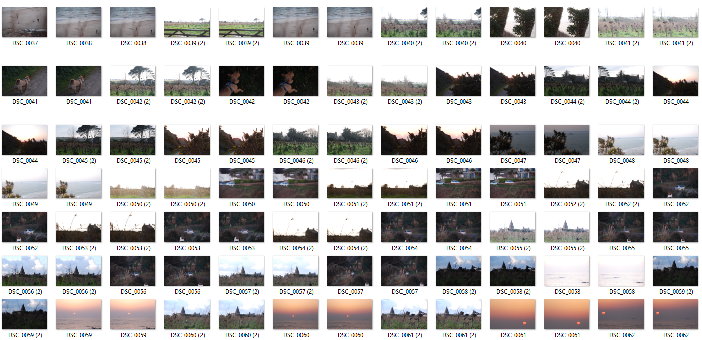
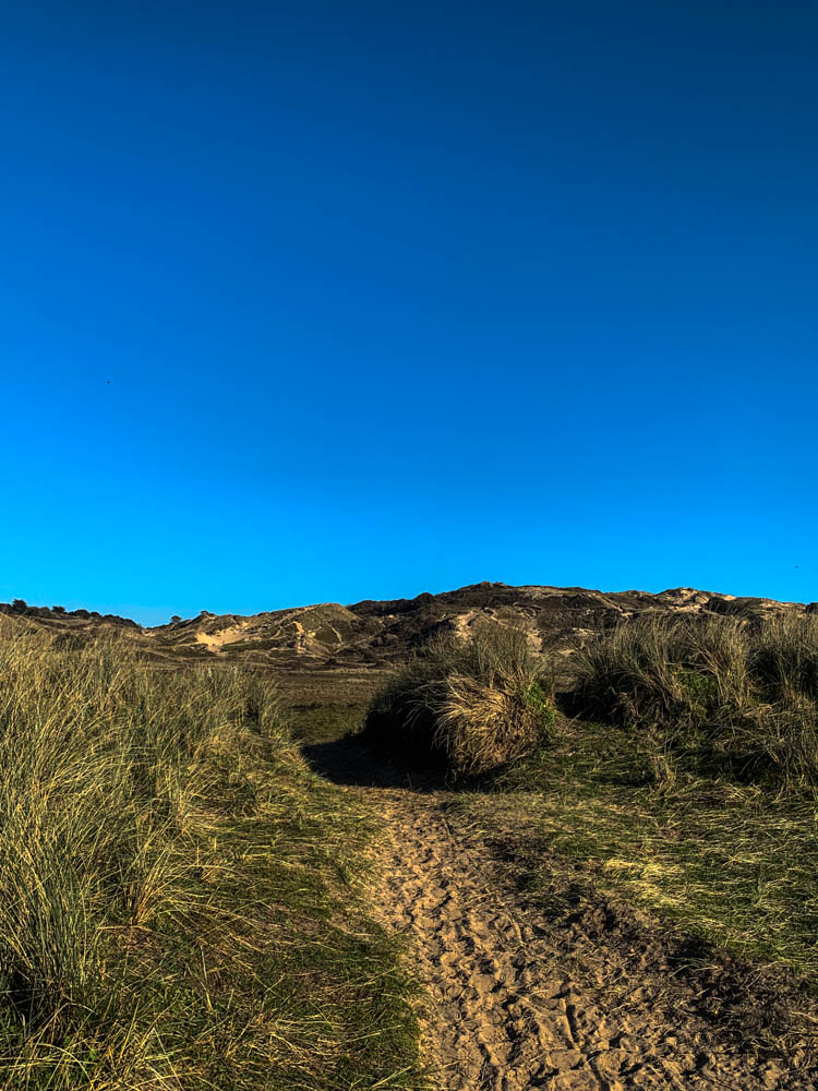
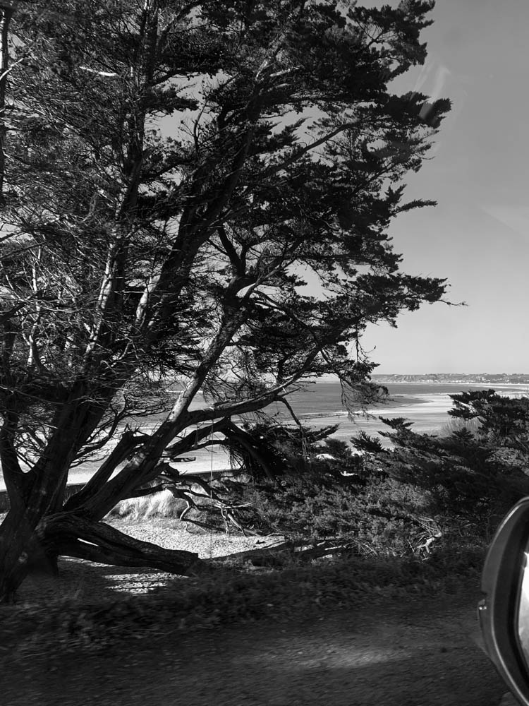
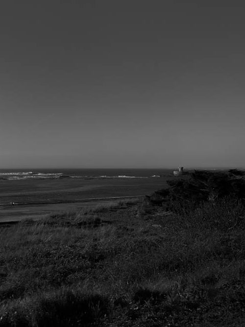
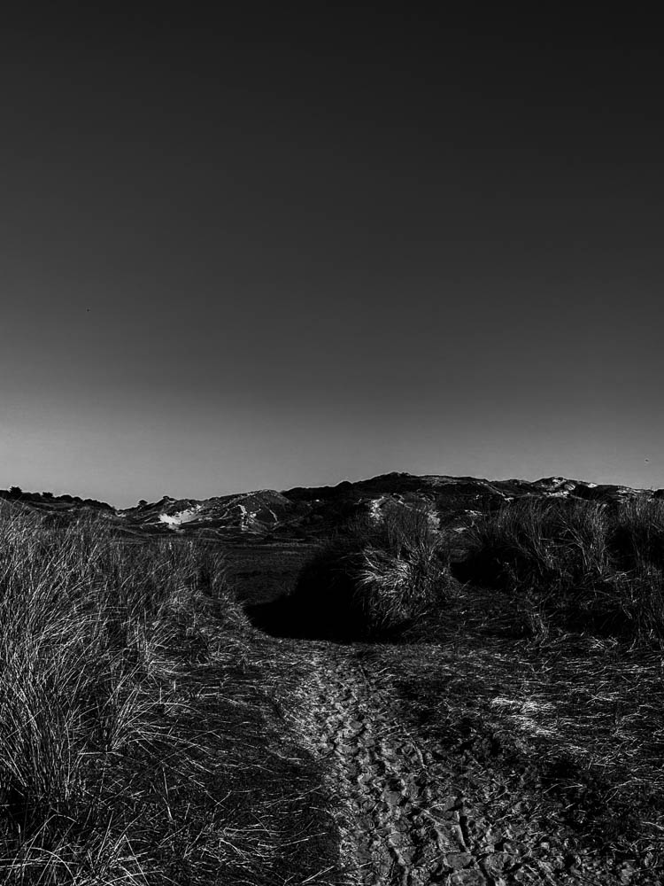
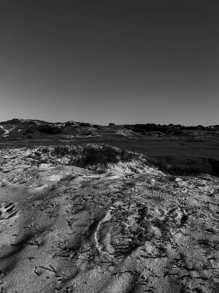
I went up to st ouens and photographed sand dunes and the coastline. I went when the weather was sunny with blue skies as I wanted bright lighting and not a rainy background.
contact sheet;
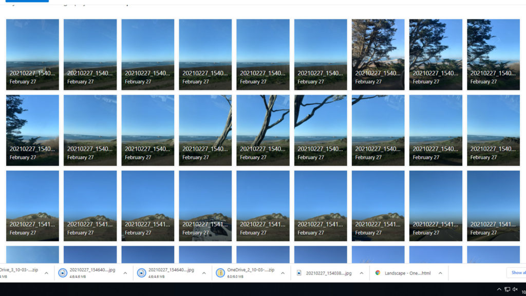


I like how these images turned out because there’s no sign of buildings or any man made aspects which is perfect for rural landscapes. I wanted to find a very open space and went to the sand dunes as well as photographing some coastal views.
Editing my favourite images/ final images;
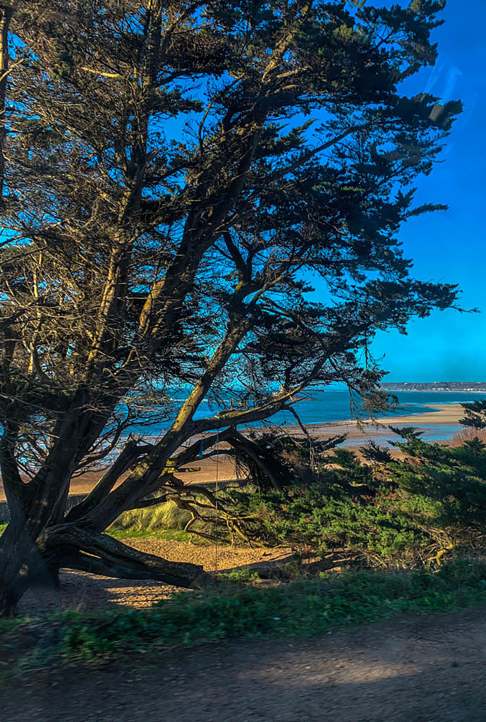

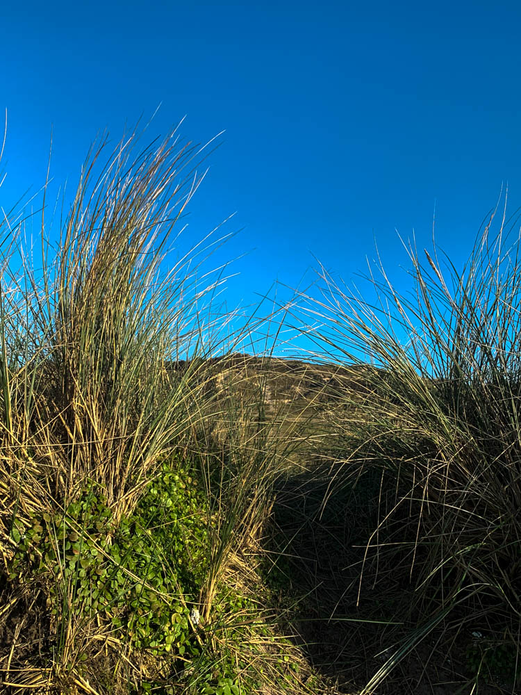
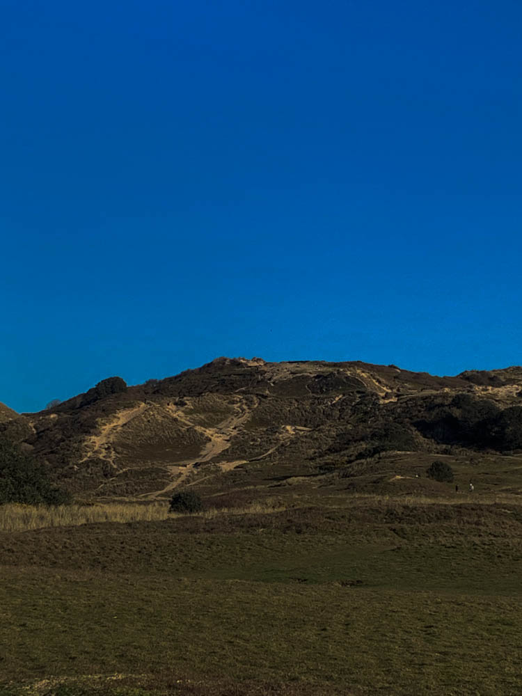
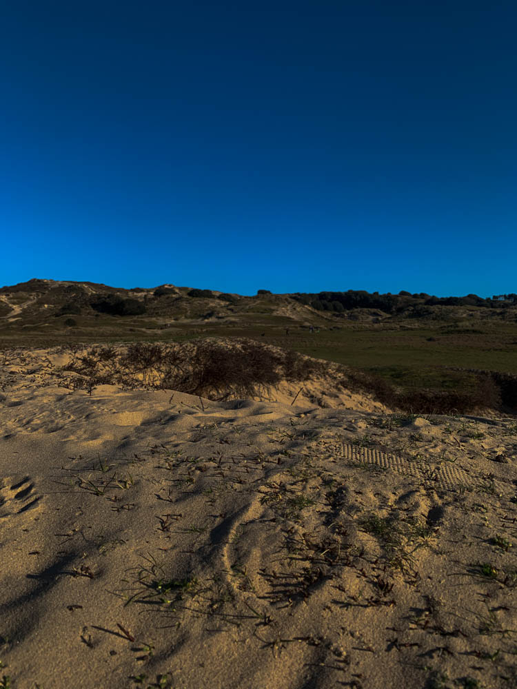
black and white version-


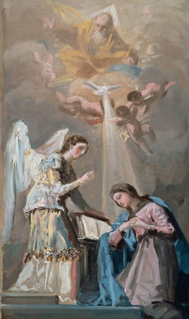
Romanticism was a movement that ’emphasized the individual, the subjective, the irrational, the imaginative, the personal, the spontaneous, the emotional, the visionary, and the transcendental’. Romantic works were a reaction to the Age of Enlightenment and the advancing Industrial Age, a time in which science and rationalization began to take firmer hold in the public consciousness. It was an international movement that swept Western Europe and Russia at the end of the 18th and beginning of the 19th centuries. It expanded to North America in the beginning of the 1830’s. Romantic literature challenged this new wave of ideas by glorifying stories rooted in emotion, nature, idealism, and the subjective experiences of common men and women. “Romanticism is precisely situated neither in choice of subject nor in exact truth, but in a way of feeling.” – Charles Baudelaire (1821-1867). Romantic artists were apt to make statements about anything (or nothing), dependent on how an individual artist felt about any given topic on any given day. Francisco de Goya’s work explored madness and oppression, while Caspar David Friedrich found endless inspiration in moonlight and fog. In the movement’s early years, these artists predominantly focused on landscape paintings, the will of the Romantic artist had the final say on the subject matter.
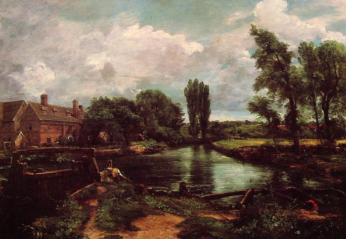
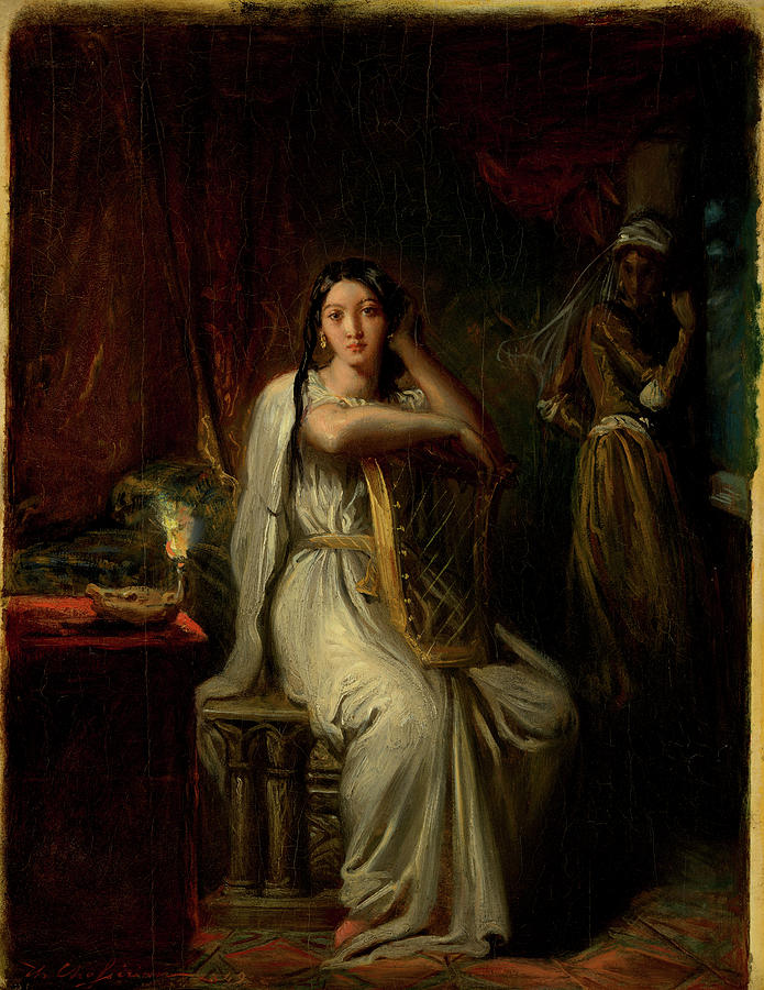
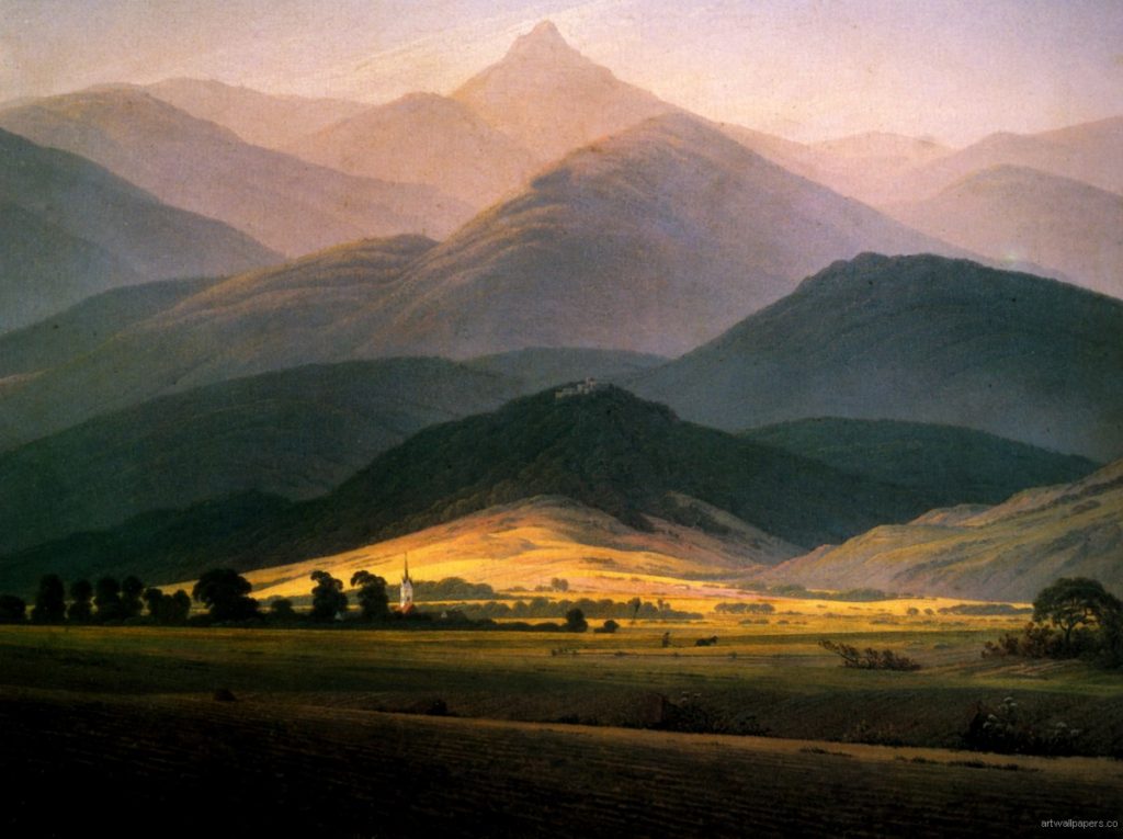
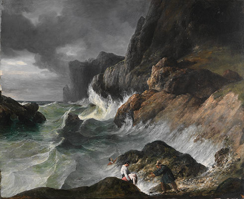
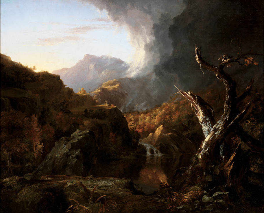
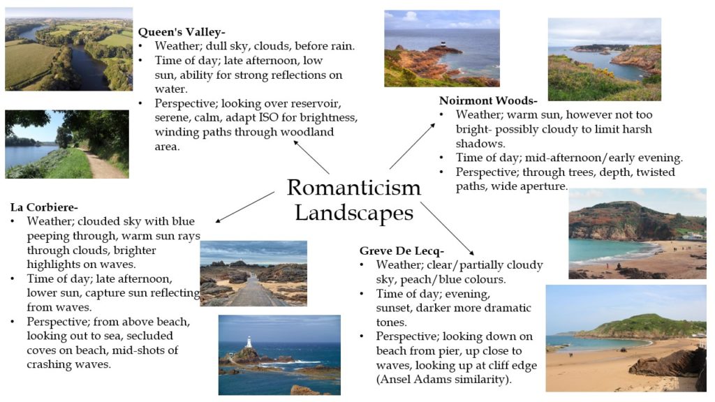
When looking at Romanticism in photography it is clear that artists are aiming to capture the dramatic emotions and atmosphere they feel when taking in their surroundings. For example, photographers such as Ansel Adams, Edward Weston and Fay Godwin capture awe inspiring images of tall mountains and winding paths to entrance the viewer into their romanticised setting. I aim to take influence from these photographer’s images and conduct a series of romanticised landscape photoshoots in specific areas around Jersey.
St Helier
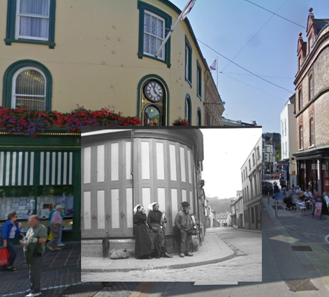
I found an old image is it made me think of st helier but at another decade and I find it interesting because you can see how over time the style changes. People’s clothes but also the architecture of the building behind.
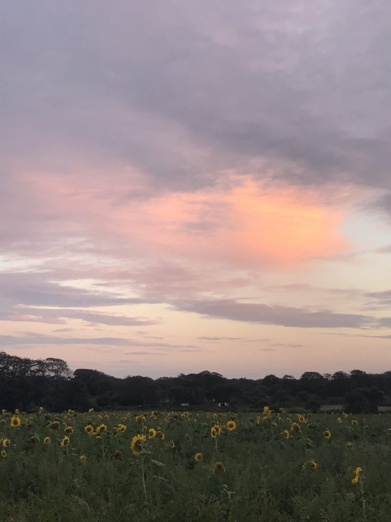
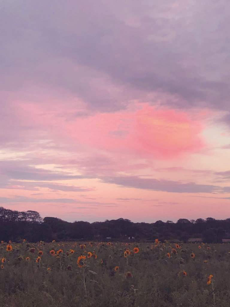
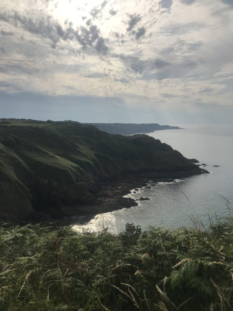
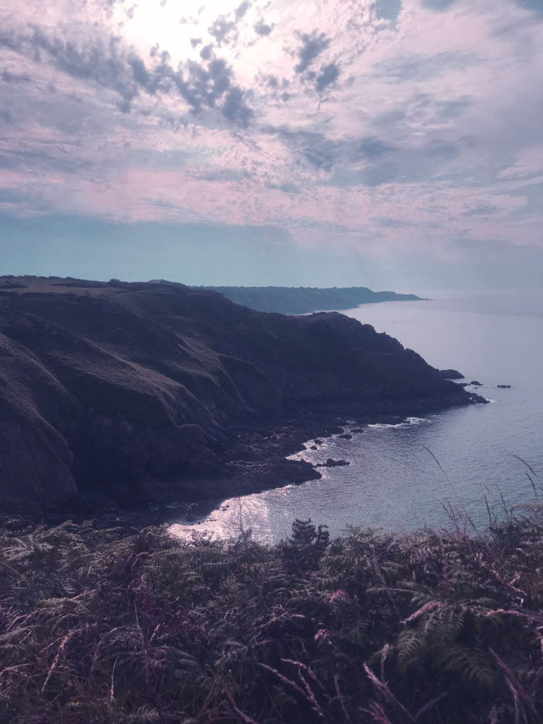
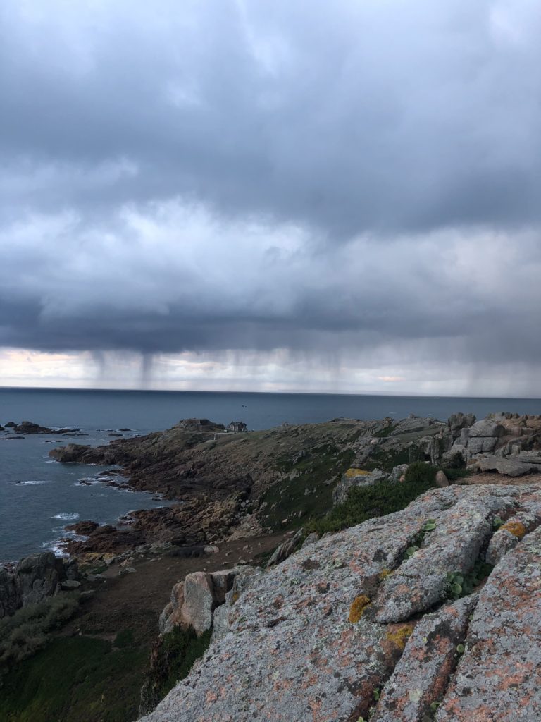
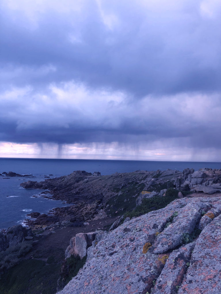
I decided to further experiment with photoshop in this photoshoot so I decided to edit the images in a similar way to the classic romanticism in art. To do this I used colour filters and adjusted the hue and colour saturation to exaggerate the colours in the photo. I think the black and white edits add a more vintage and classic, intense look to the photographs. On the other hand I think that the coloured edits relate closer to the theme of romanticism in art.

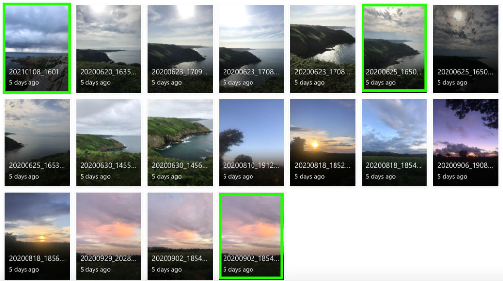
I believe the images highlighted in green are my most successful images in terms of Ansel Adams style of photography. I feel like these images have a better sense of romanticism because of the colours, tones or the interesting shape of the clouds. Putting these images in black and white through photoshop would further develop the same style that Adams is widely known for.
In general, these photos would be better quality if they were taken with a camera rather than a phone, however I did not have access to a camera for this photoshoot.
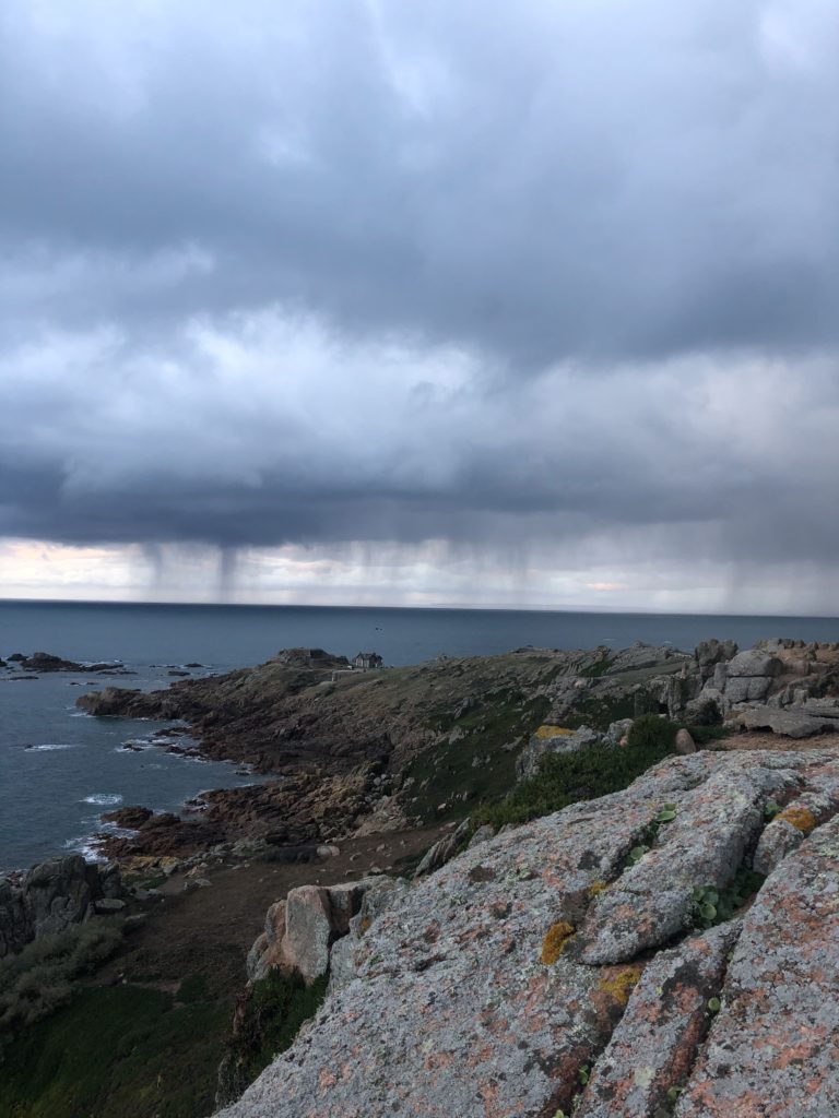


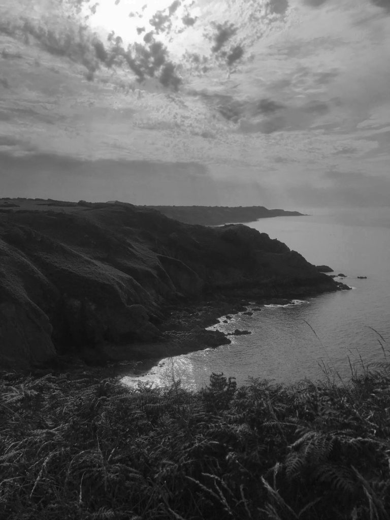

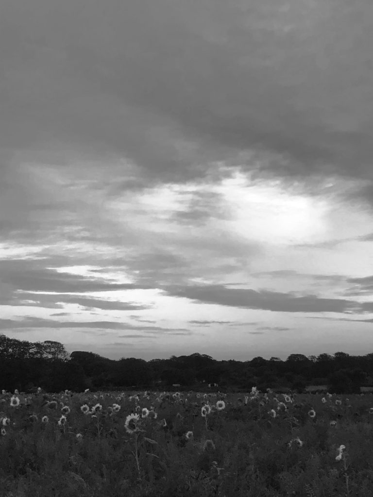
To edit these images, I used photoshop to give the photographs the same monochromatic theme that is iconically known within Ansel Adams work. I also adjusted the brightness and contrast curves to create more intense shadows and highlights, similar to the ones in the work of Adams.
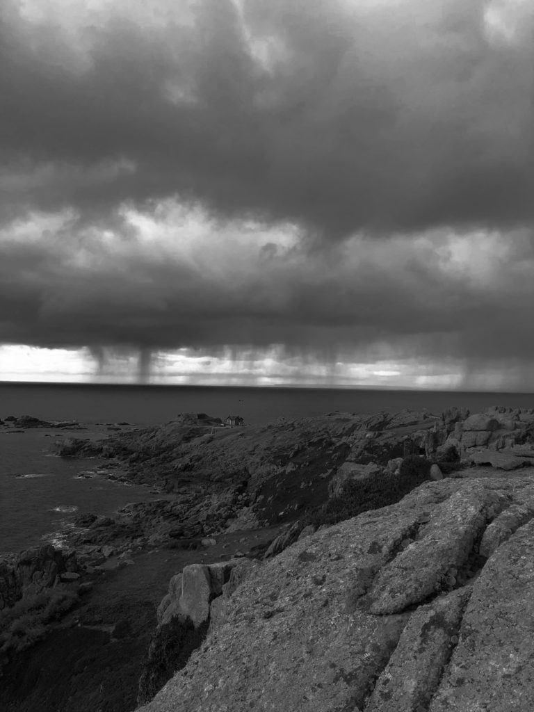
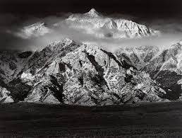
I believe my work and the work of Ansel Adams have both similarities and differences. In terms of similarities, the use of the black and white filter allows for the tones in both images to be accentuated and there is a sense of the sublime in both images. On the other hand the images are different because Adams photograph is taken on a much larger scale, he also practiced the use of using the tonal values of an image to it’s full capacity, whereas I had to alter the contrast and brightness levels in order to achieve the level of contrast that Adams is known for.
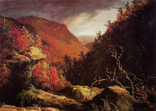
Romanticism in art became a poplar movement at the start of the 1800’s. Romantic art often saw links between the artists view of the ‘ sublime’, or expression of personal feeling and interest in the natural world. Romanticism emerged as a hopeful source on nature after the French Revolution in 1789, and shows the artist’s often exaggerated view on nature in order to create beauty out of the nature that was destroyed in war. Romanticism was shaped largely by artists trained in Jacques Louis David’s studio, including Baron Antoine Jean Gros, Anne Louis Girodet-Trioson, and Jean Auguste Dominique Ingres.

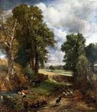


Romanticism has converted into a form of photography with the same aim as romantic art, to create an idealistic view of the world. Romantic photography depicts an exaggerated view on nature by which the features are dramatically and positively represented. This is done by editing a landscape image to create extreme contrasts between colour, tone and lighting. Ansel Adams is a perfect representation of romantic photography as his images display an almost magical view on the world’s natural state.

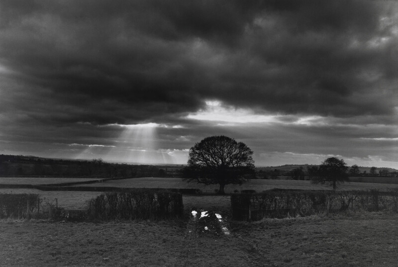


Ansel Adams, born in 1902 and died in 1984, was an American photographer and environmentalist who was passionate about capturing nature in it most beautiful and powerful form. Adams was given his first camera at age 12 on a family holiday to Yosemite National Park, and therefore discovered his love for both photography and nature through this. Adams help found group “f/64” which focused on embracing ‘pure’ photography and capturing a photo with it’s complete tonal capacity. Ansel Adam’s is an ideal representation of a romantic photographer as he dramatizes the natural world into an idealistic view.

This photograph taken by Ansel Adams in 1960, depicts the Northern California Coast Redwoods. This image ideally displays romanticism in photography with the use of extreme contrasting tones and juxtaposing levels of dark and light.
The harsh, natural lighting in this photograph both illuminates and darkens sectors of the image in an exaggerated manner. The lightest sections of the image can be seen in the trees in the foreground of the image, these are seen as an almost pure white against the contrasting darkness within the background of the image, as well as in the leaves and bushes of the photograph. As the shadows in the scene don’t fall in a particular direction, it is difficult to tell the time of day or the direction of which the lighting appears.
The white, thick lining of the trees act as leading lines for the viewer, as they direct the eyes to follow from the bottom of the image to the top. These lines create multiple focal points as they stand out amongst the darkness and create an upwards direction to the image.
The use of repetition can be seen within the trees of the photograph as these thick, leading lines are repeated throughout the image. However these repeated lines are contrasting as they vary in thickness and tone. The trees can also be seen as a form of echo as they almost duplicate each other.
There is a variety of both geometric and and organic shapes within this photograph. For example, geometric shapes can be seen in the straight-edged trees, which are juxtaposed against the more natural shapes seen in the leaves and bushes.
The depth of field is difficult to describe as the background consists of mainly negative, empty space. However I can guess that the depth of field is small as the foreground is in distinctively in focus, and the background is rather vague.
There is contrasting textures within the image. This can be seen in the leaves, which have a rougher and more jagged texture when compared to the trees which have a much smoother surface, therefor these are juxtaposed against each other.
There is an extreme contrast between light and dark tones within this image as Adams focuses on the extended use of tonal values in order to achieve a powerful juxtaposition between highlights and shadows. Ansel Adam’s goal in his work is to capture what is seen in the moment by the human eye, therefore this image is an accurate representation of the natural world. The darkest areas of the image can be seen in the shadows of the ominous forest within the background of the image. The lightest section of the image can be found in both in the off-white tree trunks and in sections of the leaves that cling onto the trees. Overall the image tends towards darkness, as the majority of the photograph contains darker tones, and these tones are more intense.
There is a lack of colour in this photograph due to the use of black and white film. The lack of colour allows for the tones in the image to be accentuated, creating a rather intense juxtaposition. If the image were taken in colour, the depth of field would probably be easier to work out as the background wouldn’t be in complete darkness. The contrast of colour would also be highlighted rather than the contrast in tones.
The composition of this image focuses on the use of lines rather than the use of thirds. There is no true focal point as the bright trees contain the viewers focus. I believe the photograph is balanced overall, as the contrasting tones are evenly distributed. The image produces an upwards direction for the viewer, directing their eyes from the bottom of the image to the top of the image.
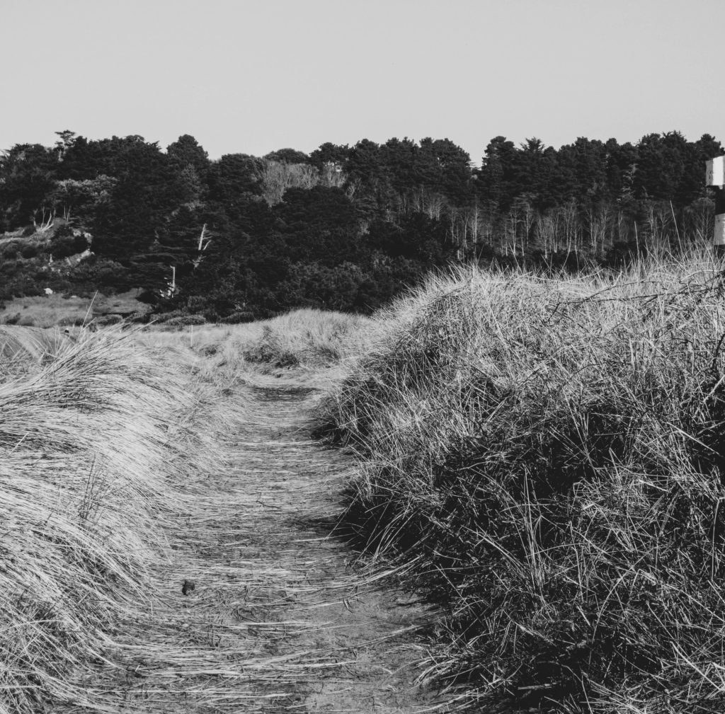
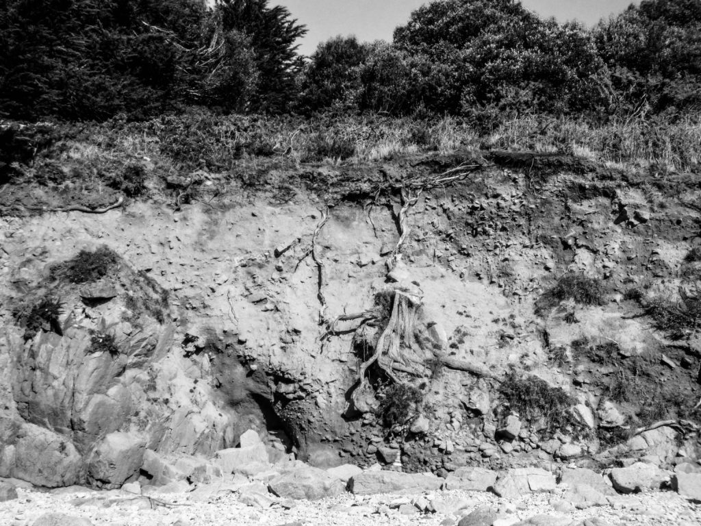
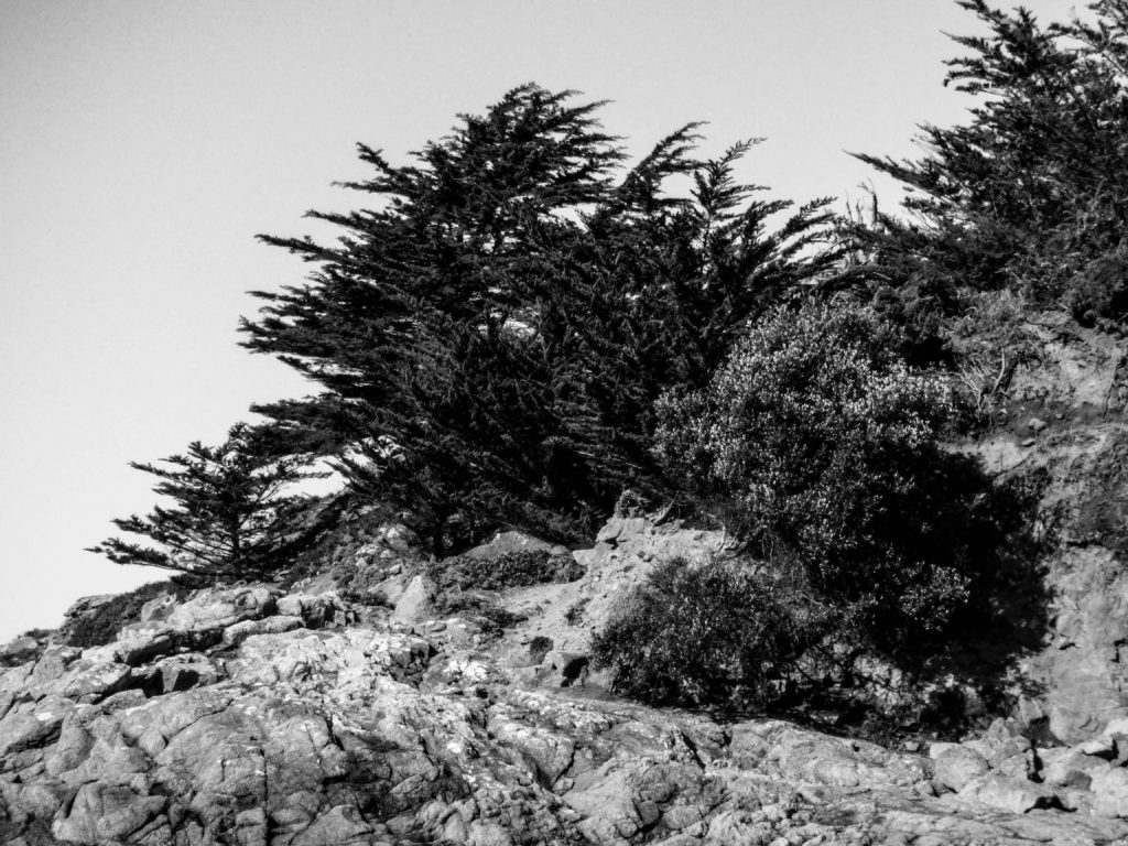
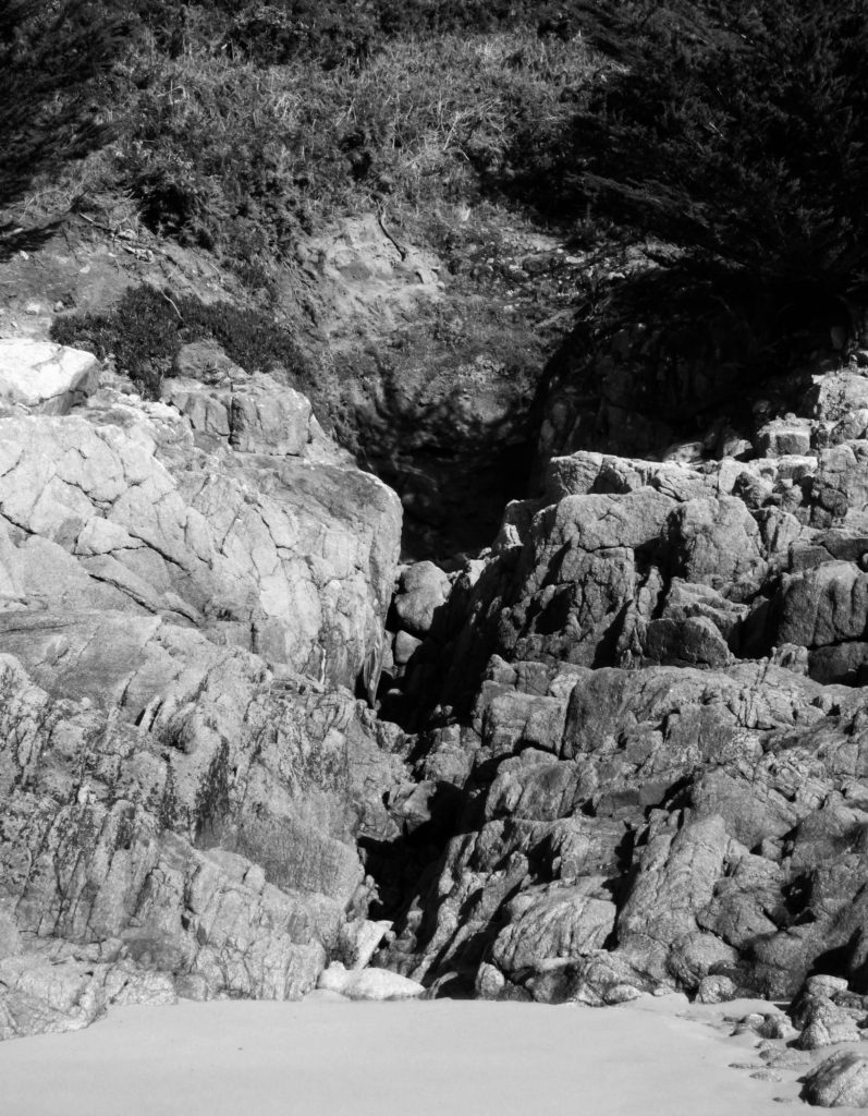
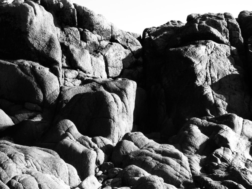
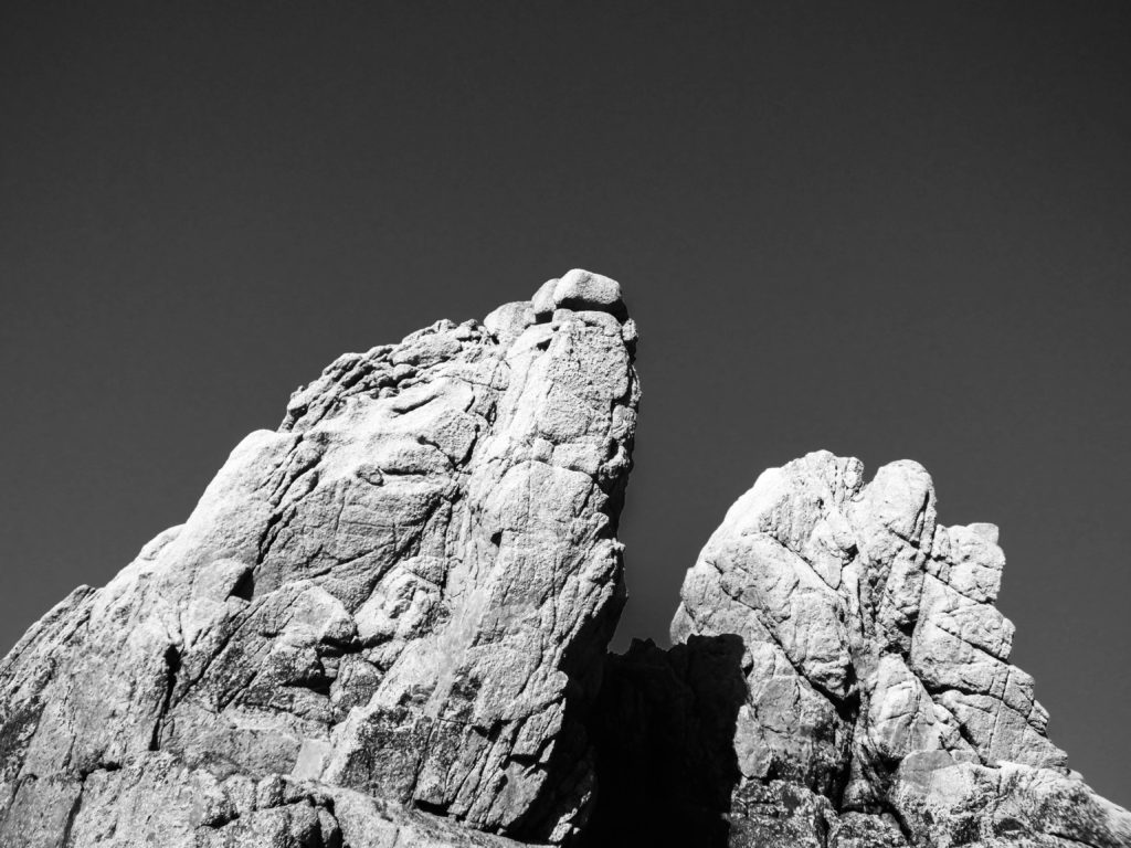
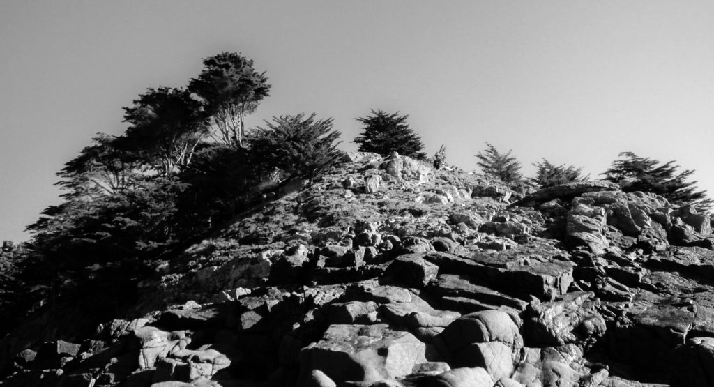
I chose a few images from my first selection and converted them to black and white, I also adjusted the contrast slightly to create a variety of tones, referring to Ansel Adams zone system of 0-10.
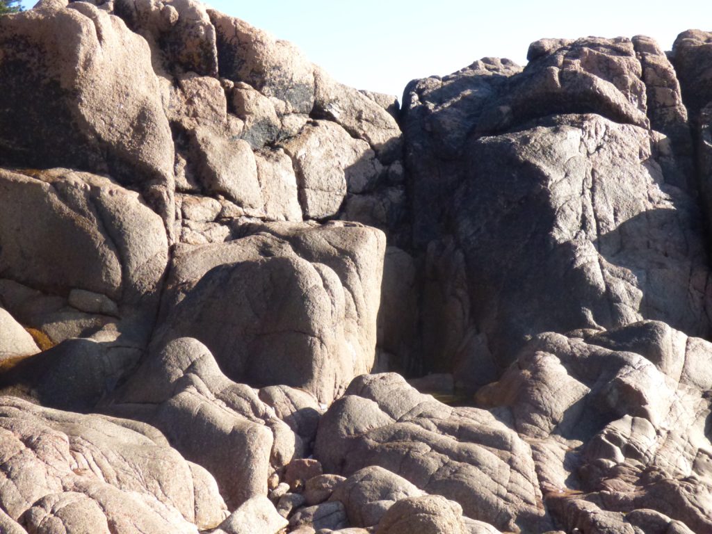

As you can see in the comparison above, the shadows are much darker and the brighter tones stand out much more. I also like the way that making and image black and white can trick the viewer, maybe making them question what exactly the image is and how close up they are to the focal point.

I decided to use this archived image of Corbiere Lighthouse as I know I already have photographs of this heritage sight and therefore can layer these images in order to show the juxtaposition of the site over time.
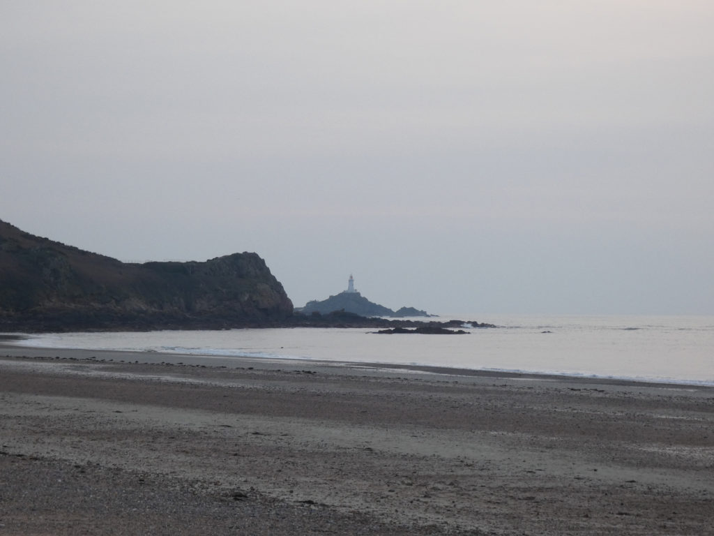
I am going to layer this image I have taken of Corbiere Lighthouse because the images have similar angles and both the images have a lack of colour, which I think will add an overall gloomy mood which would be interesting to contrast.
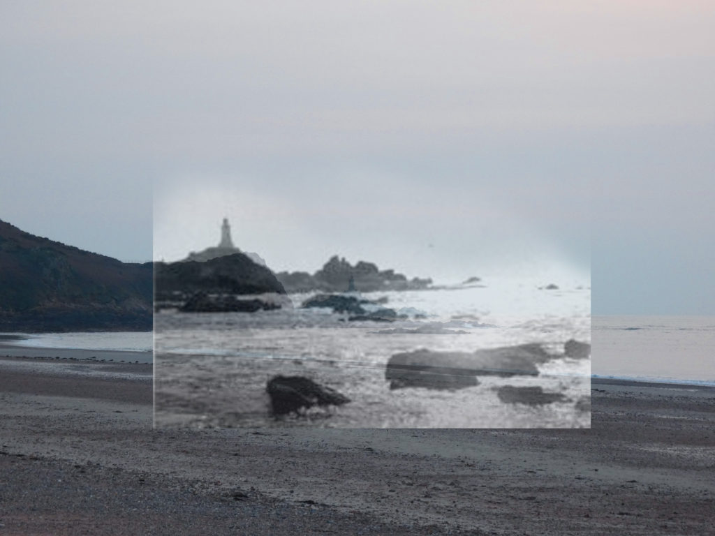
To juxtapose these images, I layered the archived image over my own photograph to project the contrast of the area over time. I then lowered the opacity of the archived image to create a ghost-like affect, almost representing time fading.