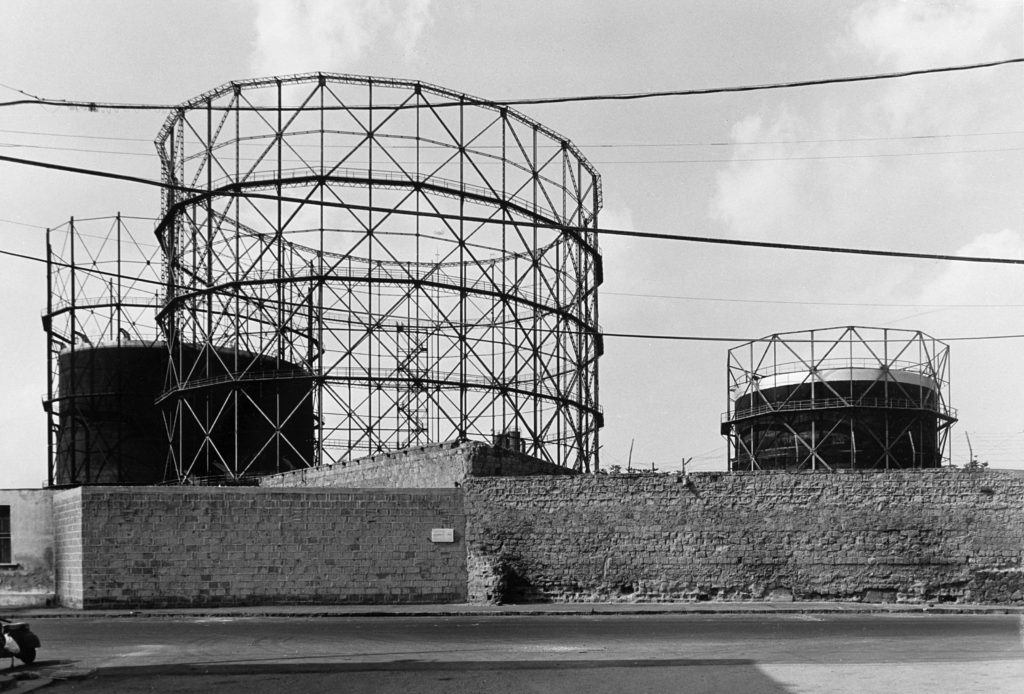
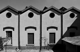
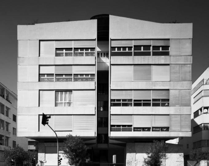
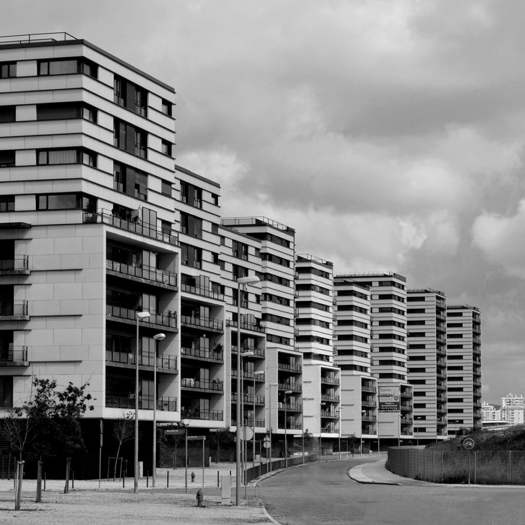
Category Archives: Task

Filters

Author:
Category:

Introduction – New Topagraphics

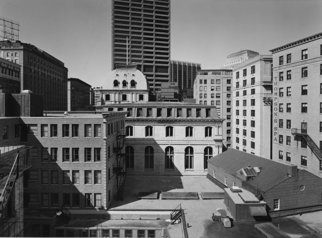
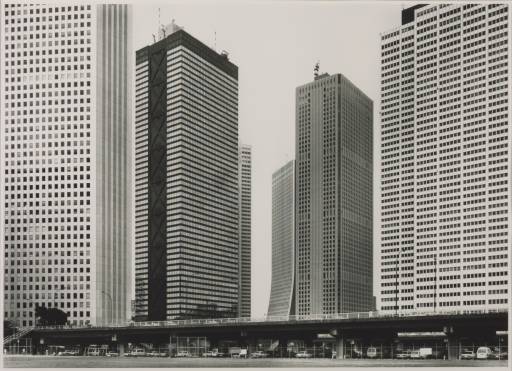
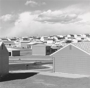
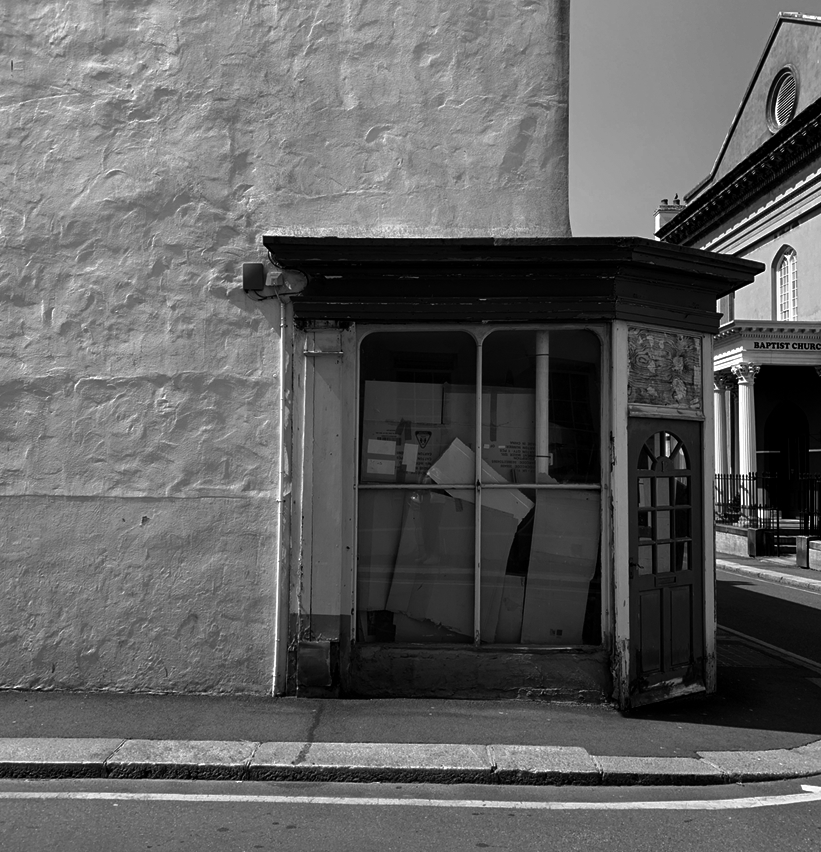
“New Topographic”, a term coined in 1975 by William Jenkins which referred to a photographic movement undertaken by a group of American photographers whose works had a similar look – mostly uniform, black and white urban landscapes.

Some of the photographers associated with this movement where Robert Adams, Lewis Baltz, Nicholas Nixon and Bernd and Hiller Becher.
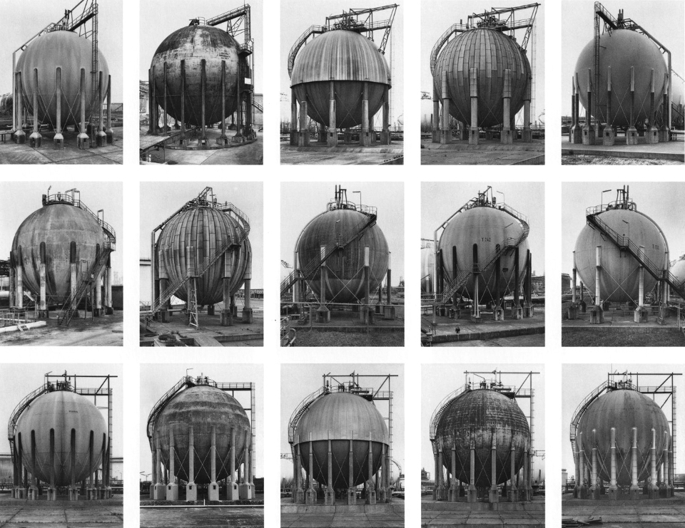
The movement captures mans impact, they photographed urban landscapes such as garages, parking lots, warehouses in a similar way to how early rural landscape photographers would shoot natural landscapes.

As environmentalism took hold of the public conscience in the 1970s landscape photography began to capture natural landscapes and human activity as a singular connected body.

New topographic pieces captured the essence and beauty of these depressing, mundane, industrialized landscapes. This aura created around the aesthetic of these images is an ironic juxtaposition to the unease the photographers felt about mans erosion of the natural environment. This was represented in their work from the emotional disparity they created in their pieces with a lack of human presence, flat contrast, lowkey tones, centred framing and unassuming depth and lighting.

On the other hand this divide they portrayed between man and nature was done with aesthetic precession. The Artists that made up the new topographic noticed how there seemed to be a sense of obscenity around photographing these urban landscapes. There was a sort of fear man had around looking at its own creations. They wanted to highlight this by photographing the urban and providing it with an aesthetic… The photographers created beauty in these images by shooting from a unique viewpoint. They shot with a deadpan aesthetic in mind and looked for sharp angles or structural elements.

ANTHROPOCENE

What is Anthropocene?

the anthropocene epoch is an unofficial unit of geological time, used to describe the most recent period in Earth’s history when human activity started to have a significant impact on the planet’s climate and ecosystems.

anthropocene in photography is a very powerful way of showing the world how we humans have changed the earth and how our actions are impacting the world everyday, usually this is shown through a negative perspective. In photography this can be presented and shown through landscape , abstract and portrait photography.

Many photographers show anthropocene through photographing how much waste humans produce or the litter found around streets and placing them in an abstract way.

some examples of anthropocene photography;

mind-map of different Anthropocene ideas/ ways of photographing it;

urban landscape photoshoot 1-

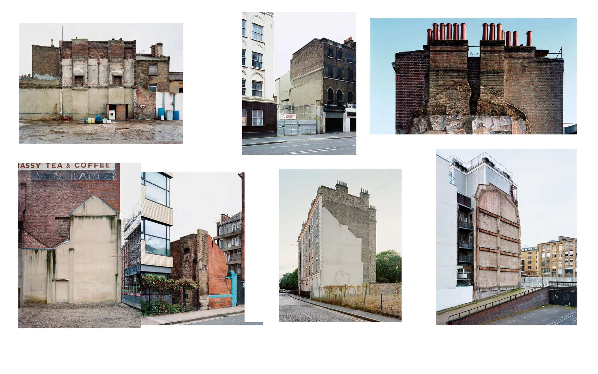
The photographer I have chosen to study and be inspired by for my first photoshoot is Thom and Beth Atkinson.

I chose to study them as they photograph old and destroyed buildings as well as missing sections of buildings. As I want to compare new and old jersey together I thought they would be the perfect photographers to get inspired by for my ‘old jersey’ photoshoot.

About Thom and Beth- In 2015 Thom published his first photobook, Missing Buildings through his own publishing imprint, Hwaet books The collaboration with his sister, Beth Atkinson, brings together an extensive body of work documenting the physical and imaginative landscapes of the London Blitz. Thom’s interest in Britain, conflict and mythology is ongoing.

Some of their photographs-

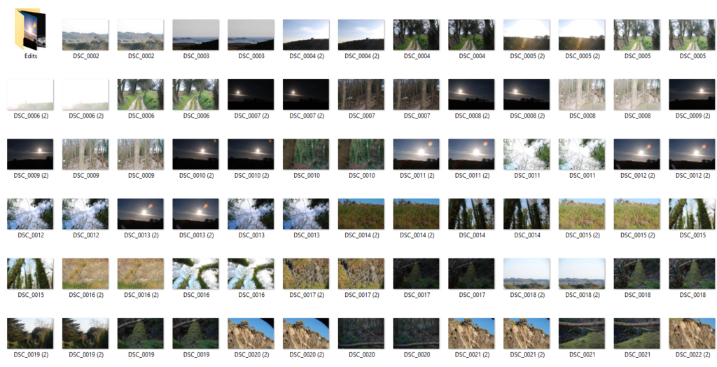
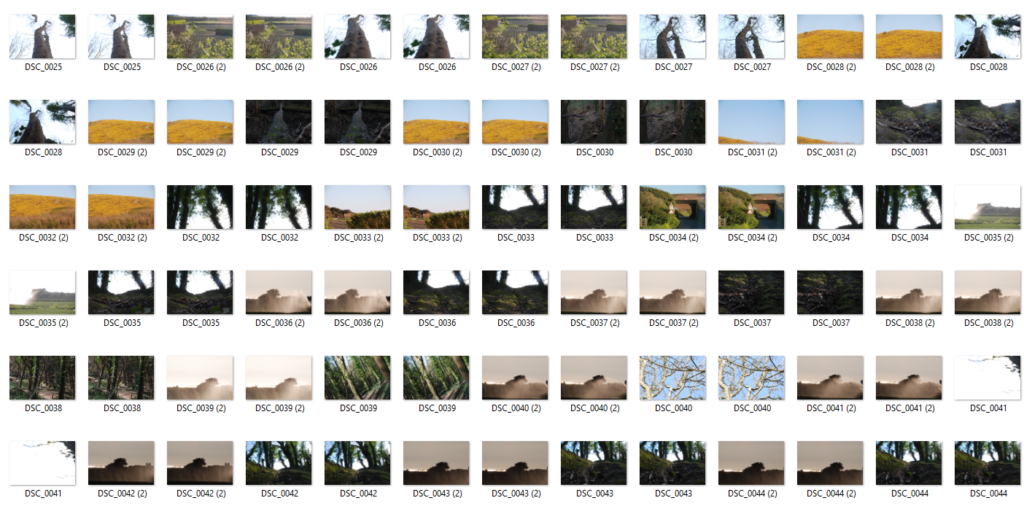
my contact sheets;

favourite images edited;

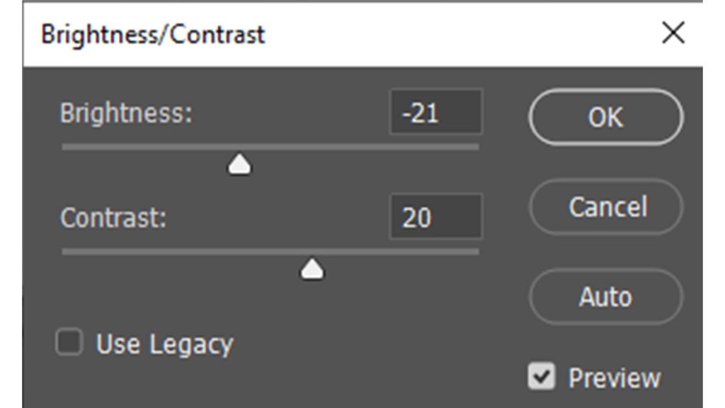
I wanted my images to be in black and white as I think it matches the atmosphere and mood of the images- as my images are of destroyed and broken buildings keeping them in colour wouldn’t be as effective as turning them black and white. I wanted to make sure I have a good palette of black and white shades in order to have good and clear contrast between extremely white and bright areas and very dark almost black sections. I think I achieved this well by increasing the contrast and lowering the exposure as well as increasing shadows while keeping the white balance quite high. I cropped these images down to make sure my images were focused on the buildings as the centre point as there were a couple of cars and people walking by in the background which wasn’t needed.

comparing my photography with Thom and Beths

DIFFERENCE- my image is in black and white with sharp contrast points however Thom and Beth’s image is in colour. I feel like that creates a different atmosphere and mood between our two images. Thom and Beths image is also taken slightly from the side which captures some of the windows on the building however mines more from a straight-on point of view. Beth’s and Thom’s image captures more of the building and its right in the centre however my image has two grids full of sky and the building is in the centre but on the bottom of the image.

SIMILAR- both of our images are of a broken or abandoned building that is definitely not used anymore. Both of our images are taken far away in order to capture the whole length of the building. Both of our images are taken at quick shutter speeds in order to not get a blurry photo

ANsel Adams Comparison

Above are two rural landscape images. The image on the left was shot by American photographer Ansell Adams and the right by myself.

Both images feature a low key, greyscale profile. The use of an ND filter and specific film allowed Adams to create an image with dominant dark tones whilst still allowing for the counteractive sharp highlights to come through in the image. I recreated this by shooting with a large aperture to include as much data in the image as possible and then altering the saturation and temperature of the image in post production. These methods allow for both images to feature a highly romanticized landscape. For example the dramatic moon in the center of a dark, almost fully black sky tucked behind a whisping blanket of clouds which are being pierced by a gathering of sharp snowy mountains is a typical depiction of an exaggerated, sublime landscape.

Both images feature a large tonal range from the dark sky’s and foliage to the white mountains and sand dunes.

Both images have similar form with the empty sky taking up two thirds of the image with the bottom of the image being filled.

They both contain a strong leading line horizontally through the image

Conceptually, both these images represent the idea of death and moving on. The images both feature dark, mournful tones. Adams image features a graveyard symbolizing death and my image contains a sublime landscape which was once flourishing but is now more baron symbolizing life and death. The images both feature bold horizons which alludes to the idea of “new horizons” and moving on from death.

Lewis Baltz- analysis

Community Verified icon

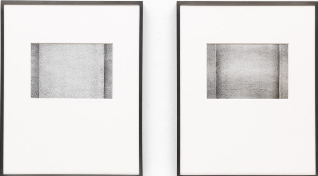
These pictures have been taken by means of American photographer Lewis Baltz in 1972, and are the 1/3 set of prints in an version of three. They shape section of Baltz’s Prototypes sequence that he had begun in 1965, taking snap shots of the post-war industrial landscape. These featured stuccoed walls, parking lots, the aspects of warehouse sheds or disused billboards baked in the regular Californian sunlight. Within these works Baltz remoted normal geometric forms, developing a anxiety between the simplicity of the constructions depicted and the ailment of the subculture from which they emerged.

altered landscapes

You may wish to intergrate the concept of altered landscapes into your project based on Anthropocene.

You could develop a set, sequence or group of final images.

You may choose to employ a range of creative and experimental techniques (digital and traditional) to create your new environments…

  • Creating changed, changing or altered landscapes
  • Creating altered landscapes by combining a range of images in Adobe Photoshop
  • Explore panoramic landscapes
  • Using photo montage/cut-n-paste techniques and printed matter (combine your own images with images from the internet, magazines, print-outs, newspapers etc)

You may already have a range of suitable images to start your designs…but may need to find additional images to work from:

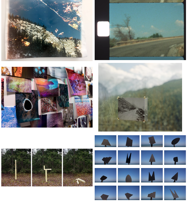
Here are some examples to help inspire your ideas…

Tanja Deman
Image result for panoramic landscapes contemporary photography david hockney
David Hockney inspired “joiner” photographs
3-d / dioramas
Dafna Talmor’s Constructed Landscapes
Felicity Hammond
Beomsik Won
Surrealist approaches
Jesse Treece
Krista Svalbonas

Paint directly onto photographs, as in these works by Gerhard Richter:

Gerhard Richter overpainted photographs
Gerhard Richter has painted over 500 of his own photographs (with many more works discarded): commercially printed images that are overpainted with spontaneous gestural smears, using leftover oil paint applied with palette knives, squeegees or doctors’ blades. In the examples above, the thick painted lines divide the composition and inject colour into what is otherwise a rather drab interior scene. The paint disturbs the viewer – shatters the illusion that we are quietly observing a scene – pulling our attention to the tactile surface and smear of texture in front of our eyes.

Combine paint and photographs digitally, like Fabienne Rivory‘s LaBokoff project:

Fabienne Rivory photography
This project by Fabienne Rivory explores interactions between imagination and reality. Selecting photographs that represent a memory, Fabienne digitally overlays a gouache or ink painting, introducing an intense vibrant colour to the work. Students might like to experiment with this idea by creating a photocopy of a work and applying ink or watercolours directly (watery mediums will not ‘adhere’ to an ordinary photography surface).

Overlay multiple photos from slightly different angles, like these experimental photographs by Stephanie Jung:

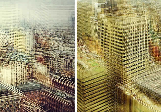
experimental digital manipulation photography by Stephanie Jung
Stephanie Jung creates stunning urban landscapes, overlaying near-identical city scenes that have been taken from slightly different angles, at different transparencies and colour intensities. The repeated forms (buildings / vehicles / street signs) suggest echoed memories, vibrations of life; the ebb and flow of time.

Cut out shapes and insert coloured paper, as in these photographs by Micah Danges:

photography with cut coloured paper layers
These landscape photographs by contemporary photographer Micah Danges have separate photographic layers and incorporate stylised abstract elements. The simple strategy of cutting pieces out of a photograph and adding layers of different paper can be a great technique for high school photography students.

Make an photography collage using masking tape, like Iosif Kiraly:

masking tape collage
Whereas the previous photomontage montages involve precise trimming and arrangement of forms, this collage has an informal aesthetic, with visible pieces of masking tape holding it together. This can be a great method for shifting and moving pieces until the work is well balanced and cohesive. Iosif Kiraly’s work explores the relationship between perception, time and memory.

Photograph a single scene over time and join the pieces in sequence, like these composite photographs by Fong Qi Wei:

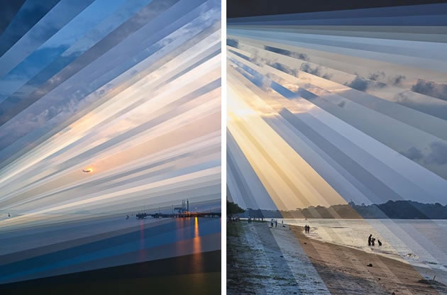
Fong Qi Wei photography
These photographs are from Fong Qi Wei’s ‘Time is a Dimension’ series, and show digital slices of photographs taken over several hours at one location. The shots above show a seaside in sunrise, with the images organised together in a way that shows the changing light conditions.

Inset scenes within other scenes, as in these photographs by Richard Koenig:

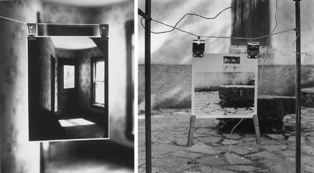
richard koenig photography
Richard Koenig hangs a print and rephotographs this in its new location, creating intriguing illusions of space within space. Perspective lines within the two images are aligned to create optical confusion, so the viewer is disconcerted and unsure about the separation of the two spaces. His work often features intimate, private moments inset within generic, impersonal, public environment.
Back to the Future

http://www.marinacaneve.com/en/portfolio/are-they-rocks-or-clouds/

Constructed Seascapes

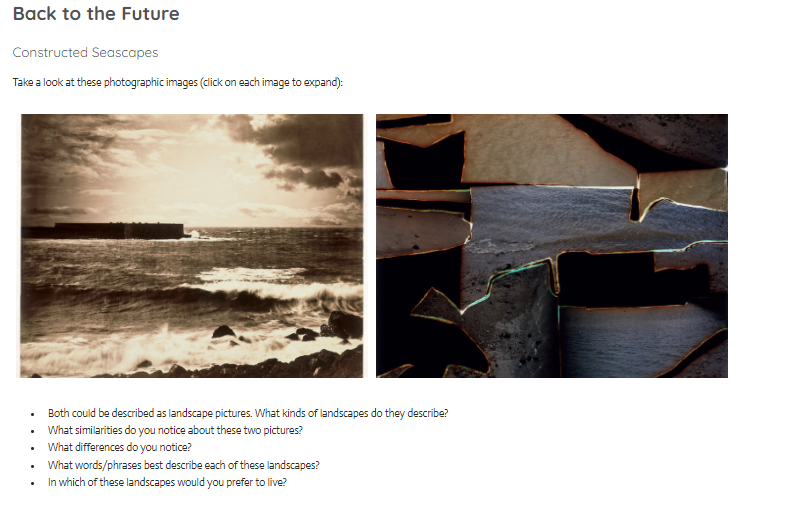
Take a look at these photographic images (click on each image to expand):GUSTAVE LE GRAY – THE GREAT WAVE, 1857. ALBUMEN PRINT FROM COLLODION-ON-GLASS NEGATIVE.DAFNA TALMOR – FROM THE CONSTRUCTED LANDSCAPES II SERIES. C-TYPE PRINTS MADE OF COLLAGED COLOUR NEGATIVES

  • Both could be described as landscape pictures. What kinds of landscapes do they describe?
  • What similarities do you notice about these two pictures?
  • What differences do you notice?
  • What words/phrases best describe each of these landscapes?
  • In which of these landscapes would you prefer to live? 

A bit of research…

Read the following descriptions about the making of these images:

Gustav Le Gray – The Great Wave, 1857Dafna Talmor – from Constructed Landscapes II
‘​The Great Wave’, the most dramatic of his seascapes, combines Le Gray’s technical mastery with expressive grandeur […] At the horizon, the clouds are cut off where they meet the sea. This indicates the join between two separate negatives […]Most photographers found it impossible to achieve proper exposure for both landscape and sky in a single picture. This usually meant sacrificing the sky, which was then over-exposed. Le Gray’s innovation was to print some of the seascapes from two separate negatives – one exposed for the sea, the other for the sky – on a single sheet of paper.This ongoing body of work consists of staged landscapes made of collaged and montaged colour negatives shot across different locations, merged and transformed through the act of slicing and splicing […] ‘Constructed Landscapes’ references early Pictorialist processes of combination printing as well as Modernist experiments with film […] the work also engages with contemporary discourses on manipulation, the analogue/digital divide and the effects these have on photography’s status. 

Blog Posts This Week…

  1. Research Altered Landscapes and produce a definition/explain what they are.
  2. Produce a Case Study about your chosen altered landscape photographer, include an analysis of one key image. Explain/show how this has inspired your ideas and process.
  3. Show your images, process, editing, selection, final outcomes and evaluation.

Click this link below for more resources…AS-PHOTOG-LANDSCAPE-guide-V2-JACDOWNLOAD

Remember to follow the 10 Step Process and create multiple blog posts for each unit to ensure you tackle all Assessment Objectives thoroughly :

  1. Mood-board, definition and introduction (AO1)
  2. Mind-map of ideas (AO1)
  3. Artist References / Case Studies (must include image analysis) (AO1)
  4. Photo-shoot Action Plan (AO3)
  5. Multiple Photoshoots + contact sheets (AO3)
  6. Image Selection, sub selection (AO2)
  7. Image Editing/ manipulation / experimentation (AO2)
  8. Presentation of final outcomes (AO4)
  9. Compare and contrast your work to your artist reference(AO1)
  10. Evaluation and Critique (AO1+AO4)

Final Display

Contact Sheets

Final Edits

Exposure Bracketing Technique

The above is an example of where I used a technique called exposure bracketing.

This is when a triptych or series of photos of the same landscape is taken but each with a different exposure.

I did this by positioning the camera, with a tripod in the exact same place. I then took the tree photos but each time changing the ISO. The first photo was had an ISO of 500 the second of 300 and the third 120. I then sliced and collaged the three images into one.

Altered Landscapes

Altered Landscapes

“Unexpected Geology #18” – Ellen Jantzen (2018-19)

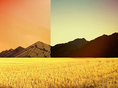
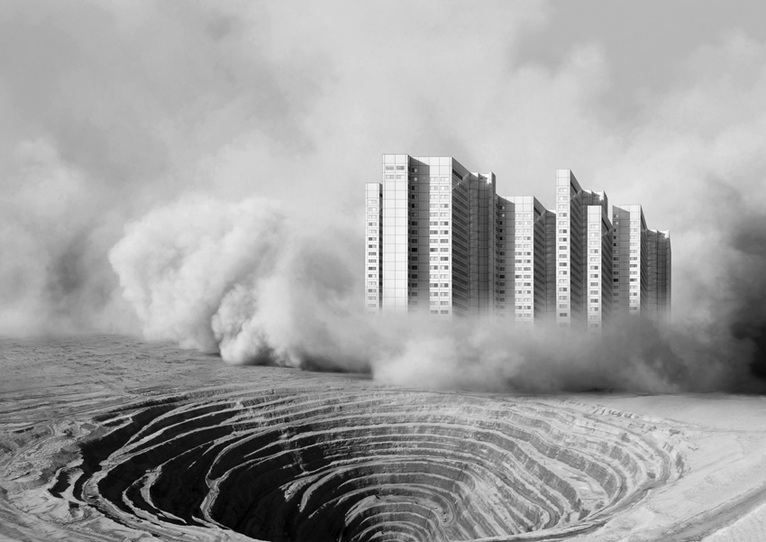
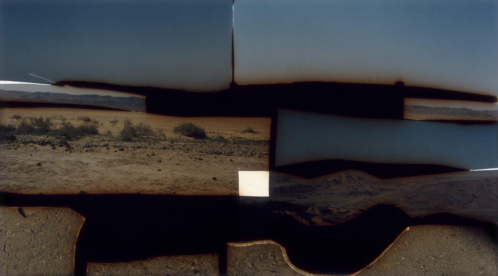
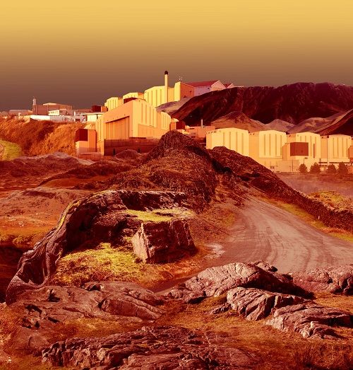
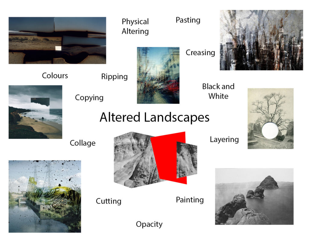
Altered landscapes focus on the process of using photoshop, or physically, in order to change the original composition of a landscape photograph. This may include changing the colours of the image, or in general changing the composition of the photo itself. For example cutting and pasting certain elements or adding forms of repetition or echo to the photograph.

Examples of altered landscapes

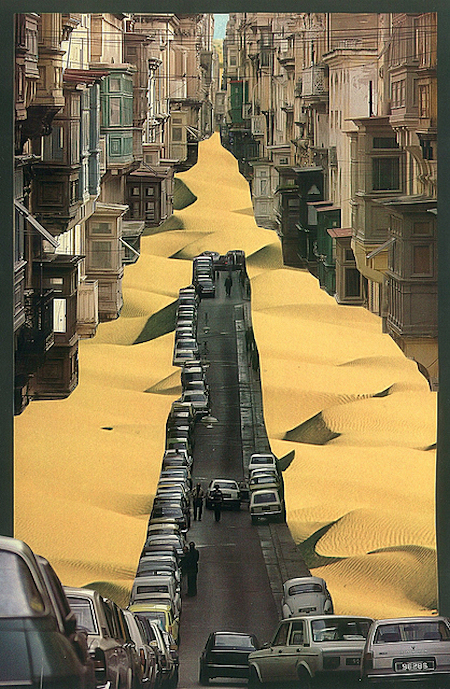
“Dust Storm” – Tanja Deman (2010)
Felicity Hammond - Restore to Factory Settings | LensCulture
Part of “Restore to Factory Settings” series – Felicity Hammond (2014)
New Reflected Landscapes and Photo Manipulations by Victoria Siemer |  Colossal
Part of “Geometric Reflections” series- Victoria Siemer (2015-16)

Altered landscapes inspired moodboard

Urban Landscapes – Altered Landscapes

Case Study

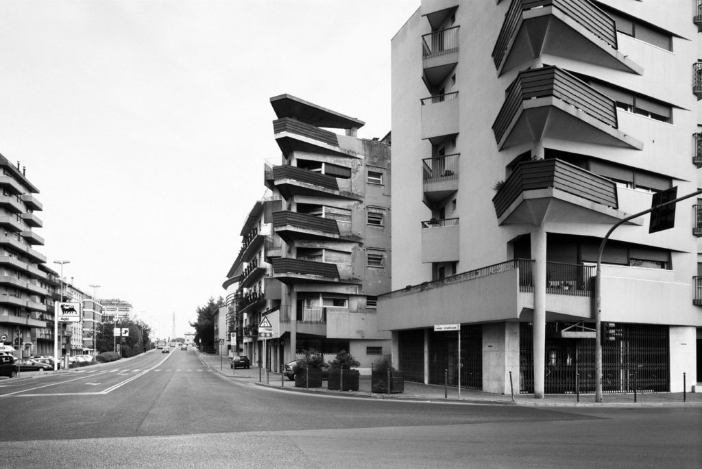
Gabriele Basilico

Gabriele Basilico was an Italian landscape photographer, born in 1944, best known for his fascination with the changing landscape that was becoming urbanised. Before taking on photography as a profession, Basilico first studied to be an architect, which may explain his eye for the geometric structures showcased in his work. This striking architectural photography soon caught peoples eyes, including the French Government which commissioned him to record the transformation of the Transalpine landscapes, amongst other photographers in which he was the only Italian. Later Basilico also went on to document the effects of the war in Beirut, the Lebanese capital, which had previously been ongoing for 15 years.

Analysis

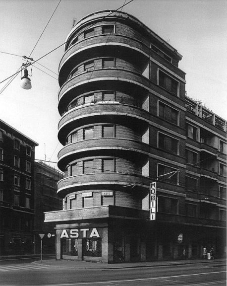
Gabriele Basilico

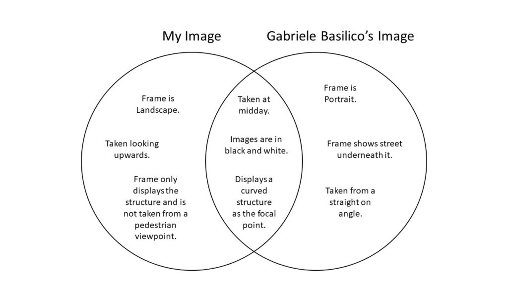
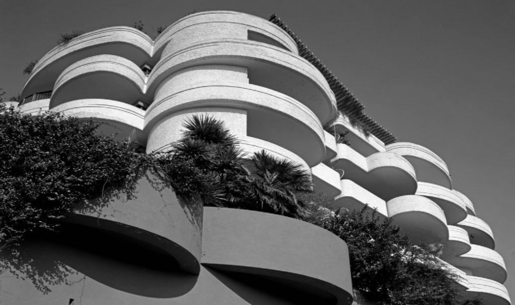
This black and white photograph taken by Gabriele Basilico showcases a curved building, located in the centre of the frame. This structure is framed by empty space both above and below the building, as the street shown appears to be desolate similar to the overcast sky. Here, it can be seen that Basilico took this photograph from a pedestrian viewpoint, looking slightly upwards. The leading lines in this composition are created by the curved, horizontal, white stripes that encompass the building, leading your eye from the right into the centre of the image, which is highlighted by the sun. In addition, these lines strongly contrast with the dark shadows underneath each balcony.

From a technical viewpoint, it can be said that Basilico only used natural lighting in order to capture this landscape, due to the fact it has been taken in a large open space outside, most likely at midday as the few shadows that are visible are going straight down, rather than at an angle. Furthermore, this means that the ISO setting used must have been a medium to low one, due to the large amount of natural light flooding the lens, allowing for a photograph that is not over exposed. This also could mean that Basilico used a fast shutter speed because of this large amount of light, also there are no visible blurs or movements here. It appears that the aperture was on a medium to low setting, as the focal structure is located far away from the photographer and the building in the background also seem to have a similar amount of focus placed on them.

Photo-Shoot

Contact Sheets

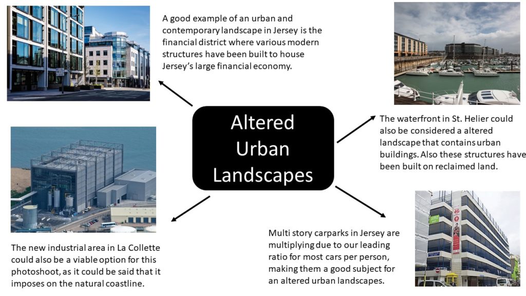
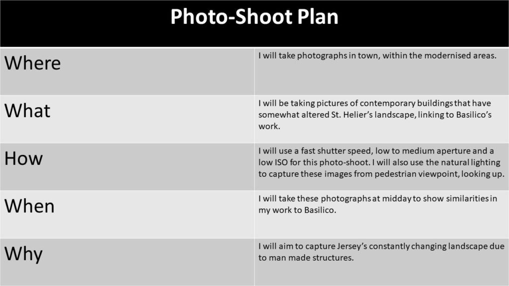
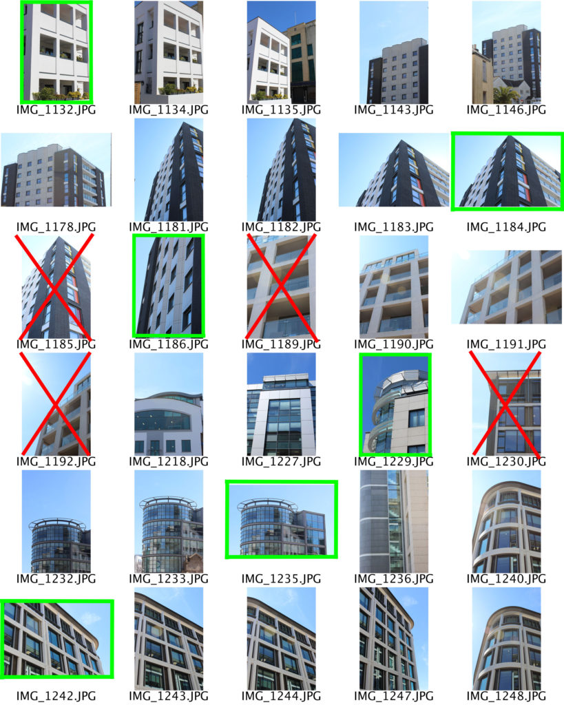
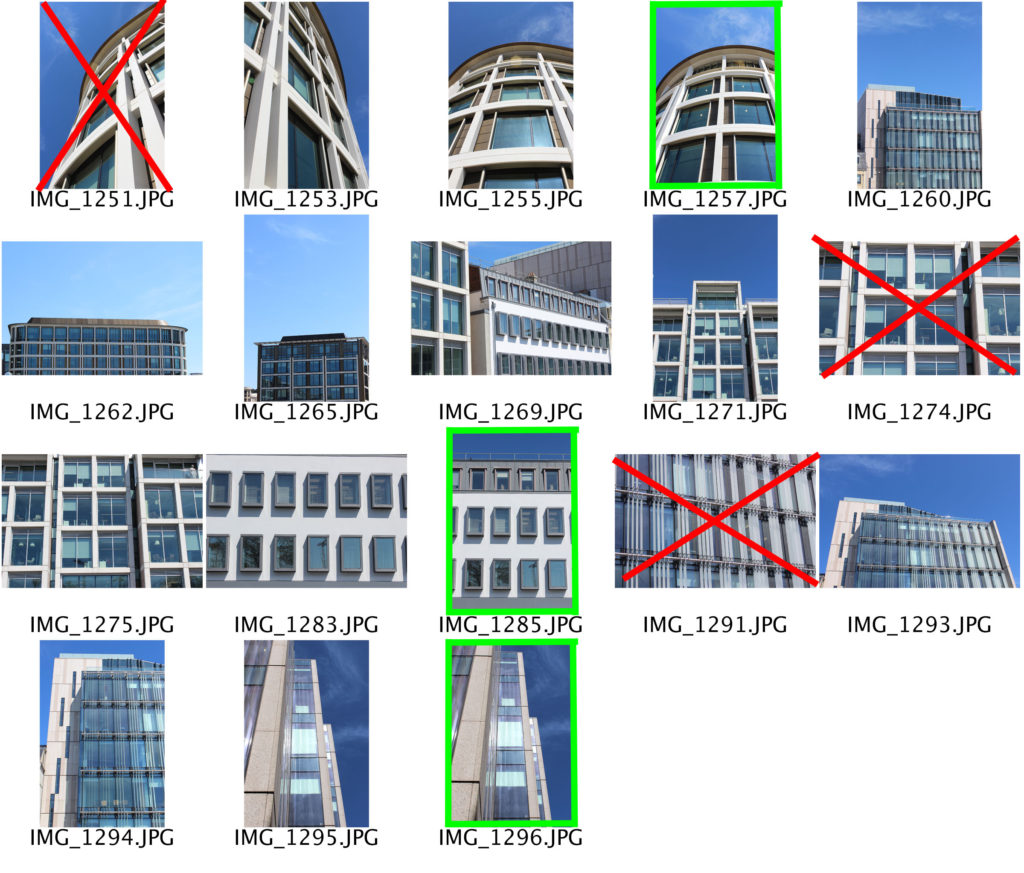
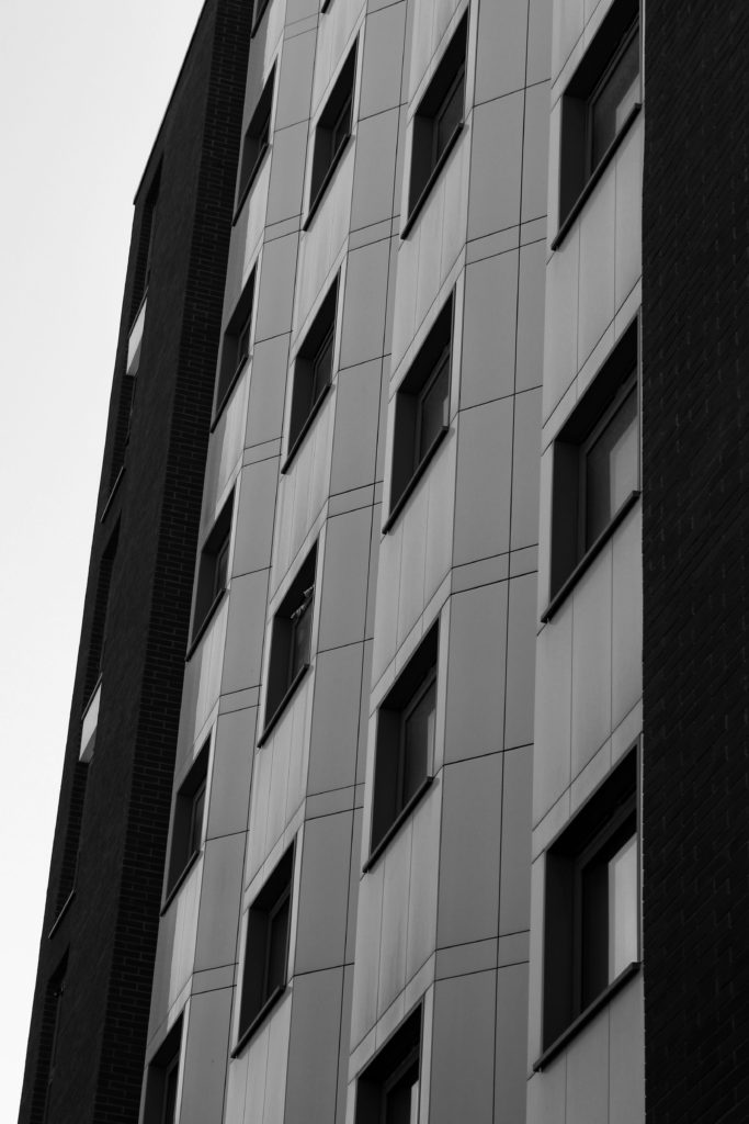
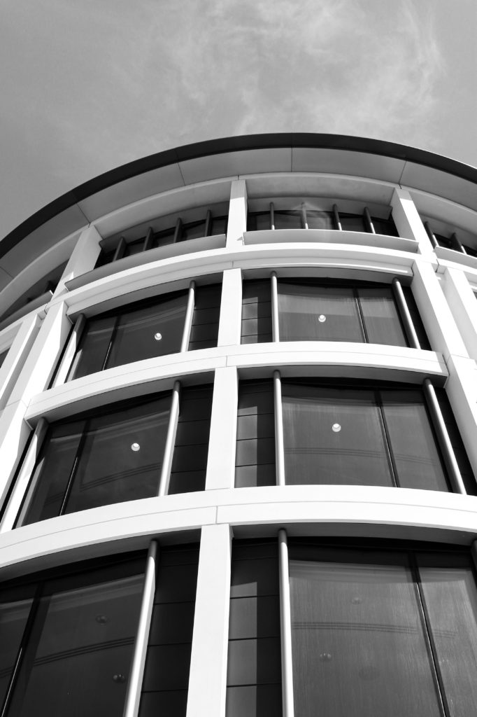
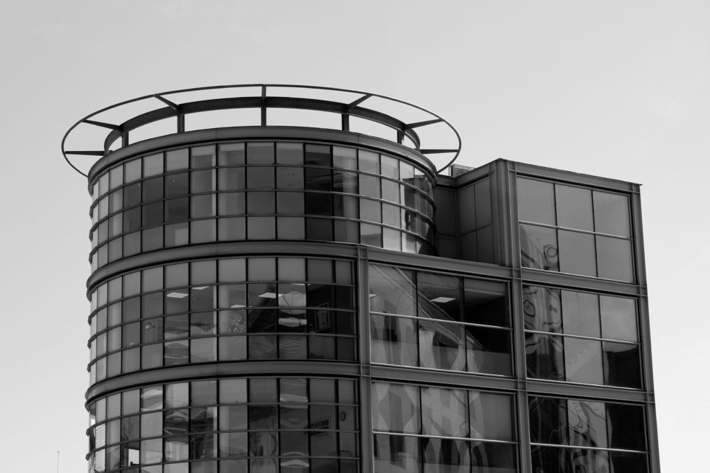
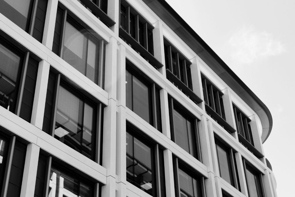
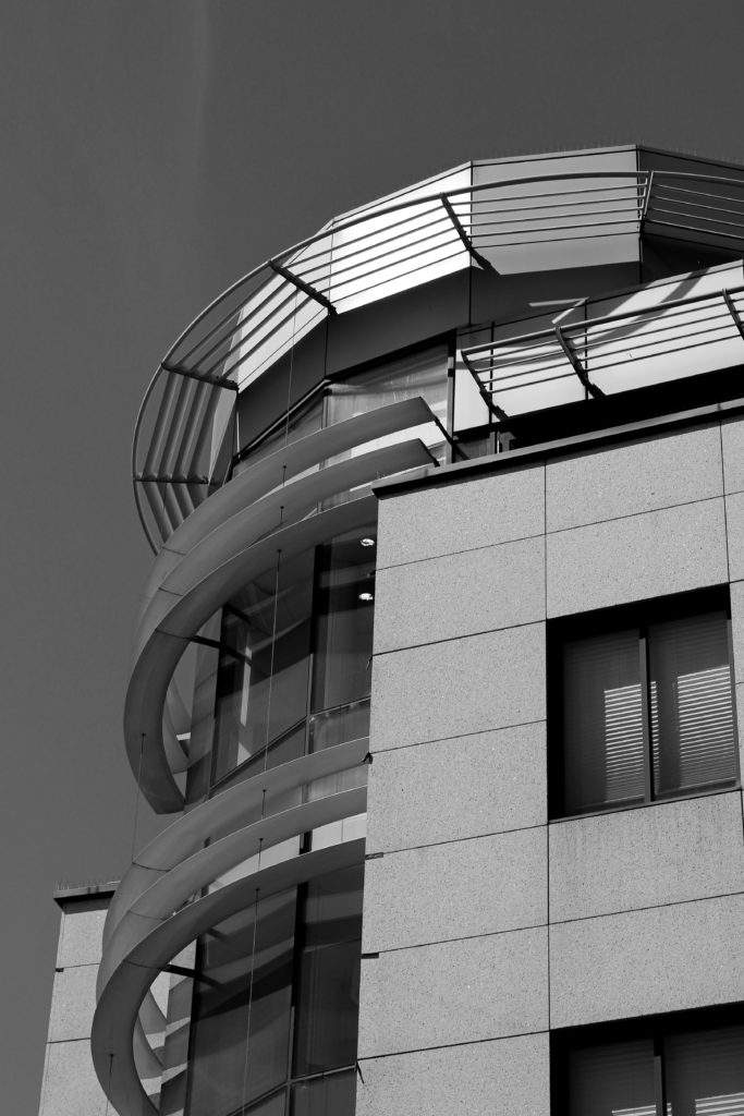
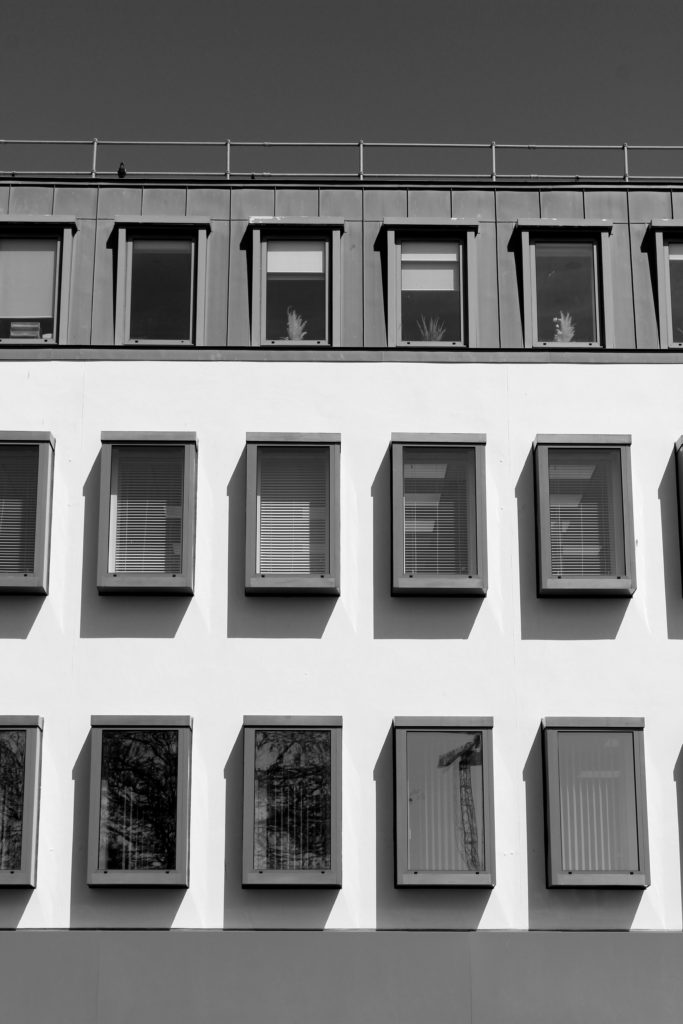
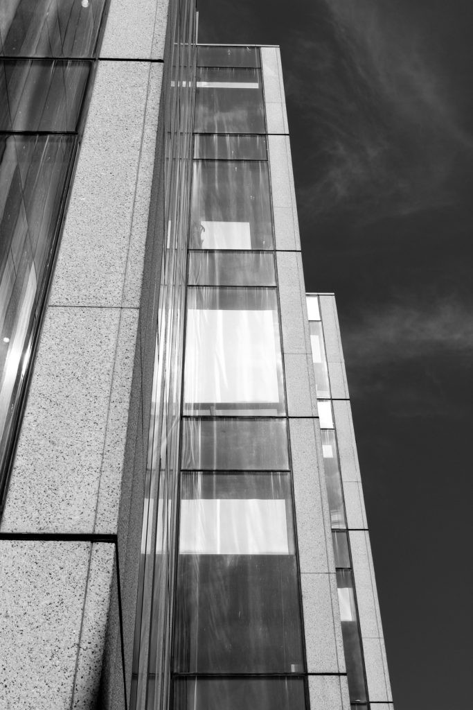
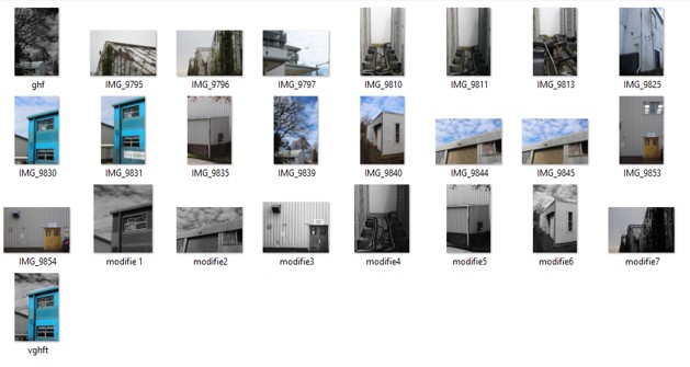
For this photoshoot I took pictures around the modernised areas of St. Helier, such as the finance and banking building along the Esplanade. Here I have highlighted the image I believe are my best, and wish to edit, and crossed out the images that are either over exposed or blurry.

Edited Images

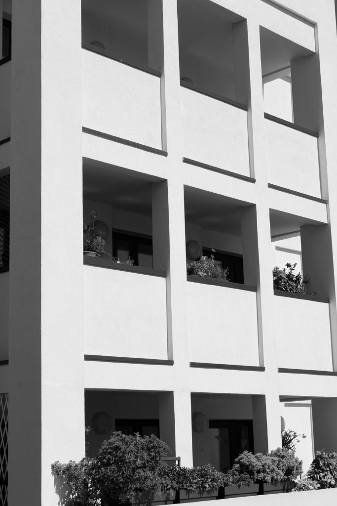
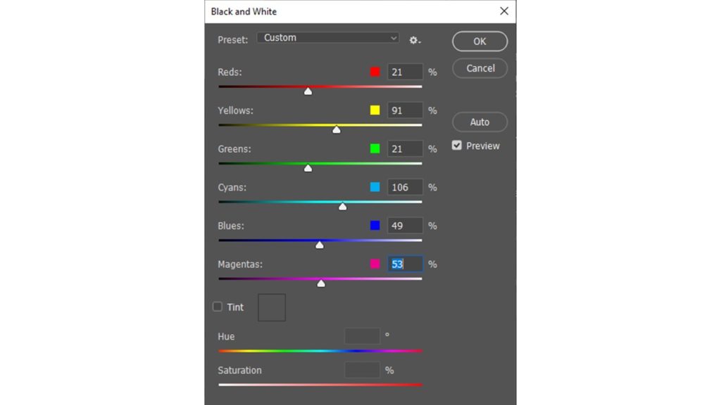
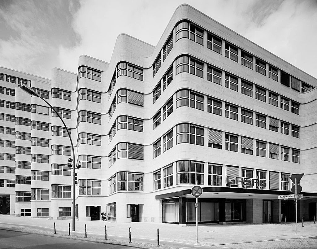
For these photographs taken in the style of Gabriele Basilico, I started off editing them by converting the images into black and white, in order to make them look similar to Basilico’s film photographs. I also adjusted other aspects, such as increasing the contrast to create a juxtaposition between light and dark.

Final Image Comparison

THE NEW TOPOGRAPHICS-shoot 1

Plan

What- I’m gonna create photos of the new topographics for that I will take pictures of buildings and search for geometric figures

When- this shoot will be taken in the day during the photography class

How- exposure – 80 – IOS – 800

Where – around Hautlieu and highlands.

Contact sheets :

Pictures selected :

Edited:

final selection:


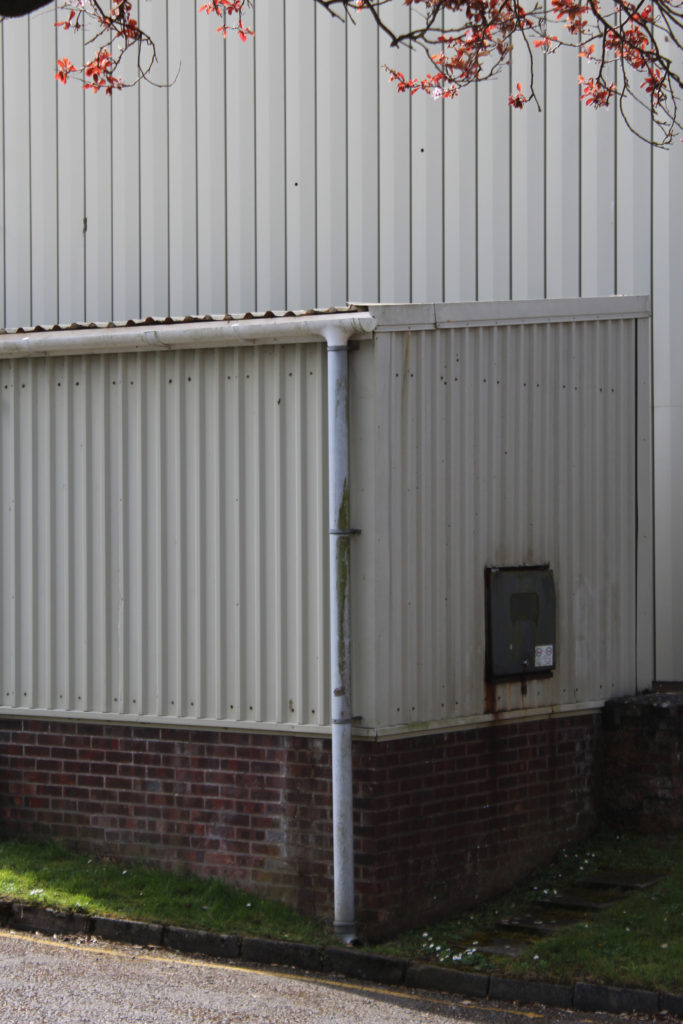
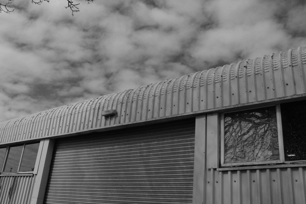
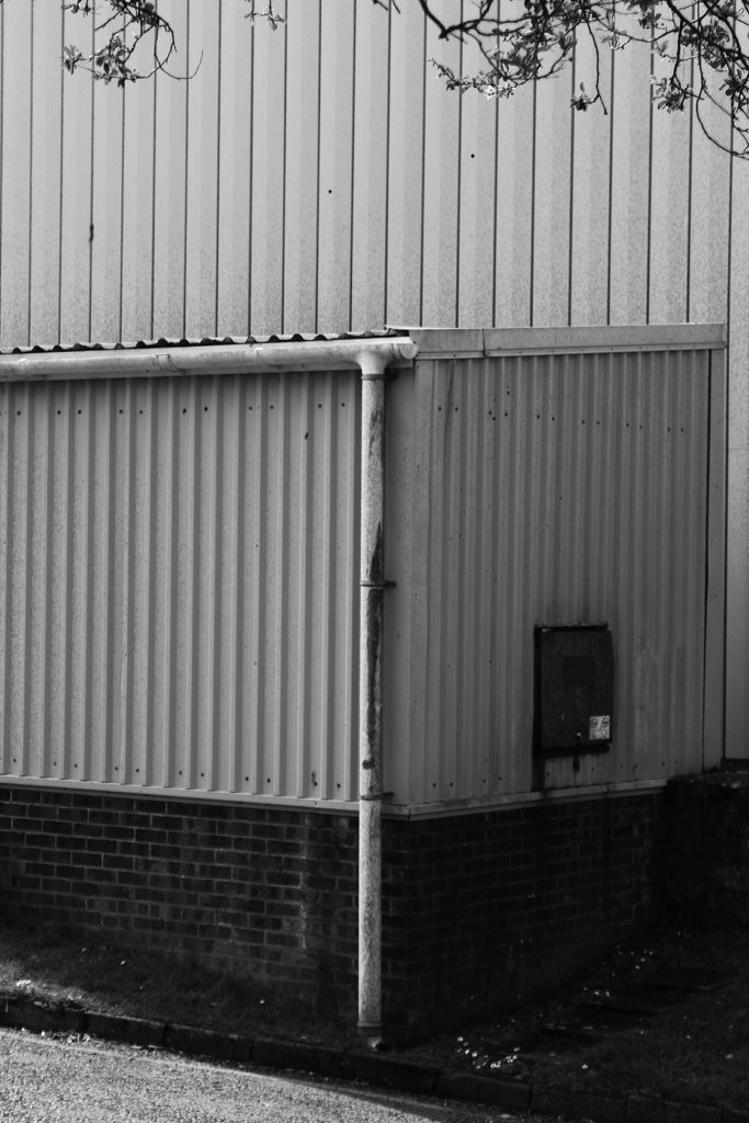
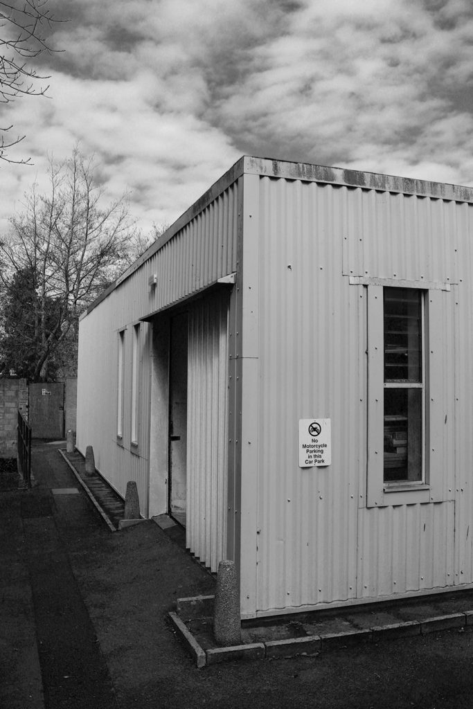
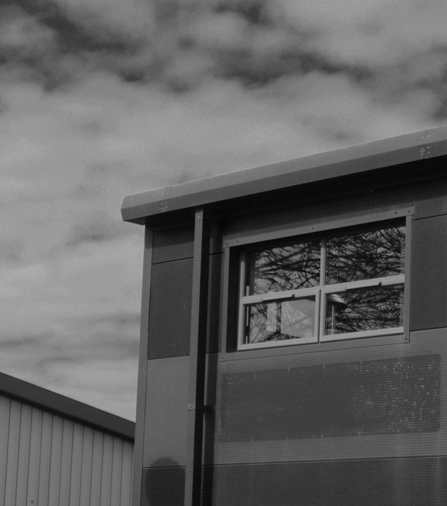
I chose this photo for the little details that can be found like we can see tree branches above the buildings and the reflection of that same tree on the windows of this building which recalls nature if you look close into the building through the window you can see a light bulb which is a human invention so in this photo we can see that nature (tree) is surrounded by human invention (the building). I therefore chose this images because it is the message that I wanted to convey with my image and then there are geometric figures (square and rectangle) like the windows, building, the front door … and we find the geometric figures in the images of the photographs of New Topographics Lewis Baltz or Bernd and Hilla Becher,