Category Archives: Resource

Filters

Author:
Category:

Claude cahun comparrison

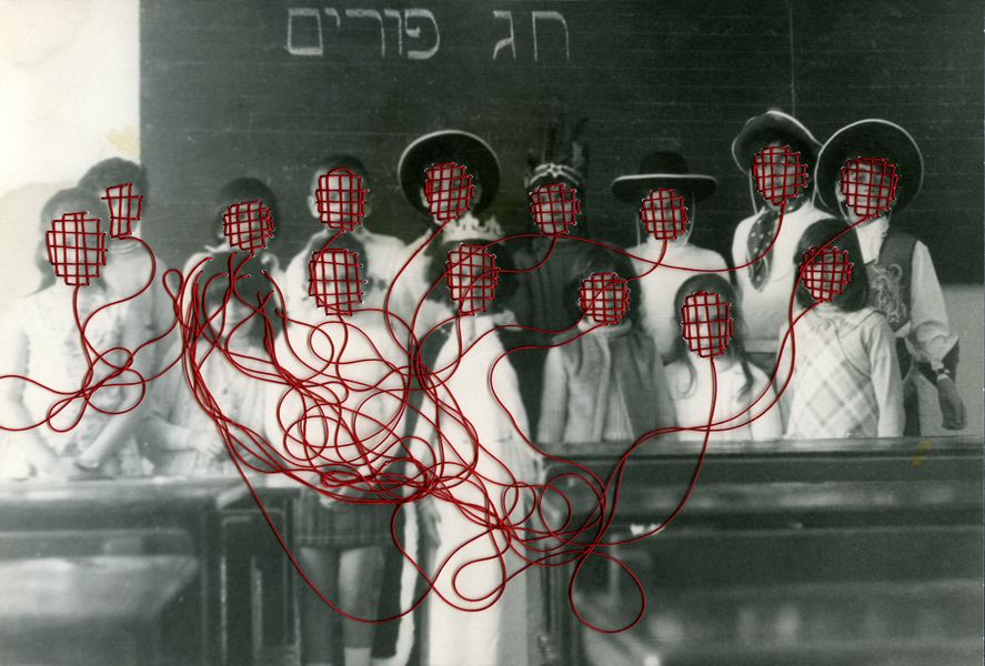
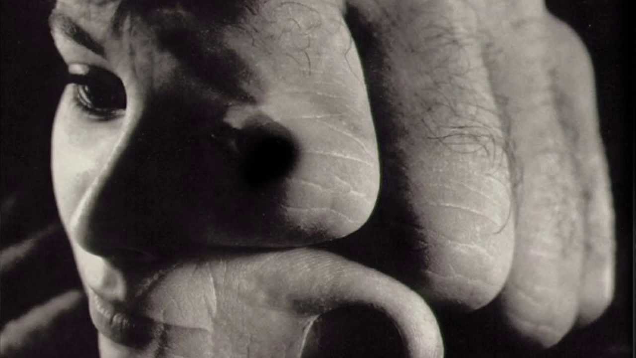
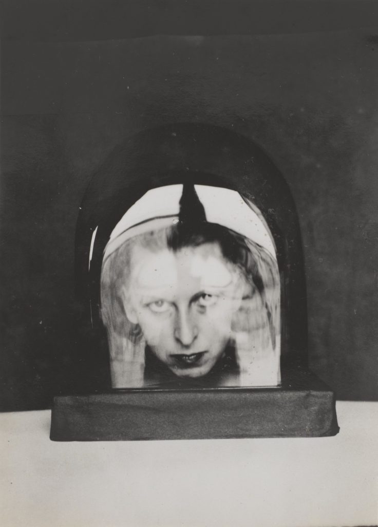
The two images above form Claude Cahun and Carole Benitah both explore identity. This is because in the pictures Their appears to be a lack of identity due to the simplicity of both pictures. In Claude’s picture you can only see her head in some sort of object that appears to be made of either plastic or glass as there are reflections coming off this making it difficult to fully see Claude’s face. Moreover, you can only see her head in the picture as well which gives this a lack of identity as you can’t really see much of the person in the picture.

As for Carole’s picture, the faces in the picture are covered in what appears to be red stitching on every face with the strings coming off them tangled up. This shows a lack of identity just like Claude’s picture even though they aren’t to similar because due to the faces being covered up you don’t really have a see for what the emotions on the people’s faces are meaning you couldn’t really imagine what their expressing if they are. Either happy or miserable.

Looking at both of the images, the pictures look similar in the format of how they were taken. They both appear to have a fairly fast shutter speed of 1/125 as there isn’t much movement that is blurred in the images. Another comparison in hoe the pictures where taken, they both appear to of have an aperture of f16 in both pictures as the background and the main appeal of the pictures are both clear visually. As for the ISO, it appears to have a low sensitivity of 200 because you can see some sort of speckles in the pictures but I think this is due to the when the pictures where taken as cameras weren’t as good as they are now.

Claude Cahun cASE STUDY

Claude Cahun was a Born-on October 25th in 1894 and was born in Nantes into a Jewish family who was a lesbian transgender which was expressed later on in her life with the photography that she worked with. 

Cahuns work was involved around writing, photography and theatre. Claude was mostly remembered for her highly staged self-portraits and tableaux that incorporated the visual aesthetics of Surrealism. During the 1920s Claude produced a large number of self-portraits in various guises such as aviator, dandy doll, body builder, vampire and angel. Most of Claude’s portraits include the artist looking directly at the viewer with her head shaved, most of the time revealing her shoulders, and a blurring of gender indicators and behaviours which goes to undermine the patriarchal gaze.

In 1937 Cahun and Moore settled in Jersey. Which was in the time period of the fall of France and the German occupation of Jersey and other Channel Islands, they became active as resistance workers and propagandists.  Against the war, Cahun and Moore produced a lot of anti-German fliers. The couple would then attend many German military events. In Jersey, strategically placing their pamphlets in soldiers’ pockets, on their chairs, and in cigarette boxes for soldiers to find. Cahun and Moore’s resistance efforts weren’t only political but also artistic actions, using their creative talents to manipulate and undermine the German authority. This was done in many ways with Claude dressing up as a transgender taking photos in which would show the mix that she could go between like dressing up as a pretty doll with weights besides her.

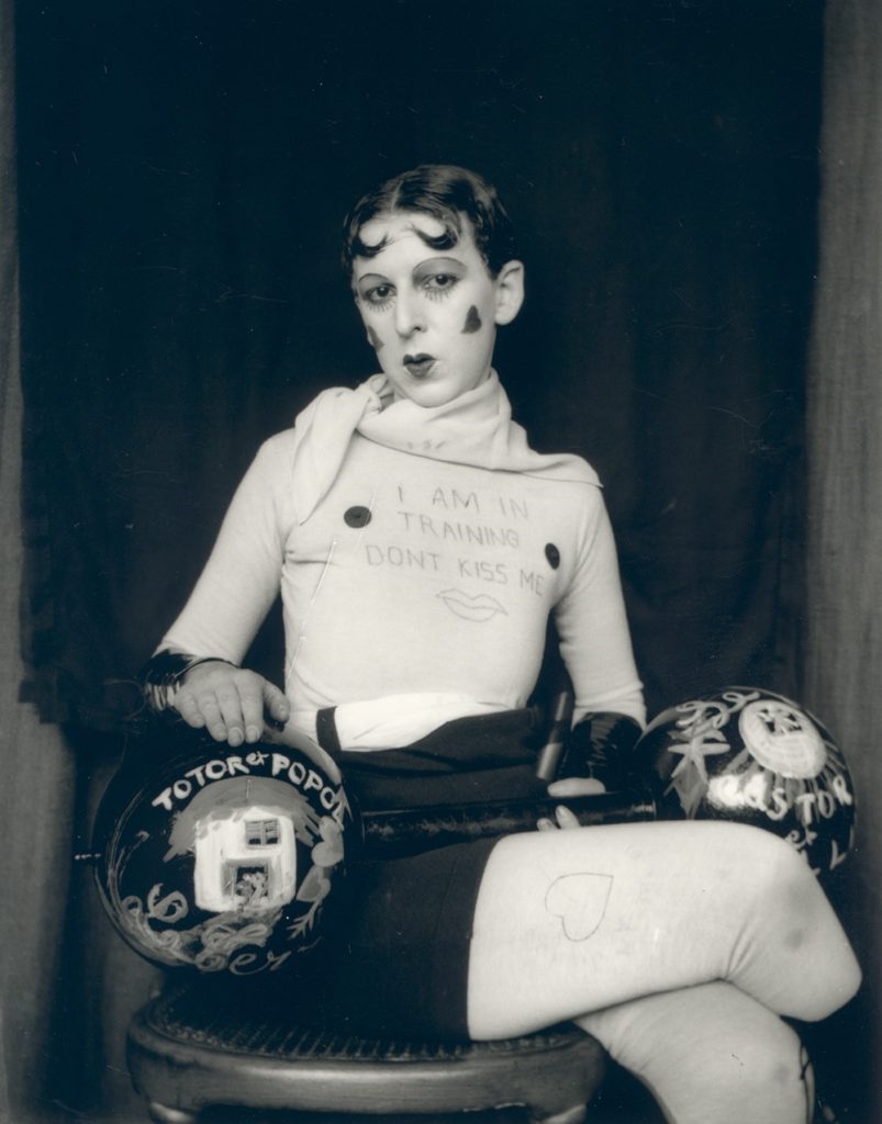
A seen in the picture above, it’s quite apparent in stating that you can see the picture was most likely taken in the 1940’s as the picture is in black and white due to the technology in cameras wasn’t as good as it is now. However, this works quite well as the contrast between black and white stands out great with the writing that is written on her top also, the love hearts that are drawn onto Claude’s face. It appears that there was some sort of stand possibly used to keep the camera in position in taking this picture of Claude. The tones in this picture are light bas you can see that everything in the picture is visible, even the background also, you can see that there are light reflections coming off the weights meaning there was some source of light used to make the picture overall stand out. Finally, in this picture Claude is dressed up as a pretty doll with weighs alongside her, this goes to show how she was trying to portray that society shouldn’t judge you for wanting to be free as she seems to be confused in picking between being male or female which could be caused due to society being so judgmental.

Claude Cahun

During the 5 year occupation of Jersey by the Germans during the second World War, amongst many terrible things that happened, many antagonists where deported to camps or imprisoned. 75 years ago the island was liberated by allied forces. The last antagonist prisoners to walk free days before the liberation were the Les mesdames who are regarded as local heroes for contributing to the liberation of Jersey.

Lucy Schwob better known by their pseudonym, Claude Cahun was the better known half of the Les mesdames, which was the name that Jersey islanders gave her and her step-sister/lover Suzanne Malherbe (known by her pseudonym Marcel Moore).

Claude came to Jersey from Paris with Marcel in 1937. The couple sought Jersey out for two reasons; because of the jubilant memories of childhood holidays to the neighbouring island, and it was a familiar place to escape the abhorrent fascism and antisemitism that was terrorizing Europe in the ’30s as Claud was Jewish on her fathers side. 

Cahun was a French surrealist photographer, writer, and sculptor. A consistent element present in her work is her unconventional exploration and representation of the concept of Identity. Claud explored her identity in a way where she challenged preconceived notions of sexuality and gender of the time. Claude presented this in her works where she would photograph self portraits where stereotypical gender characteristics where aggravated, for example the following piece where she can be seen composing her appearance as a masculine “circus strongman” while still conveying typical feminine appearance stereotypes such as the bold lipstick:

Claud Cahun

Cahun believed that gender was exchangeable. Assuming different identities was her strong suit.

Claude Cahun

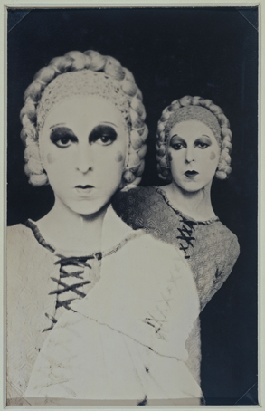
In the above image Claude represents the idea of multiple coexisting personalities by photographing a self portrait by creating a double exposure which is done by shooting an image on film and then shooting another with the subject repositioned on the same segment of film. She has used harsher fluorescent lighting in this image which has created a over-exposed, porcelain looking facial composure whilst accentuating the shadows around her jaw eyes, this could’ve been a way of exploring her identity by ridiculing the identity she was portraying by exaggerating the stereotypical feminine beauty aesthetic of the time being the over-powdered face and eccentric makeup. She also creates greater depth and form in the composition by separating the subject from the background by using a dark negative background and high contrast which opposes the light foreground giving the image an unconventional portraiture look.

Claude Cahun: Jersey’s queer, anti-Nazi freedom fighter

http://www.jeudepaume.org/index.php?page=article&idArt=1480

Diamond Cameos

These 4 images above have been chosen as my final outcomes. In my opinion they successfully show a vast understanding and application of Henry Mullin’s work as we both have used similar techniques, such as: we both have used the diamond shape, have captured our models in 4 different angles, have a similar, old style and our images are similar in colour too as we both have this brown, crème effect.

I have used the Sony Alpha 380 DSLR Camera with the portrait mode to emphasize subjects by blurring away background and reproduce soft skin tones, with a shutter speed of 1/30 and an ISO equal to 400. Additionally, I have used manual focus to successfully bring the subject into focus and blurring out the background. The camera was still during the shoot as I used a tripod

I have edited these images using photoshop to cut and create the diamond shapes on my images but have also used Snapseed to edit my images by adjusting the Retrolux and Grunge tools on the application. Have also used it to adjust the brightness of my images so they are the best they can be.

In comparison to Henry Mullin’s diamond cameo project, as mentioned above, “we both have used similar techniques, such as we both have used the diamond shape, have captured our models in 4 different angles, have a similar, old-style and our images are similar in colour too as we both have this brown, crème effect.” However, Henry Mullins portrays his images in a photograph book whereas mine is digital, his subjects are adults and mine is a young adult, he has a border around his work, and I do not, and finally, his shots kind of fade around the oval shape which in comparison to mine, the images are fixed and aren’t fading.

STUDIO PORTRAITS 1

Studio portraits :

Illuminating a studio configuration, portentous lighting is important. Portentous lighting can be created by adding a lot of contrast. Dark areas are just as important as light areas. This type of lighting requires a number of light sources located in a way that produce very light areas and some very dark ones. The most basic studio lighting uses a main light (1), a fill light (2), and a backlight (3). This is the most common lighting setting for studio-independent objects. A three-point configuration will immediately work well and is an excellent starting point for creating special effects. Light bulbs are useful because they allow you to control your direction and incident points to provide drama to the scene.

Alec Soth

My pictures :

3 Point Lighting :

Three-point lighting is a standard method of three-source lighting, I only use this technique with a few images This technique does not please me too much

1 Point Lighting :

I had a lot of fun with one light, I love the shadows found behind or on the faces of people in the pictures. I often ask people on the cheek picture with their hands their arms their body basically to create more shade.I create different types of lights just by placing the main flash in several different places.

photo montage history

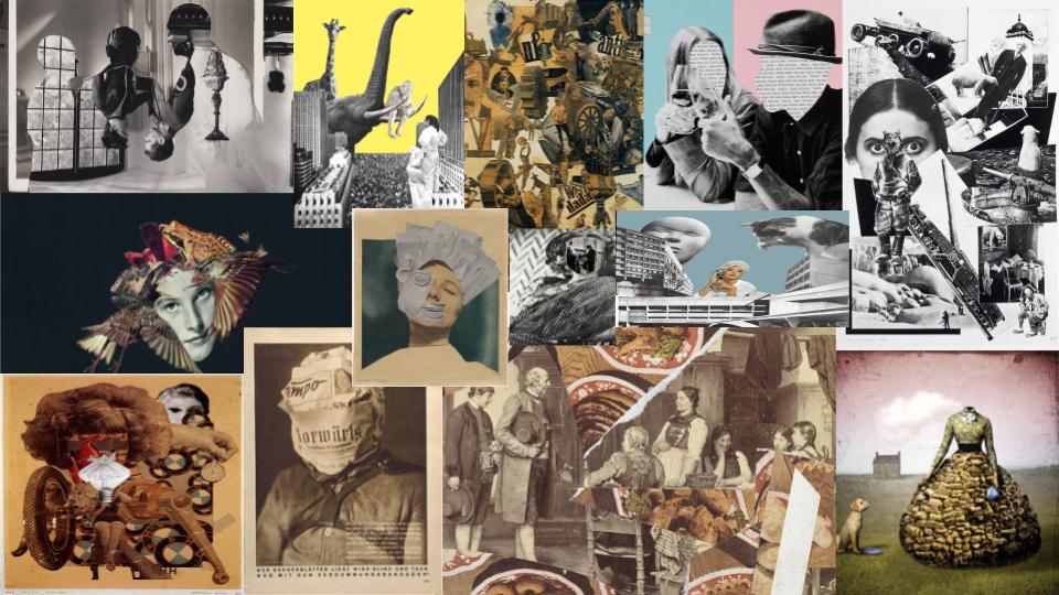
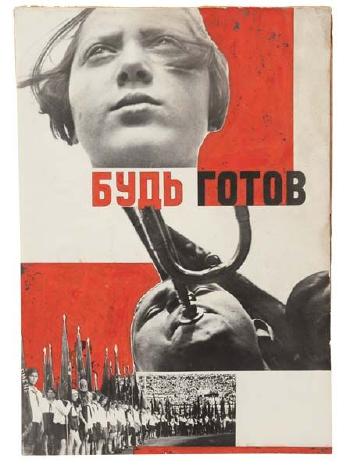
Photomontage is the process and the result of making a composite photograph by cutting, gluing, rearranging and overlapping two or more photographs into a new image. It is often used as a way of expressing political disagreement. It was first used as a technique by the Dadaists in 1915 in their protests against the First World War. It was later used by the surrealists who explored the possibilities of photomontage by using it to bring together widely contrasting images, in order to reflect the workings of the unconscious mind. In 1923, the Russian constructivist Aleksander Rodchenko began experimenting with photomontage as a way of creating socially engaged imagery exploring the placement and movement of objects in space. Other artists who have used this technique are John Heartfield, the German artist who reconstructed images from the media to protest against Germany’s Fascist regime and Peter Kennard; whose photomontages explored issues such as economic inequality, police brutality and the nuclear arms race between the 1970s and the 1990s.

JOHN STEZAKER

John Stezaker ( 1949 – ), is a British conceptual artist. His work is surreal in tone and is often made using collage and the appropriation of pre-existing images such as postcards, film stills, and publicity photographs. Art historian Julian Stallabrass said, “The contrast at the heart of these works [by Stezaker] is not between represented and real, but between the unknowing primitives of popular culture, and the conscious, ironic artist and viewer of post-modern images.” One work included in an exhibition at Salama-Caro Gallery, London, in 1991, depicted an image of a punch clock together with the caption “Why Spend Time on an Exhibition Like This?”.

one point lighting studio portraits

Studio lighting is an essential part of most photographer’s work, as it allows them to create an effect which can be either natural or artificial. A photographer’s choice of lighting is an integral part of the composition of their photographs, and can be the difference between a good image and a bad image. Studio lighting in particular can be manipulated in so many different ways, allowing the photographer to create a numerous amount of images just by changing the lighting.

Rembrandt lighting is a standard lighting technique that is used in studio portrait photography and cinematography. It can be achieved using one light and a reflector, or two lights, and is popular because it is capable of producing images which appear both natural and compelling with a minimum of equipment. Chiaroscuro is the use of contrast in light and shading across an entire image composition. It is a technique that creates a three-dimensional quality in images on a two-dimensional plane. Chiaroscuro lighting was developed by Leonardo Da Vinci, Caravaggio, Vermeer, and Rembrandt.

MY RESPONSE

FINAL IMAGES

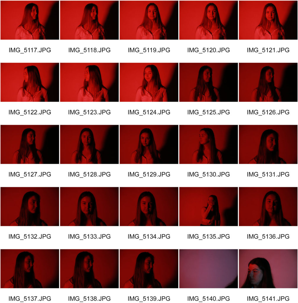
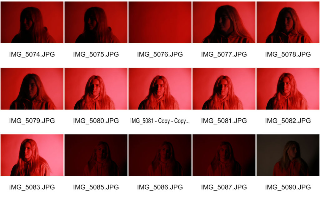
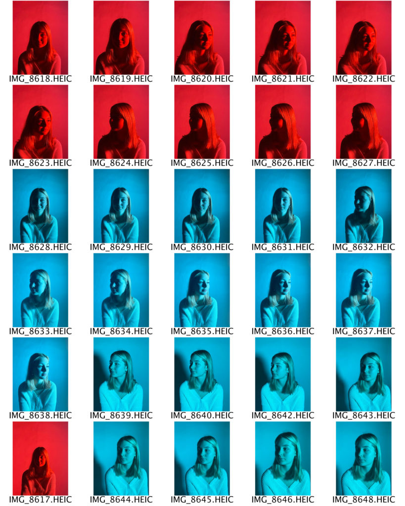
I have selected these three photographs as my final images because I think that they best show the Chiaroscuro lighting technique. The shadows being cast across my subject’s face fall in a triangular shape, which creates a three dimensional effect. I had my light set up on one side of my subject’s face and I switched sides regularly in order to create and explore different angles and shadows. I decided to use a colourful plastic sheet over an L.E.D. light instead of a spotlight because I wanted as much of my subject’s face illuminated as possible, but still with the shadows being cast over one side of her face. Additionally, I think that the colour adds a slightly modern touch to the old technique, and makes the photographs appear more vibrant and full of life. I chose the red and blue colours because they gave the best visibility through the camera lens, and were the most contrasting in tone.

headshots – deadpan

A head shot or headshot is a modern (usually digital) portrait in which the focus is on the person. Head shots are used in many different ways, for example actors, models, and other performers are usually required to present a range of head shots alongside their portfolio and CV when applying for a job. This is so their employer can see exactly who they are ( i.e. age, ethnicity, etc. ). It is therefore important that they are taken in the right and most flattering way.

THOMAS RUFF

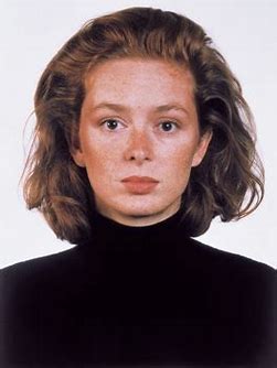
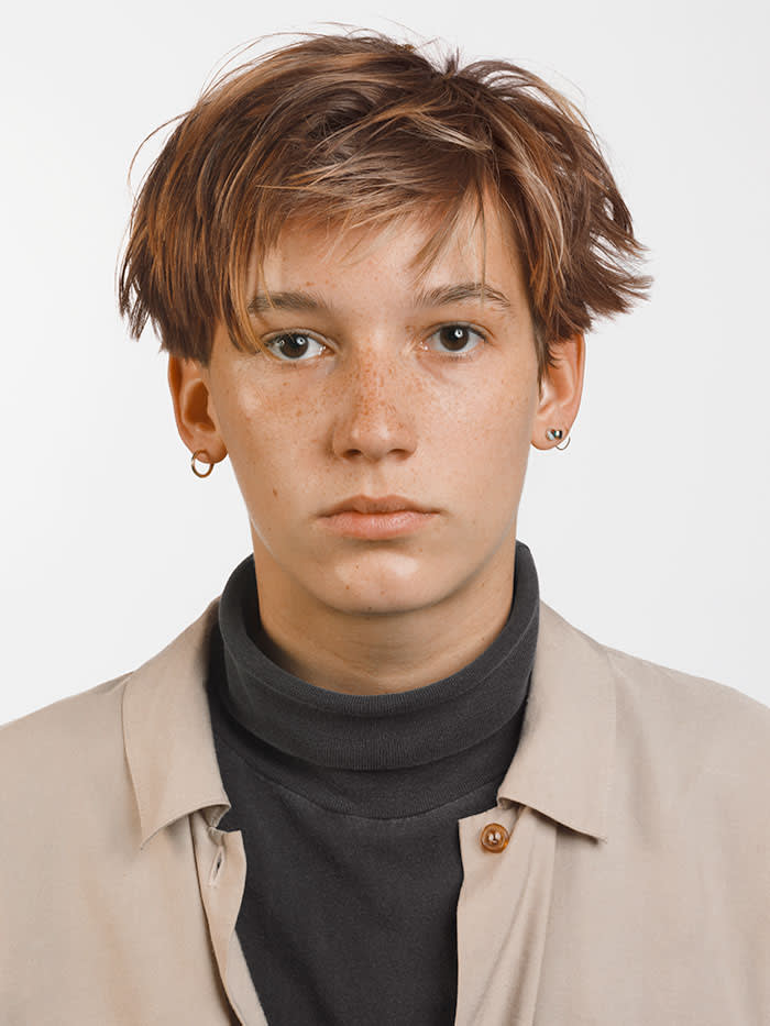
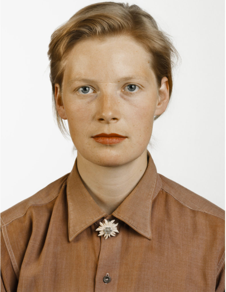
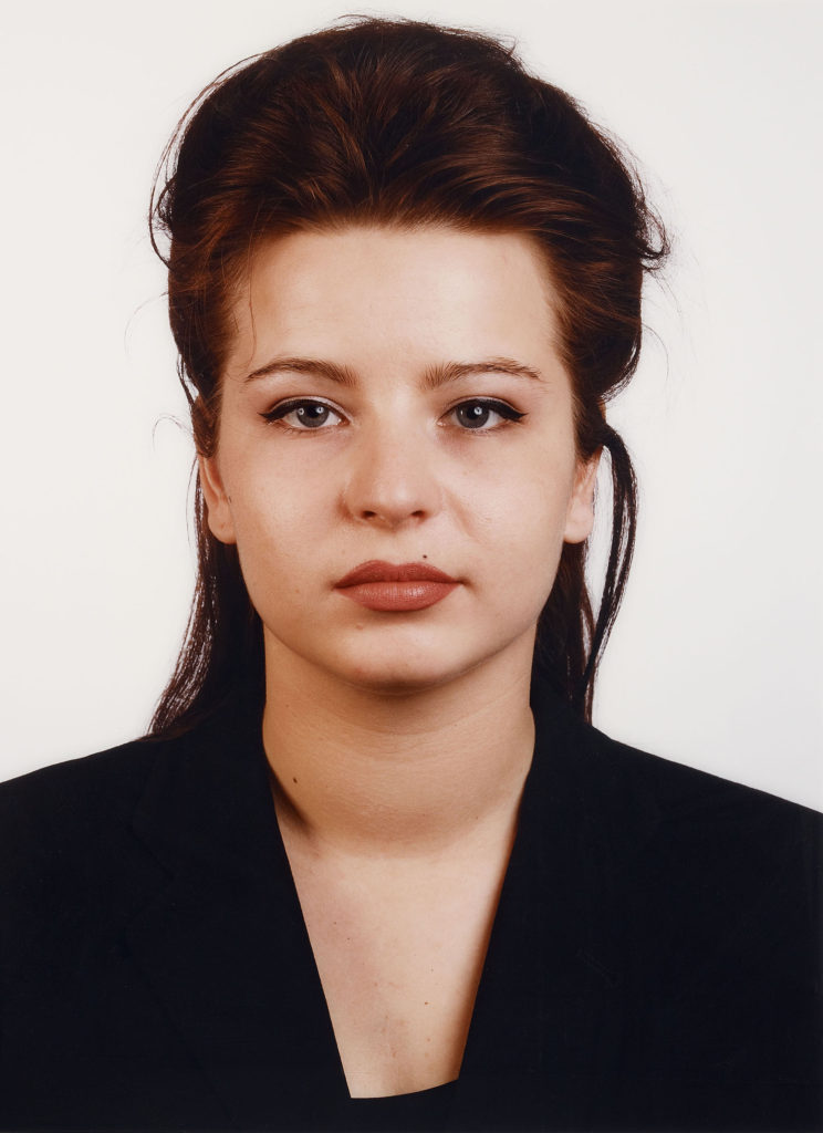
Thomas Ruff ( 1958 – ) is a German photographer who has been described as ‘a master of edited and reimagined images‘.  In 1974, Ruff acquired his first camera and started to experiment, taking shots similar to those he had seen in many amateur photography magazines. During his studies in Düsseldorf, Ruff developed his method of conceptual serial photography. He began photographing landscapes, but while he was still a student he transitioned to the interiors of German houses, with typical features of the 1950s to 1970s. This was followed by similar views of buildings and portraits of friends from the Düsseldorf art and music scene. Between 1981 and 1985, he photographed 60 half-length portraits in the same manner: passport-like images, with the upper edge of the photographs situated just above the hair, even lighting, the subject between 25 and 35 years old, taken with a 9 × 12 cm negative and, because of the use of a flash, without any motion blur. The early portraits were black-and-white and small, but he soon switched to colour, using solid backgrounds in different colours. The resulting portraits depict the individual framed as in a passport photo, typically shown with emotionless expressions, sometimes face-on, sometimes in profile, and in front of a plain background.

MY RESPONSE – ACTION PLAN

WHO – My plan is to take photographs of my friends as they are easily available for me to shoot.

WHAT – I will be taking deadpan photographs in order to portray a ‘passport’ effect.

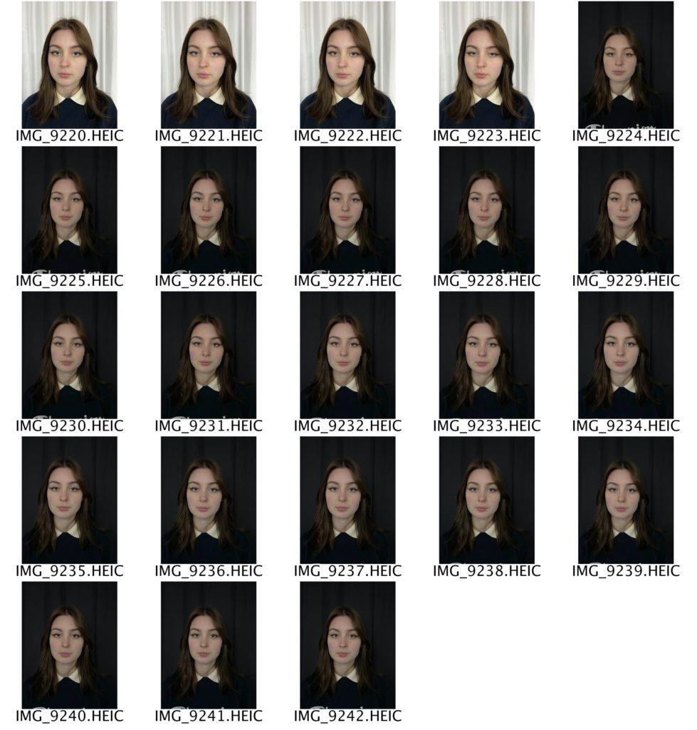
WHERE – I will take these photographs in the lighting studio against plain black and white backgrounds.

WHEN – I will be taking these photographs at the earliest opportunity in order to allow myself more time to edit and finalise my images.

WHY – I will be taking these photographs in order to showcase my knowledge and understanding of portrait photography.

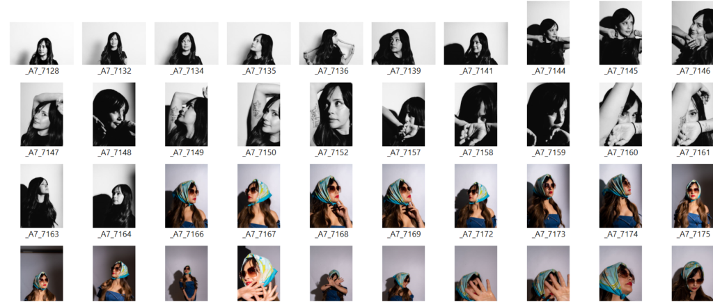
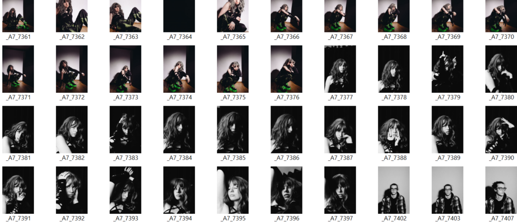
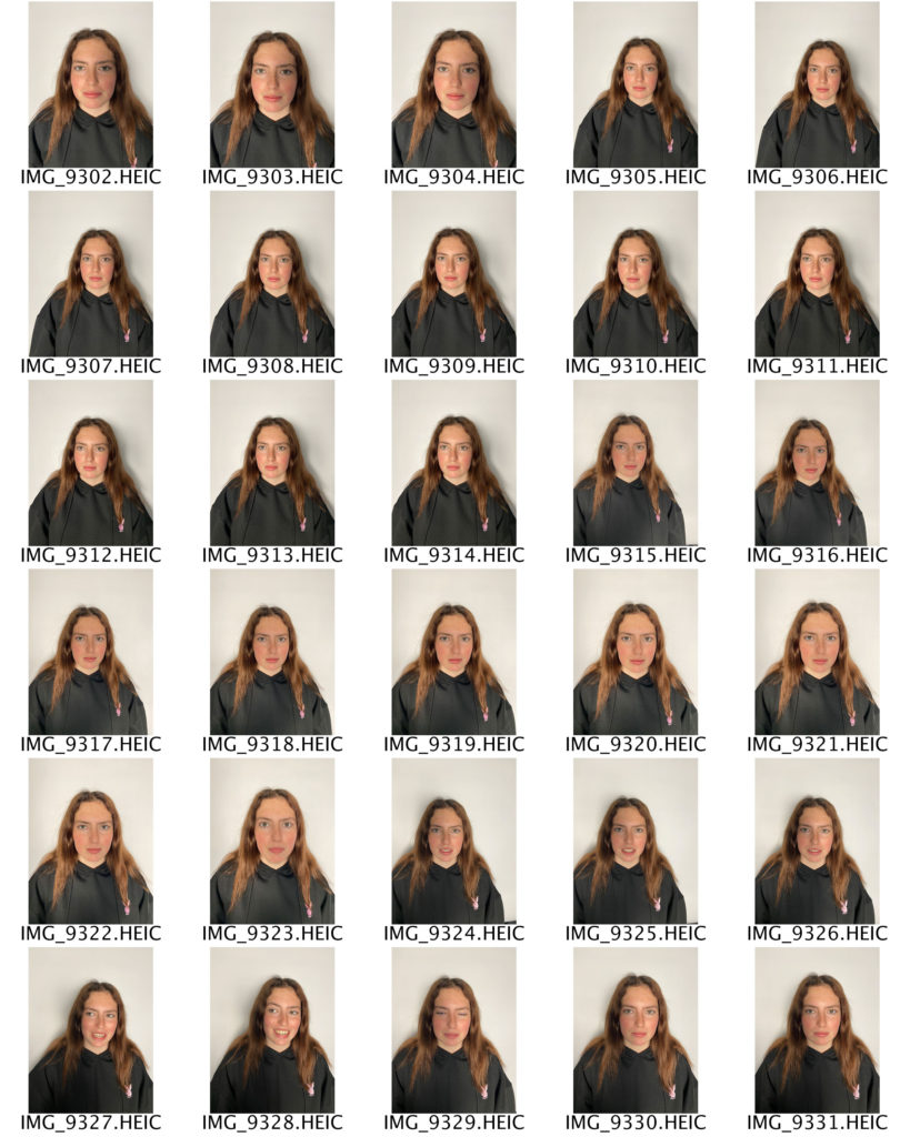
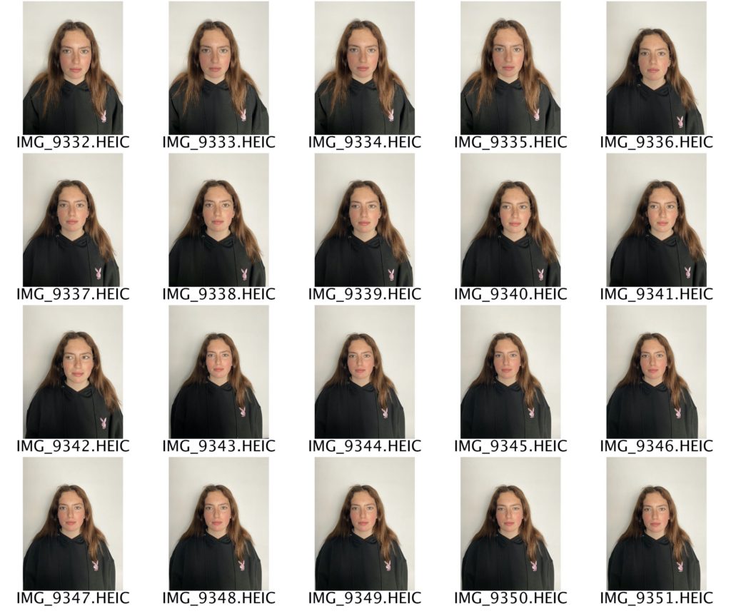
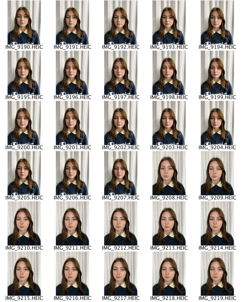
CONTACT SHEETS

FINAL IMAGES

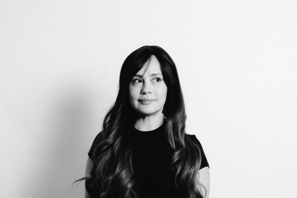
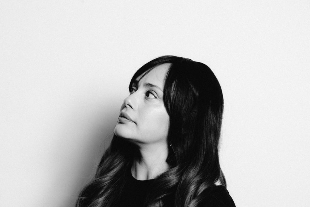
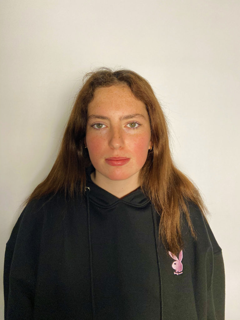
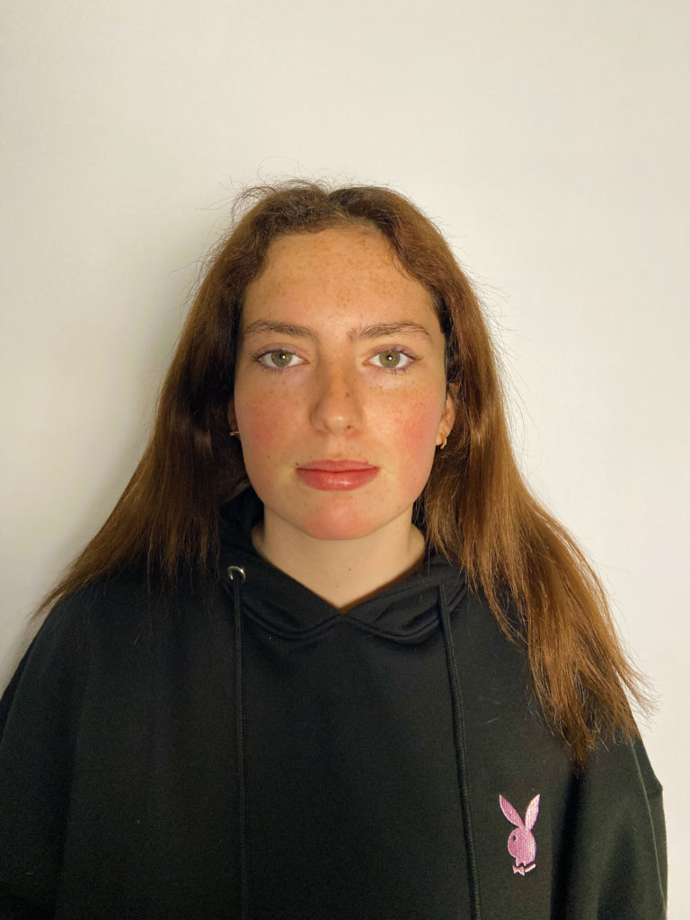
I have selected these two photographs as my final images because I think that they reflect Thomas Ruff’s work the most accurately. For example,e I have taken these photographs against a plain white background with my subject facing directly to the camera. My subject is placed in the middle of the photograph in order for there to be an equal amount of space and depth on all sides. I experimented with different angles and distances, such as shooting from up close to a few steps back. This allowed me to ensure that my photographs all looked as unique and different as possible, whilst still staying true to Ruff’s work. I edited my photographs using PhotoShop; firstly I sharpened them by selecting the filter tab, then sharpen. I then adjusted the vibrance by selecting the image tab, then adjustments, then vibrance. I slid along the scale until I was happy with the end result.

More : Photo-montage

History of Photo-montage (Europe 1910 onwards)

  • photomontage is a collage constructed from photographs.
  • Historically, the technique has been used to make political statements and gained popularity in the early 20th century (World War 1-World War 2)
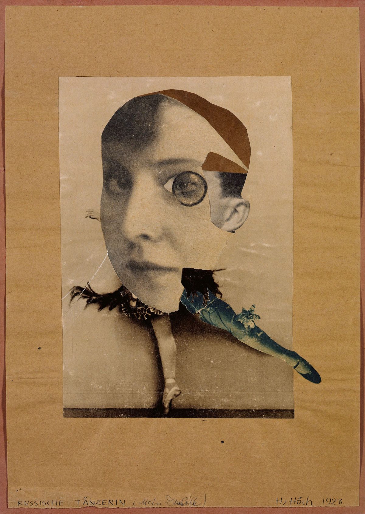
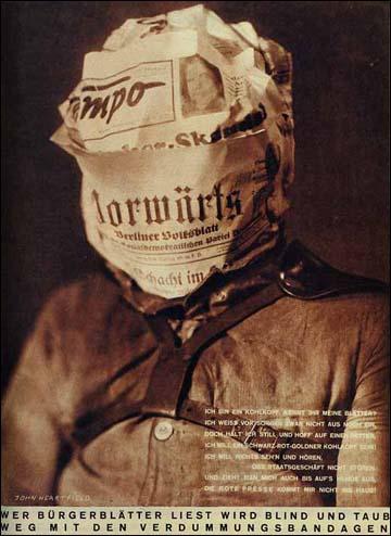
  • Artists such as Raoul Haussman , Hannah Hoch, John Heartfield employed cut-n-paste techniques as a form of propaganda…as did Soviet artists like Aleksander Rodchenko and El Lissitsky
  • Photomontage has its roots in Dadaism…which is closely related to Surrrealism
Hannah Höch, The Artist Who Wanted 'to show the world today as an ant sees  it and tomorrow as the moon sees it' - Flashbak
Hannah Hoch – art as a form of protest
Raoul Hausmann, ‘The Art Critic’ 1919–20
Raoul Haussman
Adolf Hitler addresses the German people on radio on 31st January, 1933
John Heartfield
Image result for grete stern photomontage
Grete Stern
Image result for el lissitzky
El Lissitsky
Image result for rodchenko photomontage
Aleksander Rodchenko

Pop Art developments (USA and UK 1950s-)

  • Photomontage was also used to great effect by various Pop Artists in the mid 20th Century
  • Pop art was a reaction to abstract expressionism and was similar to DADA in some ways
  • Many Pop Art images and constructions tackled popular consumerism, advertising, branding and marketing techniques
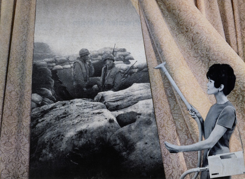
  • Pop art also explored political concerns such as war, and gender roles too
Image result for richard hamilton
Richard Hamilton
Image result for peter blake
Peter Blake
Image result for robert rauschenberg
Robert Rauschenburg
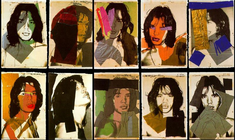
Image result for andy warhol photomontage
Andy Warhol

Examples and Inspiration

  • Richard hamilton /
  • Kurt Schwitters /
  • Peter Blake /
  • Soviet Art
  • Sammy Slabinck
  • John Stezaker
  • Jesse Treece
  • Jonny Briggs
  • David Hockney
  • Hannah Hoch
  • Annegret Soltau
  • Brno del Szou
  • Joachim Schmid
  • Jesse Draxler
  • Peter Kennard
  • Eugenia Loli
  • Sarah Eisenlohr 
  • Grete Stern
  • Jerry Uelsmann
  • Duane Michals
  • Edmund Teske
  • Man Ray
  • El Lissitsky
  • Martha Rosler
Image result for david hockney
David Hockney – joiner photographs
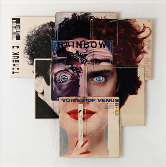
Image result for christian marclay album covers
Christian Marclay-Album Covers
Image result for soviet photomontage
Soviet war art and propaganda
Jesse Draxler: Misophonia – Sacred Bones Records
Jesse Draxler
5 things Martha Rosler taught us about war, women and cooking | Sleek  Magazine
Martha Rosler
Image result for joachim schmid
Joachim Schmid
Image result for jerry uelsmann photomontage
Jerry Uelsmann

In her artist statement Montana based artist Sarah Eisenlohr explains that her collages use places of existence to create fictional ones in an effort to demonstrate the ways in which humans have transformed the earth. These scenes often carry undertones of spirituality and faith. “I consider the figures’ desire for shelter, warmth, and something stronger than themselves as symbols of serenity that I seek through spirituality, while the use of sublime in my work points to a relationship with the divine,”

Image result for eugenia loli
Eugenia Loli
California based artist Eugenia Loli draws inspiration for her surreal art collages from vintage magazine images. Loli intends for her images to serve as a snap shot from a surreal movie from which the viewer can create his or her own narrative.

Task 1

  1. Create a blog post that includes a clear understanding of the history and background of photo-montage.
  2. Include a moodboard / mindmap
  3. Add examples of Early – late 20th Century Photomontage eg Hannah Hoch

Task 2

  1. Choose a specific photo-montage artist and write/create a CASE STUDY
  2. This must include a detailed analysis of 1 x key image by the artist
  3. Add TECHNICAL -VISUAL-CONCEPTUAL-CONTEXTUAL understanding

Task 3

  1. Create a set of 3-5 photo-montages using a mixture of your own imagery and “found” imagery….(this could be archival imagery) either using Adobe Photoshop methods or traditional cut-n-paste methods
  2. TAKE 100-200 NEW PHOTOS TO CREATE MATERIAL FOR YOUR EXPERIMENTS — based on STEREOTYPES
  3. Show your process clearly…remember to add screen shots etc
  4. Evaluate your process…describe and explain what you have done, why, how etc

KEY COMPONENTS AND DISTINGUISHING FEATURES of PHOTO-MONTAGE

  • A NARRATIVE, CONCEPT OR THEME (A MESSAGE OR A COMMENT)
  • ARCHIVAL / VINTAGE IMAGERY COMBINED WITH OWN IMAGERY
  • SUBVERSION OF MEANING—-POSTMODERNISM

SOURCE MATERIAL YOU CAN USE

  • NEWSPAPERS
  • MAGAZINES
  • ORIGINAL IMAGERY (from studio, tableau, other portraits etc)
  • INTERNET-SOURCED IMAGERY
  • BOOKS

TECHNIQUES

  • MANUAL CUT-N-PASTE (SCISSORS, SCALPEL AND GLUE)
  • PHOTOSHOP –
  • selection tools (to cut and move elements of images)
  • free transform (CTRL T)– to move, re-size and shape elements
  • layers and layer masks
  • opacity tool
  • blending options
  • distortion
  • proportion
  • scale

Ensure you have enough evidence of…

  1. moodboards
  2. mindmaps
  3. case studies (artist references)
  4. action plans
  5. photoshoots + contact sheets (annotated)
  6. appropriate selection and editing techniques
  7. presentation of final ideas and personal responses
  8. analysis and evaluation of process
  9. compare and contrast to a key photographer
  10. critique / review / reflection of your work

Ensure you discuss / describe / explain your images using key words and vocab…

Picture