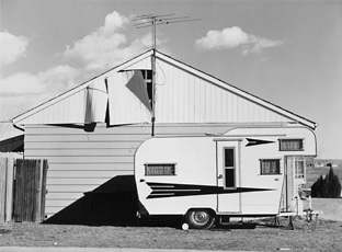
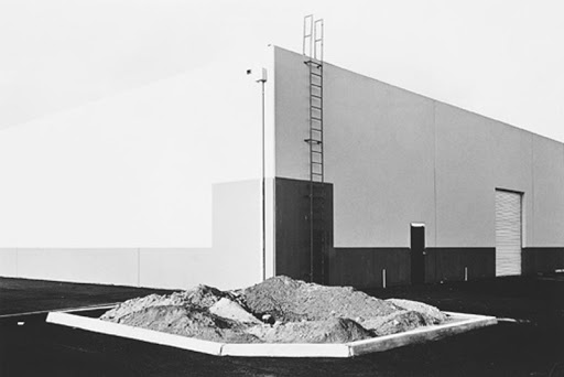
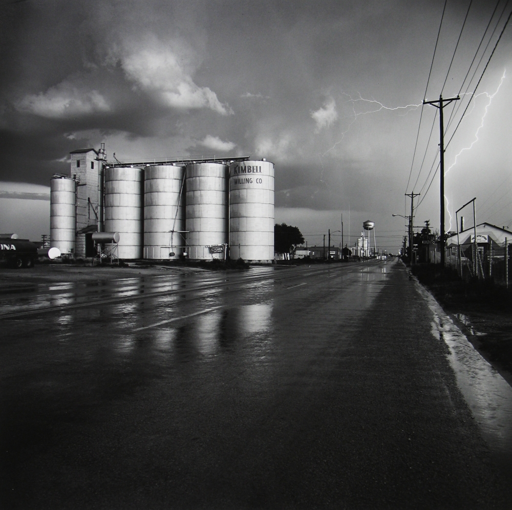
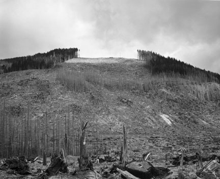
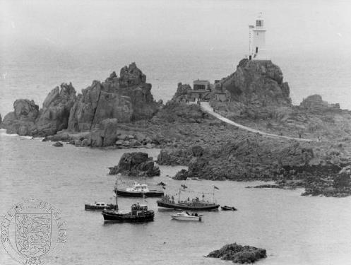
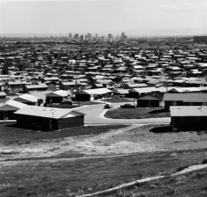
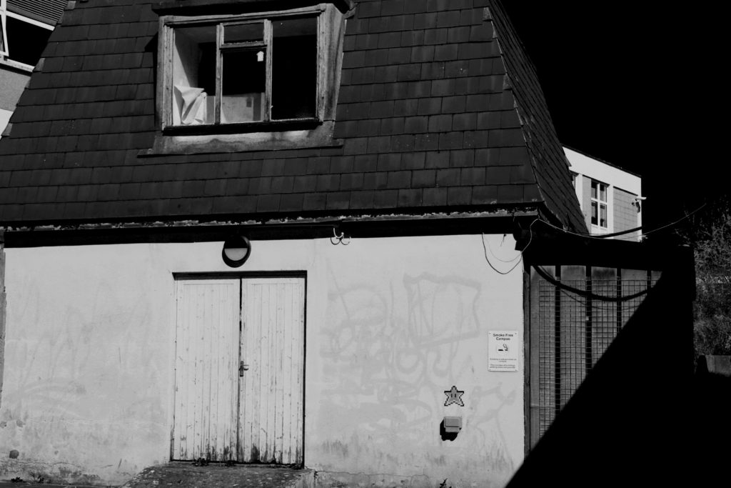
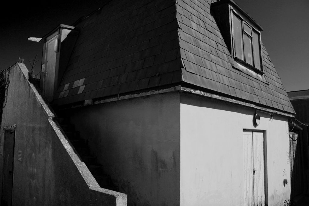
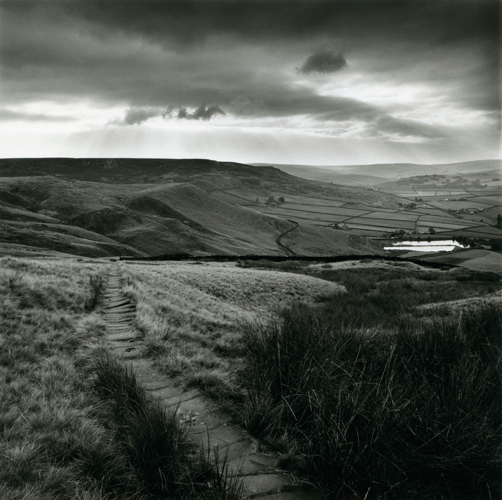
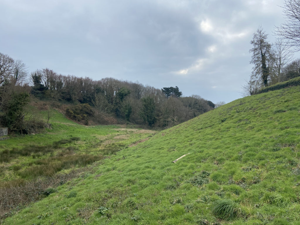
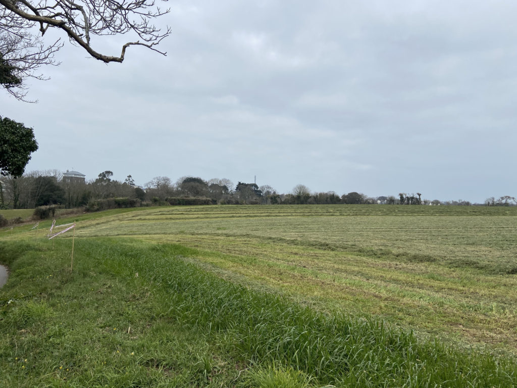
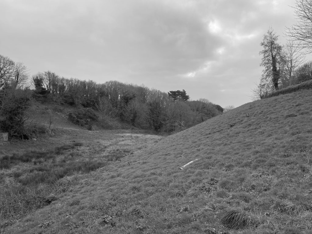
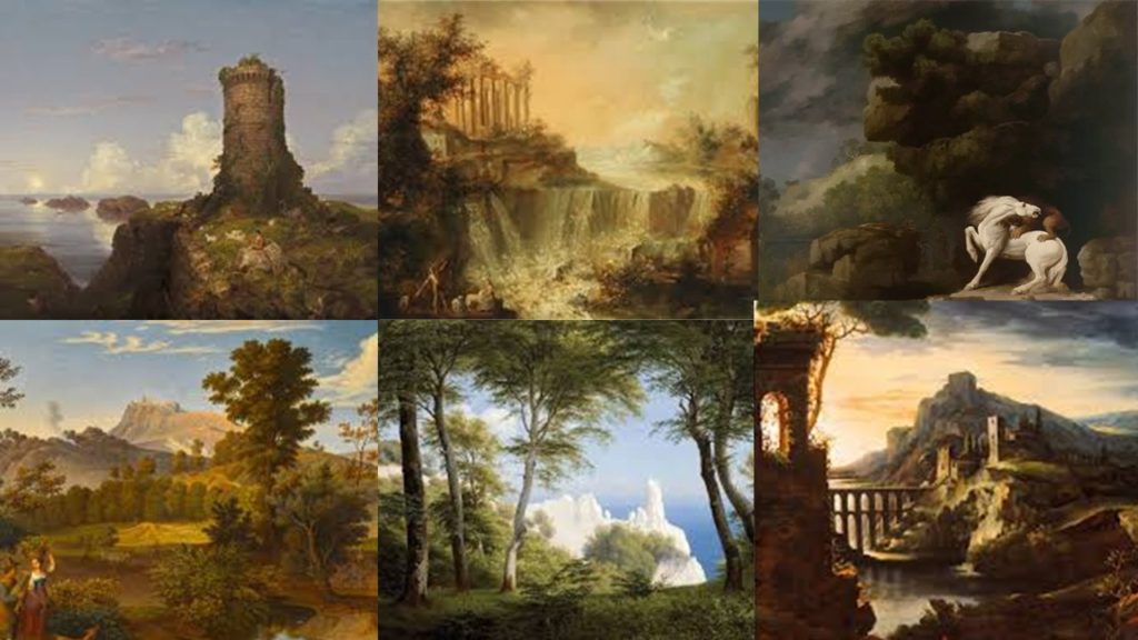
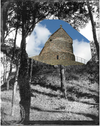
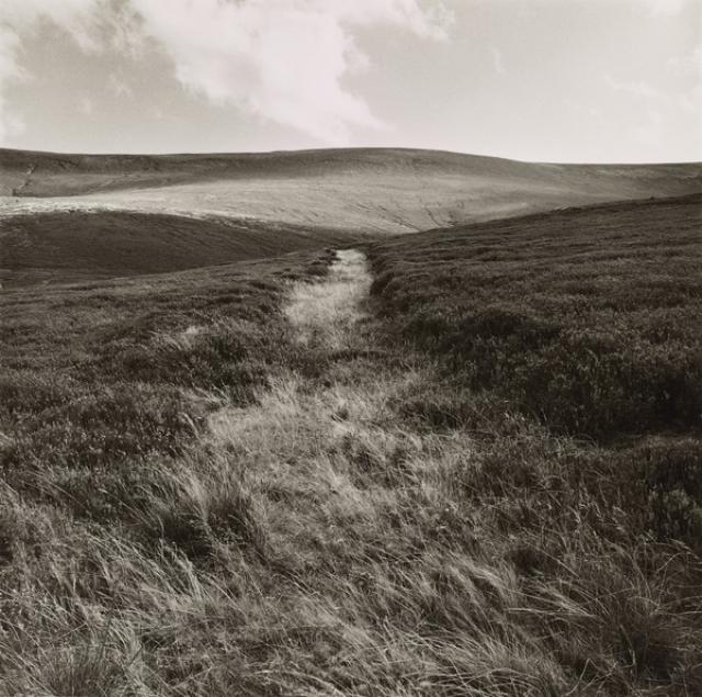
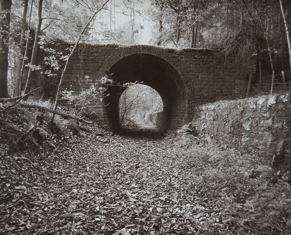
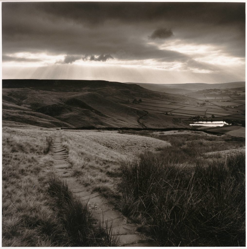
First…lets read this article by Colin Pantall and discuss
https://witness.worldpressphoto.org/a-guide-to-landscape-power-and-climate-change-767c2fe08087
Environmental Damage / Political Interventions
Possible aspects of the anthropocene you could look at and explore include…
- Clothing / fast fashion – cheap and disposable, synthetic fabrics
- Industrial Farming – over production that is harmful to the land and animals
- Commercial Fishing – by-catch issues, disturbance of sea bed
- Single use plastics – unnecessary (?) and difficult to dispose of
- Fossil fuels – heating, transport etc – harmful carbon emissions
- De-forestation – usually to create farming areas but leads to land instability and global warming
- Fly-tipping – often bulky / harmful products
- Chemical waste / pollution – rivers and oceans become tainted and polluted
- Cement production – massive energy consumption and release of harmful gases
- Over-development – cluttered infra-structures
Generating ideas using binary opposites…
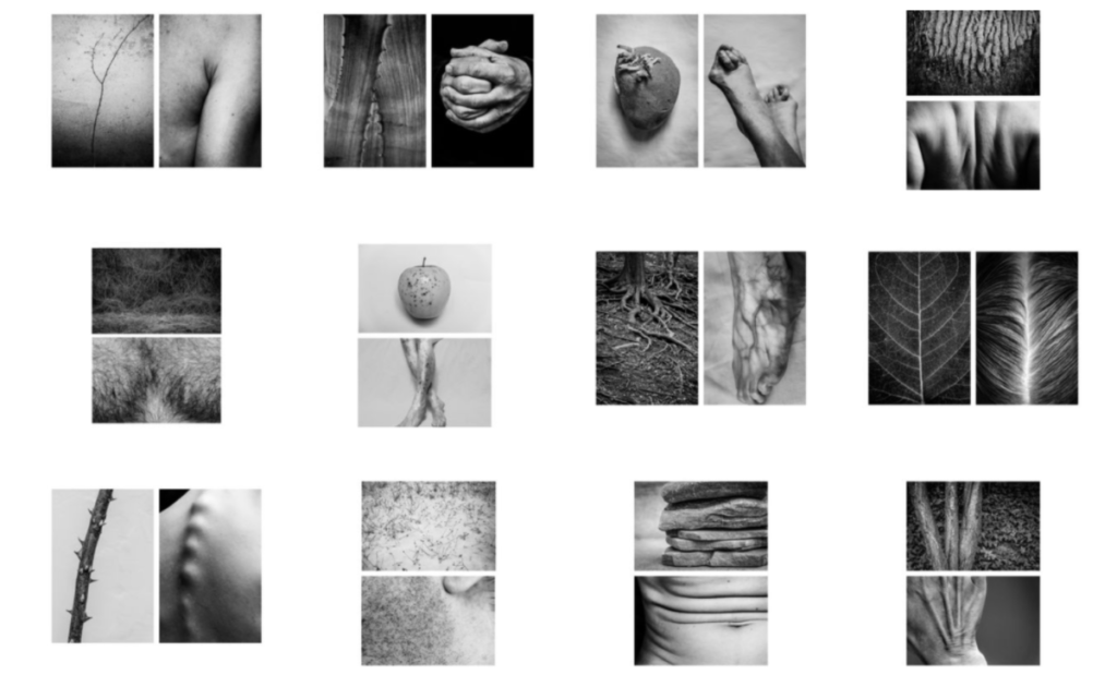
Binary opposition originated in Saussurean structuralist theory in Linquistics (scientific study of language) According to Ferdinand de Saussure, binary opposition is the system by which, in language and thought, two theoretical opposites are strictly defined and set off against one another. Using binary opposites can often be very helpful in generating ideas for a photographic project as it provides a framework – a set of boundaries to work within. You could make work about ANTHROPOCENE by exploring a problem versus a solution and vice versa…
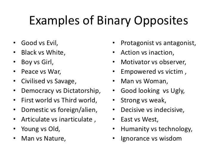
Look carefully at these examples and think carefully about how they could be responses to your theme…




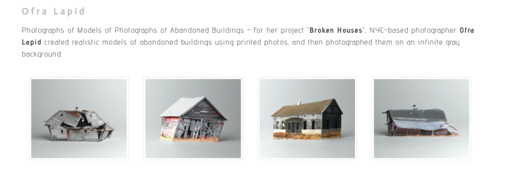

An “erratic” is a rock that has been transported by a glacier to somewhere far from its native environment. When the ice melts, it is left there, out of place. In this series of photos and sculptures, Darren Harvey-Regan went from the White Cliffs of Dover to Egypt’s Western Desert. In the desert he photographed natural chalk formations that had been scratched and shaped by wind and sand over centuries. In England he collected coarse lumps of chalk that had crumbled off the cliff face. He made them into sculptures by carving them with a razor blade and shaping them with sandpaper before placing them on plinths.
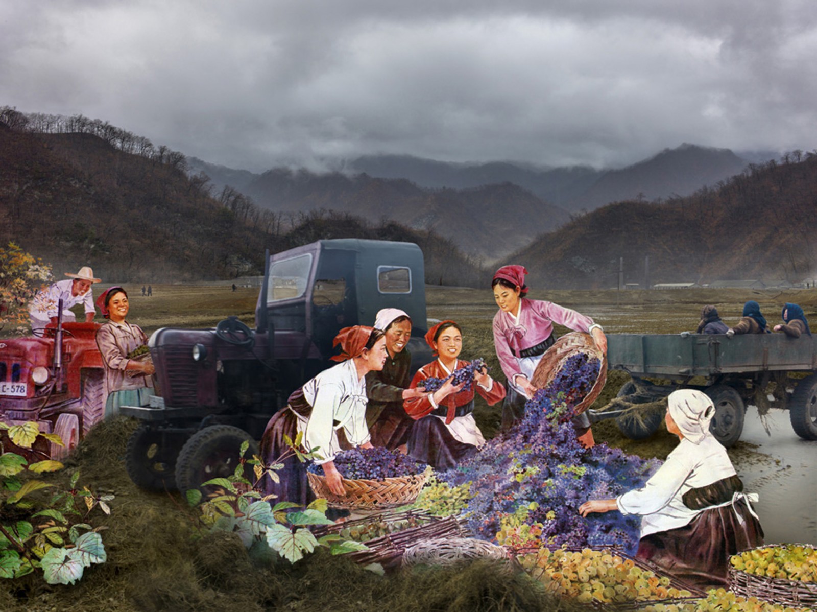
ALICE WIELINGA
NORTH KOREA, A LIFE BETWEEN PROPAGANDA AND REALITY
April 2013. While the Western media dogs Kim Jong-Un’s steps during his missile test launches, I travel 2,500 kilometres through the North Korean interior. Once arrived, the images I know from my advance research correspond with the scenes my guides proudly show me during their propaganda tour. But seeing these scenes with my own eyes, I gradually discover that behind everything they present to me, a different reality is hidden. While I listen to my guides talking about what invaluable contributions the greatly admired leaders made to their country, I drive through a landscape that looks haggard and desolate. During my journey I collect propaganda material and take photographs of the reality I encounter. This material is the basis for my multimedia project North Korea, a Life between Propaganda and Reality. With the found propaganda images and my own photographs I compose a story that deconstructs the North Korean propaganda.
Alice Wielinga
www.alicewielinga.nl
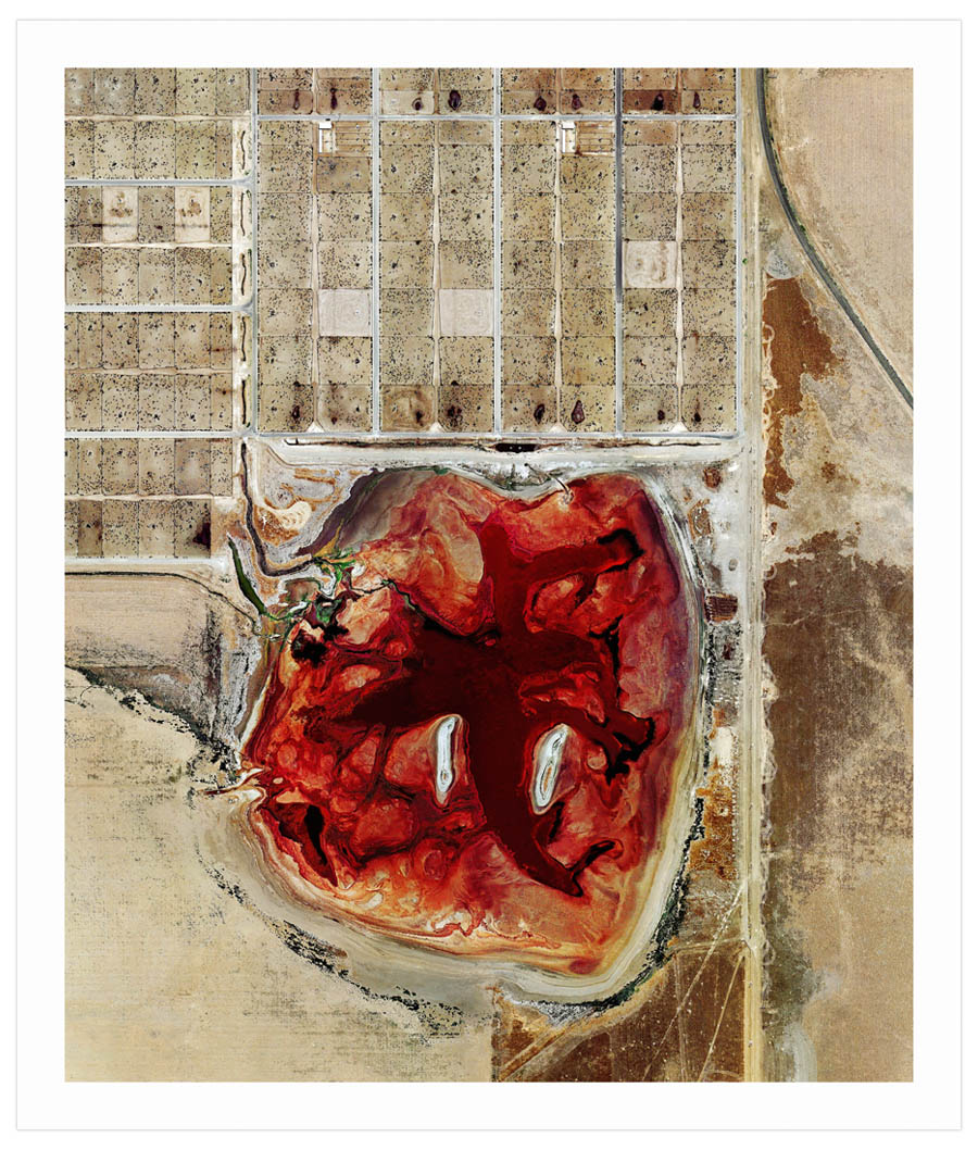
18.9×16 inches. Archival pigment print on Baryta. Unframed.
Edition of 250. Signed and numbered on reverse.
Click here for more info on the Feedlots series.
Mishka Henner says : Coronado Feeders was the final feedlot I found after researching them for over a year. Vice magazine were featuring my work on oil fields and feedlots and the US picture editor, Christian Storm, encouraged me to keep searching right up to deadline.
It struck me as soon as I saw it. Coronado isn’t the largest feedlot in America. With a capacity of 60,000 cattle, it’s less than half the size of some of the biggest.
The configuration of pens, run-off channels, and its lagoon of cattle bodily waste is much the same as any other feedlot. What these elements represent is an efficient method for maximizing the meat yield of a living animal in the minimum amount of time for the highest profit…
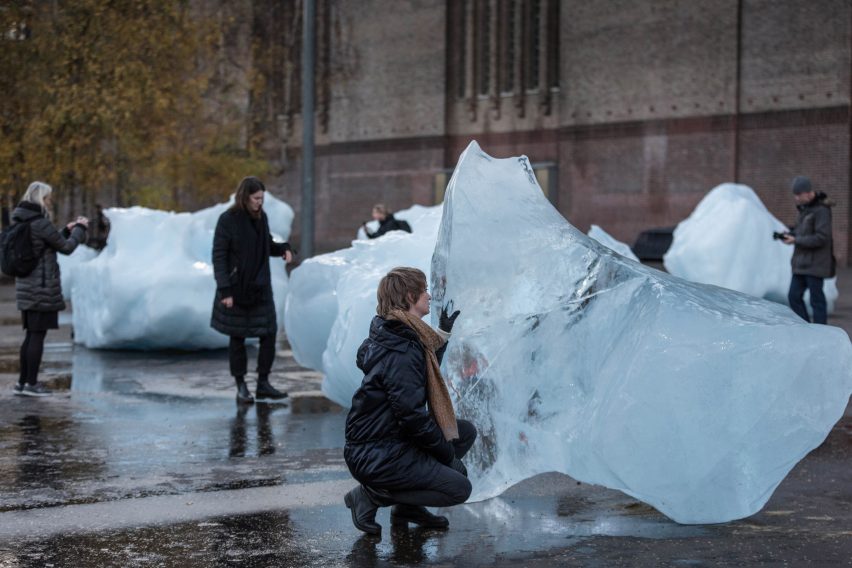
Olafur Eliasson CLICK HERE FOR MORE
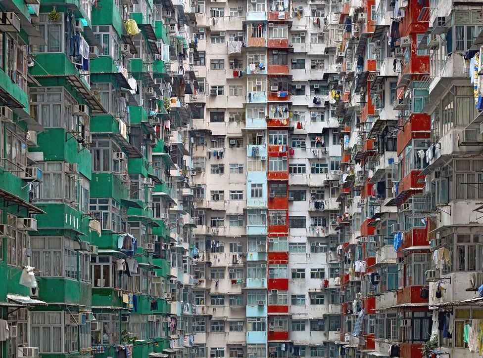
Michael Wolf – megacities- CLICK HERE FOR MORE
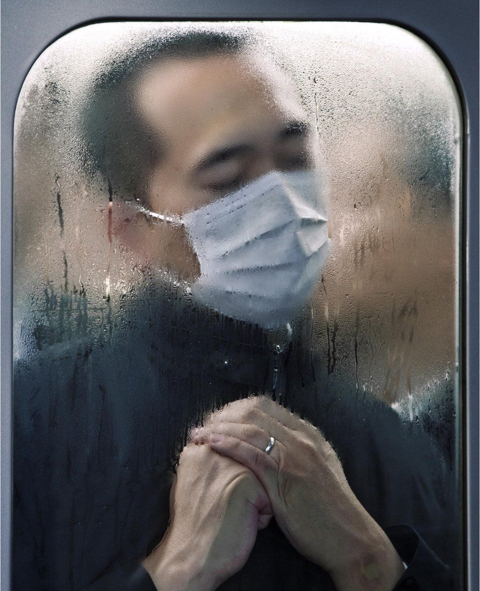

Ed Ruscha CLICK HERE FOR MORE
Michael Marten

Anthony Gormley statues, Crosby beach, Liverpool. 5 and 7 April 2008. High water 12 noon, low water 9 am, from the series Sea Change © Michael Marten
Sea Change explores tidal changes around coastal Britain. These transitions provide an ever changing environment that is integral to Island Britain’s history and sea-going way of life.
Peter Mitchell

Peter Mitchell got to know Leeds as a struggling artist, working as truck driver at times…and constantly re-visiting places that he saw were changing over time. Whole communities gave way to development, new industry and transport networks. “A New Refutation of the Viking 4 Space Mission” was published 40 years after conception…and now Leeds has changed beyond recognition. Mitchell’s photography have a painterly quality to them ; a sombre palette and considered compositions, but juxtapose the old and the new as well as the empty spaces created by change.
Robin Friend

In The Bastard Countryside Robin Friend presents evidence of a broken planet, over-consumption, waste and a lack of love and respect for the environment on our doorstep…
Thom and Beth Atkinson

Marking 75 years since the outbreak of the Blitz, Thom and Beth Atkinson’s first photobook, Missing Buildings, seeks to preserve the physical and psychological landscapes of the Second World War in London.
Over a million of London’s buildings were destroyed or damaged by bombing between 1940 and 1945. From the mysterious gap in a suburban terrace, to the incongruous post-war inner city estate, Missing Buildings reveals London as a vast archeological site, bearing the visible scars of its violent wartime past. But this book is more than a simple record of bombsites; to the artists’ generation, the war is the distant story of an epic battle, passed down to them through books, images and grandparents’ memories.
Blurring fact and fiction, Missing Buildings searches for this mythology, revealing strange apparitions of the past as they resurface in the architecture of the modern-day city. Missing Buildings asks us to contemplate the effects of war upon the British psyche and suggests that the power wrought on our imaginations by the Blitz is a legacy as profound as the physical damage it caused.
Eugene Atget and Gentrification

Working in and around Paris for some 35 years, in a career that bridged the 19th and 20th centuries, Eugène Atget created an encyclopedic, idiosyncratic lived portrait of that city on the cusp of the modern era. Around 1900, Atget’s focus shifted. The city’s urban landscape had been recently reshaped by the modernization campaign known as Haussmannization—a necessarily destructive process led by (and named after) Baron Georges-Eugène Haussmann that saw Paris’s medieval neighborhoods razed and transformed into wide avenues and public parks. Those changes, in turn, kindled a broad interest in vieux Paris (“old Paris”), the capital in its pre-Revolutionary, 18th-century form. Atget’s documentary vision proved highly influential, first on the Surrealists, in the 1920s, who found his pictures of deserted streets and stairways, street life, and shop windows beguiling and richly suggestive
Joel Meyerowitz and New York 9/11: Aftermath

Immediately after the harrowing events of September 11, 2001, the Ground Zero site in New York City was designated an active crime scene and closed off to reporters and photojournalists. Sensing the magnitude of the historical record about to be lost, internationally-acclaimed landscape photographer Joel Meyerowitz fought for access to the site.
Meyerowitz became the only photographer allowed to document the painful transformation of the World Trade Center site over time. For nine months he photographed “the Pile,” as the World Trade Center came to be known, and the courageous rescue personnel, police officers, firefighters, and construction workers leading the recovery efforts inside it.
Using both a large-format view camera and a 35-milimeter Leica, Meyerowitz made over 8,000 images around the sixteen-acre site where the Twin Towers once stood. His images show the mangled metal, shards of broken glass, and cascades of files and papers in the still-smoldering piles of debris; the riot of patriotic color seen in spontaneous memorials; and the elegiac silence of the dust that seemed to cover every surface in Lower Manhattan. Eventually, as his weeks in “the Pile” wore on, his subject shifted from the panoramic sweep of complete devastation to the intimate moments of mourning, strength, determination, and resilience in the faces and figures of the people on hand.
Vanitas Art and Photography
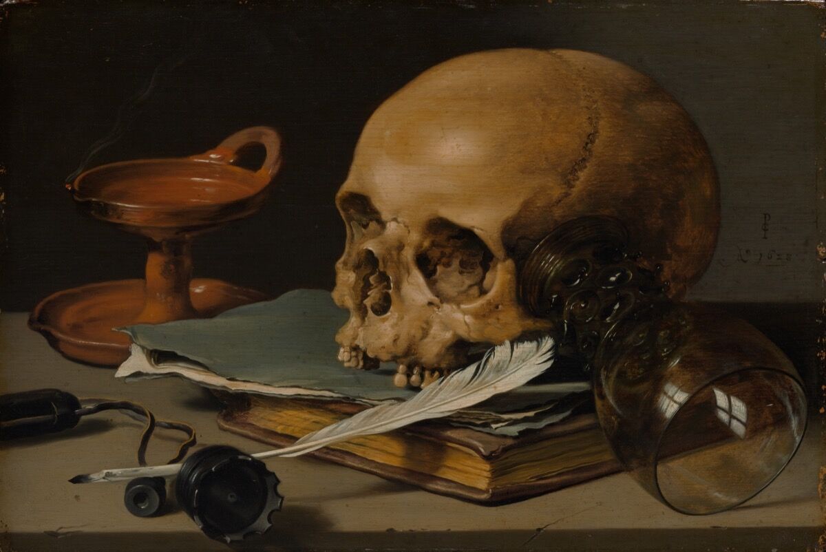
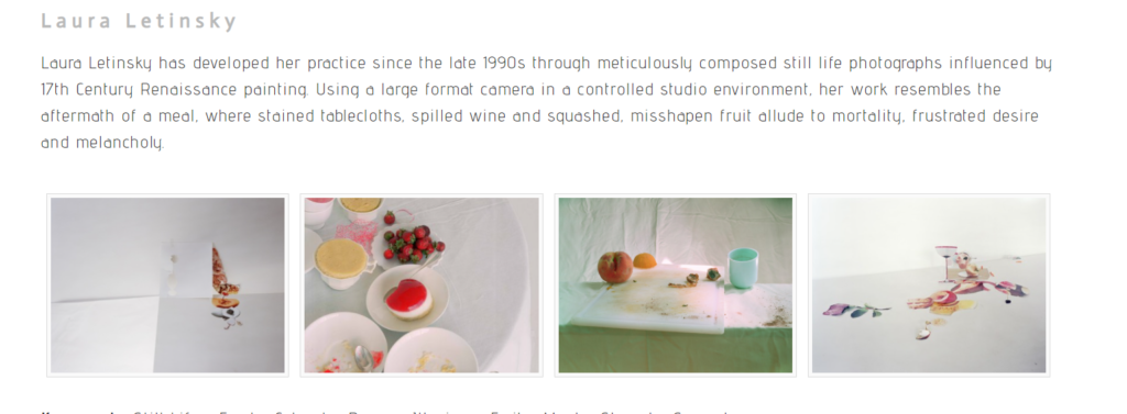
A vanitas is a symbolic work of art showing the transience of life, the futility of pleasure, and the certainty of death, often contrasting symbols of wealth and symbols of ephemerality and death.
The term originally comes from the opening lines of the Book of Ecclesiastes in the Bible: ‘Vanity of vanities, saith the Preacher, vanity of vanities, all is vanity.’
Vanitas are closely related to memento mori still lifes which are artworks that remind the viewer of the shortness and fragility of life (memento mori is a Latin phrase meaning ‘remember you must die’) and include symbols such as skulls and extinguished candles. However vanitas still-lifes also include other symbols such as musical instruments, wine and books to remind us explicitly of the vanity (in the sense of worthlessness) of worldly pleasures and goods.
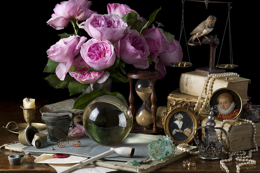
Inspired by the works of 17th century Old Master still life painters such as Giovanna Garzoni and Maria Sibylla Merian, American photographer Paulette Tavormina creates stunningly lit imagery of fruits and vegetables immersed in dark atmosphere
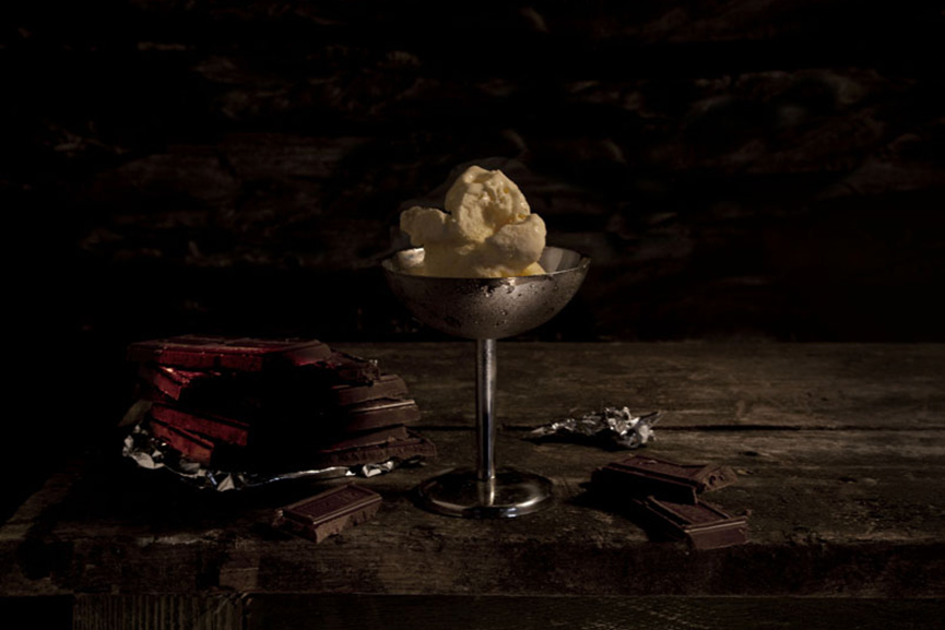
A perfect example of the old technique getting combined with modern-age ideas is Mat Collishaw’s Last Meal on Death Row series of works. Although they appear as meticulously arranged staged photography still lifes of food, each image is actually based on death row inmates’ last meals before they are executed. Apart from the eerie subject, the pictures deliver a strong drammatic effect through an excellent use of chiaroscuro.
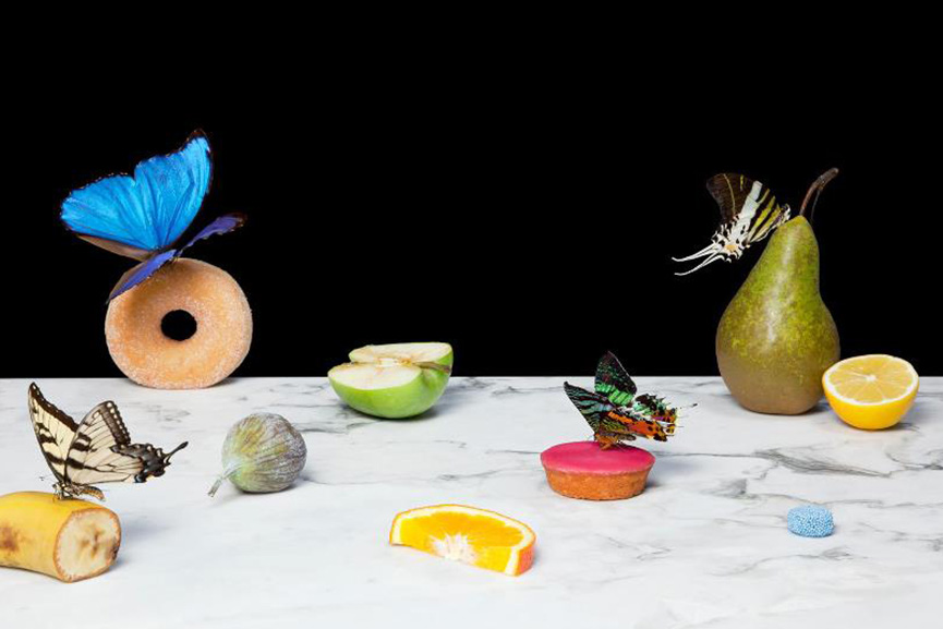
On a much more lighter, even pastel note, we have Dutch photographer Krista van der Niet, whose compositions often include fruits and vegetables mixed with mundane objects such as socks, cloths and aluminum foil, giving it all a contemporary feel. Her photos often carry a dose of satire as well, which references consumerism and popular culture through a clever employment of objects within a carefully composed scenery.
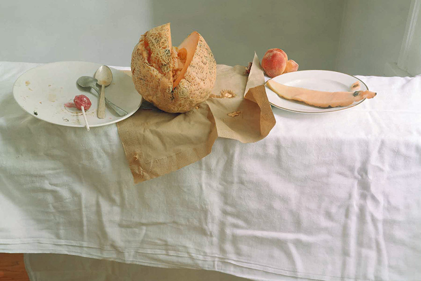
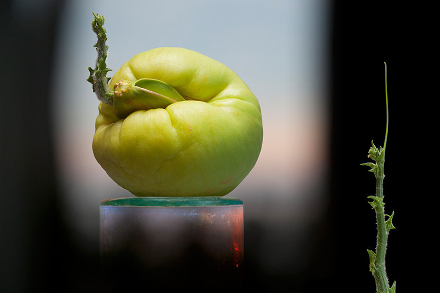
Experimenting with the endless possibilities of light, self taught photographer Olivia Parker makes ephemeral constructions. She started off as a painter, but soon turned to photography and quickly mastered the way to incorporate an extensive knowledge of art history and literature and reference the conflicts and celebrations of contemporary life in her work. Over the many years of her artistic career, her style remained fluid, yet consistent

Think paintings by Pieter Claesz or Adriaen Coorte, only in plastic. That’s how one could describe the photographs of Richard Kuiper, whose objects are all made of this everlasting, widely used material, including water bottles, floral arrangements, even the feathers. The artist tries to draw our attention towards the excessive use of plastic in our everyday lives, with the hope we will be able to decrease it before it takes over completely.
More Landscape
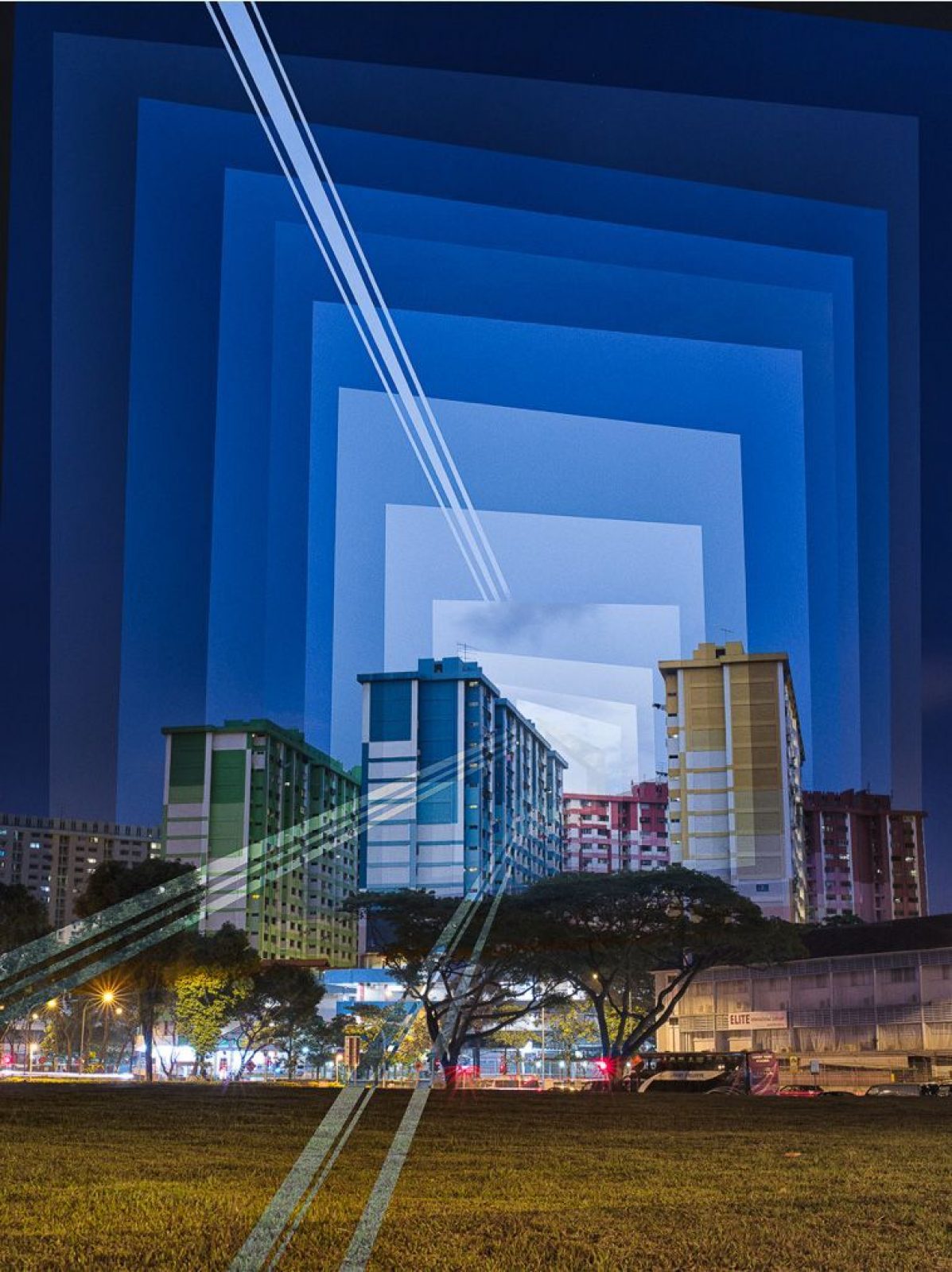
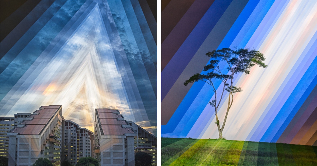
Light is the key element of photography. Photographers and filmmakers often capture both gradual and sudden transitions of light. Shadows from clouds pass across the landscape in pictures such as No Man’s Land by Fay Godwin. Other photographers show
transitions of light over longer periods, such as Fong Qi Wei and Dan Marker-Moore, who record the change from day to night in film and photographs. Stephen Wilkes’ large scale night and day panoramas of urban vistas have the epic quality of paintings by the 16th century artist Brueghel.


Robert Rauschenberg
During times of stress and economic upheaval, the language of art can change reflecting a transition in the way individuals see themselves. This shift in perspective can even apply to a whole country. Robert Rauschenberg made politically charged collages in the 1960s that at first sight seemed to be chaotic assemblages of images and marks. However, these collages showed great compositional skill in directing the viewer’s attention and
created memorable images that reflected the upheavals of the era. Rauschenberg had been influenced by the earlier collagist Kurt Schwitters and he, in turn, influenced other artists such as Sigmar Polke, David Salle and Jean-Michel Basquiat.
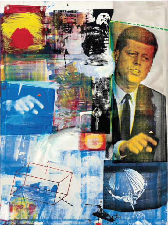
Buffalo II (1964)
screenprint
Examples of Political Transition to look at – communism – capitalism – consumerism – individualism
- USSR – Russia
- West Germany v East Germany
- China
- North Korea
Alice Weilinga
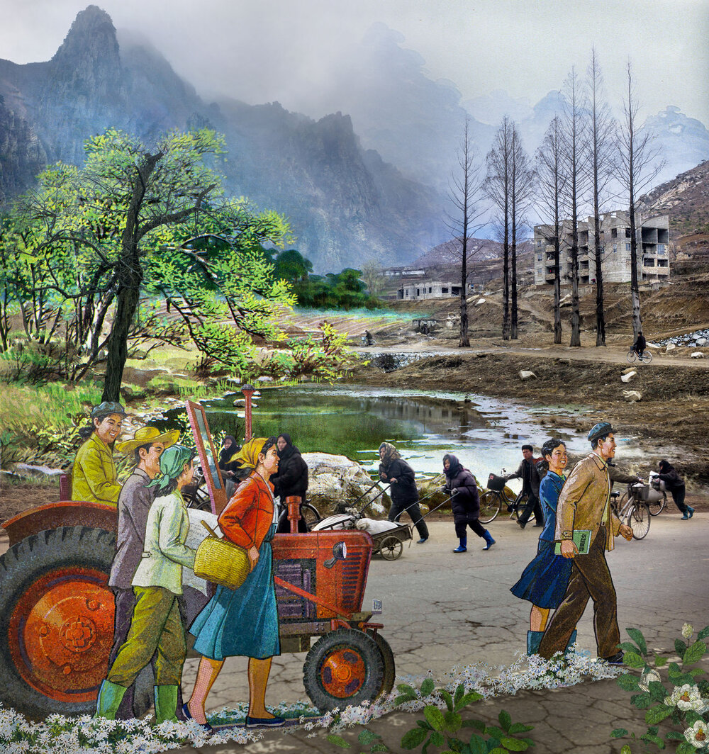
Alice Weilinga works in places like Pakistan and North Korea ; countries that have experienced radical changes in their traditional way of life but still cling to the dreams of their ancestors. Political decisions have shaped the communities and their struggles, whilst the propaganda machines depict a progressive future. Weilinga explores this tension and questions it’s validity by way of intricate composite imagery that draws on often-romanticised imagery that belies forced and slave labour, amongst other issues.
Koyaniqaatsi
Drawing its title from the Hopi word meaning “life out of balance,” this renowned documentary reveals how humanity has grown apart from nature. Featuring extensive footage of natural landscapes and elemental forces, the film gives way to many scenes of modern civilization and technology
Felicity Hammond is an emerging artist who works across photography and installation. Fascinated by political contradictions within the urban landscape her work explores construction sites and obsolete built environments.
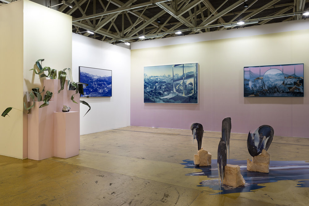
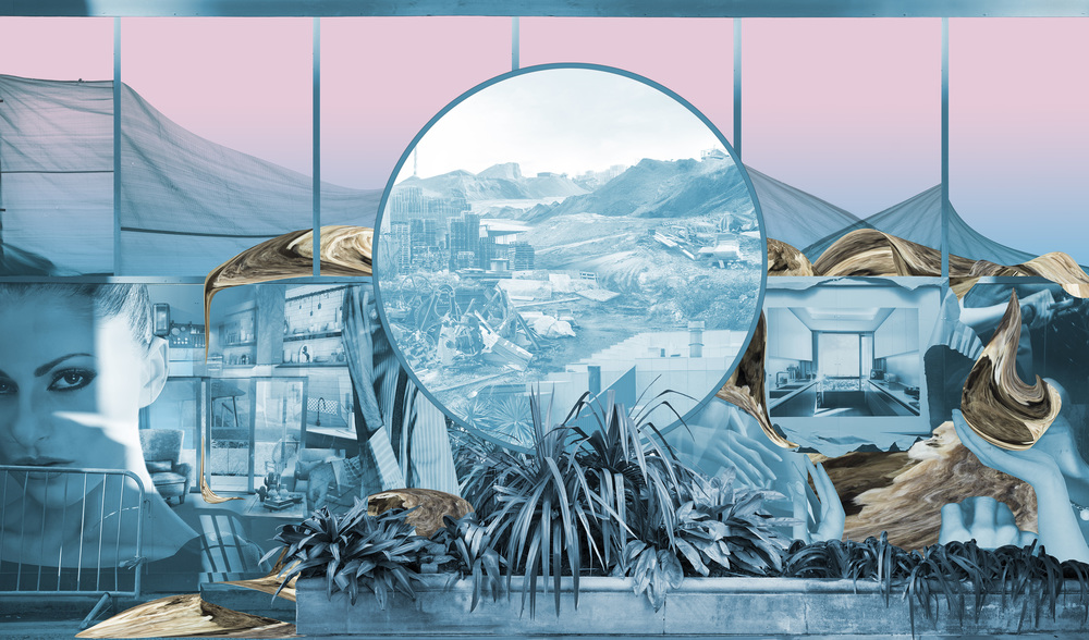
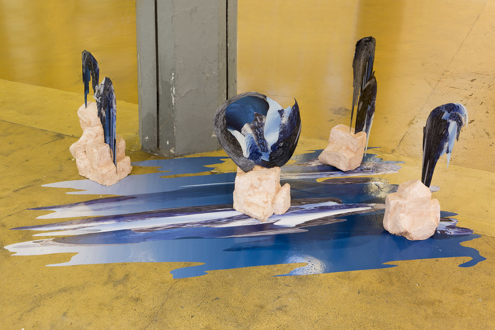
In specific works Hammond photographs digitally manipulated images from property developers’ billboards and brochures and prints them directly onto acrylic sheets which are then manipulated into unique sculptural objects. http://www.felicityhammond.com/
Lorenzo Venturi: Dalston Anatomy
Lorenzo Vitturi’s vibrant still lifes capture the threatened spirit of Dalston’s Ridley Road Market. Vitturi – who lives locally – feels compelled to capture its distinctive nature before it is gentrified beyond recognition. Vitturi arranges found objects and photographs them against backdrops of discarded market materials, in dynamic compositions. These are combined with street scenes and portraits of local characters to create a unique portrait of a soon to be extinct way of life.
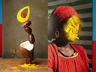
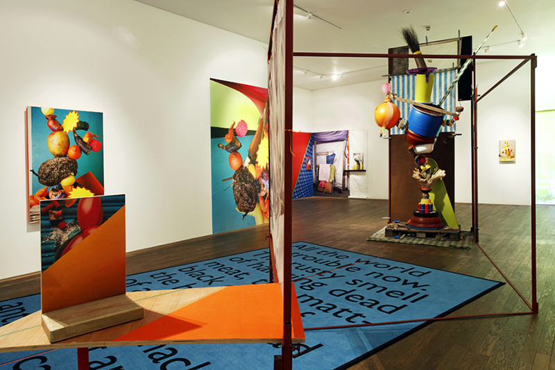
His installation at the Gallery draws on the temporary structures of the market using raw materials, sculptural forms and photographs to explore ideas about creation, consumption and preservation.
Boyd Webb (born 1947) is a New Zealand-born visual artist who works in the United Kingdom, mainly using the medium of photography although he has also produced sculpture and film. He was shortlisted for the Turner Prize in 1988. He has had solo shows at venues including the Hirshhorn Museum, Washington DC and Whitechapel Art Gallery, London.
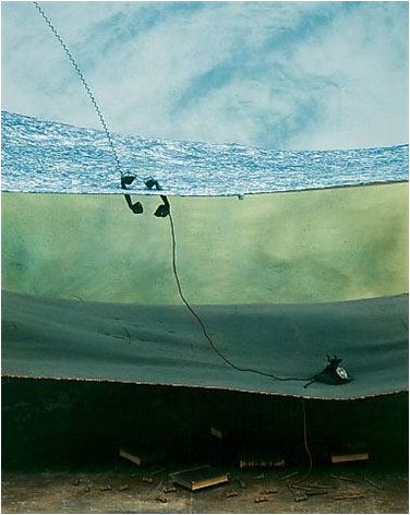
Initially he worked as a sculptor, making life casts of people in fibreglass and arranging them into scenes. He eventually turned to photography and his early work played with ideas of the real and the imagined. Through mysterious and elaborate compositions created using actors and complex sets built by the artist in his studio. In later years his focus shifted to a cool observational style, his work less theatrical and technique less elaborate.
James Casebere pioneering work has established him at the forefront of artists working with constructed photography. For the last thirty years, Casebere has devised increasingly complex models that are subsequently photographed in his studio. Based on architectural, art historical and cinematic sources, his table-sized constructions are made of simple materials, pared down to essential forms. Casebere’s abandoned spaces are hauntingly evocative and oftentimes suggestive of prior events, encouraging the viewer to reconstitute a narrative or symbolic reading of his work.

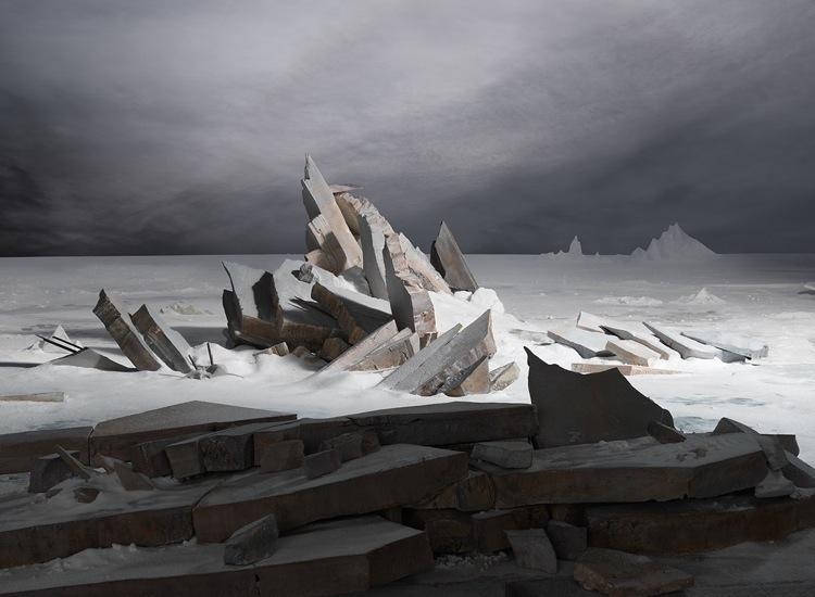
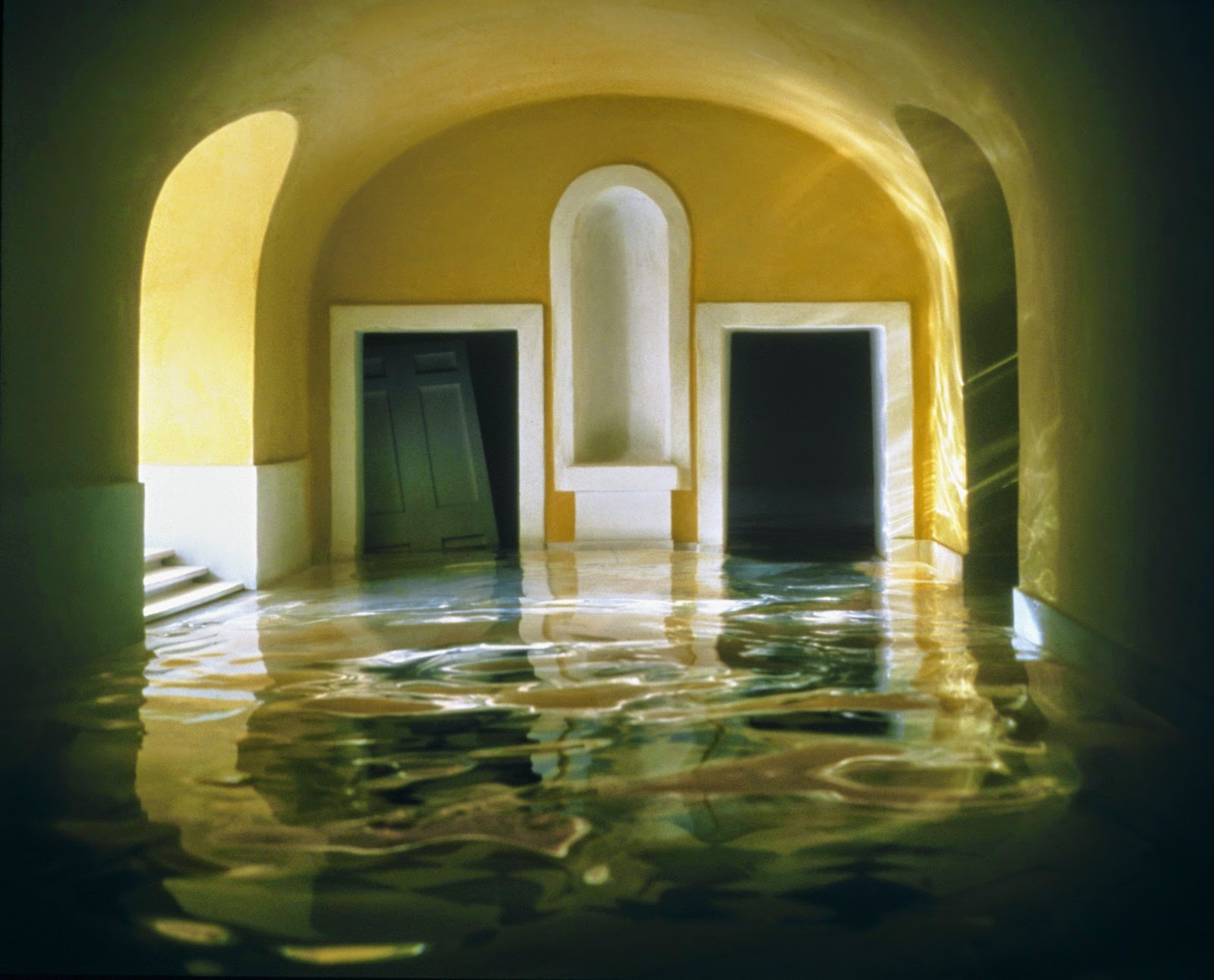

While earlier bodies of work focused on American mythologies such as the genre of the western and suburban home, in the early 1990s, Casebere turned his attention to institutional buildings. In more recent years, his subject matter focused on various institutional spaces and the relationship between social control, social structure and the mythologies that surround particular institutions, as well as the broader implications of dominant systems such as commerce, labor, religion and law.
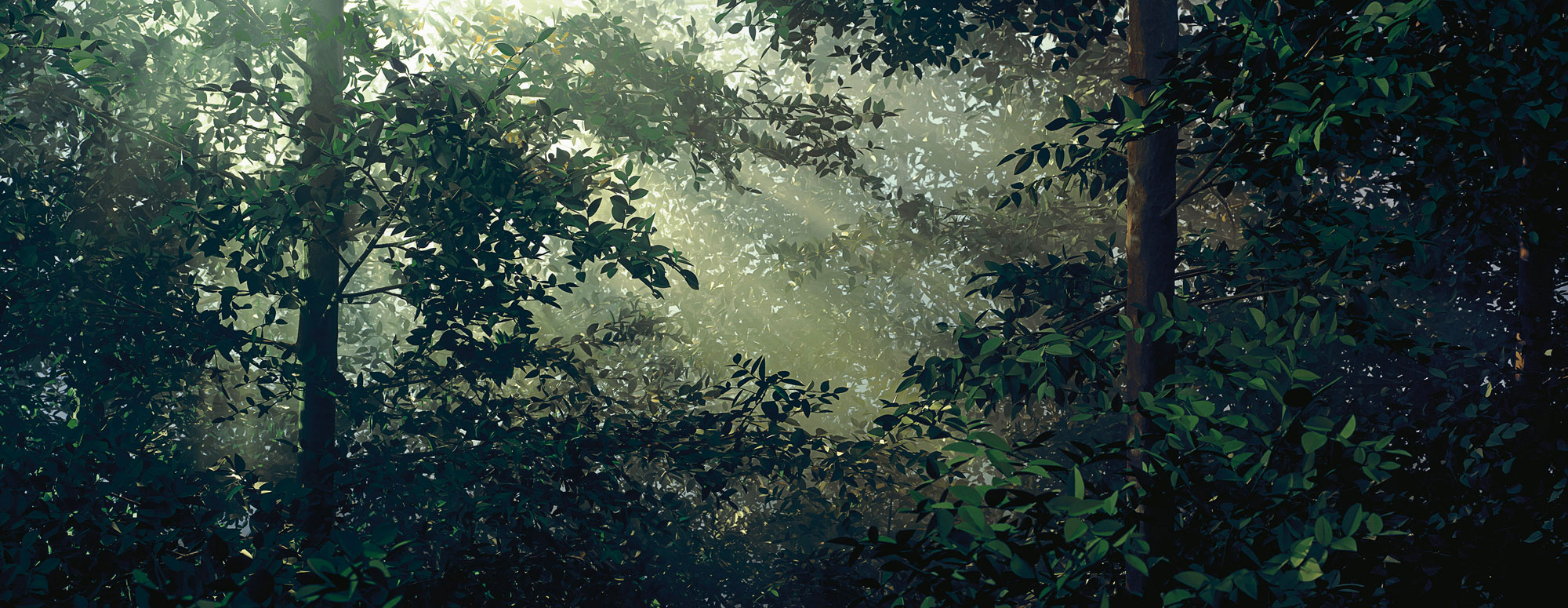
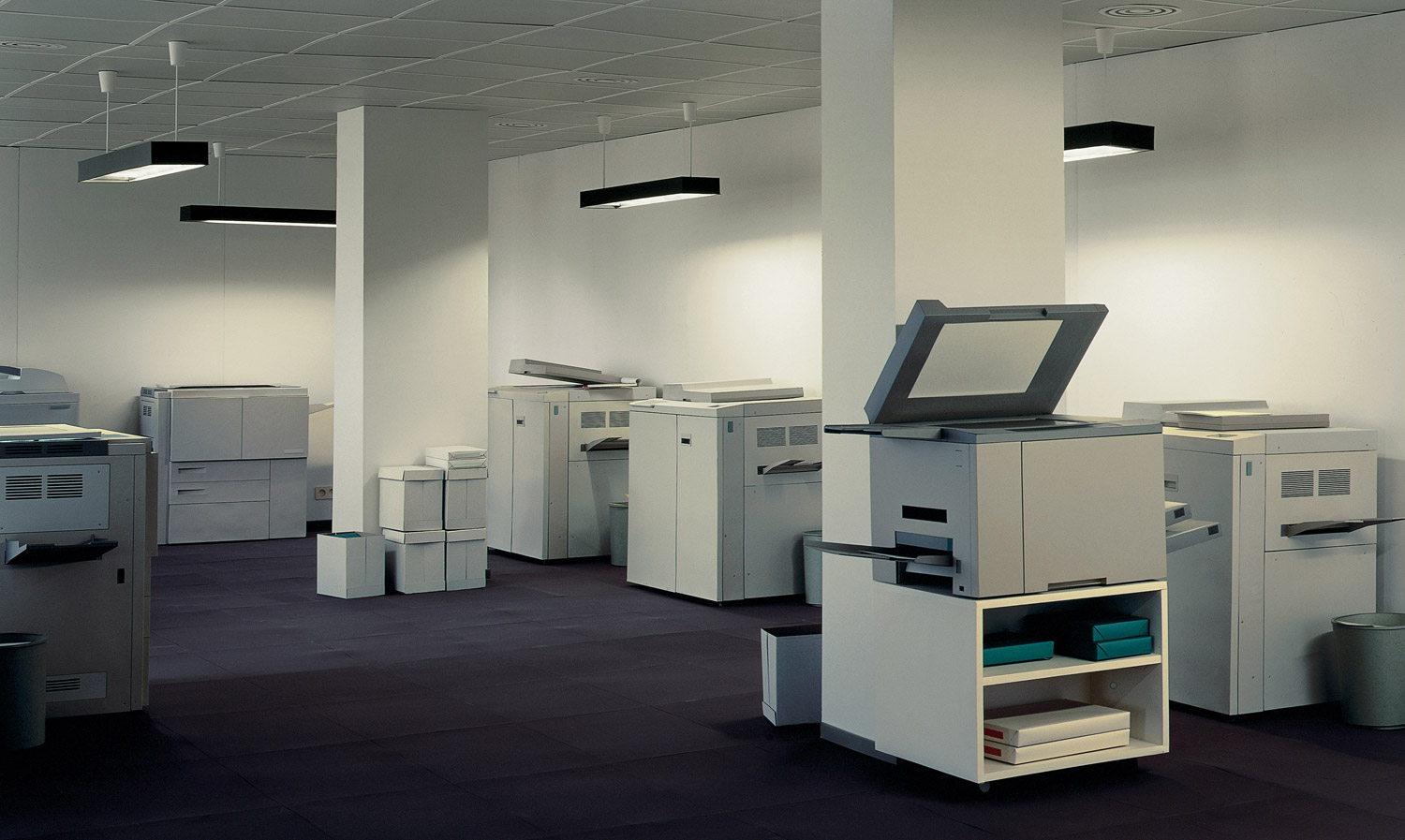
Thomas Demand studied with the sculptor Fritz Schwegler, who encouraged him to explore the expressive possibilities of architectural models at the Kunstakademie Düsseldorf, where Bernd and Hilla Becher had recently taught photographers such as Andreas Gursky, Thomas Struth, and Candida Höfer. Like those artists, Demand makes mural-scale photographs, but instead of finding his subject matter in landscapes, buildings, and crowds, he uses paper and cardboard to reconstruct scenes he finds in images taken from various media sources. Once he has photographed his re-created environments—always devoid of figures but often displaying evidence of recent human activity—Demand destroys his models, further complicating the relationship between reproduction and original that his photography investigates.
USEFUL WEBSITES
Lensculture – great source for new contemporary photography from all over the world
Photographic Museum Humanity
Landscape Stories
Photography magazine and journals
Aperture Magazine – American based publication
Aperture BLOG – in-de[th interviews with artists
British Journal of Photography (BJP) – Journal on Contemporary Photography
Huck Magazine
GUP Magazine
FOAM Magazine
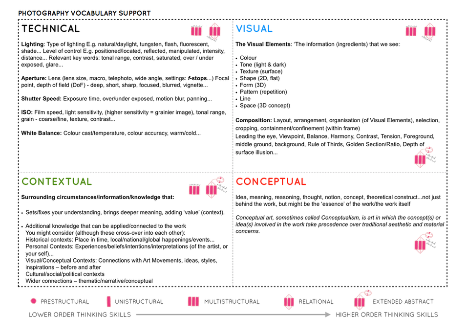
Follow the 10 Step Process and create multiple blog posts for each unit to ensure you tackle all Assessment Objectives thoroughly :
- Mood-board, definition and introduction (AO1)
- Mind-map of ideas (AO1)
- Artist References / Case Studies (must include image analysis) (AO1)
- Photo-shoot Action Plan (AO3)
- Multiple Photoshoots + contact sheets (AO3)
- Image Selection, sub selection, review and refine ideas (AO2)
- Image Editing/ manipulation / experimentation (AO2)
- Presentation of final outcomes (AO4)
- Compare and contrast your work to your artist reference(AO1)
- Evaluation and Critique (AO1+AO4)

