Category Archives: Resource

Filters

Author:
Category:

The Formal Elements – Paper

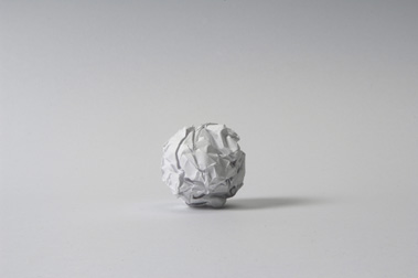
In class this week we experimented with abstract photography by using our phones to photograph paper in different ways. I was inspired by photographers such as Martin Creed, who took a photo of some A4 paper crumpled into a ball to connote the disappointment of things not going to plan.
work illustration
Martin Creed | Work No.88

I was inspired by Creed’s impreciseness of subject and I wanted to create images without an exact form so they could be ambiguous to the observer. Nevertheless, I also wanted to photograph the different shapes and structures paper could make. I did this by ripping, folding, crumpling and bending the paper to create a range of images that symbolized different things.

Contact Sheets

Paper Experimentation

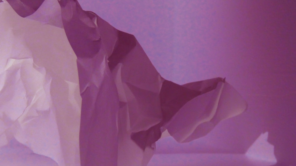
I really enjoyed the ambiguity of this image I took, I believe it shows the paper in an abstract way so it is hard to tell whether it’s paper at all. I took this close up shot of some crumpled up paper in hopes to create an image to represent ice, glaciers and icebergs. I believe I achieved this through my use of harsh lighting to create dramatic highlights with some mid-tone shadows. I edited this image on photoshop by increasing the exposure to give a brighter impression, and by sharpening the edges to reflect the crisp white colour palette of the photo. Similarly, I increased the contrast of the image to intensify the rough texture and acute lines of the paper.

In this image, I bended and squished the paper to create a photo with more curved lines instead of bold harsh ones. I believe this produces a smoother, more flowing texture. However, the sudden bursts of irregular shadows create dramatic moments throughout the image. Secondly, I have edited this image to be monochrome to experiment with tone and colour. I believe the low saturation of the photo creates a gloomy, dull atmosphere in the image. I have also zoomed in on the paper in this photo to further the theme of ambiguity, I purposefully took this shot with no black empty space to draw focus to the centre swirl of the image. Personally, I think this photo of plain paper looks almost flower-like, with large curved petals surrounding a swirl, similar to a rose.

Final Photo Analysis

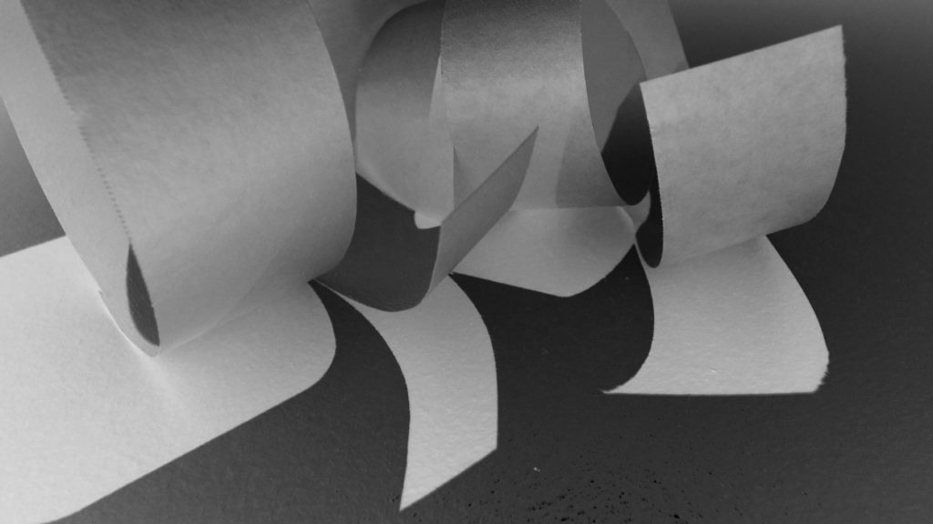
Light: My image has been lit by a strong artificial light coming from the bottom left which creates harsh shadows on the right. My dark, unlit background enhances the folds of paper and I have amplified this by increasing the contrast of the image.
Line & Shape: There are very strong straight lines in this photo that create a sharp shape throughout the image. The folds of paper look almost like book pages and the juxtaposition between the dark and light lines catch the observer’s eye.
Repetition: This image holds lots of lineal repetition with parallel lines and reflection of light. The shafts of artificial light hitting the left of the image create a dramatic rhythm. Additionally, the sharp creases of paper that repeat throughout the image draw the observer’s eyes up along the photo from one corner to the other.
Space: The space of the image is quite shallow and narrow, this is because I was close to the subject. I made sure the observer couldn’t see any other objects in the background of the image by limiting the space shown above and using a black sheet of paper to cover any unwanted distractions.
Texture: My image has a rigid texture, produced by the sharp edges of the folded paper. The points of the paper also create a jagged, rough texture.
Value/Tone: The image contains a wide range of tones going from very dark to very light. In the background, the dark black emptiness contrasts with the bright white highlights. In addition, there is a subtle blue hue in the bottom right shadow, possibly created by the blue undertones in the other phone torch I used to light the subject. The image has low saturation and vibrancy because I believe it intensifies the paper’s already muted colours.
Composition: The diagonal lines of the image and the close-up shot create a sense of drama. Also, the long folds draw the observer’s attention to just above the middle of the image, where the paper is most in focus. I created this affect by having a large depth of field so the top and bottom of the image was out of focus, and the one crease in the middle was a clear focal point.

contact sheets

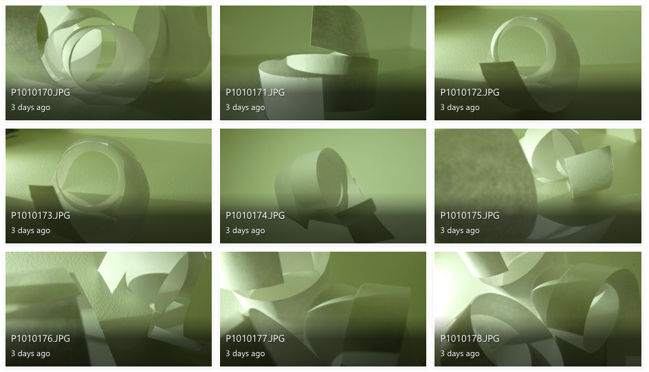
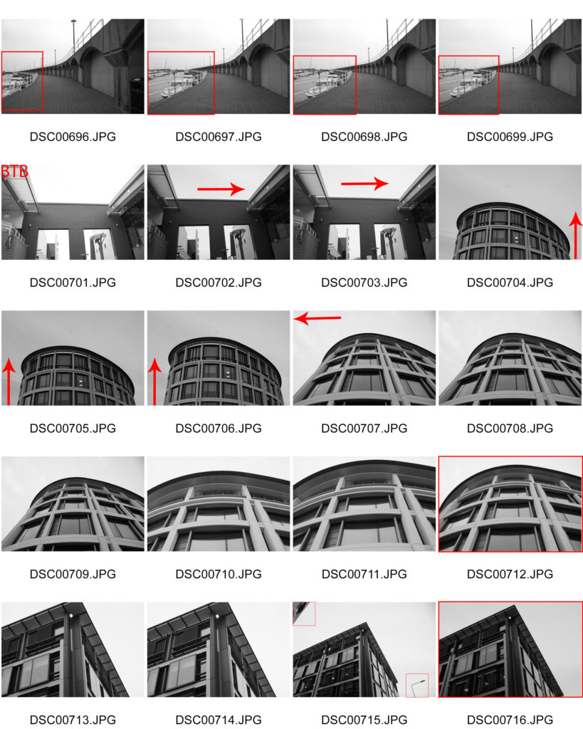
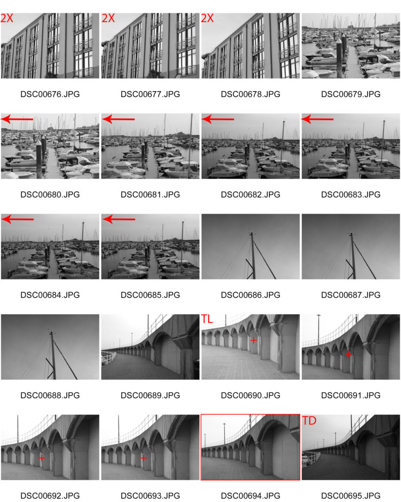
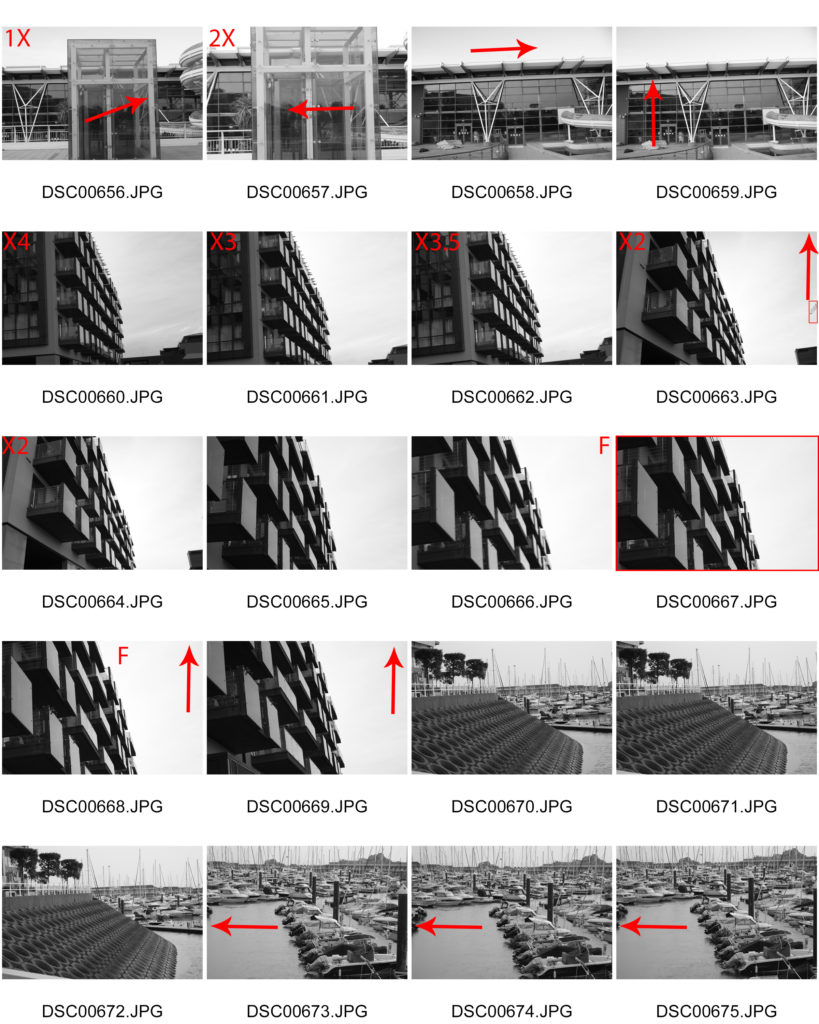
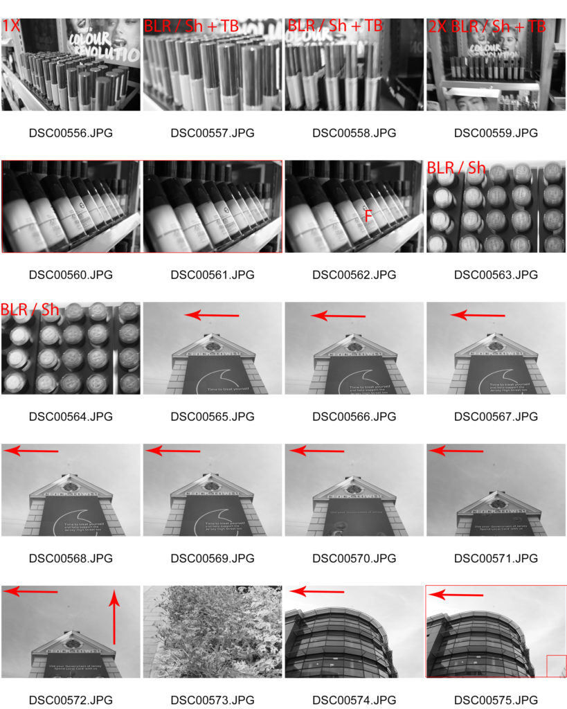
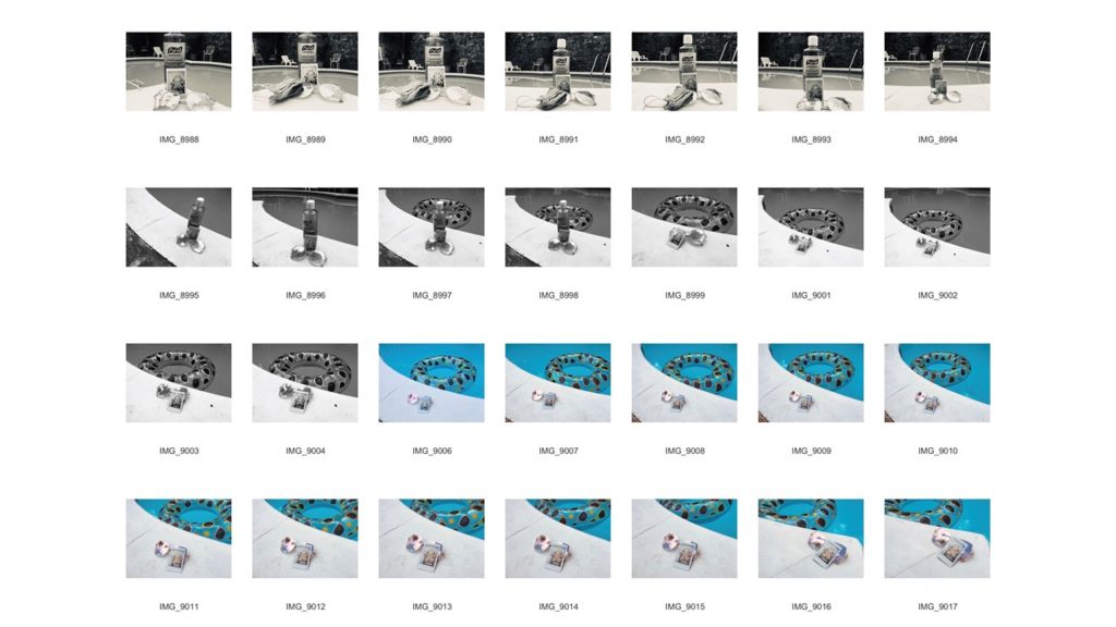
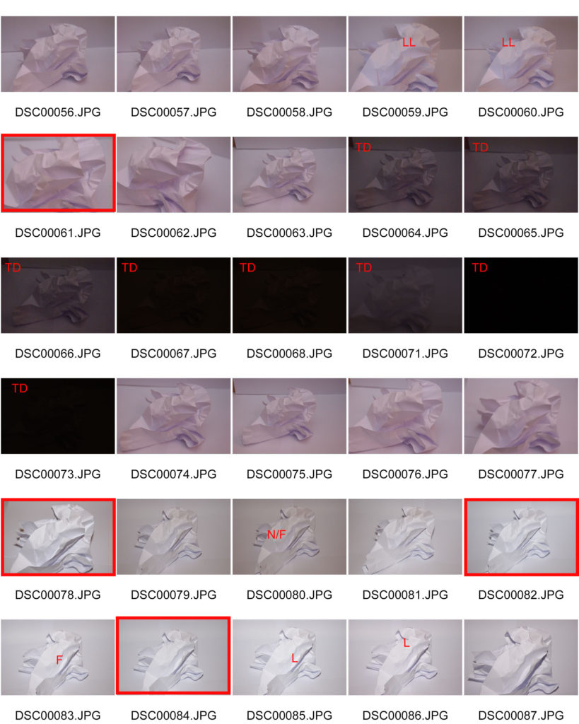
Contact sheets display a series of thumbnails from a photoshoot, these were mainly used when film photography was more popular. they are an easy way to visualise all photos at once and allows you to select your more interesting photos simply.

Thomas Lang:

“Gesalt” – Thomas Lang (2018)

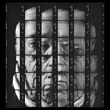
Thomas Lang is a portrait photographer who was born in Paris, France. His set of photographs from his series “Gesalt” was produced in 2018 as a form of displaying his portrait photography in an abstract form. He fractures the face of his model into a mosaic-like puzzle. Here, he uses contact sheets as a way of displaying a whole photograph in sections.

My example of a contact sheet:

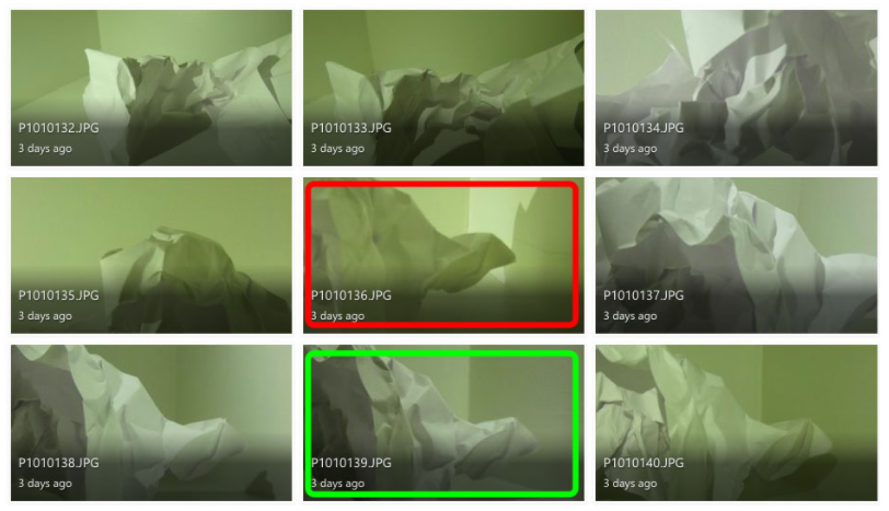
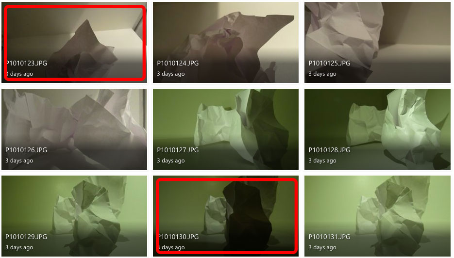
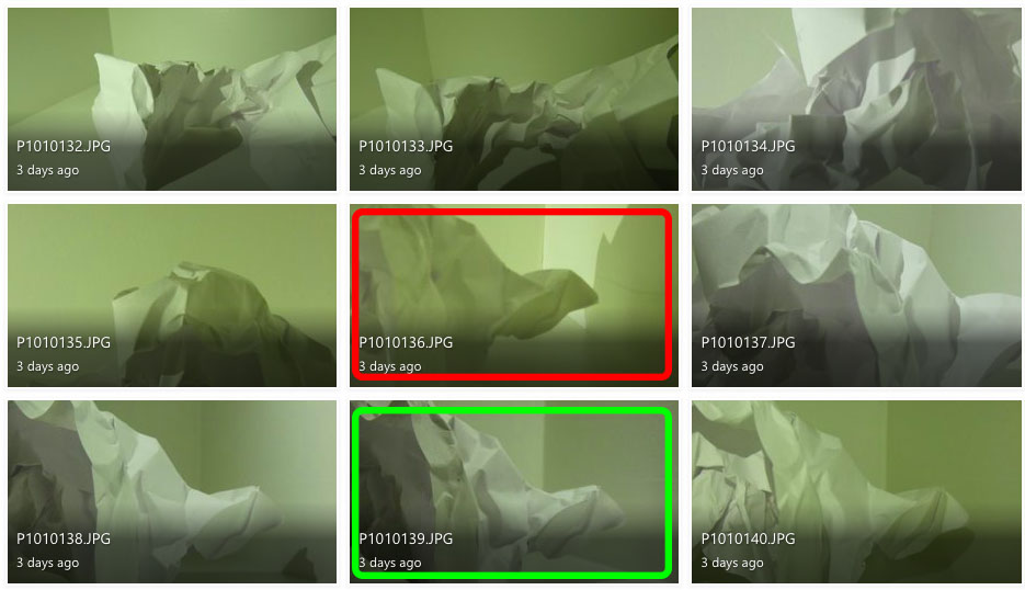
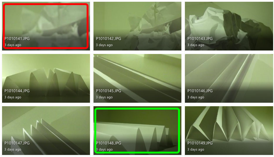
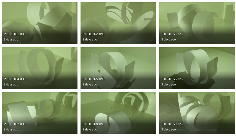
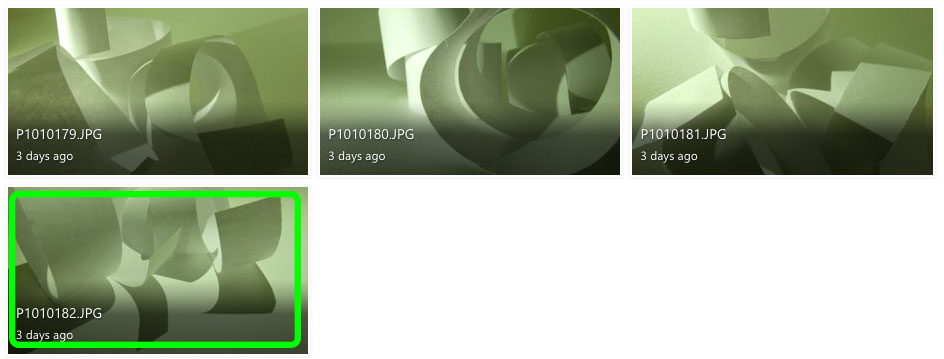
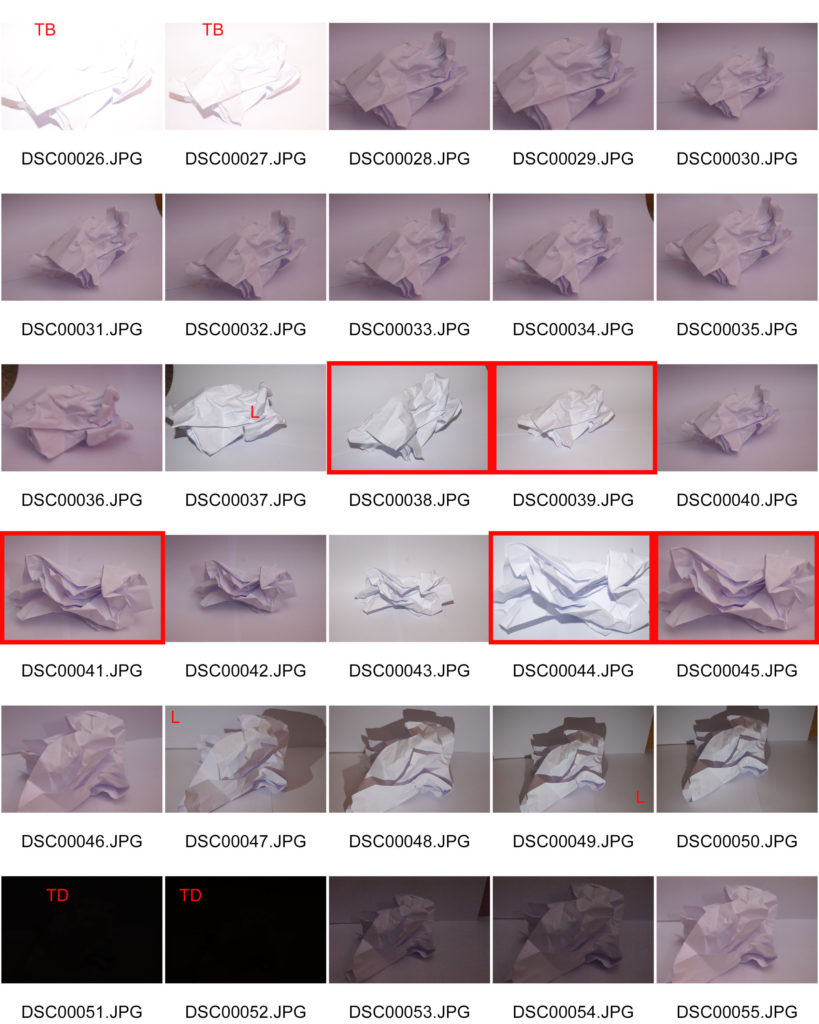
This is an example of a contact sheet from my project of creating a response to “The Formal Elements”. Here I have used the shape tool in photoshop to highlight my most successful and least successful images from the photoshoot.

This way of using contact sheets easily allows me to view a multitude of photos at once and pick out the photos that instantly grab my attention over others. I can them highlight them for future reference to show why I liked them, and why I thought they were more successful.

the formal elements – paper

Jaroslav Rossler

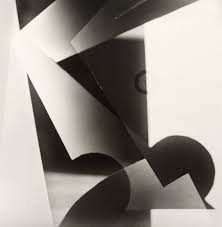
“Light Abstraction” – Jaroslav Rossler (1923)

Jaroslav Rossler was born in Czechia, in 1902. Rossler is an example of a photographer who focuses his work on “The Formal Elements”, as he finds the beauty in the simplicity of objects. He started his journey in photography at 21 years old, as he used this skill in his career creating typographic layout for magazines. Jaroslav Rossler’s work was heavily influenced by futurism and cubism, this lead him into creating his art of abstract photography.

“Akt” – Jaroslav Rossler (1926)

I took inspiration from this photograph titled: “Akt” by Jaroslav Rossler to approach the theme of “The Formal Elements”, as it perfectly represents the beauty of simple composition to focus on lighting and shadows. The geometric shapes of the paper create crisp, sharp shadows into the background to create a juxtaposition between light and dark.

My Response:

To explore “The Formal Elements” I photographed paper and explored lighting and texture by using artificial lighting to change the intensity and movement of shadows and distressed the paper in different ways to experiment with different shapes.

I don’t like the images in red because they are either out of focus or the lighting makes it difficult to define the creases and shadows.

I believe the images in green are my best photographs because they have distinct, contrasting shadows and shapes.

Photoshop development:

for the first two images, I used the invert adjustment and the monochrome filter to distort the images original shadows and lighting but still keep the same uniformed, lack of colour.

For the third image I used the invert filter again to switch the shadows and lighting but used colour hues and adjustments in order to achieve the pink-toned look of the photograph.

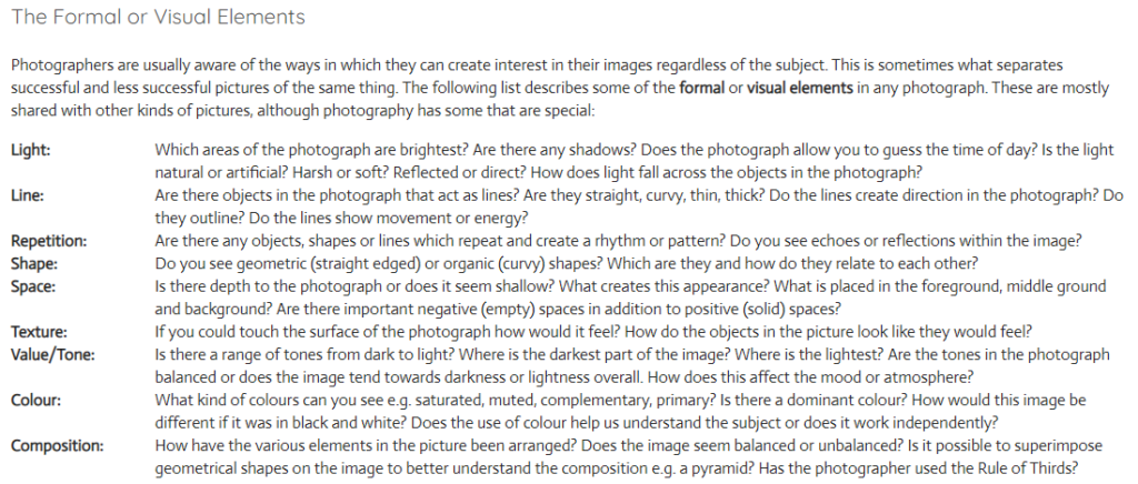
Using the Formal Elements to analyse my photographs:

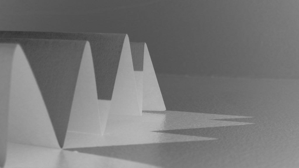
Light: For this image I used artificial lighting. The light source is coming from the bottom left, behind the paper to create distorted shadows in front of the shapes.

Lines: The lines of the paper vary in size, however they all have the same, uniformed, triangular shape. I believe the leading lines are the straight bends at the top of each fold which directs the viewers eye to the almost pyramid-like shape of the paper.

Repetition: The form of repetition I used in this photograph is the repeated pattern of folds in the paper, that create the repetition of triangular shadows.

Shape: The folding of the paper creates a geometric repetition of triangular shapes leading to the centre of the image.

Space: Although the image is very organised and minimal, I believe the shadows add a sense of depth to the image. The negative space in the background allows the viewer to focus on the sharp shape of the folds, rather than the chaos behind.

Texture: The smooth texture of the paper is juxtaposed with the sharp folds to create a contrast of texture.

Value/Tone: There is a range of tones from dark to light in this image, with the top of the folds being the lightest part of the image and the sheltered area under the folds contrasting this with the brooding darkness. Overall, the photo tends towards lightness in the image.

Colour: Although there is minimal colour within this image, there is a slight green hue to the image. I think this is purely a reflection from the artificial lighting mixed with my current camera setting, however it gives the image an almost ominous tone.

Composition: The composition of the photo is very simplistic in order to showcase the simple geometric shape of the folds. the focal point of the folds is present from the bottom left third and into the middle third.

the world is beautiful

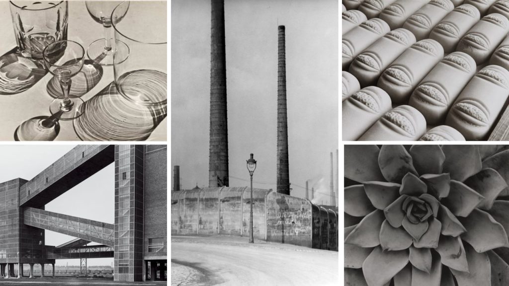
Albert Renger-Patzsch (June 22, 1897 – September 27, 1966) was a German photographer associated with the New Objectivity. He was born in Würzburg and began making photographs by age twelve. In the early 1920s, he worked as a press photographer for the Chicago Tribune before becoming a freelancer and published a book in 1925, The choir stalls of Cappenberg. He had his first museum exhibition in 1927. A second book followed in 1928, Die Welt ist schön (The World is Beautiful). His best-known book is a collection of one hundred of his photographs in which natural forms, industrial subjects and mass-produced objects are presented.

The New Objectivity (Neue Sachlichkeit) was an art movement of the 1920s and early 1930s. It was in part a response to WW1, which had left many people feeling devastated by the worldwide poverty and destruction left in the wake of the war. The movement began in Germany, with George Grosz, Otto Dix and Kathe Kollwitz being some of the most notable participants. Documentary photography became increasing popular, as artists found it to be the ideal way to capture an ‘objective reality’. They used the art form to show off gritty subjects from real life, and to express the truth of their surroundings in a post – war world.

Albert Ranger – Patzsch | The World is Beautiful

IMAGE ANALYSIS

The bridges between the buildings in this photograph create geometric triangle shapes which draws the viewer’s eye to all the blank negative space in between them. The lines created by the buildings are very clear and sharp, which contrasts with the background of the photograph, which is blurry and organic in its shape. The tone of this image is fairly bright, with the white sky being plain and without any shadows. Additionally, the colour of the sky contrasts to the dark and harsh lines of the building. Patzsch has used natural lighting in this photograph, as you can see the natural shadows cast on the side of the building. Repetition is clearly shown in this photograph, as the panes of glass in the many windows create a repetitive pattern across the entire image. Also, the bricks in the side of the building closest to the camera are clearly visible, making another repeating pattern. The black and white colours are both evenly shown, with one not overpowering the other. This creates a more balanced photograph and makes it more appealing to the viewer’s eye, as they are able to focus on one colour without being overwhelmed by the other.

MY RESPONSE – CONTACT SHEETS

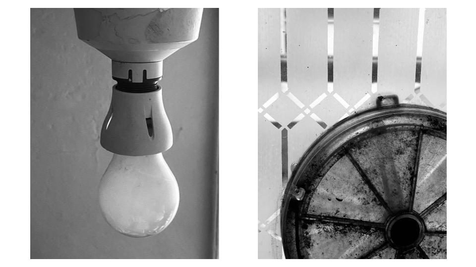
My thought process for this photoshoot was to take inspiration from Patzsch and his way of photographing things that would normally be considered boring or dull. For example, I took pictures of the corners that connect the walls in my house and the cutlery in my kitchen drawers. Although the objects in my photographs appear to be random, I thought carefully about what I was taking pictures of, and about how I could make them look more interesting by using distance, light and composition. Throughout the shoot, I experimented with different technical elements such as numerous angles and tone, and I tried not to take the same picture twice ( I wanted to keep all my photographs different from each other ). I took photographs of anything that caught my eye, and wasn’t looking to make my images ‘perfect’. I attempted to link Patzsch’s work on The New Objectivity to my own photographs by researching and reading about his intentions and his processes.

BEST IMAGES

FINAL IMAGE

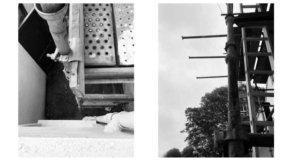
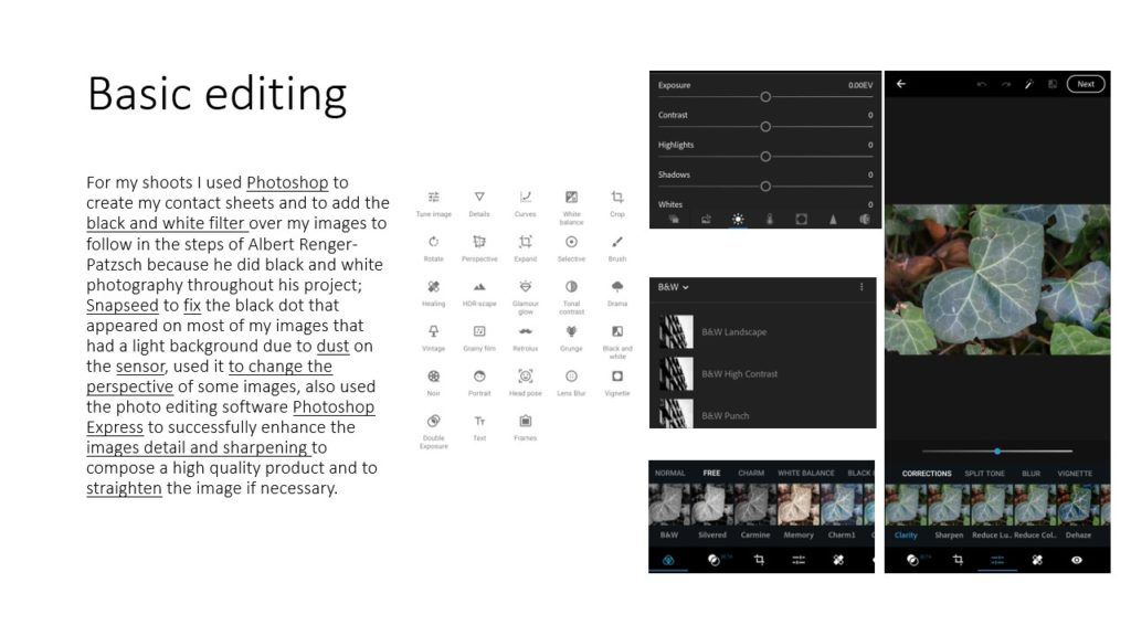
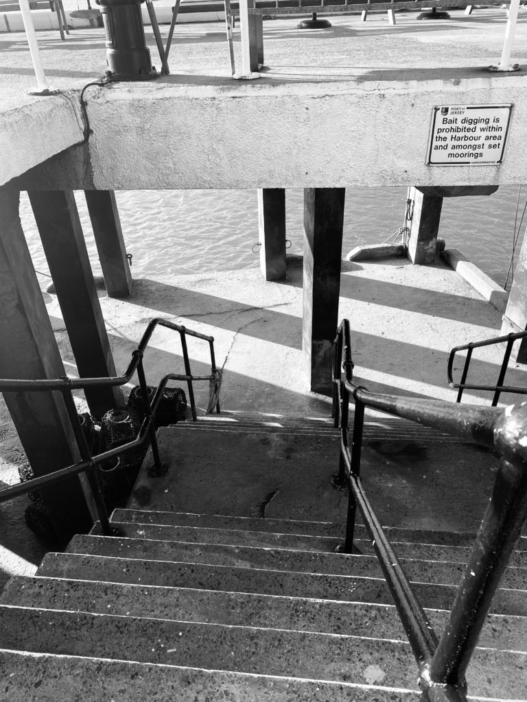
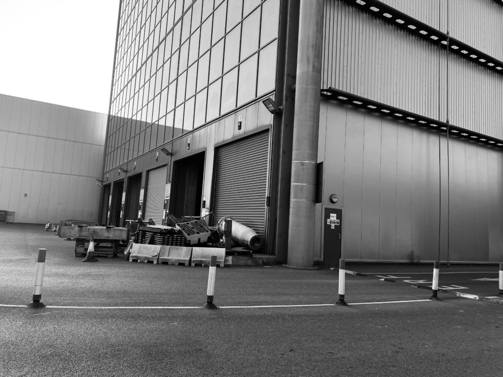
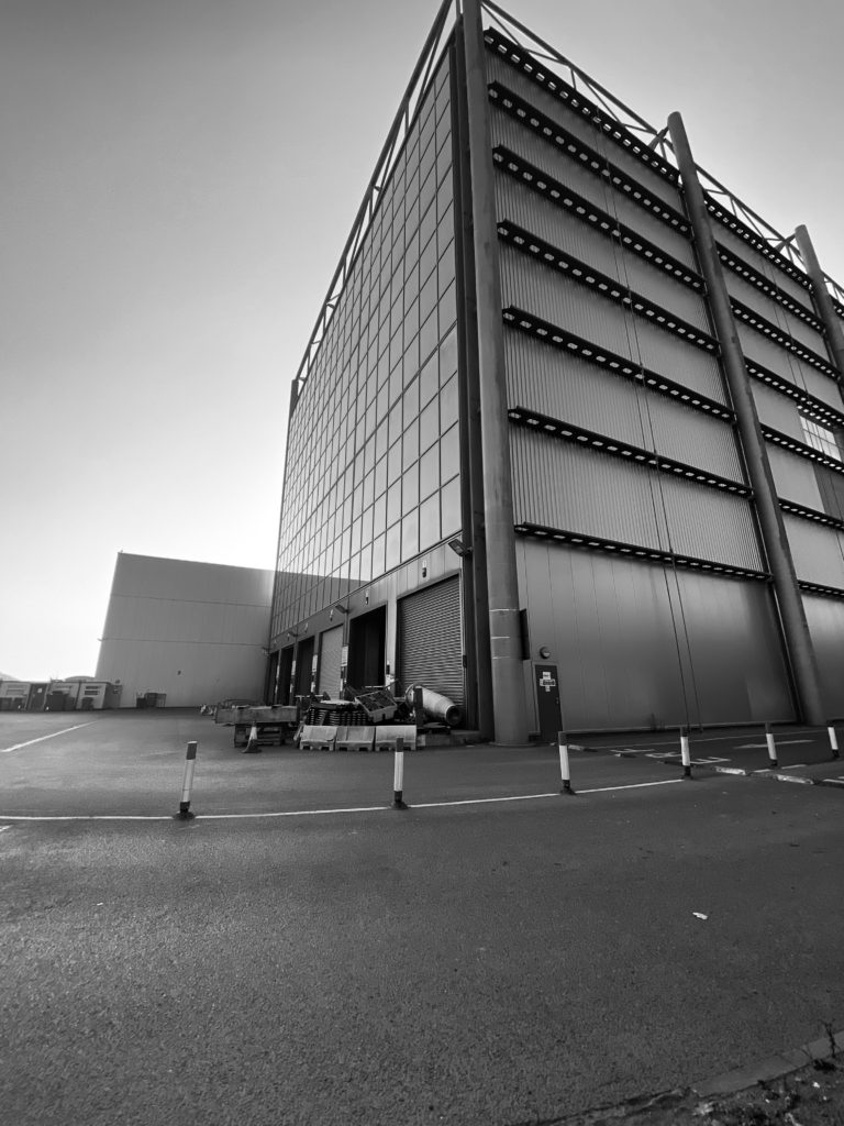
I chose the photograph as my final image because I think that it reflects Patzsch’s work the most accurately. The contrast in the colour between the bright sky and the dark, harsh tones of the scaffolding imitate Patzsch’s composition in his images. The straight lines across the photograph create geometric shapes which deviate from the more natural, organic configuration of the trees in the background. Additionally, this photograph has a lot of depth to it, making it more aesthetically pleasing for the viewer to look at. I wanted to use natural lighting in order to keep the essence of The New Objectivity, as the movement is about capturing the world as you see it. I also thought carefully about the compositional features, such as the my angles and the distance of the subject from the camera. I did this so I could create and interesting photograph. In order to get the black and white effect, I used a feature on my phone which placed a filter on all of my images.
Contact Sheets

Contact sheets date back to when you took images on film. Now they aren’t used a digital cameras have a SD card in them.

A contact sheet is all the developed negative images laid out onto photographic paper. They aren’t full size, instead they are used to give the photographer an idea on how the images look.

Contact sheets are helpful as they allow the photographer to see all the images, select the best quality images and then develop the images they want without wasting resources.

William Klein

William Klein is a photographer who was born on April 19th 1928. He was born in New York, however during WW2 he was stationed in Germany and later France, where he would later settle after being discharged in 1945.

He sometimes used his contact sheets to tell a story. However he mainly used them like others, to decide which images he wanted to use.

William Klein

My Own contact sheet

looking and seeing

Camera Skills

You must experiment with ease of these skill areas and produce a blog post on each key skills that includes evidence of your experiments and successes over the next few weeks…

The images should be of an abstract nature, and show an appreciation of abstract qualities such as line, shape, colour, form, texture, pattern, repetition, symmetry (the formal elements)

  1. Using Auto-Focus
  2. Using Manual Focus
  3. White Balance
  4. ISO
  5. Aperture
  6. Focal Length
  7. Depth of Field
  8. Slow Shutter Speed / fast shutter speed

Photoshop Skills

  1. Cropping
  2. Selections
  3. Adjustments and corrections
  4. Transforming an image
  5. Layer control
  6. Image size / canvas size
  7. Double + multiple exposures

Working towards a vision…

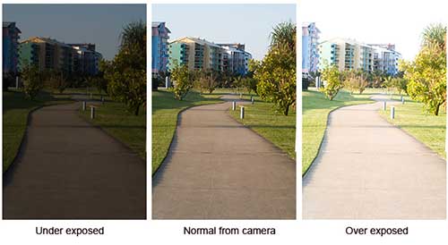
examples of different camera exposures
A Beginners Guide to Photography | Big Sam Writes Stuff
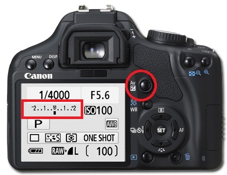
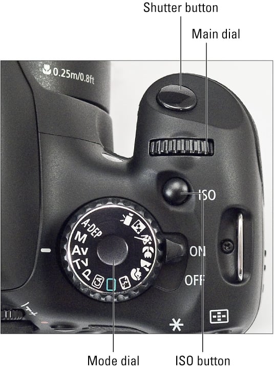
canon
Image result for canon camera control dial

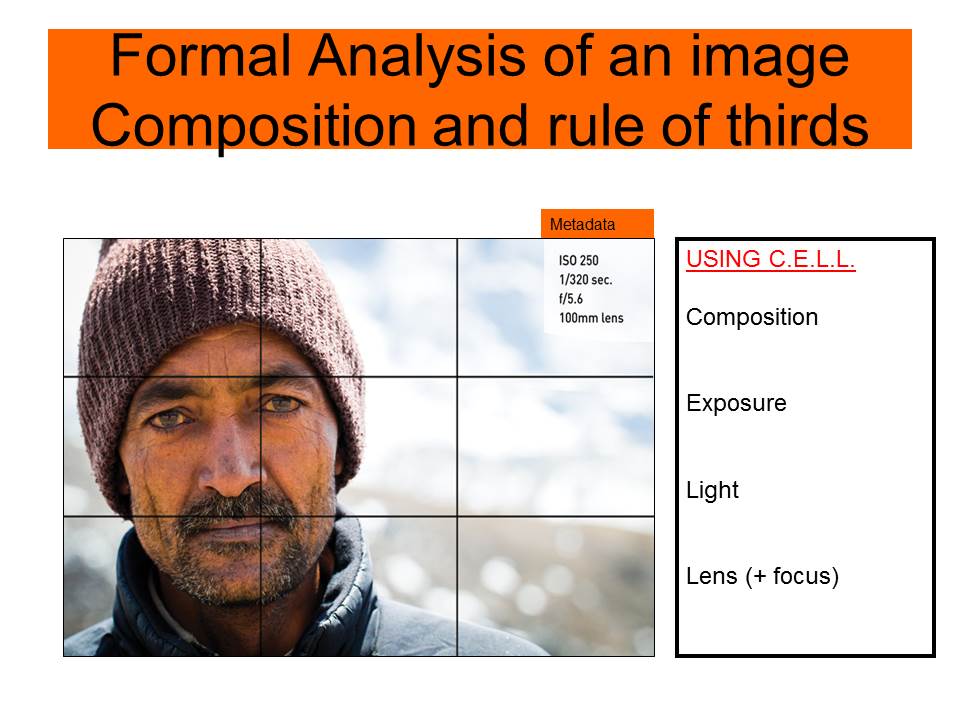
Use this method to analyse key images

Rule of Thirds

Homework | Practical / photoshoot

Due in WEDNESDAY 30th September

Minimum Expected frames/ exposures = 150-200 images

Choose from a range of camera skills that you have learned in Week 3 and 4 to complete a new photo-shoot…

We want to see that you can explore and extend your handling of

  • exposure settings
  • focus control
  • depth of field

INSPIRATION >>> choose from the following to inspire your ideas.Look carefully at the examples and aim to produce similar images that work well as a group…together.

Ralph Eugene Meatyard: 
‘No Focus’

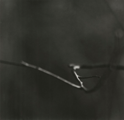
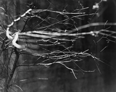
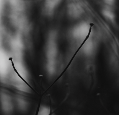
Meatyard made his living as an optician. He was a member of the Lexington Camera Club and pursued his passion for photography outside the mainstream. He experimented with various strategies including multiple exposures, motion blur, and other methods of photographic abstraction. Two of his series are particularly concerned with focus and depth of field, both stretching the expressive potential of photography, film and cameras when looking within the ordinary world.

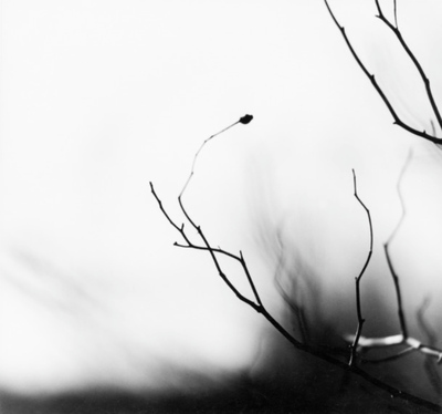
‘Zen Twigs’

You must:

  • Research the work of Ralph Eugene Meatyard, Saul Leiter and Uta Barth. How have they experimented with focus and depth of field in their work? Choose specific images to comment on in detail. You could also find other photographers who are interested in experimenting with focus effects.
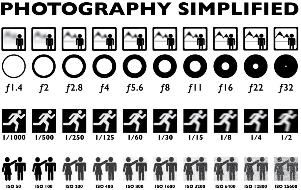
  • Explore the effects of changing the aperture settings on your camera to alter depth of field. You could illustrate this with a series of photos of the same subject shot with different aperture settings.
  • Create a series of deliberately out of focus images. Consider the degree of abstraction in the final image. How out of focus are the subjects and are they still recognisable? Experiment with colour and black and white. REMEMBER TO USE MANUAL FOCUS AND THE INFINITY SETTING
  • Create a series of images which explore dramatic depth of field (selective focus). Experiment with switching between foreground, middle ground and background focus. Remember, you will need to use a wide aperture (small number e.g. f2.8) and/or a longer lens for this. Remember to share all of the images you make (including those that you deem failures) in a gallery/contact sheet.
  • Curate your images into different groupings (see below). Experiment with editing the images in each set differently. Give each set a title and write a short evaluation explaining your editorial decisions.

Follow the 10 Step Process and create multiple blog posts for each unit to ensure you tackle all Assessment Objectives thoroughly :

  1. Mood-board, definition and introduction (AO1)
  2. Mind-map of ideas (AO1)
  3. Artist References / Case Studies (must include image analysis) (AO1)
  4. Photo-shoot Action Plan (AO3)
  5. Multiple Photoshoots + contact sheets (AO3)
  6. Image Selection, sub selection, review and refine ideas (AO2)
  7. Image Editing/ manipulation / experimentation (AO2)
  8. Presentation of final outcomes (AO4)
  9. Compare and contrast your work to your artist reference(AO1)
  10. Evaluation and Critique (AO1+AO4)

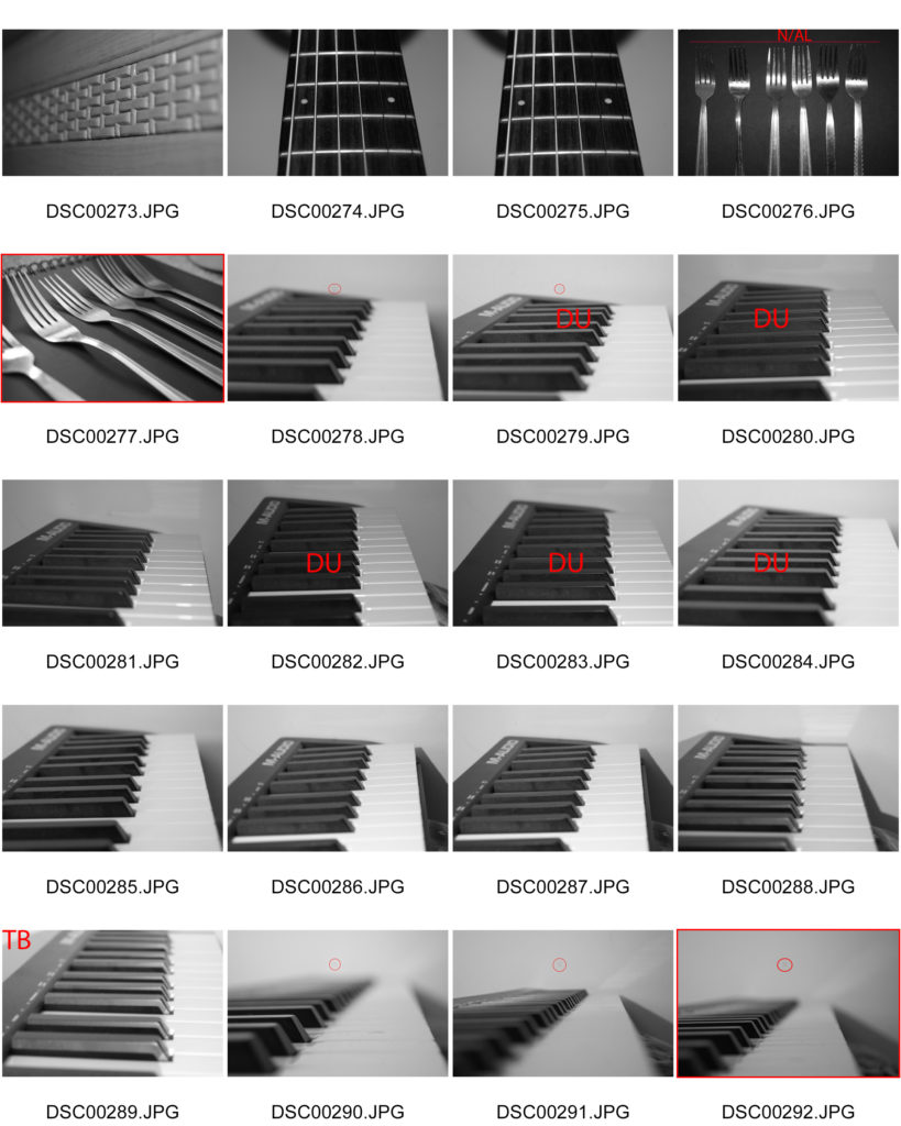
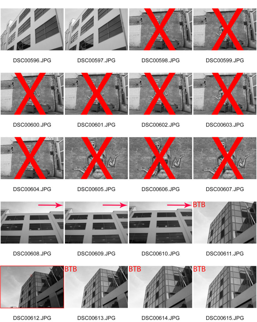
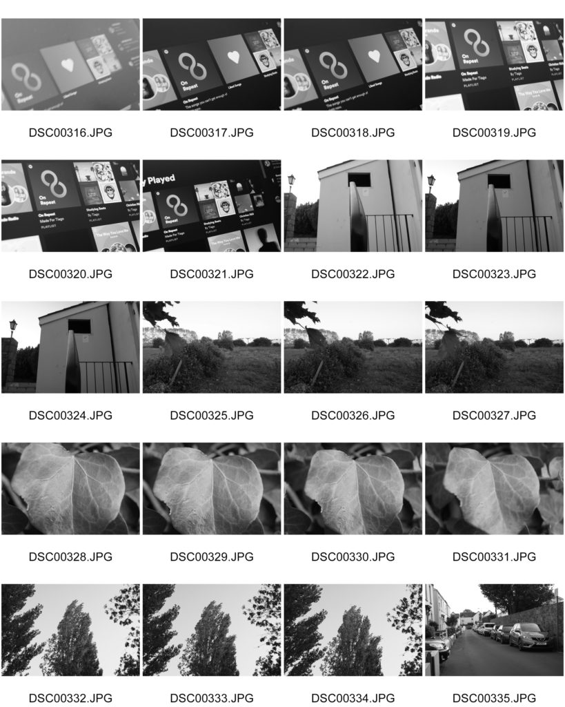
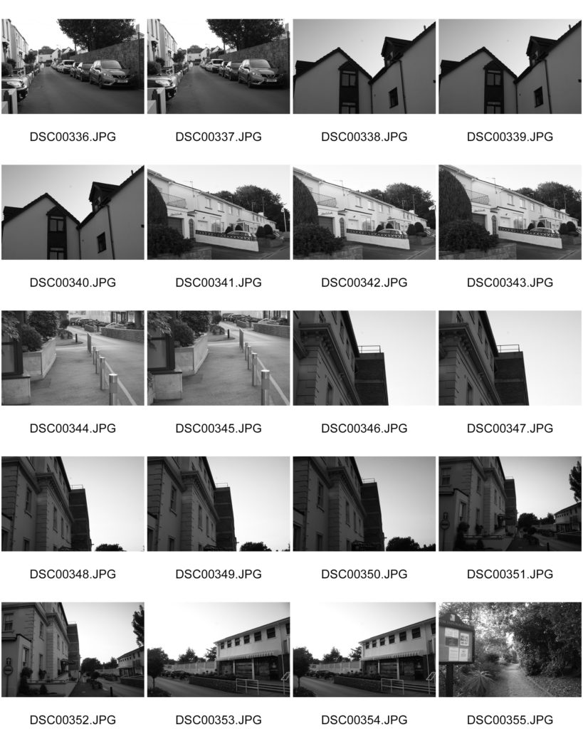
Contact sheet

What are contact sheets?

Contact sheets are a way for photographers to show proof of their work to clients. They consist of a sheet showing individual photographs with name or numbers of the image. They do this so it is easier to identify which photographs the client wants to produce.


Why are they important?

  • They help the photographer analyse and select the best photographs from his shootings and why.
  • Help the client select which images they want to be produced and edited.
  • Help the photographer reach a wider audience by showing their work to potential clients.

Albert render-patzsch – The world is BEAUTIFUL

INTRODUCTION:

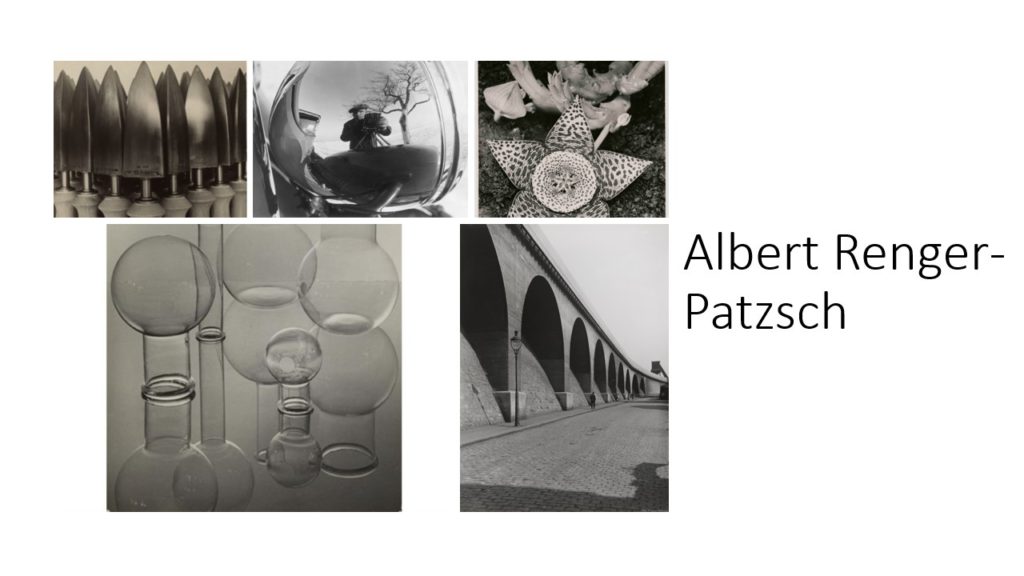
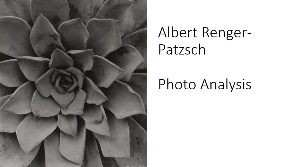
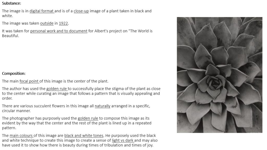
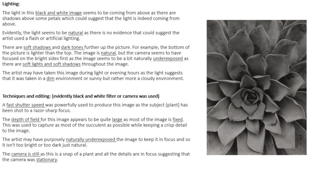
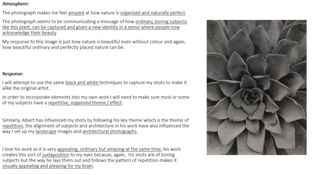
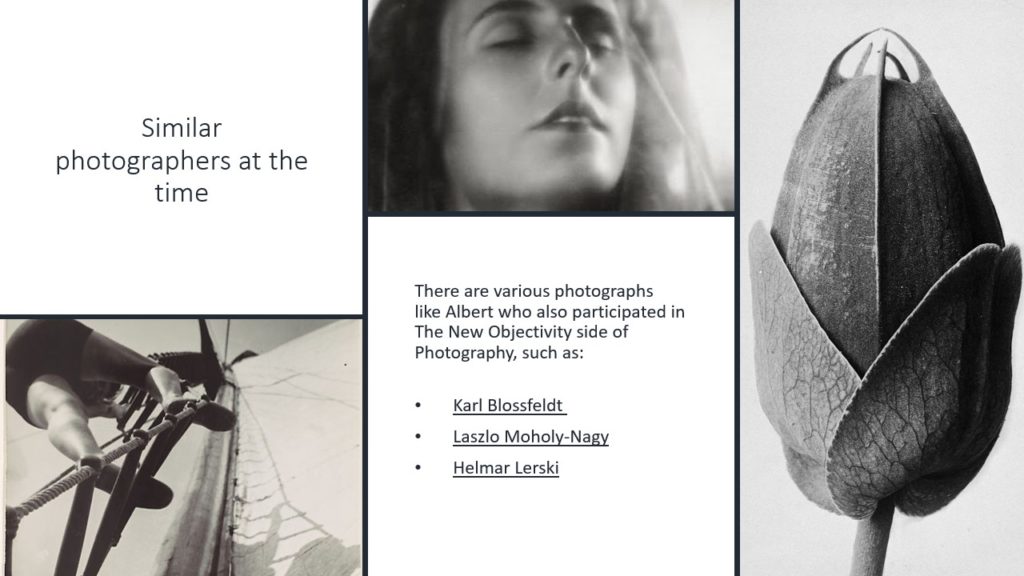
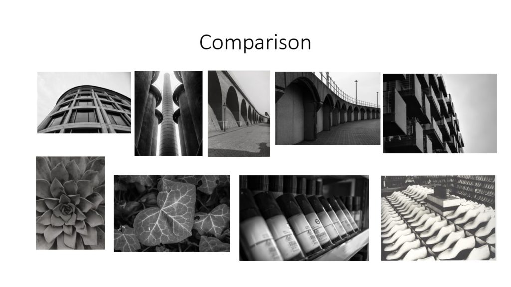
Albert Renger-Patzsch was a German photographer who began taking photos from the age of twelve. He mainly focuses on architectural photos, macro photos and object photography which he then puts into black and white adding more tones and details. His famous book which he published in 1928 ‘The World is Beautiful’ inspired several other photographers to start paying close attention to objectivity. Albert Renger-Patzsch also explored all seven formal elements such as: form, light, rhythm, line, texture, and repetition throughout his years.

ANALYSIS:

These photos are similar are different in several ways. The first thing I noticed when I started looking at these two images is that they are both in black and white showing different tones which enhances the textures. Secondly I also noticed that neither of the photographs show nature as one is architectural and the other shows a pattern which has been created by Albert Renger-Patzsch.

However there are also several differences, for example one of the photos have been taken from a close and straight angle whereas the other has been taken from a distance at a looking up angle which adds contrasts to both of the images in different ways. Another difference I noticed was the lighting tones as one of the photos have more of a warm tone compared to the other photo has more of a dark and natural tones.

MY RESPONSE

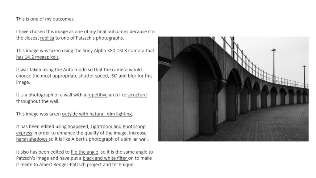
BEST IMAGES

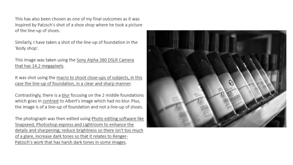
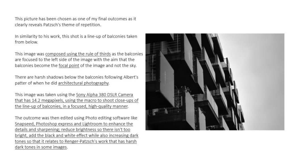
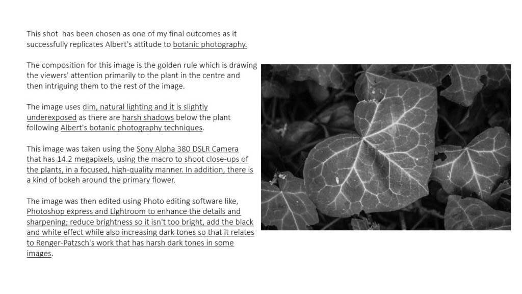
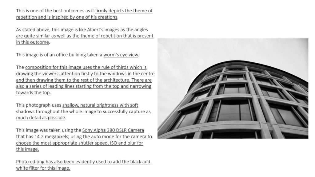
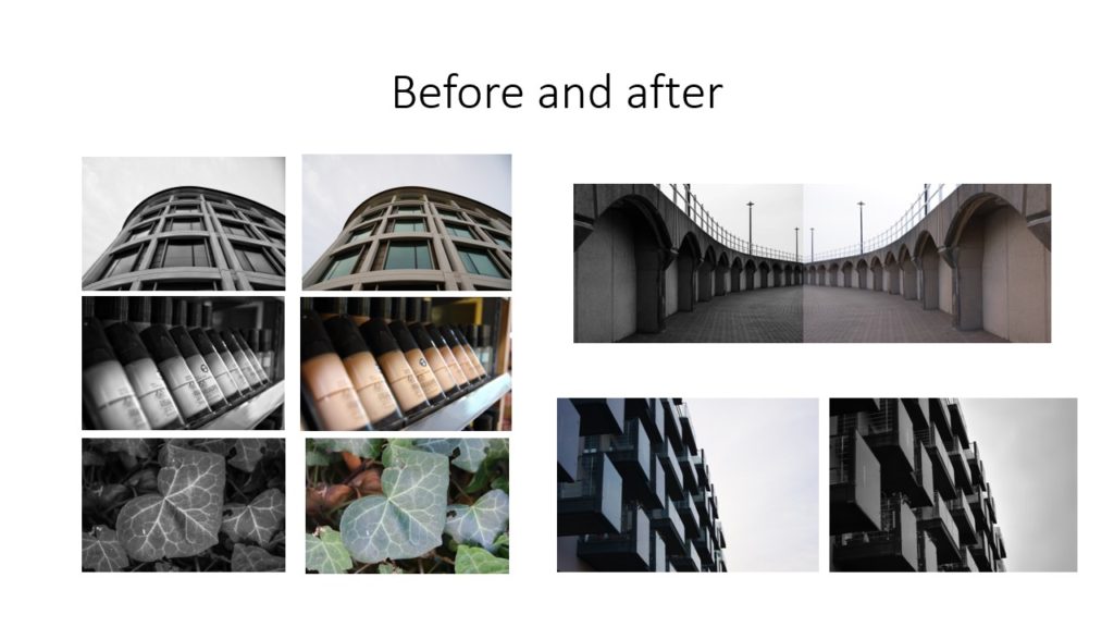
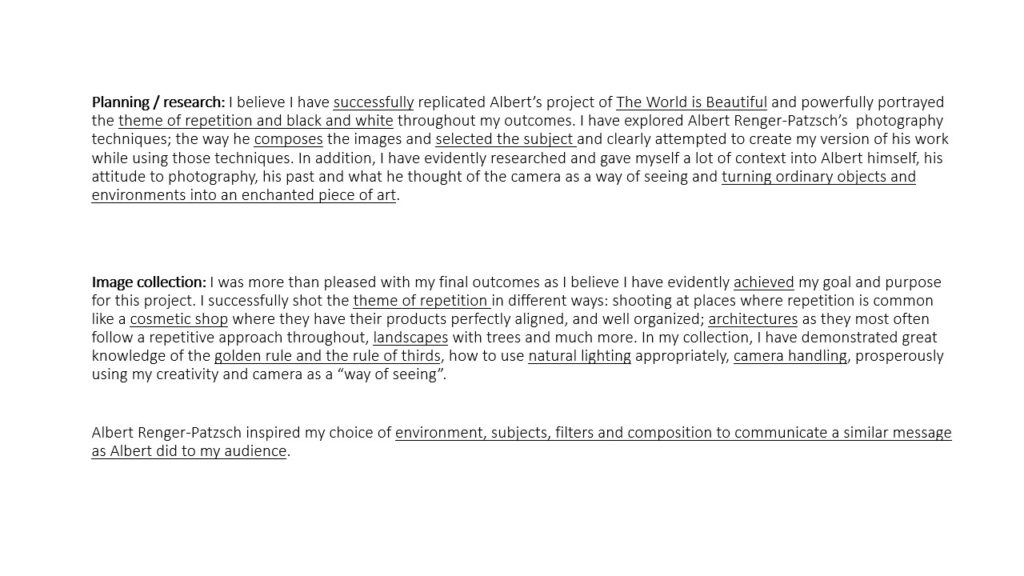
I personally believe that these are the best images I have took for this shoot, this is because I feel that they reflect Alberts Render – Patzsch as you can see clearly the direction of which the light was coming from. I started of by taking photos from a straight on angle then I later developed the idea of taking photos from a lower angle, which I think make the photographs more abstract.

Additionally I tried to avoid editing my photos in order to make them feel more realistic as this is what Albert Renger – Patzsch did throughout the majority of his photographs. The tones of the images are very different throughout due to the way in which the lighting is coming from which creates different shadows and shades.