


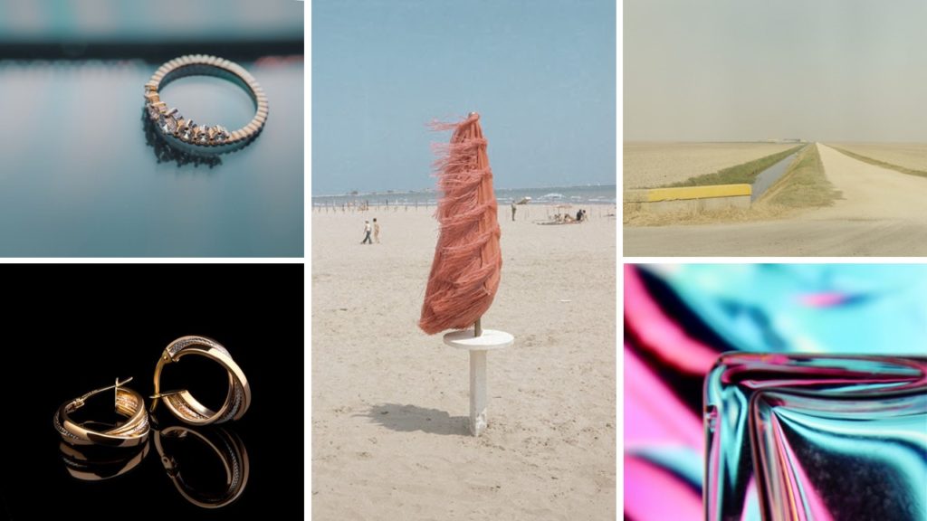

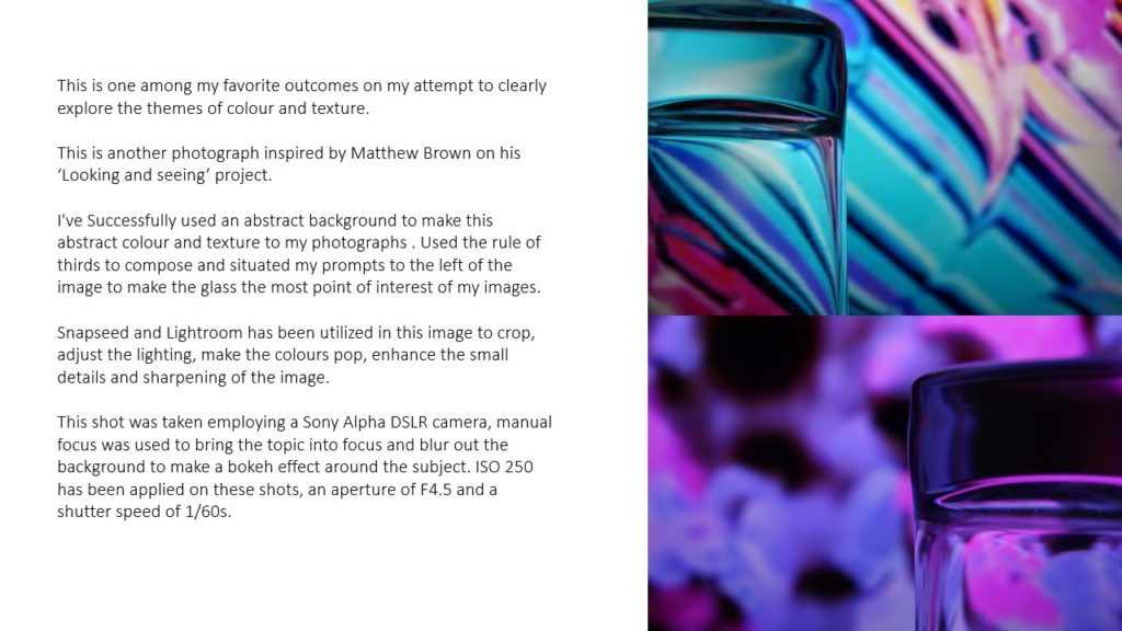
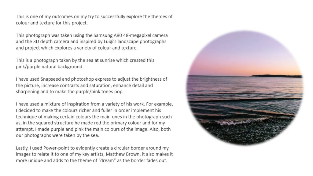
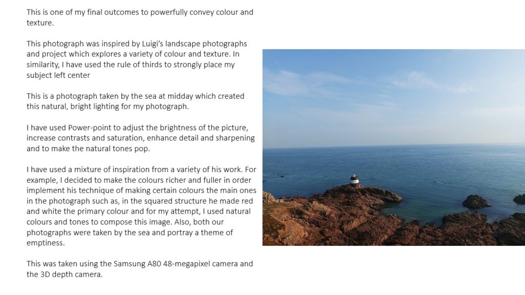


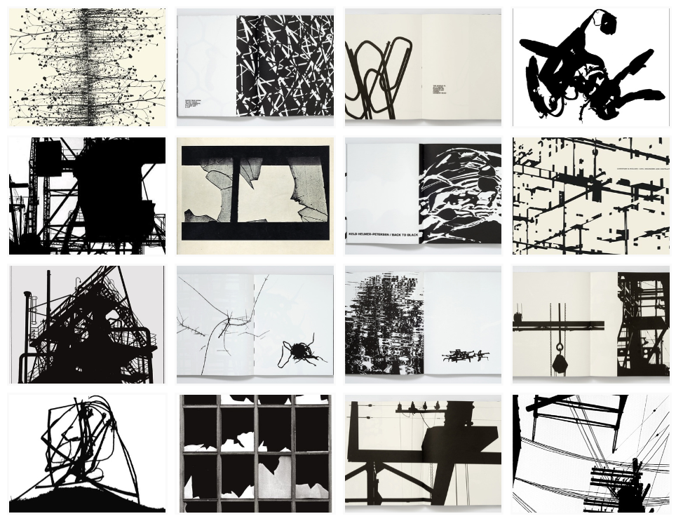
Keld Helmer Petersen.
– Petersen was a danish photographer who’s work was widely recognized 1940s and 1950s.
– His career ran for about 70 years, with his interests remaining in modern architecture, industrial areas and structures.
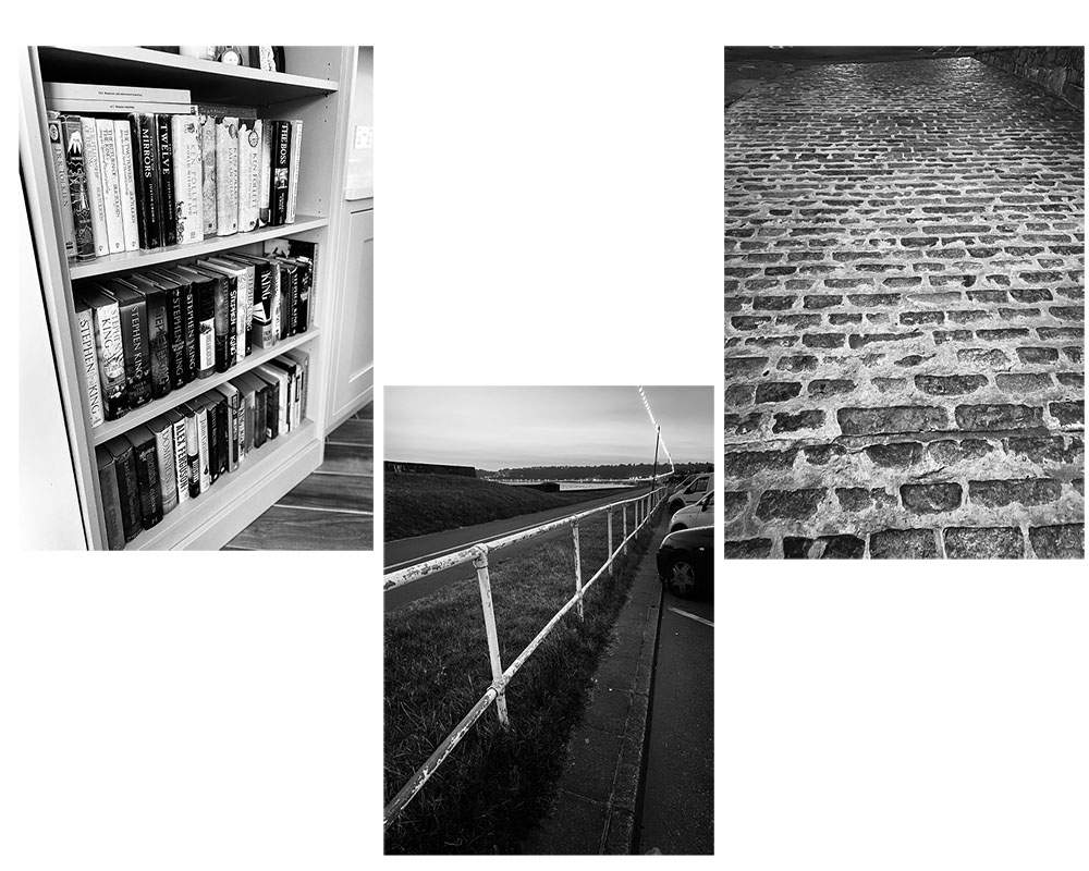
– I chose 4 of my favourite photos from previous work to experiment with to edit in photo shop
– In Photoshop, I selected the image tab, then clicked the option, Adjustments, and finally the threshold option.
– I then used the level slider to experiment with the contrast between black and white gradient.
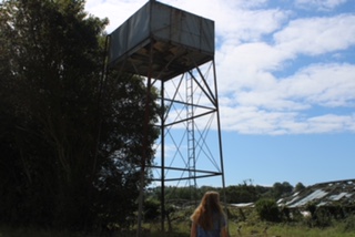
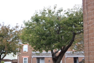
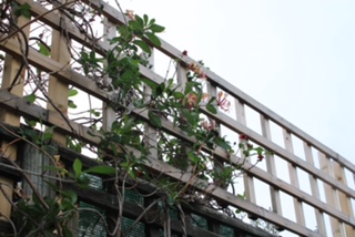
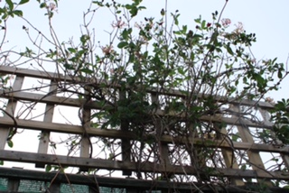
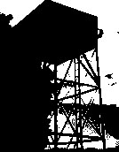
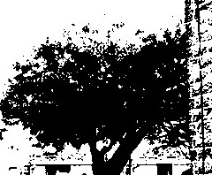
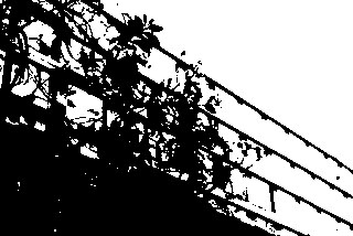
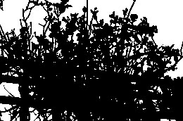
-I like the simplicity of presenting a photo as plainly black an white with no grey scale.
– However, the editing makes it harder to differentiate between the objects and we cant see any depth in the photos.
Introduction
Albert Renger – Patzsch was a German photographer whose photography was cool, detached photos forming a photographic component of the New Objectivity.
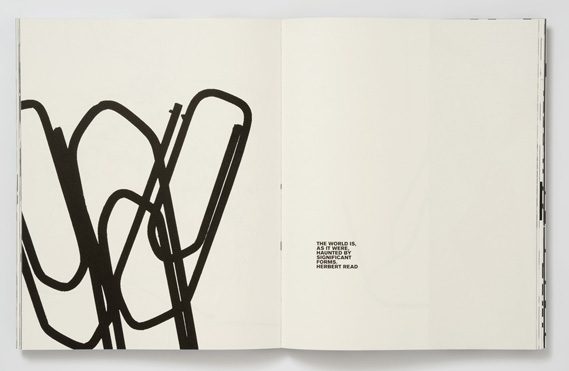
In 1925 Albert starting his career in photography as a full-time photographer as a freelance documentary and press photographer. He rejected Pictorialism and experimentation photography who relied on startling technique. In his photographs, he recorded the exact detailed appearance of objects reflecting his early career in science. He felt that the underlying structure of his subjects did not require any enhancement by the photographer. In his book “The World Is Beautiful” he took pictures of architectural and nature to show his clear transparent style of photography.
Alberts photography is black and white which shows the era in which he was taking photos in. Even though the pictures are simplistic being black and white, it can still make an amazing photo as the shadows are enhanced in the pictures making them stand out from the objects moreover, it gives people a focus point on the pictures he has taken as there are no colours involved.

Looking at his pictures, it makes someone think that even the most unattended things in the world that people don’t really pay attention to, can be a mesmerizing photo if you take a focused picture on that object. This is shown in one of his published pieces called “The World Is Beautiful”.
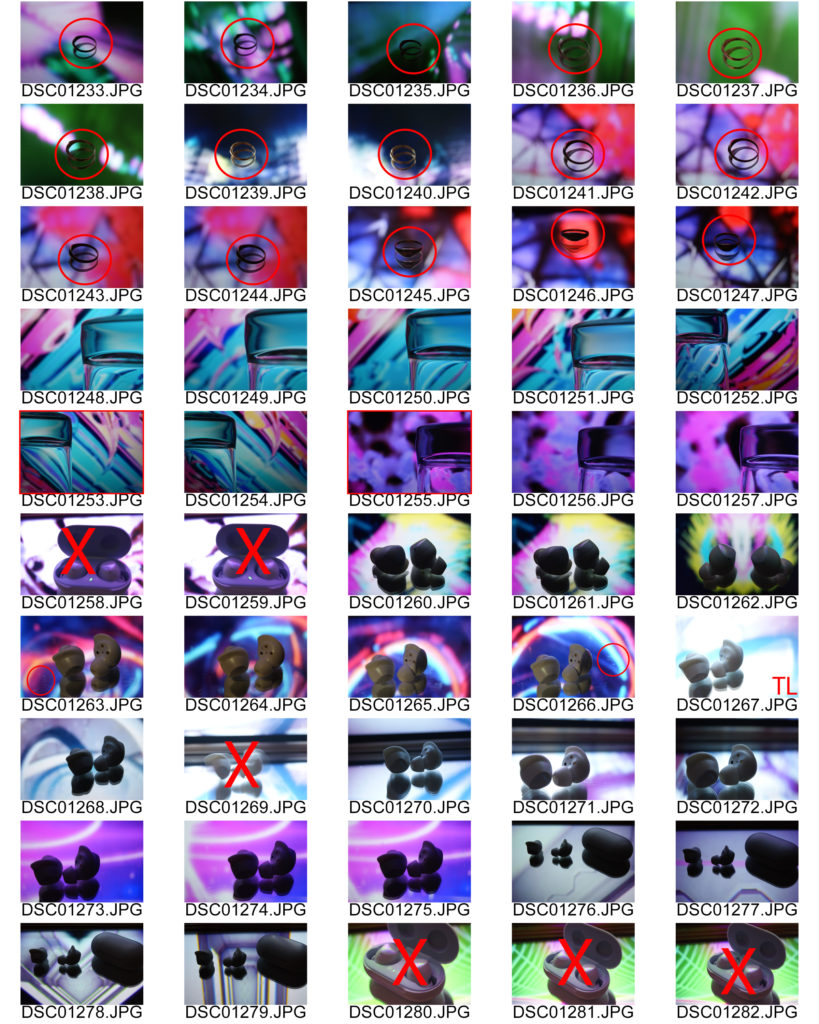
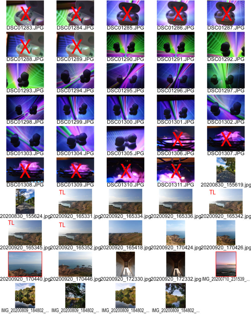
Contact Sheet

Edited Work

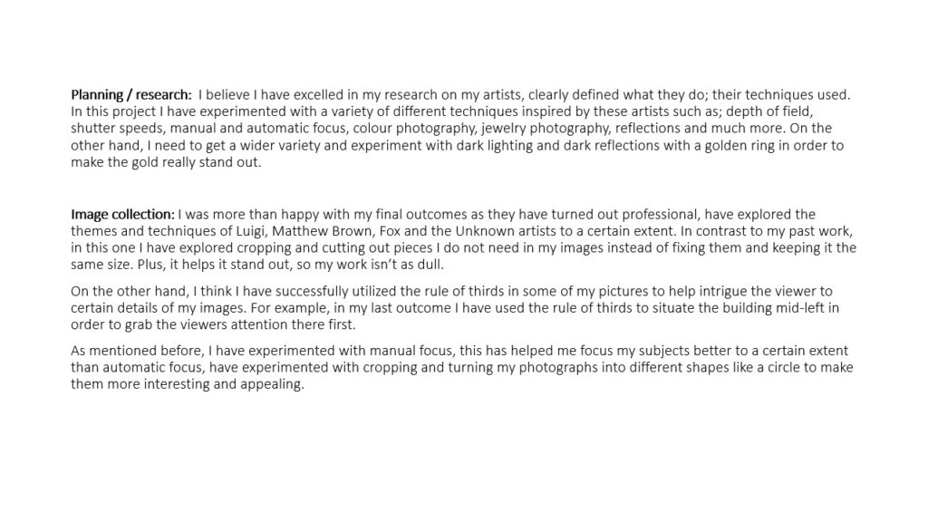
Evaluation
I have succeeded in the craft of taking pictures like Albert Renger – Patzsch because, I have taken pictures in which I edited on making them black and white moreover, the scenery in which I choose where man made and they where repetitive for example, the picture I took with a big layout of bricks that are cemented together.
Looking over my pictures, I can see that their are patterns within my pictures and the arrangement of the certain objects in the Frame. Adding onto this, with the contrast of black and white both elements stand out from each other creating an appealing contrast visually.
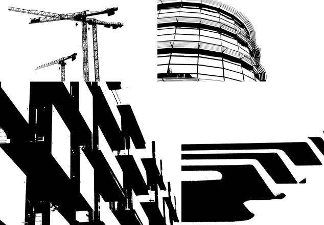
Blacklight photography is a series of black and white images that have quite harsh contrasts and tones.
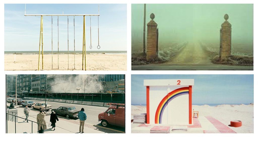
Born in Danish on the 23rd August 1920 and dying on 6th March 2013. He was most known for his abstract colour photographs in the 1940s and 50s. Interestingly, he became part of the US Camera Annual in the 1940s and gained interest with German Inter-war photography (New Objectivity movement).
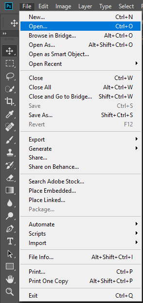
Firstly, we start by opening up the image we want to use by going to File > Open and then look for the image you want to use. For purpose of this project i will use this image:

We then go to Image > Adjustments > Threshold:
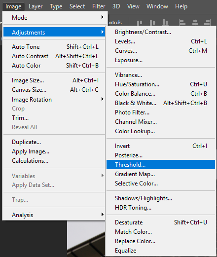
As a result, this threshold window should pop up:
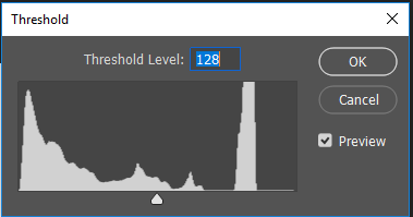
As you can see, there is a little arrow at the bottom; drag it along and you will be experimenting with the threshold tool. Adjust it appropriately. For example:
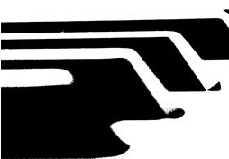
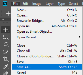
Once you are happy with your result, go to File > Save As and save your image.
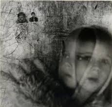
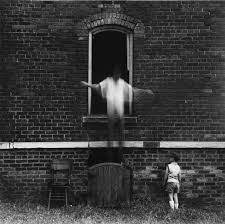
Ralph Eugene Meatyard
Ralph Eugene Meatyard was born in Normal, Illinois on May 15, 1925. He is an American photograph and optician. Ralph Eugene Meatyard purchased his first camera from the optometry shop where he worked in Lexington Kentucky in 1950; he soon became a very serious amateur photographer .He spent three months looking through an unfocused camera in order to learn to see No-Focus. Meatyard’s early photographs contain : blurred images, fabricated scenarios, masks and dolls, and a pervading dark humor.

Saul Leiter
Saul Leiter was born the December 3, 1923 in Pittsburgh Pennsylvania United States. He was an American artist .He moved to New York to become an artist. He took black and white pictures with a 35 mm Leica, In 1948, he started taking color photographs. He worked as a fashion photographer through the 1970s.


MY IMAGES
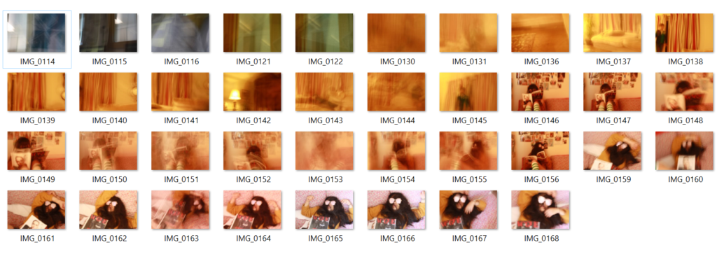
Their Ideas but in my own Style
I chose to inspire me from the two artists . Ralph Eugene Meatyard’s has kinda dark style wish I like (he puts scary maks…) . I enjoy Saul Leiter photographies because they are everyday photos and I really like the colors.
What I did
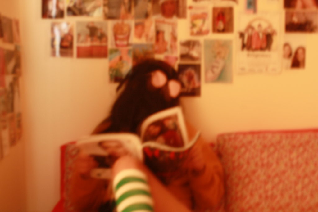
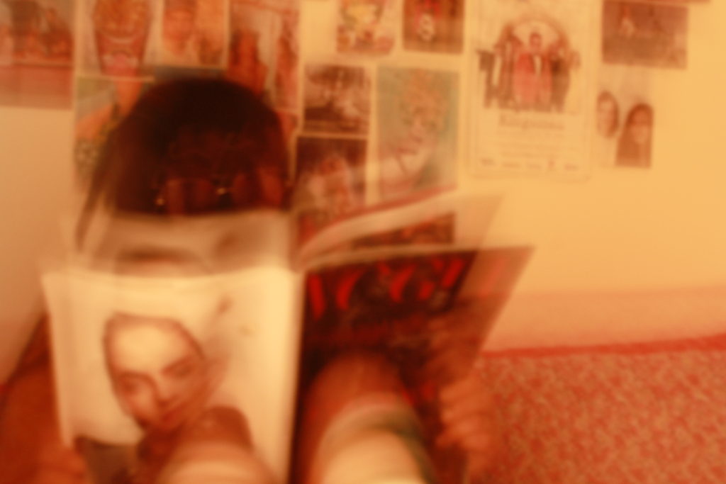
I wanted to represent a teenager in her daily life in a blury way ( watch a magazine or listen to music …) For the teenager I wanted her to look weird without it being very dramatic so I decided to hide her face with her hair kinda like in a mysterious way
My favourite images



Final images

I chose this two images because they represente what I wanted , what I was looking for , the ideas of the two artists and especially my style.
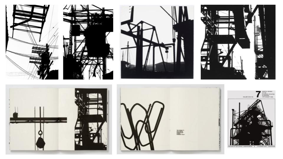
Keld Helmer-Petersen, a Danish photographer born in 1920, was recognised for his abstract photography in the 1940’s and the 1950’s. Helmer-Petersen’s passion for modern architecture, industrial areas and structures inspired his experimental photography, as he challenged the possibilities of the photographic image. He was a self-taught photographer who learnt from other photographers, such as Albert Renger-Patzsch. through technical manuals and photobooks. In the early days of his career, he joined amateur photographer clubs, where he would develop his photography skills further. Helmer-Petersen produced his first photobook, ‘Fragments of a city’, in 1960, which contained images of the city of Chicago. Keld Helmer-Petersen began teaching photography at the Academy of Architecture in Copenhagen until retiring in 1990.

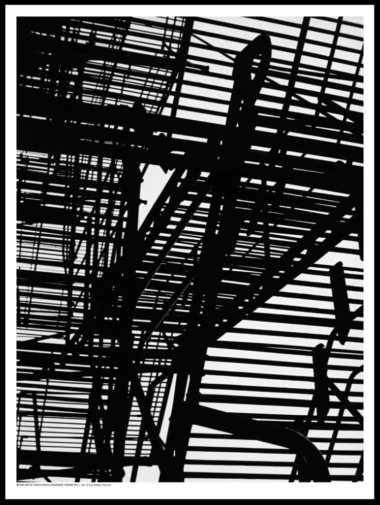
Light- The lighting in the image is hard to decipher as there is no highlights or shadows in the image. However I believe the image was taken in daylight, perhaps early afternoon in order to achieve the iconic shapes and lines.
Lines- There is a distinct pattern of lines in the image, as they cross over one another and create intricate designs. There is a contrast of both thick and thin lines in this image, which can be seen as a form of juxtaposition.
Repetition- There is a clear repetition of lines in this image, they direct your eyes along the screen, to the focal point of the large, black sillouette.
Shape- The shape of the image revolves around geometric shapes and lines, that are both thick and thin.
Space- It is hard to depict whether the image has a wide or narrow depth of field, as the image is simply a pattern of line and shapes in a silhouette, therefore this aspect of formal elements is irrelevant to the photo.
Texture- It is also hard to work out the texture of the image, but the repeated lines have a smooth surface, therefore I would say the overall texture of the image is rather smooth.
Tone/Value- There is no gradient of tone to the image, as it is simply pure black and white. However these contrast each other with the juxtaposition of light and dark.
Colour- There is no colour to the image, this is to signify the gloomy silhouettes of the geometric lines in the photograph.
Composition- The composition of the image is very organised, however there is no rule of thirds used in the image as the object was not set up by the photographer, the image rather focuses on the entire structure of lines instead of a singular focal point.
Original Images Used-
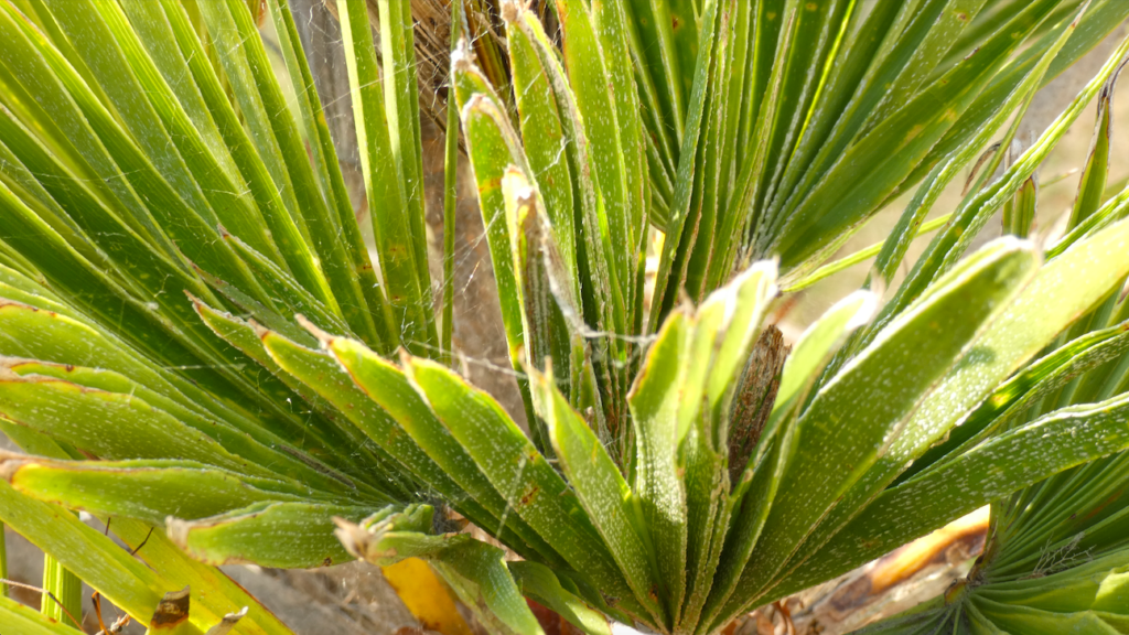

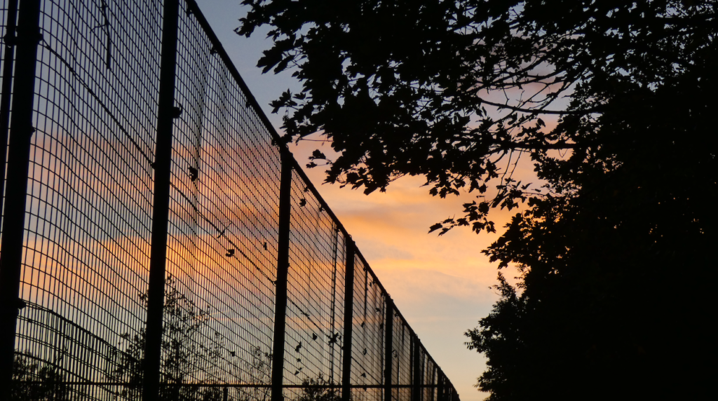

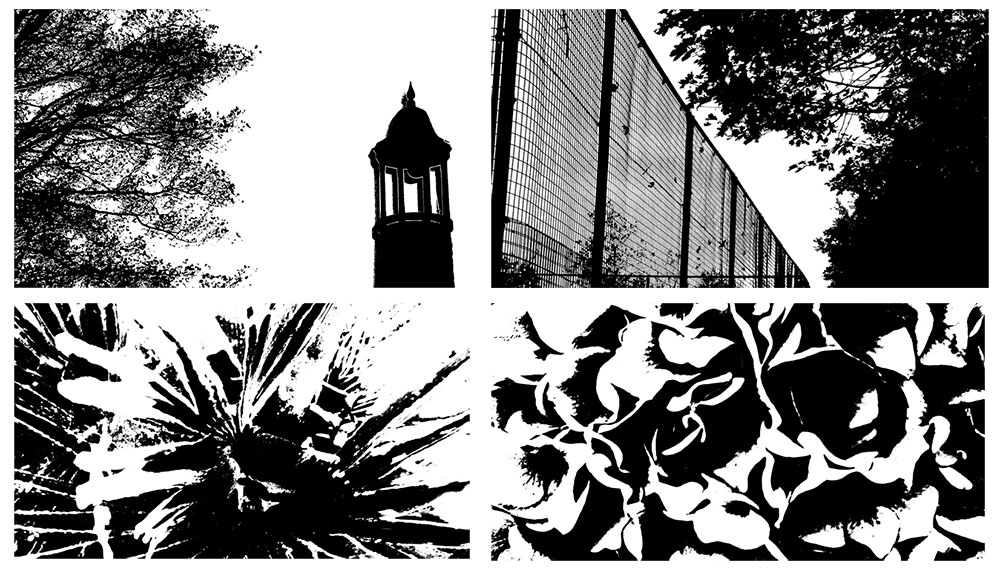
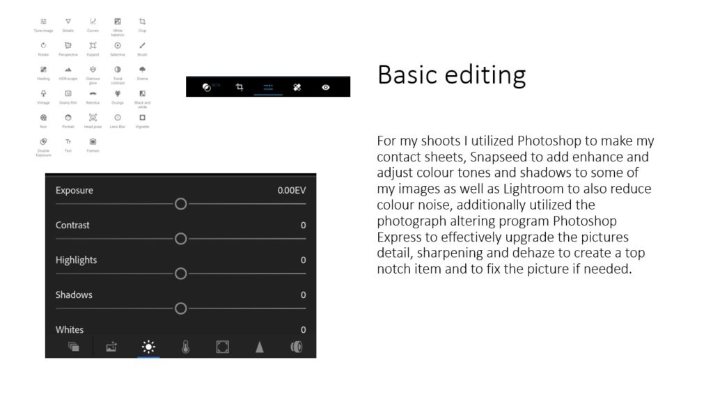
To achieve the same affect that Keld Helmer-Petersen used on his images, I used the threshold tool on photoshop to imitate the same silhouette-like appearance on the photographs.
I believe my work resembles the work of Helmer-Petersen well as it gives off the same silhouette aesthetic that he achieves with his work. It allows the shape and pattern of the object to be highlighted amongst the background behind it. However my work focuses more on natural aspects of shape, with the use of plants, whereas Helmer-Petersen often uses artificial structures for his work.
Ralph Eugene Meatyard

The image allows the viewer to sense either a calm or eerie mood. The bare twigs on the trees gives the viewer a sense of loneliness or depression as there is arguably no life on the trees. One could link bare trees to winter,which is cold, and can be a miserable time of year for some people.
On the other hand, one could also interpret this image as calming as there isn’t much going on with it and nothing is too busy.
In addition, only the front of the twigs are in focus which allows the viewer to see all the little details on the twigs and even see the little buds that are beginning to form on them.
The image is black and white which also gives the impression that the image is made to create a sense of loneliness and depression.
The twigs have a reasonably smooth texture which could be interpreted to show that life is normally simple however there will always be little bumps in the road. No one’s life is perfect.
Introduction
Keld Helmer-Petersen was a Danish photographer who liked to experiment with the contrast of black and white expression influenced constructivist artists and their fascination with industry’s machines and architecture’s constructions. Keld’s approach to photography was by and large experimental and explorative. He worked on the boarders of what we consider to be photography. Throughout his career he worked with cameraless photography which was a technique in which objects are placed directly on light sensitive photographic paper. He used to walk down pavements with his head down making discoveries of damaged roads, houses or pavements which resulted in works such as the series Deformationer.
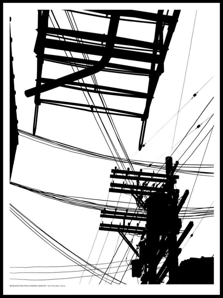
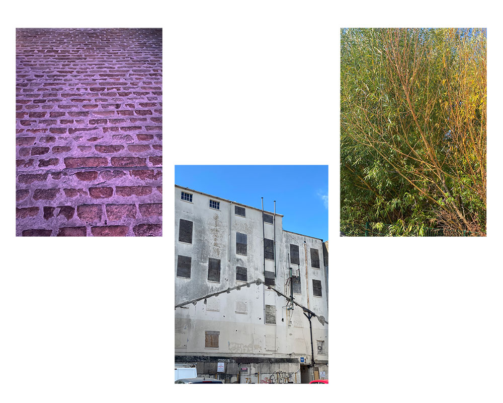
Original Photos
Edited Photos

The process I went through with making this was that I had all my photos on a separate file and edited them in order to make them have a bold contrast I achieved this by going onto image, clicking on adjustment then I went onto threshold which enabled me to adjust the threshold for my pictures, making the black and white have an intense contrast. After I done this, I opened a new file onto my photoshop and selected my images then copy and pasted them onto my new file, to have my edited pictures on the same file.
Evaluation
The evaluation that I made for my final images that I edited, was that I thought the images came out great involving the technique that Keld Helmer-Petersen uses for his photography. This is because in my images, they are flat and have bold contrasts of black and white on them having the object in any of the images stand out. Moreover, in the image of the Brewery in which I had edited, I thought this came out to be the best edit out of them all as the windows in which where bordered up and the outlines of the building highly stood out due to the building being white, the sky turning out white also made the image appealing as it seems like this could have been a sketch and not a picture.
Keld Helmer – Petersen was a Danish photographer who received worldwide recognition for his coloured photographs. He also published several books full of black and white images where all the mid – tones had been removed.
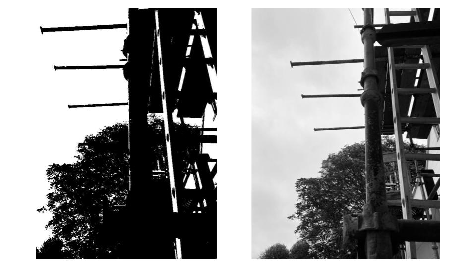
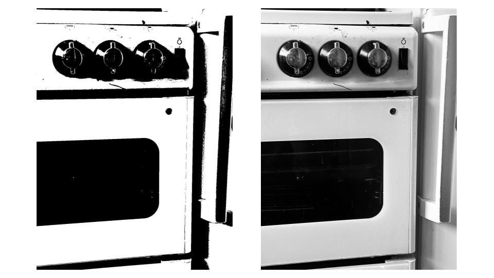
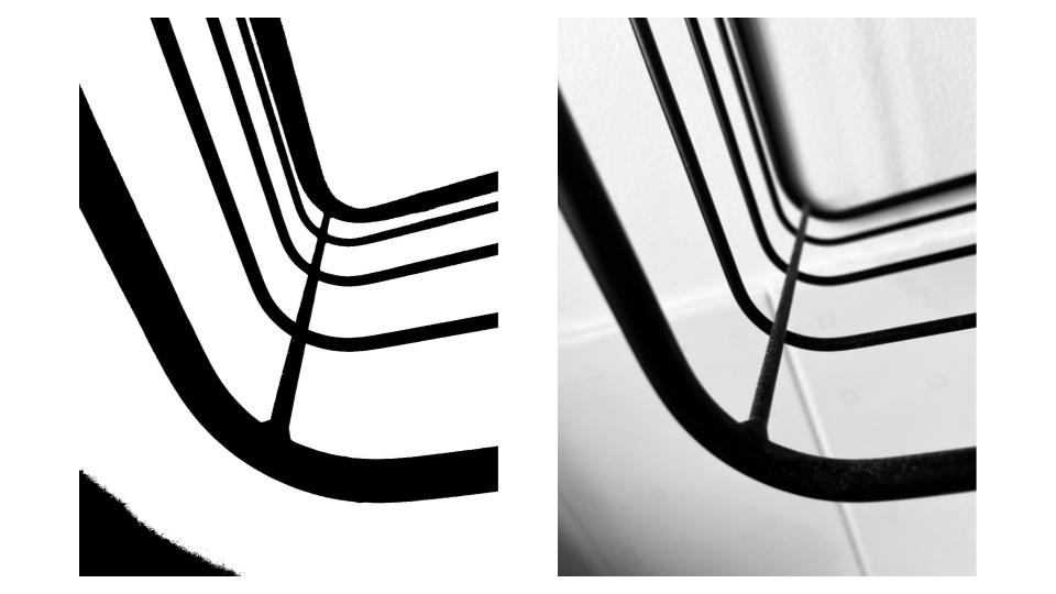
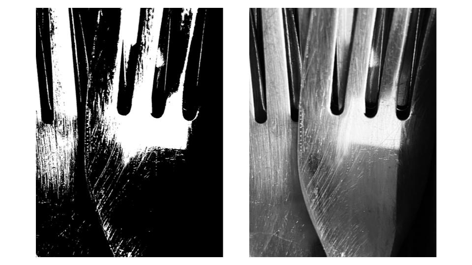
I firstly selected four images from my previous photoshoot inspired by Albert Renger – Patzsch’s ‘The World is Beautiful‘. I then opened Photoshop and experimented with the threshold tool in order to remove all the mid – tones and leave only black and white in the images. In my first photograph, I also experimented with the cropping tool so I could make the image smaller, and so I could get rid of parts of the image that I didn’t like. In the third picture, the threshold tool emphasised the shadows which were present in the bottom left of the image, and created a whole new area of black colour. The same happened in the second photograph, with the shadows casted by the dials on the oven being accented.
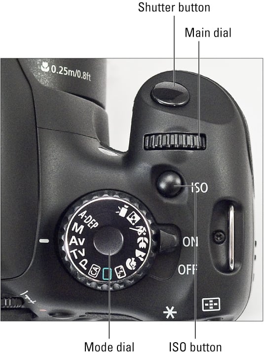
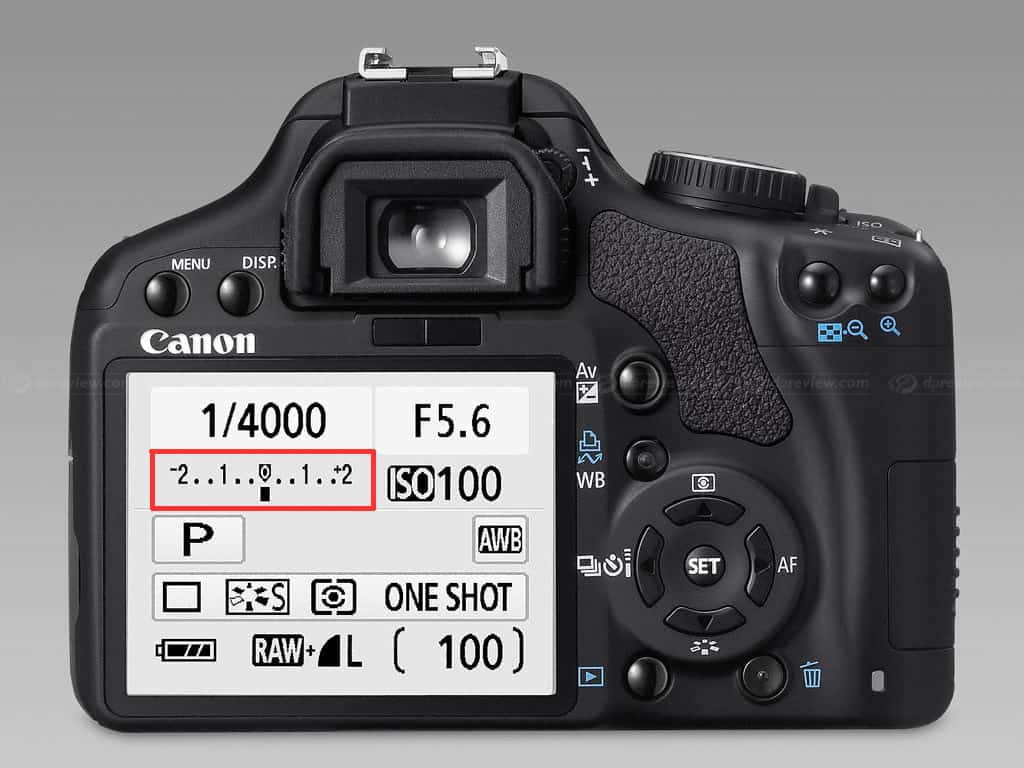
These resources are designed to encourage you to explore your use of the camera and it’s functions. The more you experiment and discover, the more control you will have and this will lead to more creative outcomes…
CAMERA CRAFT – exploring exposure settings
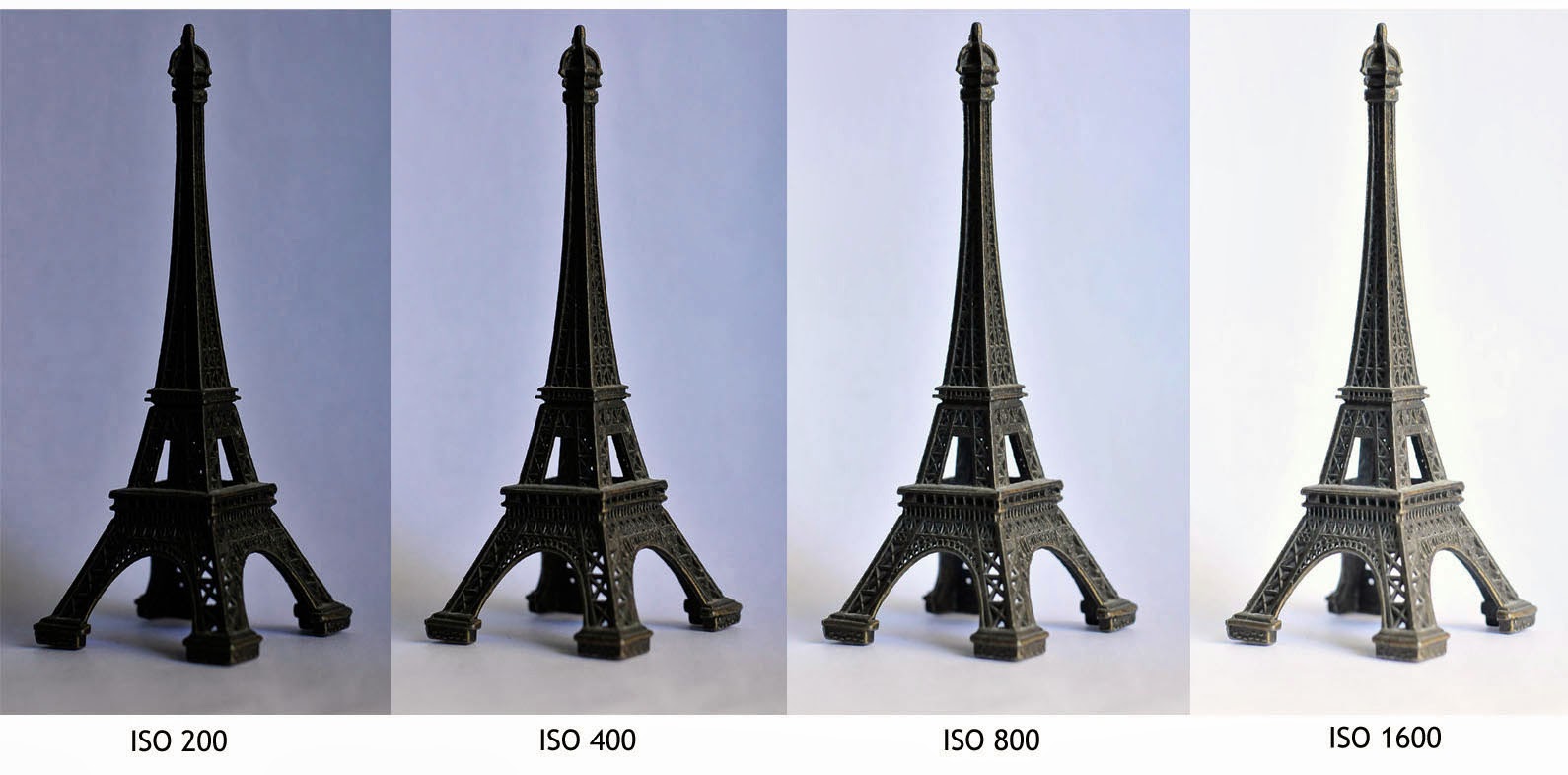
ISO – experiment with different ISO values to enhance your exposures…be wary of “noise” in your images with high ISO
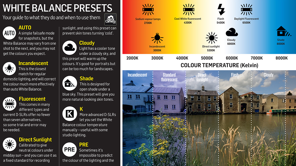
White balance (WB) is the process of removing unrealistic color casts, so that objects which appear white in person are rendered white in your photo. Proper camera white balance has to take into account the “color temperature” of a light source, which refers to the relative warmth or coolness of white light.
Homework | Practical / photoshoot
Due in WEDNESDAY 7th October
Minimum Expected frames/ exposures = 150-200 images
Choose from a range of camera skills that you have learned in Week 3 and 4 and 5 to complete a new photo-shoot…
We want to see that you can explore and extend your handling of
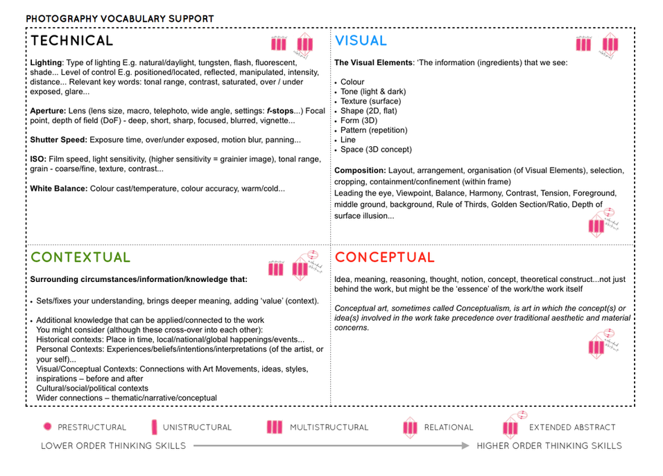
Follow the highlighted sections of The 10 Step Process and create a blog post that clearly articulates your process and tackles these Assessment Objectives thoroughly :