Category Archives: Resource

Filters

Author:
Category:

Image Display

Selection Process

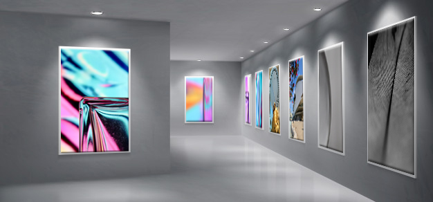
First I looked at all my abstract photos and decided one which ones were the best. I choose the ones that were the most colourful and used the rule of thirds as they tended to look better as it had more composition. For the other images I used other good images that I’ve taken to fill in the blanks.

Editing

After, I edited them and boosted the saturation by about +10 to make it ‘pop’ and cropped it to line up with the rule of thirds, to make it more visually pleasing.

Displaying

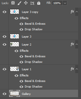
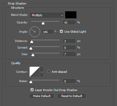
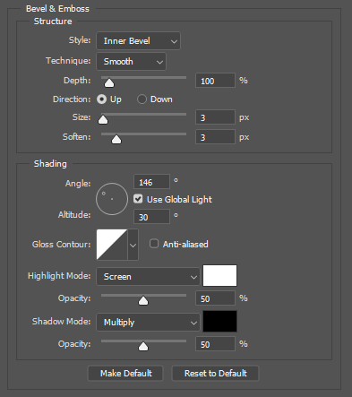
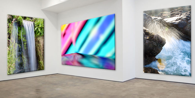
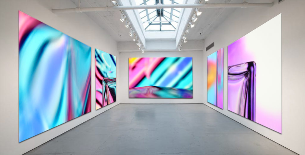
To Finalise the images I found 2 different art blank picture galleries on Google. I grouped my photos into two groups, portrait and landscape. The gallery with the large wall would be for landscape photos, and the other for portrait photos. I put my abstract photos into the galleries, I put the image onto the canvas in the gallery, where I wanted it to be, then in Free Transform mode I pressed CTRL and dragged on the corner of each edge of the image and moved it to the corresponding corner of canvas space in the gallery to match the perspective of the gallery and its 3D walls. After the image was properly on the canvas, I added Drop Shadow and angled it to the same as the direction in the base image. Then, I added bevels to the image to make it look 3D to make it realistic. To add the effects I right clicked the layer then went to blending options. As there were blank spaces in the gallery I put in other good photos that I’ve taken.

Evaluation

I really like how it turned out, as they look realistic and they all fit in naturally. The drop shadows and bevels really worked well. Overall, it was relatively simple but took a long time to added all the images in.
Only abstract photos.

REPETITION, PATTERN, RHYTHM REFLECTION AND SYMMETRY

Alfred Stieglitz

Stieglitz was an American photographer in the early 20th century. modern art promoter who was instrumental over his fifty-year career in making photography an accepted art form. Stieglitz espoused his belief in the aesthetic potential of the medium and published work by photographers who shared his conviction.
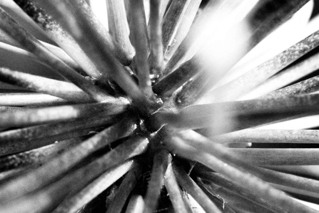
Photo shoot plan

For my photo shoot, I will carry it over a few days, in small chunks during the day. this is so then vary my outcomes as the clouds would have moved and created new patterns to photograph. I will take these photos in different locations, again to help vary the patterns and shapes of the clouds. For this project, I can carry out my photo shoot independently as I will not be needing a model.
Final Edits

For these photos, i uploaded them into photo shop and experimented with the exposure levels, brightness levels and contrast, this was to enhance the ripples and the texture i saw in the clouds to bring them more to life.

Final Photo

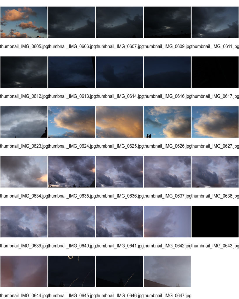
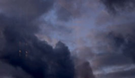
When I first look at this photo, my eye is suddenly drawn to the 3 similarly shaped clouds following a diagonal line through the photo, this is due the composition of the photo. When taking the photo, I used a fast shutter speed in attempt to capture the texture and liveliness off the clouds, a fasted shutter speed meant that there was no time for movement from the clouds. However, a faster shutter speed also meant that there was less time for light to reach the lens, this made the unedited version darker. To change this, I uploaded the brightness and contrast to lighten up the photo. I also increased the exposure as the unedited photo was under exposed due the high shutter speed and low lighting.

I especially like the contrast between the orange clouds and the blue sky. In this photo, the two colours heavily compliment each other, making the photo more visually appealing.

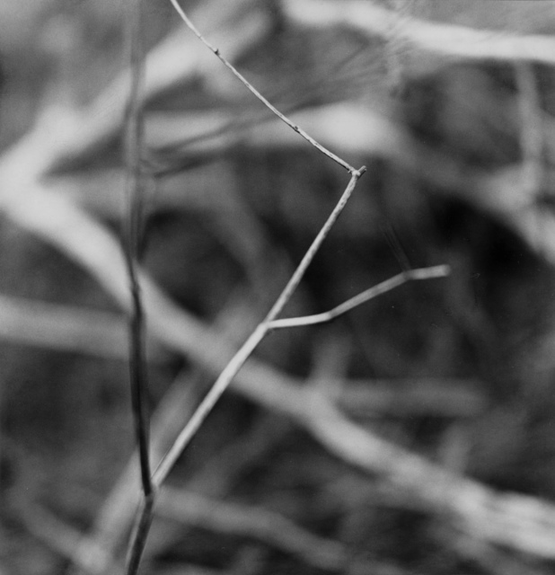
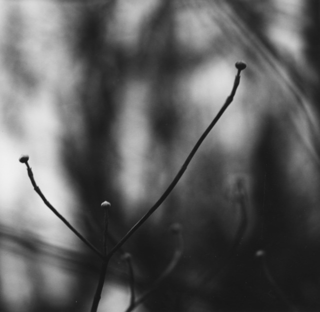
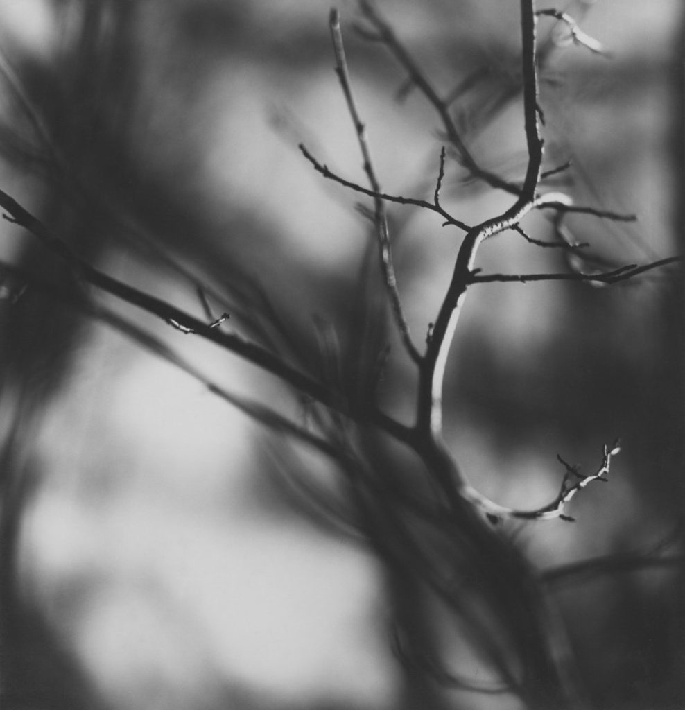
ralph meatyard – zen twigs

Ralph Eugene Meatyard ( 1925 – 1972 ) was an American photographer from Normal, Illinois, U.S. Meatyard’s work spanned many genres and experimented with new means of expression, from dreamlike portraits – often set in abandoned places – to multiple exposures, motion-blur, and other methods of photographic abstraction. When he turned 18 during World War II, he joined the Navy, though he did not have the opportunity to serve overseas before the war ended. Meatyard purchased his first camera in 1950 to photograph his newborn first child, and worked primarily with a Rolleiflex medium-format camera. He took up membership of Lexington Camera club in 1954, and at the same time joined the Photographic Society of America. Much of his work was made in abandoned farmhouses in the central Kentucky bluegrass region during family weekend outings and in derelict spaces around Lexington. 

ZEN TWIGS

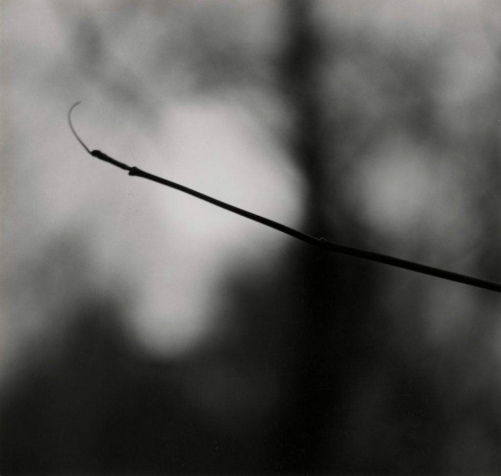
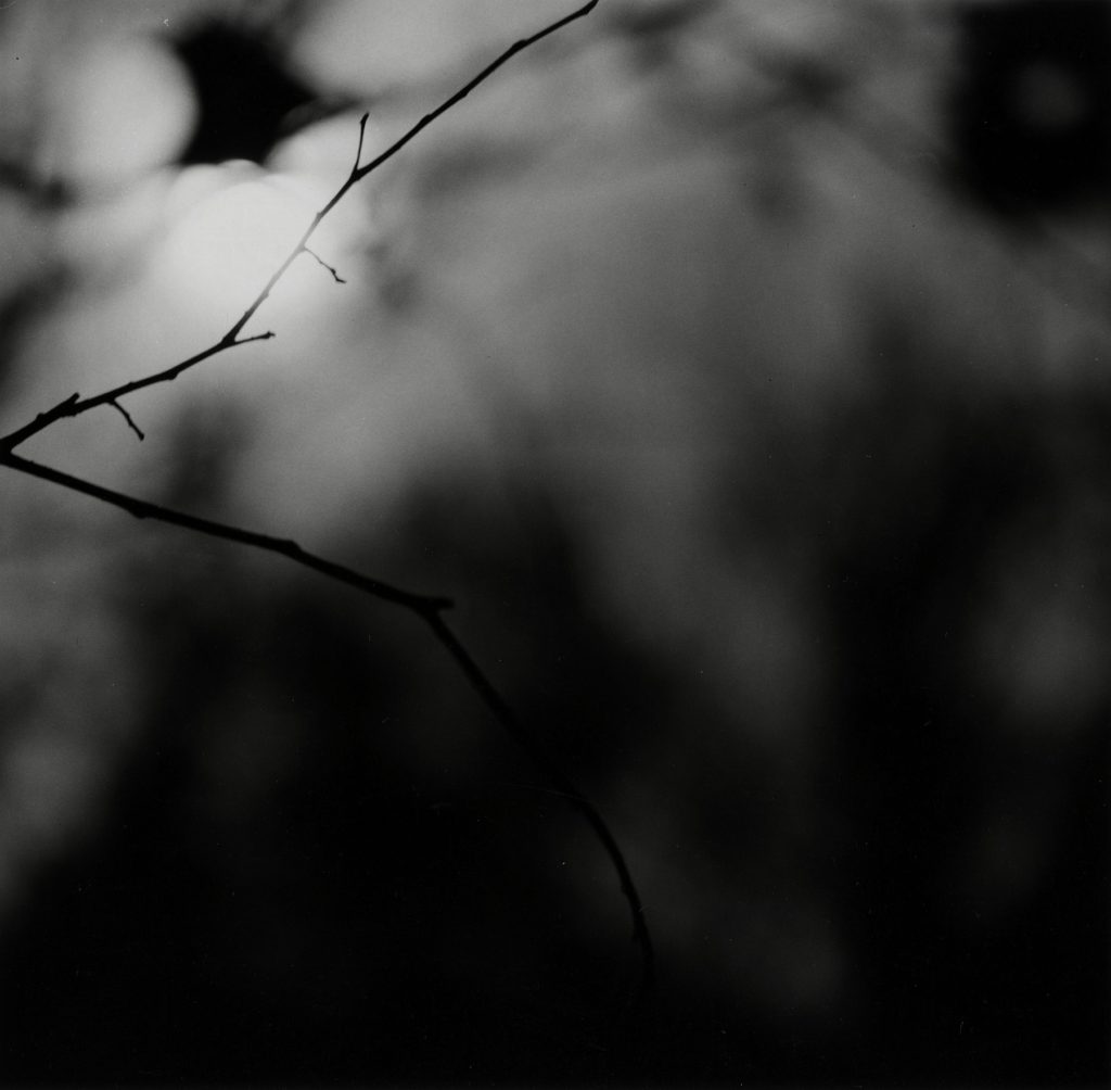
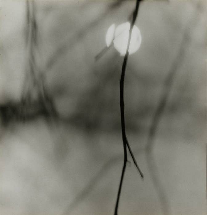
In this series of photographs, Meatyard has experimented with the different aperture settings on his camera in order to create the blurry background whilst still keeping the main subject in focus. The harsh black and dark tones of the subject contrasts to the white and brighter range of colours that can be seen in the background. Meatyard has avoided photographing rough and straight lines, instead choosing to look at the naturally occurring shapes that appear in the trees. This gives the images a softer look and feel, even though the contrasting tones could suggest otherwise. The blurred branches present in the background also adds to this effect. The fact that the main subject of the photograph is the only thing which is in focus draws the viewer’s eye to it, creating a focal point. Additionally, most of the subjects appear to be in the centre of the image, creating an equal amount of space on all sides, therefore making the photograph more aesthetically pleasing to the viewer’s eye.

REPETITION, PATTERN, RHYTHM REFLECTION AND SYMMETRY

I decided in picking these two photographers to contrast and compare their work pieces as both photographers use textures, repetition and patterns in an enchanting way. 

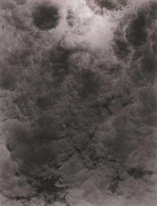
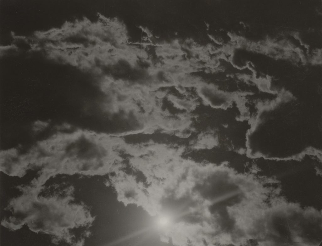
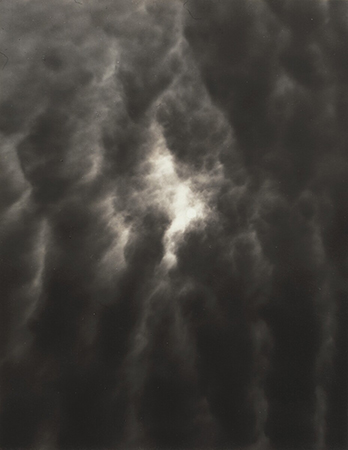
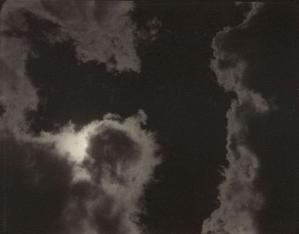
Alfred Stieglitz creates patterns and repetition when in the talking of his photos as the clouds create weird patterns and some of the patterns are repeated in the sky creating an abstract look to the clouds.

Whereas, Harry Callahan similarly experiments with these patterns and repetition in his pictures with the abstract pictures he takes of grass and repetition in the photos he has taking of trees being lined up next to each other.

Alfred’s picture on the left contains natural lighting which gives different shades into the patterns of the clouds in the sky making some of the clouds darker and lighter than other sin different regions. Visually, Alfred’s picture is appeared to seem very 2D (flat) as their isn’t much highlight’s of light in the clouds in order for them to appear to be 3D or even clouds moreover, their is a lot of patterns in this picture visually as you can see similar cloud shapes as it appears to be one big cloud with light trying to brake through different segments of the cloud. His purpose and meaning of taking these type of pictures of clouds was that it became an art form for him to take this pictures of the sky and photography quite quickly became an obsession for Alfred as he enjoyed his art form of taking pictures.

Harrys picture on the right was taken from the source of natural light with what appears to be a wide angle aperture being used in taking this picture, this enhances the shadowing and contrast in this image from light to dark tones demonstrating the differences from what appears to be wheat and grass in the picture. Visually the image is contrasted to be 3D as you due to the shadowing giving life to the surface in the picture also, their is repetition in this as you can see their is grass scattered about in the picture giving it a very earthly/ naturalistic appeal to the picture. The context of how Harry would go about in taking his pictures, was that he would just get out of bed and take numerous pictures of things that he thought interested him, this comes across in his picture in my opinion as the picture doesn’t seem to be panned but more of a ‘in the moment’ taken picture.

surface & colour

ARTIST REFERENCES

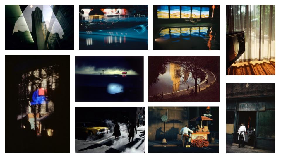
Ernst Haas (1921 – 1986) was an Austrian – American photographer who is widely considered to be a pioneering figure in the art of colour photography. His images have been featured in publications such as Life magazine and Vogue. In addition, his photographs were the subject of the first single – artist colour exhibition of colour photography at New York’s Modern Museum of Modern Art in 1962.

Photographs Captured by Ernst Haas

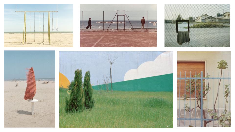
Luigi Ghirri (1943 – 1992) was an Italian photographer who gained a reputation as a pioneer and master of contemporary photography, with its particular reference to its relationship between fiction and reality. Ghirri’s work quickly attracted international attention. In 1975 Time-Life included him in its list of the “Discoveries” of its annual Photography Year publication, and he showed at the Photography as Art, Art as Photography exhibition in Kassel.

Photographs Captured by Luigi Ghirri

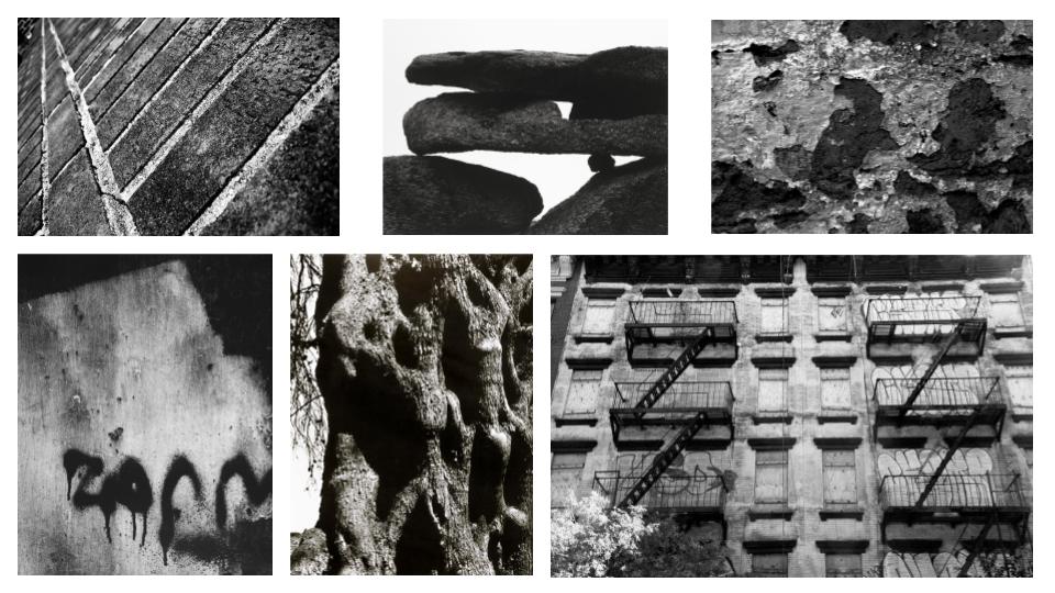
Aaron Siskind (1903 – 1991) was an American photographer whose work focuses on the minor details of its subject/s and presents them as a flat surface to create a new, independent image. Siskind used things from the real world in his photographs: close-up details of painted walls and graffiti, asphalt pavement, rocks, lava flows, ancient statues and the Arch of Constantine in Rome.

Photographs Captured by Aaron Siskind

MOOD-BOARD

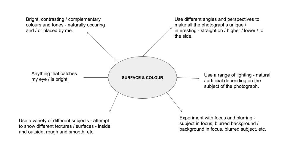
MIND MAP

MY RESPONSE

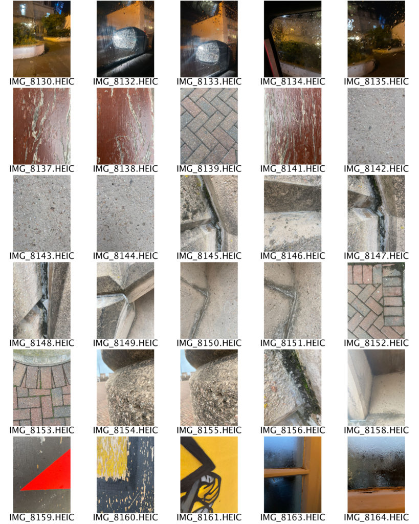
In this photo shoot I was inspired by the works of Aaron Siskind and Saul Leiter, who captured images of the condensation on windows and close up shots of different textures and surfaces. I attempted to use a range of angles throughout my photographs in order to make them more interesting for the viewer to look at. My process was to photograph anything colourful that caught my eye, which led to some unusual subjects such as plastic bags and paper towels. I also took inspiration from The Boyle Family, whose images are a bird’s eye view of various surfaces, mainly roads and pavement corners. I used mainly natural lighting in this photo shoot in order to keep the photographs as realistic as possible. I liked that in some of my images the light would reflect off of the subject, such as my photographs out of a car window, however in those images the lighting was artificial as it came from the headlights of other cars, creating a glare effect. As one of the main themes for this photo shoot was colour, I aimed to incorporated it as much as I could into my photographs. I did this by placing certain colours next to each other, making sure that they complimented one another. To help me see which colours went best together, I used a colour wheel. I also aimed to show different shapes and lines by including objects with harsh, straight lines (books) and organic, curvy lines (ribbon). Additionally, I experimented with different patterns, as seen in the photographs of the yellow coat, where I pulled back the hood to show the stripes on the inside. For the composition of my photographs I tried to use a varying range of layouts and arrangements, such as the subject being in the middle of the image, at the top or bottom, or at either side. I also explored different distances of the camera from the subject, such as far away and up close.

REPETITION, PATTERN, RHYTHM REFLECTION AND SYMMETRY

Alfred Stieglitz was an american photographer who’s career lasted for fifty years. He was born in 1864 and died in 1946.

Ernst Haas was an Austrian photographer who had a 40 year career .He was born in 1921 and died in 1986.

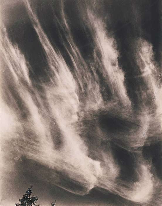
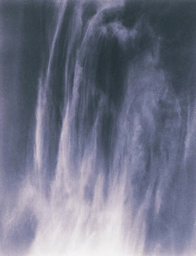
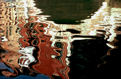
Both images are similar because they both have repeated shapes in them even though they are two totally different things. The water, in Haas’s image, has another picture reflected. However the ripples in the water has caused the reflection to look distorted allowing the viewer to try and interpret where and when the image was taken. In Stieglitz’s image, the clouds are wispy and thin at the top of the image allowing us to see columns in the sky. However, as the viewer looks down the image, the clouds seem to merge together allowing the viewer to try and see if the bulk of clouds makes a certain pattern or ‘image’ in the sky.

Although the images have similar patterns, the colours in the images are nothing alike. In Haas’s image, the majority of the colours are warm tones like oranges and reds. This allows the viewer to guess that the images are either taken during sunset as the sky turns red/ orange. Or the image could have been taken near an orange/ red building.

The source of the water is also not clear, it could be from a river, pond, lake or a puddle. The only thing the viewer notices is that there has been something in the water which has disturbed the still water and causing all the ripples.

In Stieglitz’s image the colours are very cool toned which gives the image a calm mood which allows the viewer to understand the message of the image without getting distracted by all the contrasts of colours in the image.

Repetition, Pattern, Rhythm Reflection And Symmetry – Image Comparison

Comparison – Harry Callahan & Nick Albertson

I have chosen to compare a natural form image by Harry Callahan to an abstract image by Nick Albertson. Harry Callahan was an American photographer who was well-known for both his colour and black & white photographs. His work focuses on repetition, patterns and textures while also containing a high contrast between shadows and highlights. Nick Albertson is an American visual artist who uses mundane utilitarian objects to create abstract structural forms, photographing them using repetition, light and shadow.

There are many similarities between these two images, one being both photographers capture of vertical lines. Harry Callahan photographs the straight leading lines of pond reeds which reflect off the waters surface, creating a highly textured image with movement and rhythm. Additionally, Nick Albertson captures his vertical lines in the thick red tape, which stretch a uniform pattern from the top to the bottom of the image. These orderly lines create an abstract atmosphere in the image as the placing of the subjects are systematic and rigid, which contrasts with the obvious movement in Callahan’s work. There is also immense amounts of repetition in both images as the leading vertical lines echo throughout the photographs. Moreover, both images hold a sharp texture as they appear to have pointed edges and harsh lighting.

However, there are also many differences within these images. For example, Callahan’s photograph is of a natural form in its organic environment, whereas Albertson has captured a man-made form in an abstract ambiguous way. Furthermore, Callahan photographs his images in black & white whereas Albertson has bright saturation. The dominant colour red that Albertson captures creates a bold eye catching image and its vibrancy draws attention from the observer. Contrastingly, Callahan’s black and white image holds dark shadows which contrast greatly with the bright white highlights reflecting from the water. This creates a mysterious, enigmatic atmosphere within the photo as the shadowed reeds look silhouette-like against the water. In addition, these images are taken with very different lighting. Callahan uses natural light to capture his image as he is photographing the environment presently, without disturbing or changing it. However, Albertson uses harsh studio lighting in order to capture the everyday object in an abstract way. This artificial lighting choice adds to the unnaturalness and ambiguity of the image and shows how the composition of any mundane object, depending on perspective, can change how people identify it.

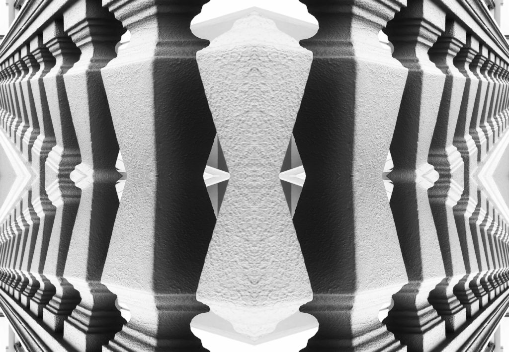
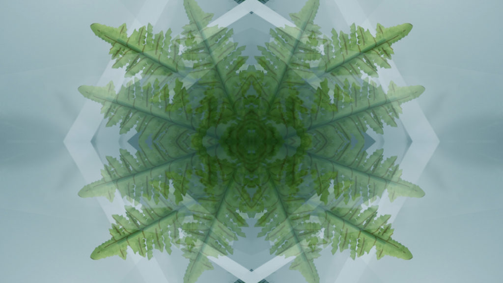
kaleidoscopic / reflected image in Adobe Photoshop

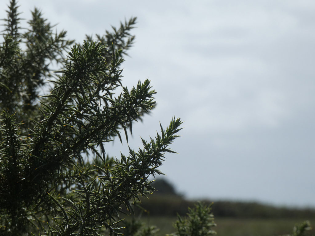
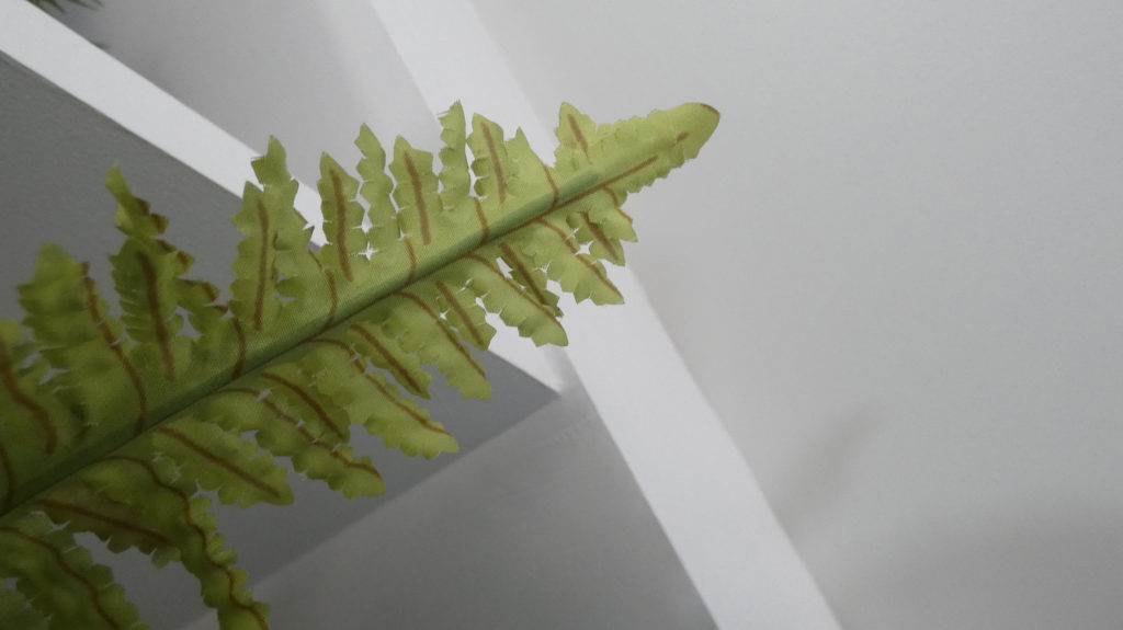
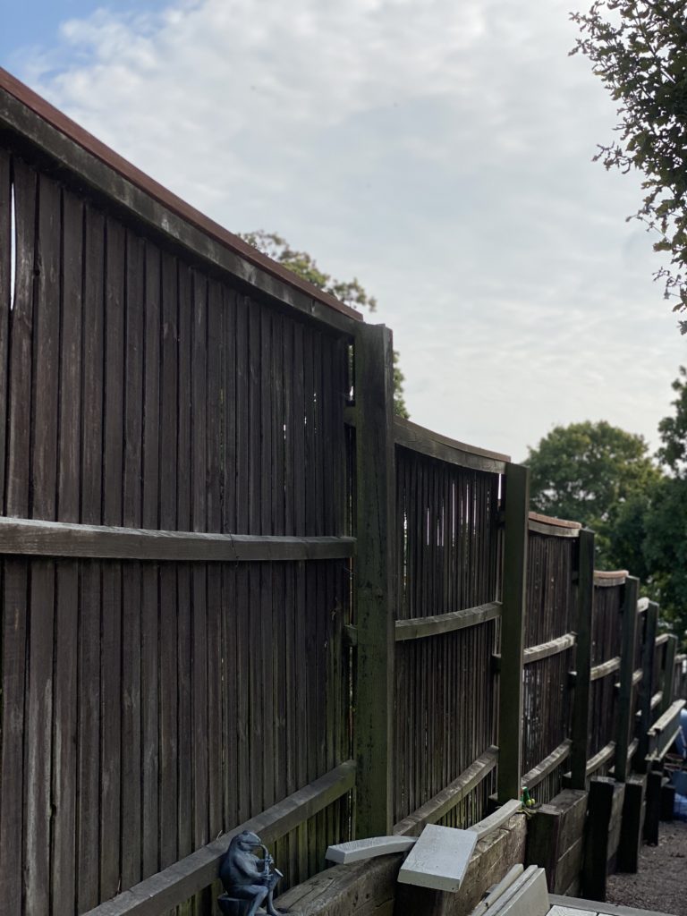
Original Images

I took these images for the nature and patterns photo shoot.

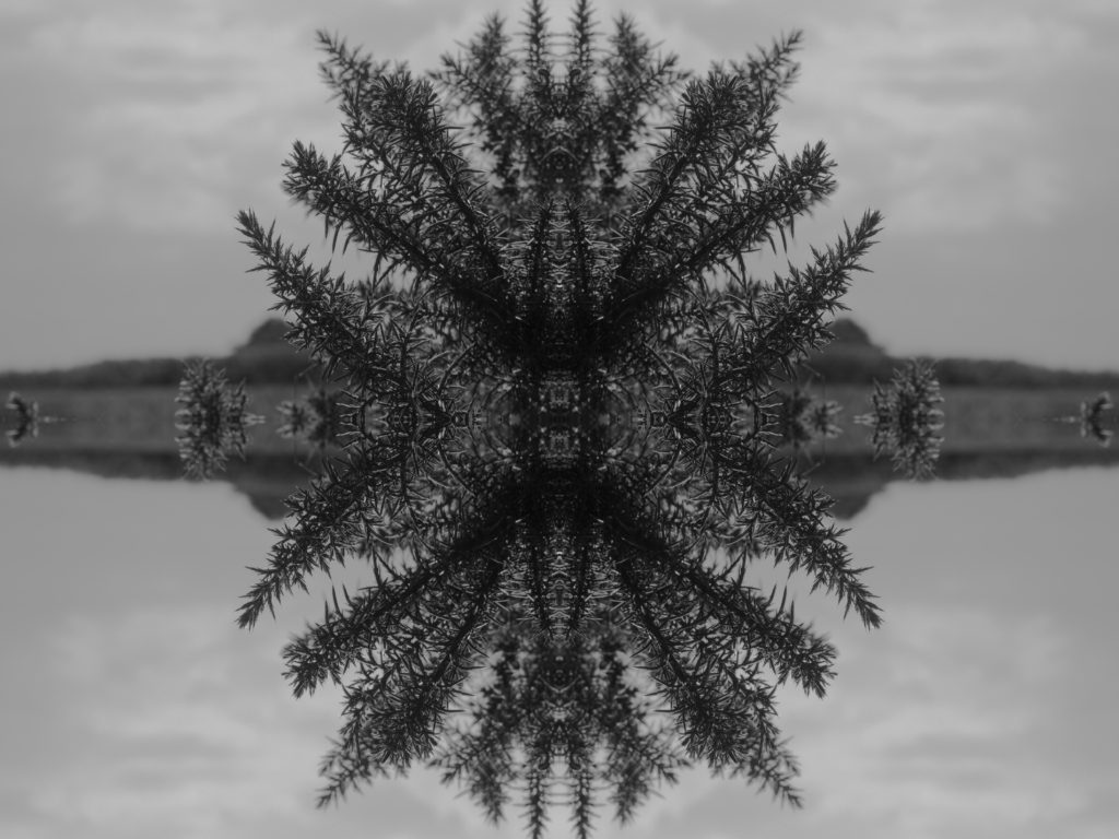
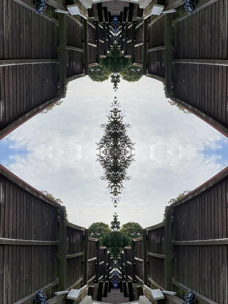
Edited Images

I edited these in Adobe Photoshop 2018.

How i did it.

  1. First, i opened it original file.
  2. Select > All
  3. Edit > Copy
  4. Image > Canvas Size
  5. If i wanted to flip i on the left, i would anchor it on the right and double the inches on the width.
  6. Edit > Paste
  7. Edit > Transform > Flip Horizontal
  8. Drag the image to the right
  9. Flatten Image
  10. Repeat steps 2 – 4
  11. You would anchor it on the bottom and double the inches on the height, if you wanted to put the flipped image on top.
  12. Edit > Paste
  13. Edit Transform > Flip Vertical
  14. Repeat steps 8 – 9

I like how i turned out because they look unique and it creates a cool pattern, which is why its resembling a Kaleidoscope.

It looks best why the subject is touching two sides of the original image. So when you flip it, it will all be connected.

Reflection and symmetry

Using Photoshop to create symmetry

Original Image
Edited Image using Photoshop

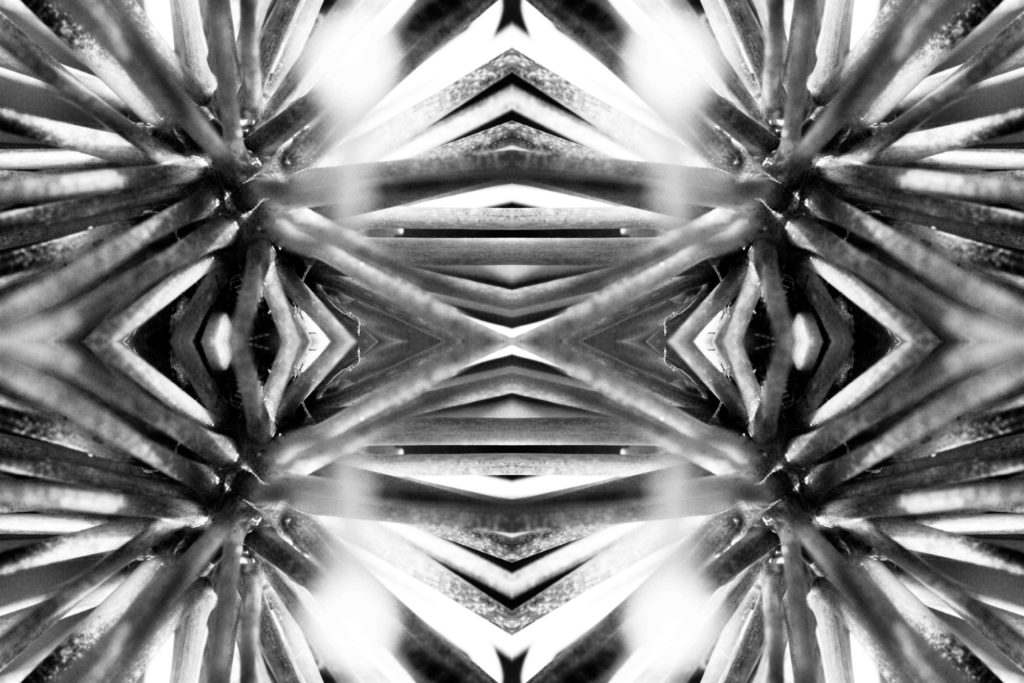
To edit this image, I copied and pasted the image onto a canvas that was double the size of the original image. I then used the transform setting to flip the image vertically to create a reflection-like affect, I flattened the image after each layer-copy aswell. I used a monochromatic filter to accentuate the shades of light and dark.

Experimenting with layers

Original Image
Edited Image using Photoshop

To edit this image, I repeated the same process in the first image to create the mirror affect, however for this image I copied and pasted the original layer back onto itself and lowered the opacity to create a ghost-like affect. I then used the eraser tool at a low harshness and opacity in order to remove extra sections of the image I wanted to remove, such as the added border of the copied layers. I adjusted the colours and curves of the image to give the photograph a cool-toned blue hue.

Reflected Image

Original Image

Edited Image

Process of Editing

1). The first step in creating this edit was, selecting the image then copying and pasting it onto the same file.

2). After this, I went onto the canvas size and doubled the width of the canvas to the right side in order to create space for the second image.

3). The I selected the second mixture on the other layer then went onto transform and flipped the image horizontally then flattened the image to make it one.

4). once that was done, I selected the image and copy and pasted it again onto the same file, went onto canvas size again and doubled the hight.

5). This then allowed me to move the copy image, select it and flip it vertically on transform in order to make it seem symmetrical and then flattened the image to make it one

6). Finally, I cropped off the image on any bits that still has some of the canvas showing and then it was complete.