Category Archives: Reading

Filters

Author:
Category:

Summer Project – Surfing Community

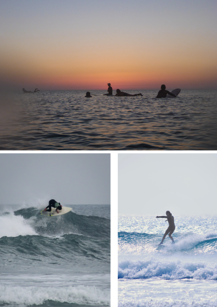
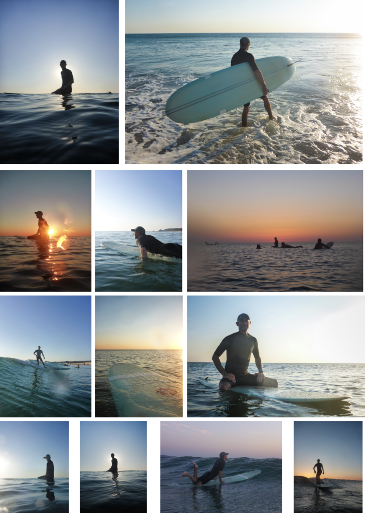
I chose to photograph the surfing community because I surf myself, and because we live on an island most other people do as well. And, I feel that the surfing community isn’t captured a lot in Jersey, so I thought I will capture it in about 10 photos.

Technically, there are two side to surfing based on the board, short boarders and long boarders. I an mostly involved with long boarding as its what I learn on years ago.

PHOTOSHOOTS

Since there are so many variables to photographing surfers, it was hard to arrange and plan what time and what day. It had to be sunny; as it makes the shot look cleaner, as there would be better light. Plus, it had to be good swell, as most people go surfing when its 2ft plus. Both the weather and swell statistics can only be seen accurately a week in advance, which made it harder to plan shots, so I just went when it the time was right.

Shoot 1 – Kempt Tower

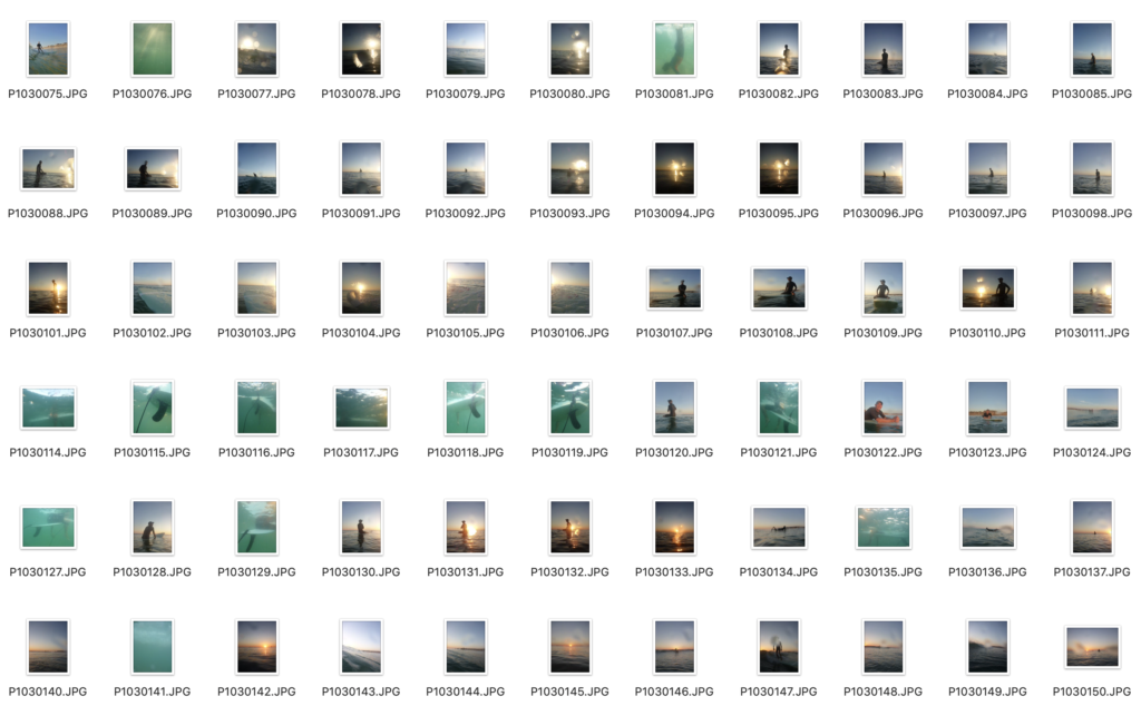
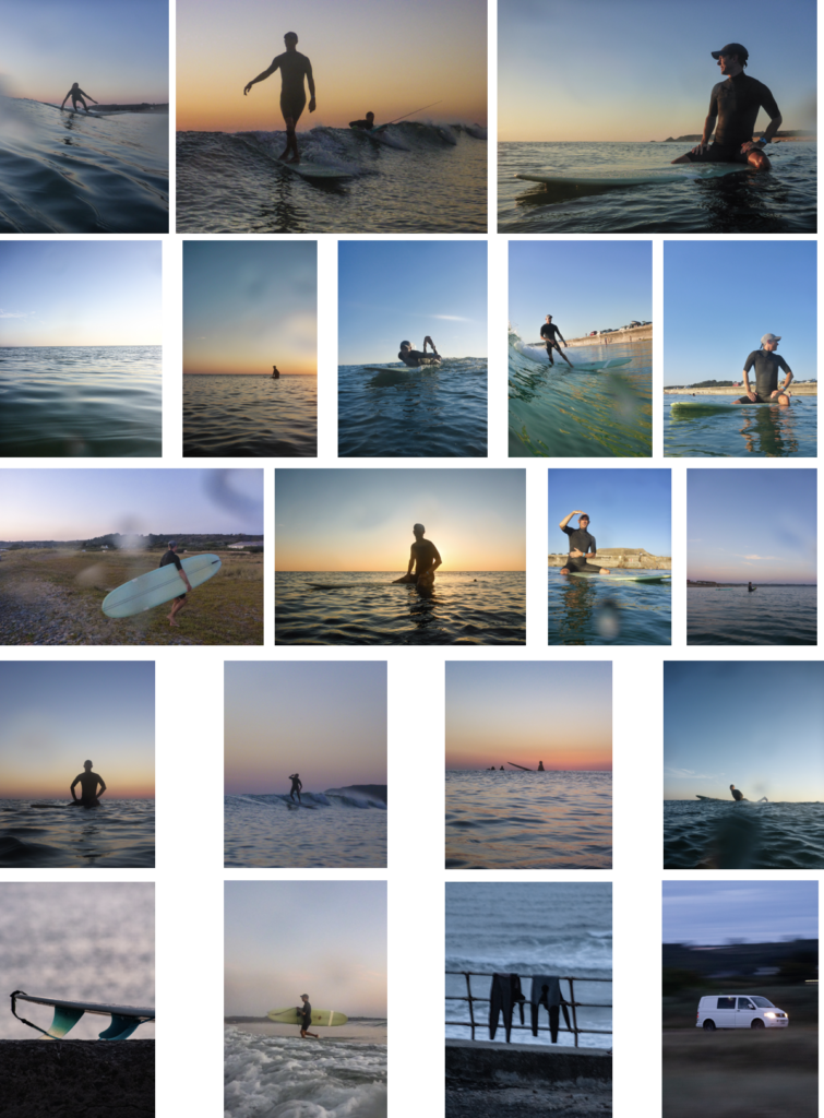
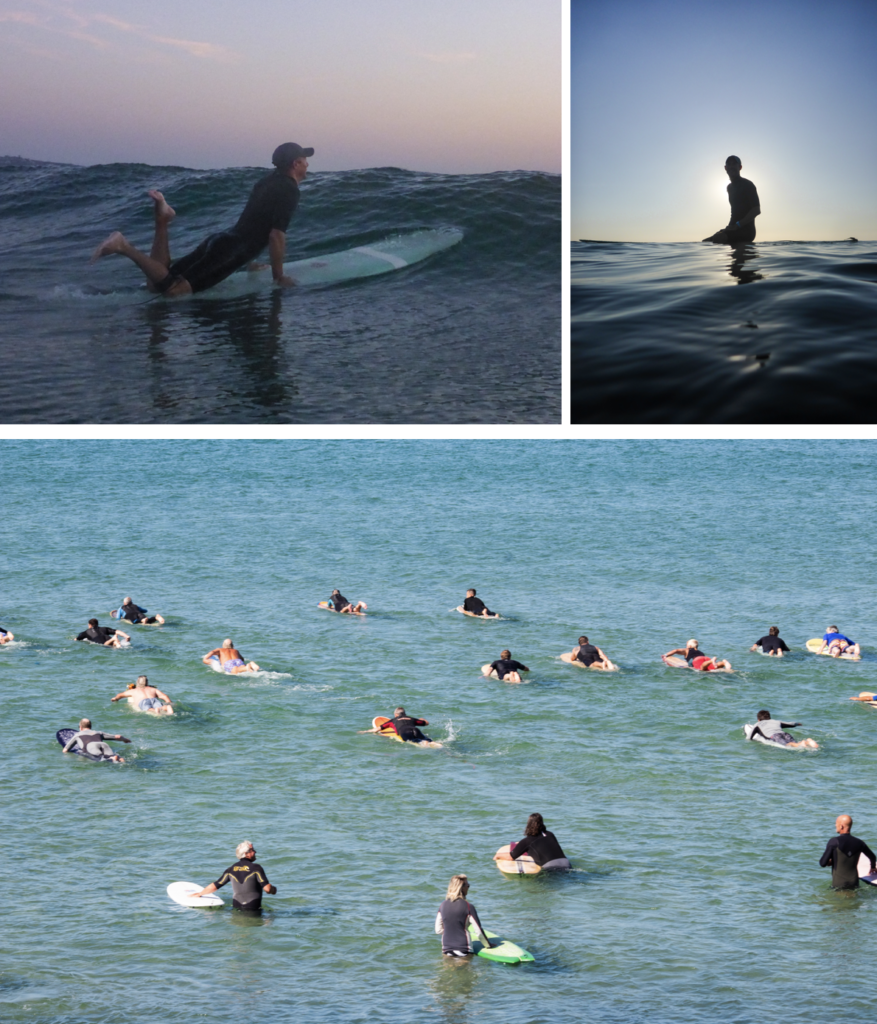
I went into the water with a waterproof camera and also a GoPro with a dome on to get 50/50 shots. I went in the evening, just before the sunset. The waves were really small, but it was a good time to take pictures of people sitting on their boards. It would be a closer insight into what it is like out back.
Shoot 2 – Water Splash, Connie Farmer Ceremony

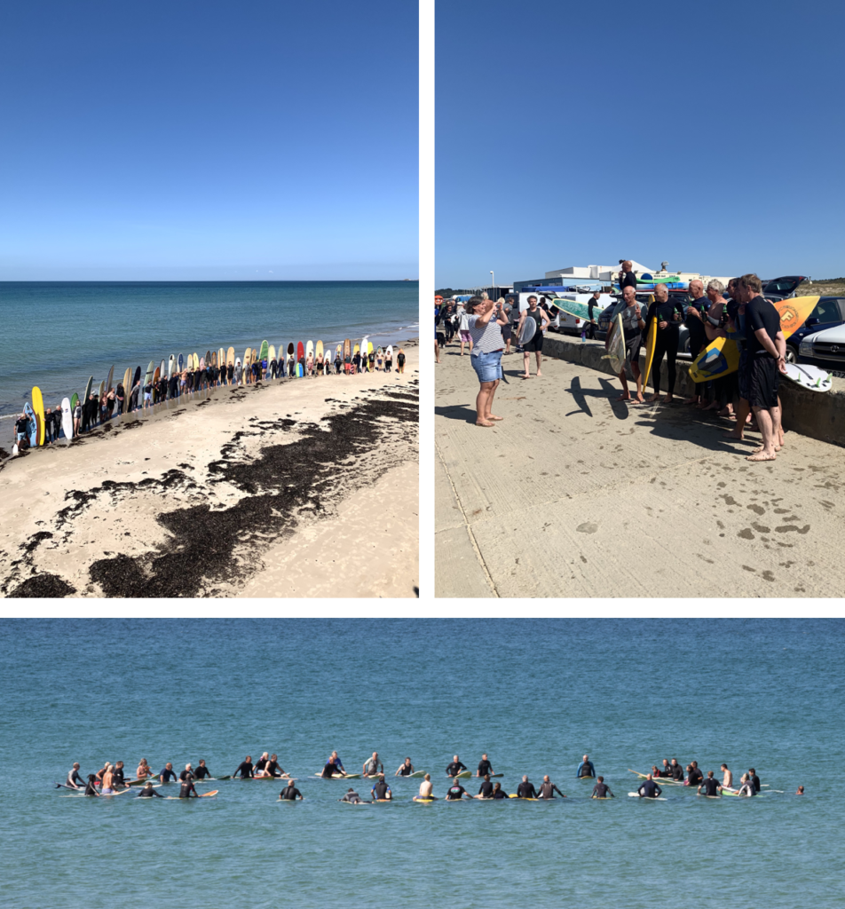
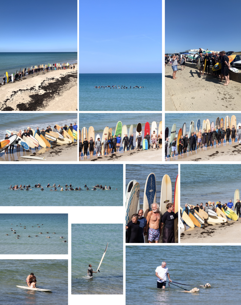
I was told that there was a paddle out ceremony, for Connie Farmer, who was a surfer in Jersey, which most the older people knew, and he was a really good surfer, and very athletic who passed away. So I captured the paddle out ceremony from the sea wall. They paddled out about 100 metres and made a circle to scatter his ashes. It shows the other side of the surfing community, and it shows how everyone is so supportive and respectful to each other, and it was great to see everyone come together.

Shoot 3 – Le Port + Shoot 4 (re-visited)

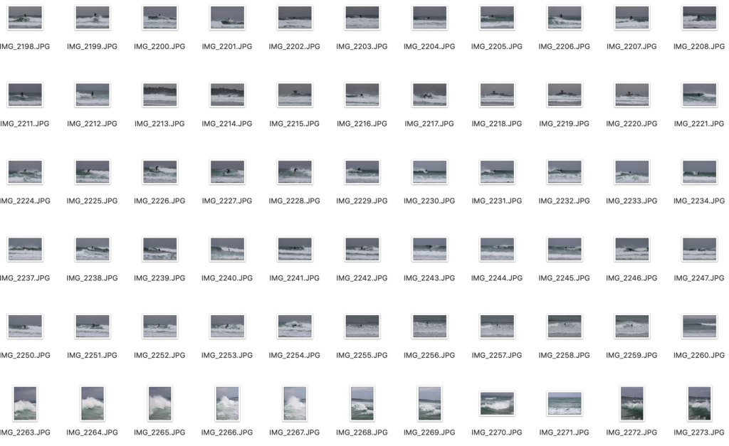
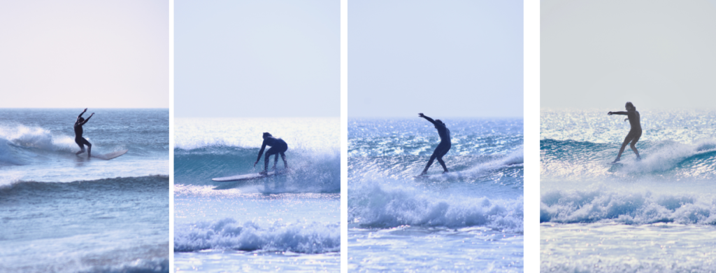
Le Port is always busy when the surf is good. So I decided to go there when the surf was good. I went down to the waters-edge and used a 100-300mm lens to capture the surfers riding the waves. Also, when the tide came up I went up on the sea wall, which gave me a better vantage point where I could see over the waves better.

I came to revisit Le Port and get more photos to have a better selection. Most the photos of fast action sports are blurry, I found 1 in 10 were not great. Which, is one of the main reasons I wanted to go back.
EDITING PROCESS

I used the same editing process for all the images. I used Adobe Lightroom CC, and used the Z and X to pick and refuse images. Then I edited all good ones, then exported them.
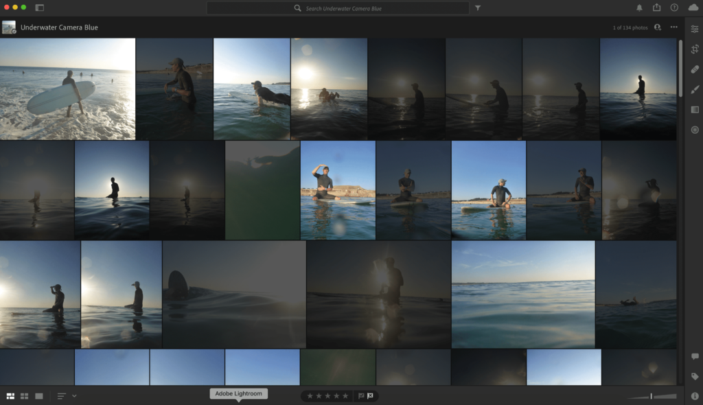
All I edited was contrast, saturation, clarity and, dehaze. Most the images didn’t need much editing don’t as I shot them in good lighting and used the right settings. Then exported them.

SHOOT RESULTS

Shot 1 – All these images turned out good. there is a variety of daylight images and sunset images, since I took them before sunset. They have a greater insight into surfing as it shows what it is like to take part.
Shoot 2 – I managed to get some good compositions, this was mainly as I was higher than everyone and I used a good zoom lens to frame the shot how I wanted to, instead of limiting myself to 55mm. Which, is the usual average lens maximum zoom.
Shoot 3 – These were shot on a cloudy day, which wasn’t ideal. However, the swell was decent, which meant there were more people to photograph, and made for some more dynamic shots.

Revisited shoot 3 – I revisited shoot 3, to try and get some shots when it was sunny. However, they turned out more blue, but I did get some more good action shots.
THE BEST SHOTS

The story of these images shows the process in order of what happens when you go surfing. First, you paddle out, then sit on you’re board until a wave comes. Then it goes to the shots when people were getting out the water, and some wetsuit hanging up. The end shots give a strong ending to the image sequence, as it shows how the surfing community comes together in important times.

EVALUATION

Overall, I am pleased with the outcome of all the images. The only thing I would change is that, I would of gone to do shoot 1 when there were bigger waves so the shots would look more intense.

To develop my images further, I would try to capture more of the community aspect in greater detail, even thought I captured a strong insight into the community, since a iconic member passed away. As I felt I captured the journey and fun side of surfing more than the community side.

Identity and Community – Artist References

Percival Dunham

Overview –

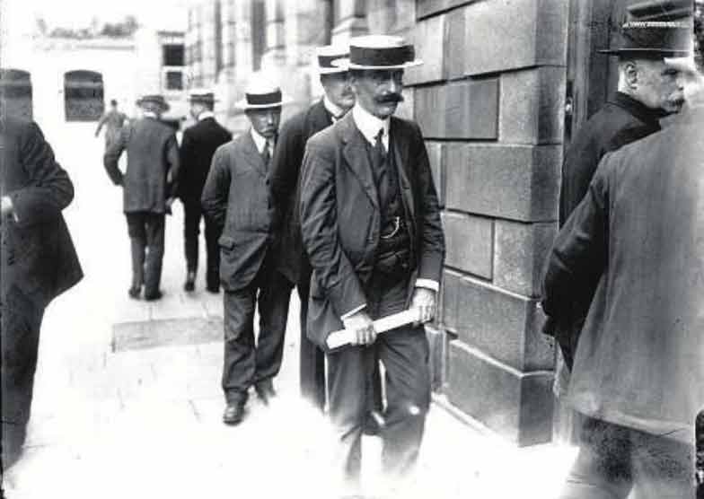
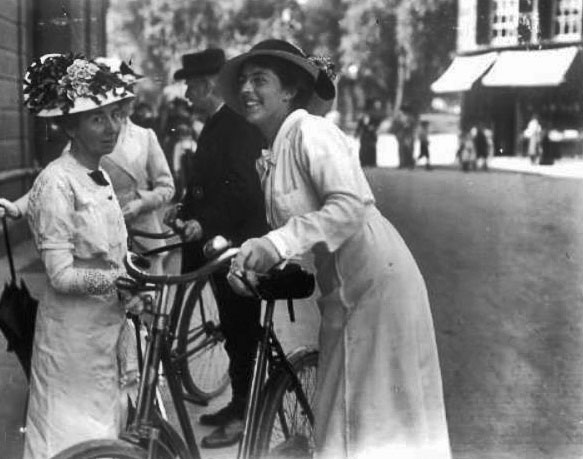
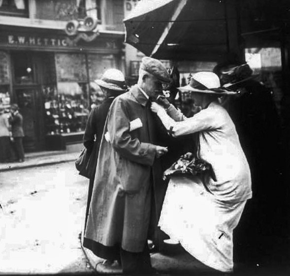
Percival Dunham worked for Jersey Illustrated Weekly and The Morning News for a brief period in 1913 and 1914 – he is known as Jersey’s very first photojournalist. Dunham had been in business as a photographer at 57 Bath Street since 1911, and had already been taking photographs of the Jersey Battle of Flowers and events such as the grounding of the Roebuck in St Brelade’s Bay in 1911. Dunham found great success while with the Illustrated Weekly and Morning News, as they were the pioneers of photojournalism, allowing Dunham to capture candid shots of the streets of Jersey in a new and upcoming style of photography. Percival Dunham presents a remarkable picture of life in Jersey before and just after the outbreak of World War One which, although it had nowhere near as dramatic impact on the island as the second global conflict which would follow 25 years later, nevertheless marked the end of an era in Jersey. More of Dunham’s images can be found here (search Dunham under ‘photographers’). His work was ahead of its time, as the term ‘photojournalist’ hadn’t even been coined yet – the images he captured relate to the modern term ‘street photography’ and show the public living their everyday lives, uninterrupted or disturbed by the camera, demonstrating sincerity in each scene.

Moodboard Of Images

George Georgiou

Overview –

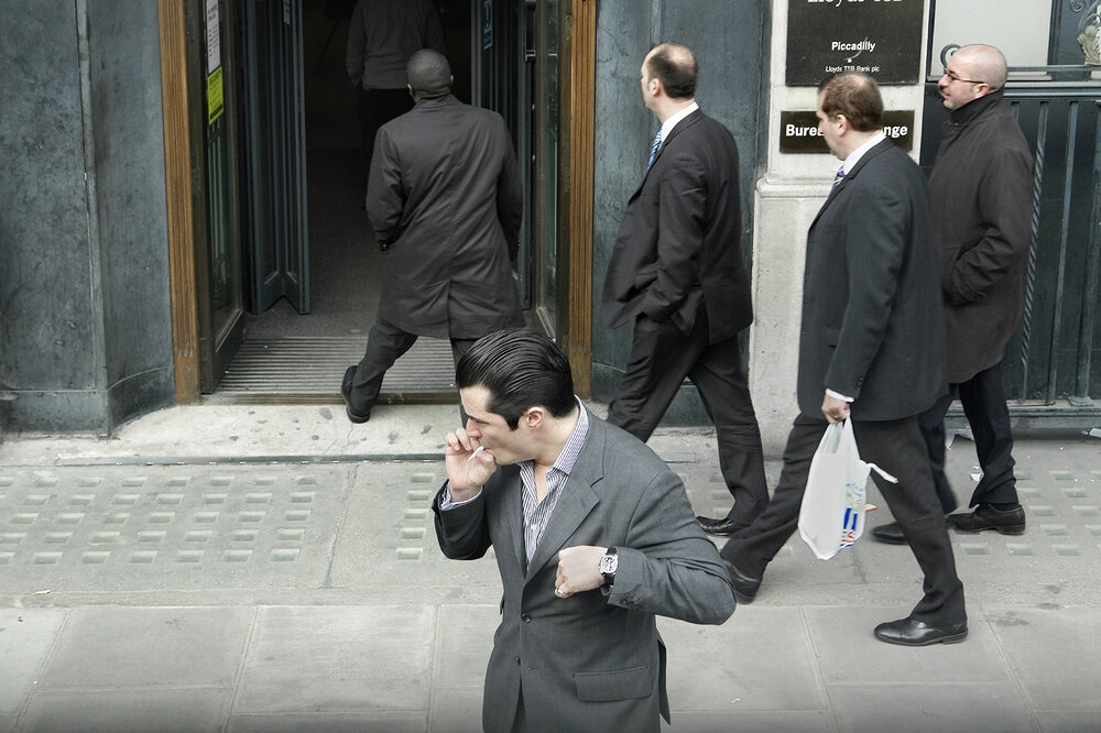
George Georgiou (1961 -) is a British photographer and Photo Journalist who studied photography at The University of Westminster. After working for six years in Serbia, Greece and eastern Europe, he was recently based for four years in Istanbul. His work in Turkey led to a series of photographs titled ‘Fault Lines/Turkey/East/West’, which has led to several exhibitions and a book. Georgiou has also taught photography at Barnet College in London and a number of workshops in Europe. Georgiou’s work mostly focuses on communities of people that are split up between different cultures. An article on Georgiou’s career wrote ‘Arriving somewhere new, Georgiou’s approach is first to unburden himself of pre-existing images of the place and to try to see through superficial differences with places he knows; he then looks for commonalities and actual differences. He starts by himself and only when well underway hopes to attract commissions and make sales.’

Last Stop –

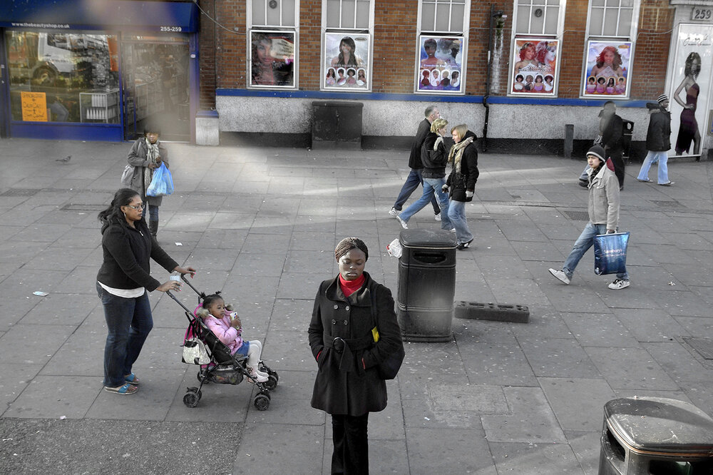
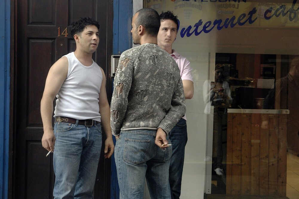
‘Last Stop’ is a series of images shot through the windows of London’s double decker buses, published as a double sided concertina book by George Georgiou in 2015. Georgiou wrote ‘The essence of Last Stop is that you might take the same route everyday but what you see, the ebb and flow on the street takes on a random nature, like a series of fleeting mini soap operas. The concertina book format reflects and mimics the flow of a bus journey, but more importantly it gives the viewer the opportunity to create their own journeys by spreading the book out and combining different images together. This moves the book away from an author-led linear narrative to one of multiple possibilities.’ Georgiou would ‘take random buses and get lost across the city’ in hopes of capturing street photography images and candid portraits from the windows of people living their everyday lives, allowing the observer to make up their story and scenario. In a video on the creation of ‘Last Stop’, Georgiou said ‘as a photographer I wanted the challenge of not having full control, taking whatever free seat there was next to the window only being able to photograph what was in reach of my static position in front of me’. I really love how he can still capture these moments without truly being involved in them, only seeing them at a glance, but portraying an entirety of different stories. When researching for my street photography photoshoot on ‘identity and community’ I wanted to take inspiration from Georgiou’s presentation of images, capturing ambiguity and mystery along with familiarity and warmth. Several of ‘Last Stop’s’ images were featured in the book Unseen London, more info can be found here.

Moodboard Of Images

Analysis – Dunham

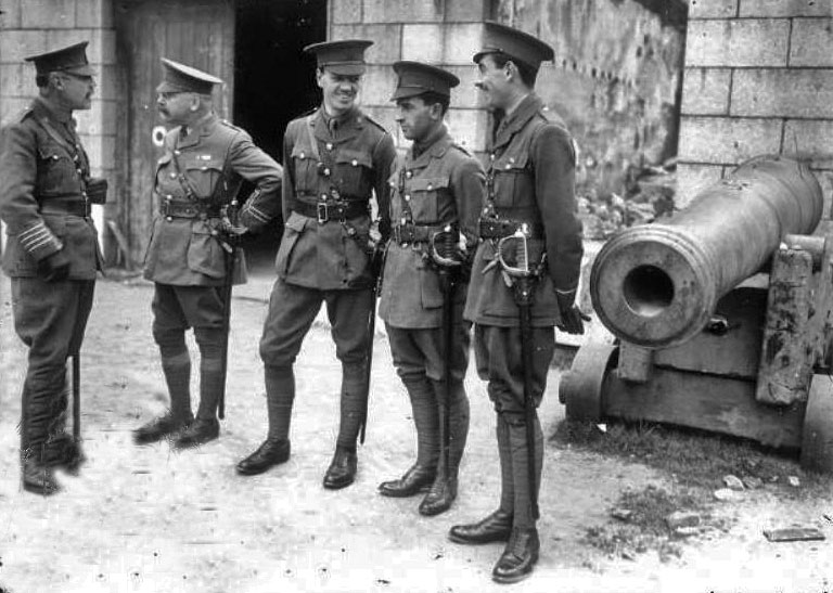
Percival Dunham | Soldiers at Town Arsenal | 1914

I made the decision to analyse this image by Percival Dunham due to it’s wide range of techniques used from ‘The Formal Elements’, yet also its ability to foreshadow and story tell. The black and white filter on the photograph shows the time period it was taken, pre-World War 1 when Dunham’s images first caught the public’s eye. From this era, we can make an assumption to which camera was used at the time; possibly the Moy & Bastie cine camera, made of wood and metal, which was the type used by British Official cinematographers working with the armed forces during the First World War. The geometric shapes on the wall behind the soldiers show defined and consistent rectangles, possibly reflecting the systematic job and duties that these men carry out. The repetition of these symmetrical shapes could link to the soldiers having to repeat the same tasks daily on the battlefield, symbolizing the methodical planning and strictness of their life. Additionally, the uniformity of straight lines created by these rectangles relates to the respect a soldier gains from his uniform.

Dunham had the ability to capture such raw moments in time, parts of history that would otherwise be imagined instead of seen. During an exhibition on Dunham’s photography at The Jersey Arts Centre in 2014 Gareth Syvret, from the Societe Jersiase, said “he really had a natural affinity for what is later called ‘the decisive moment’ in all the photographs you see around here, there are figures; he was clearly interested in the social life of the town of St Helier and Jersey and its a really powerful documentary he’s left us.” I really enjoyed this quote from Syvret as I believe it sums up Dunham’s work perfectly, with such monumental history as WWI as his setting and still creating such intimate and warm images is inspiring.

The lighting in this photograph tells such a tragic and true story, with the darkest point of the image in the background through a door behind the men- leading to a sort-of abyss of darkness and mystery. Contrastingly, the lightest point falls on the floor where the soldiers stand, creating the impression of these men starting their journey with peace and security; however lurking in the background is a foreshadowing darkness reflecting the horrors of war to come in their future. Similarly, there is a leading line created from the outline of the canon to the right of the soldiers, drawing the observers focus again to the background of the image. Here we can see a juxtaposition between the consistent pattern of ordered bricks, to the damaged building and rubble to it’s left, further in the distance. This, along with the brooding darkness behind the men, suggests Dunham wanted to capture a composition with more ambiguity and ruin further back into the image to symbolize and foreshadow how much death and destruction this war would bring.

Analysis – Georgiou

George Georgiou | Last Stop | 2015

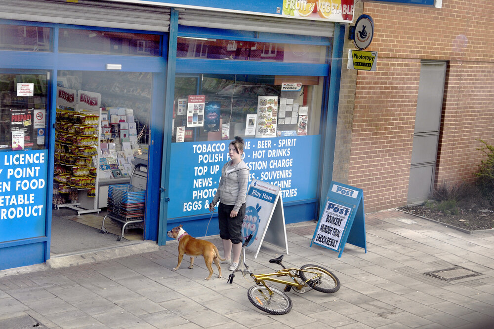
I chose to analyse this image, taken by George Georgiou in 2015, as I really enjoyed how well it told a story, a story that would be different to anyone else who saw the image. From my perspective, considering the formal elements, the reflection of the woman in the shop window on the right of the image represents how this route she walks is one taken daily – possibly taking her son to school, or going to work; the possibilities are limitless. This reflection is like a reflection of time, showing the repetition and never ending cycle she may endure while on this journey. Additionally, there are several geometric shapes in this Georgiou image, in particular the repetition of rectangles in shop windows, signs and tile flooring. The echo of this rectangular shape throughout the photo could represent uniformity and hint towards a homogeneous society where nothing is different or unique. While this series of Georgiou’s images demonstrates ‘that you might take the same route everyday but what you see, the ebb and flow on the street takes on a random nature, like a series of fleeting mini soap operas’ this one image could show a counterargument to this statement or may indicate that while the people and stories may be ever changing, the locations and surroundings witness all and stay the same. Furthermore, the range of colours in this image are limited and dull, with only brief pops of brightness of bold red, yellow, green and blue. With the only source of bright colour coming from these primary shades it reflects the child-like nature of having daily routines and set ways to live each day, as if teaching a child – Georgiou’s image may represent how each day can hold new possibilities and adventures, and that people are allowing dull ideas to overwhelm their (what should be) adventurous life.

In addition, the repetition of blue from the child’s clothing and rectangular structure on the left of the image could represent the feeling of security, as blue symbolizes trust and safety. Georgiou could be pointing out how society feels safe in their own little bubbles, isolating themselves with their own stories secret to the world around them – the child feels safe in his mother’s company, yet the story could be so different for the mother, it is for the observer to decide. A quote from Georgiou says “surveillance in the city is all around us but on the flip side of this is also our sense of invisibility, how we allow ourselves to express very private behaviour in public space, like a family argument. I see the photography as straddling, street photography, surveillance, landscape and documentary fiction.” In terms of light, the natural lighting shows it was probably mid-day as there are little shadows in the image, also hinting the weather was cloudy as there are no major reflections or highlights created by the sun. Lastly, there are many straight lines in the image, for example the straight thin lines of the shopping baskets on the right of the photo – the metallic shine on these lines is modern and mechanic, possibly portraying the idea of mass industrialization and overconsumption (also linking to this image being photographed outside a food shop). In my opinion, Georgiou capturing this repetition of a mundane, everyday object in quite a stylistic way really sums up what I have taken away from this series of images; that while everyday can be draining, similar and sometimes dull, the smallest things can make differences – life doesn’t have to be ‘an author-led linear narrative’ in the words of George Georgiou, it can ‘move to one of multiple possibilities.’

George Georgiou – Book Presentation

ZINE – Narrative And Sequencing

STORY: What is your migrant community story, for the St. Helier shoot?
Describe in:

3 words, A migrant community.
A sentence, St Helier Jersey’s migrant community featuring workers and cars.
A paragraph, This shoot represents the working people of St Helier, and their belongings, such as cars and houses. It also displays key features of the town itself.

NARRATIVE: How will you tell your story?

These are some common examples that people use to tell a story:

– Images > new photographic responses, photo-shoots
– Archives > images from SJ photo-archive, family album, mobile
– Texts > letters, documents, poems, text messages

However, I will only use images I’ve taken. This is because I feel that they tell their own story, as I’ve arranged them into a sequence which allows there to be a flow which guides the viewer through the images and tells a story.

AUDIENCE: Who is it for?

My zine will be aimed at anyone who lives in Jersey, but most specifically, St Helier. Plus, It also helps if they are 14+ as they would understand the images in more depth and detail, making it more impactful for them.

However, most image makers tend to overlook the experience of the viewer. Considering who their audience is and how they may engage with your photo-zine is important factor when they are designing/ making it.

SEQUENCING THE CONTENT – 20 images

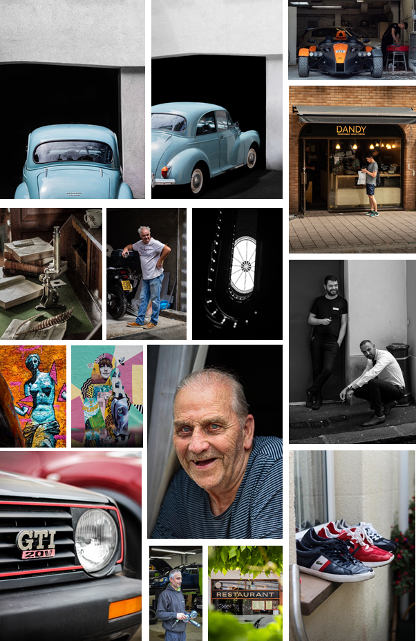
I decided not the include any images from the archive as I have taken images which juxtapose each other. Such as, the old blue Morris Minor and the red GTI Golf. This helps tell a story and emphasise differences or similarities between the cars. I will also include other methods such as “zooming out” to create similar effects.

THEME OR STORY

The front cover will be made from a zoomed in image from one of the car photos, as it is one of the main themes.

The start of the zine will contain images related to mechanics and cars. Some of images of the cars will juxtapose each other. New vs Old. The 2 images of the old car images will be full paged on the first 2 pages, as they are major establishing shots.

Near the start of the zine there will be a double page spread images of a new, modern car, which symbolise the new technology and the way forward.

There will be a 2 page spread of just street art, both the images will be full page, and both include vibrant colours, which adds a lot of colour into the project.

For the shots of the people, I will start off with 4 multiple shots one one page, of 2 street photos, then 2 full body shots, then transition into head shots and images of peoples faces.

At the end I plan for there to be images of the actual town, such as the pigeon shot, and the scaffolding and the staircase in the Jersey Museum.

I have arranged it so some images juxtapose each other and zoom into each other, creating a smooth transition between images. Most of my best images will be full page as you see a lot of detail when its bigger.

Design and Layout

Mood Board

What is a Zine?

A zine is a small-circulation self-published work of original or appropriated texts and images, usually reproduced via a copy machine. Zines are the product of either a single person or of a very small group, and are popularly photocopied into physical prints for circulation.

Zine - Wikipedia

Why Photographers Should Create Zines

Digital marketing isn’t always the most effective method of marketing your photography. That’s why photographers have been creating zines for years.

James Moreton is a photographer who is experienced in the art of zine making.

James Moreton

He is an artist who enjoys the tactile approach to photography. “I believe the photographic book is the best medium for photography. The ability to create impact by pairing, juxtaposing and sorting pictures into a flow in order to tell a story or instil an emotion in the viewer is unsurpassed by any other photographic medium” This is why zine making is an important element of a narrative project, therefore, I will incorporate it in mine.

More of James’ work here.

Craig Atkinson: Café Royal Books

Craig Atkinson is the founder of weekly publications, focussing on post-war documentary photography linked to Britain and Ireland called Café Royal Books.

This is an example of valuable photographic works being collected into the tactile and aesthetically sequential format of a zine. “The publications are bought as gifts, as nostalgic reminders. They’re used as reference for film makers, producers, screen writers and costumes designers. Universities collect the books to allow students access to the large collected history of this genre of photography, which hasn’t existed to this extent, in print, before Café Royal Books.” This shows the importance of having a tactile form of work to inspire and reference, which zines seem to capture very well.

Atkinsons zines have an aesthetic formality and consistency which I want to replicate in my zine in some form.

This video by an independent artist encapsulates the zine making process

I want my design to look like a romantisized interpretation of the buildings and communities in St Helier, I want the viewer to feel like they are walking through the town and meeting the people in my compositions when they flip through the zine.

My Format, size and orientation will be as follows:

width: 148mm
height: 210
pages: 16
orientation: portrait
columns:2
column gutter: 5mm
margins: top, bottom, inside, outside: 10mm
bleed: top, bottom, inside, outside: 3mm

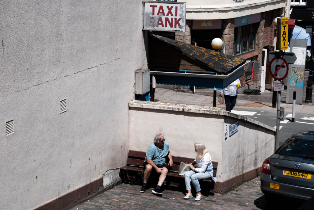
The Title for my project is ‘Rank’. This plays on the difference in class the migrants withhold, it also plays on the common feature of most towns – a taxi rank, finally it plays on the slang word for something that is disgusting – this disgust refers to the vast difference in class. I also want to caption each image with a vague subtitle allowing the viewer to think about the images in different ways.

I began by setting up my page colour to be a grey shade. I made sure I added this colour all the way to the bleed line to make sure it printed in full grey without a border. I made my page colour grey to add additional dark colour to the urbanism in my images.
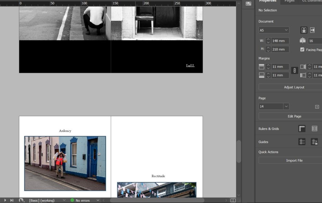
During experimenting, I decided that to enhance my narrative sequence I would rather have a different page colour for each page to enhance and compliment the aesthetic of each image individually. Following on from this I decided that every two parallel pages will have correlation and therefore share the same themes including page colour.

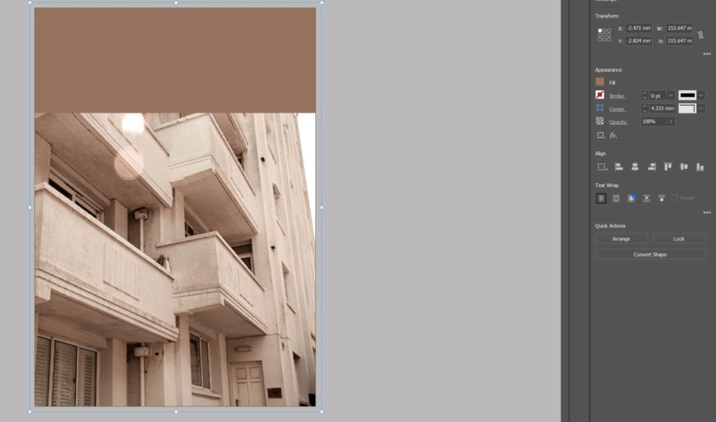
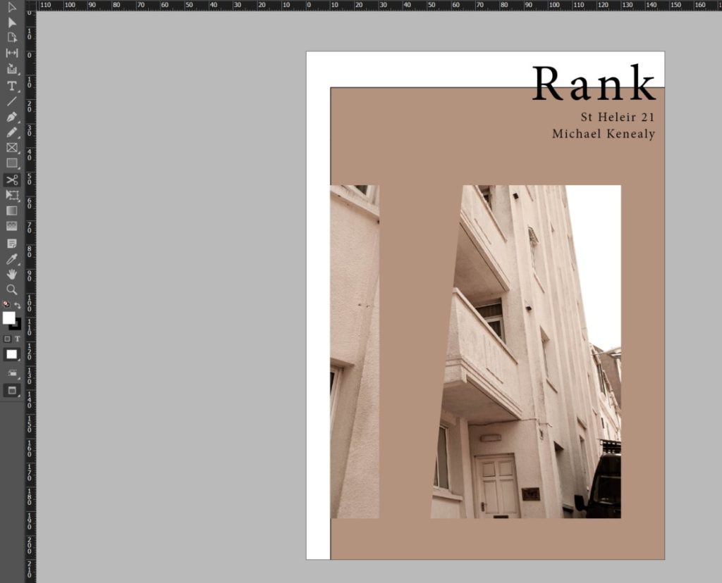
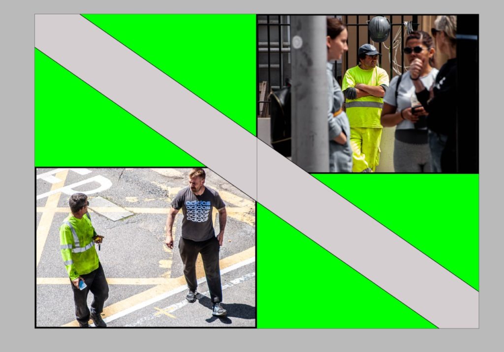
I then decided I want a more abstract look to my front cover as I wanted my zine to entice the viewer and have a more experimental theme. I did this by using the scissors tool to displace images and create different proportions and borders.
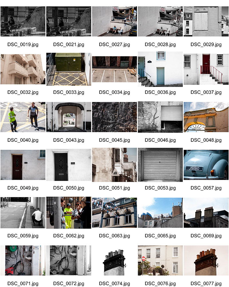
I then started adding a theme to each spread. As you can see below I introduced visual elements from my images into the rest of the spread to further develop the narrative and aesthetic of the zine.

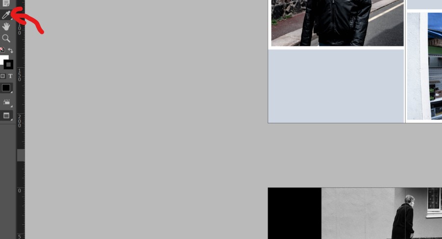
I did this by using the eyedropper tool to select a colour from the image to use as the page colour of the spread.

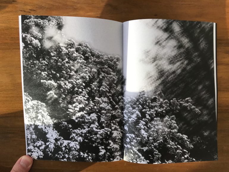
I also decided to experiment with how the page splits my images over the spread by applying some images over two pages like the image below.

I then designed a back page that correlated with the front page by using the same colours and themes.

I then scrolled through my zine adding vague image captions to further the narrative and encourage more thought about the purpose of the project.

Final Evaluation

Throughout the project I was able to endeavour into a pit of knowledge with two territories. The first being the historical and cultural contexts of Jersey and learning more about the rich cultural history the island holds. This led to understanding more about migrant communities which was the predominant theme I was exploring. The second territory of knowledge I gained was that of myself awareness. I was able to learn more about my position in Jersey’s community and my similarities and differences to others in my communities. This identity discovery waws fuelled by experiencing new people and cultures while exploring this topic and learning about the history of the place I call home. I also gained insight into an entirely different scope of art, this being the history of architecture in St Helier. I gained knowledge from an experienced historian and architect from a walk examining the wealth of historic buildings and attractive townscapes that characterise Jersey’s capital. He walked through the history of specific areas through archival records. I was also able to explore the beautifully restored Victorian House and enter the drama of a Victorian family in crisis which developed my insight into the history of how Jersey’s economy and infrastructure came to be.

I was additionally able to apply and channel my knowledge of zine making into a tangible project. I learnt about new software – Adobe InDesign and its useful qualities in terms of creating professional print works. I learnt about other significant zine publishers in Jersey – ED.EM. and others like Café Royal Books and apply them to my project. I was able to turn an idea into a tangible and aesthetically planned narrative which matched my intentions of this project sufficiently.

Narrative and Sequencing

STORY: What is your migrant community story?
Describe in:

  1. Scenario, connection, diversity
  2. Depictions of the everyday lives of migrants and their communities in St Helier.
  3. Capturing everyday lives of the vast range of people that have migrated to St Helier. The way these people have formed communities and how the different communities differ in various elements but mainly their aesthetic differences. The different social and historic contexts that have defined these people.
  1. A migrant community

NARRATIVE: How will you tell your story

I will use a sequence of deliberately positioned images which capture the essence of the story in an aesthetic way and also act on the narrative. They are positioned in a way were the images trigger questions and ideas about the subjects photographed and the narrative is told through how the images are sequenced and how the reader is guided from one image to the next.

AUDIENCE: Who is it for?

Most image makers tend to overlook the experience of the viewer. Considering who your audience is and how they may engage with your photo-zine is important factor when you are designing/ making it.

I want to lure in a wide audience who live in Jersey. My project highlights the fact that everyone in Jersey is essentially an immigrant and it is important to learn about the social and historic context regarding how and why these communities have formed. Therefore, I want to specifically target an audience that is lives in Jersey but is not essentially from jersey. I also want to target a specific ‘young adult audience’; 15 -25. This is so that the younger generation of big thinkers can start to ask questions about their heritage and educate themselves about the Island and its cultures and bands of people.

Editing

Edits from all shoots:

I believe that during the editing process I was able to dramatize and romanticise the locations and people of St Helier proficiently. I used a series of dramatic contrasting and aesthetic composition to begin telling the story of migrant communities in St Helier. I believe in order to start composing an effective narrative I needed to start categorizing and grouping images. This leads on to the next step in the process, sequencing.

Sequencing

I began narrowing my image range down from about 100 images to only 18 images.

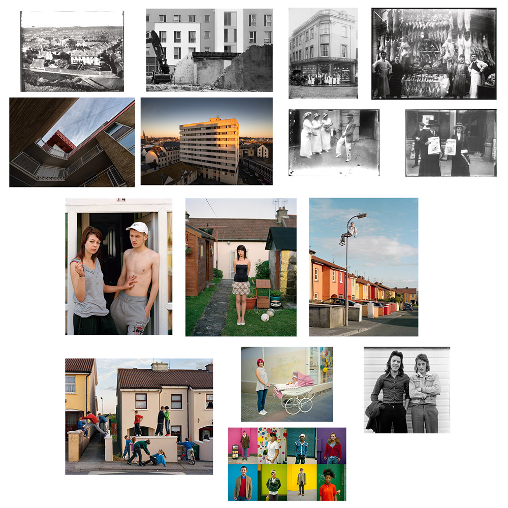
I then began a tactile process of printing my images out and, by hand organizing them into a sequence. This is so that I could move them around quickly to experiment different combinations with ease and visually connect and sequence the images. This allowed me to notice that my combination of architectural images of different styles of buildings in St Helier had correlation, visually and culturally, with the portraits of individuals in the communities. There were also a few images where I felt certain characters in them had interconnections with others, I therefore chose to position these images together in the sequence. I began to connect and contrast these together until I found a perfect sequence that told the story of St Helier’s migrant communities. This sequence is seen below in order. The

Archives – Essay

Societe Jersiaise is home to a photographic archive holding 100 000 images. It is the primary collection of images in the nineteenth and twentieth century in Jersey. The archive contains images dating back to the mid-1840s. England and France are two nations who were highly innovative in developing the practice of photography from its early stages. Jersey, being sandwiched right between these gave it a rich history of photography that the archive stores away safely. This was also because when photography arrived at the Island 9 months after its discovery in 1840, it was practiced without the worry of patents restricting the medium. The archive came to be in 1873. Included in its creation were a museum and a library. The society immediately realised the importance of recording photographic history as well as buildings, monuments, and ruins. With passion for documenting through the medium of photography consistently developing for over 140 years the archive has resultantly gathered an immense record of Jersey’s history and, consequently, an amazing capsule of the history of the art of photography. By the boom of photography and its technological developments in the 1860s, the number of photography studios in St Helier has increased drastically. The archive is located in St Helier, on Pier Road which is right beside where the bustling Jersey merchant traders used to operate. Merchant trading and ship trading were huge markets in Jersey, this makes the location of Societe Jersiaise quite appropriate. The archive holds works from many photographers that operated in these locations during the boom. Early photographers such as William Collie, Charles Hugo, Thomas Sutton and Henry Mullins. Included as well are later nineteenth century photographers such as Clarence Ouless, Ernest Baudoux and Albert Smith. To follow in the 20th century the archive holds very value images from a rich point in history in Jersey. This being WWII; specifically, images from the German occupation and the liberation of the island. This proves the idea that we can learn about the different people and communities that developed through history by looking at Jerseys past. We get a direct link between what the photographers experienced and the image they took. This correlates with the idea that most people in modern times exercise some form of archiving. Archives such as family albums are common medium found in many homes. Family albums are an example of photos taken over a period and preserved within a family. They hold a special importance for many families. Just by opening it every once in a while, memories are reminisced on, evoking strong emotions and nostalgia. These archives are normally in physical form, normally a little photobook stored away in a cupboard or on the coffee table. These have tangibility about them, and a person can connect with the archive by physically picking up the album and flicking through the pages. However, some everyday archives are kept in digital format. As we move to a more digital age, almost everyone alive has a mobile phone stuck to their hand. This means that almost everyone is some form of archivist. Most of us have vast albums of photos on our mobile devices. Newer phones are always coming out with larger amounts of storage to facilitate these images. This means most of us are carrying around a rich archive of images we have created and preserved on our mobile devices. We carry around affluent history on our phones. Even the text messages we have accumulated over years and years can be seen as a form of an archive. These archives can immediately tell a comprehensive story about one’s personality and history. Detailed insight into a person’s life and their experiences, their relationships, their interests, where they live, their career and everything in between just by looking at their camera album on their phone. This further gives understanding of society and its technological development along with its cultural development and history.

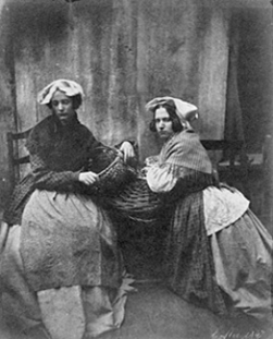
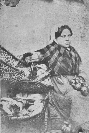
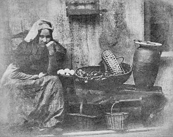
William Collie was a Jersey photographer from the 19th century. Some of Colliers previously unpublished photographs featured in an exhibition at the Musée Dorsay in Paris in 2008. This exhibition boasted some of the first photographs taken on paper in Britain from 1840 to 1860. Below is one of those photographs. It was taken in 1847. It is of Jersey Market women.

This photograph leads onto the next interesting element to note about Williams work. Williams works capturing these portrait style images was one of the earliest signs of tableau photography recorded. Tableau photography is an intentional form of photographing characters who are arranged for picturesque or dramatic effect and appear absorbed and completely unaware of the existence of the photographer/viewer. His work is featured at Societe Jersiaise’s archive. The archive further gives us knowledge of some of the first photos ever taken. William’s contribution is highly valuable. This is not just because he was one of the first to bring photography to the island but because we start to see the contribution of artistic entries into the archive as apposed to just documentative entries. The archive can provide an archaeological view into when photography started to shift from a documentative process to a more artistic one; all due to Williams early tableau works.  

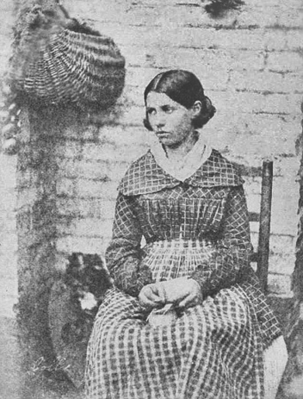
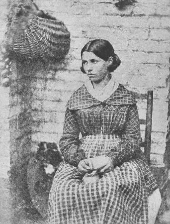
The above photograph is part of Williams ‘Market Women’ collection. The image is of a professionally composed tableau portrait where a young lady is dressed as a Jersey market woman. She is wearing what would be working class clothing of the time. The mise en scene of the image tells the story of a market environment with the hanging basket and what seems to be produced on the ground. The subject has been directed to look away from the lens. This enforces a notion that the subject is absorbed and used to create a dramatic effect; this almost gives the character a sense of elegance but also sovereignty. This sense of emotion the lady is portraying could give us an understanding of the historical context of the image as in the 19th century Jersey saw massive changes in society. A large influx of immigrants from England made Jersey a more connected island than ever before and brought with it cultural changes and the desire for political reform. During this period, the States reformed to become more representative of the population and the Jersey culture became more anglicised and less religious. The island also grew economically, and the built-up areas of the island expanded, especially St Helier, with the development of public transport on the island. This lady could have been represented as a part of this powerful time in St Helier as she is portrayed as a market woman, aiding in the growth of the town. William Collie was probably the first photographer to use the calotype process in Jersey. This is a technique, were a sheet of paper coated with silver chloride was exposed to light in a camera obscura; those areas hit by light became dark in tone, yielding a negative image. The image has an artistic contrast created by the calotype method of photography that Collier was renowned for. The negative light gives a wide tonal range from dark tones in the subject’s hair to a pure white tone just an inch down on her collar. This contrast also gives the background a grainy texture as the shadows on the bricks are accentuated. I believe this allows the viewer to focus on the structure of the image and creates a clear contrast which builds the foundation of the image and shines focus on the features of the character being shot.

In conclusion a lot can be gained from archives in terms of physical, political and social contexts in our society by looking at history in a sensory fashion; looking at images gives us a way to see through the eyes of people living different lives before us. We learn about the different emotions of each social structures at different times by interpreting the photographers’ emotions that get portrayed into an image. This will be the fashion I approach documenting communities in St Helier. I want to be able to capture detailed history of the communities at the time but at the same time interpreting William Collies artistic approach to capture the emotion of the social structures through my images.

Identity and Community – Artist Inspirations

William Collie

William Collie was a Jersey photographer from the 19th century. He was introduced to me at the societe jersiaise photo archive.

https://societe-jersiaise.org/photographic-archive

William Collie was probably the first photographer to use the calotype process in Jersey. This is a technique, were a sheet of paper coated with silver chloride was exposed to light in a camera obscura; those areas hit by light became dark in tone, yielding a negative image.

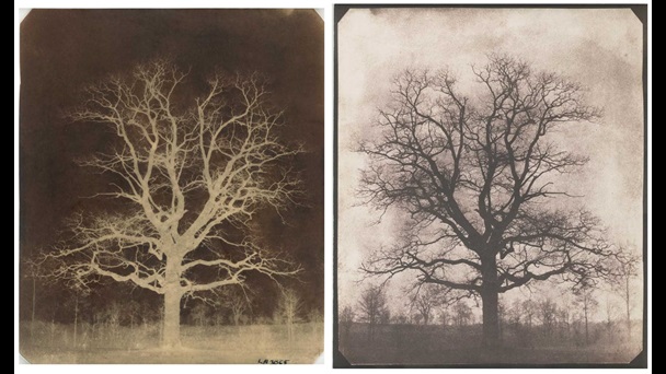
An oak tree in winter – William Henry Fox – 1842

The first pioneer of calotypes was a photographer called Willam Henry Fox.

Some of Colliers previously unpublished photographs featured alongside those of Fox in an exhibition at the Musée Dorsay in Paris in 2008. This exhibition boasted some of the first photographs taken on paper in Britain from 1840 to 1860. Below is one of those photographs. It was taken in 1847. It is of Jersey Market women.

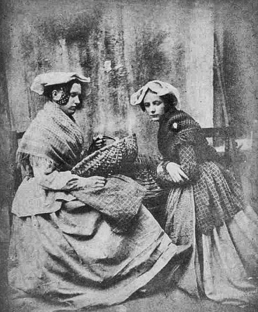
This photograph leads onto the next interesting element to note about Williams work. Williams work capturing these portrait style images was one of the earliest signs of tableau photography recorded. Tableau photography is an intentional form of photographing characters whom are arranged for picturesque or dramatic effect and appear absorbed and completely unaware of the existence of the photographer/viewer.

Marin Toft – from Tableaux Vivants

William shot a series of photographs, some of the oldest in Jersey, of Jersey market women. They were tableau photographs were the women were dressed up to look like market women.

I believe this was a huge step into the progress of photography, specifically photography as an artform. Photography during Colliers era was mainly focused on documentative intentions, photos were mainly used to record events, document, log and report. William was part of the early photographers who brought an essence of art and creativity to photography and these early tableau’s support this notion.

The above photograph is part of Williams ‘Market Women’ collection. The image is of a professionally composed tableau portrait where a young lady is dressed as a Jersey market woman. She is wearing what would be working class clothing of the time. The mise en scene of the image tells the story of a market environment with the hanging basket and what seems to be produce on the ground. The subject has been directed to look away from the lens. This enforces a notion that the subject is absorbed and used to create a dramatic effect; this almost gives the character a sense of elegance but also sovereignty . This sense of emotion the lady is portraying could give us an understanding of the historical context of the image as in the 19th century Jersey saw massive changes in society. A large influx of immigrants from England made Jersey a more connected island than ever before, and brought with it cultural changes and the desire for political reform. During this period, the States reformed to become more representative of the population and the Jersey culture became more anglicised and less religious. The island also grew economically and the built-up areas of the island expanded, especially St Helier, with the development of public transport on the island. This lady could have been represented as a part of this powerful time in St Helier as she is portrayed as a market woman, aiding in the growth of the town. The image has an artistic contrast created by the calotype method of photography that Collier was renowned for. The negative light give a wide tonal range from dark tones in the subjects hair to a pure white tone just an inch down on her collar. This contrast also gives the background a grainy texture as the shadows on the bricks are accentuated.

Dana Lixenberg
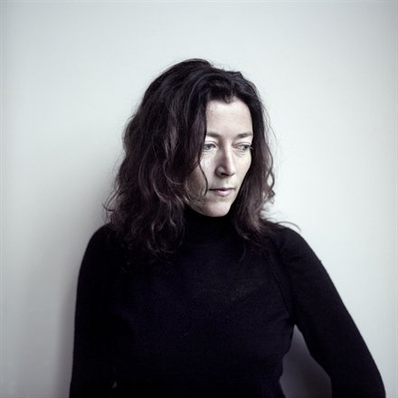
Dana Lixenberg is a Dutch photographer and filmmaker. She lives and works in New York and Amsterdam. Lixenberg pursues long-term projects on individuals and communities on the margins of society.

(self portrait)

Her work strips down her subjects to their fundamental characteristics. Her photographs allow the viewer to interoperate every element of the characters identity and essence.

Dana uses a large format field camera which are completely mechanical sheet film photography cameras. The process is highly meticulous, none the less Dana sacrifices convenience for high quality negatives. I believe that Danas use of these cameras is also a way of making the photography process a more meaningful tangible affair. This sentimental process is also probably a method of connecting with the subject she is shooting more, as her passion is contagious and will leak into the subject she shoots.

It makes the process what Dana calls a ‘slow dance’ with her subjects.

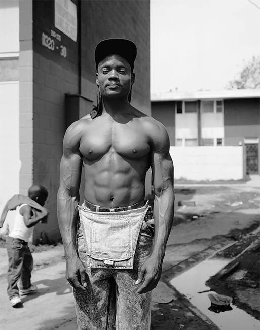
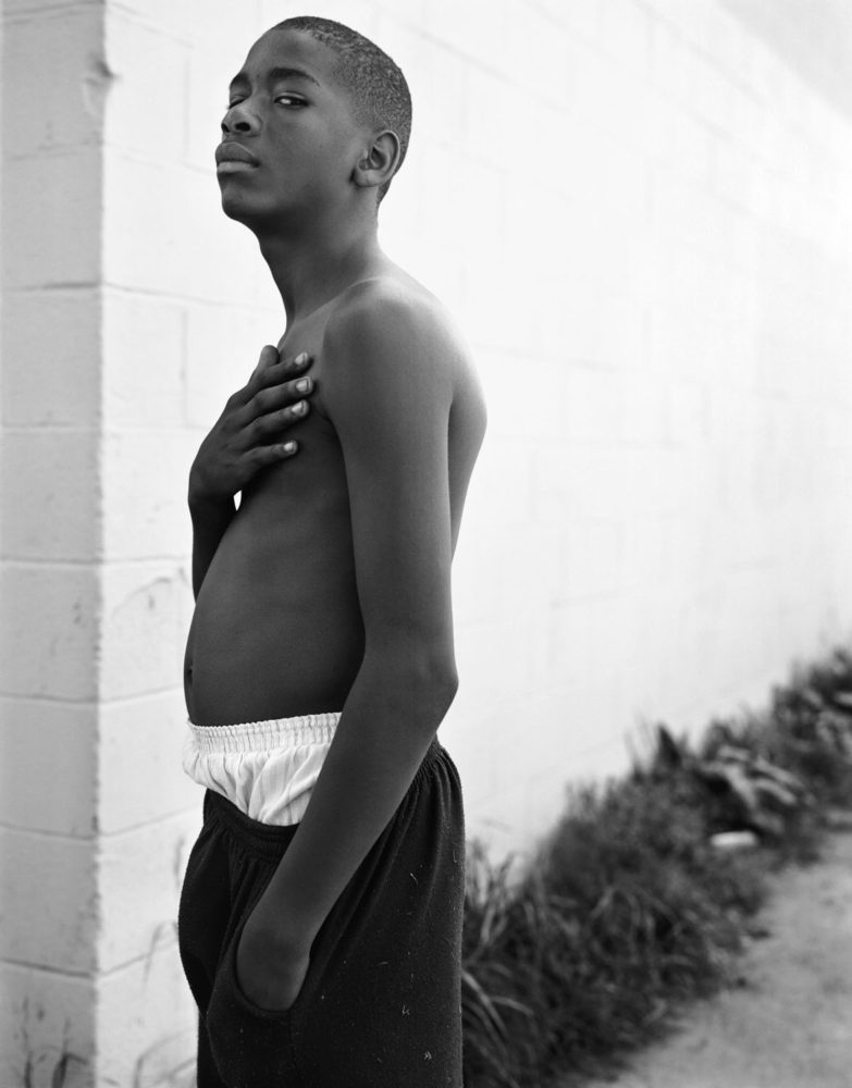
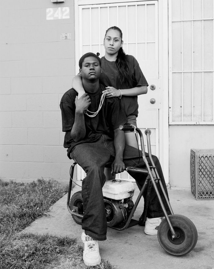
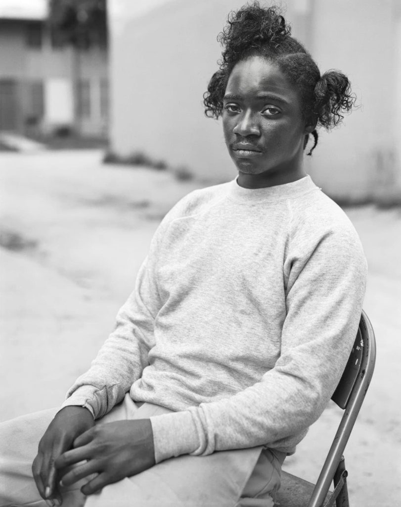
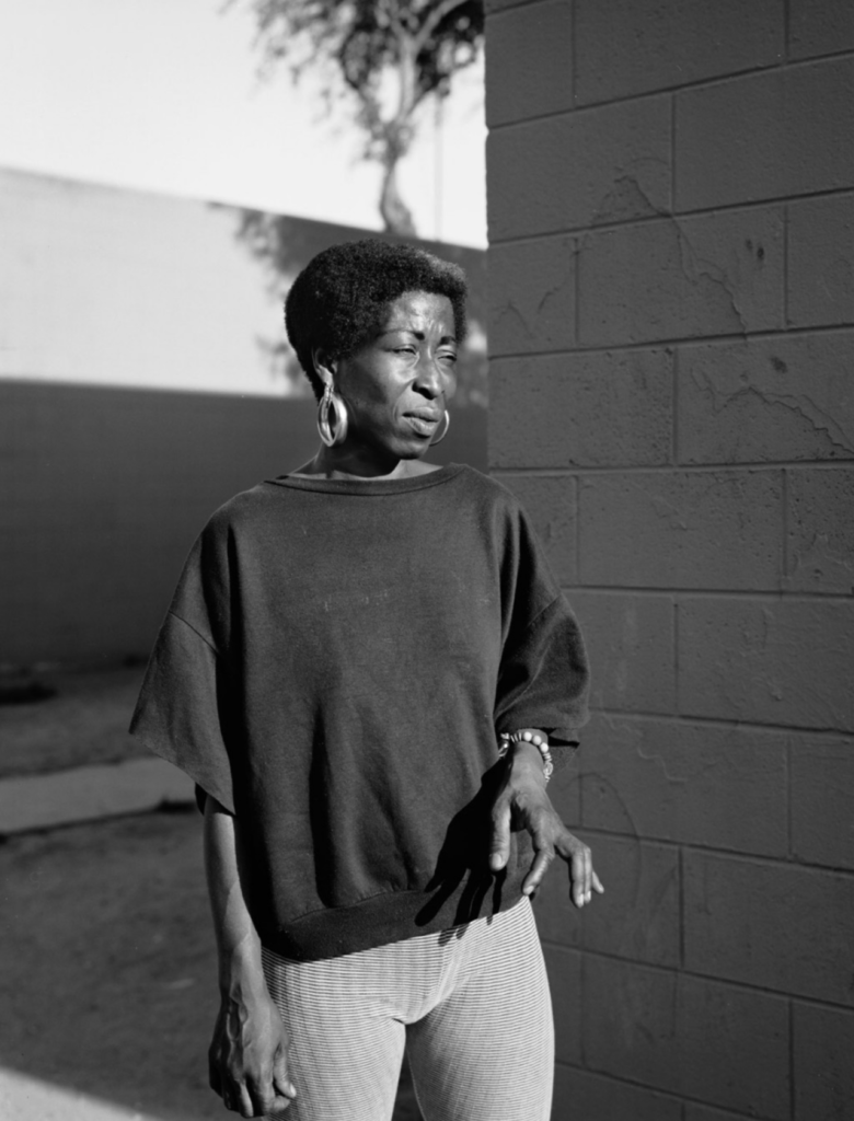
Dana pursues long-term projects with a primary focus on marginalized communities. One of these projects being Imperial Courts 1993 -2015.  It is Lixenberg’s most extensive body of work to date. The project took inspiration directly after the 1992 Rodney King riots. Spanning 22 years, the project tracks the shifting configuration of an underserved community in Watts, Los Angeles. In contrast to the often one dimensional, sensationalized media coverage of this neighborhood, Lixenberg employs a more unobtrusive and community driven photographic approach. Like her other projects, Imperial Courts consists of a series of photographs and a publication. Exploring other media for the first time, Lixenberg also included audio recordings and created a three-channel video installation. The project was awarded the Deutsche Börse Photography Foundation Prize in 2017 and continues to be exhibited internationally.

http://www.imperialcourtsproject.com/

She manages to give us such an in depth look into the residents of this neighbourhood with just street portraiture.

The above is a comparison between William Collie’s image on the left with Dana Lixenberg’s image on the right. Both these photographers are highly evolutionary with the art of photography and telling a story; they both strived to get the most out of their subject. William is pioneering new photographic technology and new styles of shooting portraiture in an artistic way. Dana is evolutionary in the opposite way. She did not try and implement the newest technologies but rather stepped away from the mainstream digital boom of photography she was born into and used older equipment to make her photography a connecting process with her subjects.

Both images are negatives and feature a black and white colour scheme. I believe this allows the viewer to focus on the structure of the image and creates a clear contrast which builds the foundation of the image and shines focus on the features of the character being shot. Both images are composed in a similar way with their subject sat down in a similar way with similar body language. The way their body’s are at a tilt and their hands are together allows both photographers to capture the subjects sense of innocence. The main difference with how the subjects have been composed is that Dana’s is engaging with the camera by looking directly into it; whilst Williams’ subject is pretending the camera isn’t there. Danas portrait makes the viewer feel as if they are engaging with the subject in a personal way whilst William’s is more tableau, making the viewer feel like they are ‘standing on the side-lines’ watching a natural scene take place.

Dana uses a very narrow aperture lens. This gives her image a shallow depth of field and a lot of bokeh. This isolates the subject and creates a neat visual aesthetic with not too many elements clashing. On the other hand William has everything in focus in his portrait. This intentionally allows the viewer to interoperate what environment the woman is in, thus giving her the identity of a market woman.

Identity and Community – Photo Walks

With this series of images I attempt to tell a story about an area of St Helier with historical or contemporary links with migrant communities.

My work will focus on three main elements to capture the historical context of the theme of identity and community in St Helier:

A sense of place – for example; location, site, environment, residential area, communal park, architecture and details, Interior of church, community centre, house or home.

Character of community – for example; street scene, decisive moment, staging or performing for the camera.

People and portraiture – For example, a resident outside his/her house/apartment block, shop/ business owner, street portrait/ passer-by.

I focused on three contrasting areas of St Helier:

Route 1: Merchant quarter – This area of town was once where the core community of merchants were located. It was once located right on the waters edge in the 1800s but now boarders the marina – this gives merchants easy access to their ships and therefore gives insight into why this area is dubbed the merchant quarter. I enjoyed photographing the character of community in this area as people fused with their environment and seemed to interact with it well.

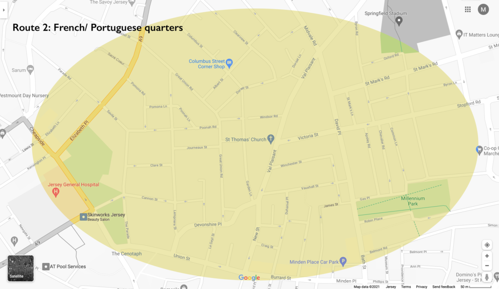
Route 2: French/ Portuguese quarters – This area of town is where most of the European migrant such as the large number of French and Portuguese people that began settling. This area features a diverse range of neighbourly people who form a lively community. This is why I found this area was most interesting to shoot in terms of people and portraiture.

Route 3: British expats/ wealthy residents (Rouge Boullion) – The United Kingdom is Jersey’s closest international partner. Deep social, cultural, economic and constitutional links between us have been built up and maintained over hundreds of years. This area is where most of the wealthy residents and British expats began to settle. The rich architecture in this area is what I found most interesting to shoot. The wealthy British would bring their builders over from the UK to build the magnificent houses. Shooting a sense of place in this area was what I focused on.

Mood Boards

Sense of Place

Character of Community

People and Portraiture

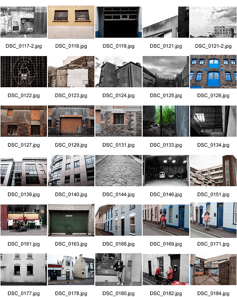
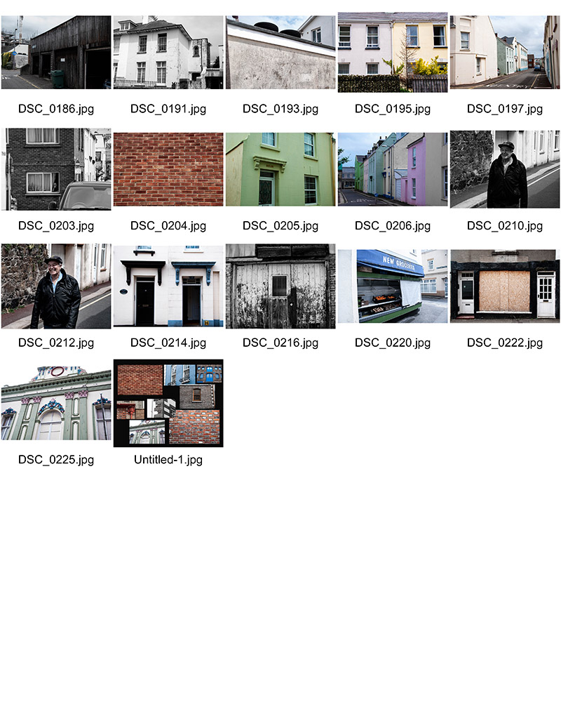
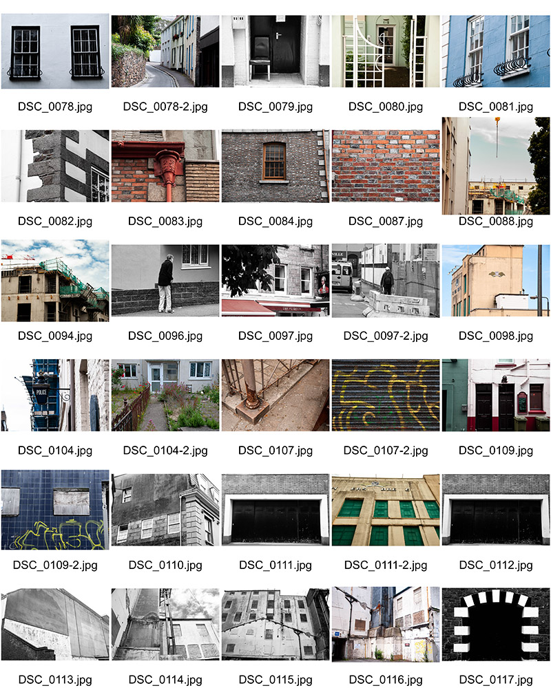
Contact Sheets

Shoot 1 – a sense of place

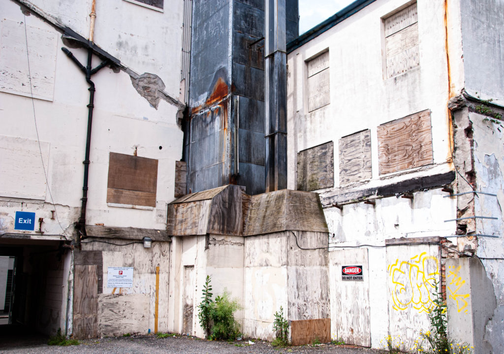
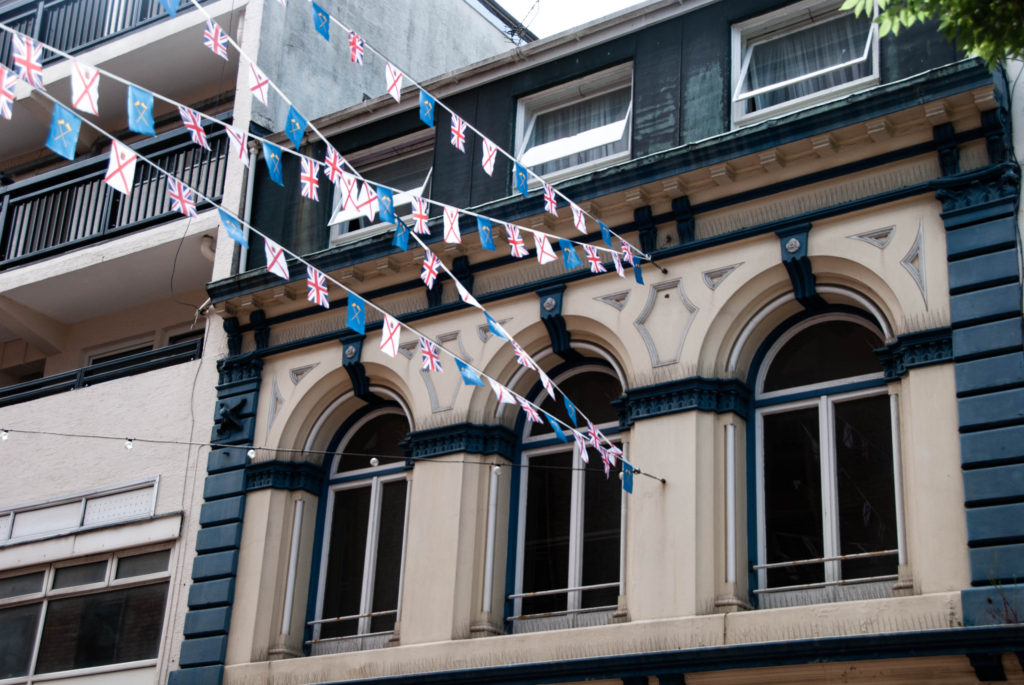
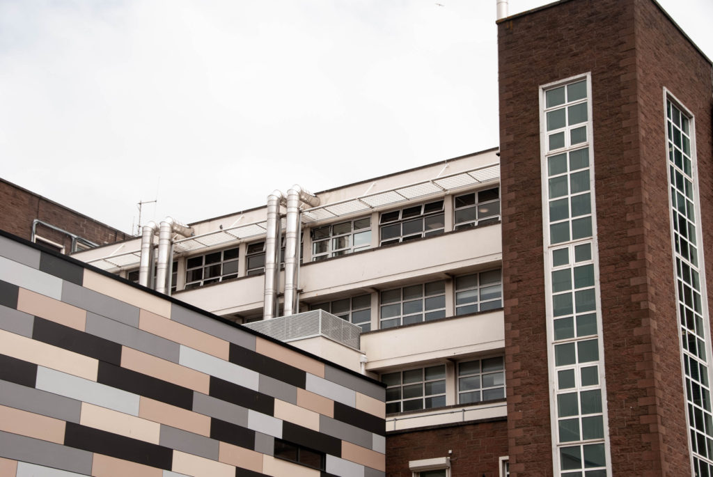
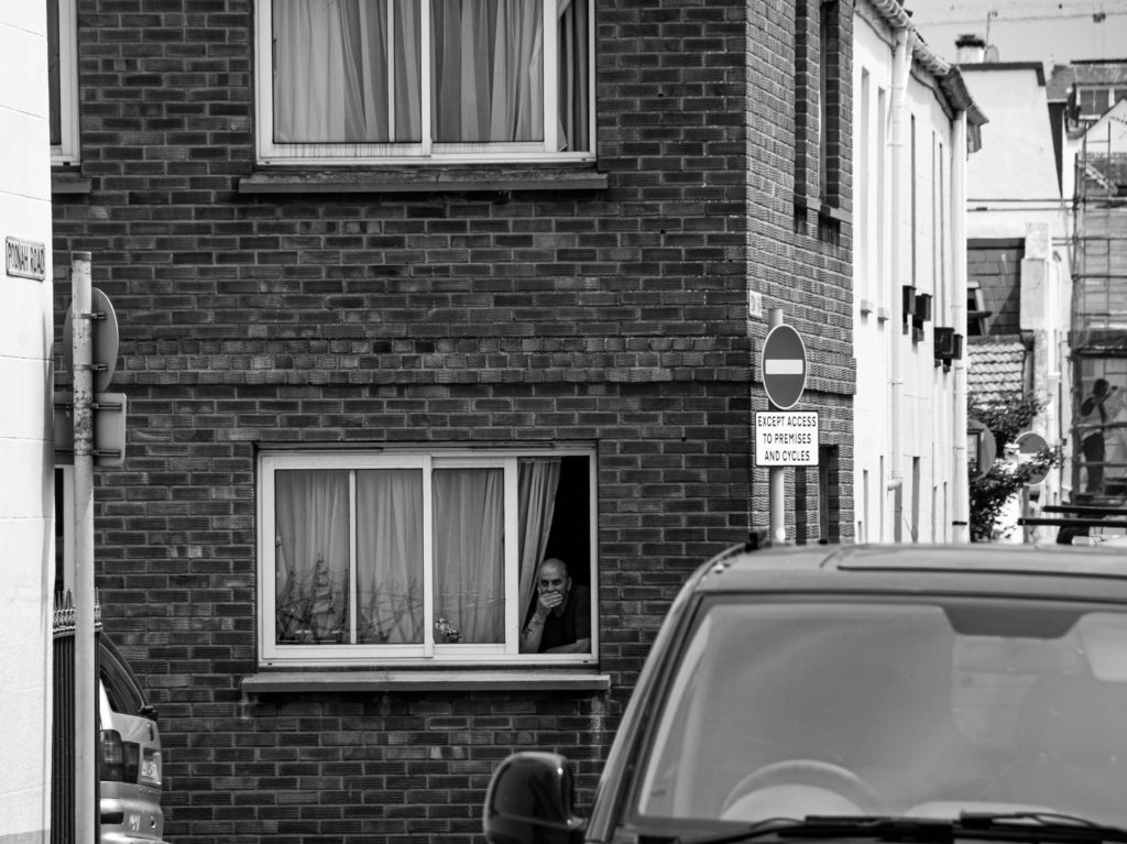
During this shoot I focused on capturing St Helier’s buildings and homes in a manner that encapsulated the social and historical contexts of Jersey. I did this by shooting different styles of buildings – Portuguese, British, houses, shops, offices. I also shot structures which had different ages; I shot newer office blocks and also old houses that had been around since St Helier’s birth.

During my editing I focused on aesthetic composition; I therefore made sure to frame everything in a symmetrical or artistic manner.

I also focused on dramatizing the buildings using deep colour schemes and contrast.

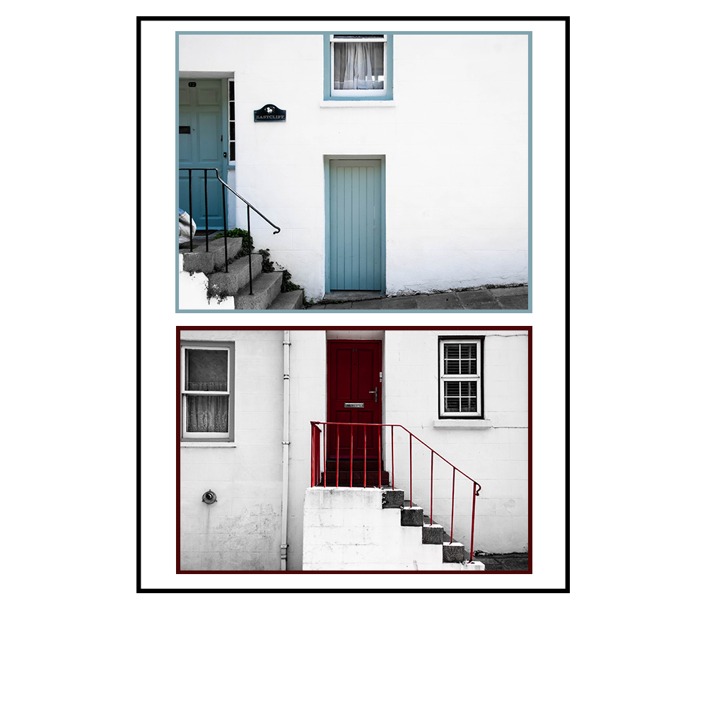
Final Images:

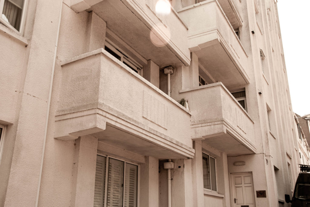
The image above presents a pleasing visual aesthetic as the images share a consistency. They are consistent with framing and composition with the two doors and stairs framed identically. This image tells a story of community and their connection through identical housing, but also shining focus on unique identity shown by the different colour choices of the doors. These images are also effective at referencing a sense of place A few other images that achieve this message in one composition are shown below.

The below images share warm tones and a ‘lens flare’ in the top of the composition that give the images a sense of prosperity that suggests the buildings have been stood happily looking down on the community for a long time.

Shoot 2 – Sense of Character

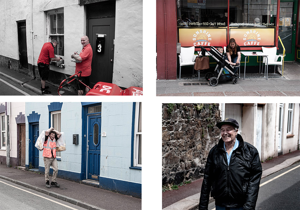
For this shoot I shot people of St Helier interacting with their environment and each other. This produced a wide range of emphatic images expressing emotion and telling a story about the area they are in and about what type of people they are.

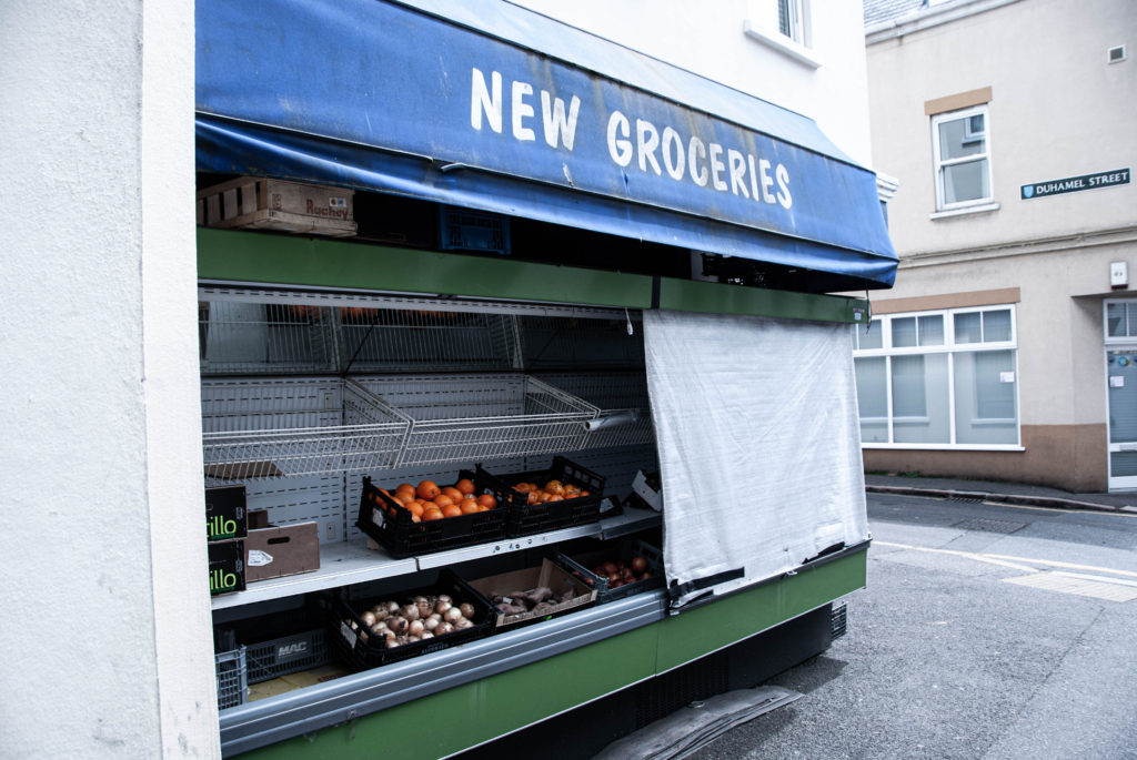
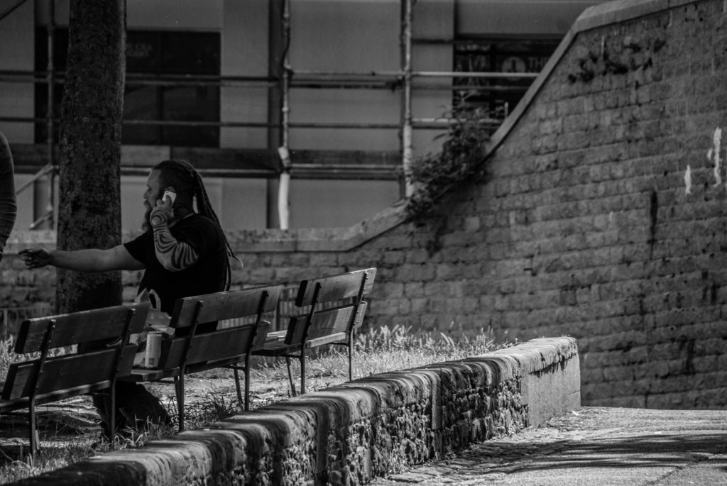
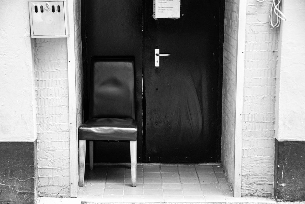
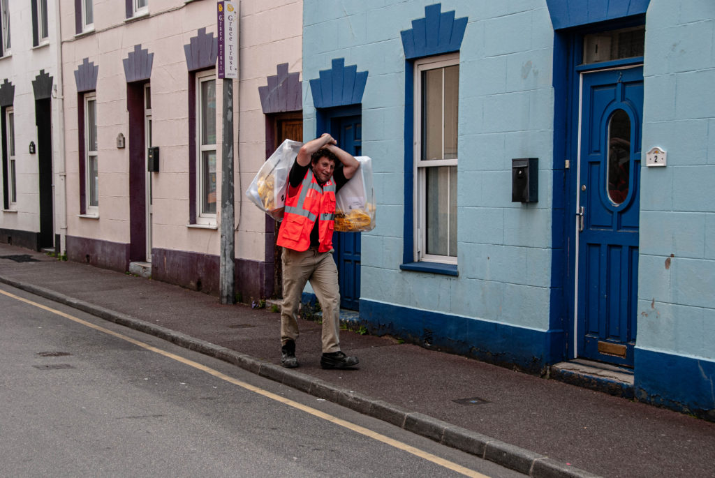
I also shot images where there was a lack of people in the shot in a physical sense. I instead shot urban landscapes where there was a setting created by people and shaped by the community but lacked the physical presence of people. For example this image of a food stall tells a story about the community and their everyday lives without anyone actually being present in the image.

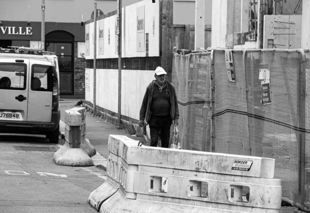
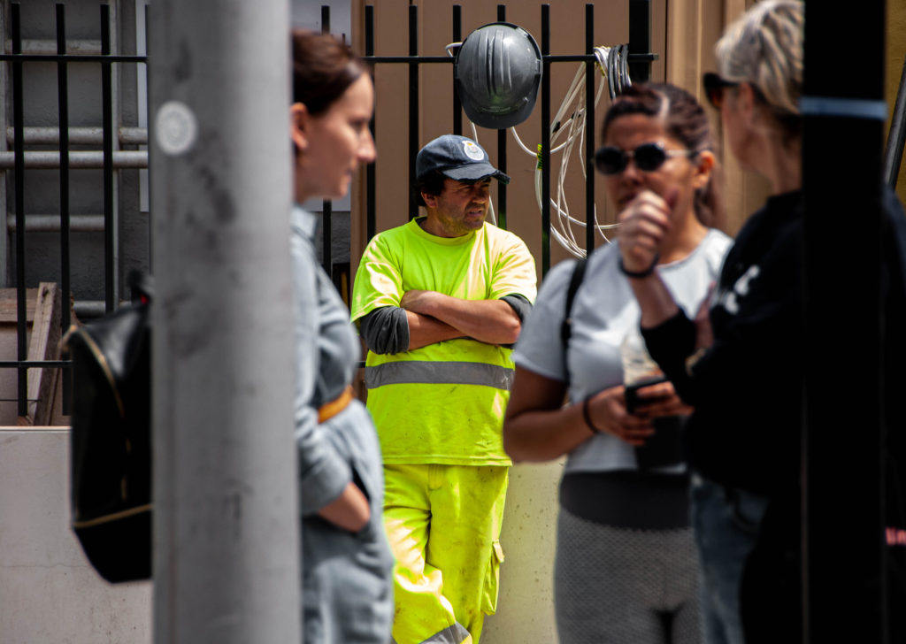
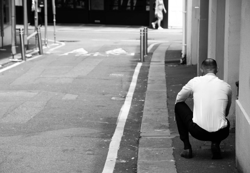
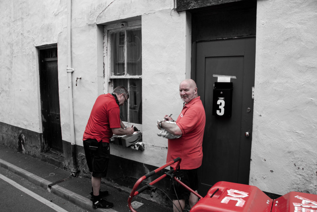
The following images are of scenes composing of characters of the community. I like the way they are composed in a way were they blend in with their environment, and all look to be living the hustle and bustle of St Helier, just like their migrant fisherman, merchant ancestors.

Shoot 3 – People and Portraiture

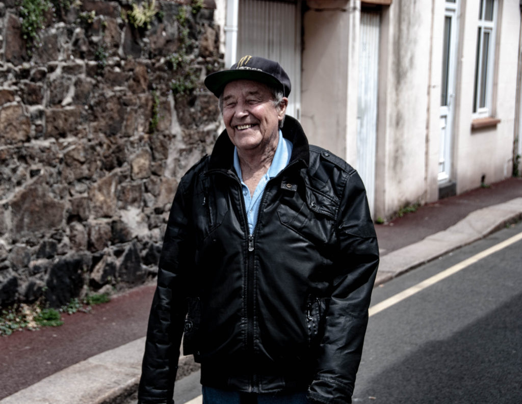
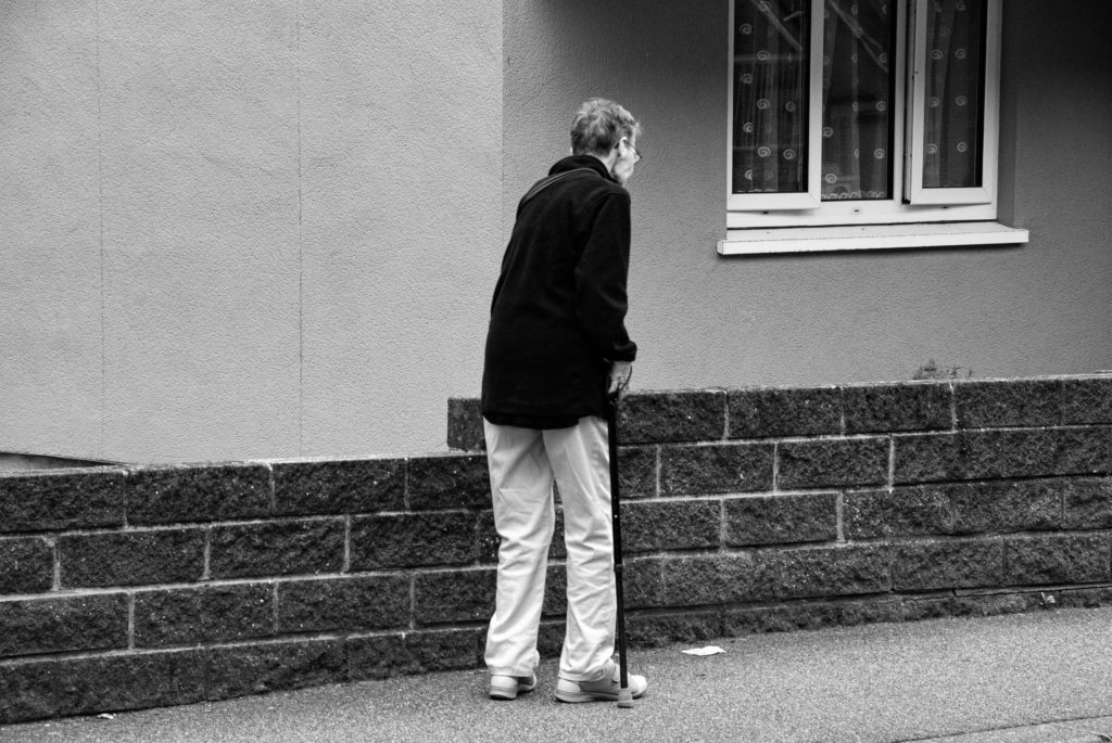
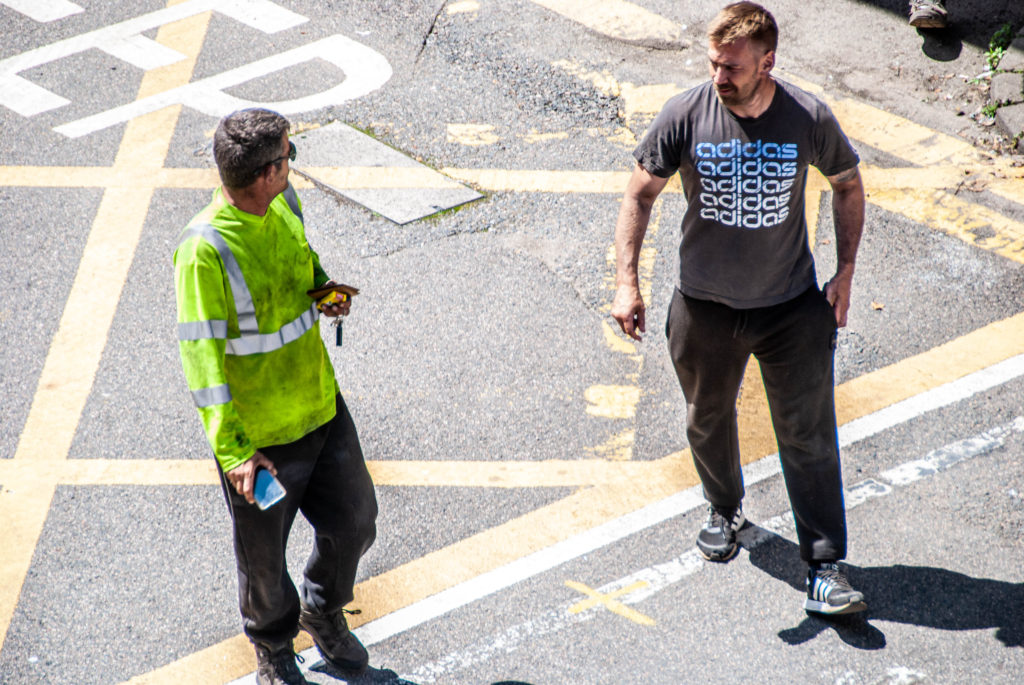
For this shoot I focused on capturing the emotion of the people I shot. I also focused on shooting people who were busy going about their day in a variety of different ways, weather that be playing guitar on the pavement or taking a smoke break; the images tell a story of identity.

Identity And Community – Shoot 1

After our tour of the museum we were able to explore the beautifully restored Victorian House and enter the drama of a Victorian family in crisis. Thereafter, we were taken on a tour on the streets near the museum by a passionate historical architecture expert Stuart Fell.

https://jerseyeveningpost.com/news/2021/03/25/our-aim-should-be-to-make-the-place-beautiful-again/

I documented the tours keeping migration and communities in mind and shot it in a fashion that focused on

– a sense of place
– character of community
– people, portraiture

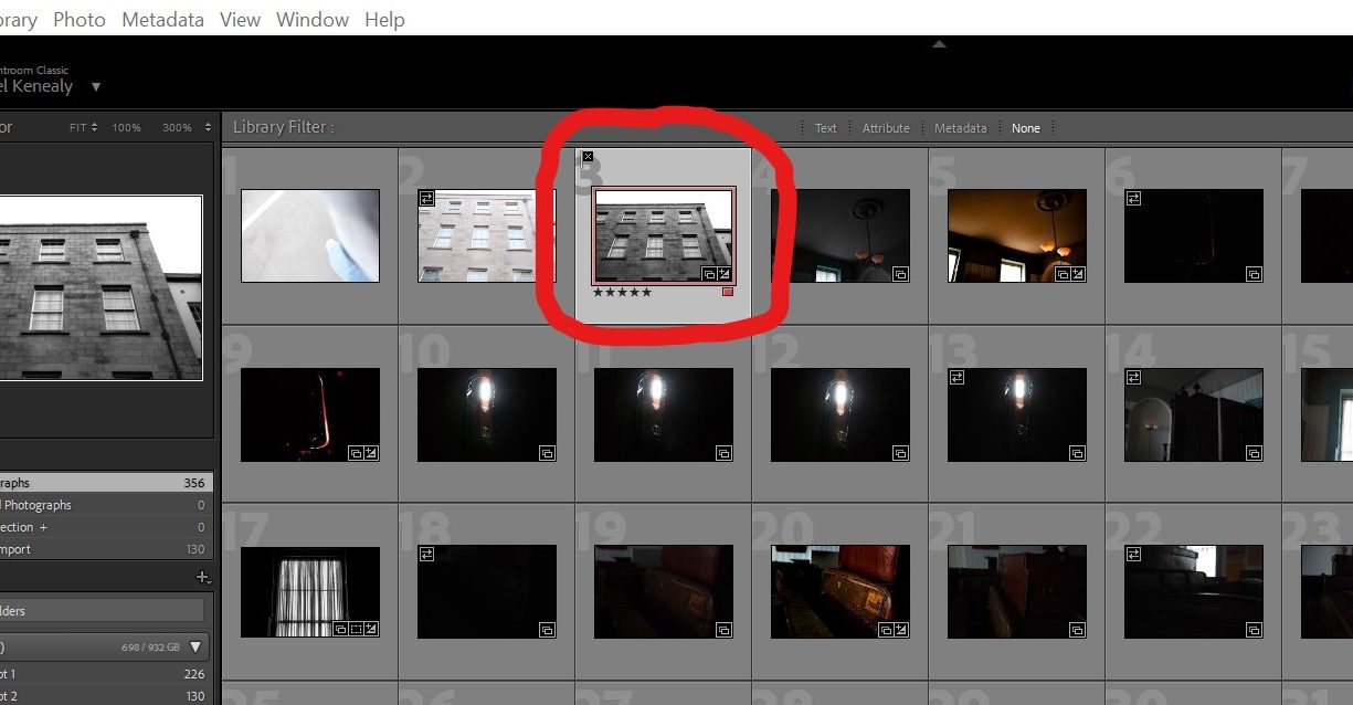
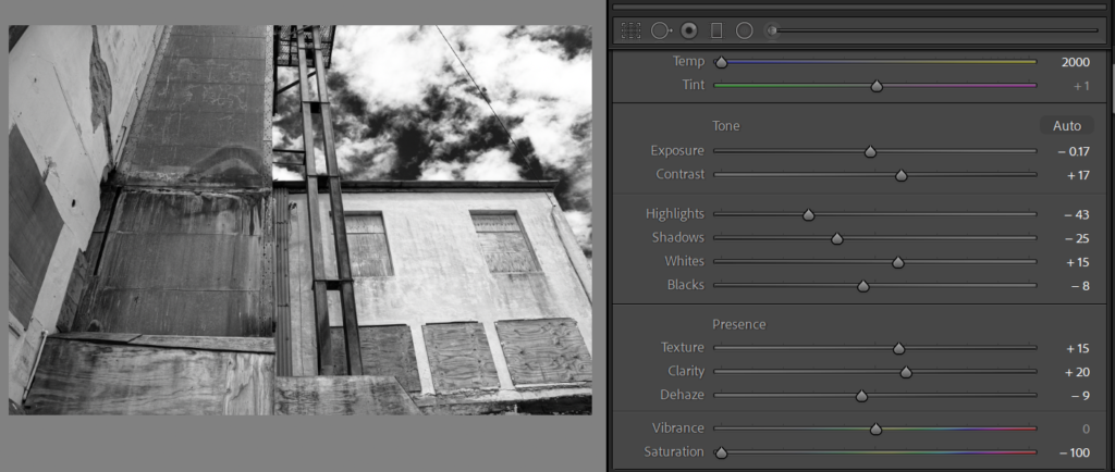
I began my editing process by using the software Adobe Lightroom Classic to start identifying my most powerful and useful images. I did this by working in the Library window and implementing LR’s features that help organise and rank photos. I gave a series of images a ‘flag’ which indicates if I picked them or not. I then gave each image a star rating which narrows down how much I like the image even more and therefore makes the displaying and selecting of my images an easier process. Finally I colour coded images that I believed would work well presented together

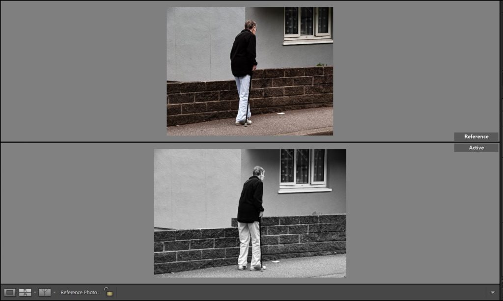
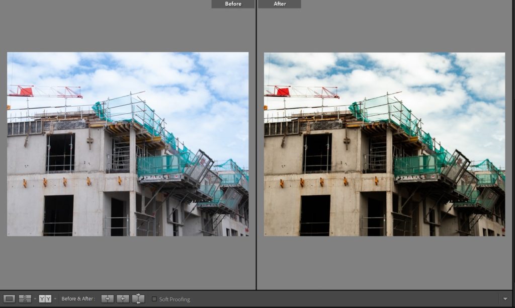
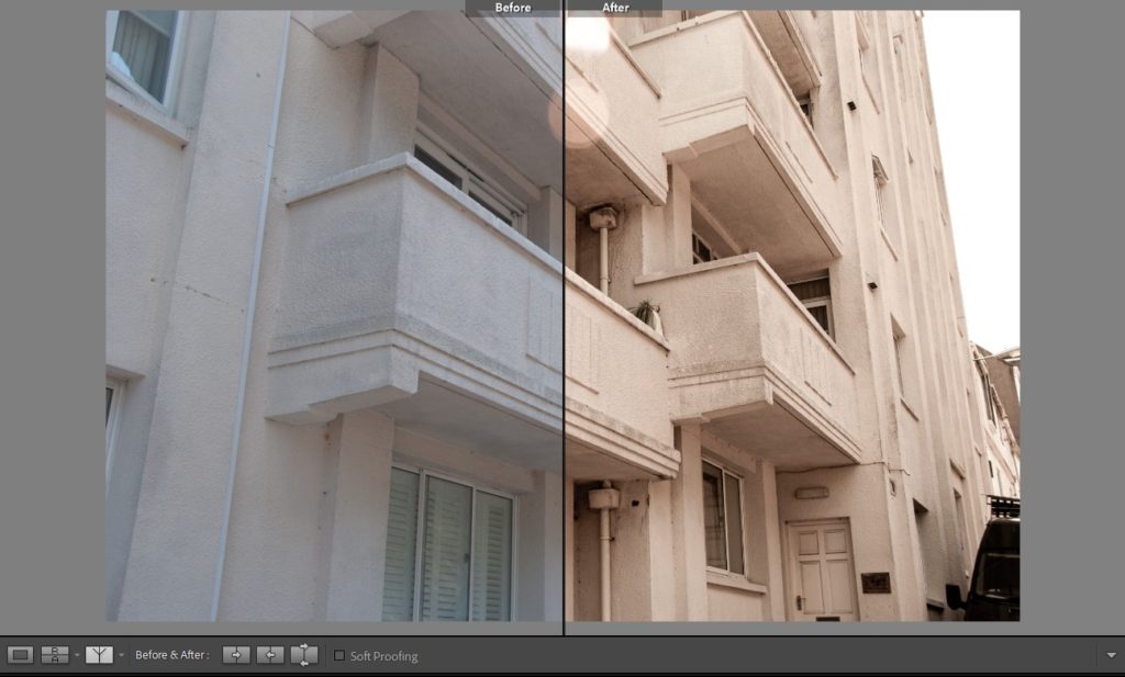
I then used the compare views feature to make comparisons between the same photo edited in deferent ways and to reflect on the before and after of my images to experiment how they could be tweaked differently and what works well to emphasise the emotion in my photographs.

The above is an example of this feature being used where I compare two different images edited in two different fashions. The feature makes it easy to see which image works better at one quick glance.

The above is an example of a before and after comparison where the image is split in half and an easy examination into what editing took place can be made.

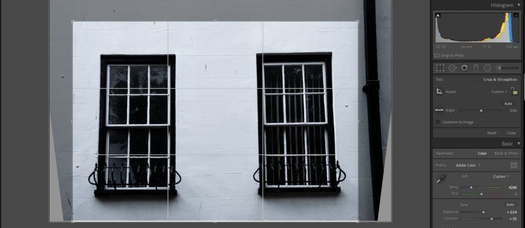
When editing my images the first element of the image I pay attention to before I start tweaking anything else is composition. I adjust the image using the crop overlay tool to frame and compose the image artistically.

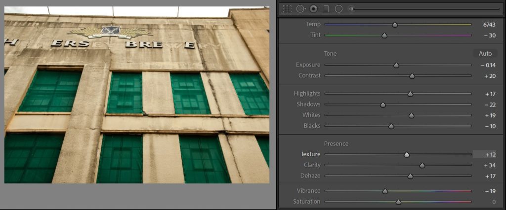
After this I experiment with the colour elements of the image

I do the same but, experiment with a completely desaturated monochrome version of an image.

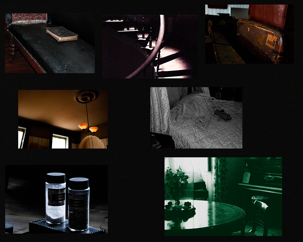
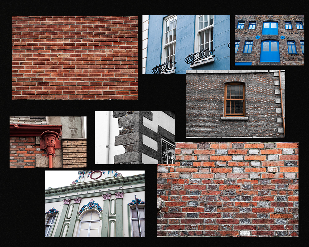
Below are the final edits of the museum and architecture walk grouped into two collages.

Identity and Community – Research

My visit to the Jersey Museum began with a dive into an exhibition room with multitudes of well designed walls detailing Jerseys lengthily history which began almost 250,000 years ago when the first people arrived in Jersey and continues through the centuries to explore the factors that have shaped this unique Island and the people who live here. This intrigued my interest in immigration and specifically how people from all over the globe come together in an inspiring feat of unity. This interest can be sourced from the fact that I am an immigrant in many forms as I have lived in a few countries and all of them have been extensively culturally diverse such as the place I call my home; South Africa. Which is just like Jersey in terms of its diversity.

https://en.wikipedia.org/wiki/Rainbow_nation#:~:text=Rainbow%20Nation%20is%20a%20term,fully%20democratic%20election%20in%201994.

I moved to the island just 3 years ago. The exhibition states; ‘Every Jersey resident has an immigration story – whether their family came here 500 years or five years ago. This exhibition explores some of these stories and the ways in which immigration has shaped and influenced the Island we know today.’ This statement immediately creates an a sense of belonging and inclusivity for me being a recent immigrant to the island considering that everyone has a story they can share and relate to one another with, even the most local islanders.

The section of the museum we visited first focused on immigration to jersey and tells the story about why people have moved here over the centuries.

https://www.facebook.com/JerseyHeritage/videos/735935120595905/

One of the areas of the exhibition I was most interested in was the section on tourism to jersey. Jersey saw a boom in tourism in the 50s, 60s and 70s.

https://www.theislandwiki.org/index.php/Photographs_of_Jersey_in_the_%2760s_and_%2770s_by_Pierre_Mette

It was nicknamed honeymoon island as it was a favourite location for newlyweds. Jersey attracted this boom of people as it had everything people wanted when they started looking to holiday in the post WWII years. Jersey was an escape from life on the mainland and it had better weather and better beaches.

Jersey's rich immigrants 'contribute lots to the community' | Jersey  Evening Post

Everything in jersey at the time was also much cheaper which attracted even more holiday goers.

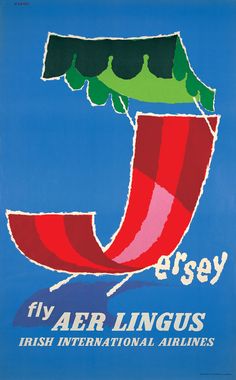
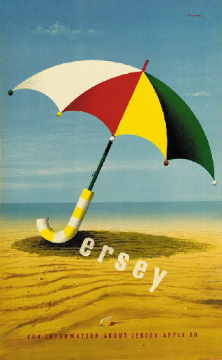
This boom in travel to Jersey changed the island in many ways. Just one example being the fact that aeroplanes used to land on the beach at low tide in jersey but due to the boom they built an airport. This segment of the exhibition took my attention due to the fascinating and aesthetic vintage travel posters used by British and Irish airlines and French railway lines to advertise travel to the island

This part of the exhibition also rang bells in another personal way for me. It relates to another South Africa to Jersey migration story. The story begins with a pair of South African surfers in the 60s got fired from the Umhlanga Hotel for swinging on the chandeliers. I grew up surfing in this area and this is a hotel I have stayed in many times so this story has many personal connections with my life and to learn about these migration stories is incredibly compelling and fulfilling. The surfers then decided to hop on a boat to the UK after getting fired from their job to look for greater opportunities. While working in the UK they realised that the cold, rainy weather and being far from the ocean was not for them. One evening they spotted perfect curling waves and blue skies on a Jersey tourism ad during the time of the tourism boom and hopped on the next boat over. They built their own boards and began surfing down at St Ouen’s Bay. The owner of the Watersplash restaurant and night club at the time noticed the lads and due to the increased number of ocean related deaths happening outside the restaurant, he decided to hire them as head lifeguards. The South African lifeguards continued to surf outside the Watersplash and this grabbed the attention of the local islanders as surfing had not yet arrived on the island. The two men had created a surge in popularity for surfing in Jersey and are responsible for bringing one of Jerseys most popular sports to the island.