Category Archives: Reading

Filters

Author:
Category:

NFT Storyboard

What is a storyboard?

A storyboard is a collection of images that tell a story. Basically, it is a sketch of the ideas a person is trying to portray. It is another way of showing a game plan to an individual with interest on what is going on. The visual elements along with the captions allow for the story to be seen by the person reading it. Disney is to be credited with the creation of storyboards since 1920. Ever since then, it has been a great way to share information.

OUR STORYBOARD

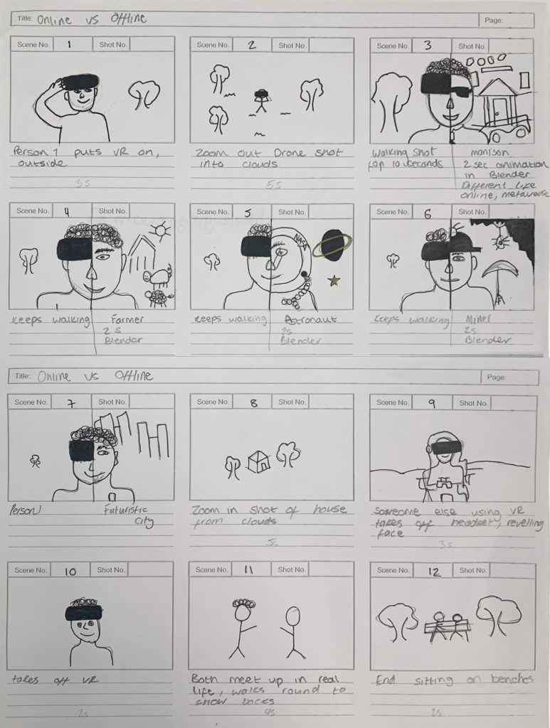
We printed a template out, and then drew on paper what we wanted our 30-second film to be. We drew the key scenes in each box.

NFT Community – Statement of Intent

3 Words

Interlaced

Divergent

Immersive

Sentence

The future of community in Jersey as a metaverse will be an extremely diverse and flourishing digital environment.

Paragraph

The future of community in Jersey as a metaverse will embrace physical elements of community and embrace them on an active and divergent digital platform. The community will flourish and connect many islanders no matter where in the world they might be. I see this being in a highly technologically advanced and immersive fashion. The metaverse will be a mostly amiable platform however I pre-empt some of Jerseys overly, patriotic, protective and xenophobic idiosyncrasies unfortunately lingering into the future.

Content

Our film will feature a seamless combination of real digital images combined with a more metaphysical and fictional animation side. We will use a split screen method to combine the two elements of film. We want to use futuristic props and a consistent, futuristic colour scheme. We want to use a futuristic, fast-paced soundtrack with an emphasise on synthesised instruments. We will also used strategically placed text to further convey our message.

Community NFT Project

What is an NFT?

NFT stands for non-fungible token. “Fungible” is an economic term which refers to a good or asset that can be exchanged for another good or asset of equal value. If something is “non-fungible,” it means it can’t be swapped for something of completely equal value. An area of land would be non-fungible, since land is unique, and finding another area with the exact same value would be difficult to impossible. Art is another example of a non-fungible asset, since its value is highly subjective. A quote from NFT book, by Two Lives ‘2 LIVES is the first exhibition ever that aims to educate and connect traditional art to digital art and the finance world to the art world, by showcasing NFTs through their multi-businesses opportunities to artists, students, curators, collectionists, stakeholders, creators and whoever involved in the NFT space. 2 LIVES is an homage to the island of Jersey through its best-renowned artists and their stories, in order to create a forever lasting exhibition in the virtual world (The Metaverse) and accessible from everywhere to become a blueprint for the future of exhibitions, jobs and community building in NFTs.’

A community of the future will celebrate diversity, equality and inclusion and propose a new digital world; a metaverse where everyone is equal regardless of class, race, gender and age. A digital ecosystem that transcends all virtual identities into a utopia for peace, prosperity and progress.

CONCEPT: What will the future of Jersey look like as a community in the metaverse?

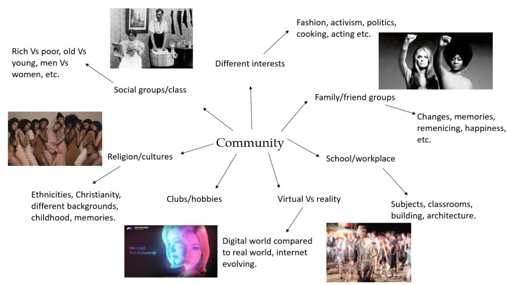
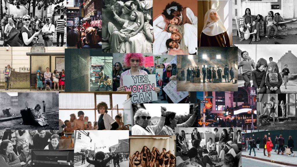
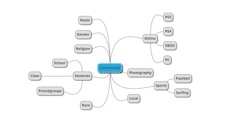
Our group for this project brainstormed many ideas surrounding community, and how communities may change or evolve in the future. We produced a mind map with themes such as religion, class, family etc – however a common area of interest was the evolution of feminism and how equality may look in the Metaverse. I then produced a mood board demonstrating different communities of women, may it be protesters, family members, diversity activists – the list goes on – all with roots linking to feminism and equality.

Describe in;

3 Words – Equal, Diverse, Free

A Sentence – A community full of equality between men and woman, a future with women’s rights and freedom.

A Paragraph – The evolution of women’s rights into the future Metaverse, a time when diversity and equality are the norms, where a woman can choose what she does with her body without the input from the government and society around her. The aim for this project is to represent a future community, both digitalised and physical, where women are empowered and are seen as equals to men. Challenging dominant ideologies surrounding feminism and the female gender, this project will show how the representation of women has changed over time, and how it will continue to change as our world evolves into a more digital and automated society.

Identity and Community – Complete Zine

Final Evaluation of Zine:

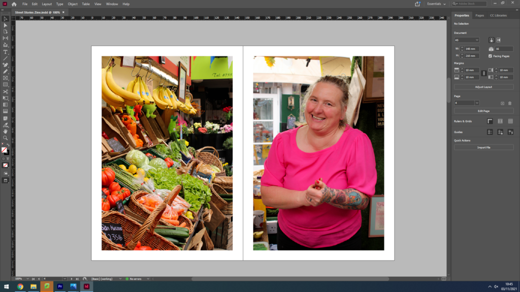
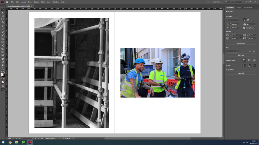
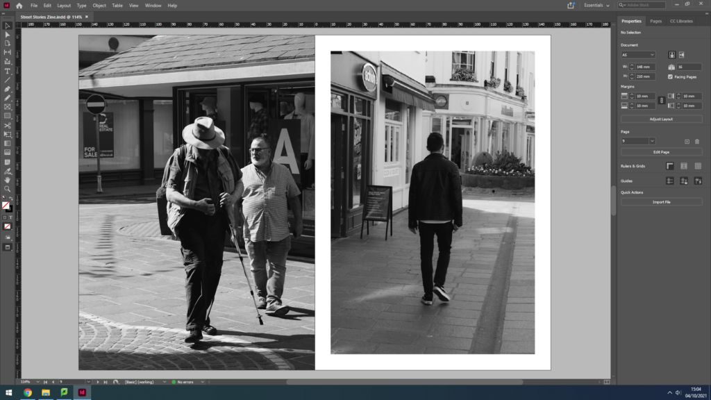
Here is a presentation of my final completed Zine, I have titled it ‘Street Stories’ drawing in connotations of street photography and community. I wanted to display the lives that are unknown, the people we see and know nothing about, their lives are a mystery but we can make guesses and make up stories we think would fit. Juxtaposing these candid images are reflections of environmental portraits, market workers and record salesmen giving us a glimpse into their working environment and engaging with the camera naturally. When I took these portraits I didn’t as for a pose or smile, I left it up to the subject to decide how they wanted to be seen. I believe this truthful display can never be entirely real, not as real as a street photography portrait, but it gives the observer a better chance to see who these people are, or how they present themselves when the camera comes out. As I spoke about in my previous post, the narrative and sequencing of my Zine shows the similarities and differences of St Helier streets, of people and of architecture – I wanted to use a mix black & white and colour images spread out across the Zine, linking back to ideas of old and new throughout time. I really enjoyed created this Zine, the presentation style is not one I had come across before and I believe it’s small size and orientation strongly helps with relaying the idea of a close community of people who ‘are not all so different’.

This image has an empty alt attribute; its file name is image-4-1024x576.png
This image has an empty alt attribute; its file name is image-6-1024x576.png
This image has an empty alt attribute; its file name is image-20-1024x576.png
This image has an empty alt attribute; its file name is image-7-1024x576.png
This image has an empty alt attribute; its file name is image-8-1024x576.png
This image has an empty alt attribute; its file name is image-19-1024x576.png
This image has an empty alt attribute; its file name is image-10-1024x576.png
This image has an empty alt attribute; its file name is image-11-1024x576.png
This image has an empty alt attribute; its file name is image-12-1024x576.png

Identity and Community – Narrative and Sequencing, Design and Layout

Narrative;

In terms of narrative, my Zine will focus on the various stories that pass through Jersey’s parish of St Helier everyday, the light and shade of a community that may get overlooked in modern society. I will use my images from my Character of Community and Sense of Place photoshoots to create a Zine inspired by the work of James Jay, his layout of images, style of photography and overall Zine design is something that has influenced me greatly in this task. I aim to show juxtapositions within each page of my Zine, for example an old building placed next to a modern building, representing the changes in these communities over time, or the differences between the old and young that may live there, or even suggesting the neglect some of these communities have had to face while others grow and flourish – it is up for the observer to decide. Nevertheless, in this Zine I also aim to promote the narrative of the popular theme ‘we’re not all so different’, showing the similarities between certain street scenes/buildings/architecture – the list goes on. I want to convey a story of memory and nostalgia, capturing the areas where communities feel safe, at home, comfortable and where people can fully be themselves.

Sequencing;

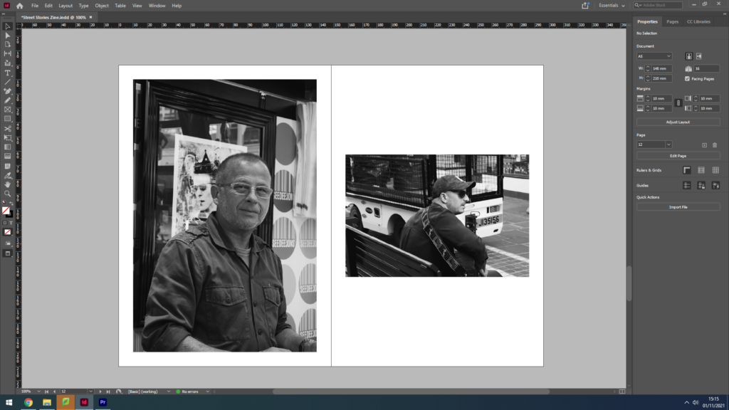
The overall layout of my Zine will be simplistic and easy to follow – however I wish to create some double page spreads where one image is bigger than the other, or have a different orientation. My plan with this layout idea is to break up what would be a Zine of symmetry and order, something I do not wish to convey – I want to demonstrate the freedom of being part of a community that is accepting of you, where you can feel truly yourself. My aim is for the contrasting orientations and layout to create a dynamic sequence for the observer to follow, the symmetry within certain pages will get disrupted and the storyline will hold hints towards freedom and relief. Additionally, providing juxtapositions and similarities within each double page is something I really want to develop. I plan on using my images from both photoshoots to find either a contrast or a subtle link, for example I wish to use some of the environmental portraits I captured placed on one side, with an image of something linking to their profession on the other. I want to experiment with how colour also effects how these two images link, by placing a black and white image next to a vibrant colour one I will demonstrate possible stereotypes, may that be of people or places.

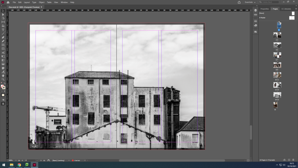
Above is a screenshot of a part of my editing process on Adobe InDesign, where I experimented by placing two images with a similar colour palette next to each other. Both images show older architecture as their primary subject, however the image of St Helier’s General Hospital on the right has a wider depth of field as we can see the side of the more modernised part of the hospital in the background. This creates a more 3-dimentional image, and in comparison to the left image, forms a jolted view for the observer. I think by placing these two images next to each other (although they hold several similarities) it does not provide the full effect of what could be portrayed, for example young Vs old if I were to place it next to an image of fully modern architecture. Additionally, while editing I had the idea to use similar geometric shapes within each image to represent the, sometimes, uniformity of a community with strict rules and regulations – juxtaposing the freedom conveyed in other pages throughout my Zine. I believe that breaking up the flow of my Zine with jarring shapes, colour changes and contrasting orientations creates an inventive and freeing piece of natural life portrayed through ‘the photograph’.

Design and Layout

Experimenting with ‘full bleed’;

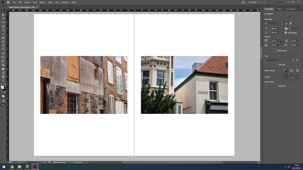
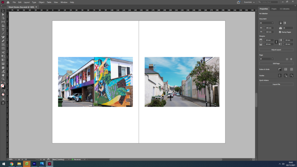
During my editing process of the Zine, I experimented with how the size of my images impacted the overall mood created by the page. For example, the screenshots above show two images I decided worked well together due to colour, composition and lighting – however I could not decide whether they should be full bleed or not. A full bleed image extends or ‘bleeds’ to the edges of a page so that the image completely covers the entire page and does not show borders or white space around the edges. As these two images are landscape orientation, using full bleed while keeping the image in full frame was difficult to make work due to the large amount of white space above the image, with none at either side. Nevertheless, I enjoyed how the full bleed created a sort of togetherness between the photographs, as if they were linked in more ways than just the formal elements. I experimented with whether joining the images in the middle created the impression of the landscapes bleeding into each other as if they were the same building, however due to the composition this was a challenge. After moving the images around and changing their sizes, I decided it was better to not use full bleed on this page as the negative space surrounding the images created a clean, symmetrical layout that I believe works best when presenting images of two man-made structures.

Layout of pages;

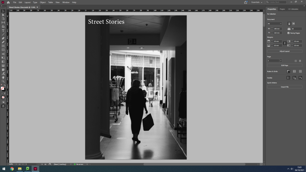
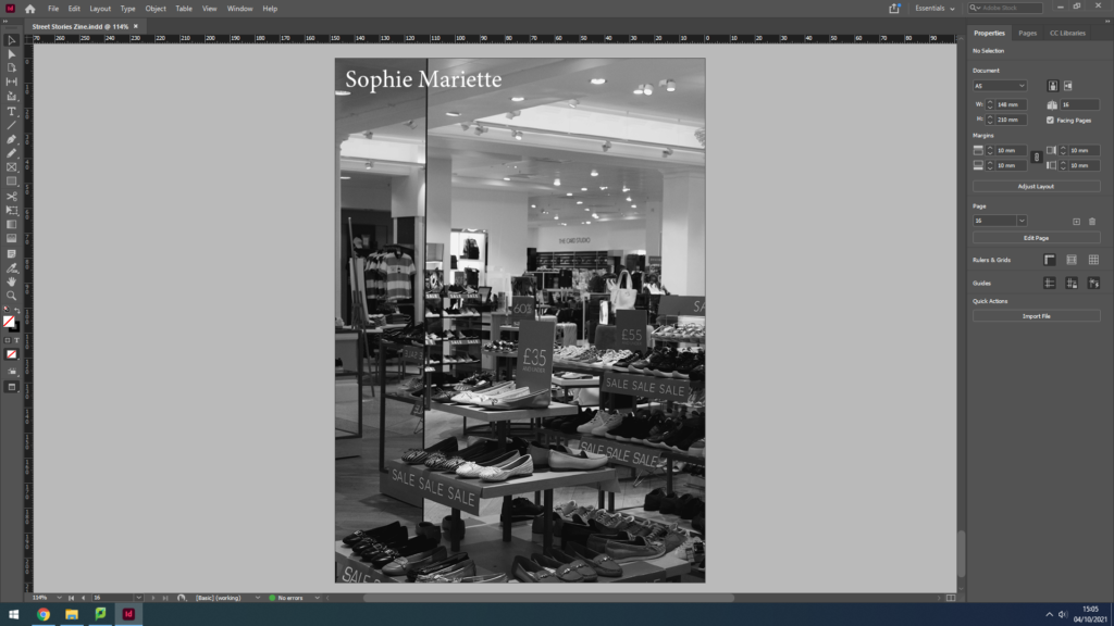
The order in which I placed my Zine pages was based on how their formats, colour schemes and layouts. I started with my front cover image, a black and white long shot of a woman’s silhouette doing some shopping, natural and normal with a sense of mystery. I wanted each double spread in my Zine to tell a story or link to each other in some way, therefore I wanted the back cover to relate to my front one; using another black and white image taken in the same shop. I then wanted to show some colour in my Zine, so my first double page shows two different buildings with minimal editing in colour, one older and one more modern. I aimed to show juxtaposition between two very similar structures. I moved on to focus on demonstrating vibrancy and portraiture and throughout the rest of my Zine I aimed to compare monochrome images to colour, relating them to each other through similar themes, shapes or ideas.

NFT Community – Ideas

What is Community

A group of people living in the same place or having a particular characteristic in common.

A few discussed ideas regarding the continuation of the concept of community into the future of humans every day lives:

I emphasise the word lives and draw attention to the fact that in these modern times, and continuing with a great deal into the future, we are living two lives. This refers to our physical, tangible life where we interact with people face to face and engage in careers, passions, hobbies and all aspects life offers in a physical way and then also our online lives. Both are thriving with different communities of people. These two lives merge in many ways but they also can juxtapose massively where we see people escaping one life to interact with contrasting communities in the other. A few of these communities are brainstormed below:

Below is a mood-board which is going to act as the foundations for the visual aesthetic of the project. The idea behind the images is how humans will react in a community in the future. We want to base our aesthetic off of an exaggerated sense of the future, e.g., flying cars, heightened technological advances. We also focussed on the word metaverse when brainstorming these ideas.

What is the metaverse

The word “Metaverse” is made up of the prefix “meta” and the stem “verse”; the term is typically used to describe the concept of a future iteration of the internet, made up of persistent, shared, 3D virtual spaces linked into a perceived virtual universe.

NFT – Artisit Refrences

Pierce “Blizzy” Williams

Blizzy is a digital artist from the USA, he got into the digital art movement by creating game art for the popular video game Fortnite. His designs stared to gain interest on social media getting him 80,000 followers across all social media platforms. Now he works with huge content creators such as Faze Clan, Tfue, Mongraal, etc, his clients have an accumulate social network of 15+ million.

Blizzy has created many pieces of digital art, which he posted mainly on Behance and his Instagram account. However, Blizzy does have a wallet on Foundation (an NFT market place), although he has only brought NFT’s from other users, and not minted any, as of 13/09/2021.

Instagram: @frblizzy

Behance: https://www.behance.net/piercewilliams

Foundation: https://foundation.app/@blizzy_

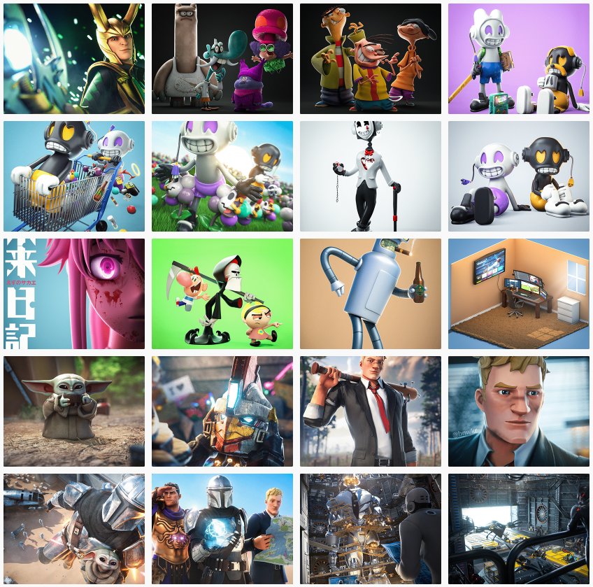
These are some of his most recent digital art pieces, which include some Fortnite art, and some of his own original creations.

Analyse

This is piece is called “RETRO GARDEN” https://www.behance.net/gallery/118487279/RETRO-GARDEN

The characters in this are called Glee and Gloom, the main focus in the image is on Glee, which is the happy character. This is why the scene is full of vibrant colours, as it helps portrays the happy, joyful atmosphere. The colour combination of white and purple suggests royalty, nobility, luxury, power, and ambition, contrasts to the colour palette black and orange which is commonly associated with a gloomy, eerie, spooky atmosphere. The use of depth of field draws attention to the foreground character and the smaller details such as the grass and flowers.

BORED APE YACHT CLUB NFTS

The Bored Ape Yacht Club is a collection of 10,000 unique Bored Ape NFTs— unique digital collectibles living on the Ethereum blockchain. Your Bored Ape doubles as your Yacht Club membership card, and grants access to members-only benefits, the first of which is access to THE BATHROOM, a collaborative graffiti board. Future areas and perks can be unlocked by the community through roadmap activation. Visit www.BoredApeYachtClub.com for more details.

The NFT market place Yuga Labs (the artist) sold their NFT’s on is Opensea, here. The main reason they are very popular, is not because of there design but their utility. Everyone that buys a Bored Ape NFT, gets access to future events and are then able to meet important people.

The Bored Ape NFT collection consists of 10,000 apes generated at random. That means trait assignment, including eyes, fur, and clothes, varies wildly from ape to ape.

Other artists that I think are interesting and good:

https://foundation.app/@mattey

https://foundation.app/@Octane

https://foundation.app/@HEXA

https://foundation.app/@Spancs
LOST – My NFT

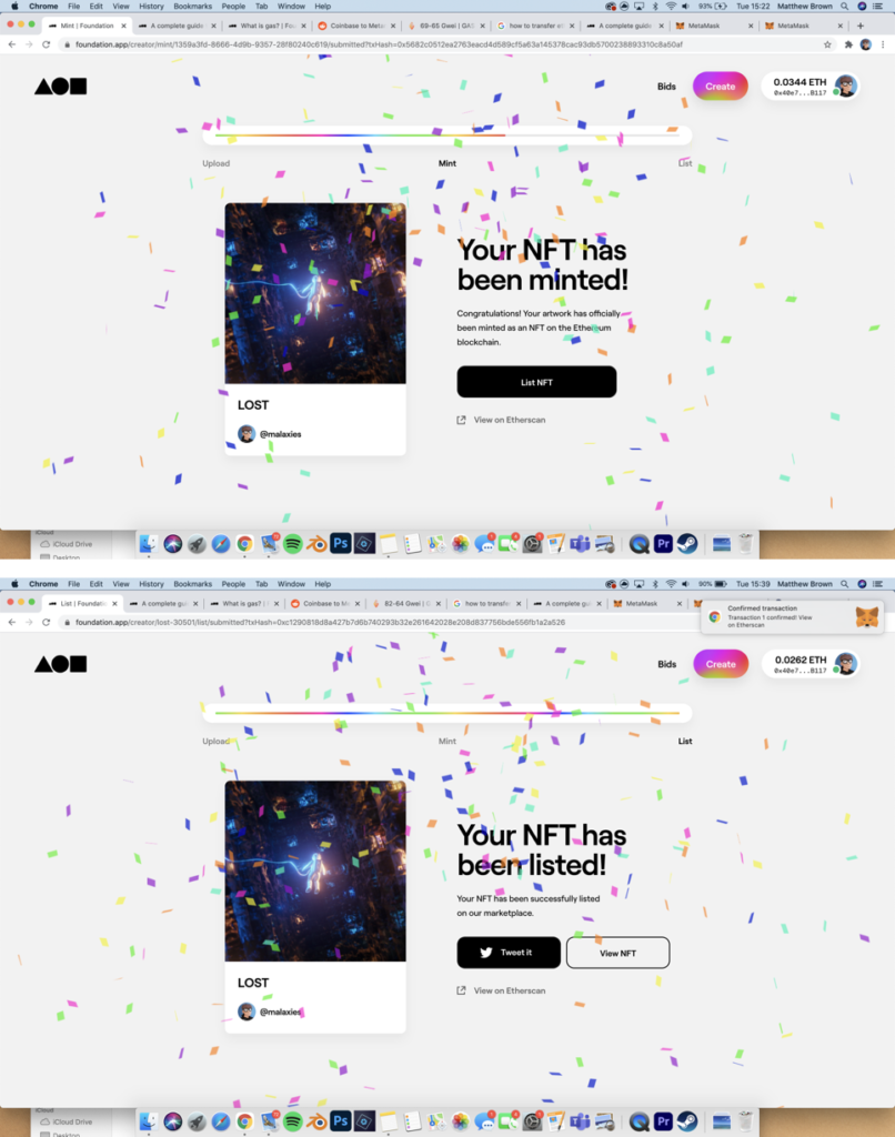
Before we started the NFT project, I already have experience with NFT’s as I created and minted one on the Ethereum blockchain through Foundation.

I chose to mint it on Foundation as at the the time it was the best place to buy and sell NFT’s. You had to get an invite to the platform in order to start selling, which I did after speaking with a few different artist and showing them my work. Foundation is probably still the best platform to sell single pieces, however opens is the best place to sell collections.

I chose to mint one on my pieces that I’ve already created using Blender (a free 3D modelling software) and Photoshop.

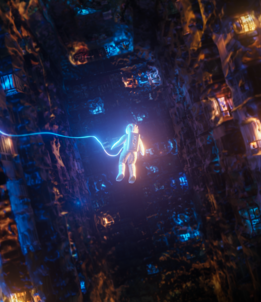
This is the piece I decided to mint:

https://foundation.app/@Malaxies/foundation/30501

It cost me approximately £80 to mint it on the ETH blockchain, and users can bid on it, or make an offer.

NFT – Research and Analysis

WHAT IS AN NFT?

A non-fungible token (NFT) is a unit of data stored on the decentralized public Ethereum (ETH) blockchain, that certifies ownership of a digital asset, which is unique and therefore is not interchangeable.

NFTs can be used to represent items such as photos, videos, audio, and other types of digital files.

The artist creates a piece of digital art, then mints it on the blockchain and lists it on a website for a fee, then users can buy the NFT for an exchange of ETH, sometime the NFT is sold with an utility which can be a real life print out or other items as well as the NFT.

HOW I WOULD DESCRIBE AN NFT?

Lets say you buy the Mona Lisa (NFT) with your money (Ethereum, ETH), now you own it, but when you go to collect it from the museum (blockchain, where all the NFT’s are on) the museum staff stop you and instead, they give you a recipe saying you own it. Basically, the recipe is a certificate of ownership.

DIGITAL ART

Digital art is the new way forward in the modern world. Anyone can create it at home on a computer using software such as, Photoshop, C4D, Adobe Animate, Blender, etc. Essentially, digital art is starting the replace physical art, as there is a lot of new ways to experiment with new ideas.

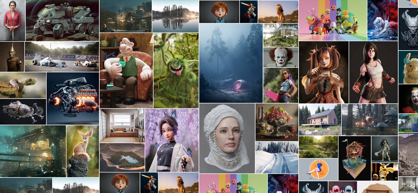
Here are some examples of digital art:

Year in Review: Best of Blender Artists, 2019 - BlenderNation

EVALUATION

I think digital art is more powerful than physical art as it is more modern and up to date with new technology, this means that there is more potential with digital art, as there are no limits. However, physical art has elements that digital art cannot possess, such as, emotion in the brush’s strokes and the texture, this is because digital art is mostly displayed on a screen, until holograms get better.

MY OWN NFT

I made some digital art, in a 3D software called Blender then used Photoshop to adjust the colours and other elements. After I minted and listed it on to a NFT market place called Foundation.

This the link to it: LOST

Presentation and evaluation: 16 page photo-zine

The zine

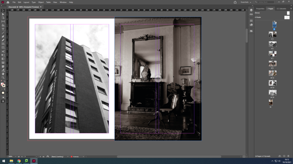
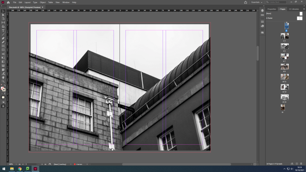
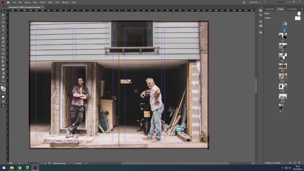
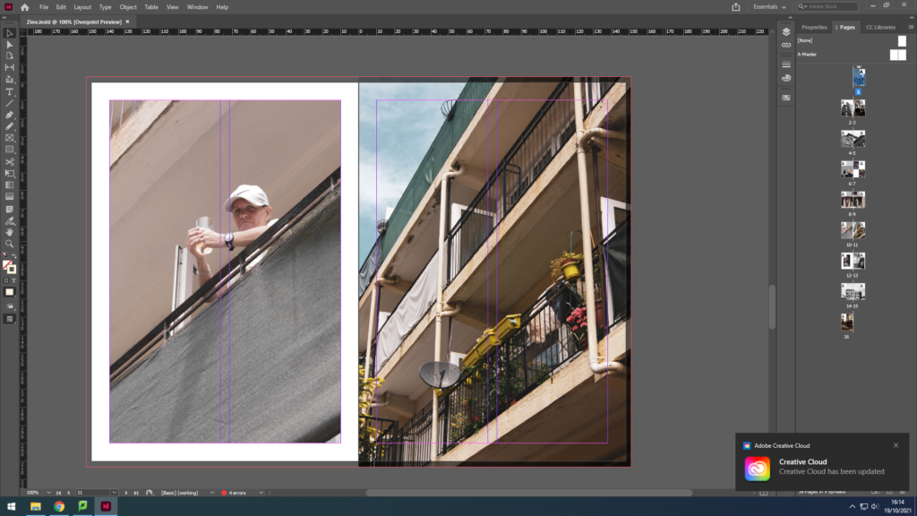
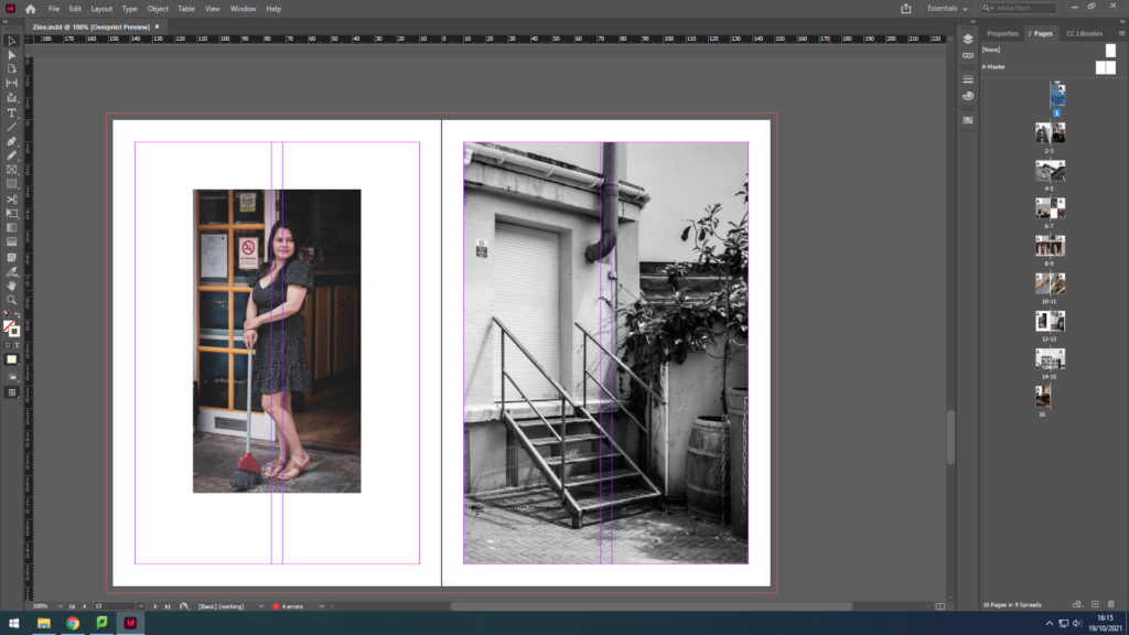
Due to printer issues, I was not able to print my zine successfully, so here is the zine in Adobe Design:

Evaluation

In conclusion, I believe my zine for identity and community powerfully portrays the different uniformity of the Jersey community. For example, I was able to capture the more elderly jersey community; a couple, a man waiting for his beloved, helping each other in love. I also captured the young generation; a young man fixing an automobile. To link the young and the wiser community together I have captured an adult man in his 50s in his garage fixing some items. These 3 examples can clearly show the successfulness of my zine for this project, for, not only does it juxtapose between the old and new generation, but it also makes sure to relate to the ways every individual is unique in their own way, such as, the photograph with the elderly couple gives a sense of unity, dependent on each other whereas the other images show a sense of individualism offering the idea that dependence is old-fashioned, and individualism is the new style.

Although, the zine also manages to illustrate other cultures. For instance, we can see a woman, dressed in black who has Asian heritage; she is standing outside the Gradees restaurant as an attempt to allow the residents to taste different foods from her culture like Half Roast Duckling with Orange sauce, which is a common dish in some lovely parts of Asia.

Therefore, we can understandably observe the prosperous of this zine on Identity and Community.