Category Archives: Reading

Filters

Author:
Category:

Personal Project – Statement Of Intent + Mood Board/Mind Map

MOOD BOARD+ MIND MAP

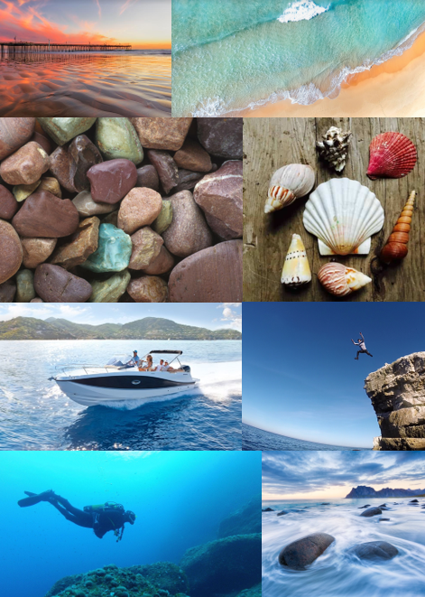
I made a mind map and mood board for the topic that I chose fo my personal study is on, which is Bouley Bay. This is because I live close to it, and I feel that there is a lot of history that be explore and because it is a landscape that has a wide variety of features I can use lots of photographic techniques to capture the bay.

STATE OF INTENT

My idea is to make a photobook in which I explore the area Bouley Bay, overall I want to capture the activity, views, and close ups of key feature such as rocks, shells, heritage, the hill climb, and the bay. I could also look into the history of the bay and the Jersey Folklore, involving the Black Dog.

It is important to me as I grew up in that area, and have many memories of it. And I hope to capture it in the same way in which remember it.

I wish to develop my project by exploring the bay and collecting lots of objects to photograph in a studio, and also to take long exposure, aerial, and underwater of the bay, as I have been inspired by many photographers, such as, Martin J Patterson (@ mjplandscapes on Instagram), Jaun Munoz (@ drjuanmdc on Instagram), and David Aguilar (@ davidaguilar_photo). Using these images I can look into topics such as, beach pollution, environment and beach life. Hanna-Katrina Jędrosz and Barron Bixler have studied environments, so it would be interesting to analyse them and their work.

FIRST PHOTO SHOOT PLAN

My first photoshoot, I will go down to Bouley at Sunset when it’s not cloudy and high-tide, and take long exposure photos using a tripod, and some neutral density filters.

Reviewing And Reflecting

My pervious work over Year 12 and Year 13, that showcases some of my best images and interesting photographic techniques

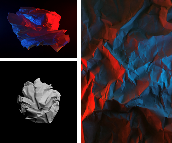
Formal Elements

My first project I started was based on the formal elements using formalism, where I scrunched up and teared up paper into shapes such as, balls, holes, and different textures, then took photos of the paper. I set up multiple different lighting environments to shoot in.

Firstly, I used 1 light source, which was the camera flash, for the image of the paper ball I also made the exposure darker to emphasis the contrast between the highlights and the shadows which made creases in the ball more noticeable, additionally it made the black paper background even darker so that you couldn’t see any of the marks on the paper. This is using minimalism to direct the focus of the image to the main focal point.

In the other photos I used 2 phones to emit different coloured lights, which made the colours clash as the paper as at different heights as it was crumpled up.

In Photoshop, I didn’t really do much adjustments image were very basic. All I adjusted was the contrast and saturation, to boost the colours, or the opposite to make it black and white by setting the saturation to 0.

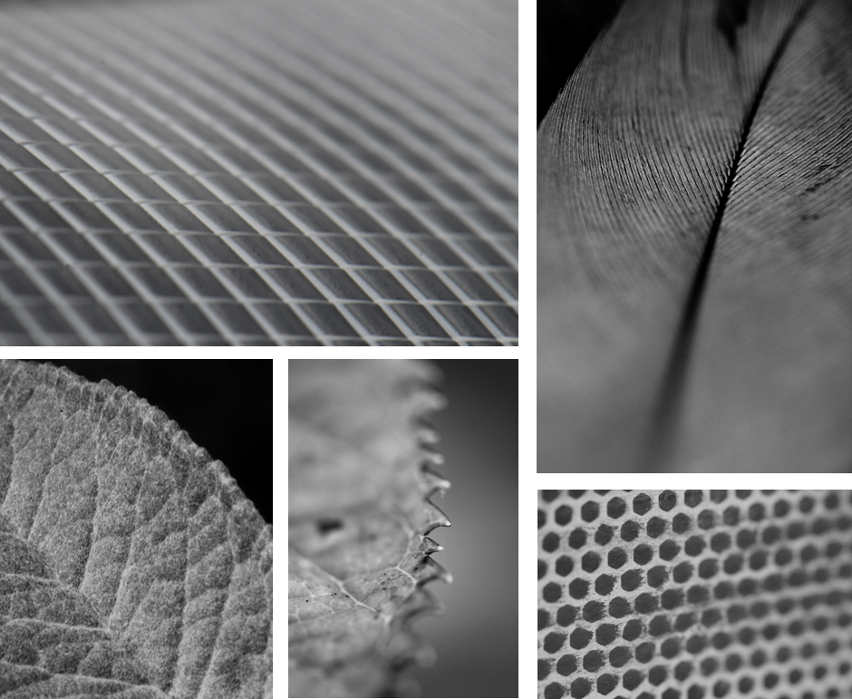
Surface and Colour

In this topic I used serval different camera lens to gain a different perspective. However, most of these image were shot using a macro lens.

This allowed me to achieved a really close up shot were you can clearly see the pattern and the repetition of shapes and the different textures of the subject. Additionally, I was able to use a shallow depth of field, which created a focus onto key features by blurring the edges.

Having these images in black and white helps remove any distraction of colour and helps the viewer focus on other aspects of the photo, such as the subject, the textures, shapes and patterns, and the composition.

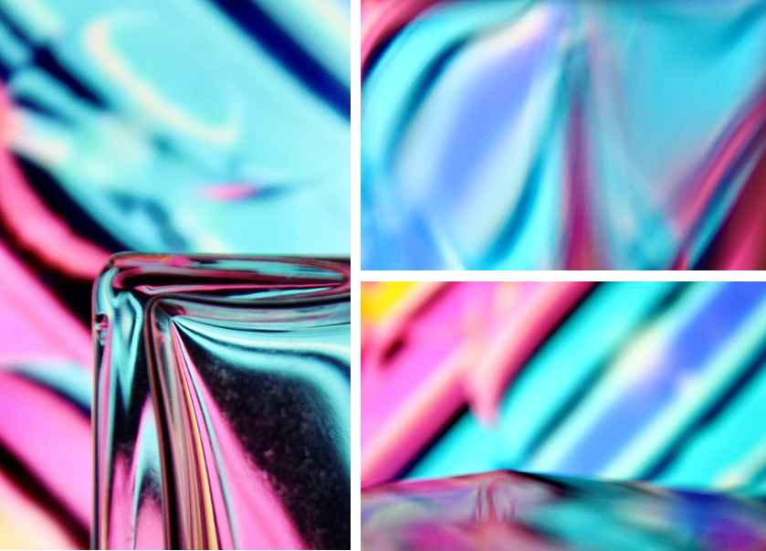
Abstract

To create these images I played a colourful video on my laptop and shot the images through different glasses, eg, wine glasses and perfume bottles to distort the video, which created a unique and abstract effect. I also used the glass to make reflections to act like a mirror.

To also create some of these images I changed my camera to manual focus and made it super blurry, then I took photos of different glasses in front of the screen, using the same method.

Minimalism – (Artist Reference / Kevin Saint Grey)

Kevin Saint Grey is a photographer I studied who is a primarily black and white LA based photographer with a minimalist approach to his subjects which creates a drastic contrast. He shoots mostly landscape and architecture, and his work distinguishes itself for the serendipity of black and white, “humanness” and silent images. He accomplishes this by using techniques such as, symmetry and long-exposure, and he manages to get amazing, creative photographs, by using camera movements while exploring unique angles while shooting architecture.

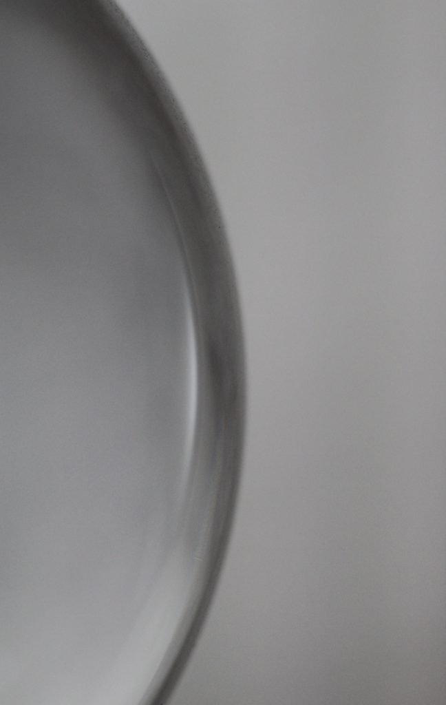
This is one favourite minimalistic images I took, it is of a glass lamp stand. I made it so the full object is not in view as it creates a minimalistic effect, that features the curve of the sphere, and the light which reflects off of it.

I submitted this image to a photography competition hosted by the Jersey Arts Centre on their Facebook page, and it won “Best minimalistic photo of the day.”

Portrait/Close Up

This image has an empty alt attribute; its file name is image-1.png

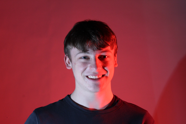
I have used the photography studio when taking portrait photos. This allowed me to experiment with different lighting colours, set-ups, etc.

This image has an empty alt attribute; its file name is multiexposure-925x1024.png

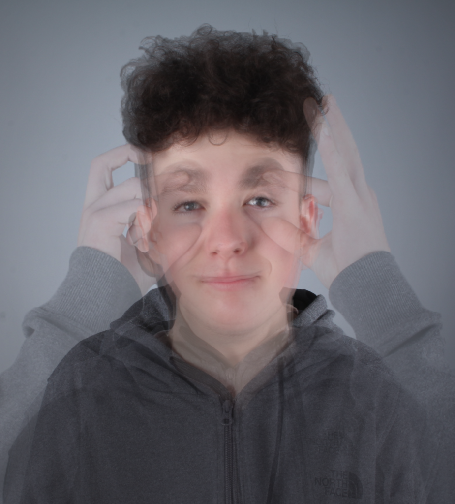
I have created a photomontage using post-processing techniques in Photoshop by using layers after lining all the images up, which created a multi-exposure image.

This image has an empty alt attribute; its file name is smallamxeye-1024x639.jpg

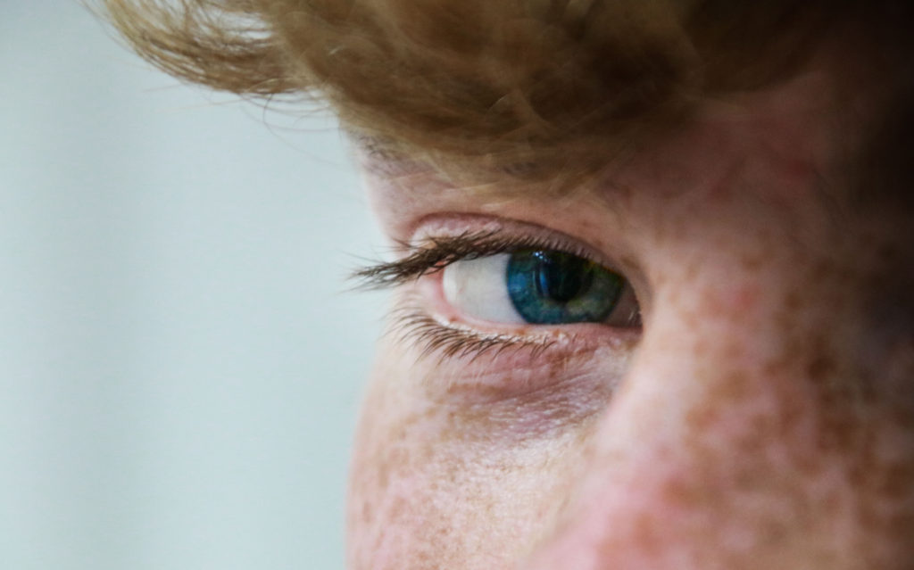
The eye contact with the camera makes it a stronger image as there is more of a direct and emotional atmosphere between the viewer and the image.

This image has an empty alt attribute; its file name is UCeye-2-min-1024x683.jpg

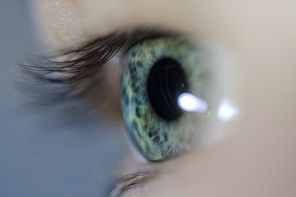
Since I used a macro lens I was able to create a shallow depth of field. This made it so the eye and part of the eye lashes were focused, and the rest wasn’t, which draws more attention to the eye itself. Macro photography is one of my favourite ways to shoot however, it one of the hardest to get right, as its only manual focus. This means you have to move closer/further away from the object or adjust the focal length.

Landscape

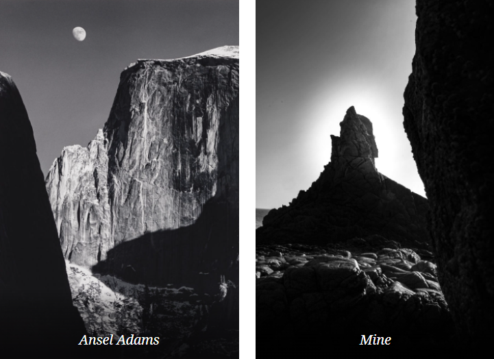
The landscape project was heavily inspired by Ansel Adams. Ansel Easton Adams was an American landscape photographer and environmentalist known for his black-and-white images of the American West. Also, he is considered the most important landscape photographer of the 20th century.

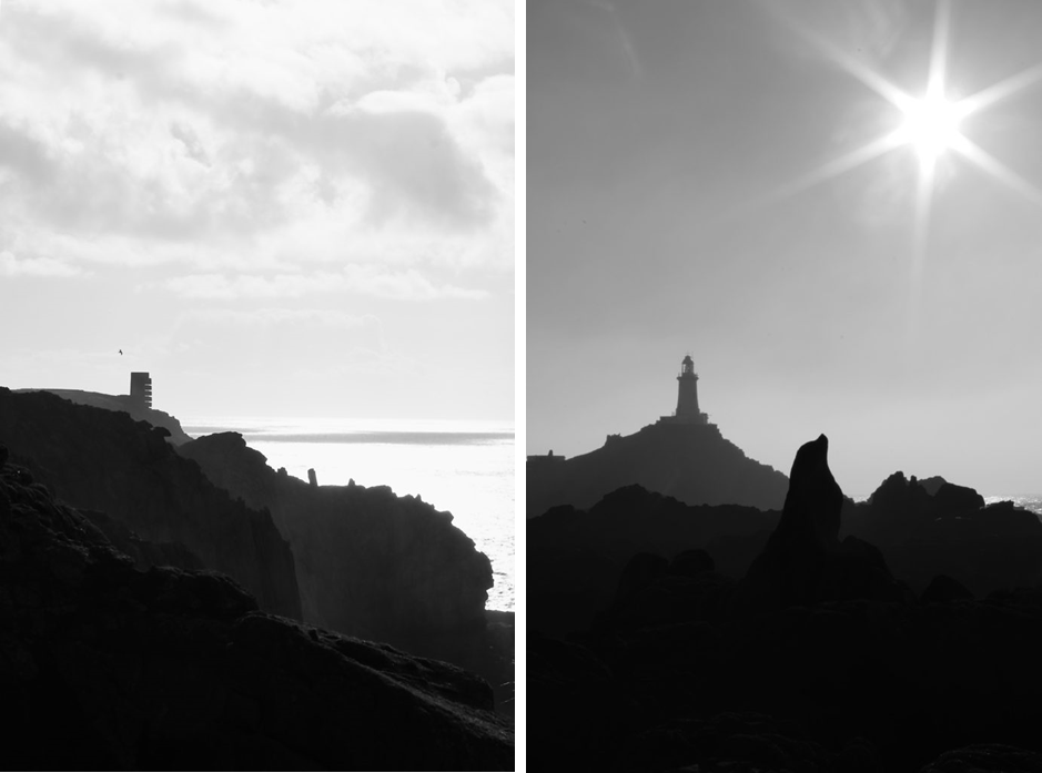
Both images are of natural landscapes, which display rock formations and both cover the whole of tonal zone system, going from 0, being black through to 10 being white, displaying different shades. This really puts emphasis on the highlights as it creates a high harmonious contrast.

These two images demonstrate the 3 levels of tonal values, is what makes this image stand out. It consists of the blacks in the foreground, with the grey behind it, then finally to the light-grey figures in the background which the lighthouse is apart of. Overall the harsh contrast between the sky and the rocks juxtapose each other against light and dark. I achieved the star effect caused by the sun, by using a high f-stop value, eg. f-32.

I used multi-bracket exposure to capture these images. The camera takes 3 photos, 1 over exposed, 1 normally, and 1 under exposure image. I edited it in Photoshops Camera Raw Filter after Photoshop merged the 3 images to create a HDR image. (High Dynamic Range.)

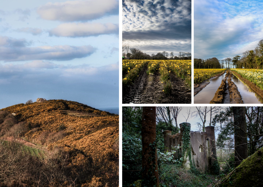
This image has an empty alt attribute; its file name is image-52-722x1024.png

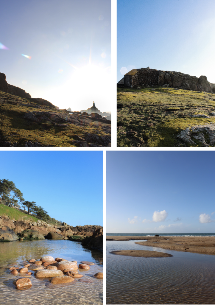
These 4 images are more generic landscape photos, however do include unique aspects such as lens flares and reflections from the water.

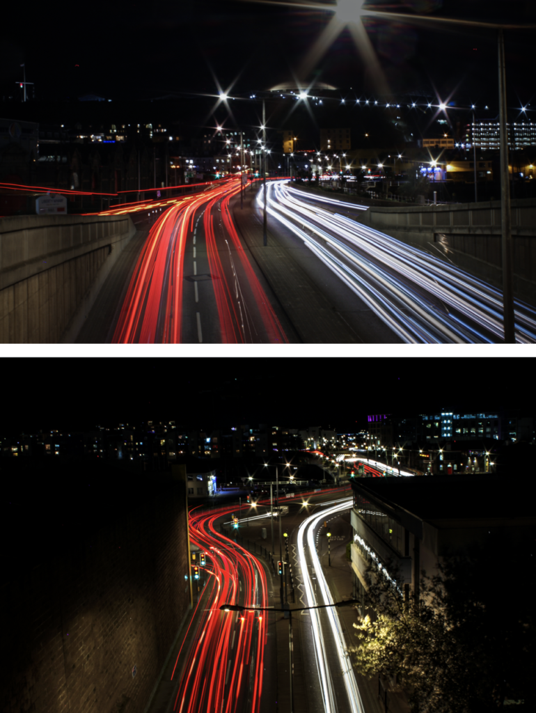
This are some of the urban landscape photos I took at night in town, using long exposure. Since the exposure time was so long I had to use a tripod so that the camera was stable to create a clear image. Long exposure is one of my favourite photography techniques, as it creates unique images every time.

This image has an empty alt attribute; its file name is image-15-770x1024.png

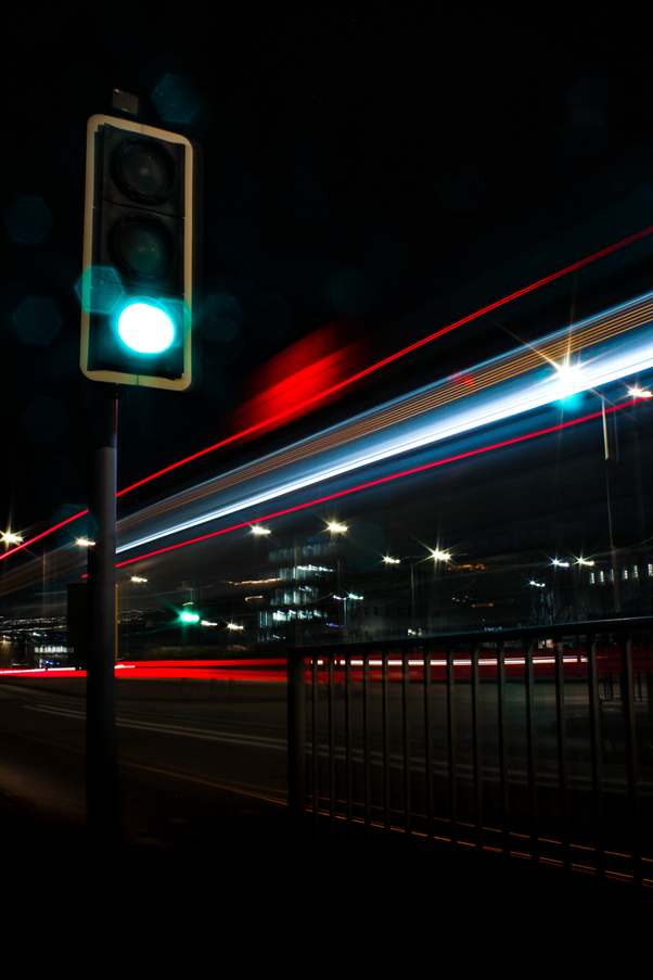
This is my favourite image from the whole urban landscape topic. It captures a bus driving past a traffic light. However it did take many attempts to capture this shot, which is part of the fun.

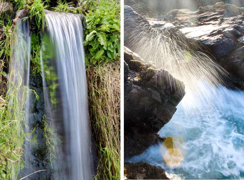
Long Exposure – Water Photo Shoot

On the topic of long exposure these are 2 strong images that where apart of another topic, that I really like.

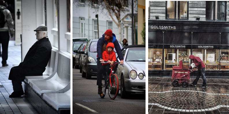
Street Photography/ Candid Photography

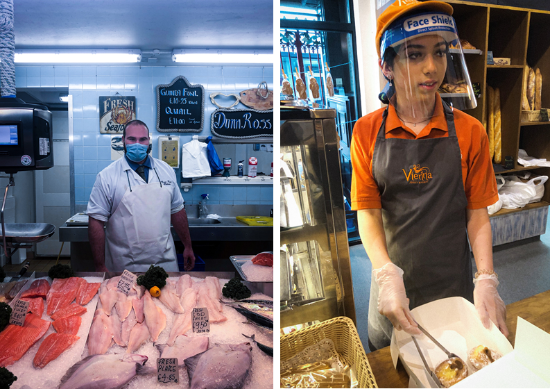
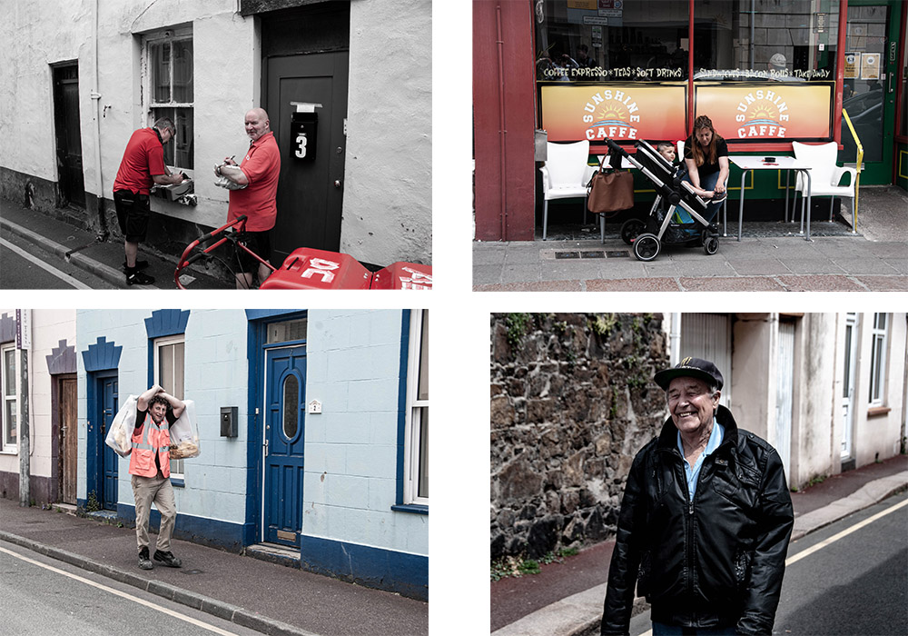
These 2 images were tableaux (set up/knew they were being photographed) Overall, I didn’t really like asking people if it was ok to take their pictures. However, it did allow me to capture the subjects closer compared to the photos below.

Where as, these 2 images aren’t set up and captures peoples natural state, emotion, and pose. Therefore, i fell that they poses more of a story.

Anthropocene

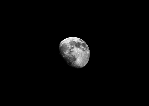
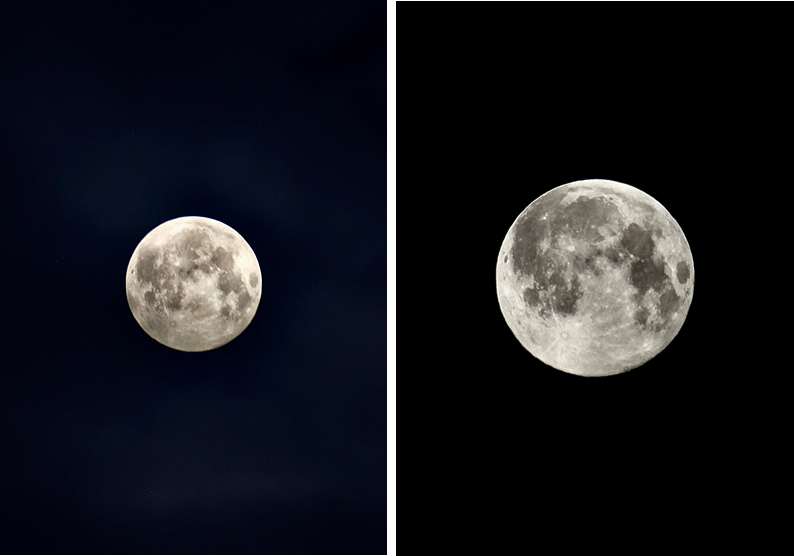
For my Anthropocene project I split it into 2 sections. The first was space, and the second was plastic water pollution.

These were some of my favourite photos I got of the full moon at 4 AM. I used a telephoto lens and a tripod to capture the moon.

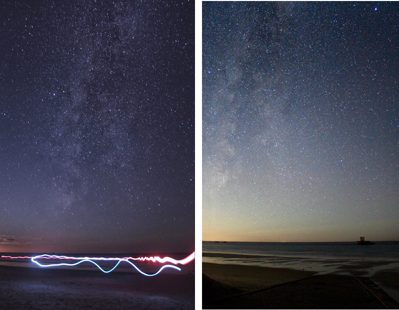
These are my attempts astrophotography, I went to the west of the island at 12-1 AM and used a 18mm lens, with a low aperture using a long shutter speed of 20 seconds to capture the stars. Before I took the photo I had to manually focus the camera on the north star, this is so that the stars would in focus. Overall, these turned out good, however it wasn’t the right season, so I could do better when the milky way is more visible.

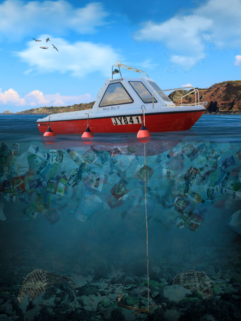
This is my best final piece which I made in Photoshop, using my own images to create a concept image using photo manipulation of plastic water pollution in Jersey. This took approximately 7.5 hours, using over 500+ layers inside photoshop, where I documented the process on my blog. I have lots of experience in photoshop and a great knowledge of the software.

Identify and Community Photoshoots Best Images

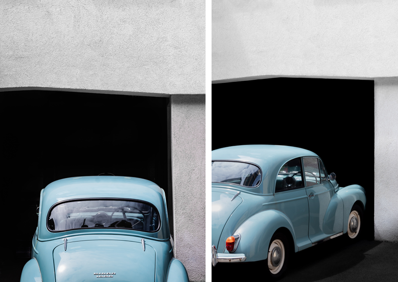
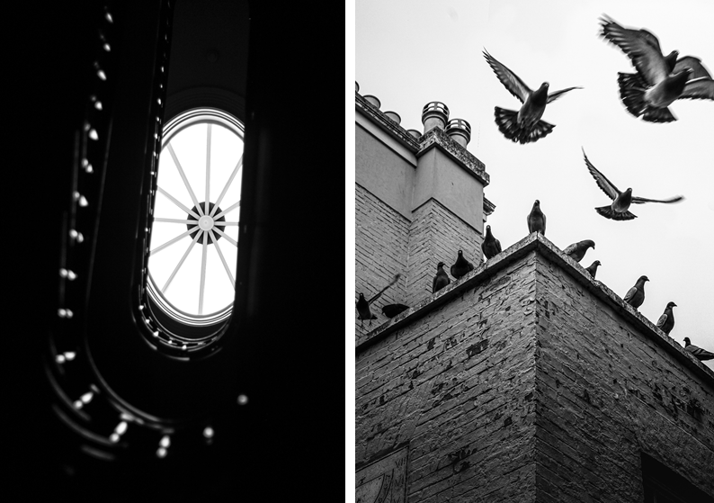
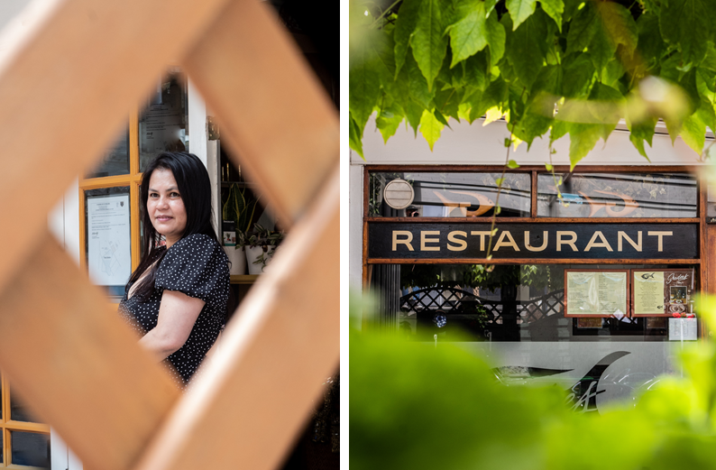
These images were taken whilst I was walking around town. This is one of my favourite ways to photography unique and different things in a new place/area.

In these images there was a metal chain across the car. This was very distracting so I removed it in Photoshop which improved the image. I also made the black background darker to remove the small details to create an old, minimalistic style.

These images work well in black and white. The image on the left demonstrates depth of field and unique angles, however the right image captures motion of flying pigeons.

These images use framing to create a focus on the key features and remove distractions around the outside of the image.

Contextual studies – Stephen Shore

I started off by selecting 3 Stephen Shore quotes that I think I could include in my image analyse of one of Stephen Shores images. The first quote I found online, and the other two were from an interview that was on a PowerPoint resource.

1.

“I don’t have to have a single point of emphasis in the picture. It can be complex, because it’s so detailed that the viewer can take time and read it, and look at something here, and look at something there, and they can pay attention to a lot more.”

2.

But even in that strange world, you were definitely making “Stephen Shore” pictures: intersections, shop fronts.

That’s true. Most of the pictures do have little indications that it’s a movie set. A contemporary car in the background or some scaffolding. But even the decision to shoot in colour meant that I was making photographs that couldn’t have been made in the period setting of the movie, It’s an anachronism. There are streets in New York that still look like those streets, but the décor and dressing are anachronistic, too. It was great fun.

3.

Can you describe what you had been doing?

In making Uncommon Places, I was walking down the street and watching all the relationships changing watching objects in the foreground change in relation to the background, thinking about how space is going to be seen in monocular vision on a picture plane. What happened for me was that, right away and throughout the work, structural issues and questions came to my mind. I had to solve those questions, and in the process of solving them other questions would arise. But it wasn’t as it I was sitting around thinking about them.

Analysis

Stephen Shore’s ‘Uncommon Places’ (book) finds the beauty in the most mundane. His sprawling vision of America has become a contemporary classic, a landmark of visual Americana, influencing a generation of photographers to take to the highway.

Stephen Shore: Uncommon Places | The Independent Photographer

This photo demonstrates how Shore finds interesting and unusual places by walking around, this is his usual method he uses to find places to photograph, as he was asked in an interview, “Can you describe what you had been doing?”, and Shore replied with “I was walking down the street and watching all the relationships changing watching objects in the foreground change in relation to the background, thinking about how space is going to be seen in monocular vision on a picture plane.” This shows how Shore think about how the image will look through the view finder before setting his camera equipment up. Photo walks are very important for photographers, as they’re not only perfect for meeting other camera enthusiasts, but also for honing your skills as a photographer, learning new ideas, and experiencing different places through your camera’s viewfinder.

Walking around and exploring allows Shore to capture images of shop fronts and intersections, which have been named the, “Stephen Shore” image. the interviewer asked Shore how he creates the classic image, that comes out so perfect. Shore states, “Most of the pictures do have little indications that it’s a movie set. A contemporary car in the background or some scaffolding. But even the decision to shoot in colour meant that I was making photographs that couldn’t have been made in the period setting of the movie, It’s an anachronism.” This shows how Shore uses anachronism to his advantage. Anachronism is a chronological inconsistency in some arrangement, especially a juxtaposition of people, events, and objects from different time periods. For example in this image the colourful cars are lined up perfectly in front of the old, squatting, lit-up movie theatre in the background. This creates a juxtaposition between the colourful cars and the bright movie theatre in contrast to the dull, brown factory looking buildings, which creates a focus on the centre of the image drawing the eye to the theatre, and the people outside which gives life to the image.
The camera position in this photo is across the road from the subject, which is the theatre. This shows how Shore photographs a scene that he finds on his walks. However, Shore has thought about the composition in this image, as Shore uses depth of field to his advantage as the cars in the foreground are blurred which focuses the eye on the main focal point. Shore once said, “I don’t have to have a single point of emphasis in the picture. It can be complex, because it’s so detailed that the viewer can take time and read it, and look at something here, and look at something there, and they can pay attention to a lot more.” This image is a good example of how Shore creates the composition of an image. However, there is a main emphasis point, which is the theatre, and it is surrounded by several sub focus points, which is the cars. The surrounding buildings and lamp posts on the street, and more detail to describe the atmosphere of the scene. The choice of shooting in the early evening makes the darker buildings less noticeable, which creates a contrast with the light, white theatre building. The light blue sky is a similar colour to the blue accents on the theatre, which creates a balance in colours between dark red, light blue and white. These colours are also the same colour palette as the American flag, this is important as Shore is an American photographer and perhaps he wanted to represent himself and glorify the American lifestyle.

Island Identity – Communities

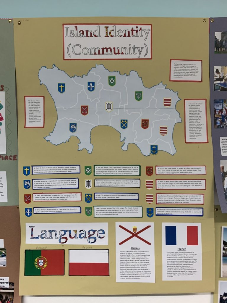
In groups of two (Ollie and I) we had to produce a poster that reflects on one of the key areas of Jersey Identity, we were given “Communities” to explore.

This is our poster, our main focus was the different communities in each parishes, and how each parish is slightly different which is depicted on there way of life. For example, St. Helier is very built up and Trinity is more rural and less busy.

The notes around the outside inform the reader about the how, the Honorary Police is one of the oldest police forces in existence, and embodies the best Peelian principles of policing by consent. The Parish Hall Enquiry system has been celebrated as a highly effective model for restorative justice, with minor offences dealt with at a community level in a way that does not necessarily criminalise first-time offenders. Meanwhile, the twice annual Branchage and the Visite Royale are both examples of important historic rituals that form part of Jersey’s Identity.

Under the map, there’s information about how the parishes got their name, with the correlating symbol on the map and next to the information. For example, St. Helier and how the blue symbolising the sea, and the axes symbolising the martyrdom of Helier at the hands of Saxon pirates in 555 AD.

Finally, the part under the map is based on the different languages in Jersey such as, English, French, Portuguese, and Polish. However, the main section is about the language Jèrriais, as it is in the DNA of Jersey. It’s a crucial historical aspect of our identity. To quote Professor of Linguistics Paul Birt, ‘There are few languages I know with such a richness of expression, some of her idioms are poetry… Jèrriais belongs to Jersey, and without it Jersey would, I believe, stop being Jersey.’ However, if we can agree that we should not allow Jèrriais to die, then we must fund its revival properly. Jèrriais should be an integral part of our Island Identity, promoted by Government, the States, businesses and organisations, and can be used as a unique selling point to those beyond our shores, also helping to differentiate us further from neighbouring countries. Teaching it in schools can embed a sense identification, pride and citizenship in Jersey school children, regardless of background.

French is also one of the crucial components of Jersey’s cultural heritage and identity. It is important for its own sake as the language of our nearest neighbour, and as a stepping stone to Jèrriais comprehension. Additionally, all of the road names are in French, like, Rue Due Mielles.

Personal Study – Statement of Intent

My projects central focus will be around the complex idea of identity. I want to explore this theme through emotional and aesthetically consistent imagery and videography. I am going to hone in on something close to me to explore the idea of identity. I want to examine the sport of rugby. I have been playing rugby for Jerseys rugby team for a number of years and have been playing the sport since a young child which will give my project the aspect of an insider documentation. I want to explore how a team conducts themselves as a whole and the notion of finding identity within a team.

Jersey Reds mini rugby coaching Sunday session Picture: MIKE KENEALY

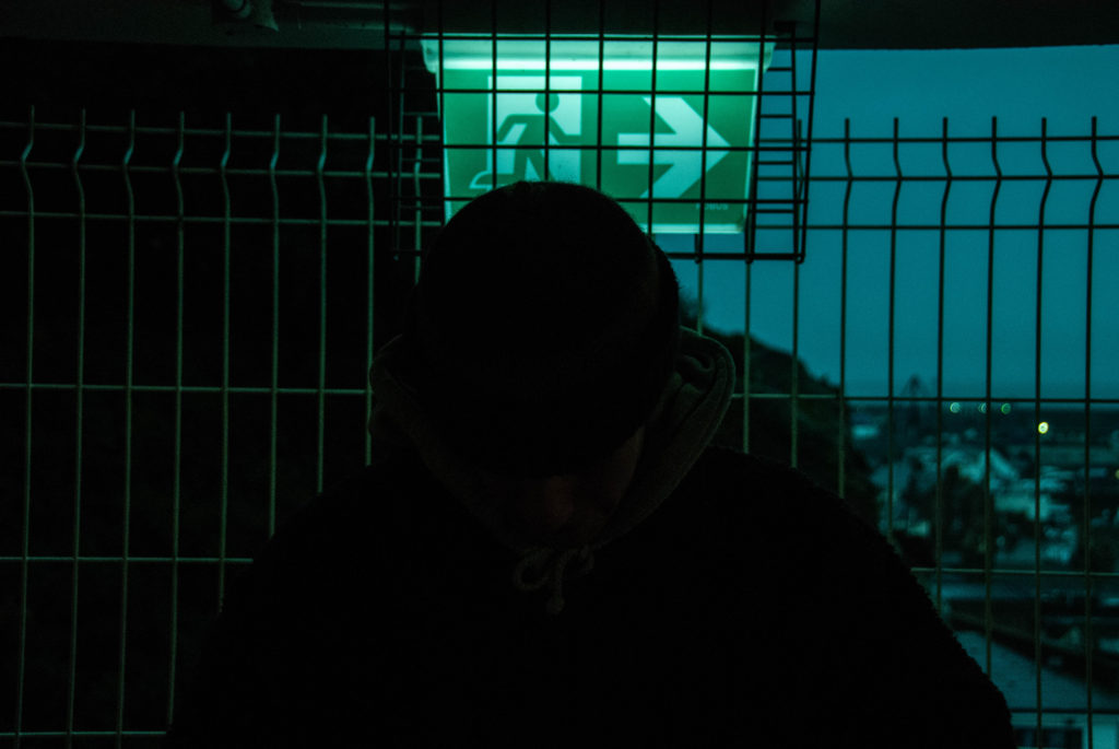
However the main focal point of my project will hone in on one person to explore their identity. In this way I want to focus on the idea of identity in terms of ideologies of masculinity and also the idea of escapism. I believe this is important to explore; growing up rugby has always been a sport that carries with it many stereotypical notions. I believe rugby carries pride, patriotism, brotherhood and endurance within it. It was always a measure of toughness and strength. Two elements that are held in high value. However, these notions can loose their value when seen from the wrong perspective. Often these ideas associated with rugby can mutate into very toxic pressures placed on individual players. Hypermasculinity can have quite a negative effect when talking about identity. With my project I want to explore a rugby player who resembles the stereotypical Viking-like nature of rugby players and strip the ideological walls down and explore a real identity not just the face value aspect of ones identity. I have already began collecting images that represent begin to explore this idea.

Personal Study – Review and Reflect

To gain insight into the task of creating a personal statement and personal investigation I explored the work of a previous student.

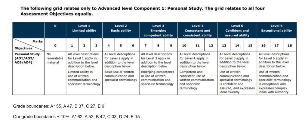
To full understand and ensure I would cover ever aspect of this project I looked at the grading criteria.

This helped me analyse the previous students work and give him a grade which will help me understand how to get into the top grade. To ensure a top grade and achieve all the assessment objectives, ideas need to be developed through sustained and focused investigations which are supported through contextual sources which presents a developed understanding of the project. Appropriate techniques and recourses need to be explored and sustained throughout. Appropriate evidence of recorded ideas need to be included and finally a meaningful response personal to the individual that relies their intentions needs to be made. I also looked at the students work in terms of Concept, Editing, Sequencing, Design, Narrative and Aesthetic. Further criteria to assess the students essay:

  • Does the essay address its hypothesis?
  • Does it provide new knowledge and understanding?
  • Is the essay well structured with a sense of an introduction, paragraphs and a conclusion?
  • Use and flow of language, prose, punctuation, spelling.
  • Use of specialist vocabulary relating to art and photography.
  • Analysis of artist’s oeuvre (body of work) and key work(s).
  • Evidence of wider reading with reference to art history/ theory, political discourse and/or socio-economical context.
  • Use of direct quotes, summary or commentary from others to make an informed and critical argument.
  • Use of referencing system (eg. Harvard) and a bibliography.
  • Use of illustrations with captions listing name of artist, title of work and year of production.

Considering all this assessment criteria will help me create a well structured and in depth response.

Following on from this I began a reviewing and reflecting process were I looked at an overview of what I have learned so far (both as Yr 12 and Yr 13 student) and how I intend to develop my Personal Study.

The project that has inspired me the most from the what I have explored so far is my work exploring the theme of identity and place through the medium of photography.

This image has an empty alt attribute; its file name is GonzPortraitSeries_1024x1024-1.jpg

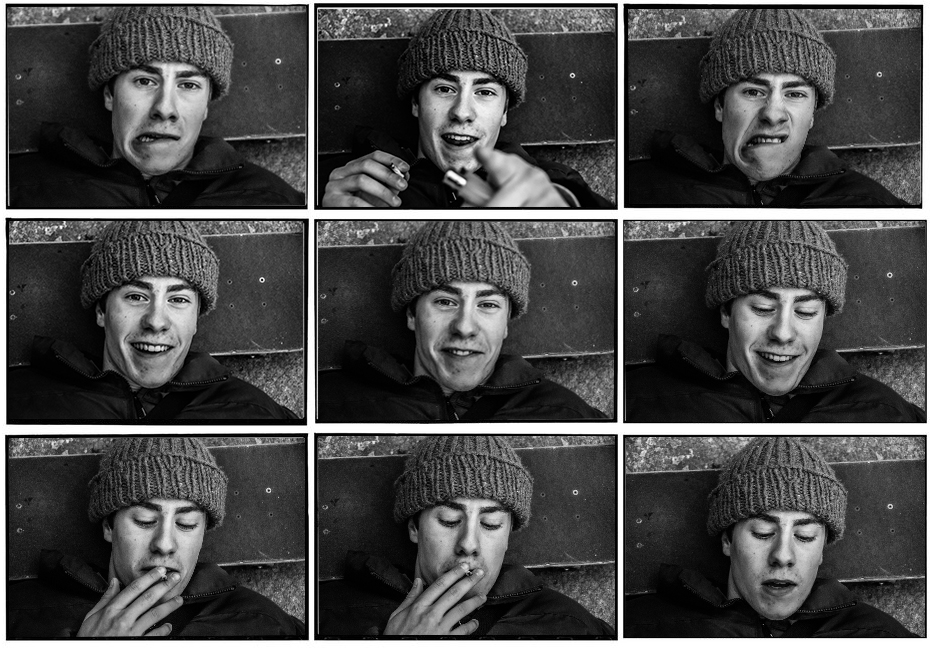
Through this project I explored the notion of telling a story in way in which I explored identity in terms of feeling a loss of identity by feeling like an outcast to society but finding identity by fitting into a sub culture. I approached the project through a combination of conceptual

This image has an empty alt attribute; its file name is DSC_0080-1024x685.jpg

And portraiture style responses

This image has an empty alt attribute; its file name is DSC_0021-2-1024x805.jpg

Through this identity project I explored more modern artists such as J grant Brittan who’s work explores the theme of identity through a romanticist style of photography. And more historic representations of Photography such as Claude Cahun, part of the Dadaist movement of photographers exploring surrealism and identity in an innovative contemporary style. Claude is a highly influential artist for me. Claude was able to massively further my knowledge and understanding of contemporary photography as well as give me a perspective on how to approach themes using my creativity through the medium of photography. I therefore also further developed my photographic skills, specifically skills relating how to create narrative with tableaux imagery and draw emotion from the subject I was shooting which has translated to my current work.

This image has an empty alt attribute; its file name is Untitled-2-2.jpg

I also experimented with more low light photography which was a challenge for me however I learnt from mistakes and fixed them which advanced me as a photographer.

This image has an empty alt attribute; its file name is DSC_0001-1024x685.jpg

This previous year 12 project is why I want to focus on developing this idea of identity to construct my personal study and investigation.

NFT Community – Evaluation

Our project based on highlighting ideas about the metaverse and the idea of ‘2 Lives’ was an overall success. We were able to complete the project within the time frame to a sufficient standard. My artistic intention was to deliver a project which used a-lot of digital techniques to relay a futuristic aesthetic. I believe through the use of animation and various other effects, along with the sound-design we achieved this artistic direction.

I feel we effectively spread the workload amongst the whole group. Everyone had something to do at all times when working on the project.

  • Matthew
    • Camera man
    • Animator
  • Reuben
    • Actor
    • Secondary editor
  • Ollie
    • Director
    • Manager
  • Myself
    • Main Character
    • Chief Editor

This was valuable as the editing process was intricate.

Although class time was used effectively in this way, I do feel more out of class work could’ve been done to help iron out any creases in the film as I do think it has room for improvement. For example some sections of the film do not flow seamlessly but rather cut quite chaotically and therefore more out of lesson time could’ve been spent on transitions.

Our project represented the idea of having social circles online and in the physical world which reacted to the theme of community well.

Our work was inspired by artists like Beeble and I feel we effectively displayed this aesthetic using the digital style of work

NFT Community – Final Presentation

Film

https://web.microsoftstream.com/video/7f2e5973-fc97-435e-8d97-632fd5209787

Digital Image

Final Statement

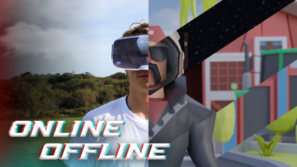
Title: Online / Offline
The concept behind our NFT video is that two friends each have two separate lives; one offline and online. Our video shows how anything can happen on an online medium, but real connection and friendship occurs in real life. As technology develops relationships of all kinds are growing apart. An example of this occurred in the height of the Covid-19 pandemic lockdown. People only experienced contact with family members in the same household and the only way to speak to people outside was via an online medium. This effected the mental health of everyone and looking back on the first lockdown we can see how much we relied on technology to keep connected with family and friends.

Creators: Oliver Shiplee, Matthew Brown, Michael Kenealy and Reuben Jeanne

NFT Community – Recording

Principal Shoot Plan

Before we planned teh shoot we established initial ‘job roles’ for the project:

  • Matthew
    • Camera man
    • Animator
  • Reuben
    • Actor
    • Secondary editor
  • Ollie
    • Director
    • Manager
  • Myself
    • Main Character
    • Chief Editor

We will shoot our video using a DSLR paired with a drone. Referring back to the story board, the DSLR will shoot close up shots and eyelevel perspective shots, while the drone will take the birds-eye-view shots.

Image preview

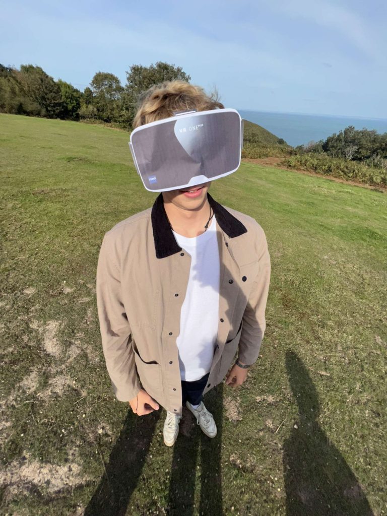
We will shoot during the day time, during overcast weather to remove any harsh lighting and add drama to our footage. We found an open field area with a cliff which is were we will film as we plan for the main character to appear as he is isolated when shooting birds-eye-view shots. The cliff also adds to the drama and the cliff will add more sublime romanticism to our footage. We want our narrative to be obvious and we are using characters who will act out this narrative effectively. In terms of props we will be using a VR headset which we have crafted ourselves using accessible materials.
Behind the scenes:

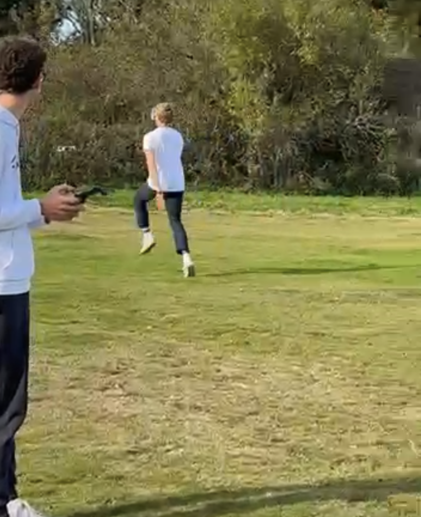
Matthew controlling the drone while I ran towards it
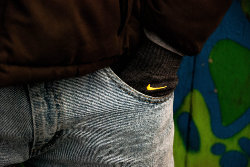
Me showing off the central handmade prop

Am I satisfied that I have enough images/ material? – Yes I am satisfied we have shot an abundance of imagery.
What are you going to do differently on next shoot? – Do not rush the takes as much and refer to the storyboard more directly.
How are you going to develop your ideas? – Add animation and editing to piece the narrative together and further add visual effect to the piece to relay a more emotive campaign.

Film Inspirations:

Editing:

Video

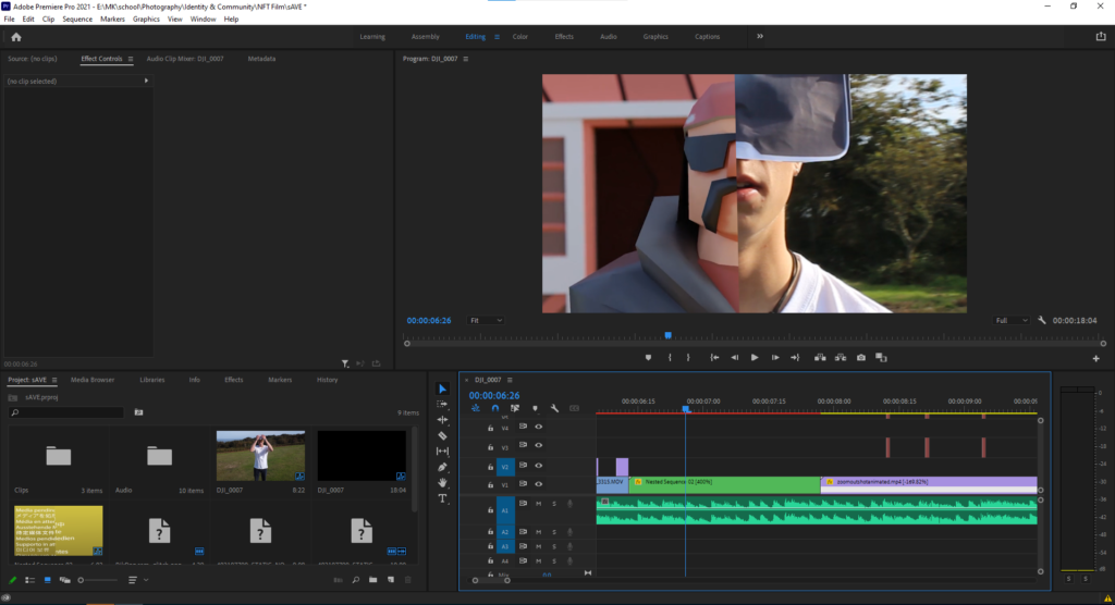
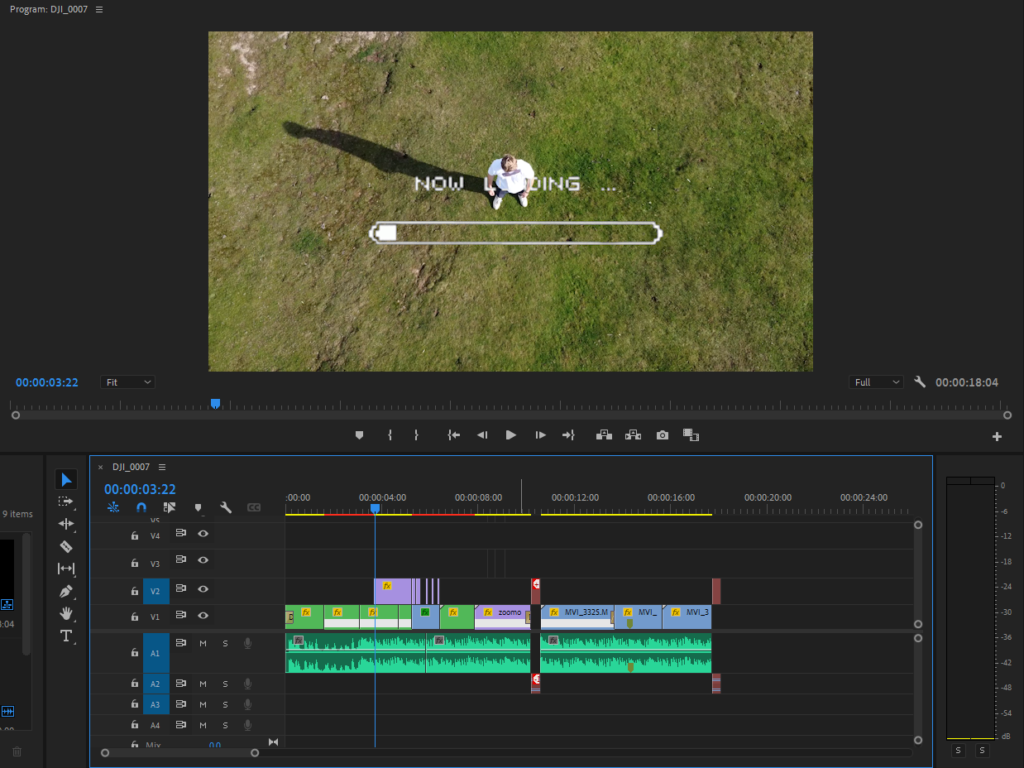
I began by laying delegating the task of finding a backing track for the video. We found a royalty-free electronic song with a fast paced beat which would complement the narrative and visuals well. I then laid the soundtrack in a new sequence in Adobe Premiere pro. Thereafter, I began introducing clips into the sequence and cutting them to the beat. Once satisfied with how the clips where positioned and the overall sequence, I moved onto the next element of post-production, colour grading and Effects. I added a grade on all of the clips using adjustment layers. I went for a high saturation and high contrast grade to dramatize the action in the video. I then added video-game style overlays such as the one below.

For the split screen concept I first had to motion track my face to stabilise the clip more so that my facial features lined up with the animation characters features. The animation was designed by Matthew. You can see his editing process for this HERE

This involved an intricate frame-by-frame masking process.

I added speed ramps to add a sense of hyperreality and the idea that time is controllable in the metaverse more. Finally I added sound FX to add a more immersive feeling.
Image

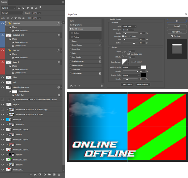
Matthew made the the digital image in photoshop. He used a screen grab from one of the videos of me wearing the VR, and the 5 animated scenes all at the same timeframe so the character lines up.

He then added some glitched text effect by using 2 layers behind each text. To make it better he added some blending mode features, such as, emboss and bevel, etc.

He used shapes and clipping layers to add all the images into to ensure all the shapes are even.

This is the final image which represents the whole NFT film. It shows the most important scene, which is the split scene that includes the animation as the NFT exhibition is called 2lives (online and offline), it shows the real world and the virtual meta verse.