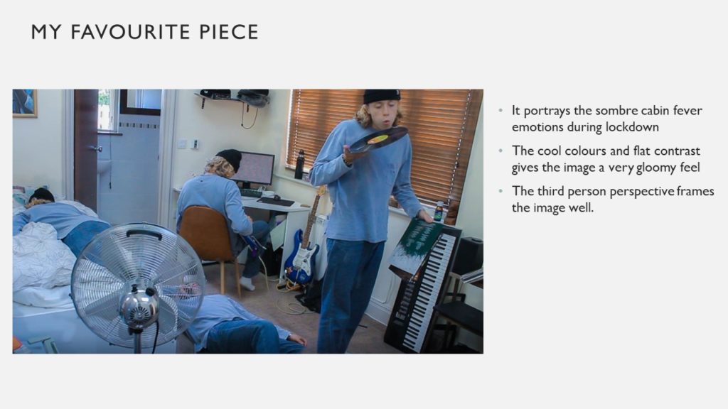


INTRODUCTION
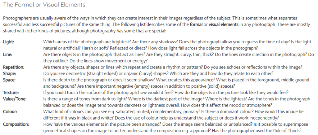
There are seven formal elements of photography which consist of: Line, Shape, Light, Repetition, Space, Texture, Value/Tone, Colour and composition. However in every photograph sometimes it can be challenging to find all seven elements. For example Martin Creed is a very well known artist for using light in several ways. To get inspiration for my photos I started off by looking at Martin Creed’s photograph of his paper ball, which personally I found very peculiar as it’s such a basic photograph but has several formal elements. However as it’s in black and white it allows more contrast to be shown which enhances the photo in several other ways. I then went on to try to recreate his photo which I feel worked to a certain extent.
PAPER SHOOT


















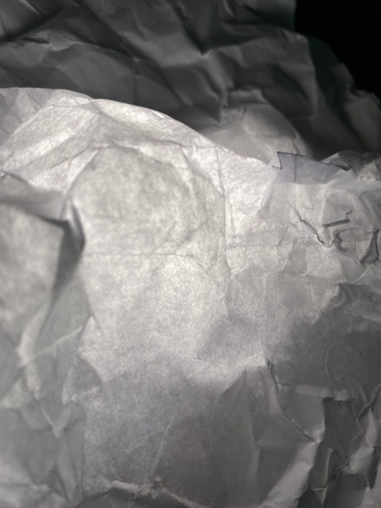








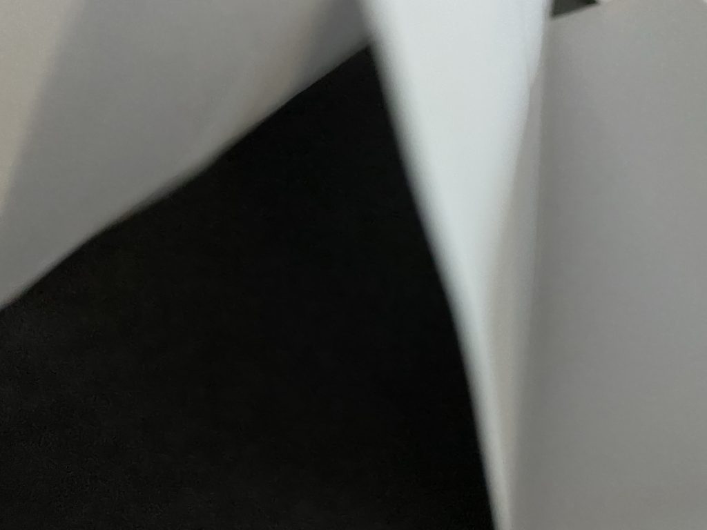






BEST IMAGES


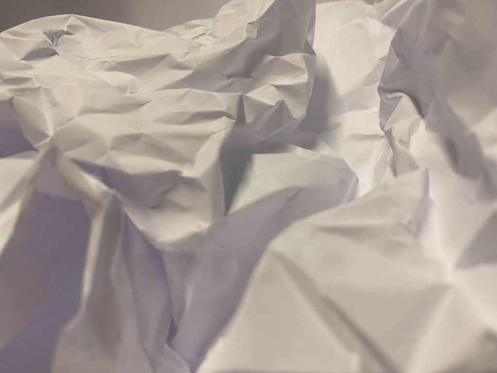
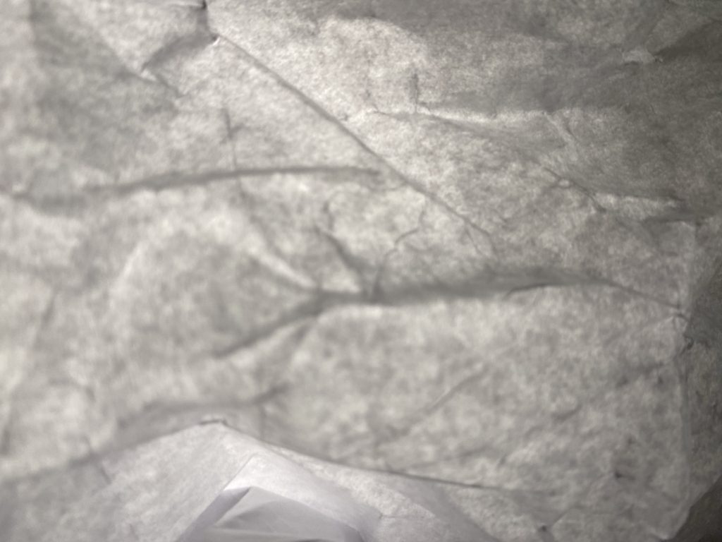
Light- The light in these photos are artificial as we used a torch to add harsh lighting to these photos rather than a soft natural lighting, which I feel enhances the texture of the paper. We can also chose the angle in which the light is coming from therefore we can adapt where the shadows are.
Line- I adapted the lines of the paper in different ways such as folding the paper in vertical lines as well as scrunching the paper up and then unfolding it to make a pattern of unorganised lines.
Repetition- In several of my photographs the lines and shapes are repeated this is due to the way I chose to fold them.
Shape- The shape of the paper is adapted throughout the photos as I decided to keep the paper flat whereas sometimes i decided to keep the paper scrunched up.
Space- As you can see I have rarely left space between the angle of the camera and the paper its self as I chose to take macro photos rather than distant photos.
Texture- The texture of my photos look very rough and uneven.
Colour- In my photographs I have chosen to adjust them to black and white as I feel that it enhances the photos and shows more details.
Composition- I decided to place the paper in the center so the photos didn’t look uneven.
Arnold Newman was an american photographer mainly known for his environmental portraits. The photo above is very unusual, This is due to the way in which he is the main focus point of the photograph as well as his eyes are looking up at the photographer making him feel intimidated by the view point of the photographer. Furthermore we don’t seem to pay as much detail to the background as its the non-focus however it looks like this photograph was taken in a train station of some sort which adds details to the overall mood.
Additionally I also feel that the way the lighting comes from above adds extra detail and contrast to the photo as the lighting adds harshness creating more tones. Overall this photo may make the viewer feel very sympathetic towards Alfred Krupp as he looks concerned due to the way he is looking up. secondly the mood of the photo is very unpleasant as the dark tones have a drastic effect on the mood overall.
Task
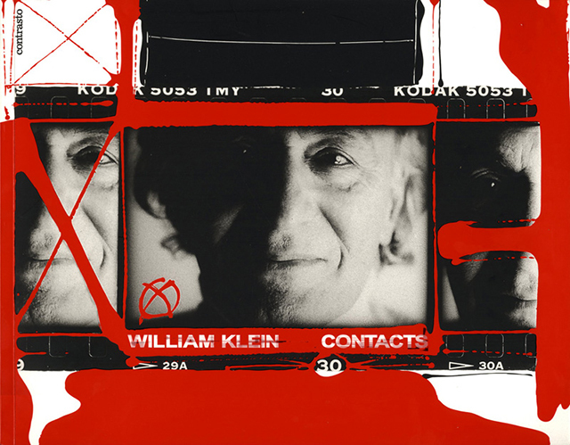
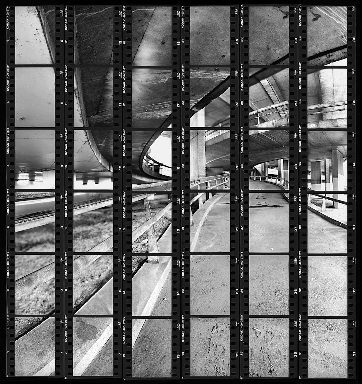
Contact sheets were an incredibly important tool and an inevitable part of the photographic process until digital photography rendered them obsolete. As Lubben notes, they constitute “a record of one’s shooting, a tool for editing, and an index to an archive of negatives.” Indeed, she continues, the contact sheet “embodies much of the appeal of photography itself: the sense of time unfolding, a durable trace of movement through space, an apparent authentication of photography’s claim to transparent representation of reality.”
Contact sheets also represent the economy of the roll of 36 frames, as opposed to the limitless numbers of shots that digital photography affords today. As such, they provide the physical marker of an era when each frame had a value, and was therefore more precious.
Then develop and publish a blog post that tackles the following…








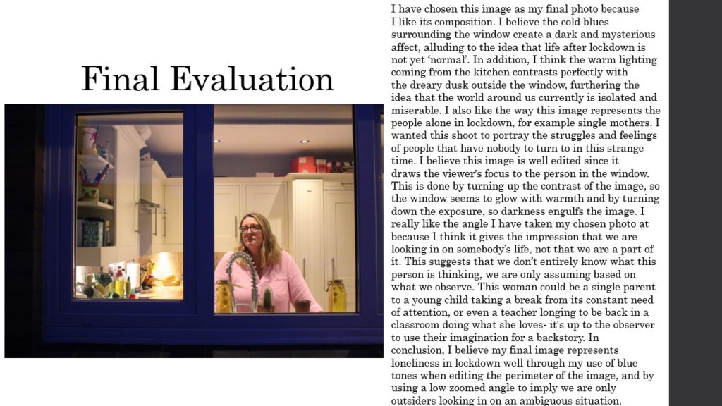
Robert Frank
•Robert Frank was one of the most influential photographers in the 20th century. Robert Frank use to be a successful fashion photographer, until he felt like he wanted to explore photography more in depth as fashion photography was very limited for him as a photographer. After being a fashion photographer, Robert Frank decided to become a more creative photographer taking pictures of places he went and what he saw, with photography style described as a “mature style” which was characterised by“bold composition and ironic, sometimes bitter, social commentary”.
•Robert Franks pictures are all in black and white with a lot of personality in the pictures as they come across to be taken in the moment, meaning that the pictures weren’t a planned shot. From some of the pictures, visually you can see that the people in the photographs where moving as he took the pictures also, there is natural lighting in all of his pictures which can be seen from the scenery the pictures are taken and the shadows in the pictures stand out as well. Moreover, his pictures are in black and white which goes to show the era in which he took his pictures in also, from the facial expressions on the pictures he has taken you can see that some of the people in the photos have some emotion attached to them being upset, frustrated and feeling casual from the lives they have to put up with.


My Pictures


Edited Pictures
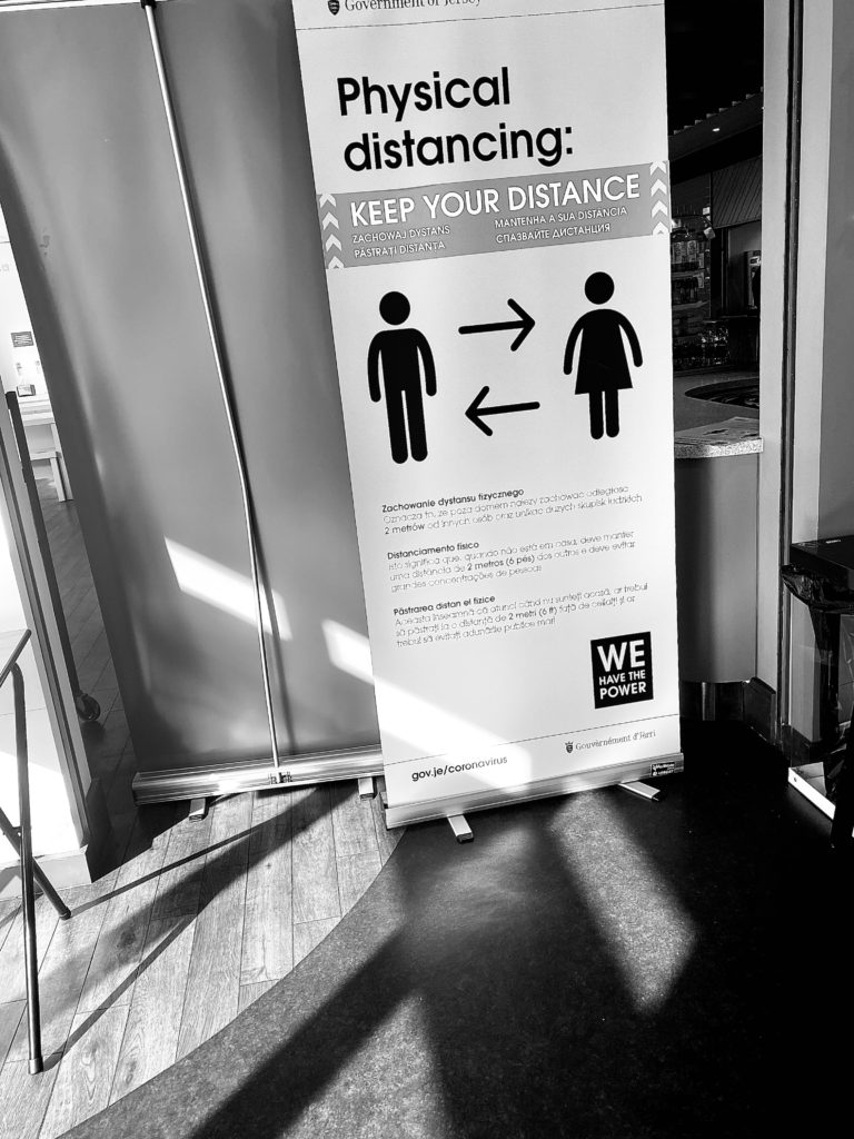


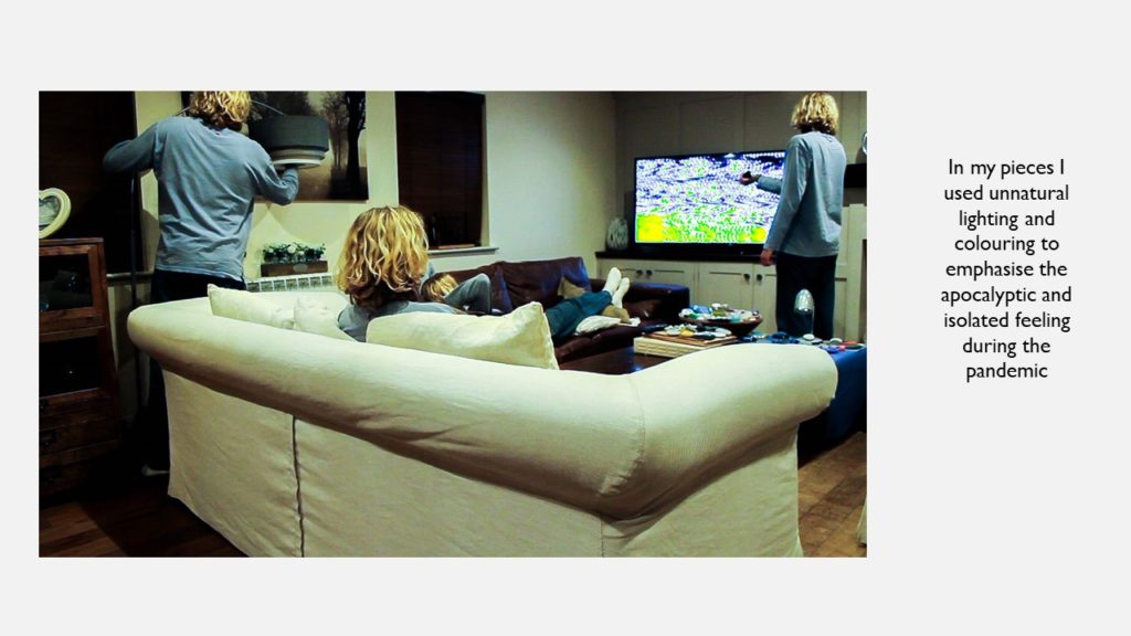
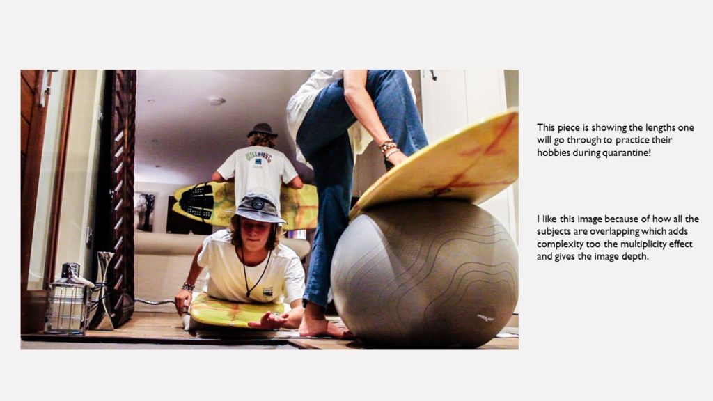
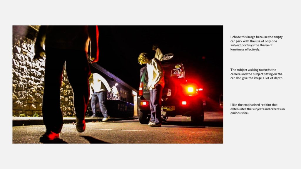
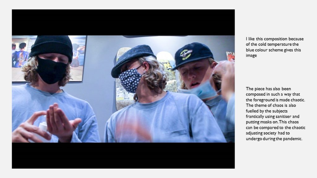
•The overall evaluation from my work is that in my opinion I think I have gotten some of my images to lok like Robert Frank’s, I know this because my iages are In black and white having some contrast being recognisied in the pictures from the bright colours in the pictures to the shades of black in the pictures. Moreover, in my pictures I have got a lot of shadowing that is quite apparent, standing out in the pictures due to using Robert Frank’s technique of black and white photography. The shadowing in the pictures is key as it goes to how where the source of light is coming from in an image also, showing how harsh or soft the lighting is within the environment. Another reason as to why I thought the technique of Robert Frank’s black and white photography does justice within this theme for the photo shot is because lockdown was a very inytense time for everyone mentally and physically, the emotion that most people probably came across was lonellyness and his technique worked with this as black and white pictures are very hollow which can show lonellyness, especially in my pictures in which their arent people around.
Favourite Edited Picture

•My favourite picture that I thought was best In terms of having a similar style to Robert Frank was this one. This is beause it was a picture taking in the moment with peiple minding their own business either socialising in small groups or wokring. Moreover, this picture links with the theme as there are glass pains in betwenn tables showing people cant be to close and there are empty tables acroos the restaurant with people sitting on them, in order for people to be socially distanced because of the virus
This induction task is designed for students who wish to study A Level Photography. The aim of this task is to ensure that the students who have chosen this option both understand the requirements of the course and start as early as possible in their journey towards completing it to a high level. The work you produce in this Induction Task will be used to stimulate a group discussion during the first session as well as form the beginning of Component 1 (coursework) in your 2 year A Level Photography course.
You can explore all / any of the genres below to express your unique ideas…
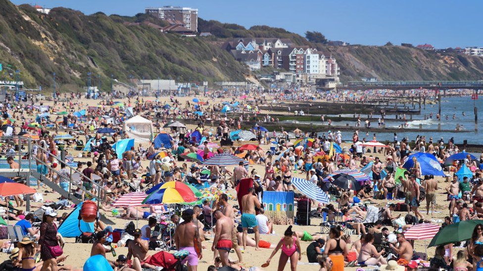
Show how you can observe, interpret, define and most importantly photograph signs of …
“LIFE AFTER LOCKDOWN“
…influenced by the COVID-19 / Global Pandemic

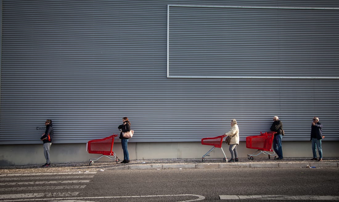
You may want to explore visual aspects, or subtle and nuanced ways of photography various forms of
freedom, liberation, captivity, isolation, loneliness, care, health, separation, mental health, well-being, environmental impact, recovery, family, community, communication, social distancing, before and after etc
…that have an emotional or personal edge. There are many possibilities…some more obvious than others. You may want to compare and contrast these aspects of how our lives have been forced to change in the last few months…
You should / could start by photographing some of the following suggestions… and of course, you may already have some of these images so add them to your project
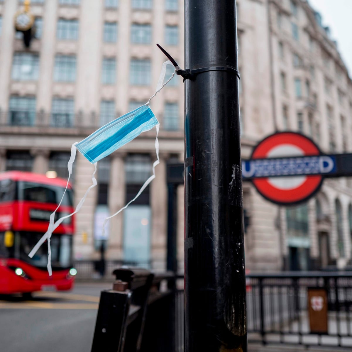
How to proceed:
Some examples…

Focused Examples
Family, environment, isolation, community, hope…
Indirect Selfie


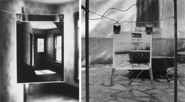
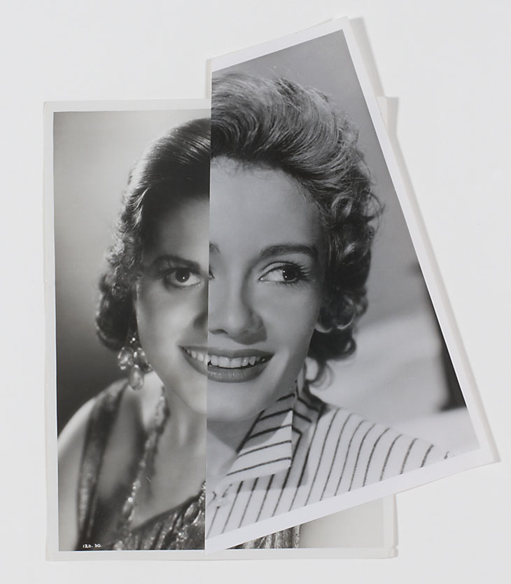
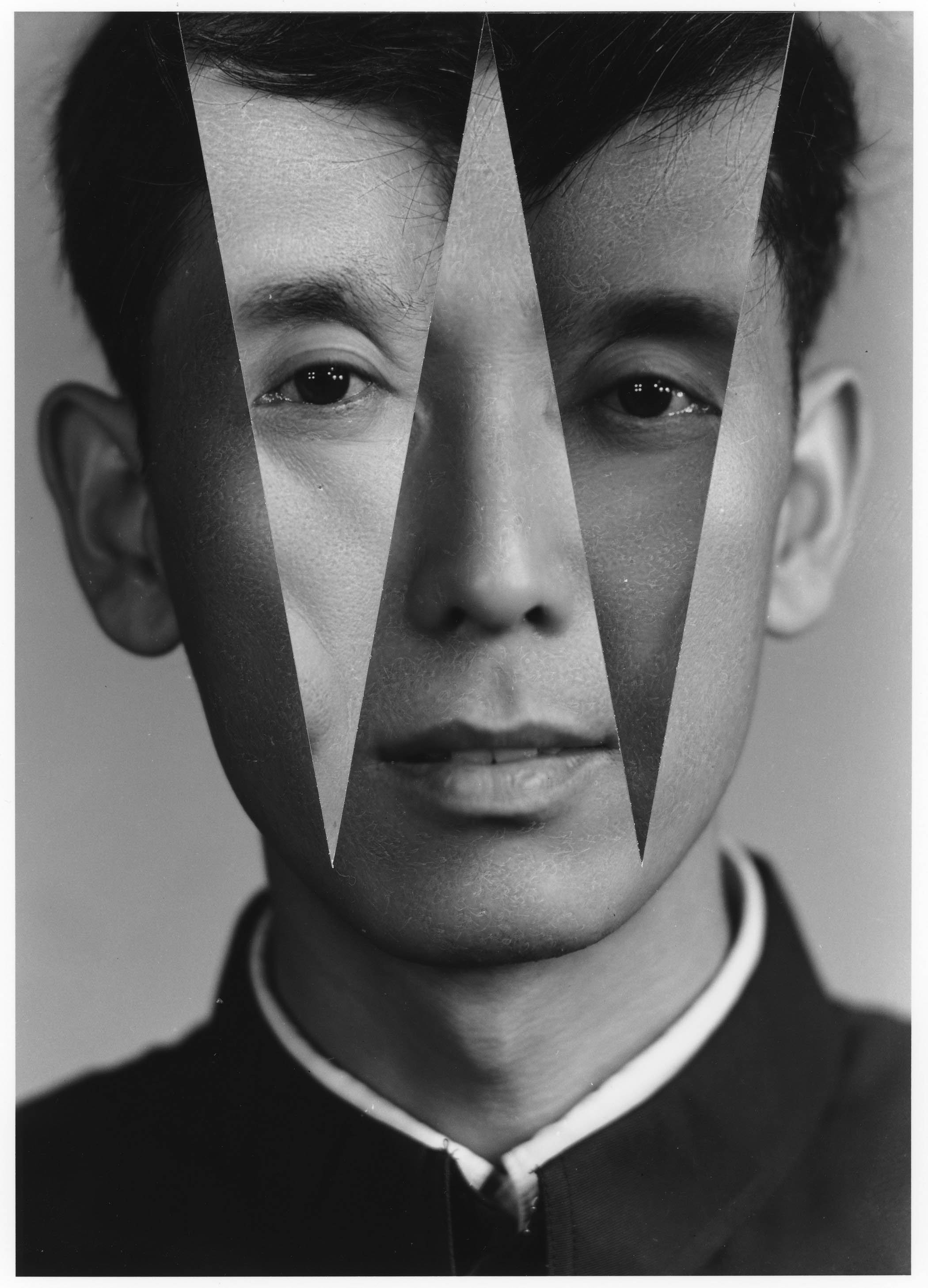


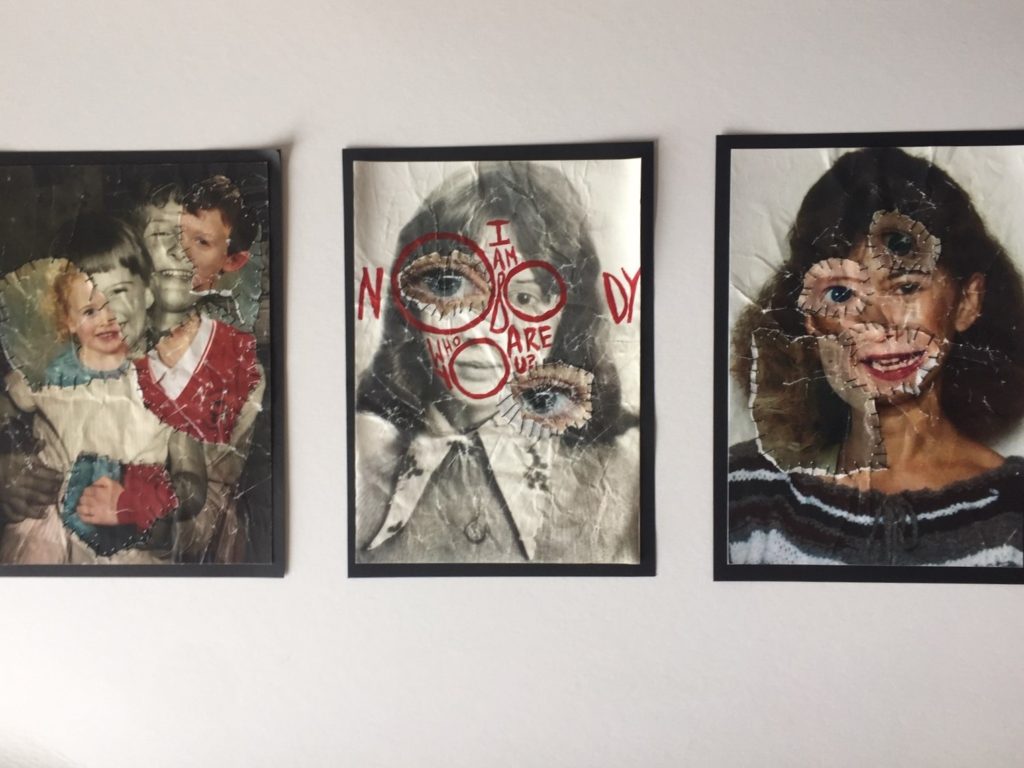
What do his / her photographs say to you?
Look at composition and its visual elements e.g. line, form, shape, colour, tone, contrast, texture, depth, balance, space, perspective, viewpoint, foreground/ mid-ground/ background, rule of thirds. Look at the use of lighting e.g. natural lighting; sunlight, overcast, soft, harsh, directional, contrast and artificial lighting: studio, flash, spotlight, side-light, backlight, reflected light, shadows, chiaroscuro (light / darkness).
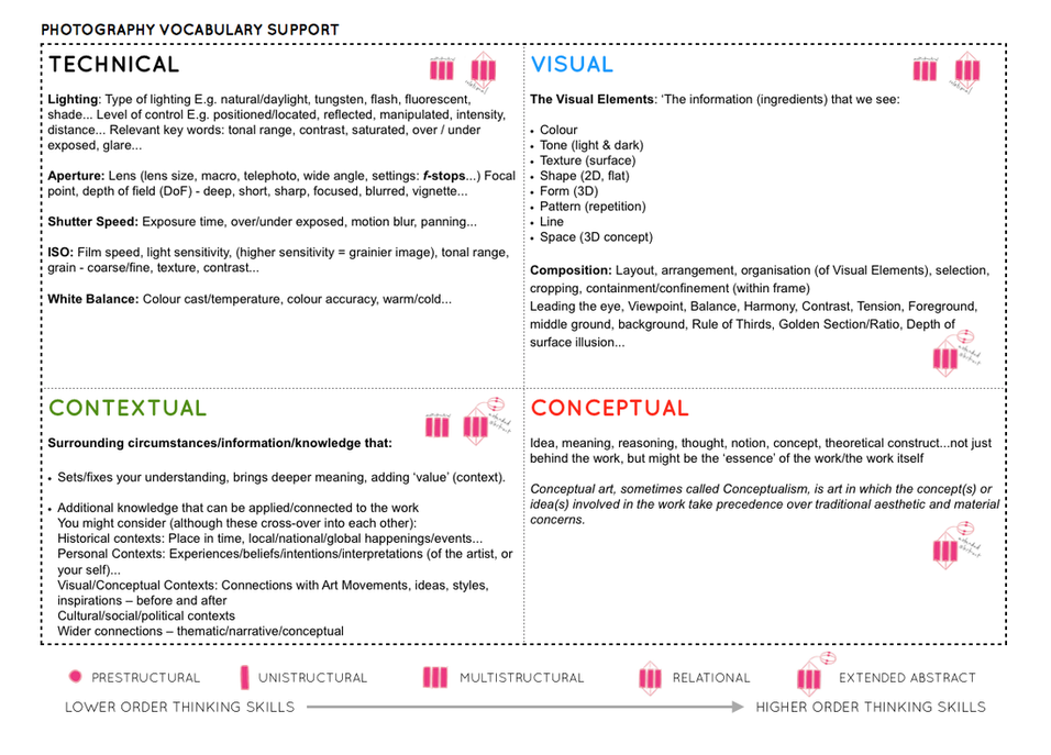
Use photographic language as above in your annotation and consider the artistic merits :
Technical , Visual , Conceptual and Contextual elements
Planning: Once you have spent time evaluating the work of your chosen photographer, plan a shoot using the same techniques and mindset.
You must: Produce a mind map showing your thought process and with breadth of thinking, and a mood board (collage of images) to illustrate the look and feel of your project.
Recording: After planning your idea, gather together what you need. When you take pictures try and think about everything that you see in the frame – what’s in the foreground, mid-ground, background. To achieve this you must think about composing your picture (use your zoom lens and/or distancing yourself from subject/object), focussing (sharp, soft focus), use creative exposure tools on camera like fast/slow shutter speed to either freeze or blur a sense of movement, different aperture settings to control the area of focus and sharpness in your picture. E.g. a high aperture setting like f5.6 will make the background soft and out of focus whereas an aperture of f16 will make everything in the picture sharp from foreground to background. Also by zooming in or using a telephoto lens you can throw the background out of focus, or conversely if using a wide-angle everything in the frame will be in focus. Crop your images carefully.
Editing: Editing is one of the most important aspects of photographic practice so be critical and selective when you choose your final selection of 5 images and then your best photograph. Think about sequence and relation between images – does your series of images convey a sense of narrative (story) or are they repetitious? Sometimes less is more!
You Must: Gather your images and select your final selection approx 5-10 images, describe each of the images, artistically and share your thoughts on what why you took and then selected the image.
You should: Show your ability to correct or adjust the images using image manipulation software, such as Photoshop, consider the cropping, adjust levels, contrast, colour correction, B/W and balance of the image.
You could: Use Photoshop to enhance your creativity and expand on the possibilities that photography gives you, include screen grabs to illustrate the techniques you have used.
Presentation: Think about how you present your work in terms of layout, scale, colour and perspective. A Powerpoint presentation is ideal for this and allows you to change and adjust your work easily.
The presentation of your photographs is just as important as your photographic images themselves. Consistency of layout throughout is paramount and try to make your work personal.
You must: Gather all of your work and present it in a logical and aesthetic manner…
A grid format could work well for this exercise

You should: Produce an individual and comprehensive response to both your chosen artist and the inspirations that the artist has given you.

Evaluation: Reflect, contrast and compare the images and ideas that you have taken and make an account of how you made the photos, development of idea and what you were trying to achieve and communicate. This can be done throughout your layout as annotation or at the end as part of your final evaluation. Finally, choose your favourite image and present this separately from your series of images. Accompany this with a brief written analysis (250-500 words) explaining in some detail what it is that you think works well about this image.
Make sure you bring with you: all of your work including your best A4 printed image for your first photography lesson in September 2020.

USEFUL LINKS
Photographs that changes the way we see the world …
Bruce Gilden’s approach to Lockdown portraits…
Julia Keil – re-staging famous portraits
Women Photographers x LOCKDOWN
Photo-Literacy
Good luck and get creative!
Email // j.cole@hautlieu.sch.je
Web // www.hautlieucreative.co.uk
| Photographs consist of formal and visual elements and have their own ‘grammar’. These formal and visual elements (such as line, shape, repetition, rhythm, balance etc.) are shared with other works of art. But photographs also have a specific grammar – flatness, frame, time, focus etc. ‘Mistakes’ in photography are often associated with (breaking) the ‘rules’ and expectations of this grammar e.g. out of focus, subject cropped, blur etc. Some photographers enjoy making beautiful images but others are more critical of what beauty means in today’s world.Photographers have to impose order, bring structure to what they photograph. It is inevitable. A photograph without structure is like a sentence without grammar—it is incomprehensible, even inconceivable. — Stephen Shore |
This way of thinking about photographs has come to seem a bit old fashioned due to competing theories of photographic meaning, Postmodernism and digital culture. It is certainly true that formalist readings of photographs alone can never do full justice to the complex webs of meaning generated by photographic images. Photographs aren’t neutral. They don’t show us things as they are, although they’re pretty good at pretending they do. Photographs are ideological constructs, a fancy way of saying that they don’t simply show us what is ‘true’ or ‘real’.
However, one might argue that photo literacy in part depends on an understanding of the formal or visual elements, some of which are borrowed from the visual arts, with others appearing to be specific to photography. As in any language, ‘grammar’ gets you so far, helps you appreciate the structure and ‘rules’ governing particular modes of expression. A knowledge of the ‘grammar’ of photography is therefore part of the analytical and creative toolkit of any photography student.

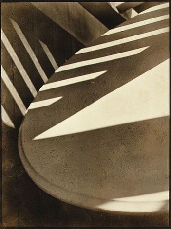
The photograph below is by Paul Strand. It is entitled ‘Abstraction, Twin Lakes, Connecticut’ and was made in 1916. You can read more about the image here. The photographer created a picture that draws attention to the Formal Elements. Spending some time really exploring photographs in terms of the formal elements is an important process in the development of visual literacy.
Link to excellent BBC Resource / formal elements and more…
Analysing and Interpreting Robert Frank – Trolley, New Orleans

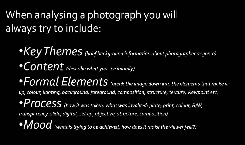
A guide to evaluating a Photograph: Key Themes, Content, Formal Elements, Process & Mood.
Key Themes – brief background information about the photographer or genre
Gain insight from title of image, date of image etc. Background research etc.
Content – Describe what you see! Look at the subject of the photograph.
What is it? What is it about? What is happening? What is in the foreground, midground, background? Where and when was it taken?
What do you think the relationship is between the photographer and the subject/s is? What has the photographer titled the image and why? Does the title change the way we see the image? Is it staged? Is it real?
Is it a realistic depiction? Has it been manipulated in anyway? If so, where and why? What is the theme of the photograph? What message does the photograph communicate?
Formal Elements – break the image down into the elements that make it up.
Colour, lighting, composition, structure, mood etc.
Colour – Is the photograph colour or black and white? Is there a reason for this? How does this affect the mood? What colours are depicted?
Lighting – is it photographed in a studio? Is it using studio lighting? Natural lighting? Has the photographer waited for the right natural light? Has the photographer positioned themselves? Vantage point. Is the lighting subtle? Is it strong? If so why and who has the lighting been used? Effectively or not? Does the lighting help the image? Why? Create mood/atmosphere? Dark, light?
Tone – Is the photograph high or low contrast? How and why? What tonal values.
Line/Composition – What sort of lines are there in the image? Leading lines? How have they been positioned in relation to the rest of the image? Is this on purpose? (the viewfinder or cropped afterwards?) What effect does this have?
Shape/Composition – What sort of shapes are there in the image? Do they remind you of anything? Do you think the photographer meant this? Is there symmetry? Is it structured in anyway? Rule of thirds? ‘S’ shape? ‘J’ shape. Golden Spiral, Golden Ratio, Fibonacci? Is it minimal? Simple? Complex? Confused?
Process – how the photograph has been taken, developed, manipulated and printed
Was the image taken inside or out? What time of day? Light sources? Evidence. Materials or tools used (props, objects, studio etc) Has the image been manipulation post production? How and why? B&W or colour? Plate, C print, large format, medium format, pin hole, slide, digital print, projection etc. Date may help.
Mood – look at the mood and feeling of the image
Is the photographer attempting to capture a moment/atmosphere/emotion? Explain why you think this. Is there a narrative/story? How does the image make you feel? Why do you feel like this? How and why?
USEFUL VOCABULARY
Colour
Intense Saturated Bright Luminous Secondary
Clash Mixed Soft Cold Opaque
Tint Deep Pale Translucent Dull
Pastel Transparent Glowing Primary Vibrant
Harmonious Pure Warm Dark
Tone
Dark Harsh Bright Fade Intense
Contrast Fair Smooth Crisp Gradation
Sombre
Composition
Background Distant Middle Ground Blurred
Shape Scale Perspective Confused
Foreground Space Form Proportion
Symmetry Structured
Light
Artificial Gentle Natural Dapple Harsh
Night Dark Haze Shading Highlight
Shadow Evening Intense Soft Light
Source Midday Tone Directional Bright
Focussed
Mood/Feeling
Alive Disturbing Sad Atmospheric Exciting
Humorous Delicate Expressive Depressing Happy
Energised Shocking Questioning Thought provoking
Powerful
Once you have been instructed on how to use the lighting studio safely and respectfully, you will be able to use the studio during lesson times or in study periods. You must book the facility in advance via one of your teachers JAC / MM / MVT.
You must always leave the studio in a clean and tidy, safe manner. All equipment must be switched off and packed away. Any damage must be reported and logged.
Portrait Studio Shoot

Types of lighting available

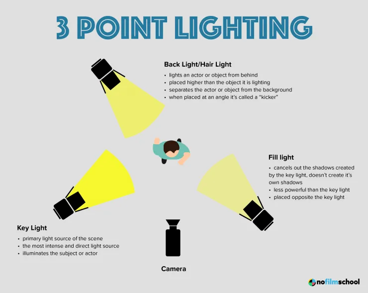
Still Life Photography and using the product table / copy stand


Still-life Studio Shoot:
You can choose to photograph each object individually or group together several objects for a more complex still life arrangements.
Technical stuff
Continuous Lights – photograph objects three dimensionally
Camera setting: Manual Mode
ISO: 100
White Balance: Daylight
Aperture: F/16
Shutter: 0.5 sec to 0.8 sec (depending on reflection of each object)
Lights in room must be switched off to avoid reflections
Continuous Lights – portrait
Camera setting: Manual Mode
ISO: 100
White Balance: Daylight Shutter Speed 1/125 sec Aperture f/16
Flash Lights – photograph images, documents, books, newspapers, etc or portraits
Camera setting: Manual Mode
ISO: 100
White Balance: Daylight
Aperture: F/16
Shutter: 1/125-1/200 (depending on reflection of each object)
Flash heads set to power output: 2.0
Use pilot light for focusing
PORTRAITS
Camera settings (flash lighting)
Tripod: optional
Use transmitter on hotshoe
White balance: daylight (5000K)
ISO: 100
Exposure: Manual 1/125 shutter-speed > f/16 aperture
– check settings before shooting
Focal lenght: 105mm portrait lens
Camera settings (continuous lighting)
Tripod: recommended to avoid camera shake
Manual exposure mode
White balance: tungsten light (3200K)
ISO: 400-1600 – depending on how many light sources
Exposure: Manual 1/60-1/125 shutter-speed > f/4-f/8 aperture
– check settings before shooting
Focal lenght: 50mm portrait lens