



Process
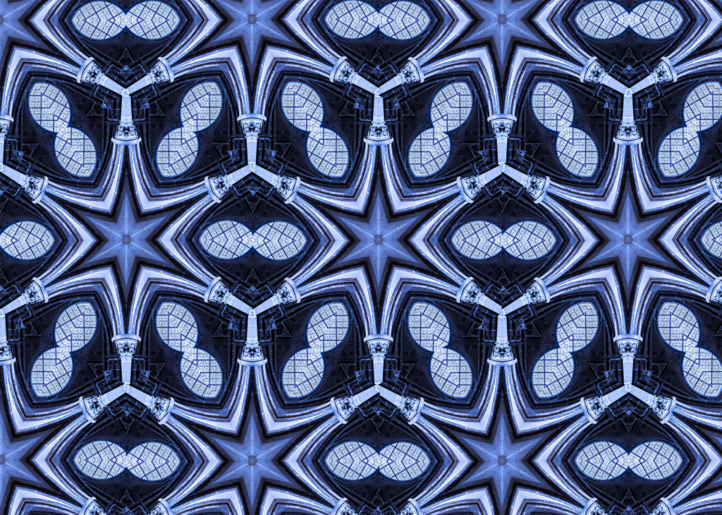
I imported an image I thought would look interesting in a reflected manner into photoshop. I chose an image of a church window with two rising parallel pillars either side of it.
I then used “ctrl + T” to enable free transform. I then rotated my image by 60 degrees by changing the angle in the top hotbar.
I then moved my image to the edge of the canvas to isolate an isosceles triangle. Once happy with the triangle I made it a seperate layer.
I then enlarged the canvas by 400%.
I then flipped the isosceles triangle on a vertical axis and lined it up with the original one to make an equilateral triangle.
I then flattened the layers and rotated the equilateral triangle around the same anchor point by 60 degrees. I then repeated this step to make a hexagon. I then filled in the rest of the image with the hexagons.
I plan to take photos of the reflections on water at Bouley Bay and, in my sink the create bubbles in the water. There is also a small waterfall at Bouley Bay, so I plan to take photos of that using a long shutter speed to capture the motion in a blurred way, I might also do this to the waves and splashes on the rocks. I will need to make the shutter speed not to long, because it will be overexposed, as there is more light going into the camera, but it needs to be long enough to get the water as a smooth texture. I want to take the waterfall photo as it demonstrates my practical skills using a camera. I was inspired by Ernst Haas’ water and reflections photography.
Final Photos
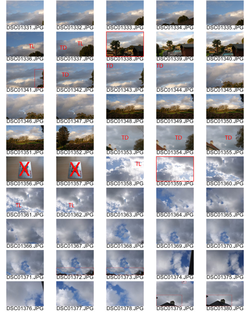
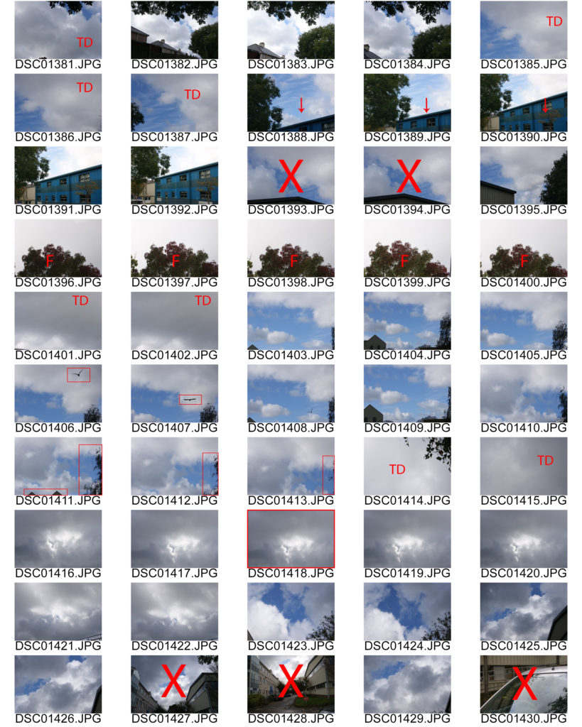
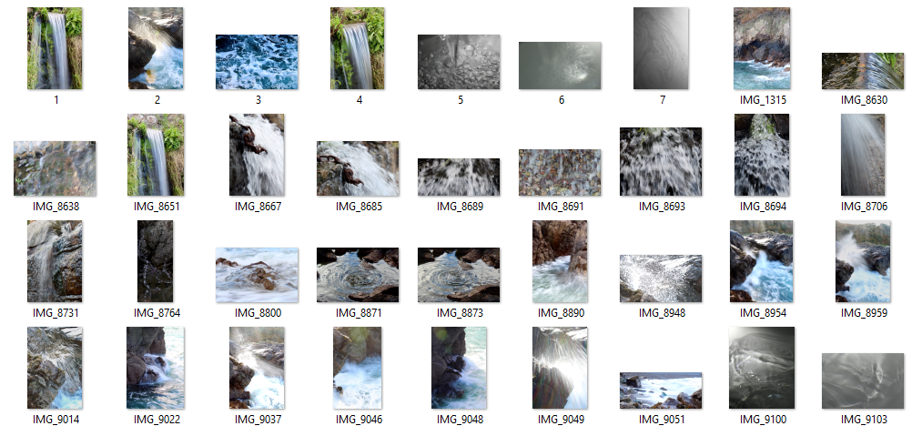
This contact sheet shows my semi-good images. It helped me choose which images to choose as my final images. It is a method of sub selection.
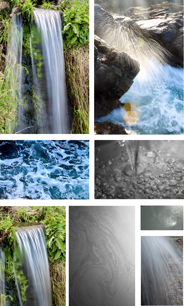
The photo of the waterfall is my favourite, because it shows the silky smooth water, fall over the rock. It has a wispy texture as the shutter speed is longer, which allows motion to be blurred. I was difficult to take as I had to hold the camera still so I didn’t get any camera shake, as it would blur the image.
The photo of the rock with the water splash mid-air is also one of my favourites. The long shutter speed makes the water droplets have a trail whilst were falling. I had to time it so when a big wave crashed into the rocks; I had the camera pre-focused, then I would press the button to take the image as soon as the splash came above the rock. The sun created a lens flare, as I was shooting into the sun. It created definition to the water droplets as they became lit up which meant you could see each individual one clearly.

I decided in picking these two photographers to contrast and compare their work pieces as both photographers use textures, repetition and patterns in an enchanting way.
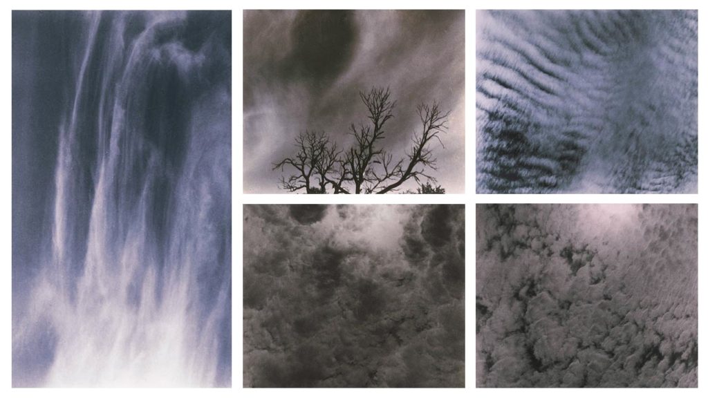
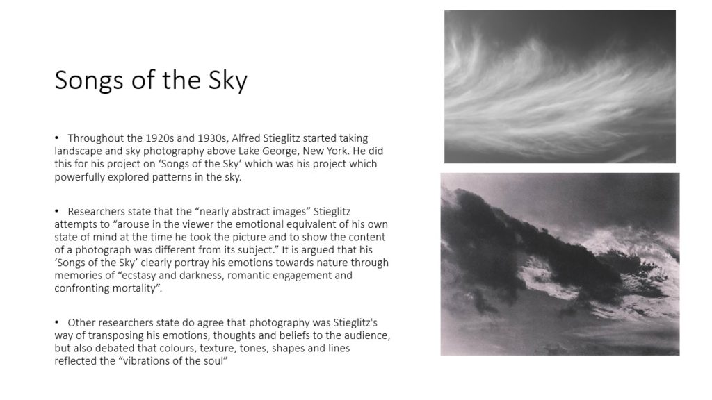
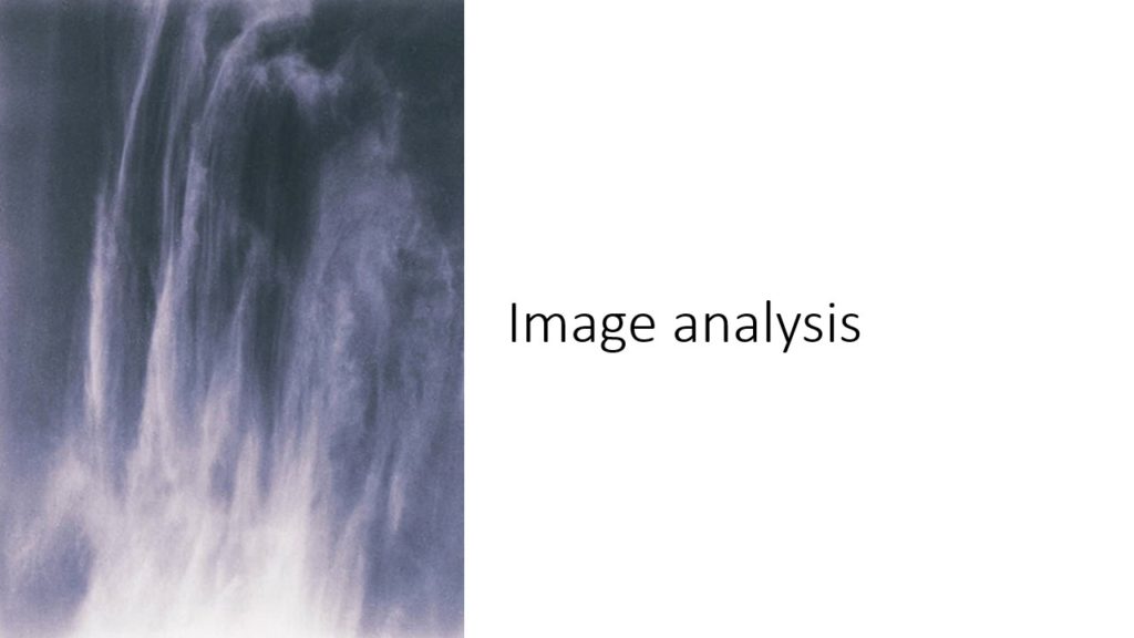
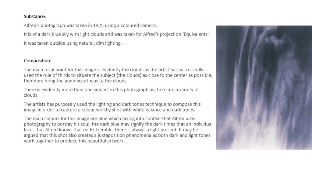
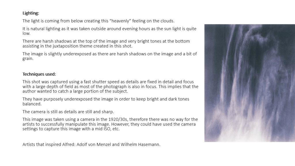
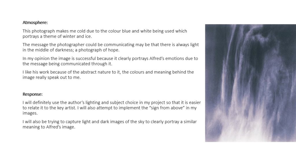
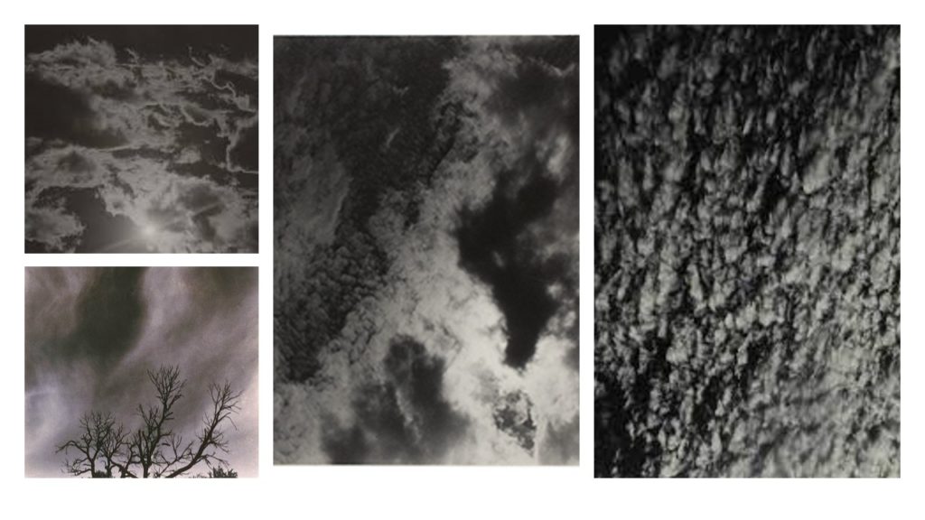
Alfred Stieglitz creates patterns and repetition when in the talking of his photos as the clouds create weird patterns and some of the patterns are repeated in the sky creating an abstract look to the clouds.
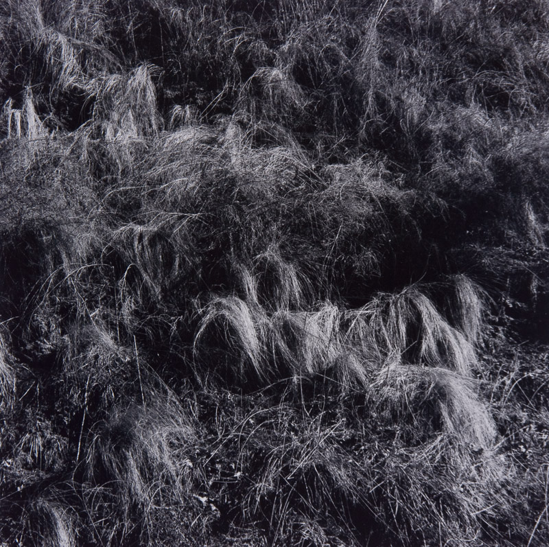
Whereas, Harry Callahan similarly experiments with these patterns and repetition in his pictures with the abstract pictures he takes of grass and repetition in the photos he has taking of trees being lined up next to each other.
Alfred’s picture on the left contains natural lighting which gives different shades into the patterns of the clouds in the sky making some of the clouds darker and lighter than other sin different regions. Visually, Alfred’s picture is appeared to seem very 2D (flat) as their isn’t much highlight’s of light in the clouds in order for them to appear to be 3D or even clouds moreover, their is a lot of patterns in this picture visually as you can see similar cloud shapes as it appears to be one big cloud with light trying to brake through different segments of the cloud. His purpose and meaning of taking these type of pictures of clouds was that it became an art form for him to take this pictures of the sky and photography quite quickly became an obsession for Alfred as he enjoyed his art form of taking pictures.
Harrys picture on the right was taken from the source of natural light with what appears to be a wide angle aperture being used in taking this picture, this enhances the shadowing and contrast in this image from light to dark tones demonstrating the differences from what appears to be wheat and grass in the picture. Visually the image is contrasted to be 3D as you due to the shadowing giving life to the surface in the picture also, their is repetition in this as you can see their is grass scattered about in the picture giving it a very earthly/ naturalistic appeal to the picture. The context of how Harry would go about in taking his pictures, was that he would just get out of bed and take numerous pictures of things that he thought interested him, this comes across in his picture in my opinion as the picture doesn’t seem to be panned but more of a ‘in the moment’ taken picture.
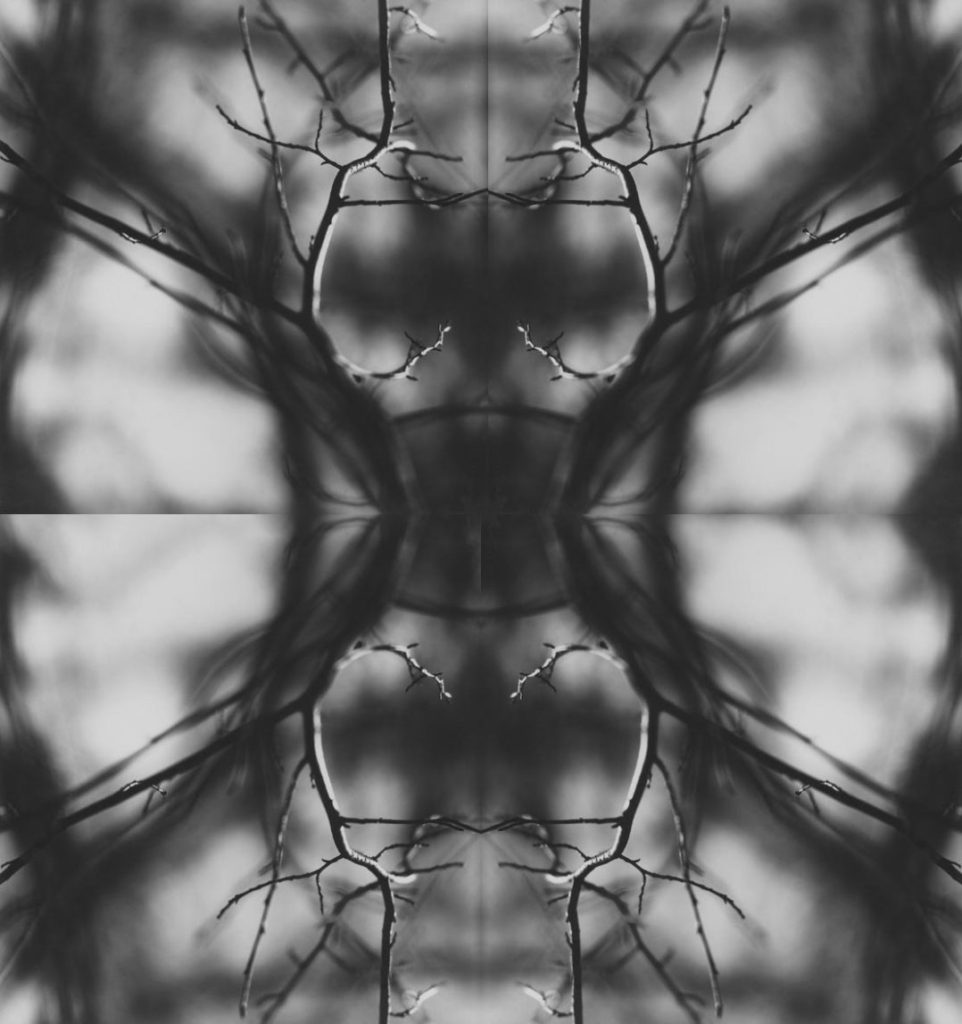
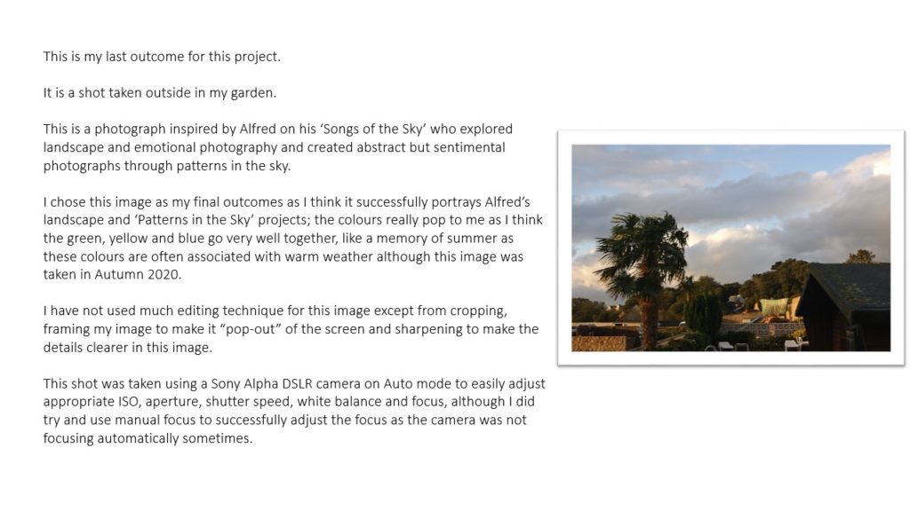
Today we learnt how to create a mirrored/kaleidoscope effect on photoshop. The image above is my final outcome. I chose this image by Ralph Eugene Meatyard because the simplistic shapes that were created by the tree’s twigs allowed the image to look slightly geometric and more complex than original image was.
I believe that the my final works well because of the image being black and white. This gave it an eerie effect which works with the original image which was sparse and and empty but now the four images have been reflected it make a whole other shape, allowing the viewer’s imagination to wander trying to figure out what the shape looks most like.
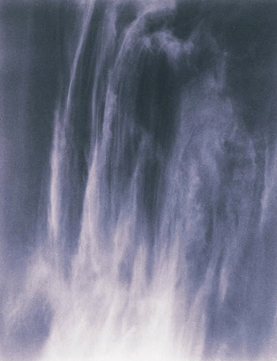
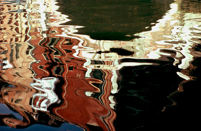
Alfred Stieglitz was an american photographer who’s career lasted for fifty years. He was born in 1864 and died in 1946.
Ernst Haas was an Austrian photographer who had a 40 year career .He was born in 1921 and died in 1986.
Both images are similar because they both have repeated shapes in them even though they are two totally different things. The water, in Haas’s image, has another picture reflected. However the ripples in the water has caused the reflection to look distorted allowing the viewer to try and interpret where and when the image was taken. In Stieglitz’s image, the clouds are wispy and thin at the top of the image allowing us to see columns in the sky. However, as the viewer looks down the image, the clouds seem to merge together allowing the viewer to try and see if the bulk of clouds makes a certain pattern or ‘image’ in the sky.
Although the images have similar patterns, the colours in the images are nothing alike. In Haas’s image, the majority of the colours are warm tones like oranges and reds. This allows the viewer to guess that the images are either taken during sunset as the sky turns red/ orange. Or the image could have been taken near an orange/ red building.
The source of the water is also not clear, it could be from a river, pond, lake or a puddle. The only thing the viewer notices is that there has been something in the water which has disturbed the still water and causing all the ripples.
In Stieglitz’s image the colours are very cool toned which gives the image a calm mood which allows the viewer to understand the message of the image without getting distracted by all the contrasts of colours in the image.
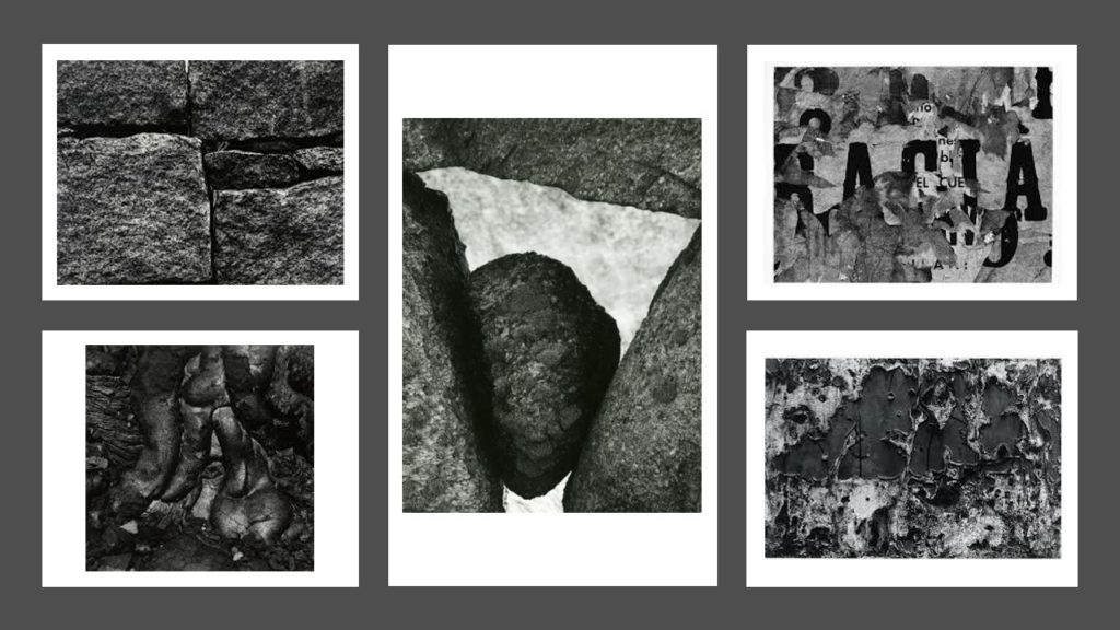
Aaron Siskind
Siskind was born in New York in 1903 and died in 1991.
Siskind focuses on taking photographs that don’t necessarily have a meaning however, his images can be interpreted in many ways. He focuses on layers in his images, it is very rare to see smooth surfaces in his work.
Siskind identified with the ideas and styles of the abstract expressionist artists in New York in the 1940s.
Plan:
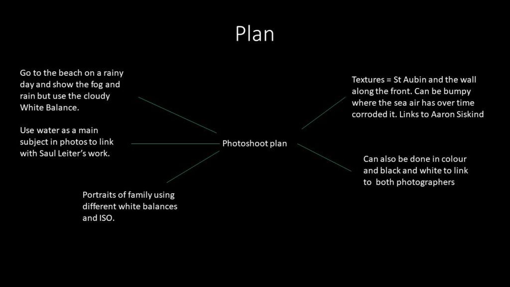
Shoot (Contact sheets on another blog)
I’ve included the images I took in school because I feel that you can see how i have used the different white balances and changed the ISO best on those images. This is because the main feature in those images didn’t move allowing the viewer to notice the difference in tone.
Favourite Unedited outcomes:
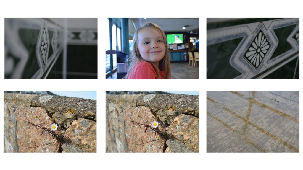
Favourite edited outcomes:
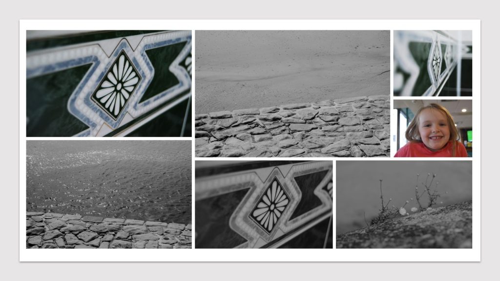
Favourite images
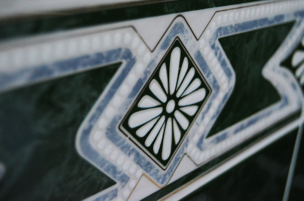

The coloured image is one my favourite images because I feel like the viewer not only sees colour but the different textures on the tiles. .I took this using a 120 ISO and the fluorescent white balance, with a manual focus and shutter speed. .The smooth looking texture of the tile at first glance contrasts the little details of the of the central details like the diamond which is slightly raised and each petal in the centre of it is also raised. The cool tones in the image gives the viewer the feeling of relaxation and this is also supported by the simplicity of the design on the tile.
The black and white image is the same but i went onto photoshop, turned it black and white, then made the contrasts in the photo more prominent so that the viewer can see the bumps around the flower like shape in the centre of the image.
The black and white image also shows the camera focused on the centre of the tile because if you look on the left hand side of the image you can see the details of the tile almost merge into one thing.

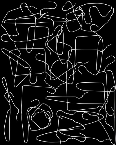
Born in Boston, Massachusetts, in 1983, Nick Albertson has had his abstract photography exhibited in Chicago, Portland, Seattle, San Francisco and New York, as well as international exhibitions such as the Pingyao International Photo Festival. Albertson’s work focuses on patterns and repetition in ordinary, mundane objects. Nick Albertson’s work combines photography, video, and sculptural forms

The harsh, artificial lighting powerfully illuminates the white hangers in order to create a clear contrast against the harsh, black background. No shadows are formed in this photograph as the background itself is black, therefore any shadows produced would have blended into the surroundings.
There is a clear juxtaposition between straight and curved lines in the photograph. There is no specific direction created in the image as the lines direct the viewers eyes in all directions around the screen. The lines are used more as focal points for the image rather than leading lines as there is not one singular focal point.
There is a pattern of repetition using lines in this image. The contrasting straight and curved lines create a type of swirling pattern around the screen as they cross paths with one another.
The aesthetic of the image is very geometrical and artificial, as Albertson lays out the coat hangers in a specific way and bends them in order to create juxtaposing lines. Shapes such as squares and triangles are created due to the specific bending of the lines.
The photograph is very shallow and has no use of depth of field as the whole image is in focus and no shadows have been created with the use of light. The image focuses purely on the patterns of repetition and contrasting light and dark. A larger aperture may have been uses for this image, perhaps f.4, as there is no need to capture the depth in the photograph. A fast shutter speed was probably used for this still-life image and I also believe a high ISO was used in this image in order to create the harsh whiteness.
It is difficult to depict the texture of this photograph as the image itself is very flat, however there is a lack of rough or jagged edges in the photo therefore I believe the texture must be smooth.
There is little range in tone or value in the image as the shades of black and white are completely contrasted. The blinding white lines are juxtaposed with the gloomy, black background in order to create a distinction between black and white. The whole image tends towards darkness, as the thin lines are the only use of light.
There is no colour in the photograph. This is because Albertson’s aim was to signify the contrast of black and white and focus on patterns of lines rather than the use of colour. The lack of colour allows the viewer to appreciate the pattern of lines in it’s purest form.
I feel as though this image is balanced as the whole image is busy and there is no negative space. The composition of the image is artificial and geometric, however there is no use of the rule of thirds in this image, as there is no specific focal point.

Harry Callahan, born in 1912, was an American photographer and educator who taught at both the Institute of Design in Chicago, and the Rhode Island School of Design. Harry Callahan held his first solo exhibition at the Art Institute of Chicago in 1951, he later held a retrospective at the Museum of Modern Art in New York between 1976 to 1977. In 1978, Callahan represented the United States in the Venice Biennale. Callahan was one of the few innovators of modern American photography noted as much for his work in color as for his work in black and white, and also often used the method of multiple exposures in his photographs.

The soft, natural lighting in this photograph allows for a slightly more subtle contrast of light and dark. The shadows and highlights in the image are not harsh, however they still depict a clear juxtaposition.
There is a clear pattern of repeated, jagged lines in the image. The lines direct the viewers eyes upwards, and towards the top third of the image.
A repetition of line is exemplified in the photograph, as the plants create both straight and curved lines that juxtapose against one another. The plants are then reflected in the water to create a further sense of abstraction, as the reflected lines are distorted by the water.
The shapes in the image are both geometric and organic as some of the lines are straight, however they become distorted and curved by the water.
There seems to be a narrow depth of field in this image as the reflections of the plants in the foreground seem to be more in focus than the background. I think this image was taken with a larger aperture and maybe a longer shutter speed in order to capture the motion of the water.
The water in the foreground of the image gives the photograph a smoother texture, however the contrast of jagged, misshapen lines also could give the image a rougher texture.
There is a range of tones from dark to light in the photograph. Although the image has a monochromatic theme, there is slight change in tone between black, white and grey. For example, the darkest area of the image is the thin, black lines created by the plants. The lightest area of the photograph is the reflections of the water in the background, which are highlighted by the sun.
There is very no colour in the image, however there is a range of tones from black to white, and a very subtle green hue to the image.
Although the composition is unorganised and organic, the composition seems balanced as the pattern of lines is consistent throughout the photograph.

Nick Albertson and Harry Callahan both interpret abstraction and especially patterns of repetition in similar ways. For example, in these photographs, they both focus on the repetition of line through different methods. In addition, these images create a strong sense of contrast with light and dark.
On the other hand, Albertson’s work is heavily artificial and organised, as he specifically places his subject into a desired pattern or shape. He also uses artificial lighting in order to highlight the repetition in his images. Harry Callahan’s work juxtaposes this as he often photographs natural forms and patterns found in nature. Because of this, he also uses natural lighting which softens the image as a whole to give less defined shadows and highlights.
Paul Strand Vs Jaromir Funke

I chose to compare and and contrast these two artists against each other as they both use light and shadowing techniques in very provocative ways.
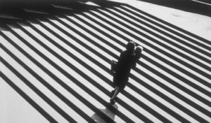
Paul strand creates black and white images with exaggerated deep contrast by shooting sharp leading lines possessed by certain architecture in harsh light which creates long eloping shadows to form giving his images this contrast and tonal range.
Jaromir Funke similarly experiments with this harsh light and shadow forming technique to form these abstract black and white pieces.
The main differences between their pieces is that Jaromir creates more abstract unconventional compositions solely sue to the fact he intentionally creates his sets of random interesting objects that will clash well with light and form shadows while Paul shoots typical, mundane architecture but in a creative fashion to form his contrasting images.
Pauls image on the left contains harsh natural light to create the intense shadows bordering each of the subjects. He used a narrow aperture to create a deep depth which is supported by the leading lines running parallel through the image. His image has been infused with sharp highlights and deep blacks to accentuate the shadows and the images tonal range. His image also includes repetition, this is seen through all the duplicating steps. This image also has a sinister essence with the baby’s face emerged in a shadow it almost juxtaposes that an innocent being could be portrayed as having an evil soul
Jaromir Funke’s image contains abstract light experimentation that plays tricks on the mind. He uses a harsh fluorescent looking light to draw out shadows and create the images contrasting tones. The image contains a lot of sharp geometrical features which frame certain streams of light and let through others. His image is l=slightly under exposed to add depth to the shadows. A high ISO has been used to add sensitivity to the film which has created a slight grain and given the image texture. The space in the image is quite populated with little negative space. He has also shot the shapes at an angle instead of straight on which gives a unique perspective to how the shadows elope and given the image more depth.
The aspect of “Surface and Colour” involves the changing of ISO settings on a camera in order to alter the saturation of the photograph, or exaggerate the contrasting surfaces of the photograph.
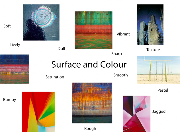

Eileen Quinlan was born in 1972 in Boston, Massachusetts. Quinlan is a self-described still-life photographer who is often regarded as one of many artists who revisits late modernism. Eileen Quinlan received her Bachelor of Fine Arts in 1996 from the School of the Museum of Fine Arts, when she attended Tufts University in Boston. She then achieved her Master of Fine Arts in 2005, from Colombia University. Before developing her distinctive style, Quinlan explored elements of both landscape and portrait photography, until she got into the photographic style she uses now. In the early days of her career, she began experimenting with the use of smoke in her abstract photos, this then paved the way for her signature style now.
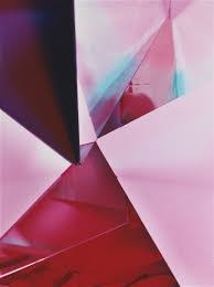
Light- I think artificial lighting has been used in this image in order to achieve the strong, contrasting shades. The darkest areas of the image are in towards the bottom left and top right of the image, the lightest parts of the softer shades of pink surrounding the dark areas.
Line- There is a pattern of straight lines in the image, they cross over each other in diagonal directions. The lines separate the different shades in the image.
Repetition- There is a repetition of straight lines in the image to give the image a geometrical composition. There is also a repetition of colour in the photograph, as the colour of pink is repeated but contrasted with the use of different shades.
Shape- The artificial set up of the image creates geometrical shapes in the photo. There is an echo of straight-edged triangular shapes in the image.
Space- The photograph has a wide depth of field in the photo as all parts of the image are in focus. However the image is rather flat so it is difficult to compare the depth of the background and foreground.
Texture- There is a range of textures to the photo, as different shades of pink has a smooth texture, especially the lighter shades. On the other hand, the folds in the darker shades give off a rougher texture.
Value/Tone- There is a range of tones in the image that vary from light to dark in this photograph. The constant use of pink changes tone in multiple areas of the image to create a juxtaposition of colour.
Colour- The tone of colour in the image is very vibrant, especially in the darker shades of pink, which is combined with lighter shades of pink in a geometrical pattern. There is also a section of blue in the image to contrast the shades of pink altogether.
Composition- The artificial composition of the image provides geometrical shapes, especially triangles. There is no rule of thirds used in the image and there is also no focal point, in my opinion.

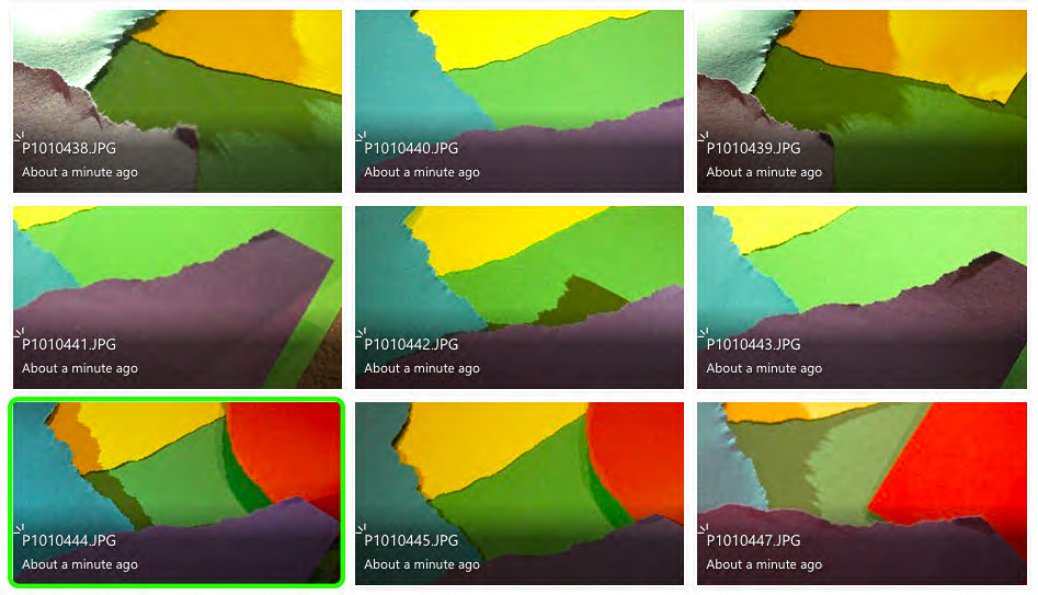


To edit my photos, I used the colour mixer and photo filter to add a pink hue to image, to make it more similar to the work of Eileen Quinlan.
I used paper to recreate Quinlan’s work, by layering, ripping and cutting the paper to form geometrical shapes in the style of Eileen Quinlan’s style.

Ernst Haas, an Australian-American born in 1921, was both a photojournalist and colour photographer. Haas was an early innovator for colour photographer, who’s images were featured in magazines such as “Life” and “Vogue”. Haas’ work was also featured in the fist single-artist exhibition of colour photography at the Museum of Modern Art in New York. In 1971, he published his photography book, “The Creation”, which was one of the most successful photography books and sold 350,000 copies.

Light- The lighting used in this image is seemingly natural, and appears to be taken in daylight on a rainy day. The light catches the colours swirling in a circular formation on the wet road, and also casts a brooding shadow next to the oil spill.
Line- There is little example of patterns of lines in this image, however the oil spill provides an echo of circular lines that almost hypnotise the viewer.
Repetition- There is of circles that create a tunnel-like affect from the oil puddled on the road. The circles echo in a mesmerising formation.
Shape- The geometric shape formed in this image os the repetition of multi-coloured circles forming due to the oil on the road. The shape of the circle is organic and not artificially set up by the photographer.
Space- There is a wide depth of field to the image as the whole photograph is in focus. The negative space around the focal point draws the viewers eyes to the oil spill, rather than the area around it. The reflective water on the ground gives the image a shiny appearance.
Texture- There is a range of textures in the image, as the water on the ground gives off a shiny, smooth texture, however the bumpy surface of the tarmac makes the texture more rough.
Value/Tone- There is a varied tone to the photograph, as the ground around the oil is dull and dark, however the splash of oil adds a contrasting pop of colour to the image. The colours of the oil spill are vibrant and give off a tie-dye look. The darkest area of the image is the shadow formed next to the oil.
Colour- The majority of colour featured in the image is in the oil spill. The colours tunnel into a spiral affect and reflect vibrant patterns of circles. These colours are juxtaposed against the gloomy, dark ground.
Composition- The organic composition features a geometric, circular pattern in the top right third of the image, this is used as the focal point to the viewer as it is the signifying contrast in the photograph.

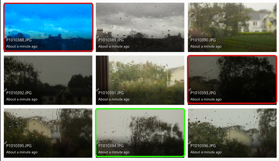
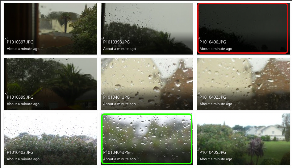


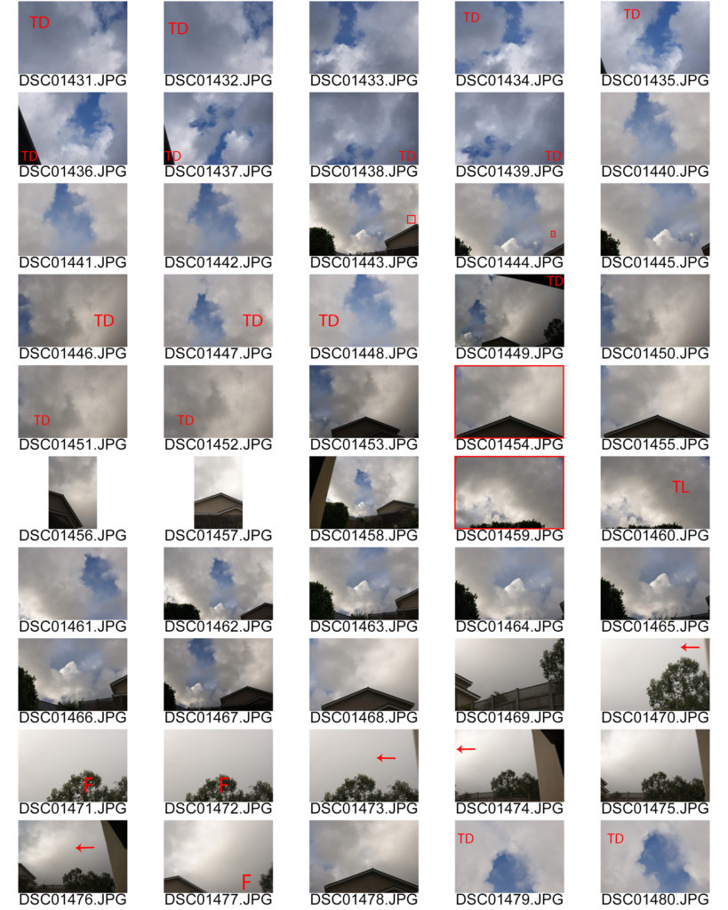
The photos highlighted in red are my least successful images because they are either too over-exposed or too under-exposed. This is because the change in ISO and white balanced has decreased/increased the amount of light entering the lens, this makes the images too dark or too light.
The images highlighted in green are my most successful images because they relate to Ernst Haas’ work the best. I tried to capture the change in texture with the raindrops falling onto different surfaces. I also wanted to recreate Haas’ work with the reflections in puddles also.
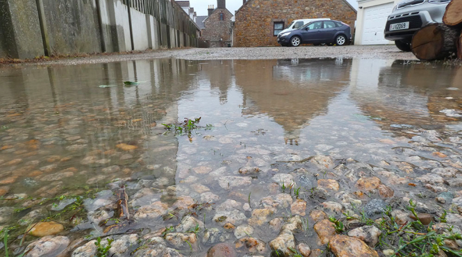


I believe I have recreated Ernst Haas’ work well with the use of capturing reflections and contrasting textures. I adjusted curve levels in these images to intensify the contrast between light and dark. I cropped the images in order to create a focal point for the viewer. I feel like my first edited image is my most successful because it uses Haas’ method of reflection to create a mirror-like affect.