Category Archives: Reading

Filters

Author:
Category:

Headshots

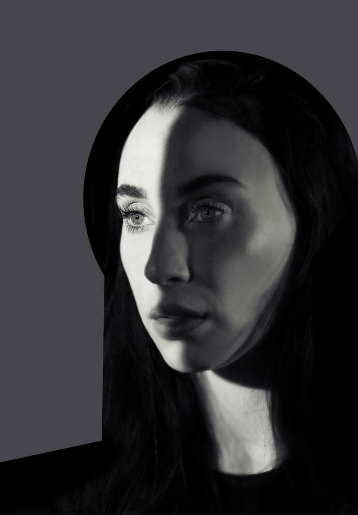
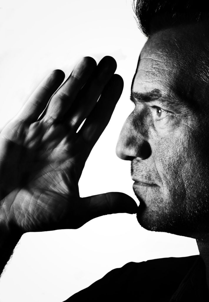
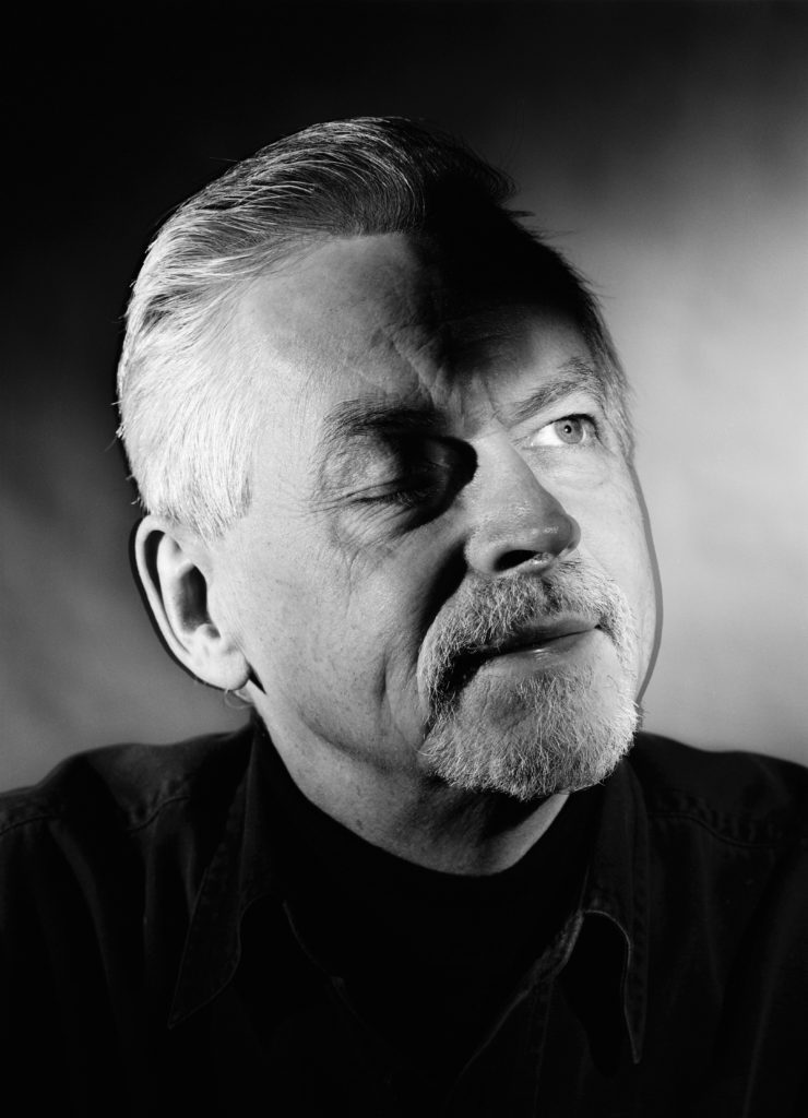
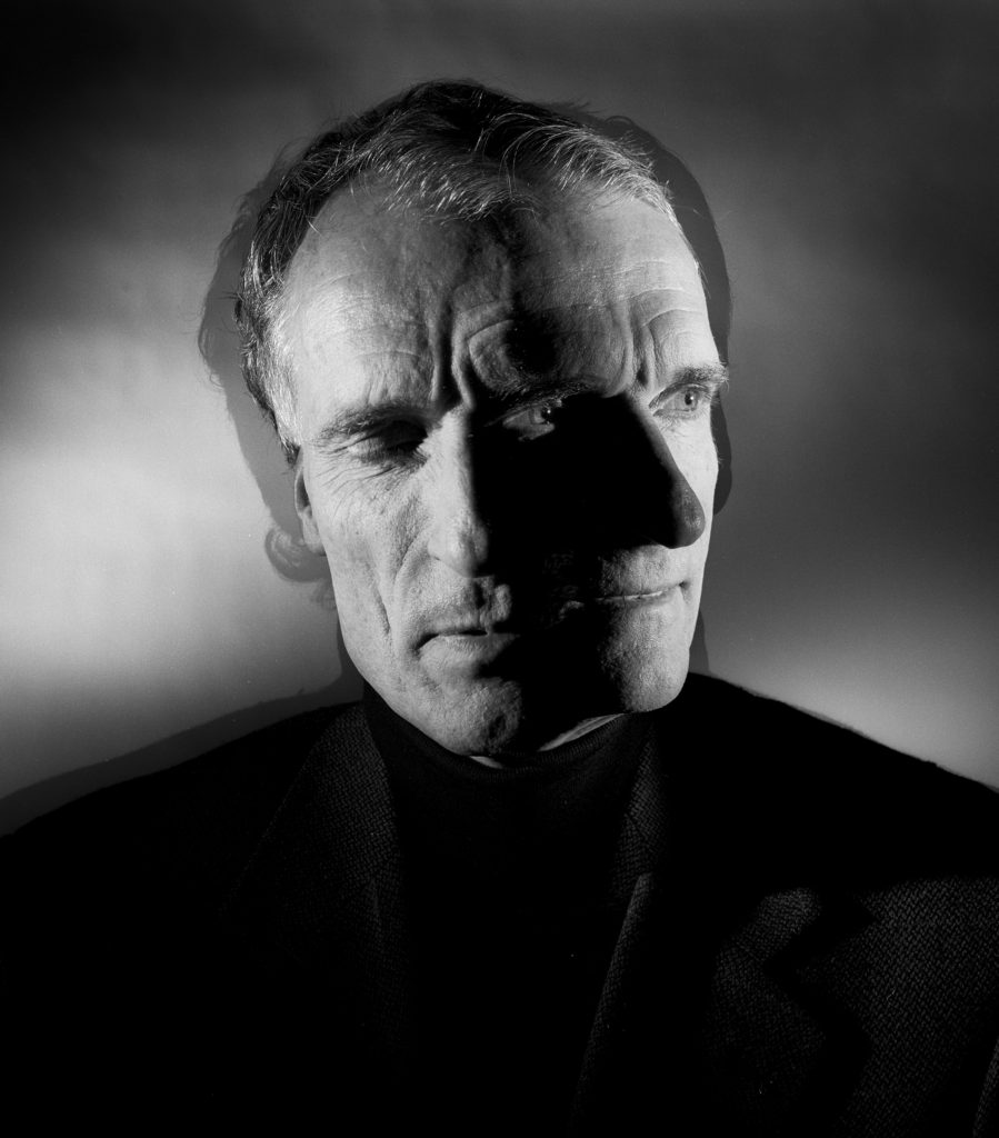
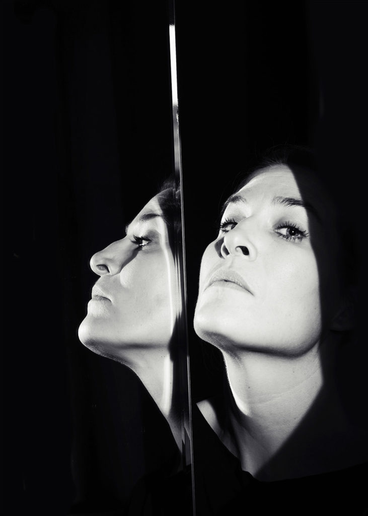
Below are some INSTRUCTIONS AND INSPIRATIONS for your headshots in the studio in the next couple of weeks until Easter. These tasks will allow you to continue to experiment with studio lighting and respond to a number of creative approaches to headshots with reference to both historical portraits photographers from Societe Jersiaise Photo-Archive and contemporary practitioners.

TECHNICAL

RECORDING: produce at least 3 portrait shoots in the studio and consider the following:

1. Lighting: soft, hard – use softbox/ reflectors

2. Framing: Headshots

3. Focusing: focus on the eyes

4. Expression: Explore different moods and emotions.

5. Pose: Manner and attitude. Use hands

Camera settings (flash lighting)
Tripod: optional
Use transmitter on hotshoe
White balance: daylight (5000K)
ISO: 100
Exposure: Manual 1/125 shutter-speed > f/16 aperture
– check settings before shooting
Focal lenght: 105mm portrait lens

BLOG

You are expected to show evidence of the following three EEEs on the blog for the work on Headshots.

EDITING: For each portrait shoot produce a screen-shots of your image selection and adjust your BEST 3 IMAGES in Lightroom using basic tools such as cropping, contrast, tonality, colour balance, monochrome. Describe also the lighting setup using an image from ‘behind the scenes’, ie. key light, back light, fill light, use of reflectors, gels etc.

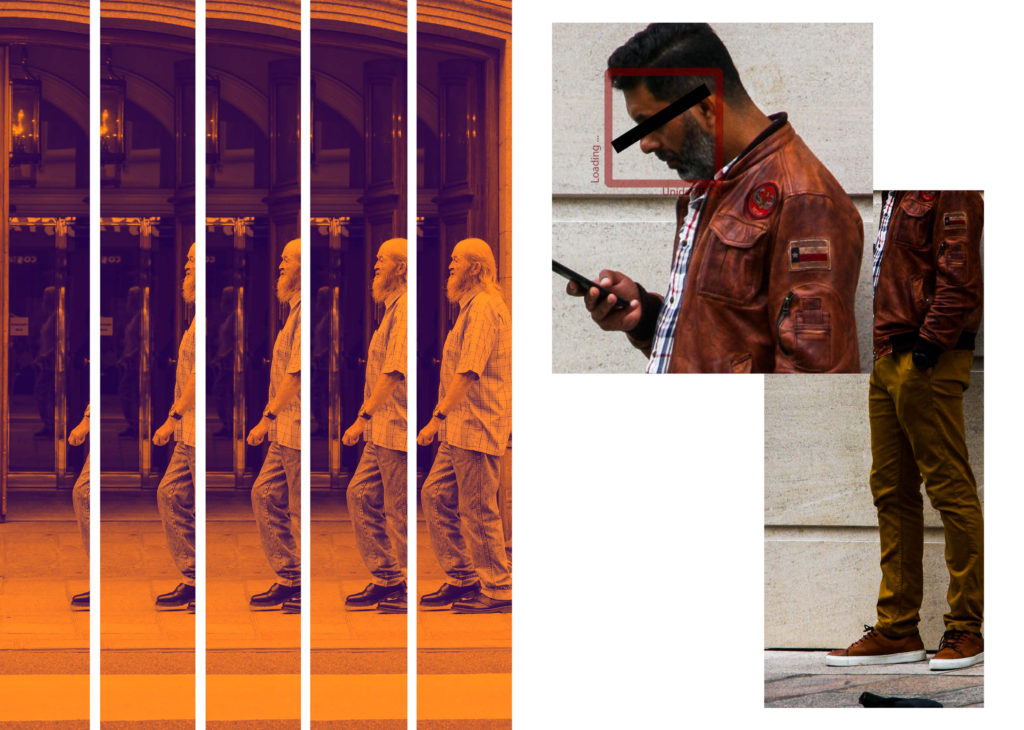
EXPERIMENTING: Complete at least 3 out of these 5 experiments on DIAMOND CAMEO, DOUBLE/ MULTIPLE EXPOSURE, JUXTAPOSITION, SEQUENCE/ GRID AND MONTAGE (see more details below). Make sure you demonstrate creativity and produce at least 3 different variations of the same portrait experiment.

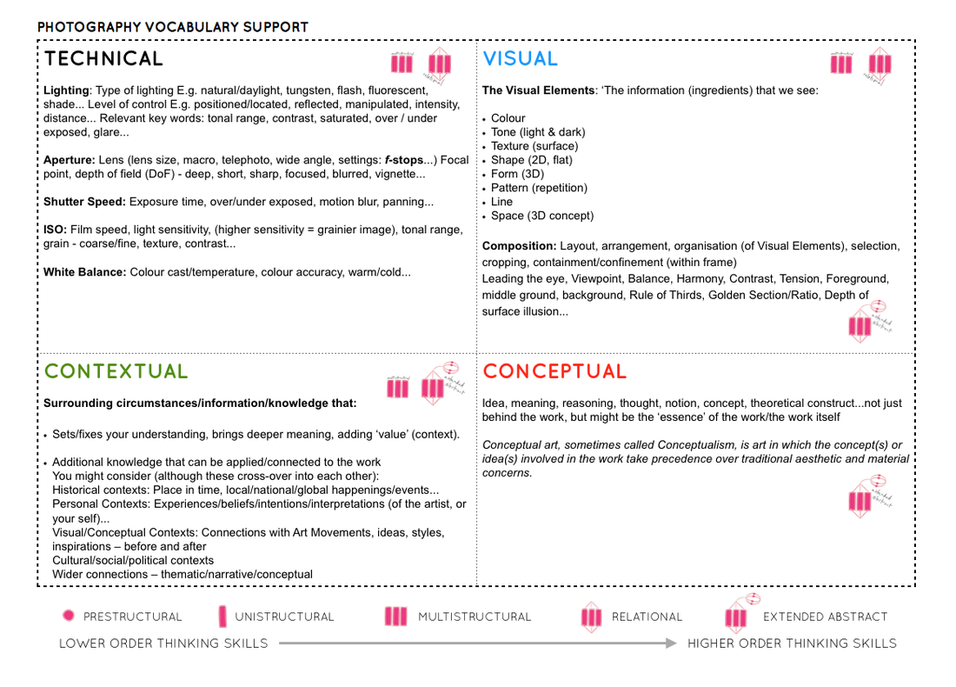
EVALUATING: Compare your portrait responses/ experiments and provide some analysis of artists work and images below that has inspired your ideas and shoots. Use this Photo-Literacy matrix.
INSPIRATIONS

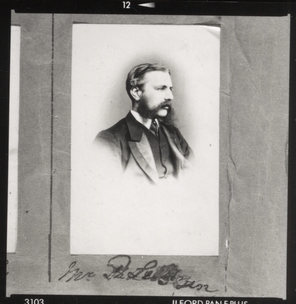
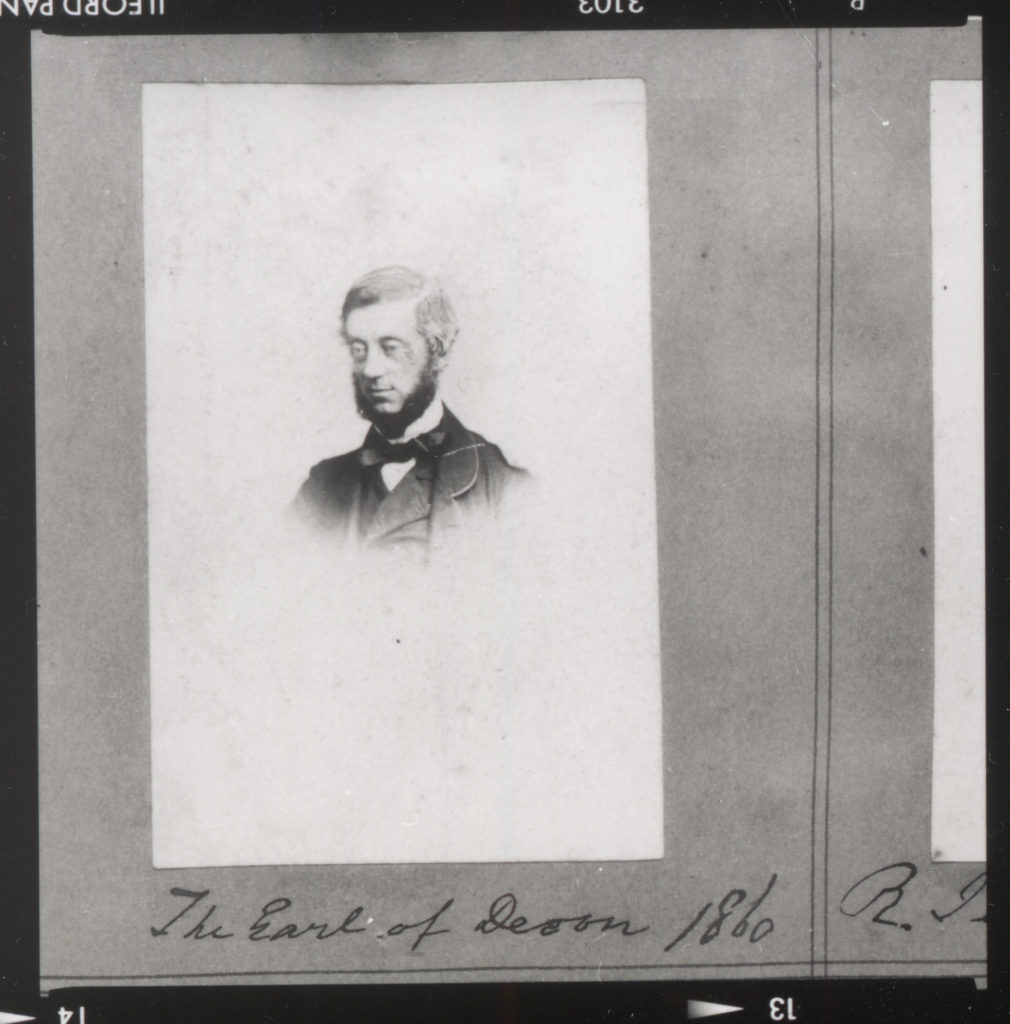
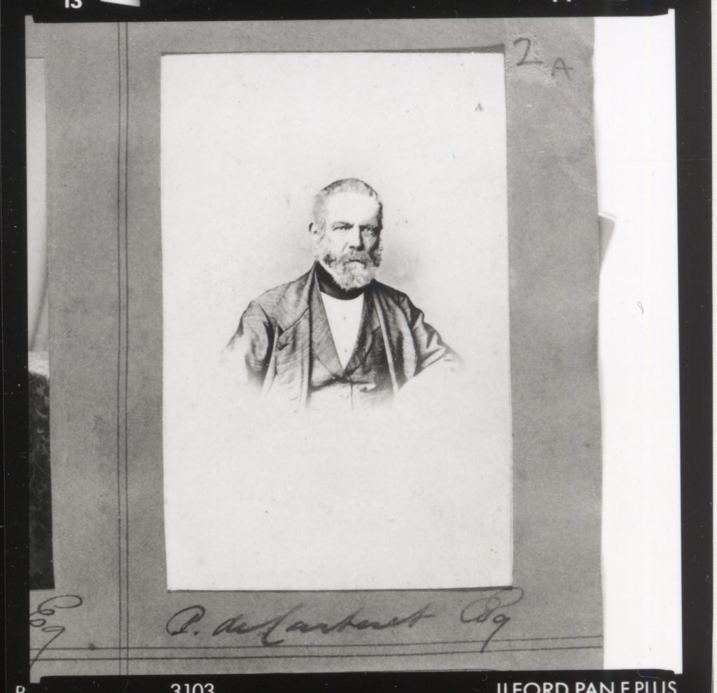
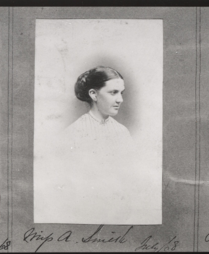
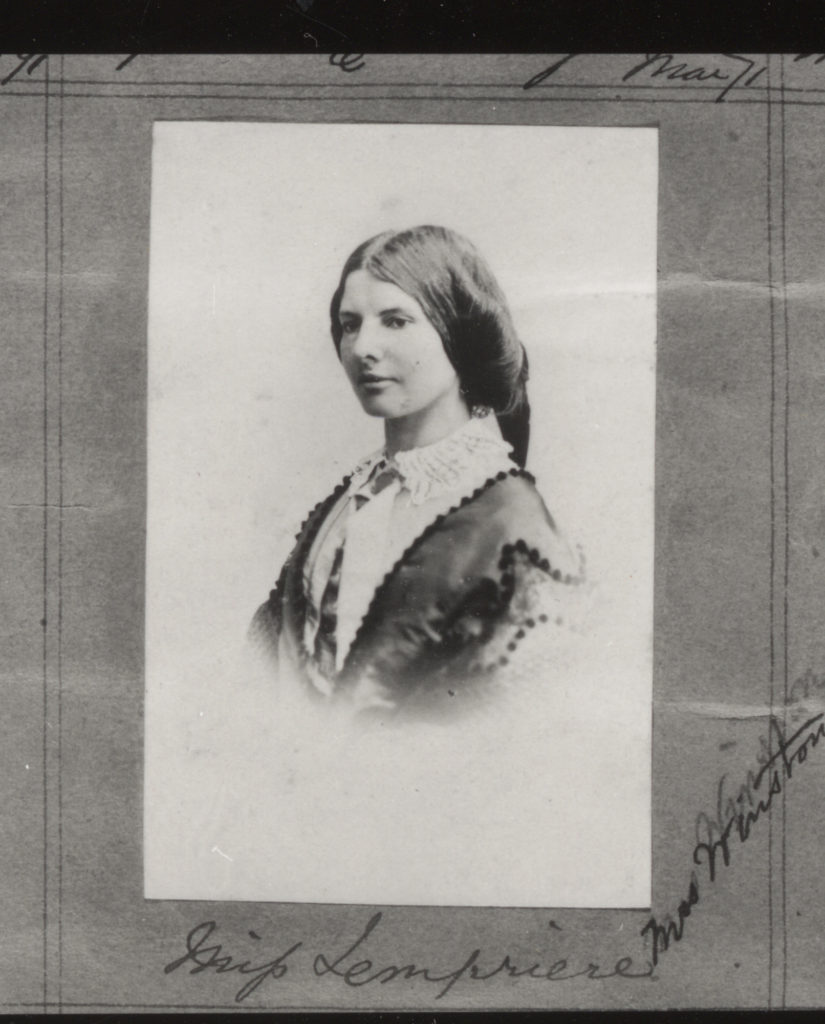
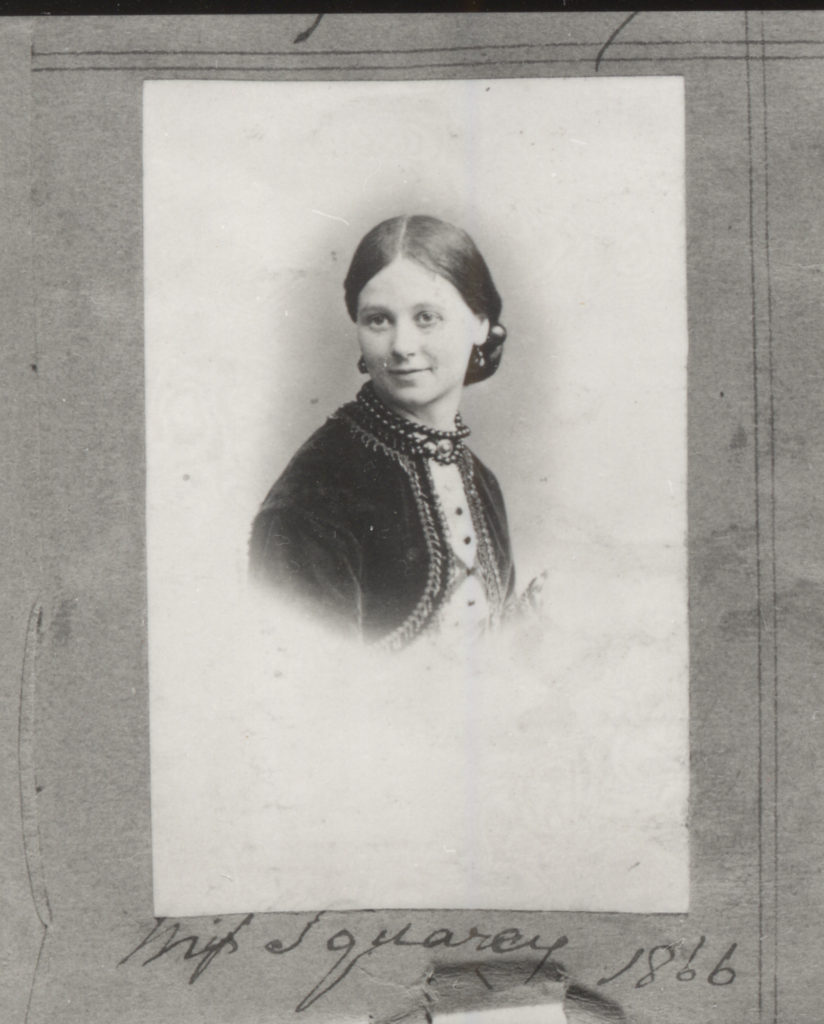
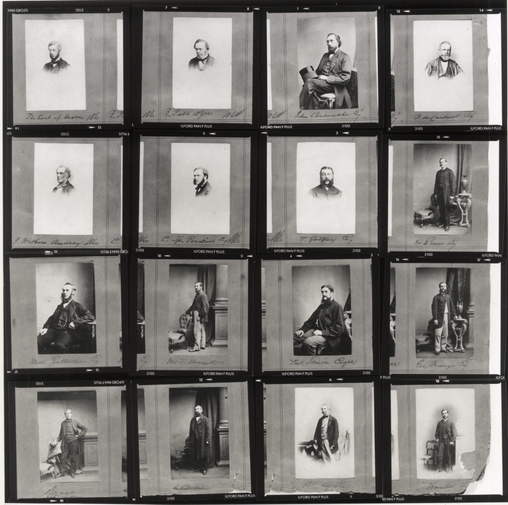
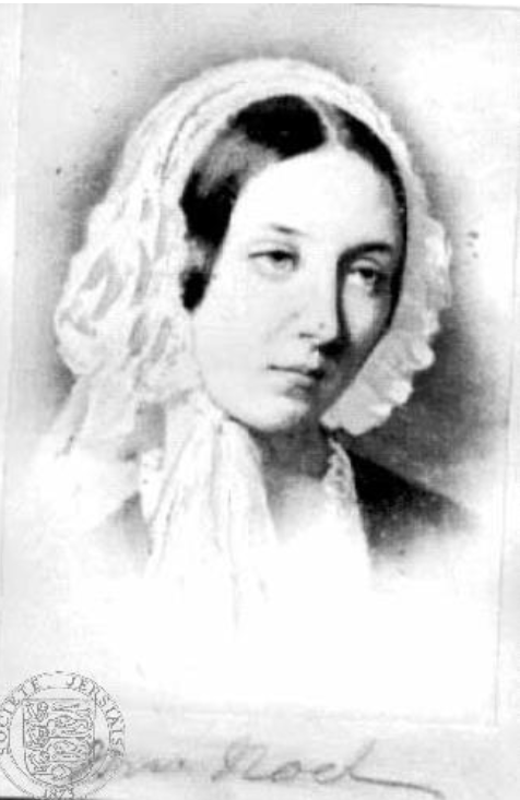
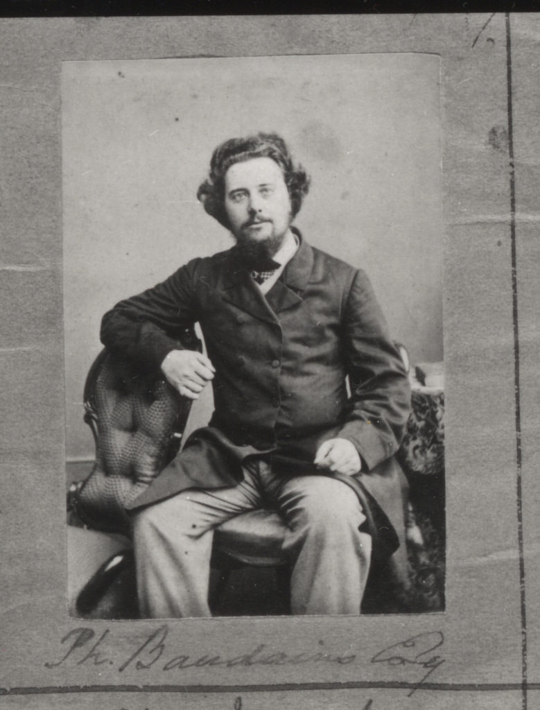
Henry Mullins is one of the most prolific photographers represented in the Societe Jersiase Photo-Archive, producing over 9,000 portraits of islanders from 1852 to 1873 at a time when the population was around 55.000. The record we have of his work comes through his albums, in which he placed his clients in a social hierarchy. The arrangement of Mullins’ portraits of ‘who’s who’ in 19th century Jersey are highly politicised.
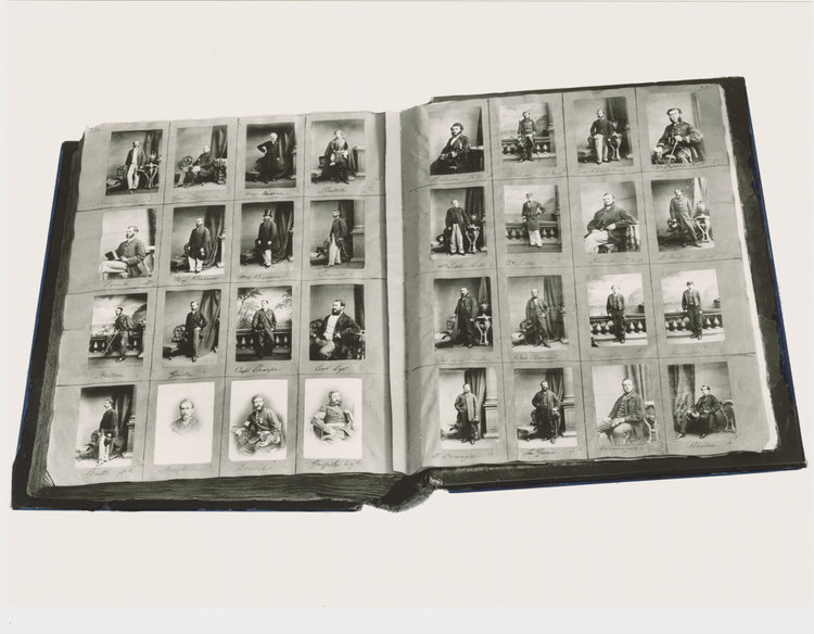
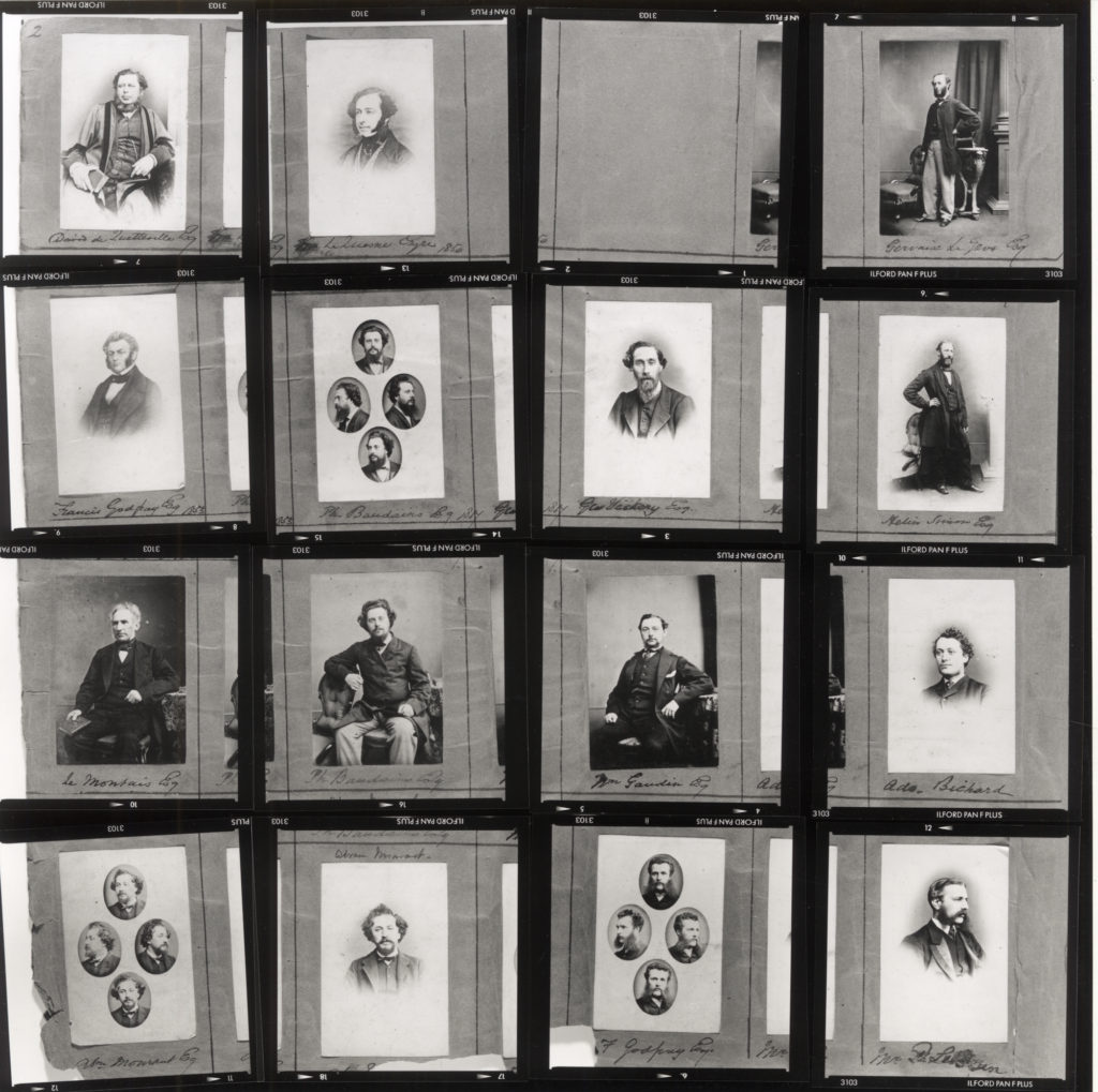
Henry Mullins Album showing his arrangements of portraits presented as cartes-de-visite

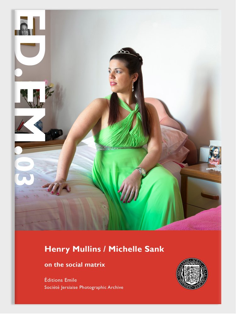
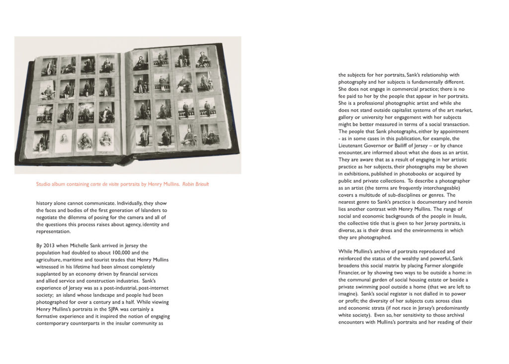
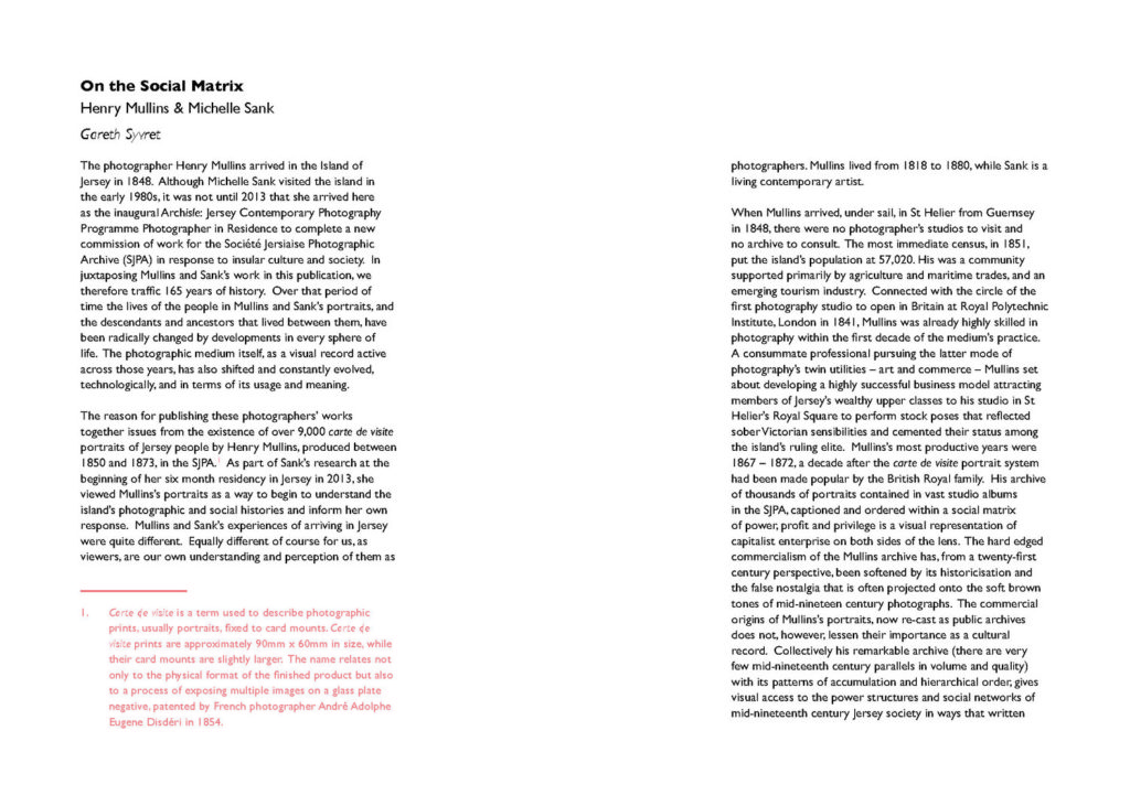
You can read more here in an extract from Gareth Syvret’s (former photo-archivist) text in ED.EM.03. Henry Mullins / Michelle Sank – on the social matrix. We also have copies of this photozine in classroom for further study and reading.
Henry Mullins started working at 230 Regent Street in London in the 1840s and moved to Jersey in July 1848, setting up a studio known as the Royal Saloon, at 7 Royal Square. Here he would photograph Jersey political elite (The Bailiff, Lt Governor, Jurats, Deputies etc), mercantile families (Robin, Janvrin, Hemery, Nicolle ect.) military officers and professional classes (advocates, bankers, clergy, doctors etc).

His portrait were printed on a carte de visite as a small albumen print, (the first commercial photographic print produced using egg whites to bind the photographic chemicals to the paper) which was a thin paper photograph mounted on a thicker paper card. The size of a carte de visite is 54.0 × 89 mm normally mounted on a card sized 64 × 100 mm. In Mullins case he mounted his carted de visite into an album. Because of the small size and relatively affordable reproducibility carte-de-visite were commonly traded among friends and visitors in the 1860s. Albums for the collection and display of cards became a common fixture in Victorian parlors. The immense popularity of these card photographs led to the publication and collection of photographs of prominent persons.
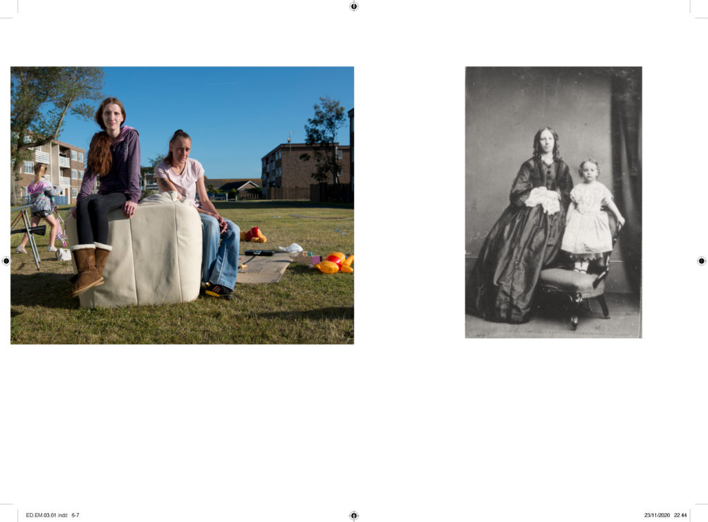
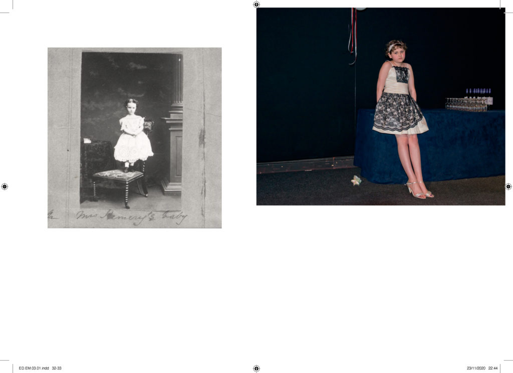
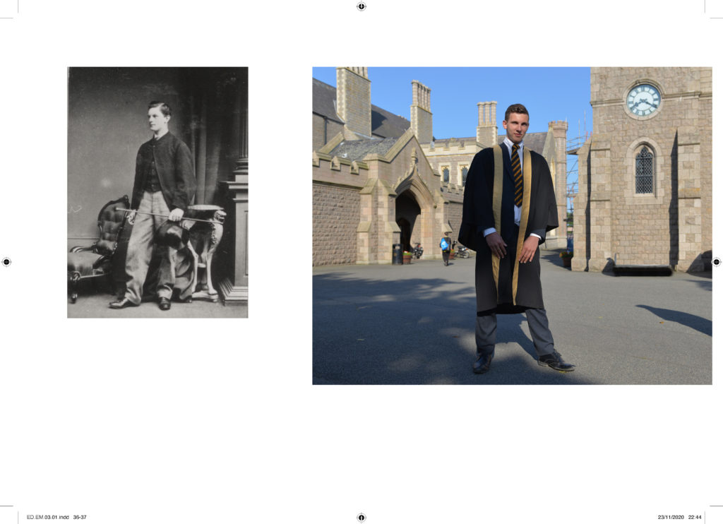
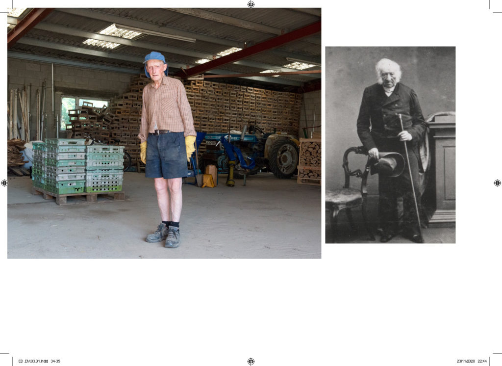
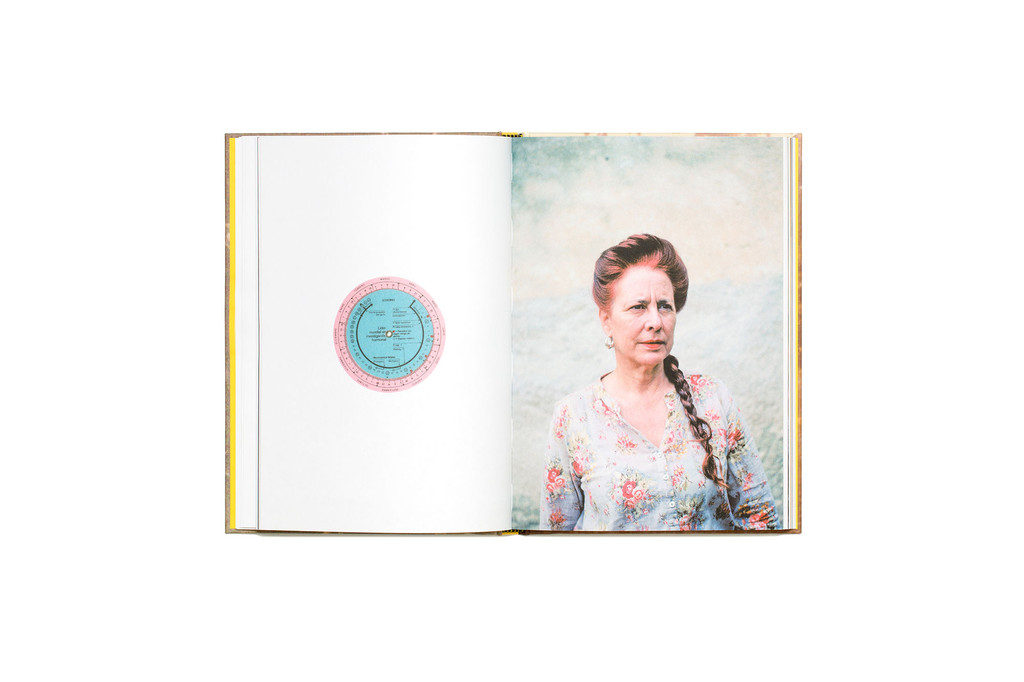
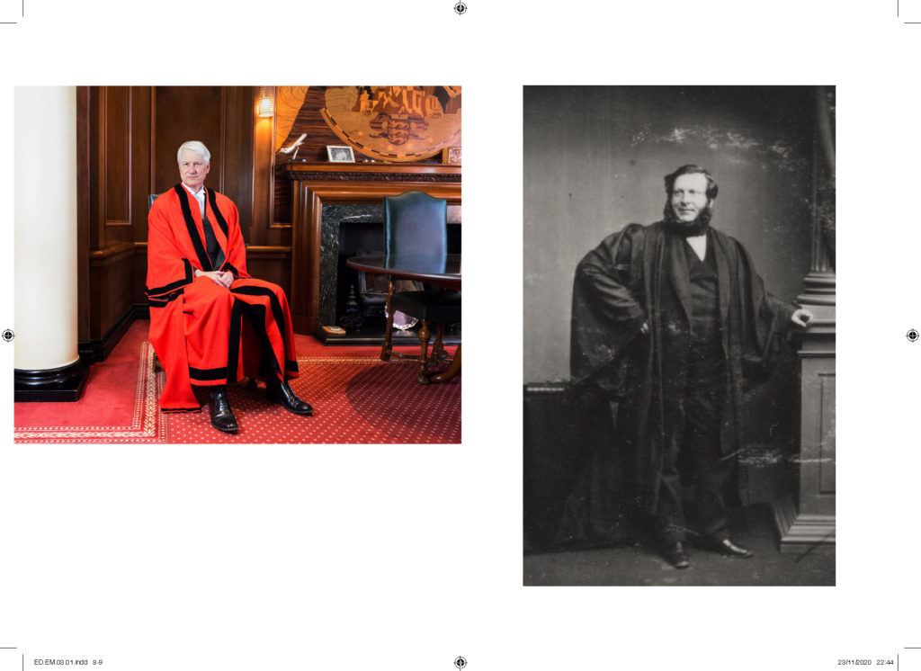
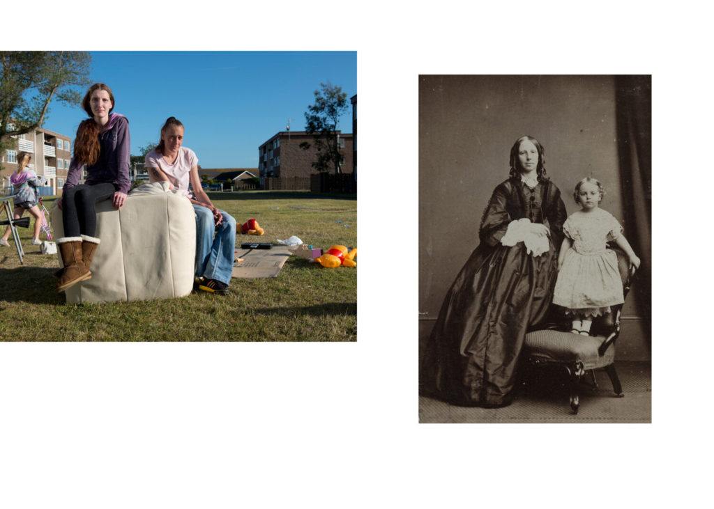
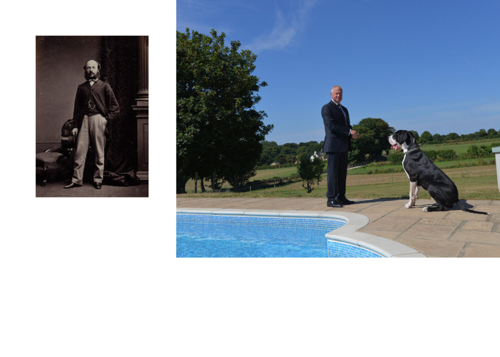
Here are some spreads from ED.EM.03 Henry Mullins / Michelle Sank – on the social matrix. ED.EM is a photo-zine produced by Societe Jersiaise Photographic Archive that presents a selection of images from its historical collection.
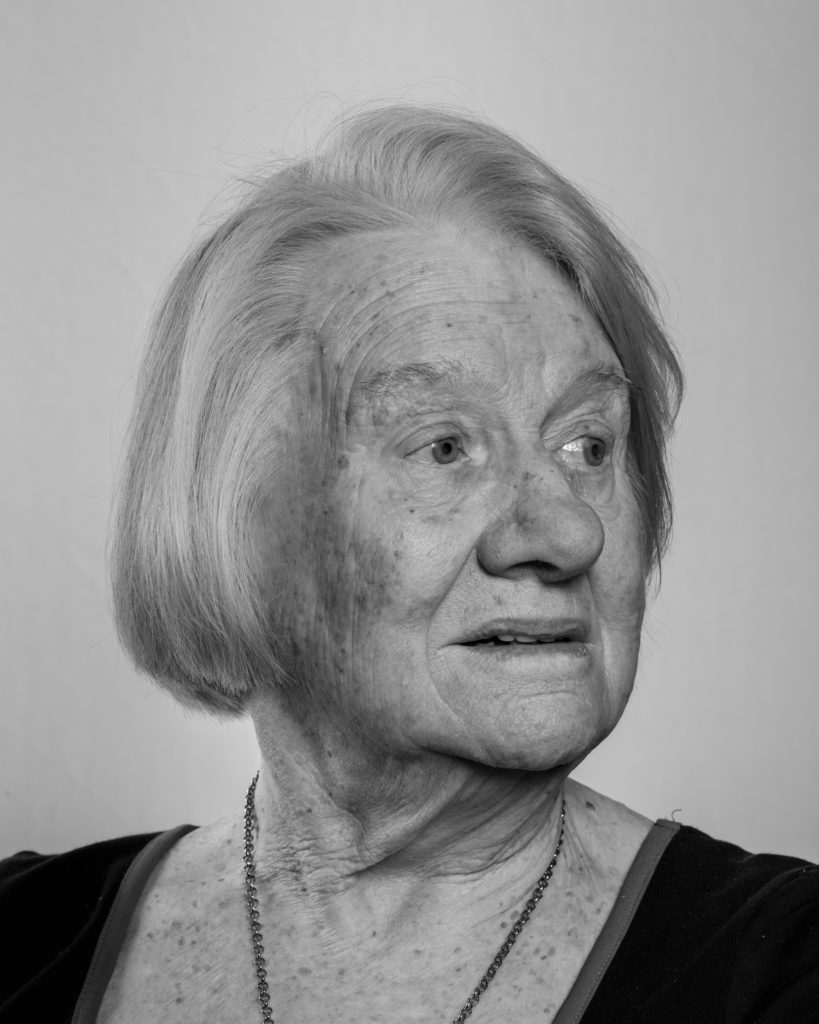
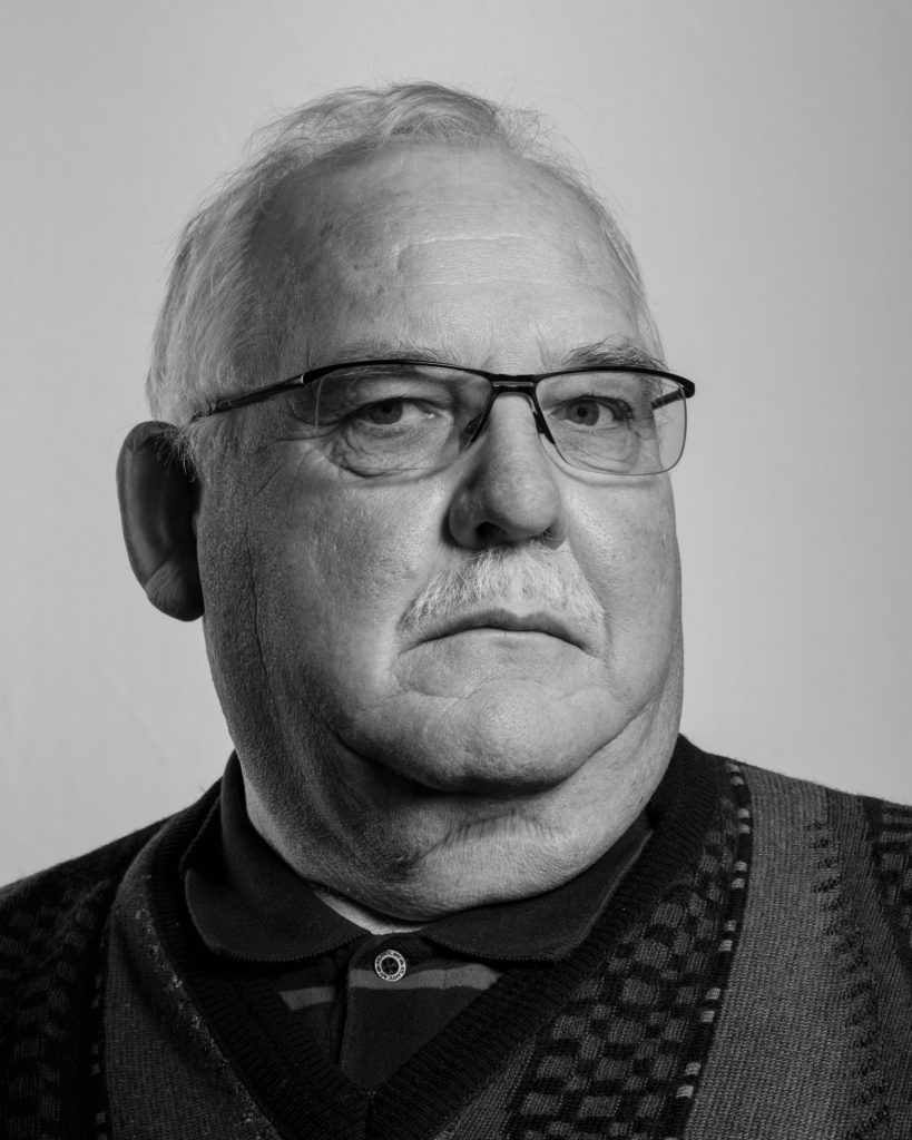
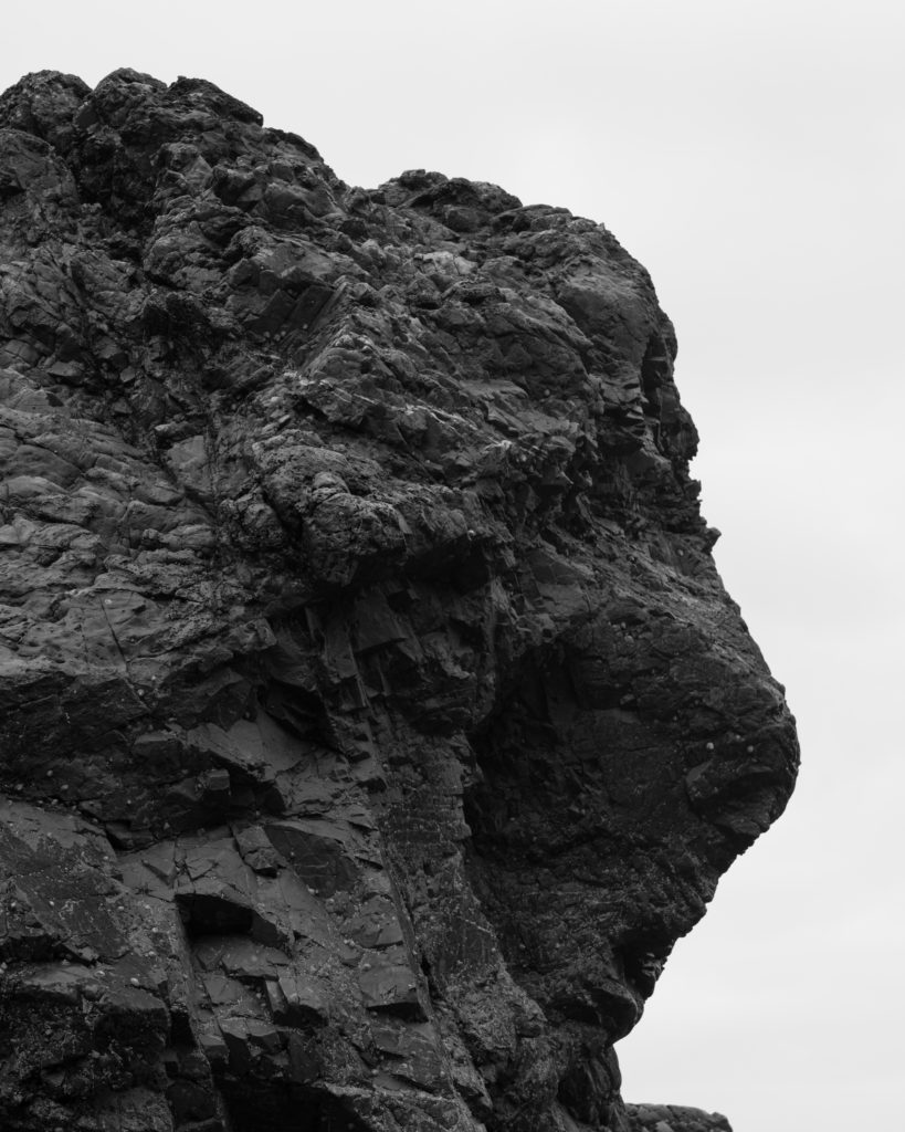
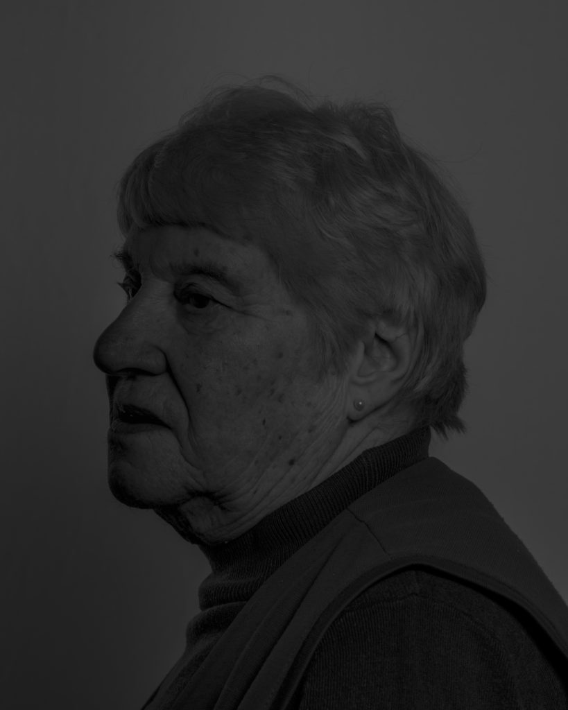
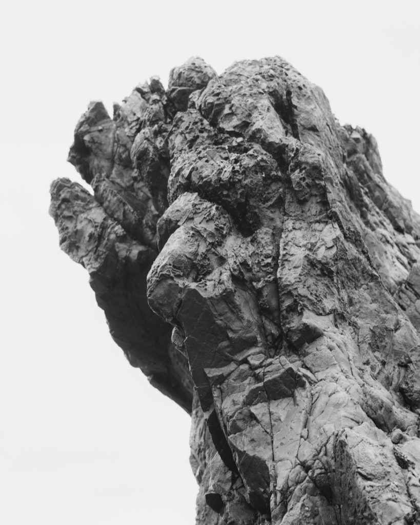
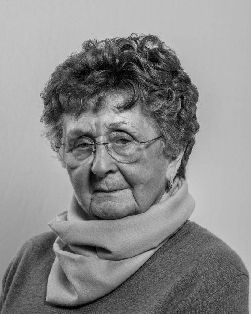
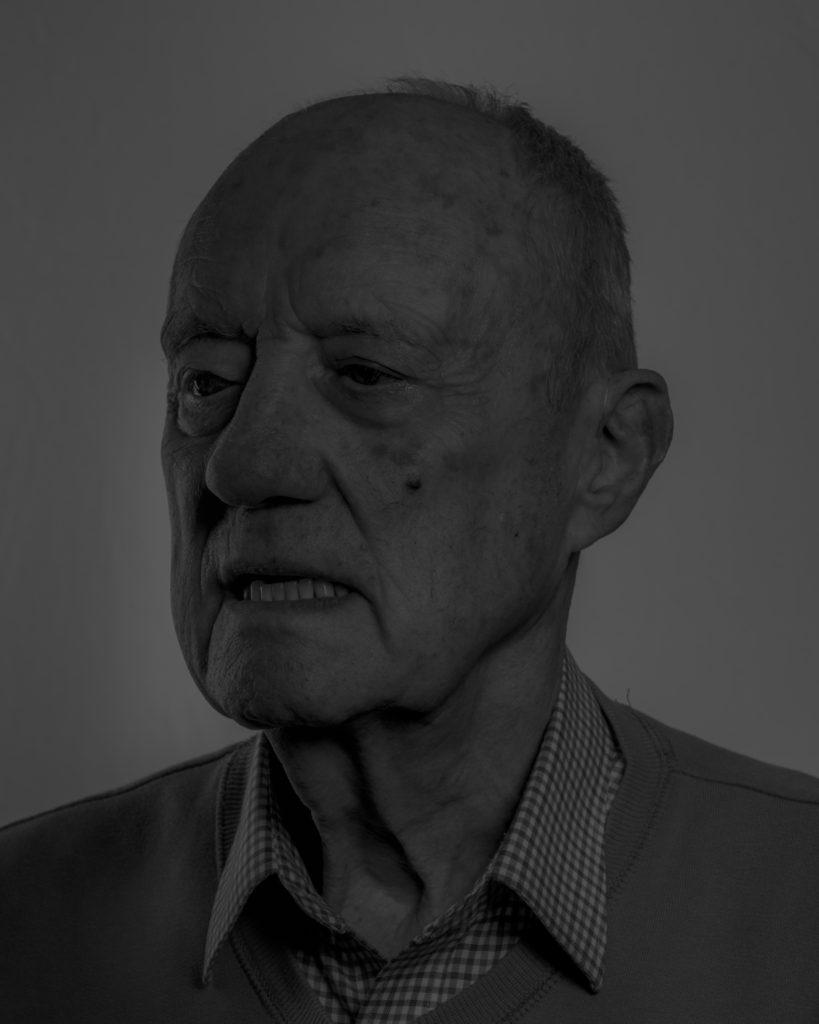
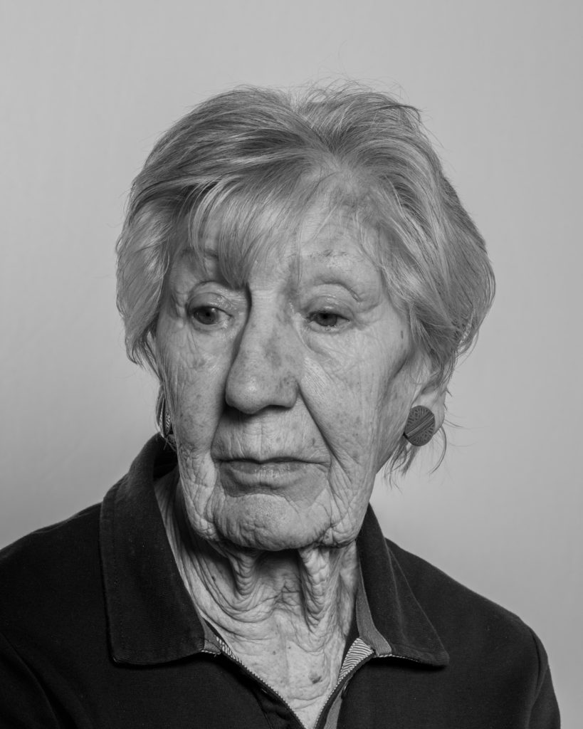
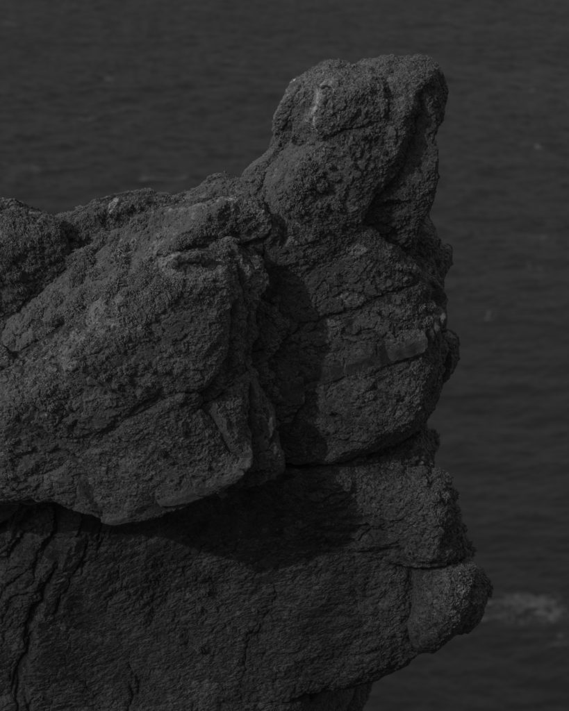
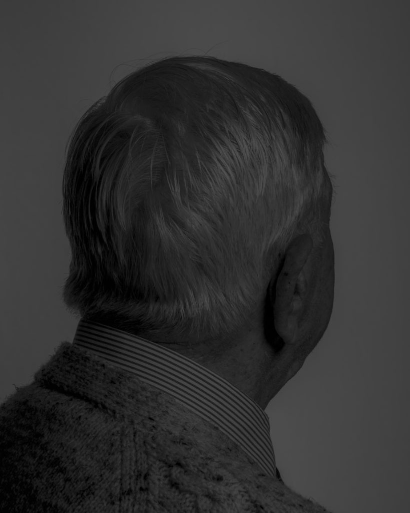
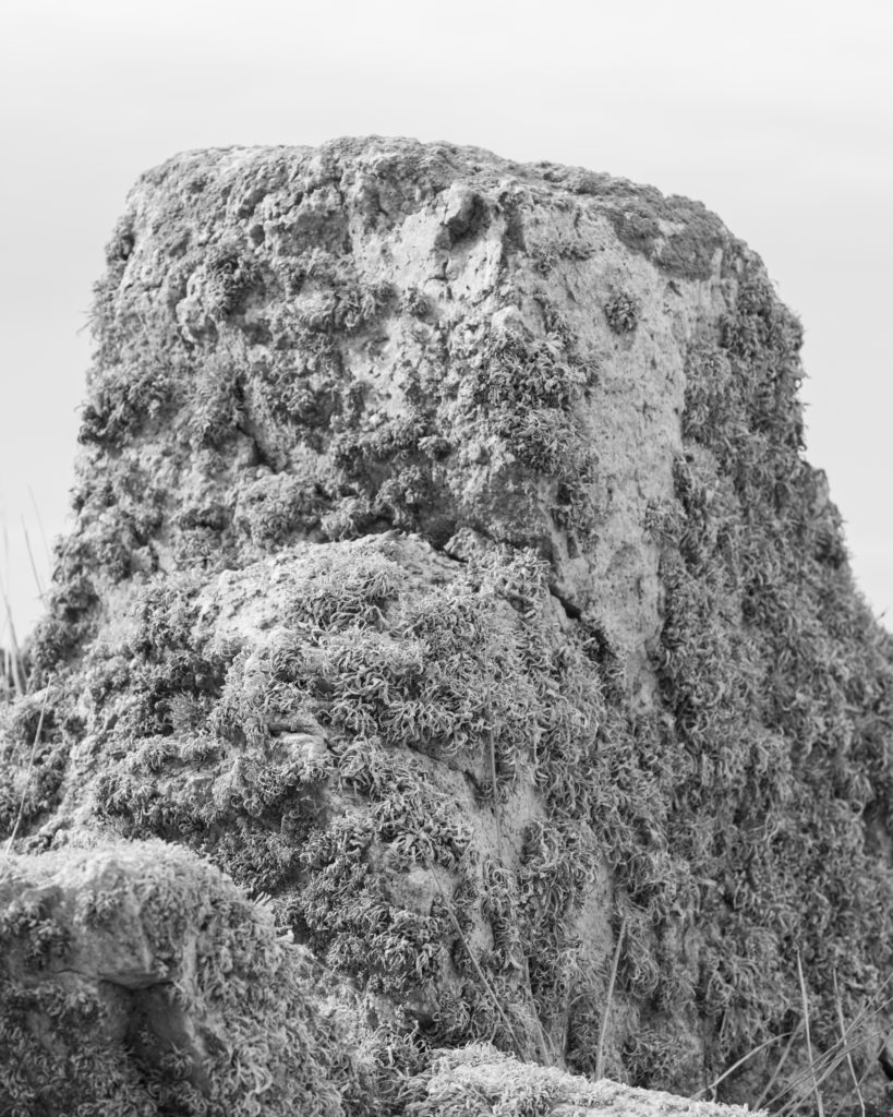
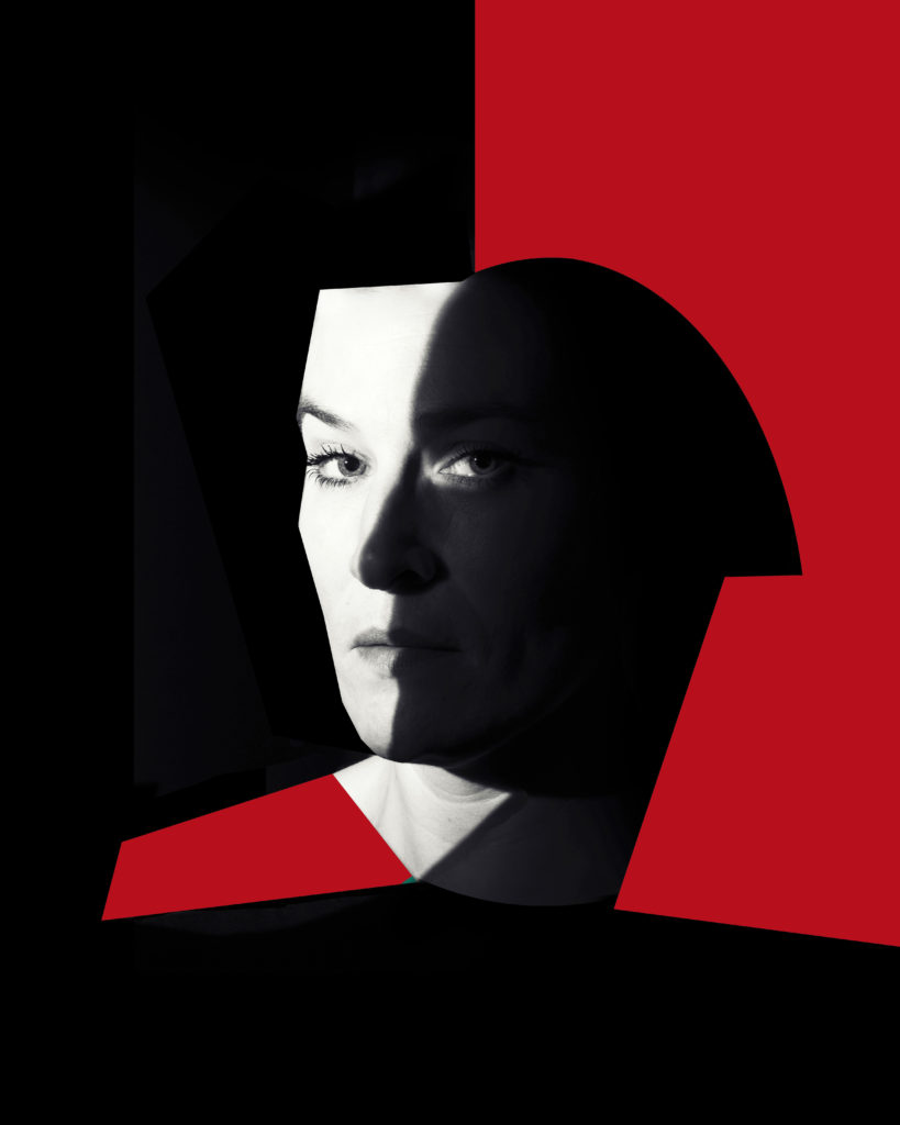
Becque á Barbe: Face to Face: A portrait project about Jèrriais – the island of Jersey’s native language of Norman French. Each portrait is titled with a Jèrriais word that each native speaker has chosen to represent a personal or symbolic meaning, or a specific memory linked to his or her childhood. Some portraits are darker in tonality to reflect the language hidden past at a time when English was adopted as the formal speech in Jersey and Jèrriais was suppressed publicly and forbidden to be spoken in schools.
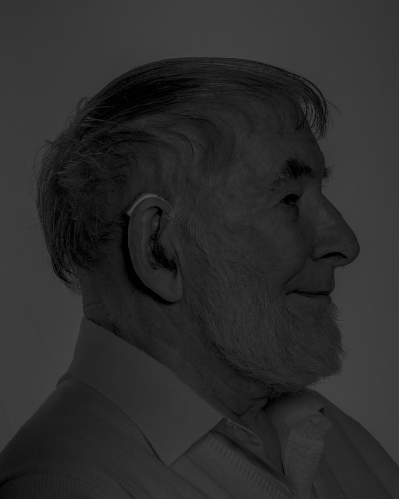
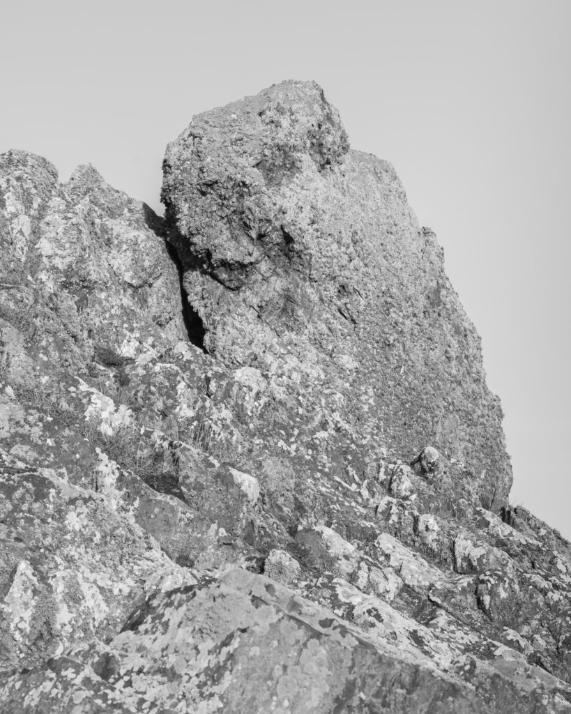
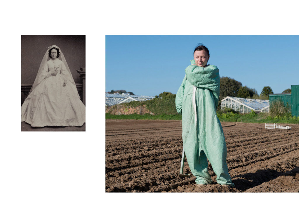
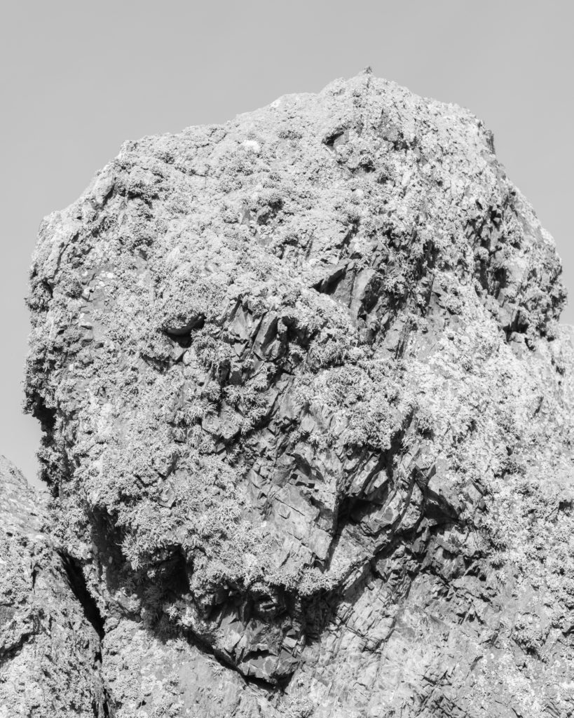
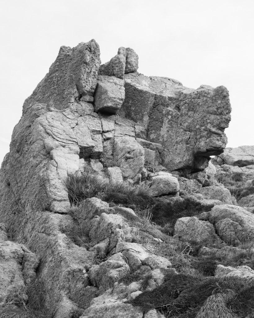
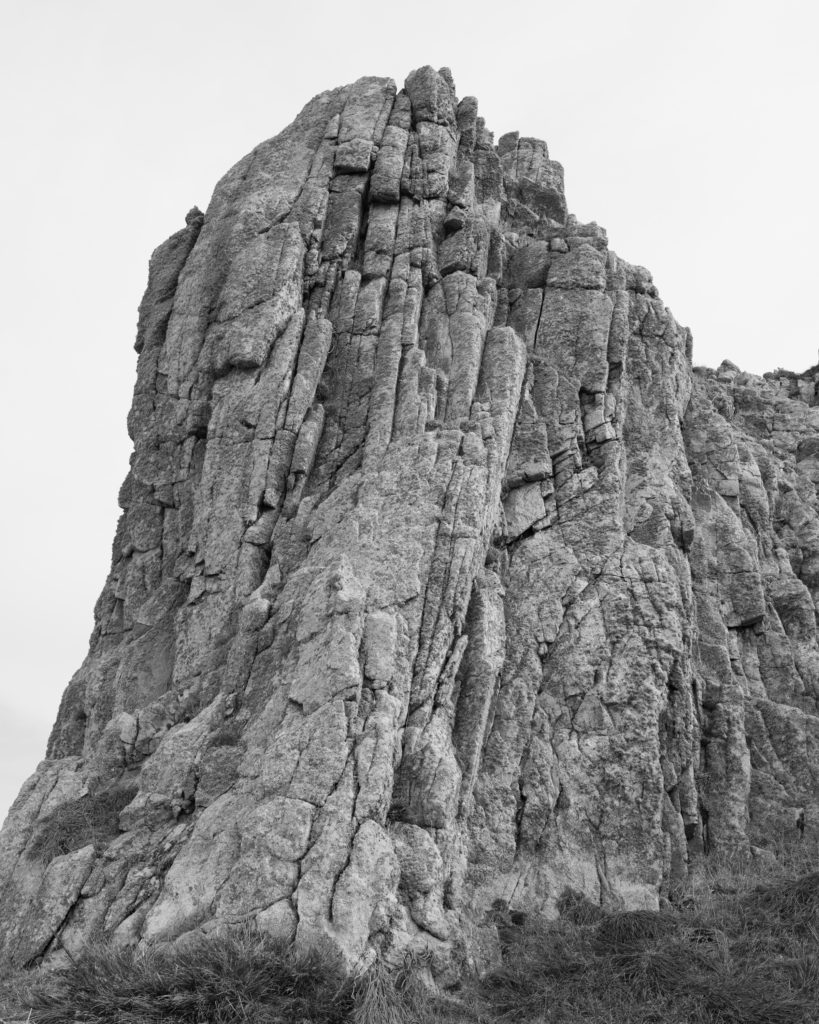
Juxtaposed with portraits of Jèrriais speakers are a series of photographs of Jersey rocks that are all designated as Sites of Special Interest (SSIs); important geological outcrops that are protected from development and preserved for future public enjoyment and research purposes. The native speakers of Jersey French should be classified as People of Special Interest (PSIs) and equally be protected from extinction through encouraging greater visibility and recognition as guardians of a unique language that are essential in understanding the island’s special character.

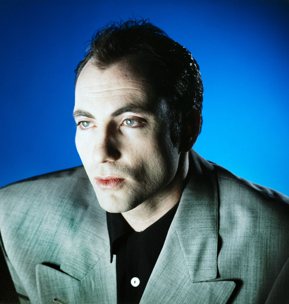
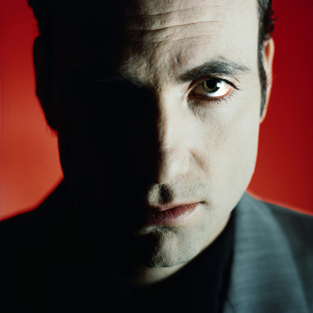
Ole Christiansen (Danish): A special preoccupation has been music photography, portraits, but also – often strongly graphically emphasized urban landscapes which is reflected in his portraiture . Ole has over the years provided pictures for a myriad of books, magazines, record covers, annual reports, etc.
THE DEADPAN AESTHETIC

According to sources the origins of the word “Deadpan”  can be traced to 1927 when Vanity Fair Magazine compounded the words dead and pan, a slang word for a face, and used it as a noun. In 1928 the New York Times used it as adjective to describe the work of Buster Keaton.

It is less clear when it was first used to describe the style of photography associated with Edward Ruscha, Alec Soth, Thomas Ruff and many others.  Charlotte Cotton devotes a complete chapter to Deadpan in The Photograph as Contemporary Art and much that has been written since references that essay.

In summary Deadpan photography is a cool, detached, and unemotional presentation and, when used in a series, usually follows a pre-defined set of compositional and lighting rules.

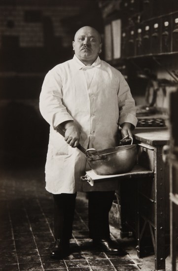
This style originated in Germany and is descended from Neue Sachlichkeit, New Objectivity, a German art movement of the 1920s that influenced the photographer August Sander who systematically documented the people of the Weimar Republic . Much later, in the 1970s, Bernd and Hilla Becher, known for their devotion to the principles of New Objectivity, began to influence a new generation of German artists at the Dusseldorf School of Photography (4). These young German photographers included  Thomas Struth, Andreas Gursky, Candida Hofer and Thomas Ruff. The Bechers (4 & 5) are best remembered for their studies of the industrial landscape, where they systematically photographed large structures such as water towers, coal bunkers or pit heads to document a soon-to-disappear landscape in a formalistic manner as much akin to industrial archeology as art. The Bechers’ set of “rules” included clean, black and white pictures taken in a flat grey light with straight-on compositions that perfectly lent themselves to their presentation methodology of large prints containing a montage of nine or more similar objects to allow the study of types (typology) in the style of an entomologist.

If you want to learn more about the theoretical and philosophical basis for the deadpan aesthetic READ HERE.

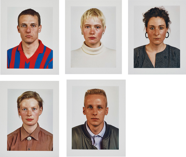
Thomas Ruff wanted to mimick the setup for a having a set of passport images taken. Read an interview with him here recently published in the Financial Times
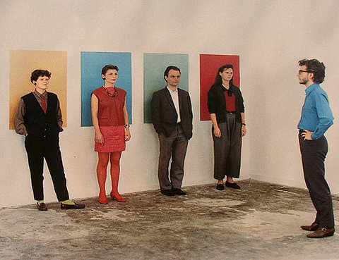
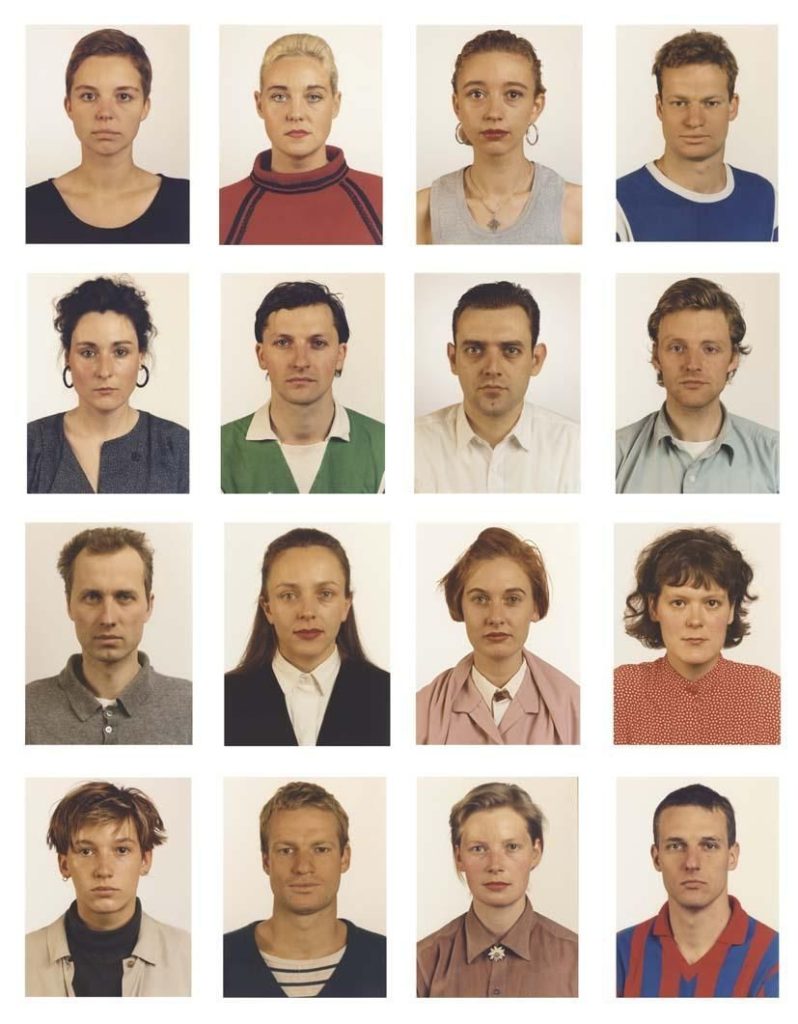
PASSPORT PHOTO

From the UK Government website

FACE:

  • eyes must be open and clearly visible, with no flash reflections and no ‘red eye’
  • facial expression must be neutral (neither frowning nor smiling), with the mouth closed
  • photos must show both edges of the face clearly
  • photos must show a full front view of face and shoulders, squared to the camera 
  • the face and shoulder image must be centred in the photo; the subject must not be looking over one shoulder (portrait style), or tilting their head to one side or backwards or forwards
  • there must be no hair across the eyes
  • hats or head coverings are not permitted except when worn for religious reasons and only if the full facial features are clearly visible
  • photos with shadows on the face are unacceptable
  • photos must reflect/represent natural skin tone

BACKGROUND:

Photos must have a background which:

  • has no shadows
  • has uniform lighting, with no shadows or flash reflection on the face and head
  • shows a plain, uniform, light grey or cream background (5% to 10% grey is recommended)

TYPOLOGY means the study and interpretation of types and became associated with photography through the work of Bernd and Hilla Becher, whose photographs taken over the course of 50 years of industrial structures; water towers, grain elevators, blast furnaces etc can be considered conceptual art. They were interested in the basic forms of these architectural structures and  referred to them as ‘Anonyme Skulpturen’ (Anonymous Sculptures.)
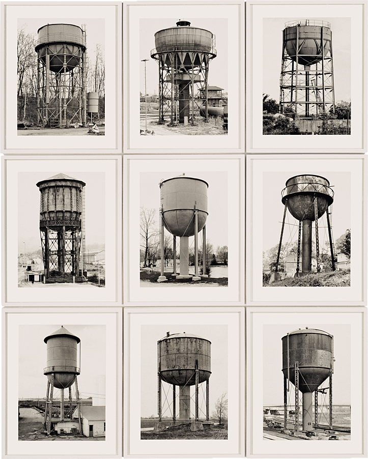
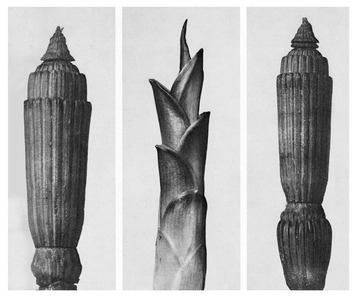
The Becher’s were influenced by the work of earlier German photographers linked to the New Objectivity movement of the 1920s such as August Sander, Karl Blossfeldt and Albert-Renger-Patzsch.
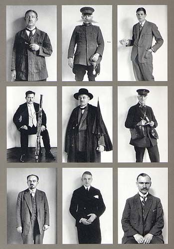
Karl Blosfeldt

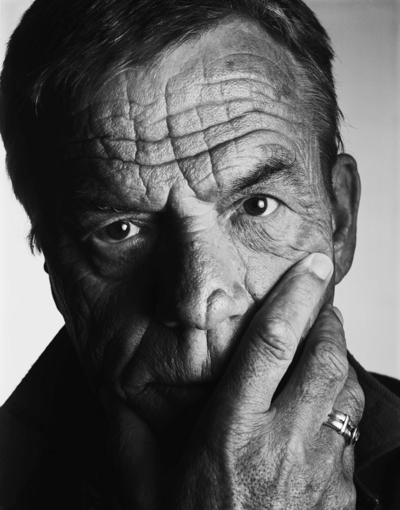
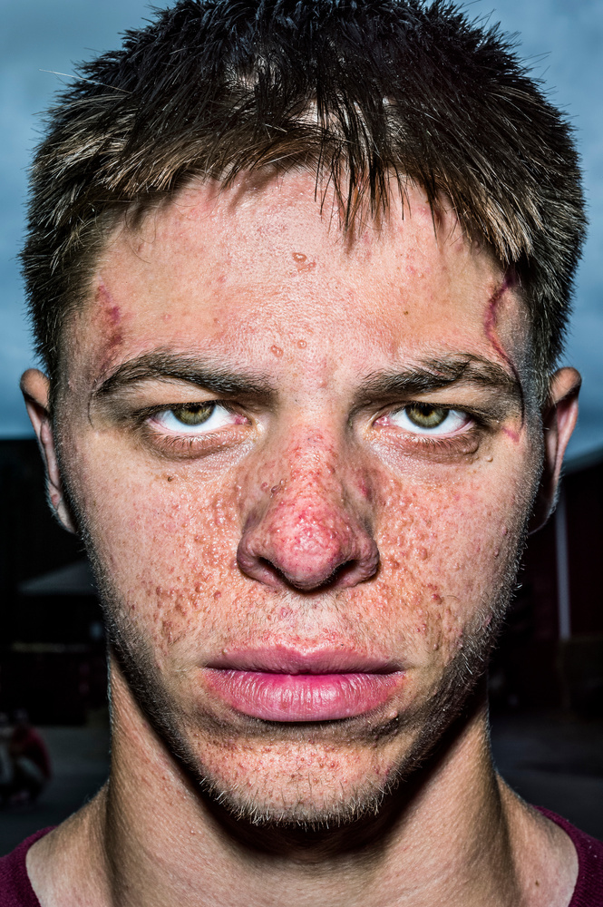
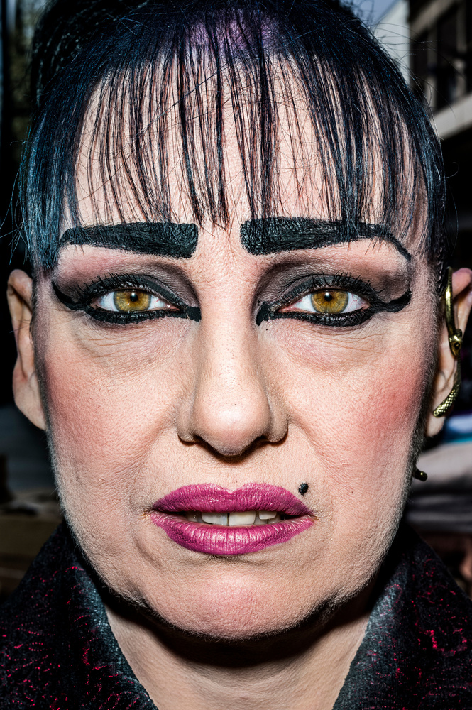
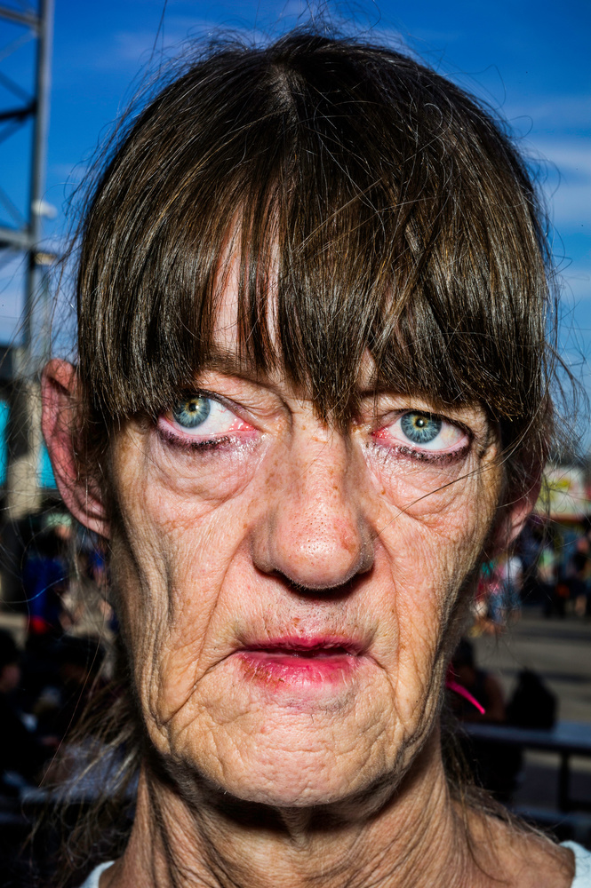
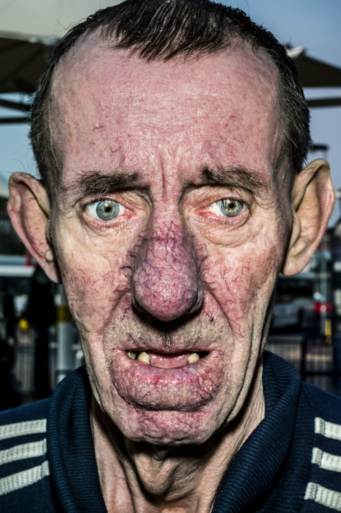
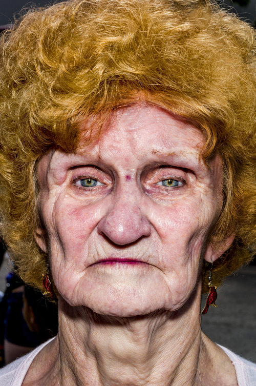
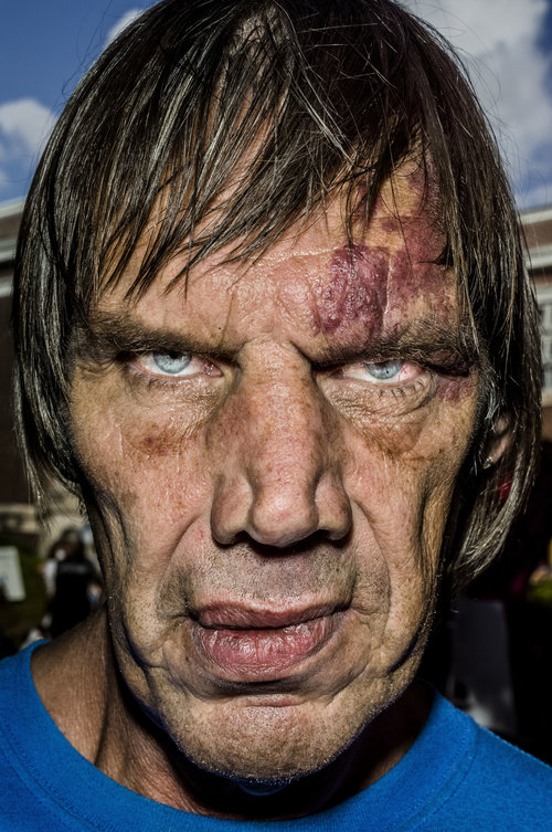
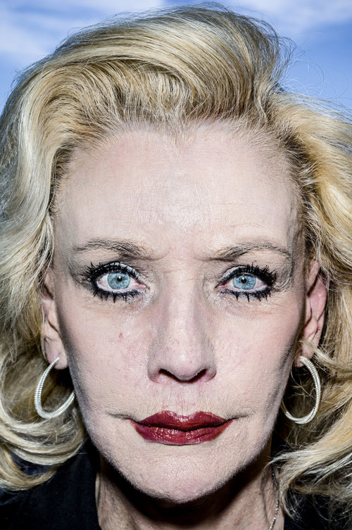
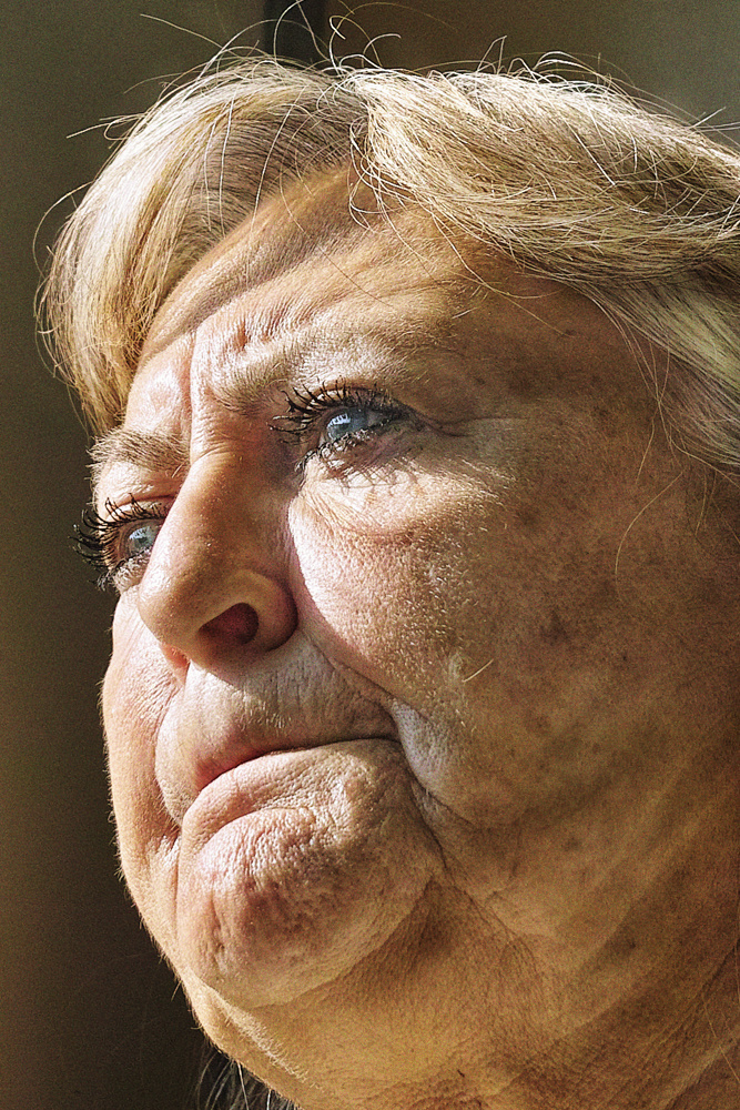
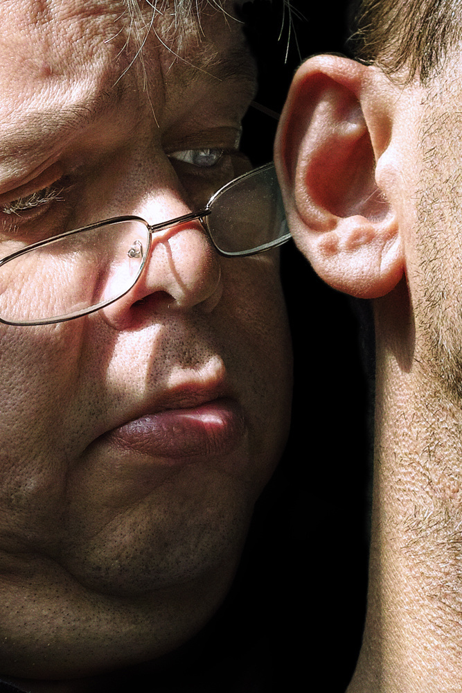
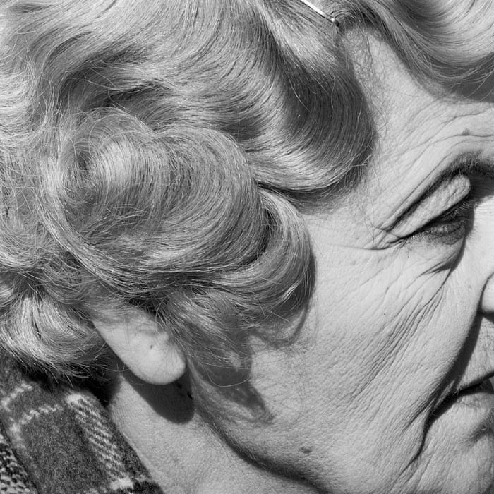
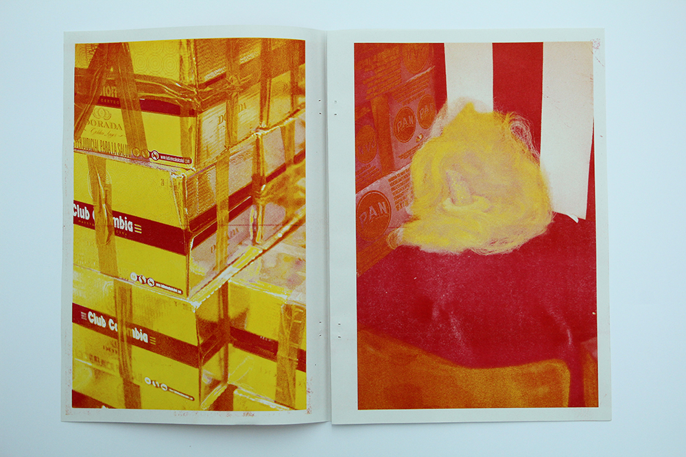
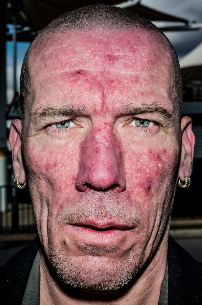
BRUCE GILDEN: FACE: Recently you have explored street photography and Bruce Gilden is renowned for his confrontational style and getting up close to his subject. Between 2012-14 Gilden travelled in America, Great Britain, and Colombia and created a series called FACE. Read a review here in the Guardian newspaper and another on Lensculture.
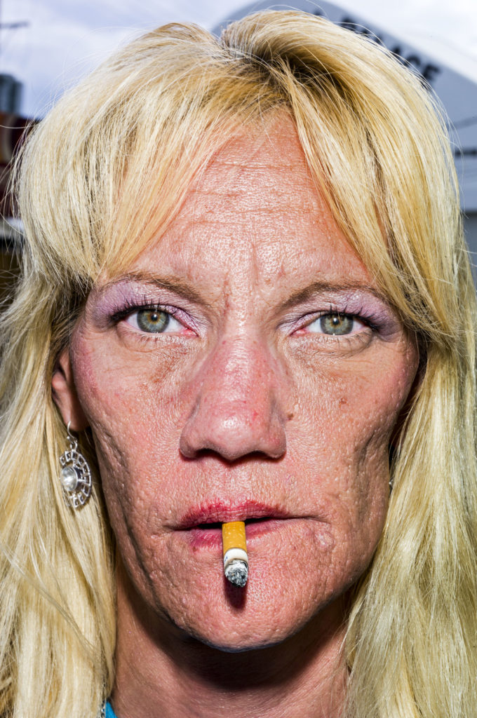
UP CLOSE

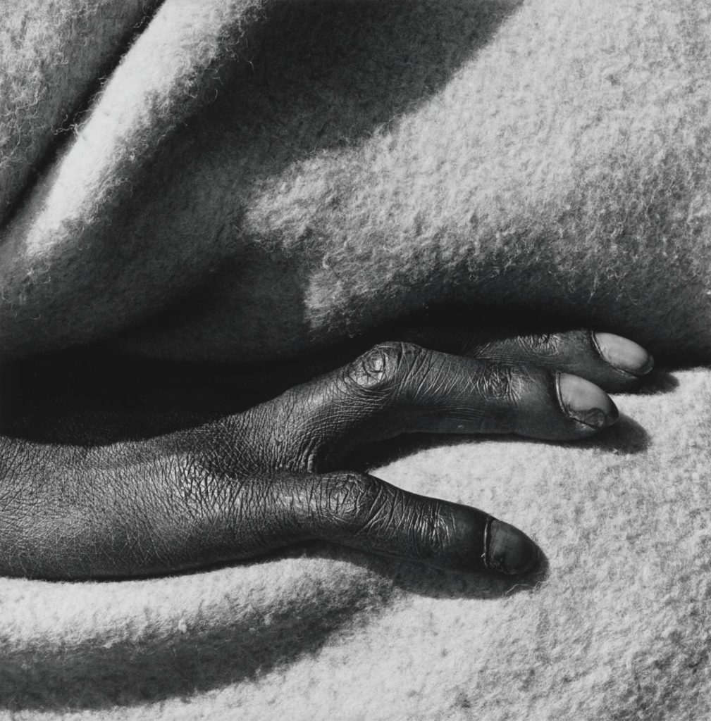
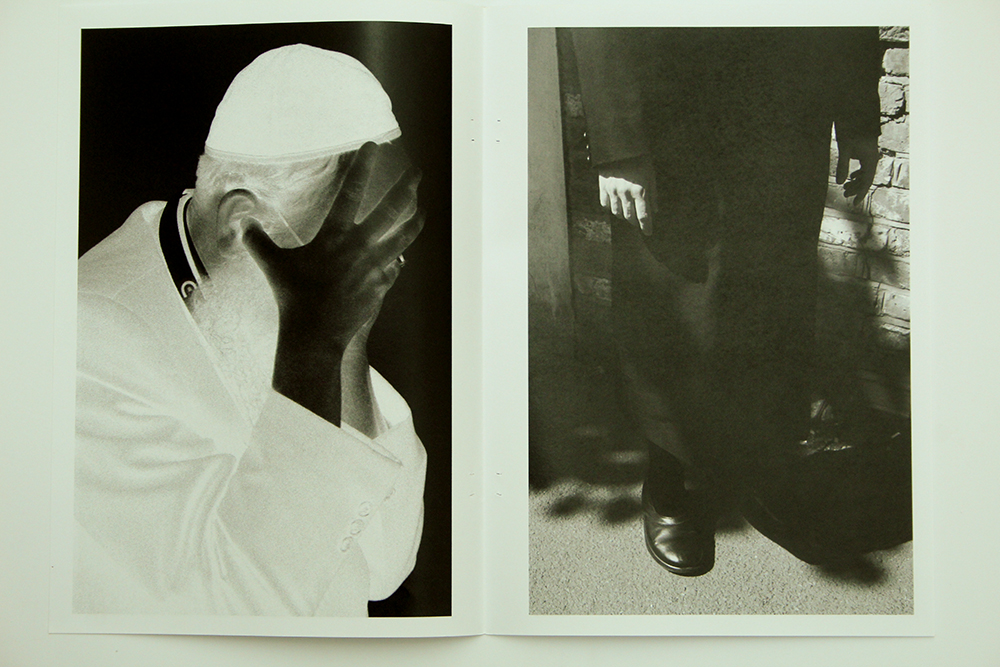
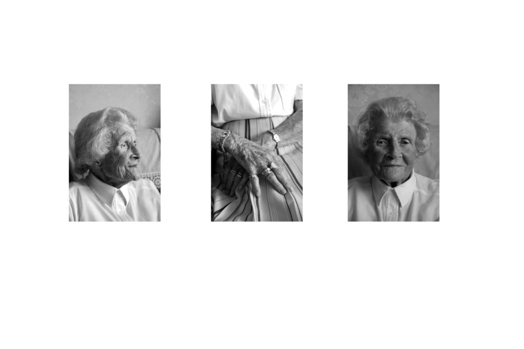
In addition to focusing on details of the face try and isolate body parts, gestures, clothing and physical features, such as hands, elbows, shoulders, neck, torso, hip, knees, feet. Your understanding of abstraction in photography; focusing on shapes, colours, light and shadows, textures and repetition is crucial here.
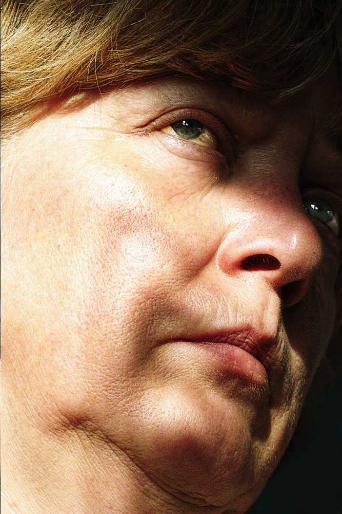
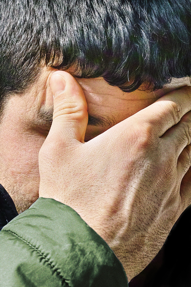
Satoshi Fujiwara: Code Unknown: In Michael Haneke’s 2000 film Code Unknown, there is a scene in which the protagonist’s lover, a photographer, secretly snaps pictures of passengers sitting across from him on the train.

Inspired by the film, I used the same approach to shoot people in Berlin trains. Yet in contemporary society, it is not acceptable to rashly and publicly display pictures of people’s faces that were taken without their permission. Thus, I shot and edited my pictures in a way that makes it impossible to identify the individual people who served as my “models.” To avoid impinging on the “right of likeness,” I used the shadows created by the direct sunlight pouring in through the windows, various compositional approaches, and digital processing to keep their identities anonymous.

When we look at another person, either directly or through another medium, we interpret a wide range of information based on outward appearance (face, physique, clothes and accessories, and movements)—in other words, various codes. By regulating and altering these codes in various ways, I set out to obscure the individuality and specificity of the subjects in the pictures in my series.—Satoshi Fujiwara
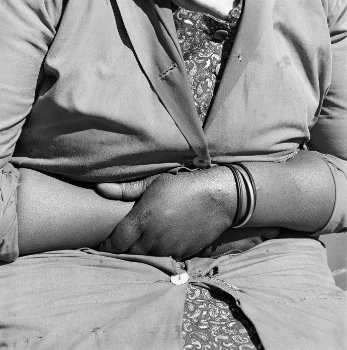
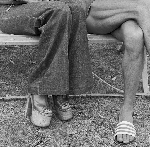
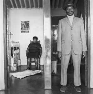
David Goldblatt: Particulars: Following a series of portraits of his compatriots made in the early 1970s, photographer David Goldblatt, for a very short and intense period of time, naturally turned to focusing on peoples’ particulars and individual body languages “as affirmations or embodiments of their selves.” Goldblatt’s affinity was no accident: Working at his father’s men’s outfitting store in the 1950s, his awareness of posture, gesture and proportion—technical as it was—formed early and would accompany him throughout his life.

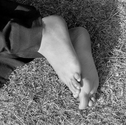
In this series we see hands resting on laps, crossed legs, the curved backs of sleepers on a lawn at midday, their fingers and feet relaxed, pausing from their usual occupations. This deeply contemplative work is framed by Ingrid de Kok’s poetry.

EXPERIMENTATION

TASK

You must produce the following experiments:

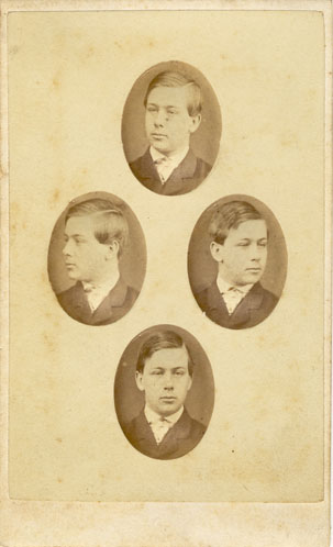
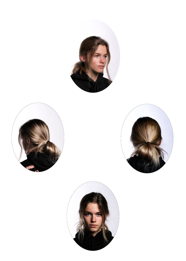
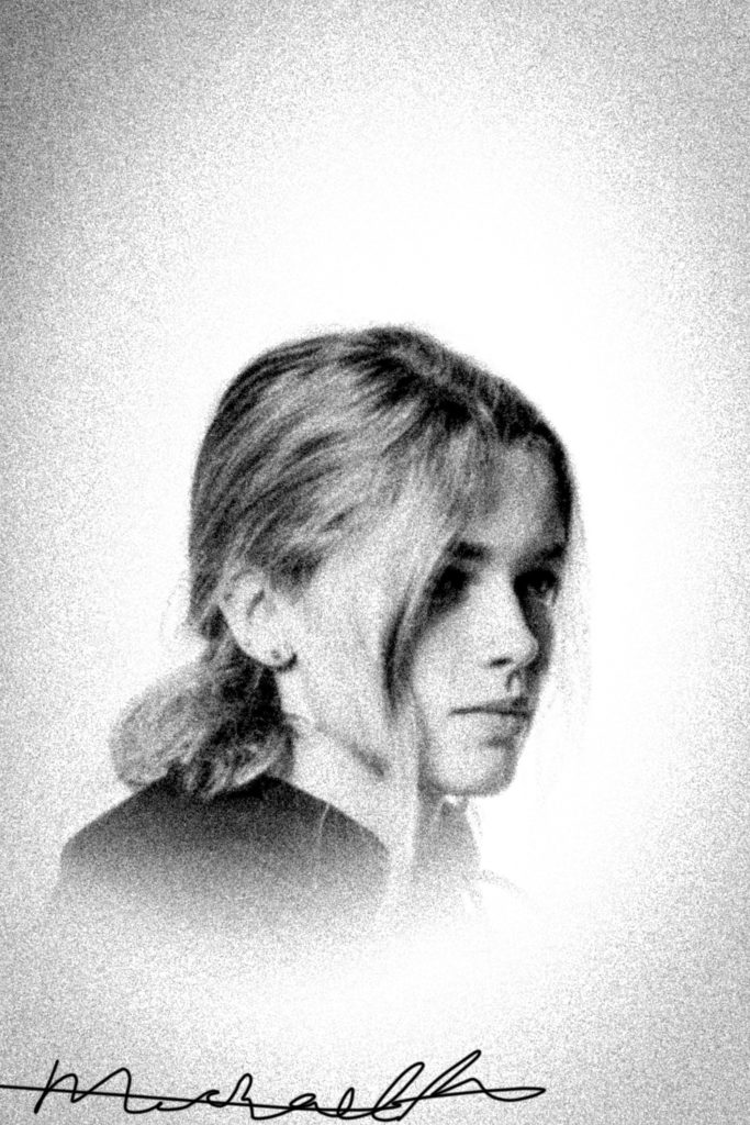
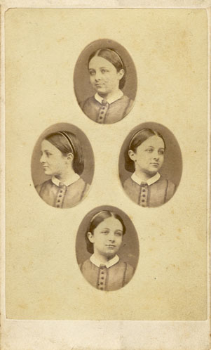
  1. DIAMOND CAMEO : Recreate a diamond cameo, similarly to Mullins of which four separate portraits of the same subject are arranged onto the same document in Photoshop.
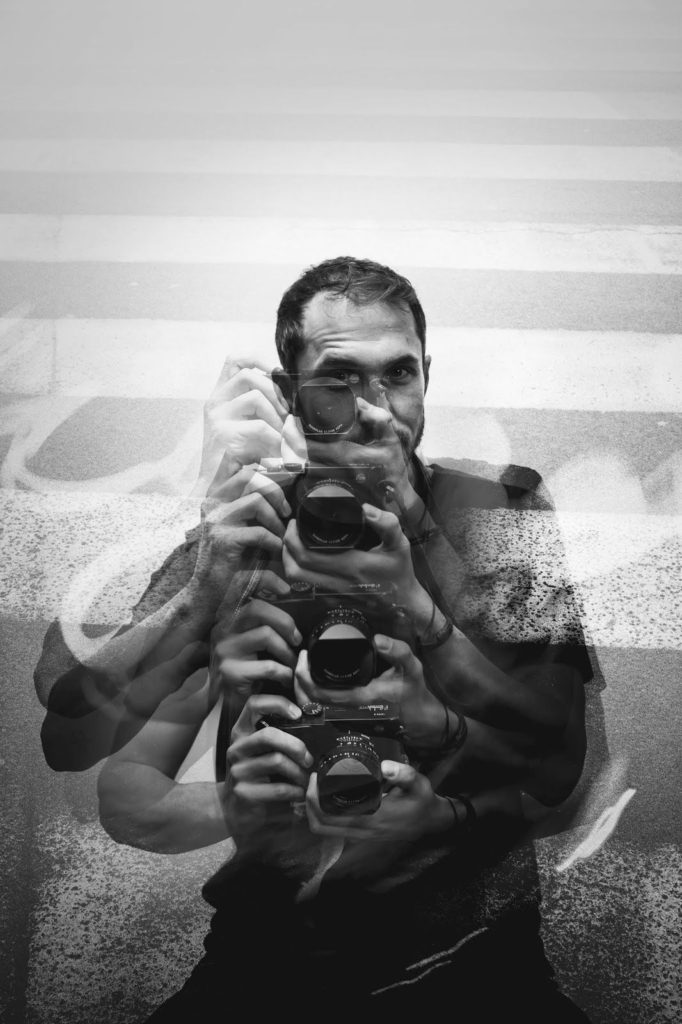
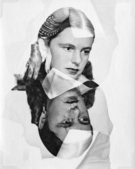
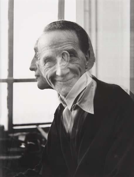
  2. DOUBLE/ MULTI-EXPOSURE: Either in camera or in post-post-production layer or merge two or three images into one portrait.
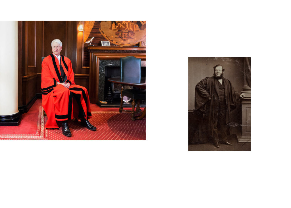
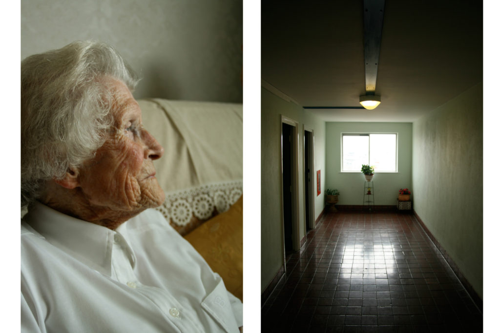
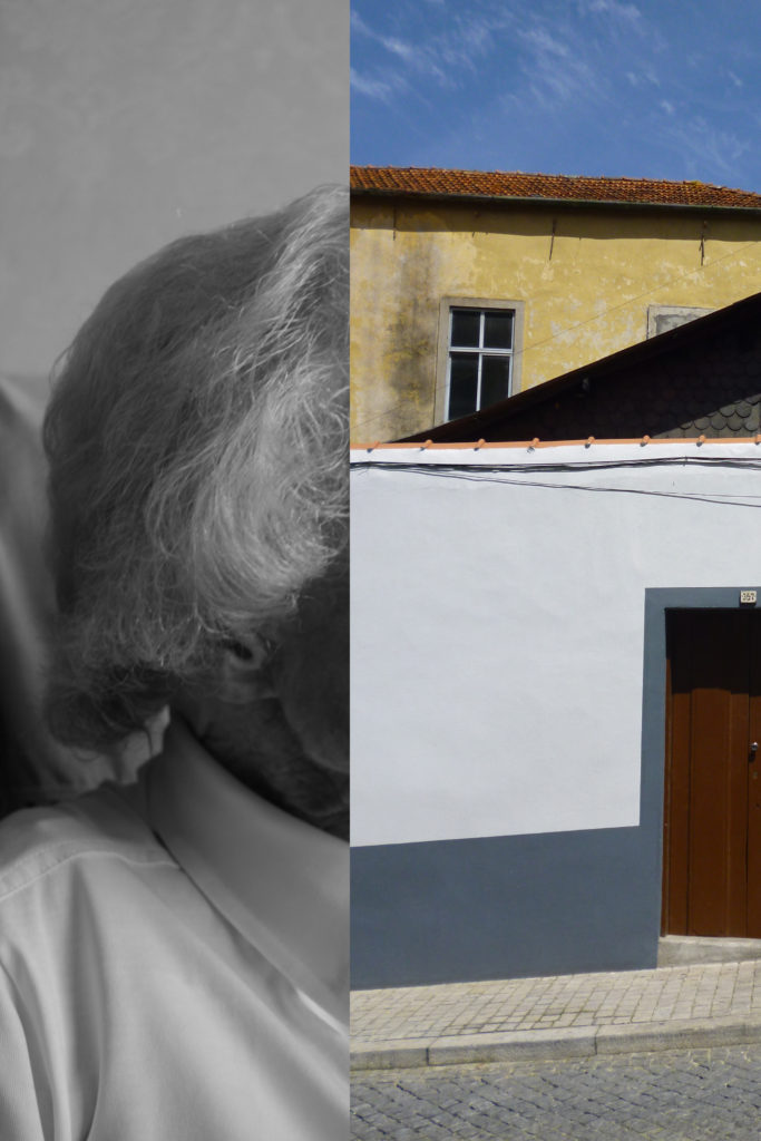
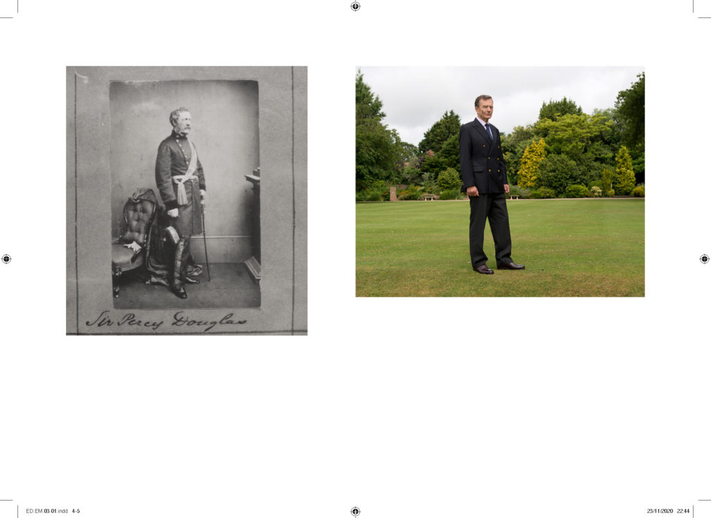
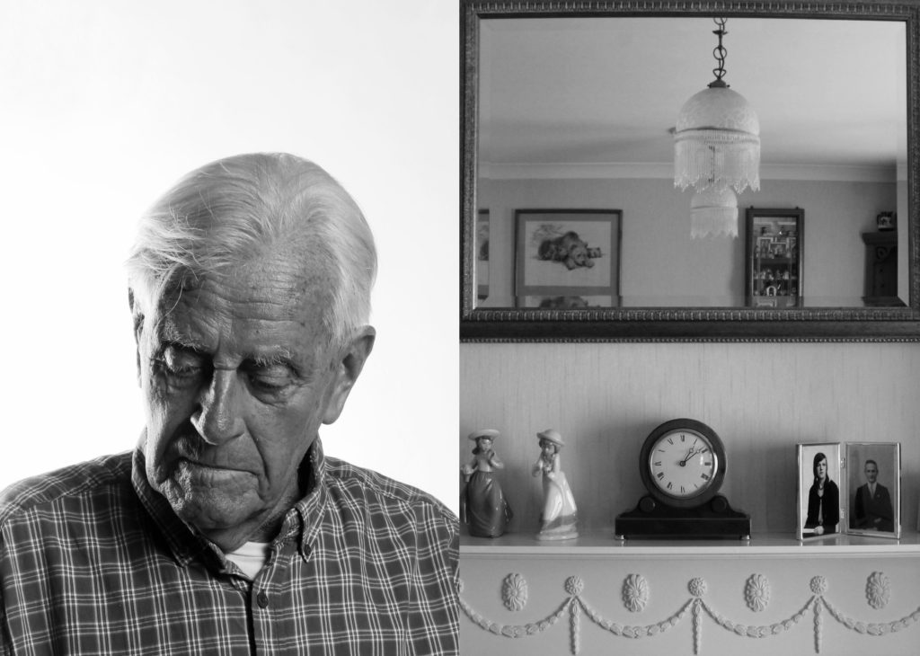
  3. JUXTAPOSITION: Select 1 portrait by Mullins and one response that you have made and juxtapose opposite each in a new document in Photoshop. Look for similarities in pose, expression, gestures and overall composition. If you have some environmental portraits from previous shoot try and juxtapose in a similar way that Michelle Sank responded to Mullins portraits in ED.EM.03.
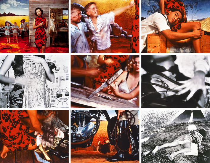
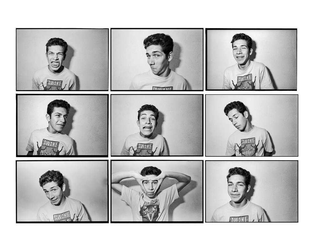
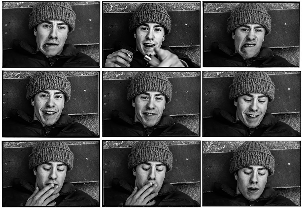
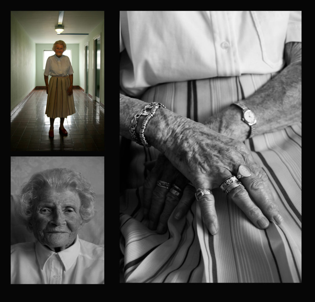
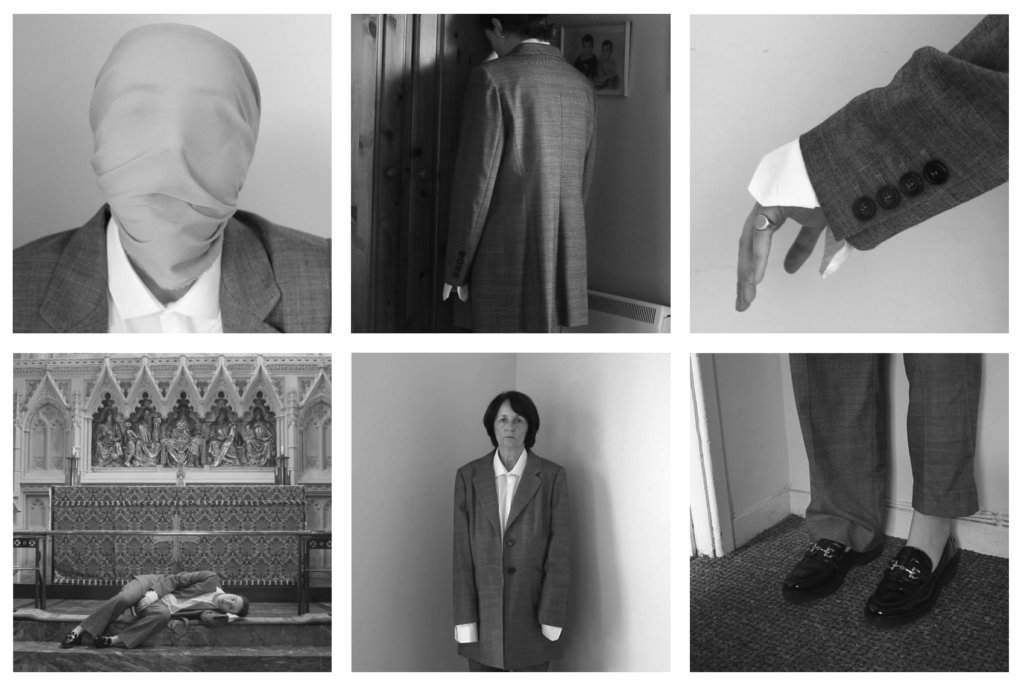
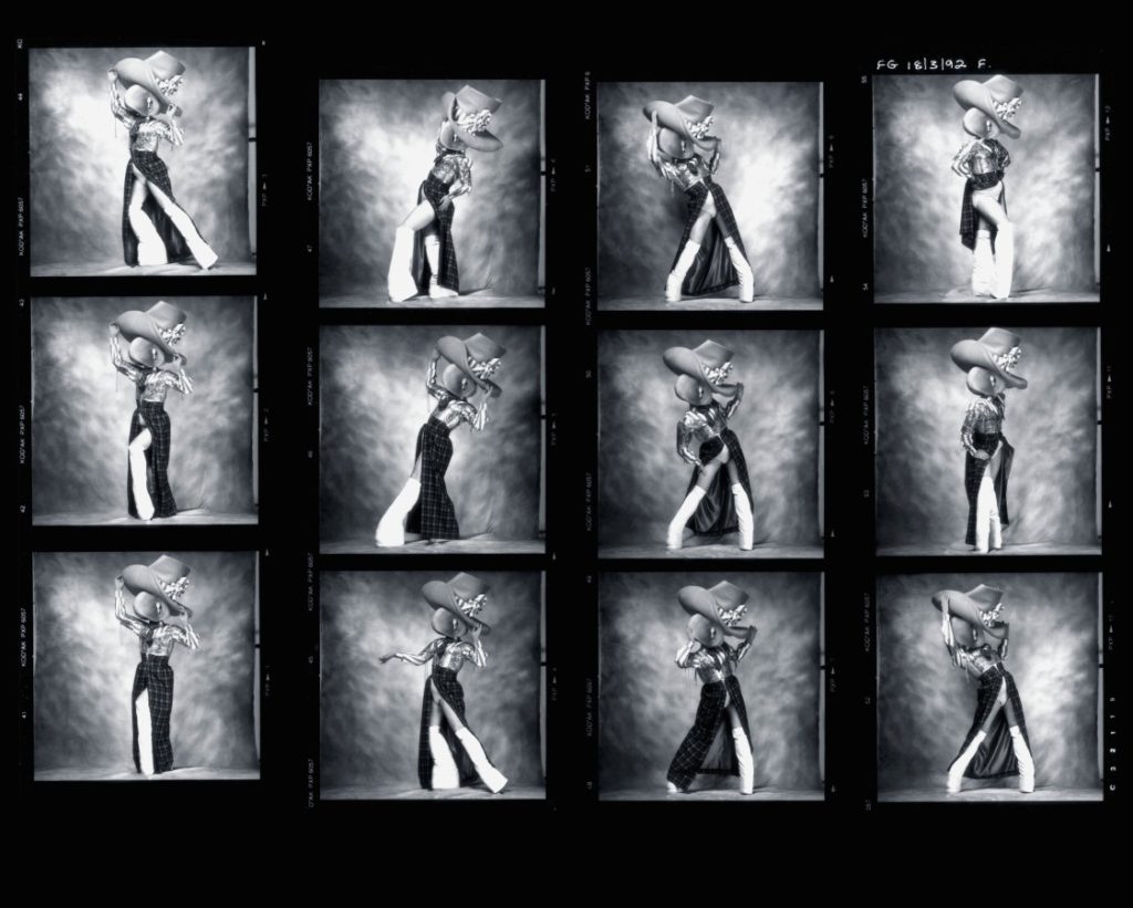
  4. SEQUENCE/ GRID: Select a series of your headshots (between 5-12) and produce a sequence either as a grid, story-board, contact-sheet or typology. Reference Mullins pages in his portrait albums
  5. MONTAGE: Select an appropriate set of portraits and create a montage of layered images in Photoshop as an A3 document.

DIAMOND CAMEO
DOUBLE / MULTI-EXPOSURES

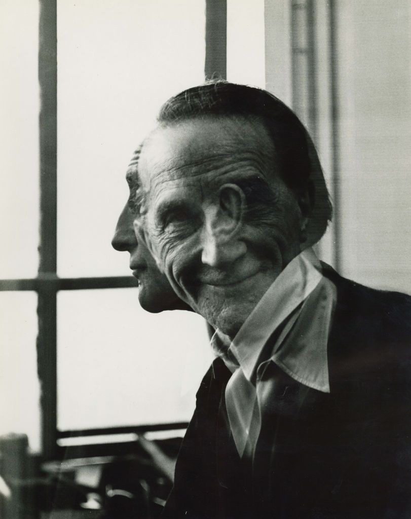
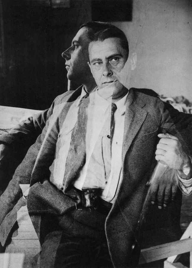
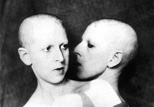
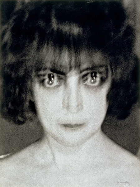
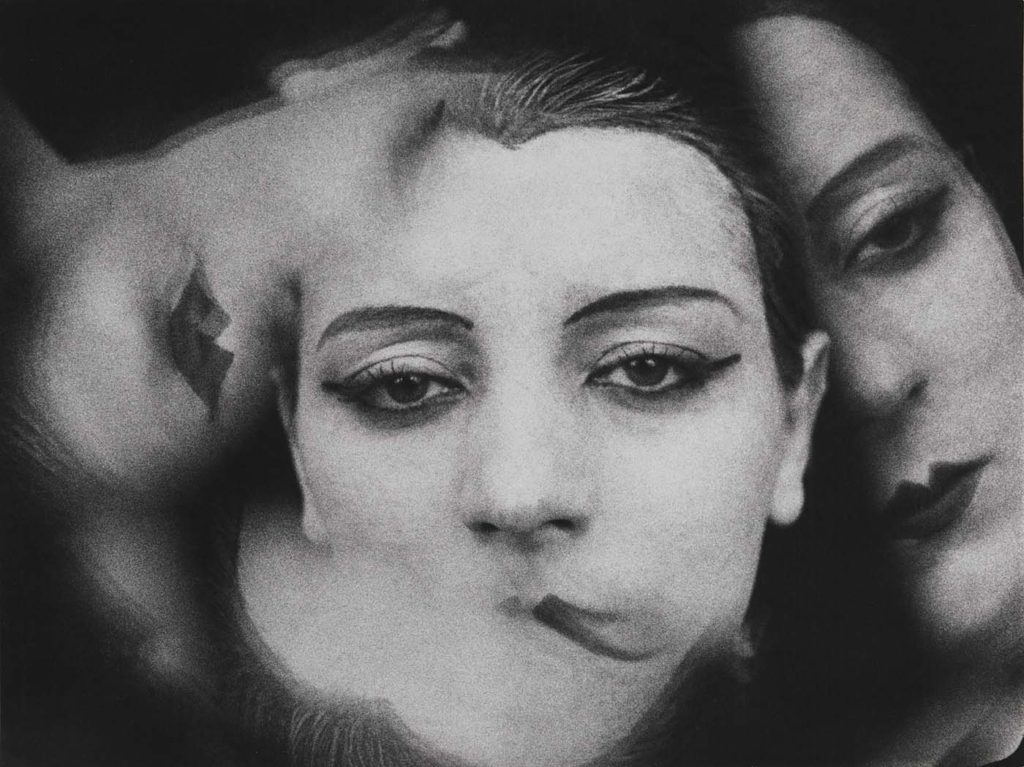
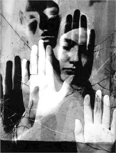
Double or multiple exposures are an illusion created by layering images (or portions of images) over the top of each other. This can be achieved in the camera settings, or on Adobe Photoshop by creating LAYERS and then using BLENDING OPTIONS and OPACITY CONTROL. Artist have used these techniques to explore Surrealist Ideas and evoke dream-like imagery, or imagery that explores time / time lapse.
Man Ray
Alexander Rodchenko
Claude Cahun
Lewis Bush, Trading Zones
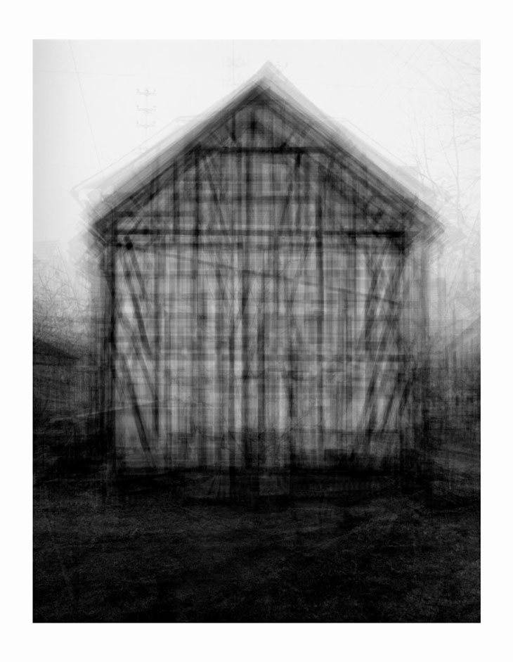
Idris Khan, Every…Bernd And Hilla Becher Gable Sided Houses. 2004
Photographic print
208 x 160 cm

Since 1959 Bernd and Hilla Becher have been photographing industrial structures that exemplify modernist engineering, such as gas reservoirs and water towers. Their photographs are often presented in groups of similar design; their repeated images make these everyday buildings seem strangely imposing and alien. Idris Khan’s Every… Bernd And Hilla Becher… series appropriates the Bechers’ imagery and compiles their collections into single super-images. In this piece, multiple images of American-style gabled houses are digitally layered and super-imposed giving the effect of an impressionistic drawing or blurred film still.

JUXTAPOSITION

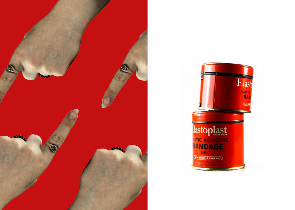
Juxtaposition is placing two images together to show contrast or similarities. For inspiration look at some of the page spreads from ED.EM.03 where pairings between portraits of Henry Mullins and Michelle Sank are juxtaposed to show comparison/ similarities/ differences between different social and professional classes in Jersey mid-19th century and early 21 st century.
For inspiration look also at the newspapers: LIBERATION / OCCUPATION and FUTURE OF ST HELIER produced by past A2 photography students and the publication GLOBAL MARKET by ECAL.
LIBERATION / OCCUPATION newspaper 25 April 2020
FUTURE OF SY HELIER newspaper 18 Sept 2019
Spreads from Global Market
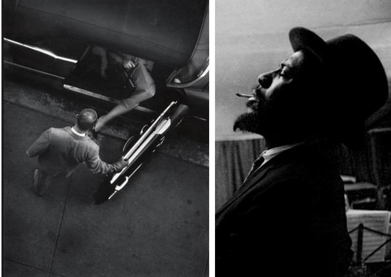
W. Eugene Smith. Jazz Loft Project

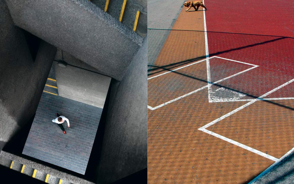
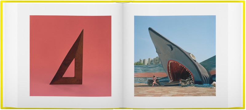
Juxtapose images according to shapes, colours, repetition, object vs portrait
COLOUR – SHAPES
This image has an empty alt attribute; its file name is fb4.jpg
SHAPES – GEOMETRY
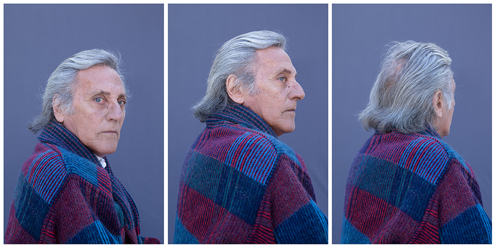
Repetition
This image has an empty alt attribute; its file name is Where-Mimosa-Bloom_03-1024x682.jpg
OBJECT – PORTRAIT

SEQUENCE/ GRID

Henry Mullins: Pages and re-constructed contact-sheets from his portrait albums.

Thomas Struth

Shannon O’Donnell: That’s Not The Way The River Flows (2019) is a photographic series that playfully explores masculinity and femininity through self-portraits. The work comes from stills taken from moving image of the photographer performing scenes in front of the camera. This project aims to show the inner conflicts that the photographer has with identity and the gendered experience. It reveals the pressures, stereotypes and difficulties faced with growing up in a heavily, yet subtly, gendered society and how that has impacted the acceptance and exploration of the self.
Duane Michals (b. 1932, USA) is one of the great photographic innovators of the last century, widely known for his work with series, multiple exposures, and text. Michals first made significant, creative strides in the field of photography during the 1960s. In an era heavily influenced by photojournalism, Michals manipulated the medium to communicate narratives. The sequences, for which he is widely known, appropriate cinema’s frame-by-frame format. Michals has also incorporated text as a key component in his works. Rather than serving a didactic or explanatory function, his handwritten text adds another dimension to the images’ meaning and gives voice to Michals’s singular musings, which are poetic, tragic, and humorous, often all at once.
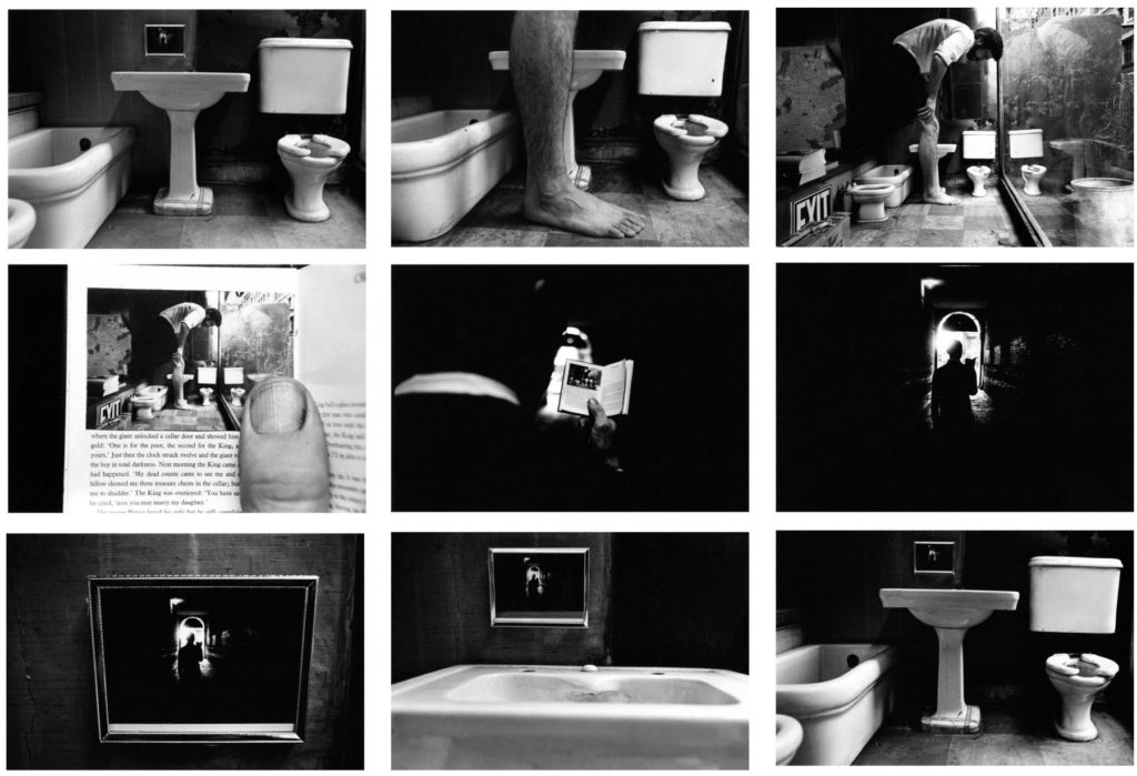
Things Are Queer, 1973
Nine gelatin silver prints with hand-applied text
3 3/8 x 5 inches 
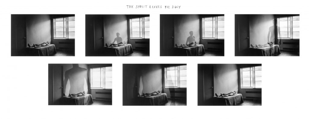
The Spirit Leaves the Body, 1968
Seven gelatin silver prints with hand-applied text
3 3/8 x 5 inches (each image)
Death Comes to the Old Lady, 1969
Five gelatin silver prints with hand-applied text
3 3/8 x 5 inches (each image)
Tracy Moffatt: Something More, 1989

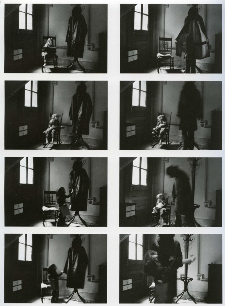
Tracy Moffatt: The nine images in Something More tell an ambiguous tale of a young woman’s longing for ‘something more’, a quest which brings dashed hopes and the loss of innocence. With its staged theatricality and storyboard framing, the series has been described by critic Ingrid Perez as ‘a collection of scenes from a film that was never made’. While the film may never have been made, we recognise its components from a shared cultural memory of B-grade cinema and pulp fiction, from which Moffatt has drawn this melodrama. The ‘scenes’ can be displayed in any order – in pairs, rows or as a grid – and so their storyline is not fixed, although we piece together the arc from naïve country girl to fallen woman abandoned on the roadside in whatever arrangement they take. Moffatt capitalises on the cinematic device of montage, mixing together continuous narrative, flashbacks, cutaways, close-ups and memory or dream sequences, to structure the series, and relies on our knowledge of these devices to make sense and meaning out of the assemblage.
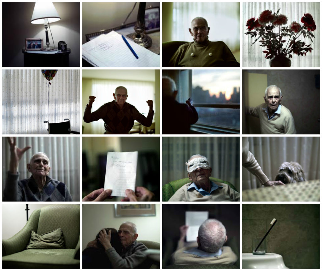
Philip Toledano: Day with my father, 2010

Philip Toledano: DAYS WITH MY FATHER is a son’s photo journal of his aging father’s last years. Following the death of his mother, photographer Phillip Toledano was shocked to learn of the extent of his father’s severe memory loss.
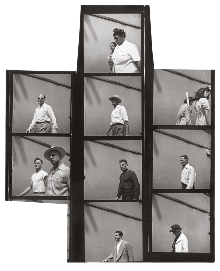
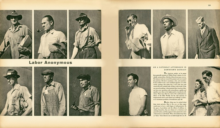
Walkers Evans and Labour Anonymous

Walker Evans: One of the founding fathers of Documentary Photography Walker Evans used cropping as part of his work.  Another pioneer of the photo-essay, W. Eugene Smith also experimented with cropping is his picture-stories

Read more here on Walker Evans and his magazine work and  his series Labour Anonymous.
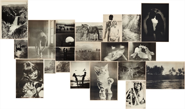
Hans-Peter Feldmann, Sonntagsbilder (Sunday Pictures). 1976
The complete set of 21 offset lithographs, on thin wove paper, with full margins,
all I. various sizes

Hans-Peter Feldmann: (b. 1941 Duesseldorf). The photographic work of Hans-Peter Feldmann began with his own publications in small print-runs between 1968 and 1975. Often using reproductions of photographs from magazines or private snapshots, which he mixed with his own photographs, Feldmann, like Ed Ruscha, undermined the aura of the unique, “authentic” work of art. With his laconic imagery he seeks to break down conventional notions of art.
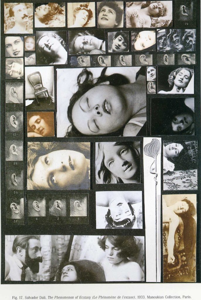
Salvatore Dali: The Phenomenon of Ecstasy (1933)

PHOTO-MONTAGE

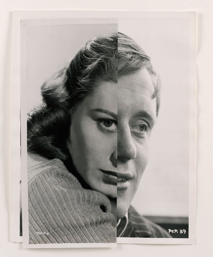
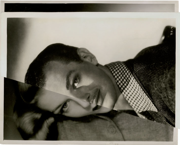
Photomontage is the process and the result of making a composite photograph by cutting, gluing, rearranging and overlapping two or more photographs into a new image. 
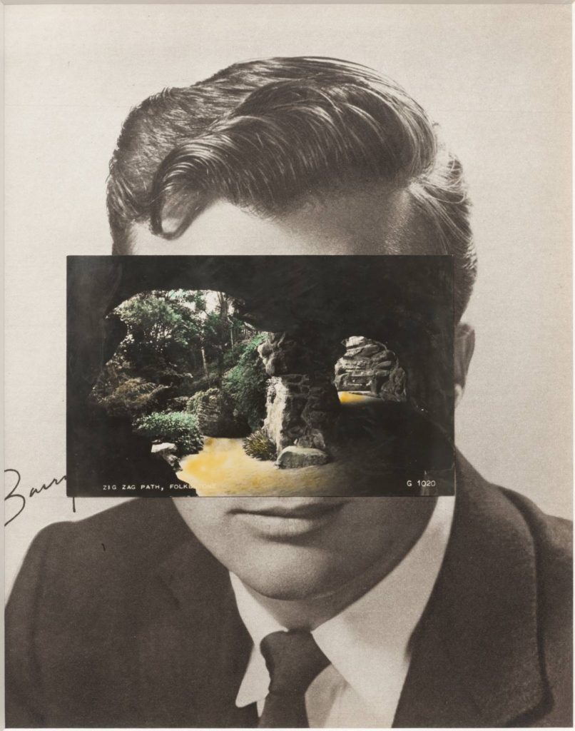
Mask XIV 2006 

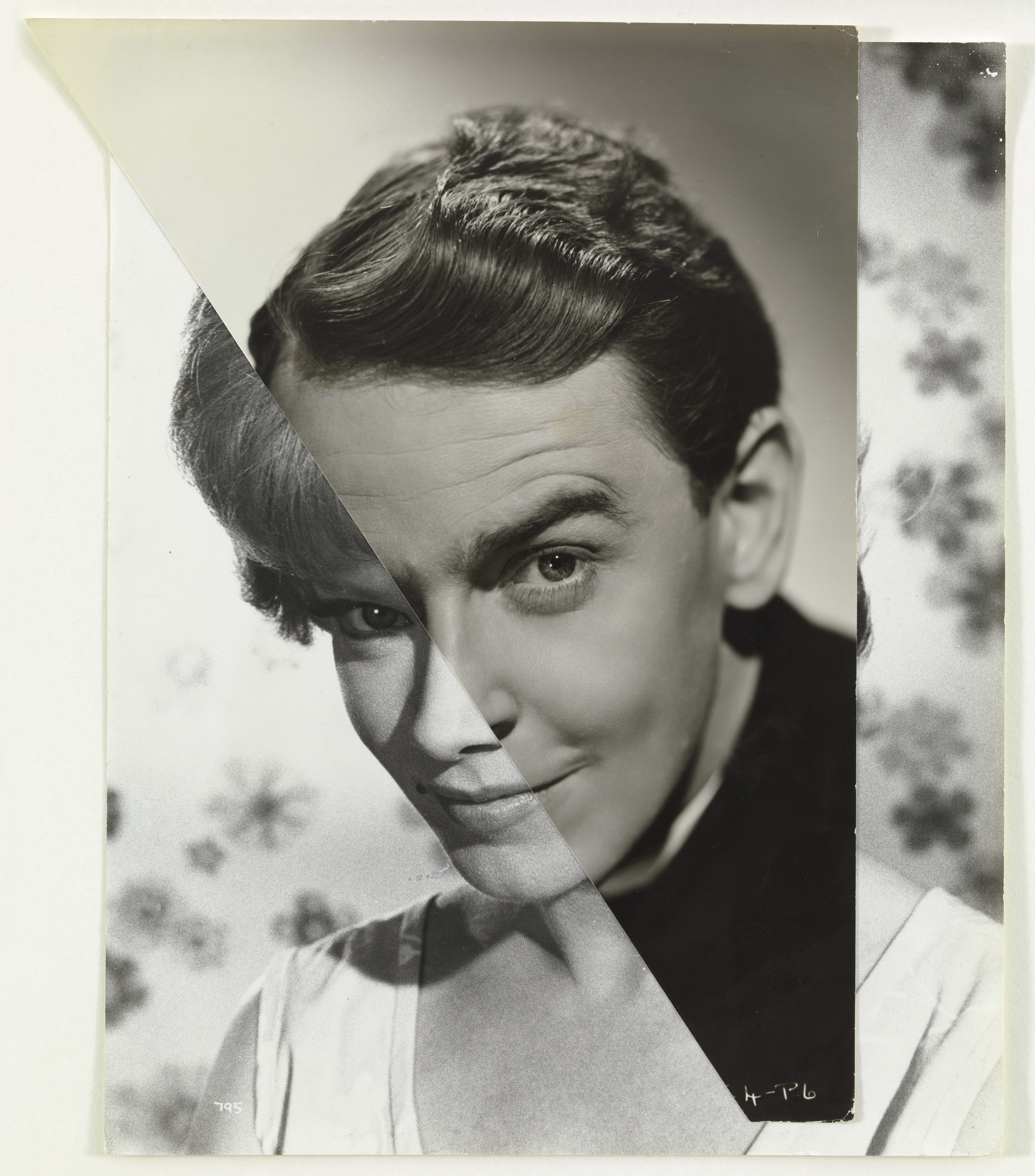
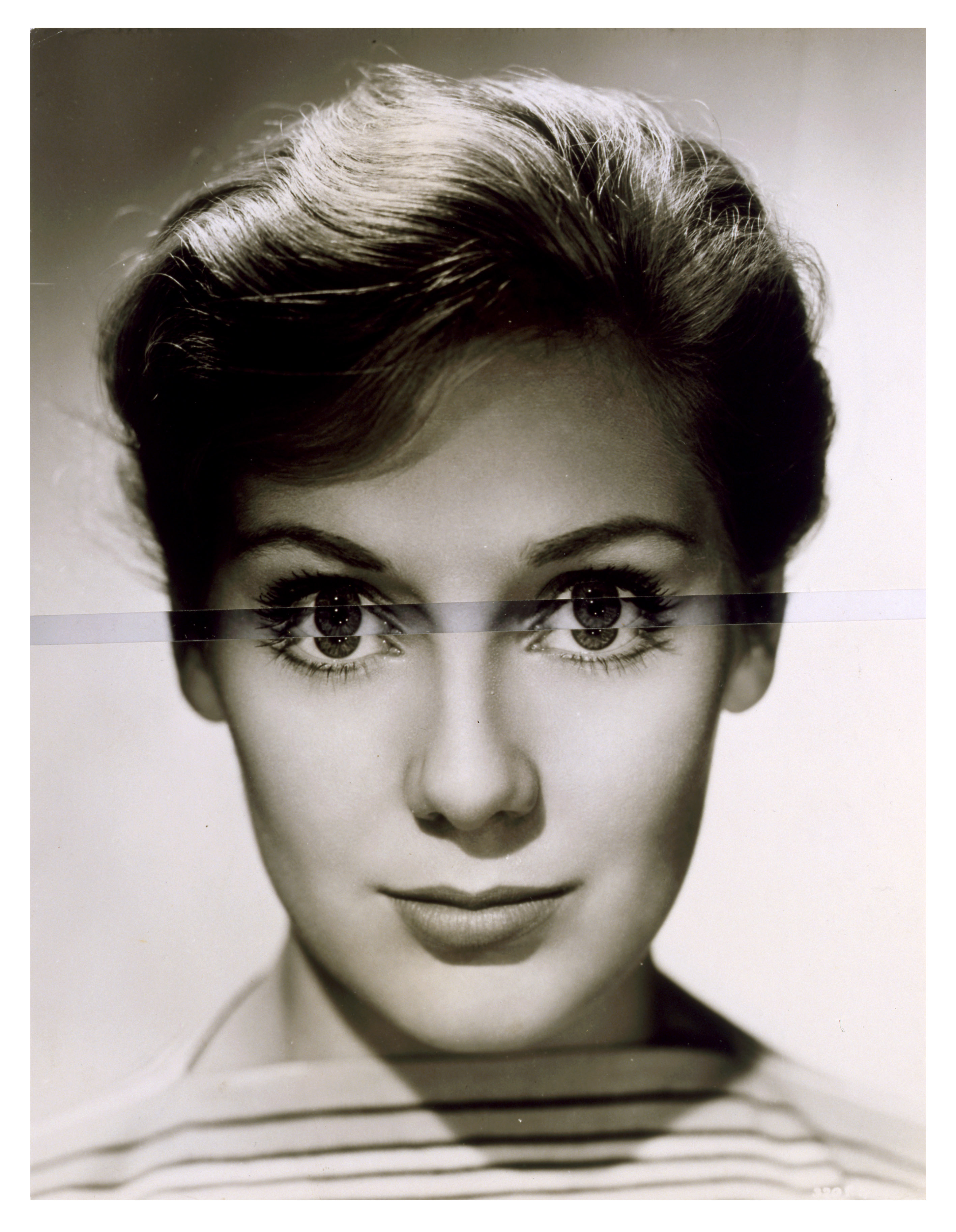
John Stezaker: Is a British artist who is fascinated by the lure of images. Taking classic movie stills, vintage postcards and book illustrations, Stezaker makes collages to give old images a new meaning. By adjusting, inverting and slicing separate pictures together to create unique new works of art, Stezaker explores the subversive force of found images. Stezaker’s famous Mask series fuses the profiles of glamorous sitters with caves, hamlets, or waterfalls, making for images of eerie beauty.
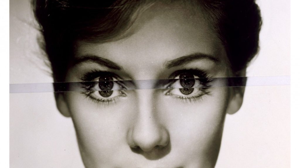
His ‘Dark Star’ series turns publicity portraits into cut-out silhouettes, creating an ambiguous presence in the place of the absent celebrity. Stezaker’s way of giving old images a new context reaches its height in the found images of his Third Person Archive: the artist has removed delicate, haunting figures from the margins of obsolete travel illustrations. Presented as images on their own, they now take the centre stage of our attention
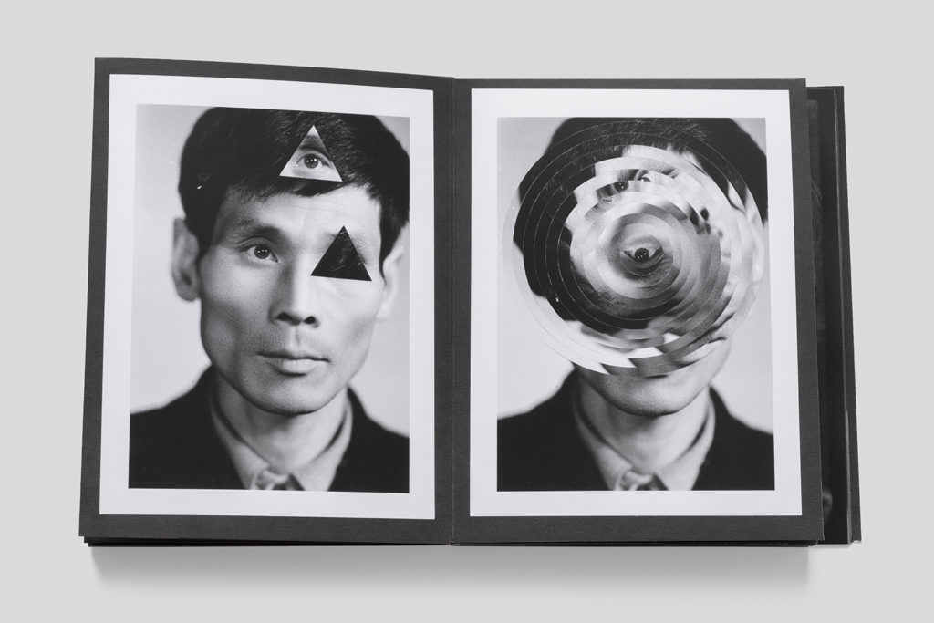
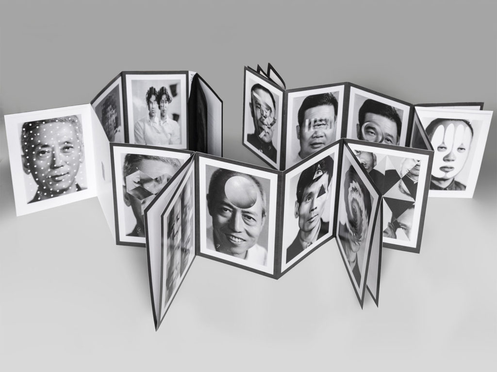
Thomas Sauvin and Kensuke Koike‘No More, No Less’
In 2015, French artist Thomas Sauvin acquired an album produced in the early 1980s by an unknown Shanghai University photography student. This volume was given a second life through the expert hands of Kensuke Koike, a Japanese artist based in Venice whose practice combines collage and found photography. The series, “No More, No Less”, born from the encounter between Koike and Sauvin, includes new silver prints made from the album’s original negatives. These prints were then submitted to Koike’s sharp imagination, who, with a simple blade and adhesive tape, deconstructs and reinvents the images. However, these purely manual interventions all respect one single formal rule: nothing is removed, nothing is added, “No More, No Less”. In such a context that blends freedom and constraint, Koike and Sauvin meticulously explore the possibilities of an image only made up of itself.

HEADSHOTS

Diamond Cameo

Henry Mullins

Henry Mullins was an English Photographer born in 1818.

Henry Mullins was the first professional photographer to come to Jersey and establish a portraiture business in the very early days of photography.

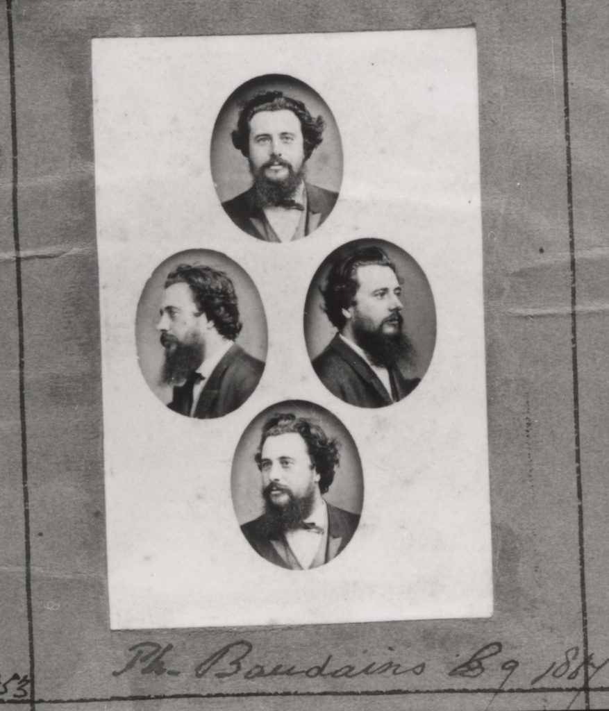
Below is an example of one of Henry’s pieces where he makes use of the presentation technique – diamond cameo.

Henry Mullins – Diamond Cameo

Diamond Cameos feature a series of four portraits that feature different angles or positions of the subject and are placed in a diamond shape in oval frames.

Michael Kenealy – diamond cameo

Double / Multi-exposures

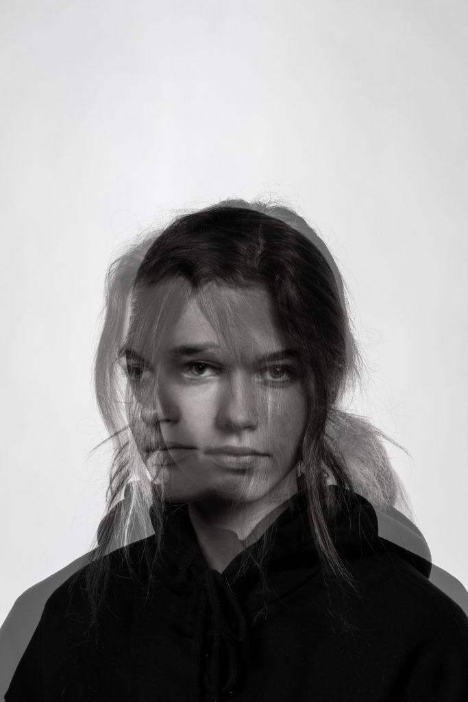
Double / multi-exposures are compositions where multiple images are layered into one to create a repetition illusion.

Philipp Reinhard

Man Ray

Man Ray was an American experimental photographer born in 1890.

He experimented with rayographs and camera-less photography and was a specialist in the dark room.

These experimental veiws on photography led Ray to discover the emerging surrealist movement in France.

Surrealism was a movement that sought to the juxtapose distant realities and activate the unconscious mind through the imagery.

Ray’s pieces explore surrealism by challenging the idea of having many compositions of the same subject in one image. He does this by creating a multi-exposure – using the same piece of film to take multiple images of the same subject.

He uses a high contrast in his images and leaves them slightly underexposed to create a gloomier feel.

Michael Kenealy – multi exposure

Juxtaposition

Juxtaposition in photography refers to the connection of two images with assumed similarities.

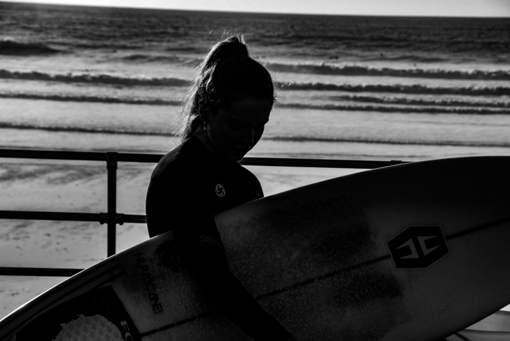
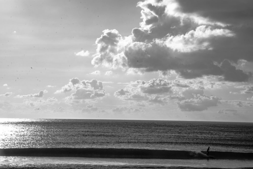
Below is a composition I shot where there is a juxtaposition between the subject and the landscape, surfer and the ocean.

The images above are both lowkey, they juxtapose in the tonal elements such as high contrast and low saturation but also in a contextual fashion – a surfer and the surfers environment.

Henry Mullins and Michelle Sank

Below are a few examples of a series of juxtaposing compositions where Photographer Michelle Sank responds to Henry Mullins’ works.

She responds by taking modern versions of old Henry Mullins pieces and juxtaposing them according to social, political, class and professional stand points.

Below is my attempt at juxtaposing with one of Henry Mullins’ portraits.

Sequence/grid

Henry Mullins has a good example of sequencing in his portrait album book.

This is a way of displaying final pieces and showcasing work in an ascetic, accessible and uniform manner.

The following is my reaction to J Grant Brittan’s piece.

Photo Montage

Photomontage is the technique of making a composite photograph by overlapping, gluing, cutting, and rearranging two or more photographs into a new image. 

John Stezaker

Is a British photographer born in 1949.

He is fascinated by the “lure”of images.

Stezakers’ works focus on photo montage to give old images a new meaning and add a creative surrealistic tinge to his photography.

John Stezaker - Artist - Saatchi Gallery
John Stezaker & the Not-So-Perfect Marriage - Gwarlingo

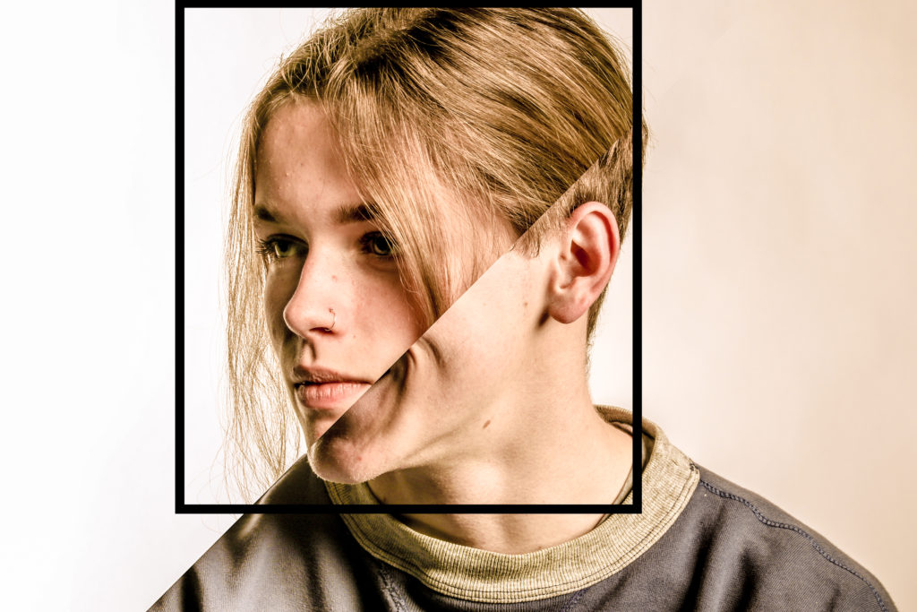
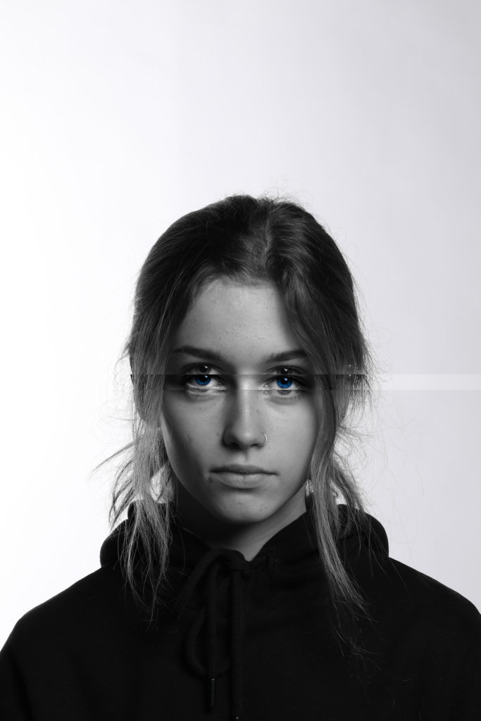
My response to Stezakers’ work:

John Stezaker. Marriage XV. 2006 | MoMA
John Stezaker
Michael Kenealy

John Stezaker - Whitechapel Gallery

Studio portraits 1

Early Pioneers…

Louis Daguerre France (18 November 1787 – 10 July 1851)

  • French artist and photographer
  • invention of the daguerreotype process of photography
  • worked closely with Joseph Niepce
  • an accomplished painter
  • developer of the diorama theatre.
Louis Daguerre, Photo Pioneer Honored By Google: Interesting Facts - HISTORY
Louis Daguerre – early Daguerreotype – c. 1850
How Daguerreotype Photography Reflected a Changing America | At the  Smithsonian | Smithsonian Magazine

Henry William Fox-Talbot (1800 – 1877) UK

Fox Talbot was an English member of parliament, scientist, inventor and a pioneer of photography.

Fox Talbot went on to develop the three primary elements of photography: developing, fixing, and printing. Although simply exposing photographic paper to the light produced an image, it required extremely long exposure times. By accident, he discovered that there was an image after a very short exposure. Although he could not see it, he found he could chemically develop it into a useful negative. The image on this negative was then fixed with a chemical solution. This removed the light-sensitive silver and enabled the picture to be viewed in bright light. With the negative image, Fox Talbot realised he could repeat the process of printing from the negative. Consequently, his process could make any number of positive prints, unlike the Daguerreotypes. He called this the ‘calotype’ and patented the process in 1841.

victorian photography | Victorian photography, Henry fox talbot, History of  photography

Julia Margaret Cameron (11 June 1815 – 26 January 1879) UK

She is known for her soft-focus close-ups of famous Victorian men and for illustrative images depicting characters from mythology, Christianity, and literature.

Much of her work has connections to pictorialism and even movements such as The Pre-Rapahelites, and often had a dream-like, constructed quality to the images.

Sir John Herschel ,1867

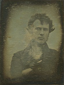
Robert Cornelius (1809-1893) USA

RobertCornelius.jpg
Cornelius’s 1839 photograph of himself. The back reads, “The first light picture ever taken”. The Cornelius portrait is the first known photographic portrait taken in America,
Henry Mullins Jersey (1854-1921)

Portrait by Henry Mullins, 1849

(Jersey-based)See also Ernest Badoux, William Collie, Charles Hugo, Thomas Sutton

20th and 21st Century Approaches

Watch : Rankin on “beautiful portraits”

This image has an empty alt attribute; its file name is pittsburghstudio-13-490x276.jpg

Studio Lighting

Exploring Technique

1. Natural Light

In most cases we can make use of natural or available / ambient light…but we must be aware of different kinds of natural light and learn how to exploit it thoughtfully and creatively

  • intensity of the light
  • direction of the light
  • temperature of the light (and white balance on the camera)
  • making use of “the golden hour”
  • Using reflectors (silver / gold)
This image has an empty alt attribute; its file name is 1_two-lightbulbs-side-by-side-1.jpg

White Balance (WB) and Colour Temperature

Image result for temperature of photography light
  • Explore using diffusers (tissue paper, coloured gels, tracing paper, gauze etc) to soften the light
  • Try Front / side / back lighting
  • Compare High Key v low key lighting
  • Exploit Shadows / silhouettes
This image has an empty alt attribute; its file name is high_key_vs_low_key.jpg

2. Studio Lighting

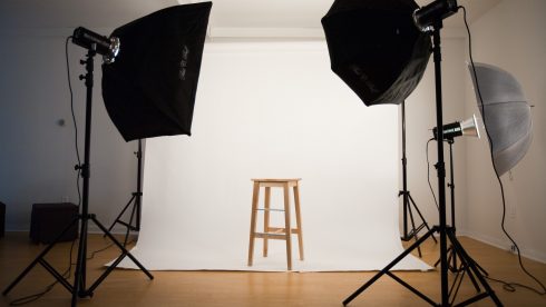
Using artificial lighting can offer many creative possibilities…so we will explore :

  • the size and shape of light
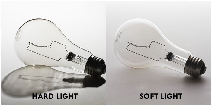
  • distance from subject to create hard / soft light
  • angles and direction…high, low, side lighting
  • filtered light
  • camera settings : WB / ISO / shutter speed etc
  • reflectors and diffusers
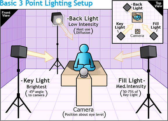
  • key lighting, fill lighting, back lighting, 1,2+3 point lighting
  • soft-boxes, flash lighting, spot lights and floodlights
  • chiarascuro and Rembrandt lighting
  • high key and low key lighting techniques
  • backdrops and infinity curves
  • long exposures and slow shutter speeds
Image result for chiaroscuro photography
Chiarascuro used to illuminate features
This image has an empty alt attribute; its file name is johannes_vermeer-490x276-300x169.jpg
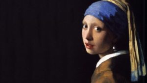
Johannes Vermeer, The Girl with the Pearl Earring, 1665—-chiarascuro as employed by the Dutch Masters
Francesca Woodman (Author of Francesca Woodman)
Francesca Woodman created blurred (self) portraits, due to movement and long exposure times), who are merging with their surroundings,

Using Flash

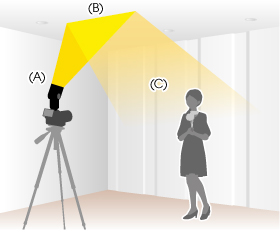
This image has an empty alt attribute; its file name is illust_bounce1.jpg
Bouncing the flash to soften its effects

Above : An example of “bouncing” the flash to soften the effects and create a larger “fill” area…try this wherever there are white walls/ ceilings

Flash units offer a range of possibilities in both low and high lighting scenarios that you could explore such as…

  • flash “bouncing”
  • fill-in flash
  • TTL / speedlight flash
  • remote / infra-red flash (studio lighting)
  • fast + slow synch flash
  • light painting c/w slow shutter speeds

Evidence of Your Learning

During this unit we would expect all students to complete 2-3 blog posts  detailing how you are experimenting with various lighting techniques eg CHIARASCURO / REMBRANDT LIGHTING

This image has an empty alt attribute; its file name is rembrandt-diagram.jpg
Rembrandt Lighting

Add information / links showing how Chiarascuro has been used since the Renaissance in painting…but also how it used now in photography and film

You must describe and explain your process with each technique…add your images to your blog as you progress, print off your successful images and evaluate your process using technical vocab and analysis skills. Think carefully about the presentation of your ideas and outcomes…compare your work to relevant portrait photographers as you go eg

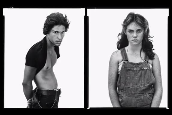
Annie Leibovitz, Irving Penn, Rankin, Richard Avedon, Yousef Karsh, David Bailey, Mario Testino, Steve McCurry, Jill Greenberg, Nick Knight, Tim Walker, Corrine Day, Jane Bown, Rineke Djikstra, Thomas Ruff et al…

Thomas Ruff | Portraits (1989) | Artsy
Thomas Ruff
Philip Toledano- Days with My Father
Sebastião Salgado se une a grandes nomes em apelo pela proteção dos  indígenas contra a Covid
Sebastiao Salgado
David Goldblatt - 126 Artworks, Bio & Shows on Artsy
David Goldblatt- Soth Africa / racial segregation / gender roles / status
Alec Soth: Gathered Leaves | AnOther
Alec Soth- social documentary and representation
The first Scandinavian retrospective of Rineke Dijkstra | Wallpaper*
Rineke Dijkstra- youth and transition to adulthood

Expected Final Outcomes by Monday 7th December 2020

  • A Case Study and Practical Responses to a photographer who employs a range of lighting techniques
  • 1 x Final Portrait using natural light + analysis and evaluation
  • 1 x Final Portrait using 1 point lighting + analysis and evaluation
  • 1 x Final Portrait using 2 point lighting+analysis and evaluation

Show you can show evidence of head shots, cropped head shots, half body, three-quarter length and full length portraits.

Show that you can employ interesting angles and viewpoints…

Make sure you ANSWER THESE QUESTIONS IN YOUR BLOG

  • Why do we use studio lighting?
  • What is the difference between 1-2-3 point lighting and what does each technique provide / solve
  • What is fill lighting?
  • What is Chiarascuro ? Show examples + your own experiments

Independent Study

  1. You must complete a range of studio lighting experiments and present your strongest ideas on a separate blog post
  2. Remember to select only the most successful images
  3. You should be aiming to produce portraits that show clarity, focus and a clear understanding of a range of lighting techniques
  4. Editing should be minimal at this point…we are looking for your camera skills here
  5. But…be creative and experimental with your approach “in camera”…extremes, uniqueness and possibly thought provoking imagery that will improve your ideas and outcomes.

Image result for contemporary portrait photography
Hendrik Kerstens (in response to Dutch Masters paintings)
Image result for david bailey
David Bailey
Image result for richard avedon
Richard Avedon
Image result for anton corbijn
Anton Corbijn…natural light

https://www.wefolk.com/artists/nadav-kander/information

“People and Places”

Further Explorations

John Coplans : Self-Portrait (Hands Spread on Knees)
1985

LINK TO JOHN COPLANS

Always follow this 10 step process to ensure that you are covering all areas of study for this unit…

  1. Mood-board, definition and introduction (AO1)
  2. Mind-map of ideas (AO1)
  3. Artist References / Case Studies (must include image analysis) (AO1) re : environmental and candid portraits
  4. Photo-shoot Action Plan (AO3)
  5. Multiple Photoshoots + contact sheets (AO3)
  6. Image Selection, sub selection (AO2)
  7. Image Editing/ manipulation / experimentation (AO2)
  8. Presentation of final outcomes (AO4)
  9. Compare and contrast your work to your artist reference(AO1) and show analysis of at least 1 of your images
  10. Evaluation of your images, process and Critique of your final outcomes(AO1+AO4)

Always refer to this to help you with image analysis, knowledge and understanding etc

Picture

Resource Packs are stored here…

M:\Departments\Photography\Students\Resources\Portraiture\TO DO

and here : M:\Departments\Photography\Students\Planners Y12 JAC\Unit 2 Portrait Photography

Studio Portraits 1

Chiaroscuro

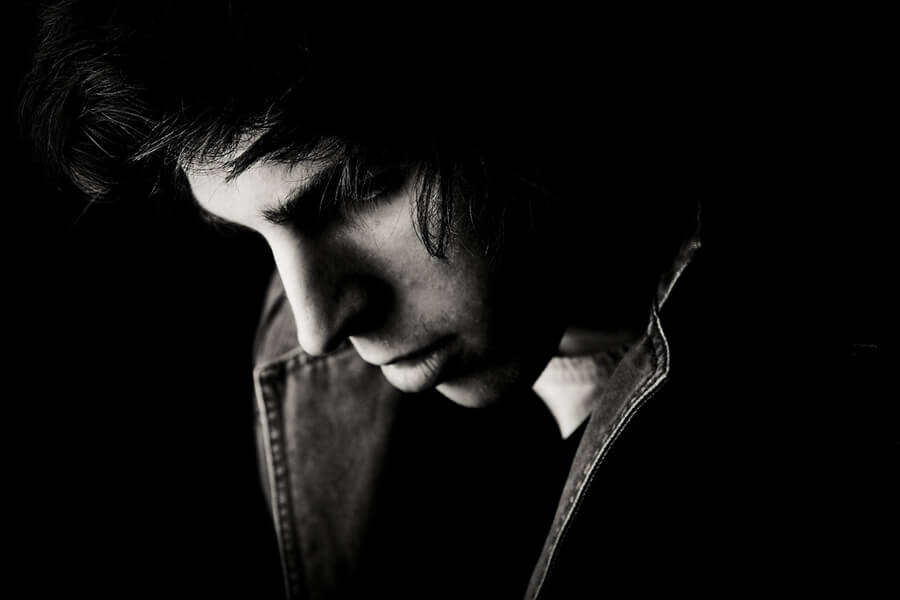
Chiaroscuro lighting is a technique that has been used for centuries. It entails the use of a distinct contrast between light and dark.

The above image shows Chiaroscuro lighting techniques where I shot the subject in a dark place and used fluorescent lighting to highlight just parts of my subjects face. The lighting positioned above the subject casts long shadows in a downward fashion to accentuate the facial features of my subject.

Chiaroscuro was used in old renaissance paintings such as this painting from Caravaggio where strong contrast between light and dark can be seen both on the casted shadow on the subjects faces and the background being dark and certain facial features being highlighted.

Caravaggio, Michelangelo Merisi da; Salome receives the Head of John the Baptist

Rembrandt Lighting

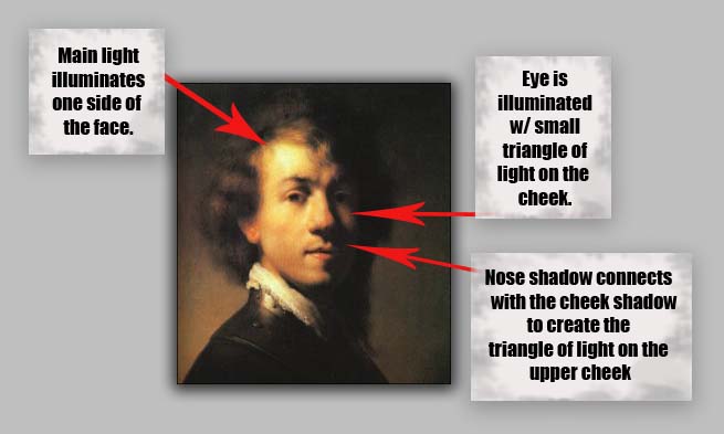
Rembrandt Lighting is a lighting technique where light illuminates one side of the face and there is a small triangle of light present on the subjects cheek.

Seen in the above image is my example of where I used Rembrandt Lighting. I used a fluorescent light source on the right side of the subject and casted enough of a shadow so that the nose shadow connects with the cheek shadow to create a small triangle of light on the subjects left cheek.

We use studio lighting to manipulate shadows, accentuate features of a subject, create a mood and manipulate the colour of the background.

Three point lighting is a lighting technique that uses three lights
– the key light, fill light and the back light.

Fill lights are used to fill in the shadows in the background

Key lights are used to light the subject.

Back lights are used to separate the subject from the background by creating a subtle rim of light around the subject.

Annie Leibovitz

Annie Leibovitz is an American photographer who is known for her alluring portraits of celebrities. She is good at captivating the intimacy of her subjects.

She uses a range of lighting. Such as these images which consist of a more low-key approach on the left and a more high key response on the right

Contact Sheets

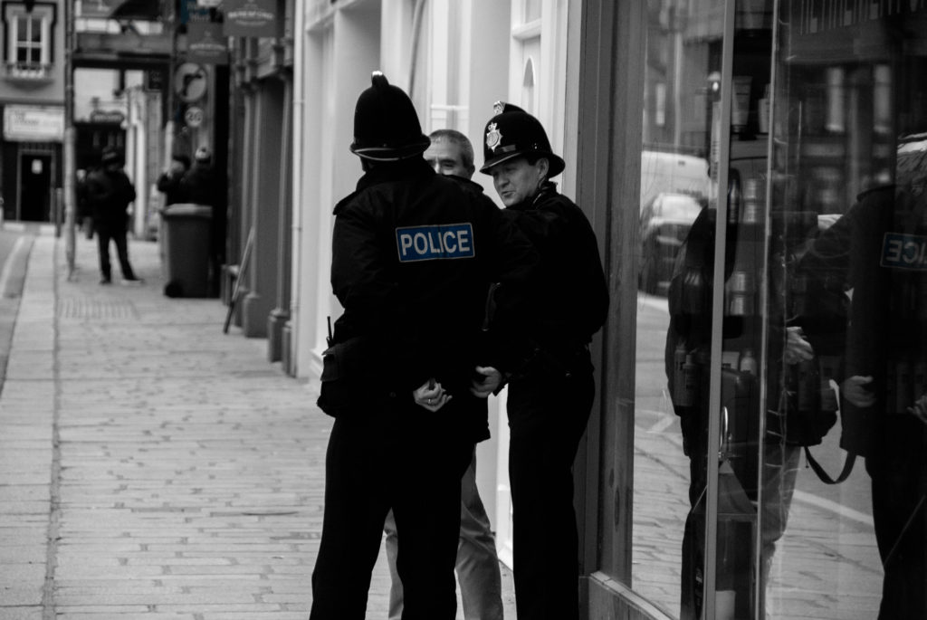
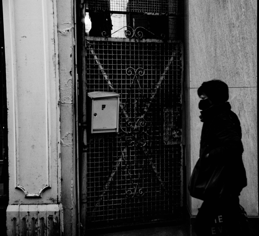
STREET PHOTOGRAPHY

Street photography is an essence of photojournalism that by definition consists of photography of random encounters and chance incidents. Despite the name, street photography does not nessiseraly have to take place on the street or urban setting but is rather defined by the presence of public presence weather that be naturally occurring populations of people in the public eye or public settings, street photography is the public world seen through an artistic eye.

Mood Board

The best street photography always tends to contain an underlying social/political context that makes a statement and ignites thought.

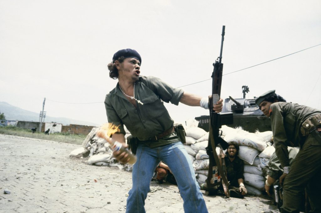
Street photography has been a form of photographical expression and journalism for over a century. This is why this form of photography can also portray certain historical events or periods in history without words which is the exact reason these images can be so powerful. They can be used as a form of rebellion: Below is an image taken by Susan Meiselas in July 16, 1979 that gives a good example of this historical context; it is taken during the Nicaraguan rebellion; the image is extremely powerful portrays the emotion and essence that was felt of the time.

Susan Meiselas

Henri Cartier-Bresson

Henri Cartier-Bresson was a French photographer born in Chanteloup-en-Brie, Seine-et-Marne. He developed an early fascination with painting particularly with Surrealism.

After spending a year in the Ivory Coast in 1932, he discovered his true life long passion – photography. Taken prisoner of war in 1940, he escaped on his third attempt in 1943 and subsequently joined an underground organization to assist prisoners and escapees. 

In 1945, he photographed the liberation of Paris.

Henri Cartier-Bresson

After three years he had spent travelling in the East, in 1952, he returned to Europe, where he published his first book, The decisive moment. From 1968, he began to curtail his photographic activities, preferring to concentrate on drawing and painting.

In 2003, with his wife and daughter, he created the Fondation Henri Cartier-Bresson in Paris for the preservation of his work. Cartier-Bresson received an extraordinary number of prizes, awards, and honorary doctorates.

He was referred to as a humanist photographer and the master of candid.

Henri Cartier-Bresson

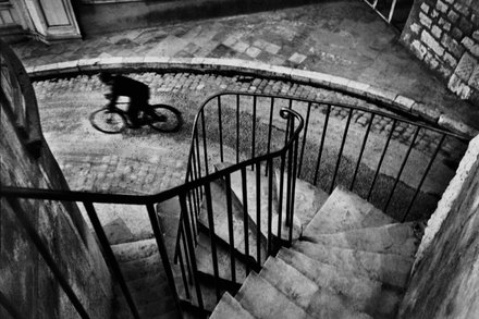
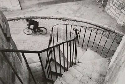
Seen above is an image from Henri’s book “The Decisive Moment” published in 1952. The composition is of a curved cobble street/ alley way surrounded by old buildings. There is a cyclist cycling expeditiously wearing black clothing on the street toward the left side of the composition. The photo is taken from the top of a spiralling staircase contained by a strong metal railing with evenly spread, parallel spokes, which meanders down towards the street in an uneven fashion. This gives the image a unique view point where the alleyway setting can be seen from above.

The photograph has low saturation and high contrast and it is also slightly underexposed and shot with natural lighting which gives the alleyway a low-key, darker, grungy look. The image is also taken with a slower shutter-speed which portrays the movement and briskness of the cyclist as he delays blurringly through the composition. Henri also framed the cyclist in the gap between where the railing stops and the strong line of the corner of a building. The image can give context to the rush and hustle that people can become enveloped in on these streets.

Henri co-founded Magnum Photo Agency in 1947. This was a cooperative agency where the founders where assigned different regions to photograph across the globe. Henri was assigned India and China. This is where he gained recognition for documenting Gandhi’s funeral in India in 1948 and the last stage of the Chinese Civil War in 1949

INDIA. 1948. Delhi. GANDHI’s funeral. Crowds gathered between Birla House and the cremation ground – Henri Cartier-Bresson

Joel Meyerowitz

Joel Meyerowitz is a street photographer from the Bronx, New York

Joe’s pieces portray humanity in its hustle, boisterous and everyday movement similarly to the works of Cartier-Bresson.

Joes works are more concentrated to the place he grew up and he goes about his work in a manner of capturing the essence of New York and documenting the city. This is different in Henri’s work; his is more diverse – he documents the essence of different cultures and political viewpoints from all over the world.

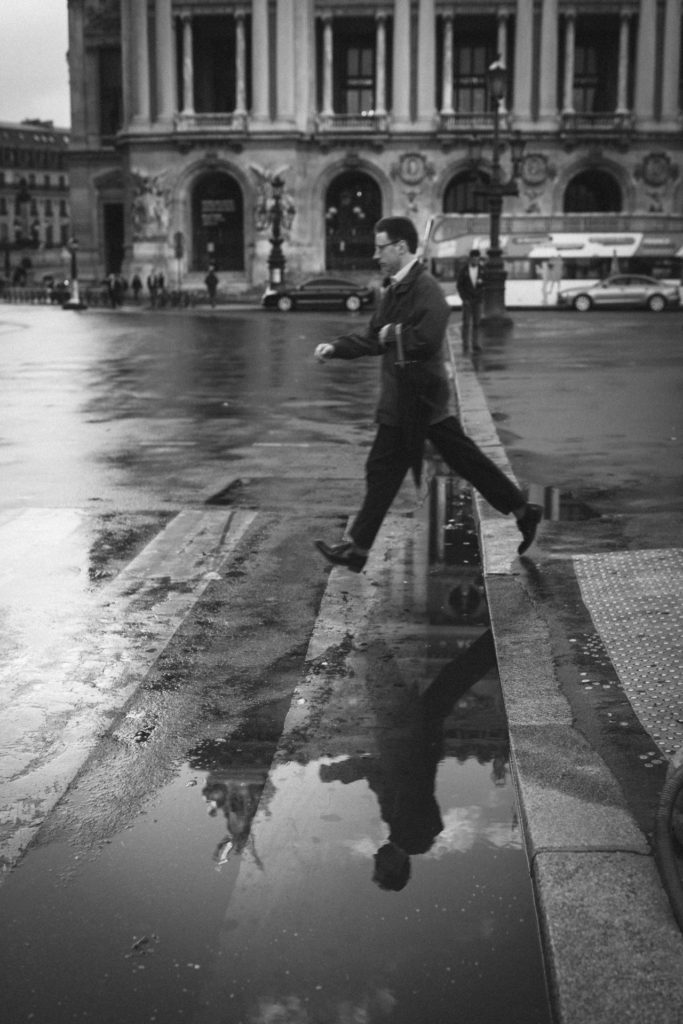
Both of the above images picture a man in smart attire mid stride in a city environment.

Both images give a background to what the life of the subject looks like and their everyday hustle. The images both capture the subjects movement and direction while including the environment around them which adds to the incite into the subjects background.

Both images have low saturation and high contrast which make the black suited subjects almost appear like silhouettes. They are both shot with slower shutter speed to capture some of the movement of the subjects. Henri’s composition is more three-dimensional as the reflection on the street below the subject adds another layer to the image and creates a horizontal symmetry. Joes image is exposed slightly more which gives it more clarity.

Photo Shoot Plan

What

People on the streets

Who

Random interesting looking people

When

During day – good natural lighting. Overcast conditions – low key images – not too harsh lighting.

Where

Town, urban area

Why

To explore the techniques, methods of shooting street, photography, to capture the essence of people going about their day.

How

Talk to people, use lens with higher focal length, position myself in way that captures a unique viewpoint.

Contact Sheets

Final Edits

Final selections

CANDID PORTRAITS

Candid portraits are unplanned, informal form of portraiture which consists of shooting more natural, fluid occurrences and behaviour of a person.

Photoshoot plan

Who – Strangers or friends that are unaware of the photograph being taken

Why – To capture candid moments of natural occurrence, capture everyday life through an all seeing eye.

What -Strangers or friends that are unaware of the photograph being taken in natural locations

Where – Populated area meant for leisure for the general public

When – During rush hour or the weekend when people are out

How – Shoot of the hip with large focus to isolate a subject.

Contact Sheets

Final Images

Environmental Portraits

Environmental Portraits is a form of portraiture where the typical working environment of the subject is showcased.

Kremer Johnson

Kremer Johnson

The above three quarter length, head-on image taken by Kremer Johnson is a perfect example of an environmental portrait.

It is a good example because the image is of a man engaging with the camera wearing his wetsuit and fishing accessories while holding a spearfishing gun and sporting wet hair. This indefinitely shows us that fishing is his passion/job.

The image also has the ocean as the backdrop of the ocean which concludes the overall scene and setting of the environmental portrait.

The image is lit using natural light with aid from a more fluorescent light which fills in the right side of of the subjects face and creates a shadow which intensifies his features and helps drive the idea of a well weathered fisherman in the portrait. Kremer uses a smaller aperture to create a large depth of field by isolating the subject from the background and creating a bokeh effect. There is also use of a warmer white balance to accentuate the theme of pride.

Kremer has created texture by using a high resolution camera and lense combined with the lighting. The texture is constructed around the contrast of the smooth neoprene chest plate with water cascading down it and the fishermans rough hands and facial features and metallic gadgets which tells the story concealed in the portrait.

PhotoShoot Plan

Who – Surfer

When – Later in the afternoon so natural light is not too harsh

Where – By the ocean

What – Subject holding surfboard in a wetsuit.

Why – This portrays her passion/hobby clearly in the portrait.

How – Use a warm white balance and a combination of natural and manmade light.

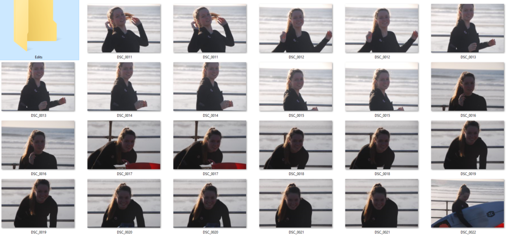
Contact Sheets

Final Images

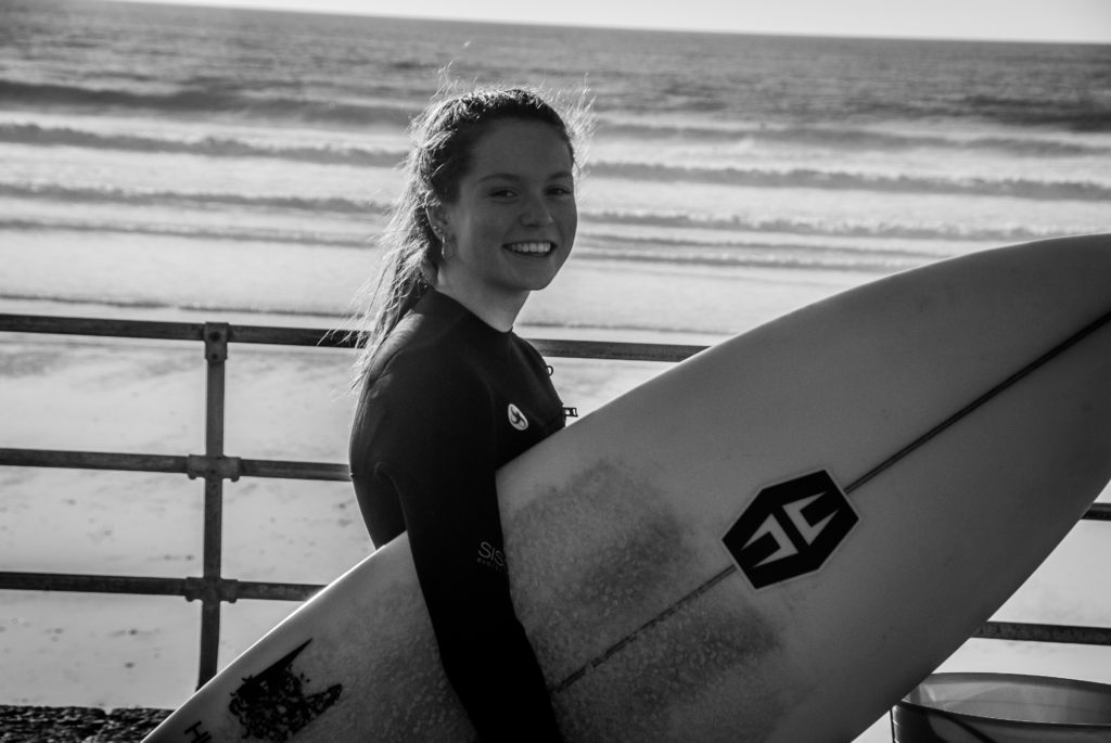
I chose to use a low saturation and a high contrast to give my image more tonal depth and clarity. This helps outline the subject and make her the focal point of the portrait.

I used a combination of natural and fluorescent for the first few images the sun was hitting my subject from the side on creating an outline on one side whilst casting shadows on the other side to emphasize her facial details. for the last two images I wanted to light my subject head on so I use a one point lighting system and it worked well with the background.

I used a lower ISO to slightly udder-expose the images to relay a gloomier mood to emphasize the winter environment. This also gives us more context into the life of the subject relaying by informing that she is a more passionate surfer as she endures colder weather.

Candid PORTRAITS And Street PHotography

What are candid portraits?

It is when you take a portrait photo of some one without them knowing to get a more realistic and a not staged image.

This is an image I took as the subject isn’t engaging with the camera, and also isn’t setup or staged in any way.

What is street photography?

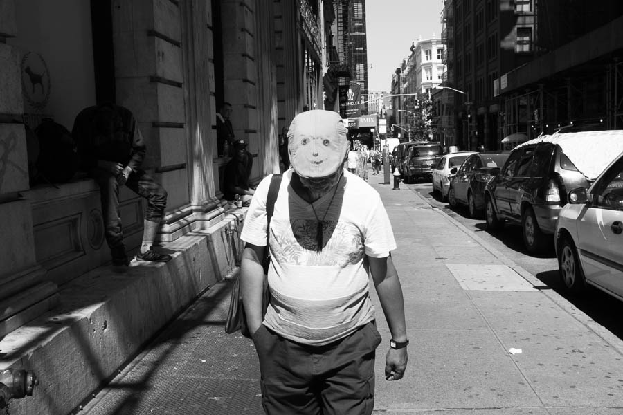
It captures unmediated chance encounters and random incidents that happen in day to day life. It is also called candid photography.

Examples of street photography

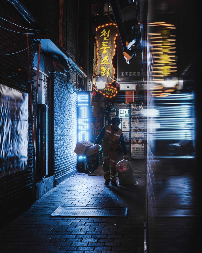
(First photo was taken by Teeman Jarvinen), (second photo was taken by Keenan Hastings), (Third photo was taken by Mats Alfredsson), (Fourth photo was taken by Martin U Waltz), (Fifth photo was taken by Dave Bottoms), (Sixth photo was taken by Marcin Baran), (Seventh photo was taken by @francesco_portelli)

Some other great examples : http://neocha.com/magazine/asia-by-night/

Henri Cartier-Bresson

Henri Cartier-Bresson was a French photographer considered a master of street photography. He pioneered the genre of street photography, and viewed photography as capturing a decisive moment.

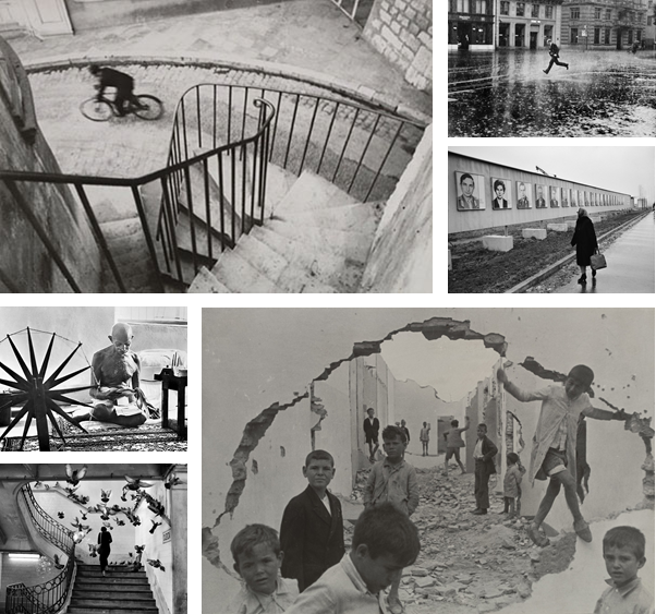
Famous Images

He was alive during August 22, 1908 – August 3, 2004, which is why his work is all in black and white.

My Favoutite Henri Cartier Image

A Closer Look at the Iconic Cyclist Photo by Henri Cartier-Bresson

I like this image because he has used the railings to create leading lines, which draws the viewers eye instantly to the subject. The rule of thirds is applied in this image, the subject on the bike sits in the top left of the image.

The black and white effect creates a drama in the image, the emptiness makes the image stronger as it singles out the subject

Henri Cartier-Bresson X Magnum

In 1947, following the aftermath of the Second World War, four pioneering photographers founded a now legendary alliance. The Magnum Photos agency.

Cartier-Bresson helped deliver the highest quality photographic content and has extensive experience in creating significant visual records, which became note-worthy editorial, books, events, exhibitions, and digital campaigns.

Compare And Contrast

The image by Bresson was taken in black and white and has a high contrast, to make it have more definition. Jarvinen’s image is taken in Tokyo, where they have lots of neon and vibrant lights, that illuminate the subject. The lights have a soft infused glow to them, with gives the image a more positive aspect to it.

Both photographers uses reflections in the image. Bresson reflects the subject through a puddle in the horizontal axis, where as Jarvinen reflects the light on the right side of the image to create a blur effect through a window. This effect adds more detail to the image without over crowding it, and making it busy.

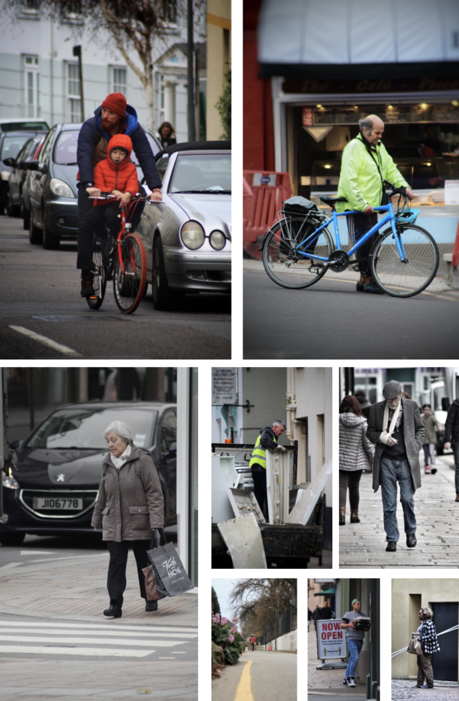
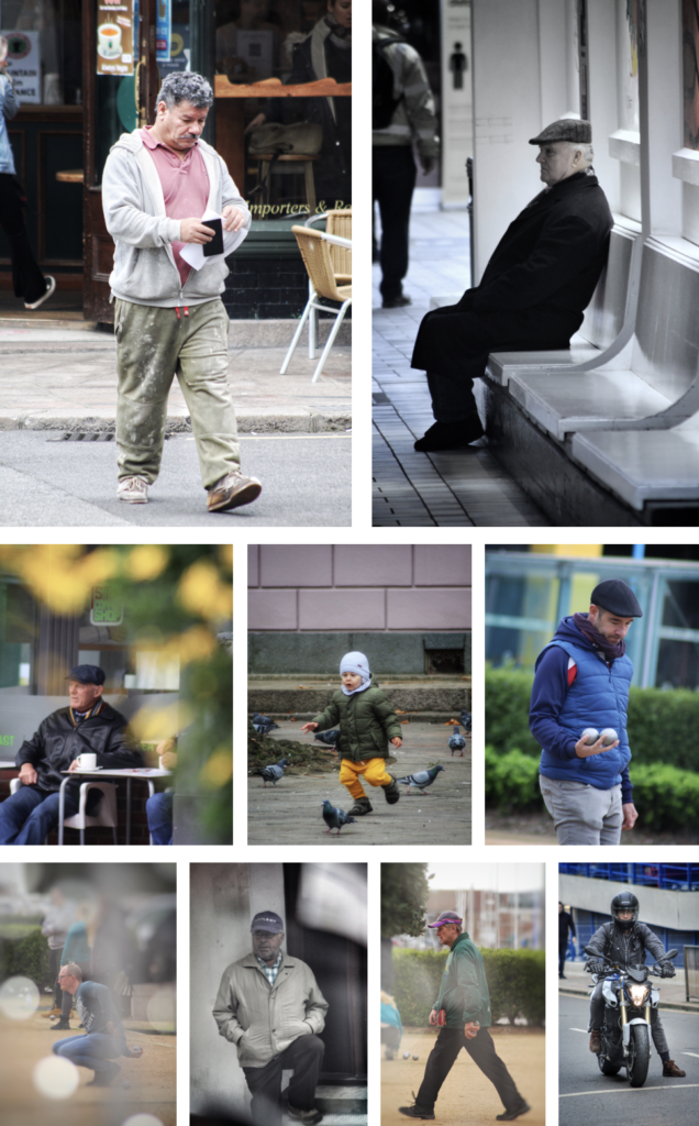
My Street Photography Pictures

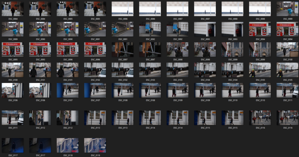
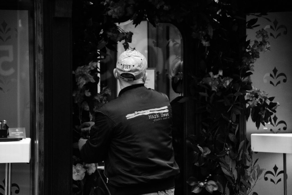
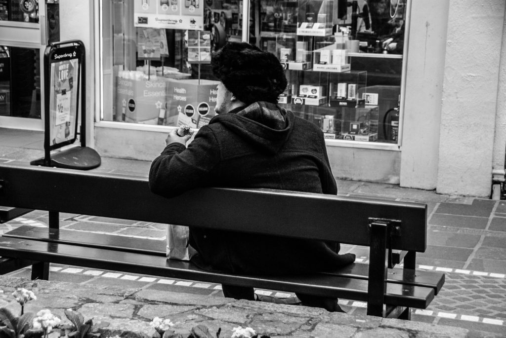
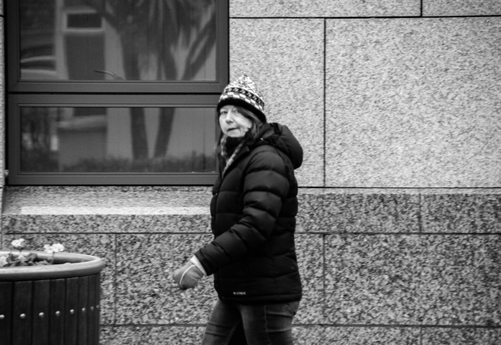
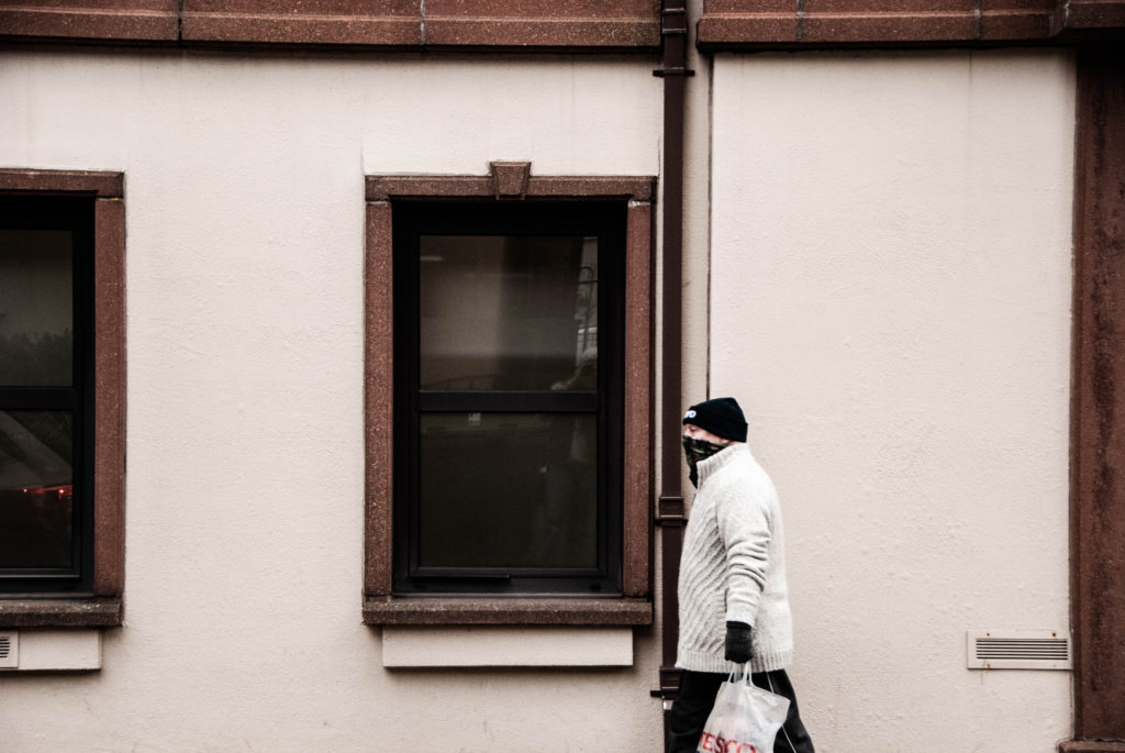
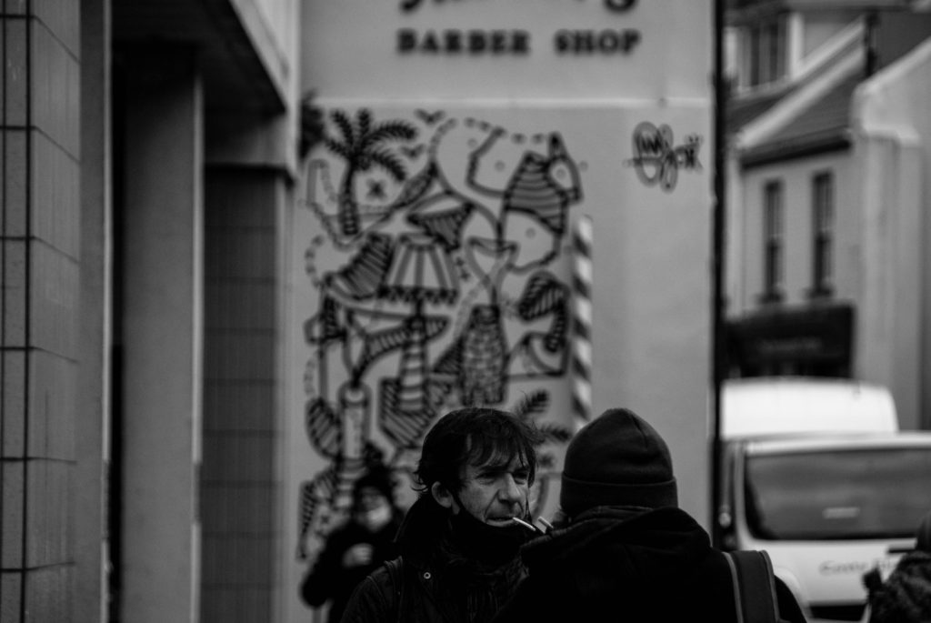
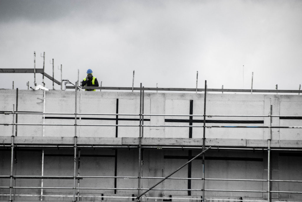
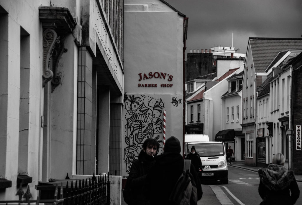
I took all these images on the same day except for the postman one. It was cloudy so I went for more dramatic shots, so that I could edit them with a more moody style.

My Final Images

To edit them I increased the contrast and saturation to make them pop out more.

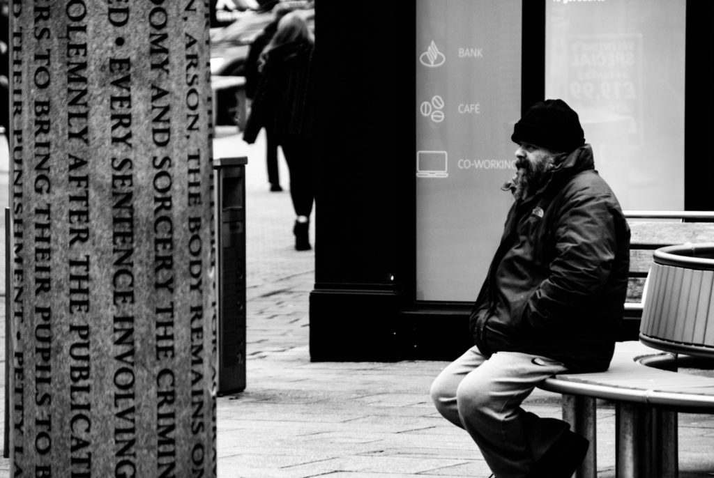
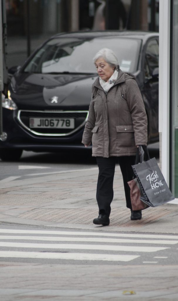
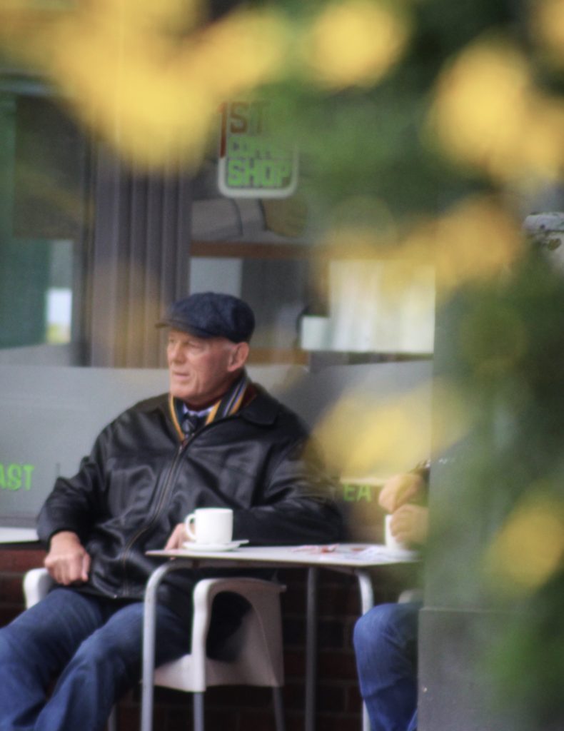
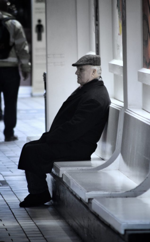
For the images that have a more of a rainy day atmosphere I decreased the saturation and individually masked over bright and colourful objects and toned the colours down, so that they blended with the image, for example the blue car in the background of the lady crossing the road, and the bright yellow cove sign in the image where the man is sitting down on the bench.

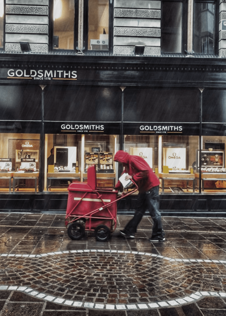
The image of the postman in the rain I edited a few more rain lines and used a motion blur, so that it would seem as if there were falling. I also increased the definition and made the colours more dark to give it the rainy day atmosphere.

The photo that’s includes bokeh isn’t edited that much all I did was boost the saturation and used an “s” curve to manipulate the contrast. The create the bokeh effect I positioned my camera close to some lights to shoot through them, then focused on the subject, so that the lights would become out of focus.

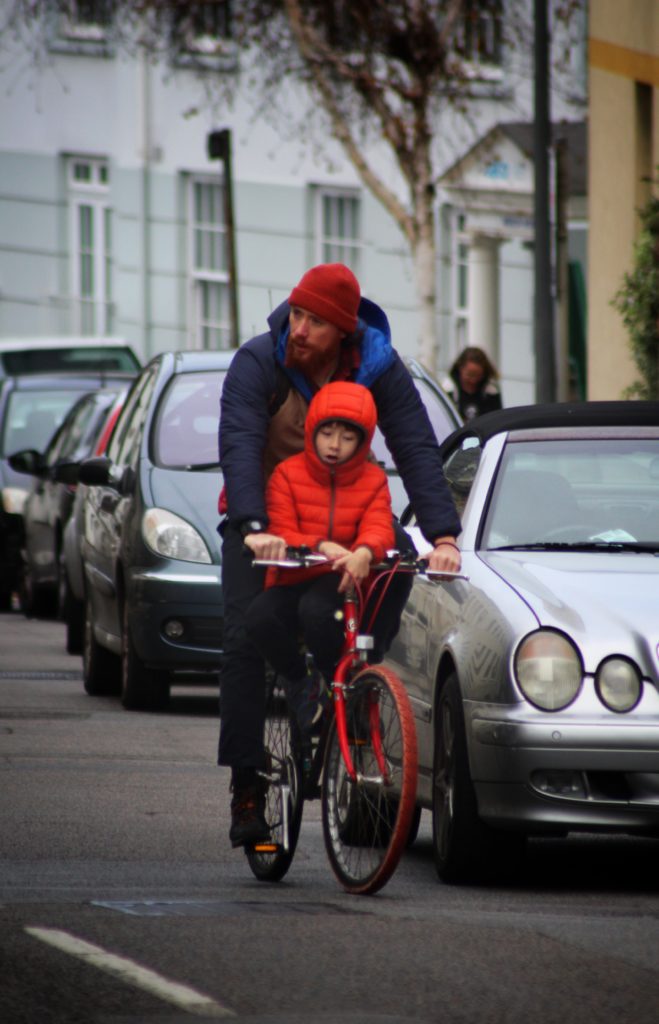
For the image where there are two people on a bike all increased the saturation, darken the background and brightened the subject, then finally added vignette.

My Best Images

I choose these 2 images as my final images as I thought they both were my strongest images that fitted into the candid photography niche. They both captured people acting natural, in an unstated environment.

The image on the left as strong detail and definition, which makes the image more dramatic, that combined with the rain, the deep reds and glowing shop windows creates a great image. the building is straight with the horizon, and there is a slope which the postman is pushing his cart up, this image show the struggle of every day life.

The image on right, the bright orange jacket contrast the entire background, the vignette helps lead you eye the to bike as well. I shot this with a focal length of f.5.4 so the people in the background are blurred.

IMAGE ANALYSIS

IMAGE ANALYSIS AND INTERPRETATION OF ALFRED KRUPP

Arnold Newman | Portrait of Alfred Krupp | 1963

This environmental portrait was taken in 1963 by Arnold Newman, creating a menacing feel due to the low lighting and specific shadows around the mans face. The man is Alfried Krupp, a Nazi war criminal who owned many factories, mass producing dangerous arms, vehicles and other weapons. He is also known to have heavily profited from the racist slave labor imposed by the Nazis. The images intimidating atmosphere comes mostly from the dark shadows surrounding Krupp’s eyes, created by butterfly lighting, giving him a sinister appearance. His eyes are also the focal point of the image. The dark, more negative essence is further emphasized around Krupp as the background is obviously much brighter. The background is a post war view of one of Krupp’s factories. Newman uses all sorts of techniques to give the image this unnerving feel. Firstly he deliberately positions his camera so Krupp is central in the image, ignoring the rule of thirds. This, combined with the depth shown going into the background gives Krupp a sense of undeserved power.