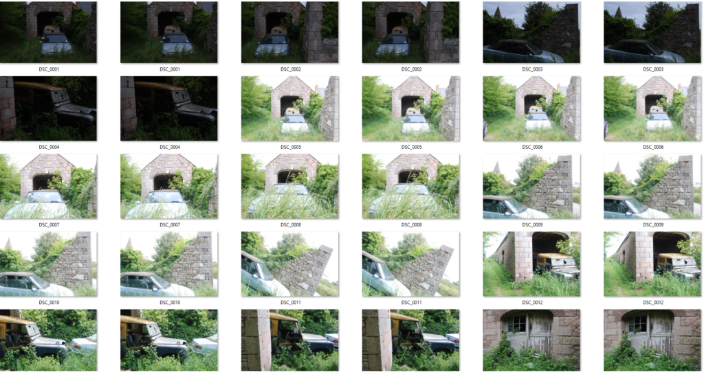
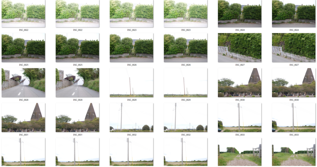
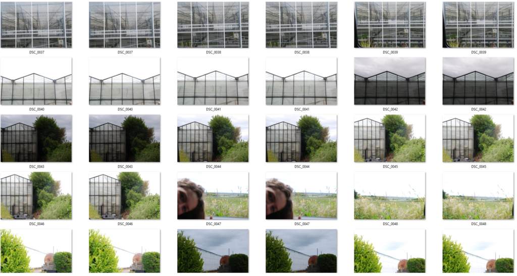
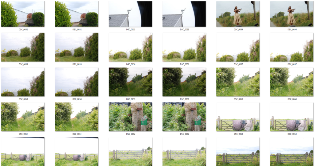
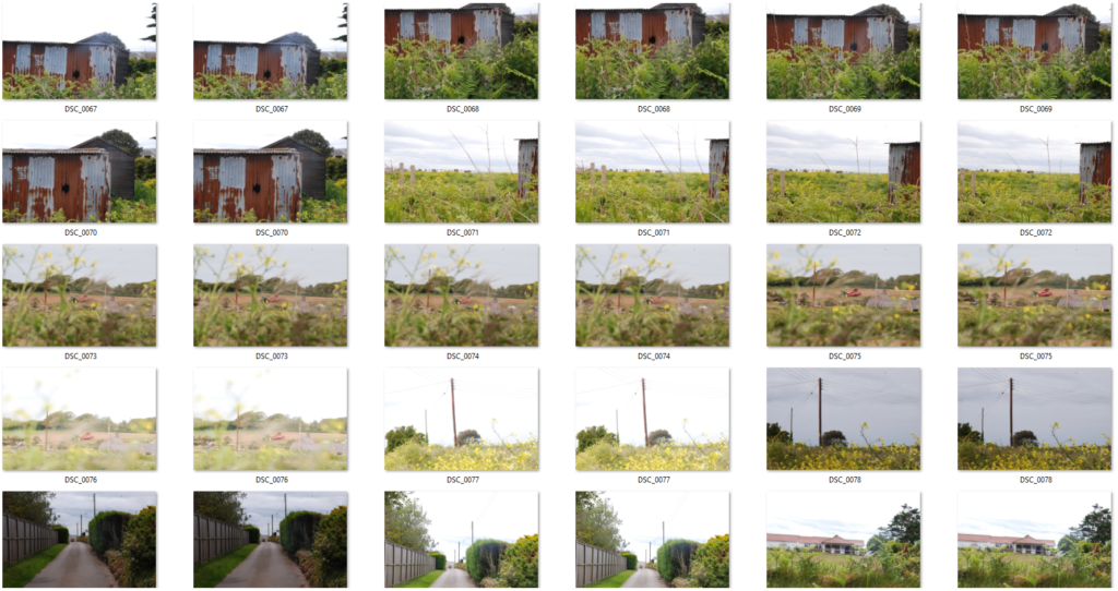
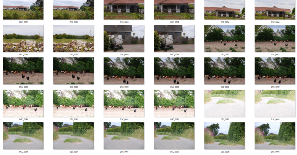
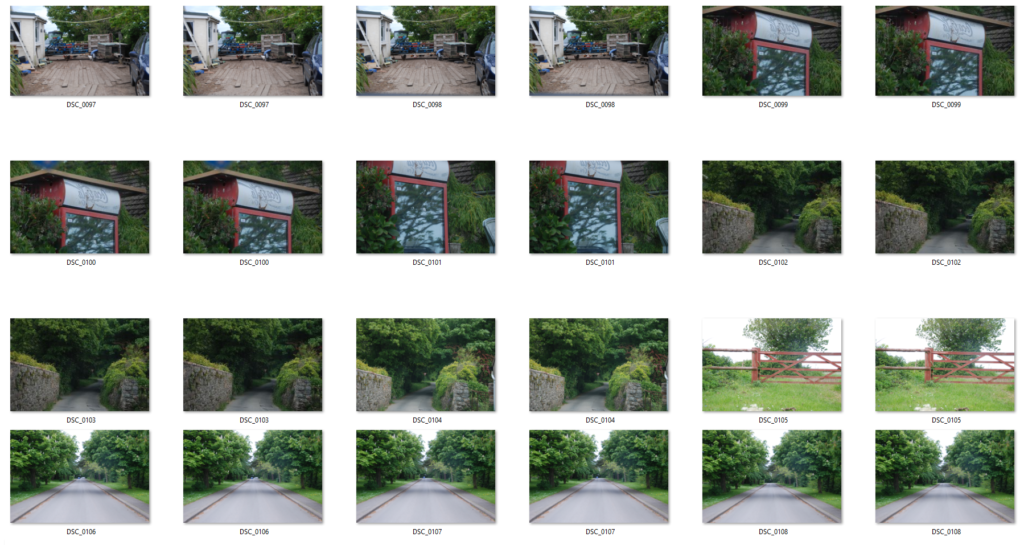
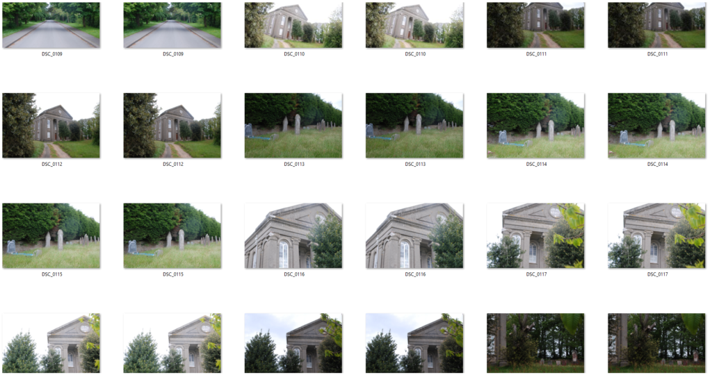
Contact Sheets From Both Shoots
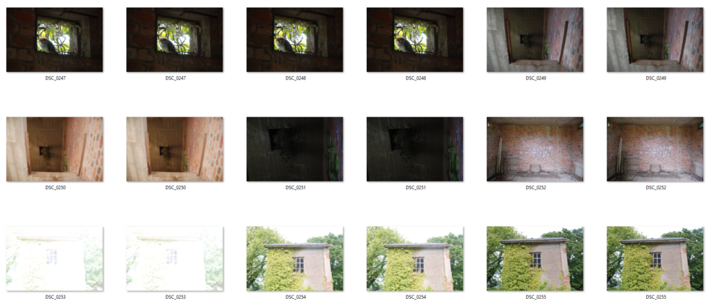
Final Edits
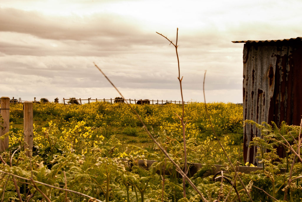
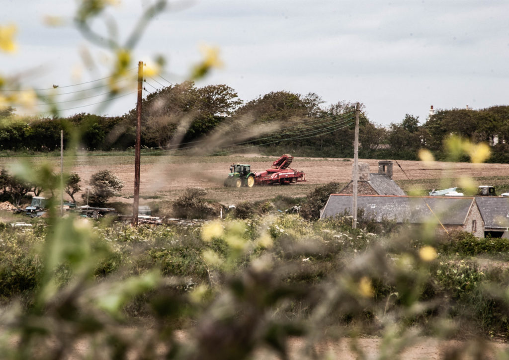
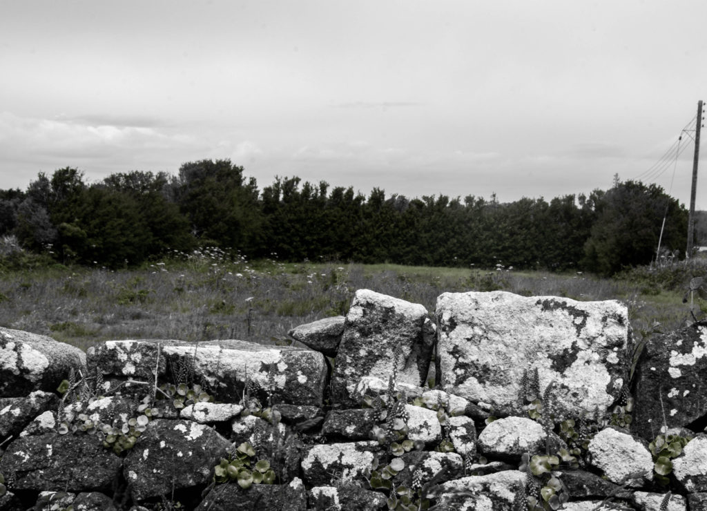
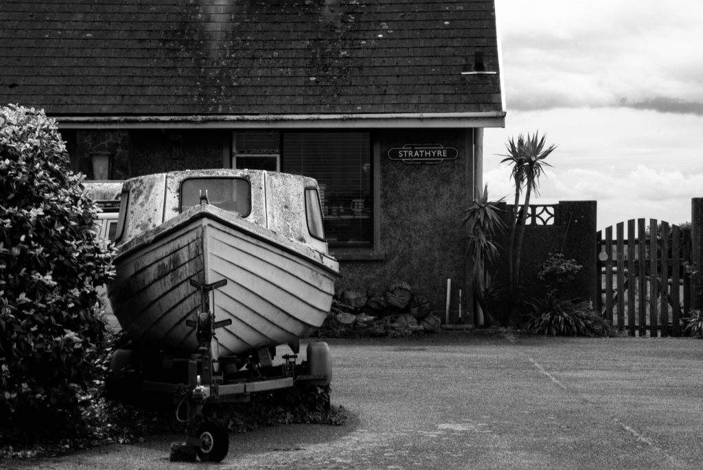
I am reacting to the works of Camilo Jose Vergara and George Marazakis so I focused on a film look with lower saturation on some images and warmer monotone colour schemes on others.
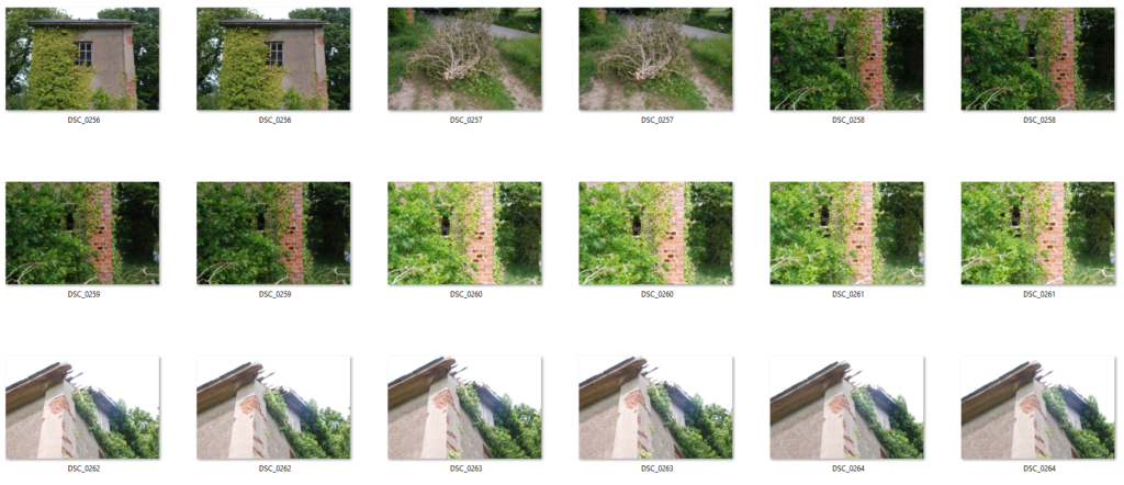
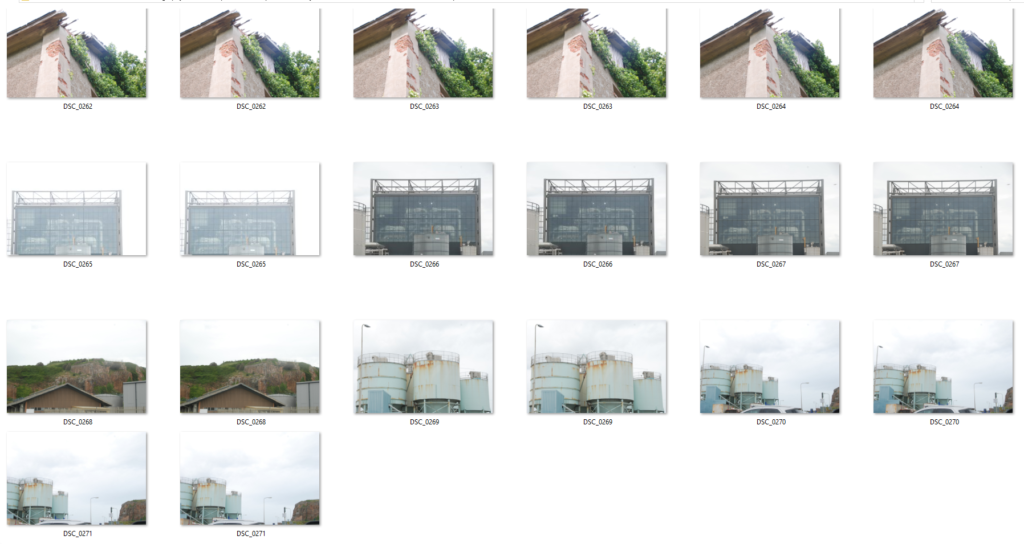
Contact Sheets From Both Shoots


Final Edits
I am reacting to the works of Camilo Jose Vergara and George Marazakis so I focused on a film look with lower saturation on some images and warmer monotone colour schemes on others.
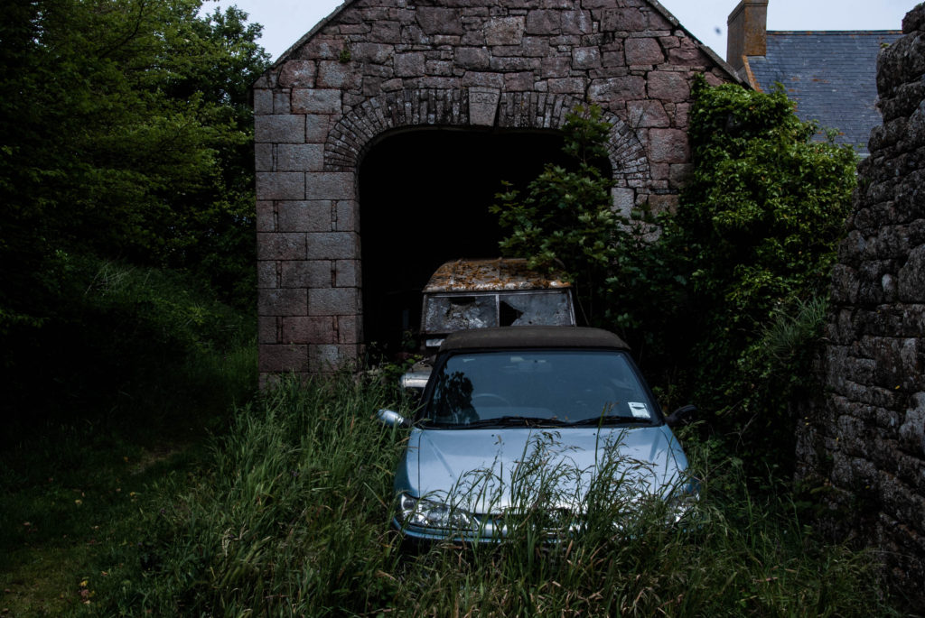
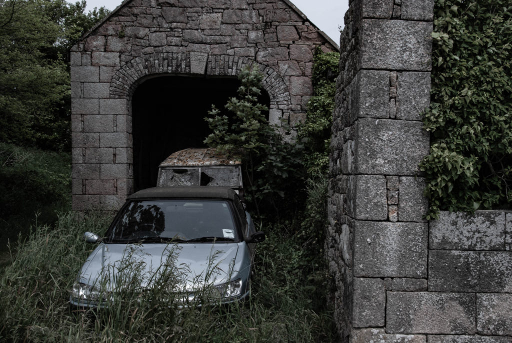
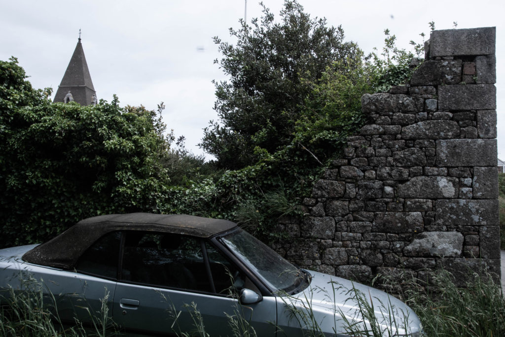
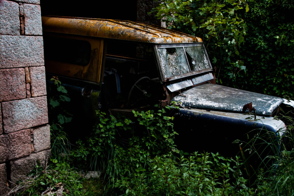
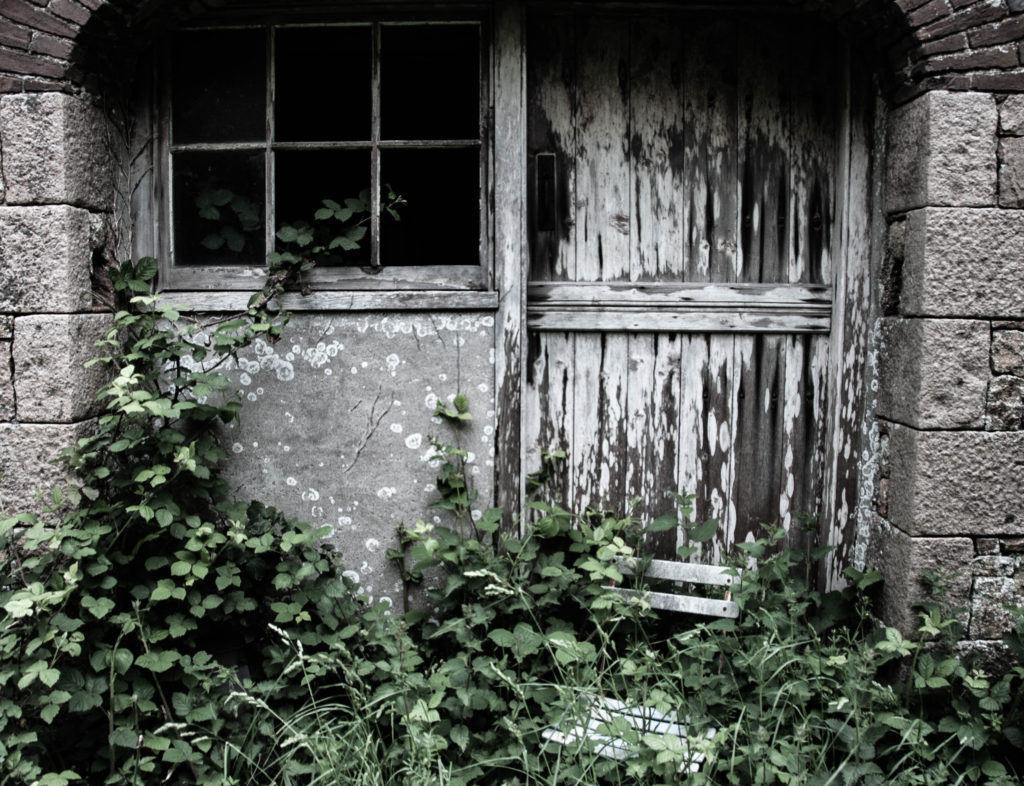
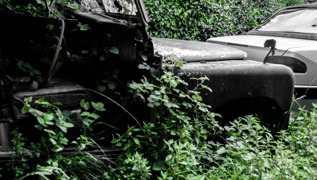
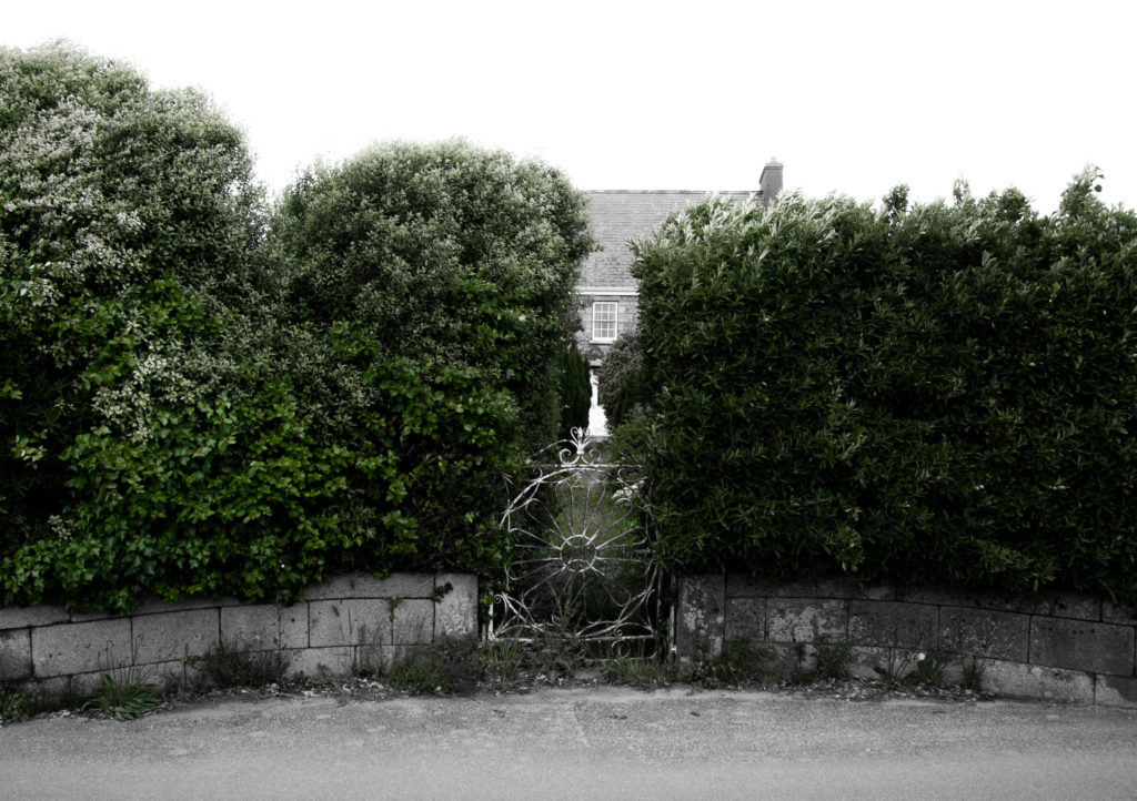
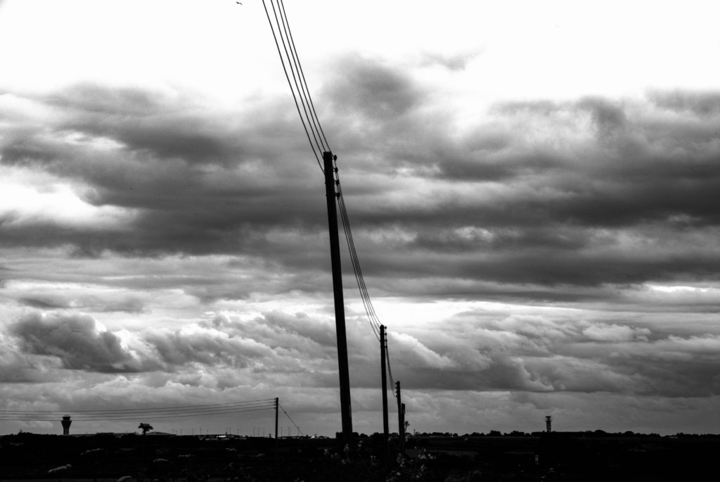
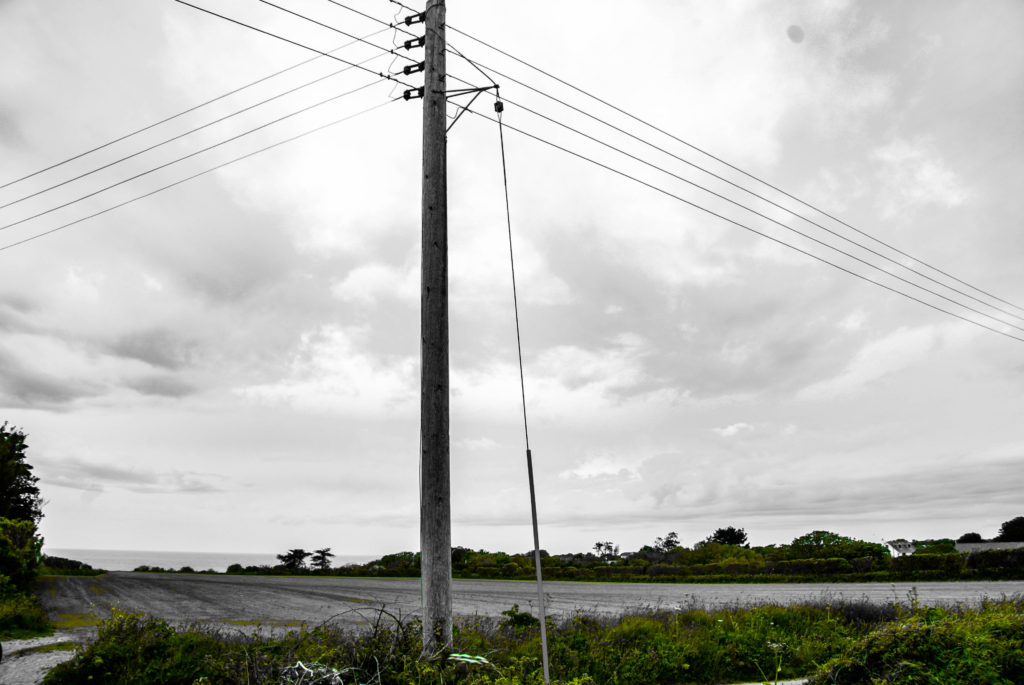
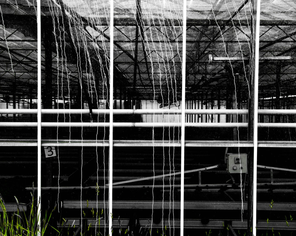
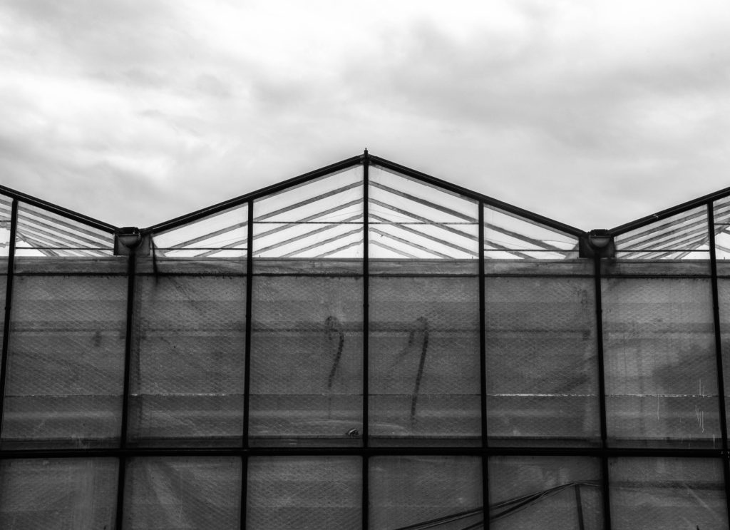
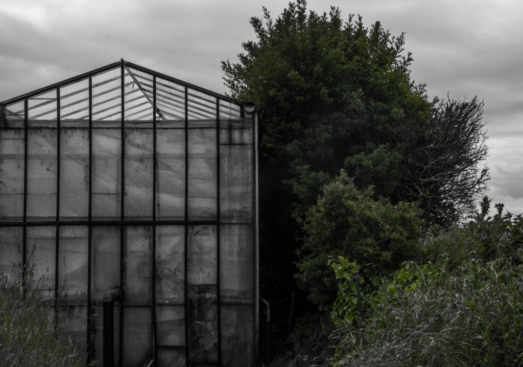
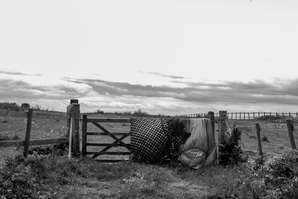
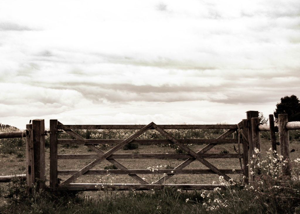
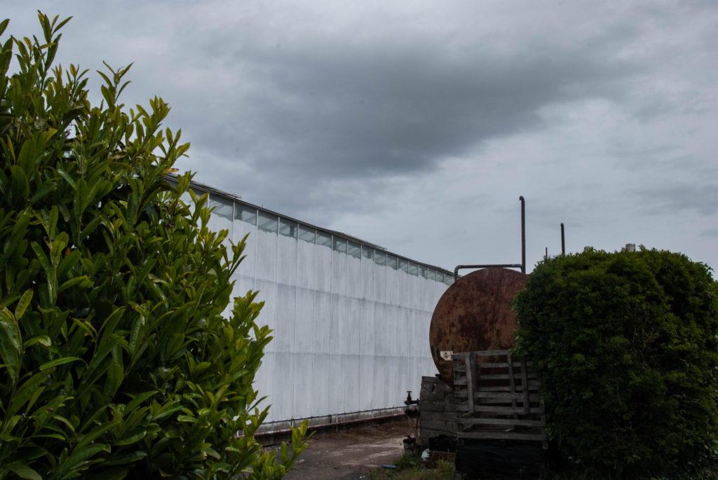
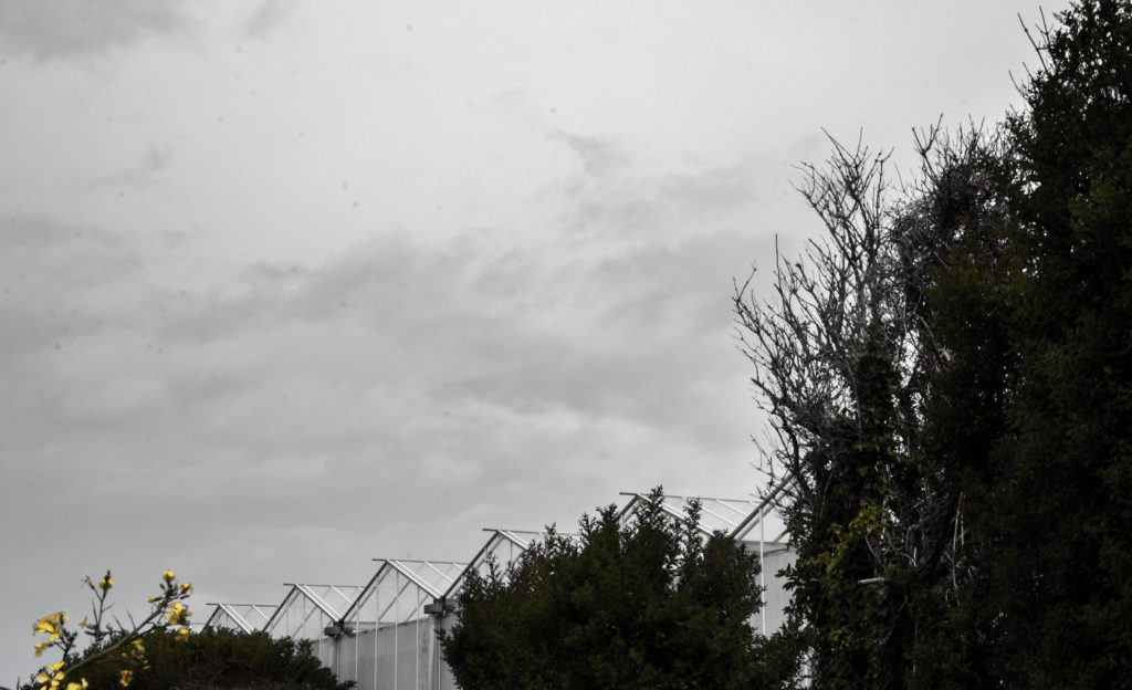
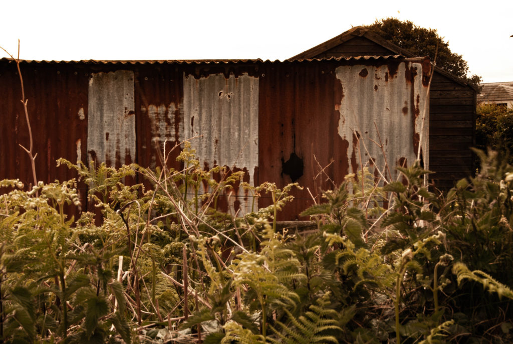

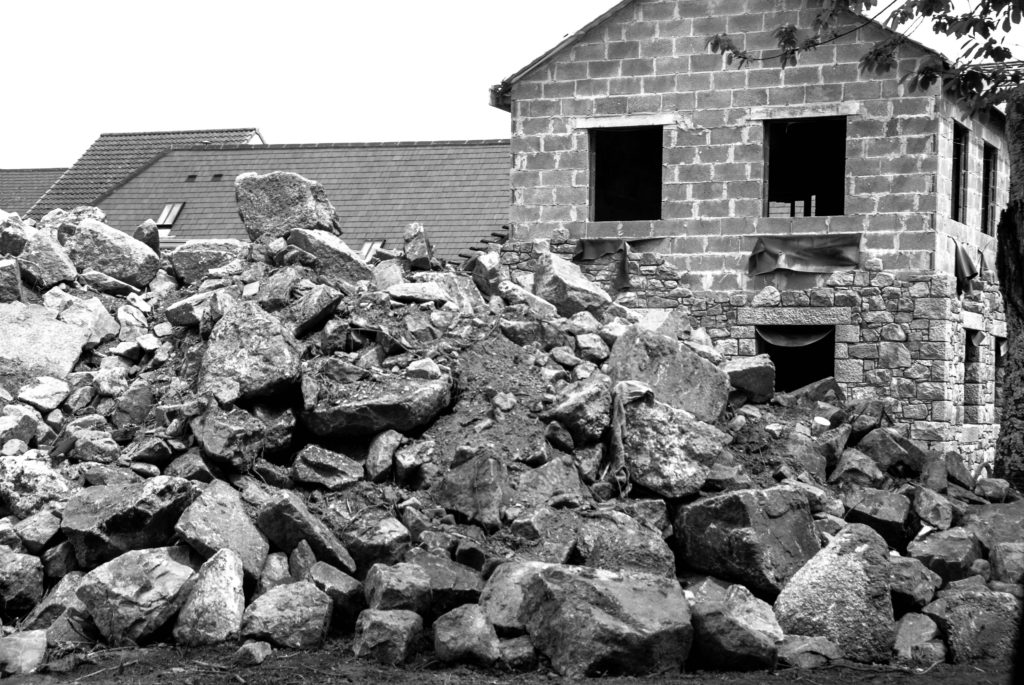
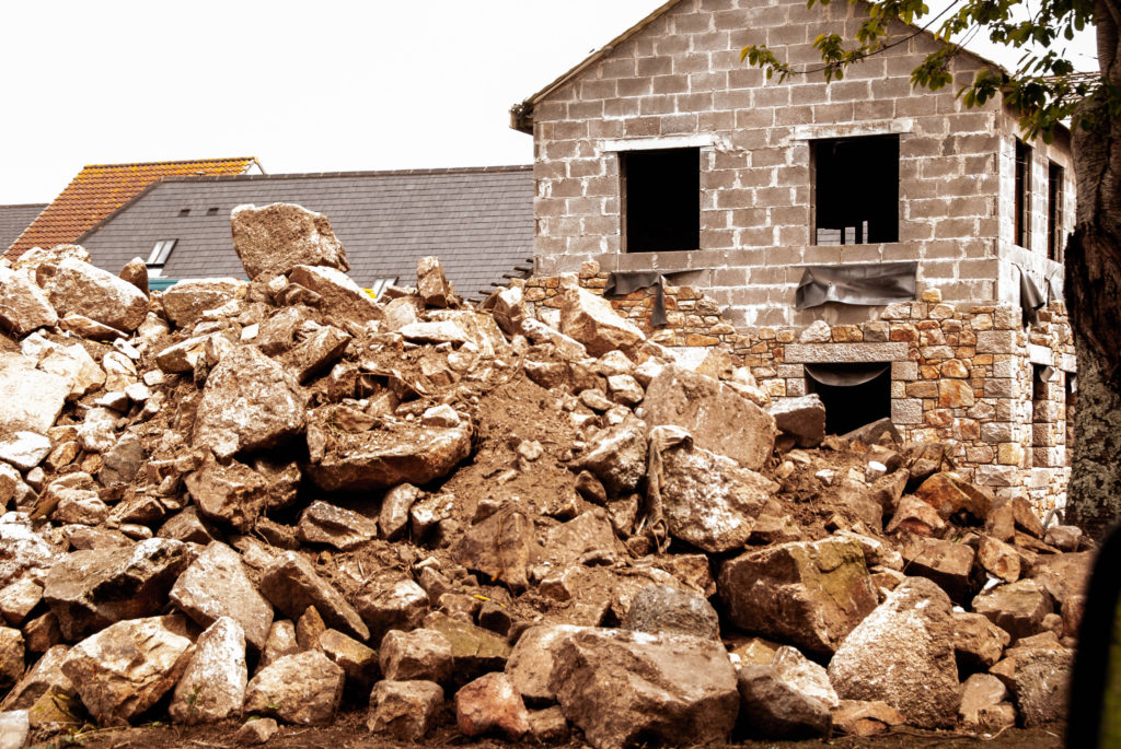
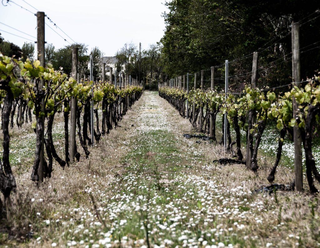
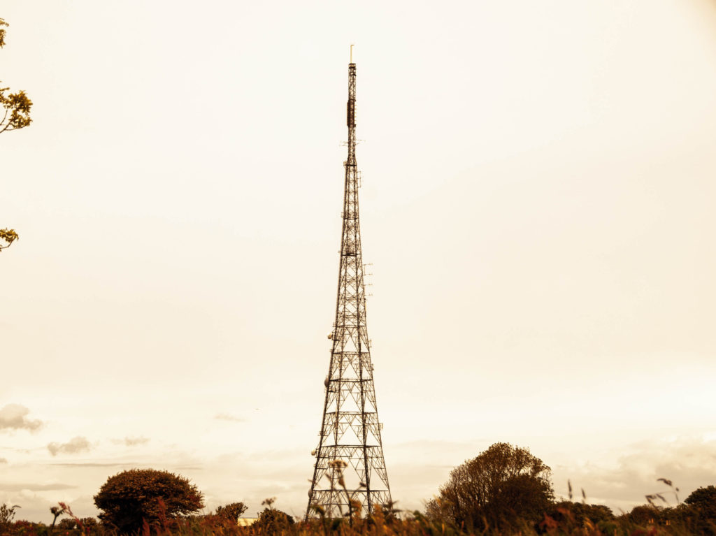

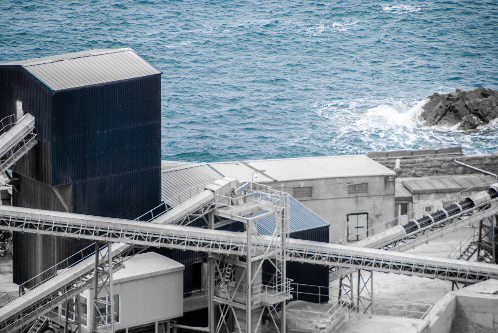
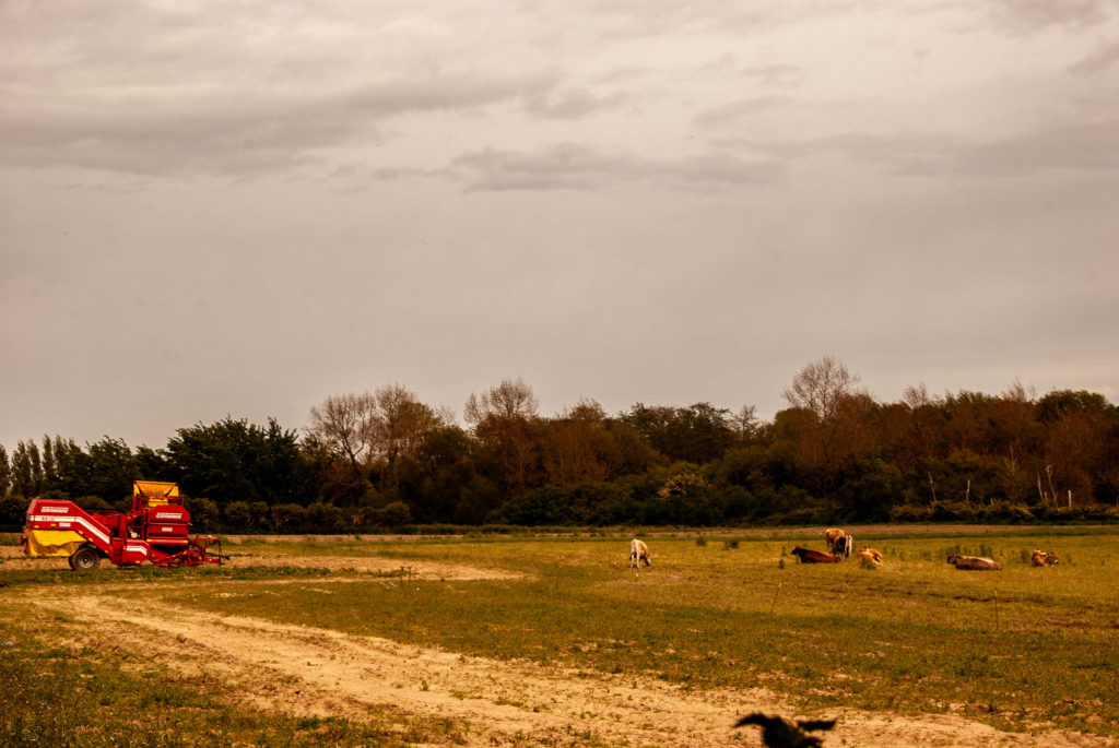
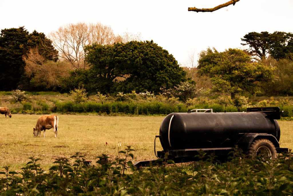
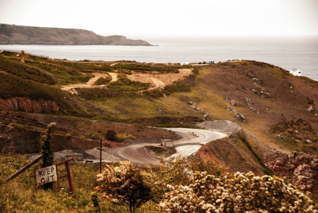

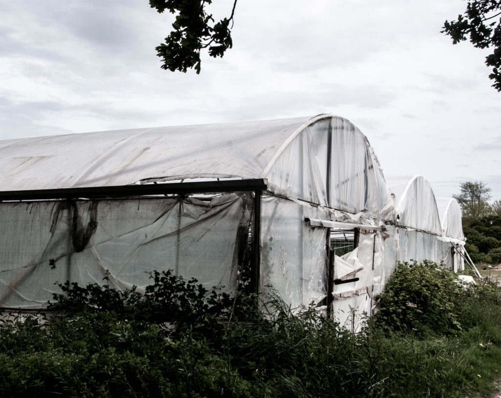
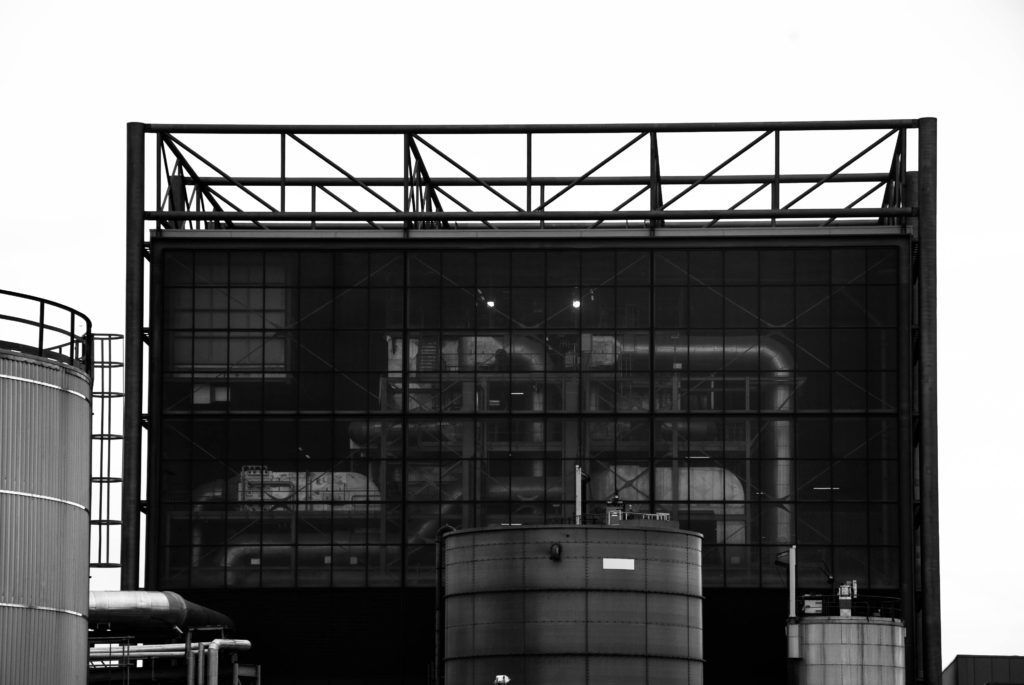
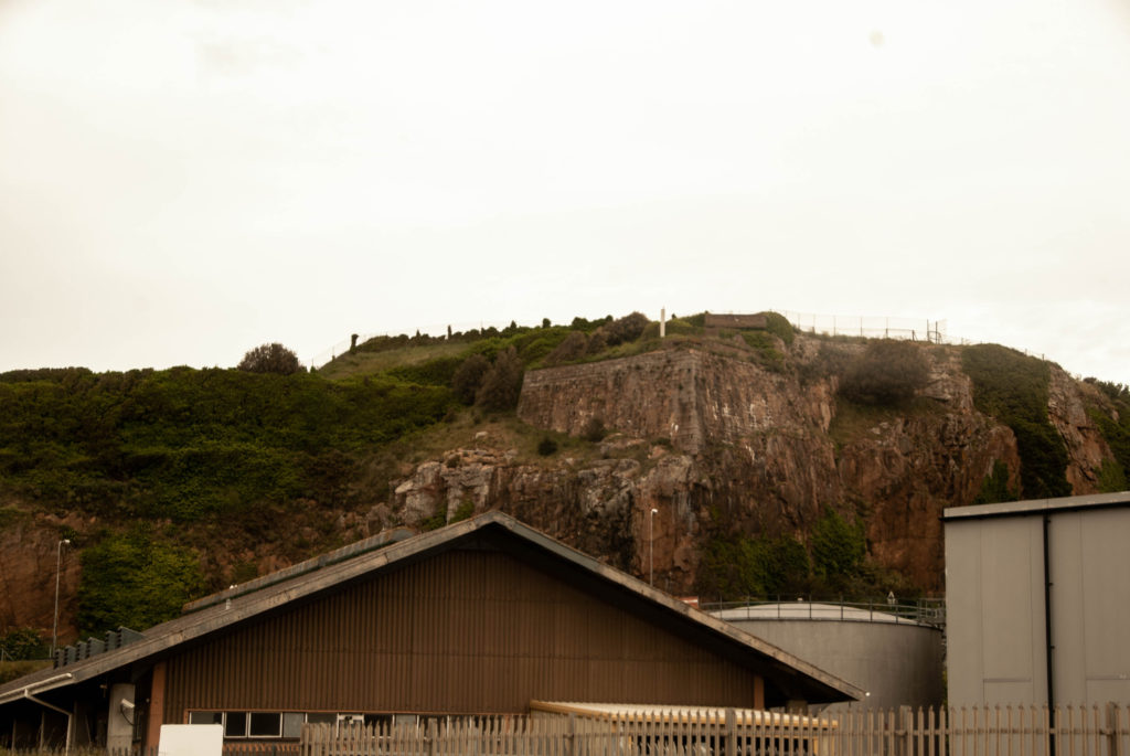
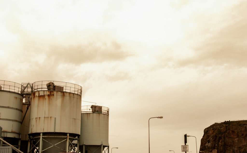
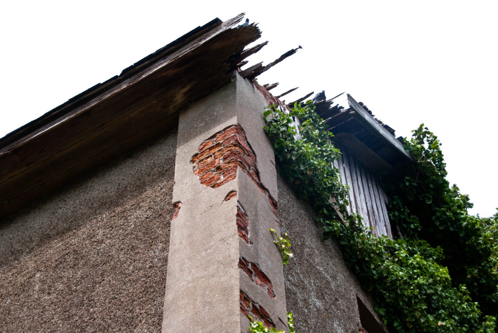
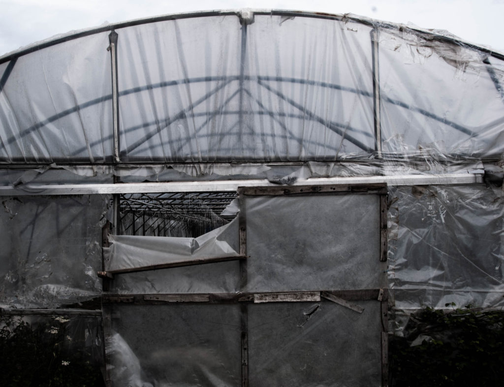
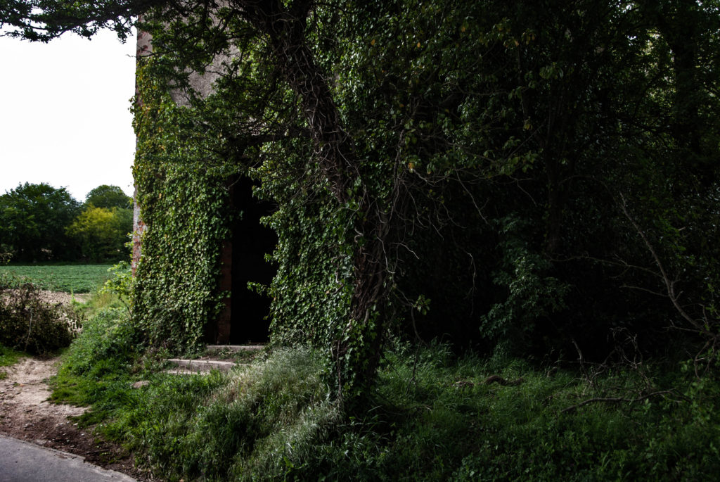
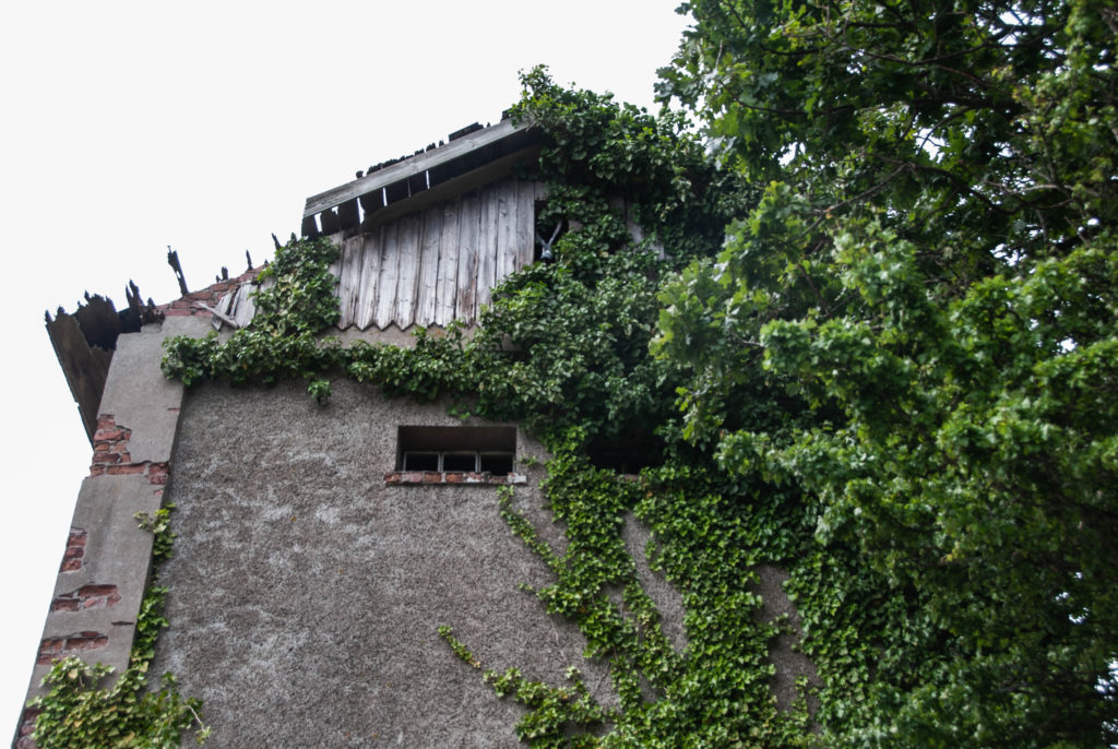
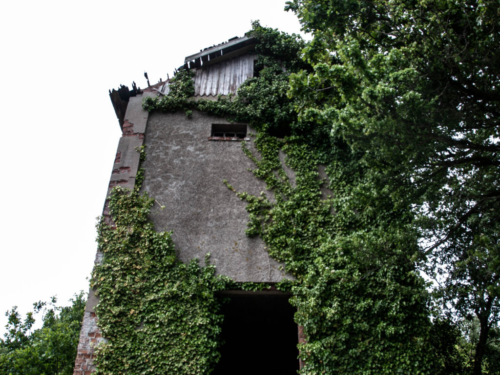
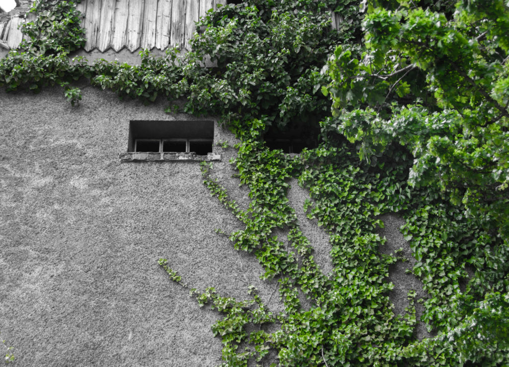

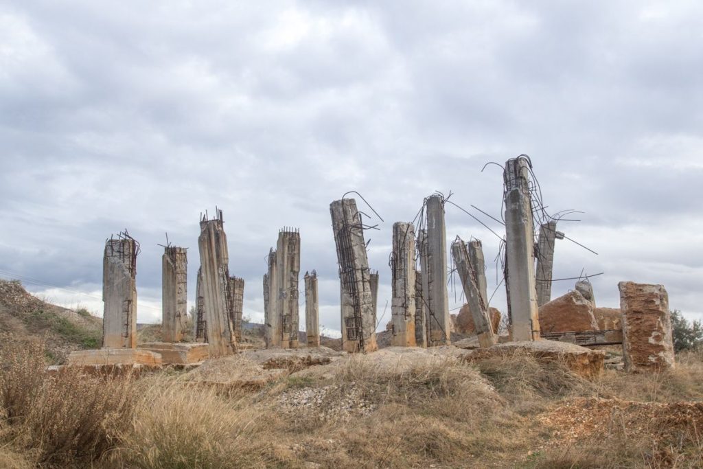
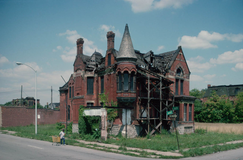
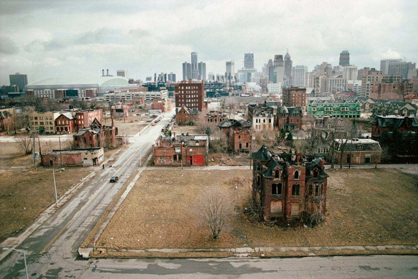
Both images feature a reaction to the Anthropocene. They do this by capturing the essence of mans reckless footprint on the natural environment and man’s greed and carelessness of having to constantly industrialise and destroy the natural environment and then move on swiftly without care. This is seen in these images where the focal point is placed on the derelict structures by framing them in the centre of the composition in a symmetrical fashion.
Both images have similar structural features, they both contain many vertical leading lines created by the structures and the neutral perspective at which they are shot. Both images also contain a deep depth of field with the structures in the foreground and the clouds and various other elements stretching far into the background.
These images differ in their colour schemes as Camilo’s image features a more saturated look with a wider tonal range which creates a deep contrast in the image. The image also contains a wider range of colours whereas George’s image contains a monotone, warmer colour scheme with shallow range of colours. Georges image is also flatter in terms of contrast, it has a narrower tonal range.
Camilo Jose Vergara is a Chilean Photographer based in New York City.
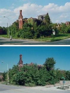
He trained as a sociologist with a specialty in urbanism and this is exactly what his photography emulates. He focuses on ‘rephotography’ in series with urbanisation and the Anthropocene. This means he shot the same buildings over a span of time to document change. This is a method of documenting urbanisation and how man is constantly tweaking the environment around them.
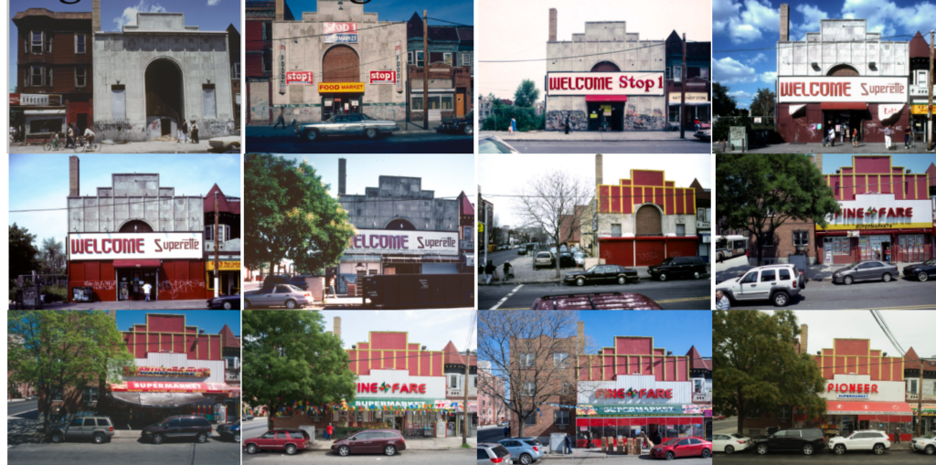
I am most interested in his work where he captures the essence of nature fighting back against urbanisation. He shoots these abandoned, derelict buildings in the fashion of rephotography to document an argument between nature and man. This can be seen through the houses slowly degrading and the earth and plants growing around them. This captures the power of nature and its ambition to flourish juxtaposing to mans greediness and carelessness of leaving ruins to rot in, what was, a beautiful natural climate. Below is an image of the Ransom Gillis House where Camilo has captured this argument and the power of nature.
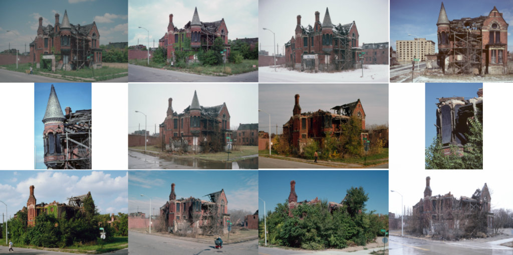
I believe the way Camilo captures these buildings is an impactful way of looking a Anthropocene. It captures humanities carelessness and the determination of nature in an impactful manner by giving it an aesthetic. The aesthetic being the series of photos where the perspective is exactly them same but there is noticeable change in the environment in every photo. This forces the thought to be made about how quickly our environment changes.
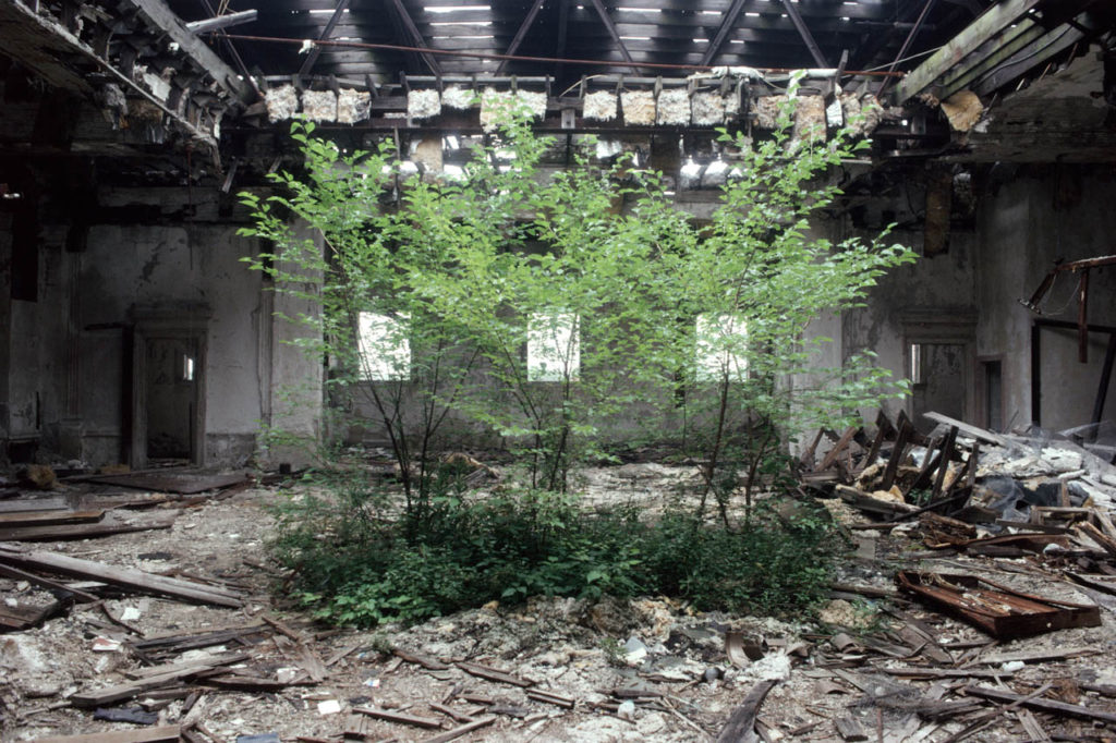
The above image is of the former Camden Library which became abandoned. There are trees growing in the former reading room of the library. Camilo framed these trees in the centre of the image with the library collapsing around them. This creates a stadium around the trees which creates tension and supports the idea of natures determination to grown through humans destruction.
Camilo used natural lighting which is coming through as streaks through the destroyed ceiling. This creates a holy like spotlight on the trees which could imply the idea of the glimpse of hope that nature holds.
The image contains high saturation on the foreground which makes the trees pop with colour but a low saturation and high contrast on the background which creates a gloomy look on the destroyed building, enforcing the juxtaposition between nature and man.
George Marazakis is a Greek photographer who has made a significant contribution to the visual enlightenment related to the Anthropocene with his photographic series, “A Cure for Anthropocene”

His work encapsulates the degradation of the environment in a subtle manner rather than a brash, “in your face” approach. His method does not concentrate on shooting the obvious, mainstream aesthetic themes such as animals entangled in plastics and inept images of geological agony that the media force feed society as a way of sort of ‘guilt-tripping’. Instead George shoots natural landscapes where subtle gestures of man’s ramifications can be seen. He seems to weave the elements of industrialism and climate change into his the landscapes rather than making them the vocal point. I feel this is a far superior way of creating awareness to the issue. It focuses on giving a neutral aesthetic to the Anthropocene. This forces the comparison process of making contrasts between the peaceful natural utopia and the traumatic dystopia that humans are inflicting on the planet. This forces audiences to use their cognition which leads to them caring about the issue more.
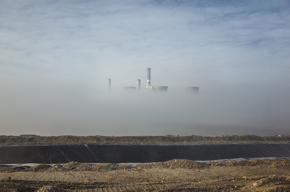
Another distinct element to his photography is the warm, hazy, monotone hue his images have. It almost implies the idea of the earth heating up and global warming. It also creates a slight sense of panic almost like a fire has started and orangey smoke is pouring out of his images. It develops an apocalyptic aesthetic for Anthropocene.
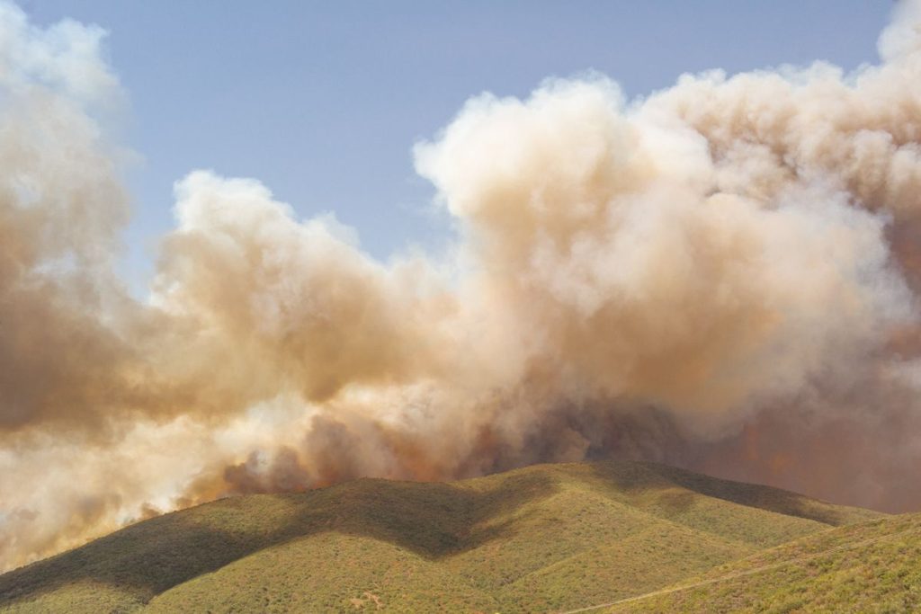
This subtle approach of integrating slight man made interruptions into his landscapes came about as George began to think of the Anthropocene as a disease. “While I was photographing the landscapes affected by human interactions in the middle of natural spaces, the topography started looking like a body to me – like something with the early stages of psoriasis on its skin,” he explains. “If humans are a product of nature, then we can say that we are a disease attacking our own organism, just like an immune system can attack its own body – like autoimmune diseases.” His work takes this idea of disease and spins it around to create a sense of hope by reinforcing the idea that diseases can be cured, this is imbedded in the name of his project ‘A CURE for Anthropocene’


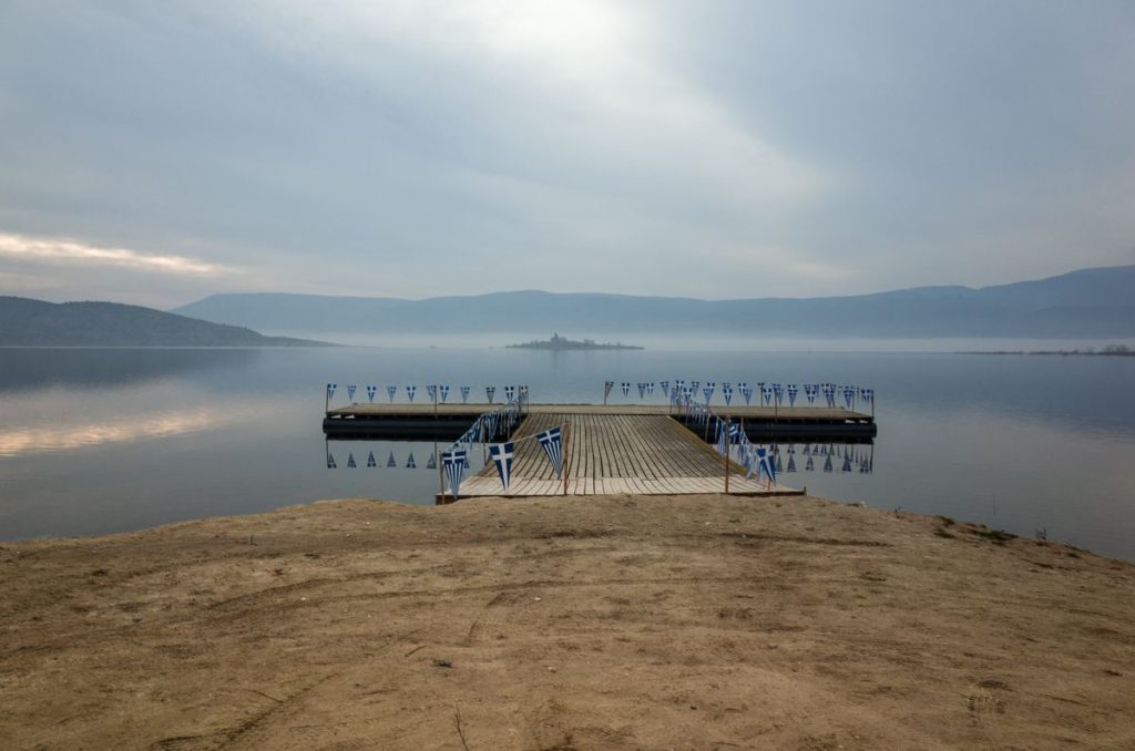
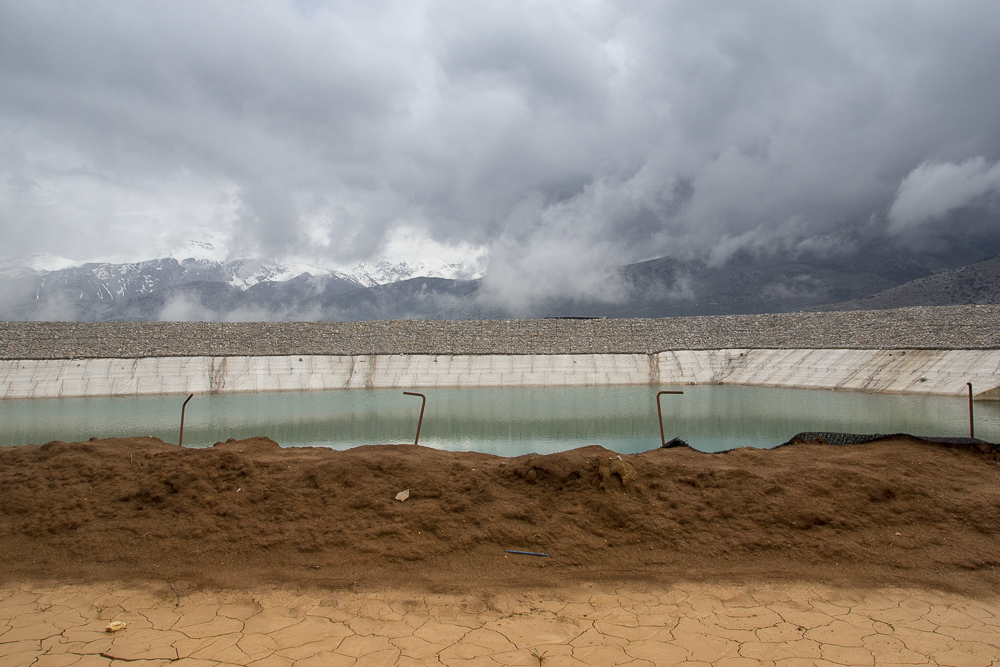
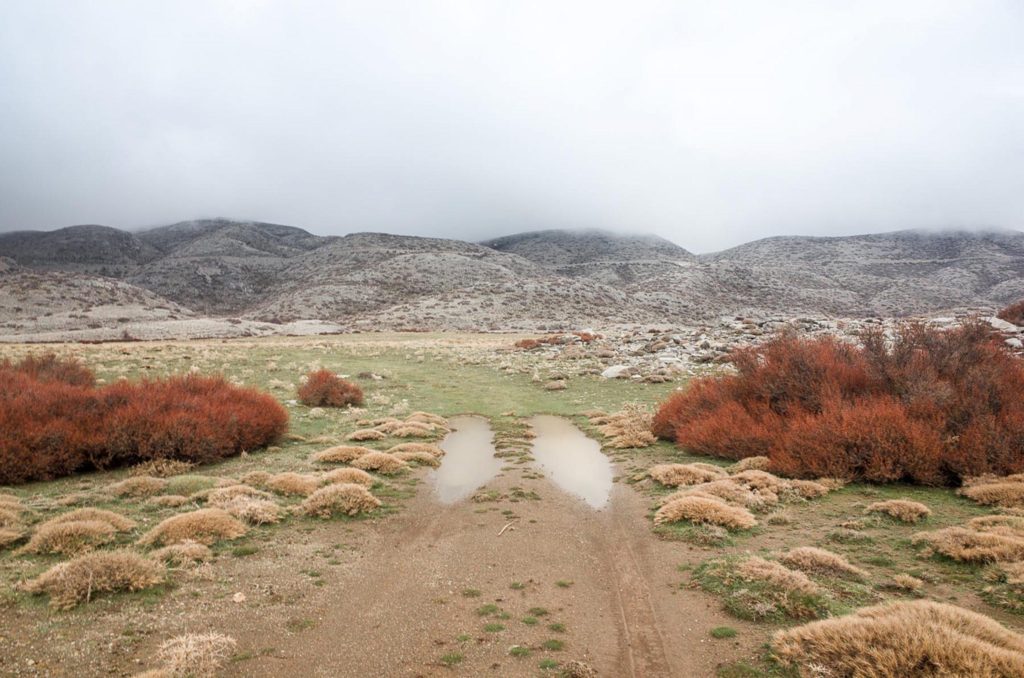
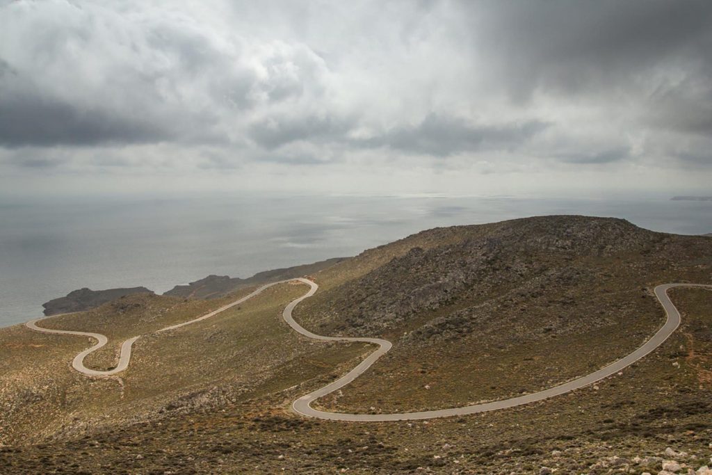
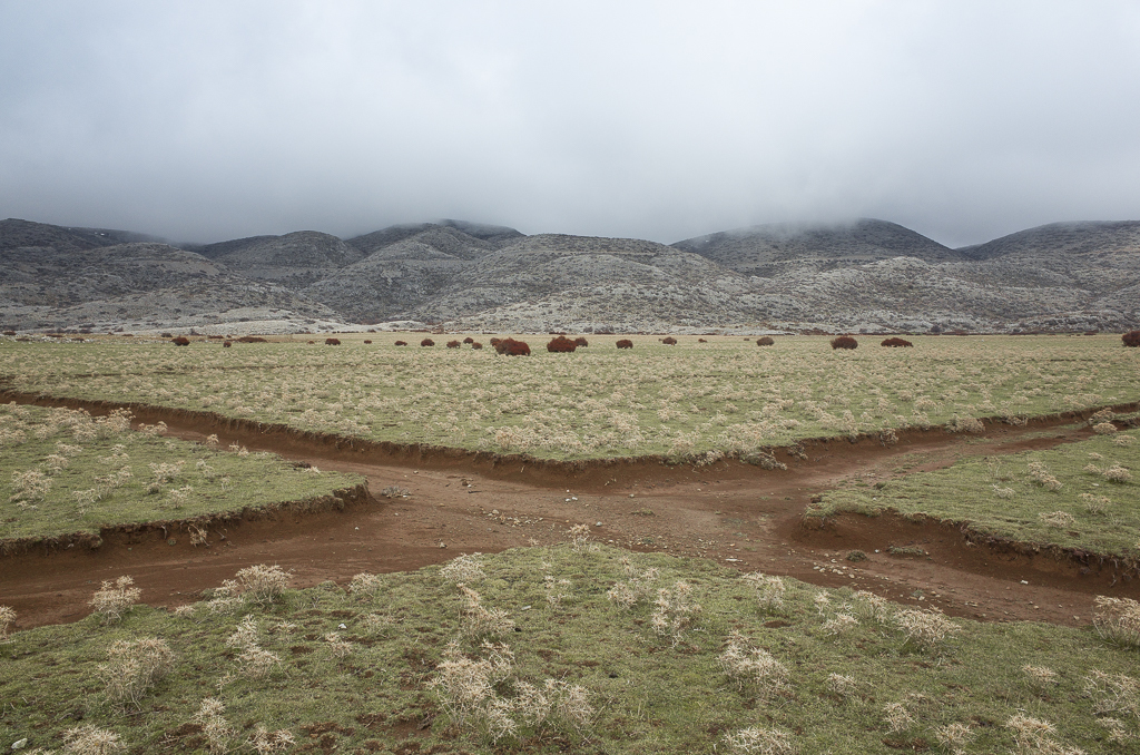
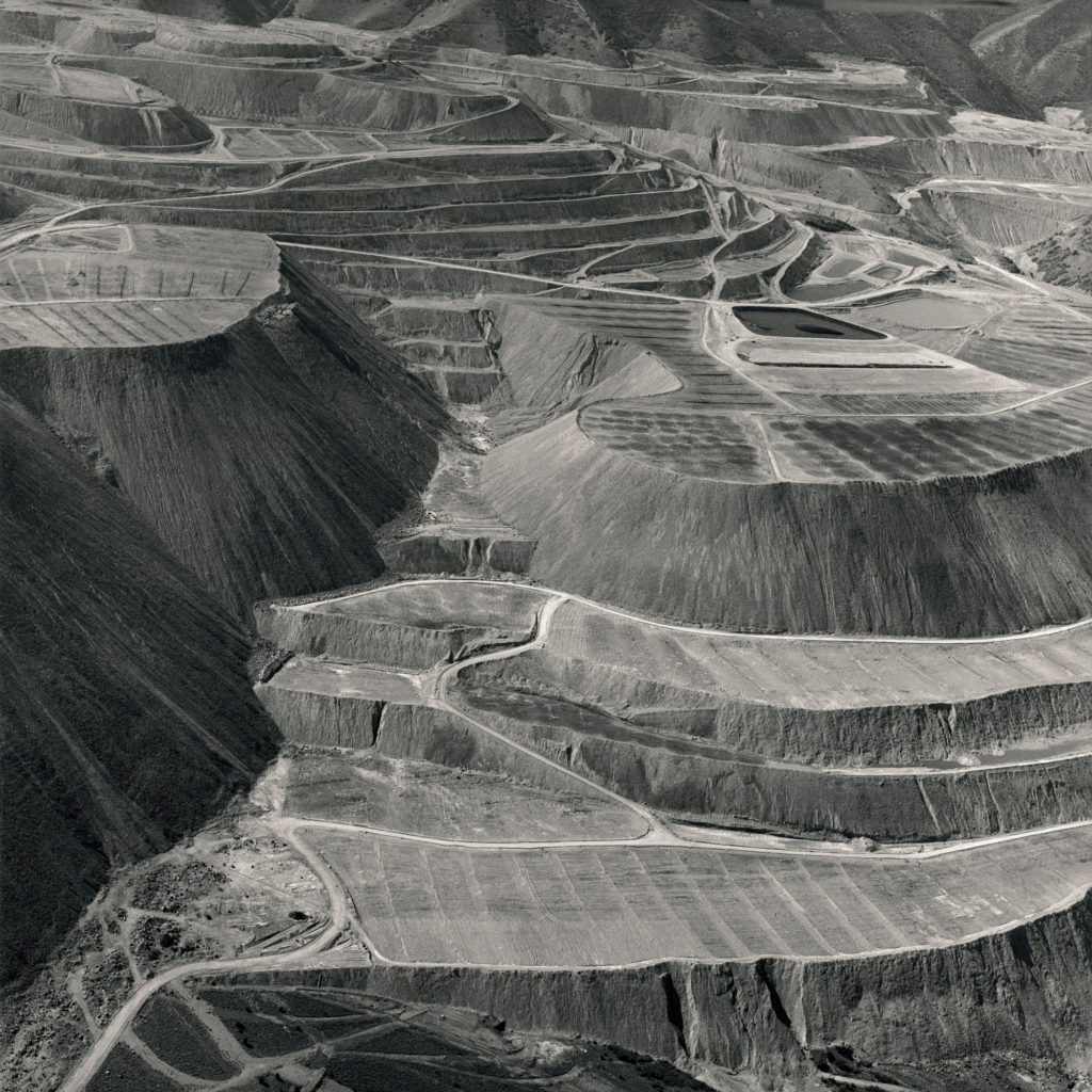
The above image features a natural landscape with a juxtaposition of a subtle hint to mans presence in the foreground with the carved out paths almost like scars on the earth.
George uses natural lighting and he creates a narrow image in terms of colour and contrast in the foreground while romanticising the background with higher contrast and tonal depth. This creates an almost boring foreground which insinuates the mundane and banal nature of man’s degradation on the earth while contrasting this with the dramatic powerful nature of the sublime in the background.
The image is also framed very symmetrically with the paths in the foreground forming an ‘X’ which creates a satisfying aesthetic.
I have chosen to explore the concept of Anthropocene through the genre of landscape photography. I plan to react to ideas of nature being transformed through industry and venture into ideas of altered landscapes through my images. I will do this by shooting landscapes in a wider and vast perspective, of which supplies a view of the full picture. This allows a juxtaposition to be made between the natural environment and what man has interrupted it with.
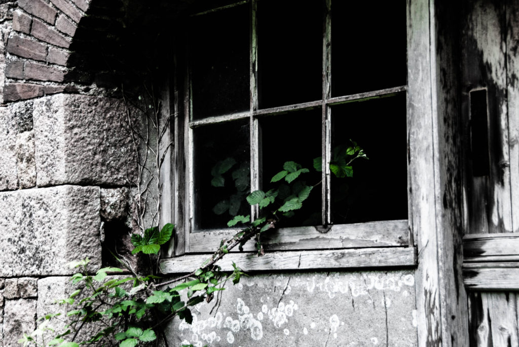
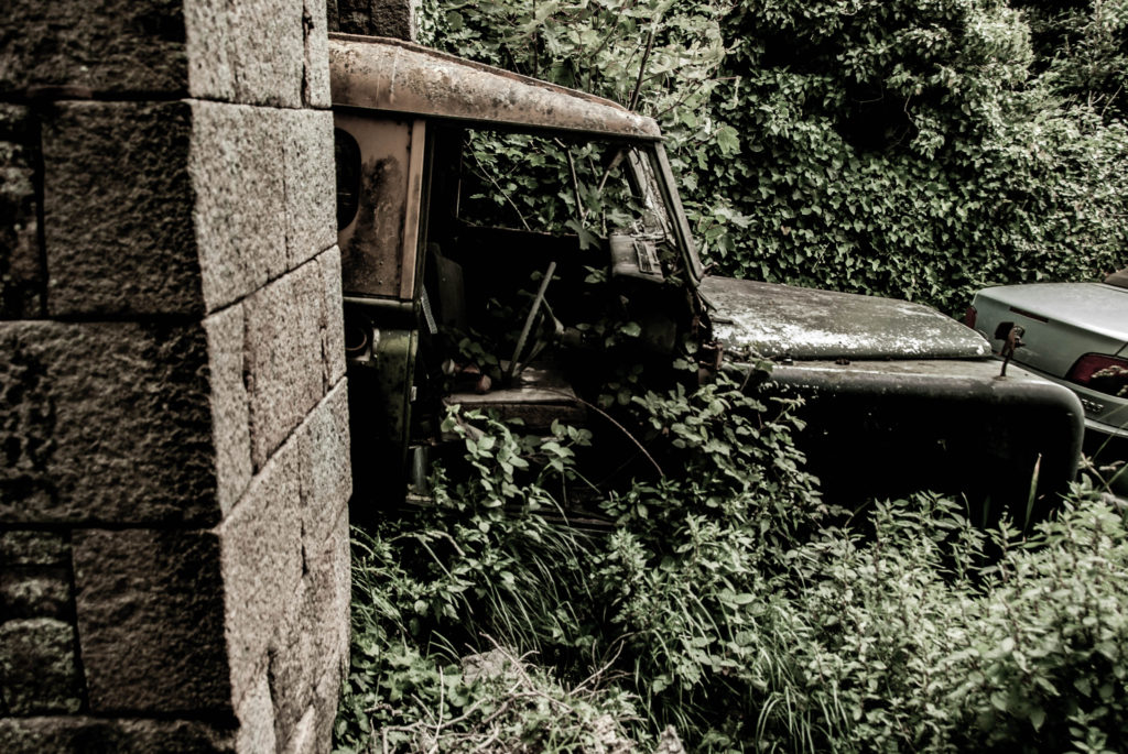
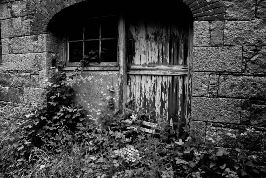
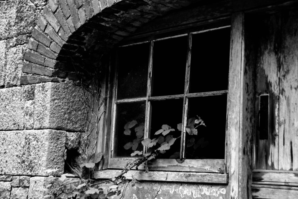
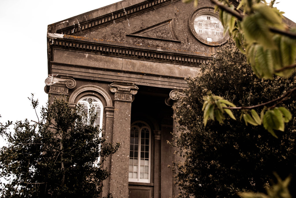
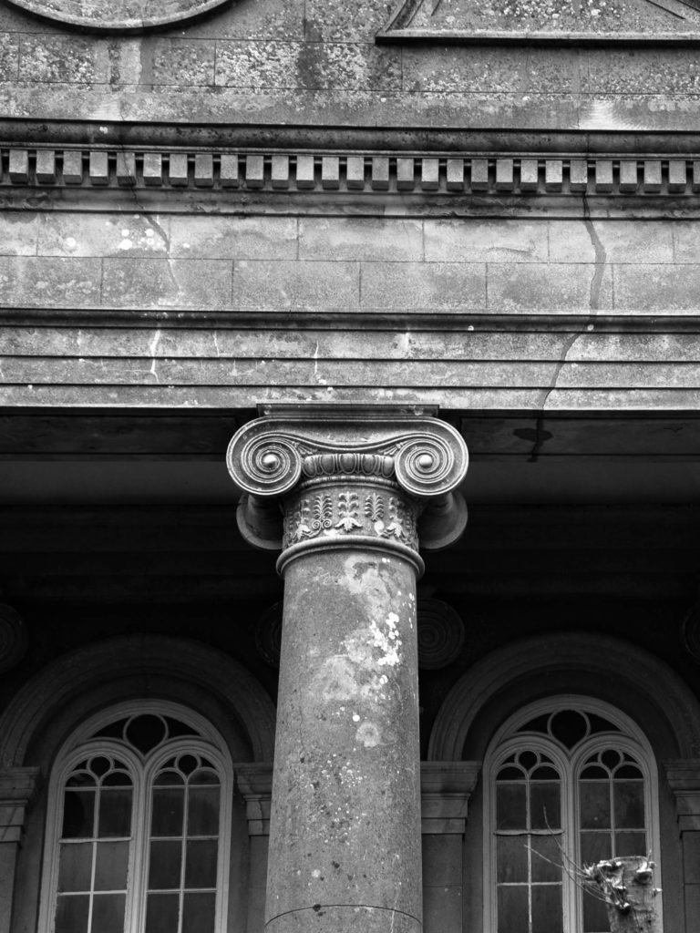
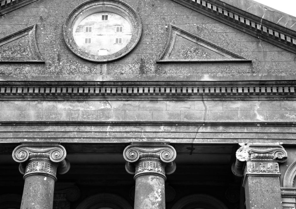
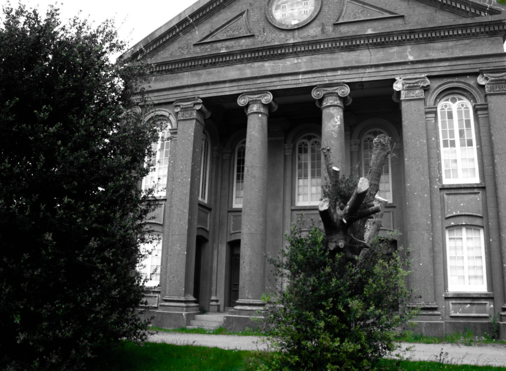
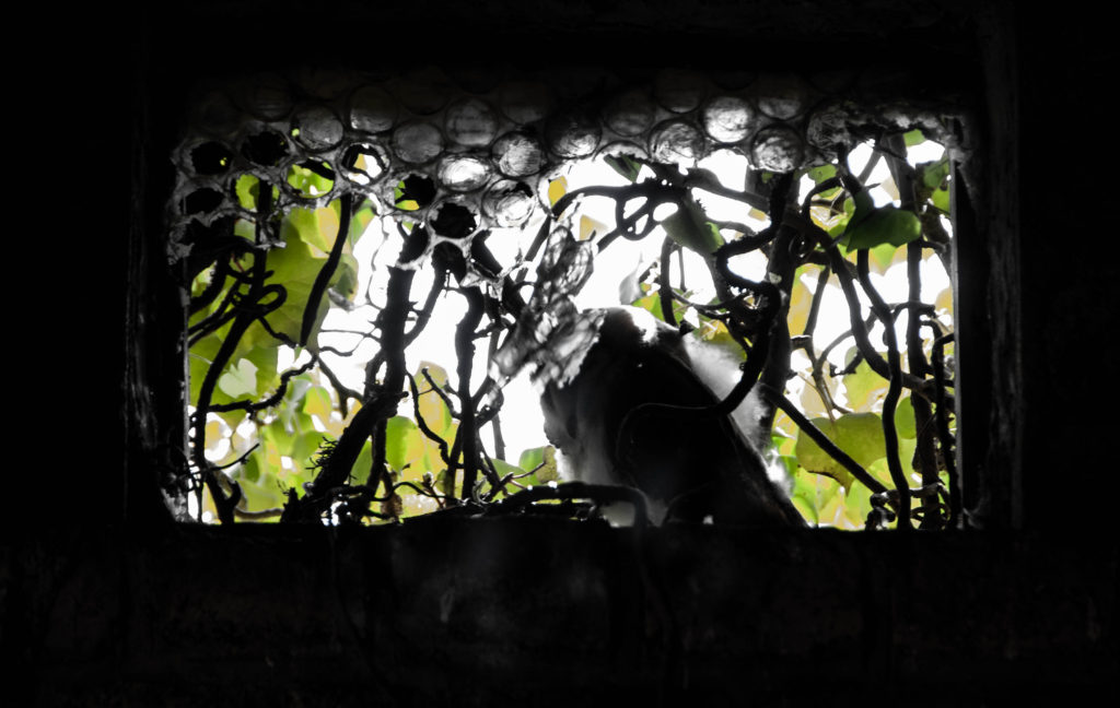
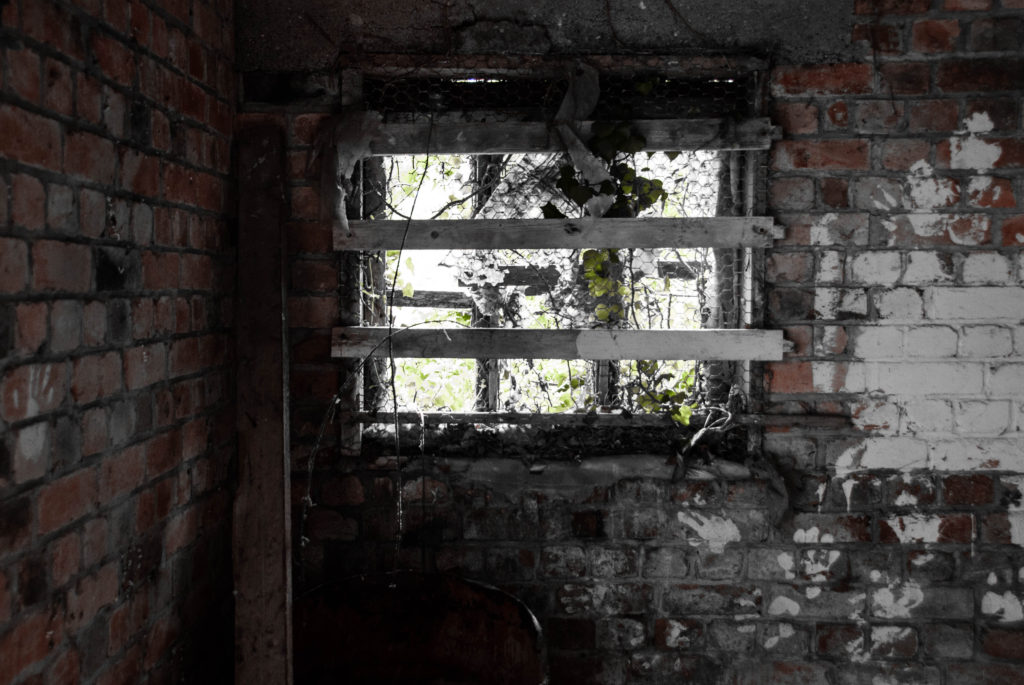
I also plan to express the conflict between urbanisation and the environment by shooting derelict buildings and portraying nature fighting back against man. I plan to incorporate some abstract methods of photographing these buildings, with a more zoomed in perspective.
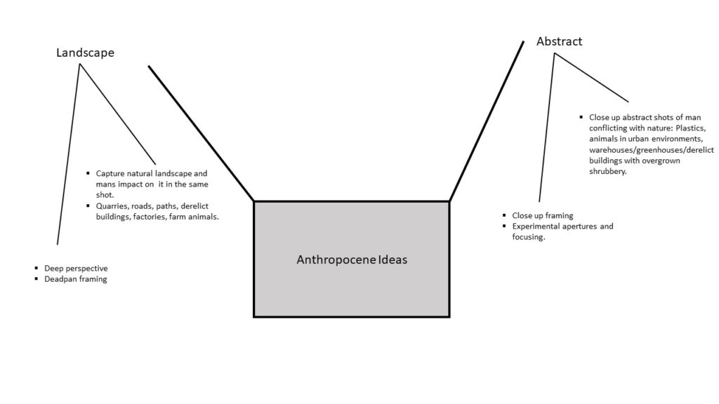
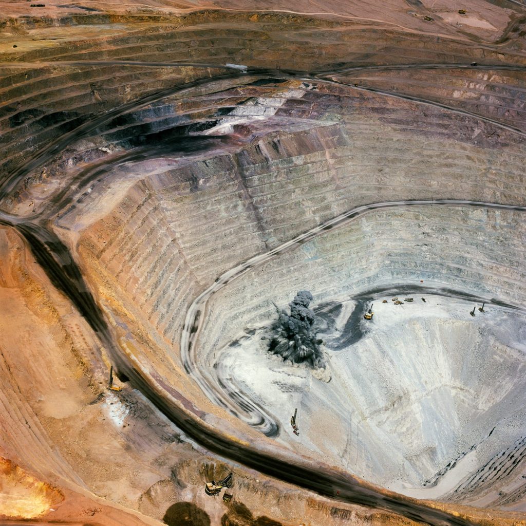
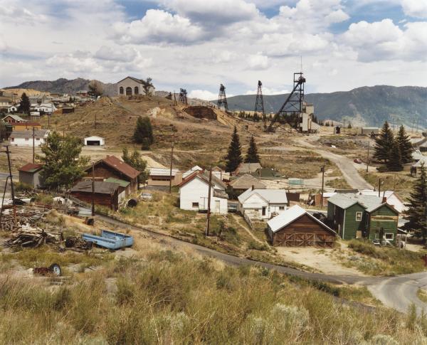
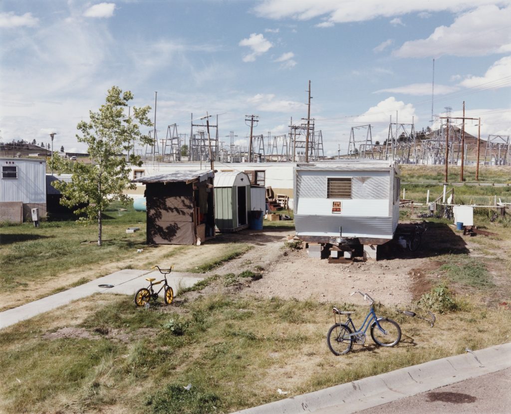
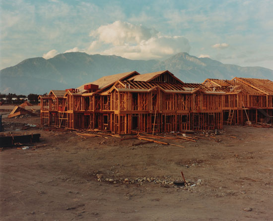
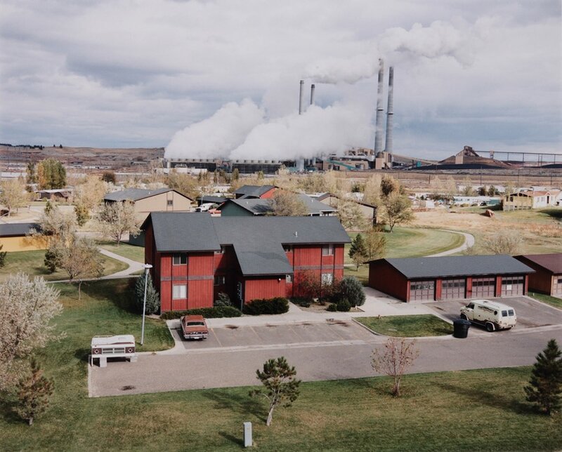
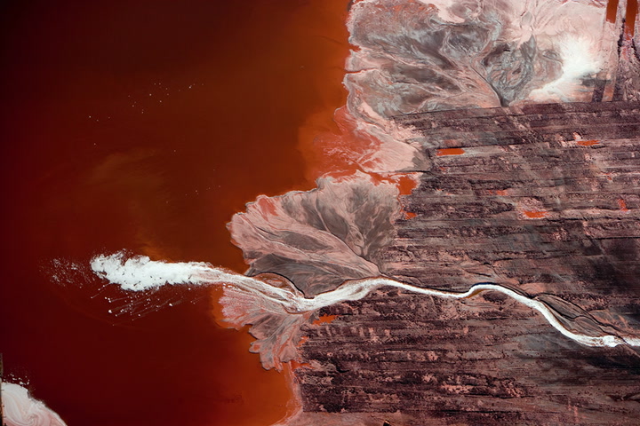
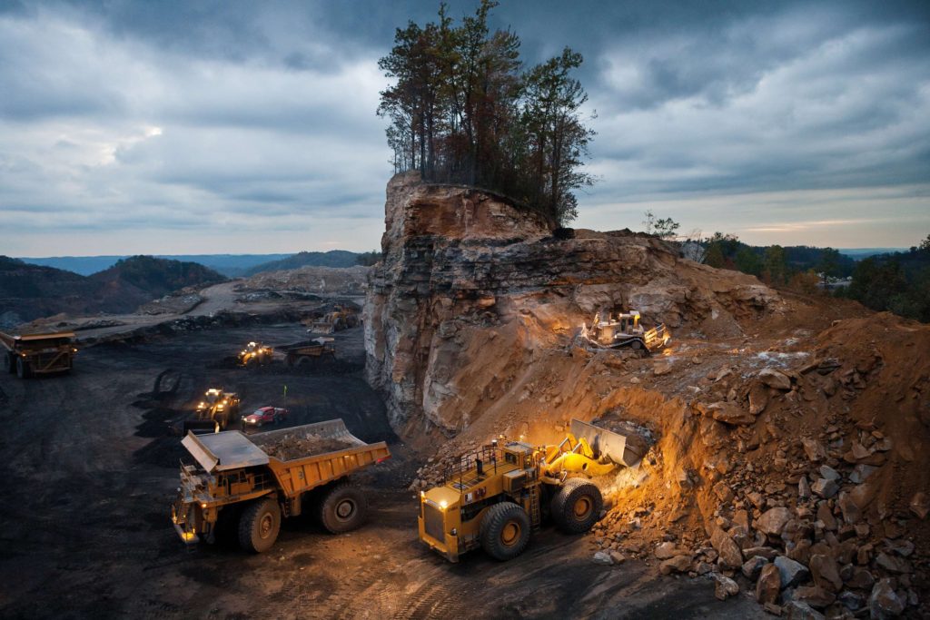
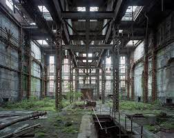
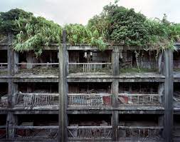
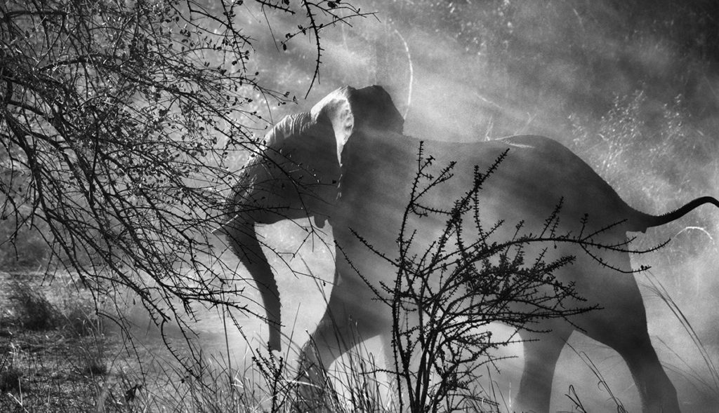
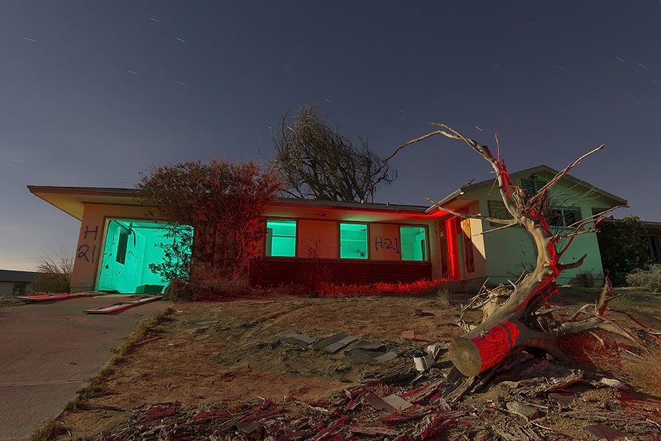
Below is some inspiration for my Anthropocene project:

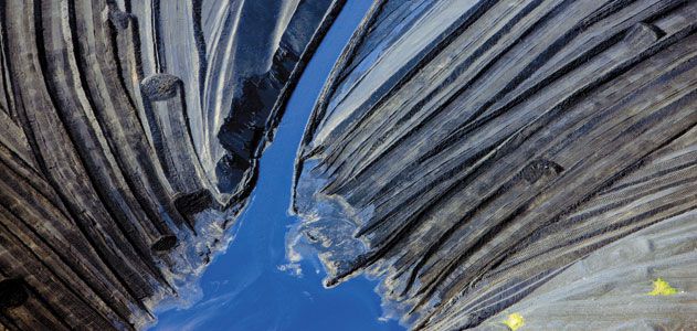
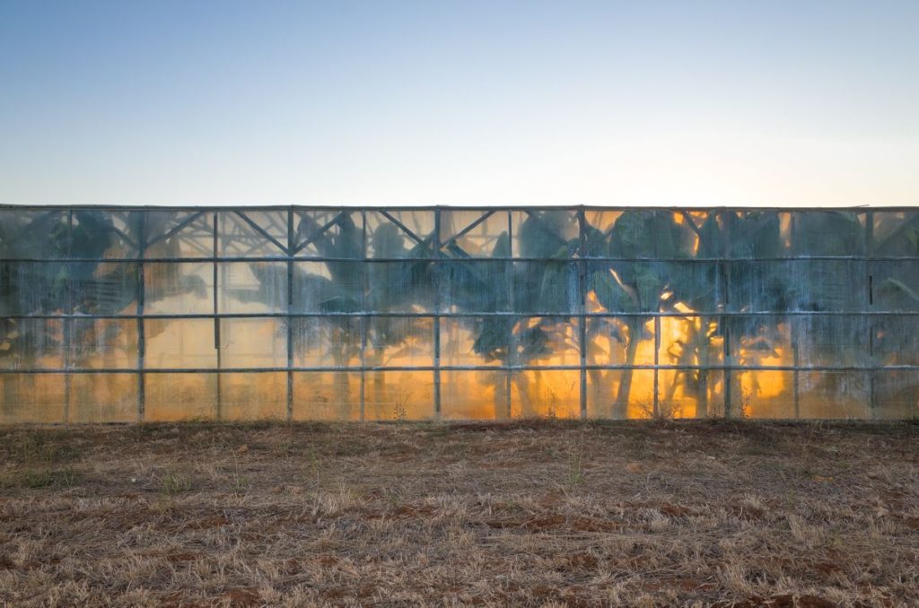

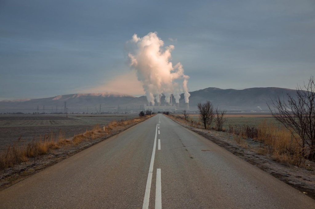
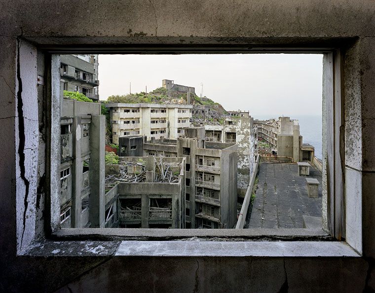
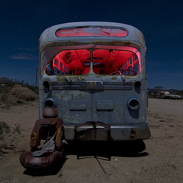
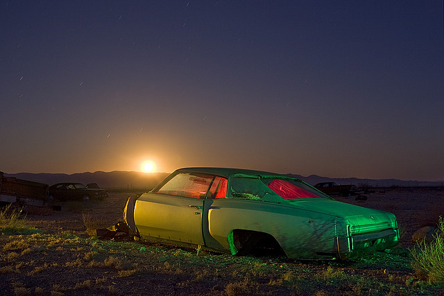
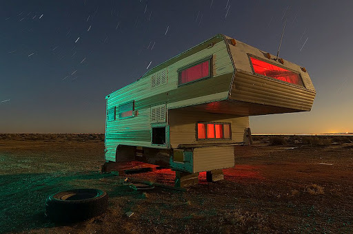
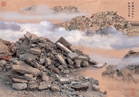
Since I’ve finished my main piece, this is the secondary topic I’m focusing on.
LINKS TO ANTHROPOCENE
There are 2 ways to think how the galaxy and space relates to anthropocene :
The first way to think about it is that air pollution (as well as light pollution) is low in Jersey, so we are able to see the stars at night, compared to somewhere like China, where the sky is filled with smog clouds. So humans are polluting the air, which stared in 1760-1840 when the industry revolution happened, and has just kept increasing.
The second way is more dramatic and extreme, but in space the magnetic field surrounds Earth, which acts as a shield around the planet. The magnetic field is generated by electric currents due to the motion of convection currents of a mixture of molten iron and nickel in the Earth’s outer core, these convection currents are caused by heat escaping from the core, a natural process called a geodynamo. If we disrupt the process by causing global warming, and increasing global temperatures, then the magnetic field will break and crack, causing the Earth to be in danger to solar storms caused by the Sun.
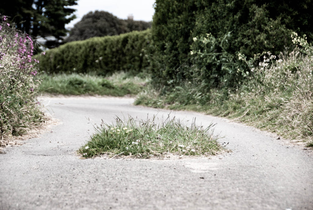
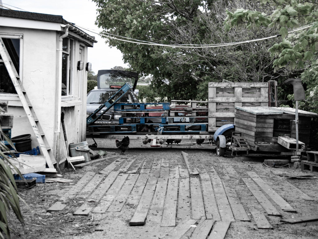
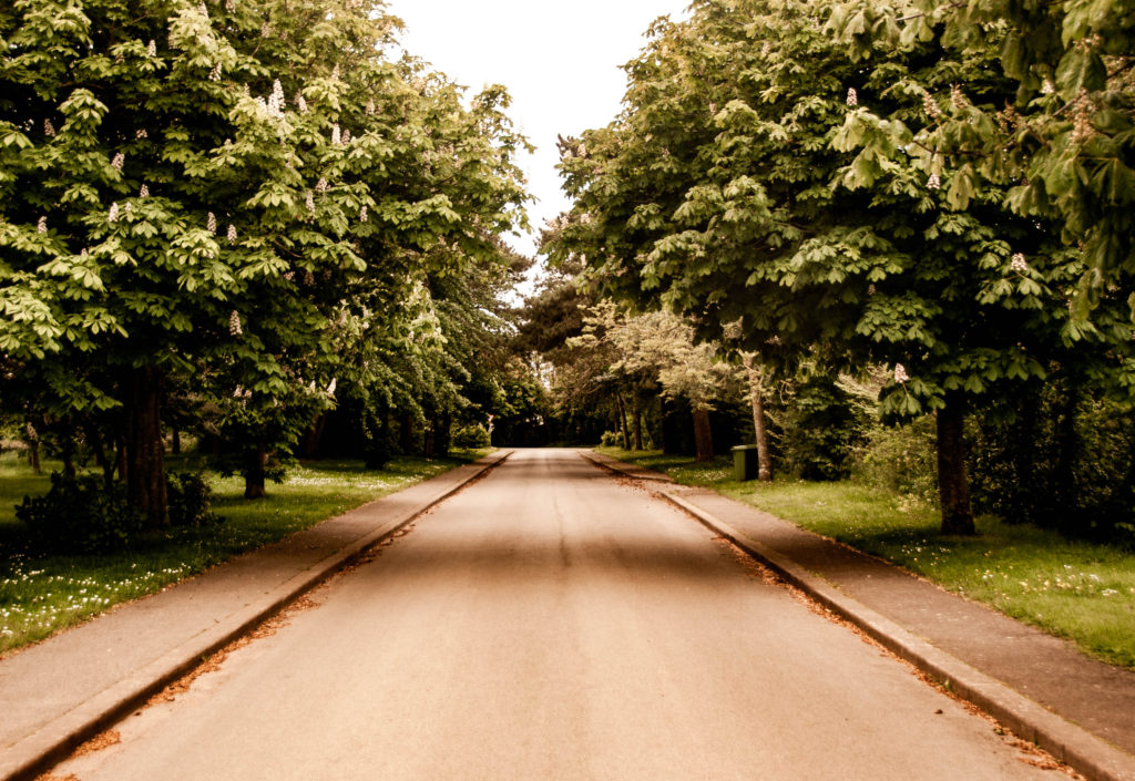
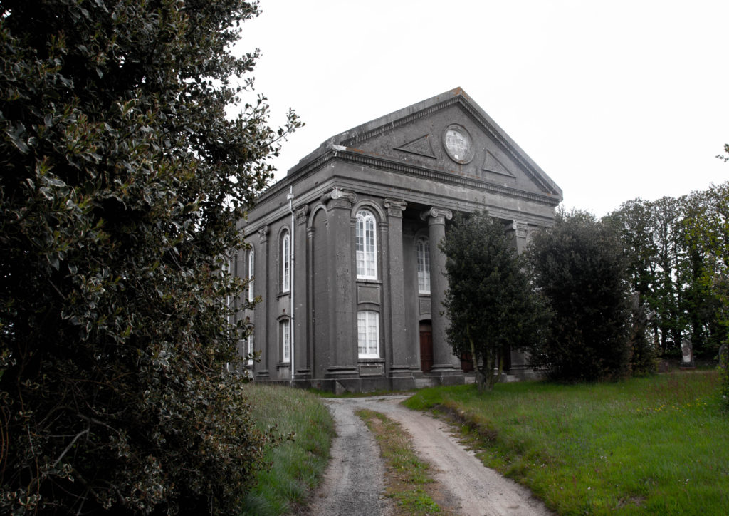
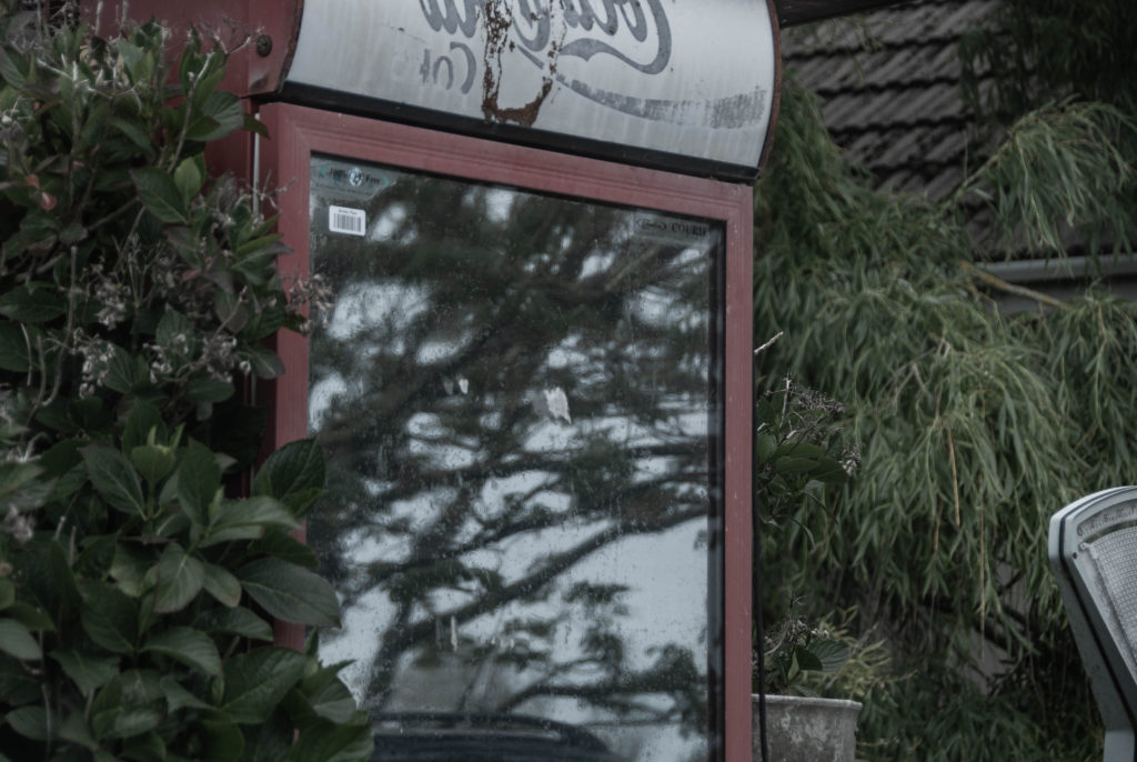
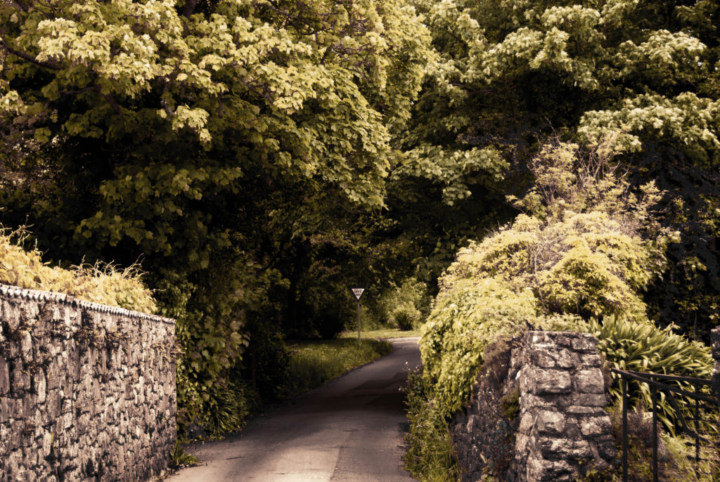
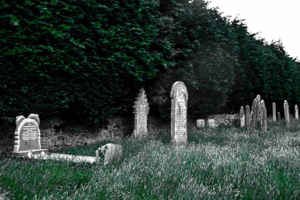
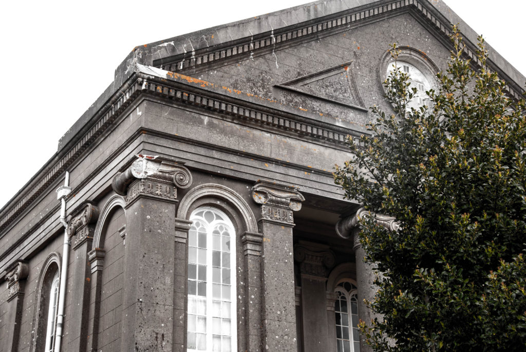
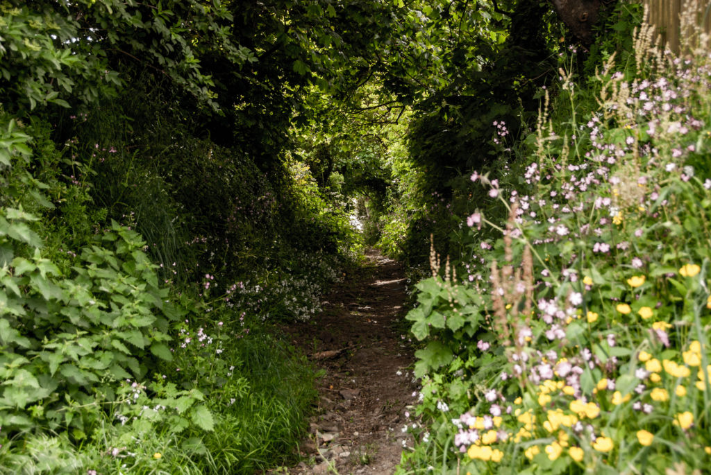
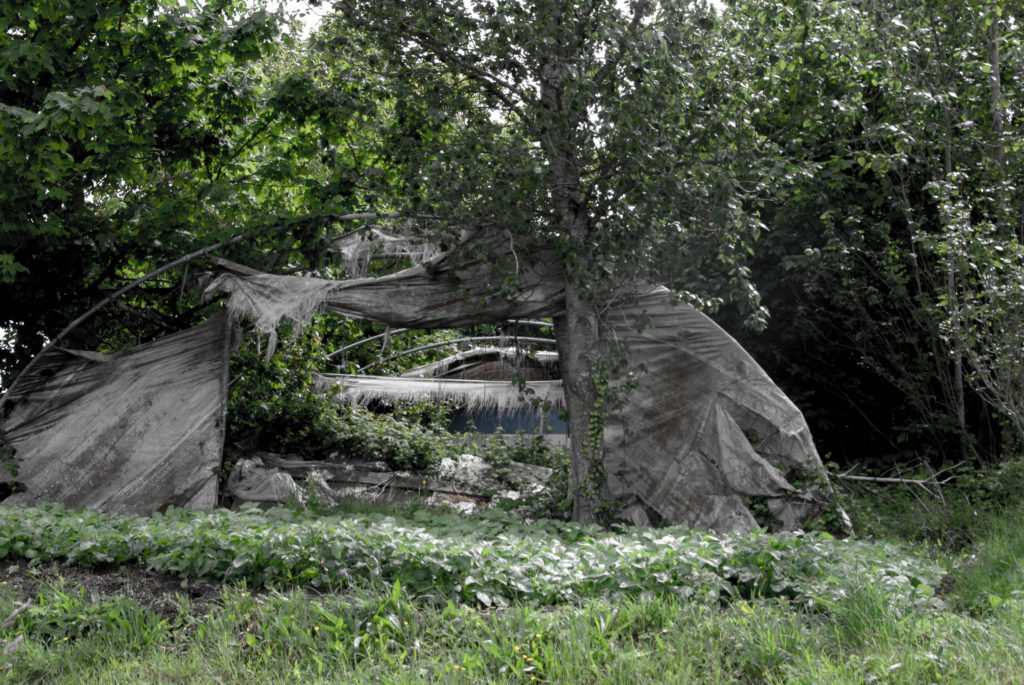
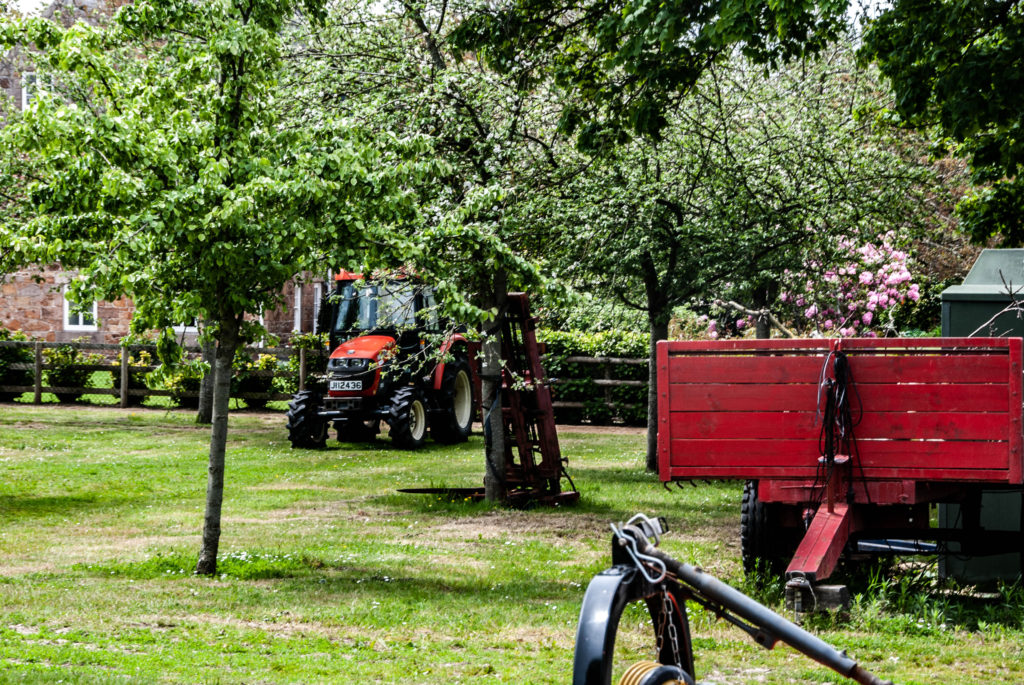
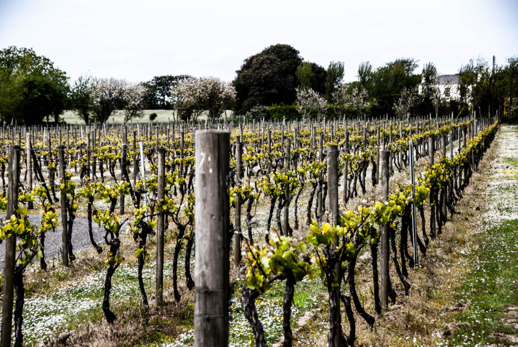
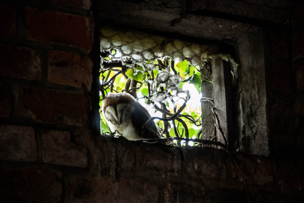
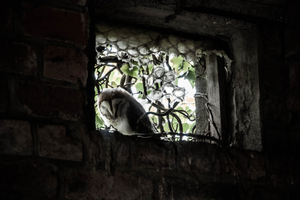
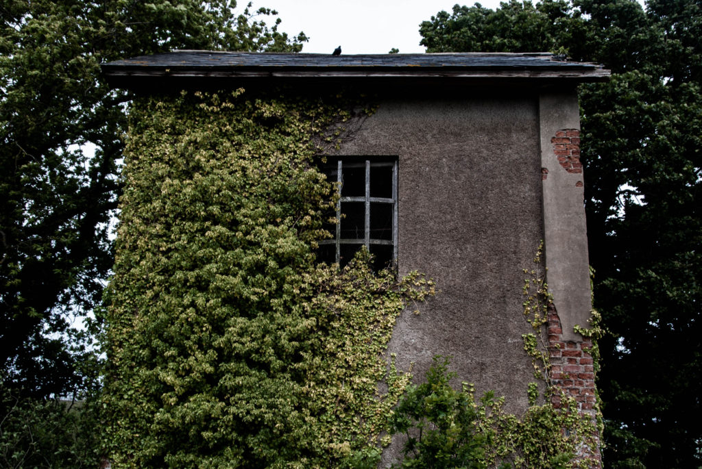
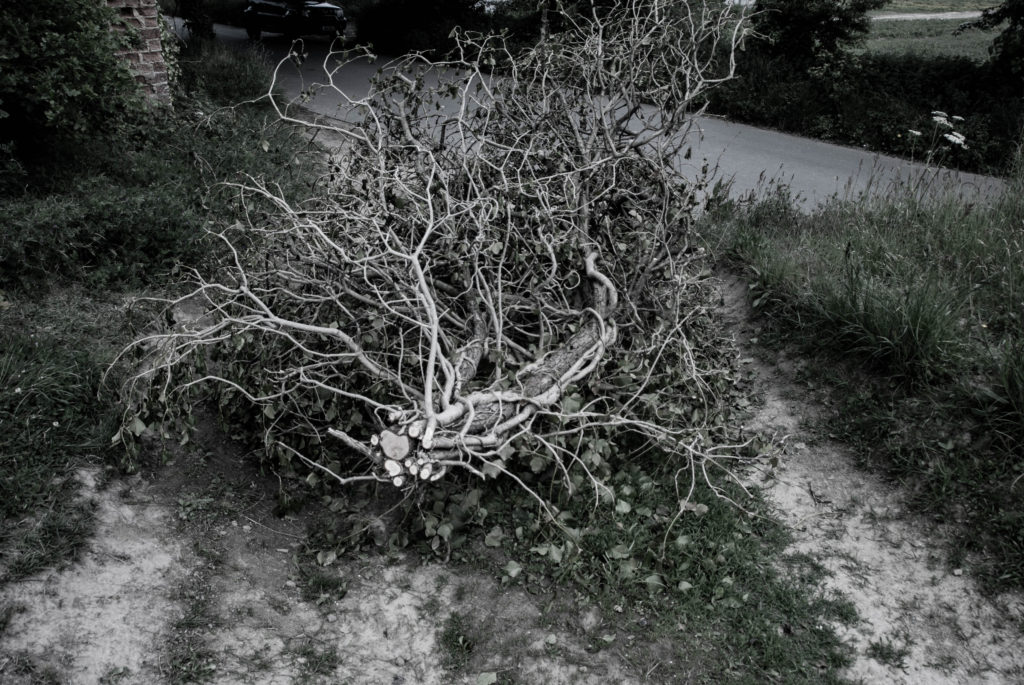
First I selected my favourite images from both La Braye and Faulkner Fisheries photo shoots.
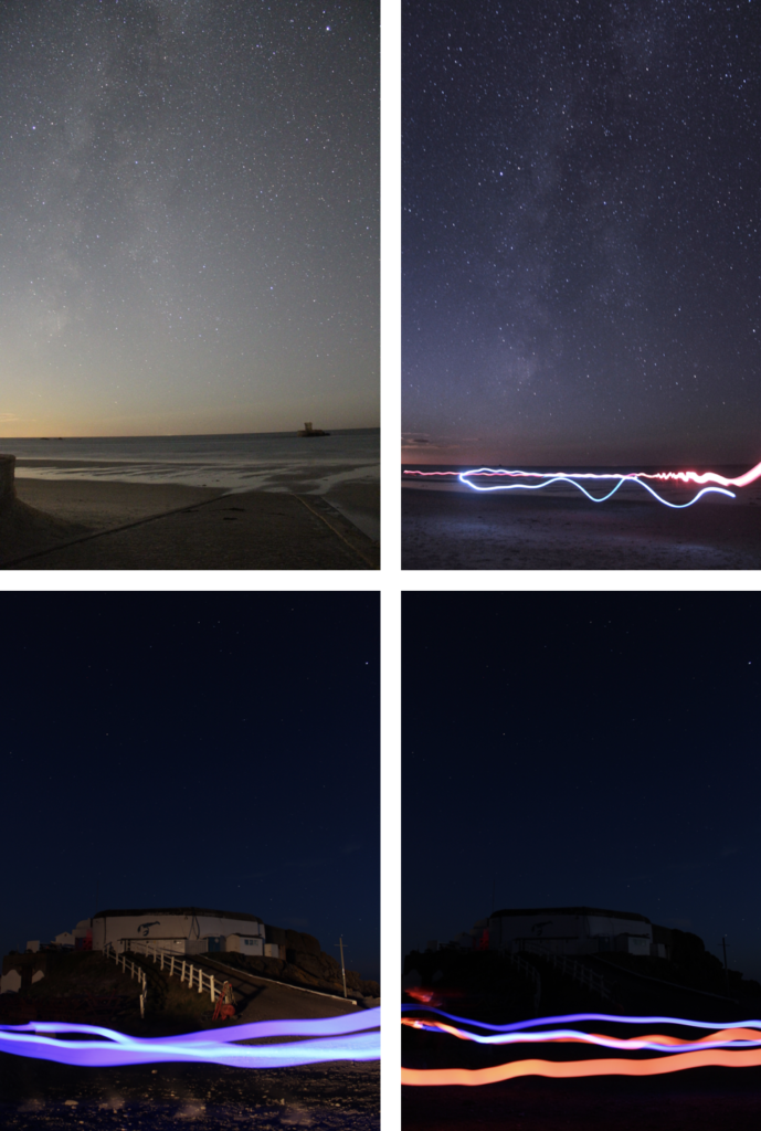
The top 2 are from the La Braye photo shoot, where as the bottom 2 are from the Faulkner Fisheries photo shoot.
Faulkner Fisheries image : ISO 200, f/3.5, 21 second shutter speed
Galaxy with lights : ISO 1600, f/3.5, 30 second shutter speed
Galaxy La Rocco Tower : ISO 6400, f/3.5, 25 second shutter speed
I took these into Photoshop, the top 2 I edited normally using the camera-raw filter, where as the bottom 2 I merged together, as 1 photo the building was light up and had a better sky, and the second photo had better foreground lights.
These were the edits I did for the Faulkner Fisheries, these are the screenshots in the camera raw filter. the top 2 were extremely similar adjustments.
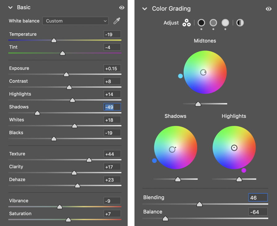
The clarity/noise/texture really brought out the patterns in the constellations.
FINAL IMAGES
After editing the images in Photoshop, this is how they turned out :
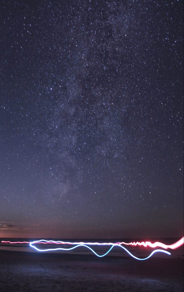
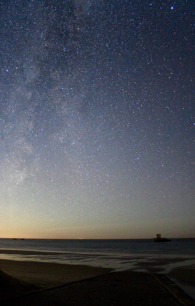
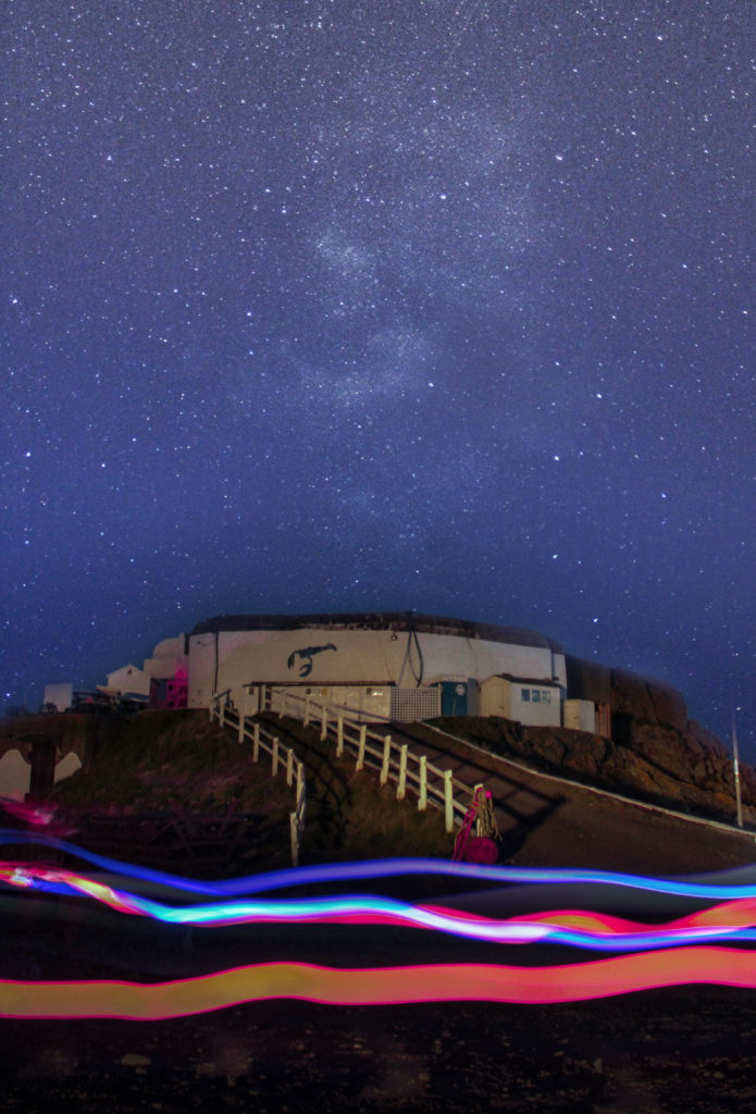
Overall, all the images display star constellations, the first 2 were taken at the same time in the same place, where as the Faulkner Fisheries on was taken at around 10PM about a week later. Which is why they have different constellations. Although, I do like the constellations which you can see in the first images I took.
The foreground with the long exposure of the lights creates a contrast in colour with the dark night sky in the background. The tower in the middle image is a silhouette among the stars, which is a different approach but I still like it.
All 3 use the rule of thirds, as that technique helps focus on sky, or part of the image that fills up 2/3rds of the image.
Overall, my favourite part of all the images, is that you can actually see the constellations, and their patterns.
CRITIQUE
These images are not perfect, they can be so much better if I have better equipment. A crystal clear wide angle lens would produce a better image. A star tracking mount would work as well, and make it more clear.
DISPLAY
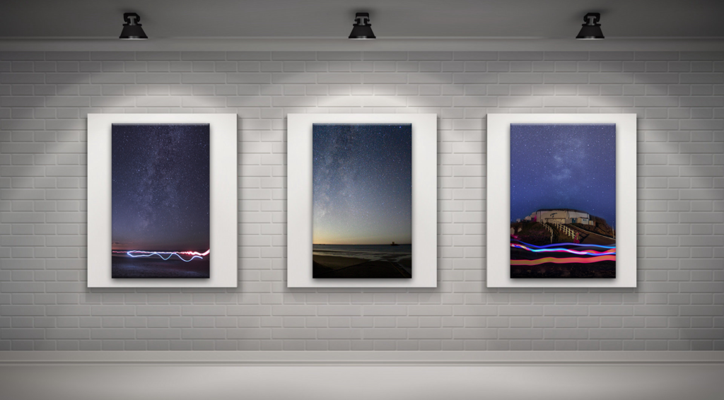
In Photoshop I edited my images into an empty art gallery, then added bevel and emboss and, drop shadow.
IN THE STYLE OF DILLON SAW
Saw uses image manipulation in his work, and oftenly space and galaxies are reoccurring themes. So I decided to make a piece in his style and inspired by him.
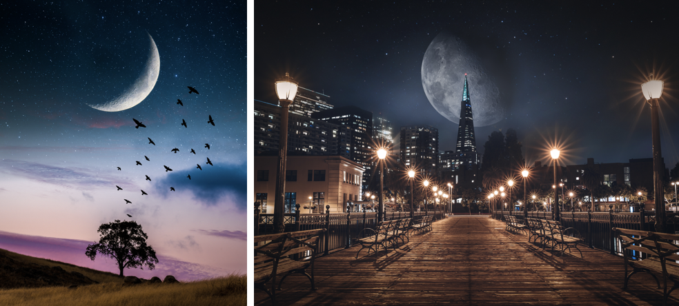
This is the work which inspired me to create my own. As you can see he makes the Moon a big part in his images.
PROCESS
I chose 3 images to use, then brought them into Photoshop and made a final piece on this topic.
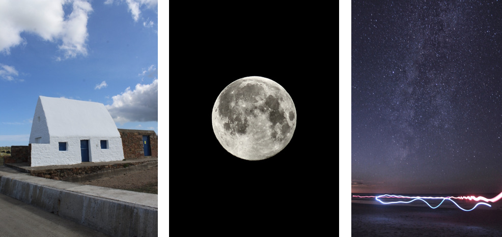
These are the 3 raw images which I’m going to edit. I took a screenshot each time I did a substantial change.
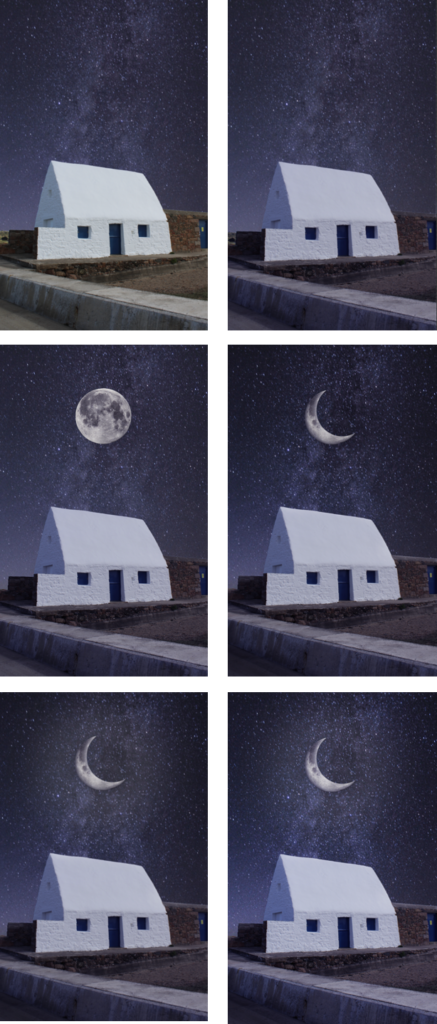
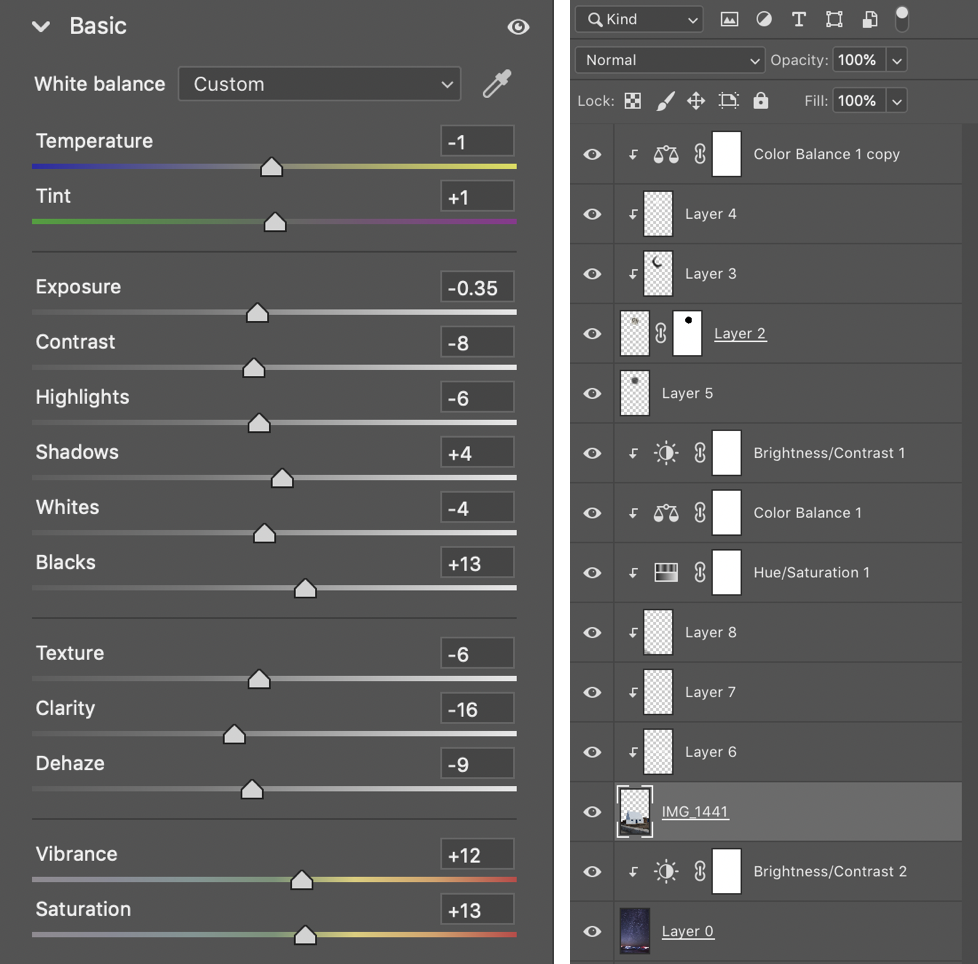
First, I stared off by layering the 2 images over each other, then I removed the sky from the White House image. After I colour matched them using a colour balance adjustment layer, and increasing the purples and blues. Afterwards, I added in the Moon after removing its background. Continually, I used a layer mask to remove a part from the Moon to make it a crescent, as I felt that the pointed edges would contrast the other shapes in the images. Then I added glow behind the Moon. The finally added a camera raw filter using the setting below.
FINAL IMAGE
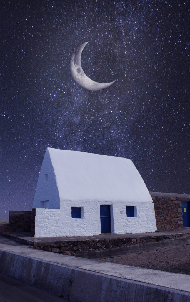
Overall, It turned out well. It has a nice flow to it, and all the colours match. It was very simple, but clean, which is why it has worked quite great.
I tried to keep it dark despite the foreground image being taken in the daytime, which actually kind of helped as it looks like the Moon has lit up the sky alongside the building.
The composition is decent, to an extent where the Moon isn’t dominating the sky, and the White House isn’t too big. It creates a contrast with the straight lines on the building compared to the moons curved edges and pointed lines. The Moons pointed, sharp edges could be a “threat in the sky” to puncture the Earths magnetic shield, and put everyone at risk.
The clear star constellations represent the clean air which allows us to see the stars shining at night, and can be shown as a warning to people if air pollution isn’t controlled, we’ll lose this incredible natural view.
CRITIQUE
If I could change on thing it would be the Moon. I would make it smaller, as it would make it more realistic, as in real life the moon isn’t that big when viewed from Earth.
EDITED VS RAW

The right image is my final image from Photoshop, compared to the left which is the raw images in the same layout as the final piece, with no adjustment layers or effects.
DISPLAY
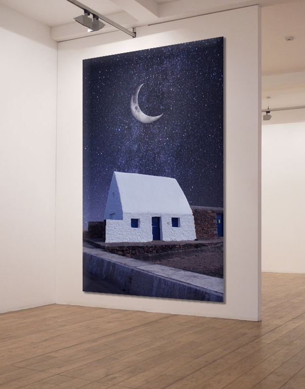
I used an empty gallery and edited my image into it. I warped it to the angled wall, then added bevel/emboss and, shadow drop. This really helped me present my work. It being against plain walls has brought out the small details.
MY IMAGE VS SAW’S
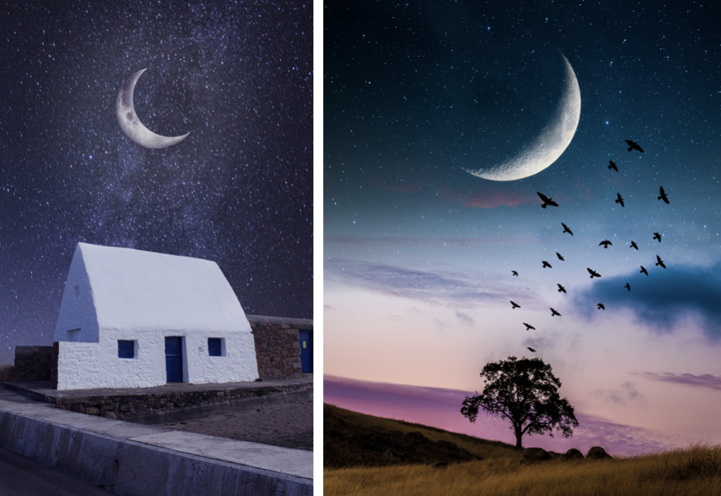
Both are based along the same subject and concept. I like how Saw has used a mix of colours in his background, compared to my image which is a bit dull. Although, my image includes stars which helps identify its night time.
Saw’s use of the tree is really impactful in regards to nature and purity. Although, I feel that it is unbalance, and is only including nature. This is where my work thrives in displaying a balance of man-made buildings and natural planets and stars. This draws ties to humans, which is the main problem to all of the climate change going on around the world right now, that relates back to the idea of anthropocene.
Overall, I like my image more, despite being less colourful, as I feel that it relates to the topic more, and the goal that I set at the beginning, which was to create a piece which involved the White House with the moon above it, that symbolises anthropocene through space.
MY AIM / GOAL / IDEA
My aim is to create a piece in Photoshop in the style of Dillon Saw (the first artist/photographer I studied) an altered landscape/image manipulation, but with Sebnem Coskun’s (2nd photographer) content, which is the plastic pollution in the ocean and ocean pollution.
I envision a boat with buoys on, in the center of the ocean that has lots of rubbish and bottles floating around in the sea. You would be able to see under water and above the water.
THE PROCESS
IMAGE SELECTION
Firstly, I decided to chose images that I plan to use from the Bouley Bay photo shoot and the St Brelades photo shoot. These photos would be the ones that I used to make the final image in Photoshop.
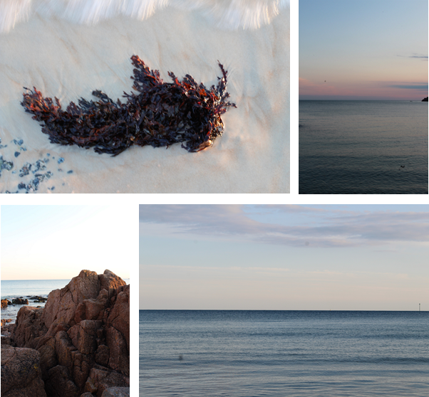
These are the photos I chose to use from the St Brelades photo shoot. The water is for the main top of the water, the seaweed I plan to have floating underwater. And the rock would be underwater on the sea floor, or maybe poke above the surface (if there is enough space).
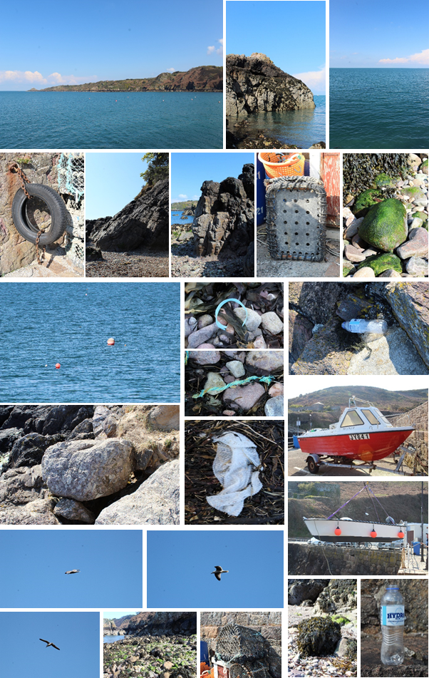
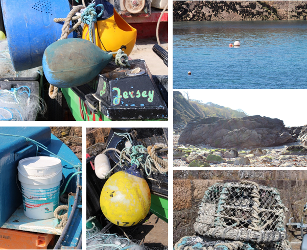
These are the photos I plan to use from the Bouley Bay photo shoot. The headland/coast will be the background. The rocks would be underwater and the seabed. All the fishing nets, rubbish and fishing equipment will be floating in the sea. The red boat will be in the center.
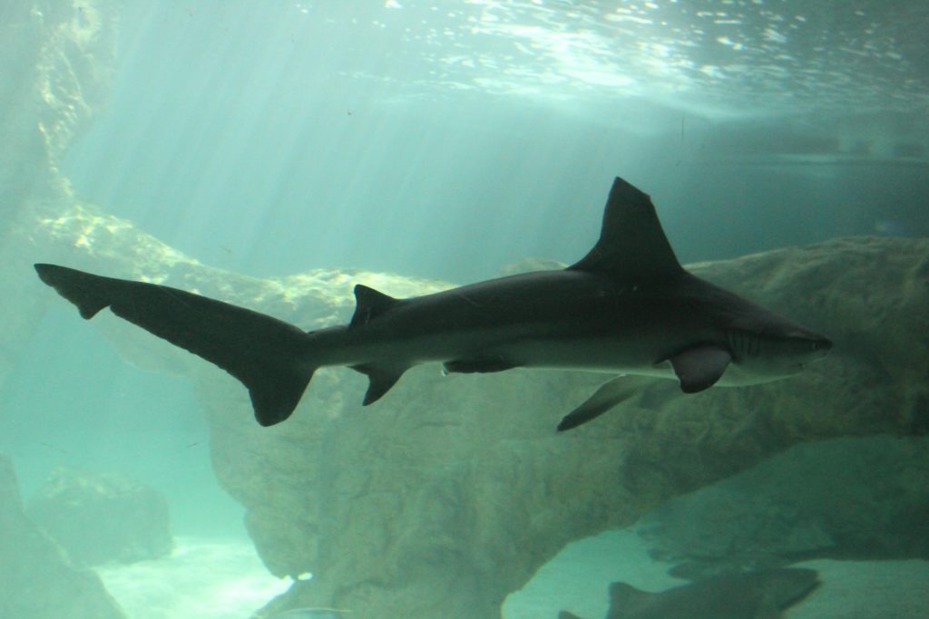
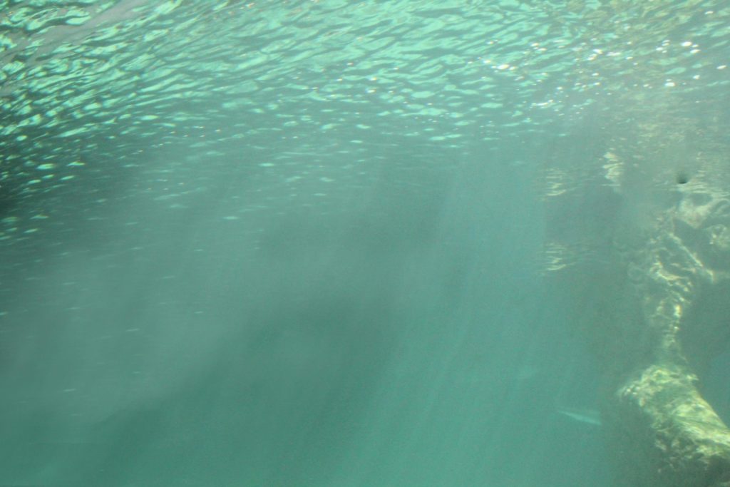
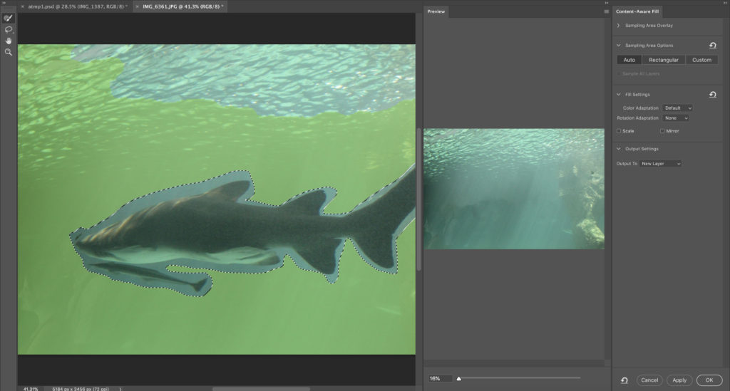
The underwater picture. I checked with Mr Cole, if I was allowed to use it. It is a picture I took in an aquarium then in photo shopped everything out and only kept the underwater perspective. I will change the saturation and hue later.
MAKING THE IMAGE
Firstly, I made a new document in a good portrait dimension, I chose portrait as I would like the viewer to concentrate on the main focus, the rubbish and pollution. Then I added the underwater image, and positioned it to fill up a bit more then half of the screen.
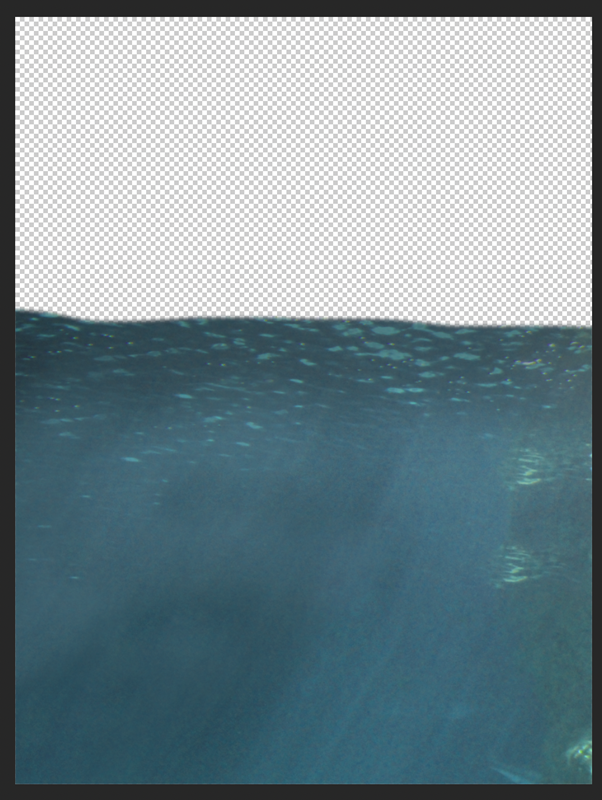
I changed the hue and saturation to match the next image. I also added some shadow to the top of the image to make it a little darker, On top of the brightness and contrast adjustment layer, where I made it darker and increased the contrast.
After, I added the photo of the sea from the St Brelades photo shoot, however, the sunset colours didn’t really match the whole ascetic, so instead I used the image from the Bouley Bay photo shoot, which was better. I positioned it above the underwater picture, then I made only the vertical part of the image “squished” to match the perspective I was going for.
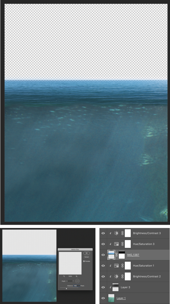
At that point, I added a layer mask of get rid of the sky and background, using the black gradient tool. After, I changed the brightness and contrast, and hue and saturation, to match the two images together. I made the top of the sea brighter as the sun would be lighting it up. Then a added a small amount of motion blur at a 0-2 degree angle, to make it a bit smoother.
Next, I deiced to add a background, which was from the Bouley Bay photo shoot, and was the image of the headland/coastline. I put that layer to the back so everything was on top of it. I aligned it so that the water I edited was on top of the water in the background photo, which kept the perspective.
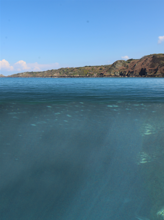
Additionally, later I will edit out the dirt on my camera; as you can see in the sky, using the spot healing brush. Then I increased the saturation of the background, to make it stand out more.
There was something off, it felt like the transition from above to below the water was to sharp. So I made a waterline from a zoomed in image of the sea I took, then used the eraser tool to make a “wave” effect. Then dragged it on to my main image, and put it on top of where the change is.
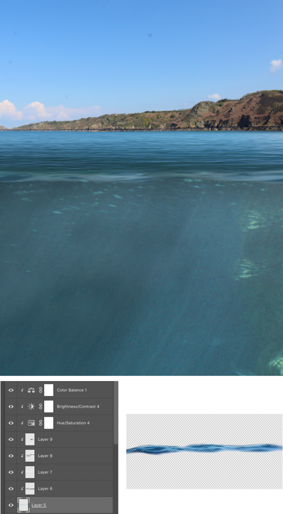
When I put it on my main image it was very blue, so I applied extremely similar adjustment layers to the water line, then added shadows and highlights to blend it into my image. I also used the eraser at 50% hardness and 15% flow, to fade the top of the water into the waterline. Furthermore, To create a sense of depth and distance, I added Gaussian blur to the waterline, to make it look like it was closer.
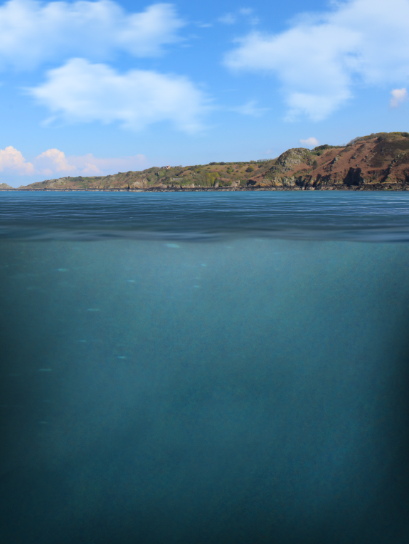
Following, I made some small adjustments, moved the underwater part up so that you couldn’t see the top of the water. This helped match the perspective. Afterwards, I made the edges of the underwater section darker, this made it more realistic, and created a sense of darkness, which can represent evilness. This is where ill be putting the rubbish, so it makes sense that it has a negative atmosphere, as it is a world wide problem.
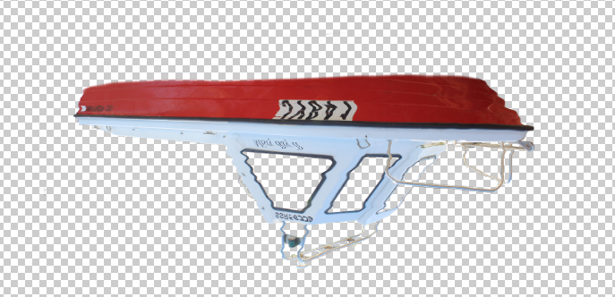
Then, I added the boat in, first I had to remove the background. Which I used the eraser and magic wand tool. I temporarily made the background black to see if i missed any parts.
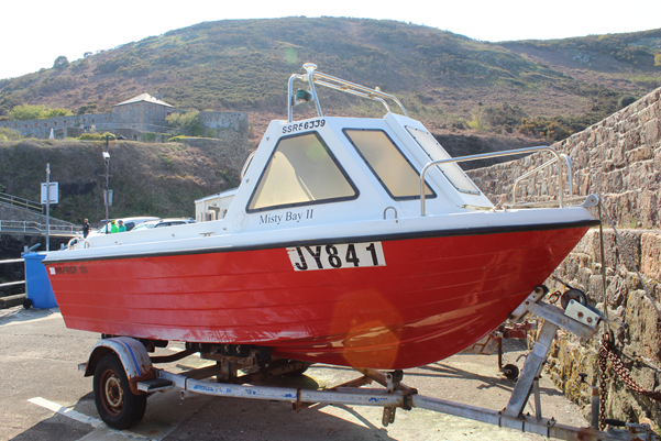
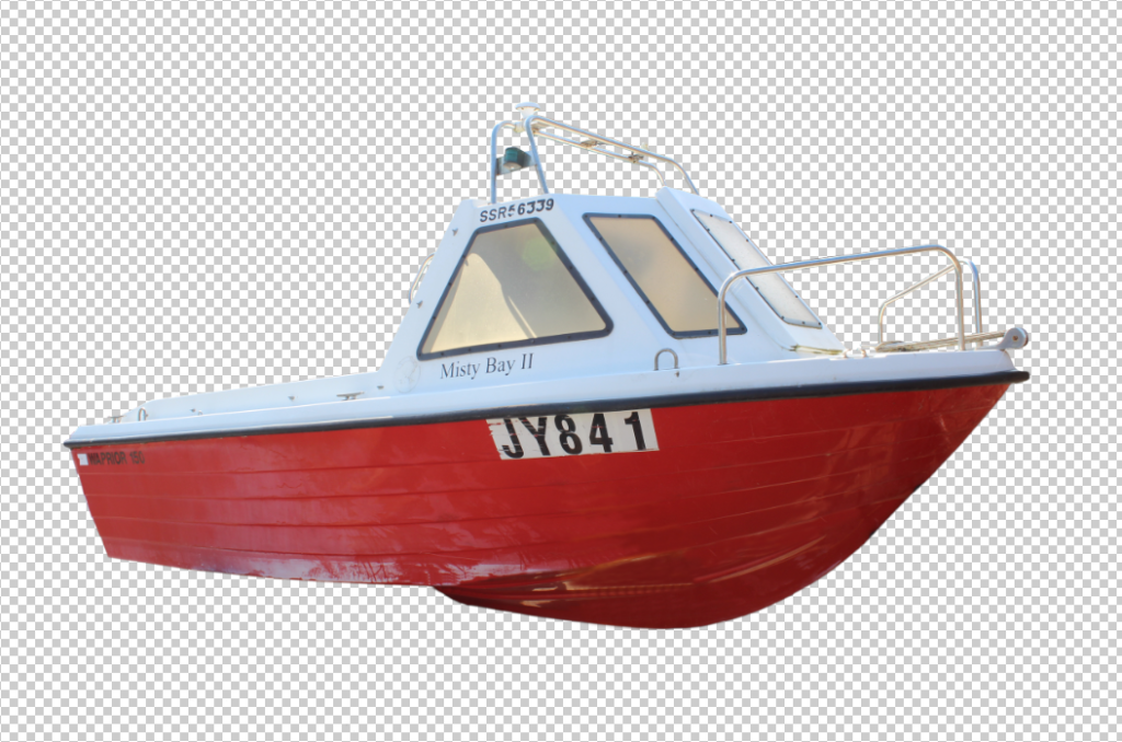
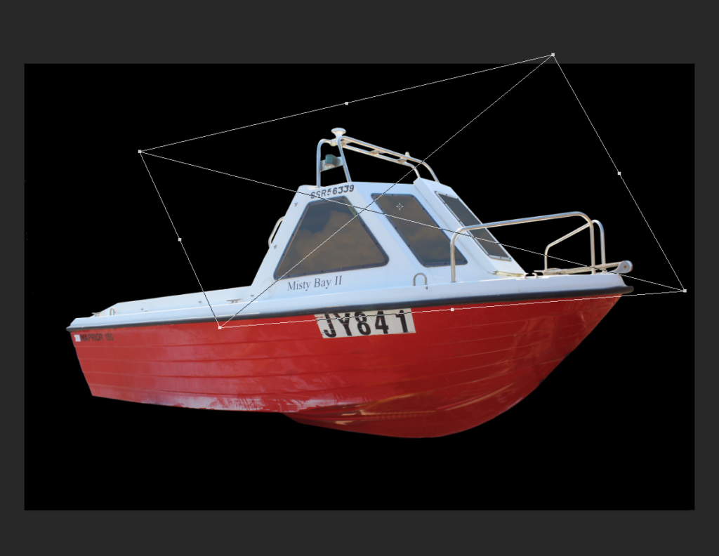
After I made the windows a separate part from the boat so I could change their opacity and add a reflection of the sky.
When I removed the background the trailer was covering the boat, so I used the clone stamp tool to manually fix the haul of the boat.
I added the boat into scene, I put the boat and windows on the top layers, and the duplicated only the boat and put it above the underwater picture, to get the blue underwater effect, I changed the blend mode to soft light, then after I erased the bottom of the boat (top layer) to let you see the layer underneath, to give the effect of it floating in the water.
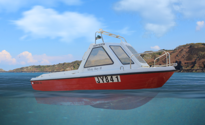
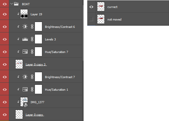
I added adjustment layers to match the boats colour with the scenery. Additionally, I added shadows to the bottom of the boat, and highlights to the top.
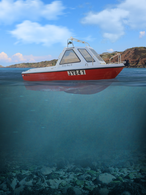
After, I added a reflection on to the water of the boat, this would make it more realistic.

I added the reflection to the top water layer and waterline, I set the opacity to 15% on each so that it wasn’t a solid.
I used Filter > Liquefy to make the reflection more realistic.
I distorted the reflection using a brush with 38% pressure and 50 size, and dragging the cursor over the reflection.
I use a photo of the rocks at low tide from the Bouley Bay photo shoot, to create a seabed in the bootom of the image.
I used a layer mask and a black gradient, to fade the rocks into the water above it. Then applied some adjustments to decrease saturation and increase contrast.
I decided to add buoys to the boat, to add details, I added shadows and highlights to the buoy, then after I added a reflection in the water from the buoy.
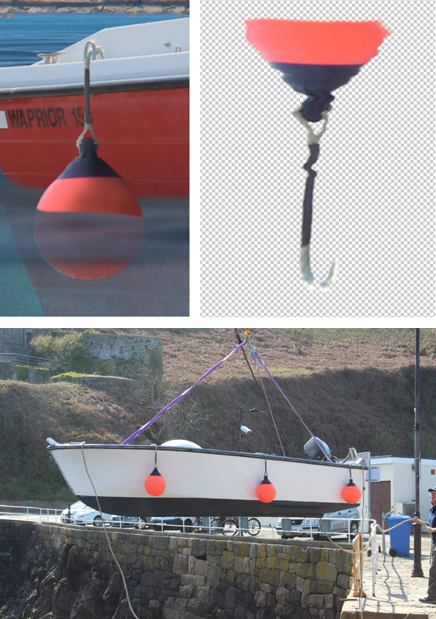
Then used the same technique when I distorted the boats reflection, to the buoy and will keep the reflections consistent, to match the astatic.
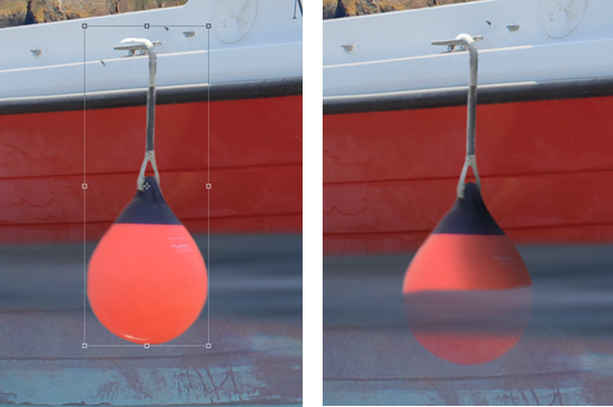
The second buoy before and after photos, I used a different buoy, but the same techniques to add shadows and highlights.
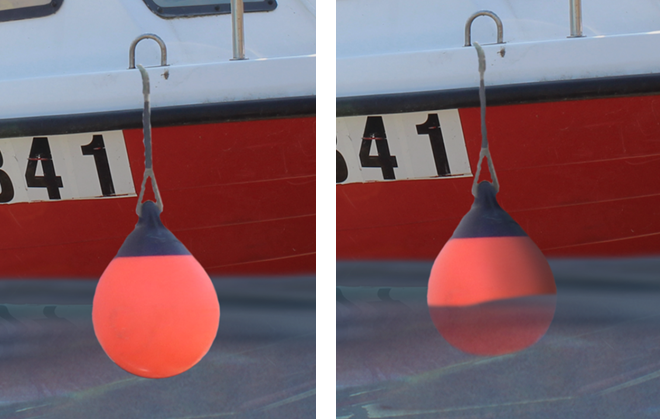
Finally, I finished the last buoy. Then moved on to the rubbish in the water.
I started to add the rubbish into the water. I started remove all the backgrounds of the images from the rubbish photo shoot, I did this in Photoshop. First, I opened the image in Photoshop, then used Select > Subject, then duplicated the selected selection (the object), then deleted the original image.

One by one, I added each into my final image, after I used all of them I duplicated them, and merged selected layers, the flipped them horizontally to fill the other side.
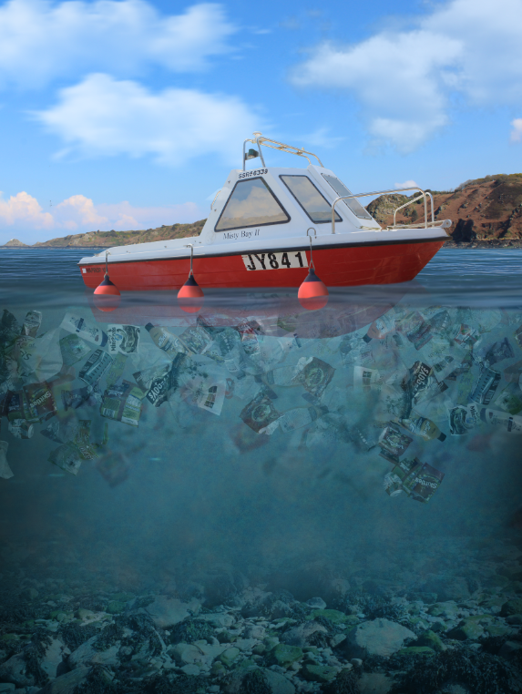
After, they were arranged, I added a hue & saturation layer, to decease saturation, to give it the old, dull, washed out look.
I then needed to add the fishing equipment to the seabed, which was left behind by fishermen.
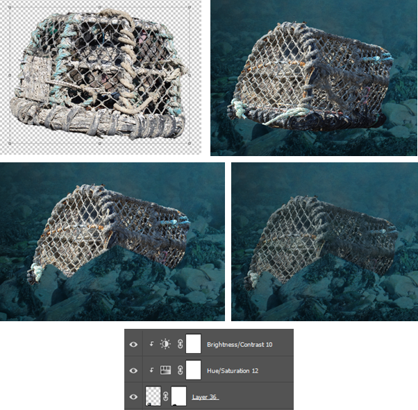
I removed the background of the net, then dragged it into the scene. I positioned it behind the rock, then used a layer mask to remove the parts that were over the rock,so it looked like it was behind the rocks. Then I added hue and saturation to decrease saturation, and the brightness and contrast to make it darker as I took the photo in daylight which is a dramatic difference to at the bottom of the sea, where there is no light.
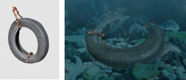
I did the same with a tire in the center underwater.
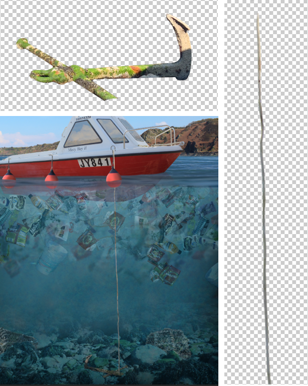
I didn’t like this as it felt to organised. So instead, I deleted it and made and anchor coming off the boat. I used the rope from the Bouley Bay photo shot, when boat was hanging in the air. And the old anchor from the same shoot.
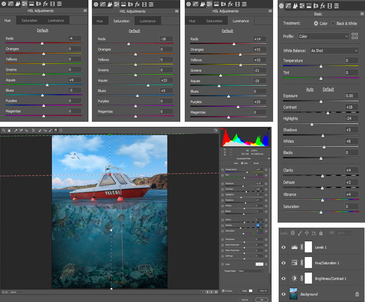
This was all the edits I planed, so finally, I added a Camera-Raw Filter to fine tune some of the settings and adjustments. I changed almost all the settings, these were the adjustments I made:
FINAL IMAGE – ANALYSE / EVALUTION
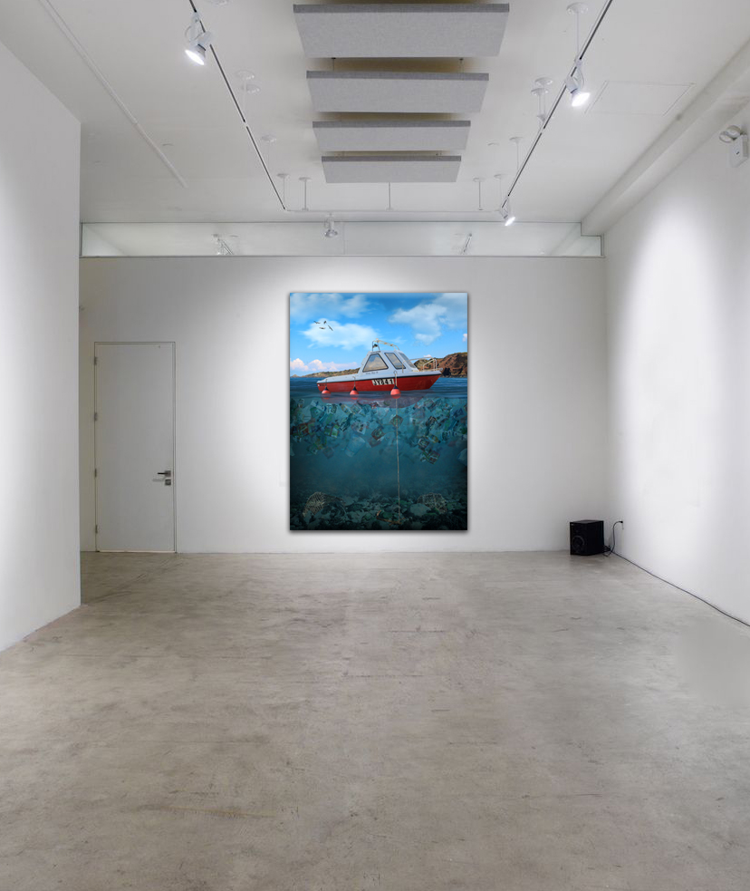
This is my final piece, it represents plastic pollution, which was inspired by Sebnem Coskun, using the style of Dillon Saw, and his altered landscapes/image manipulation. Overall, this is exactly what I said I was going to do from the start.
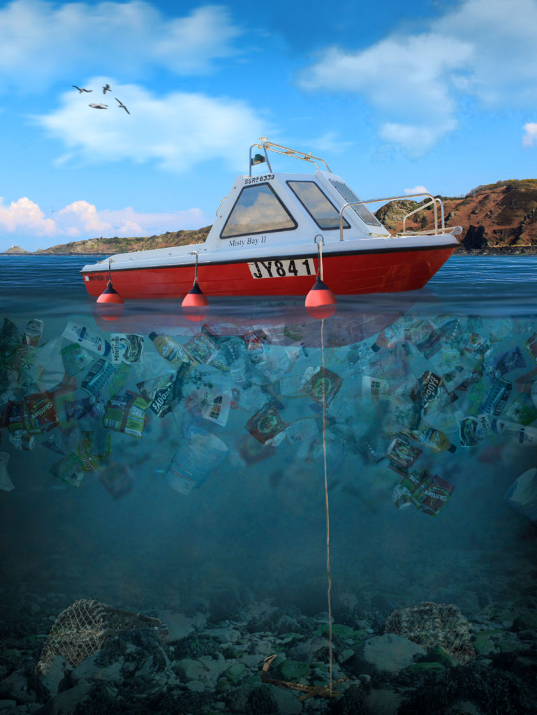
Overall, I think it turned out well! I like how it worked, and demonstrates how, we cannot see the whole plastic problem from the surface, and how we have to look at it from a different angle to see how bad it is.
This being the main piece, which I made in Photoshop. It demonstrates my editing and Photoshop skills, whilst still showing my actual photography and camera skills, as I had to envision the angles and light at which I was taking the photo. This shows how I stuck to my original idea.
I have considered how weight factors in. The bigger items such as crab nets sank, and the light plastic items floated, although some were being held underwater as there was no room the reach the surface, due to the amount of plastic in the sea.
The composition is a strength, and is good as most of the image is taken up by the underwater part, which is the main part of the image. And it holds the message that I want to get across, which is, “ocean pollution is a huge world wide problem.” I chose to do it portrait as, if I did it in landscape there would be empty space.
There is a heavy contrast in colour between the two “worlds”. The underwater section is more green, which signifies freshness and materialism, which juxtaposes the waste in the water, that varies in material, due to the type of rubbish. The sky is a nice, colorful, and vibrant blue, which is the main type of contrast in this image, other than clean vs dirty.
CRITIQUE
There are 2 things I don’t like about the image I made. Firstly, how blue the underwater part is, I would of liked it to be more green, but this is not a big deal. And secondly, I don’t like how the plastic didn’t really overlap. When I tried to overlap them some pieces got lost and turned invisible. Also, I would of moved them up to the surface more, although, I wanted to show that the boat was floating, without covering the bottom of the boat with plastic.
DISPLAY
I got an image of an empty gallery on Google, the brought it into Photoshop and put my image onto the wall. I resized it and added bevel and emboss and a drop shadow at 90 degrees. This added a 3D depth to it, therefore it looked more realistic.
The website that it downloaded the image from.
COMPARISON


On the left is my final image, on the right is that same image without and adjustment layers, shadows, and highlights. This shows how much editing I’ve done, and all the 300-400 layers there that made this piece look much better.
MY IMAGE VS COSKUN
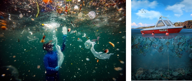
My image is on the right, Coskuns photo is on the left.
Starting off with a Venn diagram, to visualise the similarities and differences.
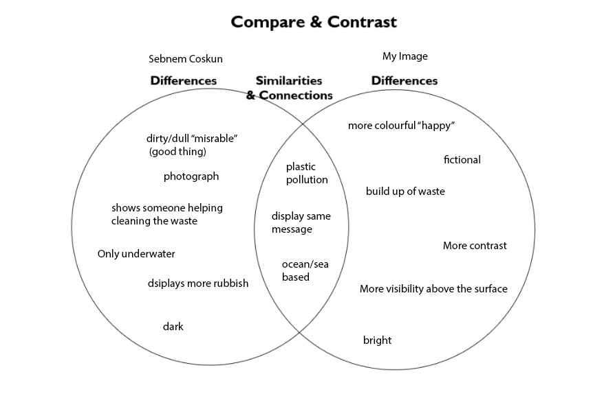
As you can see both take on the same concept, which is plastic pollution and the view from underwater.
Coskun’s work being and actual photo, and mine being a digital art piece which implements photography. They shares some similarities, Coskun’s has more depth, this is because she took it deeper underwater, where as mine in the perspective from between the surface and underwater.
Overall, Coskun’s image has more of an impact, just because it is an actual photograph, so when people look at it they realise that, this is actually happening and is a real thing. On the other hand, my piece is fictional, despite being modelled and based of real references. But people know its not reality. Its more of a concept of reality, using conceptual realism. However, both imply the same message about ocean plastic pollution, and how it is a real thing.
MAIN PIECE PHOTO SHOOT / PLAN
For my main piece, I am creating a photo manipulation to raise awareness about ocean pollution, so I need photos of :
– Rubbish
– Fishing Gear (nets, buoys)
– Underwater
– The sea
– The coastal headline
– Boats
– Rocks
I made a table to visually display all the photo shoots I need to do for my main piece.
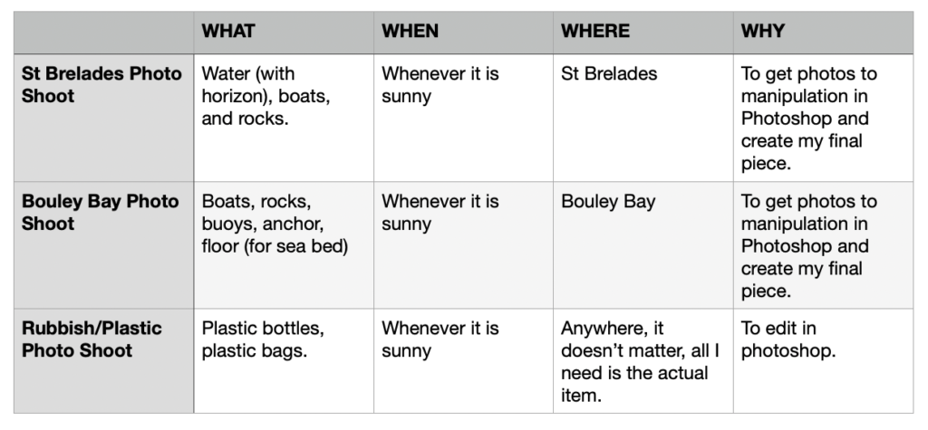
ST BRELADES PHOTO SHOOT
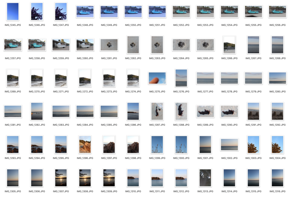
I went to St Brelades in the evening when it was clear, and took photos at the end of the beach that the pier was at. Then moved towards Quasine. Firstly I took photos of the boats in the sand, then in the middle of the beach, I took photos of the sea with the horizon in. I plan to make that the surface of the sea in my final piece. After went to the rocky area, and took photos the larger rocks.

BOULEY BAY PHOTO SHOOT
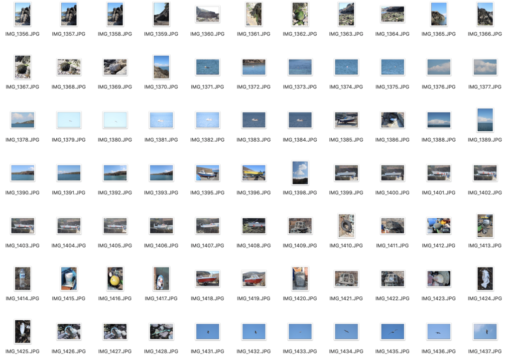
I decided to get more photos, as I didn’t really like the lighting and the reflections of the sunset from the St Brelades photo shoot. Firstly, I started near the island to get photos of the rocks. Then I went to the end of the pier where I got another photo looking out to the sea. Then lots of photos of boats, and there was a man putting his boat into the sea, so I was able to get a clear picture of the bottom of the boat, which had some buoys on. Additionally, I got some pictures of sea gulls, which I could add into the sky. in Photoshop.
RUBBISH / PLASTIC PHOTO SHOOT
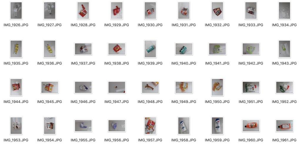
I took photos of various waste and plastic items, such as, plastic water bottles, plastic bags, crisp packets, and, cans. Nothing complicated, I positioned the subject in the centre of the frame, and for the items that had weight like plastic bags, I filled with air to make it look like it would be floating, so it would be easier to blend in Photoshop, and not look out of place.
SECOND PIECE PHOTO SHOOT / PLAN / (If I have spare time)
If I have spare time I plan to create a photo manipulation of space. For my photos I need :
– Galaxy
– Foreground photo (white house in St Ouens)
– Moon
GALAXY PHOTO SHOOT
I would need to go to a place where there is no light pollution. St Ouens would be a good place. I would need to bring a tripod and a camera. The camera settings would be at the lowest f-stop number, manual focus on the brightest star, wide angle lens (35mm), 800-3200 ISO, shutter speed is 25-30 seconds, but no longer as it would create star trails.

FOREGROUND (WHITE HOUSE) PHOTO SHOOT
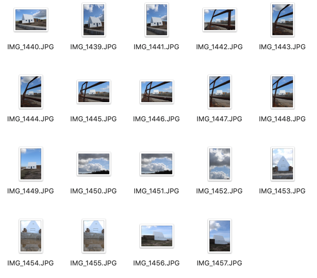
I need a subject that would be the foreground, I chose the White house. I would need to go when there is natural light, so I went in the morning (10am) as there was good light and no people.
MOON PHOTO SHOOT
I chose to take photos when there was a full moon. I would use the same setup as the galaxy photo shoot, except the lens. I would use a 300mm lens the capture the moon, with a 1 second shutter speed.

WHAT IS CONCEPTUAL REALISM?
Conceptual realism is the theory that abstract universals, unobservable general classes or ideal types have a reality that is independent, equal and sometimes superior to the reality of their individual parts or specific examples.
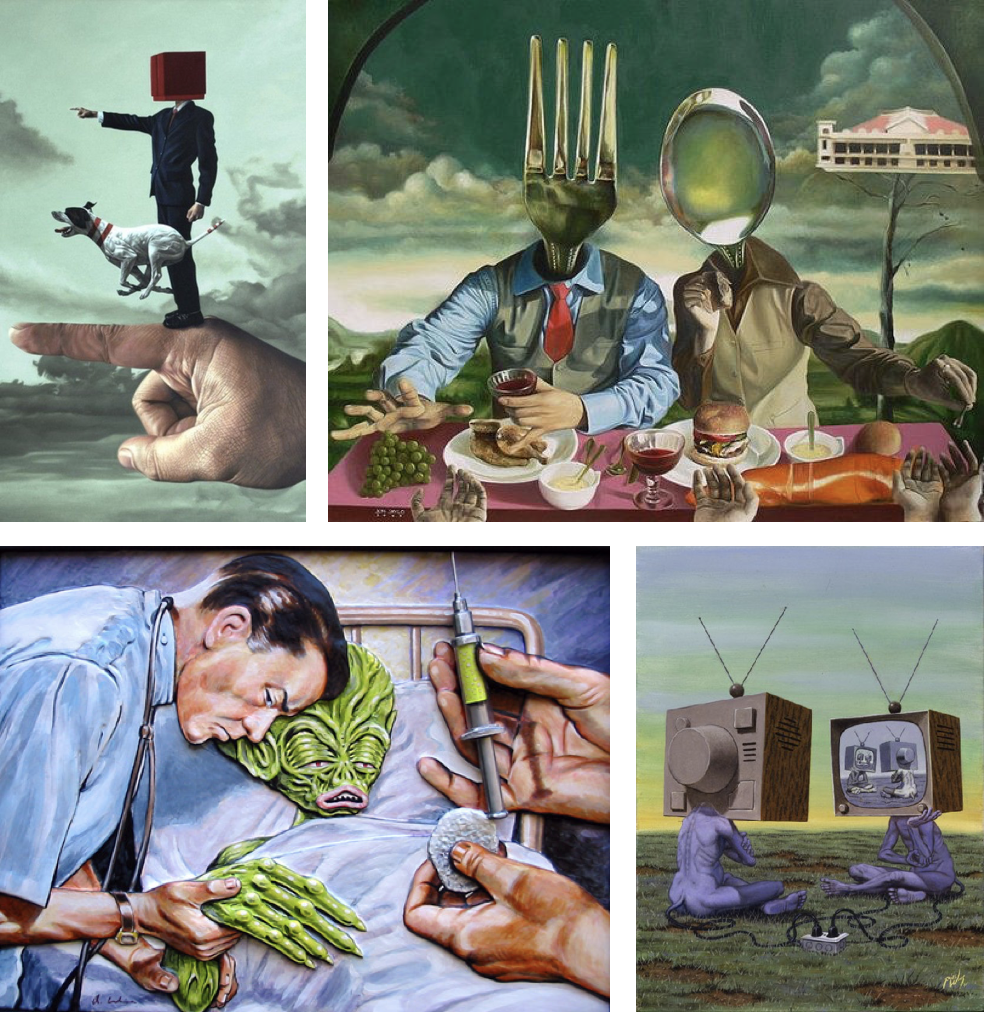
These images display the “abstract universals” to an extreme extent, almost what someone is imaging or a weird dream.
The first one shows how it can be almost realistic, and this is the style which I will base my main piece on, as well as Dillon Saw and Sebnem Coskun.
HOW IM GOING TO ACHIEVE THIS?
I my case, I am going to create a piece which visualises conceptual realism on the topic of plastic pollution. I will create a crazy concept promoting the negativity of plastic pollution, all whilst staying in the boundaries of when someone sees my work, they ask themselves, “Is that a photo?” and “Is this real?”
The word Anthropocene is largely used in science and was a word given to our current geological epoch, being the stage in the geological time scale where humans are having the greatest effect on the earth in an environmental and climate viewpoint.
This word was adapted by a group of photographers who began to take initiative into creating a visual perspective for how humans effect the earth.
Anthropocene focuses on concepts such as pollution, recourse mining, urbanisation, deforestation, climate change and so on, all as a result of human activity.