Category Archives: Reading

Filters

Author:
Category:

Essay – Archives

How do archives function as repositories of knowledge?

An archive is a collection of historical documents/records which provide information about a place, institution, or group of people. An example of an achieve is Jersey Archives, starting from 1993 Jersey Archive has collected over 300,000 archival records and, it is the island’s national repository for holding archival material from public institutions as well as private businesses and individuals. The Jersey Archive can offer guidance, information and documents that relate to all aspects of the Island’s History. Although, the most common reason for using an archive is to settle legal claims, clarify family history, they are also extremely helpful for historians, filmmakers and authors, as it gives them a sense of the way’s things were.

Archives collect primary source materials such as student newspapers, yearbooks, directories, documents related to groups and organizations, photos, and art pieces. Archives are mostly organised into fonds. A fonds is the entire body of records of an organisation, family, or individual that have been created and accumulated as the result of an organic process. Each fond is kept separately from other fonds to prevent the records from becoming disorganized and mixed up with other information, which would mean that they become inaccurate.

Société Jersiaise, is a photographic archive with a collection of 100,000 images dating from the mid-1840s to the present day. It was founded in 1873, for the study of Jersey archaeology, history, natural history, the ancient language and the conservation of the environment. There are approximately 35,000 historical images in the photographic archive are searchable online. Société Jersiaise also have an extensive library with access to may publications and records relating to the island’s history, identity and geography.

William Collie was born in Skene, Aberdeenshire, Scotland in October 1810. He stared his creative career as a professional portrait painter. Later he moved south, to St. Helier, Jersey in 1841, where he had a portrait business. He became one of the earliest photographers working in the Channel Islands, operating from Belmont House, St Helier. In the late 1840’s he made a series of genre calotype; which is an early photographic process in which negatives were made using paper coated with silver iodide, portraits depicting ‘French and Jersey Market Women’ which were well received by the photography critic of the Art Union (1 June 1847) who compared them to the work of David Octavius Hill, who was a Scottish painter, photographer and arts activist. These studies were later exhibited at the London Great Exhibition of 1851.

The Société Jersiaise Photographic Archive lists 157 photographs by William Collie. Although none of them are available to view online, due to copyright. However, you can still see them on some websites. The vast majority of the 157 images listed on the Société Jersiaise website are portraits, but there are four pictures of Jersey scenes which, if the information in their records is accurate, they are of, the church of Scotland (Not Jersey), Mont Orgueil Castle, houses on Queens Road, a granite, thatched cottage. One of his most famous portraits listed on the Societe Jersiaise website is of Elie Jean Filleul, who died aged 102 in 1851. From these images we can gather information about the history of St Helier, by using old images of streets and buildings. Also, we can identity the fashion and lifestyle in the 19th century.

William created his images using a photographic process called calotype, also called talbotype. Calotype comes from the ancient Greek word “beautiful” and “impression”. It is an early photographic process introduced in 1841 by William Henry Fox Talbot, using paper coated with silver iodide, once its dried it is floated on a solution of silver nitrate in a dark room, which forms a photosensitive silver chloride compound on one side of the paper. This is then dried and ready to be exposed to light. When exposed to light the silver chloride darkens, creating a negative image. Which is made to make multiple positive prints simply by playing the negative onto a sensitised piece of paper and exposed to light.

Elie Filleul - Jerripedia
Elie Jean Filleul

Collie’s image contains a good, high contrast as the highlights are bright and the shadows are dark. This is a good aspect to have in portrait photography as it defines facial features. Collie’s image is very clear and sharp even though it was taken in the 19th century. It contains highly detailed textures and patterns; this is due to the fact that it was processed in a dark room using multiple chemicals. This is why the edge is overexposed and has the fading look. Collie’s has positioned the subject in the centre of the frame to draw attention to them, which is an important aspect in portrait photography. By including props, like walking sticks, bowls in the background and a child, it creates a scene and a story which relates to the person being photography. We can tell by the image that the subject is of age due to a beard and the walking stick. This juxtaposes with the child on their lap.

In conclusion, archives are a good repository of knowledge and historic information, they are a good way to reflect on the past, as the contain historic photos and documents which can be compared to the present day. This shows a comparison of what life was like and how it has changed. The photos from the archives can help develop my project, as it displays different cultures and communities, which I can juxtapose to the current day and show how much they have changed. I can also use the archives to get photos to compare past and present buildings, this creates a comparison which shows a positive outcome.

Jersey museum analysis

On Monday June 7th, the school had arranged a trip to go to the Jersey Museum to discover an exhibition called ‘ People Make Jersey’. The exhibition showcased how immigration has influenced change in jersey from cultures, buildings and why people decided to immigrate to Jersey over the centuries. We learnt that in the 19th century that the jersey economy was boosted increasingly due to wealthy immigrants coming over. These individuals mainly came over from the UK or British colonies due to the attraction of the tax scheme, mild climate and for the way of life of living on the island. Due to these high value residents coming over to Jersey, this helped with creating local jobs and contributing to the growth of St.Helier in this time period.

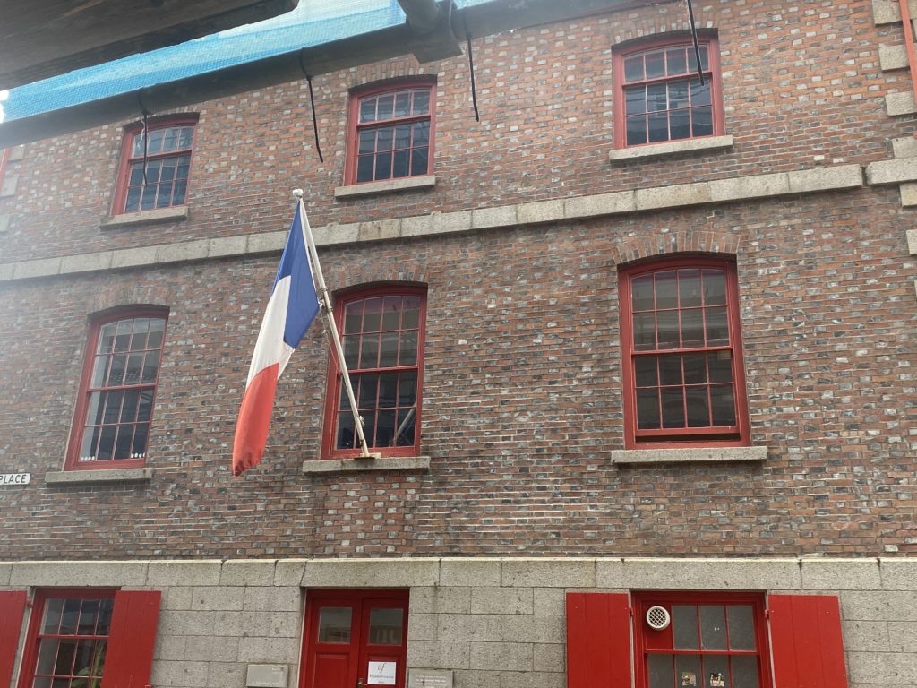
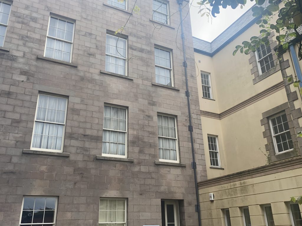
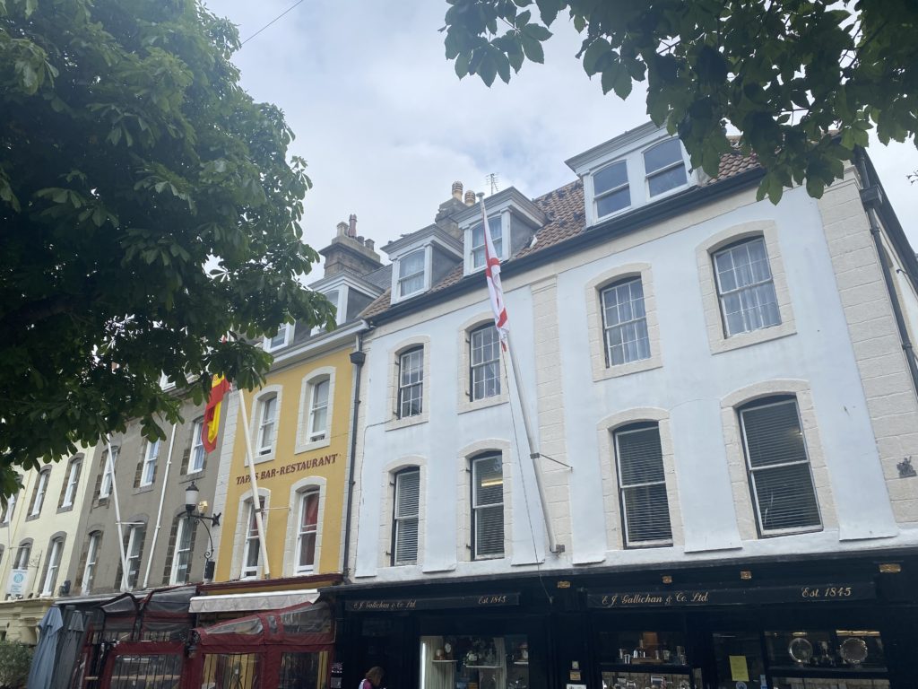
After we went around the museum taking pictures of a rich merchants house, we went out on a walk through town with Stewart to take pictures of buildings and chimneys that had a lot more meaning behind them than anyone thought. For example there where buildings that have bricks which where darker than the others and the reasoning behind this was because those brick’s had been charred for a longer amount of time then the other brick’s in the process of making them. As for the yellow chimneys, we got told that they had some sort of military meaning behind them for the Jersey military in understanding which of those buildings that had the yellow chimneys where owned by the Jersey military.

Identity And Community Photo Shoot 2

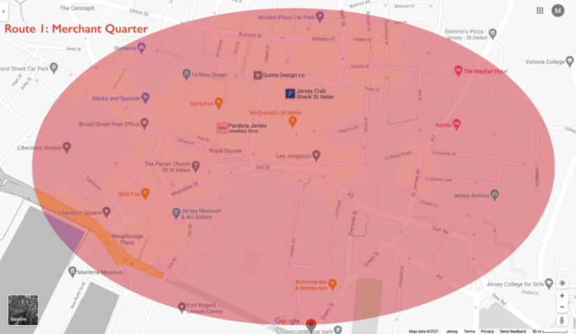
We went on a walk around the Merchant Quarters, and took photos on our walk.

Route 1: Merchant quarter around St Helier Parish Church > Royal Sq, Library Pl, Bond St, Broad St, Mulcaster St, Hill St, Snow Hill, La Motte St, Colomberie > follow onto Ann St, Hillgrove St (French Lanes), Wesley St, Ingouville Pl, Belmont Pl/ St towards Minden Pl, Rue de Funchal walk towards Val Plaisant towards St Thomas Church.

Editing in Lightroom Classic

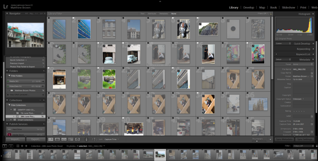
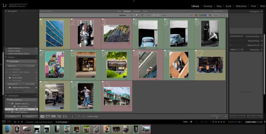
I imported all my photos from the walk into Lightroom Classic, then used the P and X method to filter out the good/bad images.

Example

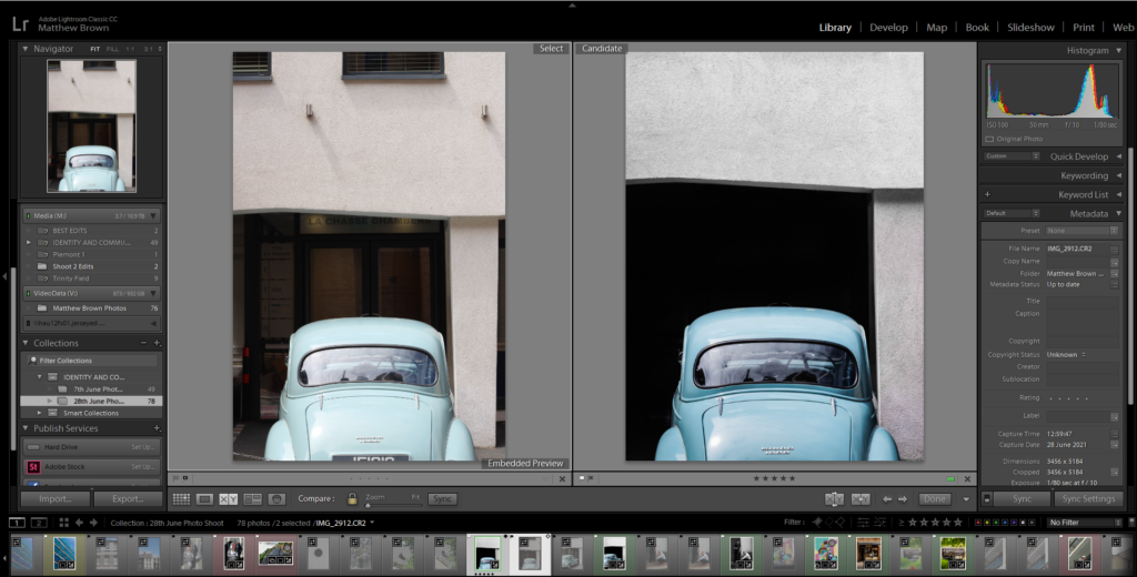
This is an example of my editing process using the 2 images of the old cars.

BEFORE AND AFTER

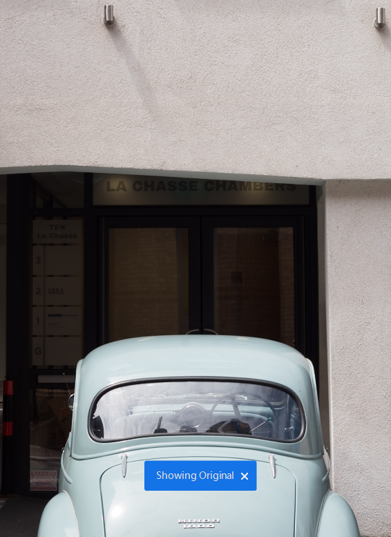
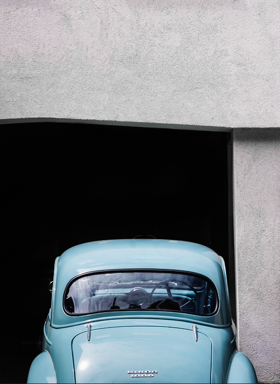
For this edit, I wanted to show how simple life was in the old days without technology and other distractions. I started by removing the detail in the background where the door was. I then removed the modern lights on the wall with the spot healing brush, as they conflicted with the old car, as it is the main focus. I used the adjustment brush, to create a mask on the background then brought the shadows, and blacks down to make it completely black, to create a simply composition, made from the white wall, black background and the car.

BEFORE AND AFTER

I used the same process as the other car image, so they would match in a collection. Then I used Photoshop to edit the chain out of the photo, as it was distracting.

Editing a monochrome image

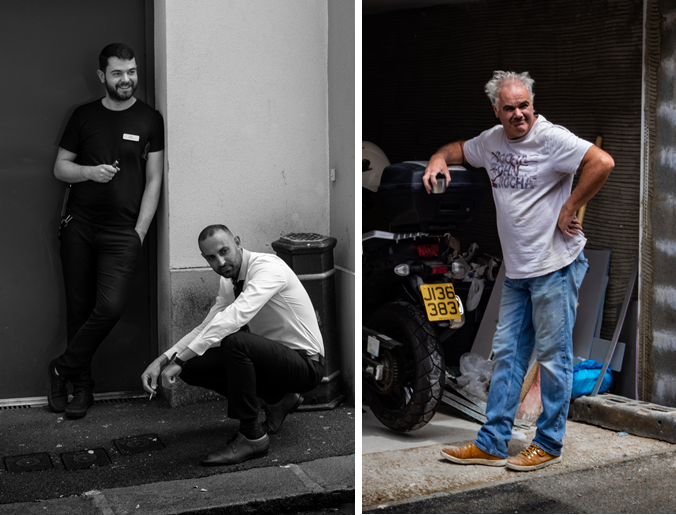
I made this photo into black and white to add more mood and make it more serious. The composition of the subjects is good as they are at different heights. It would of been better if they swapped places, so it wasn’t black on black, and white on white.

Final Image Selection

Meaning of the colours:
– Green = Good
– Yellow = Medium
– Red = Bad

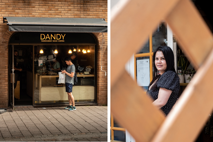
All the green colour coded images are the final images, and will be displayed below.

Final Images

Analyse

Overall, I like how my images turned out. Most of the images were colourful, and used different techniques.

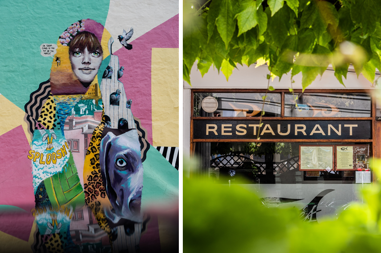
The street art image was taken using my phone as a reflection, so that way I didn’t have to include all the people walking on the pavement. Instead, it created a unique reflection.

The restaurant and the portrait of the lady, were both using the framing technique. It helped removed unnecessary features and it leads the eye to the subject.

I really like the images of the cars. I was able to accomplish the simplified style I was going for by darkening the shadows, and removing modern light. the teal/light blue car really stands out against the white walls, and dark floor and background.

CONTEMPORARY Artist Inspiration – Dana Lixenberg – (Identity And Community)

Who is Dana Lixenberg?

Dana Lixenberg (born 1964)s a Dutch photographer and filmmaker. She lives and works in New York and Amsterdam. Lixenberg pursues long-term projects on individuals and communities on the margins of society.

Her most recent project is called “Imperial Courts”, and was made between 1993-2015. It is a project about Imperial Courts, a social housing project in Watts, Los Angeles. The project contains work made over a period of 22 years and consists of a book, exhibition and web documentary

“Austere and involved perspective” was her style as quoted by Muse Magazine, by one of her most great supporters.

Mood Board

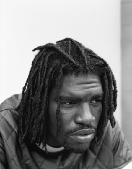
This images were constructed from Dana Lixenberg’s website in the Portrait section.

Analysis – “Brian” – 2015

Firstly, Lixenberg has positioned her subject in a way which creates a moody composition. The subject, isn’t making eye contact , which signifies anger and wanting to be alone, to not talk to anyone. The subject is also slightly leaning forwards to create an engaging pose, and he has his body and shoulders slightly away from the camera for a more natural feel.

This image was shot in natural daylight, so the subject is well lit. It is most likely a overcast day, as the whites in the image aren’t overexposed, and there are shadows on the subject face, which helps to create depth and define facial features.

Lixenberg used a low aperture e.g. f/1.8 and focused on his eyes, to completely blur the background which helps keep the focus on the subjects face. It also slightly blurred the subjects jacket as well, which created a distinction between his chin and the jacket has they are of similar colour. The background is a good choice, as is completely white, which draws attention to the subject.

Lixenberg, probably used a 50mm lens as the subject fills up most the frame. She was close to the subject to get a sharper image. The reason why I think she shot with a 50mm lens, is because anything over 50mm it can make the subjects facial features seem flattened, and anything under 50mm creates lens distortion.

Overall, I like the aesthetic which Lixenberg was going for. I think it is a great image, and an interesting subject. The detail in his hair and beard help create a unique composition to demonstrate mood. The black and white effect makes us pause and look closely. Removing colour from a picture helps the viewer to focus on a subject’s emotional state.

Links

Imperial Courts introduction video made by Dana Lixenberg:

http://www.imperialcourtsproject.com/portrait/introductie-slide/#

GRIMM Gallery about Dana Lixenberg:

https://grimmgallery.com/artists/42-dana-lixenberg/

MUSE Magazine about Dana Lixenberg:

A great supporter of Dana Lixenberg’s “austere and involved perspective”, he was the first in the United States to publish a portfolio of her Imperial Courts series

https://www.musemagazine.it/dana-lixenberg/

Photo shoot In the style of Dana Lixenberg

I will plan a shoot in her style in a separate blog post. Where I get up close headshots of people using a low aperture, and a 50mm lens. I will ask people in town with interesting facial features.

IDENTITY AND COMMUNITY – PEOPLE MAKE JERSEY MUSEUM EXHIBITION + TRIP + Shoot 1

RESEARCH

On Monday the 7th of June; the last day of the exhibition, we visited the “People Make Jersey – our stories of immigration” exhibition, at the Jersey Heritage museum in St Helier.

The exhibition is based on the fact that, “Every Jersey resident has a story of how they come to be living in the Island, whether their family came here 500 years ago or five years ago. ‘People Make Jersey’ explores some of these stories and the ways in which immigration has shaped and influenced the Island we know today.”

The oldest items in the exhibition belonged to Jersey’s first permanent settlers, who arrived around 7,000 years ago. The created basic stone tools and lived in a sheltered place where they could plant their crops and raise their families.

Picture of tools, Jadeite polished stone axe and ring. These would have been brought into Jersey from mainland France around 6,000 years ago.

It then follows the waves of immigrants who have arrived in Jersey over the centuries. Some of the people were religious, which introduced different cultures and beliefs into the island.

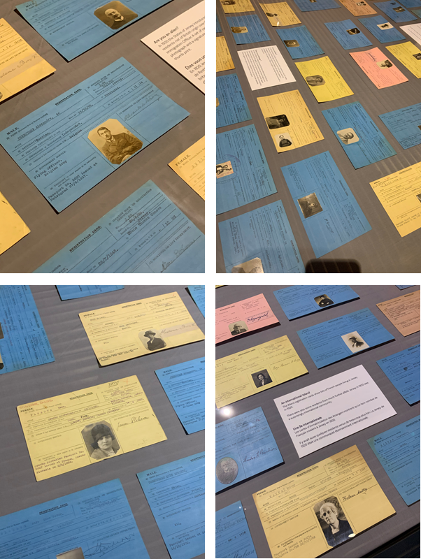
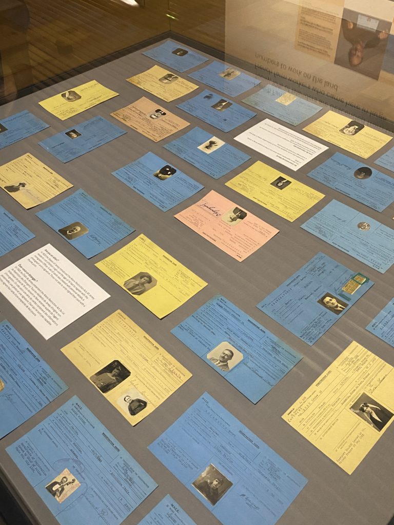
There was an glass display island in the exhibition which displayed lots of passport type cards. These were the Aliens registration cards, which show lots of French people living in Jersey in 1920.

There were also some residents from much further afield. Jersey in 1920 was a surprisingly international community. E.g. Belgium, Toulouse, and Czech Slovakia.

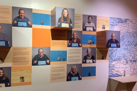
There was a wall which featured the current generation holding there ancestors registration cards, this was a good way to visualise the different cultures in Jersey and its history.

Near to the registration cards, there was a map on the wall, which mostly focused on France. It showed where some of the popular surnames originated from. In the old days the surname just meant where you were from, e.g. John Coutanche, who was from Coutances, France. These are all the names and places displayed on the map :

UK
– LANGLOIS from England
– LE GALLAIS from Wales
– HAMPTONNE from Southampton

FRANCE
– DE CARTERET from Carteret
– DE LA HAYE from La Haye de Puits
– DE GRUCHY from Gruchy
– COUTANCHE from Coutances
– LE BRETON from Brittany
– NORMAN from Normandy
– PERCHARD from the Perche region
– LE POIDEVIN from Poitou
– D’AUVERGNE from Auvergne region.

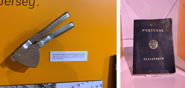
There was a wall that had items which people brought to Jersey when they first came. Each person had one item that had a significant value/memory to them. Some of the weird/interesting items was a, Potato grater, which was brought to Jersey from Poland by Karolina Klonowska, as it was very old and belonged to here grandmother, she brought it to Jersey so she could cook her favourite Polish dishes. There were other items such as dolls, passports and, musical instruments such as a flute.

Around the exhibition there were old images of Jersey maps, notes and news papers. I thought they were interesting as so much has changed over the years, for example the Waterfront wasn’t even there in the map, as it was build recently. These are the Old vs New comparisons using images from the exhibition and new versions from today.

OLD NEWSPAPER VS NEW NEWSPAPER
OLD MAP VS NEW MAP
OLD FRENCH MONEY

PHOTO SHOOTS

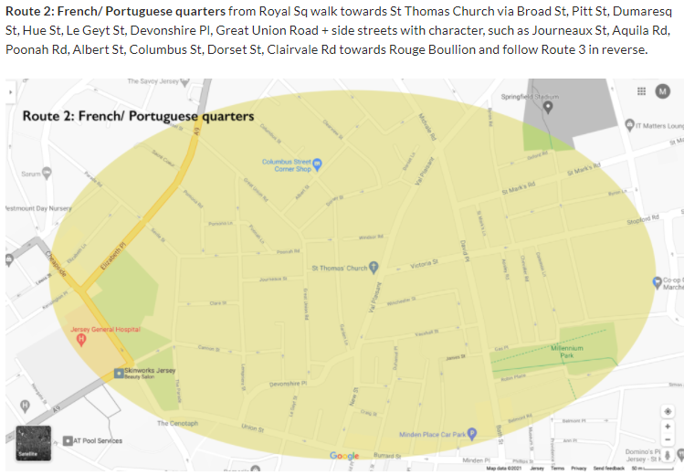
After the exhibition, we visited the Victorian part of the museum, and went on 2 walks round town. The first walk we were looking at the different types of bricks and stones in the buildings. There was this one building which have blue bricks that reflected in the sunlight (the building with the French flag). The second walk we went round town. This is a image of a map where we went. We took photos as we walked around town of the buildings and anything we saw, mainly focusing on:

MIGRANT COMMUNITIES IN ST HELIER
– a sense of place
– character of community
– people, portraiture

EDITING IN LIGHTROOM CLASSIC

I imported all my images into Lightroom from the museum trip on the 7th June.

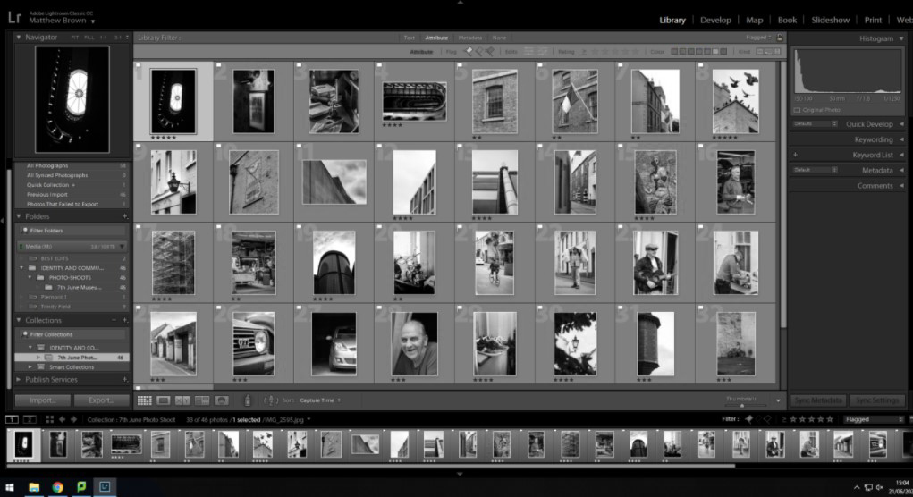
This is the selected flagged images, that use the p (pick) and x (reject). The white flag is placed on the good images, where as a black flag on the rejected images. I used this to filter all my images, which was around 300 to get it down to 10-30 good images.

I did basic adjustments to the images, increasing clarity, decreasing dehaze, increasing contrast etc. Including gradient and radial filters.

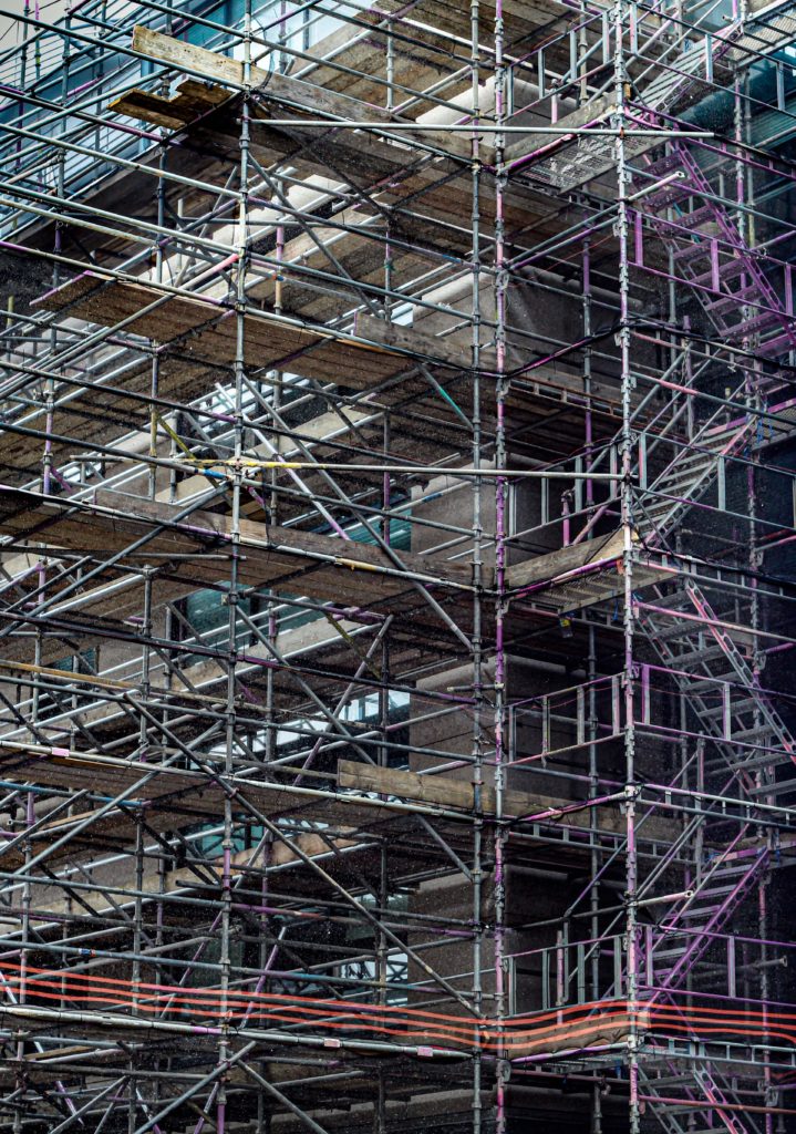
I took some of the images into Photoshop (using edit in –> Adobe Photoshop, option in Lightroom) and removed distracting elements such as ropes and security cameras.

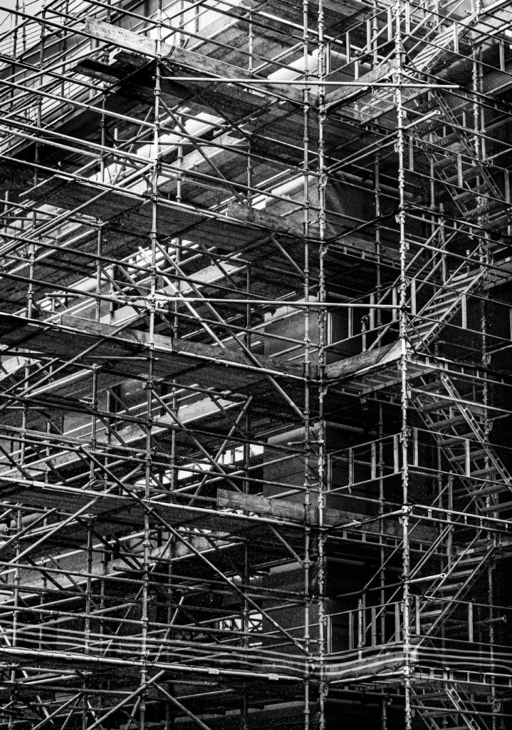
I tried a black and white, (monochrome) look to see if it would add more drama and create a moody atmosphere.

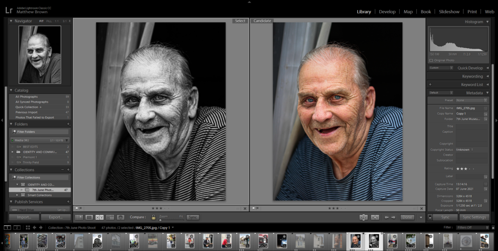
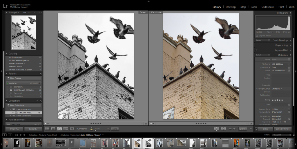
Then I used Lightroom compare view to compare the edited black and white image with the edited colour image.

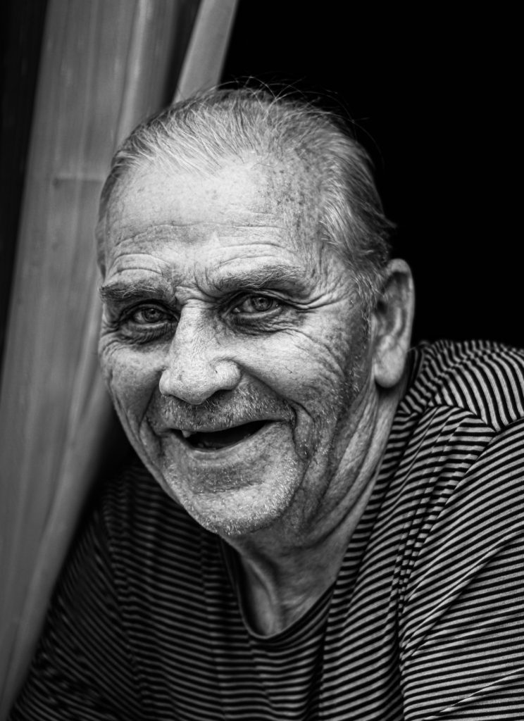
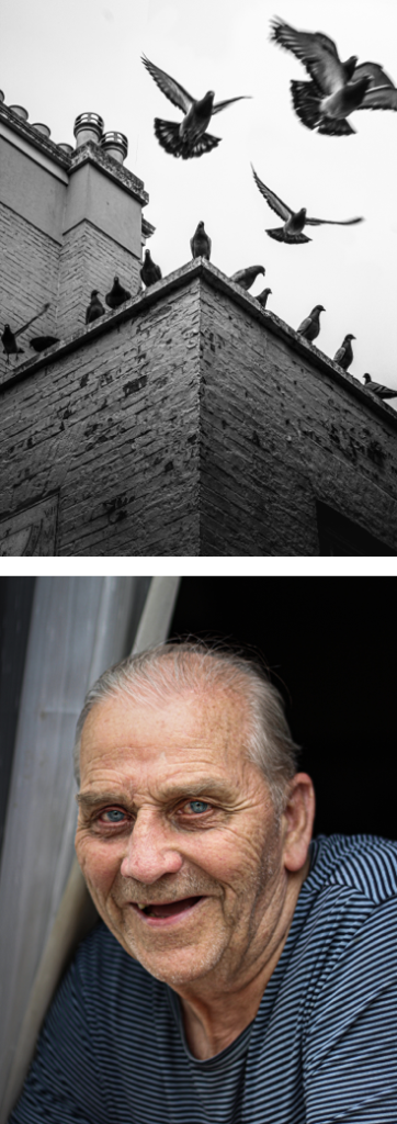
Portrait – I like how the black and white brings out the details, and adds more age to the image. This works well due to the subject being of age. Although, I prefer the colour version as it shows more personality, which is crucial in portrait photography. The detail in his eyes and mouth is more defined in the coloured image, the colours also create depth, which is hidden in the black and white version.

Detailed Image – There is lots of detail so, the black and white image separates the whites and the blacks making them more defined creating depth. It gives a cleaner look the the image, but this is not the aesthetic I wanted as it is a messy, dirty building site. Which is why I like the coloured image more, as I shows sections of dull colour between the metal poles.

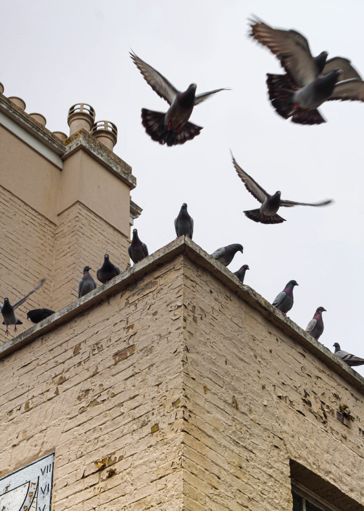
Fast Shutter Speed Image – This image shows motion in the faster flying birds, whist still freezing time as the birds fly. I like this image better in black and white, as there is more contrast and detail, compared to the coloured version. It also helps bring out the shadows in the birds more.

CHOOSING MY FINAL IMAGES

Lightroom made it easier to see all my images, as they were all in one place. Lightroom has different view features, such as, full screen, compare view, and survey view.

I used the survey view to display my good images, them I ordered them best to work using the star system inside Lightroom.

The purple colour tagged image was the best/my favourite, so I marked it 5 stars. This becomes useful when I have to make a zine, so I can just filter by 4+ stars, so I get my best images.

I colour coded my images based on its topic. Ill will try to keep it consistent throughout to year, so it is easier to find images.

The colours are:
– Yellow – Indoors
– Green – Outdoors
– Red – Portrait (environmental) / People
– Purple – Black and white photography

These are the final images in Lightroom, I then exported them into my PHOTO-SHOOTS folder in a sub-folder called June 7th Edits.

FINAL IMAGES

The larger images are my favourite ones, as there have a really nice compositions and colour.

Overall, there was a good variety of images, consisting of portraits and street photography. My favourite type is street photography, just walking around and using temporary objects to create foreground elements, since I use angles, reflections, and shapes to create my images, E.g. the car reflection in the orange street art image.

Identity And Community – ‘People Make Jersey’

People Make Jersey Exhibition

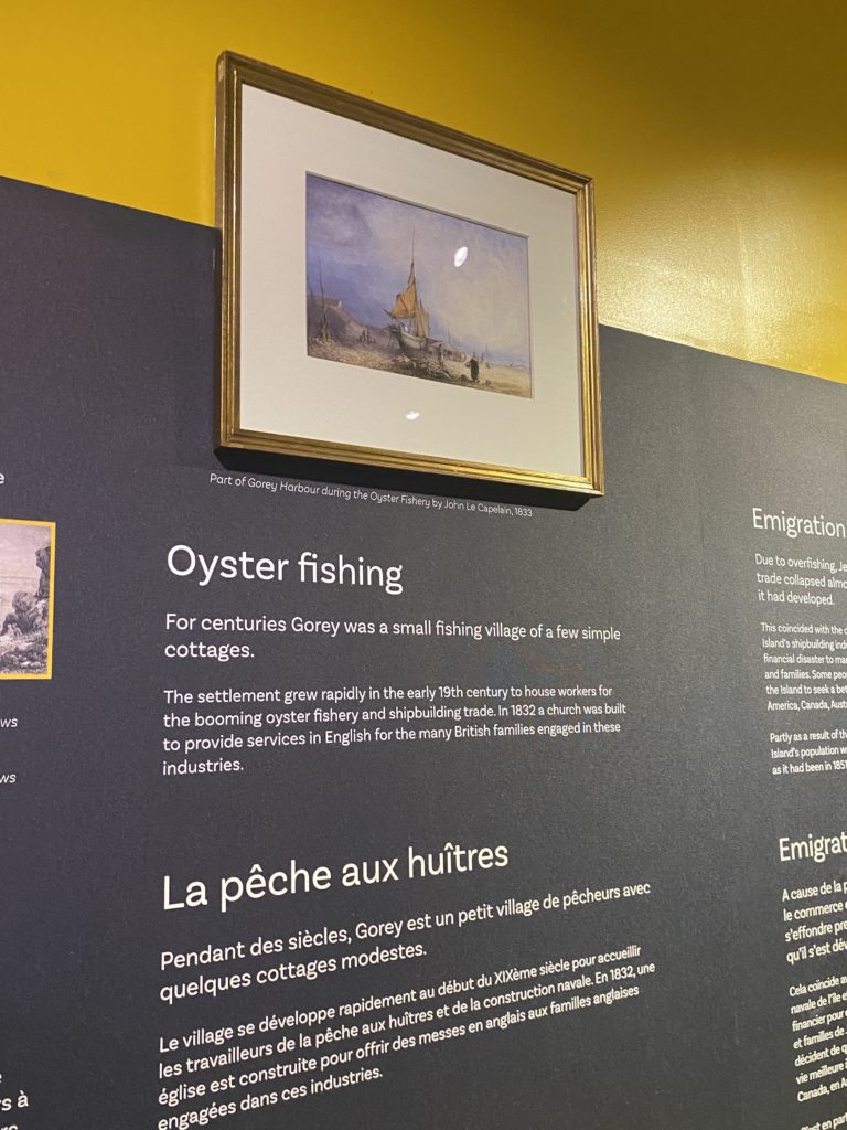
‘People Make Jersey’ was an exhibition held at the Jersey Museum which we visited on Monday June 7th. Information and facts on resident’s of Jersey’s history were displayed around the site, from farmers to local last names, the exhibition told it all. We started the day with a talk from an expert at the exhibition who took us around the area explaining different sections, such as information on religious/political refugees, economic migrants that arrived to support new industries such as oyster fishing, ship building, construction, agricultural workers and tourism.

Statement from ‘People Make Jersey’ –

‘Every Jersey resident has an immigration story – whether their family came here 500 years or five years ago. This exhibition explores some of these stories and the ways in which immigration has shaped and influenced the Island we know today.’

After attending the exhibition, I carried out some further research by speaking with my grandparents about their heritage, where their family lived, their jobs and any other interesting information on their lives being residents of Jersey. At the exhibition I was really interested in a display listing several local Jersey surnames, the display had information about where these surnames originated from and when conducting further research I wanted to discover more. When speaking with my grandmother she told me of how people of similar last names in Jersey would live in specific areas of the island. For example, my grandmother’s maiden name is Perchard; a very local Jersey name meaning ‘a man from Perche in the South of Normandy’ – many Perchard’s resided in the east of the island, in St Martin and Grouville. Additionally, when speaking with my grandfather he told me of how his father was born in Jersey and how people with his (and my) surname of Mariette were also from the East of the island in Gorey, and how many Mariette’s were fishermen. More on Jersey surnames can be found here. I found out that my grandmother’s parents were also both born in Jersey and as were their parents before that, when asking my grandmother about her parents careers she told me of how her father was the manager of a big general merchants store called ‘George D Laurens’ which was believed to be established as early as the 18th century, originally a hardware store but by the 1960s was one of Jersey’s major toy shops as well as selling general goods. I found it so interesting to compare some of my family’s heritage to the peoples I read about at the Jersey Museum, learning about their careers and lives was very eye-opening.

St Helier’s History – Stuart Fell

Later in the day, half of us joined Stuart Fell on a walk around the St Helier town centre discovering information about the architecture of this area in Jersey. We learnt about how wealthy residents who arrived in Jersey had an impact on these buildings, I found it so interesting to find out about how influential these people were in actually creating the foundations of our island. Stuart also gave us heaps of information on the different types of bricks used in St Helier’s architecture, for example we found out that brick making was once a thriving industry in the island during the 19th Century, which traded across the world, and that the most common colour of Jersey brick was red. On our walk we looked out for any red bricks in building’s chimneys, as Stuart informed us they could have been built over 150 years ago. More information on the Jersey brick making industry from islander Enid Gautier can be found here.

Migrant History of Jersey

Migrant history of Jersey

On the 7th of June 2021, Hautlieu Photography class got to take part in a visit to the Jersey museum where we were the last to see the exhibition: People Make Jersey.

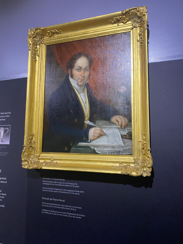
During the exhibition we got to learn from a wide variety of topics the types of people in Jersey. For example, we got to learn about how French Protestants found refuge in Jersey since in 1572, the Massacre of St. Bartholomew, the Catholics killed thousands of Protestants. It wasn’t until 1598 that King Henry IV enable citizen rights to the Protestants, but by then they have found refuge in other places, such as Jersey. We can see the Protestants impact on the island nowadays since there are many protestant churches still running service, we have Jehovah’s witness’ still in operation and many of the older generation are Protestant and attend service.

I, personally, took interest in my own culture and managed to find a beautiful love story from 1930s – 40s. In 1930s, Edouard Alho came to Jersey from Madeira (my birth-place) to work as a waiter at the Merton hotel, he then became the head waiter. During World War 2, he went back to Portugal but came back in 1948 and got marry to a beautiful local girl named Betty. He then watched Jersey get back together, the Merton hotel become of the largest hotels in the channel islands. He then retired in 1984 after 50 years of service for the Merton.

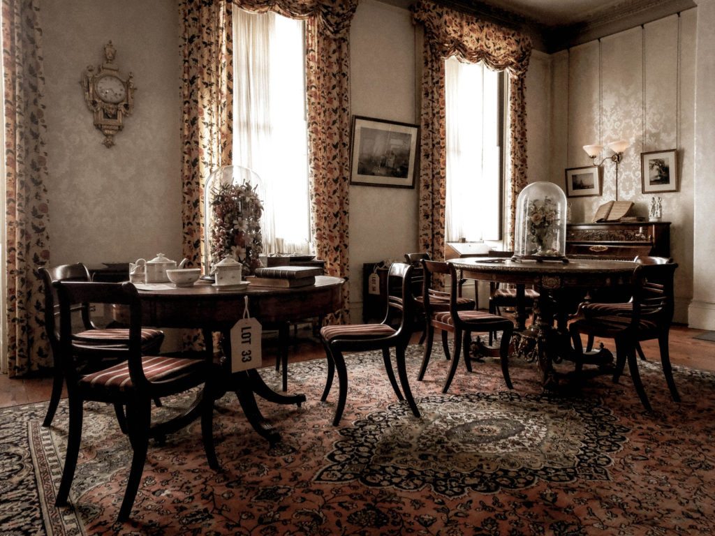
In addition, we got to learn about how rich houses were structured back in the 20th century. For example, we got to learn about the drawing rooms: the drawing room was considered to be the heart of the home. This drawing room from the museum was made by a Jersey man, Mr Philippe Nicolle Senior. He used carpenters from his own shipyards to lay the beautiful wooden floors. They would also caulk the boards with tarred strings since they had experience from the deck of a ship.


The Drawing Room

For his drawing room, Mr. Philippe was wise investing in the new gas system rather than oil in 1830. The family also beautifully decorated the room with luxury having wallpapers made by the renowned French manufacturer Jean Zuber & Co, established in 1797, maker of the finest hand blocked papers.

The residents also enjoyed music as you can clearly see by the upright piano with a large selection of sheet music housed in a charming burr walnut cabinet. As seen below:

Since our society used to be a patriarchal society, the ladies really appreciated the tables in which to do their needlework. The table includes tea or play-cards, an exceedingly ornate table made by the Hollands with the highest quality marquetry of mahogany, rosewood, satinwood and a manner of exotic woods, occasionally formed into portraits of famous artists of both the modern and ancient worlds.

To entertain the visitors, the room contained a perfect tea set made in the finest porcelain by the New Hall factory. Also, the paper Mache chair and japanned table are excellent examples of the New Hall factory. The chair, inlaid with mother of pearl, is in the latest London fashion.

As you can powerfully observe, we have learnt a lot from our trip to the museum. We learned about migration in Jersey, the contents of the finest rooms and how Jersey has changed over the years.

Therefore, the visit to the museum was very useful and inspirational.

Anthropecene Evaluation

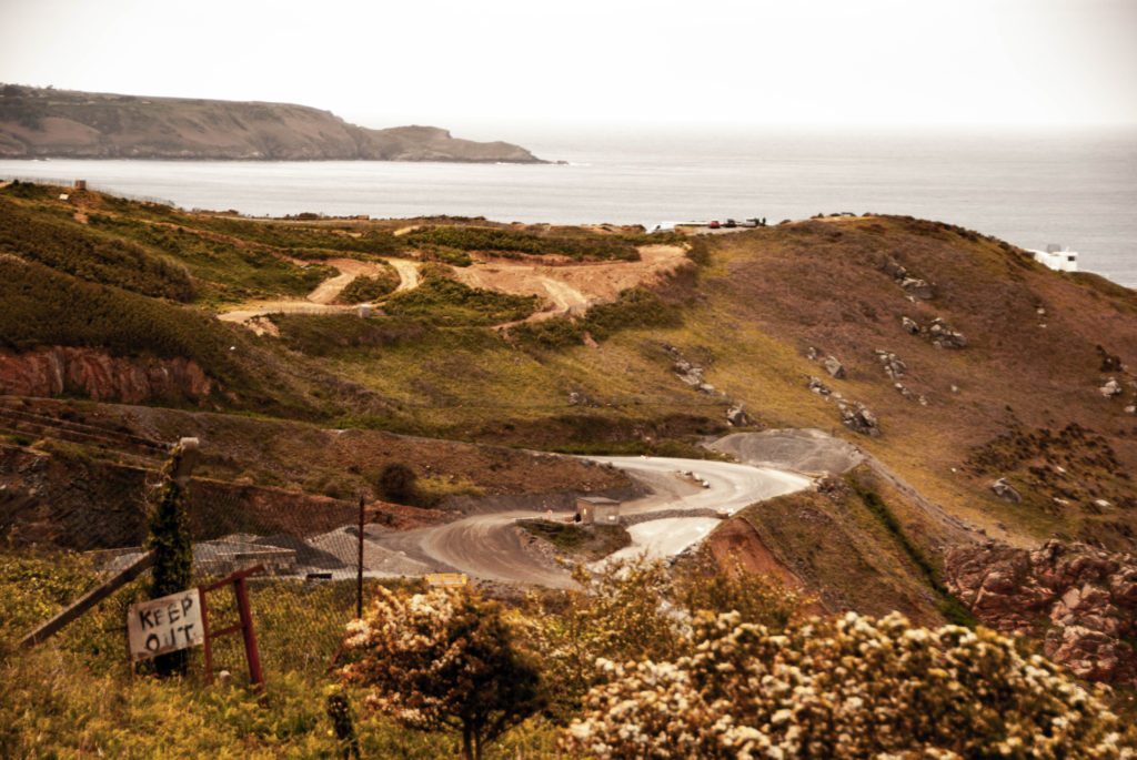
My original intentions where to shoot more landscape images with a wider perspective. Although I did manage to complete this for a few images, my focus shifted more towards a more close up look at Anthropocene landscapes and more abstract methods of capturing the argument between man and nature.
I believe the process of researching and reacting to Anthropocene in a creative and technical manner as a whole was sacksful as I gained a lot of knowledge about the topic and developed my skills in terms of how to react to it. I believe I gathered and edited a successful range of images which react to the topic well.

Anthropocene Final Display

A3

I chose the above three images as they link really well with Anthropocene.

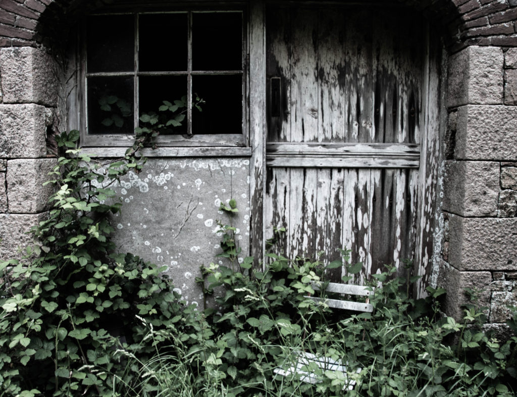
The owl sleeping in the barn window fits really well as the natural lighting beaming through the window romanticises the creature and the leaves behind it and the bubble wrap floating in front of its face represents man’s impact on wildlife. The owl is also framed really well in the window.

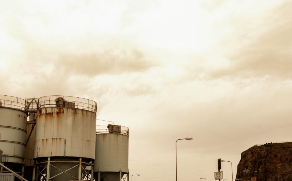
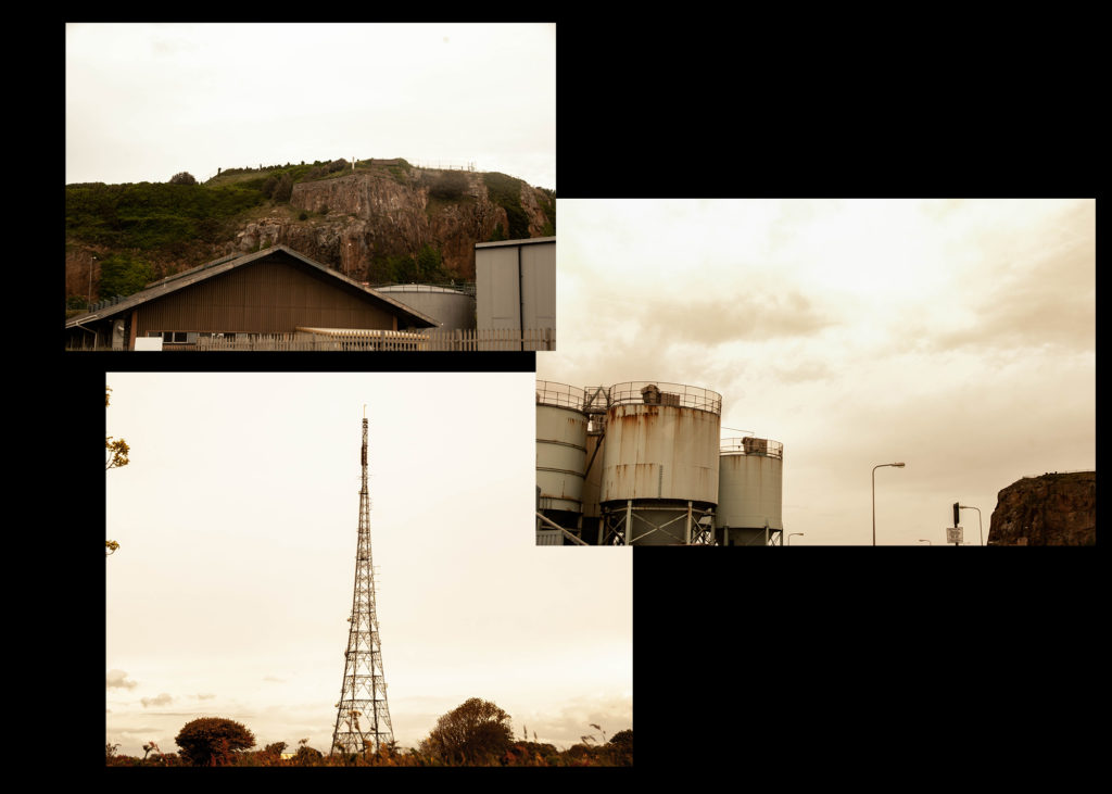
I chose the other two images because of how they represent ideas of industrialism and how their colour scheme reacts well to George Marazakis’ work.

A4

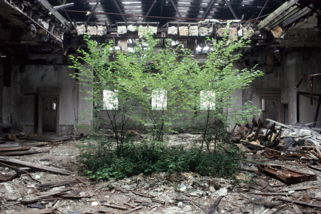
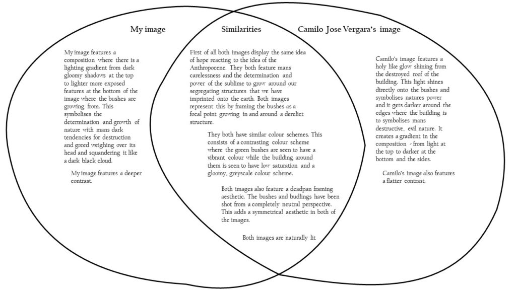
The above three images relate well with this project. The deralict land rover with the trees growing around it reacts well to Camilo Jose Vergara’s work and it features the idea of nature fighting back against man.

The two other images relate well to George’s work as they feature a vast landscape with subtle clues of man’s ‘disease’ on the natural environment.

A5

I chose the above three images as they all represent Anthropocene well. The second image is framed well and has a lot of leading lines which makes it an impactful image to represent the idea of deforestation.

The graveyard represents the death of humanity and the idea that nature will always flourish with the vibrant leaves enveloping the bleak gravestones.

Framing and Manipulation

I chose to form a triptych out of the images above as they all present the same theme of man’s destruction and all have a similar colour basis of a greyscale juxtaposing with a deep, vibrant green/emerald colour.