Category Archives: Independent

Filters

Author:
Category:

The World is Beautiful

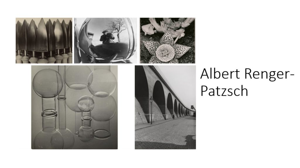
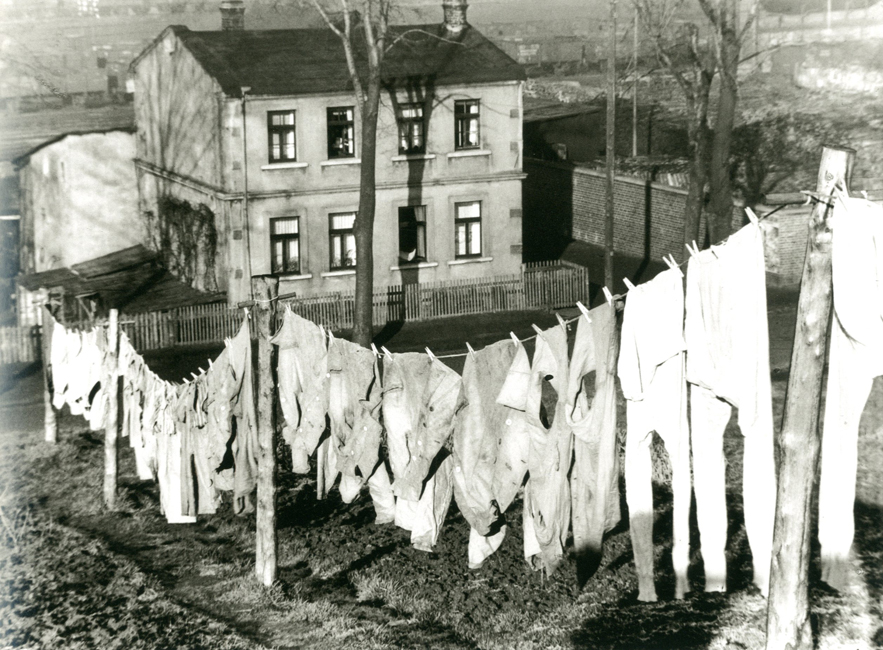
Albert Renger-Patzsch was a German Photographer born in who specialised in black and white landscapes capturing the beauty of the natural world and also its man made elements specifically industrial architecture. He often shot in harsh lighting which gave his images long shadows and a large tonal range. He liked to shoot ordinary scenes from a unique angle. A lot of his pieces also had rhythmic features as he shot a lot of repeating items. He was also associated with New Objectivity Movement.

Albert arrived to photography when a new generation of photographers were moving away from pictorialism. His work reacted to expressionism, a way to face a reality and to have a figurative approach about photography.

Albert Renger-Patzsch started his work in nature, He drew the eye close to natural elements of the word around us. As he moved on, he began to focus more on modernity and drew our eye to more dynamic angles of our world, his favourite way to do this is by shooting industrialism and in addition to this he focused on how humans have changed the landscape around them.

In his book “The World is Beautiful” he creates a metaphysical description of the world in 1928. There is a thematic progression in the book; it starts with nature and then animals, then landscapes and the world constructed by man and he finishes it with an ambiguous image of a persons hands instigating they are preying or begging. He was aware of a transformative perception that was taking place in the 20s

The new objectivity movement was, simply put a style of photography that emerged out of Germany in the 1920s reacted to expressionism in a way that focused on the objective world. Some of the other artists involved in the era were August Sander and Karl Blossfeldt.

I think another photographer that has been influenced by the new objectivity movement is Henry Wessel. Henry shoots ordinary scenes and withdraws the beauty from them.

Image Analysis
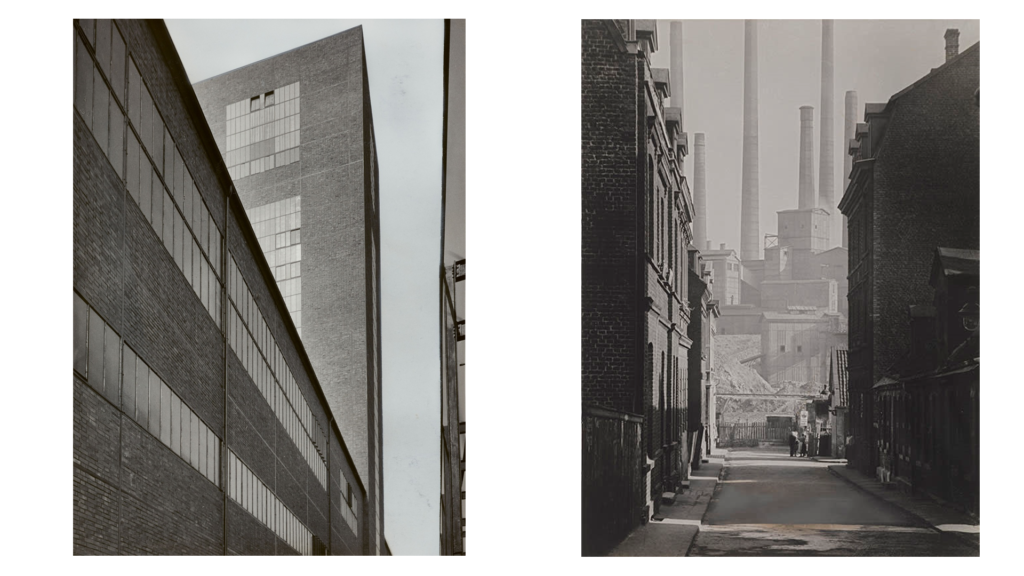
The similarities in this image include:

  • They are both industrial settings which are man made.
  • They both have leading lines which make your eye travel down the length of the image.
  • They are both shot with a lot of light and therefore possess a large tonal range
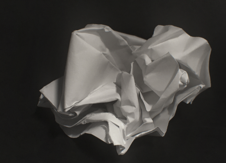
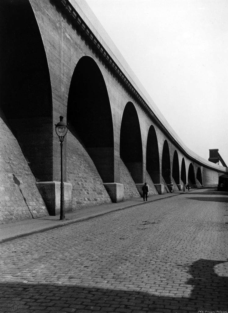
  • Both images have a repeating rhythm, the image on the left has repeating geometric window frames and the image on the right has repeating factory chimneys.

The differences in this image include:

  • With the image on the right albert has framed the industrial factory between the two street side buildings, whereas when he took the image on the left he did not frame the building.
  • The image on the right has a greater depth of field
  • The image on the left is more geometric, this is created by the perfectly rectangular and uniform windows and the sharp corners everywhere.

My reaction to Alberts photography:

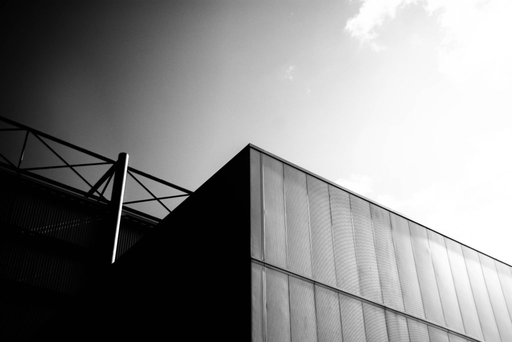
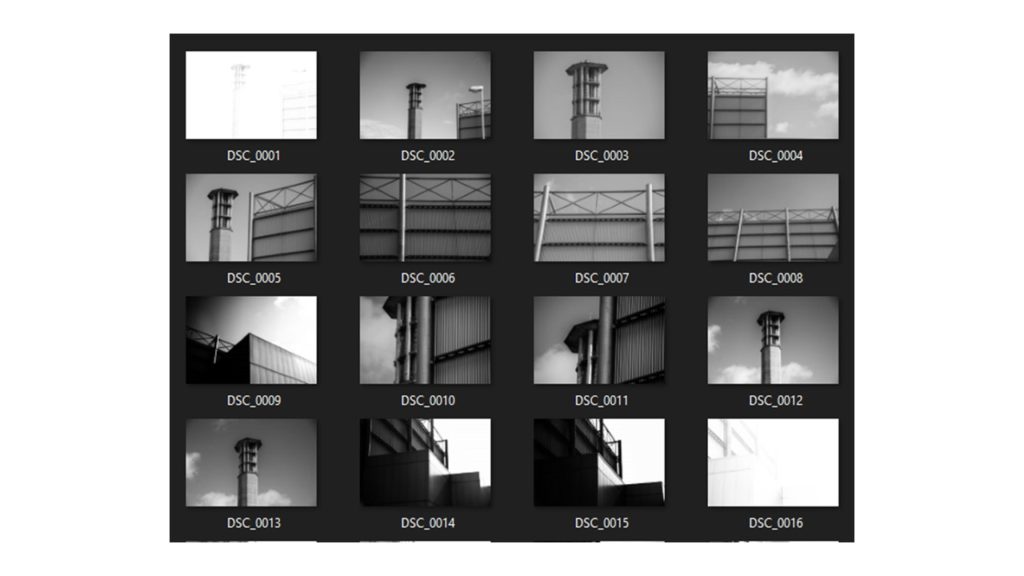
I exercised shooting interesting angles, macro framing and objectivity in our man made and natural world. I focused on finding leading lines that draw the eye to centre of the image. I also shot with a small aperture to create a great depth of field and to create more contrast in the image and accentuate the black and white film photography look that Albert used to shoot in.

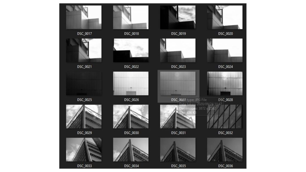
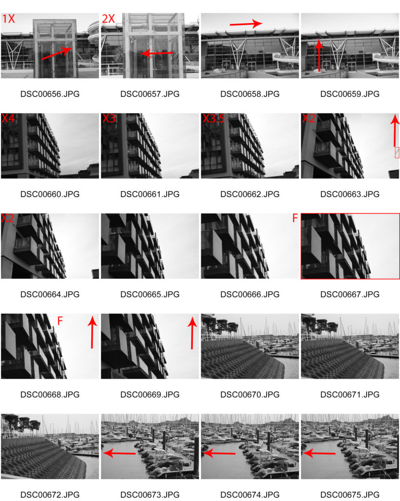
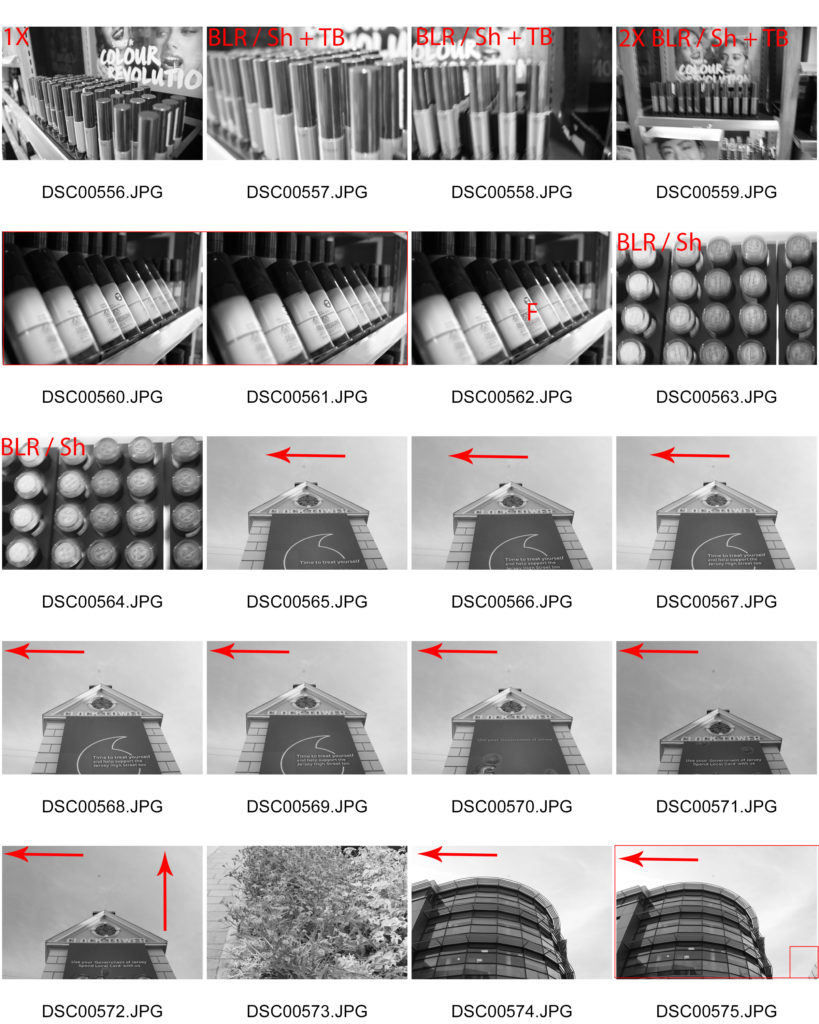
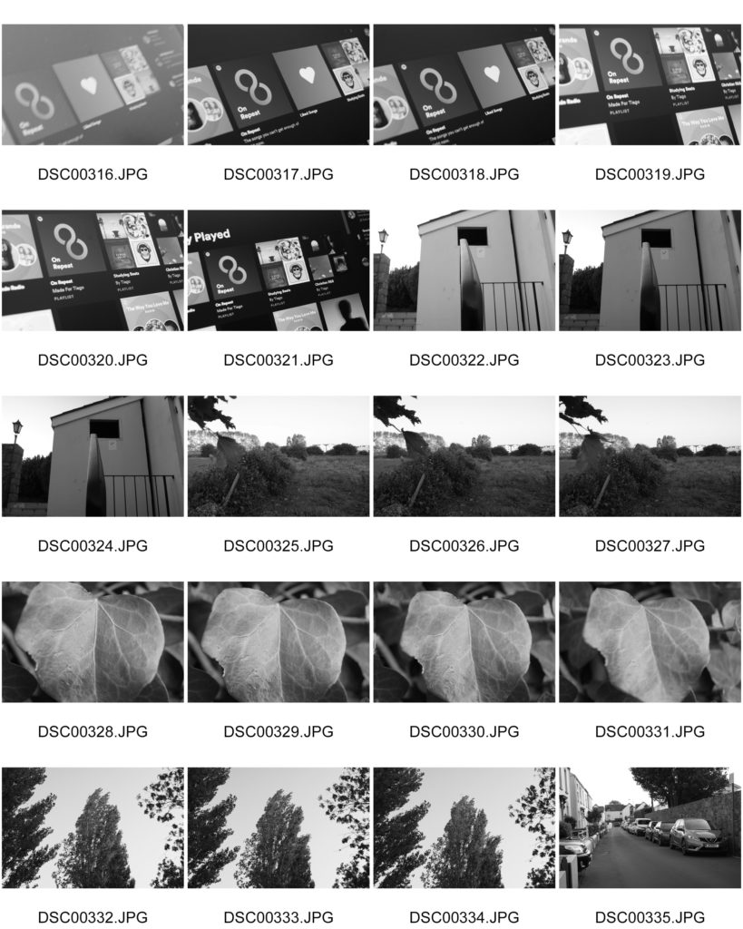
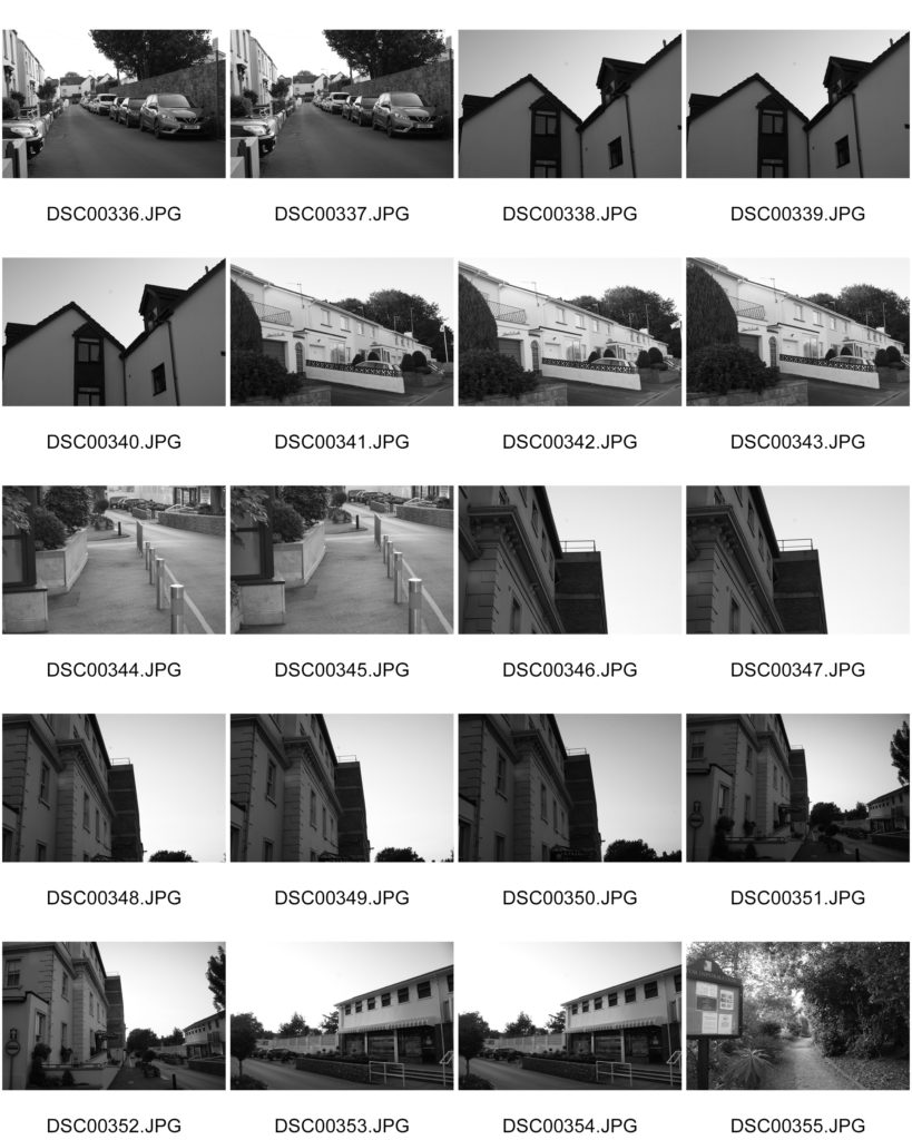
Contact sheets
the formal elements – paper

Jaroslav Rossler

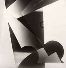
“Light Abstraction” – Jaroslav Rossler (1923)

Jaroslav Rossler was born in Czechia, in 1902. Rossler is an example of a photographer who focuses his work on “The Formal Elements”, as he finds the beauty in the simplicity of objects. He started his journey in photography at 21 years old, as he used this skill in his career creating typographic layout for magazines. Jaroslav Rossler’s work was heavily influenced by futurism and cubism, this lead him into creating his art of abstract photography.

“Akt” – Jaroslav Rossler (1926)

I took inspiration from this photograph titled: “Akt” by Jaroslav Rossler to approach the theme of “The Formal Elements”, as it perfectly represents the beauty of simple composition to focus on lighting and shadows. The geometric shapes of the paper create crisp, sharp shadows into the background to create a juxtaposition between light and dark.

My Response:

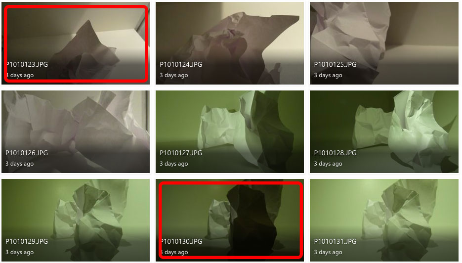
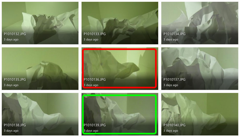
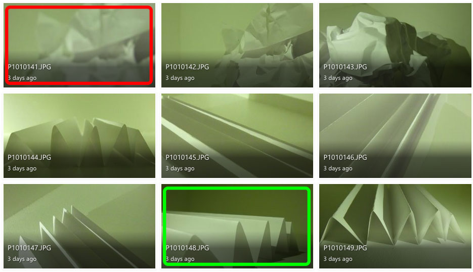
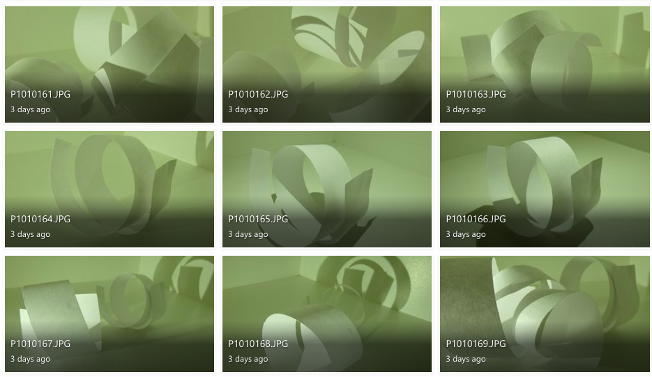
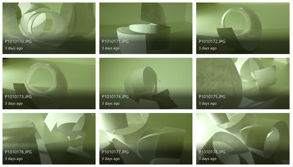
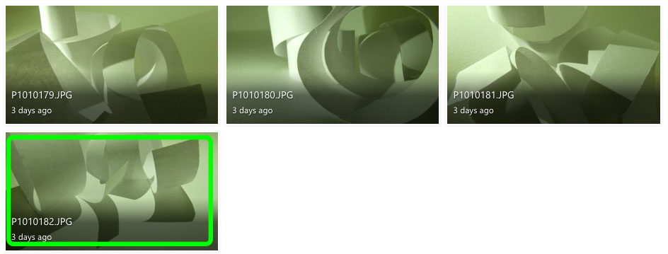
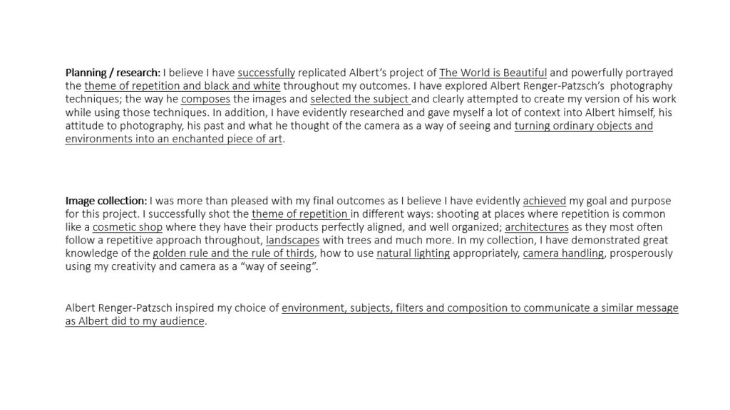
To explore “The Formal Elements” I photographed paper and explored lighting and texture by using artificial lighting to change the intensity and movement of shadows and distressed the paper in different ways to experiment with different shapes.

I don’t like the images in red because they are either out of focus or the lighting makes it difficult to define the creases and shadows.

I believe the images in green are my best photographs because they have distinct, contrasting shadows and shapes.

Photoshop development:

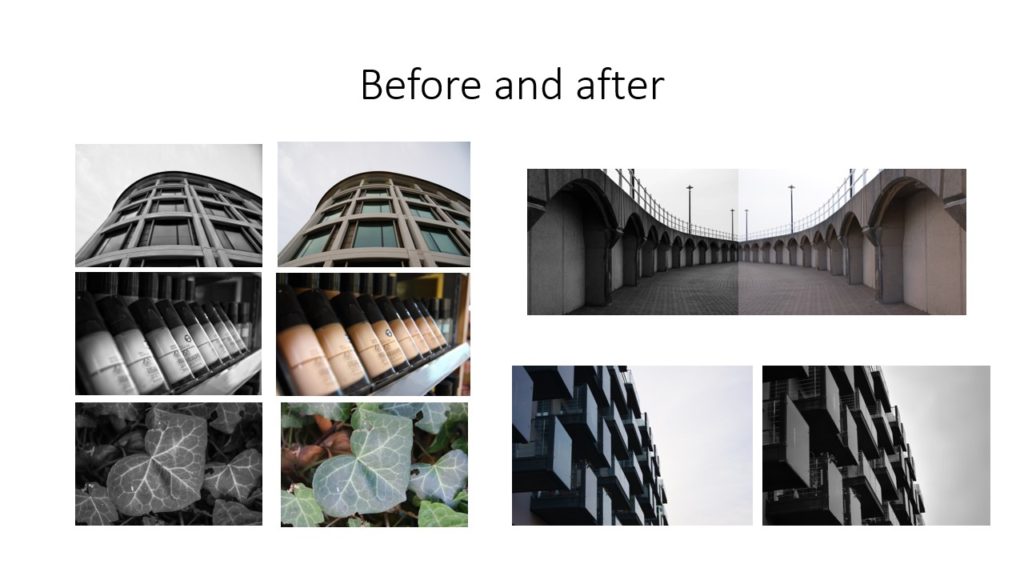
for the first two images, I used the invert adjustment and the monochrome filter to distort the images original shadows and lighting but still keep the same uniformed, lack of colour.

For the third image I used the invert filter again to switch the shadows and lighting but used colour hues and adjustments in order to achieve the pink-toned look of the photograph.

Using the Formal Elements to analyse my photographs:

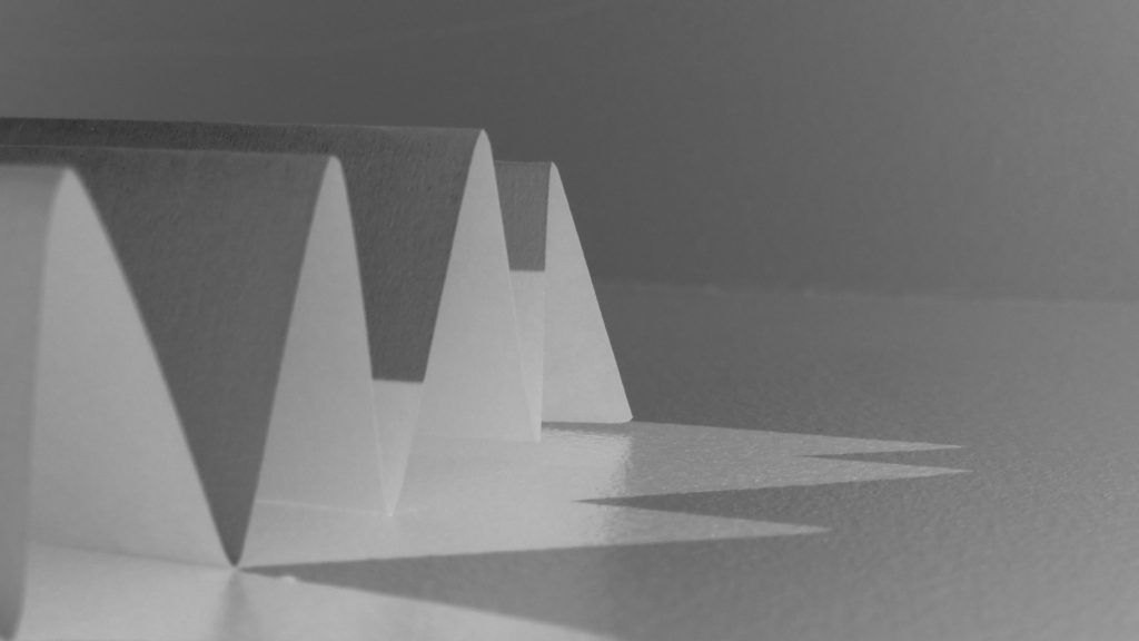
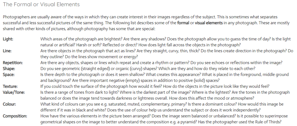
Light: For this image I used artificial lighting. The light source is coming from the bottom left, behind the paper to create distorted shadows in front of the shapes.

Lines: The lines of the paper vary in size, however they all have the same, uniformed, triangular shape. I believe the leading lines are the straight bends at the top of each fold which directs the viewers eye to the almost pyramid-like shape of the paper.

Repetition: The form of repetition I used in this photograph is the repeated pattern of folds in the paper, that create the repetition of triangular shadows.

Shape: The folding of the paper creates a geometric repetition of triangular shapes leading to the centre of the image.

Space: Although the image is very organised and minimal, I believe the shadows add a sense of depth to the image. The negative space in the background allows the viewer to focus on the sharp shape of the folds, rather than the chaos behind.

Texture: The smooth texture of the paper is juxtaposed with the sharp folds to create a contrast of texture.

Value/Tone: There is a range of tones from dark to light in this image, with the top of the folds being the lightest part of the image and the sheltered area under the folds contrasting this with the brooding darkness. Overall, the photo tends towards lightness in the image.

Colour: Although there is minimal colour within this image, there is a slight green hue to the image. I think this is purely a reflection from the artificial lighting mixed with my current camera setting, however it gives the image an almost ominous tone.

Composition: The composition of the photo is very simplistic in order to showcase the simple geometric shape of the folds. the focal point of the folds is present from the bottom left third and into the middle third.

the world is beautiful

Albert Renger-Patzsch (June 22, 1897 – September 27, 1966) was a German photographer associated with the New Objectivity. He was born in Würzburg and began making photographs by age twelve. In the early 1920s, he worked as a press photographer for the Chicago Tribune before becoming a freelancer and published a book in 1925, The choir stalls of Cappenberg. He had his first museum exhibition in 1927. A second book followed in 1928, Die Welt ist schön (The World is Beautiful). His best-known book is a collection of one hundred of his photographs in which natural forms, industrial subjects and mass-produced objects are presented.

The New Objectivity (Neue Sachlichkeit) was an art movement of the 1920s and early 1930s. It was in part a response to WW1, which had left many people feeling devastated by the worldwide poverty and destruction left in the wake of the war. The movement began in Germany, with George Grosz, Otto Dix and Kathe Kollwitz being some of the most notable participants. Documentary photography became increasing popular, as artists found it to be the ideal way to capture an ‘objective reality’. They used the art form to show off gritty subjects from real life, and to express the truth of their surroundings in a post – war world.

Albert Ranger – Patzsch | The World is Beautiful

IMAGE ANALYSIS

The bridges between the buildings in this photograph create geometric triangle shapes which draws the viewer’s eye to all the blank negative space in between them. The lines created by the buildings are very clear and sharp, which contrasts with the background of the photograph, which is blurry and organic in its shape. The tone of this image is fairly bright, with the white sky being plain and without any shadows. Additionally, the colour of the sky contrasts to the dark and harsh lines of the building. Patzsch has used natural lighting in this photograph, as you can see the natural shadows cast on the side of the building. Repetition is clearly shown in this photograph, as the panes of glass in the many windows create a repetitive pattern across the entire image. Also, the bricks in the side of the building closest to the camera are clearly visible, making another repeating pattern. The black and white colours are both evenly shown, with one not overpowering the other. This creates a more balanced photograph and makes it more appealing to the viewer’s eye, as they are able to focus on one colour without being overwhelmed by the other.

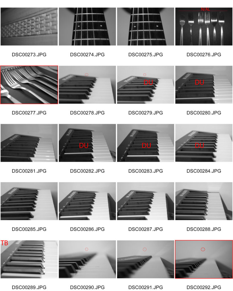
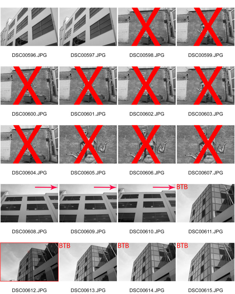
MY RESPONSE – CONTACT SHEETS

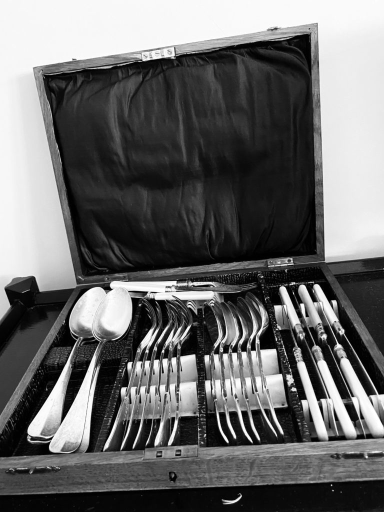
My thought process for this photoshoot was to take inspiration from Patzsch and his way of photographing things that would normally be considered boring or dull. For example, I took pictures of the corners that connect the walls in my house and the cutlery in my kitchen drawers. Although the objects in my photographs appear to be random, I thought carefully about what I was taking pictures of, and about how I could make them look more interesting by using distance, light and composition. Throughout the shoot, I experimented with different technical elements such as numerous angles and tone, and I tried not to take the same picture twice ( I wanted to keep all my photographs different from each other ). I took photographs of anything that caught my eye, and wasn’t looking to make my images ‘perfect’. I attempted to link Patzsch’s work on The New Objectivity to my own photographs by researching and reading about his intentions and his processes.

BEST IMAGES

FINAL IMAGE

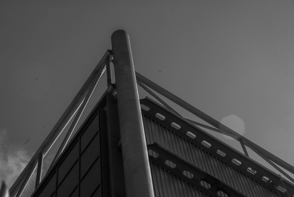
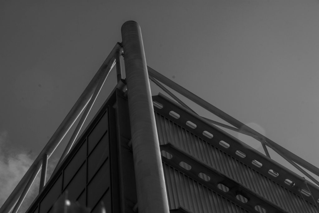
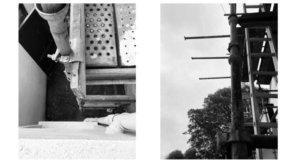
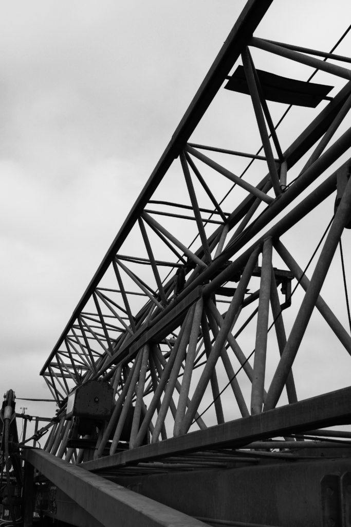
I chose the photograph as my final image because I think that it reflects Patzsch’s work the most accurately. The contrast in the colour between the bright sky and the dark, harsh tones of the scaffolding imitate Patzsch’s composition in his images. The straight lines across the photograph create geometric shapes which deviate from the more natural, organic configuration of the trees in the background. Additionally, this photograph has a lot of depth to it, making it more aesthetically pleasing for the viewer to look at. I wanted to use natural lighting in order to keep the essence of The New Objectivity, as the movement is about capturing the world as you see it. I also thought carefully about the compositional features, such as the my angles and the distance of the subject from the camera. I did this so I could create and interesting photograph. In order to get the black and white effect, I used a feature on my phone which placed a filter on all of my images.

the formal elements

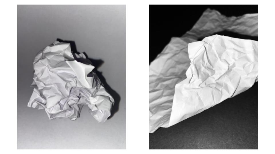
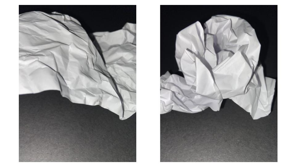
Shape: we can see a wavy texture and we can notice a few triangular shapes .

Light :The light come from the sides .We can notice a lot of shadows and that interested me because it creates other shapes apart from that of paper.

Space : In the first picture there’s a lot of negative space but in the other two picture I’ve decided to zoom in so that the details are more visible .

Repetition: The paper repeats in triangles in different positions .

Texture: The crumpled paper makes the texture rough and coarse

This image has an empty alt attribute; its file name is image-2-1024x768.jpg

I prefer this image because it is a little bit different of the other two image . It looks like waves which means that it has a shape while the other two images do not. It is also different because it has more clarity .

The World Is Beautiful

Albert Renger-Patzsch

Albert Renger-Patszch (1897-1966) was a German photographer associated with The New Objectivity. In the early 1920’s he worked as a press photographer for the Chicago Tribune before becoming a freelancer. Patzsch published his first book entitled The Choir Stalls Of Cappenberg in 1925, and has his first museum exhibition in 1927.

In 1928, Patzsch published his second, best known, book The World Is Beautiful- which is a collection of one hundred of his photographs in which natural forms, industrial subjects and mass-produced objects are presented with the clarity of scientific illustrations. These types of subjects are what Patzsch thrived to photograph.

The New Objectivity was a movement in German art that arose during the 1920s as a reaction against expressionism. Patzsch’s work fits with this movement because he believed that the value of photography was in its ability to reproduce the texture of reality, and to represent the essence of an object. He wrote that the secret of a good photograph is it’s realism, he wanted people to ‘leave art to the artists’ and ‘endeavour to create photographs which will last because of their photographic qualities.’ Artists such as Max Beckmann, Christian Schad and Otto Dix were also part of The New Objectivity movement.

Patzsch Photo Gallery

Patzsch’s photographs are monochrome, using very harsh dark and light tones, with high contrast and low exposure. He uses lots of repetition in his images with industrial buildings and nature, showing elements of the world in their natural forms. Patzsch also takes his photos from many abstract positions, some extremely close to the subject, some from below, he uses a wide range of camera angles and zoom. Many of his photos have a rough spiked texture due to the business of his images and the detailed subjects in them.

Patzsch Photo Comparison

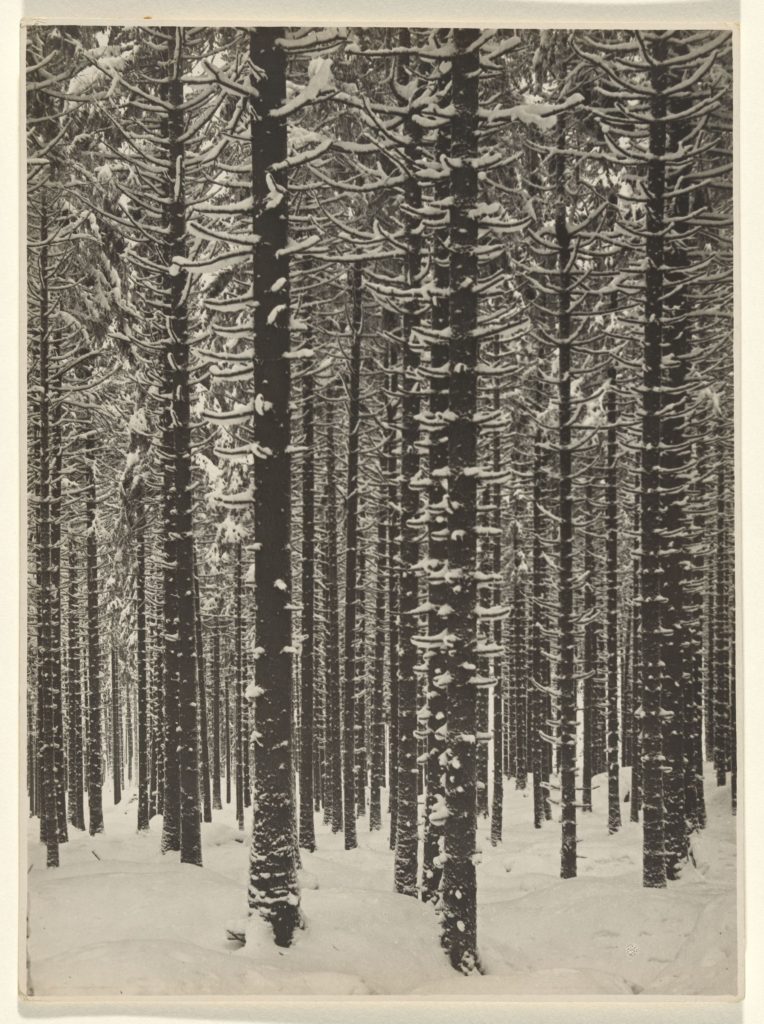
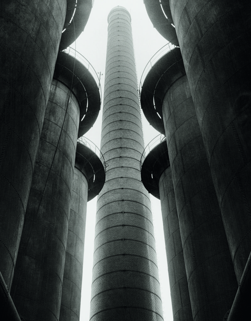
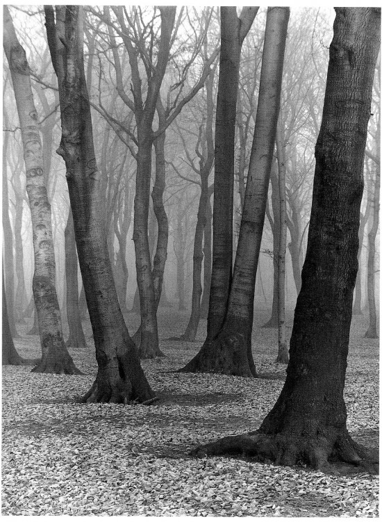
These two images are from Albert Renger-Patzsch’s collection ‘The World Is Beautiful.’ In the first image we can see a gloomy forest filled with tall trees, a representation of nature. However in the second image the subjects are imposing industrial towers, clearly man-made. Also, both images are edited with a monochrome, unsaturated filter- a staple of Patzsch’s photography. One similarity we can see in these images is the repetition of cylindrical objects. In the first image, the trees in the forest are unique with twisted branches and of different shapes and sizes. Contrastingly, the towers in the second image are repeated, however in a uniformed manor with identical structures and shapes. Additionally, the towers look almost like tree trunks themselves, linking to The New Objectivity and the idea that nature is being ruined and replaced by man-made industrial buildings and objects. Moreover, the subjects in both images are not fully in shot, as the frame cuts off the tops of the trees and towers, which connotes the idea that man cannot fully see the damage they have done to the world, they are oblivious.

Nevertheless, there are also many differences between these two Patzsch images. For example, the photos are taken from very opposite camera angles, the first from an eye-level medium shot and the second from a low angle medium shot. The first image’s angle shows nature surrounded by more and more nature, suggesting the power of the environment is fundamentally superior to mankind. However, the angle of the second image paints the industrial towers as intimidating, looking down on everything below them, implying man is always watching. Furthermore, we can see a significant difference in the depth of field in the images. The first clearly has more depth, as we can see trees going far back disappearing into the mist. The second has certainly got depth, however the focal point of the middle tower draws the observers attention, so not much else can be seen in the background. Additionally, the images have contrasting lighting, with the first having much more muted highlights and the second having very bright over-exposed highlights in the background. Patzsch could have purposefully done this to symbolise how nature is being forgotten and ‘muted’ in our minds, whereas industrial buildings and man-made factories thrive while destroying our environment.

My Response – Contact Sheets

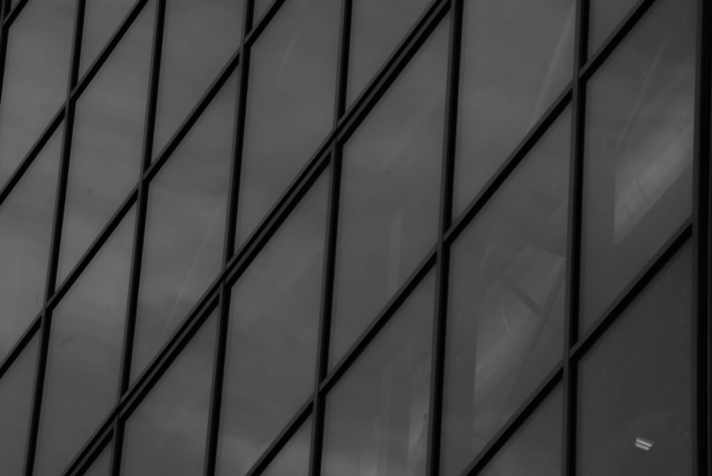
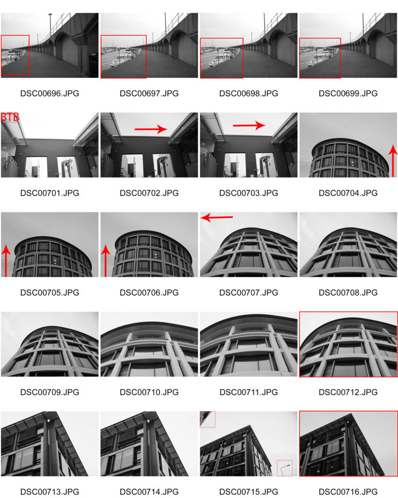
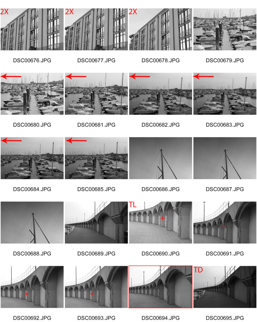
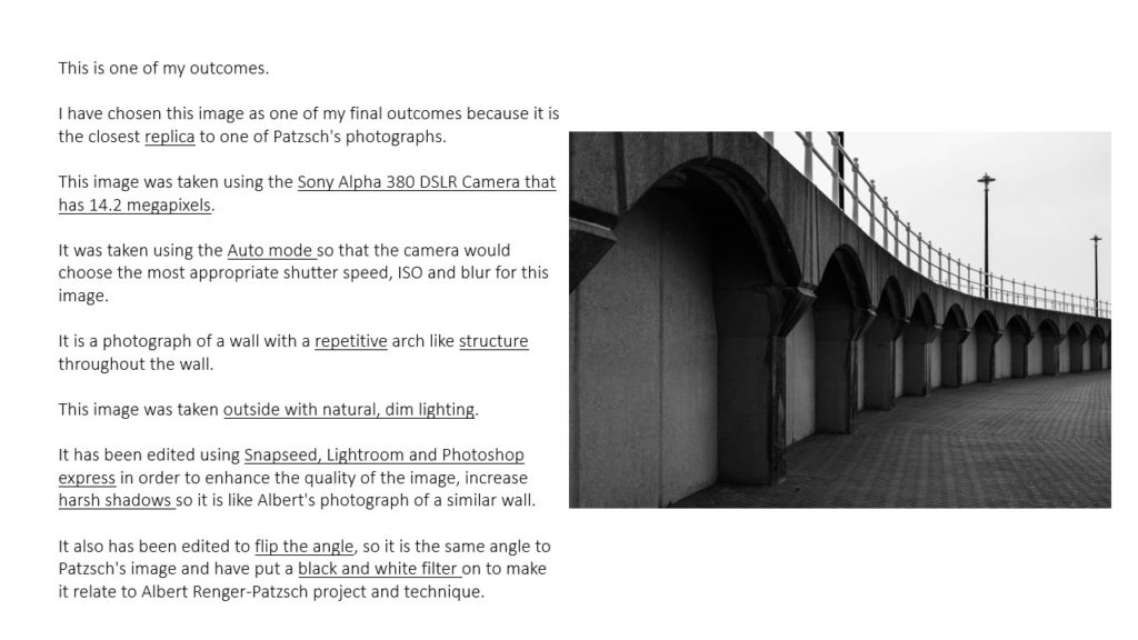
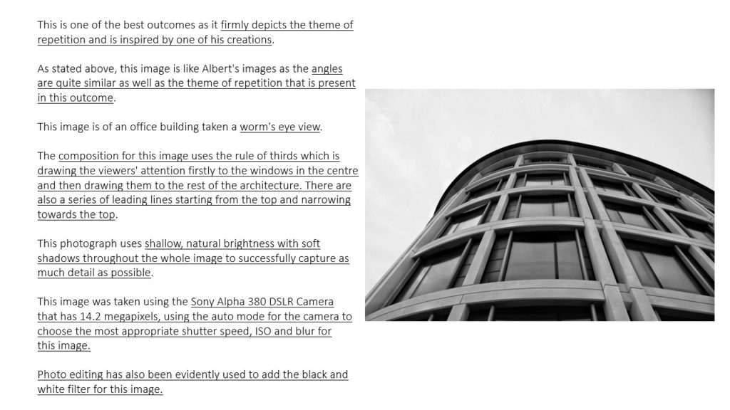
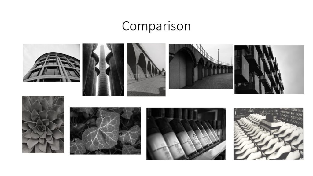
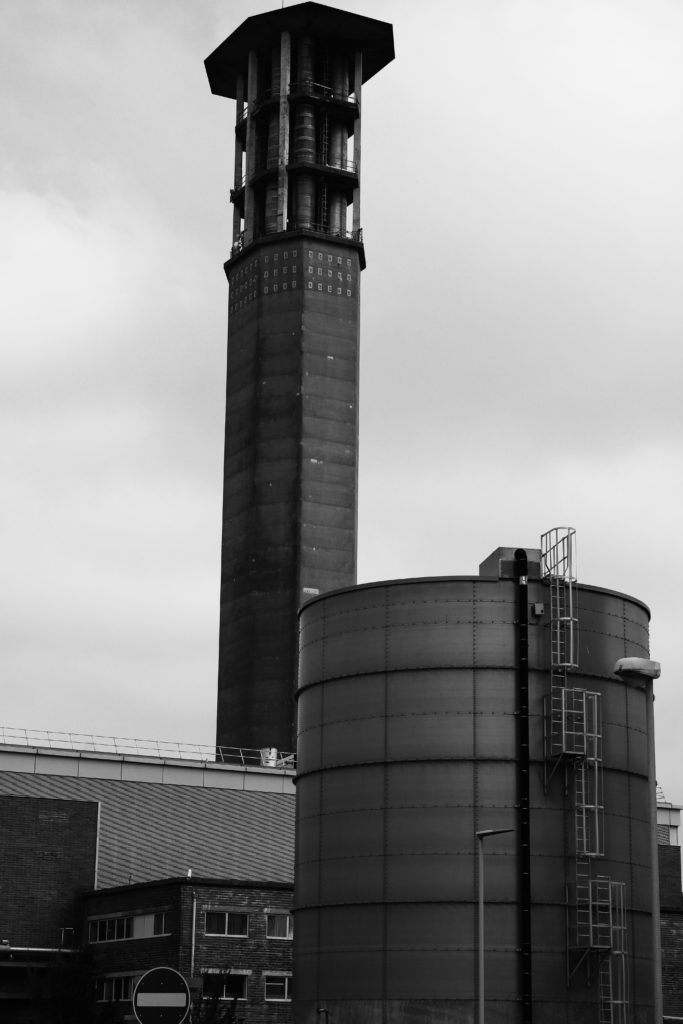
In this first shoot, I photographed industrial buildings around the island that I believed best linked to Patzsch’s work. I focused on capturing man-made buildings and objects, looking at the range of tone and texture created by metal and stone. I also looked for repetition of buildings, windows and fences to add more rhythm to my images as Patzsch does.

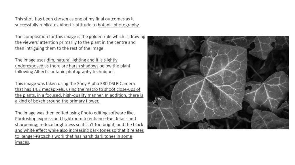
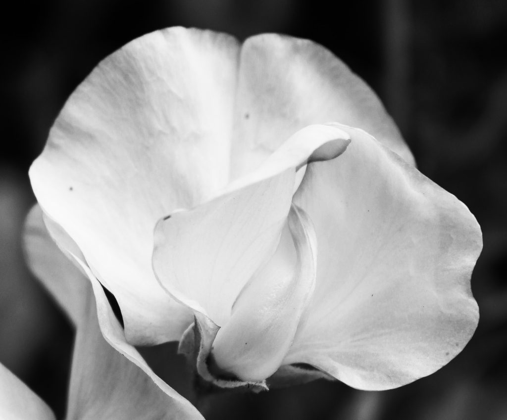
In my second shoot, I captured elements of nature to link to Patzsch’s photography of the environment. I focused on photographing abstract flowers with rough and soft textures, tall trees with twisted branches and insects that symbolise the beauty of nature.

Final Edited Photos

Final Images

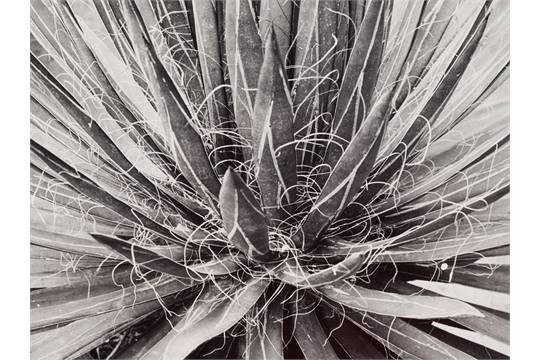
I have chosen these three images as my final evaluation because I believe the nature photos compliment each other well, while contrasting strongly with the industrial. Firstly, I love the high contrast of all these images and the sharp central focal point they all hold. I like the way both of the flower images have a circular shape, I believe the rounded perimeter’s of the subjects help to draw the observer’s attention and focus to the centre of the image. I also believe this contrasts with the second image as it contains more straight lines and geometrical shapes- clearly man made. Next, I really enjoy the repetition of the petals and flowers in image 1 and 3, I think it links well to Patzsch’s work on The New Objectivity. Additionally, I think the natural photos compliment the industrial as both have harsh dark tones and bright highlights. However, in the background of the first and last image, there are dark tones and shadows which enhance the white highlights of the flowers, painting them as clean and pure. Yet, in the industrial image, the bright highlights are in the background creating a dark silhouette of the structure. I chose to photograph this building in such a way to reflect Patzsch’s intimidating industrial images and to contrast with the purity of the environment. The camera angle of this image is also from below the subject which alludes to the idea of man looking down on society.

Contact Sheets
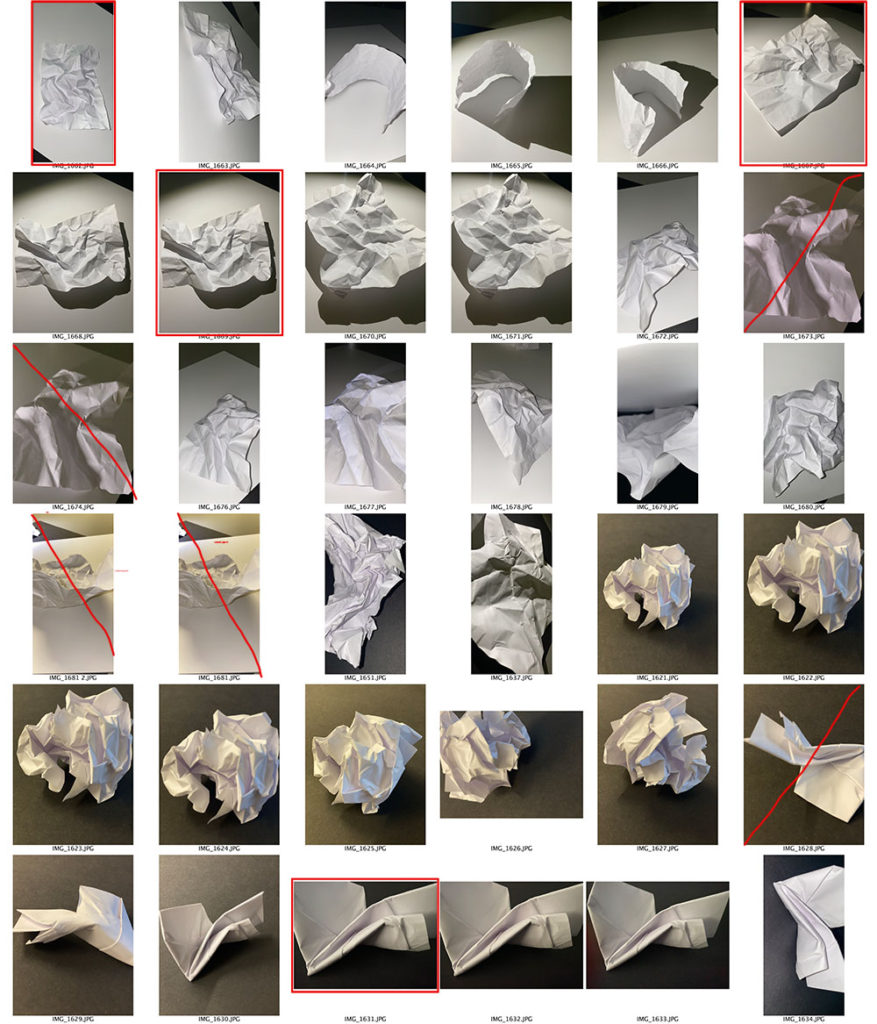
A contact sheet is a piece of photographic paper on to which several or all of the negatives on a film have been contact-printed. It could also be used for photographers to analyse which pictures they think are best from a photo shoot in order to select from moreover, it could be used to show off a to a person what the outcome of a shoot ones and which pictures are most presentable.

As shown from my photo shoot, I have highlighted with a red square around a picture which ones are most suitable and better presented from the photo shoot of the elements of paper. Also, the pictures in which i have crossed out are the ones that aren’t presentable enough due to either lighting, focus and the angle.
the world is beautiful

Albert Renger-Patszch was a German photographer who was heavily involved in the new objectivity movement which emerged in 1920s Germany to contrast the abstract art of German expressionism . The movement focused on industrial objects and buildings and was similar to the style of realism. His attitude towards photography created a ‘faithful recording of the world’ according to the Tate. Renger-Patszch photographed a range of different things, from botanical’s, to still to life, to industrial architecture. His book “the world is beautiful doesn’t focus on just one aspect and instead shows this mix. He often used light to create beautiful shadows in his photos. He also used a lot of symmetry and repetition which made his industrial photos look more harsh but grew him criticism for being “too beholden to a naive idea of photographic realism and ended up aestheticizing everything, thus obscuring social realities” Other artists who were prevalent in the era of new objectivity were August Sander and Laszlo Moholy-Nagy.

analysis of his photos

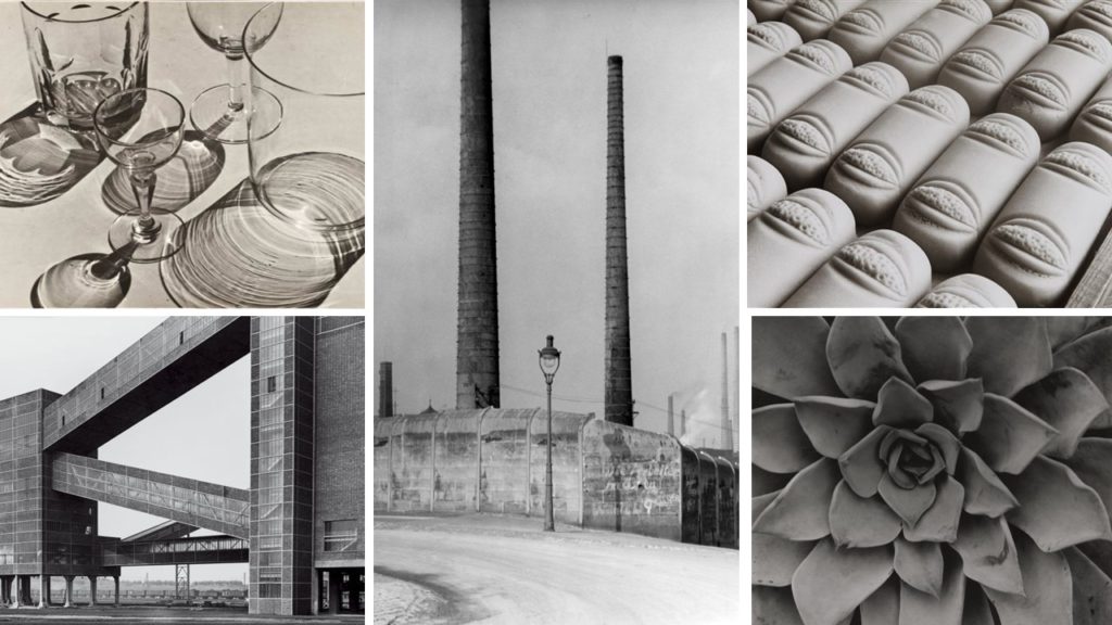
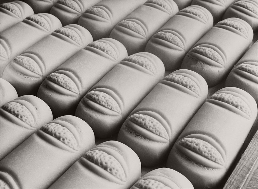
Both of these photos are in a black and white tone. This was the only option for Renger-Patszch at the time as coloured photography was not available. Even though this wasn’t a conscious decision, it adds to the affect on the audience as it accentuates the monotony of the repeated line of loves as well as making the shadowing on the glasses clearer. The lack of colour brings attention to the objects. Both photos are of man made objects, even though the loaves are more organic they have a more industrial feel to them compared to the glasses as the photo is so focused on their symmetry and faultlessness. As said before the shadowing in his photos are excellent, this is partially due to the artificial lighting that adds an almost clinical feeling to the images, especially of the loaves. The cropping and framing of the photos is interesting as in the right hand photo, not all of the glasses are in frame and in the other photo the frame has been tilted instead of just rows photographed. This gives the illusion that the loaves just carry on going forever, again giving the photo an industrial feel.

Renger-Patszch inspired photography

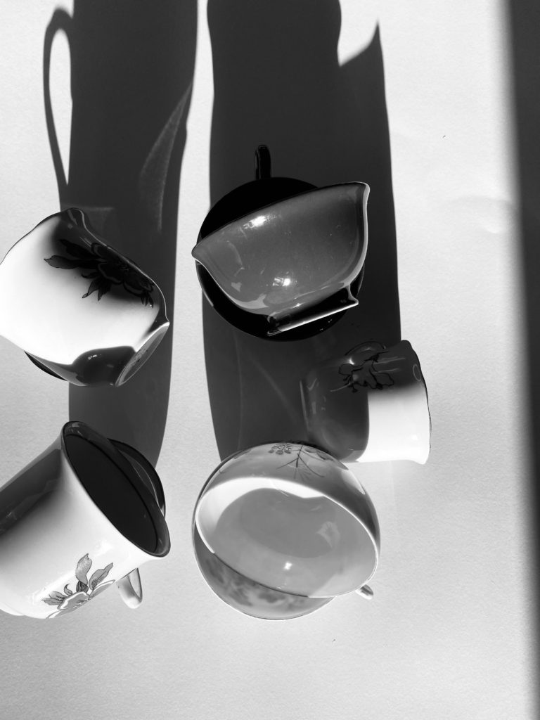
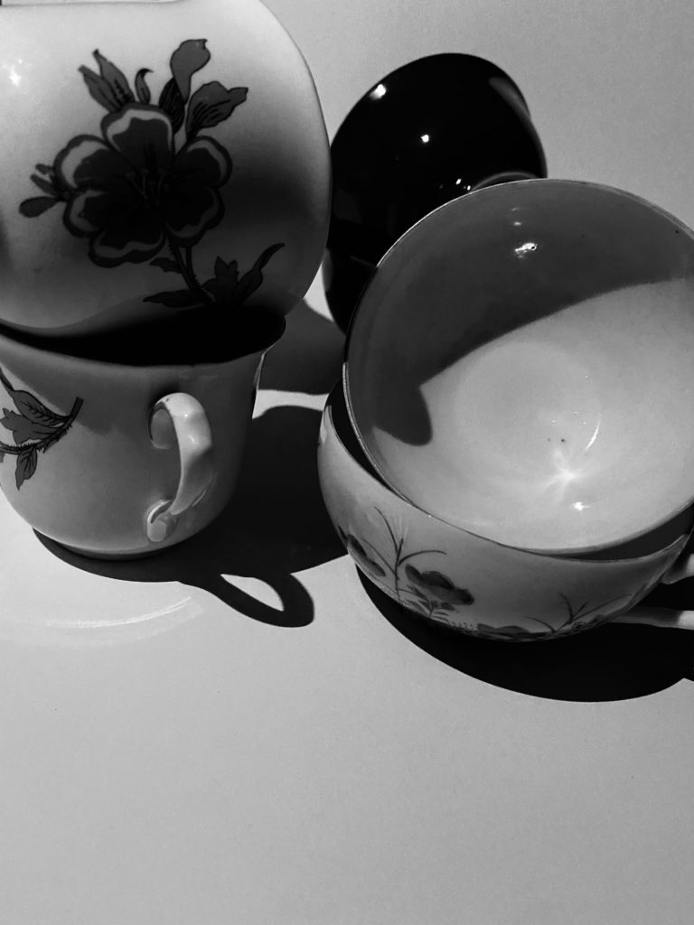
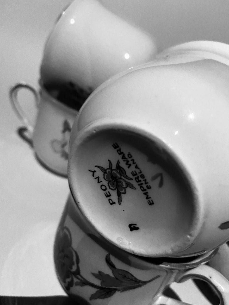
I was especially inspired by Renger-Patszchs work on still life, in particular his photo of glasses, so i decided to take some similar photos using objects around my house. I ended up using some vintage crockery and cutlery which I felt worked really well.

the formal elements – paper

Light – The light in all of these photographs is artificial as it is coming from the torch feature on a phone. I wanted the lighting to be harsh so that you could see the clear lines in the paper made by the folding. I also wanted to include some shadows so that the white paper would appear to contrast it. I wanted the brightest part of the photograph to be the closet part to the camera, so I directed the light onto that specific place.

Line – I made the lines in the paper by folding and scrunching. I wanted there to be a mixture of both straight, harsh lines and soft, curved lines.

Repetition – In some of my photographs, there are lines and shapes that are repeated, as I folded the paper symmetrically several times.

Shape – There are a lot of geometric shapes in my photographs. For example, in the fourth picture, you can see several triangle shapes made by the straight edges of my folding.

Space – In the last three photographs, they appear shallow as the paper is very close to the camera. However in the first photograph, the paper is sat at a distance, creating a deeper look with the shadows behind it. There is also a lot of negative space in the background which has been left empty and bare.

Texture – The scrunched and folded paper would create a rough and coarse feeling.

Value/Tone – The paper is the brightest part of all my photographs, as the artificial light from the phone illuminates it against the black background. For the first picture, although the background is white, it isn’t as bright as the paper itself.

Colour – I chose to keep my photographs in simple black and white because I think that it shows the contrast between light and dark more clearly. I also think that if I had introduced any sort of colour, the creases in the paper wouldn’t be as apparent.

Composition – I placed the object mostly in the centre of my photographs so that it would appear even and balanced.