Category Archives: Independent

Filters

Author:
Category:

Water Photo Shoot

I plan to take photos of the reflections on water at Bouley Bay and, in my sink the create bubbles in the water. There is also a small waterfall at Bouley Bay, so I plan to take photos of that using a long shutter speed to capture the motion in a blurred way, I might also do this to the waves and splashes on the rocks. I will need to make the shutter speed not to long, because it will be overexposed, as there is more light going into the camera, but it needs to be long enough to get the water as a smooth texture. I want to take the waterfall photo as it demonstrates my practical skills using a camera. I was inspired by Ernst Haas’ water and reflections photography.
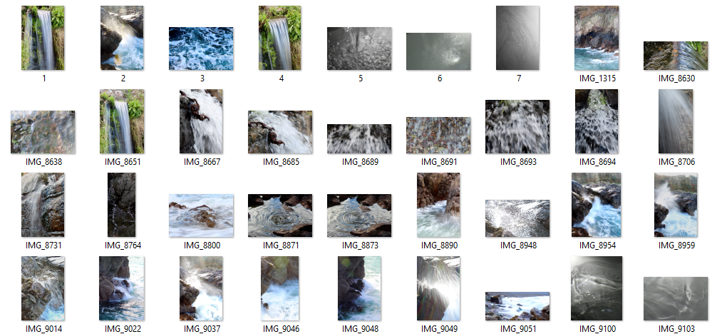
Final Photos

This contact sheet shows my semi-good images. It helped me choose which images to choose as my final images. It is a method of sub selection.
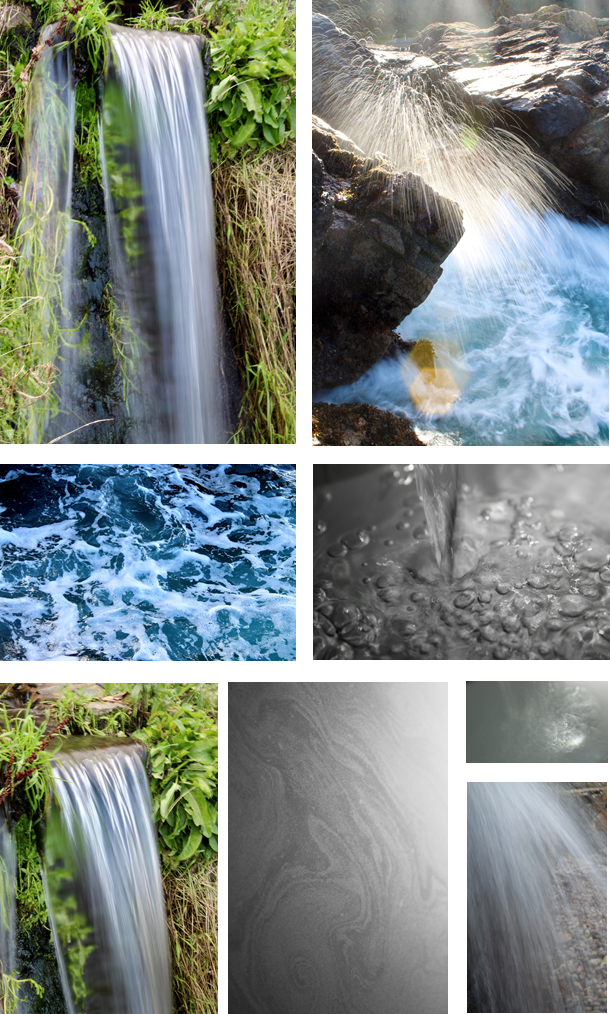
The photo of the waterfall is my favourite, because it shows the silky smooth water, fall over the rock. It has a wispy texture as the shutter speed is longer, which allows motion to be blurred. I was difficult to take as I had to hold the camera still so I didn’t get any camera shake, as it would blur the image.

The photo of the rock with the water splash mid-air is also one of my favourites. The long shutter speed makes the water droplets have a trail whilst were falling. I had to time it so when a big wave crashed into the rocks; I had the camera pre-focused, then I would press the button to take the image as soon as the splash came above the rock. The sun created a lens flare, as I was shooting into the sun. It created definition to the water droplets as they became lit up which meant you could see each individual one clearly.

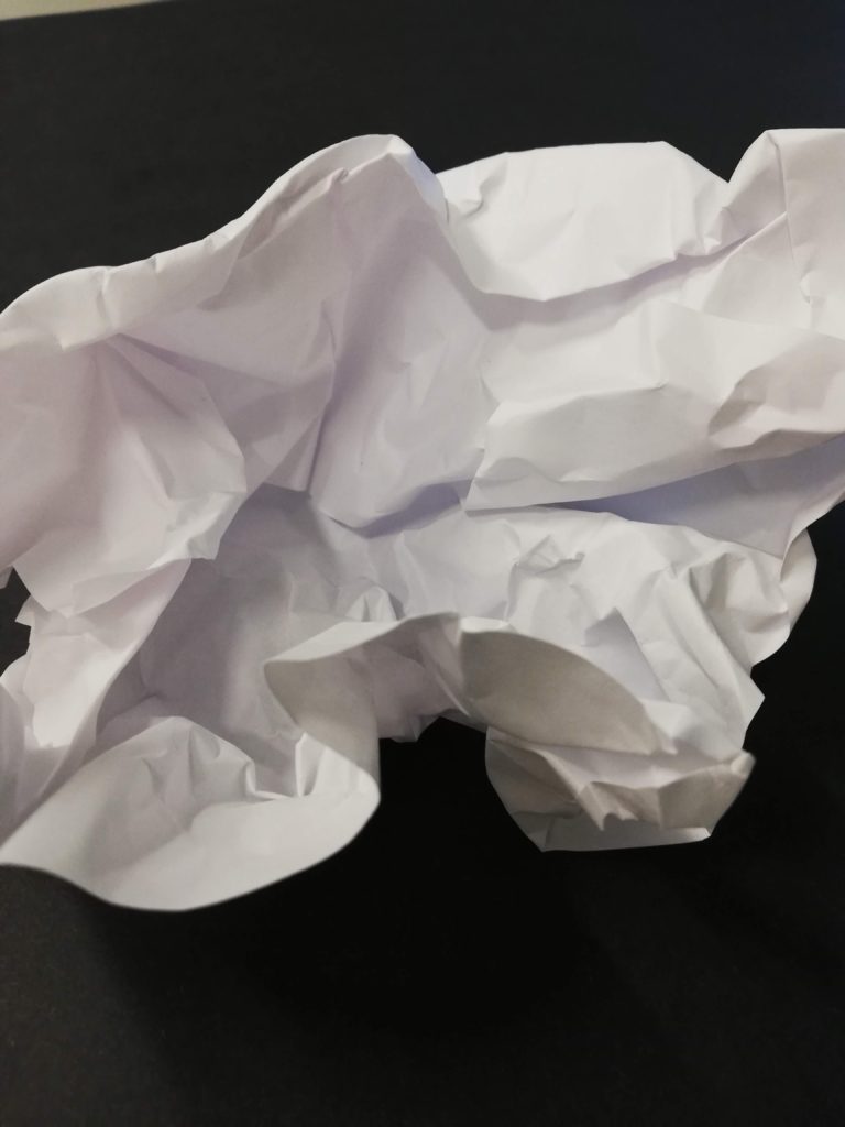
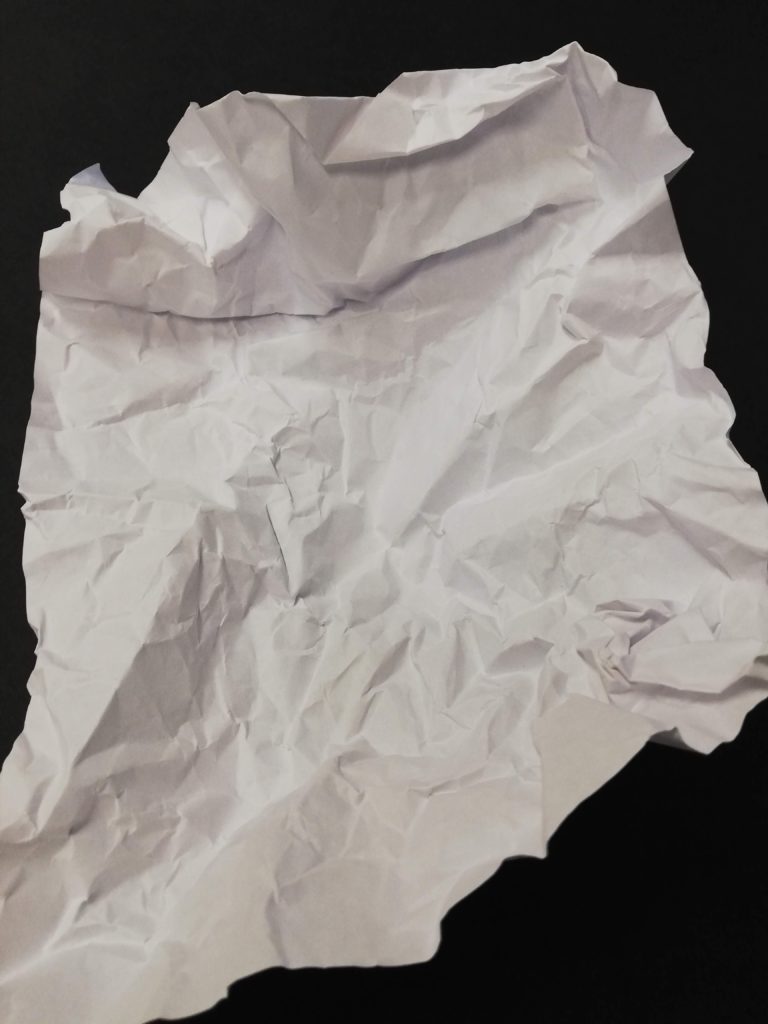
Paper- The formal elements

Best Outcomes

Favourite Image

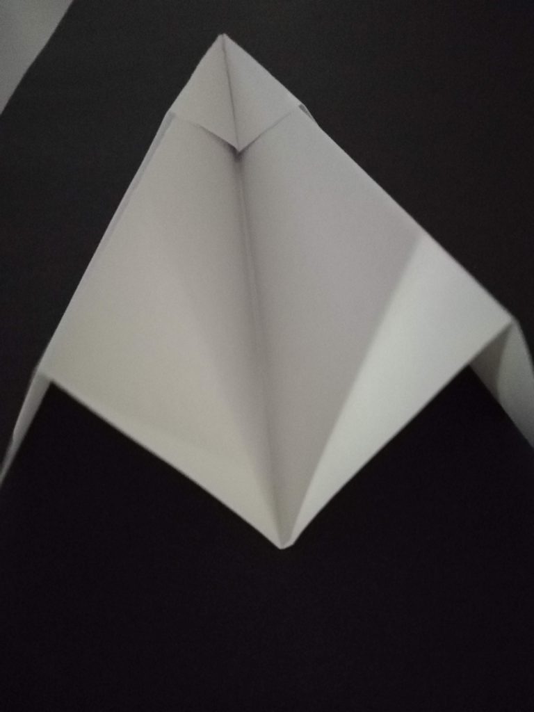
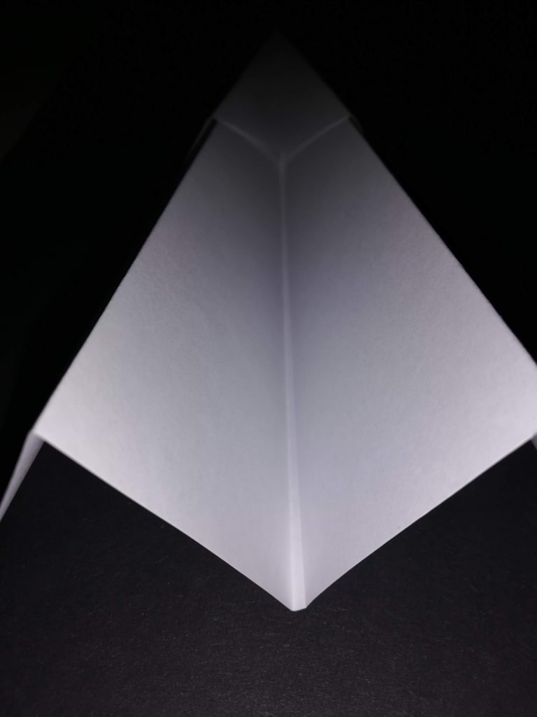
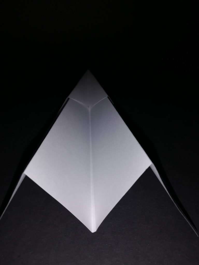
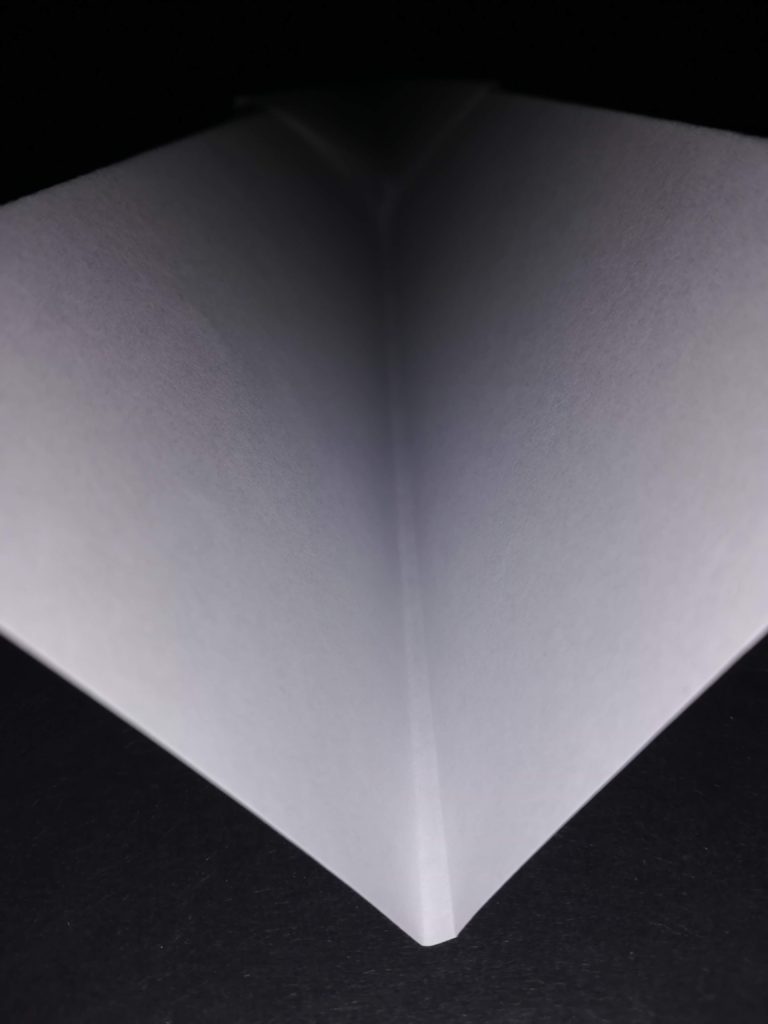
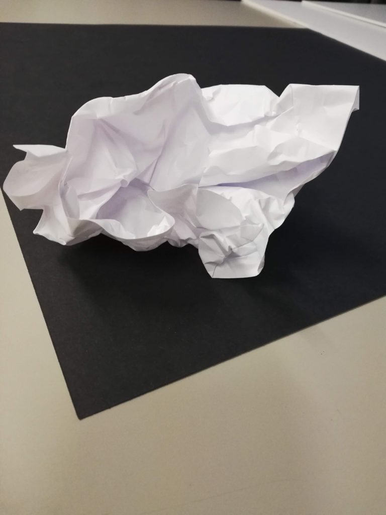
This is my favourite image because I like the fact that, under the harsh light, the folds of the paper become more prominent and edges become crisp because the black background contrasting it.

The paper aeroplane also looks like it begins to blend into the background as the flash only hits the back of the plane. The tip of the paper aeroplane is also barely noticeable because practically no light reached it.

Selecting and finalising and displaying…

Over the next two weeks you will be…

  1. selecting your most successful images (from the abstract unit)
  2. finalising your most successful images (from the abstract unit)
  3. displaying your most successful images (from the abstract unit)

So…you must create a set of blog posts that clearly shows your thought process, selection criteria, image enhancement and manipulation, and how you intend to display your final image / set of images.

Selection Criteria

Focus…is the image(s) in focus ?

Exposure….is the images(s) correctly exposed ?

Evidence of learning…does the image refer to at least one of the formal elements?

Connection to a chosen photographer…how close is the relationship ?

Unique / interesting…how sophisticated / complex is your image(s)

Examples

This image has an empty alt attribute; its file name is image-107.jpeg
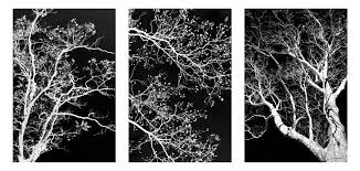
3 images that go together = a triptych
This image has an empty alt attribute; its file name is image-587.png
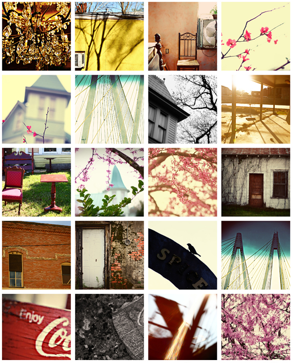
A grid / gallery of images can work really well…

Research and explore alternative approaches to presenting your final images. This should be an integral part of your concept…not a gimmick…ultimately, the quality of your photography will be the primary focus and your mark will reflect this…

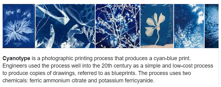
Cyanotype

https://www.amazon.com/SunPrint-W330-Paper-Kit/dp/B001KOGY3M

Virtual Gallery (use Adobe Photoshop)

Image result for photo gallery
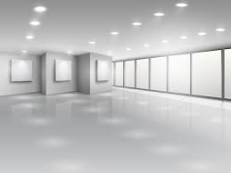
Download a photo of an empty gallery…then insert your images and place them on the walls. Adjust the perspective, size and shape using CTRL T (free transform) You can also add things like a drop shadow to make the image look more realistic…
Copeland Gallery | Copeland Park & Bussey Building
You can use this one…
Empty gallery interior with light windows - Download Free Vectors, Clipart  Graphics & Vector Art
…or this one

Always follow the 10 Step Process and create multiple blog posts for each unit to ensure you tackle all Assessment Objectives thoroughly :

  1. Mood-board, definition and introduction (AO1)
  2. Mind-map of ideas (AO1)
  3. Artist References / Case Studies (must include image analysis) (AO1)
  4. Photo-shoot Action Plan (AO3)
  5. Multiple Photoshoots + contact sheets (AO3)
  6. Image Selection, sub selection, review and refine ideas (AO2)
  7. Image Editing/ manipulation / experimentation (AO2)
  8. Presentation of final outcomes (AO4)
  9. Compare and contrast your work to your artist reference(AO1)
  10. Evaluation and Critique (AO1+AO4)

SURFACE AND COLOUR

Luigi Ghirri

Luigi Ghirri: Impossible Landscapes at Matthew Marks Gallery - Center for  Italian Modern Art
Exhibition: Photographer Luigi Ghirri and Sculptor Paolo Icaro at  Fondazione Querini Stampalia - Where Venice

Luigi Ghirri was a Italian photagrapher born the 5 January 1943 at  Scandiano in Italy . His work was most of the time made in Europe, and most of it focused on a small area of northern Italy . He prefersr to photograph this themes: maps, landscapes, windows, still lifes, interiors, fog, the seaside

Julian Schulze

Julian Schulze Photography
Synergy Effects (Part 3) on Behance

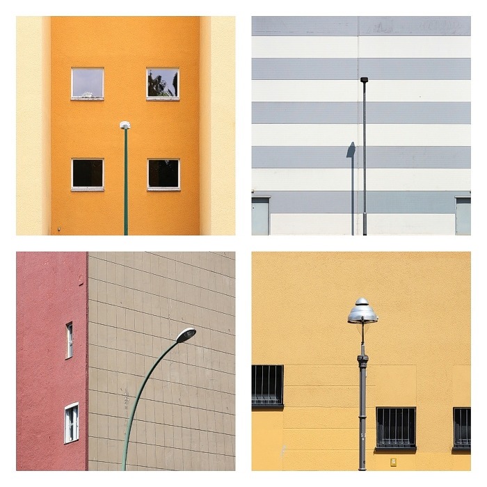
Julian Schulze born 1986 in Hannover . He’s art is focused on geometric abstraction and minimalistic compositions. All of his images were taken in Berlin and Munich. He uses colours and the composition of geometric patterns .He also loves bold colours and colour combinations “I like the simple things in everyday life” He says .

Their Ideas but in my own Style

I chose to inspire me from the two artists . What like of the images of Julian Schulze is the colors he uses and his images look like they taken from a polaroid . I enjoy Luigi Ghirri because his pictures look like vacation photos they are calm and mysterious  and I think it could be really fun to try to mixt them together in my own style .

What I did

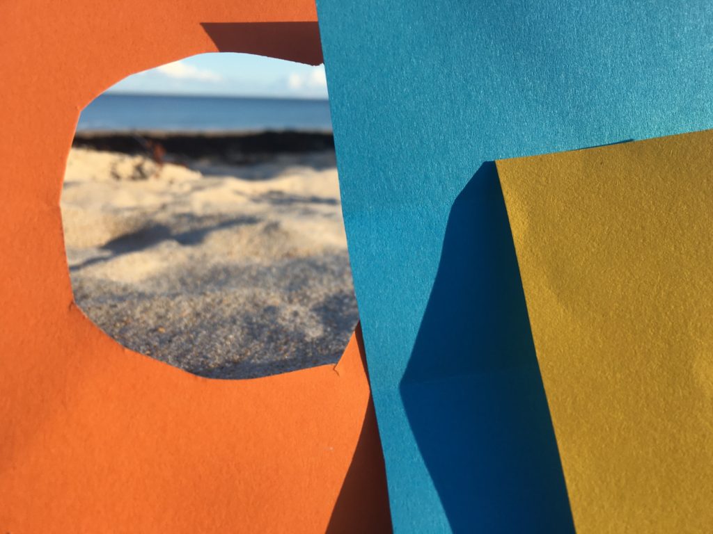
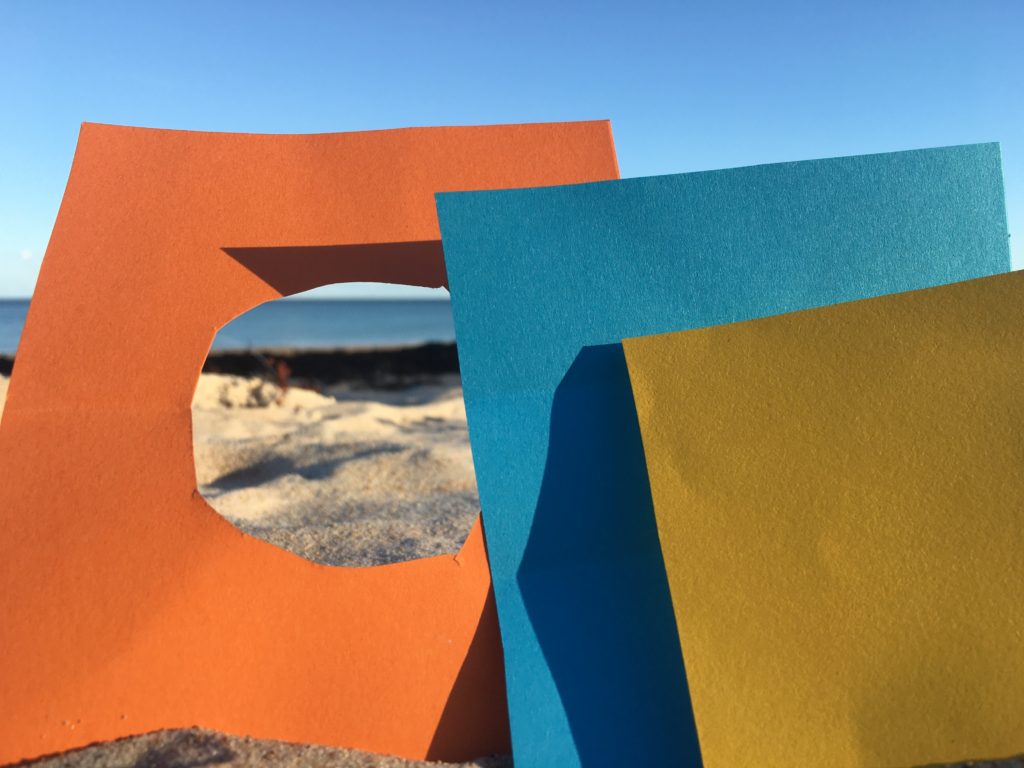
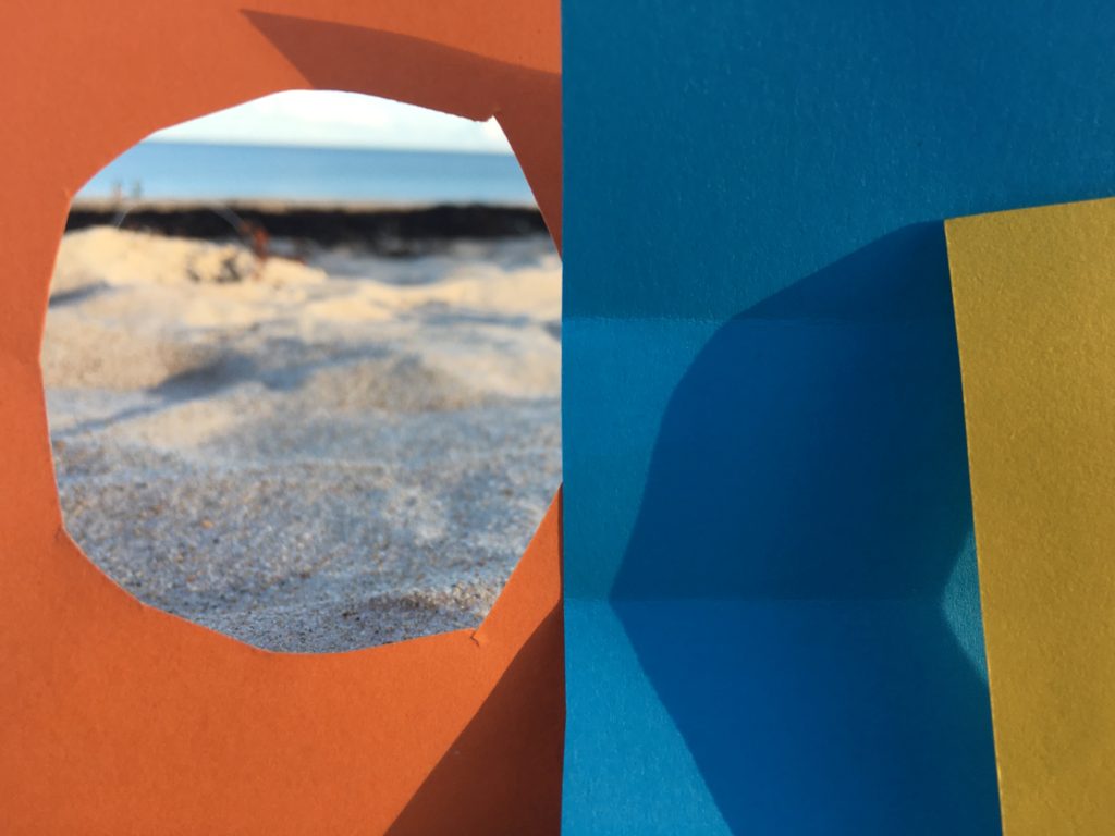
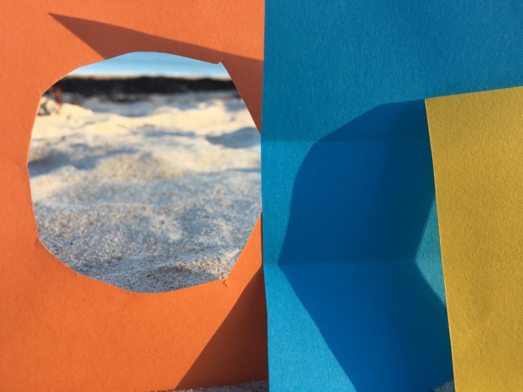
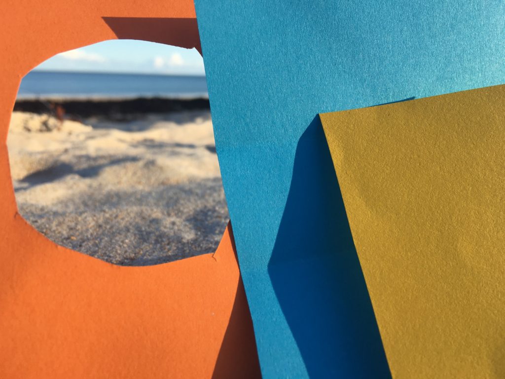
I cut three colore paper and put it above the sand on the beach to make it look like in a vacation . I wanted squares because it remind me Julian Schulze’s pictures.

My pictures

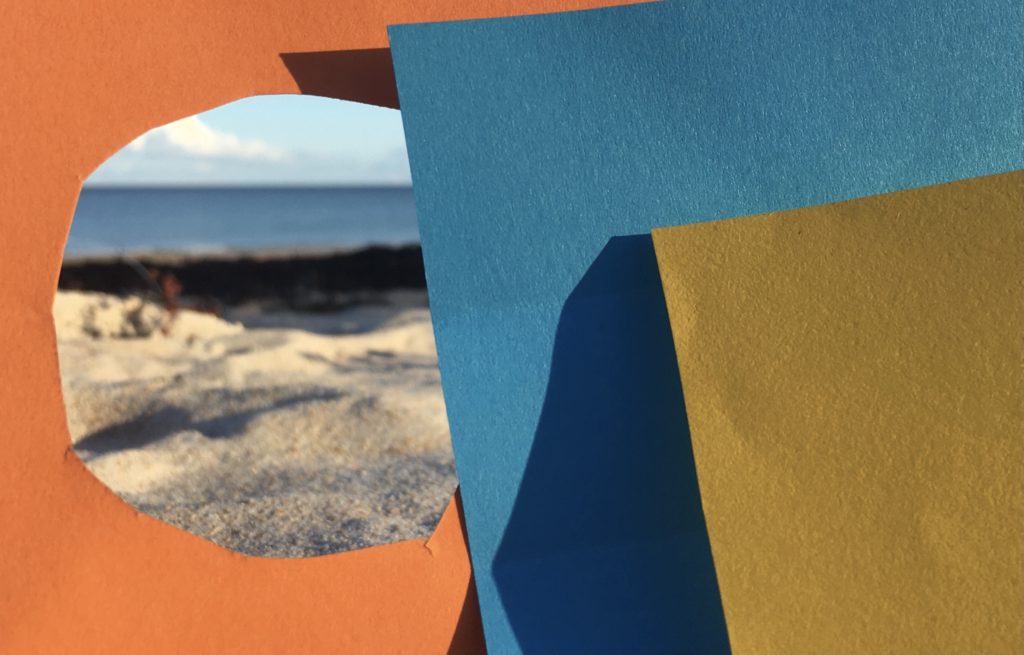
My favourite picture

I really like the shadows on the paper it creates a nice contrast. And I really like the hole on my orange paper because it looks like in way freedom.

repetition, pattern, rhythm, reflection and SYMMETRY

  1. I it in Photoshop to as an original size
  2. I copied the image by selecting Image> All
  3. I then went to Image> Canvas size and doubled the width of the canvas and put the photo to the side with the line of symmetry in the middle.
  4. Then i pasted the same image next to it.
  5. I flipped the copy image and aligned it next to the original, then flattened it to create a new image once it was aligned how i wanted it.
  6. I selected Image> All and clicked copy again with the new image.
  7. Repeated step 3, but now doubling the canvas length, moving the photo the the line of symmetry was in the middle of the canvas.
  8. Repeated step 4 and 5.

surface & colour

ARTIST REFERENCES

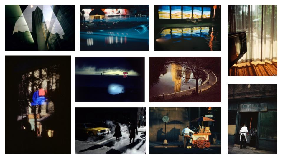
Ernst Haas (1921 – 1986) was an Austrian – American photographer who is widely considered to be a pioneering figure in the art of colour photography. His images have been featured in publications such as Life magazine and Vogue. In addition, his photographs were the subject of the first single – artist colour exhibition of colour photography at New York’s Modern Museum of Modern Art in 1962.
Photographs Captured by Ernst Haas

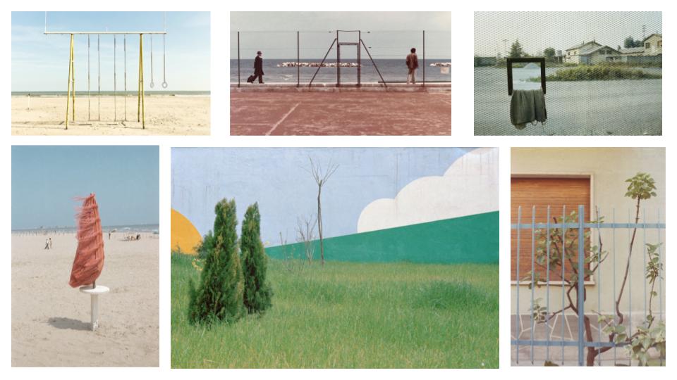
Luigi Ghirri (1943 – 1992) was an Italian photographer who gained a reputation as a pioneer and master of contemporary photography, with its particular reference to its relationship between fiction and reality. Ghirri’s work quickly attracted international attention. In 1975 Time-Life included him in its list of the “Discoveries” of its annual Photography Year publication, and he showed at the Photography as Art, Art as Photography exhibition in Kassel.

Photographs Captured by Luigi Ghirri

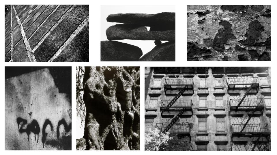
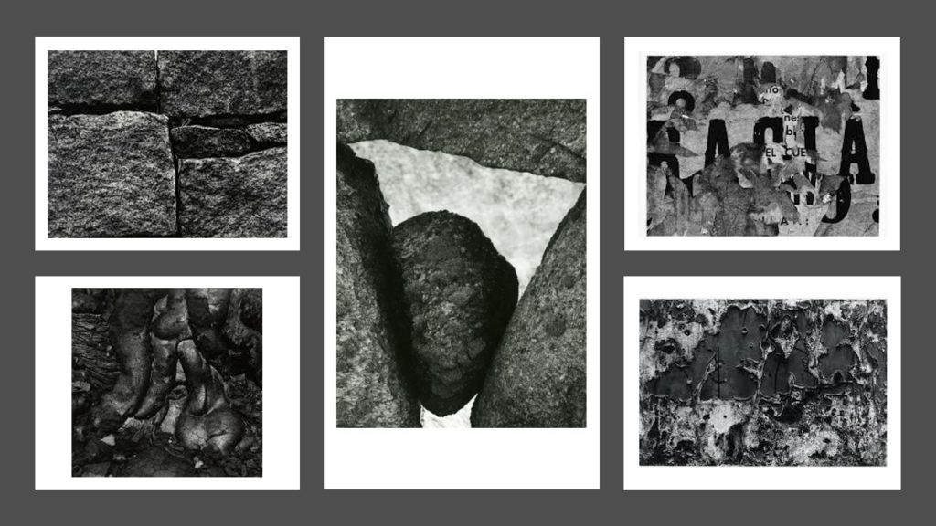
Aaron Siskind (1903 – 1991) was an American photographer whose work focuses on the minor details of its subject/s and presents them as a flat surface to create a new, independent image. Siskind used things from the real world in his photographs: close-up details of painted walls and graffiti, asphalt pavement, rocks, lava flows, ancient statues and the Arch of Constantine in Rome.

Photographs Captured by Aaron Siskind

MOOD-BOARD

MIND MAP

MY RESPONSE

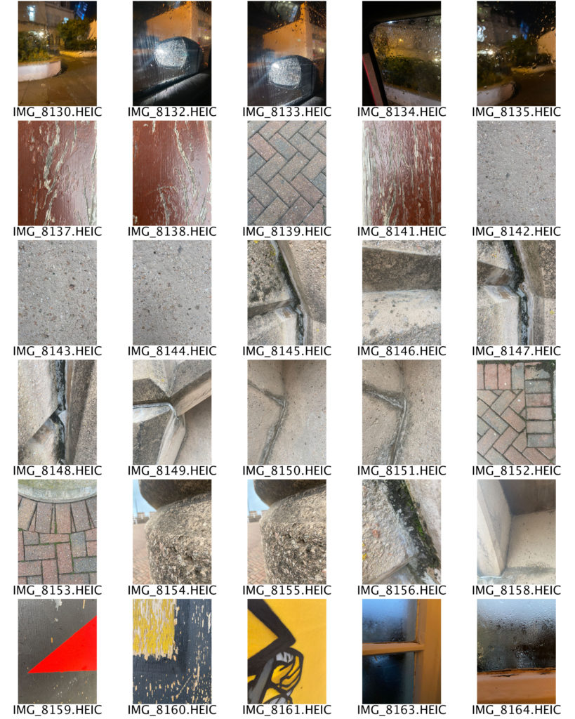
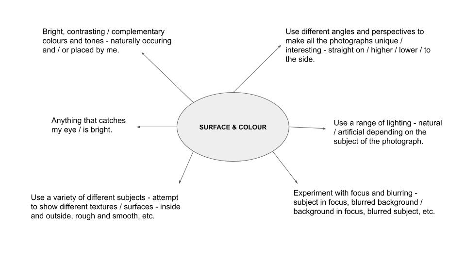
In this photo shoot I was inspired by the works of Aaron Siskind and Saul Leiter, who captured images of the condensation on windows and close up shots of different textures and surfaces. I attempted to use a range of angles throughout my photographs in order to make them more interesting for the viewer to look at. My process was to photograph anything colourful that caught my eye, which led to some unusual subjects such as plastic bags and paper towels. I also took inspiration from The Boyle Family, whose images are a bird’s eye view of various surfaces, mainly roads and pavement corners. I used mainly natural lighting in this photo shoot in order to keep the photographs as realistic as possible. I liked that in some of my images the light would reflect off of the subject, such as my photographs out of a car window, however in those images the lighting was artificial as it came from the headlights of other cars, creating a glare effect. As one of the main themes for this photo shoot was colour, I aimed to incorporated it as much as I could into my photographs. I did this by placing certain colours next to each other, making sure that they complimented one another. To help me see which colours went best together, I used a colour wheel. I also aimed to show different shapes and lines by including objects with harsh, straight lines (books) and organic, curvy lines (ribbon). Additionally, I experimented with different patterns, as seen in the photographs of the yellow coat, where I pulled back the hood to show the stripes on the inside. For the composition of my photographs I tried to use a varying range of layouts and arrangements, such as the subject being in the middle of the image, at the top or bottom, or at either side. I also explored different distances of the camera from the subject, such as far away and up close.

REPETITION, PATTERN, RHYTHM REFLECTION AND SYMMETRY 2

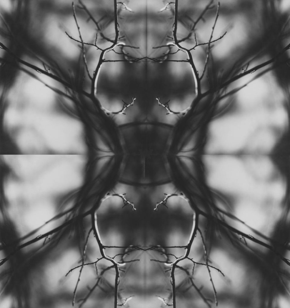
Ralph Eugene Meatyard (1962)-Untitled used

Today we learnt how to create a mirrored/kaleidoscope effect on photoshop. The image above is my final outcome. I chose this image by Ralph Eugene Meatyard because the simplistic shapes that were created by the tree’s twigs allowed the image to look slightly geometric and more complex than original image was.

I believe that the my final works well because of the image being black and white. This gave it an eerie effect which works with the original image which was sparse and and empty but now the four images have been reflected it make a whole other shape, allowing the viewer’s imagination to wander trying to figure out what the shape looks most like.

Surfaces and Textures

Aaron Siskind

Siskind was born in New York in 1903 and died in 1991.

Siskind focuses on taking photographs that don’t necessarily have a meaning however, his images can be interpreted in many ways. He focuses on layers in his images, it is very rare to see smooth surfaces in his work.

Siskind identified with the ideas and styles of the abstract expressionist artists in New York in the 1940s. 

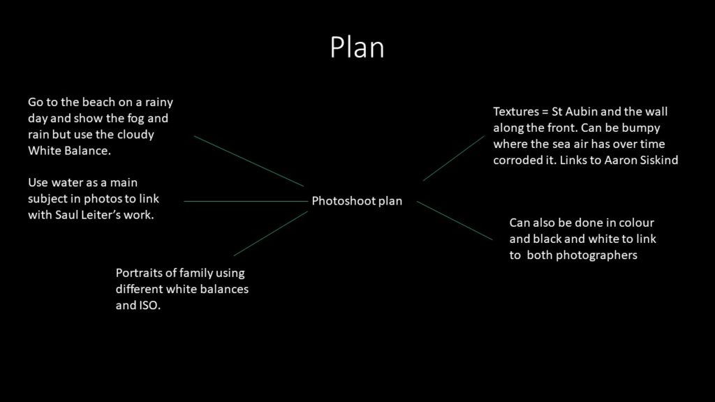
Plan:

Shoot (Contact sheets on another blog)

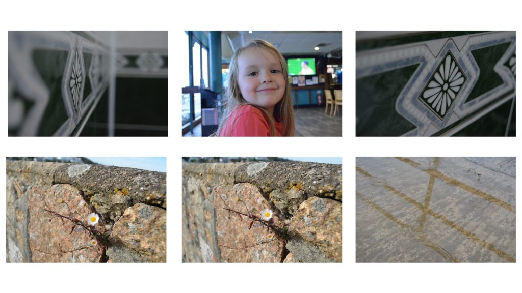
I’ve included the images I took in school because I feel that you can see how i have used the different white balances and changed the ISO best on those images. This is because the main feature in those images didn’t move allowing the viewer to notice the difference in tone.

Favourite Unedited outcomes:

Favourite edited outcomes:

Favourite images

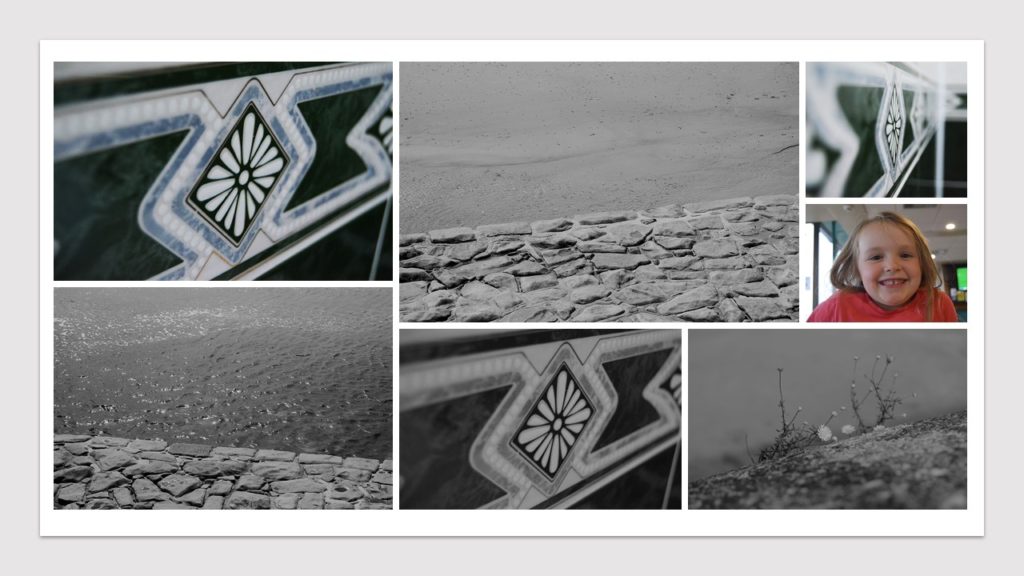
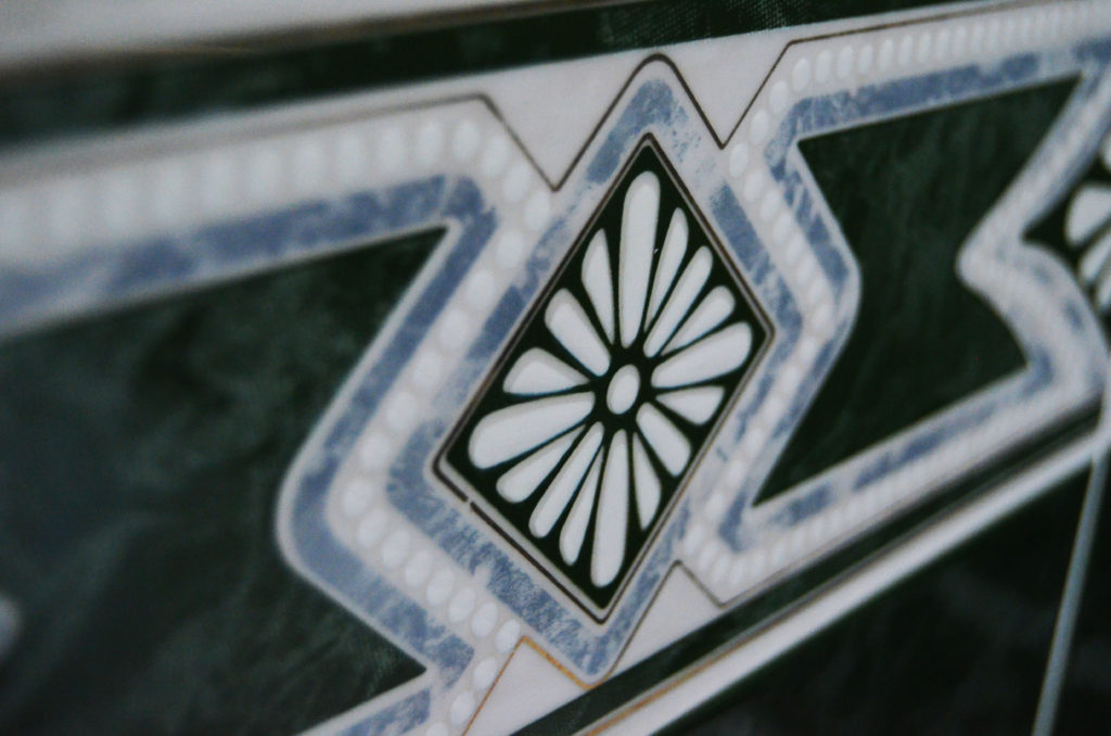
The coloured image is one my favourite images because I feel like the viewer not only sees colour but the different textures on the tiles. .I took this using a 120 ISO and the fluorescent white balance, with a manual focus and shutter speed. .The smooth looking texture of the tile at first glance  contrasts the little details of the of the central details like the diamond which is slightly raised and each petal in the centre of it is also raised. The cool tones in the image gives the viewer the feeling of relaxation and this is also supported by the simplicity of the design on the tile.

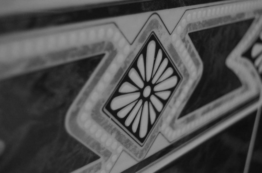
The black and white image is the same but i went onto photoshop, turned it black and white, then made the contrasts in the photo more prominent so that the viewer can see the bumps around the flower like shape in the centre of the image.

The black and white image also shows the camera focused on the centre of the tile because if you look on the left hand side of the image you can see the details of the tile almost merge into one thing.

REPETITION, PATTERN, RHYTHM REFLECTION AND SYMMETRY- 1

Alvin Langdon Coburn

In the galleries: Alvin Langdon Coburn's "Vortograph" and Barry Stone's  "Sky 3099"
Through a glass darkly: Tate Britain celebrates the work of Alvin Langdon  Coburn | The Independent

Ernst Haas

ERNST HAAS ESTATE | COLOR: EUROPE

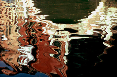
Both of this artists uses reflections in their images which creates an original and symmetrical image. Ernst Haas use the reflection of the water which gives a quite a natural way to the image.He also uses colors in his images . You can find the images in your daily life . We can notice in the reflection of the water that there are buildings so it’s quite visible.  Its dynamic movement He crops the subject to increase the sense of abstraction. Alvin Langdon Coburn’s images are very symmetrical . We can notice a lots of triangles which forms.The reflections that he uses are those of the mirror which creates a repetition . We can notice some type of cristals he uses for his images.


REPETITION, PATTERN, RHYTHM REFLECTION AND SYMMETRY-2

Today we learn how to repeat a image on Photoshop. I choose this old image of a building that i like because of the architecture I thought it really was interesting . It looks like it’s reflected by the water but I just copy and paste it next and over to the original photograph. I had to select the image , copy it , increased the canvas size ,  paste the original picture in the white space , transform it flip it horizontally or vertically and then flattened the image.Repeat it three times.