Steve McCurry 
Annie Leibovitz 
Tim Tronckoe 
Alfred Eisenstaedt 
Lee Jeffries 
Manny Librodo 
Richard Avedon 
David Lazar 
Oleg Oprisco
Category Archives: Independent
Filters
ENVIRONMENTAL PORTRAITS – PHOTO SHOOT
Ideas for your environmental photo shoot.
WHO
- Barber/Hairdresser
- Dentist/Doctor
- Postman
- Market trader
- Florist
- Tattooist
- Musician
- Barista
- Fishmonger
- Butcher
- Baker
- Farmer
- Cleaner
- Chef/Cook
- Teacher
- Fisherman
- Builder/Carpenter
- Sportsman/Coach
- Taxi driver
WHERE
- Central Market
- Fish Market
- St Helier Shops
- Hair salons/barbers
- Coffee shop
- Hautlieu School
- Building Sites
- Harbour
- Sport centres/fields
- Taxi Ranks
- Own home
WHEN
You will have to think ahead and use your photo shoot plan.
You may have to contact people in advance, by phone, or arrange a convenient time. (Ask if you can return later in the day).
Remember to be polite and explain what your are doing and why!
It may surprise you that most people will be proud of what they do as it is their passion and profession and will be happy to show it off!
Don’t be scared. Be brave. Be bold. Be ambitious!!!
portraits
A portrait is a painting, photograph, sculpture, or other artistic representation of a person, in which the face and its expression is predominant. The intent is to display the likeness, personality, and even the mood of the person. Portrait photography is one of the most popular genres of photography, with good reason. Good portrait photographers are able to capture the personality and emotion of people around them.
There are many different types of portrait photography. These include
- Environmental photography
- Candid & Street photography
- Conceptual photography
- Traditional photography
- And more
Examples of portrait photography
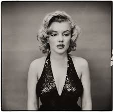
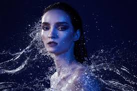


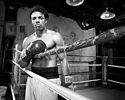
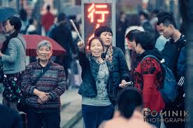
portraiture introduction
Portrait photography, or portraiture, is a type of photography aimed toward capturing the personality of a person or group of people by using effective lighting, backdrops, and poses. There are many different types of portrait photography, including; traditional, lifestyle, environmental, candid, street, glamour, fine art, conceptual and surreal.
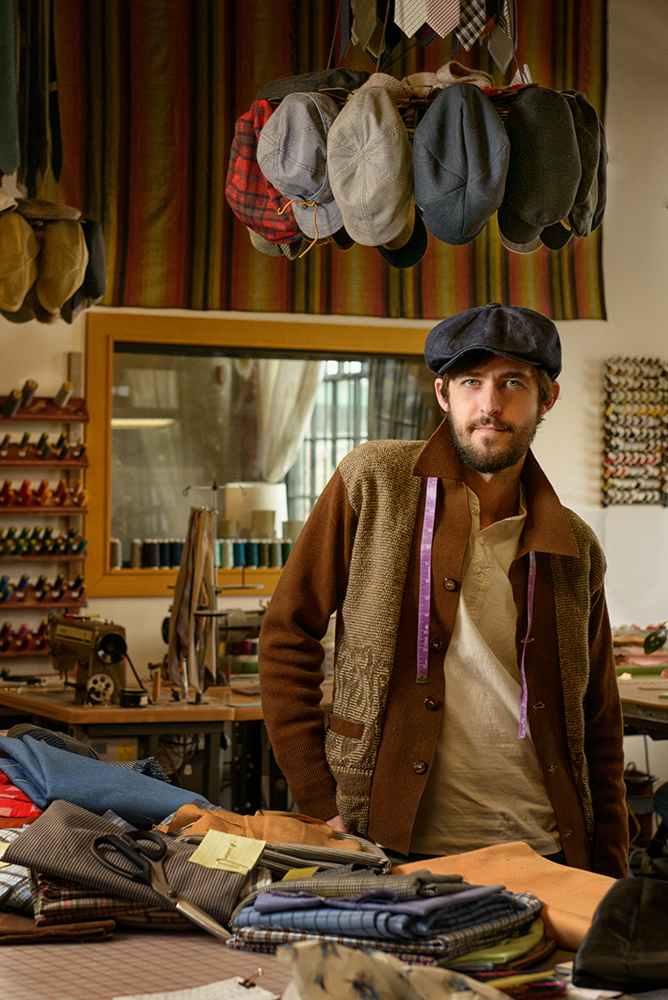
Benny Migliorino 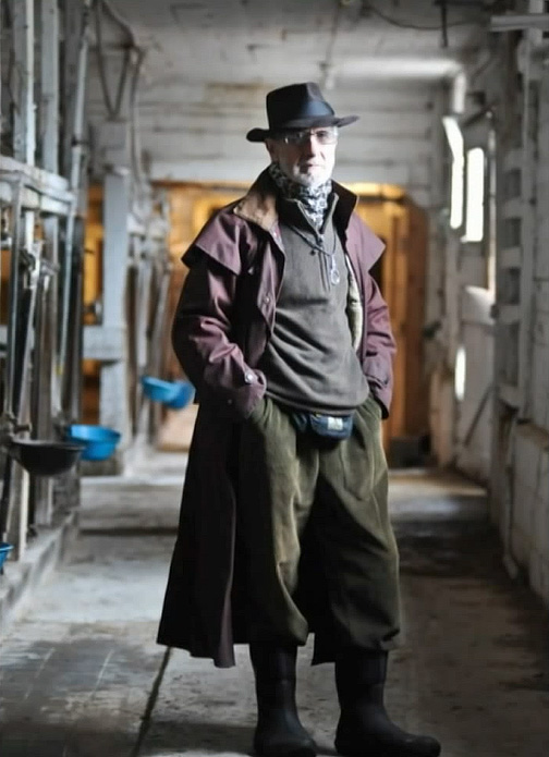
Unknown 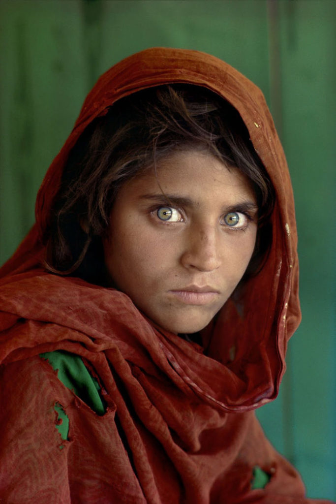
Steve McCurry 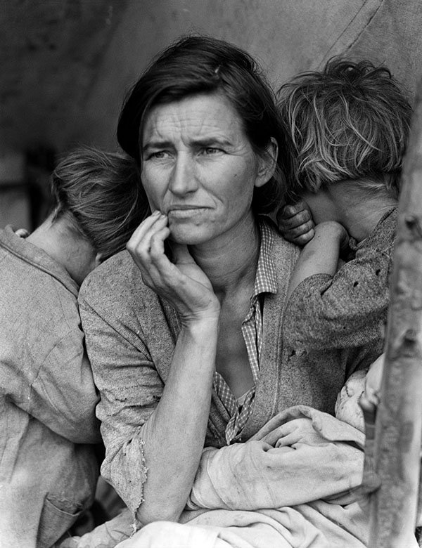
Dorothea Lange 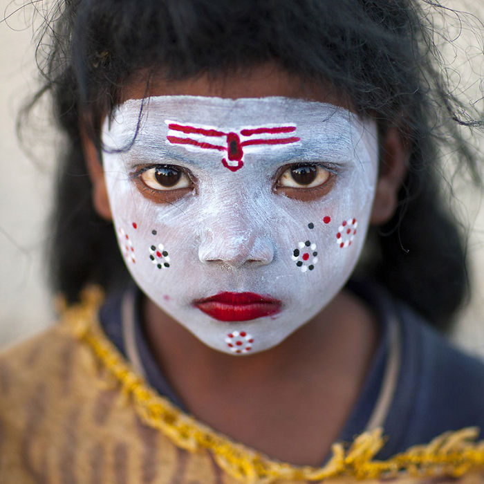
Eric Lafforgue 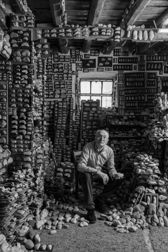
Unknown 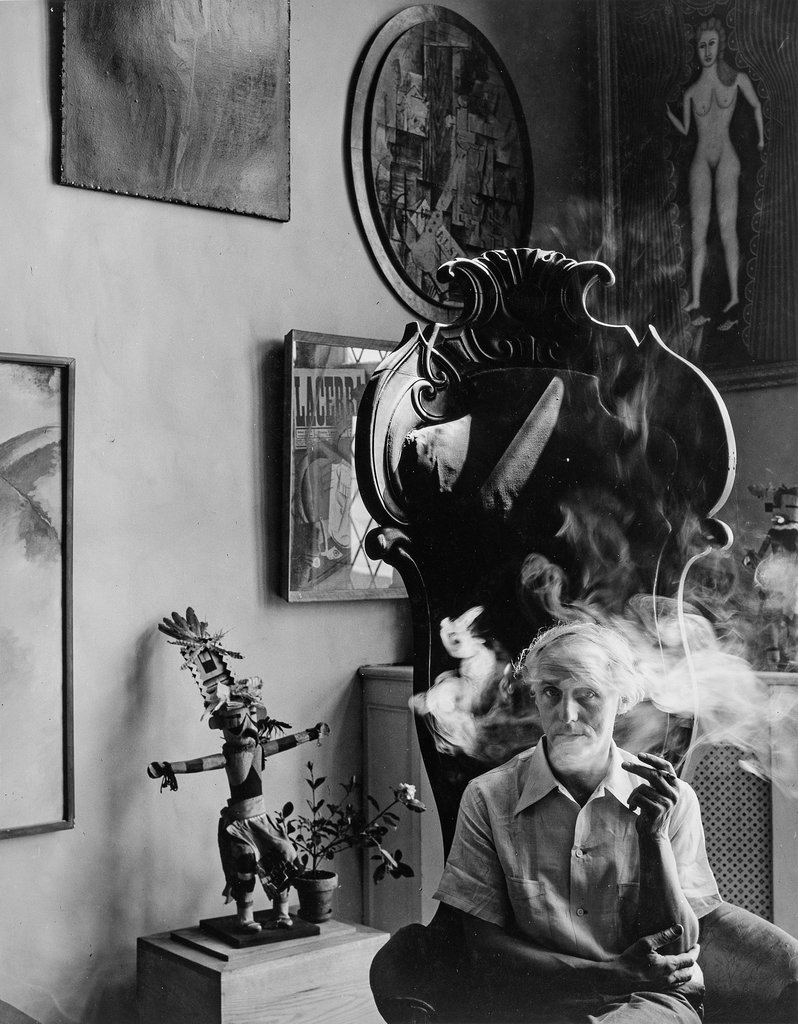
Arnold Newman 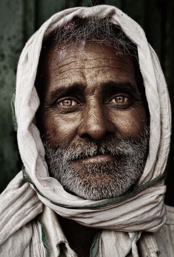
Unknown 
Giulio Sciorio
IMAGE ANALYSIS
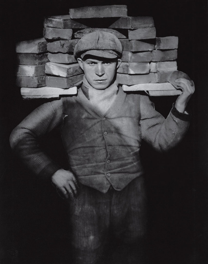
August Sander chose to photograph this bricklayer as a part of his work ‘The People of the 20th Century’. His aim was to show all walks of life including doctors, farmers, chefs etc., in a post – WWI Germany. Sander’s photographs were the first body of work to document a culture through photography. In this photograph, the main point of focus is the man’s head, as it is being framed by the layers of bricks stacked behind him. However it could be argued that the bricks are actually the main focal point, as the man’s face is blurred, which contrasts to the in-focus bricks behind him. The way that the bricklayer is holding himself suggests to the viewer that he is proud of his profession and lifestyle, as his stance is very intimidating and authoritative. The lighting in this image appears to be coming from the upper right hand corner, and is casting a shadow across the bricklayers body whilst also illuminating and highlighting his head and the bricks stacked behind him, which again draws the viewer’s eye to these particular points of focus. There is a varying range of shadows across the photograph, with dark shadows being casted across the lower half of the man’s body on the left side of the image, whilst the right side and upper half is well-lit.
Selecting, Finalising and presenting Your Photographs
Sample of my Virtual Gallery / Exhibition:
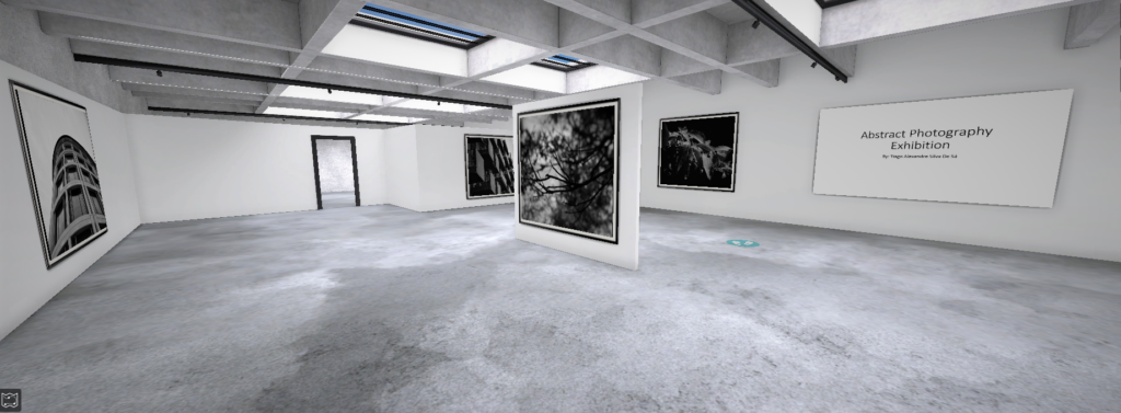
Why I chose to present my final outcomes in this way:
I felt really inspired to present my final ideas and outcomes from these projects in a form of Virtual Reality Exhibition due to the fact of COVID-19. I took inspiration from the fact that there are now being held art exhibitions, University inductions and much more through virtual reality programs. For example, the British Museum, London has undertaken Virtual tours during the quarantine.
How I did it:
Step 1: Go to www.artsteps.com
Step 2: Sign in / up.
Step 3: Create.
Step 4: Create your own location or choose a template.
Step 5: Upload your images, put them in your exhibition, name it and give it a description. For mine, I justified my photographs.
Step 6: Present / view your Exhibition.
Evaluation
Planning: In my opinion I have given myself enough time to think about what images to use and why. I have also clearly thought and justified the reason behind my presentation.
I have clearly worked hard and considered the situation many of us are in like the Pandemic and took inspiration from Museums doing Virtual Tours during this dark time.
Image Collection: I was very satisfied with my work as I have powerfully managed to explore and present my ideas on abstract photography. I successfully picked the photographs that portrayed as much abstract and colour as possible.
selecting, FINALIsING and displaying
When selecting my final photos, i segregated my black and white photos from my colour ones. I did this as i thought that grouping the different colour scales were more appropriate to display them as they shared a reoccurring tone.
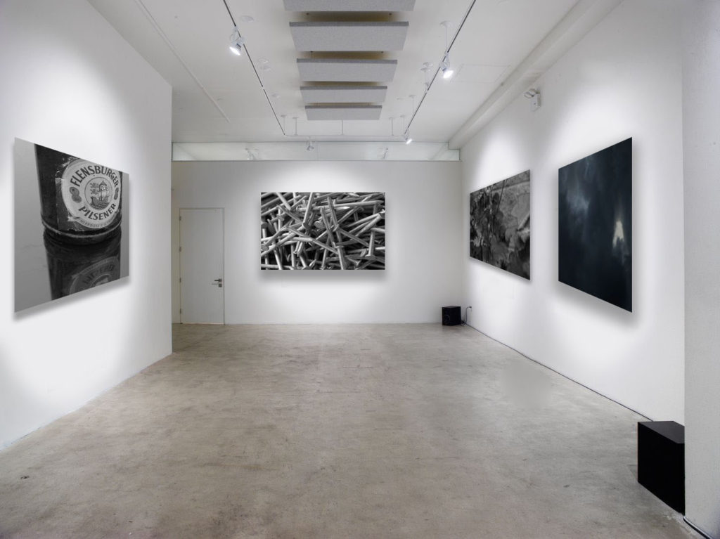
Displayed in my black and white gallery are two of my final photos from my ‘The World Is Beautiful’ project. i selected these two as i feel that they strongly capture the essence this movement was working towards, making overlooked objects look fascinating and beautiful. I paired these photos with one from ‘Looking And Seeing’ and ‘Repetition, Pattern, Rhythm, Reflection And Symmetry’ which both capture natural objects and occurrences. Grouping these four images together emphasises that both man-made and natural objects are fascinating.
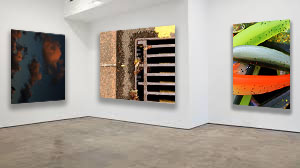
When choosing my colour photos, i gathered what i felt were the sharpest and most vibrant photos. Even though the photo of clouds isn’t vibrant, I felt like is showed a good representation that there are a wider range of coloured images then just vibrant and bold colours.
One main aspect I focused on while displaying my colour gallery was the plain gallery to use as the background. To me, this was key as the selected photos are vibrant and dominant photos, so placing them close together will clash the colours and tones. I used this leveled gallery display to isolate the photos, meaning that they’re least likely to clash as they aren’t as close together.
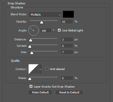
When uploading and displaying my photos, i used the distance, spread and size bars shown above. These bars adjust the drop shadow around the photos, making the final gallery more realistic and 3D. This makes it easier to imagine what my photos would actually look like in an art gallery.
SELECTING AND FINALISING AND DISPLAYING
Paris abstract
Photos selected
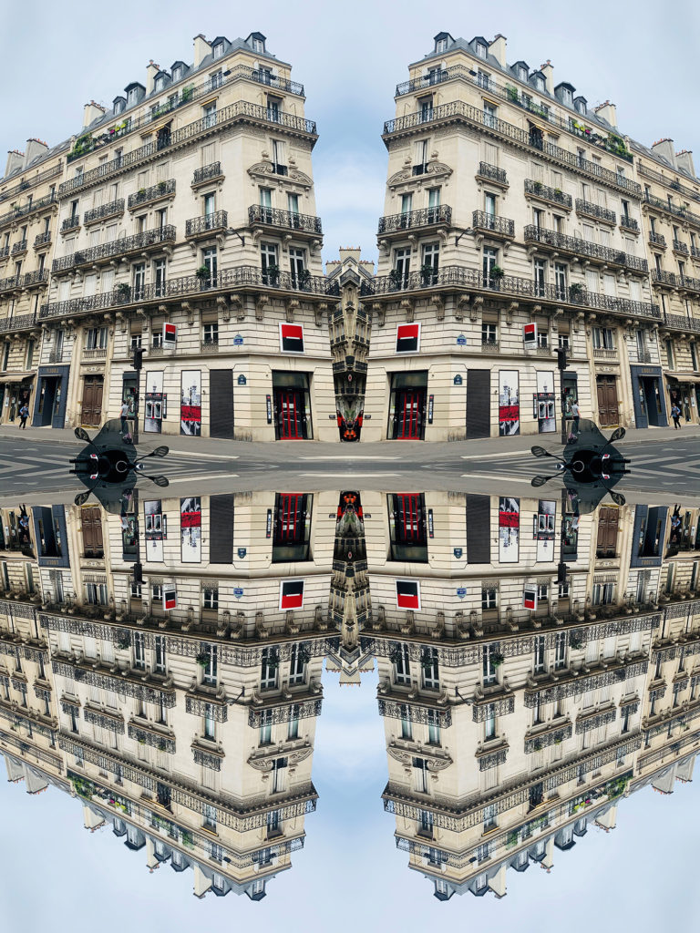
Gallery
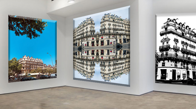
This gallery is composed of three different subjects: the firt one is an original photo the seconde one it's the REPETITION, PATTERN, RHYTHM REFLECTION AND SYMMETRY task and the third one is the BLACK LIGHT task. I named this Gallery because they are all pictures I took from Paris.
Strange teenager
Photos selected
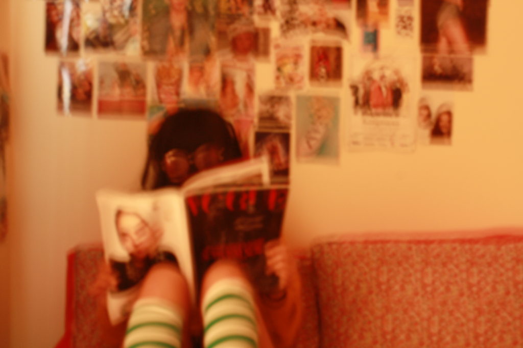
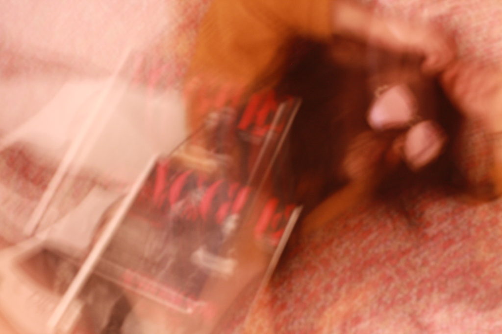
Gallery
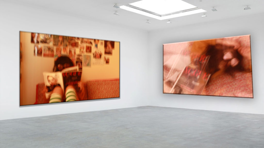
This two photos are from the looking and seeing task. I got inspired by Ralph Eugene Meatyard and Saul Leiter’s images.What I like about this two images is that it’s my own style and it looks a bit a fashion photographie. It gets closer to what I would like to be later. I also like rthat it is blurry I think it creates a fun effect.
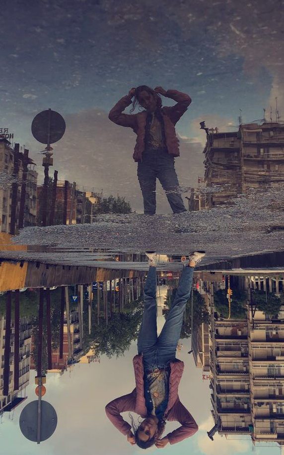
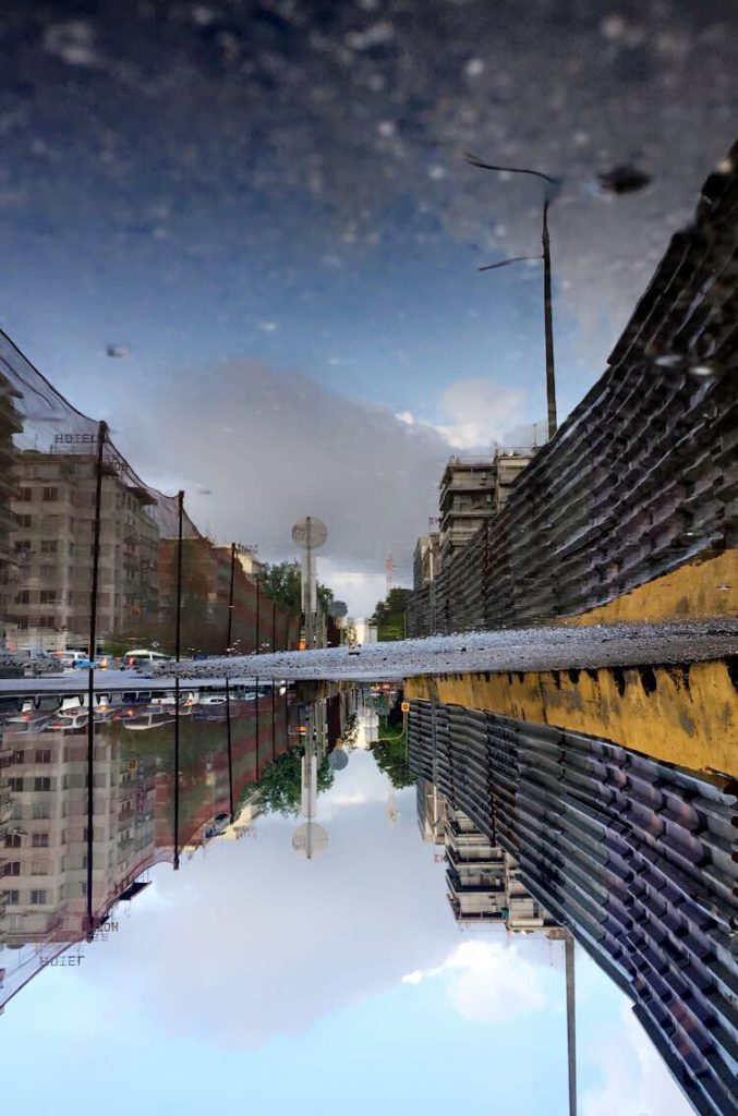
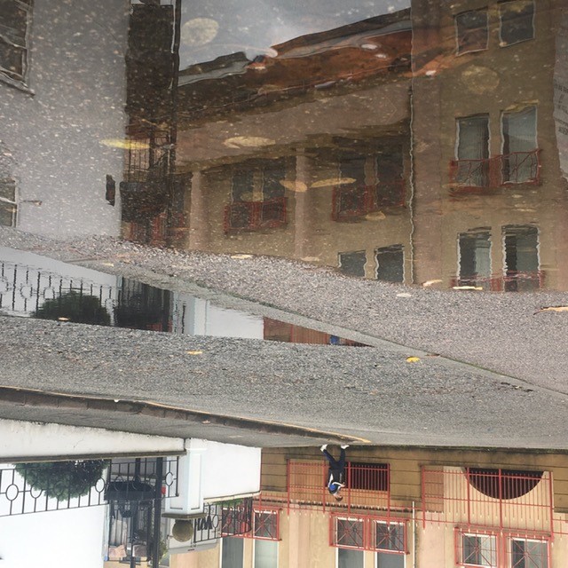
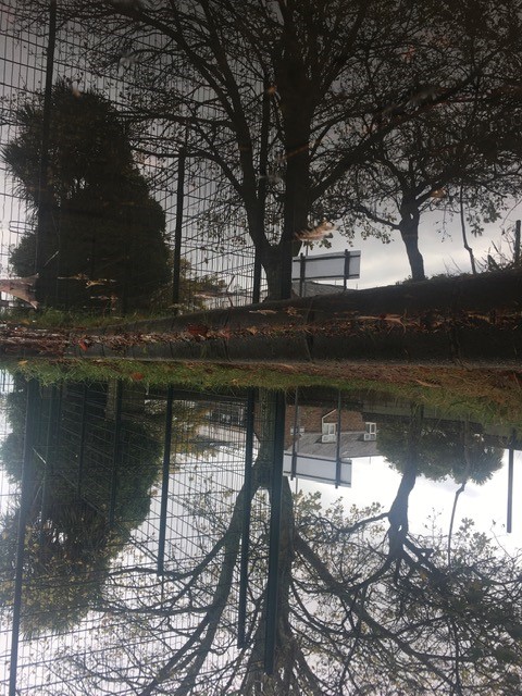
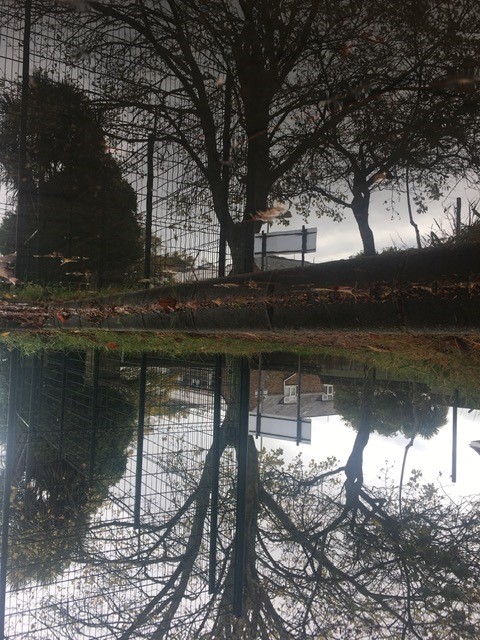
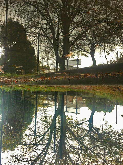
The world upside down
Photos selected
Gallery
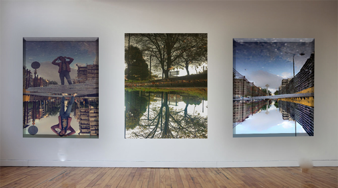
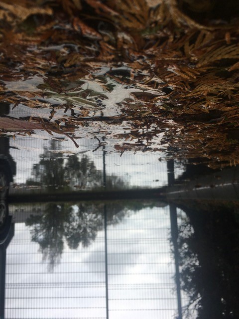
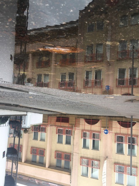
This gallery is from my REPETITION, PATTERN, RHYTHM REFLECTION AND SYMMETRY task . I was inspired by Ernst Haas who took some pictures of the reflection of the water .I tooked two pictures 2 years ago on my holidays in Greece I liked because it was like if the world was upside down. The one on the middle was favourite picture on my task I loved the detail of the tree reflected on the water.
REPETITION, PATTERN, RHYTHM REFLECTION AND SYMMETRY -3
Nick Albertson
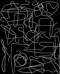

Nick Albertson was born on 1983 in Boston. Nick Albertson works as a photographer he also do videos and sculptural forms . He uses objects, such as paper clips, paper cups and rubber bands of their intended functionality , He creates repetition. Most of Nick’s work investigates accumulations of material .
Ernst Haas
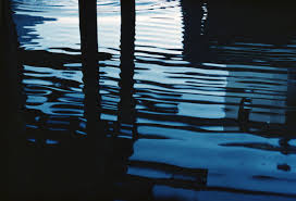
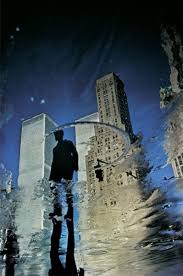
Ernst Haas was an Austrian-American photojournalist and color photographer. Haas was a prolific photographer, much of his photography involved creating very simple but stunningly photographs, beautiful light, sumptuous colour and intense feeling. Haas’s simple photos of lines on the street and reflections.
Photo plan
Who – The subject of my shoot is based on what can we see so this involved the obejct or person I decide to put in my image .
What – I’m gonna focus on the reflection of the water like the work of Ernst Haas. I what to create like a mirror on the floor I want the reflection to be abble to see the details
Where – I taking my photos on all the spaces I can see water on the floor and where I can see interesting elements like trees or buildings or persons. I will try to create differents perspectives and angles.
When – At this point what I’m really looking for are the elements in my pictures so the time don’t really matter
Why – I want to recreate two images I did on my Holidays in Greece, they remind at the images of Ernst Haas.
My pictures
My favourites pictures
I really like those images because I think we can really see effect I wastrying to create the only I have to do now is to change the lights becasue I don’t really like it.
Abstract Final project
Surface and Colour
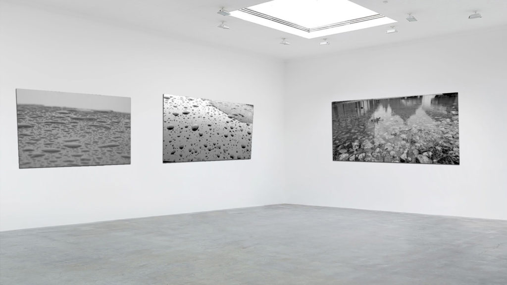
Pattern and Rhythm
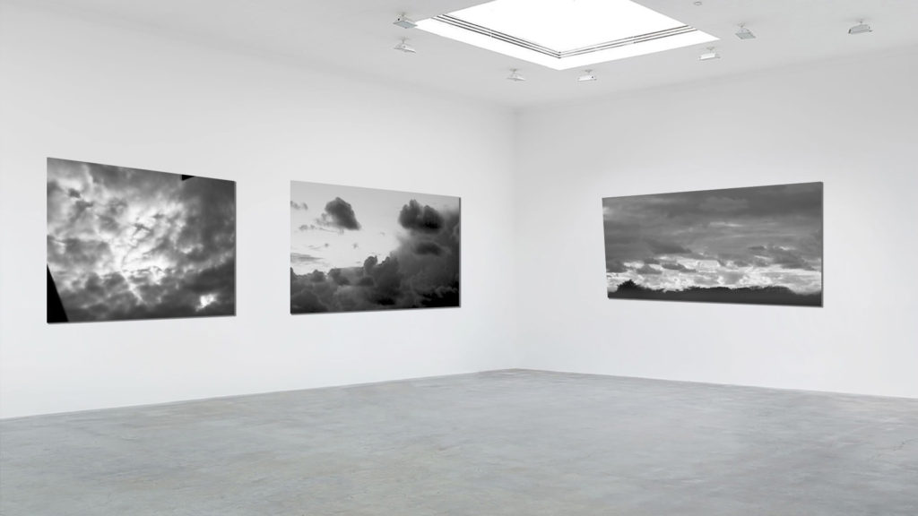
Reflection and Symmetry
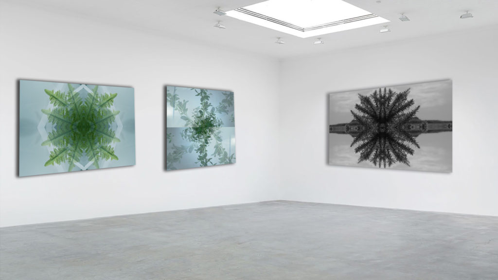
Looking and seeing
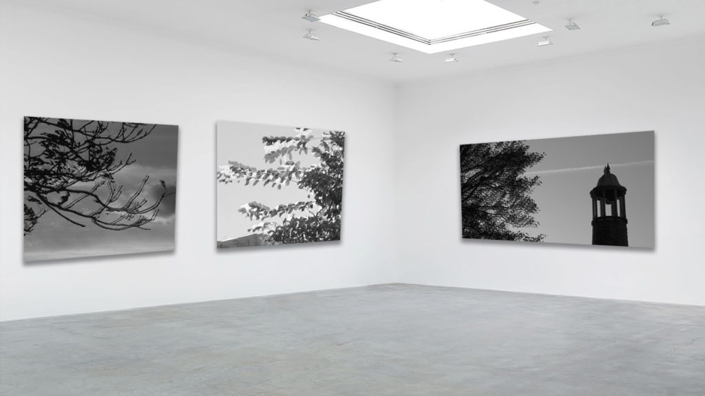
The World is Beautiful
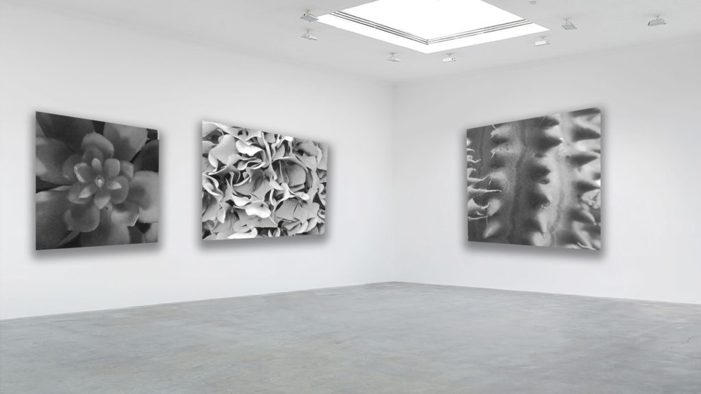
The Formal Elements – Paper
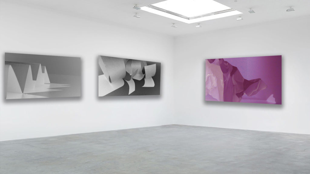
Black Light
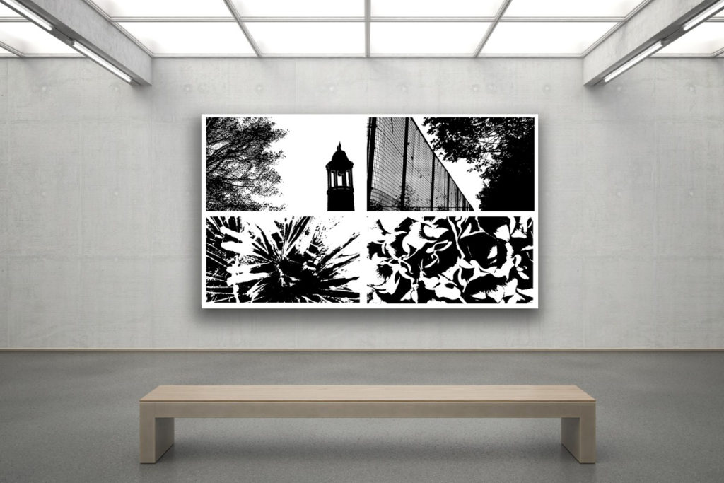
Abstract Project final gallery
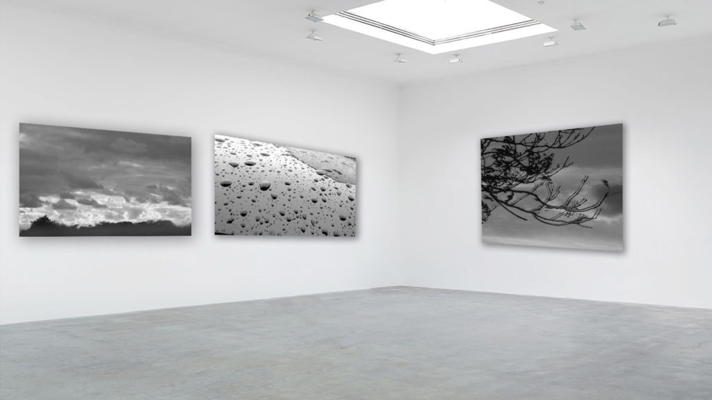
I believe these images work well as a set due to the use of the monochromatic filter that gives the set a sense of uniformity when visualized together. All these images focus on the abstraction of nature through texture, shape and echo. Because of the reoccurring theme of nature, this also means the photos work well. They also have a similar dark, dull tone which adds to the sense of unity of the photographs.
frederick sommer and minor white Comparison
Frederick Sommer
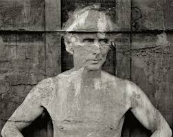
Frederick Sommer, born in 1905, was an Italian-born photographer raised in Brazil. He was considered a master photographer, as he started his love for art in photography in 1931. He originally explored his creative trait through watercolour ink and paper but later discovered his passion for photography in 1938, when he acquired an 8×10 Century Universal Camera. Sommer was a self-taught photographer who experimented with wild concepts for his creative work, he worked with materials as extreme as coyote bones and chicken parts. Frederick Sommer often mixed the two concepts of landscape, portrait and abstraction in his work, for example his portrait of Max Ernst, in my opinion, contains all three elements. Sommer’s landscape work of the vast desert he lived in is considered to be his most extravagant and impressive images, he referred these images as “constellations”. Frederick Sommer later died in 1999, in the desert in Arizona where he lived due to medical issues.
Analysis of Frederick Sommer’s work:

light: The natural sunlight of the image allows areas, such as the walking path, to be highlighted amongst the masses of trees and plants. As the sunlight is coming from above, harsh shadows are cast under them which contrasts against the blinding path.
Lines: There is a pandemonium of unorganised lanes scattered across the image in a chaotic manner, therefore they do not lead to a specific focal point.
Repetition: The only form of repetition in this image is the constant cluster of trees running through the photo, however there is no definite pattern.
Shape: The shapes in this photograph are organic and unorganised, giving the image a chaotic appearance.
Space: There is a wide depth of field to this image as the majority of the photo is in focus, there is also no negative space in the photograph as the whole image is busy in all areas.
Texture: The photo appears to have rough texture, as the trees and plants create a harsh, bumpy composition, however this is contrasted against the smoother and less harsh texture of the path running through the image.
Value/Tone: There is a varied tone from dark to light in this photograph as the darkness is concentrated around the middle third, however there are also scattered tones of darkness amongst the light, therefore I believe the tones are balanced.
Colour: The lack of colour in the image enhances the light and dark tones in their natural form.
Composition: As the photo is a natural landscape, the composition is very unorganised and organic. The rule of thirds could possibly be seen in the middle third, with dark areas concentrated here, but there is no recognisable geometric shapes in the image in order to understand the composition.
Minor White
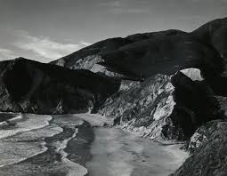
Minor White, an American photographer, theoretician, critic and educator, was born in Minnesota in 1908. His interest in photography began in 1937, as he combined his passion for philosophical theories with taking photos. He was influenced by how people would view photos differently on a personal level, which then began his photography career in black and white and colour landscapes. White created thousands of photos focusing on all areas of landscape, portrait and abstraction before he died in 1976, he also taught photography in many schools across America in his lifetime. His images create a string sense of juxtaposition in the sense of light and dark.
Analysis of Minor White’s work:

The natural lighting in this photograph is reflected onto the water to create and intense highlight running through the middle third of the image. It also allows harsh shadows to be cast either side of the highlighted water to create a juxtaposition of light and dark.
The leading lines of the two cliffs direct the viewers eyes to the middle third of the photo, this creates the focal point of the glistening water, the harsh lighting also accentuates this. There is also a repetition of jagged lines in the image that appear in the cracks of the cliffs.
There is a repetition of line used in this image, but in a more organic sense. The natural cracks in the rocks are present throughout the image, aswell as the curved lines within the curves of the waves.
The shapes in this photograph are organic and curved, however there is a sense of sharpness in the jagged rocks and cracks within the rocks.
There is a strong depth of field in this image, as the foreground of the cliffs are significantly clearer compared to the background, which is concealed by fog. The darkness of the cliffs create a negative space which acts of a kind of border to the natural chaos of the waves.
The image portrays a rough texture as the sharpness of the rocks is contradicted against the curved waves. The surface of the rocks is uneven and organic, which adds to the coarseness of the photograph.
There is a range of tones from dark to light in this photograph, as the highlights and shadows juxtapose each other. The darkest area of the image is the rocks towards the left and right third, which act as a border to the lightest areas of the image, that being the waves in the middle third of the photograph.
The monochromatic format of the photograph allows the viewer to focus on the highlights and shadows of the image,as well as the shape formation, rather than the colours.
The image has a balanced appearance as the dark and light tones are evenly distributed throughout the image. For example, the dark tones are concentrated around the edges of the image, which then surround the lighter tones concentrated in the middle third.
Comparison of White and Sommer’s work
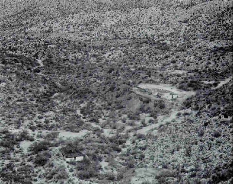
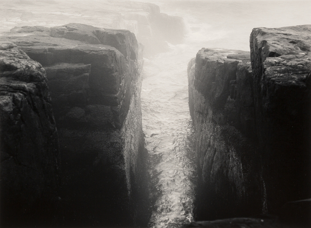
Frederick Sommer and Minor White share similarities in there landscape work, especially the use of the monochromatic format towards their images, as they focus on tone and shape rather then colour. They also capture the chaotic composition of nature in it’s purest form, as well as the juxtaposition between light and dark.
Alternatively, White’s image here specifically focuses on depth of field and blurring out the background in order to create a focal point, whereas Sommer captures the landscape as a whole and rejects the use of a singular focal point. The juxtaposition between light and dark is much harsher in the work of White compared to Sommer, which suggests that White’s image became over exposed possible from using a wider aperture.


