Category Archives: Independent

Filters

Author:
Category:

Environmental Portraits

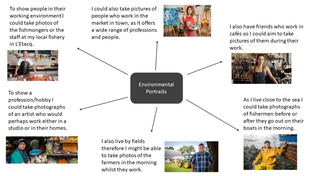
Environmental Portraits is a form of portraiture where the typical working environment of the subject is showcased.

Kremer Johnson

Kremer Johnson

The above three quarter length, head-on image taken by Kremer Johnson is a perfect example of an environmental portrait.

It is a good example because the image is of a man engaging with the camera wearing his wetsuit and fishing accessories while holding a spearfishing gun and sporting wet hair. This indefinitely shows us that fishing is his passion/job.

The image also has the ocean as the backdrop of the ocean which concludes the overall scene and setting of the environmental portrait.

The image is lit using natural light with aid from a more fluorescent light which fills in the right side of of the subjects face and creates a shadow which intensifies his features and helps drive the idea of a well weathered fisherman in the portrait. Kremer uses a smaller aperture to create a large depth of field by isolating the subject from the background and creating a bokeh effect. There is also use of a warmer white balance to accentuate the theme of pride.

Kremer has created texture by using a high resolution camera and lense combined with the lighting. The texture is constructed around the contrast of the smooth neoprene chest plate with water cascading down it and the fishermans rough hands and facial features and metallic gadgets which tells the story concealed in the portrait.

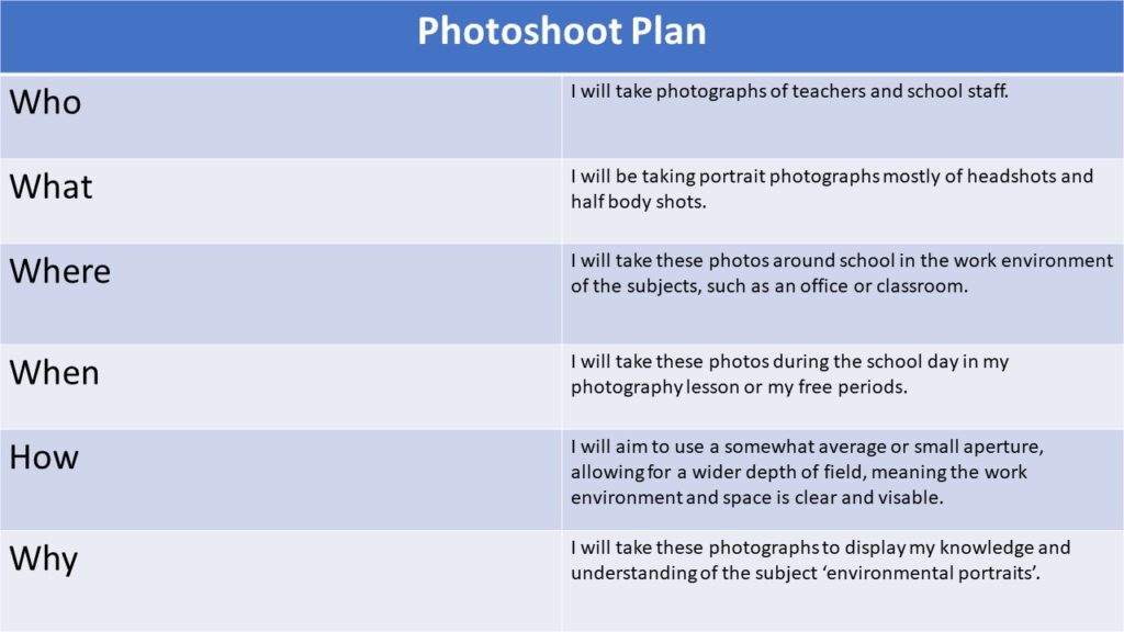
PhotoShoot Plan

Who – Surfer

When – Later in the afternoon so natural light is not too harsh

Where – By the ocean

What – Subject holding surfboard in a wetsuit.

Why – This portrays her passion/hobby clearly in the portrait.

How – Use a warm white balance and a combination of natural and manmade light.

Contact Sheets
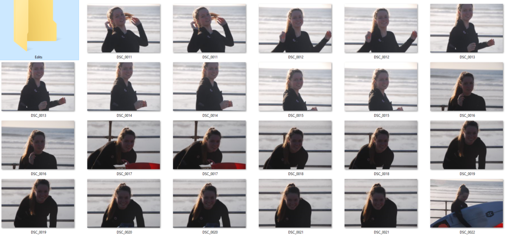
Final Images
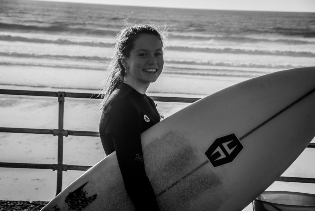
I chose to use a low saturation and a high contrast to give my image more tonal depth and clarity. This helps outline the subject and make her the focal point of the portrait.

I used a combination of natural and fluorescent for the first few images the sun was hitting my subject from the side on creating an outline on one side whilst casting shadows on the other side to emphasize her facial details. for the last two images I wanted to light my subject head on so I use a one point lighting system and it worked well with the background.

I used a lower ISO to slightly udder-expose the images to relay a gloomier mood to emphasize the winter environment. This also gives us more context into the life of the subject relaying by informing that she is a more passionate surfer as she endures colder weather.

Candid PORTRAITS And Street PHotography

What are candid portraits?

It is when you take a portrait photo of some one without them knowing to get a more realistic and a not staged image.

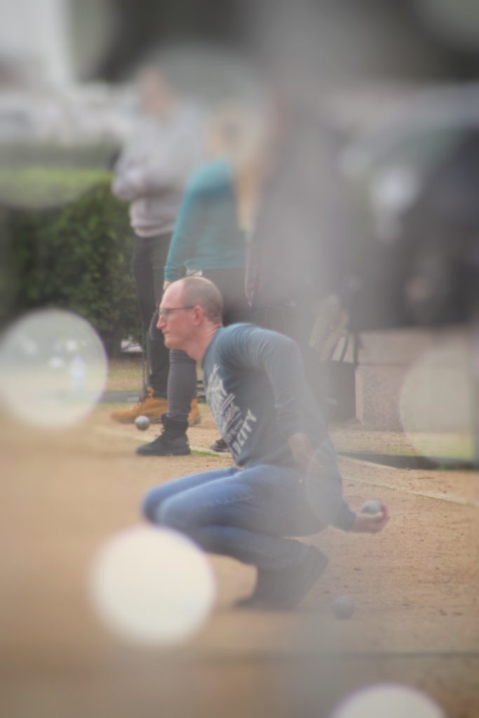
This is an image I took as the subject isn’t engaging with the camera, and also isn’t setup or staged in any way.

What is street photography?

It captures unmediated chance encounters and random incidents that happen in day to day life. It is also called candid photography.

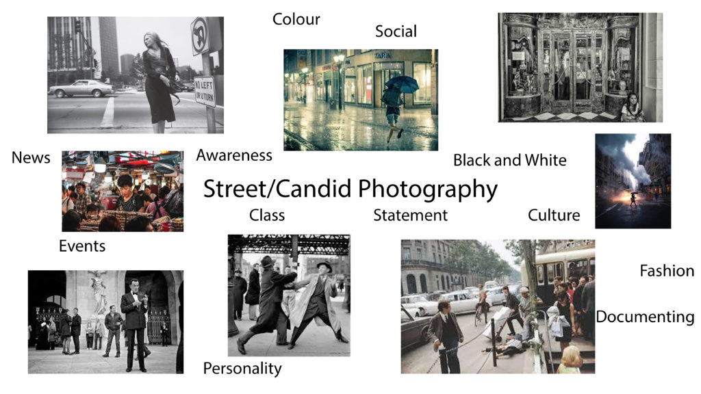
Examples of street photography

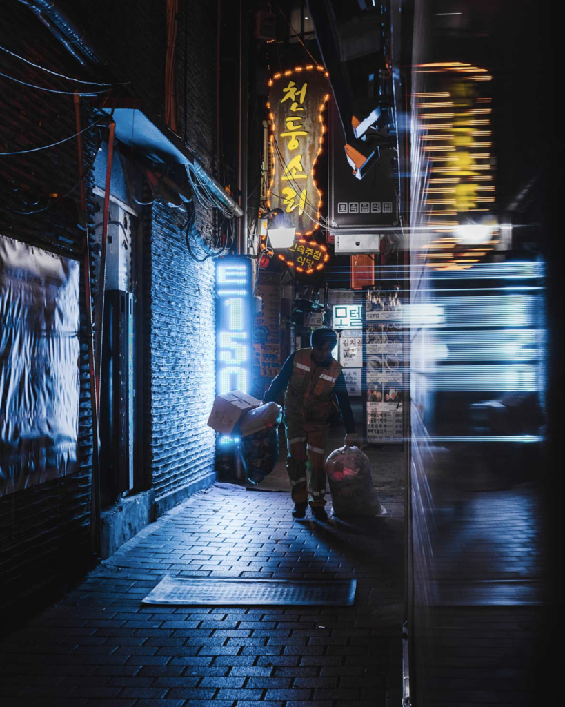
(First photo was taken by Teeman Jarvinen), (second photo was taken by Keenan Hastings), (Third photo was taken by Mats Alfredsson), (Fourth photo was taken by Martin U Waltz), (Fifth photo was taken by Dave Bottoms), (Sixth photo was taken by Marcin Baran), (Seventh photo was taken by @francesco_portelli)

Some other great examples : http://neocha.com/magazine/asia-by-night/

Henri Cartier-Bresson

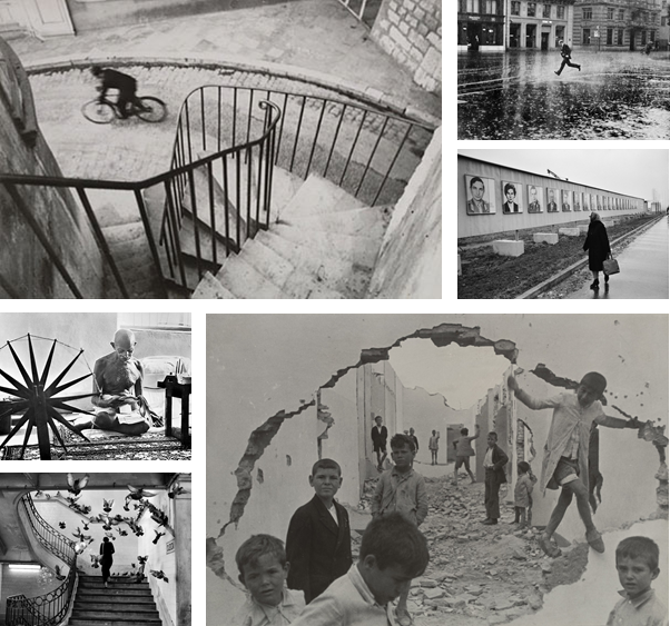
Henri Cartier-Bresson was a French photographer considered a master of street photography. He pioneered the genre of street photography, and viewed photography as capturing a decisive moment.

Famous Images

He was alive during August 22, 1908 – August 3, 2004, which is why his work is all in black and white.

My Favoutite Henri Cartier Image

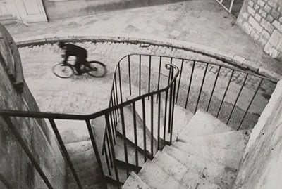
A Closer Look at the Iconic Cyclist Photo by Henri Cartier-Bresson

I like this image because he has used the railings to create leading lines, which draws the viewers eye instantly to the subject. The rule of thirds is applied in this image, the subject on the bike sits in the top left of the image.

The black and white effect creates a drama in the image, the emptiness makes the image stronger as it singles out the subject

Henri Cartier-Bresson X Magnum

In 1947, following the aftermath of the Second World War, four pioneering photographers founded a now legendary alliance. The Magnum Photos agency.

Cartier-Bresson helped deliver the highest quality photographic content and has extensive experience in creating significant visual records, which became note-worthy editorial, books, events, exhibitions, and digital campaigns.

Compare And Contrast

The image by Bresson was taken in black and white and has a high contrast, to make it have more definition. Jarvinen’s image is taken in Tokyo, where they have lots of neon and vibrant lights, that illuminate the subject. The lights have a soft infused glow to them, with gives the image a more positive aspect to it.

Both photographers uses reflections in the image. Bresson reflects the subject through a puddle in the horizontal axis, where as Jarvinen reflects the light on the right side of the image to create a blur effect through a window. This effect adds more detail to the image without over crowding it, and making it busy.

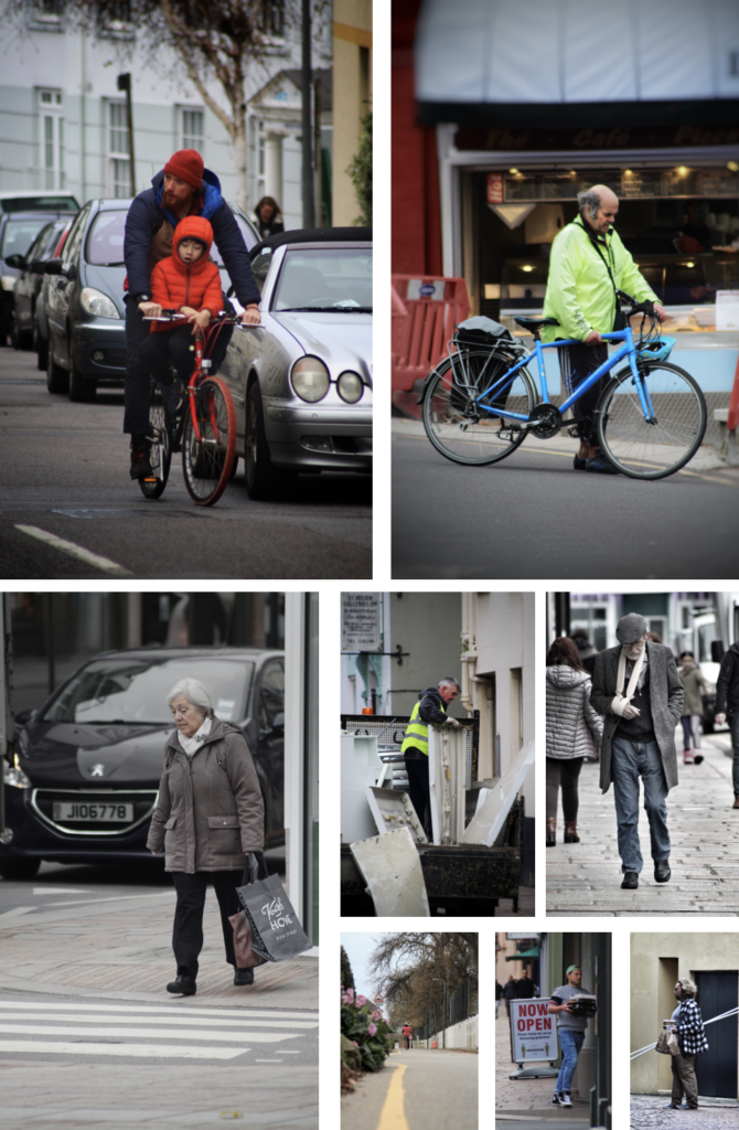
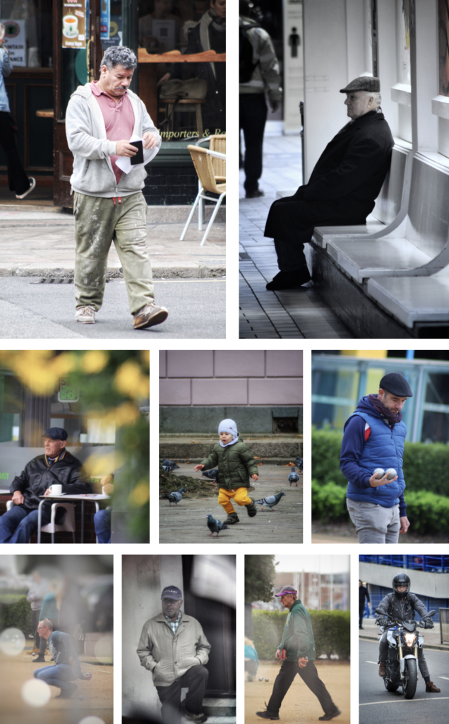
My Street Photography Pictures

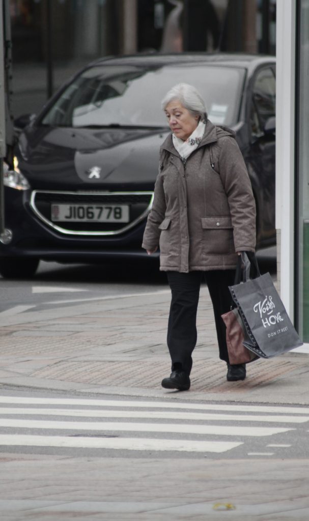
I took all these images on the same day except for the postman one. It was cloudy so I went for more dramatic shots, so that I could edit them with a more moody style.

My Final Images

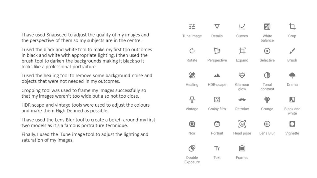
To edit them I increased the contrast and saturation to make them pop out more.

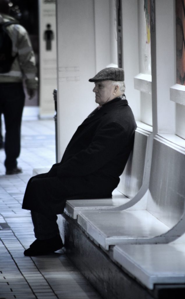
For the images that have a more of a rainy day atmosphere I decreased the saturation and individually masked over bright and colourful objects and toned the colours down, so that they blended with the image, for example the blue car in the background of the lady crossing the road, and the bright yellow cove sign in the image where the man is sitting down on the bench.

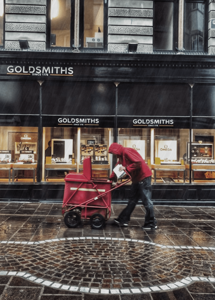
The image of the postman in the rain I edited a few more rain lines and used a motion blur, so that it would seem as if there were falling. I also increased the definition and made the colours more dark to give it the rainy day atmosphere.

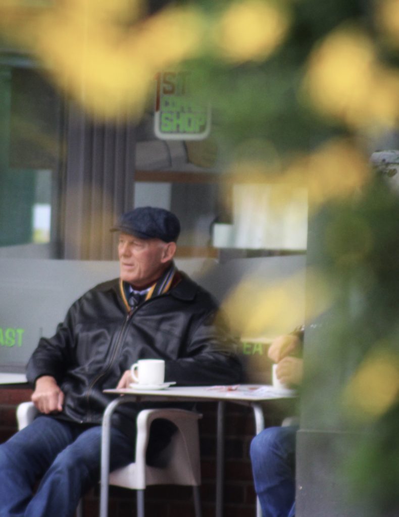
The photo that’s includes bokeh isn’t edited that much all I did was boost the saturation and used an “s” curve to manipulate the contrast. The create the bokeh effect I positioned my camera close to some lights to shoot through them, then focused on the subject, so that the lights would become out of focus.

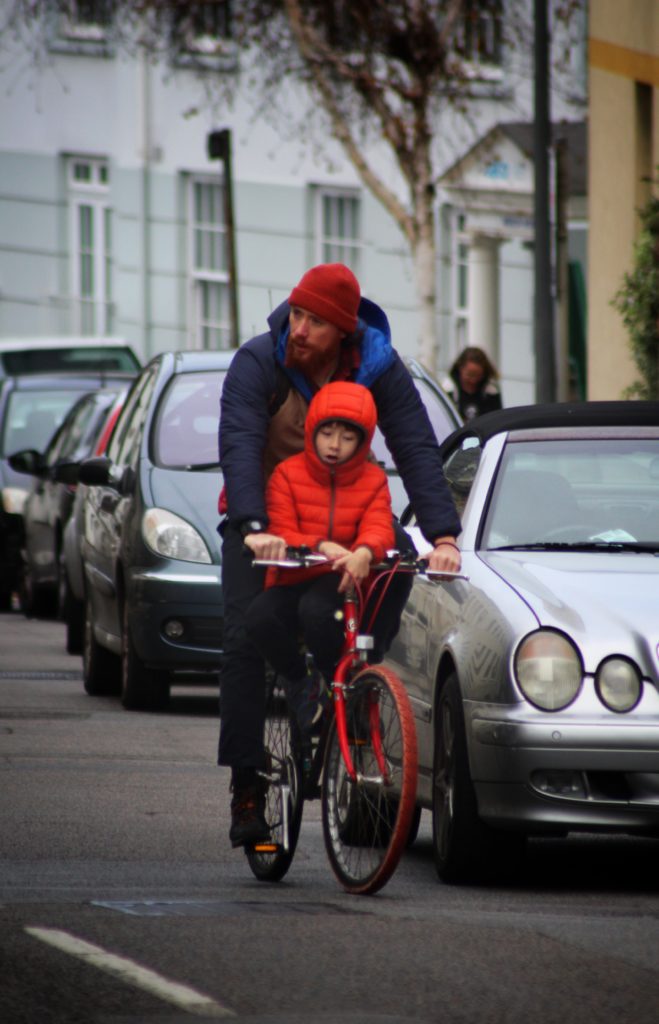
For the image where there are two people on a bike all increased the saturation, darken the background and brightened the subject, then finally added vignette.

My Best Images

I choose these 2 images as my final images as I thought they both were my strongest images that fitted into the candid photography niche. They both captured people acting natural, in an unstated environment.

The image on the left as strong detail and definition, which makes the image more dramatic, that combined with the rain, the deep reds and glowing shop windows creates a great image. the building is straight with the horizon, and there is a slope which the postman is pushing his cart up, this image show the struggle of every day life.

The image on right, the bright orange jacket contrast the entire background, the vignette helps lead you eye the to bike as well. I shot this with a focal length of f.5.4 so the people in the background are blurred.

SELECTING, FINALISING AND DISPLAYING…

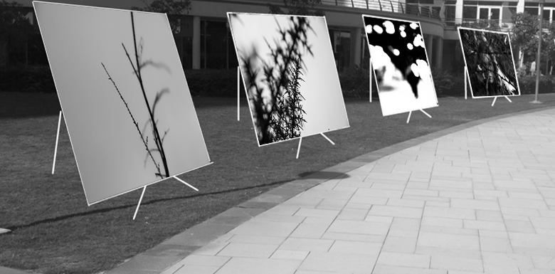
I grouped the above images together as they portray the same vertical leading line architecture both with each other, and with the gallery they are displayed in.

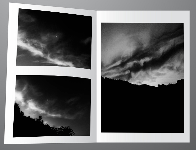
These images I decided to display in a digital zine format. They follow the same tonal and textual features showcasing the sandpapered clouds in a dark underexposed style.

The above images follow the same desaturated and geometric rectangle features which coincides with the gallery I chose which features grey walls and geometric rectangular architecture.

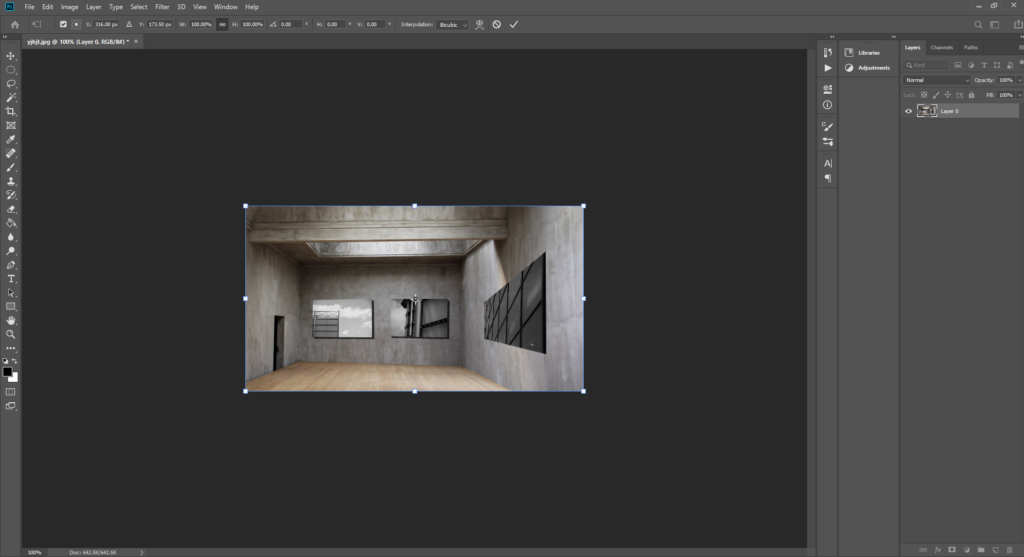
These images feature the same experimental focal style. They all have unconventional focus features with varying depths of field which made it suitable to use the immersive gallery which provides depth of field as some images look closer than the others.

The above images are curated together into that setting for the way they look like a portal into a different universe.

Method

I first gathered my my images according to how aesthetic they would look simultaneously, into five sub-galleries

I then chose a fitting empty background to stitch the clusters of images onto. I chose backgrounds that possessed similar shape and form of the images and also any other visual elements such as similar cloud patterns.

I then used photoshop to transpose these images onto the coinciding backgrounds by making use of free transform and warp to make the images look naturally apart of the background. I also added a drop-shadow to the images to help achieve this.

Portraits

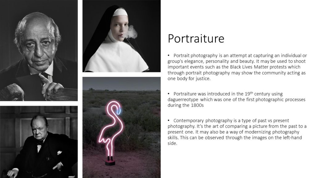
A portrait is a painting, photograph, sculpture, or other artistic representation of a person, in which the face and its expression is predominant. The intent is to display the likeness, personality, and even the mood of the person

What makes a portrait a portrait?It should say something about the person you are photographing or the person you are creating with the camera

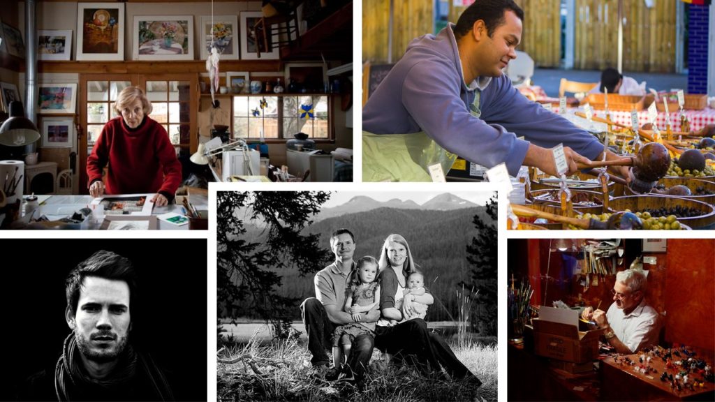
An environmental portrait is a portrait executed in the subject’s usual environment, such as in their home or workplace, and typically illuminates the subject’s life and surroundings. The term is most frequently used of a genre of photography.

The best to take an environmental portrait is to spend time getting to know the individual you’re photographing, chose the perfect location, use props if you need to, posing, direct eye contact to make sure the subject is engaged with the camera and use good camera settings.

LOOKING AT ENVIRONMENTAL PORTRAITS-

“An environmental portrait is a portrait executed in the subject’s usual environment, such as in their home or workplace, and typically illuminates the subject’s life and surroundings.

Examples of some well known environmental photographs –

Image result for famous environmental portraits
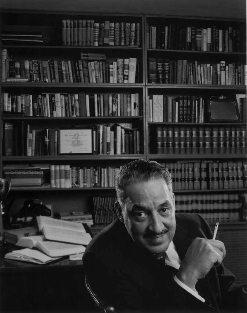
Arnold Newman : Leonard Bernstein , 1968
Image result for august sander
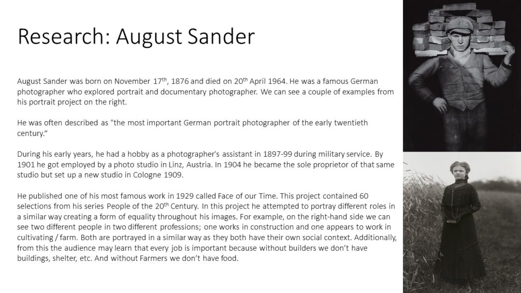
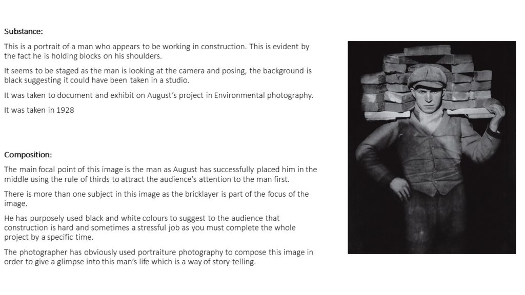
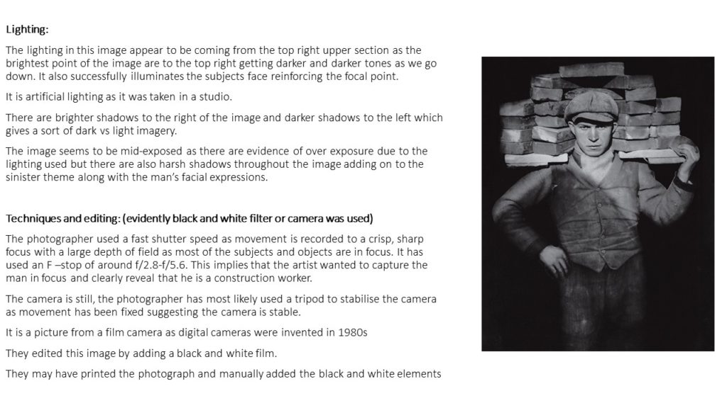
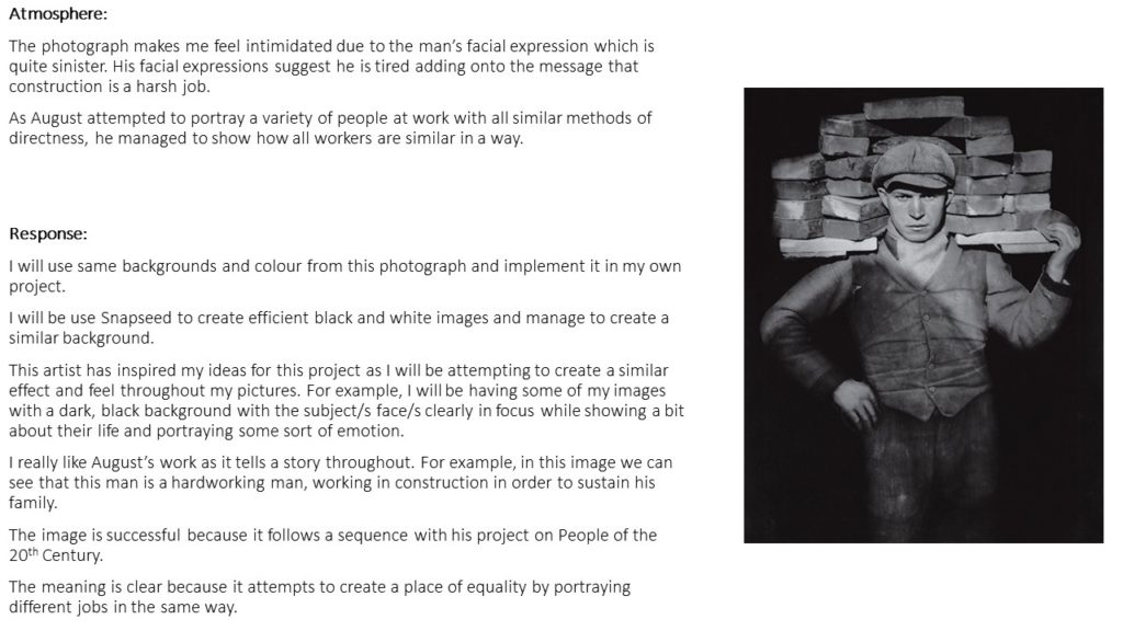
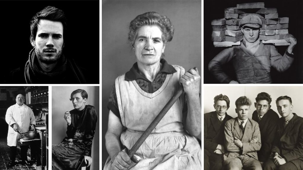
August Sander : Brick Layer, 1928

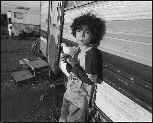
The photographer I chose to look at – Mary Ellen Mark

Mary Ellen Mark was an American photographer known for her photojournalism, documentary photography, portraiture, and advertising photography. She photographed people who were “away from mainstream society and toward its more interesting, often troubled fringes

Analyzing one of her photographs

Looking Back at a Master: Mary Ellen Mark | Shutterbug
looking back at a master Mary Ellen Mark, 2010

In this portrait you can see that the young boy isn’t posing and it’s not a formal shoot as he’s leaning back on the camper van behind him. It’s a half body portrait and it’s been taken further away than a normal head shot would be taken. The portrait is taken from the same angel as the boy’s perspective. It’s in black and white which in some way creates a sad effect and mood as there’s no bright colours.

An environmental portrait can tell you a lot about the subject being photographed, for instance, in this photo you can assume that the boy hasn’t been raised in a wealthy area due to the background around him and the dirty clothes. The boy is holding an animal which implies he might have been raised on the countryside. On the other hand the dove he’s holding may symbolize innocence and hope as he’s only young and is living in poor life conditions. He isn’t directly engaging with the camera as there’s no eye contact but his facial expression is sad as he isn’t smiling which might indicate fear.

Composition- in the photo the black and white lines behind the boy on the camper van are drawing the attention directly towards the boy as they’re slightly slanted and go directly towards him making him the main subject. The campus he’s at is quite dirty and depressing as there’s nothing pleasing to look at.

My photo-shoot action plan-

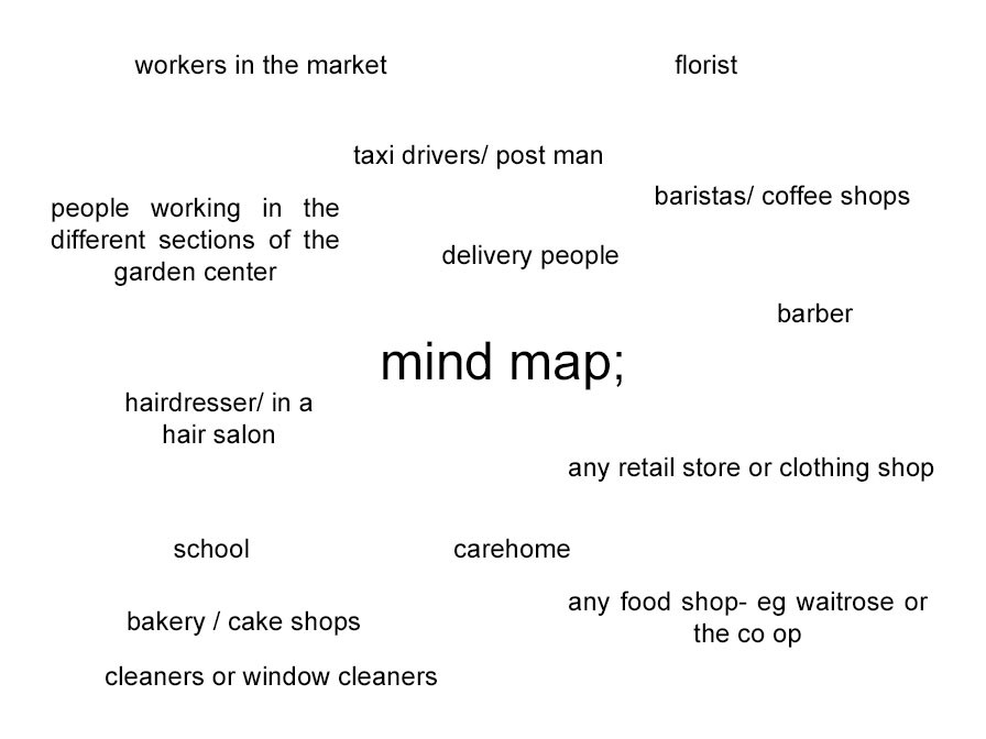
  • who– a stranger/worker in their everyday working environment or a family member
  • what– an individual working and someone was is surrounded in their working environment.
  • when– after school , go to the market or shop and ask permission to take photos.
  • why- to capture people in their everyday environment and the background that surrounds them on a daily basis.
  • how- take them on my camera in natural lighting.

MY CONTACT SHEET-

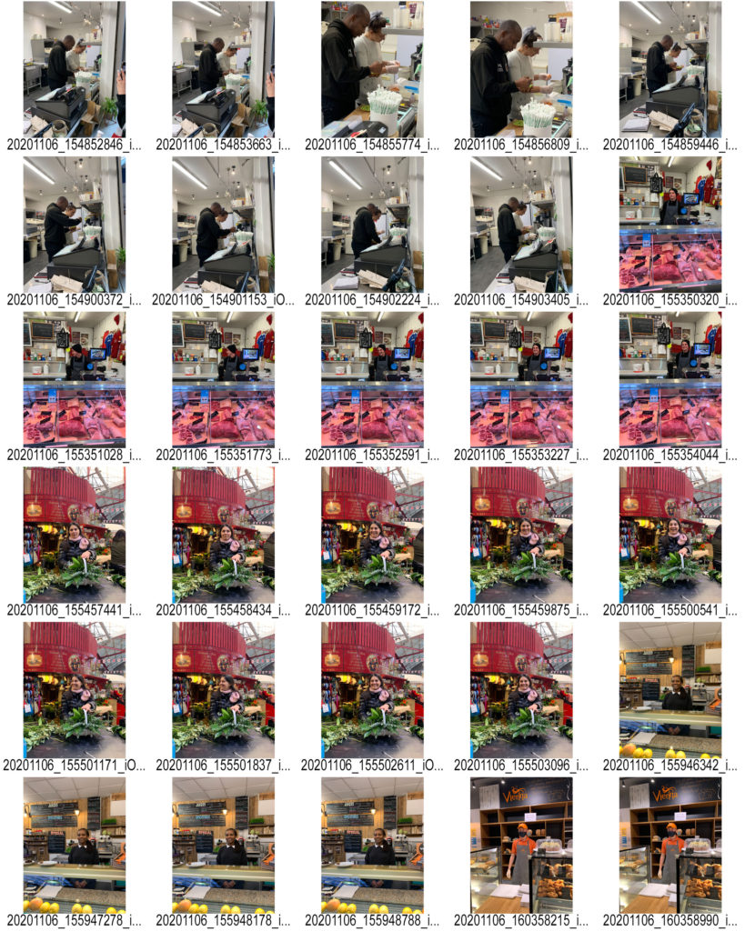
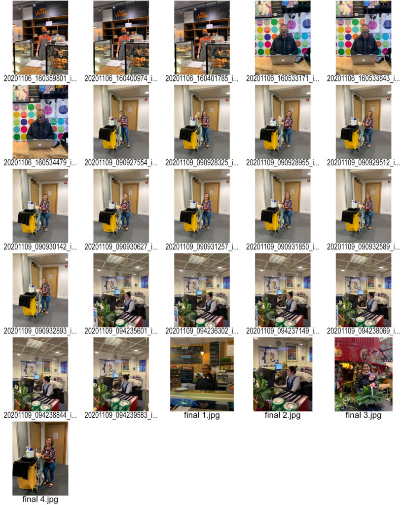
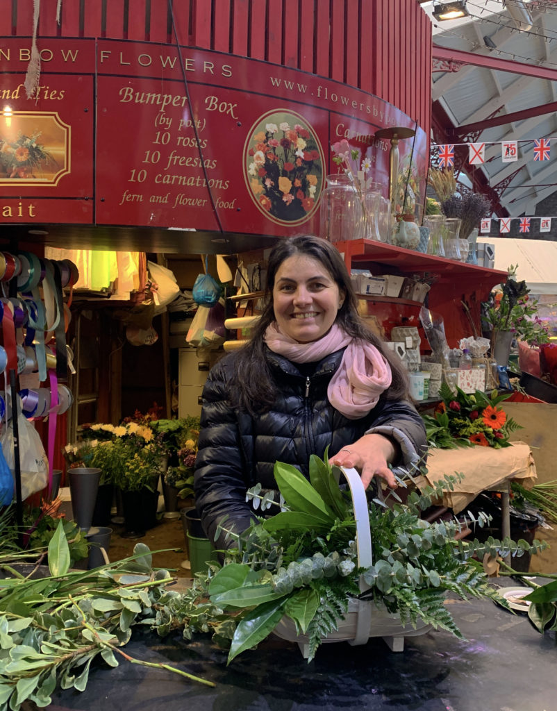
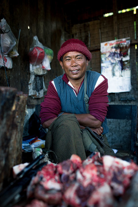
I went into town , to the market and fishmarket, to take photos of workers in their working environment. I photographed a few different sections of the market to get a variety of different backgrounds.

Some of my favourite and edited photos;

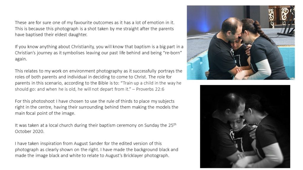
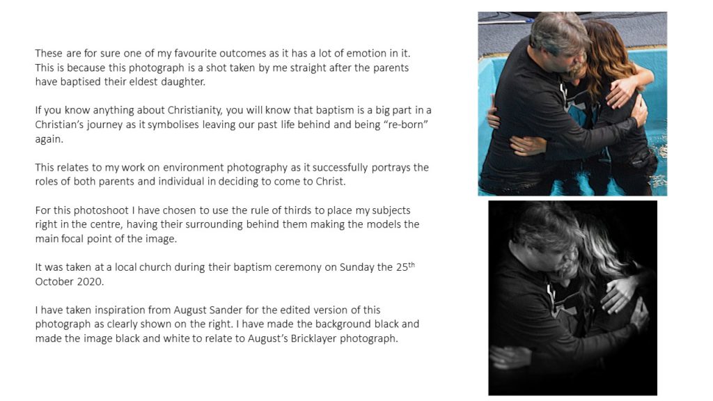
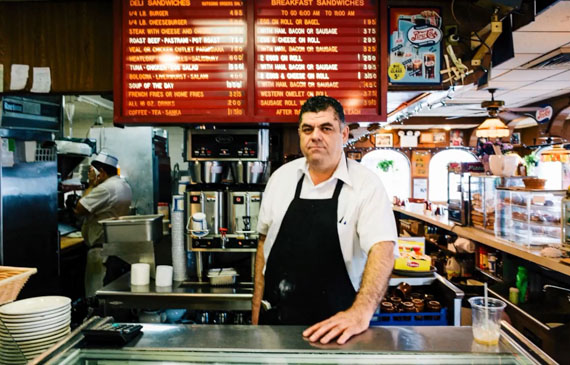
These are my favourite photos I took because I think they all capture the working environment perfectly as well as it being a portrait. Only one photo I took was a full body shot and the rest you could only see half of their body as they were behind desks. I wanted them to smile to create the mood of a happy working environment instead of them looking sad.

Street Photography Introduction

Street photography, also known as candid photography, captures unstaged incidents often in public places. Street photography can focus on people and their behaviour in public, or used to record people’s history. However, people being featured in the image is not a necessity within street photography. For example some photographers often produce photos without people included in the frame, but their presence is suggested by the subject matter.

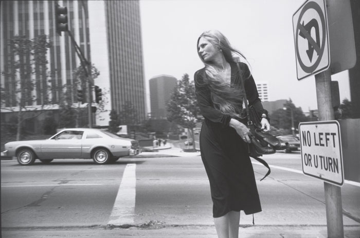
“Jeu de Paume” – Garry Winogrand (Circa 1980-1983)

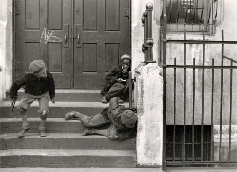
Helen Levitt

“NYC” – Helen Levitt (1938)

Helen Levitt, born in Brooklyn, NYC, in 1913, was known as “the most celebrated and least known photographer of her time”. Whilst teaching art classes to children in the 1930’s, Levitt became fascinated by chalk drawings that were part of the New York children’s street culture at the time. This led her to buying her first camera to capture the drawings and the children who made them. This resulted in her publishing these images in 1987, naming them “In The Street: chalk drawings and messages, New York City” (1938-1947). Levitt continued to take photos throughout the 30’s and 40’s, with her work first being published in the Fortune magazine’s 1939 issue. Helen Levitt received her first grant in 1946 from the Museum of Modern Art in 1946, and received two grants in 1959 and 1960 from the Guggenheim Foundation fro her colour photography work. She then published her first major collection, “A Way of Seeing”, in 1965 and became a Photography Fellow of the National Endowment for the Arts.

Analysis of Helen Levitt’s work

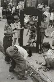
“New York, 1940” – Helen Levitt (1940)

Helen Levitt started her career by taking photographs of the inhabitants of poorer neighbourhoods in New York, such as the Bronx and Harlem. Here she photographs children in the streets of their neighbourhood.

The lighting used in this image is very low and dull. This suggests natural lighting was used as there is little representation of shadows or highlights. The use of natural lighting adds a sense of rawness to the image, as she captures the scene in its pure form, almost without purpose but simply to capture the moment.

There is little example of line within the photograph, however it could be argued that the placement of the pavement can be seen as a leading line to direct the viewers eyes to the focal point of the children, and the frame.

There is no form of repetition in the photograph as the composition is not purposely set up. There is also no use of echo or reflection in the photograph for the same reason.

The only use of shape in this photograph is the geometric square shape in the centre of the frame that the children are holding in the centre third of the image. Otherwise, the shapes in the photo are all organic and don’t have any relation to each other.

There is a wide depth of field within this photograph as both the background and foreground are in focus, this provides a strong sense of depth as the environment further displays the culture and meaning behind the focal point of the children.

There is little sense of texture in this photograph, however some may say the leading line of the edge of the pavement has a more uneven and rough surface, giving the overall image a harsher texture. However this is contrasted with the smoother surface of the pavement, on which the children stand.

There is a limited range of tones in this photograph as the image has a monochrome filter. The lightest parts of the photograph are the lighter-tones clothing of the people, which is juxtaposed with the harsh, black frame in the centre of the image. The dark frame takes up the majority of the photo, causing the image to tend towards the darker tones.

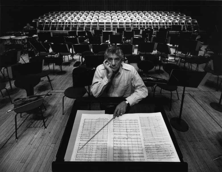
There is a lack of colour in this photograph, which is a common factor for Helen Levitt’s earlier work. This is most likely because colour photography was only made accessible in the 1930’s, therefore the majority of Levitt’s work was black and white until her later work in the late 1960’s. The lack of colour accentuates the strong contrast between light and dark.

The composition of the image is unbalanced and unorganised. This is because Levitt’s main focus in this shoot was to capture the joy and interest of the children in the poorer neighbourhood’s of New York, therefore the image is not set up and captured in the spur of the moment. Although there is a lack of thirds in this photograph, the focal point (that being the black frame) is coincidentally placed in the centre of the image.

Portrait / Environmental PORTRAITURE

What Is Portraiture?

Portrait photography draws attention to the subject. This is normally achieved through some combination of a shallow depth of field, composition, color, and lighting. It is aimed toward capturing the personality of a person or group of people.

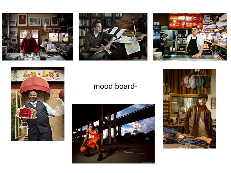
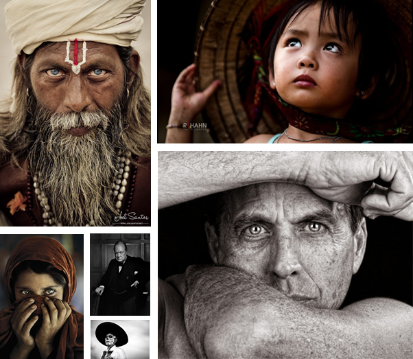
Mood Board

These are photos are inspirational, and I plan to take some of my own in a similar style.

Images from Google “famous/iconic portrait photography”

Complementary Photography

Complementary photography is marked by the current time period, and reflects our values and, challenges at that point in time.

Environmental Photography

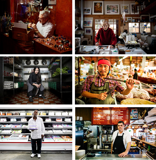
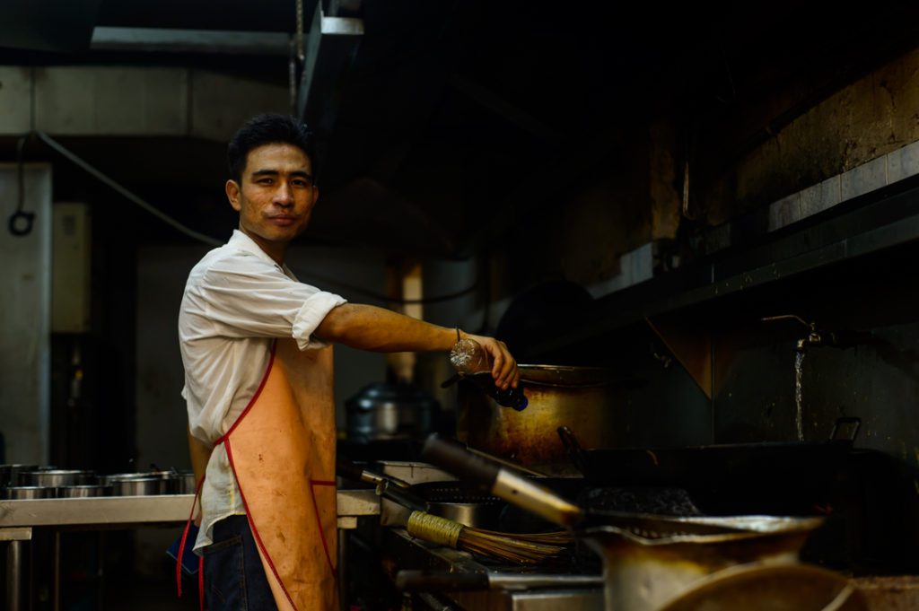
Environmental photography is when you take a photo of someone working in there environment, wearing there uniform, to create a more informative and dramatic photo.

Images from Google “environmental portrait photography”

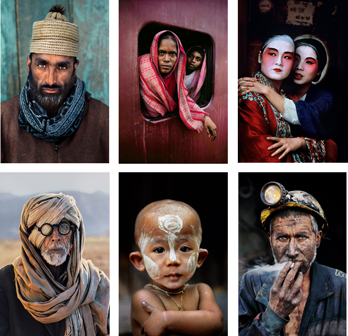
Steve McCurry

He is an American portraiture photographer, he was born in Philadelphia, Pennsylvania. He made many trips to India and Pakistan, he was also smuggled into Afghanistan. He  is best known for his evocative colour photographs that document both human struggles and joy. Having travelled the globe for over thirty years, McCurry has photographed warzones, burning oil fields, refugee camps, ship breaking yards and monsoons all over the world.

All images were taken by McCurry and published on https://www.stevemccurry.com/

Photo Shoot Plan

I plan to go into town and ask people that are working if i can take photos of them working naturally or stage a quick photo shot with them.

I plan to ask post men, bakers, shop assistants, fishmongers, and anyone else working in there environment.

I can take photos of them from the other side of the counter, which means the products they’re selling will be on display. Which helps the viewer understand their work environment.

My Photos

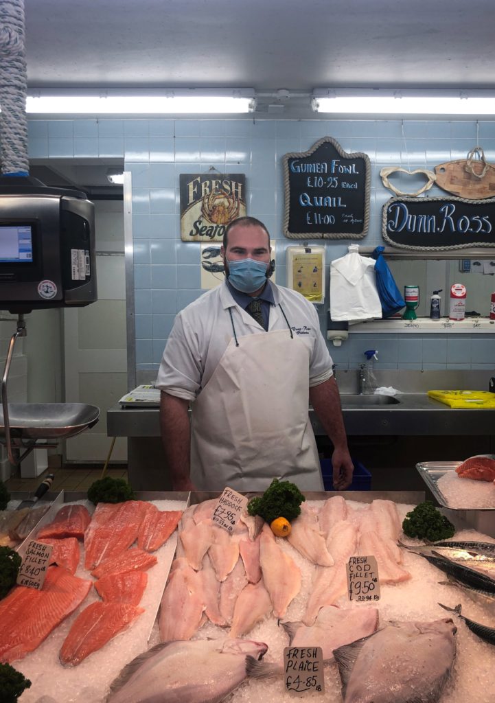
My Favourite Image

I like this because it shows the fishmonger in front of his filleted fish. The colours are vivid and they pop out as the rest of the image has a cold atmosphere as there are mostly cooling blue colours. The subject is centered, which sets the image up nicely. The whole image is in focus as it hows the work environment off. To take this photo I had to ask if it was ok to photograph them, I had to take it quick so it wasn’t to staged, although there is eye contact with the camera.

Environmental Portraits

An environmental portrait is a portrait executed in the subjects usual environment, such as their home or workplace, and typically illuminates the subject’s life and surroundings. The term is most frequently used as a genre of photography.

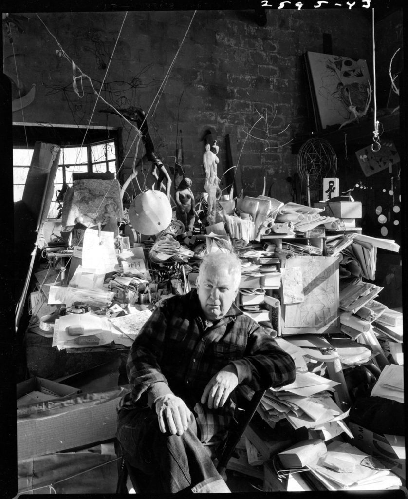
Arnold Newman

Arnold Newman was an American photographer, born in 1918 in New York, well known for his environmental portraiture work, which showcased a formal image of a subject surrounded by their work space or environment. Newman stated that he viewed his photography as an expression of himself, reflecting him and his fascination with people and the world around him. Newman was also often named the “Father of Environmental Portraiture”, with his work being displayed in museums all over the world.

Analysis

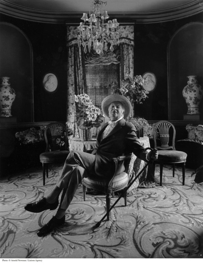
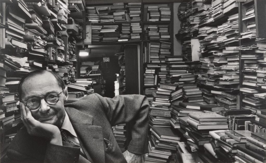
Arnold Newman – Erhard Weyhe – 1948

This black and white, half body portrait, taken by Arnold Newman, clearly displays the genre of environmental portraits, due to the subject of this image being Erhard Weyhe, an art book dealer, sitting among his immense book collection. Furthermore, here the subject, Weyhe, is displaying direct eye contact with the camera showing engagement, also whilst smiling suggesting an informal image. These stacks of books allow for short and interrupted leading lines, that guide your eyes around the background of the image, whilst making what would be empty space around the portrait feel cluttered and meaningful to the story of the subject. These books, that show the essence of his profession also act as a repetition of shape throughout the photograph.

In Addition, the lighting of this image appears to be the natural lighting of the work environment due to the highly contrasting tones between the book pages and the shadowed areas around the room, which would perhaps mean that it could be described as underexposed. Here you can see that Newman has chosen to take this picture with a small aperture, therefore allowing for a large depth of field meaning that the subject’s workplace environment is clearly showcased. Furthermore, the shutter speed used for this image is presented as fast, due to the fact that it is a clear and detailed photograph without any blurs.

In this photograph Newman has intended to present one of the great book dealers of his time, Erhard Weyhe, and to give an incite on his way of living and working. This lifestyle has been presented by Newman as a somewhat labouring and almost chaotic one, due to what looks like an interminable tunnel of books, pilled high. This depiction of Weyhe could be a sign of respect and appreciation from Newman towards his profession.

Environmental Portrait Photo-shoot

Plan

Photo-shoot plan

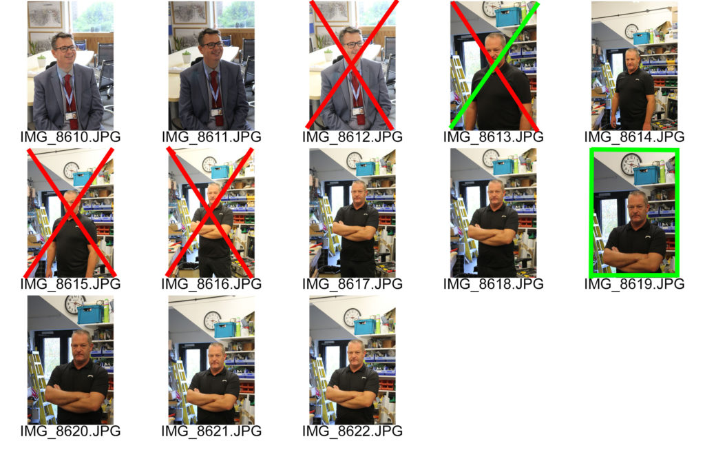
Contact Sheet

For this photo-shoot I used a fast shutter speed aiming to capture sharp images. Also, I used a small aperture for these portraits so their work environment would be clear due to the nature of the background. Here I have crossed images out in red that I will not edit, either because the subject is not engaging with the camera, or it is too over exposed or blurry. I have also highlighted the images I will edit in green as I believe them to be my best from this shoot, showing the fundamentals of environmental portraiture.

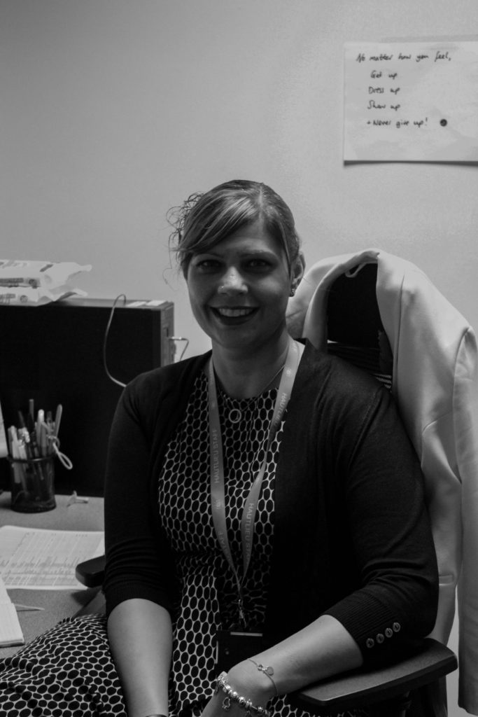
Edited Images

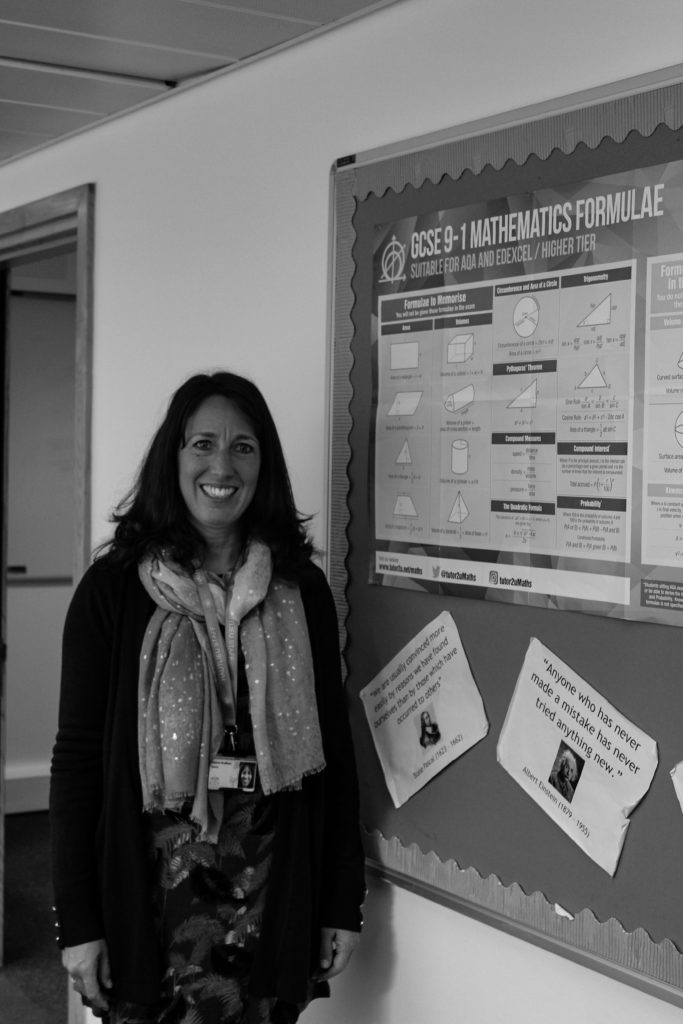
Final Image

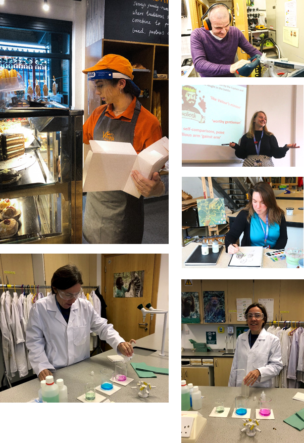
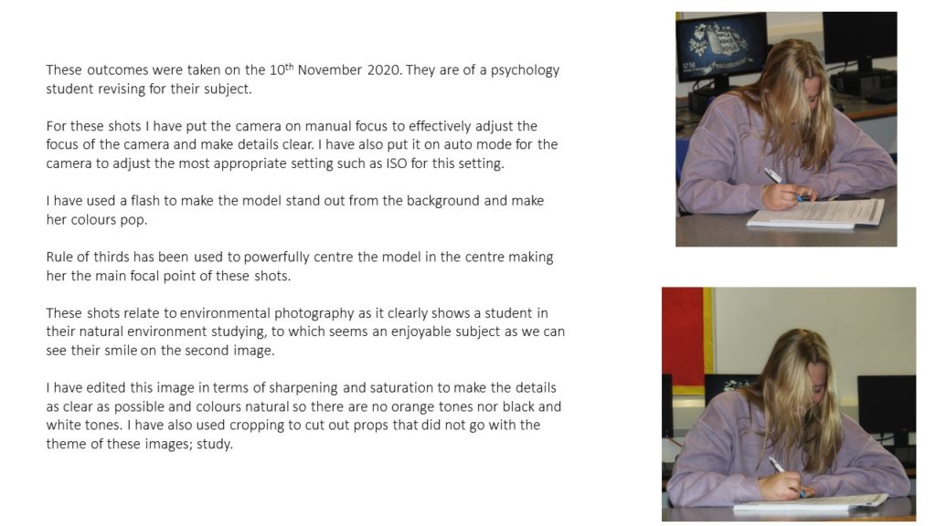
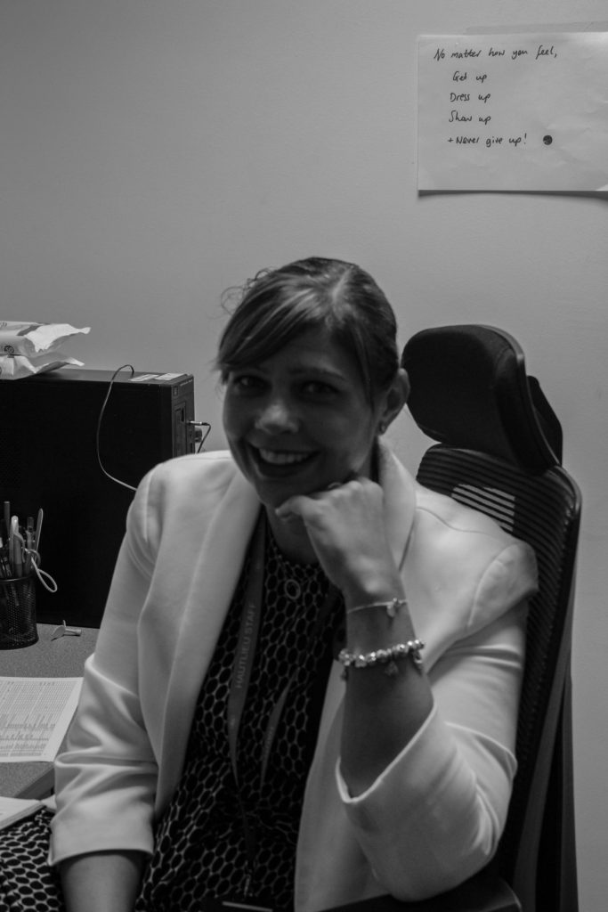
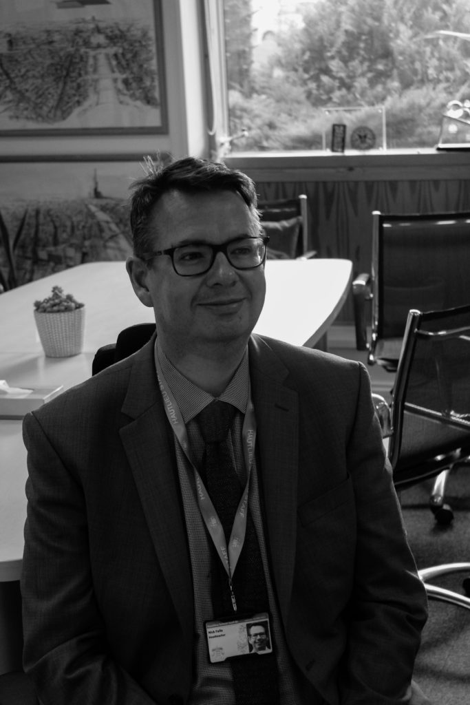
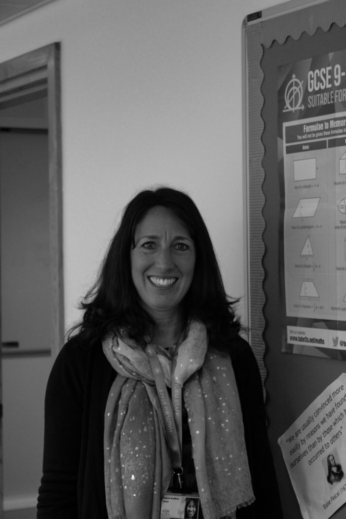
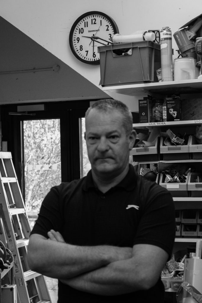
I believe that this is my best environmental portrait as it displays a clear half body image, with the subject surrounded by their work environment, shown on the board on the right. In addition, as the subject is smiling it causes the image to feel welcoming, reinforcing the profession qualities of teaching.

Modern Day Heroes

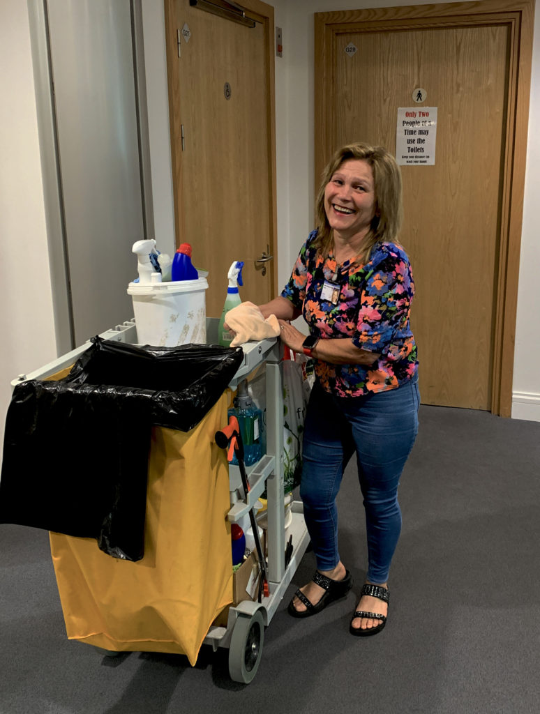
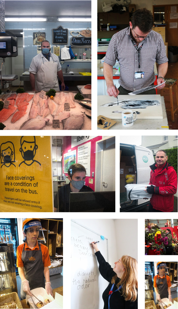
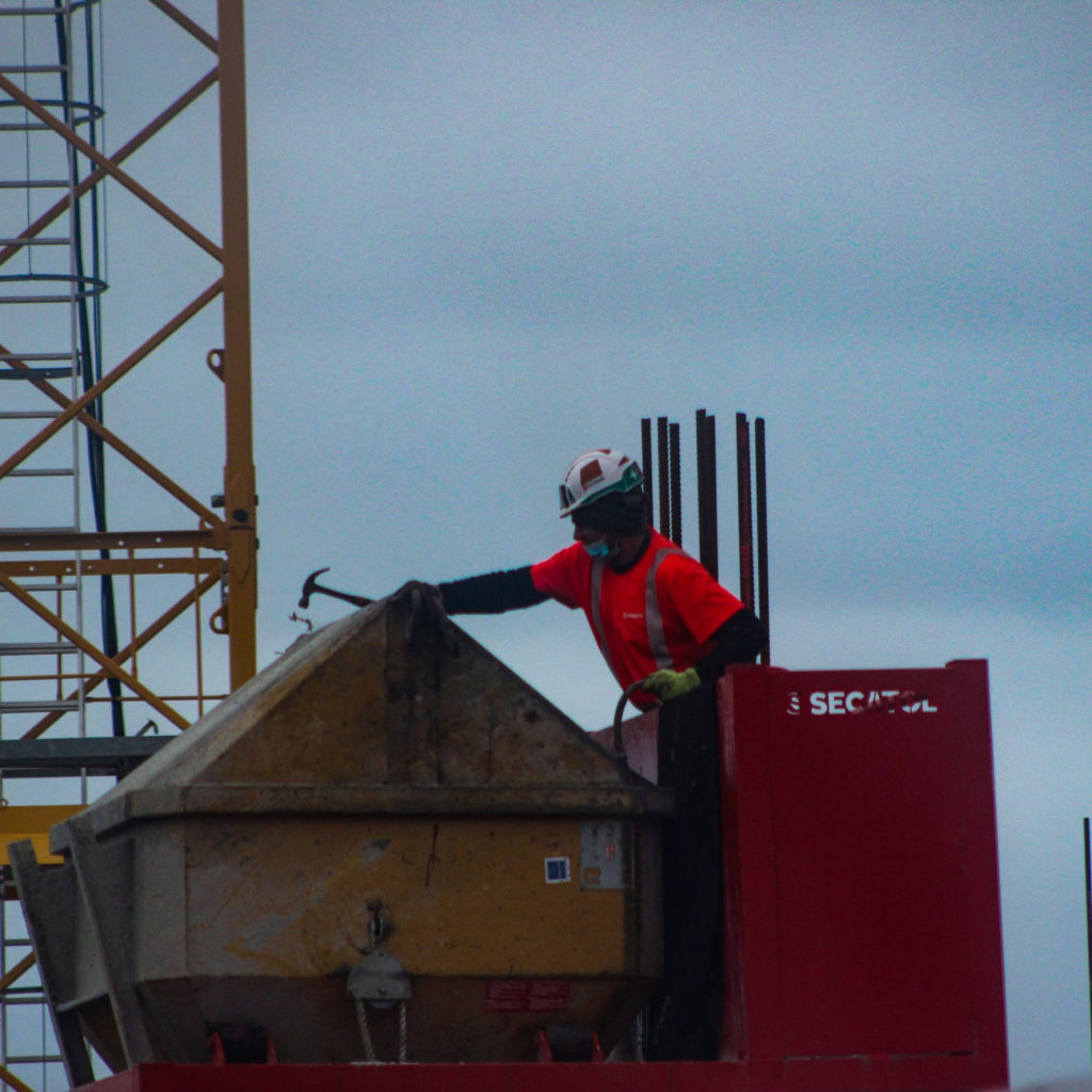
For this introduction to portraits, we had to take photographs of key workers or modern day heroes in their work attire. These key workers can come in all forms from the nurses and doctors who work on the front line, to the postmen and women who continued to do their job under such hazardous circumstances.

Contact Sheets

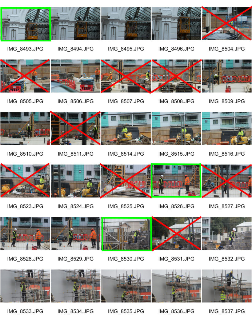
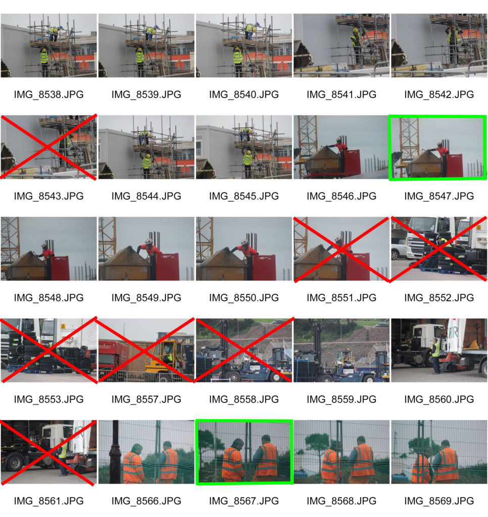
For this project I decided to focus on construction or repair workers that might have had to continue working during the lock-down stages of the pandemic to keep the island running. Here I have crossed out the images in red that I will not edit due to them being to blurry or not focusing on the topic of key workers. I have highlighted the images I will edit in green as I feel they best showcase the essence of the topic.

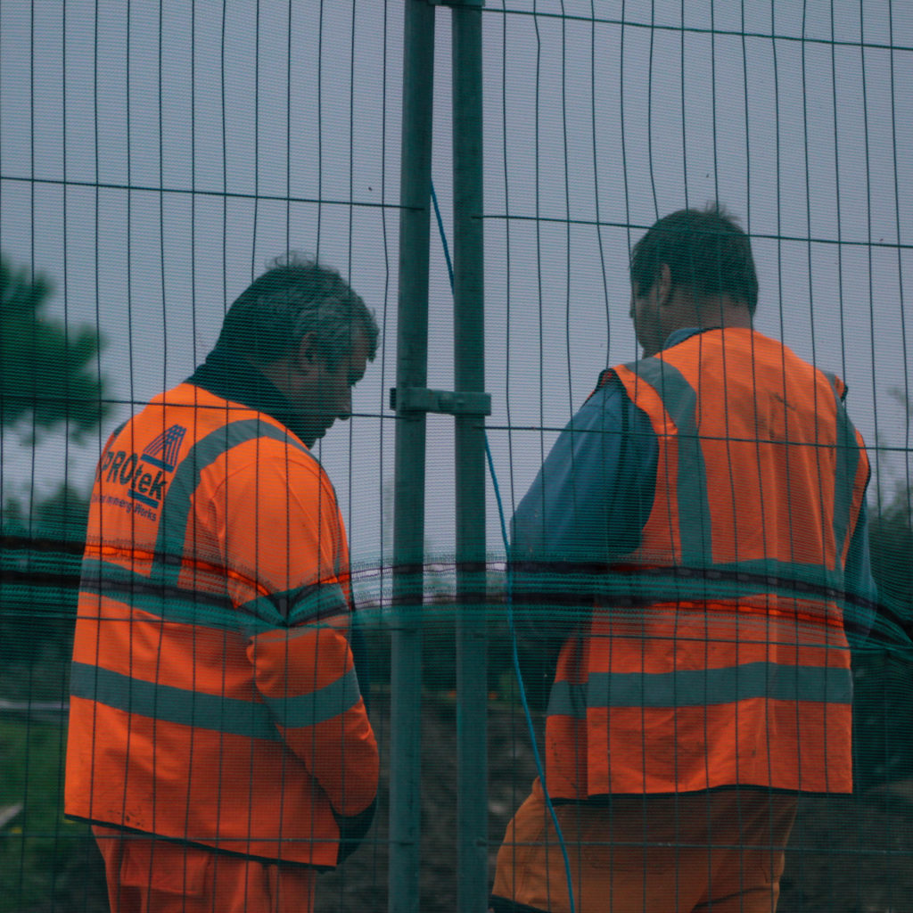
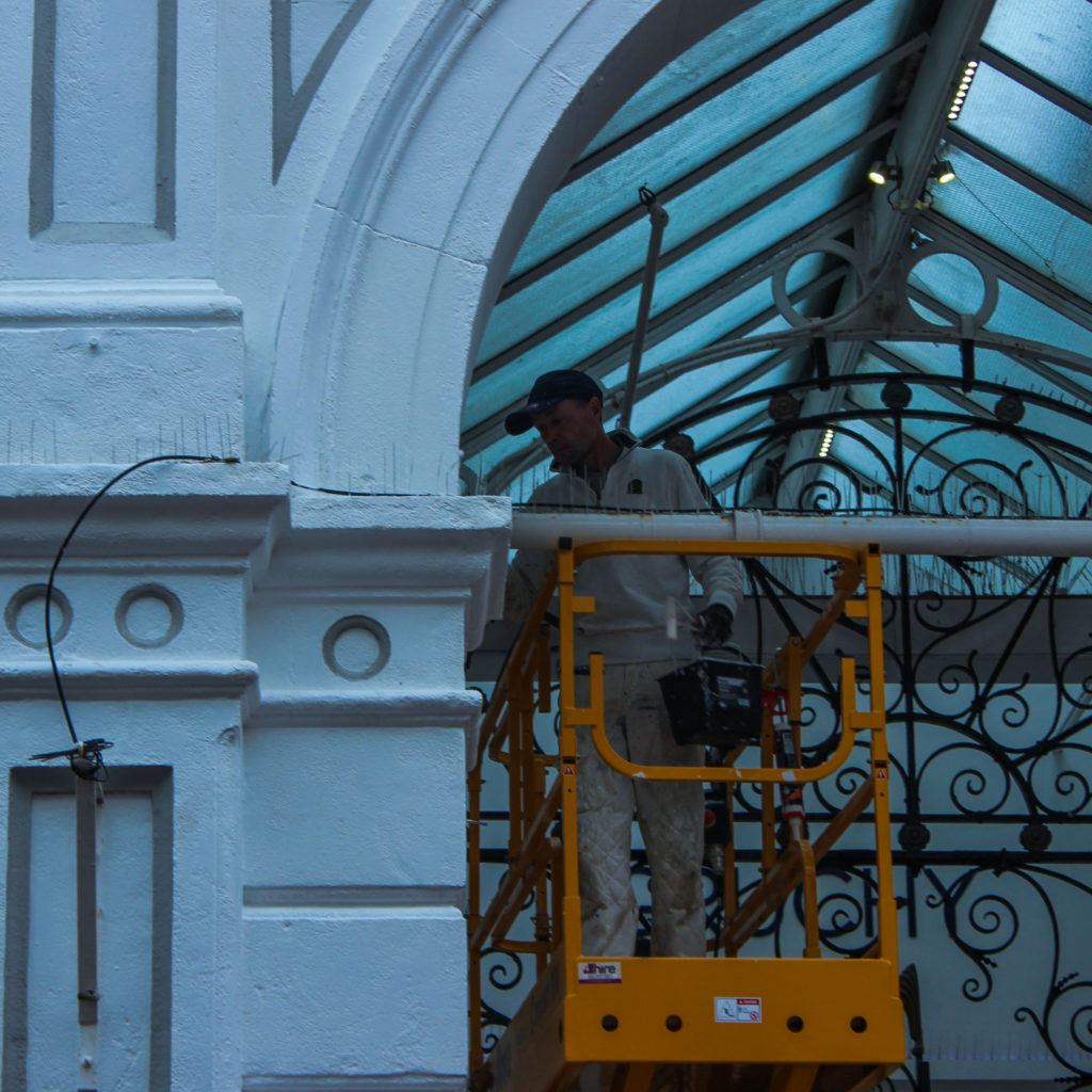
Edited Images

I believe that these are my best images as they display how life needs to carry on even in a global pandemic, and how people like this allow for that to happen. It could be said that they also incorporate this years theme of hope, as they are building for a future in which this pandemic no longer exists.