As well as using new photographic images of my own, I will also be using old archival images from my family photo albums. For these photos in particular I took images from albums created by my grandparents revolving around their time moving houses and their jobs. As these were all physical copies, I had to re-photograph these images to allow me to edit them on Lightroom and Photoshop. I did this by placing the photographs on a white paper background, making it easier for me to cut out the background, with lots of light so there would be no visible shadows. I also took photographs of the documents that were in these albums, such as certificates, ID, work emails and advertisements for houses which my family moved into. These documents will add to the sense of of a family photo album that I am trying to create with my photo book as well as being useful in creating digital photomontages that replicate this appearance.
With these images I will rework them both digitally and manually, by hand, creating new meanings to these old photographs. This will also help these images to fit in with my new images I have made as part of the series, making them coherent as a set of photographs, as some of the images from the new photoshoots will be reworked also. Examples of ways I will use this archival material to produce images for my photobook include embroidered pieces as well as digital photomontages.
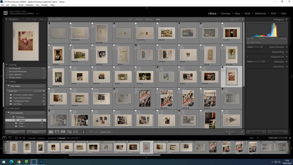
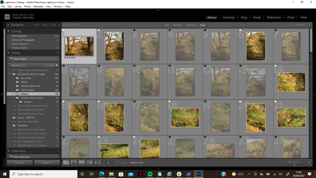
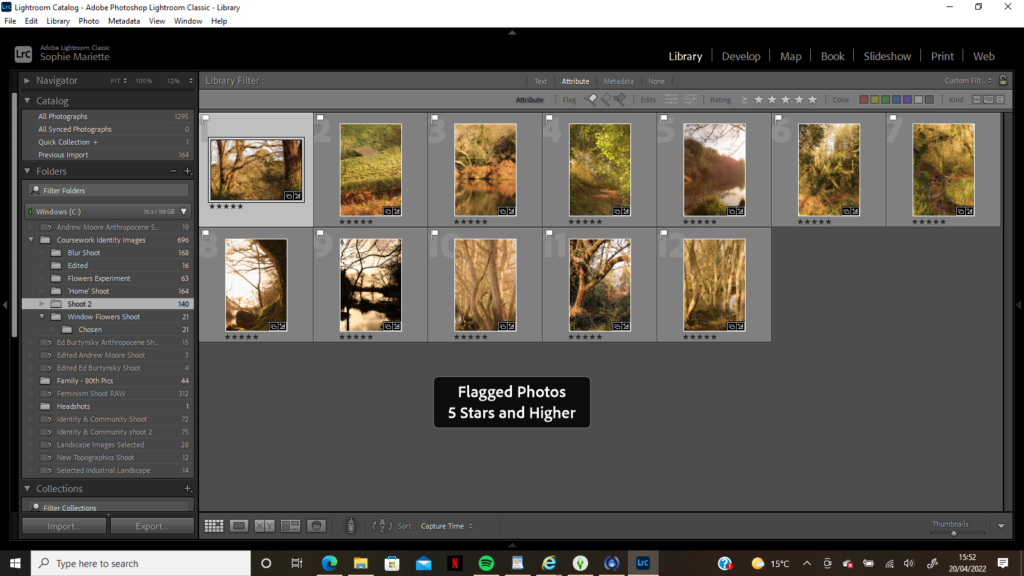
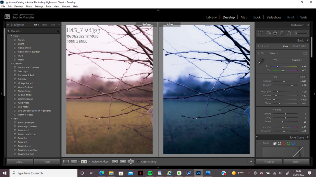
Once photographing all of my archival material, I then uploaded them to Adobe Lightroom. Here, I went through the photographs flagging the images I thought would best aid my photo book narrative. I then rated the flagged images out of 5, to further refine my selection. Once I had done this, I colour coded the images I had rated 4 or 5, with green being my best quality and most useful pieces of material and yellow being of lower quality but not useless however, as some may be useful for photo montages. From this selection process I decided which images I was going to edit and rework, these being the green images.
In order to edit my archival material digitally or print them out to be reworked, I had to use the perspective warp tool on Photoshop to make sure the photograph’s dimensions were straight and not stretched out. This allowed me to make the archival material the same image size as my newly produced images.
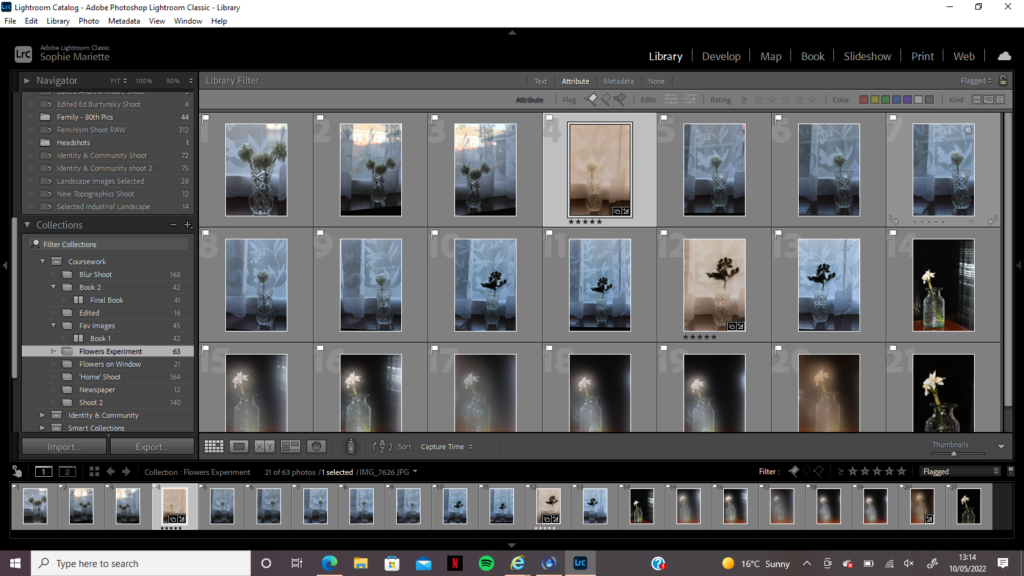
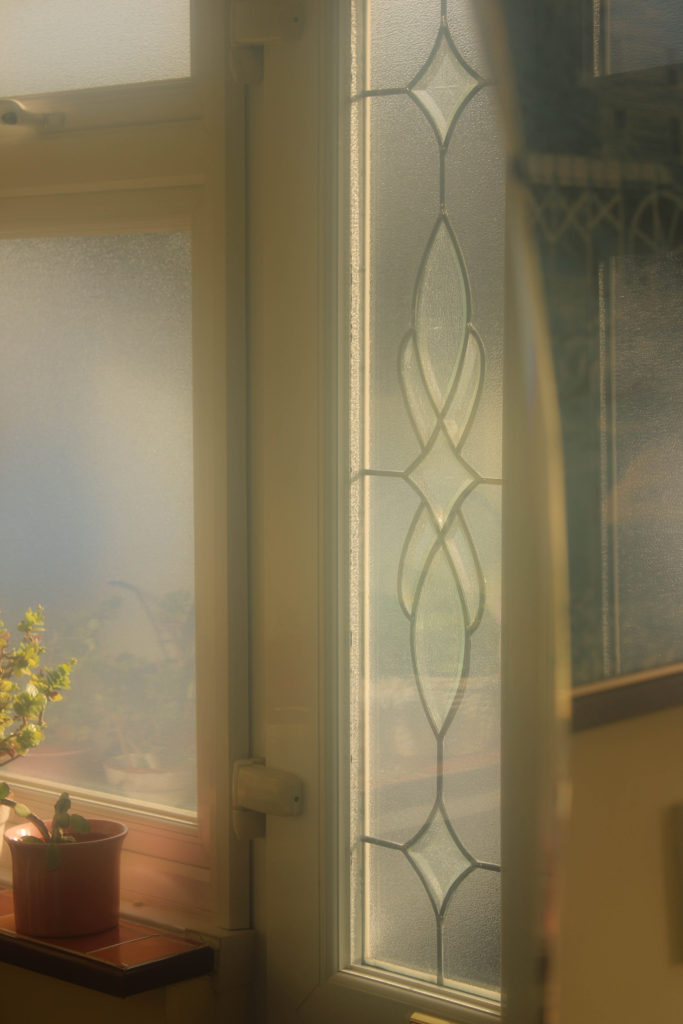
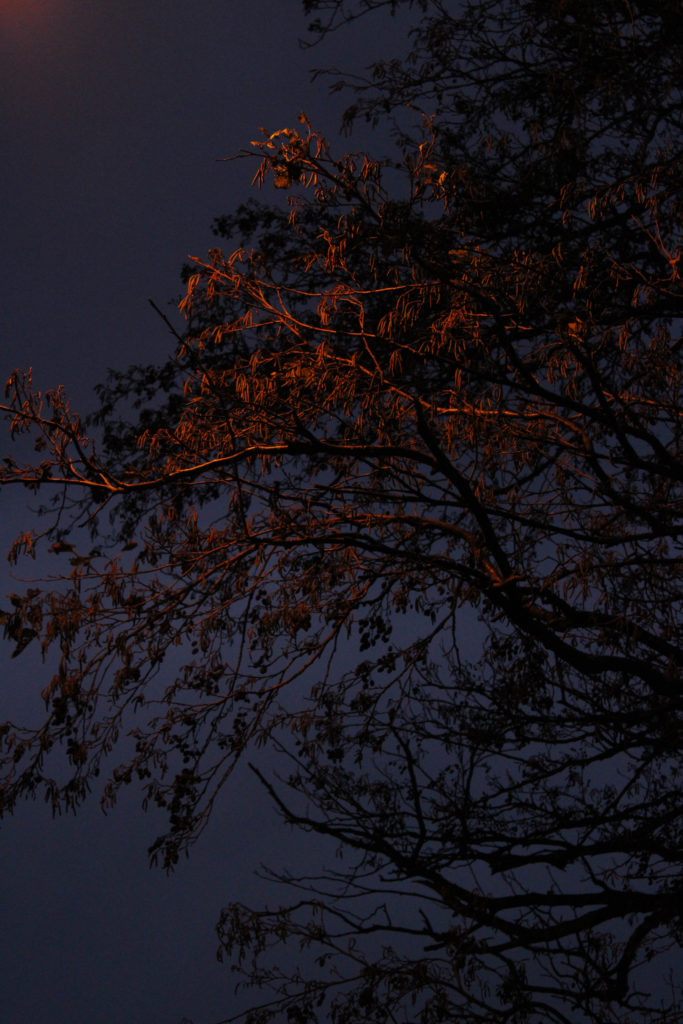
My initial aims for this Josef Sudek inspired photoshoot were to combine the technique I discovered while on my ‘Photoshoot 2 – Pictorialism’ , creating a dream-like bur, with Sudek’s iconic display of flowers in clear vases being captured on window sills. I wanted to combine these ideas to create a whimsical depiction of nature, however showing how it can adapt to its surroundings – as if these flowers are symbols of hope. I planned on capturing my shoot using the windows inside my home, however I found it difficult to replicate Sudek’s compositions due to my windows not having such a large space underneath for the flowers to sit. Therefore, I had the plan to use my grandparents home to capture my images, a place still close to my heart that held meanings in location as well as subject. I aimed to conduct my shoot during the afternoon as I wanted there to be enough light to illuminate the subject, but not too much so that it became a silhouette. I planned on using the downstairs bedroom window which looks out onto the garden as I knew there were netting curtains that I could experiment with across the windows, I wanted to see whether this background still allowed for the observer to ‘look through’ the image. I had the idea to use an array of either singular flowers or bunches of flowers in the vase, I wanted to use a selection of types of flowers, and also a set of flowers that were more wilted to compare the effects and atmospheres they created.
Initial Shoot Experiments
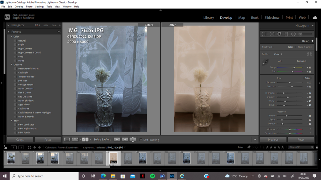
This first shoot was conducted at my grandparents house, using their curtains to create a set of images with an abstract background. I wanted to mirror Sudek’s use of the rain which lined his windows/background but to experiment with a different pattern to see whether this created a similar mood. The lighting of the room was very cold on my shoot day, the sun was behind clouds which actually made it easier to capture the flowers without risk of them becoming silhouettes, however this also meant the warm pink tones that I had captured in my Photoshoot 1 and Photoshoot 2 were not replicated. I knew that I would have to heavily edit the tones and hues of these photographs in order to mirror my fantasy/dream-like theme, nevertheless I captured several images with strong compositions that I knew could be of use when creating my final selection.
Second Shoot Experiments
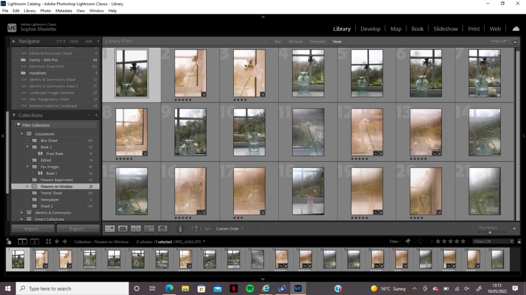
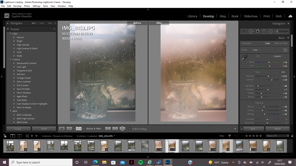
I decided there was a need to do a sub-shoot using the same theme and ideas, however this time using a different location where I could better reflect Sudek’s work. I discussed my idea of shooting in front of a panelled window with my friends and was lucky enough to be able to use one of their bedroom windows to conduct my shoot, it was a subtle reflection of Sudek’s location and gave me the opportunity to experiment with compositions lined up with the window panels. I began my shoot without steaming up my camera lens for a few images so when editing I could experiment with how I could manipulate the image to seem blurred in a Pictorialism style, without manually doing it on the day. I then used my technique of creating a fog over the lens with my breath to take the rest of the images, nevertheless there was still a blue hue that washed over my photos. I also wanted to replicate Sudek’s capturing of rain in the background of his images, however on the day of this photoshoot there was no rain forecast, so I came up with the idea of pouring a glass of water over the outside of the glass to look like raindrops rolling down the window. This idea was very successful and allowed me to experiment with aperture to focus on either the flower or the raindrops – I wanted to create a set of images that were delicate and soft, breaking up the fantasy world from previous shoots with hints of reality breaking down.
Juxtaposition Shoot Experiment
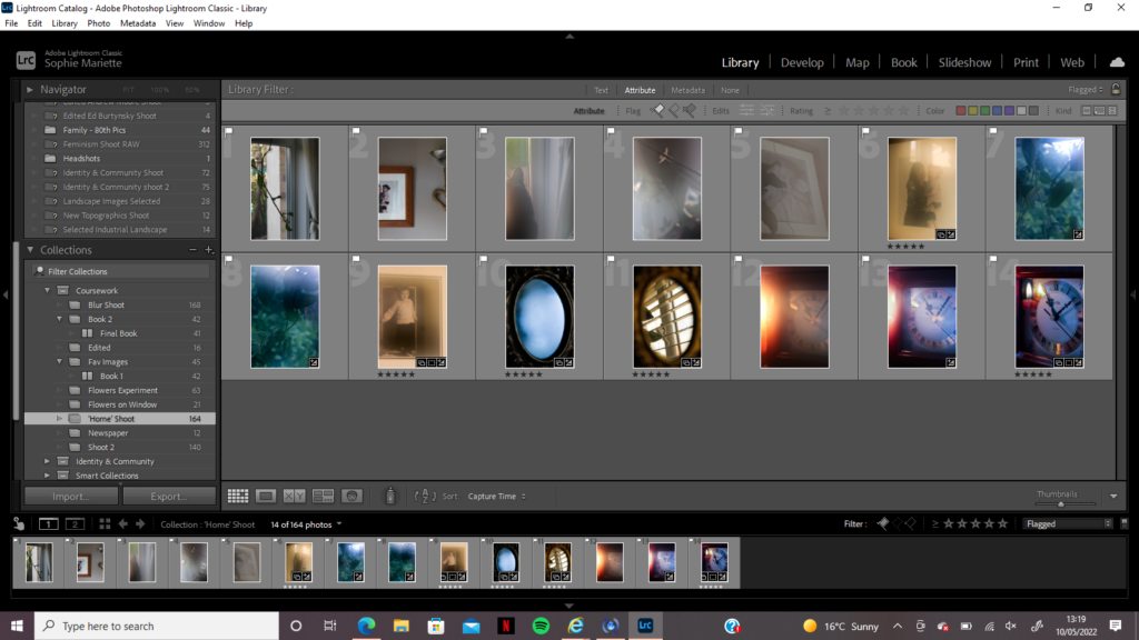
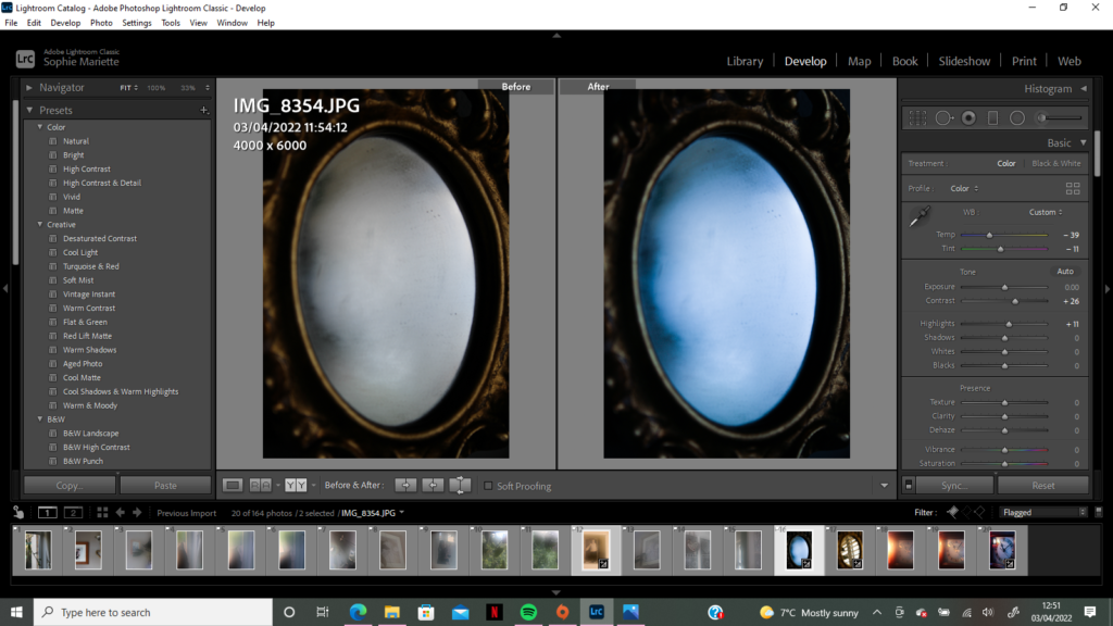
After going through my images from each photoshoot, I realized there were not enough nightmare style images to disrupt my photobook design, I wanted to have a book full of juxtapositions and disjointed hues of blue and peach that contrasted each other, conveying a sense of anxiety creeping in. Therefore, I decided on conducting a 4th photoshoot based on the idea of ‘nightmares’, bringing in the idea of Alice in Wonderland by photographing mirrors and clocks that could be placed next to images of foggy streams to link to the theme of escapism. I undertook this photoshoot around my home, capturing old photographs of my younger self/of family members using the blurry method, as well as capturing sharp images of them to contrast which looked better next to my other shoots. I wanted to focus some images on the idea of reflections, using a small mirror in my bedroom to act as symbol for clearing the mind, starting by capturing it fogged up and then capturing it from the same position once the mist disappeared. I used this photoshoot as an opportunity for experimentation, I knew that I would only choose a small selection of images to be presented in my final collection, however I still wanted to see how many ways I would portray the idea of ‘a nightmare’.
Editing
For the first flower experimental shoot I knew there would need to be a lot of manipulation in Lightroom to make the images fit my whimsical theme. I used this as an opportunity to use the different features of Lightroom that I had previously not used as much, such as turning down the clarity of the image and dehazing it to create an over-exposed style. I then saw how turning up the temperature and tint of the image would give it the same peach/pink filter that washed over my other shoots, creating this fantasy display similar to an old blurred photograph. After exploring how turning up or down the contrast/exposure/highlights of the image affected its atmosphere, I found the perfect balance of editing which created my final image. For the second flower shoot, there was still a blue hue that washed over the images due to the artificial indoor lighting being cold, therefore during the editing process I had to, again, turn up the temperature and tint of my images to fit my theme. Even though I had steamed up my lens for most of this shoot, I still used the dehaze and clarity feature to create more of a dreamlike blur over the photos, I believe this successfully replicated Sudek’s work while also bringing in my own personal fantasy style. The nightmare shoot images were mostly cold and lacked in vibrancy, however when editing the two images of my mirror I wanted to experiment with how increasing the blue hue created a mystical and dark atmosphere. All of my images have a fantasy theme, may it be soft positive dreams of childhood or mysterious dark memories rooted in anxiety – this shoot let me edit in an abstract style to separate my subjects from reality. I increased the contrast of this shoot to create sharp edges underneath the blur as there was a lot of shadows and darker tones that I could draw focus to – the circular composition of my mirror image is inviting and unsettling, which were the main ideas I wanted to convey during this shoot.
Final Sudek Inspired Images
Final Juxtaposition Images
Comparison to Sudek:
Josef Sudek | The Window of my Studio 1941-1954 | Comparison
Josef Sudek | The Window of my Studio 1941-1954 | Comparison
Sudek’s images are dark, they have a sense of mystery to them, and a sense of loss. Nevertheless, when I look at Sudek’s work, though there is loss, there is also hope – flowers are symbolic of life, it is as if Sudek (even in his confinement to his studio) is telling his observer there is still life wroth living – possibly he is trying to convince himself of this fact also. Comparing my work to Sudek’s, there is a clear link in subject and location – I have tried to replicate his surroundings as best I could with the weather circumstances etc – yet there is a contrast in atmosphere. My images are soft focused and bright, there is a content and calming mood within them as if the over-exposed highlights are beams of sunlight bringing joy and hope. Contrastingly, Sudek’s images are cold and dark – even without saturation it is clear that there is a gloomy atmosphere surrounding his subjects – hinting towards his own isolation. I wanted to create this difference to convey a sense of optimism, even though Sudek may be documenting a difficult time in his life there is still faith in nature and finding a way to adapt – this faith and hope is what I wanted to draw the most focus to in my images, they still give an impression of isolation, however this loneliness is surrounded by warmth and brightness as if its optimism for the future. Additionally, Sudek’s use of soft focus is replicated in my work, yet I have taken it to the extreme using my Pictorialism inspired technique – there is an impression of reality breaking down in both mine and Sudek’s work, with abstract shapes in the background creating an eerie atmosphere. Overall, I am really happy with how my Josef Sudek inspired photoshoot turned out, I have been able to experiment with different editing techniques and compositions, having to explore different ways of conveying a theme of anxiety, escapism and safety.
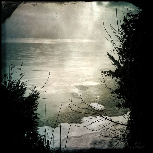
I wanted to create a set of images that combined the work of Robert Darch and Josef Sudek, mirroring techniques and themes used in Pictorialism photography. I plan on using the main location of Reg’s Garden, a community garden that I used to visit as a child with my grandparents, capturing areas where I would escape into imaginary worlds. I also plan on using my grandparents home for several images, using locations such as the kitchen, hallway and spare bedroom. In these rooms I hope to capture a sense of memory, past and nostalgia by photographing mirrors and doorways, windows that look into the past and provide a view to the future. The theme of safety is one I want to focus on in this shoot, the Pictorialist style will hopefully create a mystical yet welcoming atmosphere, using a soft blurred focus to distort any harsh textures or shadows in each image. I plan on conducting this photoshoot during the mid-afternoon, I want to take full advantage of the bright weather to create exaggerated highlights in my images. Experimenting with the Pictorialism technique is something I really want to explore in this shoot, I plan to bring Vaseline with me on the day to smear over the camera lens, however I would like to try using different materials to create the staple blurred filter over my images. This shoot will serve as an exploration of childhood imagination, physically capturing the Wonderland-like world I escaped to, whether I was happy, sad, confused or anxious – I want to display the dream-like state of ‘playing make believe’.
Editing:
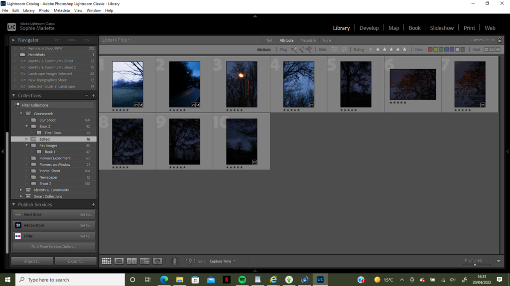
I began editing in Adobe Lightroom, going through each image and flagging it if it portrayed the right atmosphere and theme I wanted to put across. Aesthetics was a feature that had importance in this shoot, I wanted my images to have a whimsical fantasy style that gave the impression of an almost ‘too perfect’ world. I looked for warm tones and orange hues when flagging my images, I found they were more successful when resembling colours of late evening sunsets as it created a cosy and welcoming atmosphere. After flagging my favourite images, I went through them again rating them from 1 -5 and focused on finding the meaning behind each image, when I took this image what did I have in mind? Does that message/idea come across successfully? Additionally, I wanted several images to hold a sort-of ‘escape route’ within them, may it be a door or a window, a clearing in the trees or a bridge to walk across – anything that could lead to this mystical world. Negative space that I captured in my images sometimes served as this ‘escape’, when sorting through and choosing which would be my final images to edit it was clear that keeping this fanciful narrative helped create my desired effect. Below is my selection of 5 star images, I considered colour, composition, meaning and light to create this selection and give the impression of an idyllic world full of imagination.
How I replicated Pictorialism:
I had planned on using Vaseline smeared over the camera lens to mimic that of Pictorialism, nevertheless when I began setting up for this shoot I though of a different idea and technique to create this imagery style. I wanted to create a gradual blur, some images slightly misty and foggy and others completely distorted, to compare how much I wanted to change the atmosphere of my surroundings in each image. Using Vaseline, although effective, was not the most practical material to create this gradual effect, as I would need to keep removing and reapplying the gel to the lens when I wanted less or more blur. Therefore, I thought of using my breath to steam up the lens, as the effect would ware off after a few seconds and I could take multiple shots of the same location as it gradually loses its blur. This allowed me to experiment with how much the lens should be steamed up when photographing to create enough blur to be distorted and dream-like, however not so much that the subject cannot be recognised as a bench or statue. As this project has such a personal connection to me, it was as if I was breathing life into these images to create this other-worldly effect – experimenting with how an image can be manipulated without editing it harshly in Photoshop or Lightroom was something I really wanted to explore. This Pictorialism imagery gives the impression of memories, foggy and blurred but still remembered as happy and content – there is a calmness to this shoot that when mixed with the oil-painting-style imagery portrays an imaginary world where anxiety disappears and childhood can live on.
Experimentation:
The images above and below were both taken in my grandparents home, it was the secondary location to Reg’s garden, holding memories of childhood and happiness. However, during the time of this shoot the lighting and weather was dull and cloudy, blue undertones and shadows made the images seem desolate and forgotten – which was no the atmosphere I wanted to create. When photographing I though of changing the ISO and white balance to create a warmer tone, however I was undecided as to whether the images would make it into my final selection, so did not make the changes. This gave me opportunity while editing to manipulate the highlights, temperature and tint of these photos in order for their colour pallet to match the rest of the blurred images. Instead of keeping the cold blues and putting these images with the ‘nightmare-style’ shoot, it made no sense to take a photo of a happy, loving place and change its whole meaning – therefore slightly warming the temperature and tones helped create my desired mood of welcoming. My grandparents home has always been a place where I have felt safe, as a child I would create stories in every room and escape from the outside world, using props such as cutting boards for boats or shields and curtains to keep the ‘monsters outside’ – all of these memories are now foggy yet still so clear, I wanted to use a Pictorialist style to show this.
Final Edited Images
Overall I am very pleased with how the final edits of this shoot turned out, using breath to manipulate the camera lens and capture a distorted scene allowed me to experiment with how a Pictorialist style can represent a fantasy world. Themes of serenity, perfection, calmness and persuasion were all ideas I wanted to keep in mind during the shoot. Using the style of Robert Darch by capturing nature in all of its beauty, and of Josef Sudek by taking his use of misty blurred surroundings, altogether created this display of fantasy. Using pink and orange tones that replicated a sunset throughout created this warm welcoming atmosphere, which will be disrupted by the harsh ‘nightmare’ shoot images which will break up my photobook. I am using Darch’s technique of progressing narrative through colours and tones, in The Vale of Despond by Dan Cox he describes this in Darch’s work; “A change in the palette of the images, another influence from the cinematic, signals this move, with cooler blues and yellows fading into greys, as the space becomes increasingly hostile.” I plan on creating a third photoshoot delving more into the world of Josef Sudek, being influenced by his study of flowers on a window sill and linking it to themes of adapting to my surroundings and to change. I want to progress these ideas further by experimenting more with the Pictorialism blur and using it to capture scenes in Sudek’s style.
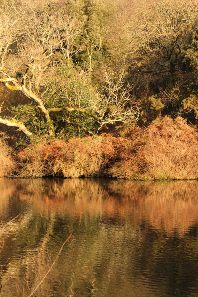
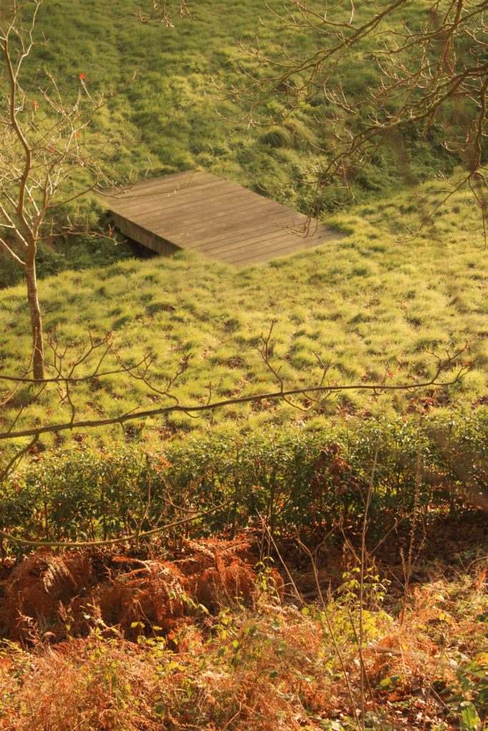
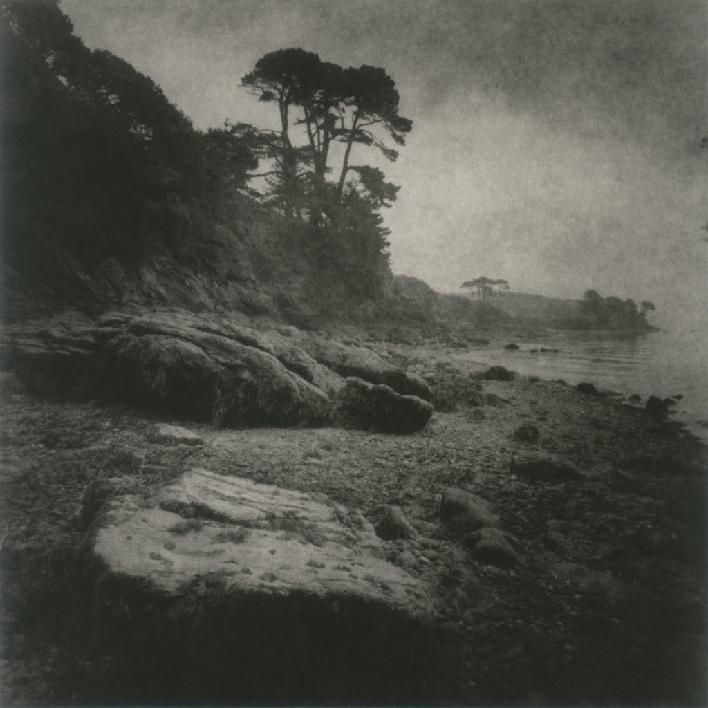
During my initial planning for this photoshoot I aimed to create images focused solely on nature and the environment, I wanted to capture specific areas around the island where nature has felt both comforting and unnerving to me- juxtaposing ideas of contentment and anxiety. I planned on keeping to locations where memories of childhood lay, such as St Catherine’s Woods and Le Creux Woods – I knew there were possible photographic spots full of twisted trees that I wanted to capture so I made sure to shoot on a bright sunny day to take full advantage of the shadows that would be created. I wanted to reflect the work of Robert Darch using natural sunlight to create a sense of optimism and hope in my images, I planned on beginning my shoot early in the morning to capture some more golden tones around the landscapes. Similar to Darch’s style, I will use an aperture setting of about F/16 to create a balance between depth of field and sharpness ensuring that each element of the image is in focus. Nevertheless, to contrast this and provide a break in the synchronicity, I plan on capturing several ‘nightmare-style’ images with cold blue hues and darker tones throughout. In these images I will experiment with using a wider aperture of F/2.8 to focus on a specific branch or leaf, then using a very narrow aperture to compare which style creates a more eerie atmosphere.
Editing:
I began editing my images in Adobe Lightroom, flagging the images I liked best due to composition, lighting, atmosphere and repetition. I found that the images I captured at St Catherine’s Woods were more successful then those taken at Le Creux due to the location holding more expansive landscapes that related to Darch’s work greater. After flagging my images, I rated them from a score of 1 to 5 to create a final selection of the strongest ‘unedited’ images – then I went in and touched up exposure, vibrancy and contrast to enhance the comforting ‘dream-like’ atmosphere I wanted to create. The theme and intertextual idea of Alice in Wonderland came to me during this shoot, I thought of combining a series of the whimsical Josef Sudek photos with vibrant Darch inspired landscapes to create this fantasy ‘Wonderland’ influenced world where one could escape to in times of panic. It was always an idea I wanted to portray however I didn’t yet know how ‘make’ this world, throughout this photoshoot I tried to capture areas that seemed a little too perfect to stay compatible with ideas of Wonderland and dreams.
When undertaking the 1-5 rating of my images I focused on selecting those that best gave the impression of escaping into another world, may it be over a bridge or through a gap in the trees – I wanted each image to have a sort-of ‘clearing for an escape’. Composition wise, I looked for geometric shapes within my images, many had hints of circles that opened out into an expanse of sky, or distant trees. I was really drawn to these photographs as I believe they tell a greater story for the observer, like there if still more to be seen beyond the image – yet it also allows them to come up with the end of this story themselves. I also aimed to include images with lots of repetition, to keep with this ‘too perfect’ idea, like this magical world is not all it seems to be. Images with repetitive trees contorted around each other that seem to just keep going and going into the background of the image always fascinated me and made me think of fantasy worlds – I wanted to include the themes of escapism, but through natures captivating features. Hues and colour pallets in each image we mostly warm and vibrant, I did minimal editing to keep a cohesive pallet throughout of oranges, greens and yellows. However, when shooting the more ‘nightmare-style’ photos I wanted to use colder, more blue hues. I edited my images, which were taken late evening, by turning down the temperature and adjusting the amount of shadows and highlights to create a more mysterious brooding atmosphere. I aim for this contrast to confuse the observer, making them think of why such warm and welcoming images have been disrupted by these dark reminders of reality and fear creeping in.
Experimentation:
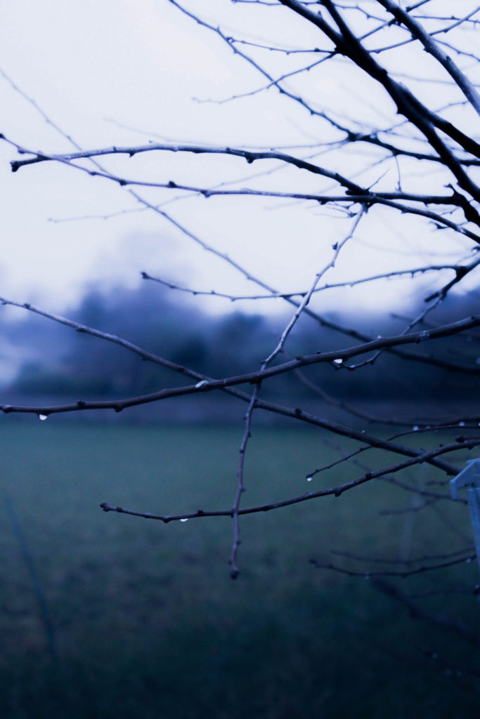
This was one of the first images I captured for my project, on a walk through a familiar woodland one evening I found this branch covered in raindrops. At first I was focused on its beauty, I tried capturing it from different angles and using a wide aperture to blur the background, however when it came to editing I couldn’t decide which atmosphere it created more. Looking at the image it made me feel quite unnerved, the branches closing in from the right have an almost claustrophobic feel to them, I saw a more ‘nightmare-inspired’ atmosphere than a calming one. Nevertheless, this meant editing had to be more thorough to fit with my idea of harsh blue tones breaking up the warmth of other images. I began by decreasing the temperature to -68 so I was able to work with the blue tones, I then increased the contrast to create a sharper image and decreased the exposure slightly however the image had too many purple undertones from the original sunset haze. Therefore I slightly decreased the tint of the image to create more green undertones so the image wouldn’t look too unnatural. After touching up the dark and light tones in the image I was really happy with how it turned out, from beginning my edit with a pink, soft image which I had edited to fit with the ‘dreamlike’ photographs, it was interesting to then completely try to change the mood by using a colder palette.
Final Edited Images:
So much inspiration was taken from Darch’s photobook ‘Vale’, I wanted to create that same welcoming but also disconcerting atmosphere. Some quotes that inspired me, from critics discussing ‘Vale’; “Vale is the latest photobook by the artist, which he has self-published. Images of old trees, verdant valleys and hot summer hazes denote an archetypal British countryside and typify the narrative. Alongside this, disconcerting elements peek from behind; something can be felt amongst the trees. The beauty of nature faces a ghostlike, fractured, and melancholic stillness. There is more at play under the surface of this pastoral landscape.” “The work draws from the lived experiences of ill-health. Darch found comfort in fictional worlds, domestic interiors, and the natural landscapes around him. Vale is a compilation of these multiple worlds, allowing the realities, dreams, fictions and memories to blend together in a space of escapism and meditation. Vale cannot be found on a map. It is not a topographical reality, but a semi-fictional one Darch has lived in for the last decade.” – Isaac Huxtable – 2021. It is these fictional worlds that I wish to continue creating in each photoshoot, I plan on undertaking my second shoot by focusing on this theme of ‘dreams’ and using a pictorialism influence to make some Robert Darch inspired images seem even more mystical and unreal.
Key characteristics/ conventions; Reacted against mechanization and industrialization, dismayed at increasing industrial exploitation of photography through commercialisation. Championed evocative photographs and individual expression, constructed images looking for harmony of matter, mind and spirit – subjective and spiritual motive. Pictorialism is an approach to photography that emphasizes beauty of subject matter, tonality, and composition rather than the documentation of reality. Images had a foggy, mystical-type quality of fantasy that highlighted the aesthetically pleasing elements of an image.
Influences; Allegorical paintings – figurative mode of representation conveying meaning other than the literal. Communicates through symbolic figures, actions or symbolic representation – the underling meaning has moral, social, religious or political significance.
Artists associated; Alfred Stieglitz (Equivalent; clouds study), Peter Henry Emerson, Hugo Henneberg, George Davidson (Reflections 1899), Charles Job (Pulborough Bridge), Alvin Landon Coburn, Henry Peach Robinson, F. Holland Day, Robert Demachy, Edward Steichen.
Key works; Alfred Horlsey Hinton (Fleeting and Far 1903), George Davidson (Reflections 1899), Joseph Gale (Cottage Garden 1890), H P Robinson (He Never Told His Love 1884), Alfred Stieglitz (Equivalent; clouds study).
Methods/ techniques/ processes; Making photographs that resembled paintings, manipulating images in the darkroom, scratching and marking their prints to imitate the texture of the canvas, using soft focus, blurry or fuzzy imagery based on allegorical and spiritual subject matter. Photographers smeared Vaseline onto their camera lens to create a dream-like effect over their images, making them look like hand-made art.
Allegorical Paintings
An allegory is the description of a subject in the guise of another subject. An allegorical painting might include figures emblematic of different emotional states of mind – for example envy or love – or personifying other abstract concepts, such as sight, glory, beauty, Revolution, or France. These are called allegorical figures. The interpretation of an allegory therefore depends first on the identification of such figures, but even then the meaning can remain elusive. Allegorical subjects were frequently painted from the Renaissance until around 1800, although they were probably most often used in medals and engraved frontispieces to books. Single allegorical figures were also painted, sometimes in series, each figure representing, for example, one of the Liberal Arts or the Virtues.
Pictorialism Photography
Straight Photography/ Realism
Time period; Began in 1915
Key characteristics/ conventions; Photographers believed in the intrinsic qualities of the photographic medium, making use of its ability to provide accurate and descriptive records of the visual world. These photographers strove to make pictures that were ‘photographic’ rather than ‘painterly’, they did not want to treat photography as a kind of monochrome painting. They abhorred handwork and soft focus and championed crisp focus with a wide depth of field. Realism, which is closely associated with Straight Photography, has claims of having a special relationship with reality and it’s premise, that the cameras ability to record objectively the actual world as it appears in front of the lens was unquestioned. The key characteristic of this style was to reflect a person/landscape/object with complete honesty and ‘realism., without heavy editing or manipulation.
Influences; Social Reform Photography – he rural poor or the urban environment were not subjects for Pictorial photographers. But when a Danish immigrant, Jacob Riis, published his book ‘How the Other Half Lives’ about the slums of Manhattan, a new kind of realism was born with a socialist dimension. A number of photographers such as Dorothea Lange and Lewis W Hine began to document the effects of industrialisation and urbanisation on working-class Americans. This work influenced what we now call photojournalism.
Artists associated; Walker Evans (1903-1975) was often considered to be the leading American documentary photographer of the 20th century. He rejected pictorialism and wanted to establish a new photographic art based on a detached and disinterested look. His most celebrated work is his images of three Sharecropper families in the American South during the 1930’s depression. Paul Strand, Jacob Riis, Dorothea Lange.
Key works; Frederick Henry Evans; ‘A Sea of Steps’, Wells Cathedral, Steps to Chapter House (1903). Paul Strand; Bowls (1917), Ansel Adams; Monolith, the Face of Half Dome (1927), László Moholy-Nagy; Funkturm Berlin (Berlin Radio Tower, 1929), Manuel Alvarez Bravo; Ladder of Ladders (1931).
Methods/ techniques/ processes; Straight photographers visualized the image before taking the photo. Edward Weston defined this term in 1921 and stated: “Get your lighting and exposure correct at the start and both the developing and printing can be practically automatic.” The aim is to create an image which is not manipulated, either in the taking of the image or by darkroom or digital processes, but sharply depict the scene or subject as the camera sees it.
Straight Photography
Modernism
Time period; 1900-1960’s
Key characteristics/ conventions; Some things that were questioned in modernist photography, art and literature is what is the difference between wrong and right, what will America’s future be, what is truth, and what does it mean to be an American. One of the major changes in the modernist era is a break from tradition which focuses on being bold and experimenting with new style and form and the collapse of old social and behavioural norms. Practitioners of each new style were determined to develop a visual language that was both original and representative of the times.
Influences; Modernists drew inspiration from the philosophical investigations of 19th century writers, in addition to experimental forerunners in their own mediums. An investigation into the key areas of Modernism reveals influences among a variety of 19th and early 20th century thinkers and artists. The American poet Walt Whitman revolutionized the concept of poetic form, and his “Leaves of Grass” served as a foundational text for Modernist poetry. French writer Arthur Rimbaud inspired Modernists with his symbolic poems and unconventional, obscene subject matter.
Artists associated; Alfred Stieglitz, Dora Maar, Edward Steichen, André Kertész, Man Ray, Otto Umbehr (Umbo), Walker Evans, Iwao Yamawaki, Hannes Meyer, Richard Neutra, Paul Strand, Tina Modotti.
Key works; Salvador Dali (Metamorphosis of Narcissus), Raoul Haussmann (The Art Critic), Wall Street (1915), Abstractions (Twin Lakes, Connecticut 1916), Blind (Paul Strand 1916), The Steerage (Alfred Stieglitz), Workers Parade (Tina Modotti 1926).
Methods/ techniques/ processes; Although many different styles are encompassed by the term, there are certain underlying principles that define modernist art: A rejection of history and conservative values (such as realistic depiction of subjects); innovation and experimentation with form (the shapes, colours and lines that make up the work) with a tendency to abstraction; and an emphasis on materials, techniques and processes. Modernism has also been driven by various social and political agendas. These were often utopian, and modernism was in general associated with ideal visions of human life and society and a belief in progress.
Modernism Photography
Post-Modernism
Time period; Began during 1960’s/1970’s
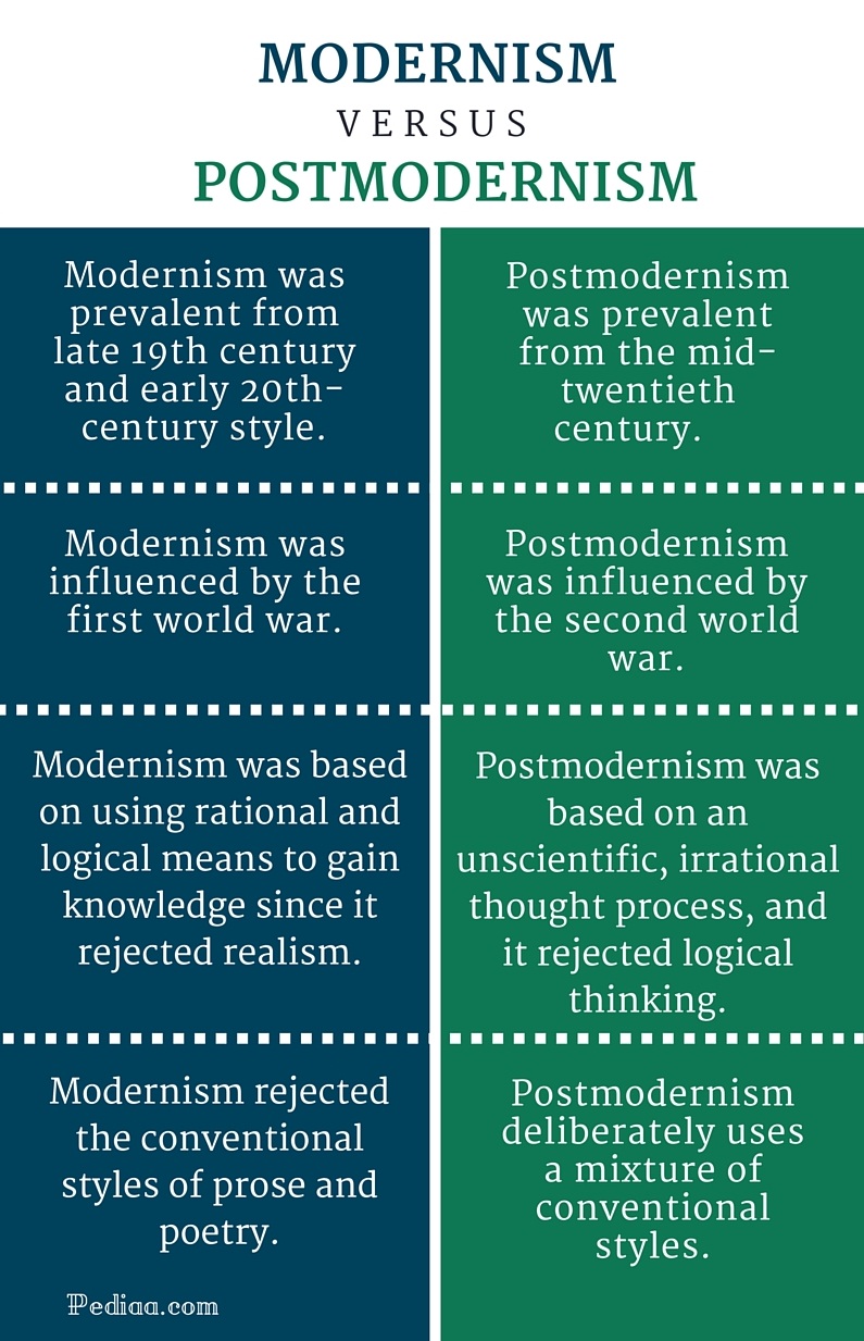
Key characteristics/ conventions; Postmodernism can be seen as a reaction against the ideas and values of modernism, as well as a description of the period that followed modernism’s dominance in cultural theory and practice in the early and middle decades of the twentieth century. The term is associated with scepticism, irony and philosophical critiques of the concepts of universal truths and objective reality. While modernism was based on idealism and reason, postmodernism was born of scepticism and a suspicion of reason. It challenged the notion that there are universal certainties or truths. Postmodern art drew on philosophy of the mid to late twentieth century, and advocated that individual experience and interpretation of our experience was more concrete than abstract principles. While the modernists championed clarity and simplicity; postmodernism embraced complex and often contradictory layers of meaning.
Influences; Jacques Lacan (1901–1981), was a prominent French psychoanalyst and theorist. His ideas had a huge impact on critical theory in the twentieth century and were particularly influential on post-structuralist philosophy and the development of postmodernism. Lacan re-examined the psychiatry of Sigmund Freud, giving it a contemporary intellectual significance. He questioned the conventional boundaries between the rational and irrational by suggesting that the unconscious rather than being primitive, is just as complex and sophisticated in its structure as the conscious. He proposed that the unconscious is structured like a language which allows a discourse between the unconscious and conscious and ensures that the unconscious plays a role in our experience of the world.
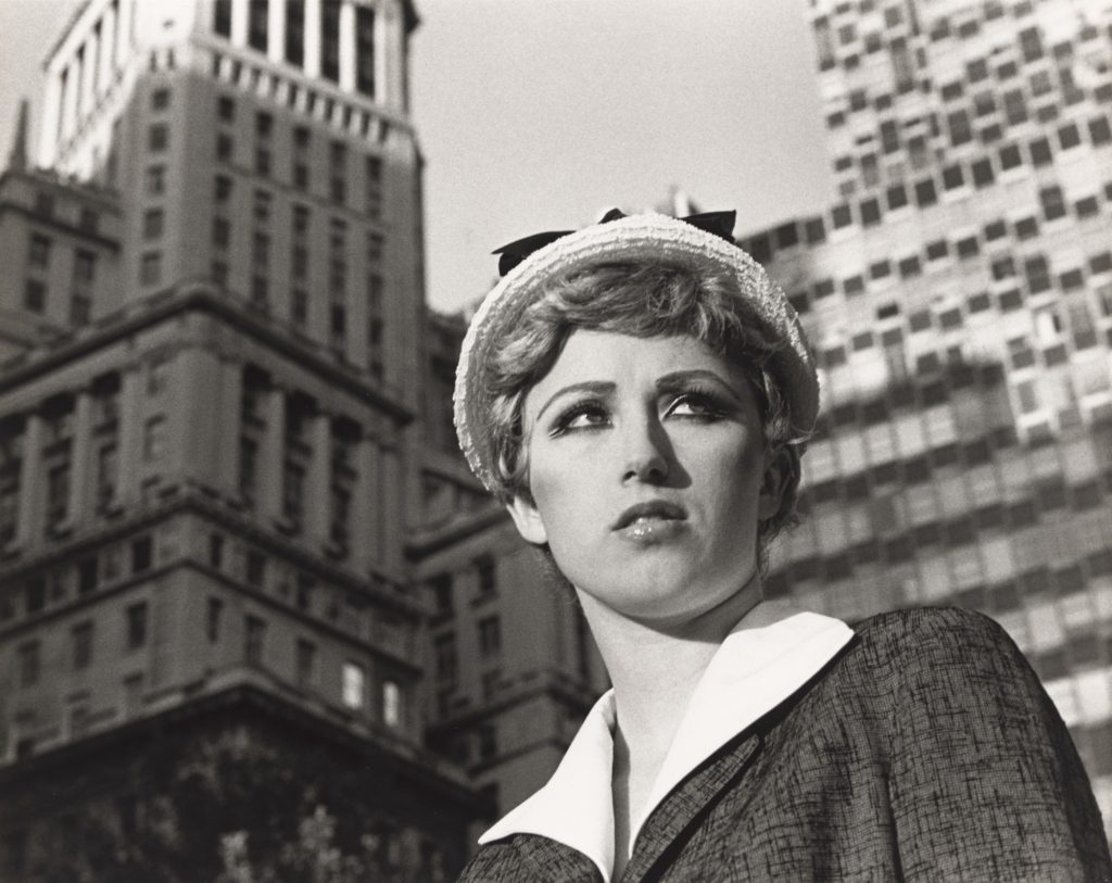
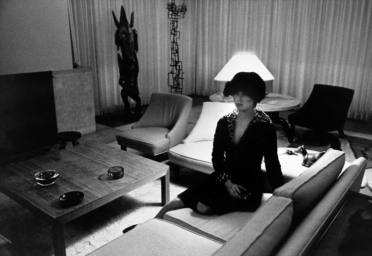
Artists associated; William Eggleston, Cindy Sherman, Jeff Wall, Guy Bourdin, Goran Sekulovski, Lee Friedlander, Andreas Gursky, Jacky Redgate, Robyn Stacey, Yasumasa Morimura.
Key works; Untitled Films Stills (Cindy Sherman), Ice (Robyn Stacey 1989), A requiem: spinning a thread between the light and the earth 1946 (Yasumasa Morimura), Campbells Tomato Juice Box (Andy Warhol).
Methods/ techniques/ processes; Its main characteristics include anti-authoritarianism, or refusal to recognize the authority of any single style or definition of what art should be; and the collapsing of the distinction between high culture and mass or popular culture, and between art and everyday life. Postmodern art can be also characterized by a deliberate use of earlier styles and conventions, and an eclectic mixing of different artistic and popular styles and mediums.
The above is the first image I chose due to its powerful use as a double page spread. This is because the landscape can fill the page and create an immersive experience when this page is opened. The negative space is also powerful as it splits the page horizontally and also presents an obscure aesthetic.
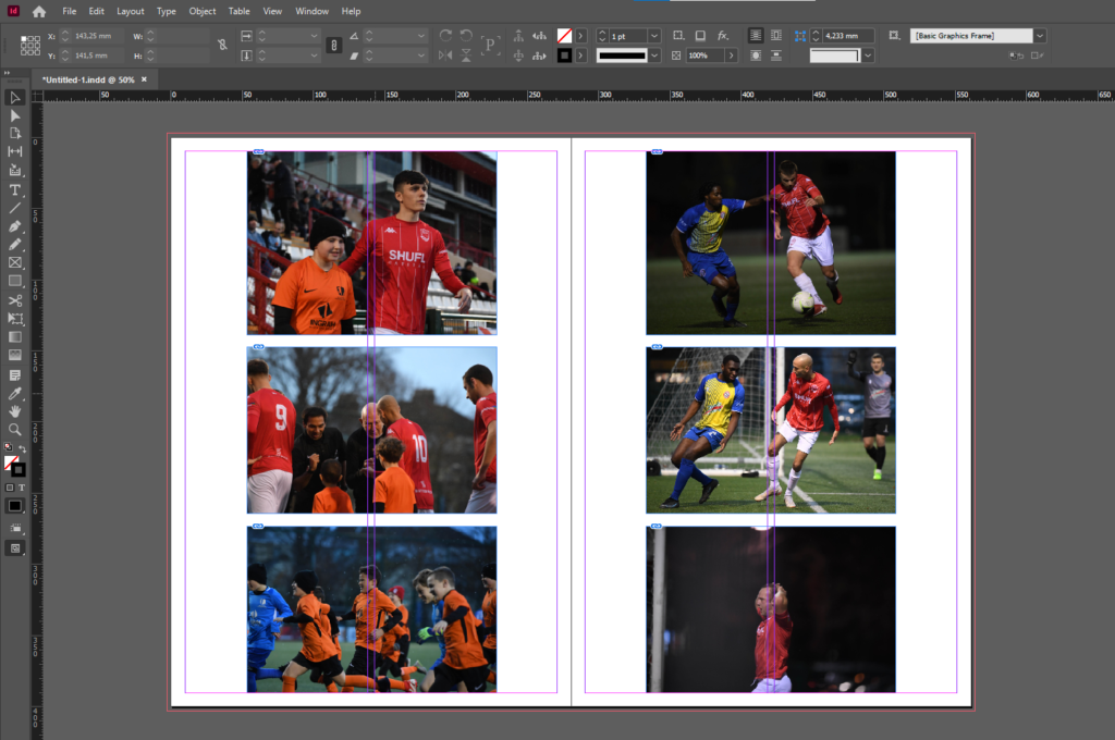
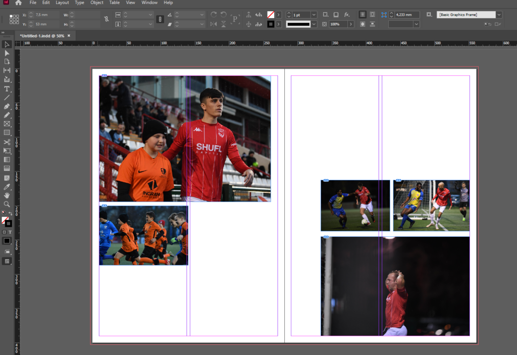
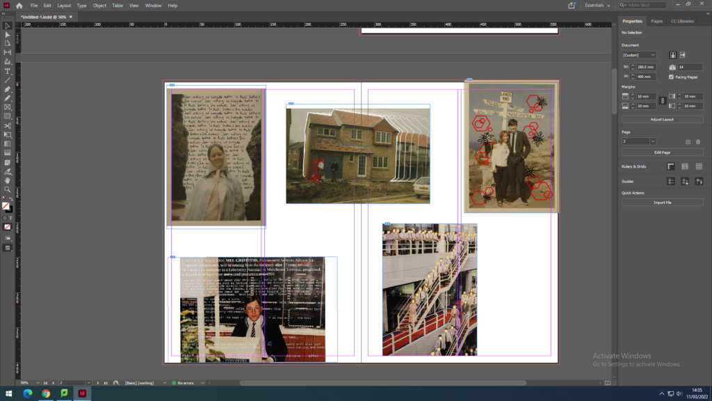
I then gathered related images and laid them out to create a photo-story. I chose theme images as they feature good framing, focus and balance while presenting the emotion of the subjects. After presenting them in this way I decided to configure them in a more traditional fashion suitable for a newspaper, with some images bigger than others and set out where a readers eye would easily follow down the page from left to right.
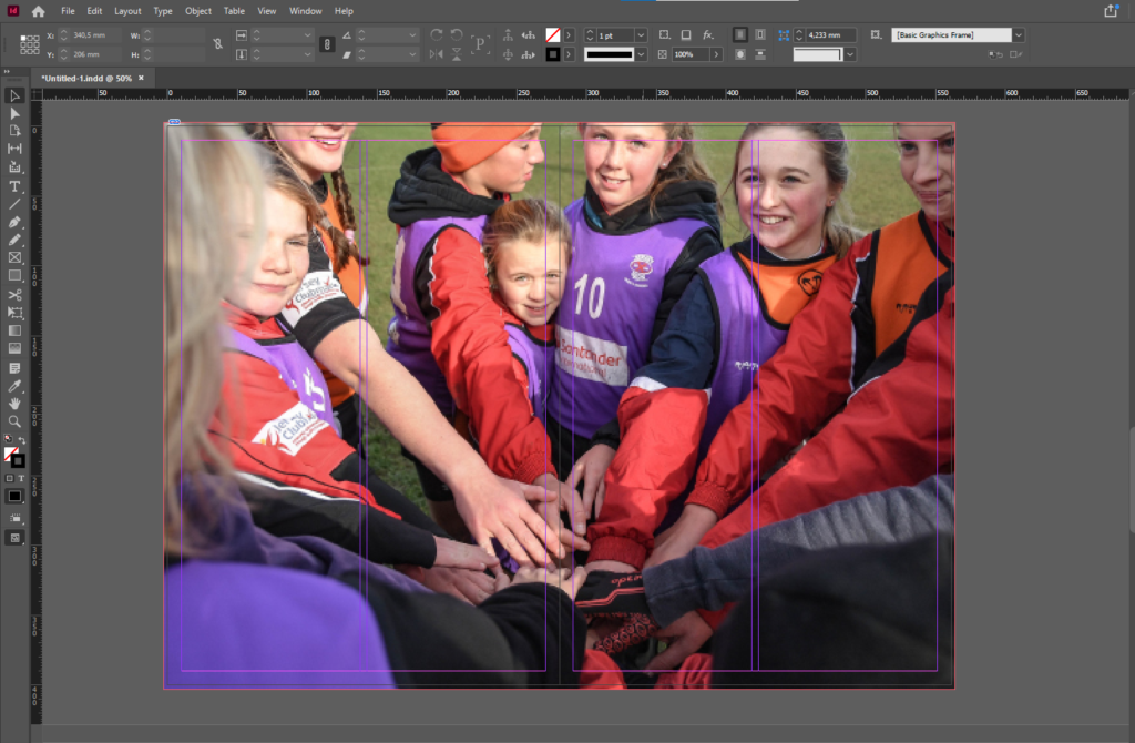
I then decided on another full double page spread using the below image as it presents the idea of identity and community well. With the girl staring into the lens it confronts whoever is looking at at the image and evokes emotion. This images is effective as a double page spread as it it immersive with depth of field created by the subjects in the foreground being out of focus while the subject in the background staring into the lens, makes it feel like you are part of the team huddle. The girls head is placed just before the middle of the spread so her head is not split in half.
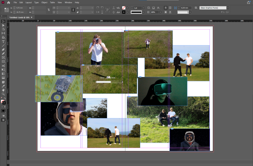
Finally I presented a montage of screenshots from the NFT film.
For my newspaper spread I decided to incorporate work from various different projects and topics we have covered throughout our 2 year photography course, including studio portraits, landscape, and object photography. I chose what I think were my best work from these projects and experimented with different ways of laying them out in various sequences and narratives. To begin this process, I went through all of my published blog posts and selected the images that I thought best represented my progress and effort throughout photography. I tried to use images that were not too similar to each other, in order to keep the viewer interested. I then had to check that all the photographs were high quality, and that they had the appropriate number of pixels each. After that I imported all the images into InDesign and began to experiment with different layouts until I found one that I was happy with.
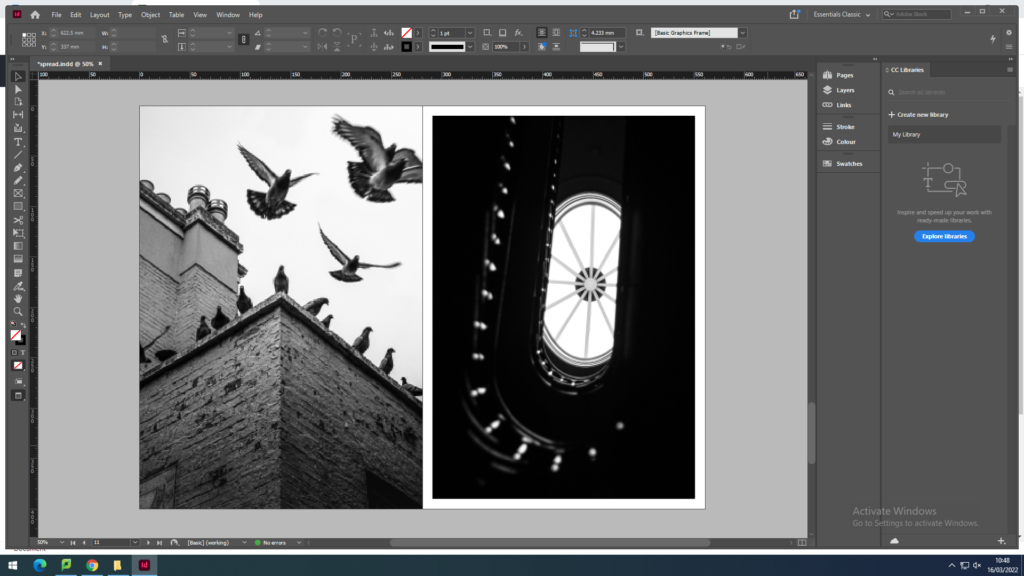
I plan to use 4-8 images which strongly summarise my work. Mainly from my recent project of Bouley Bay, the castle in the woods near Bouley Bay, and the two black and white photos from the Jersey Museum trip, of the staircase and the pigeons. And depending on how much space I have left I might include some screenshots of the NFT film.
These are the images that I plan to use:
They are all high definition which is needed to print in the newspaper. (The long edge must be 4000+ pixels)
page 1
page 2
page 3
page 4
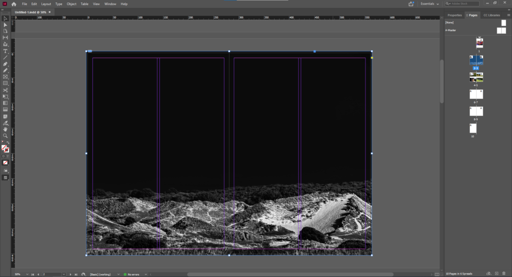
To create the newspaper composition in InDesign. I used some the images above to make two pages of a newspaper
I made an InDesign document with the correct dimensions for a newspaper the imported the images into the area I selected with the x tool.
double page spread (featuring Bouley Bay)
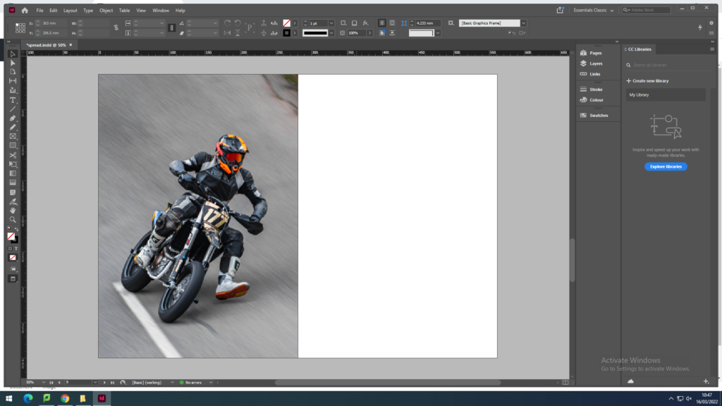
1 page of a motorcyclist at Bouley Bay Hill Climb. 1 page of town life in St. Helier.
Above I have thought about a wide range of different design layouts which includes, one page full-bleed image (sunset at Bouley Bay), a sequence of images (multiple images of Bouley Bay), large scale image with a border (Hill Climb Motorcyclist), and a juxtaposition between two images (inside/outside town images).
After rethinking my design layout, I remade the pages so that the images were bigger and had more juxtaposition to create a stronger spread layout.
I removed one of the biker images, as it was too small because it was less then 4000 pixels on the long edge, so I replaced it with a rock to create a focus on the close up studio shoots I got of small features of Bouley Bay. I ended up contrasting it with a granite heritage building.
However, I still thought I could include more contrast between the landscapes and objects.
I felt that there was a good amount of varity and juxtaposition between my images.
So I decided to package the document and save it into the shared folder where the newspaper editor (Mr Toft) can access it.
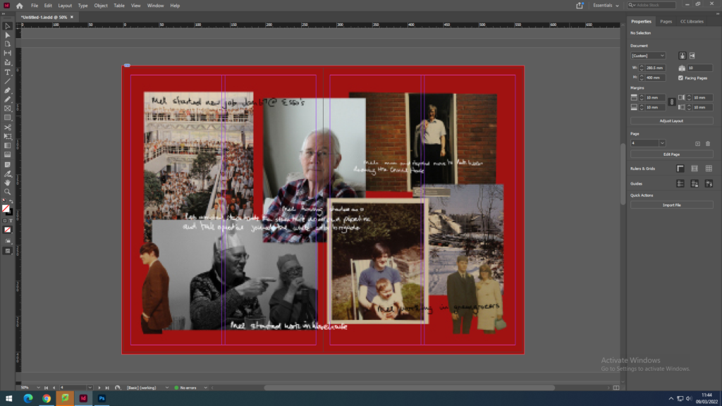
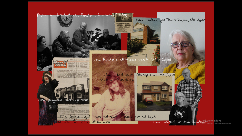
These montages I have created showcases various images of my grandad and grandma along with some pieces of text that contextualise their lives and work throughout the years. I created this using Photoshop, cutting out sections of some images, as well as tracing over images of my grandma’s handwriting to create the text. These pieces will also feature in my photobook as part of my personal study project. I have also laid them out on the page to be a full bleed, meaning the image will go to the edge of the page with minimal borders.
Juxtaposition
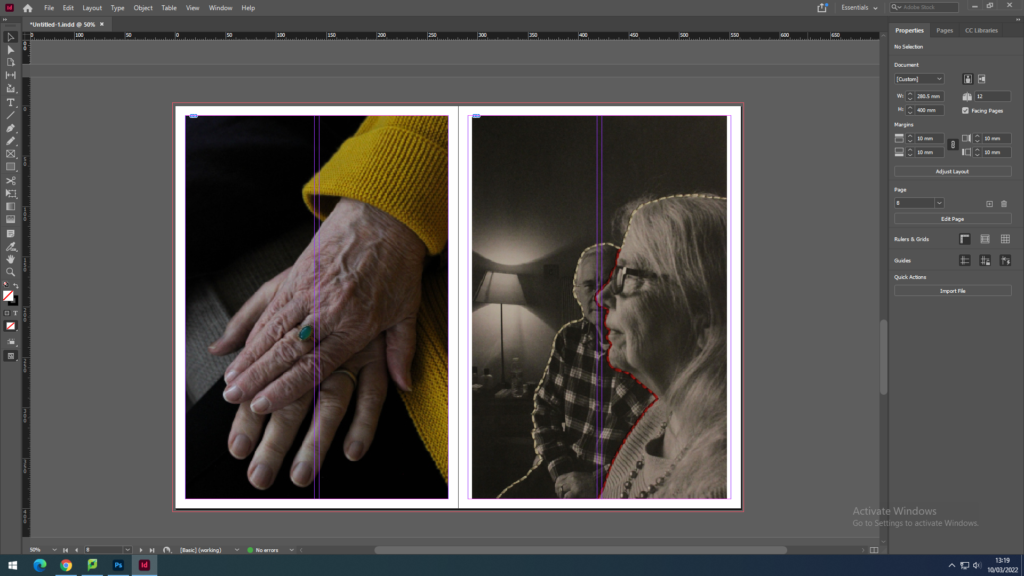
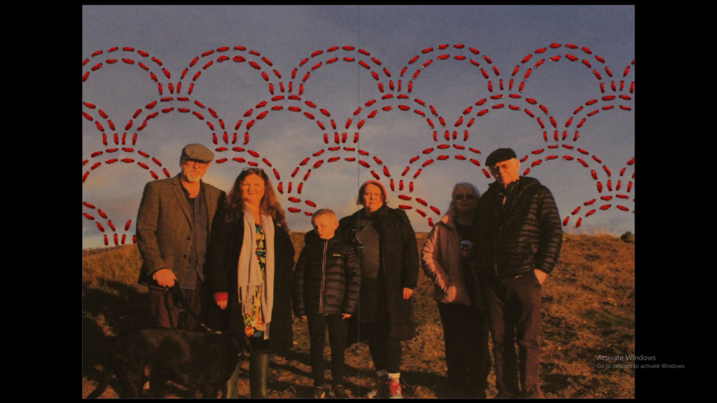
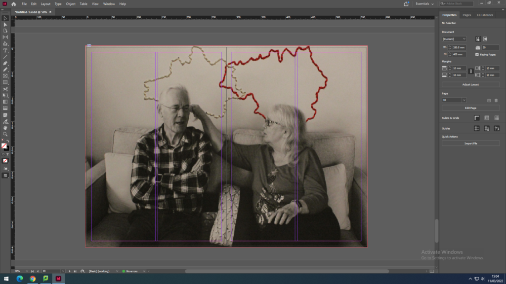
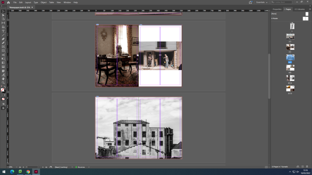
Here I have used again images from my personal study project and photobook to create a juxtaposing spread. Here, these two images contrast with each other due to the left image being in colour whilst the right is in black and white, excluding the stitching. However they are still relating in the way that they both part of the same project and feature my grandparents in different forms. The photograph on the left displays the hands of my grandma and grandad, showing a ring my grandad gave my grandma many years ago. On the right is also features both grandparents although with embroidery using white thread to highlight their strong relationship with each other and red thread to represent the bloodlines and family they have created.
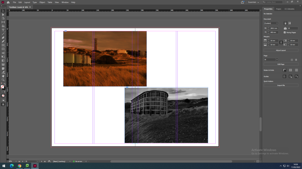
Here I tried using images from my Anthropocene project that show contrast through one image being in black and white and one being a colour image with a bold orange hue. These link together as well, due to them both displaying what St. Ouens bay would look like if it was not a protected piece of land.
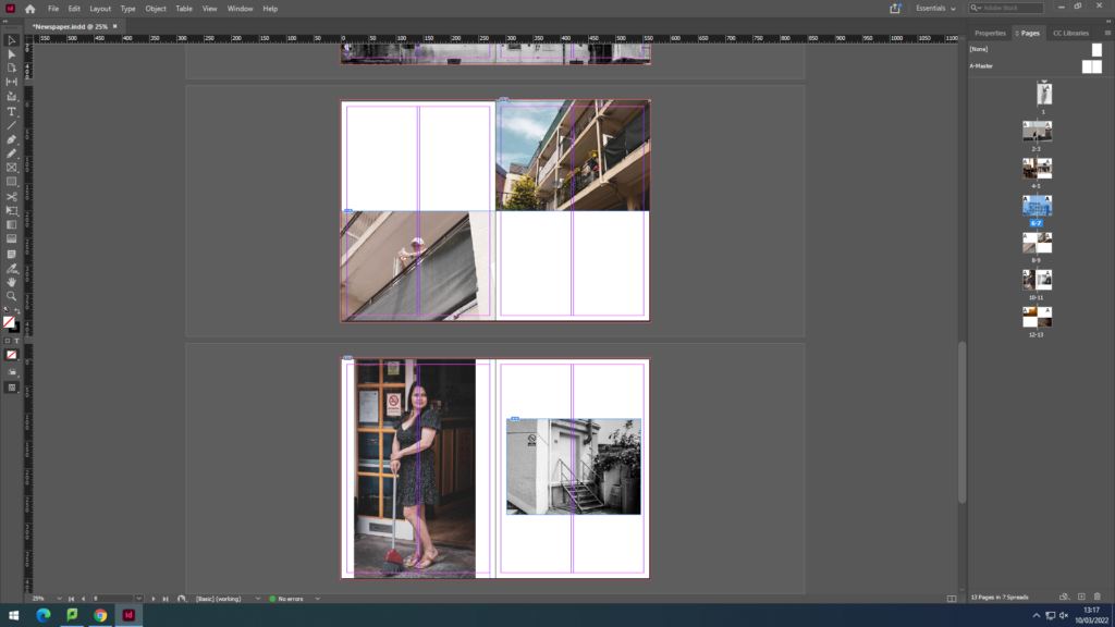
Sequence
This sequence showcases various digital edits I have made using archival images of my grandparents. These display the story of my grandparents hard work ethic that my personal study is based on, touching on subjects such as my grandads job and my grandma’s caregiving nature.
I have also created another spread of sequential images instead featuring reworked pieces I have created by hand, using techniques such as embroidery. These images in particular are taken from recent photoshoots also made for my personal study project.
Full bleed
In addition to potentially having one of my montage pieces I could also use the embroidered pieces from my personal study project.
NEWSPAPER SPREADS: Design 3-4 versions of a newspaper spreads based on images from both your current and previous projects.
You must design the following spreads:
FULL-BLEED: Select one image as a full-bleed spread.
JUXTAPOSITION: Select 2 images and experiment with different combinations.
SEQUENCE: Select a series of images (between 4 – 12) and produce a sequence either as a grid, story-board, contact-sheet or typology.
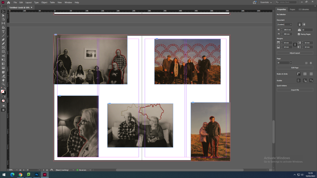
MONTAGE: Select an appropriate set of images and create a montage of layered images. You may to choose to work in Photoshop for more creativity and import into InDesign as one image (new document in Photoshop 400mm(h) x 280.5mm(w) in 300 dpi)
Here we can see the start of my work:
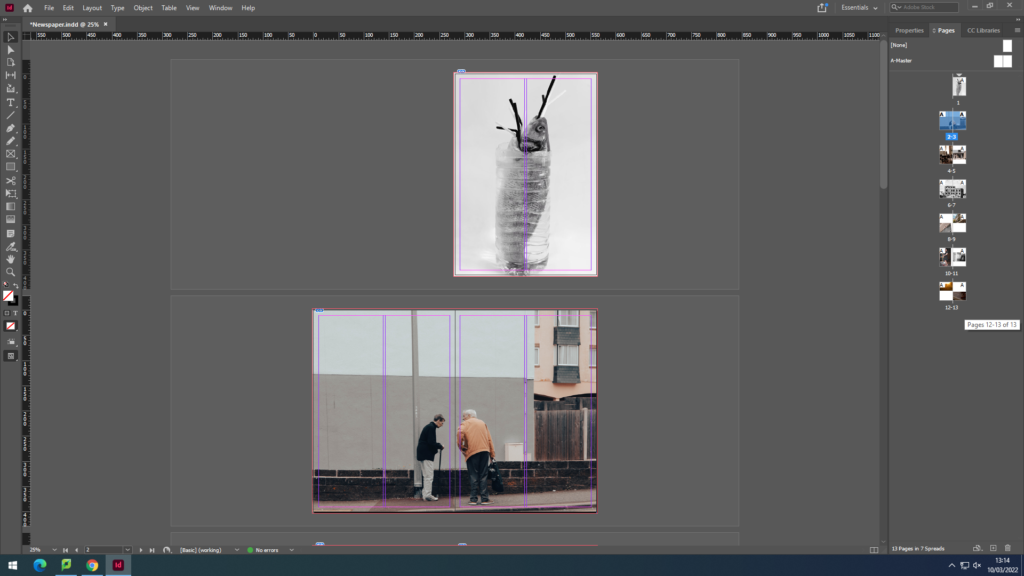
This was done by adding pages and inserting the Rectangle Frame tool and drag and drop the images into the frame. This was done so that the image was fitted inside the box which saves time having to resize.
We can see that I have made the first 2 full bleed with one taking over 2 pages since it is landscape.
Here we can see I have got more creative with the layout having an image be full bleed on one side and having another on the other side smaller. In addition, consistency was shown through the double page spread image again.
Similar creative approach was produced here having the images juxtapose each other in different ways; black and white vs colour and populated vs inhabited.