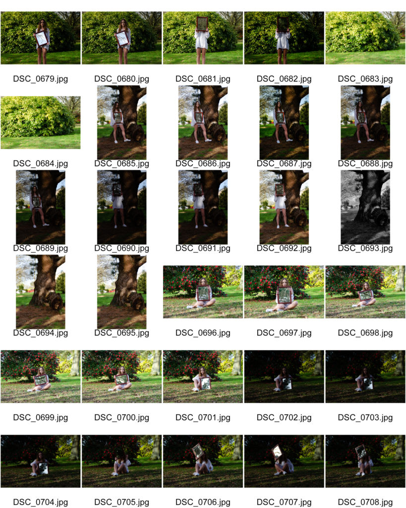
Shoot 1
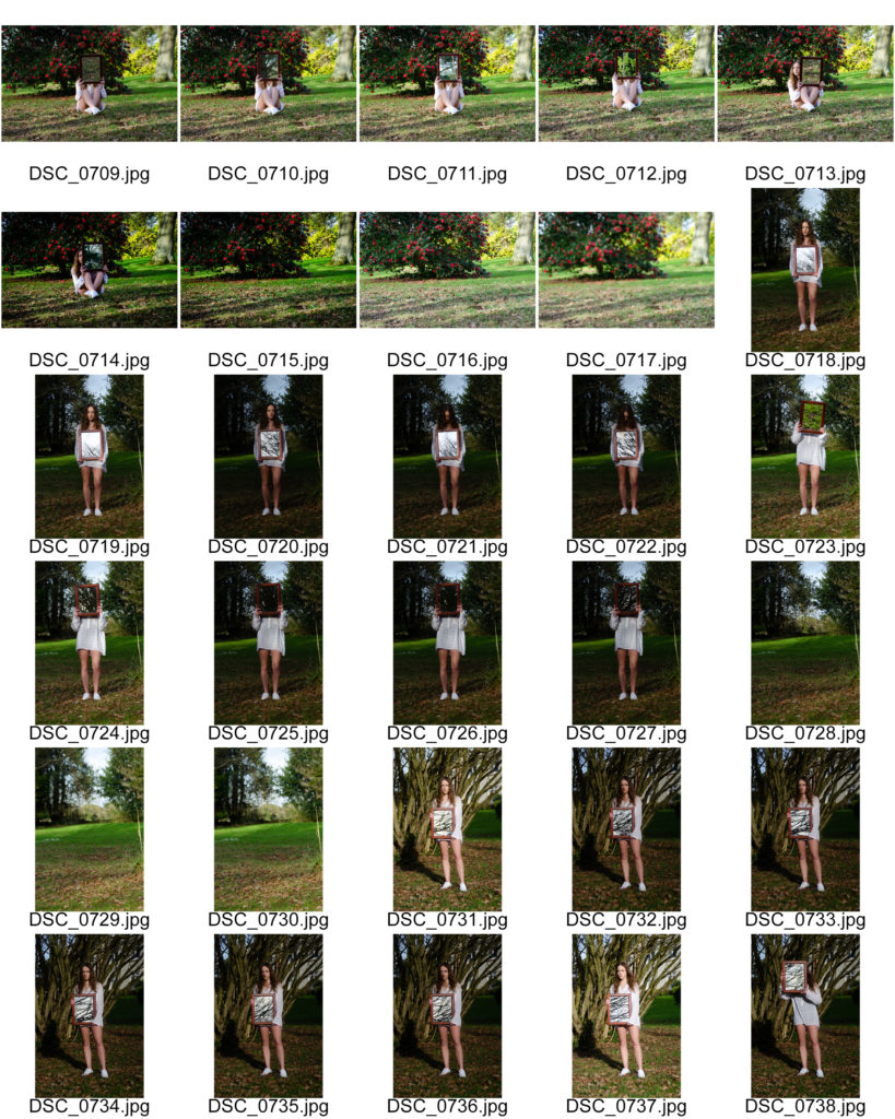
Shoot 2

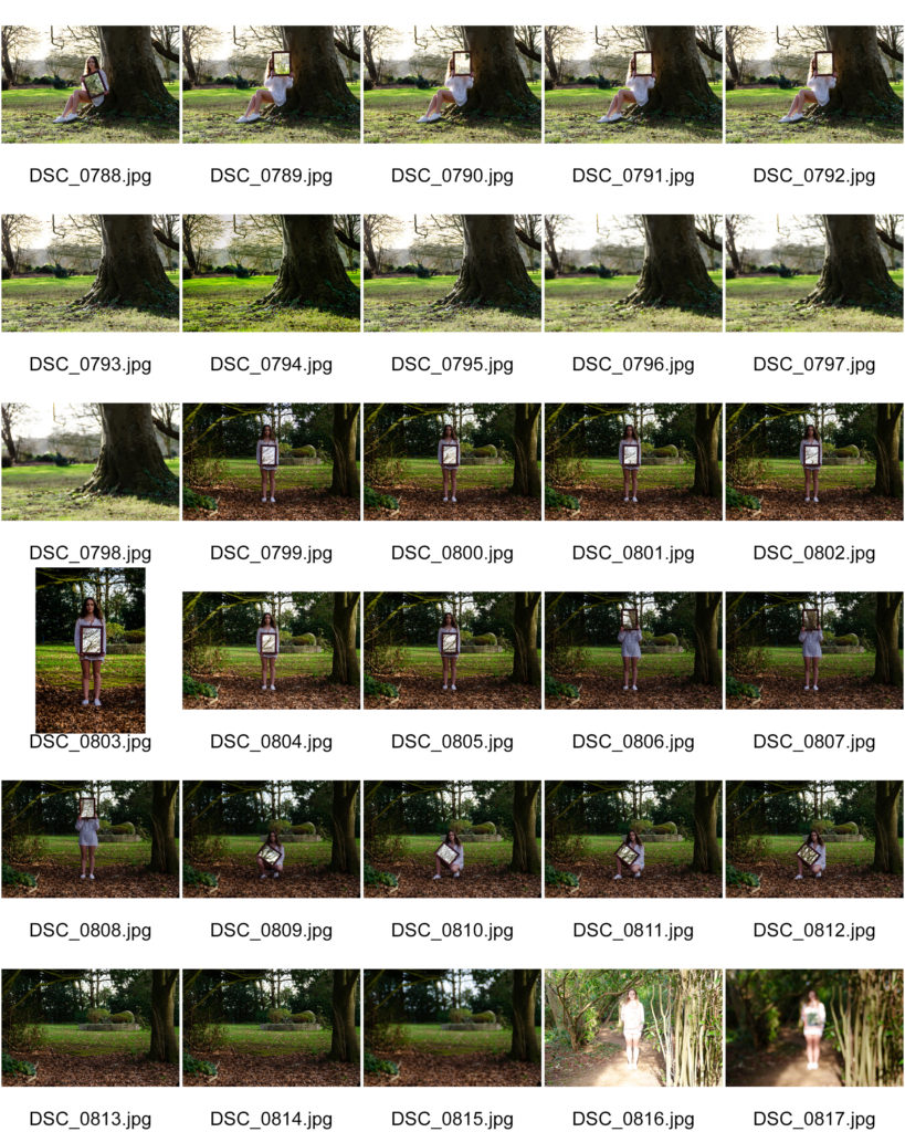
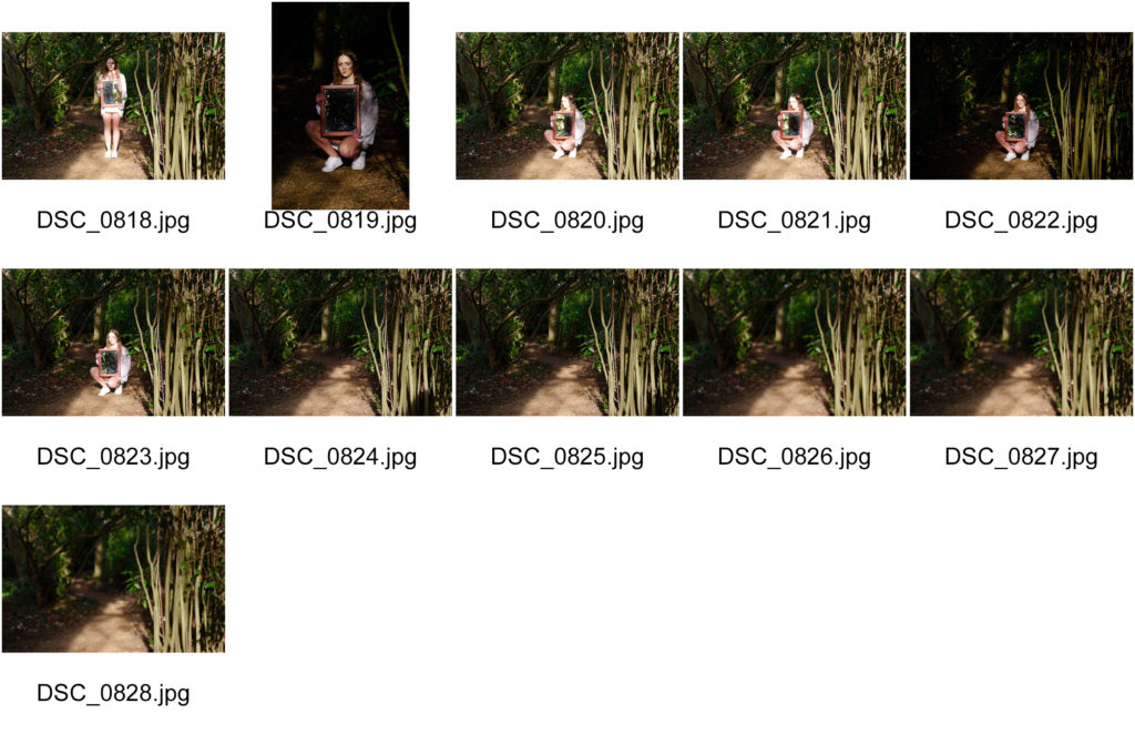
Shoot 3
Shoot 1


Shoot 2


Shoot 3

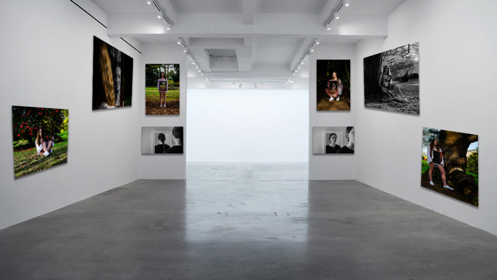
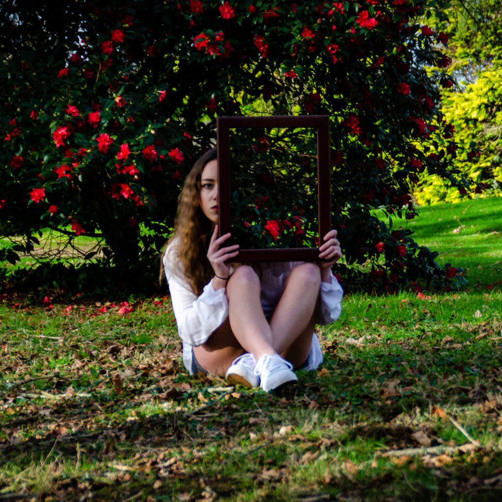

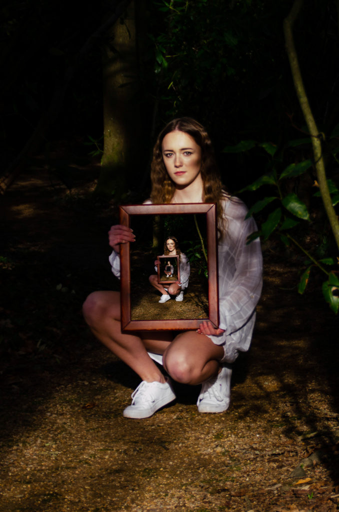
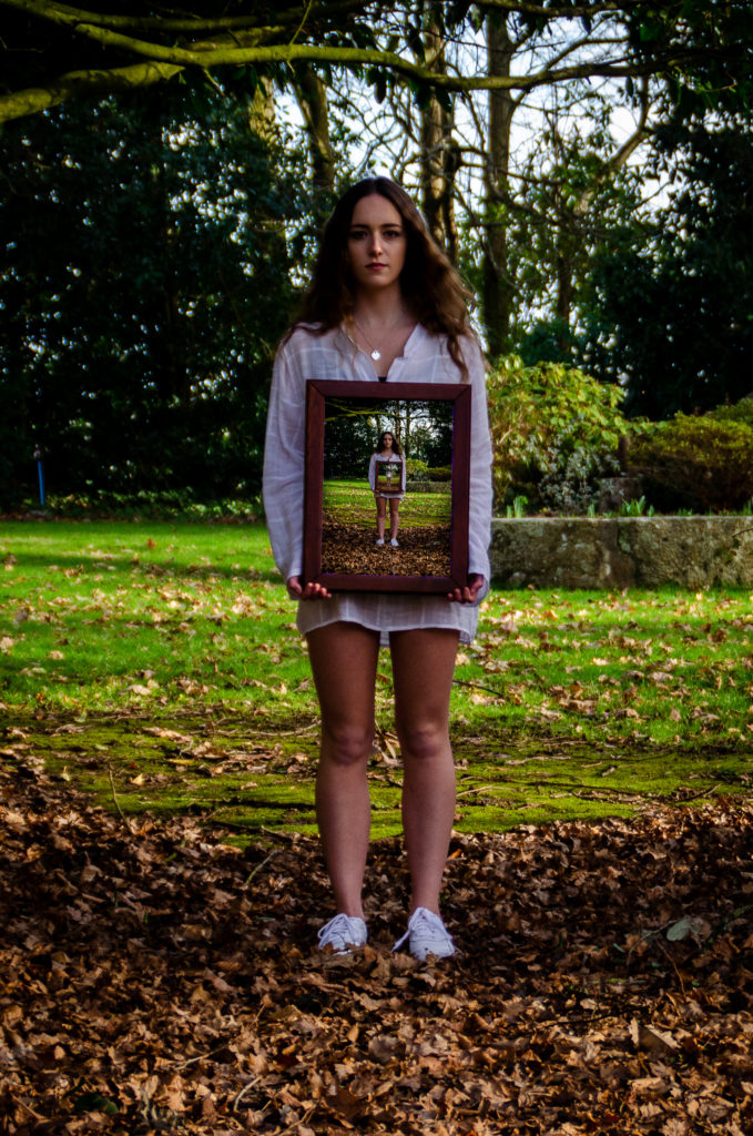


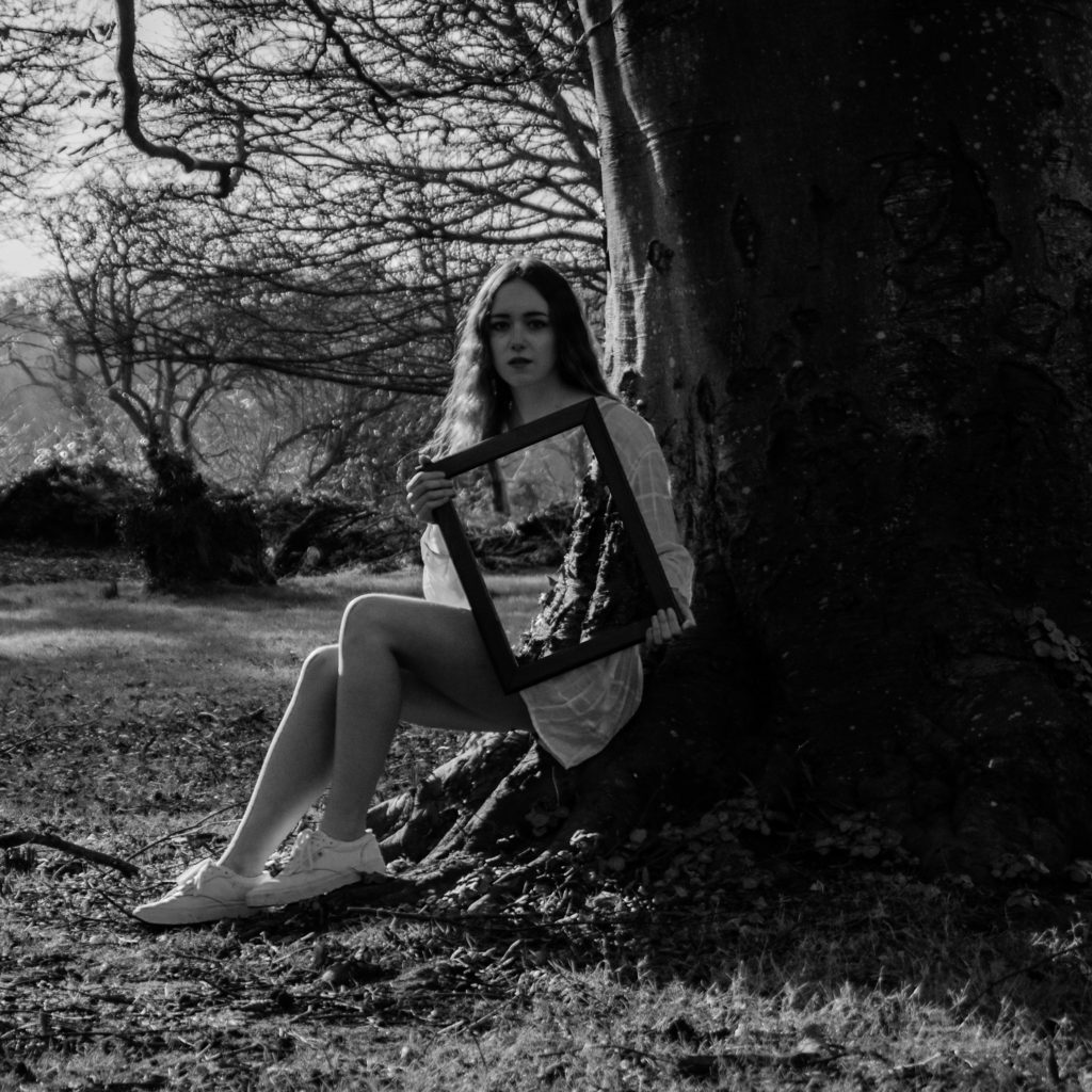
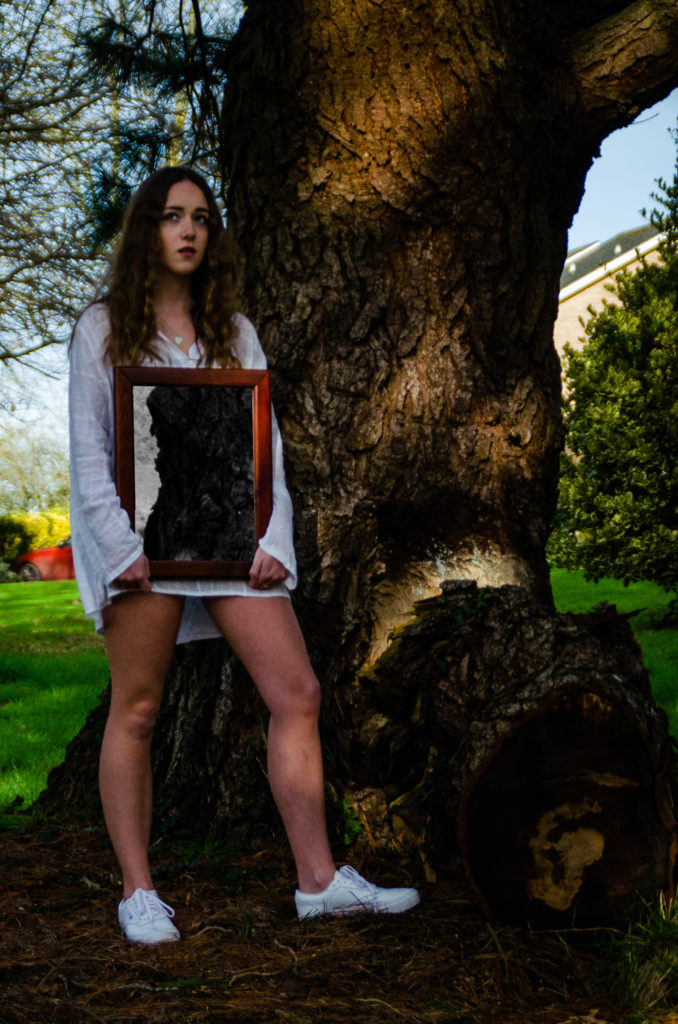
These final images are direct responses to a series of images by Laura Williams where the effect is that the mirror being held makes that subject seem invisible, creating a sense of a lack of identity.
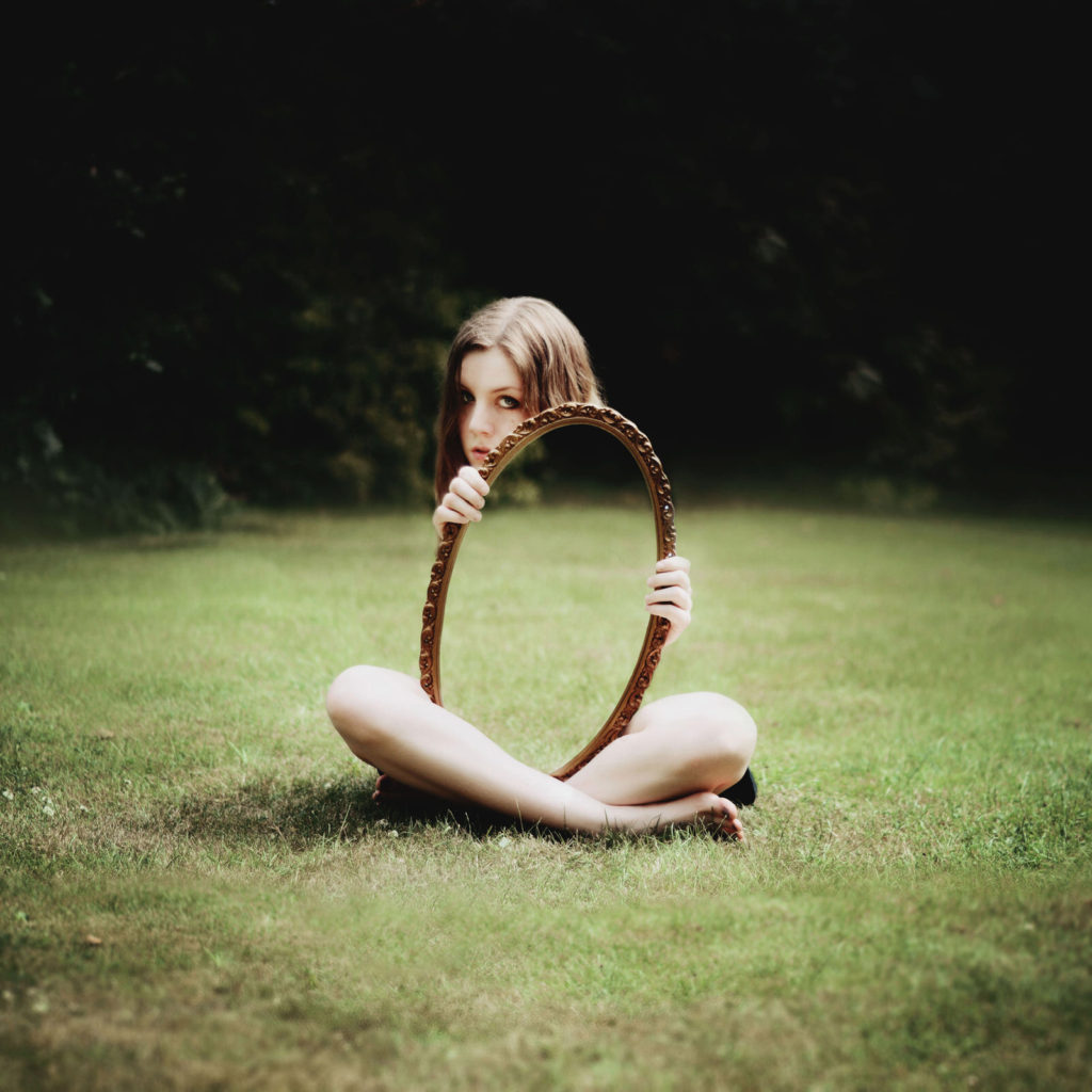
In final image 1, the female subject is in a similar position to the subject in Laura Williams’ image, where the subject has a serious expression and is looking directly into the camera. The colours are also vibrant in both of the images and the mirror covers up part of the subject.
In final image 2, the concepts and contents of the image is the same, but it is in black and white, enhancing the contract in tones between the highlights and the shadows.
Final image 3 is a mix of the two, where the main image is in colour, but the ‘reflection’ in the mirror is in black and white, indicating that maybe the subject may not know her identity because the ‘reflection’ has a lack of colour, indicating a lack of identity.


These final images link to an image by Laura Williams where the image that has been taken, is repeated within the mirror being held by the subject, which gives a sense of confusion as this seems impossible, which links to not knowing your identity or confused about identity.
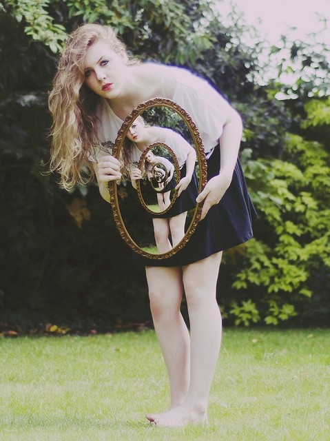
Both final image 4 and 5 are in this style by Laura Williams, the female subject is looking directly at the camera with the mirror covering her torso. The subject is also wearing a white, loose and wavy style top which, along with the edited mirror, adds a surreal feeling to the image.
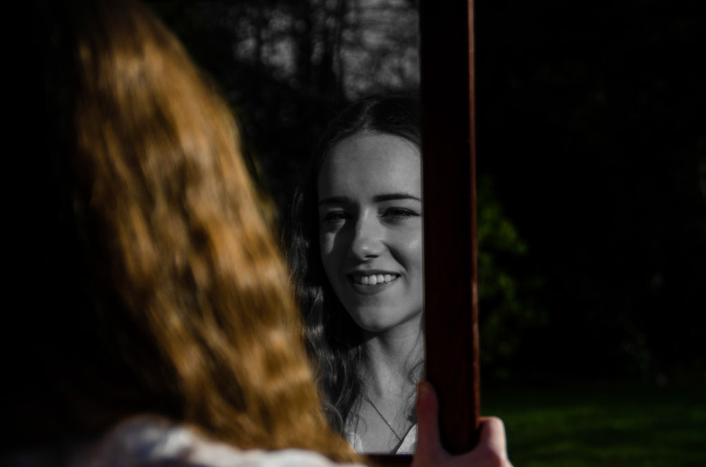
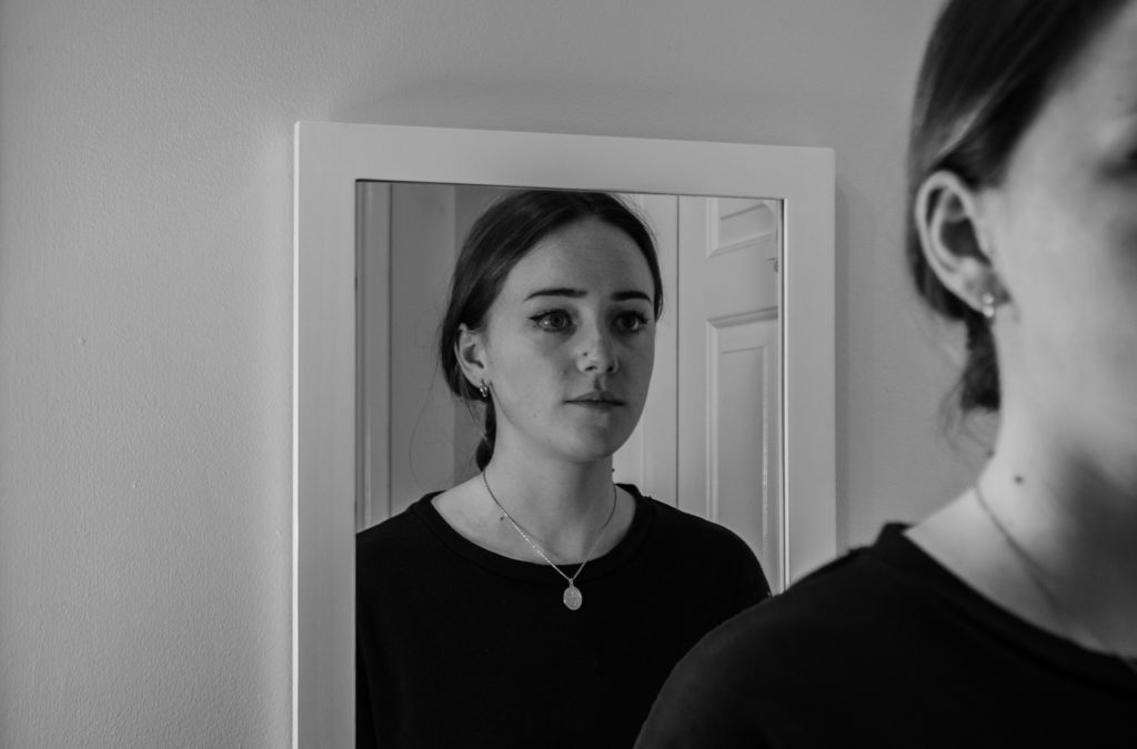

These images are influenced by Laura Williams mirror portraits, but also Bobby Becker’s surrealism images.
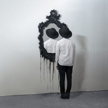
Bobby Becker creates a surreal effect by creating an impossible image with mirrors. The reflections in the mirrors are different from what they should be, creating an eerie, surreal effect.
Final image 6 symbolises a lack of reality as what is inside the mirror lacks colour, but what is outside of the mirror doesn’t.
Final image 7 and 8 link to Bobby Becker’s surrealism mirror images because of the un-real reflections in the mirror, creating a surreal, eerie feeling.
‘Photography’s connection with surrealism lies in its ability to represent the material world in strange and abstract ways. Surrealist photographer Man Ray used double exposure, solarisation and reversed tonality to disturb the viewer’s recognition of things and to suggest the overlapping of dream and reality.’
Bobby Becker creates eerie surreal photography, sometimes using mirrors to do so.
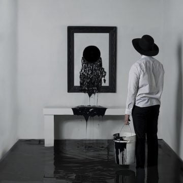

Bobby Becker’s images link to identity because what you are seeing in the image is not true to real life. Linking to how people may have an altered perception to their identity.
Bobby Becker, laura Williams and Claud Cahun all explore identity in some way, but some more than others.
Claude Cahun explores ideas of identity the deepest out of the three photographers. She expecially explored gender identity and how smeone saw their own identity.


Laura Williams, similarly to Claude Cahun, explores how people see their own identity and lack of or multiple identities. This links to the Claude Cahun image above, which symbolises the subject having multiple identities and how they view their own identity.
Laura Williams explored lack of identity and identity as a whole through the use of mirrors. and reflections.

Some of Laura Williams photographs are impossible looking images, such as making the subject appear invisible and epeating images within the mirrors. These give a sense of surrealism.
This links to Bobby Becker, who is a surrealist photographer. And also links to Claude Cahun and identity because of the eerie confusing images. This shows the subject being confused about their identity. Bobby Becker also has a few images with mirrors creating a reflection that doesn’t make sense within the image, such as the subject facing the wrong way in the mirror, eerily plain rooms and other images that dont make sense and make the viewer feel somewhat uneasy.

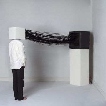
Lots of Claude Cahun’s images link to gender identity. In her images she tackles the problem with gender norms and stereotypes by going against the way people would expect a woman in her time to dress/act.

The image above shows an image of Claude Cahun in a shirt. This would stereotypically for the 1900’s be mens clothing. Claude Cahun taking images going against these stereotypes was important to let people know that they can be free to wear and act how they want no matter their gender.
There are lots of other images by Claude Cahun that address gender norms/stereotypes such as the ones below.

This idea of gender identity is reflected in Laura Wiliams work and my final images because all of the subjects are female, only showing the identity and thoughts of a female subject.
What
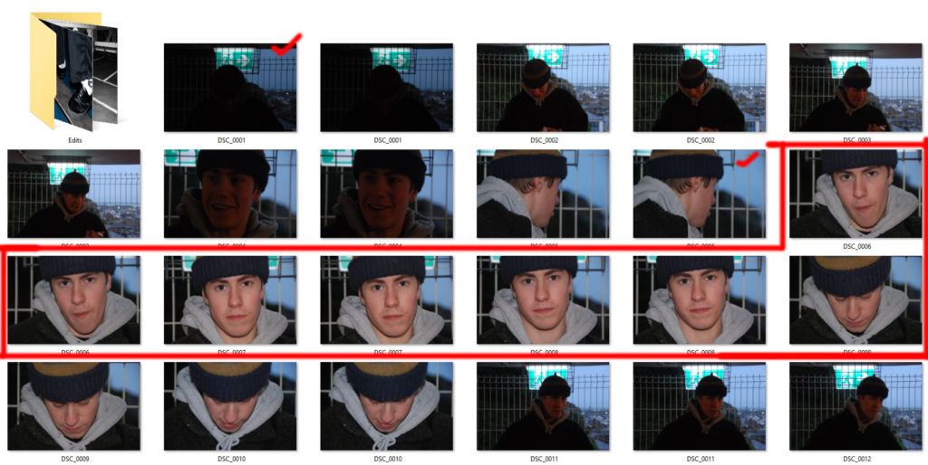
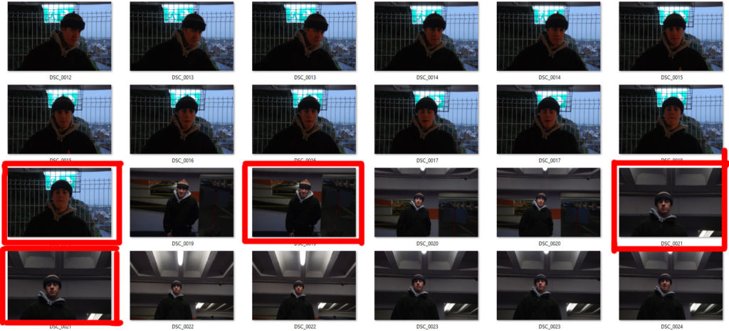
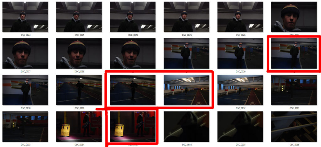
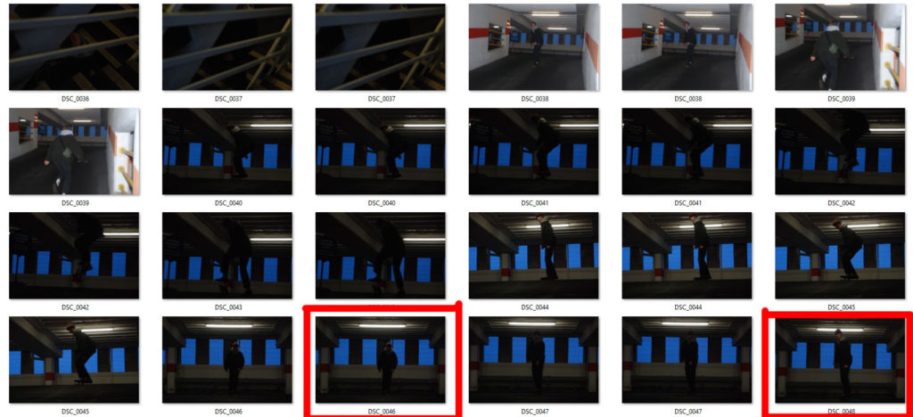
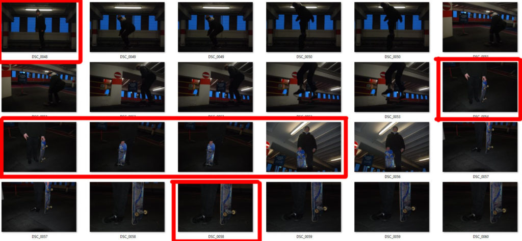
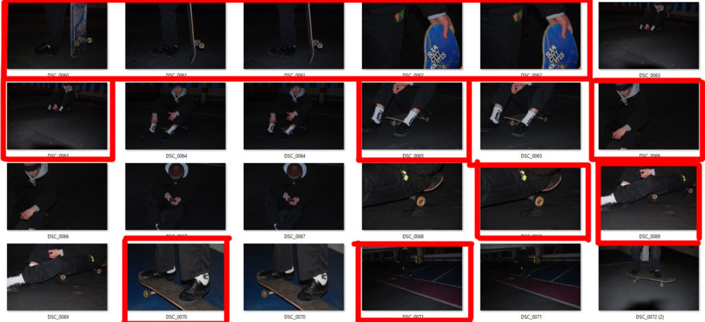
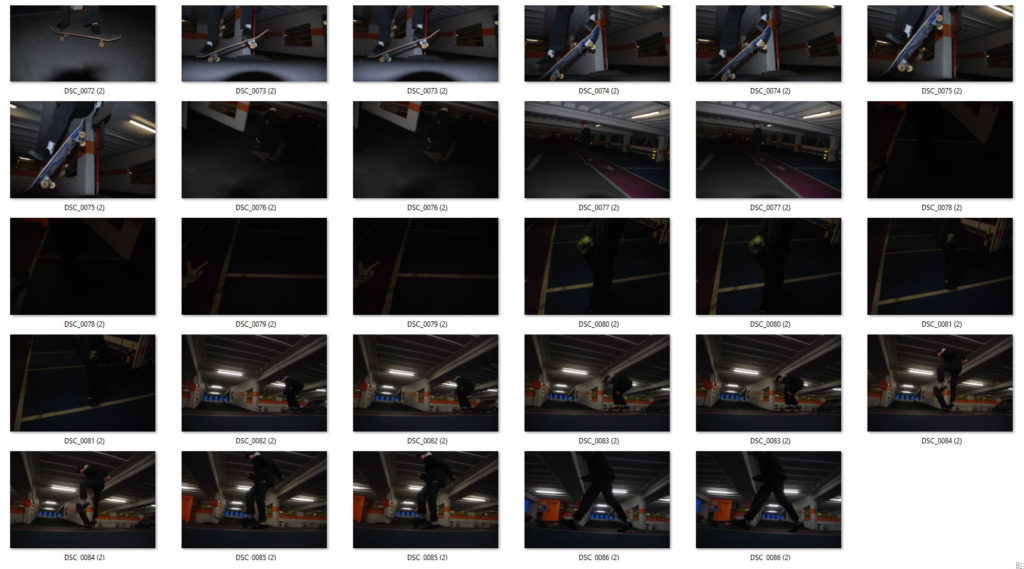
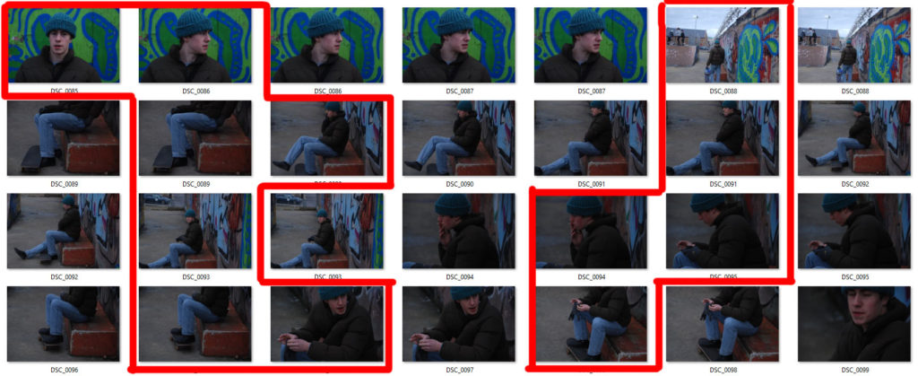
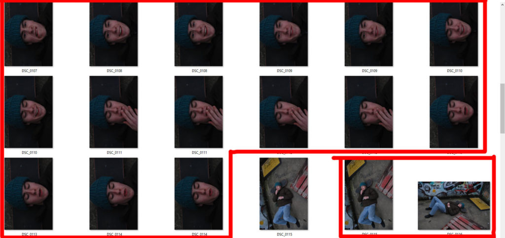
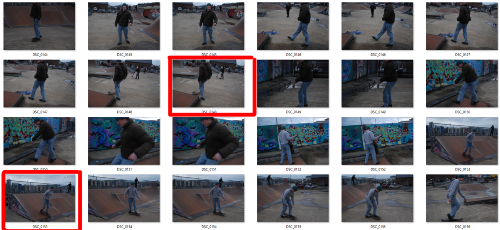
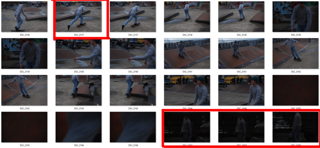
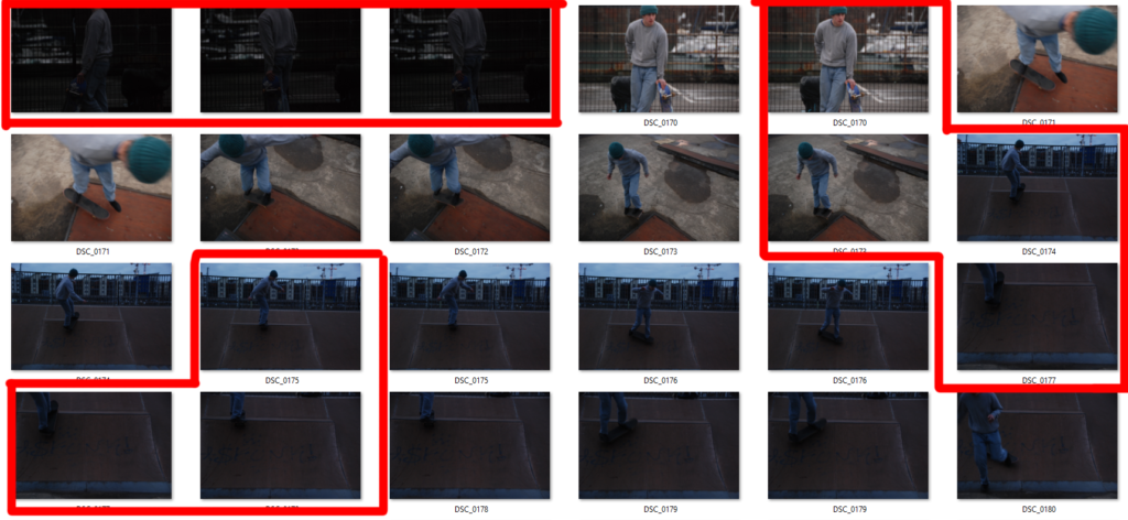
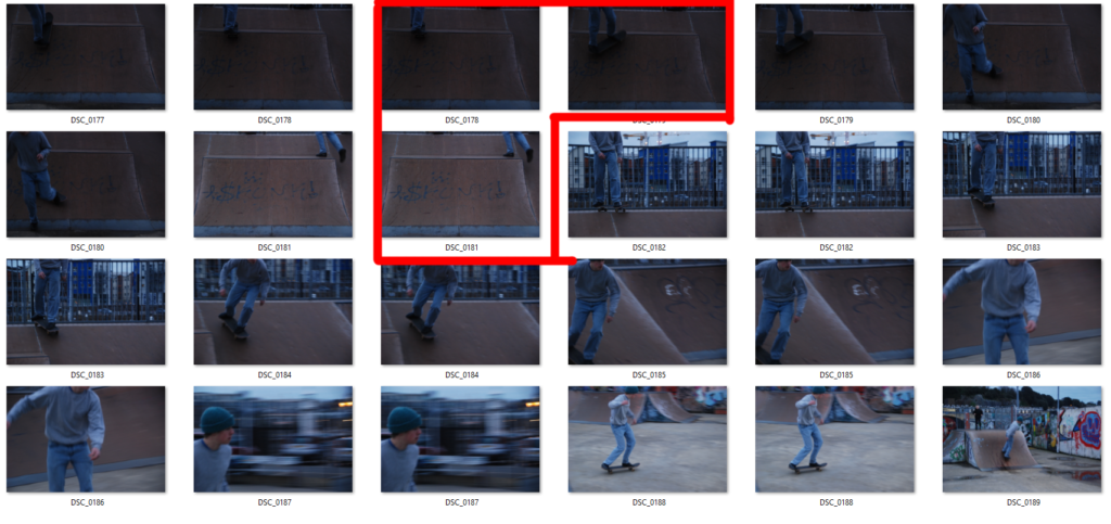
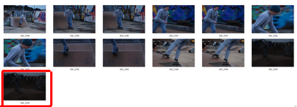
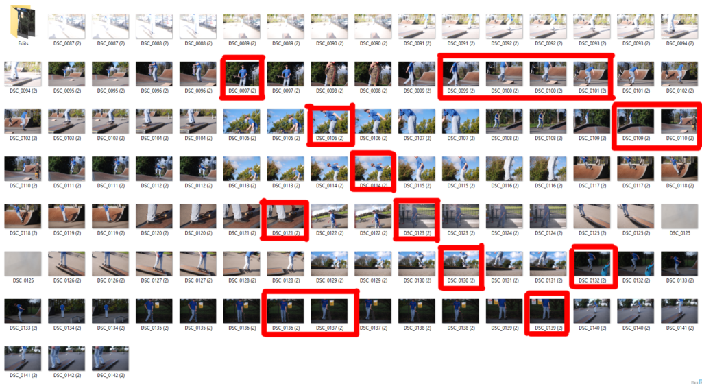
Portraiture and action shots of a skateboarder relating to the work of J Grant Brittain
Why
This is to explore the idea of identity of individuals within a sub-culture.
How
Direct subject into different locations and capture him in his “natural habitat
Who
A local skateboarder
Where
Various skateparks and an urban multi-story carpark
When
During clear weather.
Frida Kahlo
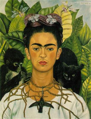
In 1929 Diego Rivera and Frida Kahlo had been Mexico’s most well-know couple. While Diego was a painter who was famous for his large murals. Frida was famous for being his wife. But in 1938, Frida’s painting were starting to get known. Her style is unique and her art had always been in response to her life. Magdalena Carmen Frida Kahlo y Calderón is now known for her many portraits, self-portraits, and works inspired by the nature and artefacts of Mexico. She is iconic.

This is a self-portrait of Frida Kahlo published on Vogue in Paris in 1938. I think this picture is very iconic. I want to recreate this image but with my personal touch. I like to identify myself often with Frida Kahlo because she is an artist with a original creativity. What I love about her is that she is a powerful Mexican women, she is iconic.
Andy Warhol
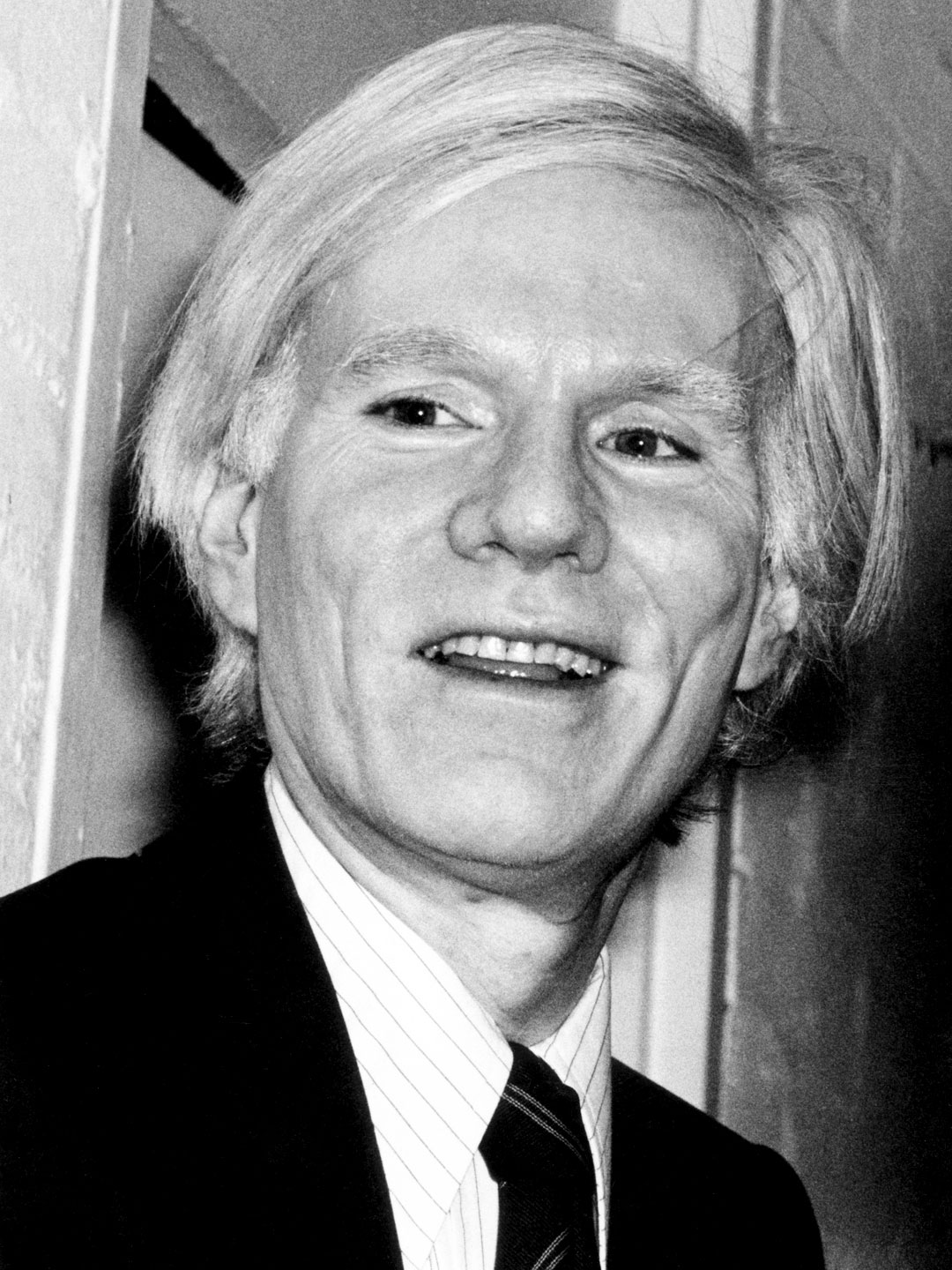
Andy Warhol was an American artist, film director, and producer who was a leading figure in the visual art movement known as pop art. In 1967, Warhol established a print-publishing business, Factory Additions, through which he published a series of screen-print portfolios on his signature subjects. Marilyn Monroe was the first one. He used the same publicity still of the actress that he had previously used for dozens of paintings. Each image here was printed from five screens: one that carried the photographic image and four for different areas of colour, sometimes printed off-register. About repetitions Warhol said, “The more you look at the same exact thing, the more the meaning goes away, and the better and emptier you feel.”
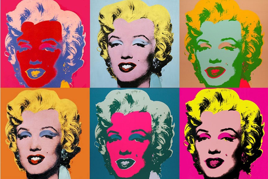
To represent my identity I want to recreate this effect of the same photo but different colours. With this effect I will show the different cultures in which I had the opportunity to grow up. Because these cultures have made me the person I am now.
Comparison
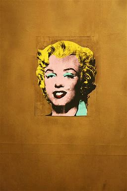
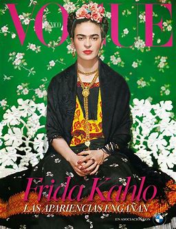
They are both colourful pieces. They don’t have they’re not really in common, they don’t have the same style. The one on the left is the Marilyn Monroe painting that Andy Warhol has achieved while the one on the right is a cover of Vogue. We can notice that Frida Kahlo wears a traditional Mexican outfit, it shows its origin and then the decorative paper behind is green. one of the colours of the Mexican flag. You can also see small details like flowers. they don’t have the same tones of colour. Andy Warhol paints the face of Marilyn Monroe in pink and then surrounded with gold.
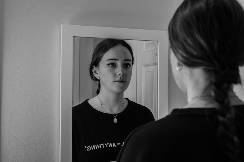
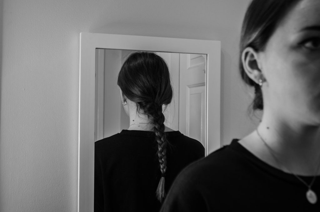

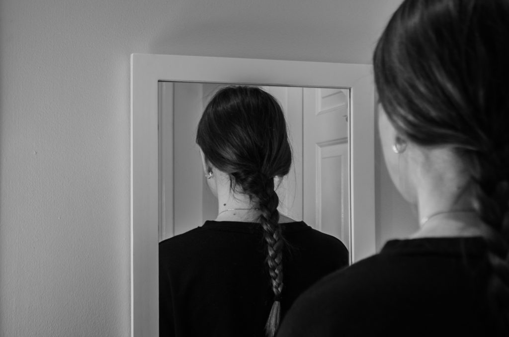
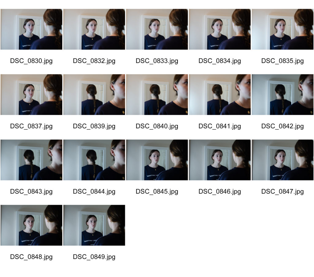
This photo shoot used ideas of Laura Williams and her mirror portraits to create an idea of loss of identity.
My plan for this shoot was to take multiple images of the same subject facing different directions. My plan was to then edit the images in photoshow to create an un-realistic image where the reflection does not reflect what should be being seen in the mirror.
J Grant Brittain is a 65 year old photographer who has shot the skateboarding scene for over 3 decades.
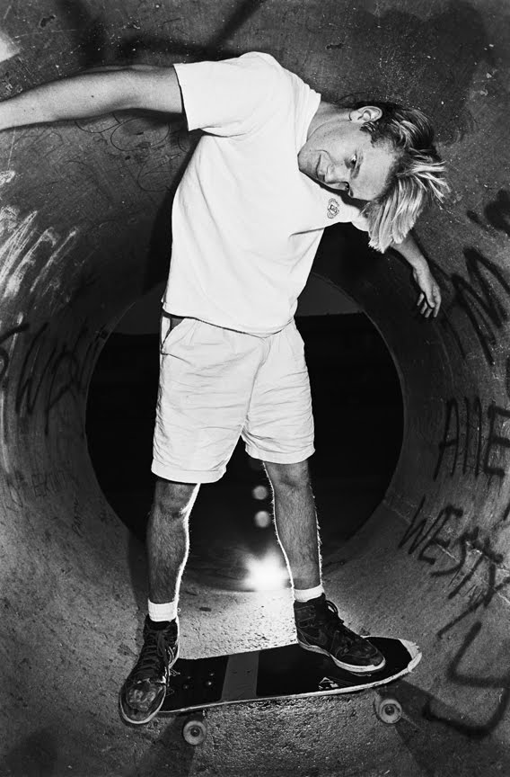
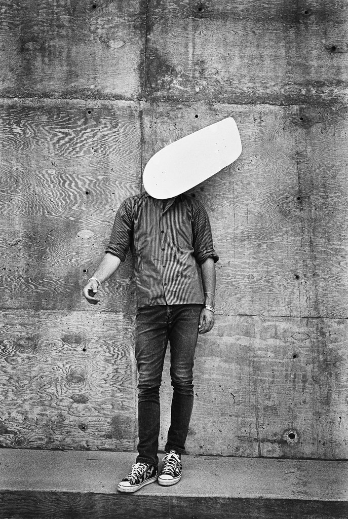
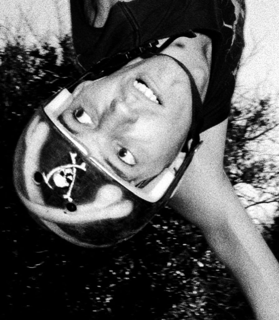
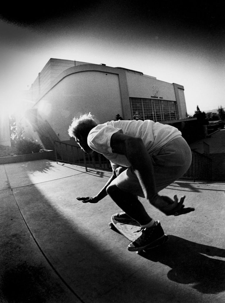
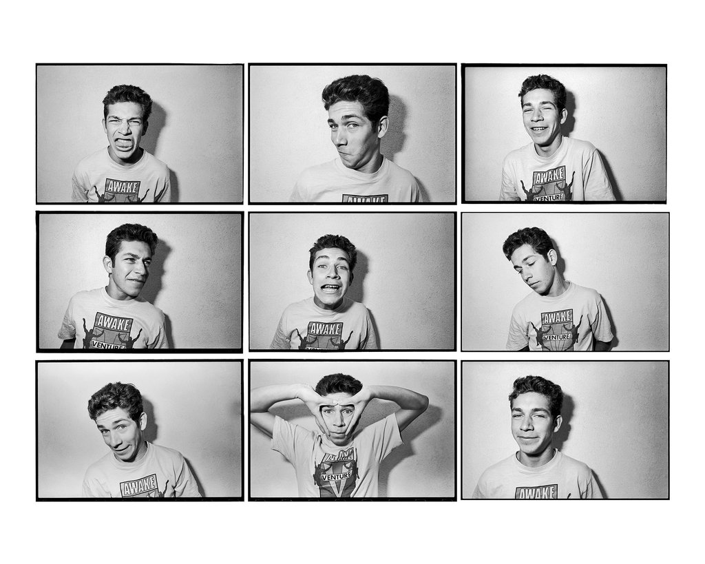
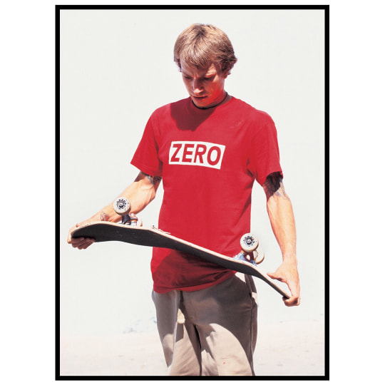
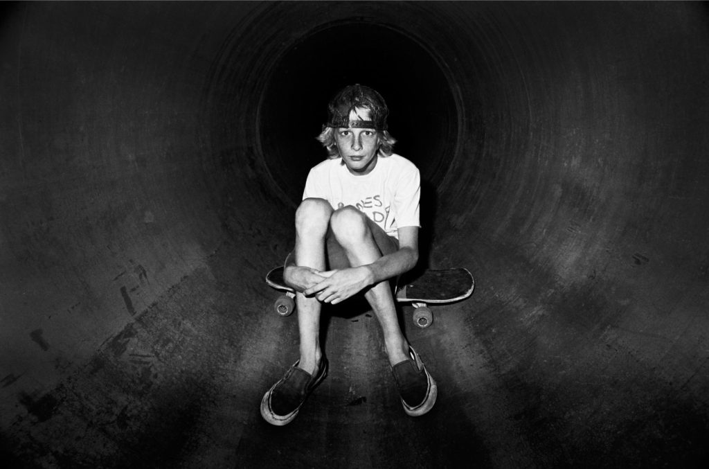
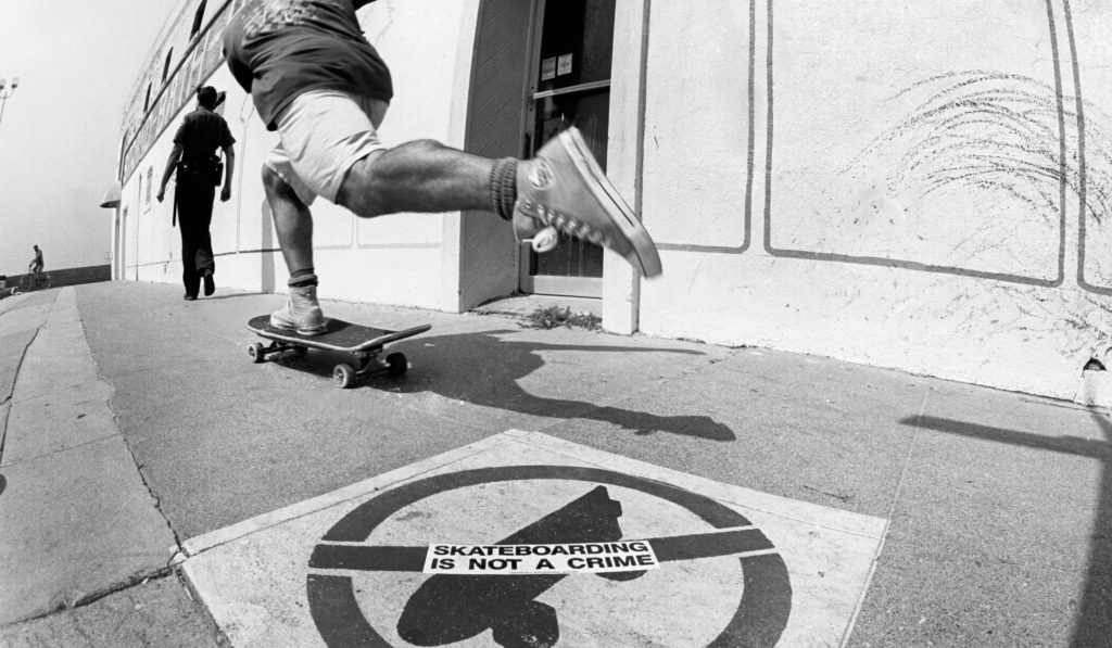
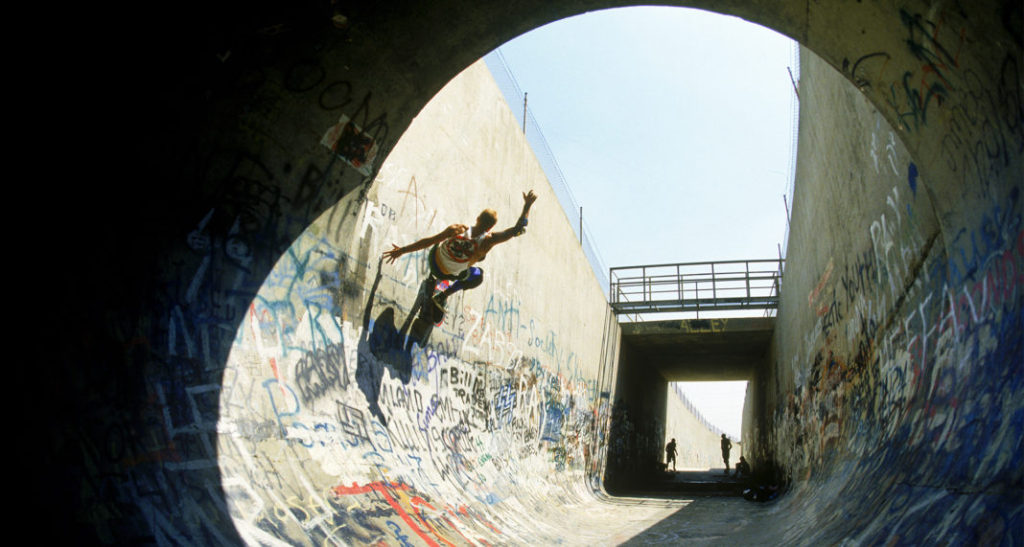
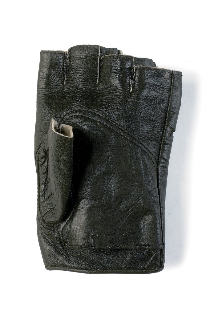

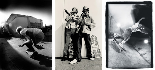
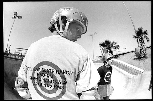
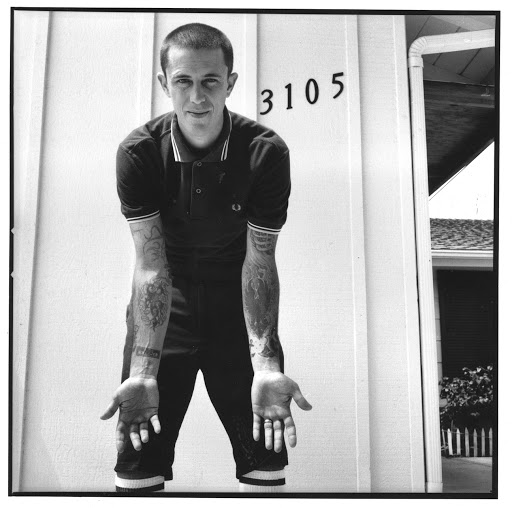
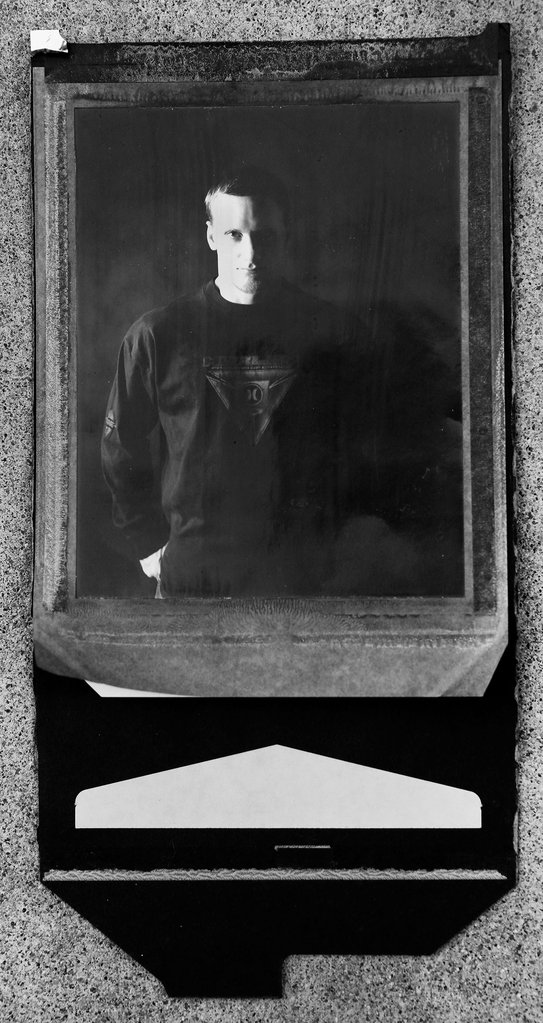
The reason I have chosen to reference his work when completing my project on identity is because he has grown with the culture of skateboarding and he understands how to capture its essence very well. I am also fond of the way he doesn’t limit his work to the conventional action-shot fashion. He broadens his work into a deeper sense to capture the identity of the skaters and their emotions towards the culture of skateboarding. For example the following image captures the identity of the person as it exhibits the subjects emotion and tells a story about the person.

In the above image Grant uses high contrast to deepen the shadows around the subjects face to relay more emotion and definition. This is a way he included themes of identity in his work. The subjects identity is also explored by giving the image context and showcasing the subjects interests and culture he does this by composing the image with the subject holding a broken skateboard. Grant also does a good job of isolating the subject by photographing him with an contrasting background which gives the image a pleasing visual form.
Additionally, when Grant shoots the action shots he doesn’t just focus on showcasing the manoeuvre of the skateboarder but rather their style and environment which many skaters will tell you is far more admirable and important than the tricks you are doing. A skateboarders style and creativity is a what makes up their identity. This creative identity formation is a huge part of the culture of skateboarding and this is one thing that 3 decades of Grants work has made clear.
J Grant Brittain; Claude Cahun Comparison
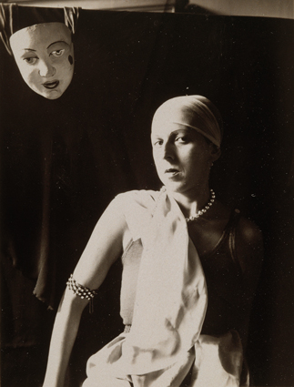

These two images by Claude Cahun and J Grant Brittain both suggest the exploration of Identity. Both images focus on a person and their facial expression and emotion. The compositions both tell a story that we can see behind the eyes of the subjects. The subjects are both photographed with their style being flaunted, the self portrait of Claude her upper body is positions in a confident, striking manner and her chic jewellery and clothing is also seen, the skater in the other composition has a chaotic yet focused style to him with his his creativity shown through his customised helmet which is a visual centre-piece of the composition.
The way the two artists question the theme of identity differs. Claude explores the idea of questioning her identity and her troubles with identity. This can be seen in the above composition with the placement of the mask in the top left corner suggesting notions of multiple identities and is masking her true identity. However on the contrary Grant explores a subject who has found his true identity through the passion of his creative field (skateboarding). Instead of challenging identity he is celebrating the concept through capturing the subject in the moment of passion and expression.
The images both share low saturation and high contrast. This highlights the subject facial features in the two images by accentuating difference in the highlights and darks in the face of the subject.
The images have different textures the self portrait of Claude has a quick shutter speed and appropriate ISO to create a smooth professional portrait texture. This is compared to Grants image which has a slower shutter speed, higher ISO and clarity to show more motion and noise in the image to create a rougher texture.
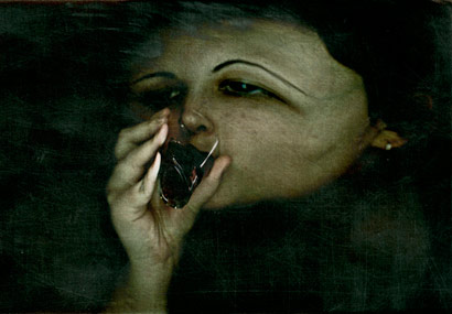
She uses photography to represent Borderline Personality Disorder symptoms with photographs. She decided to use scannographies instead of photos because the pictures she took with her scanner gave her the look she wanted, like “someone trapped inside a dark place”, a dark place which could be a Borderline’s mind.
Her Life
Scanography is the art of recording a subject using a flatbed scanner. It is created in the same way that Xerox art is created using a photocopier, however scanners typically have the ability to create larger, higher quality digital files.
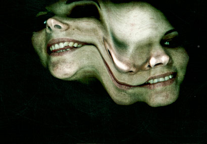
They capture movement in exciting ways, such as Evilsabeth Schmitz-Garcia’s ‘Borderline Personality Disorder’ portraits above, which have been distorted and stretched as the scanner arm moves across the screen. Scanners can also be used to take scans of objects place upon existing photographs, as per the example below.
She began her art studies in 2003, at “Escuela de Arte La Palma, Madrid”, where she had photography as an optional subject. She found out that she was fascinated with how photography worked so she used to spend hours taking pictures and developing them.
She began her own scannography experiments, in the end she chose this as her final project. She started scannographies as her teacher showed her example which inspired her.
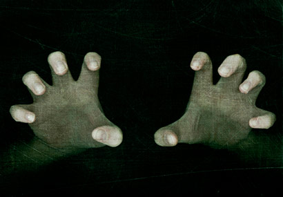


How i would include her style?
I would like to include the merge aspect, where she merges multiple faces which I would accomplish using Photoshop, or long exposure to create a blur, therefore you see multiple faces.
I may use hands and edit them in, around the edge. To create a manipulative, and creative idea. It would make a uncomfortable, crawly image.
Finally, I may take the idea where she uses multiple faces to create a single image. I would use about 5 faces then make all of them blank, then show the process of editing facial features on which shows the development of identity.
A lot of Laura Williams mirror portraits are edited in photoshop to create the funal product.
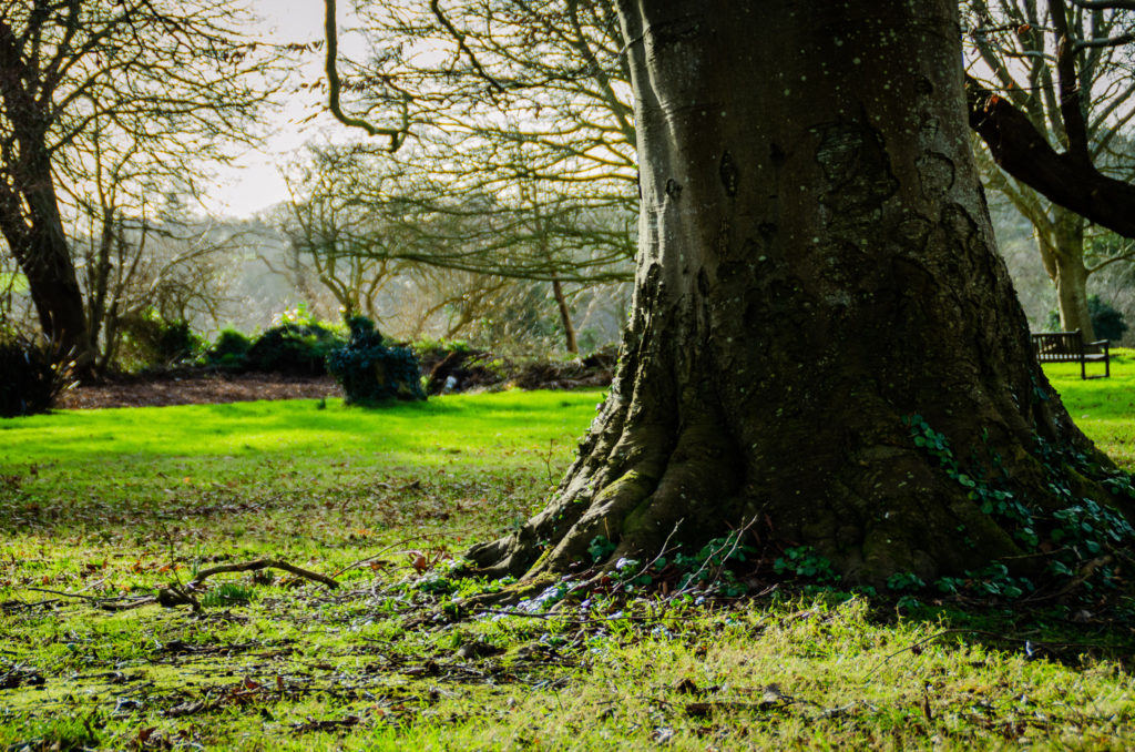
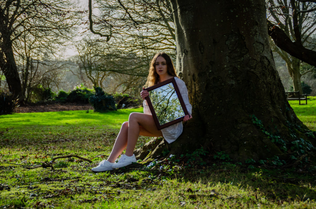
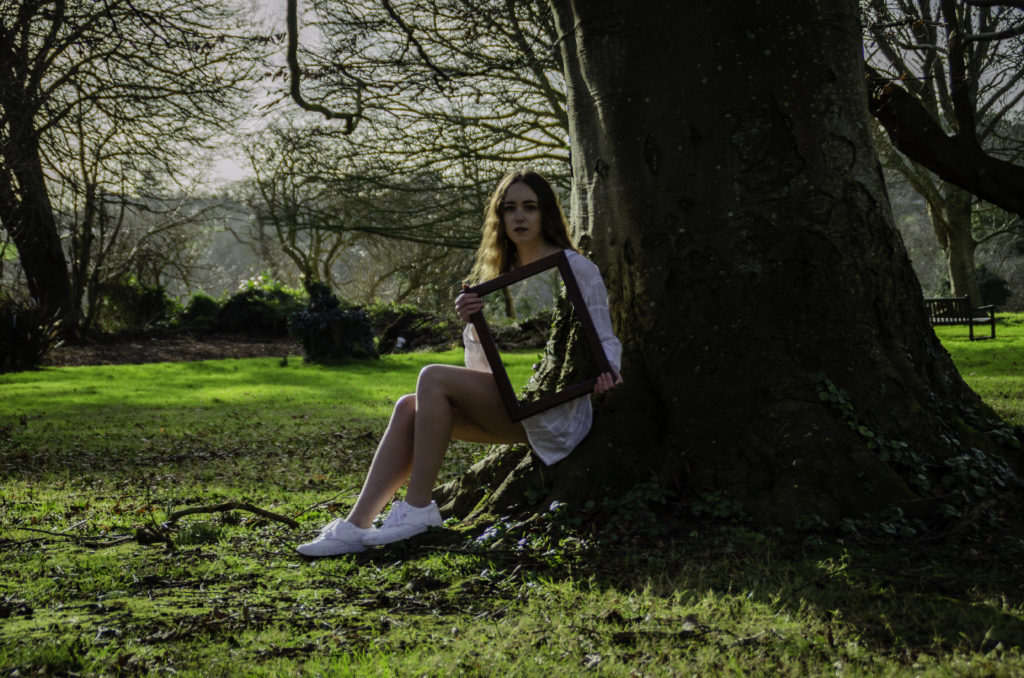
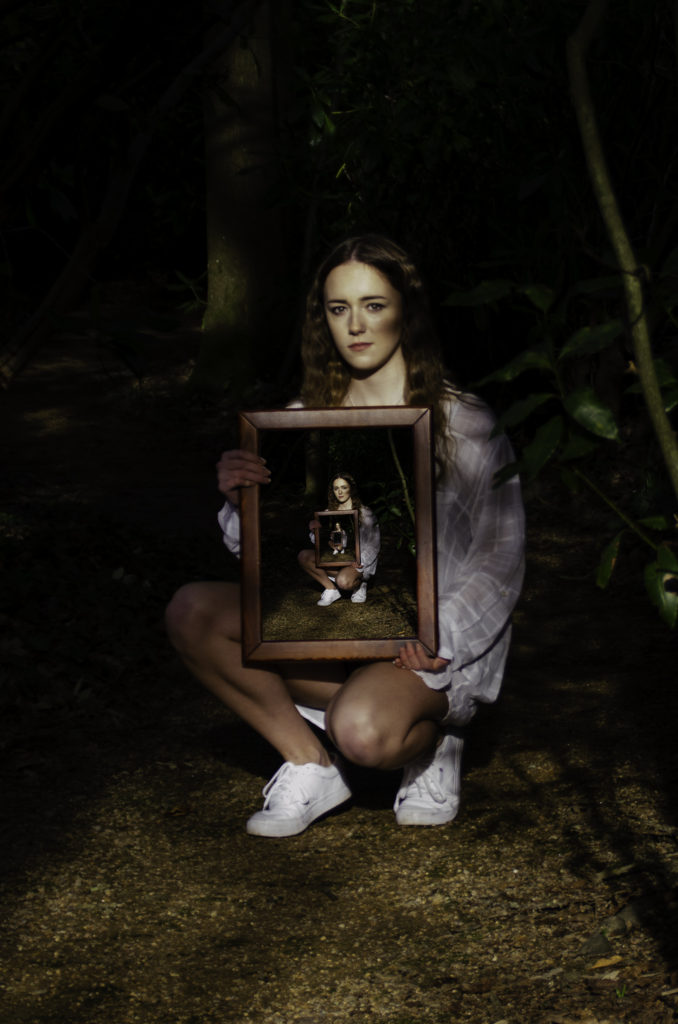
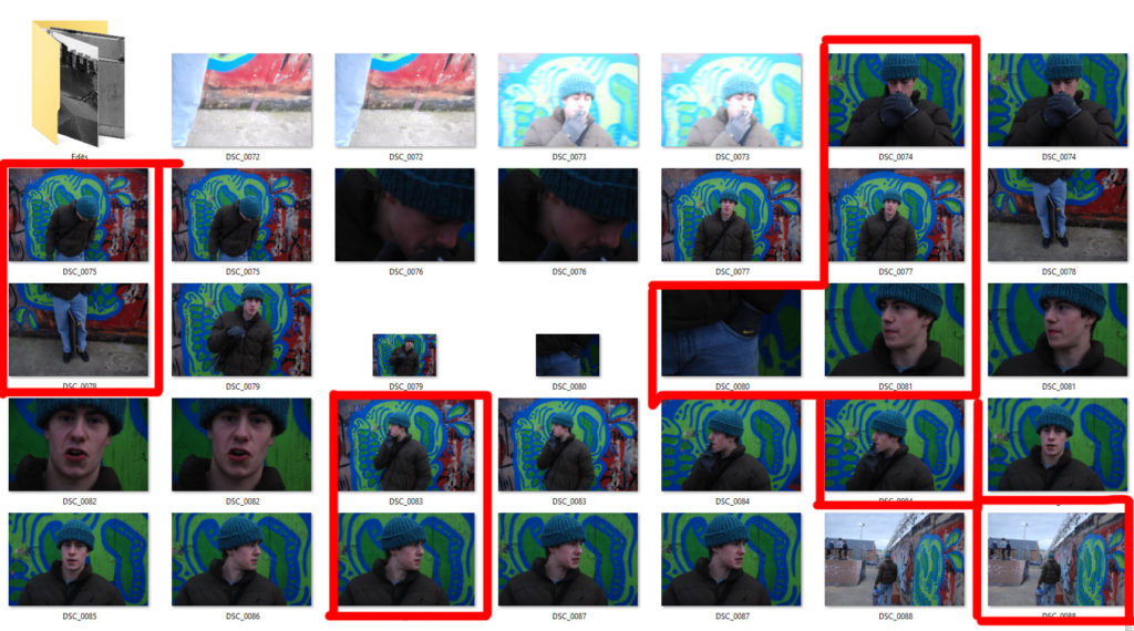
For this shoot i took photos in the style of Laura Williams’ mirror portraits.
My plan for this shoot was to go to one of my relatives garden because has many possible backgrounds similar to Laura Williams mirror portraits. I also did the shoot n a clear bright day naturally light the shot well.
