Category Archives: Independent

Filters

Author:
Category:

rural landscape case study

FAY GODWIN

Fay Godwin (1931 – 2005) was a British photographer known for her black and white landscapes of the British countryside and coast. She produced portraits of dozens of well-known writers, photographing almost every significant literary figure in 1970s and 1980s England, as well as numerous visiting foreign authors. After the publication of her first books he was a prolific publisher, working mainly in the landscape tradition to great acclaim and becoming the nation’s most well-known landscape photographer. Her early and mature work was informed by the sense of ecological crisis present in late 1970s and 1980s England.

IMAGE ANALYSIS

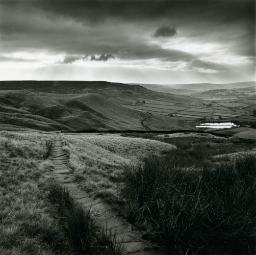
Godwin has used utilised the natural lighting available to her in this photograph, and has avoided using any form of artificial lighting as the image was captured in an outdoor environment. There is a range of tones in the image, varying from dark and almost black in the grass, and much brighter ones in the sky and clouds. Additionally, the photograph being captured in black and white adds to the contrast between them. However, the colours in this image are not entirely black and white as they fall somewhere in the middle, which still leaves the photograph feeling natural and untouched. Godwin has positioned herself in the middle of the pathway in the photograph, which has lead to leading lines being presented to the viewer, drawing their eyes to a singular focal point (where the pathway meets the hill in the background). This focal point is also in the centre and the middle ground of the photograph, which again draws the viewer’s eye to this particular point. We can see that there is repetition present in the photograph in the grass in the foreground as they are all positioned in the same way. The texture of the grass is also still clearly visible through the image, and the rough surface contrasts to the soft look of the clouds in the sky as well as the smooth look of the hill in the background.

CLASSWORK – EVALUATING A PHOTOGRAPH
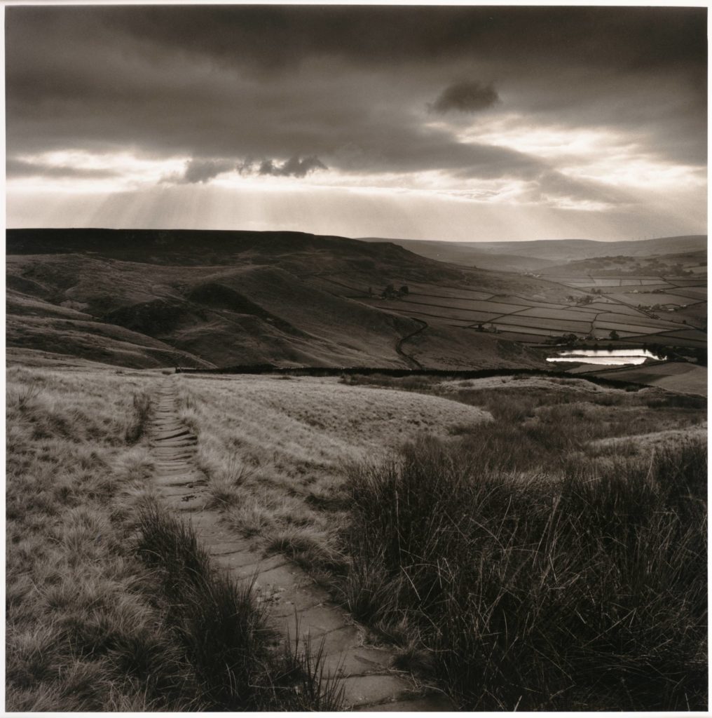
This photograph is of a path leading to a reservoir in the countryside and is aptly named ‘Path and Reservoir’. It was captured in Yorkshire in 1977 by Fay Godwin. Godwin was known for being a part of The Ramblers, which is Great Britain’s leading walking charity that celebrates the pleasures of walking and aims to protect the places people love to walk. They believe everyone, everywhere should be able to experience the joy of walking and have access to green spaces to walk close to home. It is very possible that Godwin took photographs such as this as a way to show her love for the countryside and her evident disdain at the growing privatisation of the environment by big businesses. In the foreground of the image there is a wooden path which leads to the middle ground of the photograph and draws the viewer’s eye to the dividing line in the middle of the image. Perhaps it was her intention to use the edges of the pathway as leading lines towards the middle of the photograph, thus creating a focal point for the viewer. which is the edge of the hill that the path is on. She appears to have kept the photograph as natural as possible, probably as a way to give the viewer a realistic depiction of the countryside that she is seeing. She has also captured this image in black and white, which may have been an artistic choice; this was taken in 1977 when, although coloured cameras were available, many photographers still chose to shoot in black and white. However, the photograph is not completely black and white, as different hues of tones can be seen in the grass and the hills in the background. We can tell she has used natural lighting as the photograph is of the outdoor environment. Godwin most probably placed herself in an intentional position when she took the image. There are multiple curvy and natural lines in the image, shown by the dividing lines of the fields in the background and the clouds in the sky. This could emphasise Godwin’s intention to show the natural landscape in an organic and raw way, as it has not been made straight, rigid or repetitive by humans. I think that Godwin wanted the viewer of this photograph to feel inspired and in awe of the natural beauty of the countryside.

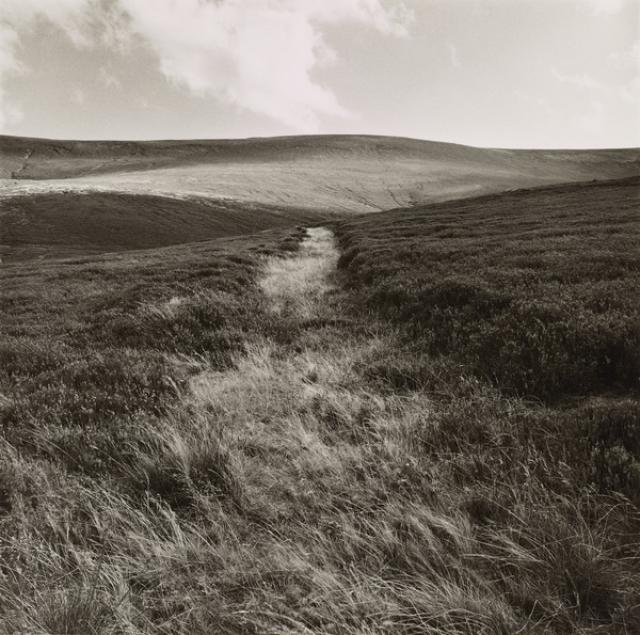
Fay Godwin analysis

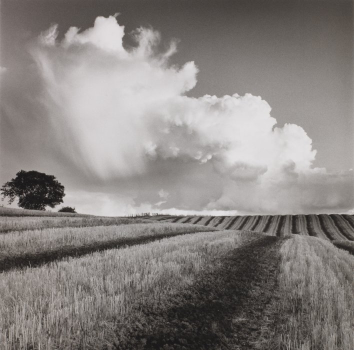
Large white cloud near Bilsington, Kent” – Fay Godwin (1985)

Fay Godwin, born in 1931 and died in 2005, was a British photographer who was recognised for her intense landscapes, specifically her black and white work. Godwin began her photography career with portraits of well-known writers such as Ted Hughes and Clive James, however she broadened her love for photography when she found her passion for walking and the environment. Her early landscape work was created with the intent of bringing to light the ecological crisis within the late 1970’s to the early 1980’s, where she protested the English countryside being privatised. Later, in the 1990’s, Godwin was offered a Fellowship at the National Museum of Photography, Film and Television in Bradford, where she was pushed further with in the direction of colour and urban photography.

Examples of Fay Godwin’s work

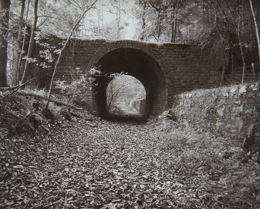
Fence, Parkend Woods, Forest of Dean” – Fay Godwin (1985)
The Ridgeway, Uffington Castle by Fay Godwin on artnet
“The Ridgeway, Uffington Castle” – Fay Godwin (1975)
Godwin Fay | Tree with sheep, Alcomden, Calder Valley (1979) | MutualArt
“Tree with sheep, Alcomden, Calder Valley” – Fay Godwin (1979)

Analysis of Fay Godwin’s work

Land Lines — Fen Ditton Gallery
“Path and Reservoir above Lumbutts” – Fay Godwin (1977)

This image by Fay Godwin, titled “Path and Reservoir above Lumbutts” depicts exactly what it states within the title. At first glance, fields, ponds and moody clouds can be seen, complete with a winding pathway. This image was taken in the late 1970’s, at the prime of Godwin’s project to help preserve British public land from being privatised. This could prove Godwin trying to display both the beauty and the threat that the natural world holds over us. This is not a realistic depiction of nature as Godwin takes tonal values to the extreme to create an intense juxtaposition.

The lighting in this image is gloomy, overcast natural lighting. The lighting suggests the image may have been taken in the late afternoon, perhaps in autumn or winter. The lighting is natural yet harsh, meaning distinct shadows and highlights are created. The most well-lit sections of the image can be seen in the light reflected onto the reservoir water and the illuminated sky. The light is directed further towards the right of the image, as the majority of the left side of the image is in darkness.

There is representation of a leading line in this image, in the form of the path that winds into the distance of the image. This thick, curved line directs the viewers eyes into the left of the image. This provides a forwards movement to the photograph, although when the path comes to an end, the viewers eyes are directed to the other sections of the image. There is also representation of lines within the fields that are separated with subtle, thin lines. The line provided by the horizon also acts as a leading line that directs the viewers eyes from one side of the image to the other.

There is a subtle representation of repetition in this image, which can be seen in the repeated squares of fields in the background of the image, as well as repetition of line within the leading line and also the slightly indistinct lines separating the fields, however these lines do not create any sense of pattern or rhythm.

The majority of the shapes in this photograph are curved and organic, for example the clouds are very irregular with soft edges, also the leading line of the image is curved. The only visual geometric shapes are the square-shaped fields in the background.

There is a shallow depth of field in this image as the foreground of the image is in focus and the background is captured with a slight blur. The shadows produced by the clouds also create the sense of a shallow depth of field as the darkened areas are indistinct and indistinguishable. The entirety of the photograph is filled with positive space.

The aesthetic of this image has a rough texture due to the masses of sharp-cut grass. However this is juxtaposed with the exceptions of the soft, light clouds as well as the calm waters.

The range of tones in this image range from dark to light. The darkest areas of the photograph can be seen in the background towards the left, and also the clouds. These areas are contrasted with the lighter areas of the photo, for example the glistening water and the gleaming sky. Overall, the image tends towards darkness, especially in the top third with the near-black clouds.

There is a lack of colour in this photograph. I think this is because Godwin wanted to show the power and beauty of nature in it’s purest form, and the extreme contrasting tones adds a sense of intimidation to the aesthetics of the image. Metaphorically speaking, as Fay Godwin’s message in her work is to preserve the natural world, the use of the monochromatic filters could signify the death and destruction of the world, as the image provides a gloomy, depressing atmosphere.

There is a complex composition to this image, as it follows the rule if thirds in some sense, yet also follows it’s own unique composition. The rule of thirds can be seen to be used horizontally, as the image almost separates into layers of contrasting dark and light. However, there is no use of the rule of thirds vertically as the focal points, being the footpath and the reflected water are not located in the middle third. I think the composition is fairly balanced as the light and dark tones are rather evenly spread throughout the image.

Photo-Montage – John Stezaker

Stezaker is a British photographer born in 1949.

He is fascinated by the “lure”of images.

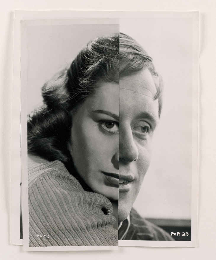
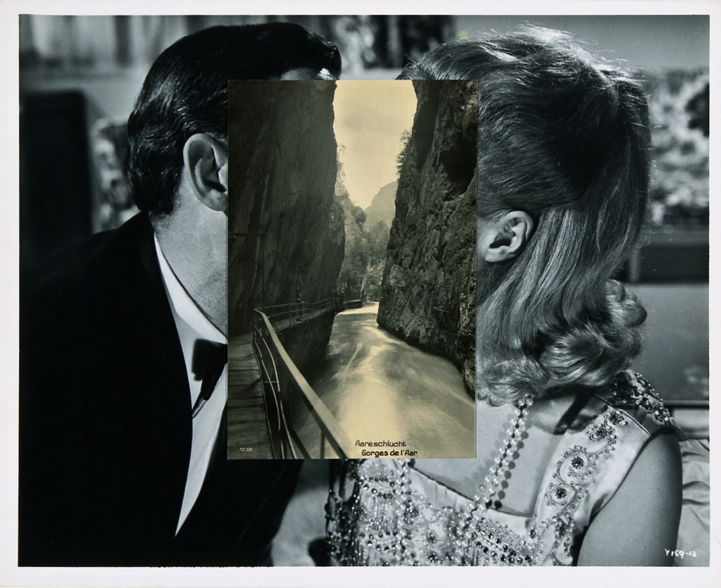
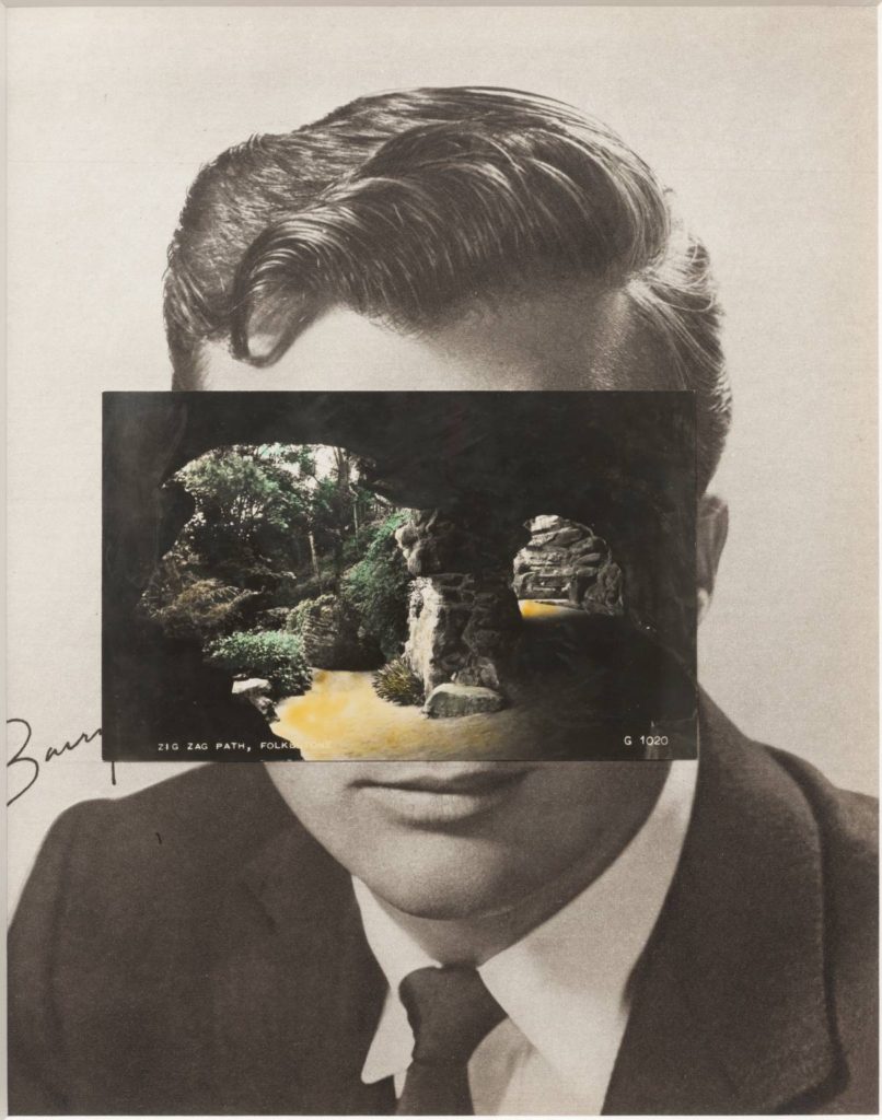
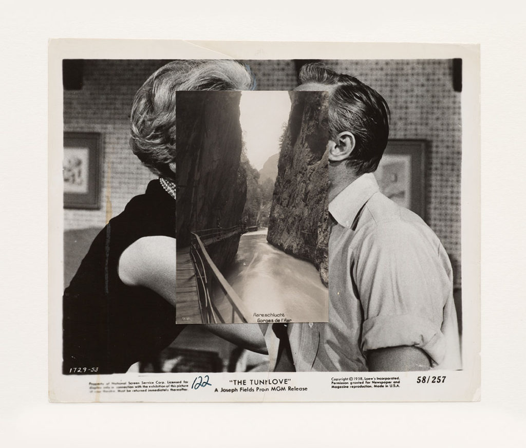
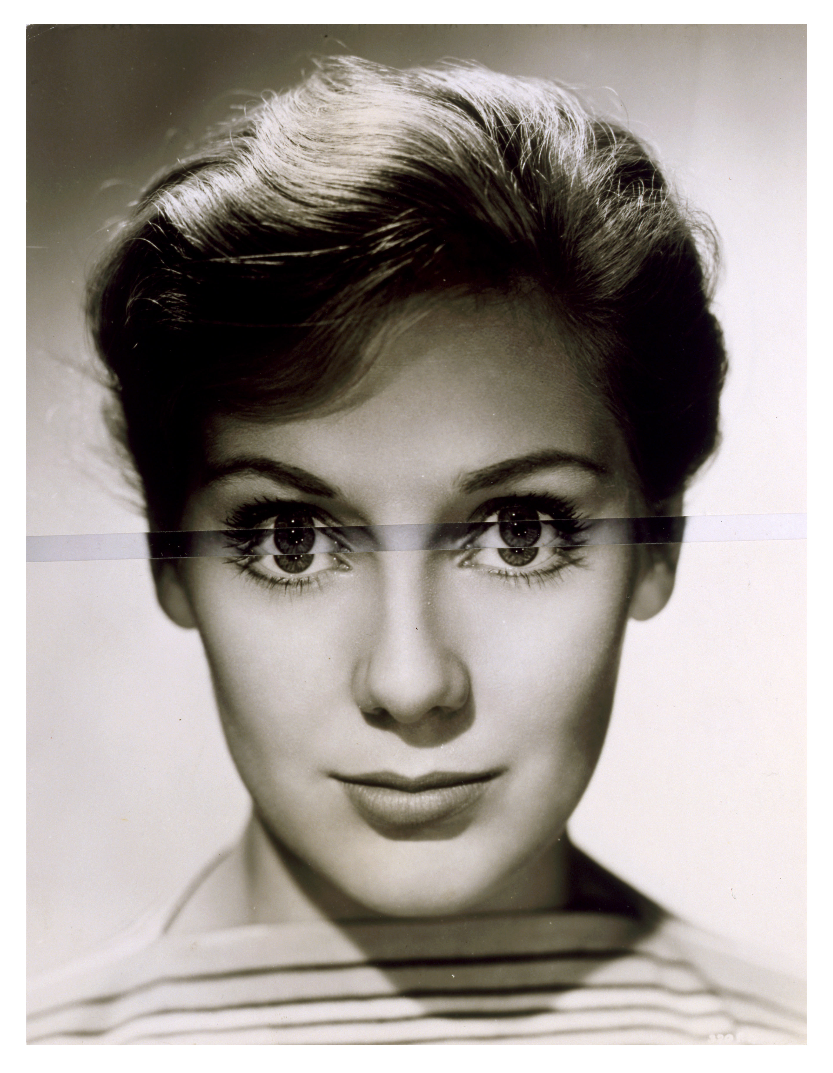
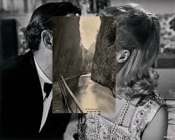
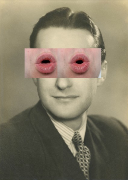
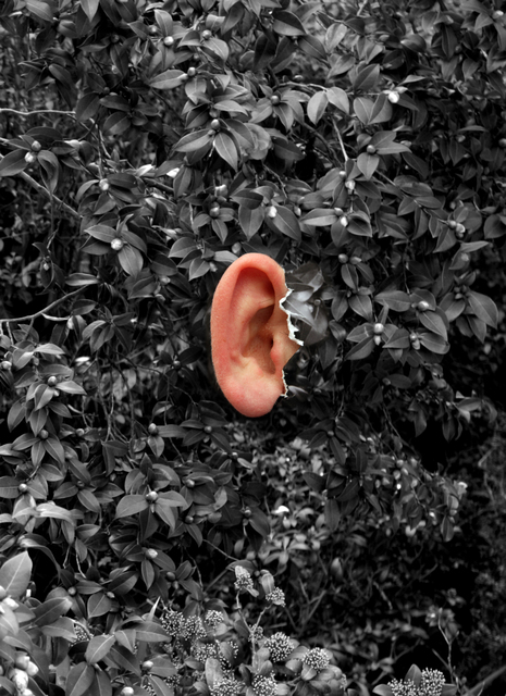
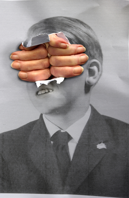
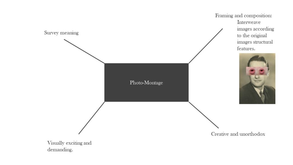
Stezakers’ works focus on photo montage to give old images a new meaning and add a creative surrealistic tinge to his photography.

He focuses on the similarities of structural and compositional elements of an image and stitches them together in a seamless yet surreal fashion. For example in the below image he uses the structure of the cliff faces and relates them to the structure of the subjects faces in the background.

This image has quite a flat, monochromatic style which almost gives it a warm balance, soft texture and comfortable feel. The montaging of the cliff faces is visually appealing as it is framed in the centre of the image. The two layers to the image each have their own depth which creates this double up of depth in the image and the eye has a lot of elements to look at which would give it a chaotic composition however because of the montaging the additional layer fits seamlessly within the background which cancels out this chaos and rather satisfies the composition.

My response to Stezakers’ work:

John Stezaker. Marriage XV. 2006 | MoMA
John Stezaker
Michael Kenealy
John Stezaker - Whitechapel Gallery
John Stezaker
Michael Kenealy

rUral landscape introduction

Rural landscape is photography that’s taken in the countryside in order of capturing the life of the countryside for people to look at the image and really realise that the we have beautiful places around us possibly all the time. For me I find that rural landscape photography is used in order for people to really analyse the images of rural landscapes, so that they can really see the beauty in some places because usually people go to amazing places and ignore the whole situation however, these landscape images are almost a reminder for people to look at. Moreover, when these types of images are looked at, people might even see things that they wouldn’t have even noticed whilst being at these places in person. Rural landscapes can also come with an emotional value behind them because the image could be so appealing to people that they have a reaction to the image possibly imagining that they are at the place in which the photo was taken of, imaging how it would feel like being there in that picture.

landscape photography – romanticism

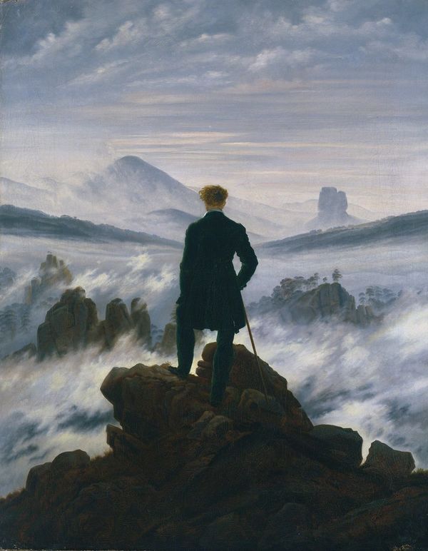
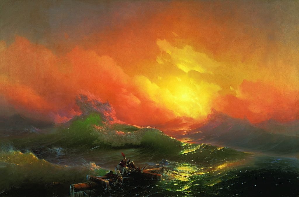
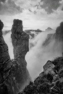
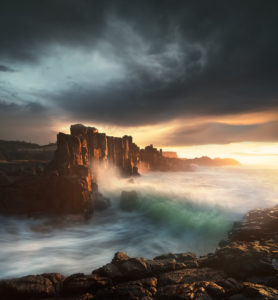
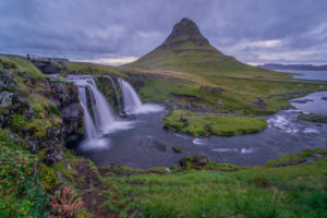
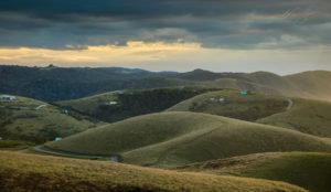
Romanticism places particular emphasis on emotion, horror, awe, terror and apprehension. Romantic style images are luminous images, the source of light and subjects bathed in that light are full of delicate rich details and textures. These images are filled with texture, bright colours or can also be in black and white. Romanticism has a particular emphasis on emotion and individualism, along with a glorification of the past. Painters, poets and writers drew particular inspiration from nature, which played a prominent role in their depictions. Today’s most prominent landscape images definite a sense of mood and emotion infused through the images. Shadows are a prominent feature of the scene of a landscape photograph, and are rich in details and textures, and very often the story of the image lies in the shadows. It’s he depth and presence of shadow that make the light seem to come alive. The darkness in the shadows is never excessive; never too black that a sense of presence is lost. Landscape photography connects with the viewer in a way that means something, an image can create emotions, however, not all viewers will feel the same when looking at a particular photograph.

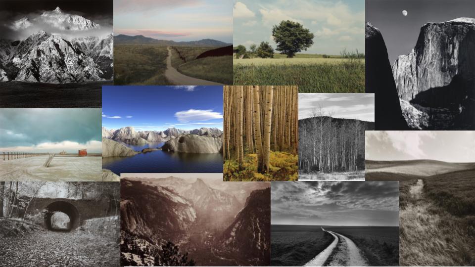
Examples of Romanticised Landscape Photography

Shoot

Final Images

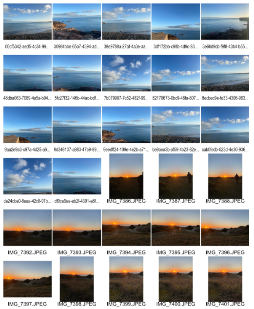
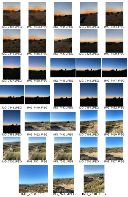
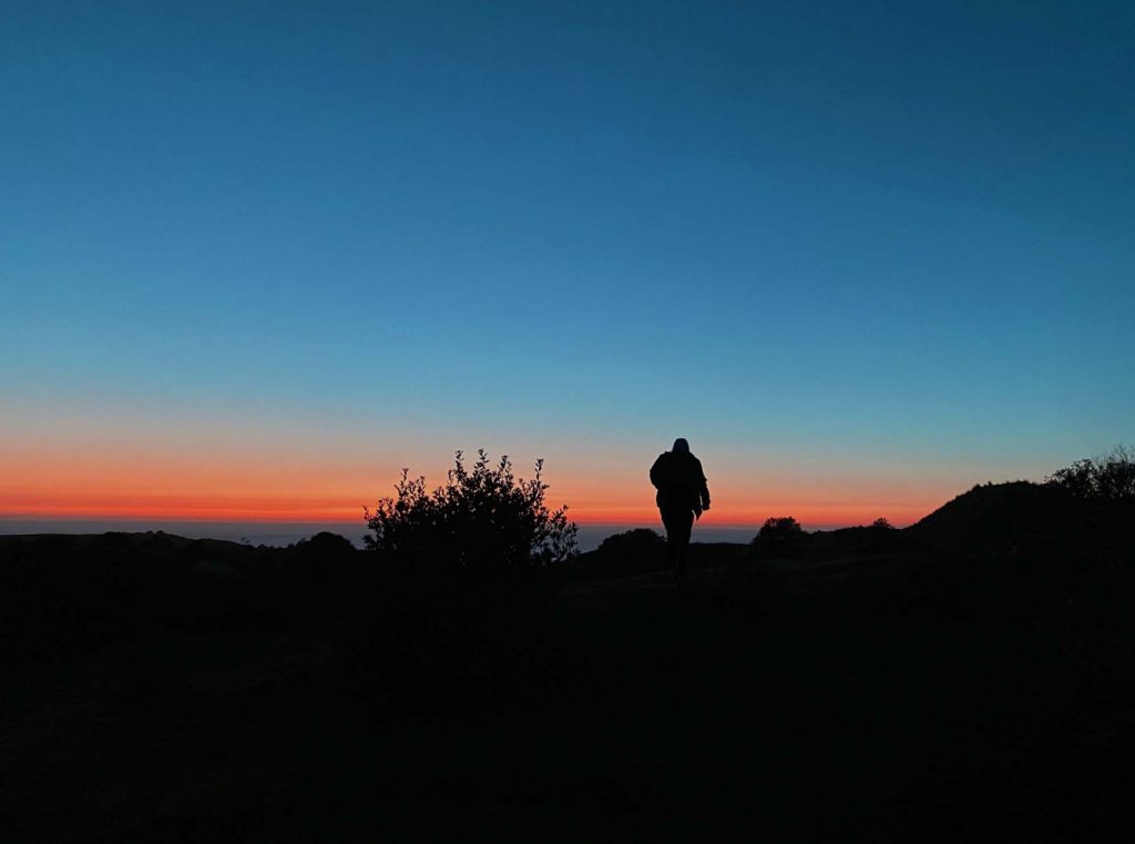
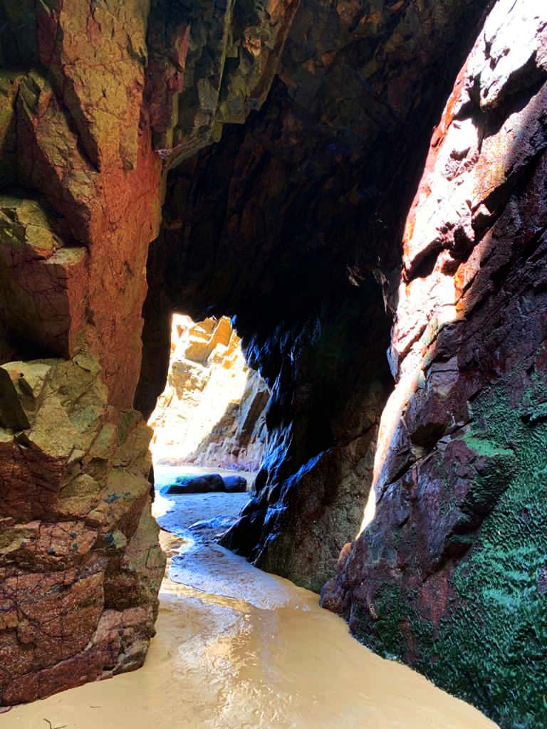
This image is filled with colour, with both warm and cool tones. These bright and luminous colours strongly contrast against the black, creating a silhouette which bring out the bold colours even more. I took this image late in the evening at sunset in natural lighting to capture the shades as the sun went down. As the sun went down, the less light there was, which created the silhouette, to make it stronger I upped the contrast and made the brightness dimmer which made the colours the main attraction of the photograph.

Romantic landscape photographs have a particular emphasis on emotion, this picture creates a warm and calming sensation with a mixture of reds and the blue tones to create the feeling of tranquility.

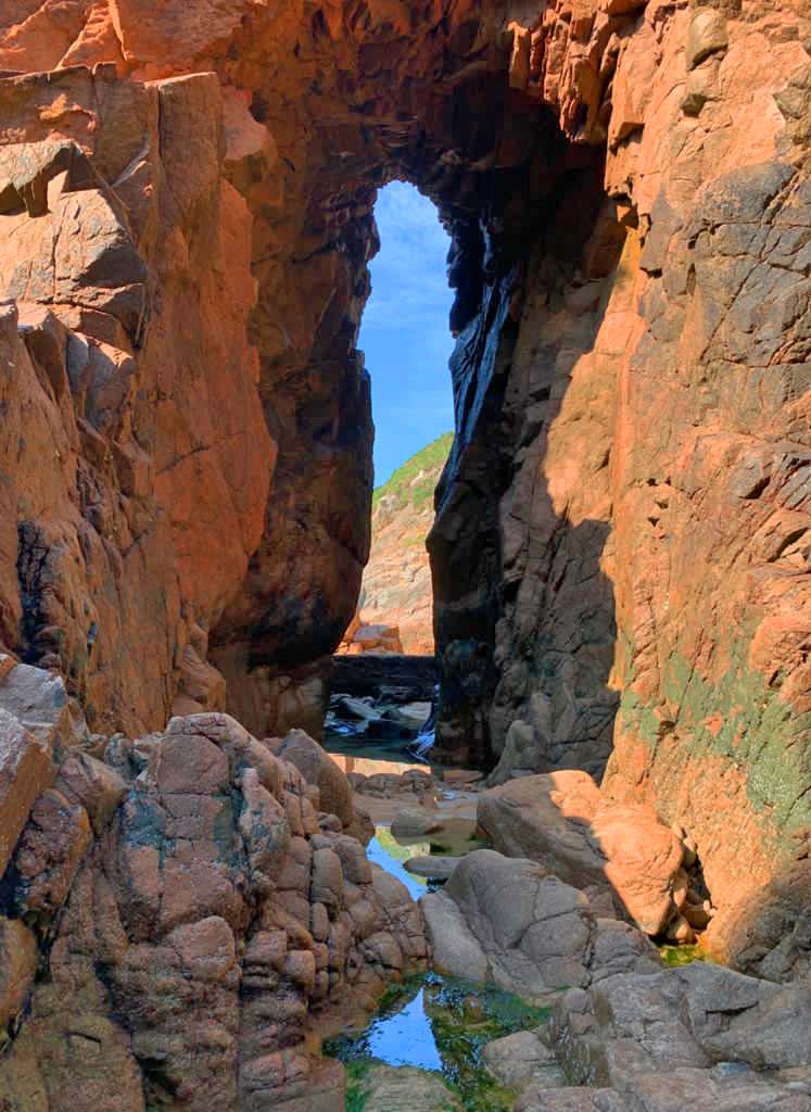
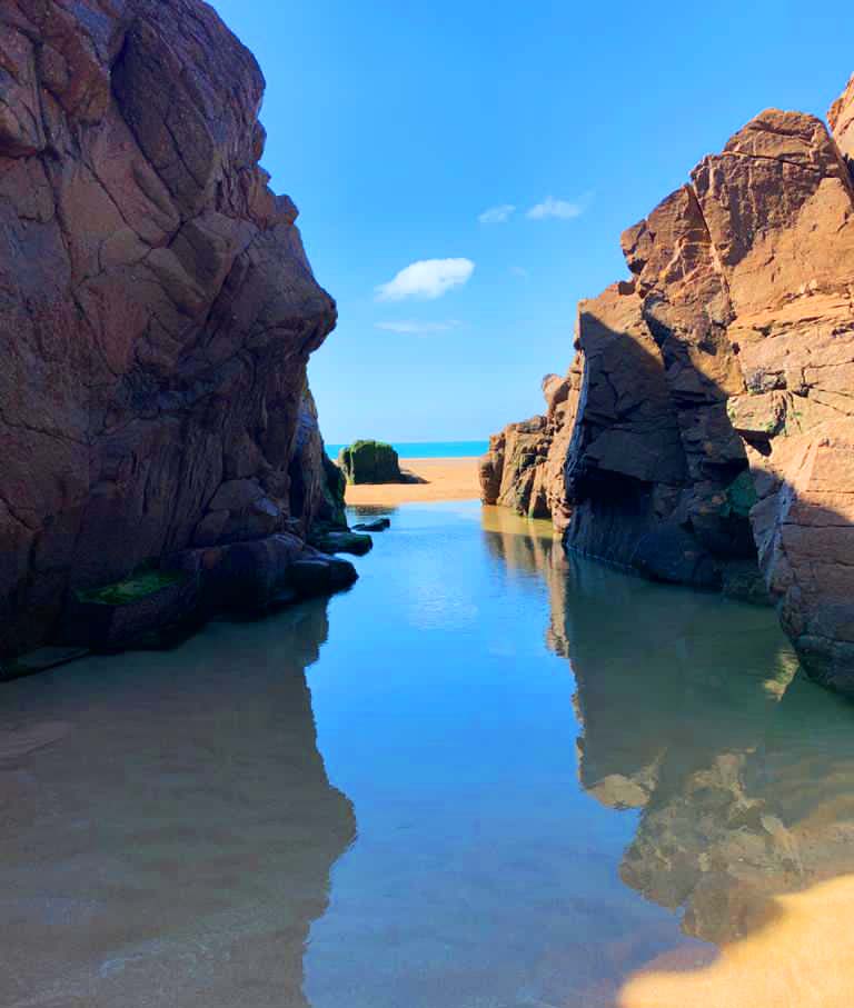
What I like most about this image is the reflection of the sky onto the clear water that creates a blue pathway for the viewers eyes, leading them towards the horizon. The rocks either side of the water have shadow and texture that contrasts against the softness of the water. This image was taken midday in the warm, natural light from a low angle to capture the reflection in the water. This image is also very tranquil and still which calms the viewer. Even though this photograph is filled with cool tones, the bright sunlight creates a sense of warmth and comfort.

studio portraits – two point lighting

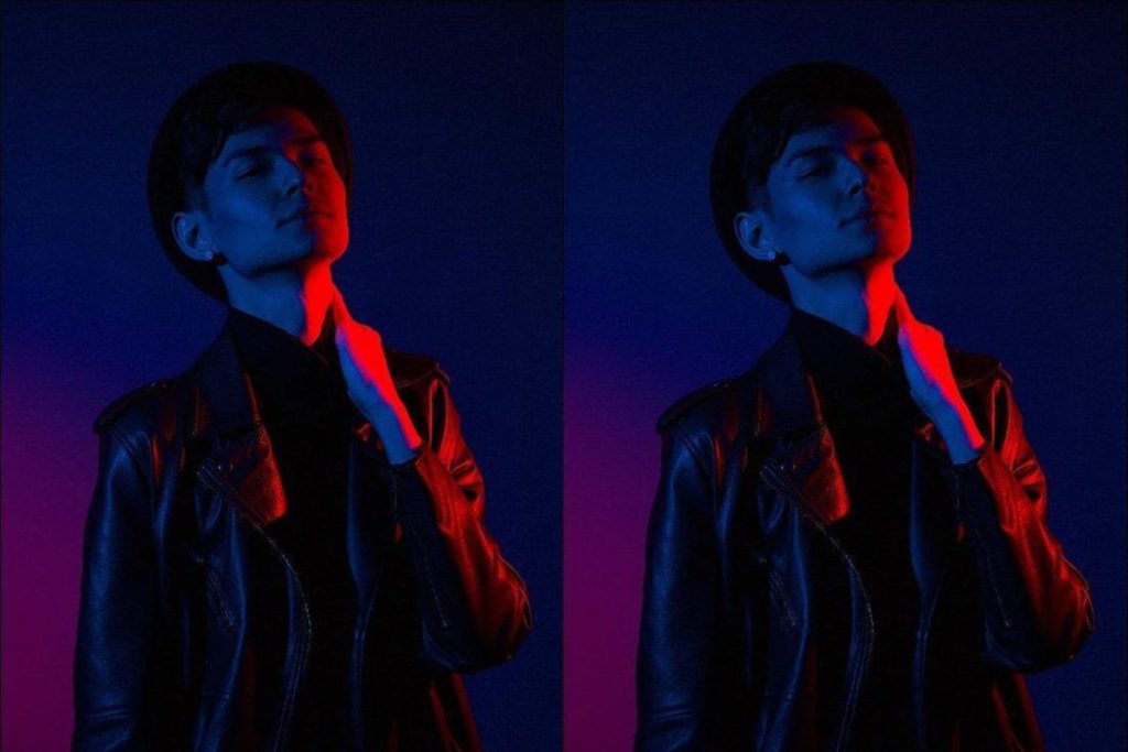
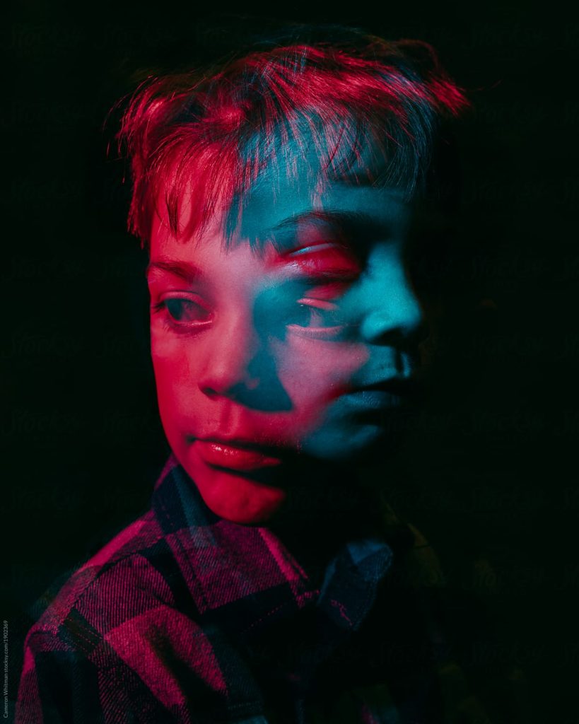
The crucial concept to understand when using 2 point lighting is that the light sources point directly towards each other and the subject is placed between the two. Two point lighting is the most versatile lighting design for shooting fashion or beauty on the street.

Lighting is a key factor in creating a successful image. It determines not only brightness and darkness, but also tone, mood and the atmosphere. Therefore it is necessary to control and manipulate light correctly in order to get the best texture, vibrancy of colour and luminosity on your subjects

Examples of two-point lighting

Image result for famous studio portraits2 point lighting

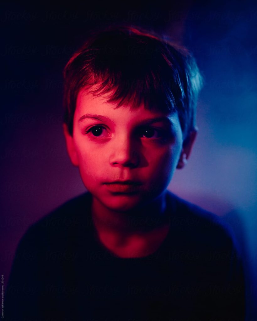
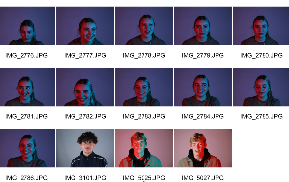
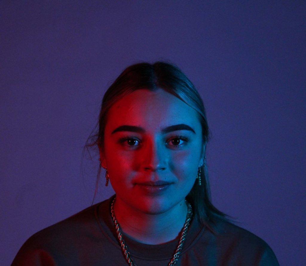
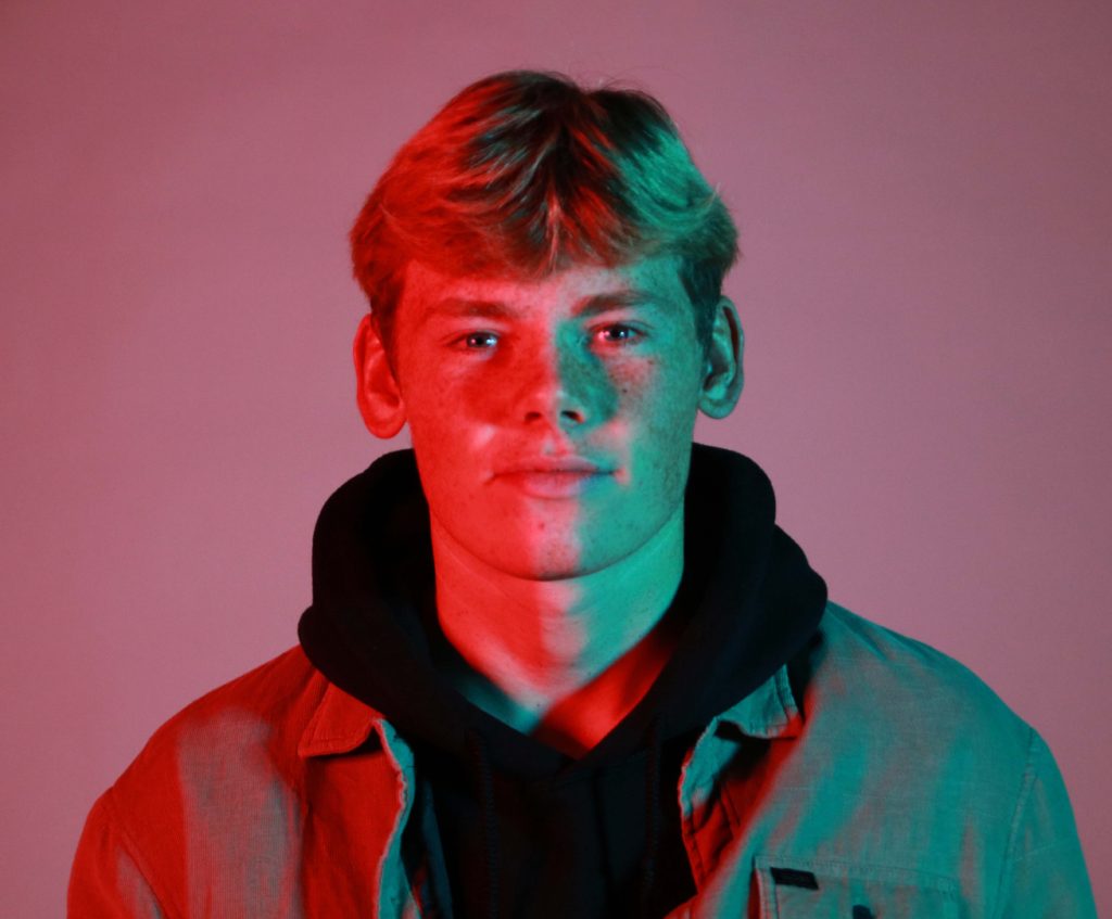
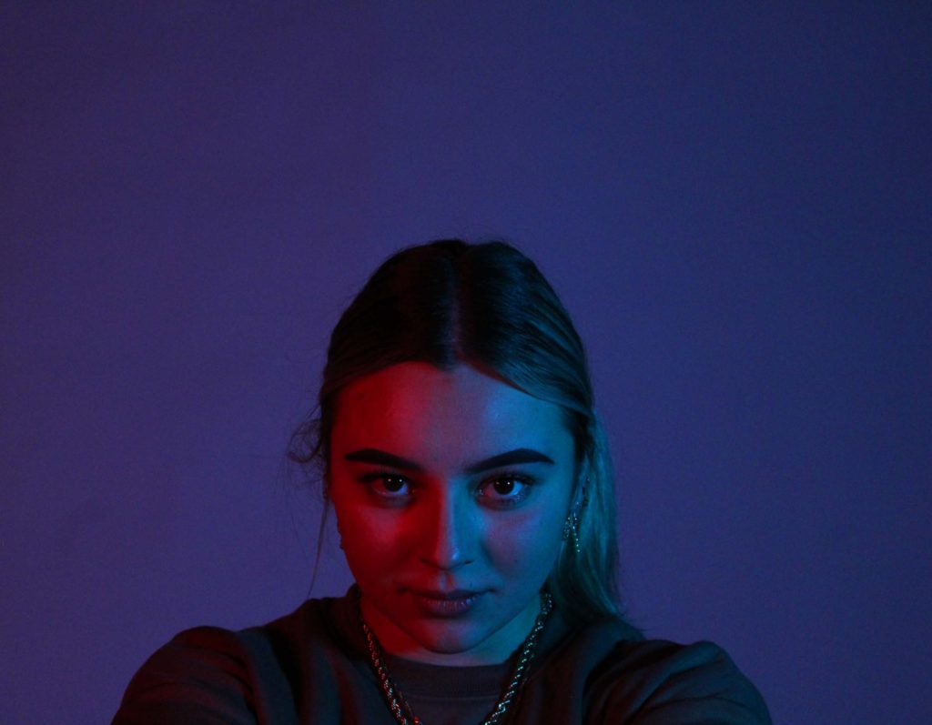
In my final images I used a variety of colored transparent objects in front of the lights on either side of the subject, the colours bounced off of her face and also blended together towards the center of the face. In one of my final images i used red on one side and green on the other, these are complementary colours. The red warm toned colours contrasts against the green cool toned colours, yet they fit well together. Unlike one-point lighting, both sides of the face are illuminated, highlighting all features and highpoints on her face, the use of red and blue mix together to create a dark blue/ purple colour as the background.

what is romanticism?

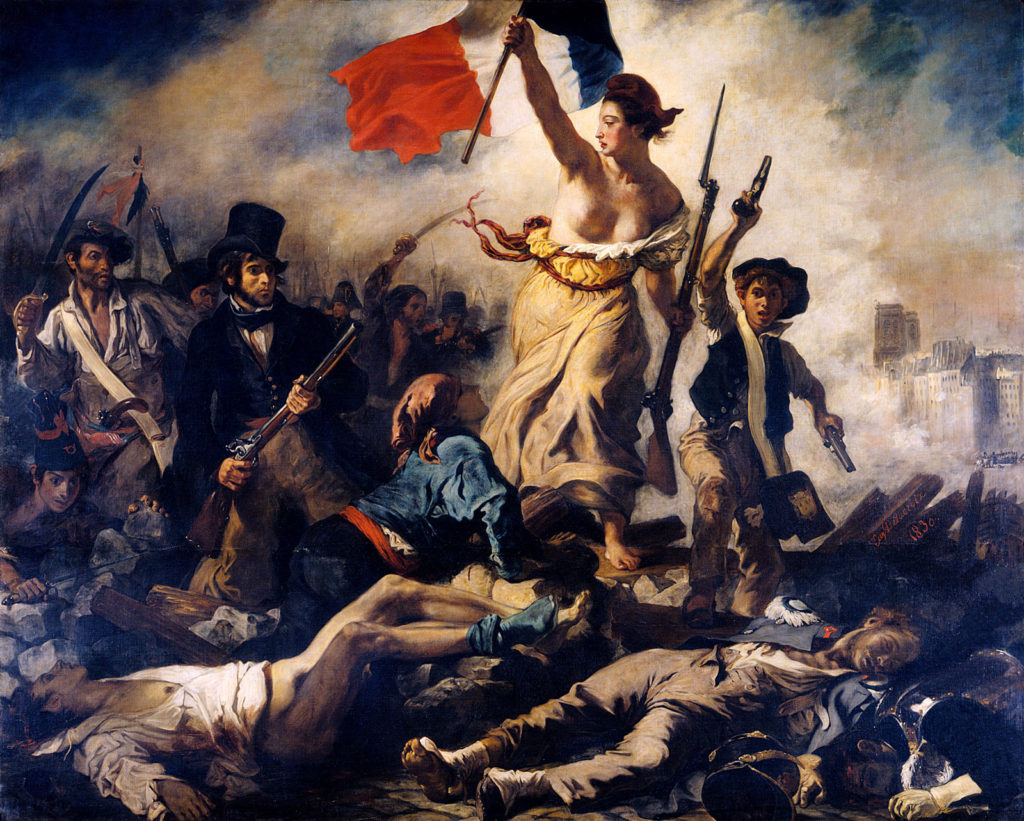
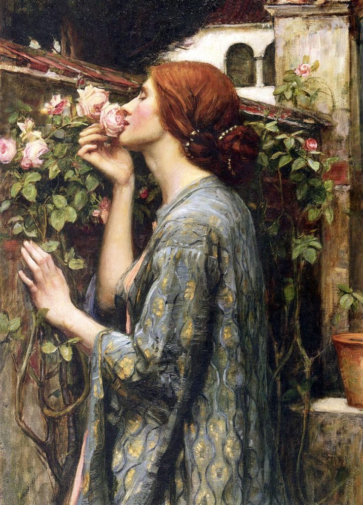
Romanticism was an artistic, literary, musical, and intellectual movement that originated in Europe towards the end of the 18th century, and in most areas was at its peak from 1800 to 1850.  Romanticism emphasized the individual, the subjective, the irrational, the imaginative, the personal, the spontaneous, the emotional, the visionary, and the transcendental. It was partly a reaction to the Industrial Revolution. The movement focused on intense emotion as an authentic source of aesthetic experience, placing new emphasis on such emotions as apprehension, horror and terror, and awe.

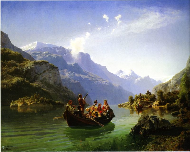
In the visual arts, Romanticism first showed itself in landscape painting, where from as early as the 1760s British artists began to turn to wilder landscapes and storms and Gothic architecture. A number of British artists at home and in Rome, including James Barry, Henry Fuseli and John Flaxman began to paint subjects that were at odds with the strict decorum and classical historical and mythological subject matter of conventional figurative art. These artists favoured themes that were bizarre, pathetic, or extravagantly heroic, and they defined their images with tensely linear drawing and bold contrasts of light and shade. William Blake, the other principal early Romantic painter in England, evolved his own powerful and unique visionary images.

ROMANTICISM IN LANDSCAPE PHOTOGRAPHY

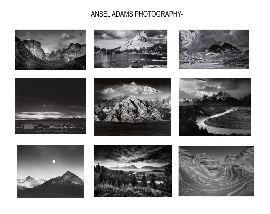
Case-study: ansel adams

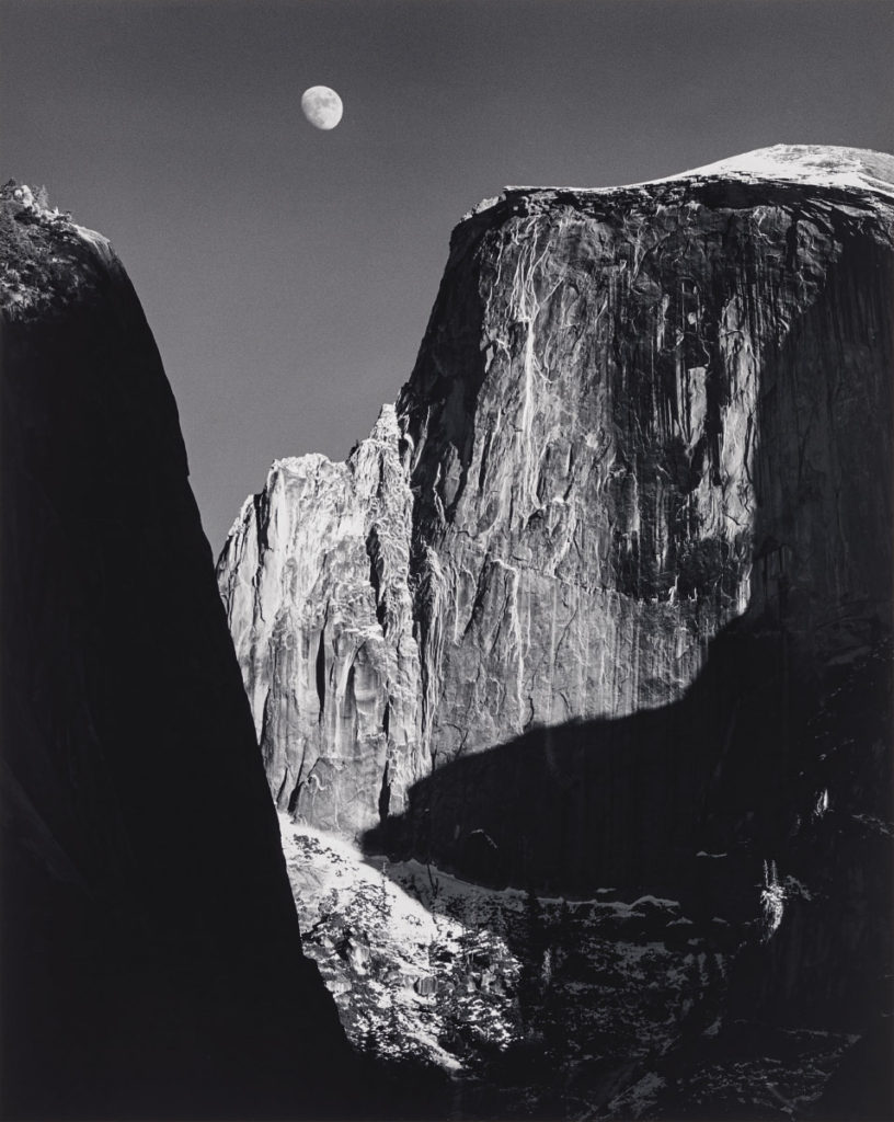
Ansel Easton Adams was an American landscape photographer and environmentalist known for his black-and-white images of the American West. He helped found Group f/64, an association of photographers advocating “pure” photography which favored sharp focus and the use of the full tonal range of a photograph.

  He was best known for his ultra-sharp landscapes, which he achieved through the use of a 4×5 view camera. The view camera allowed Adams to adjust the film plane and the lens plane so he could control the depth of field and the size relationships of objects in the frame with tilt and rise and fall movements.

Adams’s professional life was dedicated to capturing through his lens the forgotten and unspoiled wilderness of America’s national parks and other protected conservation areas in the West. He was a committed environmentalist and nothing short of an icon for the 20th century conservation movement.

a mood board of some his photography

analysing one his photographs;

The Ansel Adams Biography: Pioneering Wildlife Photographer
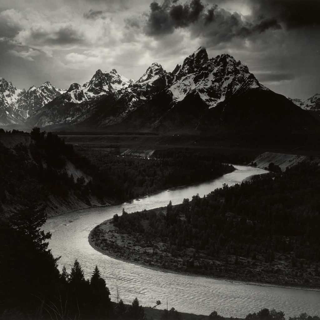
The Tetons and the Snake River (1942) Grand Teton National Park, Wyoming | © Ansel Adams

Technical- the lighting in this image is natural as its been taken of a natural landscape in the open. You can straight away see that Ansels control over how much light he lets in is good as its what makes his images so different from other photographers- due to the range of different tones. His tonal range goes all he way from 0-9 which not many photographers can achieve in every image.

Visual- The photo was taken in black and white ( as well as all his other photographs) this helps in seeing the difference between all the different tones. His tone palette is done very successfully as you can clearly see the white shades along the river and the completely black tones on the trees and the mountains. This makes the contrast significantly sharp across the whole image. The image has been taken from a very far point of view in order to be able to capture the whole view however its taken from a straight on point of view which makes the viewer think they’re looking directly at the river and mountains.

Contextual- In 1941, at the height of World War II but before the bombing on Pearl Harbor, Adams received a commission from the U.S. Department of the Interior to photograph National Parks and other notable landscapes. In exchange for film, paper, and darkroom chemicals, and a day rate of $20, Adams would provide photographic murals for display in the halls of the Department of Interior. Although Adams took some 225 photographs for the project (including this image), the project was later dropped (never to be resumed) due to America’s sudden involvement in the war.

Conceptual- I don’t think there’s a big meaning behind this image other than Ansel wanting people to see this insane view in a more different way , such as over exaggerating and romanticizing all the different tones he captured in his images.

landscape photography – introduction

Landscape photography shows spaces within the world, sometimes vast and unending, but other times microscopic. Landscape photographs typically capture the presence of nature but can also focus on man-made features or disturbances of landscapes. Rural landscape photography focuses on photographing outdoor areas which are not densely populated, and have been left relatively untouched by humans. These photographs often include trees and greenery, wildlife, and different outdoor environments.

LANDSCAPE PHOTOGRAPHERS

Ansel Adams ( 1902 – 1984 ) was an American landscape photographer and environmentalist known for his black-and-white images of the American West. Adams’s first photographs were published in 1921, and Best’s Studio began selling his Yosemite prints the next year. His early photos already showed careful composition and sensitivity to tonal balance. In letters and cards to family, he wrote of having dared to climb to the best viewpoints and to brave the worst elements. Between 1929 and 1942, Adams’s work matured, and he became more established. The 1930s were a particularly experimental and productive time for him. He expanded the technical range of his works, emphasizing detailed close-ups as well as large forms, from mountains to factories.

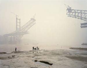
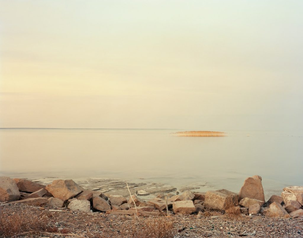
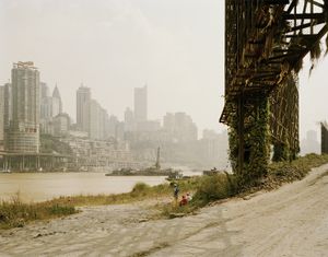
Nadav Kander ( 1961 – ) is a London-based photographer, artist and director, known for his portraiture and landscapes. Kander is best known for his Yangtze – The Long River series, for which he earned the Prix Pictet Prize. Kander never photographed further than twenty miles from the river itself. He was named International Photographer of the Year at the 7th Annual Lucie Awards in 2009 and has also received awards from Art Director’s Club and IPA in the USA, from the D&AD and the John Kobal Foundation in the UK and Epica in Europe.