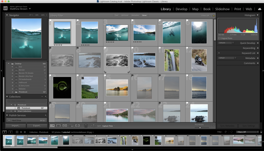
In order to create my photobook I went to Adobe Lightroom and went to my catalogue and pressed the book feature:
In there I was able to see and further develop my images as well as figure out a narrative for the book:
As we can see above, once you press the Book method in Lightroom it takes you to this screen where you can drag and drop the photos from the bottom in to the book.
While figuring out a narrative which talks about my personal life, relationship experiences as well as addiction and religion, I did find it quite difficult as I thought, “How will I mix all these 4 themes in to one photobook without it looking disorganised?” However, as I started experimententing I started to figure out the narrative as we can see below:
Here we can clearly see how the book starts with what appears to be a happy couple; portrays them as really happy and having fun, then there’s a break where I’m thinking of adding my first essay.
The book then goes to show the couple on dates with messages from a gay dating application called Grindr. The messages reveal a kind of example of the type of messages I get daily. I have ordered them along with the couple on dates images in an attempt to show how people always get in the way of some relationships which is clearly shown from the oxymoron of the two images. This can be clearly seen in the following:
Here we can powerfully see a happy couple on one side and the other side a text message from a Grindr guy trying to make me feel or look bad. This oxymoron may make the viewer feel like there are some issues in the relationship which indeed is true.
However, I soon found out that the Grindr texts were a bit too colourful and ruined the aesthetic of the photobook.
So, to combat this issue, I followed Broomberg & Chanarin’s inspiration with the Holy Bible and created something similar; overlayed the text messages over the bible texts. For example:
We can clearly see the correlation between Broomberg & Chanarin’s Holy Bible project since they overlapped photos over Bible texts and I over lapped text messages over the passages which creates a sort of controversy since the passages talk against homosexuality and the messages reveal a few of my same sex experiences.
Contact sheets and experimentations
During my experimentation with these images I attempted to not only show a same sex couple having fun with each other while attempting to portray this relationship as some sort of dream. This was powerfully achieved through the use of blur and gloss on some images. This is clearly shown in the following:
My idea with the blur and gloss was to get the reader to feel or see a sort of fantasy or dream; something that is not quite real. This idea originated from the song lyrics, “painted a picture, I thought I knew you well. I got a habit, of seeing what isn’t there. Caught in the moment, tangled up in your sheets. When you broke my heart I said you only wanted half of me. My imagination is too creative, they see Cain and I see Abel…” (In my head, Ariana Grande). What these song lyrics mean to me is basically, for me it talks about having a habit of seeing, creating and falling “in love with the version of a person that you’ve created in your head, that you are trying to but cannot fix…” Therefore, this is what I attempted to achieve with the glossy/blurry images.
On the other hand, with the hi-res images I attempted to portray a feeling of reality because the experiences were real and true. This creates an oxymoron which successfully shows how relationships can be beautiful but negative events happen all the time meaning this “love” becomes nothing but a memory.
Sequencing
I have chosen these to be my back and front cover. The Front cover image has my model looking straight at the reader which could be interpreted as the reader diving into this same sex relationship since there’s a saying that “the eyes are the window to the soul.”
The back cover portrays the couple cuddling / comforting one another which makes sense after the reader has been through the whole book.
The book then goes to show the couple having cute intimate moments which makes the reader feel like they are diving into their story which is exactly the aim.
The black and white images with high contrast are there to show how there are negative moments even during intimate moments.
The colourful images however mimic the happiness in relationships.
Similarly, I attempted to create the same effects as shown above but included extracts from both the bible and text messages/experiences I’ve had with guys to attempt and tell my own story.
In what way have Robert Darch and Josef Sudek used their photography as a form of therapy?
“Photographs, which cannot themselves explain anything, are inexhaustible invitations to deduction, speculation, and fantasy.” – Susan Sontag, On Photography, 1977.
The concept of escapism; the tendency to seek distraction and relief from unpleasant realities, running away to a world where sorrows are only distant memories. Photographers Robert Darch and Josef Sudek explore this idea within their work, questioning how they can use photography as a form of therapy to convey their mental/physical illness through still-lives and landscapes. The use of photo therapy has grown substantially in recent years, pioneers of the style Rosy Martin and Jo Spence have worked together since 1984 exploring its concepts and benefits. In ‘The Photography Reader; Liz Wells’, a collection of essays from Martin and Spence describe how “out of the myriad fragments thus mirrored to us, first unconsciously as babies, then as we are growing into language and culture, aspects of our identities are constructed.” They use photo therapy as a method of coming to terms with and accepting themselves, in their essay ‘Psychic Realism as a Healing Art?’ it is stated that “what photo therapy engages with is primarily the ‘needy child’ within all of us that still needs to be seen and heard. The therapist has to become the advocate of this ‘child’ and to encourage her to recreate and witness her own history, to feel safe enough to protest, and then learn to become her own inner nurturer.”
In my personal investigation I aim to use photography as a medium to explore how I have coped with anxiety throughout my life, focusing on the idea of finding safety and comfort in certain places around my home, family member’s homes and areas around the island that have always made me feel calm. The whole concept of anxiety has been quite normalised in today’s society, having both positive and negative effects, as some feel less alone while others feel less seen. Highlighting this topic, by studying the positive areas of life where I have felt most safe, is very important to me; what matters to me most is creating a truthful display on a personal topic. Analysing the work of Robert Darch and Josef Sudek reveals the methods of photo therapy that I wish to reflect, juxtaposing images of flowers cut down from their mother plant (adapting to their environment in vases), with pictorialism inspired natural landscapes. These photographers have the ability to convey deeper meanings, ambiguous stories and ideas in their work; locations and places that tell the stories of their lives, Darch especially revealing his pain and want for an escape. One must consider the subject’s relationship with themself, for instance the links between past and present, and how locations shape a person’s true self, exploring photography as a means of healing.
How can a Pictorialist style demonstrate an atmosphere of nostalgia and comfort? Aspects of the Pictorialism movement have been reflected in several photographic works long after the movement ‘ended’, nevertheless have morphed and adapted to fit our changing times. During the 1880’s, when Pictorialism first begun, it was a reaction against mechanization and industrialization, dismayed at increasing industrial exploitation of photography through commercialisation. Writer and lecturer Stephen Bull describes Pictorialism as “the imitation of painting in an attempt to raise photography up to the same status as art that characterises the Pictorialist movement”. Photographs resembled paintings, being manipulated in the dark room by scratching and marking their prints to imitate the texture of a canvas – photographers used a soft focus to capture landscapes and portraits by smearing Vaseline onto their camera lens. This method allowed for the creation of dream-like artwork on spiritual subject matters, taking inspiration from Allegorical paintings which personified envy, love and glory. It was a means of exploring the unreal, the weird and the mystical – though photo therapy was not a concept during the time, there are links to its ability of escaping the banal of everyday life into another world. In her 1977 collection of essays ‘On Photography’, Susan Sontag describes how “photographs are a way of imprisoning reality…One can’t possess reality; one can possess images–one can’t possess the present, but one can possess the past.” I believe this can relate strongly to the values of Pictorialism, reality is presented in a fanciful style, ‘imprisoning reality’ that has been manipulated into fantasy which results in possession of an altered reality. One may question whether Pictorialism can even be considered as reality at all?
A.L. Coburn, Fifth Avenue from the St Regis | Morning 1908 by Clarence H White | Mary Warner à contre-jour, 1908 – Heinrich Kuhn
Photography can be a freeing medium, much like painting in the way it can cleanse the soul of creative ideas that need to be reflected on paper. The extent of the freedom of the camera all depends on what the photographer wishes to reveal; they have the ability to hide certain truths, or in contrast have complete unfiltered honesty. British photographer Robert Darch explores how to reveal the truths of his past through landscape photography. Darch’s website states “his practice is motivated by the experience of place, in which the physical geography and material cultures of places merge with impressions from contemporary culture that equally influence perception. From these varied sources, both real and imagined, he constructs narratives that help contextualise a personal response to place.” When Darch was just 22 years old he suffered from a minor stroke which has had an impact on his life ever since. Completing his Photographic Arts degree at the time, he had to continue his studies from home when his health did not improve – his home was as much a prison as a safe space. Darch viewed his illness as a space, a location he could not escape physically; so, he had to do so mentally. In 2020, Robert Darch published his second photobook which he titled ‘Vale’ – a name with many meanings such as letting go, or even a hidden valley tucked away in the mountains. Ambiguity is something that first drew me to Darch’s work, his ability to capture the most idyllic ethereal landscapes but make them appear almost eerie in their solitude makes observers question whether this world is real. Are these areas from Darch’s childhood that we are getting a glimpse of all they seem to be? Do these locations hold more hurt than hope, always being there for Darch through such a low point in his life? An extract from ‘The Vale of Despond’, by Curator Dan Cox, reads “The fictional worlds into which Darch escaped, exhibited characteristics which were at once benign and threatening…Vale is a result of this percolation and loss. It is the fictional space where Darch can relive and re-imagine a lost period in his life, journeys with friends both through physical spaces and through time.” What Darch is able to encapsulate is a feeling of dream-like nostalgia, his work in ‘Vale’ is persuasive and welcoming but as the book goes on, the flickers of discomfort creep in.
In regard to photo therapy, Darch’s use of photography to escape from the harsh reality of his past allows him to heal from it, seeing it in a different perspective to truly understand his feelings and emotions. I want to use this idea of ‘photographic healing’ to reflect on my experience of anxiety, documenting the locations where I feel safe and secure within myself to understand how they’ve shaped my personality and life. Darch’s use of light in his ‘Vale’ work conveys a sense of optimism, like the sun beams are rays of joy or hope; artificial light can only be seen in the last few images in his photobook, perhaps hinting towards closing this fake reality. Natural landscapes are dream-like in Darch’s photographic eyes, soft focus and light tones compliment the misty woodlands and sunlight reflects off ponds and lakes to create a world of picturesque fantasy. Pain and suffering are escaped from; the warm hues that cover each image fill the landscapes with comfort and peace, Darch’s use of colour (bold oranges, yellows and greens) reveals his desire for security and safety within this rural atmosphere. A quote from Darch, in an interview with FotoRoom, reads “the warmth of the summer is tempered by an internal melancholy of loss, and the poetic narrative is in direct response to the emotions, feelings and thoughts cultivated during the period of isolation I experienced.” The confessional tone and atmosphere created in ‘Vale’ was therapeutic to Darch, he was able to physically show other people this world of fantasy that he would escape to – what once was his secret, could now be seen by the rest of the world; honesty and truth revealed. As I responded to Darch’s work, I wanted to convey the same sense of intimacy and imagination. Taking inspiration from Pictorialism, my aim was to create similar sepia blurred landscapes using Vaseline to create the iconic dream-like mood – however, I had the idea to steam up my camera lens with my breath, as if physically breathing life into my personal story. Using this technique allowed me to form deeper connections with my work, it was remedial to physically create this escapism that my youthful anxiety craved.
Robert Darch, Vale (2020)
Why do some photographers focus their energy and photographic art on one specific location? Perhaps it holds a happy memory, or maybe it is the only place they can get inspired, whatever the reason; it’s therapeutic. Concentrating on one singular place, similar to Josef Sudek’s work ‘The Window of my Studio’, allows the photographer to experiment with changing what they can see, healing can come from changing your perspective on the truth. Czech photographer Josef Sudek is well-known for his still-life photography, he captures orchestrated scenes of flowers, vases and abstract objects on the windowsill of his studio in Prague. Sudek’s images are mysterious and eerie, they hold an atmosphere of loss, but at the same time show hint towards hope for a brighter future. Looking into Sudek’s past it is clear that this photographic style was healing, he served in the Austro-Hungarian Army during the First World War, when he was wounded and subsequently lost his right arm to amputation. After this sudden change to how he lived his life every day, Sudek turned to Photography and became a member of the Prague Club for Amateur Photographers from 1920-24, nevertheless he struggled with feeling isolated form the rest of the world. Russell Lord, from the New Orleans Museaum of Art, described Sudek as follows; “for Sudek, who grew increasingly reclusive over the decades, his studio, the window, and the small garden beyond became an important sanctuary, and a way to express his own tentative relationship with the external world. Sometimes perfectly transparent, sometimes coated with frost or water droplets, the glass window both frames the outside world and serves as a barrier from it.” Seclusion: Sudek struggled with this most, ‘The Window of my Studio’ served as a retreat from the judgement and staring eyes of 20th century society, he created a series of images from the only place he felt safe and at one with himself. Though at the time Sudek may not have intended on creating imagery holding themes of anxiety, I can recognise similarities to the feeling of loneliness and uncertainty as if his window is his foggy, misconstrued version of the outside world.
Susan Sontag describes how “photographed images do not seem to be statements about the world so much as pieces of it, miniatures of reality that anyone can make or acquire” – to me, Sudek’s photography reveals his small corner of the world, his small corner of reality. It is clear that throughout Sudek’s work there has been a strong influence from Pictorialism, his work holds the same dream-like, soft atmospheres that many other Pictorialist photographers captured, for example the work of Alfred Stieglitz and his study of clouds in ‘Equivalents’. Sudek’s use of windows, documenting overcast murky days through frosted glass, additionally adds to his Pictorialist style – his use of light and aperture settings creates this soft blur around his flower subjects, almost replicating that of an oil painting. As Sudek was creating and photographing during the change of an art movement from Pictorialism to Modernism throughout the 1930’s and 1940’s, his work holds an almost vintage feel when compared to those being created during the same time period. Delicacy contrasted with harsh shadows is an element of Sudek’s work that beguiles the observer, is it an image of hope or a reminder of tragedy? Are we meant to focus on the survival of nature in an unnatural environment, or the looming enigma behind the glass? Twisted shadows of trees, the misty soft texture, repetitive streams of rain drops; it’s the creation of the fantasy world where Sudek wished to escape from. We can look through, but also look beyond his subject – the negative space that surrounds each flower could be symbolic of Sudek’s past woes and struggles – each element is subjective. My response to Sudek’s work has been very experimentational, I wanted to take a similar abstract approach using a large aperture setting to create a high depth of field however still breathing onto the lens to create a mystical Pictorialist quality. Furthermore, I wanted to take advantage of the natural light source which formed many golden highlights over my images, taking a colourful but gentle palette instead of monochromatic allowed me to explore how colour affected the mood of my images. The fanciful escapist themes that I wanted to present were emphasised by such pastel warm colours, Sudek’s work provided the concept of how one can explore serenity juxtaposed with confinement.
Josef Sudek, The Window of my Studio (1940’s)
We are led to believe that imagery can bear witness to reality, sometimes that reality is twisted and manipulated, forming what could be seen as an entirely different world; yet who’s to say this is a bad thing? Both photographers have gone through difficult points in their lives, with Darch suffering from a stroke at a young age and Sudek losing his arm during the war. Creating these fantasy realities has helped them to escape, to heal and to learn. In respect to my Personal Investigation, both artists have used photography as a method of escapism from an illness/disorder that had impaired them throughout their life – I have explored how elements of their images may have deeper meanings in regards to symbolism of weakness or hope. Although Sudek’s images are not known to have been made with his impairment in mind, I can still recognise themes of optimism in a time of isolation through his project; as if the flowers are symbols of life continuing, adapting in a new environment – they are still able to survive in a singular glass of water. Nevertheless, Darch’s work noticeably conveys a sense of escaping from reality through vibrant colours, dream-like compositions and golden hues that relay this idea of ‘the light at the end of the tunnel’. Though Darch reflects his sickness throughout his project, it is done subtly, with Darch himself stating “during the illness I no longer wanted to turn the camera inwards, to linger on the reality of my situation, preferring to lose myself in fictional constructs of the mind”. This fictionality in his work is honest and raw, giving the observer a glimpse into his own imaginative mind. In my own work I wanted to use locations from my past as a catalyst for a tribute to my childhood escapes, the worlds I would create to get away from anxious thoughts and feelings. Nevertheless, to interject moments of reflection and calmness, I wanted to use Sudek inspired imagery of flowers, some wilted, others blooming wilding – all to relay the concept of hope, of carrying on and taking a moment to revaluate my perspective. In her essay ‘Frames of Mind; Photography, Memory and Identity’, Patricia Marcella Anwandter questions “what do we choose to remember and how do we reinforce it? Who are we in relationship to who we were?” – I have mimicked the work of Darch and Sudek’s photo therapy to answer and heal from these questions.
My Response:
Bibliography:
Wells, L. (ed), Martin, R & Spence, J (2003), The Photography Reader. London.Routledge; Taylor & Francis Ltd
Martin, R & Spence J. (1988), Psychic Realism as a Healing Art. London. Ten8, No 30 Spellbound
Bull, S. (2009), Photography. London: Routledge; Taylor & Francis Ltd
Sontag, S. (1977), ‘In Plato’s cave’ in On Photography. London: Penguin Books
Darch, R. (2020), Vale. Devon. LIDO Books
Cox, D. (2020), The Vale of Despond. London. LIDO Books
Marcella Anwandter, P. (2006), Frames of Mind; Photography, Memory and Identity. CUREJ: College Undergraduate Research Electronic Journal, University of Pennsylvania.
How can reality be presented and altered through the medium of photography?
How can the concept of escapism be represented through the medium of photography?
In what way have Robert Darch and Josef Sudek explored the concept of escapism in their work/ photography?
In what way have Robert Darch and Josef Sudek used their photography as a form of therapy?
In what way have Robert Darch and Josef Sudek explored the concept of ‘the real world’ in their photography?
Essay Structure Plan:
Introduction (250-500 words): What is your area study? Which artists will you be analysing and why? How will you be responding to their work and essay question?
Discuss the concept of escapism, what does it mean to me/to the world?
Area of study = anxiety shaping identity, celebrating the locations I would escape to/the worlds I would create to feel safe and calm in etc.
Responding using still life and landscape photography.
Taking inspiration from Robert Darch and Josef Sudek – describe summary of their work.
Discuss Rosy Martin and Jo Spence ideas on Photo Therapy, use extracts from their essay ‘Psychic Realism as a Healing Art?’.
Pg 1 (500 words): Historical/ theoretical context within art, photography, visual and popular culture relevant to your area of study. Make links to art movements/ isms and some of the methods employed by critics and historian.
Add images from Pictorialism movement – A.L. Coburn, Fifth Avenue from the St Regis
Explore how Pictorialism has impacted my project, how I think it links to both Darch and Sudek’s work.
Historical facts and ideas on Pictorialism – what influenced it? What’s its main concepts/message? How are Pictorialist images created, discuss use of Vaseline/manipulation in dark room etc.
Themes of Pictorialism that I want to replicate, eg; dream-like atmosphere/fantasy, altering reality similar to how I would alter my reality to escape to different worlds, escaping anxious thoughts etc.
Bring in idea of Susan Sontag opinions of photography, use quotes from series of essays ‘On Photography’ .
Pg 2 (500 words): Analyse first artist/photographer in relation to your essay question. Present and evaluate your own images and responses.
Add images from Robert Darch’s ‘Vale’ Photobook
Discuss freedom of photography, how photographers can show us what they want to show us.
Robert Darch information, who is he? What’s his backstory? Why did he inspire me?
Use quotes from his website/from essays written on his work, eg; Dan Cox.
Analyse why Darch takes the photos he takes, what do they mean to him? Explore how his work has deeper meanings to do with childhood and past memories.
Analyse Darch’s photography style, his compositions/tone/lighting/shadows etc – why do they matter?
What did I do to respond to Darch’s work, how did I use him as inspiration>
Pg 3 (500 words): Analyse second artist/photographer in relation to your essay question. Present and evaluate your own images and responses.
Add images from Josef Sudek’s ‘The Window of my Studio’ series
Discuss use of location in photography, question the values of a place connecting to photographers memories or life story.
Introduce Josef Sudek, his series ‘The Window of my Studio’ – how does it relate to my project? What do I see when I analyse his work?
Give Sudek’s background, who is he/what did he do/what was he famous for?
Talk about how Sudek’s injury and amputation may have hindered his life both physically and mentally, perhaps photograph was his escape from the outside world.
Use quote from critics of Sudek eg; Russell Lord discussing how Sudek isolated himself from society and became completely interested in capturing scenes from his window.
Analyse what techniques he uses, his links to Pictorialism and use of soft focus.
How I respond with my project, what similar styles did I use etc?
Conclusion (250-500 words): Draw parallels, explore differences/ similarities between artists/photographers and that of your own work that you have produced
Display selection of both Darch and Sudek inspired images from myself
Conclude by comparing both photographers use of photography as a healing art, how do they do it? Why did they do it?
Draw points together by mentioning photographer’s pasts, and how this influenced their imagery.
Discuss how I have responded with my work, what techniques I used and what they all mean to me, use ideas from critics and photographers to discuss similarities between artists.
Historical factors and movements (Pictorialism) that have been inspirations throughout project.
Close with idea from Patricia Marcella Anwandter about how photography reflects memory, and is therefore healing to the photographer.
Bibliography: List all relevant sources used
List online websites
List essays I have read and quoted
Photobooks that inspired me throughout
Use Harvard System of Referencing to create bibliography
How to format references;
Photography book used = Zanele Muholi.
How to set out Bibliography –
Muholi, Z. (2020). Zanele Muholi, Tate. London: Tate Publishing.
In your text cite author’s surname, the year of publication and the page reference immediately after the quoted material e.g. Where a section of your main text directly quotes another source, or else uses ideas which have been drawn from another source, the end of that quote should have an entry like this …which is the point that Liz Wells’ makes when she says ‘one of the central principles of the documentary aesthetic was that a photograph should be untouched, so that its veracity, its genuineness, might be maintained’ (Wells 1998:40)
Themes and Ideas to Discuss:
Symbolism and metaphors
Windows = light, wellbeing, to grow, opening to another world
Mirrors = reflections of past, future etc
Comparison – Vale shows the idyllic escapism from anxiety, into different realities/worlds as one would in childhood imagination, whereas Sudek’s images, to me, represent the present hopes towards escaping – flowers and nature are cut down from their original source however they still thrive using a vase of water as a new way of living, its adapting to surroundings just like I have had to do when finding places to feel safe with anxiety.
Changes; possibly edit my Sudek inspired image in colour but softer vibrancy and clarity – inspiration from pictorialism – could mention in essay about the inspiration Sudek has taken from the pictorialism movement.
Quotes of Possible Use?
“It’s hyperreal and dreamlike,” Darch says. “I daydreamed a lot as a kid, I still do as an adult, and definitely in those years when I was isolated, I was inside, I was in my mind all the time.”
‘So successful has been the camera’s role in beautifying the world that photographs, rather than the world, have become the standard of the beautiful.’ Susan Sontag
“To suffer is one thing; another thing is living with the photographed images of suffering, which does not necessarily strengthen conscience and the ability to be compassionate. It can also corrupt them. Once one has seen such images, one has started down the road of seeing more – and more. Images transfix. Images anesthetize.” ― Susan Sontag, On Photography
“In the real world, something is happening and no one knows what is going to happen. In the image-world, it has happened, and it will forever happen in that way.” ― Susan Sontag, On Photography
“Photographs, which cannot themselves explain anything, are inexhaustible invitations to deduction, speculation, and fantasy.” ― Susan Sontag, On Photography
The magazine is called “More Than Two” because there is always more than two people in a situationship apparently.
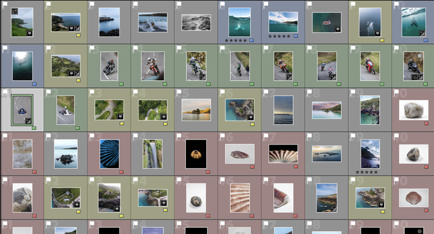
Using Adobe Lightroom, I uploaded all of my final images from my folder and gave them colours to show which ones I think are best and which images aren’t as good. For example:
As you can obviously see I experimented with the images on different pages seeing which images work best together. I also adjusted the size of the photograph and experimented with making some images full bleed and white borders. What I gathered was having the Bible texts as a full bleed gives a Bible book feel as well as having the front and back cover full bleed looks more aesthetically pleasing. Also, having a full bleed bible passage with a white-bordered image looks better on my layout and perfectly shows the juxtaposition between the two.
I also experimented with the order of the pages to test which order portrayed my story best and found that it was best to start off the book with the bible quote which was constantly being repeated in my mind when I was with my second ex; “For the lips of the adulterous woman drip honey, and her speech is smoother than oil; but in the end, she is bitter as gall, sharp as a double-edged sword.” – Proverbs 5:3-4. This quote, to me, at the time, was like a warning, or a reminder that this guy, may be sweet but will soon become toxic which was indeed the case, sort of… We broke up because I wasn’t ready to take things deeper with him.
The book then proceeds to show same-sex partners getting intimate together, right at the start. This was actually done on purpose for if you know anything about Grindr and hookups, you get quite intimate scarily quickly.
Moving forward, we then have a landscape image to try and show the reader that this couple has been going on dates, getting to know each other, and acting like a couple. Also shown through the upcoming images. Some images are blurry on purpose; to give a sense of memory since in many cases, these cute moments end really quickly and you’re left with nothing but memories.
My book then goes on through a new twist; a bible passage. Ironically every bible passage within my book is the passages that talk about homosexuality, and in red are some of the gay stories and experiences that I had to go through. These texts are joined by some images to help the viewer better imagine these scenarios.
When creating digital edits of my images to go into my photo book, I first used Adobe Lightroom to adjust the image qualities such as the contrast, exposure, tone, shadows and highlights. After doing this, I then exported my images out of Lightroom, making sure they had a large image size, and then used photoshop to rework them. I altered these images in a style similar to Carole Benitah, although making sure that the adjustments I made made sense and improved my photo book narrative in particular. I did this using both newly produced photographs as well as archival material. On photoshop I edited the images in order to make products such as photo montages, as well as using ideas from my experimentation with this style to create pieces that I believed would appear better if altered digitally opposed to stitching or other handmade alterations.
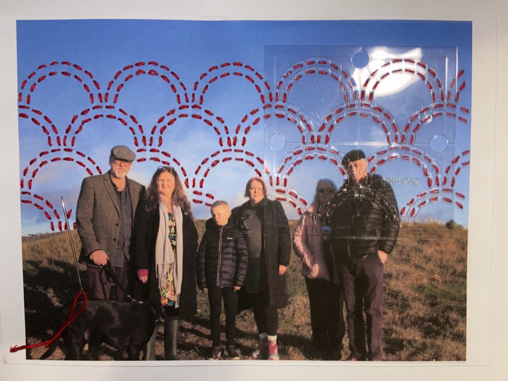
Using Photoshop, I digitally altered the images using different techniques to create singular edits. For example, in one edit I made multiple, red hexagonal shapes around an archival image of my grandparents. I then traced over an image of the Manchester worker bee, making it into a PNG, and then placed these around the photograph as well. I chose to do this as my family is from Manchester and the worker bee is one of the best known symbols for Manchester, representing the population’s hard work ethic and the city being a hive of activity. This symbol is often seen in mosaics around the city, which I believe the broken apart hexagons help represent also. In another edit I used Photoshop to erase sections of my great-grandparents. I did this by using samples of the gold-leaf texture from Carolle Benitah’s work, in order to create this appearance digitally without the material. To copy this texture digitally I used the clone stamp tool to create a silhouette of their upper halves. I believe that this texture adds to my narrative as it resembles a faded image and can be said to represent a faded memory of the people in the image, unable to fully recall their character. This also applies to my personal connection with them as I never met them however know of their memory through photographs.
Handmade Edits
When creating edits of my images by hand I first printed off images that had been slightly edited in Lightroom, with qualities such as contrast, exposure, tone, shadows and highlights. Here I used a mixture of both archival material as well as my newly produced photographs. With these, I decided that the method of stitching would work best to improve the narrative function of the images. To ensure that when stitching into the photographs that they didn’t rip I printed them off on card, providing a sturdier material than paper but still containing the levels of detail and saturation that may not have appeared if transferred onto fabric. When stitching, I stuck to the colour scheme of red, white and black thread, with red being the main colour used to symbolise blood lines and family. I used larger needles and thread to create the more basic patterns and create bolder shapes, and used a smaller needle and thread for the more intricate and smaller patterns, using a back stitch to achieve all of these pieces.
With this method, I made similar designs to my digital edits making sure they were coherent. For example, for one of the images I stitched into I created red hexagonal shapes and embroidered bees around the image, resembling the digital edit displayed above. I did this using a medium size needle for the hexagons and a small needle with smaller thread for the bees, as they were smaller and harder to stitch. I also used patterns to alter my photographs, such as using an arch template to plan my stitches, allowing them to be uniform and neat. For all of my stitched images, I first punctured holes into the card for where I would embroider. This ensured that the stitches were similar lengths.
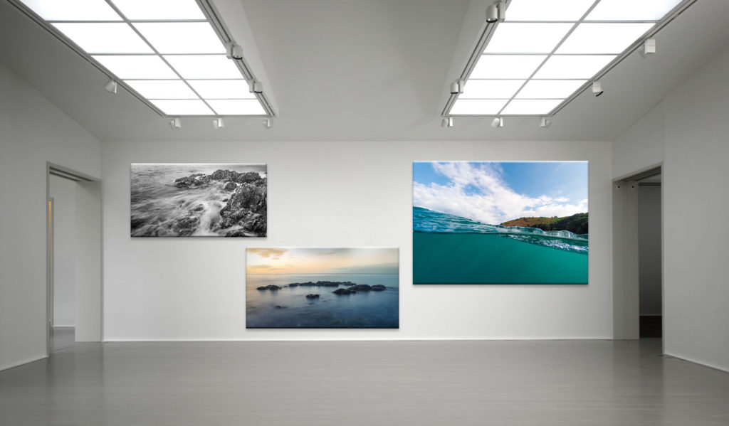
I wanted to select a group of images that I used in my portfolio, which I made in my own time, so that I could print and mount some of the images.
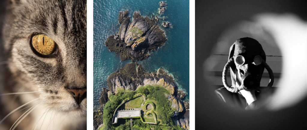
Firstly, I would like to print these 2 examples of my graphic design skills. For the image on the left I used Blender (3D modelling software) and Photoshop, it was the image that I entered into the Eco Active Competition about climate change. For the right image, I made it in Photoshop and is a strong example of photo manipulation using 3 images.
Firstly, I would like to print these 2 examples of my graphic design skills. For the image on the left I used Blender (3D modelling software) and Photoshop, it was the image that I entered into the Eco Active Competition about climate change. For the right image, I made it in Photoshop and is a strong example of photo manipulation using 3 images.
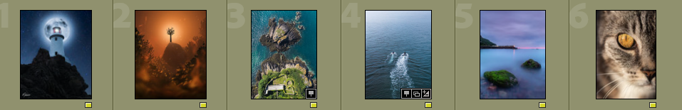
Secondly, I would like to print these 2 images from my Portfolio, as they are my favourite images from it.
The image of the cat I shot during ‘golden hour’ which gave the eye, the central focal point, a vivid golden effect that emphasises the detail of the cat’s iris. I used a macro lens to get really close to the subject. This created more attention to the eye positioned in the centre of the image, and created a slight soften blur to the nose, whiskers, and the mouth. However it still maintains the detail of the hair and the pattern of the cat.
For the aerial image, I used my drone, a DJI Mavic Mini 2, to fly above L’Etacquerel Fort, one of the many Heritage sites in Jersey. The photo was taken from the cliff path, at a height of 120 metres. I boosted the greens and blues to get a more natural look to the environment. I feel this image works well as the curved lines in the architecture contrast the jagged cliff rocks, showing the footprint of the fort really well.
Finally, the mask mask photo, I wanted to create an old, World War 2 atmosphere. In order to do this I took the shot through a cardboard tube with a ripped end, which created a frame around the subject which gives the appearance that the subject is inside a room and you are on the outside of the door looking in through a peephole.
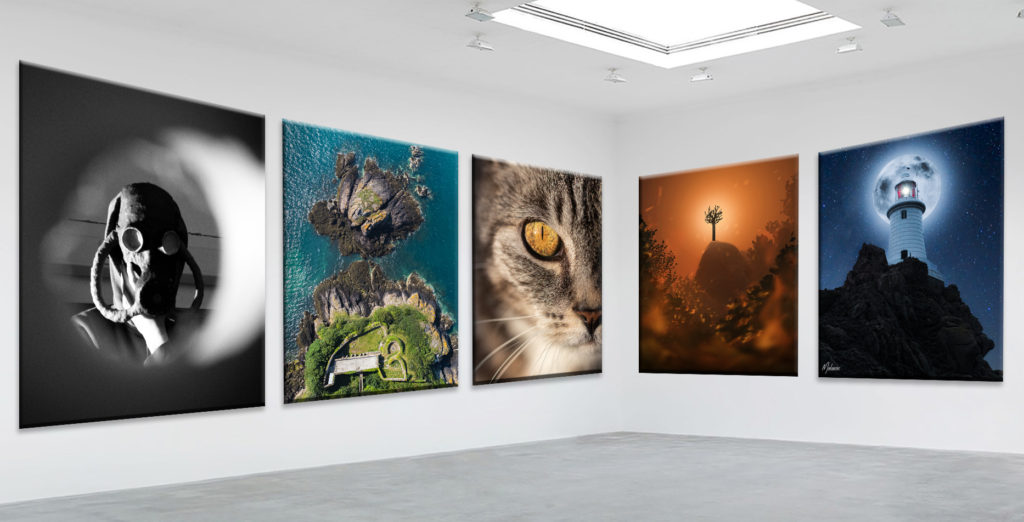
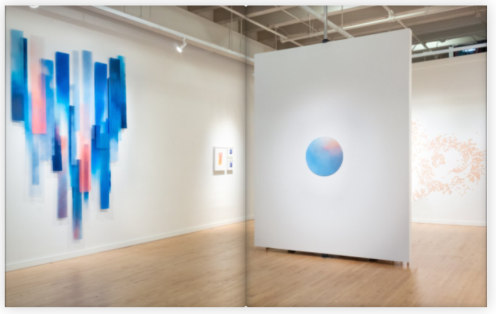
To showcase my images I will make a virtual gallery in Photoshop, so that it looks like my images have been displayed in an actual gallery.
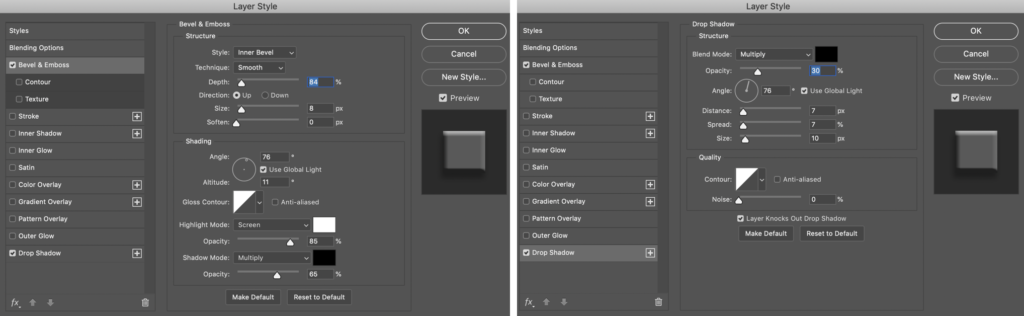
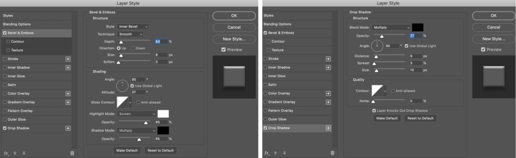
I used CTRL-T to warp the image so that the top and bottom edges of the photo are parallel to the the floor and ceiling. After all the images matched the perspective of the gallery I used blending options to make the images look real and 3D, such as, bevel and emboss and, drop shadow.
Left: Bevel and Emboss. Right: Drop Shadow.
Overall, I think that these extra images help display my photographic and post production abilities and therefore the main reason which I wanted to include them in the next print job.
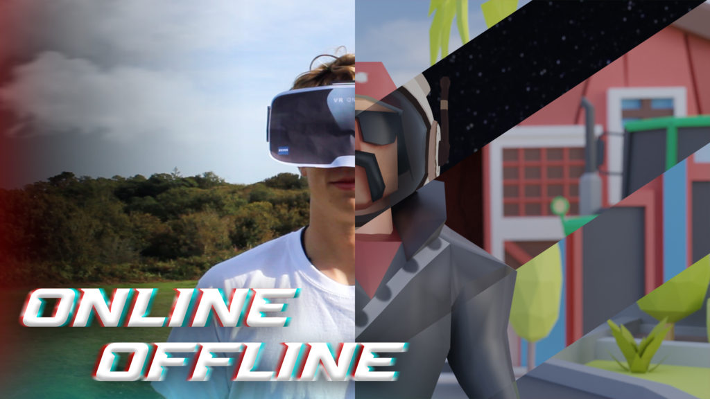
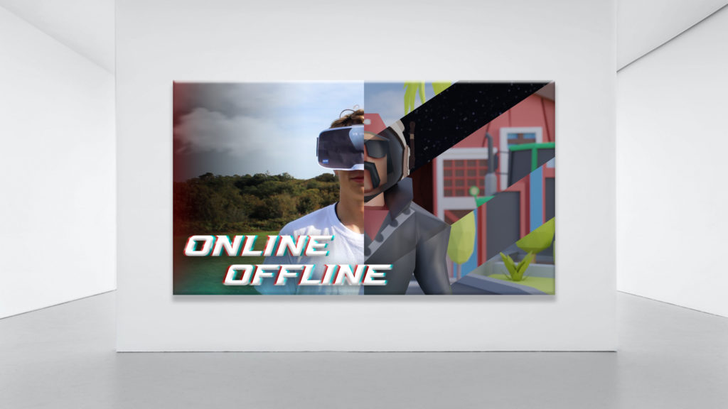
NFT Project Image
I also wanted to include the poster image from the NFT project, which looks like this:
I used the same technique to make a gallery in Photoshop, by using bevel and emboss and drop shadow.
It will be printed A3 unless the quality is bad as its 2560 × 1440 pixels. If it can’t be printed A3 then A4 is ok.
To decide the images that I wanted to print and mount, I used my photo book and picked my favourite images. I would also decide an additional 5 images from my Portfolio that I would print.
In total there are 7 images in the book that I would like printed. I chose them as they stand out and demonstrate great camera skills. I feel that they represent the photo book very well as they are the best ones from it, however they don’t take the value away from the book as it have created contrast and juxtaposed some of the images by paring them with objects and other different images.
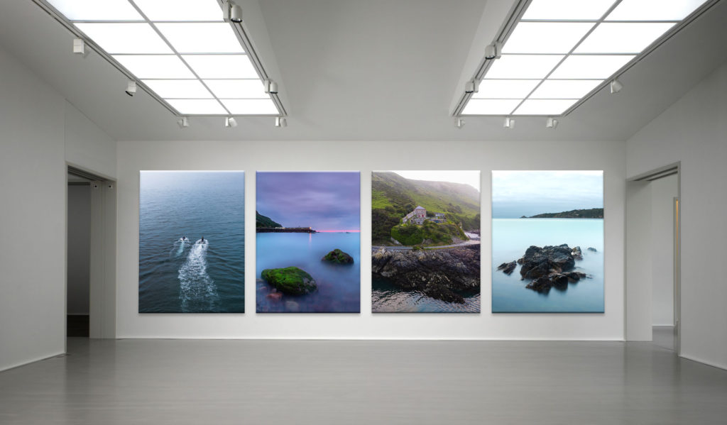
Presentation(Virtual Gallery)
To showcase my images I will make a virtual gallery in Photoshop, so that it looks like my images have been displayed in an actual gallery.
Portrait image display
After postponing the images where I wanted them, I used blending options to make the images look real and 3D, such as, bevel and emboss and, drop shadow.
Left: Bevel and Emboss. Right: Drop Shadow
Overall, I am happy with my selection of images to print as they are my strongest images from my most recent project.
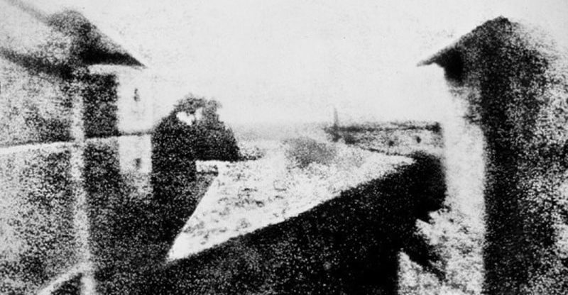
The word photography comes from the Greek words phos “light” and graphos “written” or “recorded”, so it is a writing with light or a recording made with light. The history of photography spans from the 19th to the 20th century, but has many antecedents in earlier times. It is one of the most revolutionary technologies that man has developed. Photography has made an impact on the sciences, the arts, and historical documentation. It also gave rise to other technologies, such as cinema, among others. The idea of capturing images and preserving them is something that humans have wanted since ancient times. It is what gave the appearance of painting, sculpture and, later, photography. There were old attempts to capture an image automatically, especially by means of the camera obscura principle, which is the same as that of photographic cameras. The camera obscura is a closed space, totally dark, in which light penetrates through an opening in one of its sides and projects an up side down image of what happens outside. This technique was known from the time of Aristotle or later from the Arab scholar Alhazén. From that work, scientists such as Giovanni Battista della Porta or Gerolamo Cardano experimented with the camera obscura in 1558. In the 16th century, the German Johann Zahn developed this technique in a wooden device, which was ready to become a camera. The first image obtained in history was made by the French scientist Nicephorus Niepce. He achieved results by prolonging exposure to light of pewter plates covered in bitumen, inside a dark room. The first image was in 1826 and took eight hours of exposure in broad daylight. In 1827 Niepce met Louis Daguerre and they signed a work agreement that left the latter with all the knowledge of Niepce’s photographic techniques after his death in 1833. Daguerre added to the mechanism a polished silver plate, on which the impressions, thus greatly reducing the exposure time. Later the daguerreotype appeared. This new technique allowed portraits to be taken, and was the best-known form of photography for a long time. However, other inventors were studying their own methods to obtained similar prints.
I took all the photos that I wanted to use and, that I have already edited from the photoshoots in Photoshop, then I created a new collection set in Lightroom Classic to import the photos into.
The editing process is shown on the photoshoots blog posts.
After importing the photos into the photo-book collection I used the “pick” and “reject” method using the “P” and “X” keys.
Next, I used the different colours to visualise what type of photo each image was, e.g. aerial (yellow), underwater (blue), hillclimb (green), etc.
These are all of the images that I plan to use in the final book design.
My Book Specifications
Before I design the book I need to decide the specifications and think about the design.
This is information about how I will make the book and about the materials and requirements it needs.
How you want your book to look and feel.
Ideally, a hardback book would be nicer as it has a more genuine feel to it, and it lasts longer. However, it is more expensive compared to a regular, softback book.
Paper and ink
The premium paper will make the images better and isn’t to different to the standard paper, price wise.
Format, size and orientation
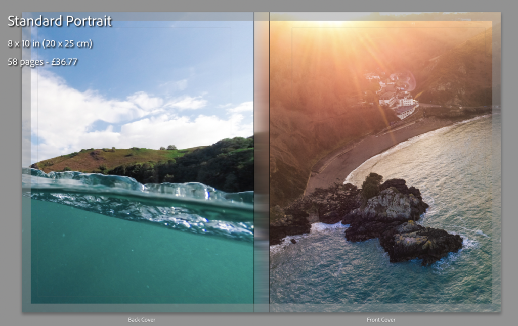
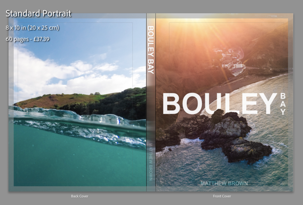
I will use a normal A4 book. (8×10 in)
Binding and cover
I will use a hardcover with an image wrap, with Mohawk proPhoto Pearl 140#.
Title
Bouley Bay
Design and layout
Single image full bleed
Single page image with white borders
Double page full bleed
Double page spread
Double page single image.
Editing and sequencing
I will try and create a zoom effect with the images and use certain objects to carry to flow of the book.
Images and text
There won’t be any text except for the essay at the back of the book.
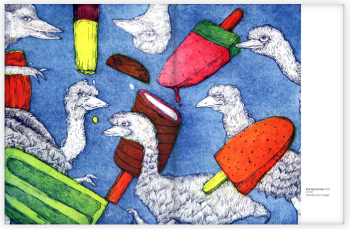
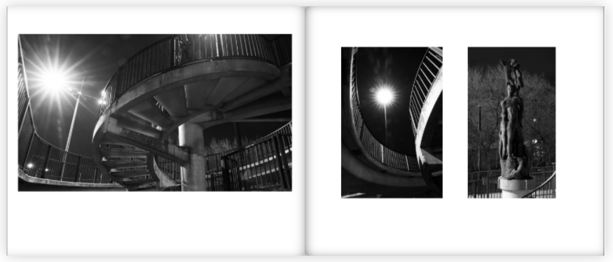
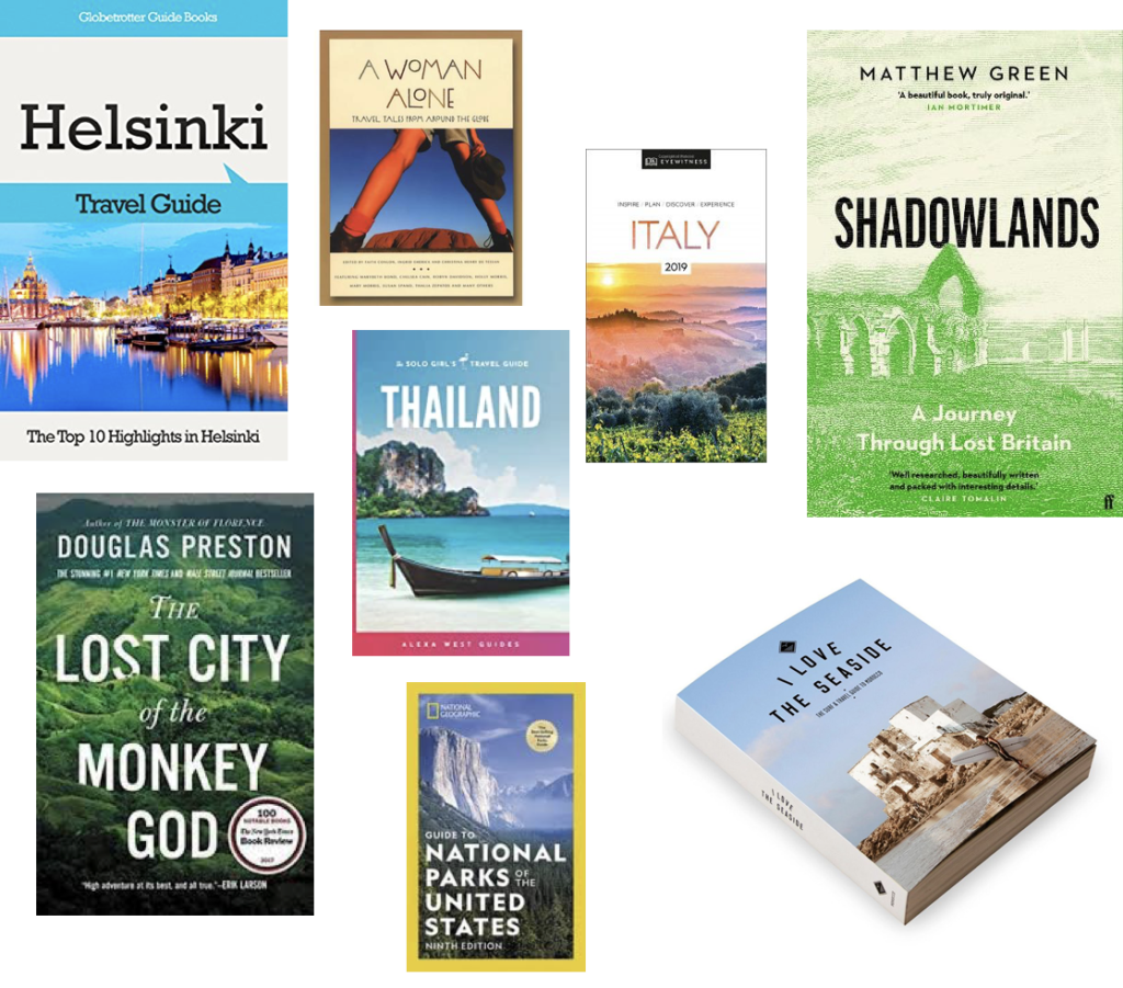
2. Produce a mood-board of design ideas for inspiration. Look atBLURB online book making website, photo books from photographers or see previous books produced by Hautlieu students on the table in class.
This is a mood board of books that have inspired my design process. I found them Blurb’s bookshop page on their website.
I mostly chose these pages from these books as the display the images in a unique way that engages with the user.
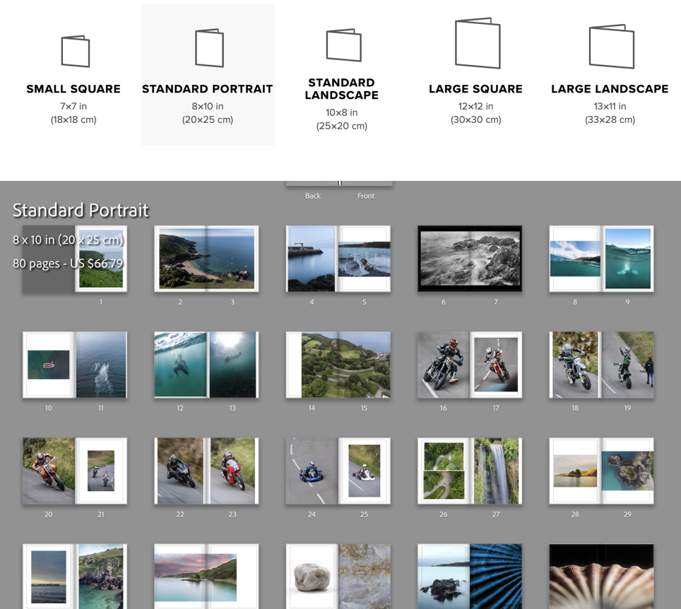
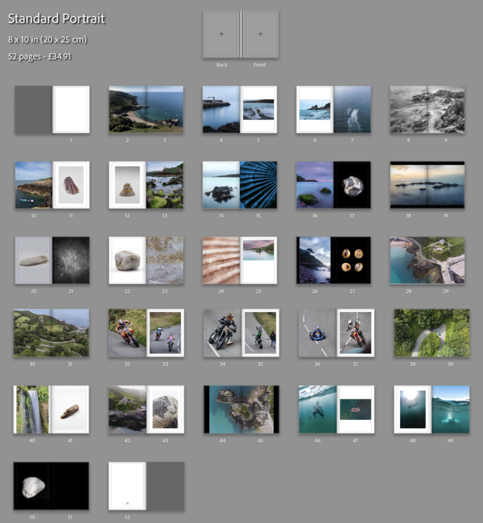
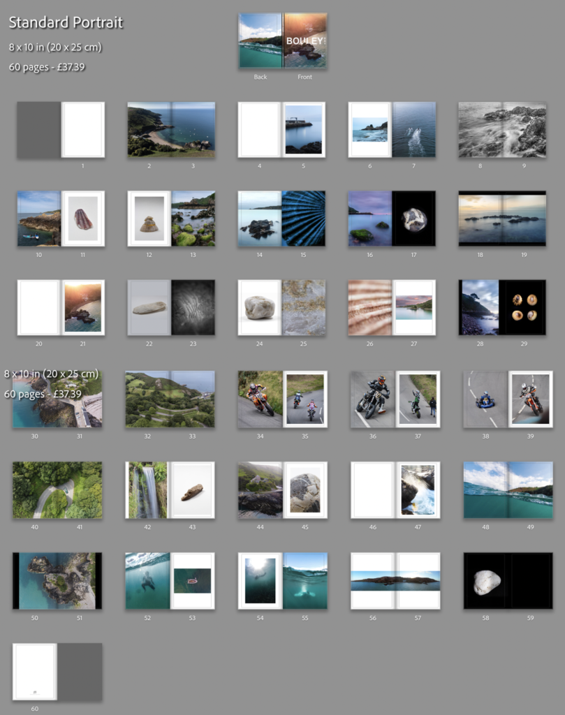
I reorganised the order which I the photos would be in, in the photo-book. Then I clicked the book button where I chose to use the “Standard Portrait” book, then put the images in the order that looked the best.
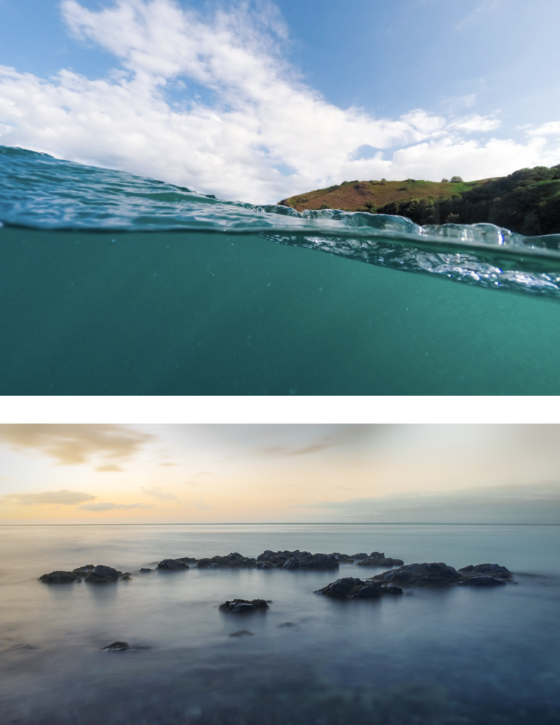
I made use of the page setups to arrange the images to create an interesting composition. I mainly had two images on the double page spread and, they either linked with each other or were opposites.
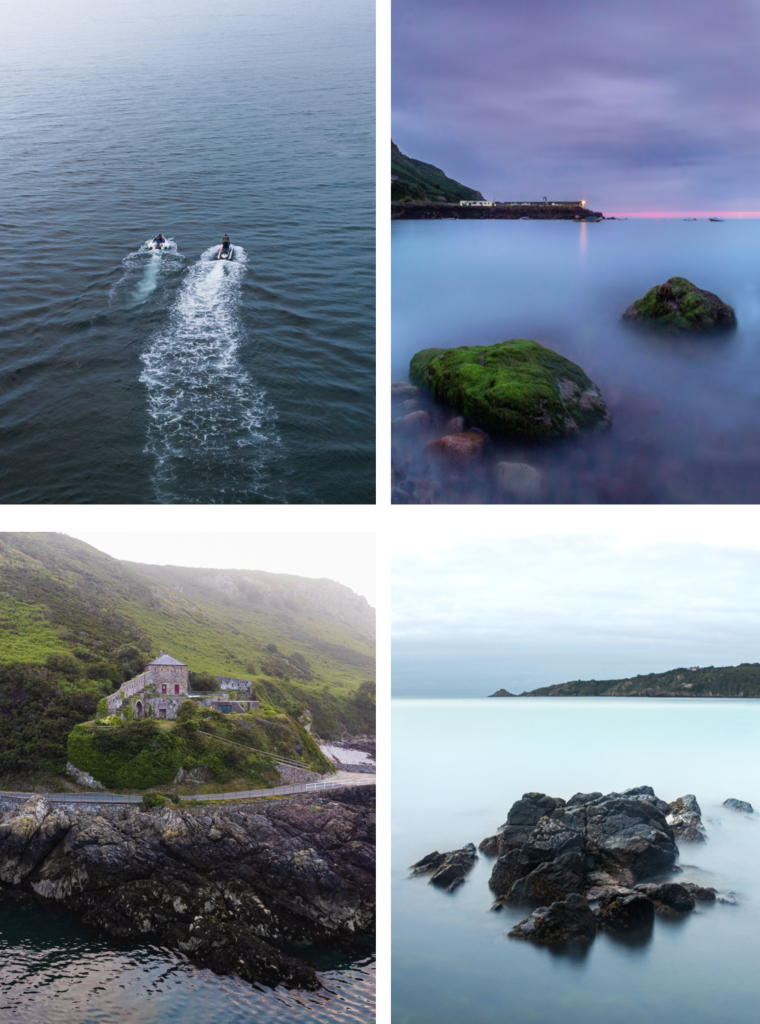
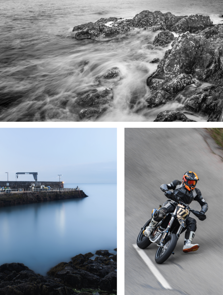
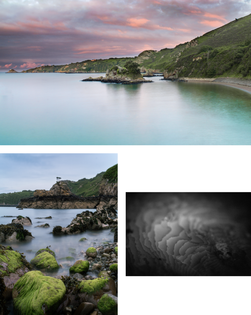
To create a narrative I tried to create a zoom effect. I started by getting images that where of a general overview of the bay, then I focused on the pier, the water coming on to the pier, then I focused on the long exposure shots of the water on the rocks, which transitions to underwater photos. Once there is a brief introduction to the bay there it focuses on the hill climb which brings in the areas “character”. After I introduce the bay again by using the greens hill and the green around the waterfall in the bay, which shifts the focus back to the bays features like the L’Islet, and the heritage site. I often compared close ups of objects and match colours to create an interesting concept and presentation.
My favourite images are these below, I chose them as they are unique and interesting, and showcase great camera skills.
I achieved my goal, which was to accurately recorded a physical location through images. These images above are the strongest images I have taken which help showcase the environment that is Bouley Bay.
Unfortunately, I deleted all of my work, which meant the pervious book design disappeared. Therefore, I had to redesign the book, which isn’t necessarily a bad thing a I had too many images. This helped me reduce the size of the book and add more contrast, as the pervious version was more illustrative.
This result is more balanced as there is a greater mix of content and I feel that I have used a wide range of different page layouts to shift the viewers focus whilst looking a different images. My favourite pages are, 8-9, 14-15, 16-17, and 32-33.
I decided to add 2 more images. One would be a 2 page spread using full bleed and, then second would be a single image, which would probably be on a double page however, it would only use up one page. I plan to do this to a few more images earlier on in the book and eliminate some of my weaker images.
Creating the book cover
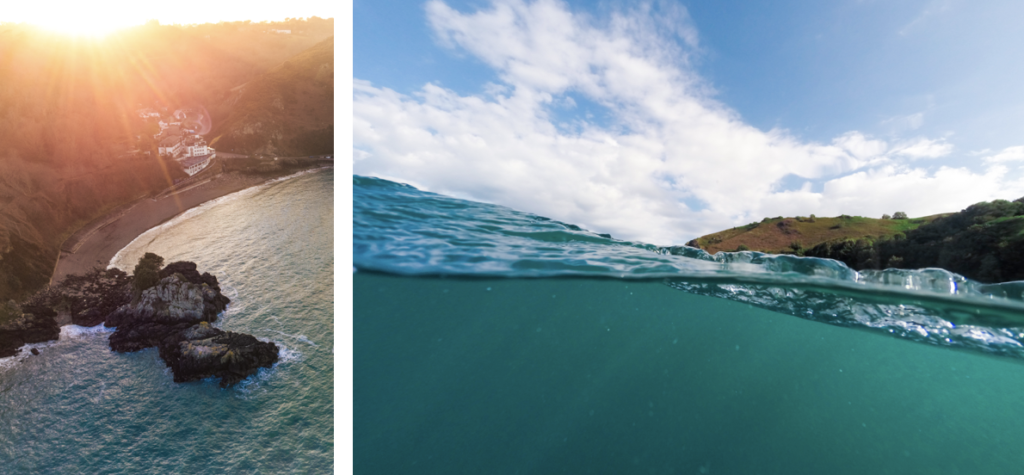
I decided to use an image that had a wide view of the bay which clearly shows where and what the book is about. I am using the image from the extra photoshoot I made with my drone. For the back of the book I wanted to have an abstract image where it is hard to work out where it was taken. Doing this makes lets the front cover have all of the attention. These are the two images I’m using for the book cover:
Left: Front Cover, Right: Back Cover
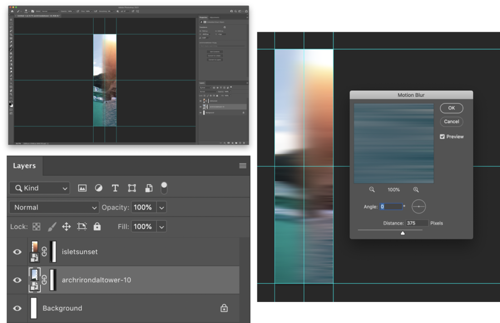
I needed to create a design for the spine, I thought I would blend the edges of the two images above to create a fade between them. After, I would add text to the front cover, and the spine.
I used layer masks to create a gradient fade on the edges that meet with the opposite image. Then used motion blur to smoothen the transition between the images. This will look better when I add the text to the image.
This is what it looks like without the text on the cover. As you can see it looks good, even without the text.
I have created a mood-board to gather inspiration on books about places to decide how to design a title. These are the designs that inspired me:
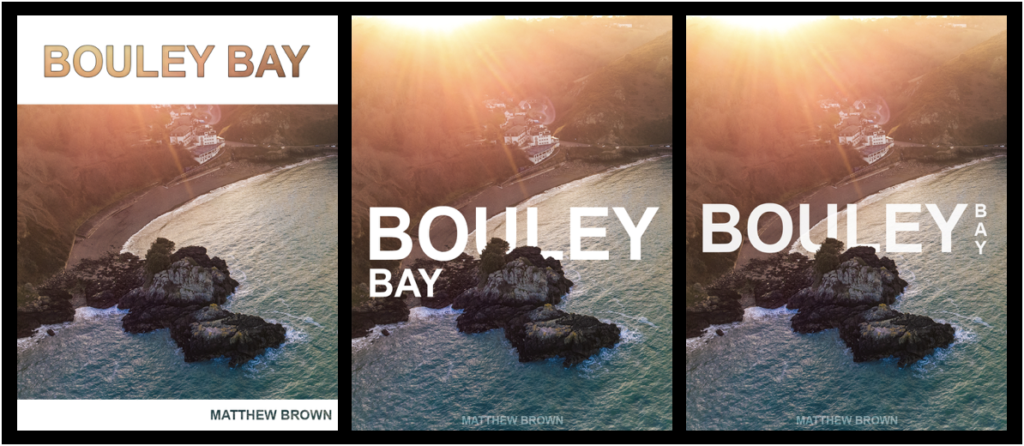
Using Photoshop I have made 3 different front cover designs, and just needed to chose with one I wanted to use. I used clipping and laying masks to help me design and layout my process throughout creating the cover.
I decided to use the design on the right as it is more ascetically pleasing than the others as, it is on one line and incorporates a more complex design whilst keeping it simple.
The design on the right I used blending option on the text such as, stroke and inner shadow, with a clipping mask of the image to let the image show through.
For the two similar covers, I used a layer mask to remove parts of the text to show the island, to give the simple look and complex effect.
I changed a few small details, such as moving the text up a bit. Then I added and replaced the image on the front of my book and on the spine to see what it looked like completed.
I added the text to the 2 files (spine image and front cover image) that I had open in Photoshop to my the final cover images.
I quickly made an inside cover page with just text on, which is the same as on the front cover.
Final design and layout
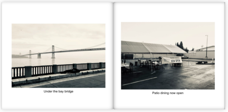
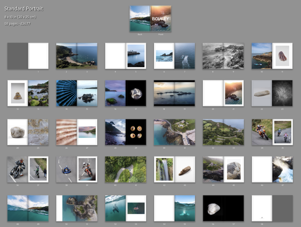
These are the rest of the pages in my photo book:
After some last small adjustments, I’ve come to my final presentation of the photo book. I removed the panorama of the bay, the image on page 54 (underwater image), and I change the bleed on some of the images to removed some of the borders, you can see the before (above) and after (below) of the changes that I’ve done.
I feel that this is the best design and layout, as it includes multiple double page spreads, 2 image layouts with borders, full bleed pages and single page spreads. I decide not to add my essay into the back of the book as I feel that it would ruin the “professional” look.
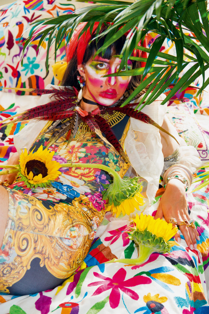
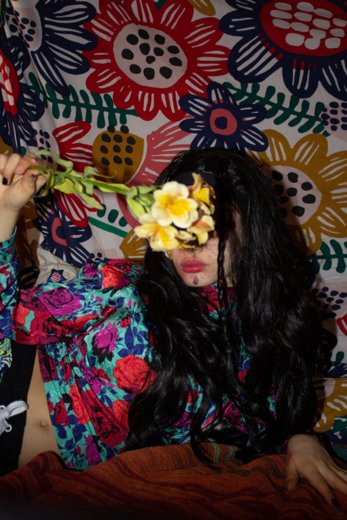
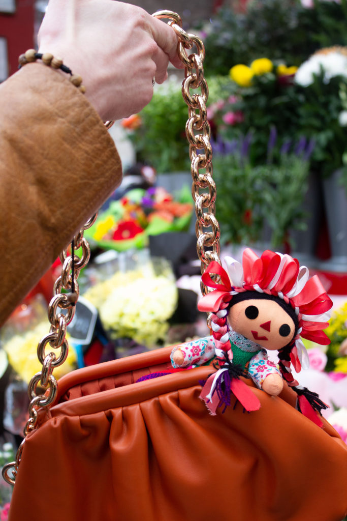
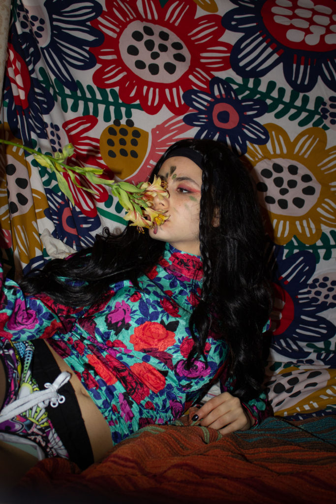
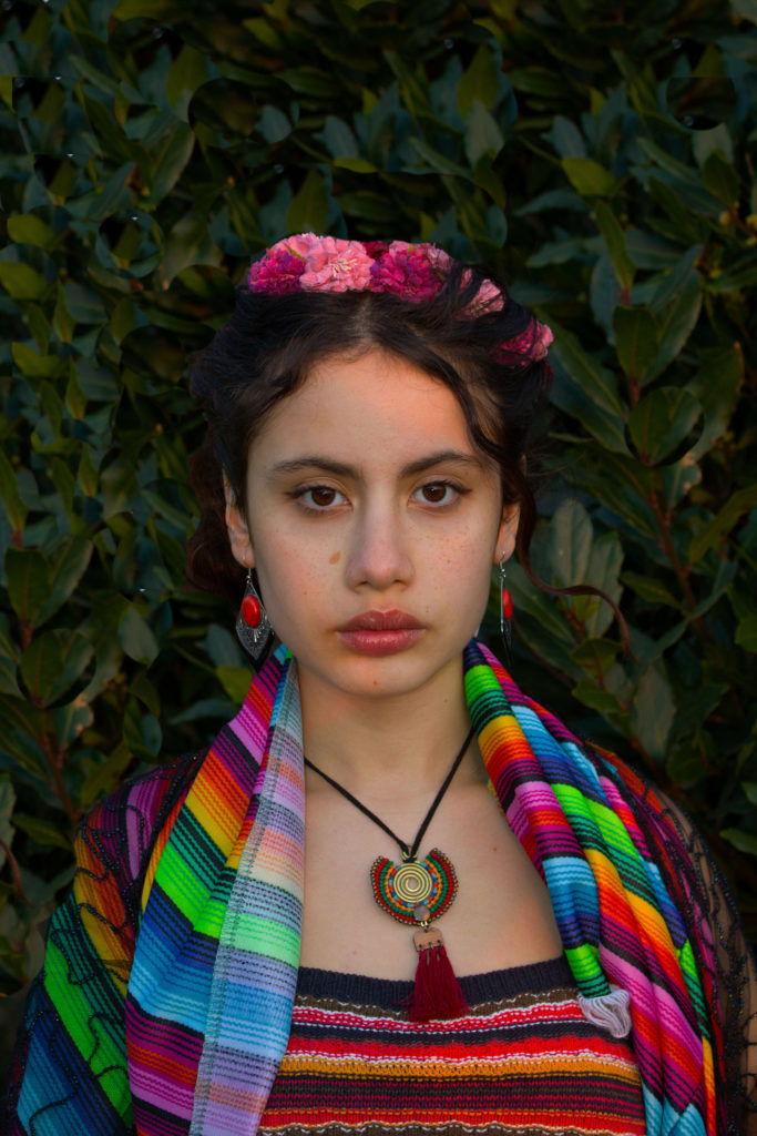
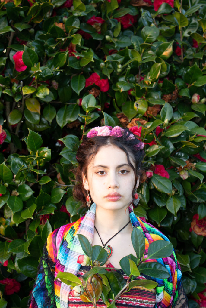
what? This time I’ll focus more in the fashion side show the beauty of Mexico. Shoots: Mexican objects, Garden of flowers (between the flowers), Family photo, Strong women Frida Kahlo or Carmen Miranda
how? Colours and patterns will be needed. Pay attention to details like the clothes, the accessories, make-up, background, lights…
when? March
where? I want each photo to be a different story so for me it would be more suitable if I do each photo in a distinct location, They mostly be in house but I want to be spontaneous so anywhere that reminds of Mexico or I think is a perfect place for one of my stories would be great.
Carmen Miranda
My full inspiration will be on Martinez Gutierrez. Her photos are so colourful and represent indigenous people in a modern way that will be my challenge to acquire. She uses a lot of fun makeup and outfits all well thought. Here are some images i would like to produce