Category Archives: Independent

Filters

Author:
Category:

Naturalistic Landscape

Naturalistic Landscape

What is a landscape?

Landscape photography is an art form which focuses on areas of land and how they interact with natural/man-made structures. It includes things like the mountains, hills, rivers, vegetation, architecture, weather like lighting, sunny and rainy, and so much more.

Photographing landscapes is very important since landscapes are prone to evolution; the land we see now may not have looked the same 50 years ago. This can have a relation to memory and enable us to reflect on the past and remember our ancestors or how life used to be back then.

Ansel adams

Ansel Adams was born in the 20th February 1902 and sadly passed away April 22nd, 1984. As a child Adams was always into art; he taught himself how to play the piano at the age of 12. He then started taking lessons and looked to pursue music. Evidently, Adams was always very artistic. In the end, he gave up his love for music and aimed to pursue another passion of his, photography.

Adams grew up in a house in the middle of the sand dunes of the Golden Gate. This seemed to have influenced his love for nature as he started to take photographs with a Kodak no. 1 Box and would go out to hike, explore and climb just to take a photograph that matched his visual mind/imagination. For example, he once hiked with his friends up a stiff dome just to take this amazing photograph in 1927:

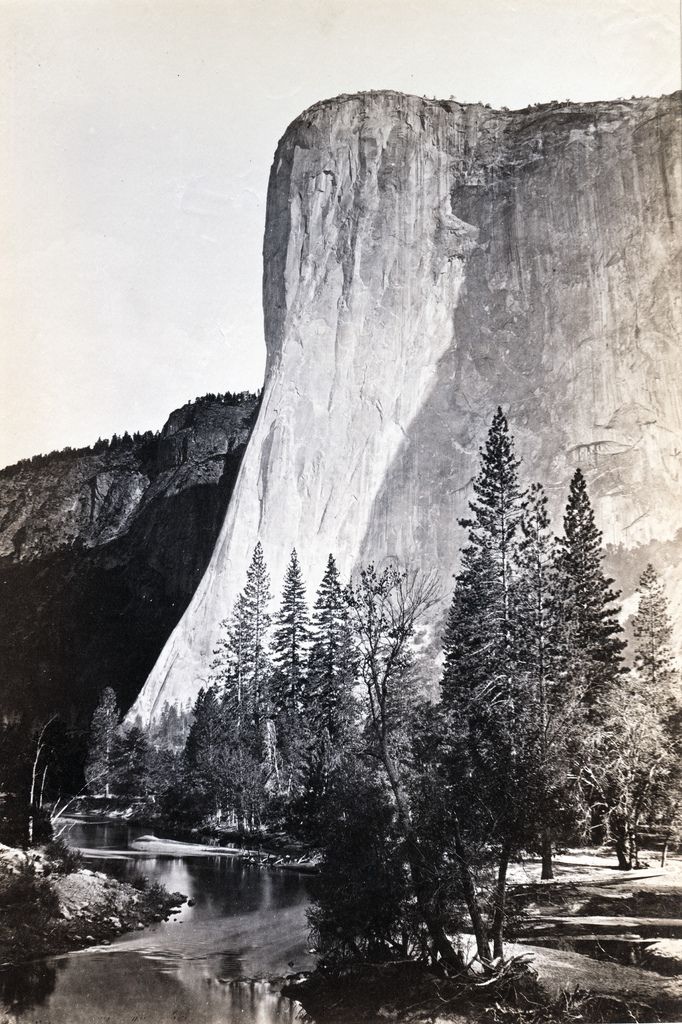
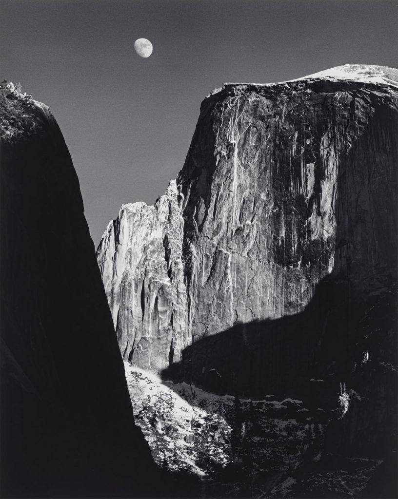
Monolith, The Face of Half Dome, 1927

After this picture was taken in Adam’s first High Trip, he met Albert M. Bender who influenced Ansel a lot and began the preparation and publication of Adam’s first portfolio; Parmelian Prints of the High Sierras.


Image analysis

Light:

The brightest part of the image is obviously the snow since it is white.

The background is dark black since the artist has experimented with different exposures to match what he wanted the image to look like.

This photograph contains natural lighting and seems to be coming from behind since it is successfully lighting the whole scene.

Space:

There is a perfect illusion of 3D space in this 2D image due to the monocular depth-cues used and captured by the photographer.

Texture:

The surface of this mountain is rocky, hard and cold. The rocky parts of the mountain may be used for climbing. The smooth surface of the snow reflects light, adding sparkle and making the photograph more appealing.

Lines:

There is a common repetition of vertical lines in this natural image communicating a sense of height since they extend upwards towards the sky. In this photograph, vertical lines may suggest danger and adventure since Adams did have to hike up this mountain to capture this image. For religious people the vertical lines could be linked with spirituality, our soul rising towards the heavens once we die which relates to Ansel Adam’s work since the image is black and white which is commonly linked to death.

There is a slight curve by the left side of the mountain (<) successfully leading the eye to the top of the mountain making it the main focal point.

Shape and form:

This image has an organic shape since it’s an image taken in nature and also it is irregular and asymmetrical.

There are various shapes you can see in this image such as: a cuboid which makes the mountain making it seem like an old book and triangles making the points.

There is also depth in this image as well as height and width adding to the 3D form in this 2D image. For example, relative size, occlusion, cast shadows and interposition all play a role in helping us perceive this image to be 3D.

Colour:

The brightness of the colours found in this image are dark which suggests a lack or use of dim natural lighting, as in afternoon. The dark colours may also convey a sense of cold and mystery.

The intensity of the colours are pretty dull creating a serious atmosphere. In this image the artist has captured the seriousness of the scene with dull, grey imagery.

Planning

Contents:

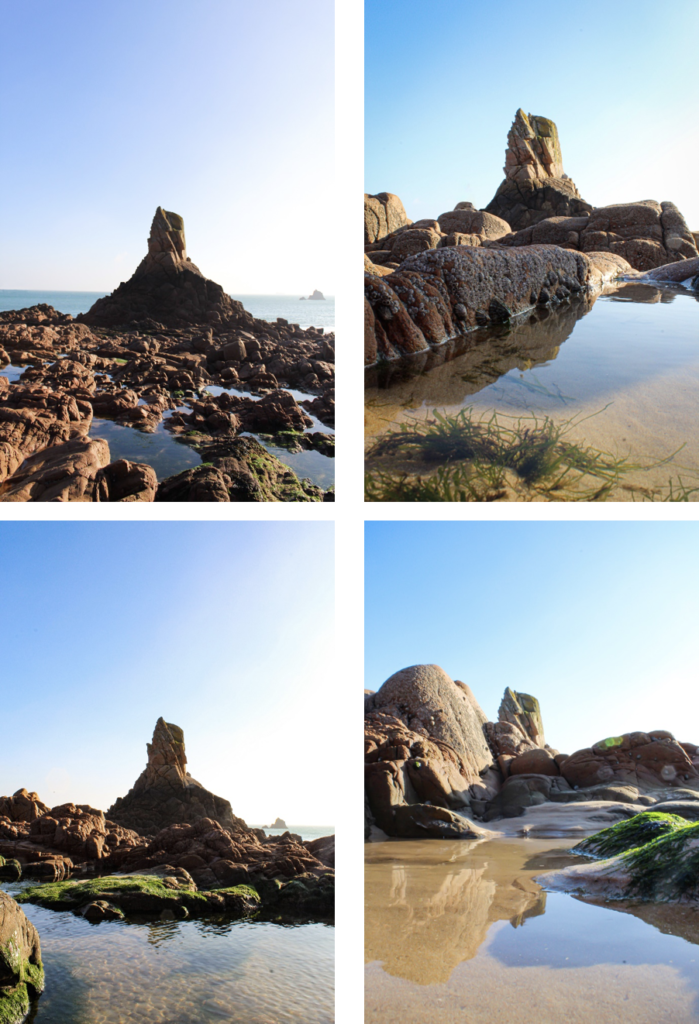
I will attempt to capture natural areas of Jersey such as Queen’s valley.

Location:

As mentioned above, the location will be primarily around Queen’s valley
since its a large environment with different kinds of views and aesthetic.

Lighting:

For this shoot, I will clearly use natural lighting since it’s an outside
shoot plus, it allows my images to look natural and allows me to capture the
natural scene of the land.

Camera settings:

For this project I may set the
ISO to 100 since the weather appears to be sunny with the shutter speed at
1/500 in order to let enough light in.

I may also set the camera to
automatic mode so that the camera determines all aspects of exposure, selecting
exposure parameters consistent with the appliance at intervals the constraints
of correct exposure, together with exposure, aperture, focusing, light-weight
metering, white balance, and equivalent sensitivity.

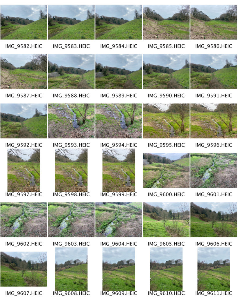
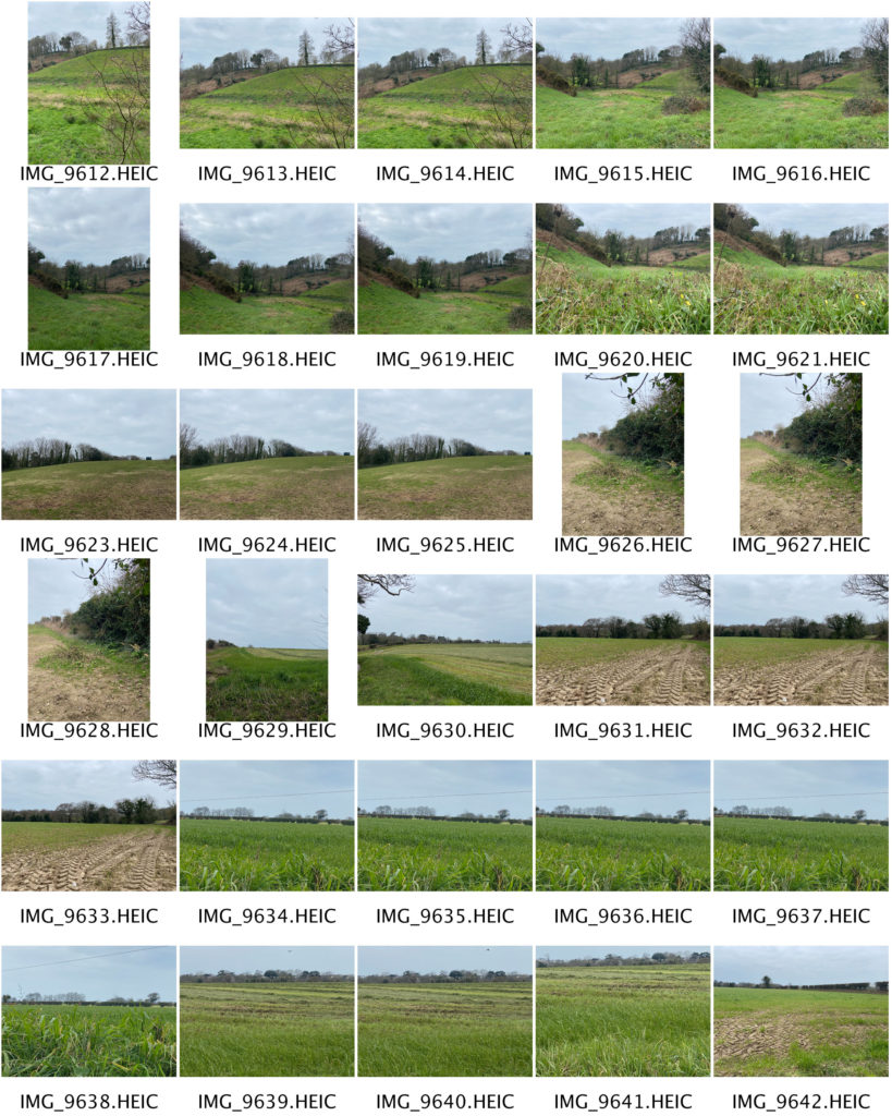
Contact sheets

Tree Blend

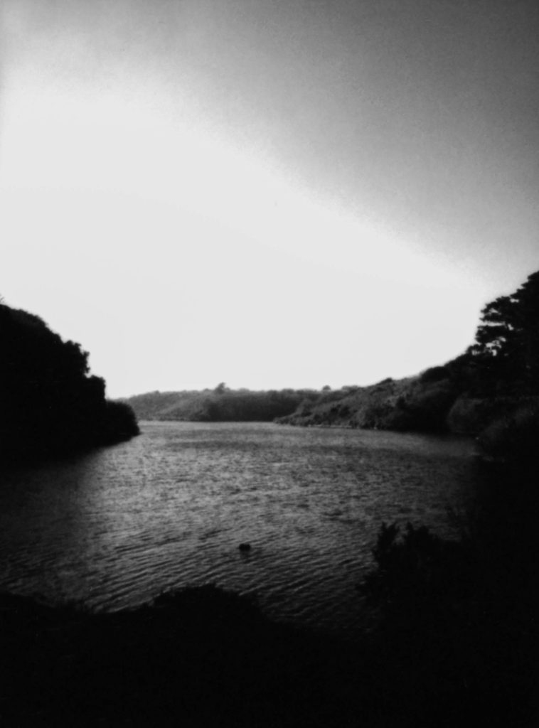
This is one of my final outcomes and it’s called Tree Blend because there is a branch in the middle of this photograph which blends with the reservoir.

It was taken using a Fujifilm instax mini 90 NEO CLASSIC with a coloured polaroid.

In order to put the polaroid on the blog, I had to “scan” it with my Sony Alpha 380, clearly edited the “scanned” polaroid with Lightroom and photoshop in order to make it monochrome and look quite old so that it is easier to relate to the key artist.

In comparison to Ansel Adams, both our shots are in black and white, there is a strong balance between the black and white tones and both our images are both of natural landscapes.

However, Ansel Adams used a film camera whereas I used a polaroid and DSLR camera. In addition, his photographs are sharper than mine as his film was most likely professionally scanned.

This outcome was taken employing a Fujifilm instax mini ninety modern CLASSIC with a coloured film.

In order to place the film on the web log, I had to “scan” it with my Sony Alpha 380, clearly altered the “scanned” film with Lightroom and photoshop so as to form it monochrome and appearance quite recent in order that it’s easier to relate to the key creator.

In comparison to Ansel Adams, each our shots are in black and white, there’s a robust balance between the black and white tones and each our pictures are each of natural landscapes.

However, Ansel Adams used a film camera whereas I used a polaroid and DSLR camera. Additionally, his images are swindler than mine as his film was possibly professionally scanned.

The world is round

This shot was used a DSLR. In contrast to Ansel Adams, our images is are black and white, with a strong balance between the black and white tones, and each of our images is of natural landscapes.

However, my shot is evidently framed differently as it is circular to represent the earth. Apart from that I think this image is a successful outcome inspired by Ansel Adams.

Lastly, I agree to a large extent that I have powerfully managed to create my own photographs inspired by Ansel Adams.

To capture a greater essence of the time period and kind of camera Adam’s has used, I decided to take 2 photographs in film (polaroid) format. Although it isn’t the same type of film Ansel used it served and gave my outcomes this vintage look which matched my inner view of the outcomes (what I have imagined the photographs to look like). In addition, as explained above: images are in black and white, with a powerful balance between the black and white tones, and every of our pictures is of natural landscapes.

Nevertheless, my images are evidently of different types of landscape; Ansel Adams looked at the mountainous kind of landscapes whereas I had to adapt to my own environment but still managed to create a few mountainous illusions as shown in outcome 1. Again, as mentioned above, the main differences are that However, some of my shots are manifestly framed otherwise because it is circular to represent the world and “Ansel Adams used a film camera whereas I used a polaroid and DSLR camera. Additionally, his images are swindler than mine as his film was possibly professionally scanned.”

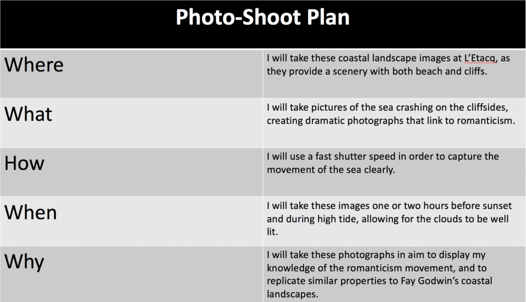
Coastal Landscape Photo-Shoot

Plan

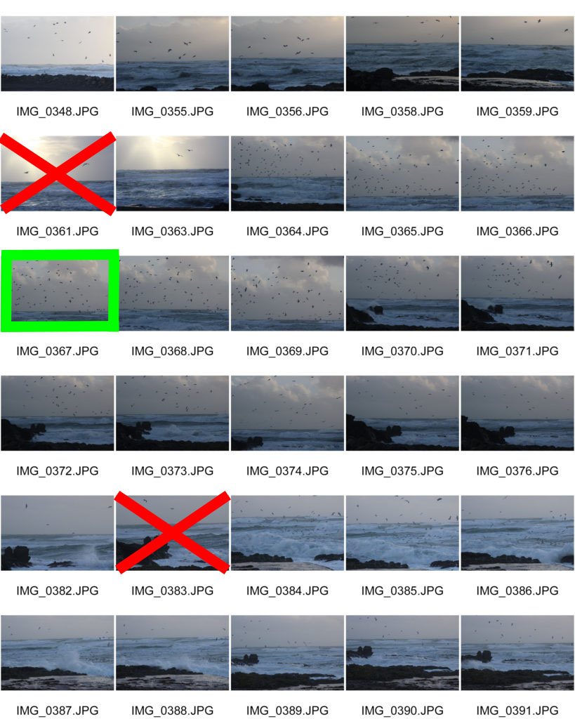
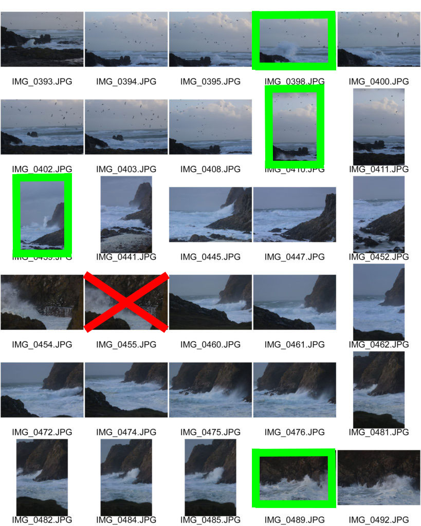
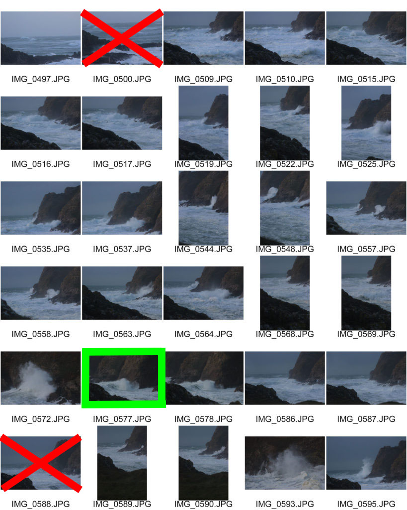
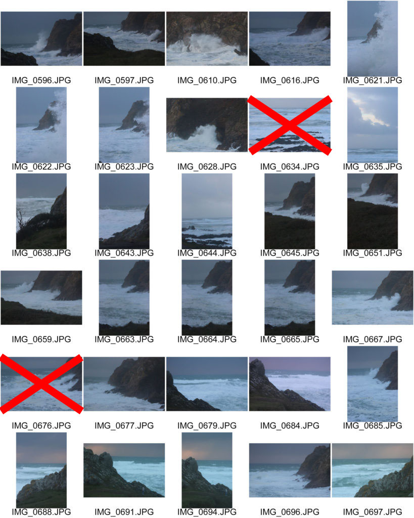
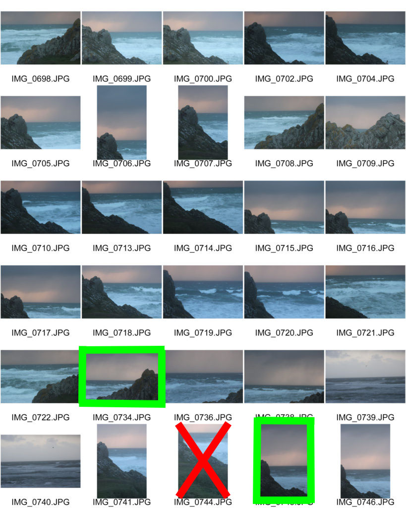
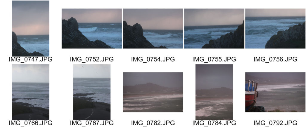
Contact Sheets


Edited Images

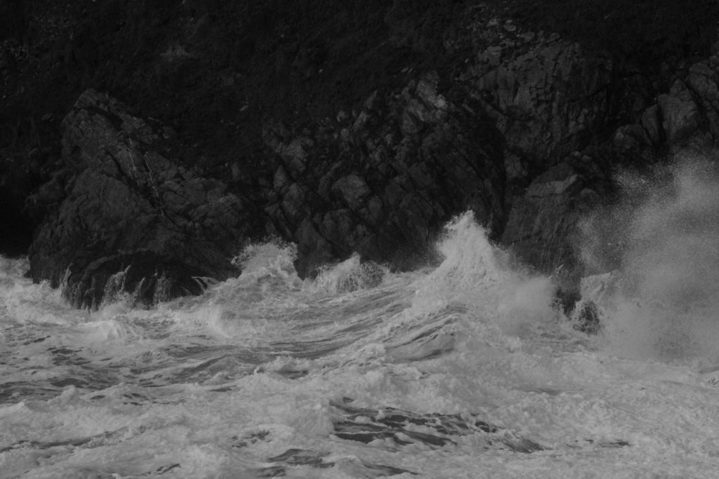
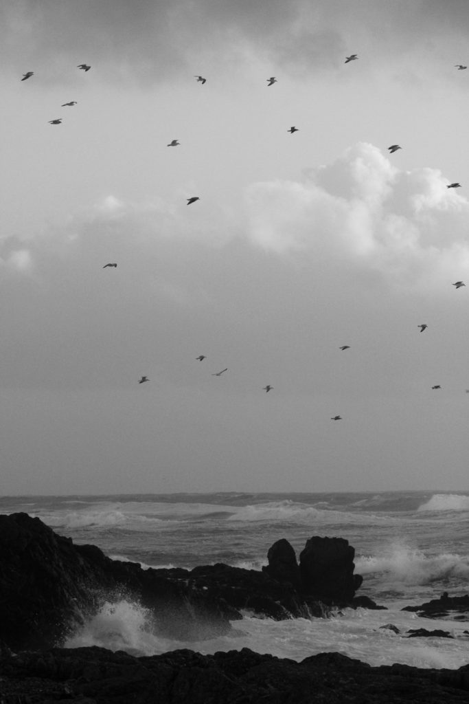
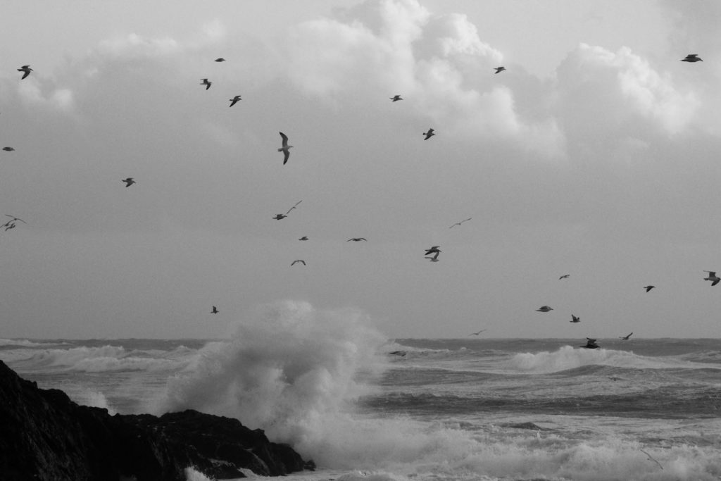
When editing these coastal photographs, I used Photoshop to convert them first into black and white, then increasing the contrast, highlights and shadows for each image. In addition, I also adjusted the curves and levels on Lightroom.

Final Image

I believe that this is my best edited photograph, as it displays elements of romanticism through the harsh weather and the dramatic clouds, therefore replicating aspects of the sublime. Furthermore, this image also coincides with the rule of thirds as the horizon line is located in the lower third of the photograph.

Rural Landscape Intro

A landscape is the visible features of an area of land, its landforms, and how they integrate with natural or man-made features.

Landscape photography is a broad genre of photography, it focuses on the capturing of a this landscape scene and brings the viewers to this scene. These scenes can range from broad and vast landscapes to more microscopic focused landscapes.

They can be rural or urban. Rural Landscapes are subjectively delusive of anything manmade and they focus on the sublime and nature. Urban landscapes highlight mans disturbances on these natural scenes.

Rural Landscapes Mood board

Using Photo Archives

Here I have found a photograph from Jersey’s photograph archive, taken by Albert Smith, of people planting potatoes in the ploughed fields at L’Etacq. I will edit this image together with my own photograph taken from my rural landscape photoshoot, which displays the same setting of L’Etacq.

Case study; ROBERT ADAMS

Robert Adams is an American photographer whos mainly focused on the changing landscape of the American West. His work first started to get noticed in the mid-1970s through his own book The New West.

He has documented the extent and the limits of our damage to the American West, recording there, in over fifty books of pictures, both reasons to despair and to hope.

some examples of his photography;

my favourite image and analysis;

Robert Adams on Working at Home and Photography as Metaphor (2009) –  AMERICAN SUBURB X
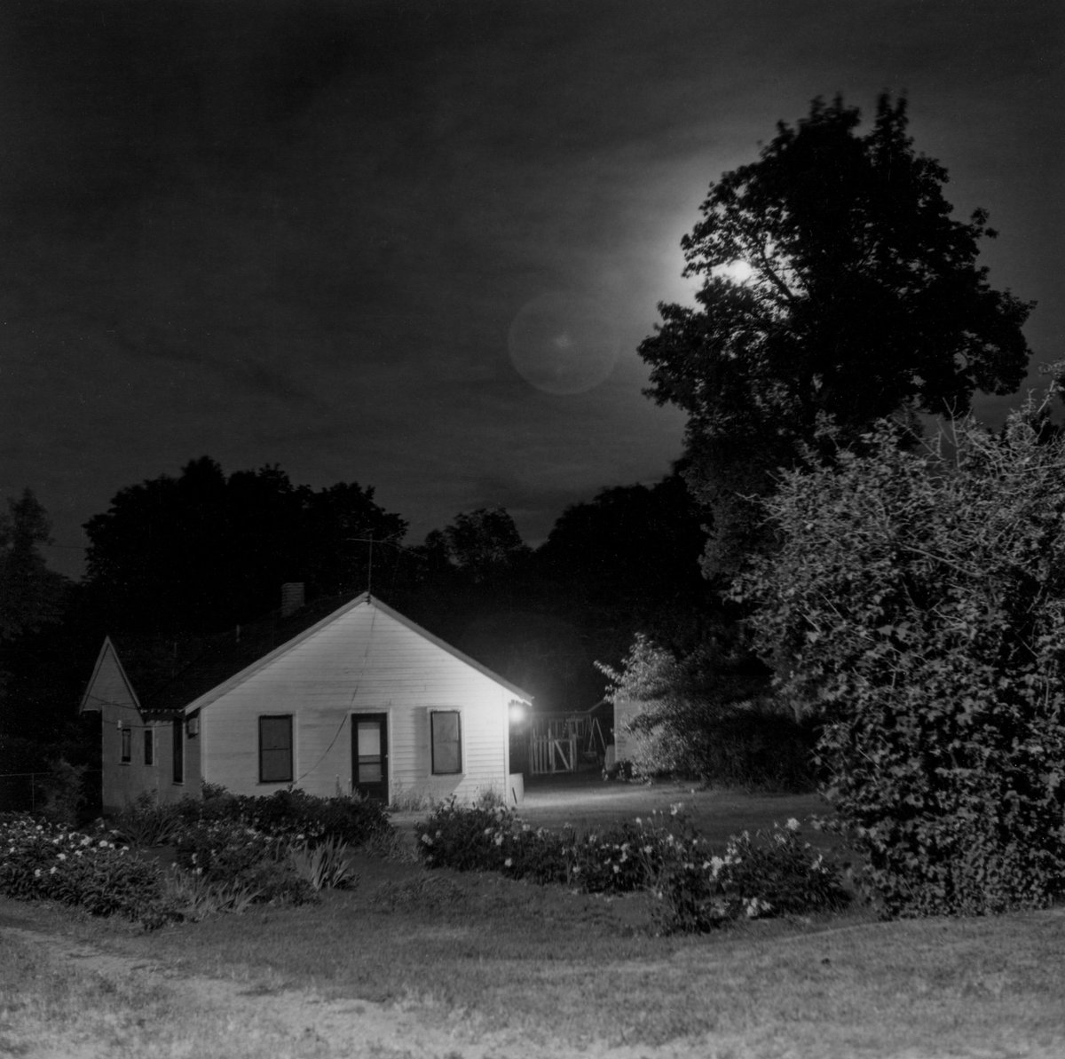
robert adams 2009- name unknown

technical- This image has a range of different lighting, as it’s been taken in the night time this would mean there is no natural lighting. However a lamp and the moon are being over exposed in order to create warmer and lighter tones in the image overall. They’re the two brightest sections of the image therefore grab your attention right away. I assume flash has been used in this photo as it would need some sort of help brightening the image up. The contrast between the white house and extremely dark sky works very well together as it’s very sharp. However this image could have in fact been taken during the day time and that could be the sun peaking through the trees and Robert Adams has just turned the image into black and white. The image is very focused and has been taken from far away or maybe through a wider/longer lens.

Visual- This image is clearly taken in black and white or has been edited afterwards. There’s a variety of different tones, from extremely bright and white areas such as the moon and lamp on the house to dark, black/navy areas such as the sky and trees surrounding the house. This image doesn’t focus on shape or texture as it’s a landscape photograph. The house has been centered to the left of the image and the lamp and moon light are in line with each other but in a slanted upwards direction. The viewpoint of this image is straight on in order to capture more at once on a more flat level.

Contextual- there isn’t much history behind this image that Robert Adams took other than simply wanting to photograph the ‘beauty and insight’ of simple landscapes. This a famous quote of his when he talks about why he takes the photographs he does,” To want to make pictures is fundamentally to want to share something that you have seen of value, and that you suspect maybe people haven’t paid enough attention to. The American West has been my primary subject, particularly the landscape. They are frightening landscapes and the only way I can get over my own anxiety about them is to go and keep working.” – Robert Adams
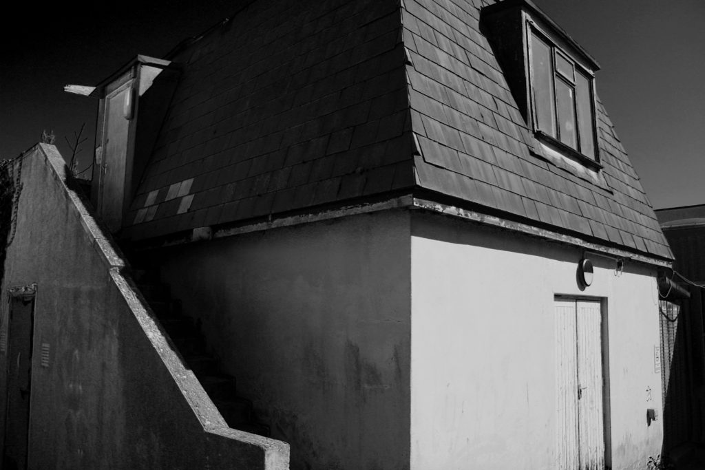
Conceptual- I think there isn’t a deep meaning behind this image that Robert Adams took however I think he wanted people to appreciate the simple details in landscape photography. For example this small little white house that looks like it’s located in the middle of the woods, most people probably wouldn’t think much of it but in the night time when the moonlight shines over it , it makes you see it from a different side. The way Robert Adams edits his images also makes them more interesting to look at due to all the different tones in the image that make certain areas stand out a lot more.

the new topographics

The new topographics was the turning point in history in 1975 which was a shift away from photographing traditional landscapes, to photograph of landscapes that are unromanticised, industrial urban landscapes. This movement of new landscape photography was made because of the fact that society wasn’t recognising the issues of how the world was being slowly decaying from the natural landscapes being altered to urban, man made buildings taking over, raising awareness of the issue that was on the uprise. The photographers that where involved in this movement where 10: Robert Adams, Lewis Baltz, Bernd and Hilla Becher, Joe Deal, Frank Gohlke, Nicholas Nixon, John Schott, Stephen Shore, and Henry Wessel.

Pitheads 1974 Bernd Becher and Hilla Becher 1931-2007, 1934-2015 Purchased 1974 http://www.tate.org.uk/art/work/T01922

As you can see from the image above, this photograph is perfect in terms of the explanation of the “new topographics”. This reasoning behind this is because in the image you can see how there are industrial images as the main focus when you look at the image, however, if you look in the surroundings of these images you can see that there is some natural scenery in the surroundings of these industrial landscape images. This is because the photographers that where apart of this movement tried to get across that if society carries on with having urban/industrial landscapes cover up the world, we wont be having many more natural landscapes or even beautiful scenery to appreciate from what the world has given us.

Plan

Where – photo shoot will be taken around oakfield sports center and highlands.

What – I will be taking some deadpan images of industrial buildings

When – I will be carrying out this photo shoot during the daytime at around 1pm.

How – These photos will be taken at head height with the camera facing starring onto the object that i will be taking pictures of with the setting’s being exposure/80 and IOS/400.

Why – I am taking these pictures in inspiration of the new topographic in taking my own pictures to do with this project.

Contact Sheet

Final Images

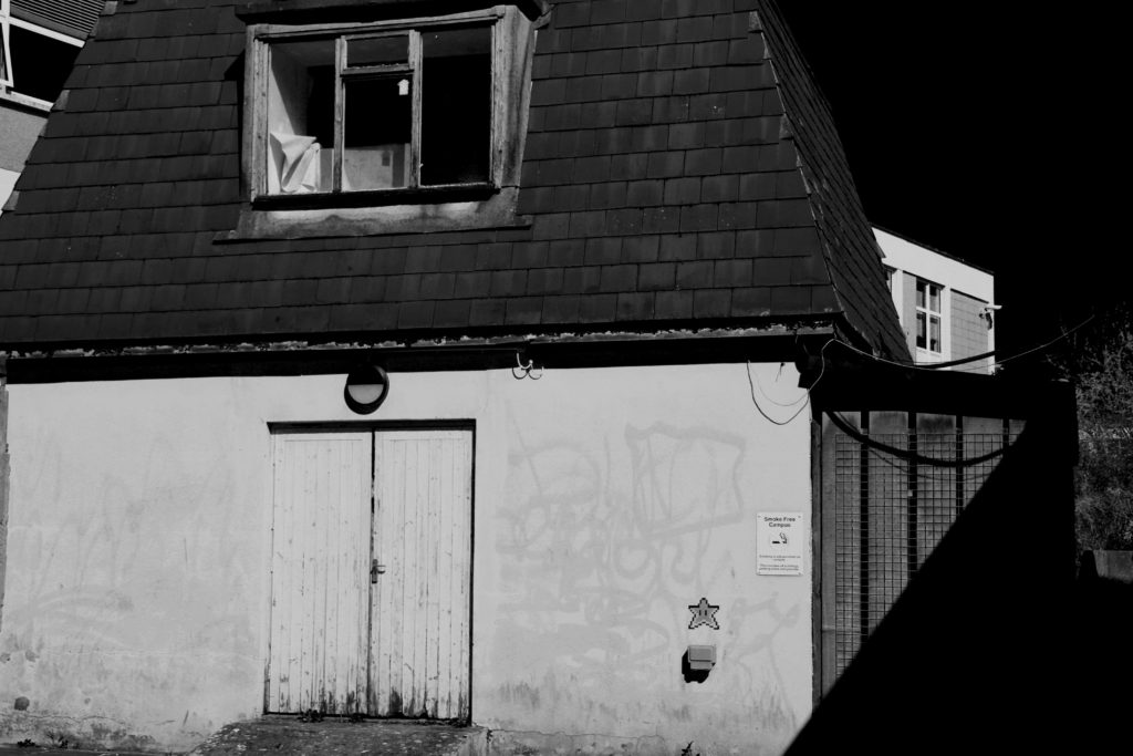
From my final images, i got them to look so appealing in the compositions of black and white through editing. The process I went through in editing the images where making them black and white, then i went ahead and changed the colours that where in the images originally to enhance some proportions of the images. For example, it is shown in my images that you can see some dirt and textures that are enhancing from the edit making them appealing.

Comparison

Frank Gohlke

My Image

In both images, the lighting used is petty much identical, Frank’s image was lighted by natural light coming from above and behind the two focal points of the image which is directly above the structures. I know this because it shown in the picture’s that there are shadows on the ground in front of the objects on the ground. In my image, I used an aperatu

Landscape Juxtaposition / Photo Archives

What is juxtaposition?

It is the fact of two things being seen or placed close together with contrasting effect, for example, new and old, or dark and light.

The first photo I got from Societe Jersiaise, it was taken in 1870 – 1887, by Ernest Baudoux. The website features many photos and information about the history of Jersey.

The second photo I took at Plemont on the 24 ‎February ‎2021, ‏‎10:51:08, as part of my Rural Landscape Project.

Photoshop Display

To create juxtaposition between the images I used Photoshop and overlay them, then align them so that you can see that they are the same image.

I darkened the edges of the image, by using a black brush at 75% opacity.

Overall, I think it shows that the images juxtapose each other, due to the black and white colours of the older image, and the vibrant colours of my image. This is due to the evolution and development of technology. Also the quality of the image in better and more clear.

Fay Godwin ANALYSIS

Fay Godwin, Paved Path and Reservoir above Lumbatts, York…
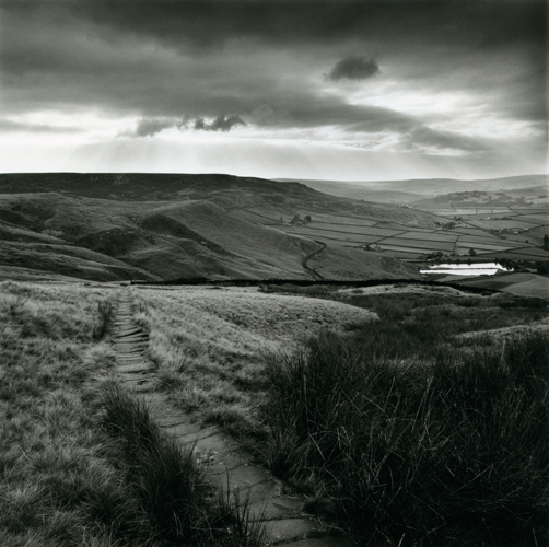
Path and Reservoir, Lumbatts, Yorkshire, 1977

Firstly, Godwin uses the path as a leading line to drag our eye to the natural mountain scenery. The horizon rests on the top horizontal line, demostrated by the rule of thirds.

The monochrome black and white filter exaggerates the intense clash in the harsh shadows cast by the mountains, that contrasts with the bright highlights of wild grass in the foreground,

The whites in the sky don’t blend with landscape which creates a border between the two elements. This adds an atmospheric and energised mood, due to the steep changes of tonal values, overall it helps contribute towards the dramatic overcast look Godwin was going for.

The mountains on the left gradually get lighter as they disappear into the distance. This gives the image more depth, as the structure of the mountains has less form, which makes you focus on the larger mountains as that is where all the crisp details are.

The Sun acts a the main natural light, which gives off genuine and complex shadows. The reflections in the reservoir also display that it is a bright day, the haze in the distance created due to clarity in the sky gives off a more detailed atmosphere.

RURAL AND ROMANTICISM LANDSCAPE PHOTOGRAPHY

What Is Rural Landscape?

Rural landscape is photos of an area that is not densely populated or intensively developed that isn’t protected land.

Influential Landscapes – (Mood Board/Examples)

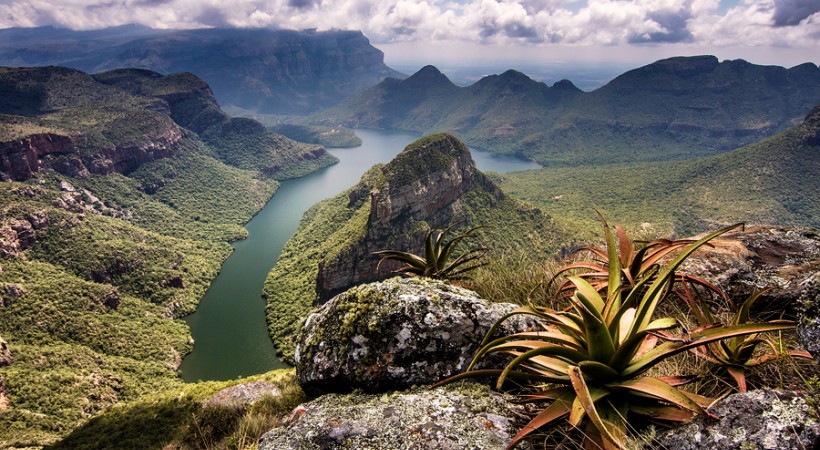
I found these images of landscapes off Google, and found their respected photographers. I want to try and do a long exposure of the water, and include the details of the rocks.

Ansel Adams – (Case Study)

Ansel Easton Adams was an American landscape photographer and environmentalist known for his black-and-white images of the American West.

At age 12, he was given his first camera during his first visit to Yosemite National Park. He developed his photography skills, and later he was contracted with the United States Department of the Interior to make photographs of national parks.

He is mainly recognised talent was that he showed a deep technical understanding of how tonal range is recorded and developed in exposure, negative development, and printing.

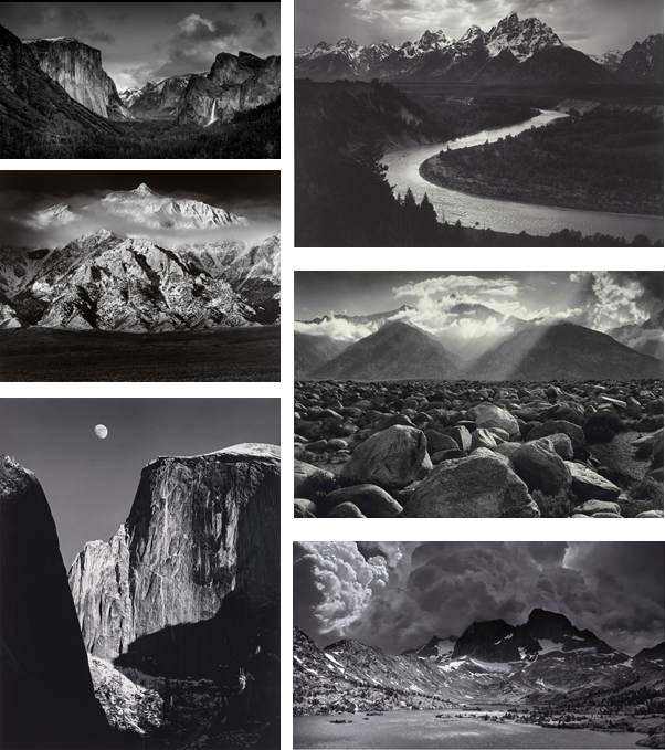
His Famous Photos :

Ansel Adams Tonal Values

As you can see, Adams uses the excellent tonal values. For example, he used the darkest black, in the shadows of the mountains, on the other hand he has used the brightest white, in the highlights of snow resting in the mountain.

He uses filters to create and tone down the highlights in the sky. He mainly used a red filter and exposed it for 5 seconds, which created a darker sky, which is what Ansel Adams imagined. The top of the sky is normally grey the fades into a white.

Texture and Surface

The rocks always include high detail and lots of shadows. I can achieve this by increasing the clarity and texture in Photoshop. Black and white makes the detail stand out more as there are no colours that are distracting. There is normally a more dominant black and white colour, grey is used to display highlights and depth.

Composition

Adams uses leading lines to draw attention towards the main focal point, for example the river (2nd photo) progresses towards, and makes a path to the mountain in the background. This makes the image more powerful as there is more integrity and thought which has gone into it , creating this scenic view.

Adams sometimes uses rule of thirds; a composition guideline, to place more emphasis on a particular point, such as in the first photo.

Although, Adams also uses the foreground to his advantage. By including it into his image it adds depth and fills up blank/wasted space in the image.

What is Romanticism?

Romanticism was specified by its emphasis on emotion and character as well as emphasising nature. It also promoted the individual imagination of freedom from classical notions of form in art, since photography wasn’t popular as it had just stared in 1826, and romanticism was mostly reverent in the 1800 – 1850 era.

Romanticism examples in landscape

Keith Arnatt, ‘A.O.N.B. (Area of Outstanding Natural Beauty)’ 1982–4

This photo was taken by Keith Arnatt, in 1982-1984. in an “area of outstanding natural beauty” it was following a long-established scenic route, the C

Arnatt represents a landscape that cannot fail but to live up to expectation, full of interrupting buildings and sharp corners.

The foreground is dominated by a bald curve of tarmac and a café. This might appear to be a misrepresentation of romantic landscape, but early tourists were just as struck by pointed, sharp contrasts of greatness.

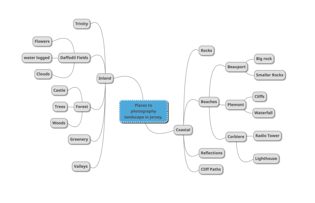
Where can I photograph in Jersey?

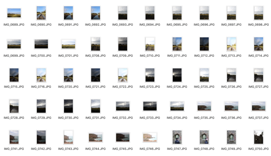
Contact Sheet (Simplified)

Since I took over 600+ images I only put 1 screenshot of a small section of images as my contact sheet.

HDR exposure bracketing technique. What is it?

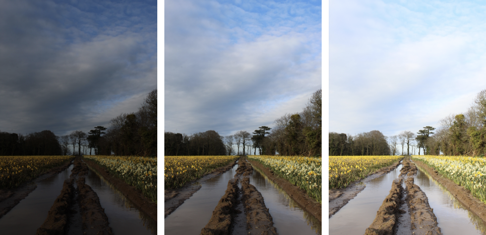
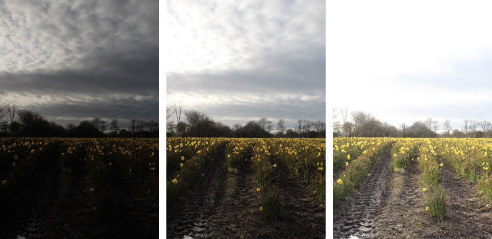
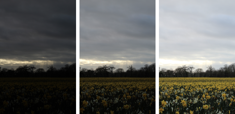
Exposure bracketing is when you create pictures with different exposure settings. (Overexposed, Balanced, Underexposed.) The purpose of this is to cover more of the dynamic range. Bracketed photos are used later to create an HDR (high dynamic range) photo. For example, in a normal photo the sky might be overexposed, therefore, the dark image produced by the bracket settings will keep all the detail in the sky, so when you put it into Photoshop or Lightroom to make the HDR image it will merge all the images together and keep all the best parts for each image. Overall it will created a high detailed image that is perfectly exposed in all areas.

To learn how to setup this technique I used a Youtube tutorial, that uses a Canon camera, this is the link :

Exposure Bracketing (AEB) for better HDR with Canon DSLRs

All images below were taken with a tripod and a Canon DSLR 1300D, then edited in Adobe Photoshop.

Part Of The Process (HDR/Exposure Bracketing)

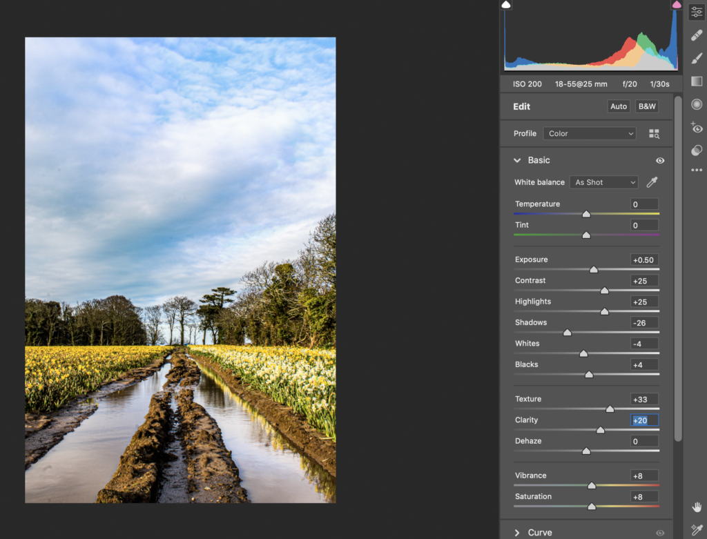
This is one of the screenshots from the first image I edited, it shows the Camera Raw Filter being added to HDR image. Photoshop merges the 3 images for you so I wasn’t able to screenshot it doing that.

My HDR Images

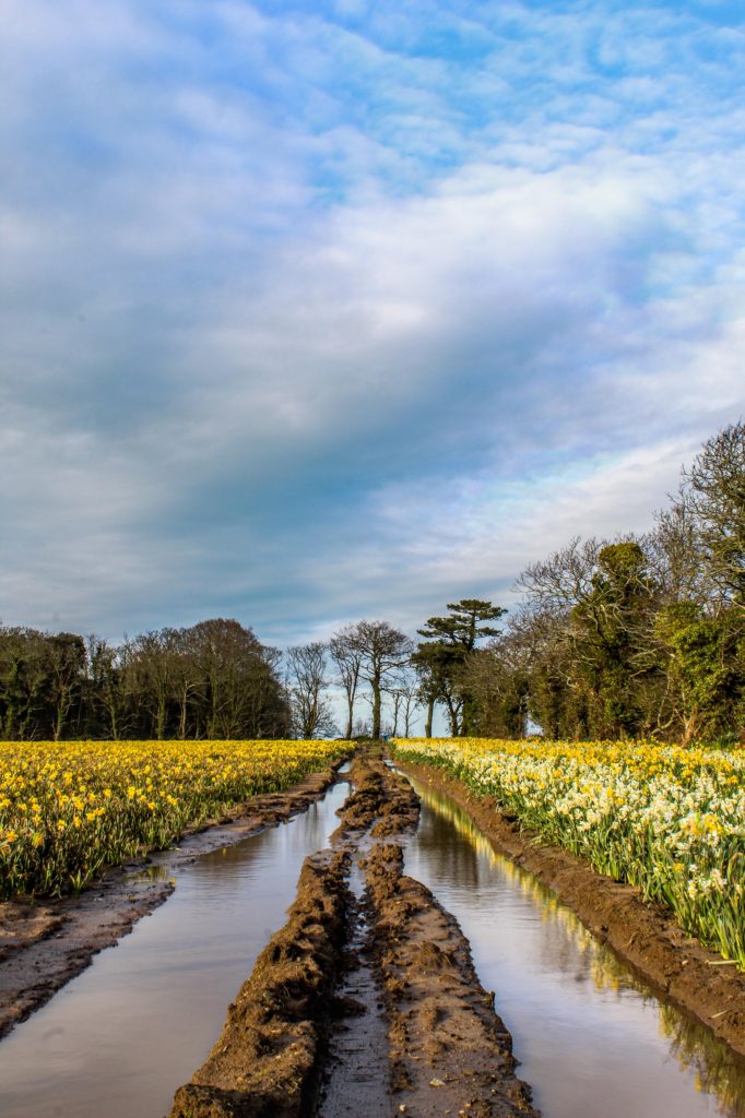
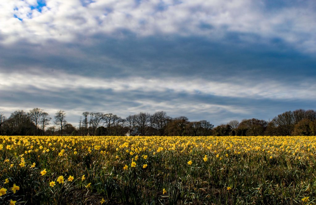
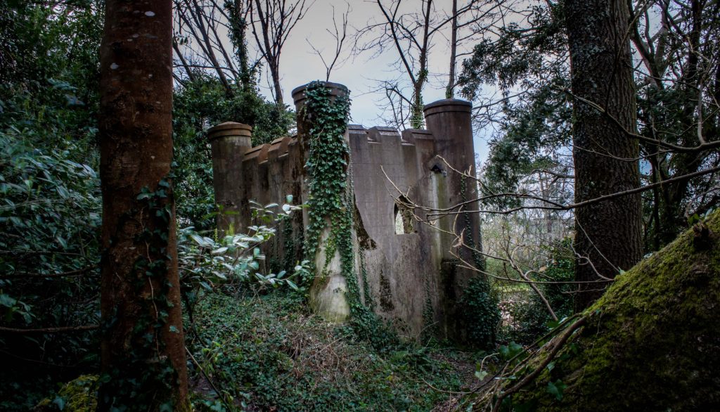
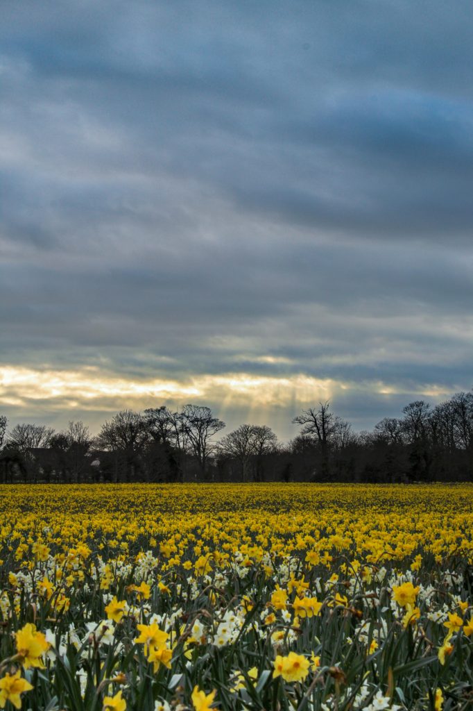
As you can see there are four photos above. The larger one is the final edit, which I made from the three images I took using bracketing technique, which I will show in every image.

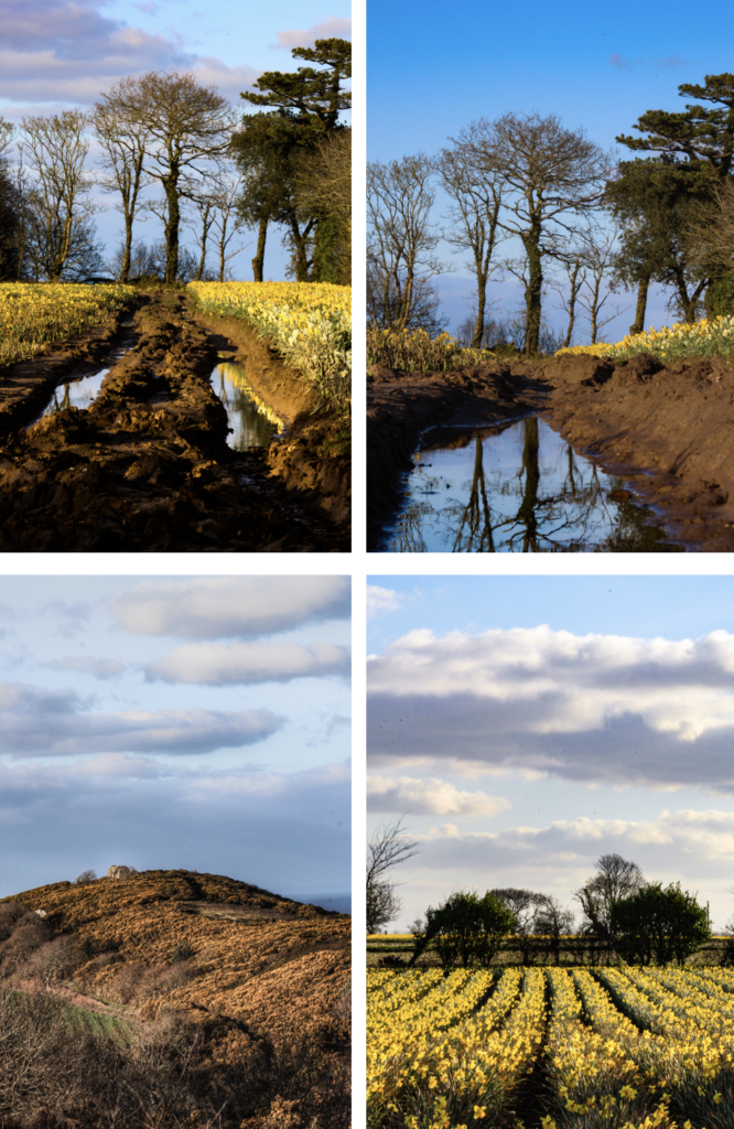
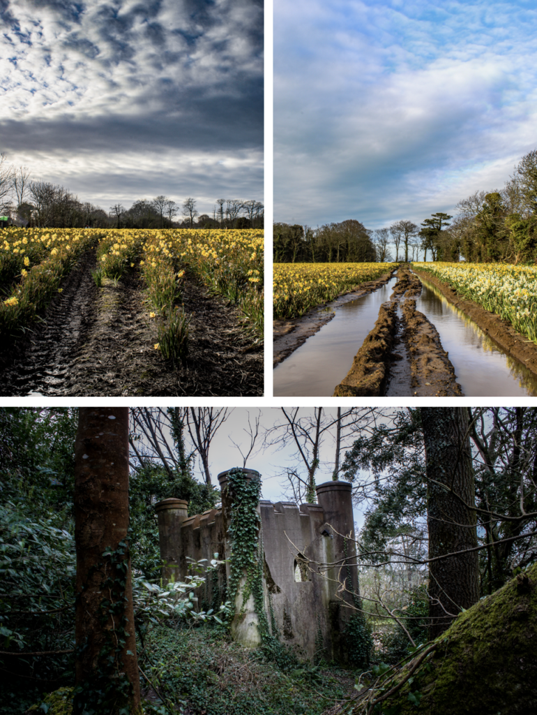
This is my favourite one alongside the castle image. The image has high details in the highlights and shadows which creates a nice depth in the mud and rows of flowers. The tractor marks creates leading lines that focus on the tree that is centred in the image, as well the rule of thirds composition is used as the horizon rests on the bottom 3rd of the image. The colours are vibrant and isn’t over saturated, which is what I was worried about creating the HDR image.

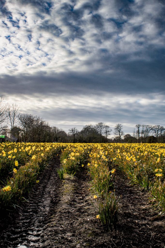
This image I wanted to create a moody atmosphere, as it was cloudy, so I added a gradual filter to the sky using a camera raw filter in Photoshop, and added a high dehaze, clarity and darkened the shadows to bring out the detail in the sky. After I added a more detailed texture to the ground to match the scene I created with he sky. By using the rule of thirds it makes it so that the yellow flowers aren’t all visible making it not destroy the grumpy atmosphere with contrast of happy flowers.

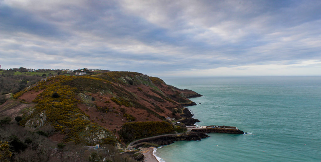
I wanted to show the scale of the coast in this image, by including the small pier as the comparison. There isn’t much detail in the clouds which makes you focus on the actual terrain, which is the effect is wanted to created. I love the different shades of blue coincide with each other, and how the water is a nice turquoise colour, where as the sky is a deeper blue.

This image is a normal landscape image that looks like it would be a screensaver on a computer. I feel that there is a motion in the clouds which move horizontally, this also exaggerates the integrity in detail in the clouds, which could suggest a more complex understanding to just a picture with pretty flowers and cool clouds as the have this “heavenly” look to them.

This is one of my favourite images. I was going for the abandoned look, so I made the camera tilt to the side so it looked like the castle was left and abandoned quickly, the visual aesthetic of overgrown ivy and vegetation adds a strong characteristic to the effect I was going for. The detail that the HDR image provided really helped show how the walls were washed out and how dense and compact the forest was. Overall, I’m really happy hoe this tuned out as I want planning to photograph this until suggested by family. The colours aren’t super saturated as it would have ruined the worn down look.

The sunlight was disappearing, therefore it was breaking through he clouds in the formation of rays, I thought this would be a good experiment of exposure bracketing as the were a steep difference between lights and darks, eg the sunlight and the forest line. I went for the moody evening vibes, when editing this photo. So I added a gradual filter to decrease the dehaze in the sky and underexpose it, then a radial filter to increase the temputerure of the rays of light to add more emphasis to it. The foreground is a bit blurry as the flowers were sawing in the wind. This is due to the 3 images being combined into one with a o.5 second time interval between each shot. Even with photoshop auto-align software is was not able to fix this, as the sky as-well as most the image was aligned, due to the tripod I used. I am pleasantly pleased how this turned out and like the aesthetic it gives off.

My Images

These were the good images from my combined photoshoots.

Best Images

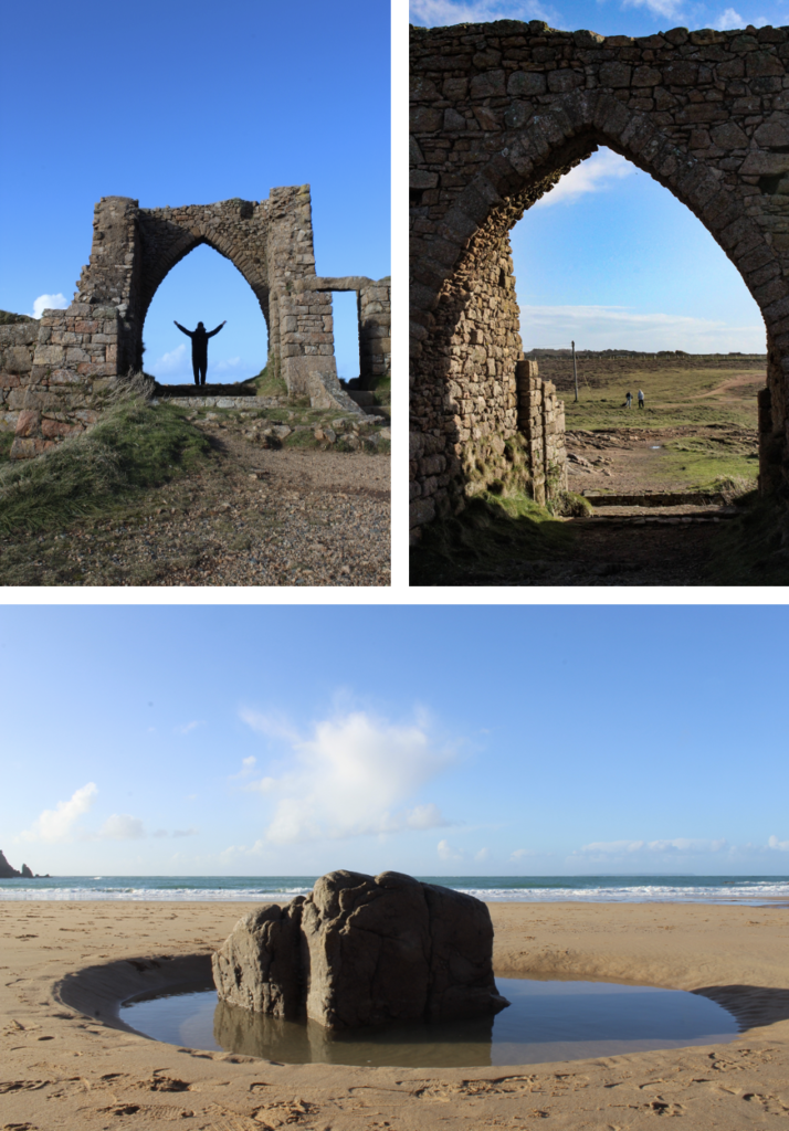
These were the final best images for the 4 Photoshoots that I did. They were all edited in Photoshop and occasionally Lightroom.

This set of images are the HDR images that I have previously explained what I like about them. Although these are my favourite 3, due to high detail and preservation of the colour almost an exact replica to real life.

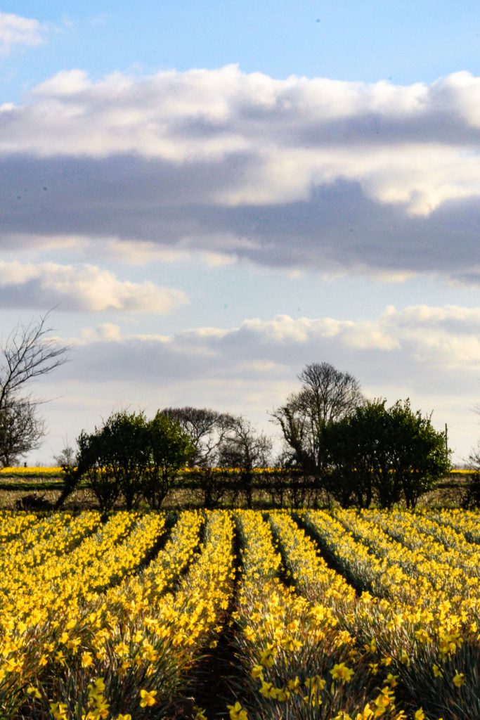
This image shows the linear pattern in the daffodil field, which contrasts between the irregular patterns in the clouds. The highlight on the clouds make it seem like this is an old pattern in the style of Picasso. The colours are nice and vibrant, which gives off a positive atmosphere.

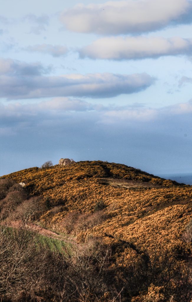
This image has that vintage feel to it, as the clarity is high, which brings out all the discoloured vegetation on the hill. The small cottage is marked using the rule of thirds composition terchnique. Similarly, this image also include detailed clouds, which was achieved by using a gradual filter in Photoshop.

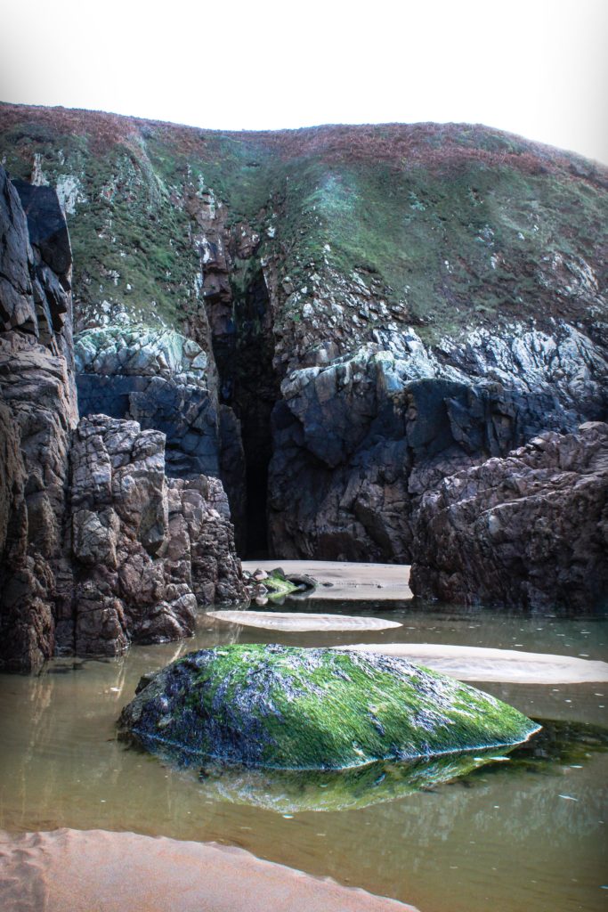
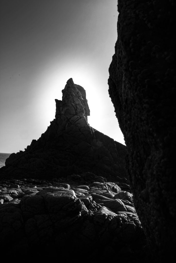
I wanted to focus on the highlights in this image, so I gave the tip of the rock a halo effect, as that was where the most light was. The increased clarity makes this image in the style of Ansel Adams, as he uses highly detail images mostly including rocks in all of his photos. The light was coming from the top right which makes for some unique shadows which I brought out by decreasing the darks and increasing the contrast. I like how it turned out as it feels mysterious and magical, probably due to the irregular shape.

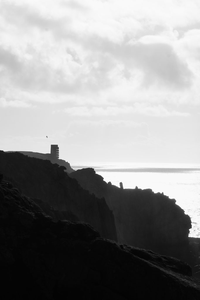
This image clearly shows the jagged cliffs catching the shadows of the cloudy afternoon. The foreground is dark, but as the cliff gets further away it gets lighter. This helps add more depth to the image. The tower is visible as it doesn’t fit into the landscape, which helps identify it as the main focal point. The clouds are slightly overexposed, although you can still see the texture in them. Overall I really love as the composition is good as it focuses on something in the distance and also include the natural part of Jersey.

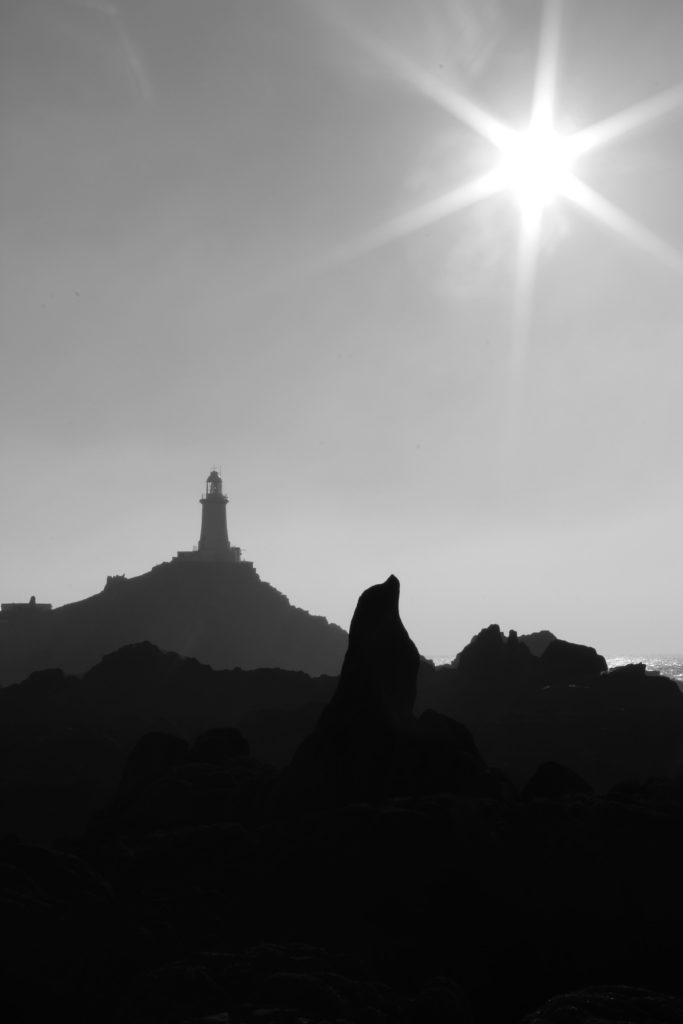
The 3 levels of dark tonal values, is what makes this image stand out. It consists of the blacks in the foreground, with the grey behind it, then finally to the light-grey figures in the background which the lighthouse is apart of. Overall the harsh contrast between the sky and the rocks juxtapose each other against light and dark. I achieved the star effect caused by the sun, by using a high f-stop value, eg. f-32.

Ansel Adams Comparison With My Own Image

Similarly, both mine and Adams images are of a natural landscape, which display rock formations. Both include a dark portion of the foreground on the side of the image. Although, Ansel Adams image uses scale to exaggerate how large the mountain is, by including the moon, which is a huge natural satellite.

A black and white filter is used on both of the images.  Ansel Adams has covered the whole of tonal zone system, going from 0, being black through to 10 being white, displaying different shades. This really puts emphasis on the highlights as it creates a high harmonious contrast, which also brings out the structure int the image.

Likewise, both images use natural light produced by the sun, as the images were taken in daylight. Adams image has a gentle feel to it as the light has a gradual fade from white to black, which gives off a calm but expressive atmosphere. Compared to mine which has a more abrupt, intense change in tone and light, which produces a more energised atmosphere. However, mine could signify hope, as most of the image is in the negative colour; black, that expresses a more sad, depressing mood. Except for the “halo” at the top of the rock, which is like the light at the end of the tunnel, and-that means that there is a delicate, alive essence to this photo.

rural landscape photoshoot

ACTION PLAN

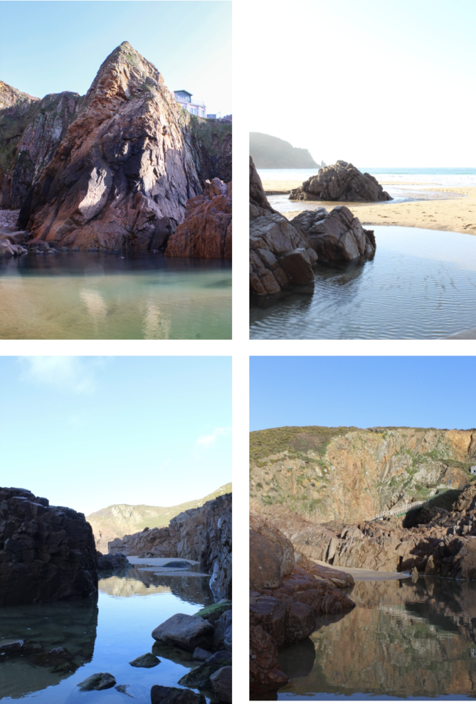
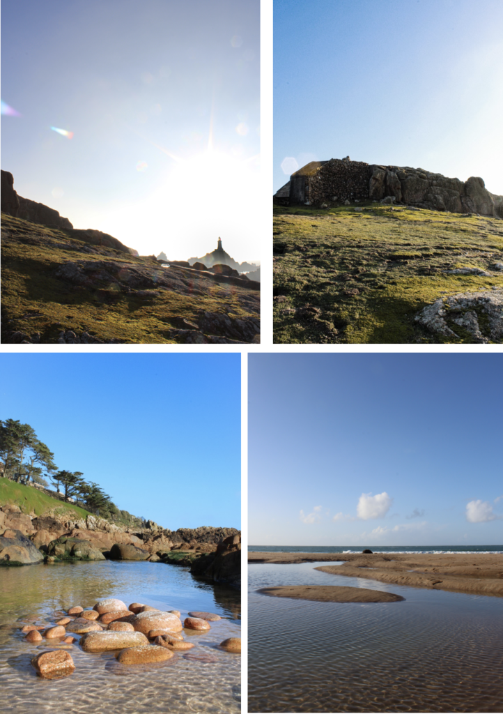
LOCATIONS – North coast cliffs ( Grosnez, Plemont, Portlet ), St Ouen’s ( sand dunes ), rocky beaches ( Archirondel, Green Island, La Hocq, La Rocq ), fields.

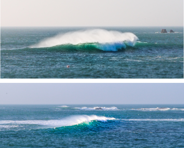
WEATHER / LIGHTING – Foggy, misty, sunny, bright, rainy, cloudy, stormy, windy, overcast, sunset, sunrise.

CAMERA SETTINGS / VIEWPOINTS – Bird’s eye, worm’s view, straight on / eye level, through trees, ISO, shutter speed, different exposure levels.

ARTIST REFERENCES – FAY GODWIN

MY RESPONSE – CONTACT SHEETS

FINAL IMAGES

EDITING – BLACK AND WHITE

ARTIST COMPARISON

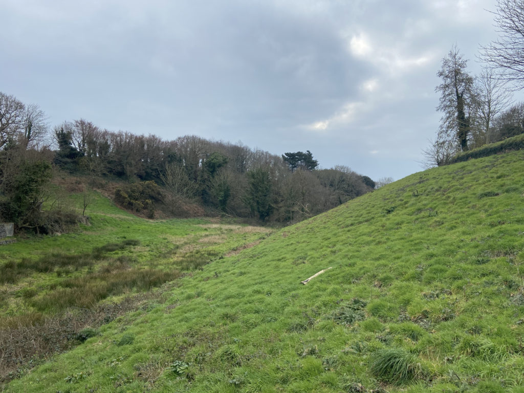
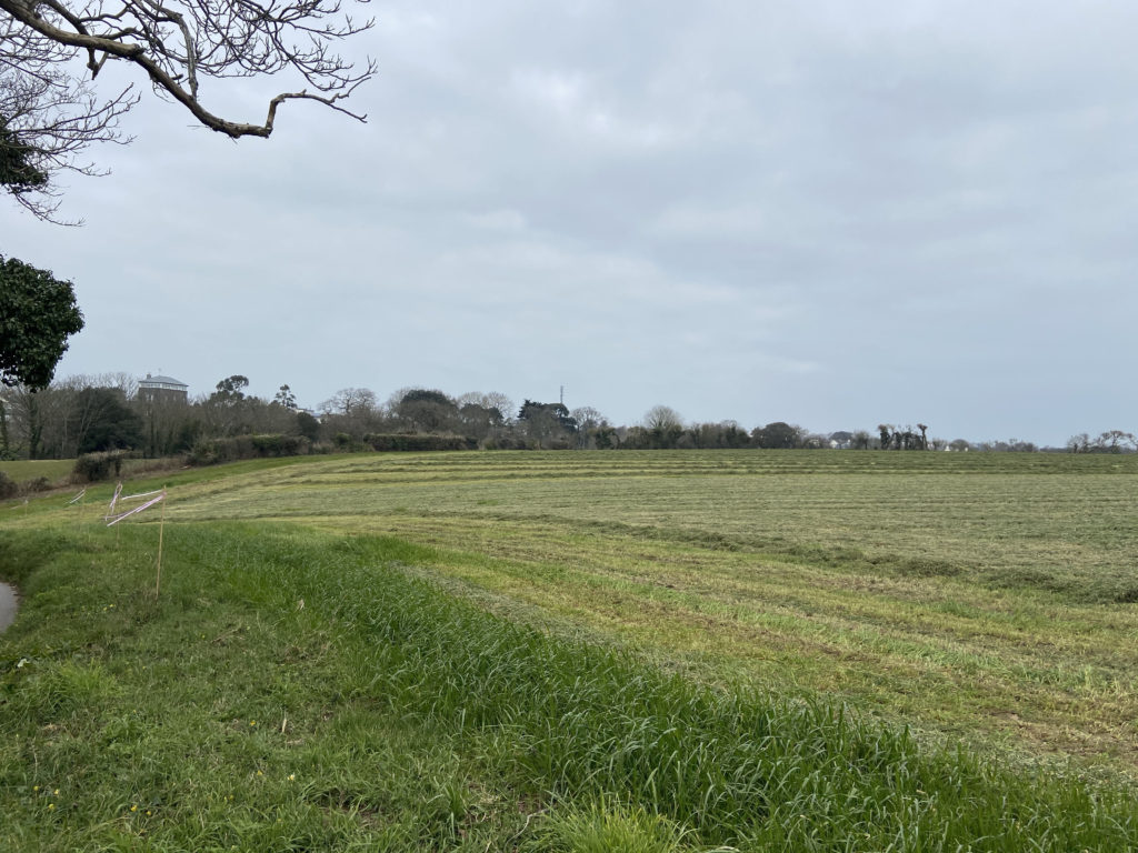
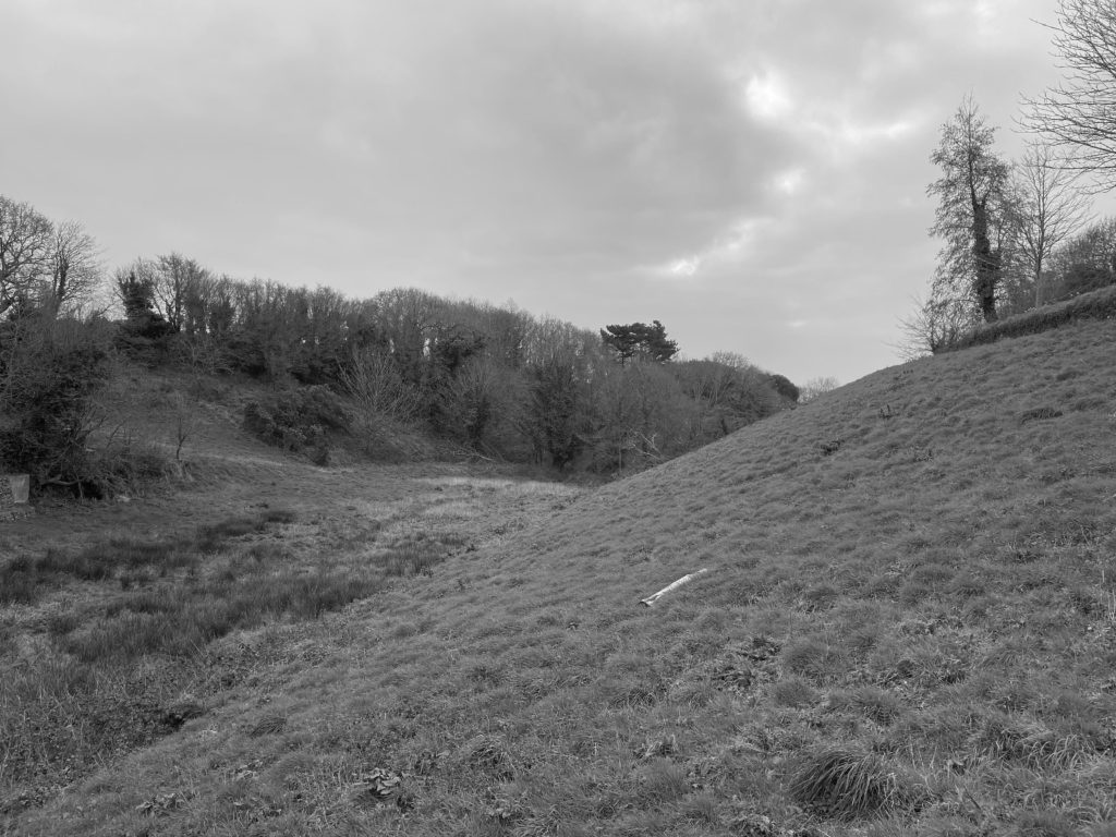
When taking my photographs I tried to always refer back to Godwin’s work, and I went to places and locations which looked similar to those in her own images. For example, in the photograph above I shot in a field that looked close to the one in her own image. There are many similarities between these two photographs, one being that the landscape is sloping downwards in both images. Fay Godwin has captured the slanting landscape in the background of her photograph, whilst in mine it is in the foreground. I aimed to keep my image as real and unedited as possible just as she had done in order to give the viewer a real depiction of the environment that I was in. The weather conditions in the two photographs are very similar, with the clouds in the background creating a moody and melancholy atmosphere. Additionally, the white colour of the clouds contrasts with the darker tones of the trees and the grass. The lines that appear in both of these photographs are natural and curvy, which shows how the environment hasn’t been touched or changed. If this was the case, there would be straight, rigid and repetitive lines, which is something that Godwin wanted to avoid in her images. I think that my final photograph successfully shows influences of Fay Godwin’s work, and that both images portray the same mood and feeling to the viewer.