Category Archives: Independent

Filters

Author:
Category:

Naomi White artist study (anthropocene)

Naomi White

Naomi White - 98 Artworks, Bio & Shows on Artsy
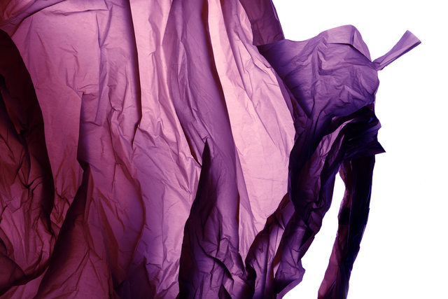
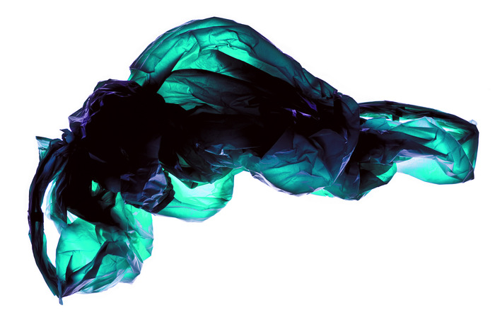
From “Plastic Currents” Series – Naomi White (2012)

Naomi White is an activist artist and educator who’s work focuses on ideas at the intersection of political ecology and photography. White’s aim in photography is to bring to light the issues that humanity is creating for the planet and the detrimental health of our ecosystems. She also documents the social issues of racism and the capitalist model of domination between unequal societies. White has achieved awards such as the PDN’s Objects of Desire Award, holds an MFA in Photography and Related Media from SVA in New York, and has participated in exhibitions throughout North America and Europe, as well as having her work published in The Brooklyn Rail, Fayn and Uncertain States. Naomi White is currently the Chair of Photography at the New York Film Academy in Burbank, California.

https://www.naomiwhite.com/about

Examples of Naomi White’s work

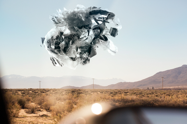
Naomi White | Engulfed, Plastic Currents (2012) | Available for Sale | Artsy
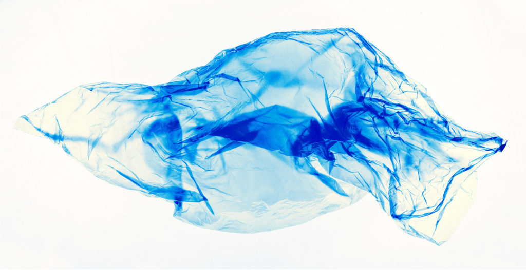
From “Plastic Currents” Series – Naomi White (2012)
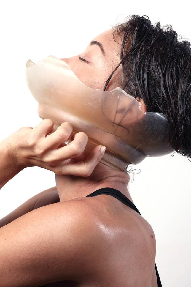
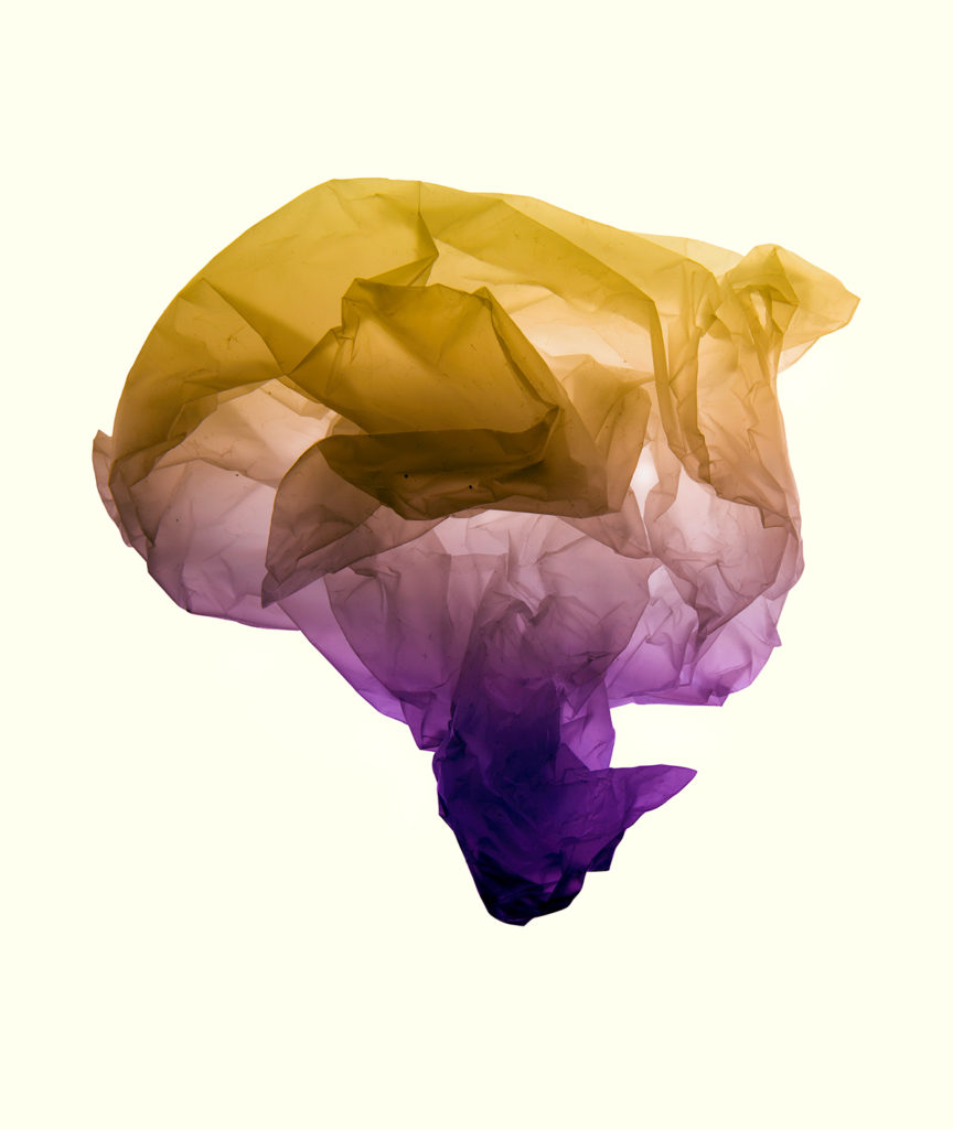
Naomi White | Shipwrecked V (2017) | Available for Sale | Artsy
“Shipwrecked V” – Naomi White (2017)
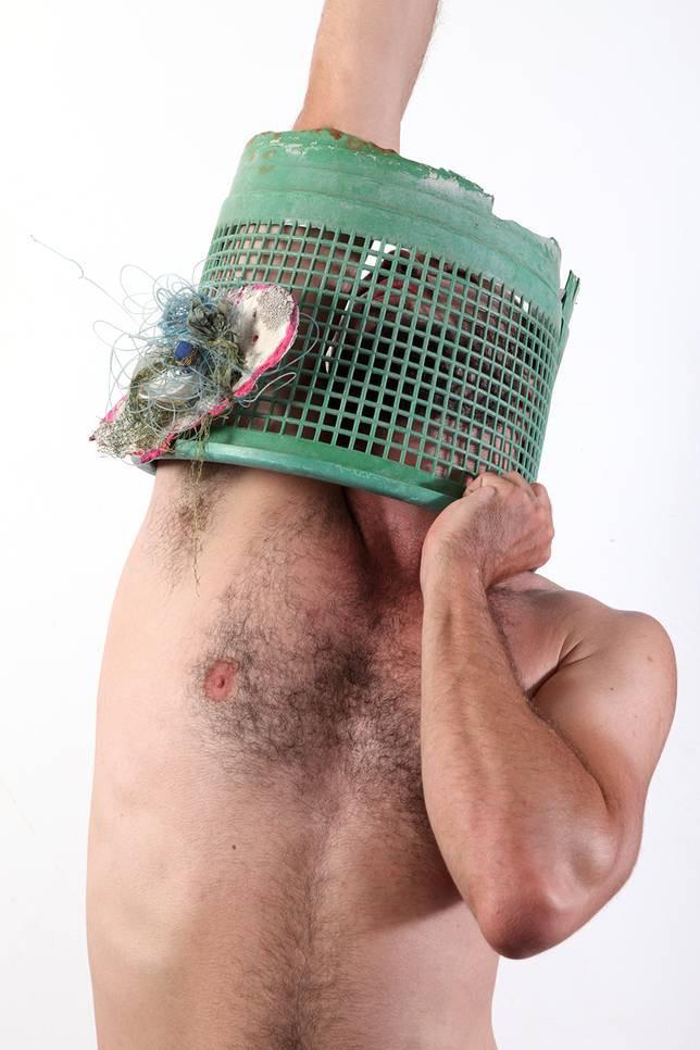
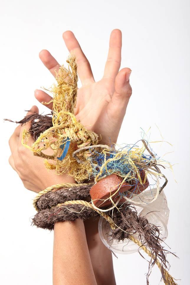
Naomi White | Argument with a surface VI (2018) | Available for Sale | Artsy
“Arguments with a surface VI” – Naomi White (2018)

Analysis of Naomi White’s work

Naomi White @ artavita
From “Plastic Currents” Series – Naomi White (2012)

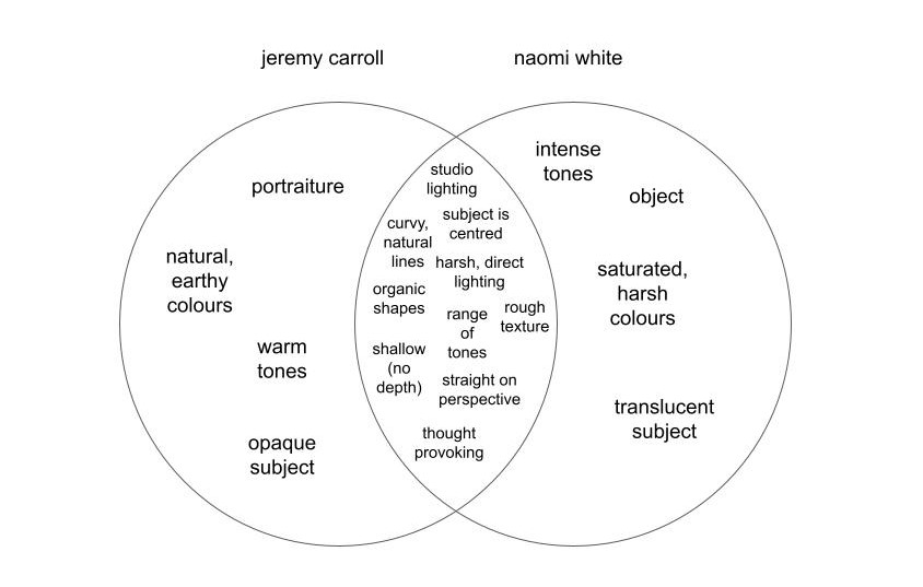
This image by Naomi White is part of her series which she developed in 2012, named “Plastic Currents”. The image depicts a plastic bag, lit with intense, harsh studio lighting in order to provide an almost abstract affect. This series was part of a movement created to raise awareness for sea pollution and the overall harm that humans have created to the planet.

The lighting in this image is extremely harsh, creating very intense highlights and shadows that are projected throughout the curves and folds in the bag. The lightest areas of the image can be seen around the edges of the plastic bag, which creates a jarring juxtaposition between the light and dark tones. The lighting is artificial and has been created using studio lighting, presumably projecting from underneath the object as the raised sections of the image are in darkness.

There is no use of line in this image, although the object that is being photographed, there is no form of repetition. On the other hand there could be said to be an outline to the object, as the bag has been crumpled and the outlining of the bag has various points of light and dark shading.

There is no form of repetition within this image as the focus of the project is to raise awareness of sea pollution, rather than creating abstract patterns.

Although the object is man-made, the shape of the object is still some-what organic and curved as the photograph has been taken of the bag out of it’s natural state in which it was first made.

The depth of field is impossible to state as the background is compiled of simple empty, negative space. The only representation of positive space is the bag itself, though it still has very little detail and only consists of folds and juxtaposing shadows and highlights.

The texture of the image is contrasting, as the rippled folds in the bag create a slightly rougher texture when compared to the flattened sections of the bag which display a smooth texture. However the representation of texture is not the main focus of this image.

There is a range of tones from dark to light within this image. The darkest areas can be seen mainly towards the centre of the bag, however they do begin to form strands of darkness as the viewers eyes cast away from the centre of the bag. The lightest areas can be seen around the edges of the bag, where the plastic material is less concentrated and therefor can let in more light.

There is a rather uniformed colour palette within this image, as it consists of whites, blues and blacks. the colours are saturated in some areas of the image as the man-made plastic has an artificial blue tone to it. The dominating colour in this photograph is blue, but this is juxtaposed with the dazzling white background and the intense black shadows. If the image were in black and white it would become more abstract as the plastic material could not be detected and the viewer may mistake it for another material such as paper. This would mean the aim of the project would not come across quite as prominent as the audience would struggle to work out the type of material being photographed.

There is a very simple composition to this photograph, although it does not purposely follow the rule of thirds. The focal point of the back is found mostly within the middle third of the image, with the remaining thirds being filled with negative and empty space. The image is rather unbalanced as the majority of the positive space is concentrated into the centre of the image.

anthropocene case study + comparison

JEREMY CARROLL

Jeremy Carroll is a London – based artist and photographer who aims to raise awareness of the Earth’s growing plastic pollution problem by photographing his subject with various plastic objects such as fishing nets, ropes and plastic bags. His 2017 exhibition ‘Entanglement‘ depicts human beings caught up in the waste which is commonly found in seawater and along beaches. With the way things are going, the Ellen MacArthur Foundation predicts that there will be more plastic than fish in the sea by 2050. Carroll’s approach to this pressing international issue is to allow his human subjects to take the place of the various marine life which is constantly being affected by the plastic in the world’s oceans, such as turtles, dolphins, and sharks. By doing this, he hopes that more people around the world will be convinced to reduce their intake of single – use plastics and switch to more environmentally friendly and sustainable alternatives.

NAOMI WHITE

Naomi White is an intersectional feminist, artist, and educator, working on ideas at the intersection of political ecology and photography. Focusing on the transformative power of photography to affect desire and change, much of her work questions how we can shift our focus away from the current racist, capitalist model of domination to one of equity and collective voice, for the sake of all people, animals and the planet. Her work has been shown throughout North America and Europe, and is held in both public and private collections. White’s work draws from a diverse background in art history and film, investigating themes of identity construction in our camera-bound world, focusing on how photography affects materials, memory, and culture. 

ARTIST COMPARISON

Introduction – New Topagraphics

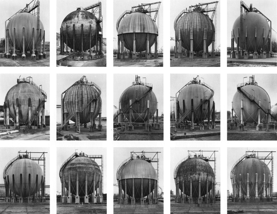
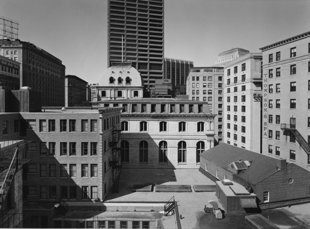
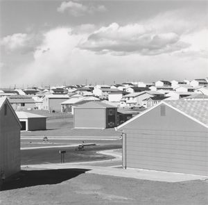
“New Topographic”, a term coined in 1975 by William Jenkins which referred to a photographic movement undertaken by a group of American photographers whose works had a similar look – mostly uniform, black and white urban landscapes.

Some of the photographers associated with this movement where Robert Adams, Lewis Baltz, Nicholas Nixon and Bernd and Hiller Becher.

The movement captures mans impact, they photographed urban landscapes such as garages, parking lots, warehouses in a similar way to how early rural landscape photographers would shoot natural landscapes.

As environmentalism took hold of the public conscience in the 1970s landscape photography began to capture natural landscapes and human activity as a singular connected body.

New topographic pieces captured the essence and beauty of these depressing, mundane, industrialized landscapes. This aura created around the aesthetic of these images is an ironic juxtaposition to the unease the photographers felt about mans erosion of the natural environment. This was represented in their work from the emotional disparity they created in their pieces with a lack of human presence, flat contrast, lowkey tones, centred framing and unassuming depth and lighting.

On the other hand this divide they portrayed between man and nature was done with aesthetic precession. The Artists that made up the new topographic noticed how there seemed to be a sense of obscenity around photographing these urban landscapes. There was a sort of fear man had around looking at its own creations. They wanted to highlight this by photographing the urban and providing it with an aesthetic… The photographers created beauty in these images by shooting from a unique viewpoint. They shot with a deadpan aesthetic in mind and looked for sharp angles or structural elements.

what is anthropocene?

The Anthropocene defines Earth’s most recent geologic time period as being human-influenced, or anthropocentric, based on overwhelming global evidence that atmospheric, geologic, hydro-logic, biospheric and other earth system processes are now altered by humans. The word combines the root “anthropo“, meaning “human” with the root “-cene“, the standard suffix for “epoch” in geologic time. The Anthropocene is distinguished as a new period either after or within the Holocene, the current epoch, which began approximately 10,000 years ago (about 8000 BC) with the end of the last glacial period.

ANTHROPOCENE IN PHOTOGRAPHY

Many photographers around the world have used Anthropocene as a stimulus and a trigger point for various projects, which for the most part aim to create and spread awareness on several issues such as climate change, plastic pollution, poverty, urbanisation, overpopulation, and open cast mining.

‘ Burtynsky’s latest exhibition, The Anthropocene Project, is directly influenced by the proposed new geologic era ‘Anthropocene’ – introduced in 2000 by chemist and Nobel Prize winner Paul Jozef Crutzen, to represent a formal recognition and acknowledgement of the “human signature” on the planet. Experts argue that the end of the current epoch has been marked by striking acceleration since the mid-20th century of carbon dioxide emissions and rising sea levels, the mass extinction of global species, and the transformation of land by deforestation and development. Burtynsky hopes to demonstrate this. “Scientists do a pretty terrible job of telling stories, whereas artists have the ability to take the world and make it accessible for everyone,” says the 63-year-old. “We are having a greater impact on the planet than all the natural systems combined. I’m trying to let people know that.” ‘

Anthropocene Introduction and statistics

What is Anthropocene?

The Anthropocene Epoch is a unit of geologic time used to describe the period of time in which human beings began to make a significant, negative impact on the earth’s climate and ecosystems.

Anthropocene in photography is a form of activism that photographers have used in order to raise awareness of how us humans are impacting the planet. This type of photography is shown in all forms of landscape, portraiture and abstraction.

Examples of Anthropocene –

Landscape Anthropocene

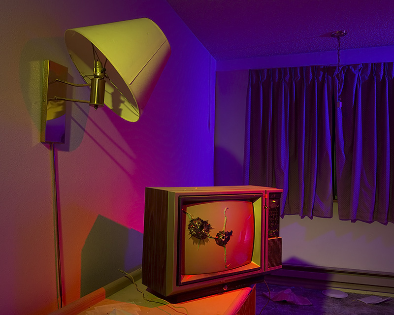
Bobby Peru's Room” 8×10 Print | Lost America
“Bobby Peru’s Room, Abandoned motel, Mount Montgomery, Nevada” – Troy Paiva (2013)

Abstract Anthropocene

Mandy Barker | Lost At Sea (2016) | Available for Sale | Artsy
“Lost At Sea” – Mandy Barker (2016)

Portrait Anthropocene

Memories, 2019
“Memories” – Darian Mederos (2019)

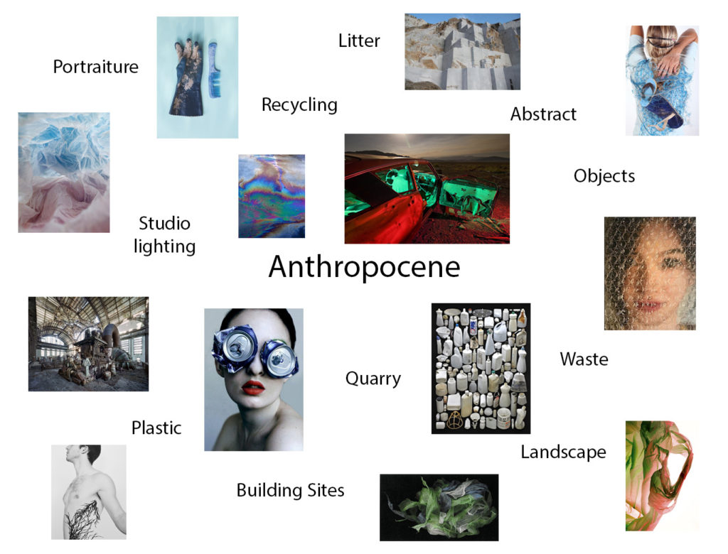
Anthropocene inspired mood board

Plastic waste statistics

For my Anthropocene themed photoshoots, I want to focus on the aspect of plastic waste as I feel like plastic pollution is an instant thought when it comes to the topic of Anthropocene. Plastic pollution also has a direct link with both air pollution and sea pollution, which makes it one of the most threatening methods of destruction to both humanity and our environment

Nearly 300 million tonnes of plastic waste is produced every year, this almost equals the combined weight of the total human population. Ocean life suffers immensely due to this, which is proven by the fact that 73% of all litter on beaches worldwide is plastic, which has caused the tragic statistic of 1 million marine animals dying due to plastic pollution every year.

Although masses of plastics are produced globally on a daily bases, only a tiny portion of this is recycled, further generating plastic waste. The disregard for recycling plastic has lead to the suggested statistic that there will be 1.3 billion tonnes of plastic garbage discarded on land and in bodies of water by 2040.

ANsel Adams Comparison

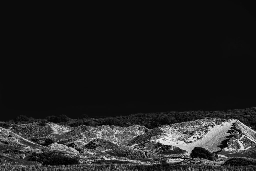
Above are two rural landscape images. The image on the left was shot by American photographer Ansell Adams and the right by myself.

Both images feature a low key, greyscale profile. The use of an ND filter and specific film allowed Adams to create an image with dominant dark tones whilst still allowing for the counteractive sharp highlights to come through in the image. I recreated this by shooting with a large aperture to include as much data in the image as possible and then altering the saturation and temperature of the image in post production. These methods allow for both images to feature a highly romanticized landscape. For example the dramatic moon in the center of a dark, almost fully black sky tucked behind a whisping blanket of clouds which are being pierced by a gathering of sharp snowy mountains is a typical depiction of an exaggerated, sublime landscape.
Both images feature a large tonal range from the dark sky’s and foliage to the white mountains and sand dunes.

Both images have similar form with the empty sky taking up two thirds of the image with the bottom of the image being filled.

They both contain a strong leading line horizontally through the image

Conceptually, both these images represent the idea of death and moving on. The images both feature dark, mournful tones. Adams image features a graveyard symbolizing death and my image contains a sublime landscape which was once flourishing but is now more baron symbolizing life and death. The images both feature bold horizons which alludes to the idea of “new horizons” and moving on from death.

altered landscapes

You may wish to intergrate the concept of altered landscapes into your project based on Anthropocene.

You could develop a set, sequence or group of final images.

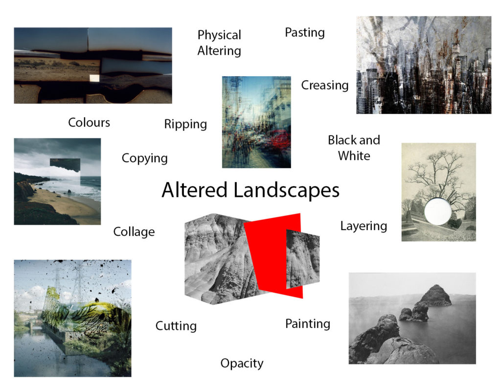
You may choose to employ a range of creative and experimental techniques (digital and traditional) to create your new environments…

  • Creating changed, changing or altered landscapes
  • Creating altered landscapes by combining a range of images in Adobe Photoshop
  • Explore panoramic landscapes
  • Using photo montage/cut-n-paste techniques and printed matter (combine your own images with images from the internet, magazines, print-outs, newspapers etc)

You may already have a range of suitable images to start your designs…but may need to find additional images to work from:

Here are some examples to help inspire your ideas…

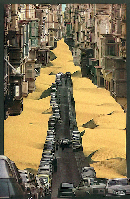
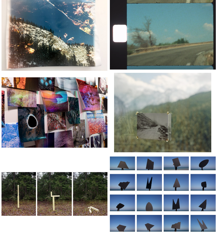
Tanja Deman
Image result for panoramic landscapes contemporary photography david hockney
David Hockney inspired “joiner” photographs
3-d / dioramas
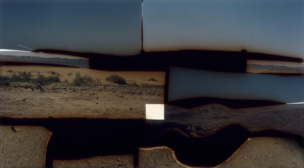
Dafna Talmor’s Constructed Landscapes
Felicity Hammond
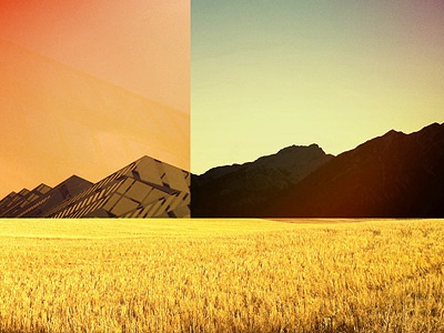
Beomsik Won
Surrealist approaches
Jesse Treece
Krista Svalbonas

Paint directly onto photographs, as in these works by Gerhard Richter:

Gerhard Richter overpainted photographs
Gerhard Richter has painted over 500 of his own photographs (with many more works discarded): commercially printed images that are overpainted with spontaneous gestural smears, using leftover oil paint applied with palette knives, squeegees or doctors’ blades. In the examples above, the thick painted lines divide the composition and inject colour into what is otherwise a rather drab interior scene. The paint disturbs the viewer – shatters the illusion that we are quietly observing a scene – pulling our attention to the tactile surface and smear of texture in front of our eyes.

Combine paint and photographs digitally, like Fabienne Rivory‘s LaBokoff project:

Fabienne Rivory photography
This project by Fabienne Rivory explores interactions between imagination and reality. Selecting photographs that represent a memory, Fabienne digitally overlays a gouache or ink painting, introducing an intense vibrant colour to the work. Students might like to experiment with this idea by creating a photocopy of a work and applying ink or watercolours directly (watery mediums will not ‘adhere’ to an ordinary photography surface).

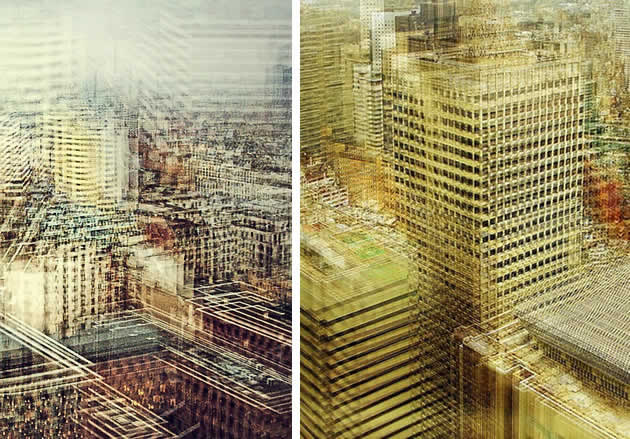
Overlay multiple photos from slightly different angles, like these experimental photographs by Stephanie Jung:

experimental digital manipulation photography by Stephanie Jung
Stephanie Jung creates stunning urban landscapes, overlaying near-identical city scenes that have been taken from slightly different angles, at different transparencies and colour intensities. The repeated forms (buildings / vehicles / street signs) suggest echoed memories, vibrations of life; the ebb and flow of time.

Cut out shapes and insert coloured paper, as in these photographs by Micah Danges:

photography with cut coloured paper layers
These landscape photographs by contemporary photographer Micah Danges have separate photographic layers and incorporate stylised abstract elements. The simple strategy of cutting pieces out of a photograph and adding layers of different paper can be a great technique for high school photography students.

Make an photography collage using masking tape, like Iosif Kiraly:

masking tape collage
Whereas the previous photomontage montages involve precise trimming and arrangement of forms, this collage has an informal aesthetic, with visible pieces of masking tape holding it together. This can be a great method for shifting and moving pieces until the work is well balanced and cohesive. Iosif Kiraly’s work explores the relationship between perception, time and memory.

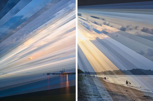
Photograph a single scene over time and join the pieces in sequence, like these composite photographs by Fong Qi Wei:

Fong Qi Wei photography
These photographs are from Fong Qi Wei’s ‘Time is a Dimension’ series, and show digital slices of photographs taken over several hours at one location. The shots above show a seaside in sunrise, with the images organised together in a way that shows the changing light conditions.

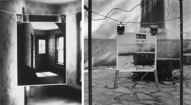
Inset scenes within other scenes, as in these photographs by Richard Koenig:

richard koenig photography
Richard Koenig hangs a print and rephotographs this in its new location, creating intriguing illusions of space within space. Perspective lines within the two images are aligned to create optical confusion, so the viewer is disconcerted and unsure about the separation of the two spaces. His work often features intimate, private moments inset within generic, impersonal, public environment.

Back to the Future

http://www.marinacaneve.com/en/portfolio/are-they-rocks-or-clouds/

Constructed Seascapes

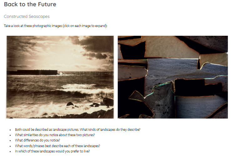
Take a look at these photographic images (click on each image to expand):GUSTAVE LE GRAY – THE GREAT WAVE, 1857. ALBUMEN PRINT FROM COLLODION-ON-GLASS NEGATIVE.DAFNA TALMOR – FROM THE CONSTRUCTED LANDSCAPES II SERIES. C-TYPE PRINTS MADE OF COLLAGED COLOUR NEGATIVES

  • Both could be described as landscape pictures. What kinds of landscapes do they describe?
  • What similarities do you notice about these two pictures?
  • What differences do you notice?
  • What words/phrases best describe each of these landscapes?
  • In which of these landscapes would you prefer to live? 

A bit of research…

Read the following descriptions about the making of these images:

Gustav Le Gray – The Great Wave, 1857Dafna Talmor – from Constructed Landscapes II
‘​The Great Wave’, the most dramatic of his seascapes, combines Le Gray’s technical mastery with expressive grandeur […] At the horizon, the clouds are cut off where they meet the sea. This indicates the join between two separate negatives […]Most photographers found it impossible to achieve proper exposure for both landscape and sky in a single picture. This usually meant sacrificing the sky, which was then over-exposed. Le Gray’s innovation was to print some of the seascapes from two separate negatives – one exposed for the sea, the other for the sky – on a single sheet of paper.This ongoing body of work consists of staged landscapes made of collaged and montaged colour negatives shot across different locations, merged and transformed through the act of slicing and splicing […] ‘Constructed Landscapes’ references early Pictorialist processes of combination printing as well as Modernist experiments with film […] the work also engages with contemporary discourses on manipulation, the analogue/digital divide and the effects these have on photography’s status. 

Blog Posts This Week…

  1. Research Altered Landscapes and produce a definition/explain what they are.
  2. Produce a Case Study about your chosen altered landscape photographer, include an analysis of one key image. Explain/show how this has inspired your ideas and process.
  3. Show your images, process, editing, selection, final outcomes and evaluation.

Click this link below for more resources…AS-PHOTOG-LANDSCAPE-guide-V2-JACDOWNLOAD

Remember to follow the 10 Step Process and create multiple blog posts for each unit to ensure you tackle all Assessment Objectives thoroughly :

  1. Mood-board, definition and introduction (AO1)
  2. Mind-map of ideas (AO1)
  3. Artist References / Case Studies (must include image analysis) (AO1)
  4. Photo-shoot Action Plan (AO3)
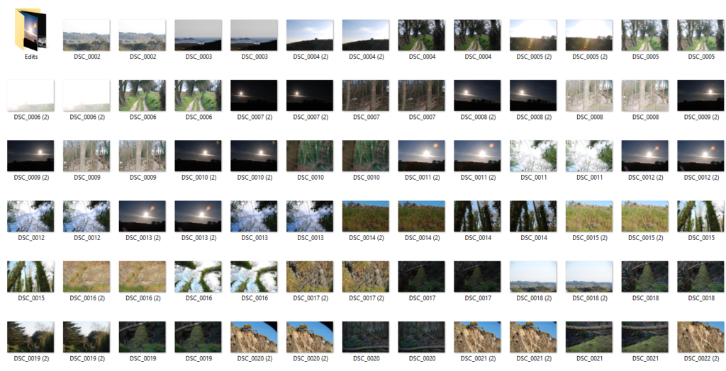
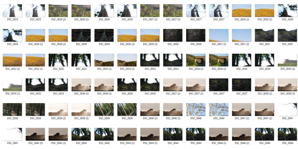
  5. Multiple Photoshoots + contact sheets (AO3)
  6. Image Selection, sub selection (AO2)
  7. Image Editing/ manipulation / experimentation (AO2)
  8. Presentation of final outcomes (AO4)
  9. Compare and contrast your work to your artist reference(AO1)
  10. Evaluation and Critique (AO1+AO4)

Final Display

Contact Sheets

Final Edits

Exposure Bracketing Technique

The above is an example of where I used a technique called exposure bracketing.

This is when a triptych or series of photos of the same landscape is taken but each with a different exposure.
I did this by positioning the camera, with a tripod in the exact same place. I then took the tree photos but each time changing the ISO. The first photo was had an ISO of 500 the second of 300 and the third 120. I then sliced and collaged the three images into one.

Urban Photography

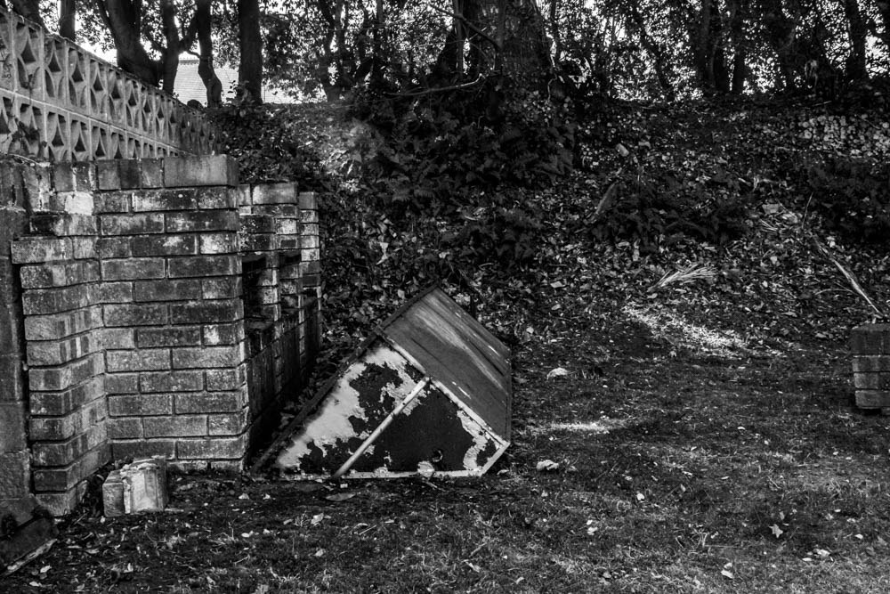
For this shoot, we went around the sports block and round highlands.

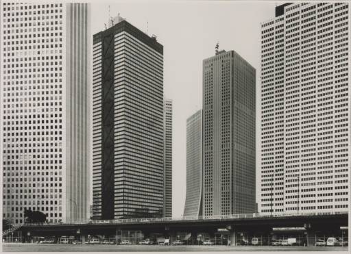
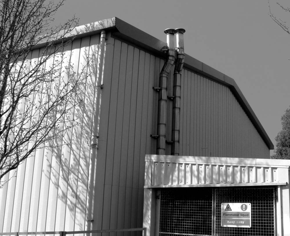
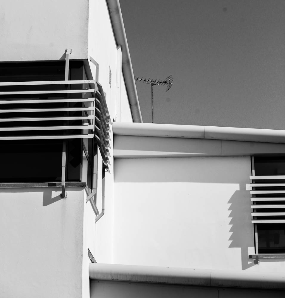
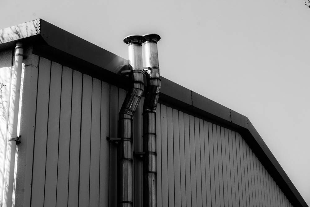
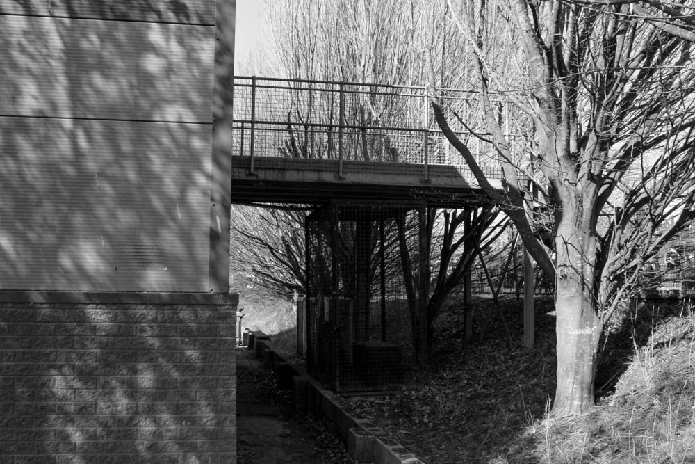
While walking around the sports building I focused on the grids and vents on the side of the building. The sports block is very monotone which relates back to New Topographics, where images were taken with the main subject of man made buildings rather than natural landscapes.

SEE MORE: https://www.tate.org.uk/art/art-terms/n/new-topographics

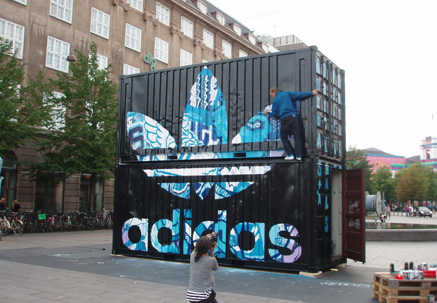
Street Art

Definition: Artwork that is created in a public space, typically without official permission

Street art is very common in urban areas. It is also done for multiple reasons;fun, advertising and they can also have a political message behind them.

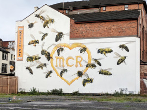
For example, the image on the left was made as a mural after the Manchester Bombing at the Ariana Grande concert in 2017. The bees around the heart represent the 22 victims of the attack.

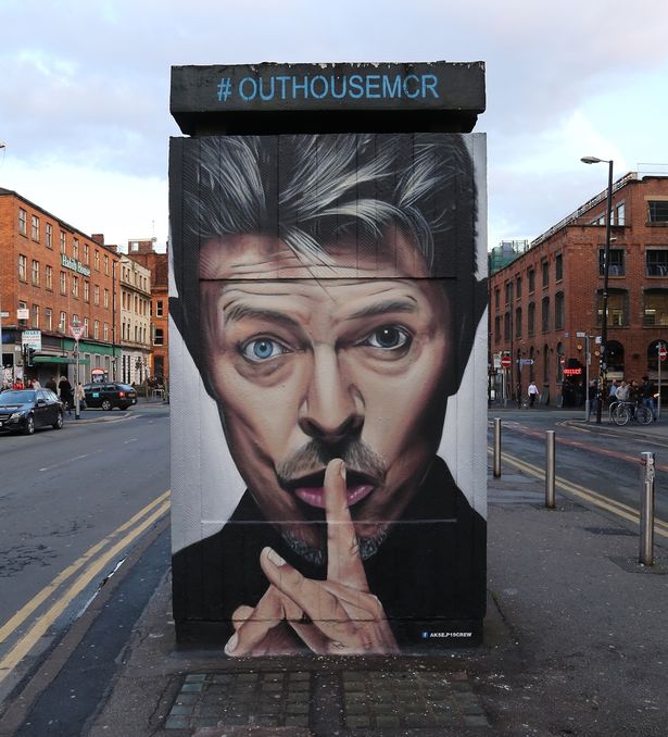
The middle image is an image of David Bowie that was painted onto the side of an abandoned outhouse in the middle of Manchester.

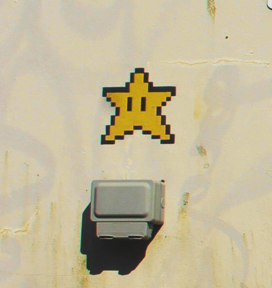
The image on the right is of an advertisement for Adidas painted on the side of two shipping containers.

Images

Architectural Images

Often, industrial photographs show people building and making things – the aim is to capture the manufacturing process and the laborious jobs that are performed by workers.

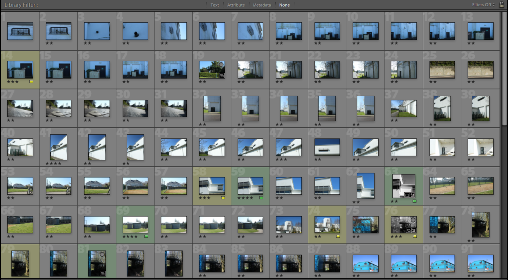
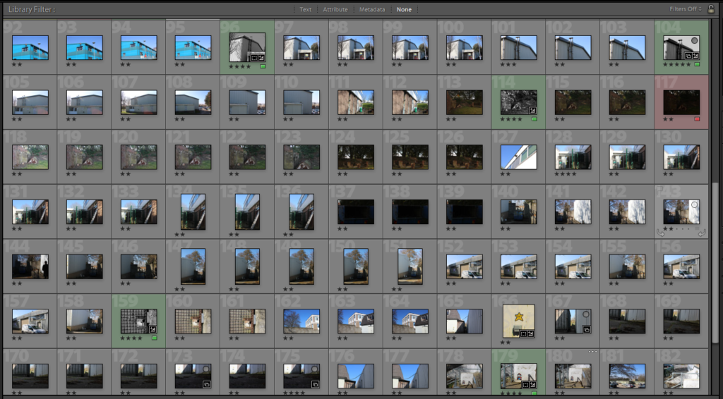
Contact Sheets

This image has an empty alt attribute; its file name is image-98-1024x161.png

Rated Images

Final Images

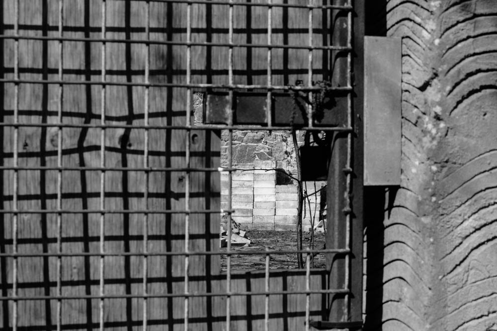
I put all my final images in black and white, I feel like this went well with some of the new topographics work that we looked at before. It also emphasises how all the colours are monotone and dull.

I focused on the man-made aspects of the buildings and the surrounding areas. I took images of things that had repeating patterns and symmetry to emphasise the fact that only man made things have perfect lines. Straight lines do not exist in the natural world.

Altered Landscapes

Altered Landscapes

“Unexpected Geology #18” – Ellen Jantzen (2018-19)

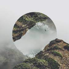
Altered landscapes focus on the process of using photoshop, or physically, in order to change the original composition of a landscape photograph. This may include changing the colours of the image, or in general changing the composition of the photo itself. For example cutting and pasting certain elements or adding forms of repetition or echo to the photograph.

Examples of altered landscapes

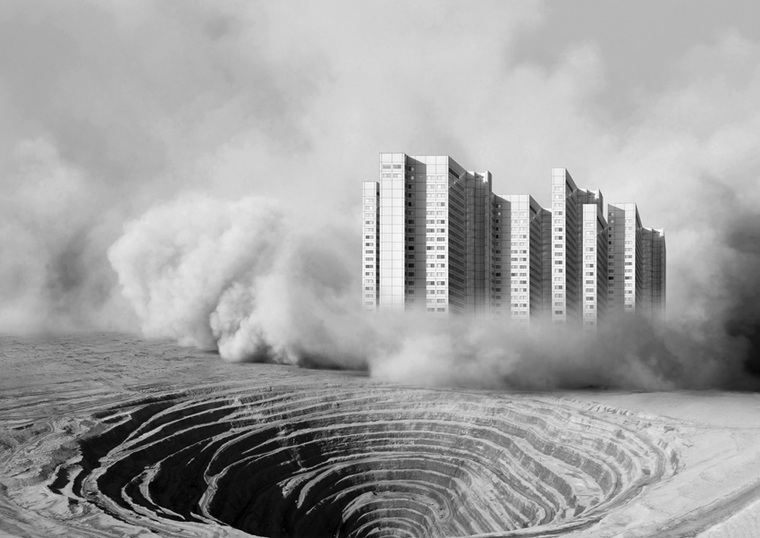
“Dust Storm” – Tanja Deman (2010)
Felicity Hammond - Restore to Factory Settings | LensCulture
Part of “Restore to Factory Settings” series – Felicity Hammond (2014)
New Reflected Landscapes and Photo Manipulations by Victoria Siemer |  Colossal
Part of “Geometric Reflections” series- Victoria Siemer (2015-16)

Altered landscapes inspired moodboard