Category Archives: Independent

Filters

Author:
Category:

anthropocene

Meaning

The meaning of anthropocene is a geological point of view in which humans have started to impact the earth’s ecosystems or even climate change that has occurred within the past years. Therefore, this word fits perfectly into photography as photographers take pictures which can be documented to show the change’s in the ecosystem on the earth in order to show the rest of the world the downfall in the ecosystems and climates changes on our planet.

Ideas (mood-board/ images)

Anthropocene
Landscapes places that have construction undergoing or getting pictures of cranes on site.forests that appears to be damaged which could be done by being abstract. Places in which there are industrial buildings that cause damage to the environment through pollution.
Portraits Someone wearing a bin as a outfit or plastics in general. Using plastics as accessories on the model. After a simple portrait being taken of a model, I could edit some landscapes onto them.
Altered LandscapesPicture of king street with the pavements being sand once edited.Picture of some flats then editing them onto a sand dune. Taking a picture of a forest changing the bright colours into colours that represent negative emotion.

Case Study

The two photographers that I feel explore anthropocene through the genre of photography that I will be choosing is Camilo Jose Vergara and Yves Marchand & Romain Meffre. Down below will be images of the photographers mentioned.

Camilo Jose Vergara Case Study

Camilo Jose Vergara was born in 1944 Santiago, Chile who was a New York based writer, photographer and documentarian.Vergara has been compared to Jacob Rills for his photographic documentation of American slums and decaying urban environments. Vergara applied the technique of rephotographing in a series of American cities, taking pictures of the same neighbourhoods from the exact same point at regular intervals over many years in order to show changes of the neighbourhoods over time. He was a sociologist with a speciality of urbanism, Vergara used this to his advantage to show the public eye the social decay happening across the world.

As you can see from the images above that Vergara has taken, there are a series of neighbourhoods that have decayed over time. This goes to show that he was a great sociologist in urbanism as you can see from the landscapes that the images of the buildings he had taken, decayed over time in the fact that they have been broken down or even abandoned. The pictures display urbanism as in the images there are buildings displayed that either got done up and look more modern, or the building has either been taken down or abandoned. These images that Vergara has taken above fit in perfectly with the topic of ANTHROPOCENE as the images displayed show how “humans have started to impact the worlds ecosystem” due to there being wasted land or space that is taking over the environment for no reason as the buildings appear to have no use to them. Moreover, this shows how humans are damaging the environment as these buildings could very well have better use to them as possible places to make it green again in order to have habitats for animals so that they can be safe and have some better environmental living than some abandoned houses and streets.

Yves Marchand & Romain Meffre Case Study


Marchand (b.1981) and Meffre (b.1987) live and work in Paris. Initially pursuing photography individually, they met online in 2002 and started working together with the beginning of their Detroit project in 2005. Steidl published The Ruins of Detroit in 2010. A second printing is planned for later this year. They are currently completing their Gunkanjima book, also to be published by Steidl, and they continue to work on a project documenting American theater’s that have either fallen into decay or been transformed entirely. Their work has been exhibited extensively throughout Europe and has been featured in the New York Times, The Guardian, The British Journal of Photography, Time Magazine, amongst others.

As you can see from the images displayed above from Yves and Romain took images of abandoned places which are being overgrown by the nature surrounding it. As you can see they where great in taking landscape images of abandoned places as everything in the picture is visible with use of what appears to be of natural daylight, in order to show every detail of nature taking over in these landscape images. Therefore, these images fit in perfectly with the theme of Anthropocene as you can see that humans have harmed the environment by having these wasteful abandoned buildings, occupying areas of nature like forests or fields, being overgrown by the nature around it due to these buildings being left unattended in the middle of nature having moss or vines overgrown. Therefore, this could be an impactful message to the world as people can see the damage caused to the world with wasteful buildings occupying these forests or fields as the nature growing back in these buildings is trying to take back what use to be there before the buildings where built.

Comparison

Both photographers mentioned above show the term of anthropocene as the images they have taken come across this subject showing similarities. For example, the picture that they took appear to be portrait/ landscape due to the images being of abandoned buildings that are slowly decaying throughout the years. Moreover, you can see the similarities in which the photographers had taken their pictures with the use of natural daylight and the setting’s of ISO 50, f16 and the shutter speed set at 1/500.

In terms of context behind the images they both display similarities of abandoned buildings that have no use to them as they all appear to be damaged leaving rubble behind and even just occupying areas in which could be turned to beautiful parks with trees in them or even just have the buildings knocked down in general not disturbing the environment. Moreover, both photographers present anthropocene because the images display the disturbance of the environment through humans due to the images showing abandoned buildings that are man made. This could have questions being raised to society on wether we are a lazy society or wether we don’t care about our environment in general as we just leave these buildings that are abandoned to slowly decease throughout its existence as these buildings slowly decay whilst people who walk past don’t having any feelings towards these buildings just wasting space when they could just be demolished and have use for these spaces for either society or just leave the areas alone for nature to take over and grow over these areas not causing any more harm to the environment as it already is.

Photo Shoot

Edited Images

The editing done to these images was that for the black and white ones I converted the images to black and white on photoshop and then changed around either how dark or bright a certain colour of that image was to make shadows pop out more and to create a more contrast between light and dark.

As for the coloured images, this was achieved by changing the hue and saturation on these images to make the colour I selected either really pop out or have some other colours be dimmed as they don’t have to be in the image, as shown in my images I went for the theme of red on all of my coloured images.

Compare & Contrast
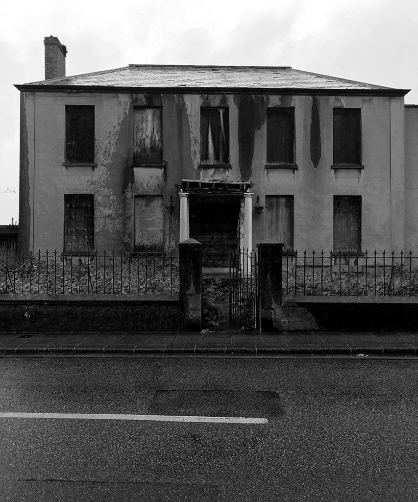
The photographers work that I will be comparing and contrasting is Camilo Jose Vergara.

Differences – The differences between my photograph and Camilo’s are that mine is in black and white and his is shown natural as in he didn’t edit his image for colour. Another difference is that his images shows off more contrast between bright and dark with the shadowing in his image, whereas mine hasn’t got any shadowing as the building was flat not having any 3 dimensional structure to it to make it have exaggerated shadows. Finally, a key difference is that he appears to have people in his images where as in my image I don’t have people in it. Therefore, this could go to show that the building in my image is fully abandoned and left out to rot going to show how people in society don’t care about the waste of space being preserved by abandoned buildings in the world. Whereas, in Camilo’s image he has people roaming which goes to show the building in his image is in use, not wasting space however, there appears to be graffiti on the buildings and they seem to be dirty which goes to show how the people in society are very lazy and don’t have a car for the environment as they seem to paint over it and not keep the general streets clean.

Similarities – The similarities between my photograph and Camilo’s are that we both appeared to use natural lighting as our sources of light to capture the images we taken. Also, we have both appeared to take on a dead pan pictures of the buildings that we decided to take images of across the street form the buildings. The final similarity between the images are that both buildings appear to be dirty or damaged due to the lack of care that has been given to them, due to society in the 21st century appearing to be lazy or unconcerned for the community in general as this can lead to people loosing house’s as they just deteriorate leading to it being un-manageable for people to be living in these conditions, which can lead to people overpopulating to somewhere cheaper which what appears to be the cause of Camilo’s picture where as for mine the people have already moved out and now the building has been left wasting space.

Final Image’s

The way in which i would present my images would be by having my picture up on a wall for people to be able to walk around and feel them. Moreover, I could consider on putting materials from the images like leaves or rubble so that people who are looking at the pictures could potentially touch them to get an idea of what the image feels like as well.

Evaluation

Therefore having read the history of Eugene in the reasoning as to why he done photography, this gave me the objective of showing the people who look at my images how buildings can be left derelict for no one to care of which could have better use to them. Moreover, I believe that the economy has a big impact on buildings being derelict due to the fact that as the economy goes up in any place the prices go up and cost of living especially in Jersey where it is very expensive in terms of housing, which could cause people to move away from these homes making them derelict leading to the abandoned buildings being forgotten making them relics of the past.
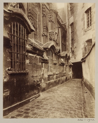
Overall, I believe that I was successful in presenting my objective with my images through to the audience/ people who would see my images in an art gallery, this is because I have images of abandoned buildings that have been around for a long time including the old Jersey Brewery which could be considered as a relic of the past as it is an old building that was of great use to Jersey. However, if I was to do this project again I would change the way in which I would display my images by getting images of old buildings that are now abandoned, then I would split the images in half and put them together in order to show the drastic changes in the buildings over time.

anthropocene – Darian Mederos

Distorted View

Shoot

Final edits inspired by Mederos

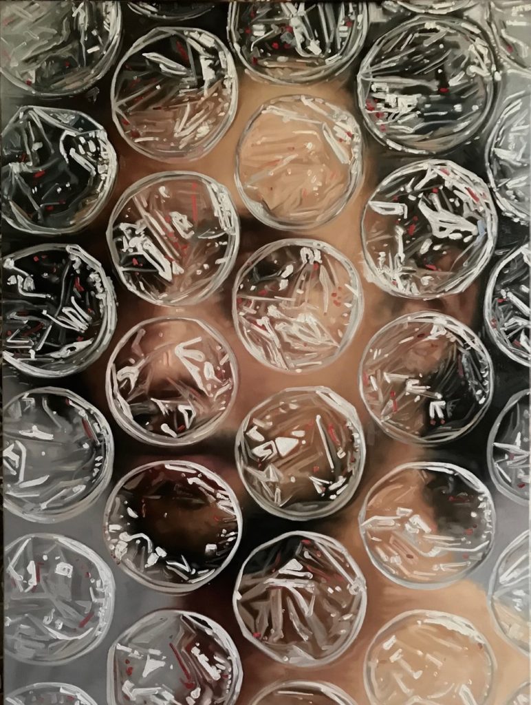
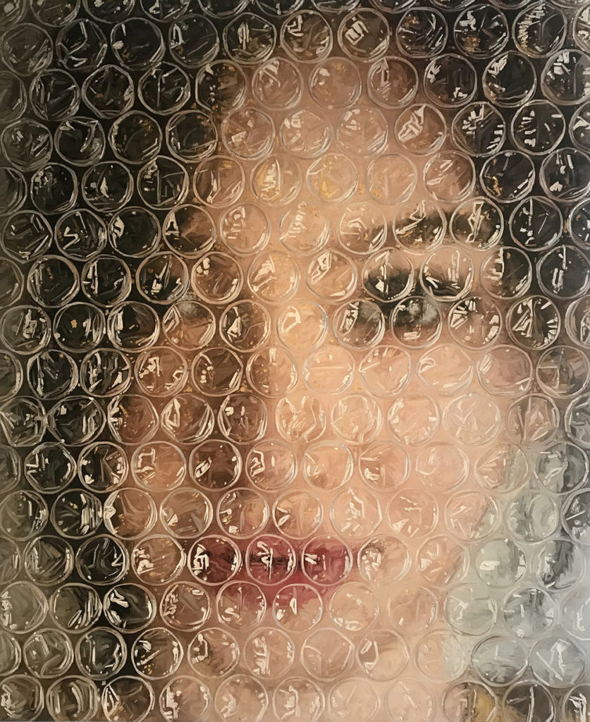
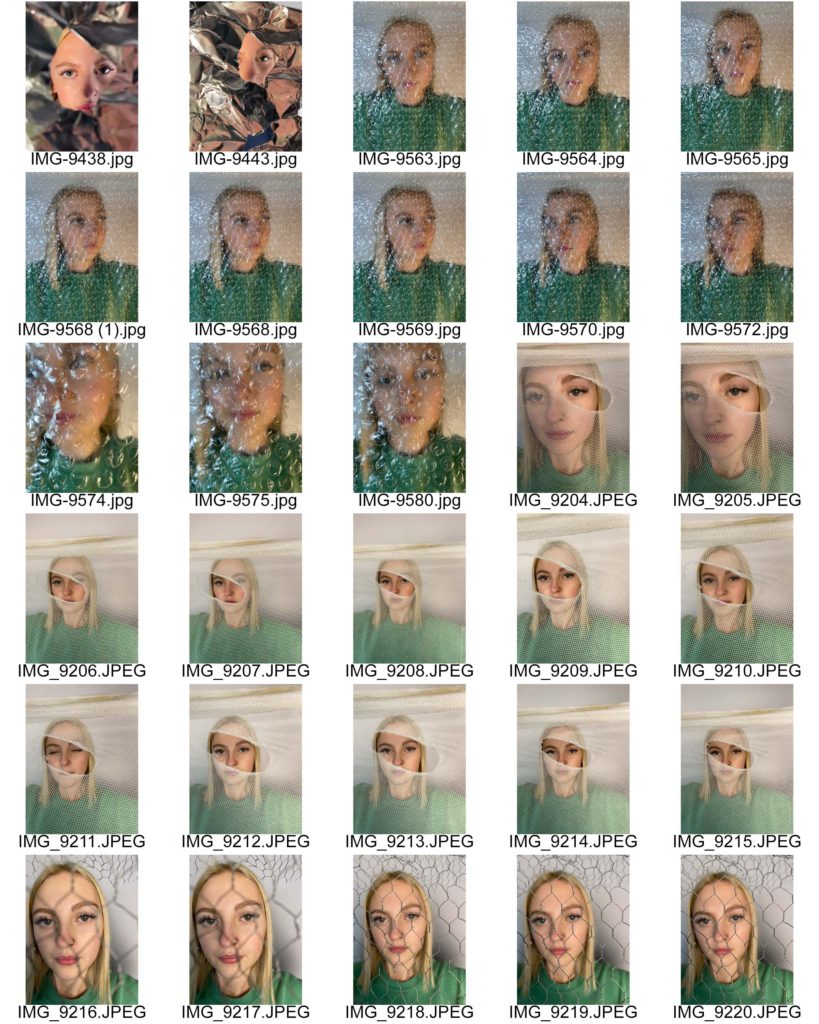
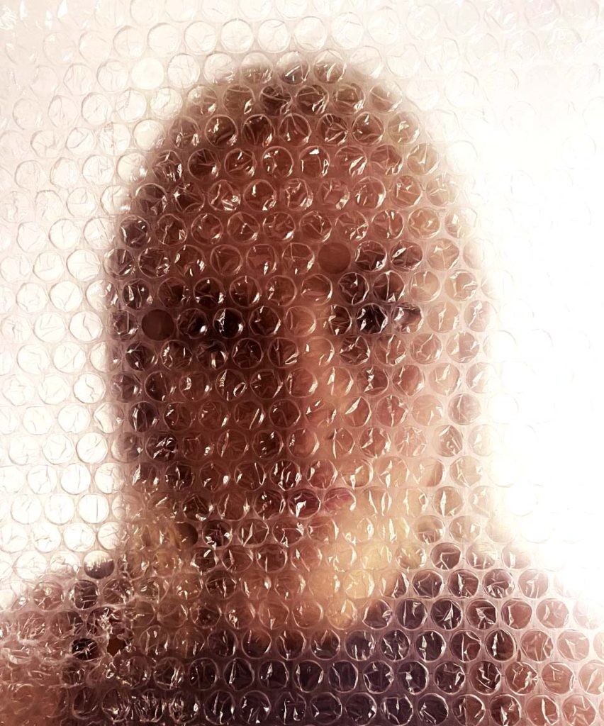
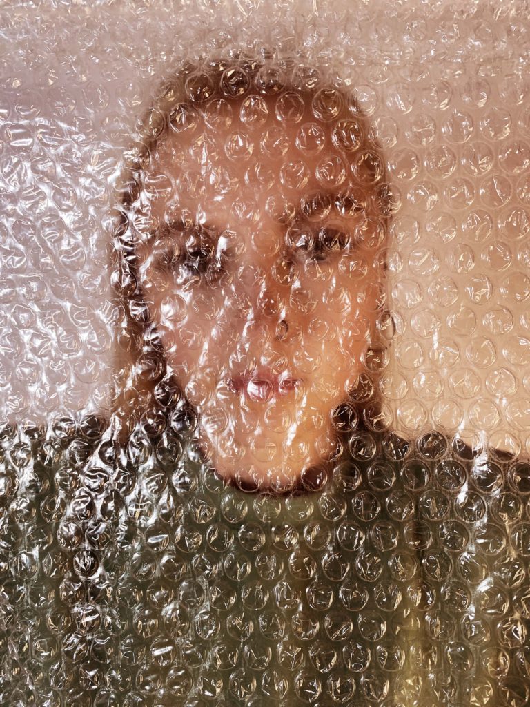
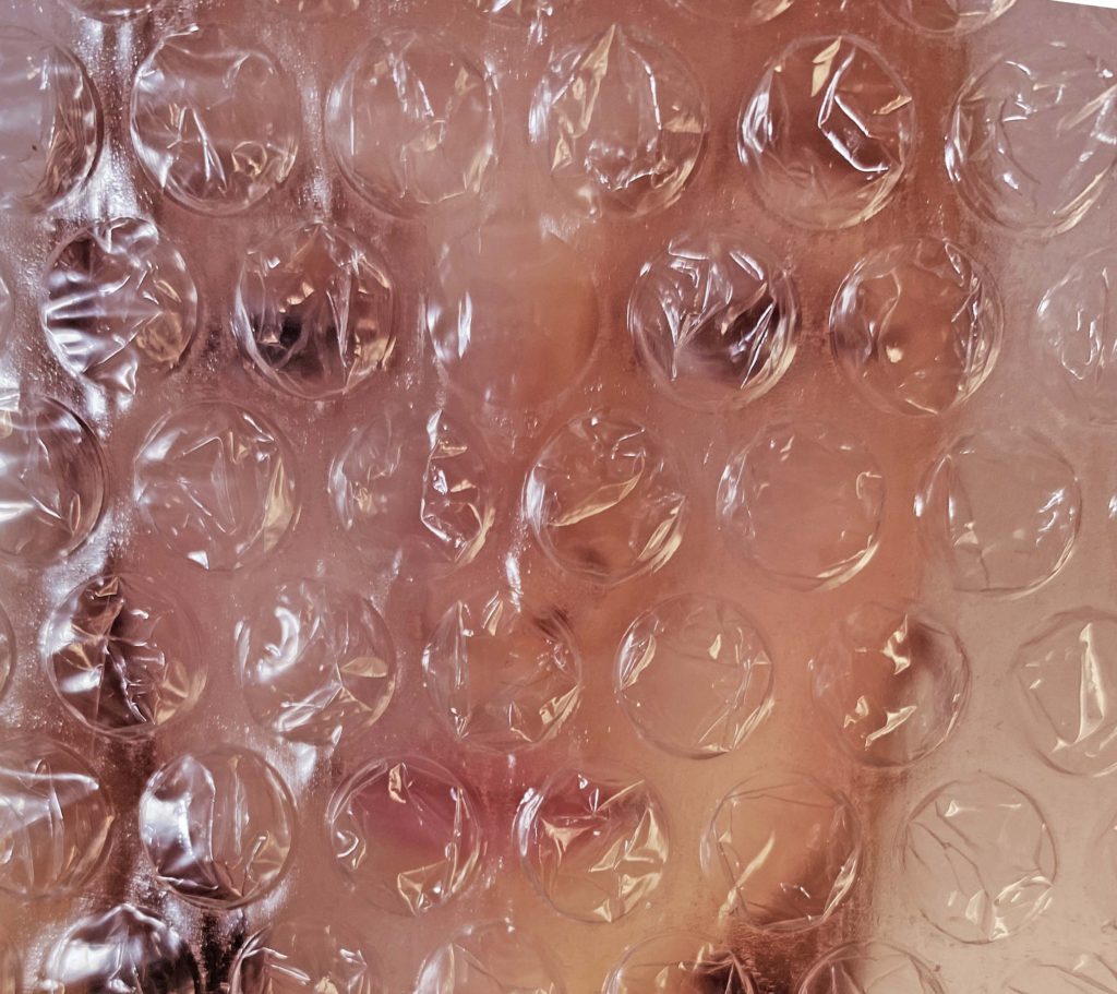
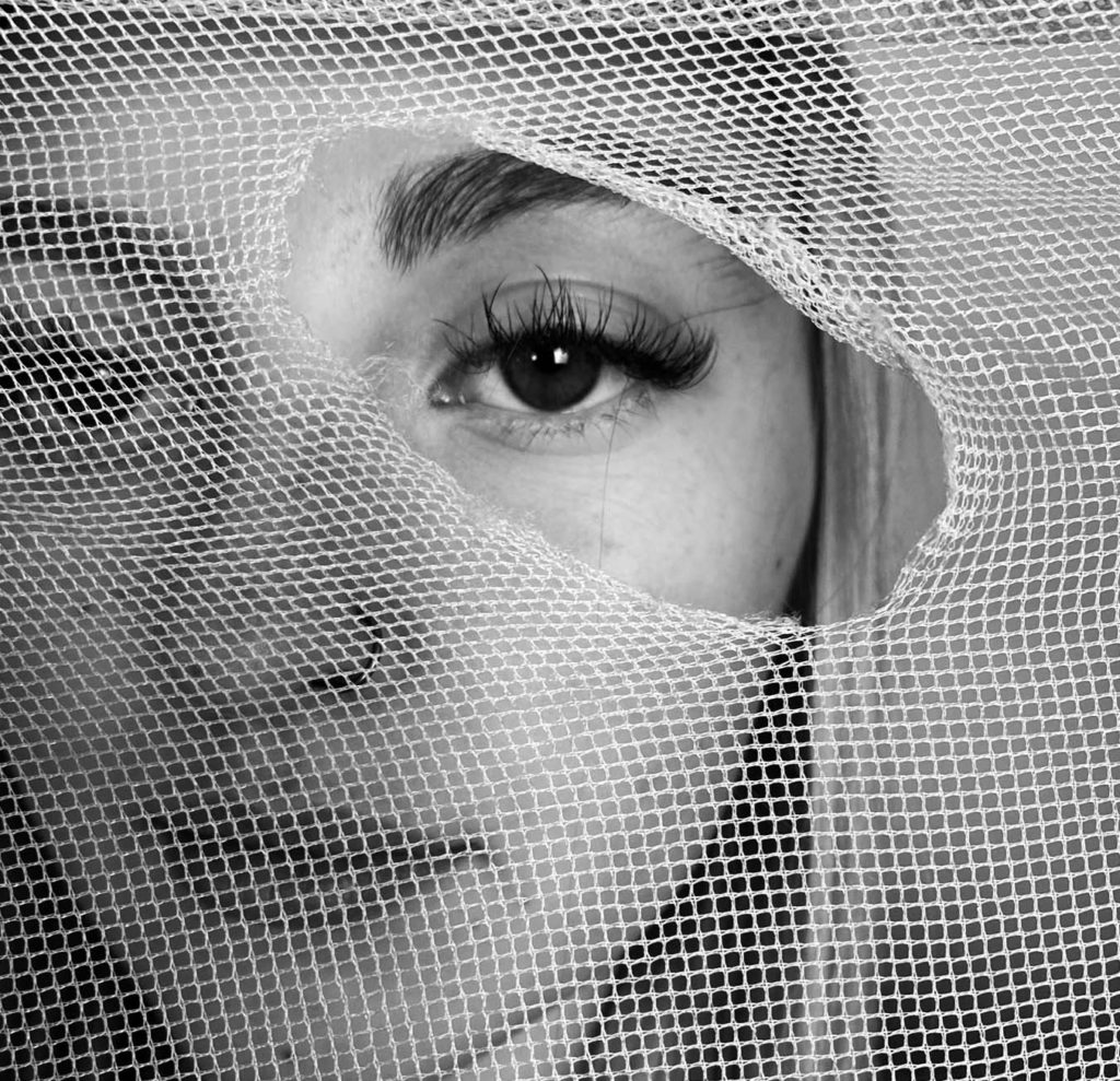
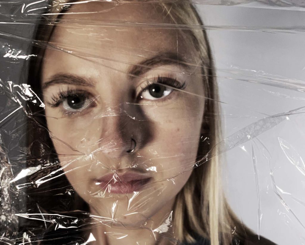
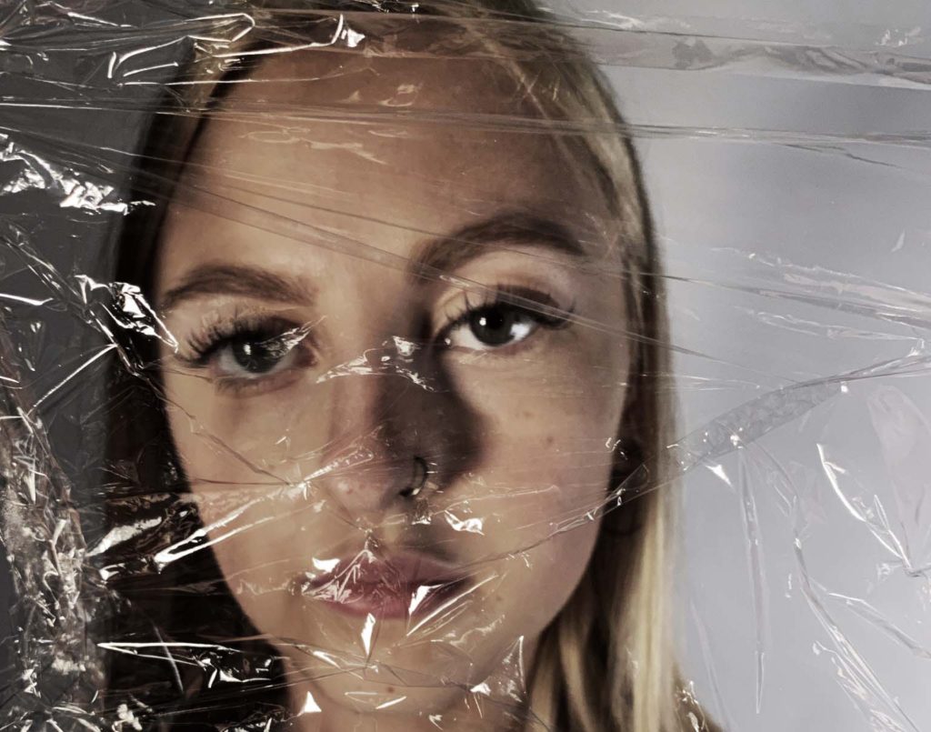
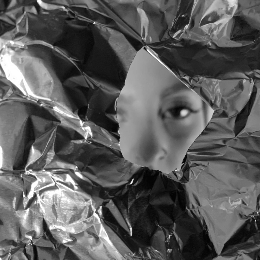
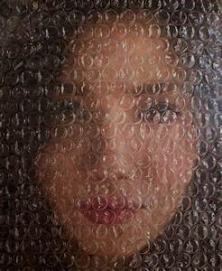
My outcome was successful when recreating Mederos work through photographs. Mederos is best recognized for his signature bubble-wrap style where he paints individual bubbles over portraits for added texture and effect. To create these images I placed bubble-wrap in front of the face to mimic Mederos where he creates texture and light reflecting off the bubble-wrap and distorts the image underneath. You can make out the image underneath by looking at the photograph from a distance. His images don’t necessarily have a meaning or send a message to attract viewers, its the large amount of detail and the unique technique to create his final image that draws attention.

What I like most about this image is the detail on the bubble-wrap that contrasts against the blurred background. The artificial light reflects off the bubble-wrap, like in Mederos’ paintings. The main focus of his artwork is the detail on the bubbles, the background is blurred so the main attention is how the camera focused and captured the detail on the bubble-wrap. I took this image with artificial lights and edited and adjusted the colour to look like his paintings. The repetition of bubbles could represent the continuous plastic use that is affecting our planet. The lack of emotion in the face shows most of us have no reaction to how negatively we’re effecting the earth and environment, yet it is right in front of their eyes and they still act unbothered.

Final edits inspired by distorted view

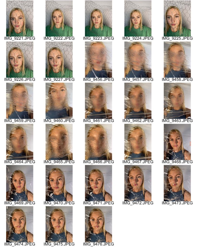
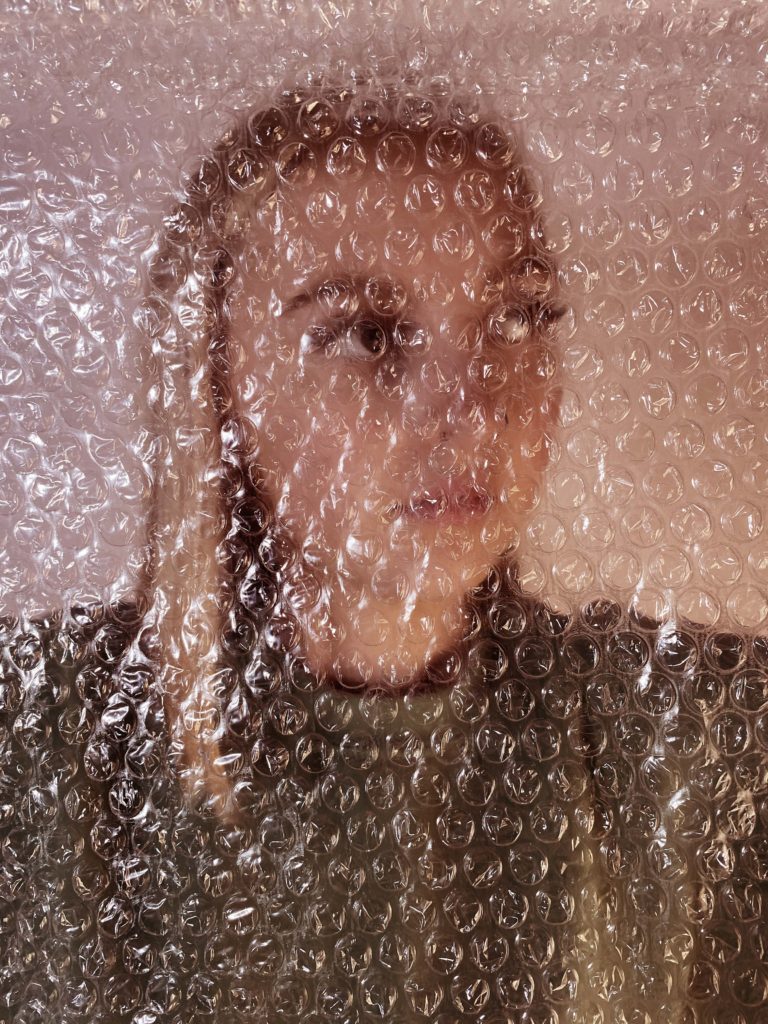
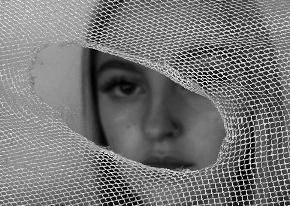
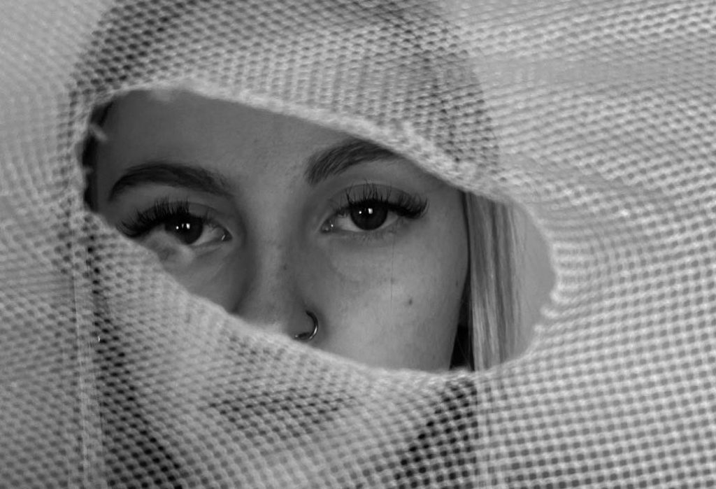
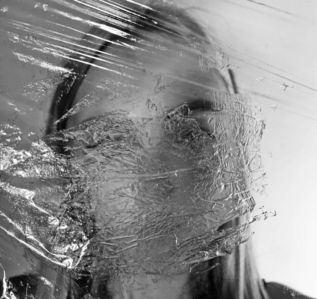
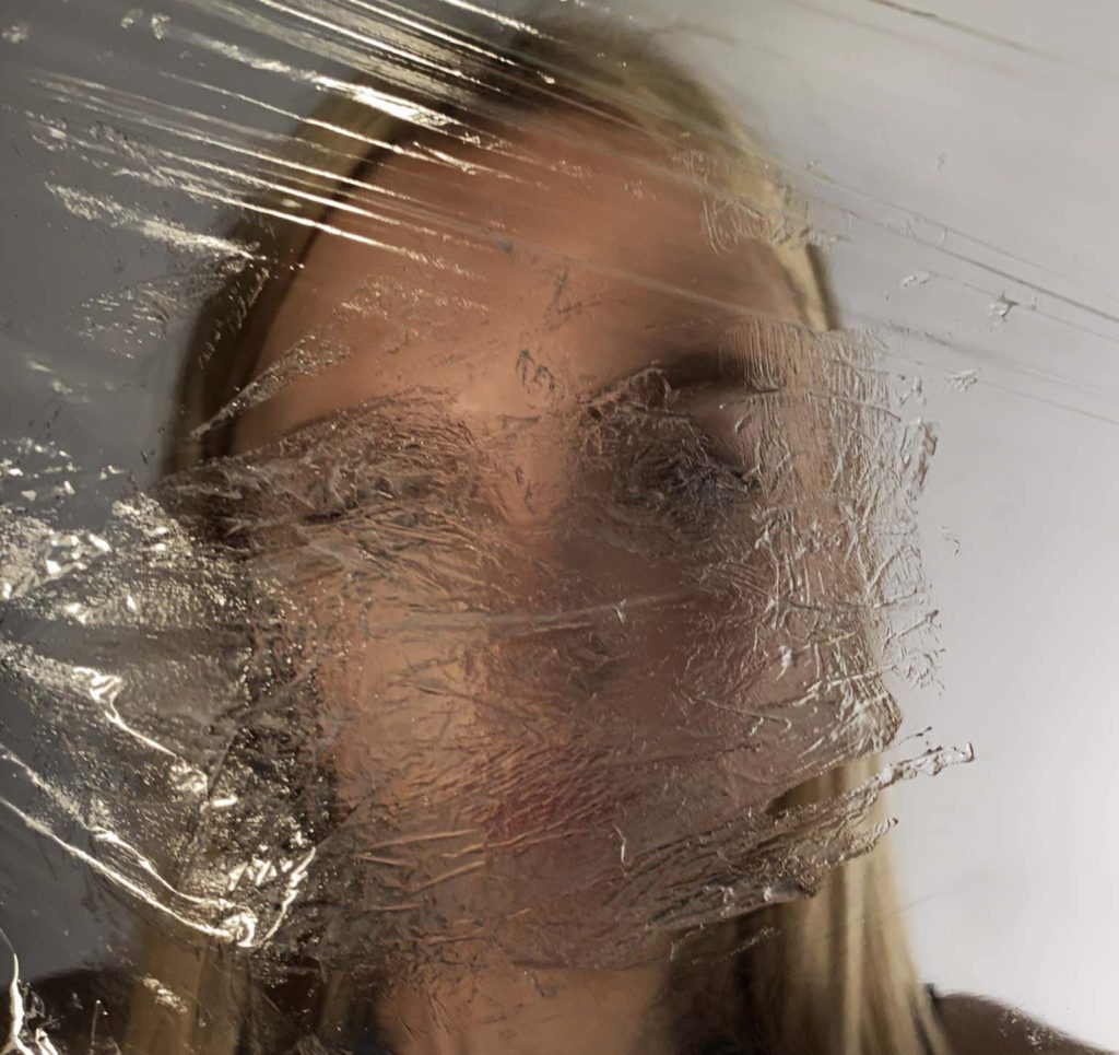
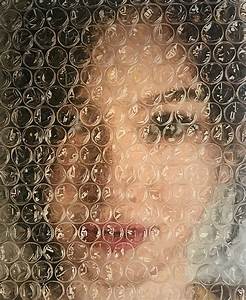
The creases in the plastic sheet affect the face like plastic affects the sea. At least 8 million tons of plastic end up in our oceans every year, and make up 80% of all marine debris. Marine species ingest or are entangled by plastic debris, which causes severe injuries and deaths. Litter dropped on the street doesn’t stay there. Rainwater and wind carries plastic waste into streams and rivers, and through drains into the ocean. This plastic that covers the lens of the camera has distorted the face and wont be seen how it originally was. The plastics in our seas affect the natural nature of our oceans and ruins its natural form.

I took this image with artificial lighting which reflects off the plastic sheet. The materials I used to create this image has blurred out any facial expressions on the face. This represents how many people don’t react or act upon the waste in our seas.

anthropocene – Alexandra Bellissamo

The relationship between nature and mankind.

Shoot

Conceptual Realism

Conceptual realism is the theory that abstract universals, unobservable general classes or ideal types have a reality that is independent, equal and sometimes superior to the reality of their individual parts or specific examples.

The terminological distinction was made in order to stress the difference between the claim that universal mental acts correspond with universal intentional objects and the perspective that dismissed the existence of universals outside the mind.

Surrealism

Surrealism is the creative potential of the unconscious mind, for example by the irrational juxtaposition of images. Surrealism aimed to revolutionize human experience, rejecting a rational vision of life in favor of one that asserted the value of the unconscious and dreams. The word ‘surrealist’ means ‘beyond reality’. Many surrealist artists used automatic drawing or writing to unlock ideas and images from their unconscious minds, and others sought to depict dream worlds or hidden psychological tensions.

Surrealism was a means of reuniting conscious and unconscious realms of experience so completely that the world of dream and fantasy would be joined to the everyday rational world in “an absolute reality, a surreality.”

Surrealism can be expressed through photo montage. Photo montage is often used as a means of expressing political dissent. It was first used as a technique by the dadaists in 1915 in their protests against the First World War. It was later adopted by the surrealists who exploited the possibilities photo montage offered by using free association to bring together widely disparate images, to reflect the workings of the unconscious mind.

Final images inspired by Bellissamo and surrealism

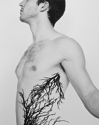
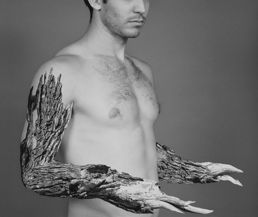
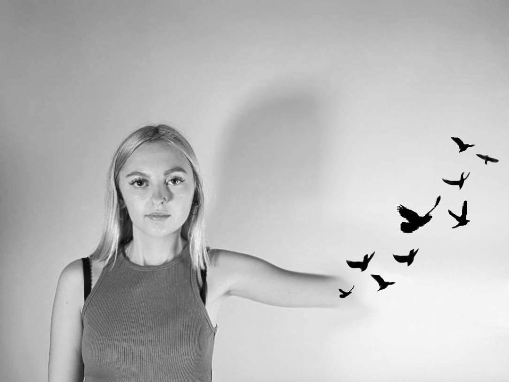
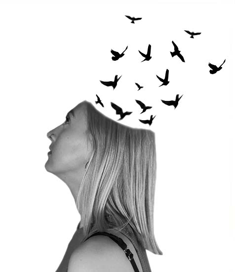
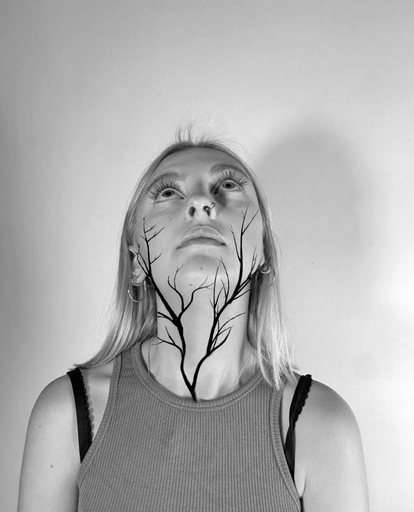
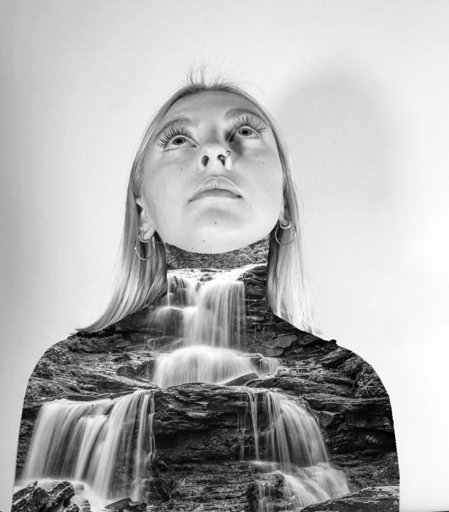
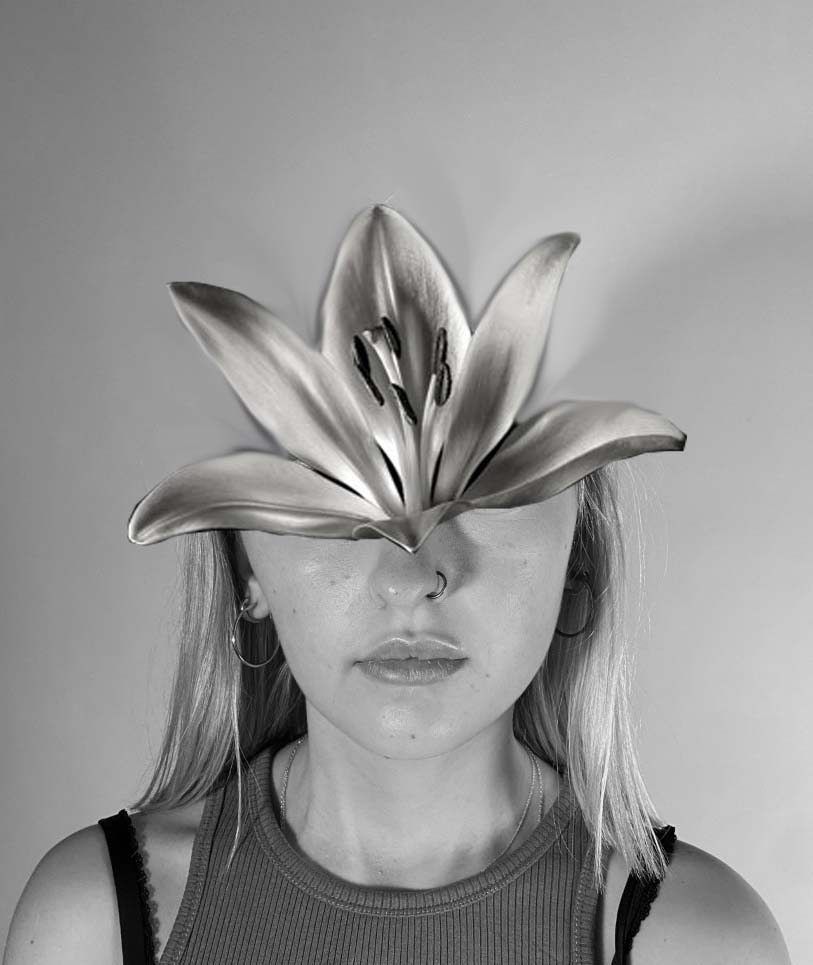
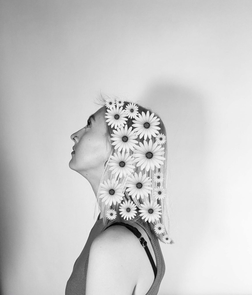
These images relate to surrealism in the way that they explore alternate worlds with hidden intentions. The message I aim to project through this image is how the thought of nature and how our actions affect the world around us has left our mind. We have put ourselves first and underappreciated the environment whilst doing things that benefit us and damaged the earth.

This picture represents how nature can fight back to how we affected the environment has humans. The way the branches crawl up the neck, strangling them as punishment.

The same with this image as the water falls down the neck, as if it was trying to drown the person in the photograph.

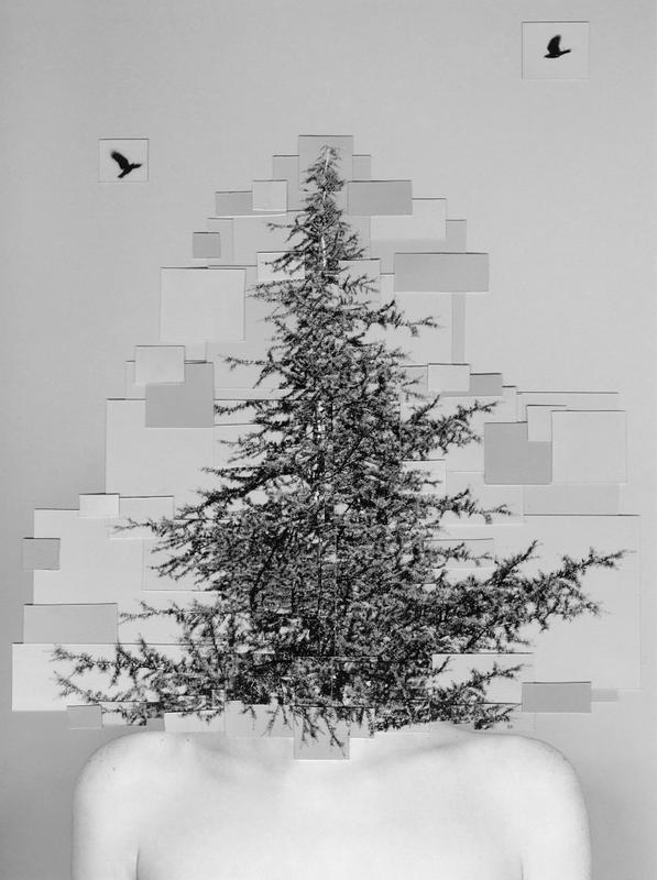
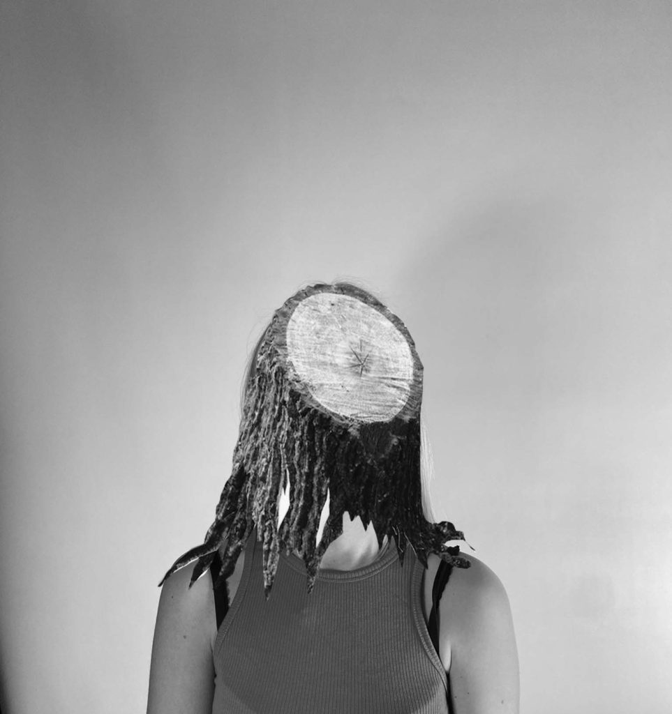
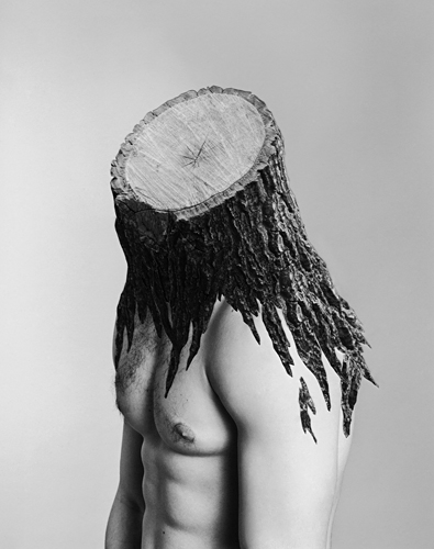
Another approach to these edits could be about the people who care and try to change the negative affects on the environment. This image shows a tree trunk instead of a head and brain. This represents how some people can be so focused on helping the planet and being vegan e.g., that it takes over their day-to-day life and they can become brainwashed.

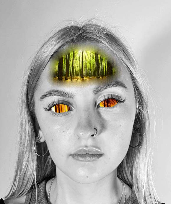
This edit is inspired by Bellisimo’s collage between humans and nature. To involve the theme of Anthropocene, I edited this image with the reflection of a forest fire in the persons eyes, representing what they can see, compared and contrasted to what is in her mind. The green, healthy forest in her mind is a memory of what nature used to look like before deforestation. Forests still cover about 30% of the world’s land area, but they are disappearing at an alarming rate. Between 1990 and 2016, the world lost 502,000 square miles of forest. We need trees for a variety of reasons, they absorb the carbon dioxide that we exhale, and the heat-trapping greenhouse gases that human activities emit. As those gases enter the atmosphere, global warming increases, climate change. Anthropocene is man’s impact on the environment, this edit represents the large, negative impact we are having on earth.

To create this edit I made the image black and white, created layers with the forest images and cut and pasted where I wanted it to be. I took the portrait in the studio with artificial lighting to have a clear, sharp image. The face being in black and white indicates the lack of happy emotions, like the lack of bright colours. The colourless image represents the negative emotions created by what is seen.

anthropocene – case study

Darian Mederos

Distorted view

Darian Mederos is a painter and visual artist who is known for his unique and different approach to painting. He is best recognized for his signature bubble-wrap style where he paints individual bubbles over portraits for added texture and effect. Mederos’ work focuses on the ubiquitous human face. Emotive and replete with meaning, our faces encompass the vast human experience, revealing everything at once or nothing at all.

When creating the “Obscura Series”, Mederos creates something new, a photorealistic abstraction. The bubble wrap reflects light and distorts the underlying image, it is only at a distance that the works come into focus.

Alexandra Bellissamo 

The relationship between nature and mankind.

Alexandra Bellissimo makes artworks that focus on “making” pictures rather than simply “taking” pictures. To make her surreal images, she uses collage techniques in combination with her photographs. In doing so, she combines man with nature to create works infused with emotion and psychology.

Alexandra Bellissimo’s body of work extends beyond traditional photograph. Her imagery explores the physical and psychological relation between nature and humans when combined through the use of collage. Her collaging process involves cutting layering and adhering photographic prints together into a single image. Bellisimo’s collages evoke a sense of empathy, intimacy and harmony when humans and nature coexist.

Comparison

Bellisimo’s images are constructed through a combination of photographs and collage. Her outcomes are black and white, crisp and sharp images with a variety of grey scale tones. Her images are taken with artificial lighting in a studio which resulted in high detailed images. Her images have a range of tones from light to dark to create highlights and contrast. The absence of colour helps to bring out the definition of her images. The arrangement and layout of her images tend to be head-shots and portraits. I believe Bellisimo’s photographs have a deeper meaning than what is seen by the eye. Her photographs show the relationship between nature and humans, it could be nature taking over humans as punishment for how we treat the planet, for example.

Mederos paints his images, in the circles of the bubble wrap he paints large strokes, it is only when you step away that the whole images comes together to reveal what is underneath. His images are very warm with a mixture of light and dark tones. Mederos paints the light that reflects off the bubble wrap to create the effect that it has been photographed with artificial lighting.

The difference between these two artists is Bellisimo photographs and collages and Mederos paints large images with big brushes that when stepped away from has masses amount of detail. Bellisimo’s images have hidden messages and send a message about nature and the world around us, compared to Mederos who paints images with large detail that do not need a hidden message to engage the viewer, his interesting and abnormal technique is enough to attract the viewers eyes.

Final Images

I chose these as my final images because I believe that they are the best images that represent Air, land and water pollution as well as the current situation with medication and the need we have for it since the pandemic hit.

I especially believe that some of my images that represent pollution have a strong message. I used Jeremy Carroll as my main inspiration for those images as I feel as though I accurately adopted his ideas.

I also feel like I have explored more information on the current pandemic and have more of an understanding of how much damage it has done on the economy and the environment. But I’ve also found out how it has brought people together and I believe that I have shown this through my images.

Photoshoot 1

This shoot was inspired by Jeremy Caroll. As well as including Caroll’s style I wanted to highlight the topic of air pollution as well as water pollution.

I wanted my images to show the impact that people have on the world. Even by eating something with a plastic wrapper humans are negatively impacting the world and pouring plastic into the oceans.

Water Pollution (plastic)

Plastic is accumulating in the world’s oceans at a staggering rate. An estimated eight million tons of plastic – the equivalent of over 26,600 Boeing 747 planes – are swept into our seas and oceans every single year, mainly via rivers and coastal urban centres.

500 marine species are known to be affected by plastic pollution.

Nurdles – the pre-production pellets from which most plastic items are made – are a significant direct source of microplastic pollution. Because of their small size and the way in which they are transported and handled, millions of these pellets are spilled in factories and other sites every year, and are often washed straight into storm drains and out to sea.

Ocean plastic pollution | Fauna & Flora International (fauna-flora.org)

Air Pollution (smoking)

Unfortunately, the environment is the worst hit by activities of the tobacco and cigarette industry. Until everyone learns to start doing something about this trend, they might be in for some big trouble in the nearest future. This article will focus on some of the negative effects of tobacco on different elements of the environment, as well as steps that must be taken to prevent the looming damage.

The smoking industry is designed by its own processes to harm nature. The kind of land needed to grow tobacco is often not gotten, except by chopping down of trees. Over time, deforestation has cost our environment. And continuing in the process of deforestation will do more harm than good.

Land Pollution (plastic and global warming)

In 2019 a new report “Plastic and Climate” was published. According to the report, in 2019, production and incineration of plastic will contribute greenhouse gases in the equivalent of 850 million tonnes of carbon dioxide (CO2) to the atmosphere. In current trend, annual emissions from these sources will grow to 1.34 billion tonnes by 2030. By 2050 plastic could emit 56 billion tonnes of greenhouse gas emissions, as much as 14 percent of the earth’s remaining carbon budget.

Plastic pollution on land poses a threat to the plants and animals – including humans who are based on the land. Estimates of the amount of plastic concentration on land are between four and twenty three times that of the ocean. The amount of plastic poised on the land is greater and more concentrated than that in the water.

Plan

WHOKiera and Miriam
WHATStrangled by plastic+vaping
WHEREstudio+house
WHEN05/05/21

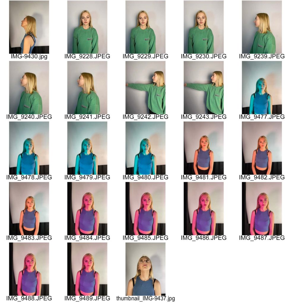
Contact Sheet

Final Outcomes

Best Edited Images

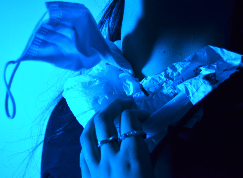
For this image I used a blue and green gel on top of my light which was on the highest brightness and had a slight warm tone to help the green shine through however I wanted it to be a cool blue to emphasise the coldness of the ocean and the the fact that humans can be seen as cold hearted since we are so careless with what we do with our rubbish. The blue background also helps emphasise the fact the image is focusing on the treatment of ocean life.

I liked the shadow that the mask created on my model’s neck as it helps represent the deeper parts of the ocean and that plastic effects them as well even though they are hundreds of miles deep. The shadow could also emphasise the fact that millions of creatures are dying due to plastic.

I used a mask in my image to show that the current pandemic has caused lots of damage to the environment. For example, many people have the disposable masks which can easily break, they’re also very light weight and if dropped, can easily float away out of reach and can land anywhere. Even the COVID 19 tests have plastic packaging which is only used once and then binned and destroyed.

I zoomed in to 35 mm on my camera and stood quite close to my model to ensure that her neck, which is getting strangled by rubbish, was the main subject. I wanted my model’s hand to be in the image to show signs of struggle and pain to further show that if humans were in this situation more people would want to help and stop what is going on. I also used a fast shutter speed and got my model to move her head and hands so that I could get a more realistic image.

I like the fact that there are a range of textures in the image. The mask, crumpled bits of paper and the plastic bag all have a harsh look to them which nicely contrasts the smoothness of the model’s neck. I got my model to keep her rings on her fingers to show that it’s not only large bits of plastic that are the problem.

There is a very cool tone to this image which I believe is good to help present the important issue. The blue and black colours in the image link to the saying ‘blue and black’ which is often said when someone got hurt and badly bruised. I feel like the colours in my image are a metaphor of how our world is slowly deteriorating and getting beaten till it will break.

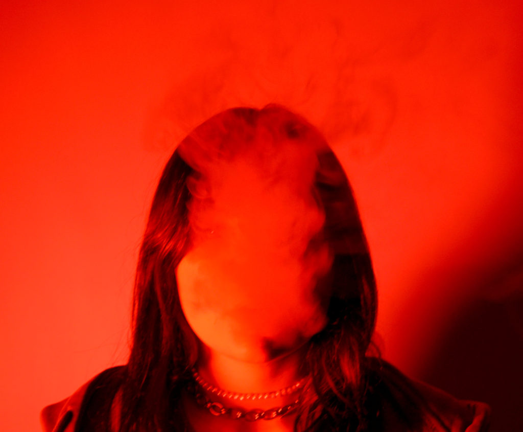
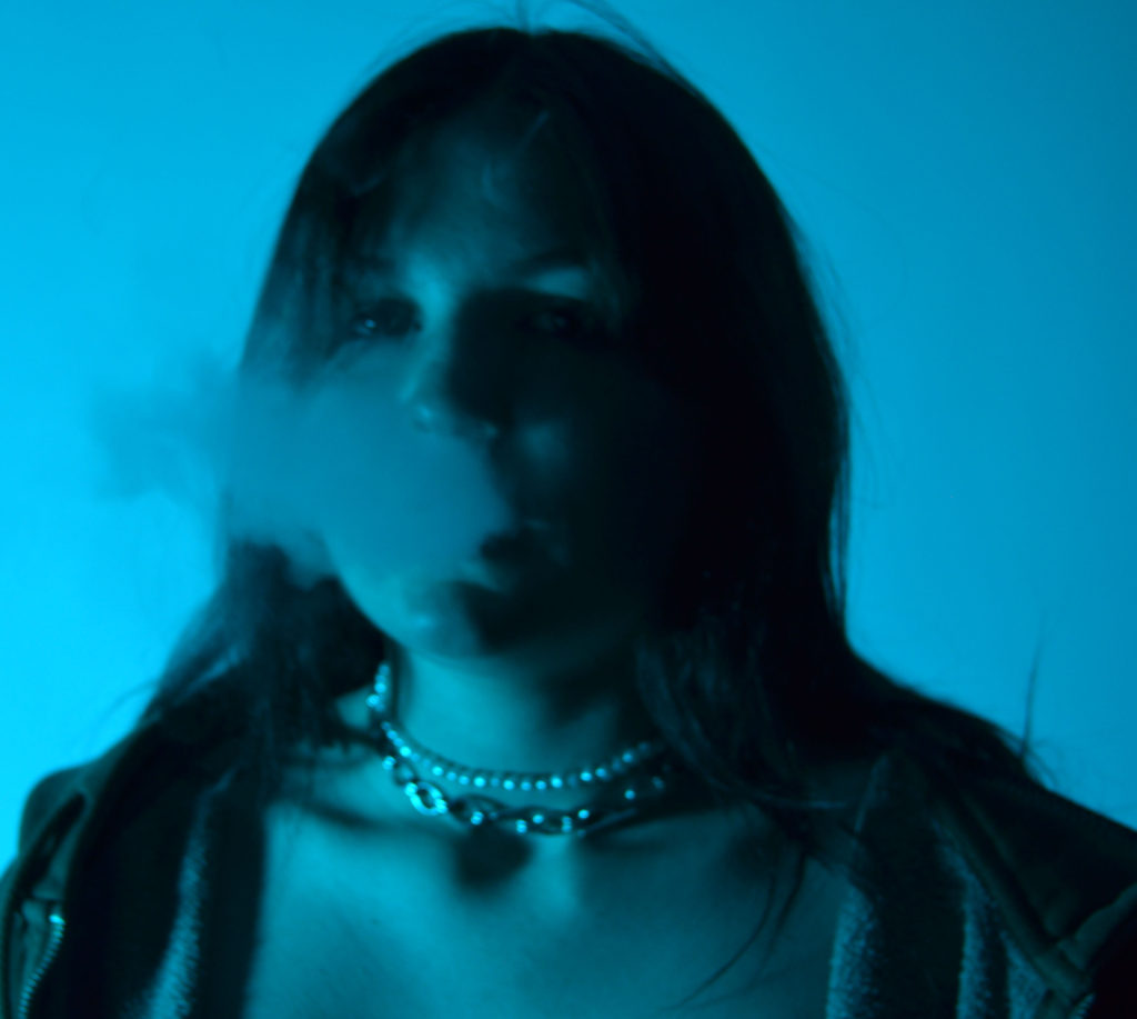
This image was taken to represent air pollution and the damage it does to our bodies. I used red LED lights for my main source of lighting as I wanted the image to be quite dark. I chose the colour red to help emphasise the dangers of smoking and also emphasise the fact that our air is slowly getting polluted by fumes from cars and industrial sites. The thick smoke represents the fact that the air we breath in isn’t clean and we are slowly damaging our bodies.

The smoke is in front of my model’s face to emphasise that we aren’t really seeing what’s happening in the world and that we are normalising things that should be changed. Smoking not only does it damage and kill your lungs, it is also putting a strain on the environment making the trees take in more CO2 and since trees are decreasing in numbers due to deforestation, we are getting less O2 in our atmosphere.

The image is blurred to represent the fact that the world is changing ridiculously quick. The image has quite a smooth texture all together. The smoke, because it’s so thick, helps smooth out the model’s face and when the smoke rises above the model, it looks like its a shadow on the middle of the wall.

The shadow in the bottom right of the image represents the fact that we are slowly beginning to change the the world for the better. It could also however represent the irreversibility of the damage we have done to our planet, and it is looming over us, slowly growing and becoming more and more apparent.

I used a quick shutter speed for this image as I wanted to capture the smoke at different stages so that I could pick the best looking images. Since the smoke is in front of my model’s face, I think that it allows the model to represent the whole world watching its planet get slowly destroyed. The smoke being thick also represents the amount of chemicals that get released into our atmosphere each day.

For this image I zoomed in at 25mm and stood about a metre away from my model which I think was a good decision as I wanted to focus on her face and above so I did a headshot and left quite a large gap above her head to allow the smoke to rise.

The chains around the models neck links to the fact that when you smoke you are slowly damaging your lungs and the chain looks like her airflow is being restricted which is what we as a community are doing to ourselves when we release harmful gases and chemicals into our atmosphere.

I chose this image because I thought that it looked like my model was praying for help whilst they were tied up with rubbish. I wanted my model to represent the struggle the animals go through, however I feel like this image looks like it represents the people who are noticing the damage that the animals are put through and they are pleading for help and for people to notice the harsh reality of what the world looks like.

The green lighting helps this idea of people wanting to help the animals who are in danger. Green is a colour often associated with life and new beginnings. I chose the green lighting to emphasise the fact that even though plastic effects oceanic life quite significantly, land creatures and the land itself gets effected equally as bad.

I asked my model to keep her rings on as I noticed that one of them was made from microplastics which are now known to be even more dangerous for animals as they mistake the plastics for things like small eggs or insects.

Final Analysis

I believe that my final images worked well with Carroll’s work since I used the same concept as him. However, I focused on keeping little things in the images such as jewellery and also wanted to use coloured lights to create more of an atmosphere and have a story behind it.

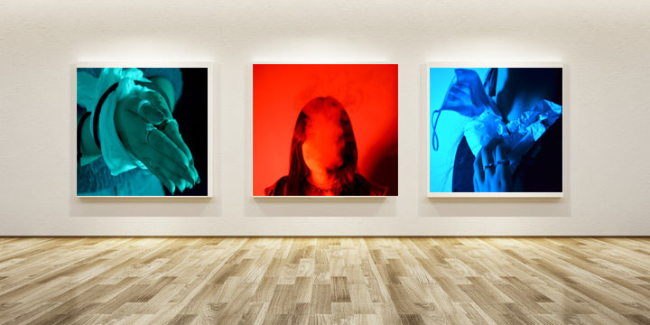
For my first gallery, I wanted to put the red image in the middle because it’s the most eye catching out of all three of my images. The red also has connotations of danger and I thought that it would be best to put that in the middle so that the viewer can subconsciously understand that the images are about the danger we are putting ourselves and our planet in.

The other two images next to it have a cooler tone which is less harsh than the bright red. Although they are cooler toned, they are more aggressive images due to the fact that people are tied up or are seen struggling.

For this gallery I wanted to do the same pattern as the one above. However, I wanted to show that the two blue images result in the red image. Where smoke takes over your body, and you put yourself in danger. Just like when people emit fossil fuels into the atmosphere we are damaging the planet’s ozone layer, and consequently putting ourselves in danger. The middle image could be seen as a warning, and the other two images is the world before things get permanently damaged.

Alexandra Bellissimo

Alexandra Bellissimo

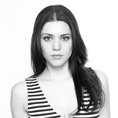
Portrait of Alexandre Bellissimo

Bellissimo’s work extends beyond regular photography. Her work explores the physical and psychological relation between nature and human beings when combined through the use of collage. She precisely cuts out bits of different images and layers them together. Her work evokes a sense of empathy, intimacy and harmony while humans and nature coexist.

Images

For more of her work look at this website.

http://alexandrabellissimo.com/

Image Analysis

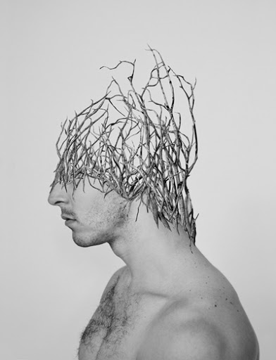
This image was taken in with a plain white background with white lighting; this helps the viewer focus on the model. The model has a hole where his eye should have been, the fraying around the eye shows that the hole was put there by force, just like how humans intentionally damage our world by leaving rubbish around. If you look closer at the hole in the eye, you can see there is a lighter section nearest the nose. It almost looks like bark. This shows the connection between humans and nature. When we damage nature we damage ourselves in the process.

The hole in the models eye could also emphasise the fact that we as a species ignorant and we are choosing not to notice the damage that we are doing to the world. However, the fact that the we can see the model’s other eye represents a glimmer of hope that we can change the world before it’s too late.

The model’s mouth is also slightly open which could represent that maybe the model wants to say something however is too afraid to speak up. He could also represent the people that are saying something. But because there’s such a small amount of people who aren’t afraid to speak up about these matters, compared to the population of the world, the small gap could represent the world’s view on their views and they feel like their view is insignificant.

Photoshoot 2

For this shoot I wanted to highlight the fact that even when we need to heal ourselves, we harm the planet in the process.

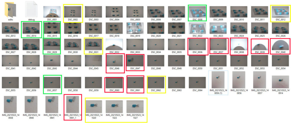
I took pictures of a packet of capsule tablets which were encased in foil and plastic wrapping. The capsule itself is made from a kind of plastic which dissolves in our stomach acid. By having these types of tablets we are constantly adding to the plastic productions.

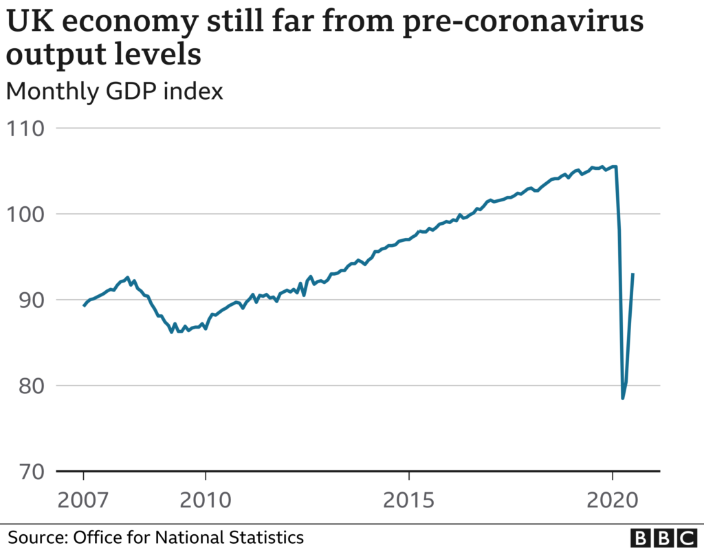
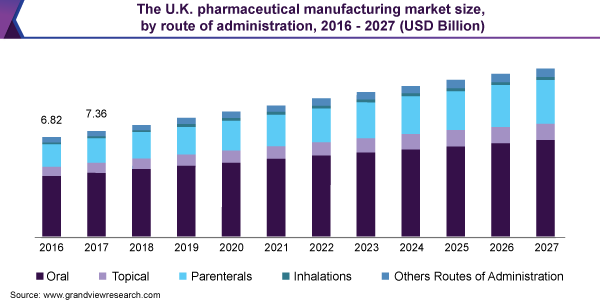
In addition to this, I wanted to emphasise the fact that the whole population now relies on medication. As more diseases are found, there is a higher demand for cures/vaccinations to be found at the same time. This then means the production of plastic waste increases as well as the funds that need to go into pharmaceuticals around the world. This has become more apparent recently as COVID 19 took over throughout 2020- the present day. The whole world was relying on the pharmacists around the world to find a vaccine to prevent the spread of COVID. This lead to the government needing to provide millions of pounds to ensure that the NHS and labs throughout the country were safe enough to work in but also so that they had enough protective clothing and equipment to help those who caught the virus to keep as many people safe as possible.

Lockdown had a major impact on the UK’s economy as shown here:

However, there is evidence that even more money will be put into the NHS and pharmaceuticals in the next coming years:

Contact sheet

Final Outcomes

Best Images

For this image, I went into photoshop and increased the contrast from 0 to 22 and decreased the brightness from 0 to -15. This helped enhance the texture of the plastic and foil wrapping. I also put the image into black and white, I did this to show that even the things that help us can harm us. I think this works well with the two ends of the tablet. The darker side represents the harm that plastic does to our environment and the lighter side is how plastic can help us, like for packaging our medication and keeping things fresh.
I also think that the fact that the image is in black and white also represents the dangers of medication. Even though they are made to help people, they can quite easily kill . Some can take to many without realising and cause serious harm to themselves. The contrast in the colours of the medication can represent this fine line.

The two colours of the medication could also represent the fact that in America, there are fees for medication and medical care. This was problematic especially throughout the pandemic because if someone who was financially struggling , they wouldn’t be able to afford the medical help they needed which then meant that they had to struggle and live in pain. But, if you had enough money to afford the medication/ help you would be able to recover quickly and get on with your life.
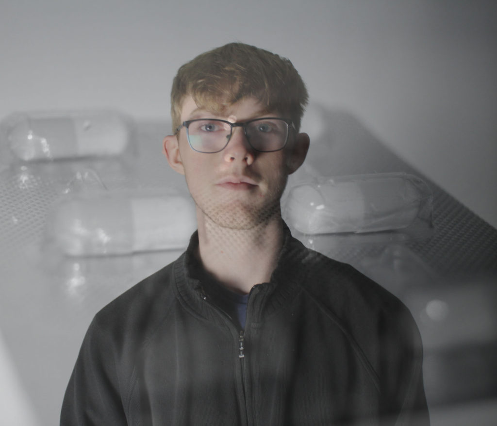
I created this image by merging the image above with the colour version and flipped it. I did this to try and represent the mass production of medication that happens each year. I wanted it to be a circular image to show that there is a routine in this industry and once the routine has finished it begins again. I also mixed the coloured image with the black and white to show the range of medication that is created and sold to different people around the world.

The Corona Virus put a huge pressure on the Pharmacists around the world to work constantly around the clock. This meant there was a mass production of test tubes, syringes and pipets, all of which are made from plastic.

Experiments

For this shoot I took images of my friends, first individually and then together. I did this to show that people became united during the pandemic. It also represents the fact that people get closer when they are in certain situations that can cause panic. I chose to put the black and white image behind Aaron and the coloured medication behind Kiera to show that they are different people and have totally different lives. But when they are together I put the coloured medication behind them to represent that they are in the same situation and are connected in some way or another . This represents the world when the pandemic hit and everyone had to go into lockdown.

Anthropocene – Andrew Moore Photoshoot

Why Andrew Moore?

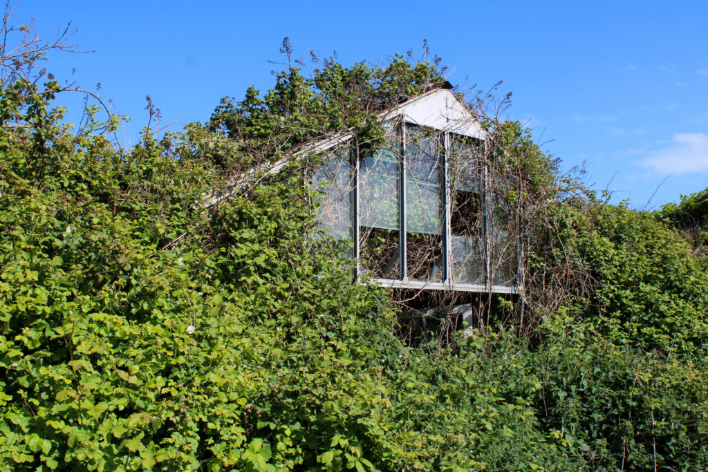
Andrew Moore’s work depicting the effects of time on natural and built landscapes has greatly inspired me while researching for this Anthropocene project. I really enjoy the way Moore captures his images from a different perspective to Burtynsky and how he demonstrates the way nature is trying its best to overcome the effects the human race is having on the environment. I wish to reflect this element of Moore’s work through landscape photography of overgrown scenes while also capturing images showing areas of nature by the side of industrial buildings. I believe this will further the Anthropocene idea on society’s impact on the world by showing the impending modernization creeping into each photograph. Additionally, Moore’s use of saturated colours and natural lighting allows the observer to understand the subject better, for example letting them acknowledge how nature; when left alone and undisturbed by humans, has the ability to form beautiful natural landscapes and areas that are not overwhelmed by industrialized structures.

Photoshoot Plan

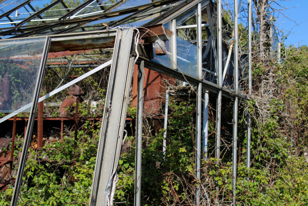
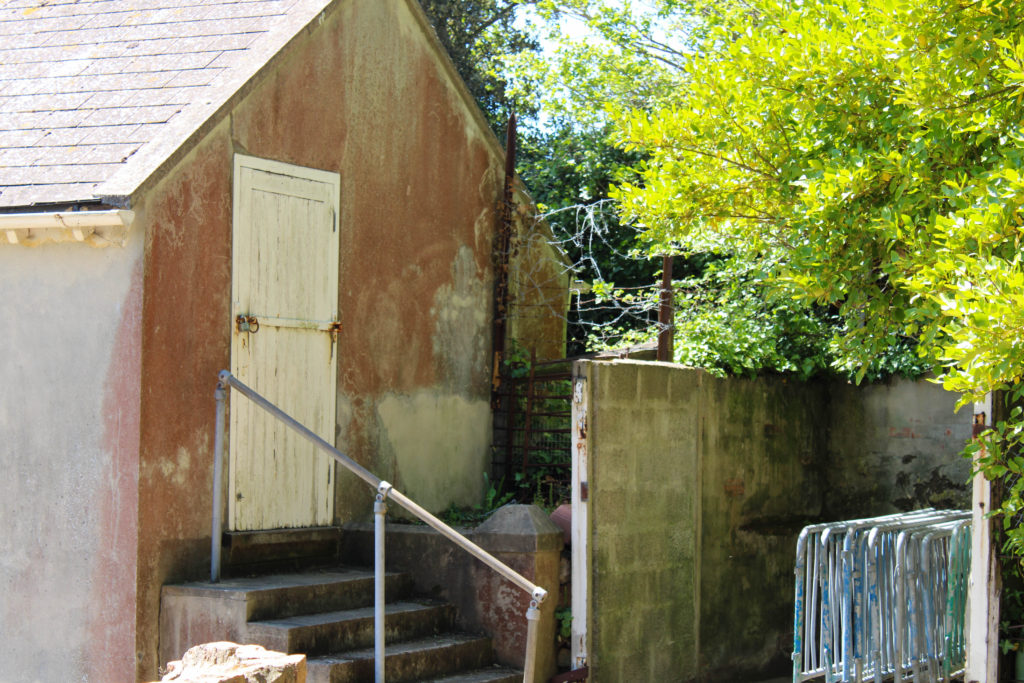
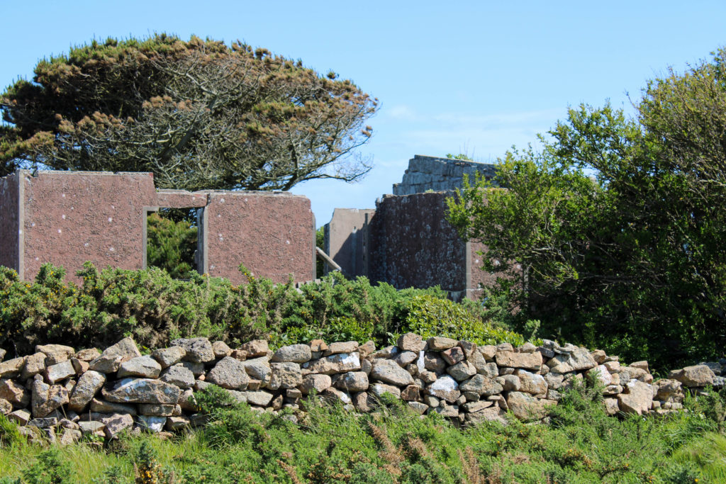
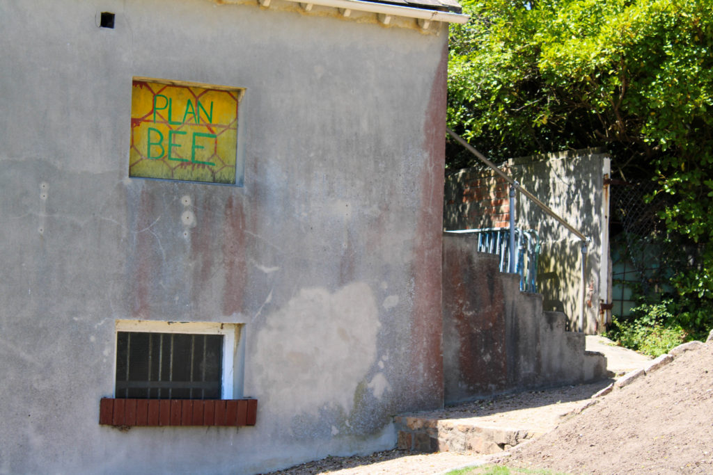
What – I plan on capturing images of landscapes which have been impacted by humans with buildings, greenhouses, ruins and industrial sites – however with nature still trying to make an appearance, fighting back against the urbanisation. I wish to capture elements of the natural environment juxtaposed with modern structures to represent the imminent world industrialisation.

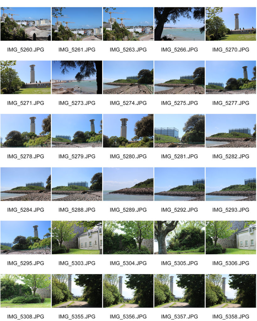
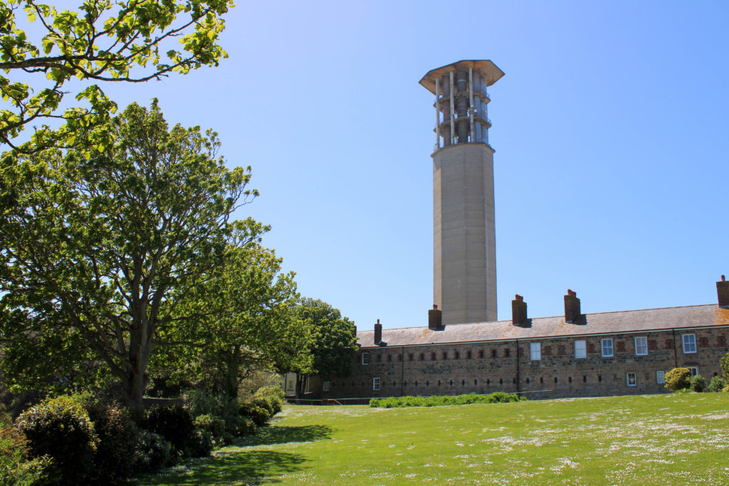
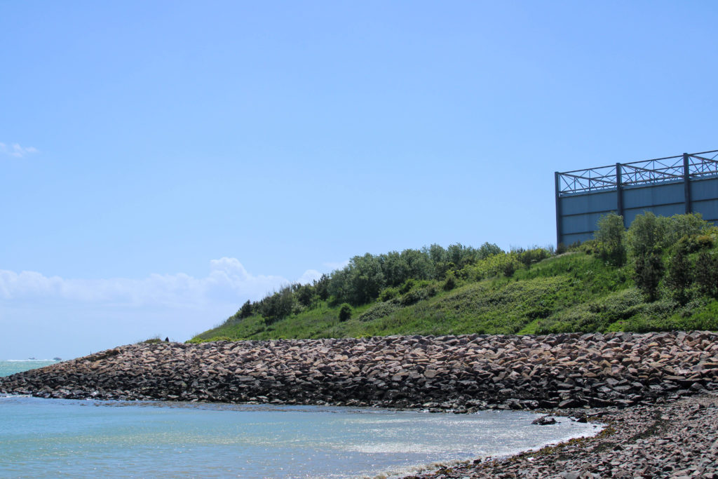
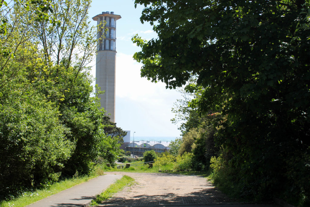
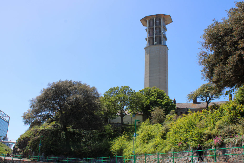
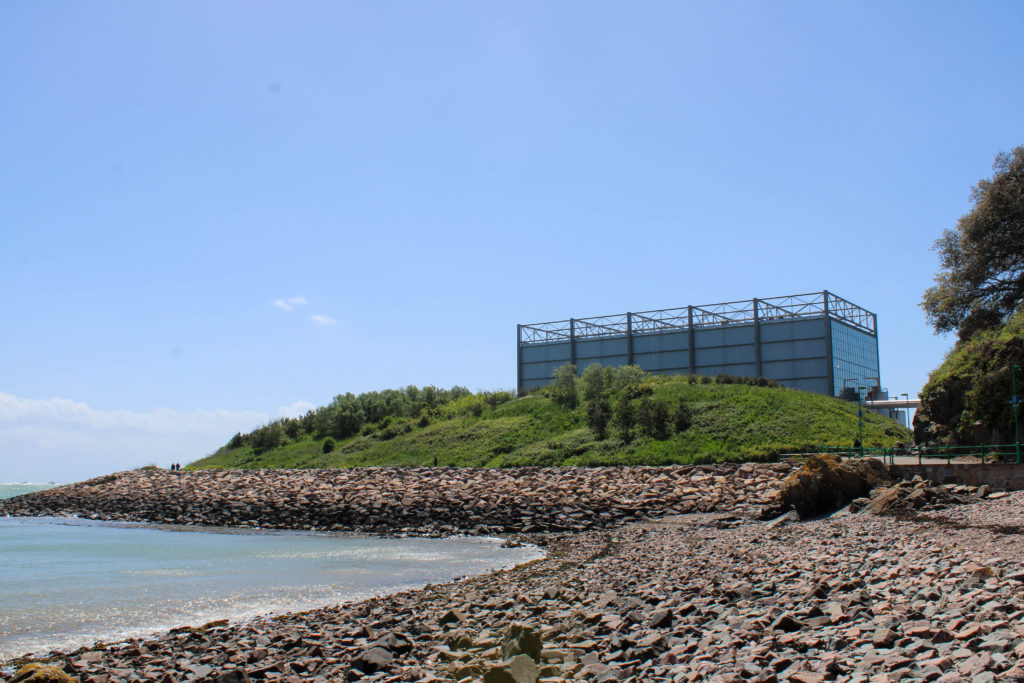
Where – I aim to produce this photoshoot around many locations on the island; the first, where I wish to photograph the difference between nature and industrial structures, is at Le Quesne Barracks, Mount Bingham in St. Helier. I also plan on walking down to the beach at Halve Des Pas to capture the natural landscape with tall structures from La Collette in the background.

When – My plan is to conduct this photoshoot on Friday 21st of May due to the forecasted sunny weather, as I am taking my images inspired by both Edward Burtynsky and Andrew Moore on the same day. The bright weather will aid my photoshoot as it will create harsh shadows and emphasise natures vibrant colours, symbolising the beauty in the untouched natural environments around us, which are slowly being destroyed and forgotten.

How – Similar to my shoot inspired by Edward Burtynsky, I will use natural sunlight to capture my images. I also plan on standing from a lower eye-level point of view and getting closer to the main subject of my photos to reflect Moore’s more grounded style of photography.

Why – My aim in producing this photoshoot is to mirror the work of Andrew Moore by capturing natural landscapes which have been effected by the human race with buildings and structures creeping into each photo. Additionally, I want to photograph areas of landscapes that have been tampered with by humans however where nature is retaliating against the urbanisation of it’s natural habitat.

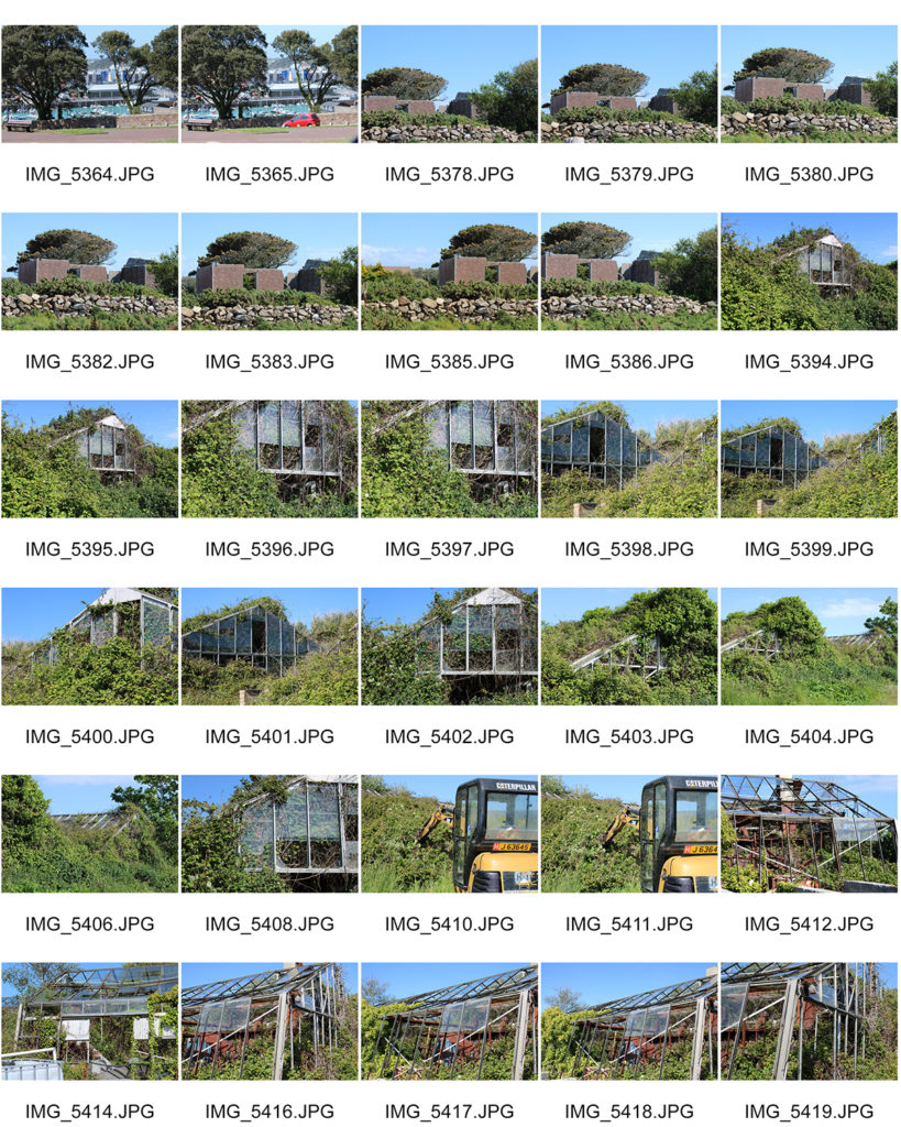
Contact Sheets

Selected Images

Image Analysis

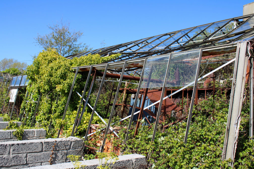
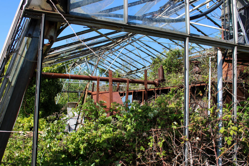
I have chosen to analyse this image from my Andrew Moore inspired photoshoot as it represents the idea of nature fighting back against industrialization. I captured this photograph at an abandoned greenhouse in Grouville, during mid-day using natural lighting to reflect Moore’s style of photography. The first element of my image that I really enjoy is my capturing of straight leading lines, creating direction in the photograph and guiding the observer’s attention into the center of the image. These thin abstract lines create geometric patterns from the mid-ground to the background and symbolize the rigid systematic way that humans are impacting natural environments. These artificial shapes contrast greatly with the organic pattern formed by the cluster of bushes and leaves which are reflected throughout the image. The texture created by these brambles is rough and spiky which gives the impression that nature is having to fight for its environment through force as society’s modern architecture will not let it thrive. Furthermore, the actual location of where this image was taken links to the Anthropocene idea even more as it is planned to be destroyed in order to make room for new housing and apartments. The context of the location shows how little humans are caring about the natural world, connoting the idea that they will let their beautiful landscapes become abandoned to make profit on industrializing and destroying them in the future. Additionally, the high saturation of colour in this image helps the observer to understand the value in our natural environments as it connotes the idea that when nature is left to thrive on its own it can create beautiful surroundings – however the vibrancy is juxtaposed with the dull monochrome greenhouse structure which symbolizes how nature is trapped behind the industrial bars of man-kind.

Natural Landscapes

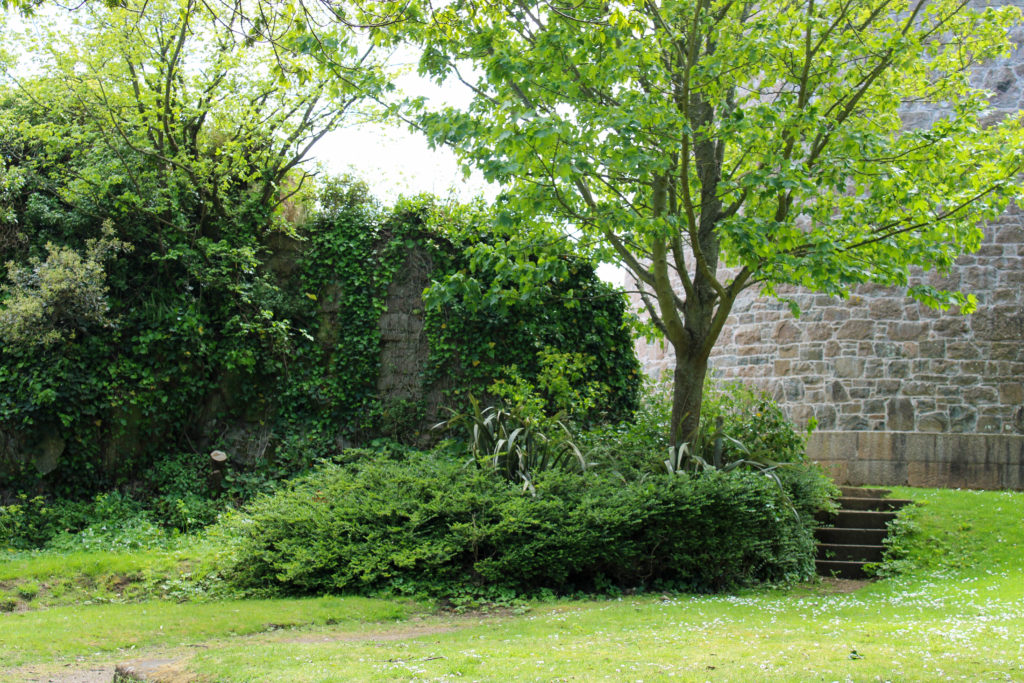
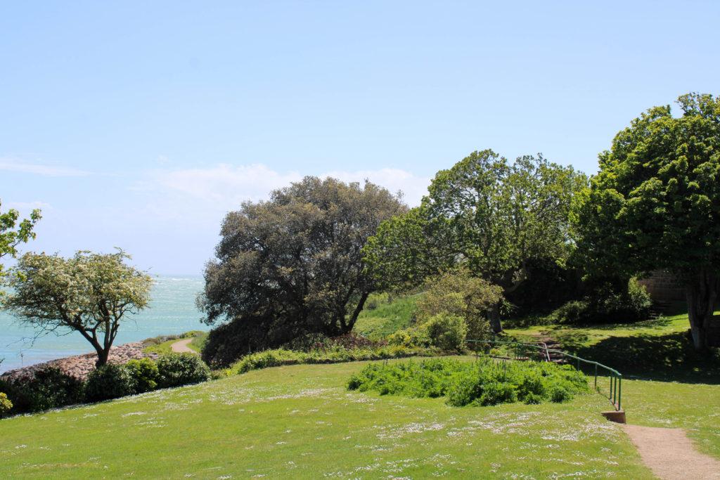
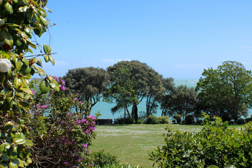
During my Andrew Moore inspired photoshoot, I captured elements of the landscapes that I was in which showed nature, untouched by man and thriving in its natural environment. I wanted to photograph these landscapes to link to my initial idea of presenting the three different stages of industrialization, showing nature unharmed, nature fighting against man-made structures and nature destroyed with urbanization taking over – in my final presentation of images I wish to use these natural landscape images as the first photo in the sequence of three. I wanted to highlight the beauty of nature through vibrant colours and the use of negative space in the skyline – I believe this gives the impression of a clear clean future of surviving natural landscapes, which contrasts significantly with the other two elements of my Anthropocene project.

Jeremy Carroll

Portrait of Jeremy Carroll (from Facebook)

Jeremy Carroll is a photographer and artist who wants to change the world and by doing this he must change how people see things.  In order to illustrate what plastic pollution is doing to fish and sea mammals, he created an exhibit called “Entanglement.” It shows humans entangled in the waste that is most commonly found in seawater and along beaches.

Famous Images

Jeremy Carroll focuses on sharing the impact plastic has on the environment and sea creatures through images of humans facing the same problems. Humans often feel more remorse when they see arm done to things they view as their equal.

Image Analysis

The red rope and plastic around the models neck is central and is what draws the viewer in as soon as they look at the image. The colour red could have been used to emphasise the fact that the person is now in danger or it could represent the blood that is drawn from the tightness of the plastic around the neck. In the centre of the model’s neck, you can see signs of struggle with the wrinkles that have formed and the fact that you can see the model’s hands trying to loosen the items that are currently shortening their life right before their eyes.

Carroll used a white background to ensue that the model was the centre of the viewer’s attention. The model also takes up a lot of the image which helps direct the viewer to look at the different materials and textures restricting their airflow. The different textures also emphasise the smoothness of the models skin and how it looks like it can easily be broken. This helps show the innocence of the creatures that get caught in these kinds of traps daily.

On the model’s neck, there is bits of yellow rope which had fallen. This helps emphasise how easy it is for plastic and debris to get into the ocean. It just shows that not every bit of plastic was put into the ocean on purpose. The shadows on the model’s neck look like marks that have been left there from how tight the plastic was wrapped round.