Category Archives: Independent

Filters

Author:
Category:

people Make Jersey

On 07/06/21 we went to the Jersey museum and art centre. While we were there, we went around the exhibition which was about the heritage of different people in Jersey. In that exhibition, there was a display covered with glass which contained people’s registration cards from when they first moved here.

I went on the Jersey Archive but sadly was unable to find any more information on the people in the images above. However I did do some more research on where the stereotypical ‘Jersey’ surnames actually came from.

The name Le Breton has a long French heritage that first began in north-western region of Brittany. The name taken from when the family lived in the province of Brittany, known to the French as Bretagne.

This surname was first recorded as Normant and Normanus in the 12th century and other early variations include Le Norman, Normand and Le Normand. The census records for the island show people with this surname living in most of the parishes.

It is one of the oldest Jersey surnames, first recorded in the 12th century as de Haya. Other variants of the name include La Haye, delahaye and de la Haie. Census records show that this family originally settled predominantly in the parishes of Trinity and St Helier. A number of de la Haye’s emigrated to new colonies such as Australia.

For more information on this, use the link below.

https://www.jerseyheritage.org/family-history/jersey-names

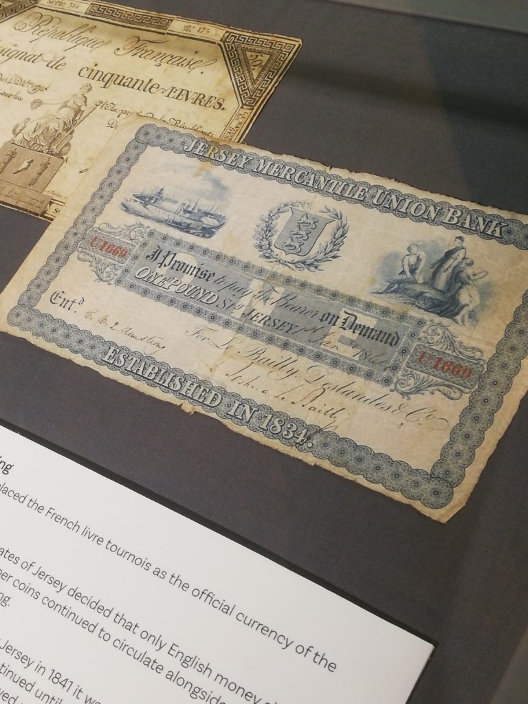
The pound note in the image above shows that it was established in 1834, when Jersey adopted the English currency. Before 1834, the currency was livre which consisted of French coins. In the 19th century there was a rate of 26 livre = 1 sterling pound.  After the livre was replaced by the franc in France in 1795, the supply of coins in Jersey dwindled leading to difficulties in trade and payment. In 1834, an order in council adopted the pound sterling as Jersey’s sole official legal tender, although French copper coins continued to circulate alongside British silver coins, with 26 sous equal to the shilling. Because the sous remained the chief small-change coins, when a new copper coinage was issued for Jersey in 1841, it was based on a penny worth 113 of a shilling, the equivalent of 2 sous. This system continued until 1877, when a penny of 112 of a shilling was introduced.

Migrant History of Jersey

Migrant history of Jersey

On the 7th of June 2021, Hautlieu Photography class got to take part in a visit to the Jersey museum where we were the last to see the exhibition: People Make Jersey.

During the exhibition we got to learn from a wide variety of topics the types of people in Jersey. For example, we got to learn about how French Protestants found refuge in Jersey since in 1572, the Massacre of St. Bartholomew, the Catholics killed thousands of Protestants. It wasn’t until 1598 that King Henry IV enable citizen rights to the Protestants, but by then they have found refuge in other places, such as Jersey. We can see the Protestants impact on the island nowadays since there are many protestant churches still running service, we have Jehovah’s witness’ still in operation and many of the older generation are Protestant and attend service.

I, personally, took interest in my own culture and managed to find a beautiful love story from 1930s – 40s. In 1930s, Edouard Alho came to Jersey from Madeira (my birth-place) to work as a waiter at the Merton hotel, he then became the head waiter. During World War 2, he went back to Portugal but came back in 1948 and got marry to a beautiful local girl named Betty. He then watched Jersey get back together, the Merton hotel become of the largest hotels in the channel islands. He then retired in 1984 after 50 years of service for the Merton.

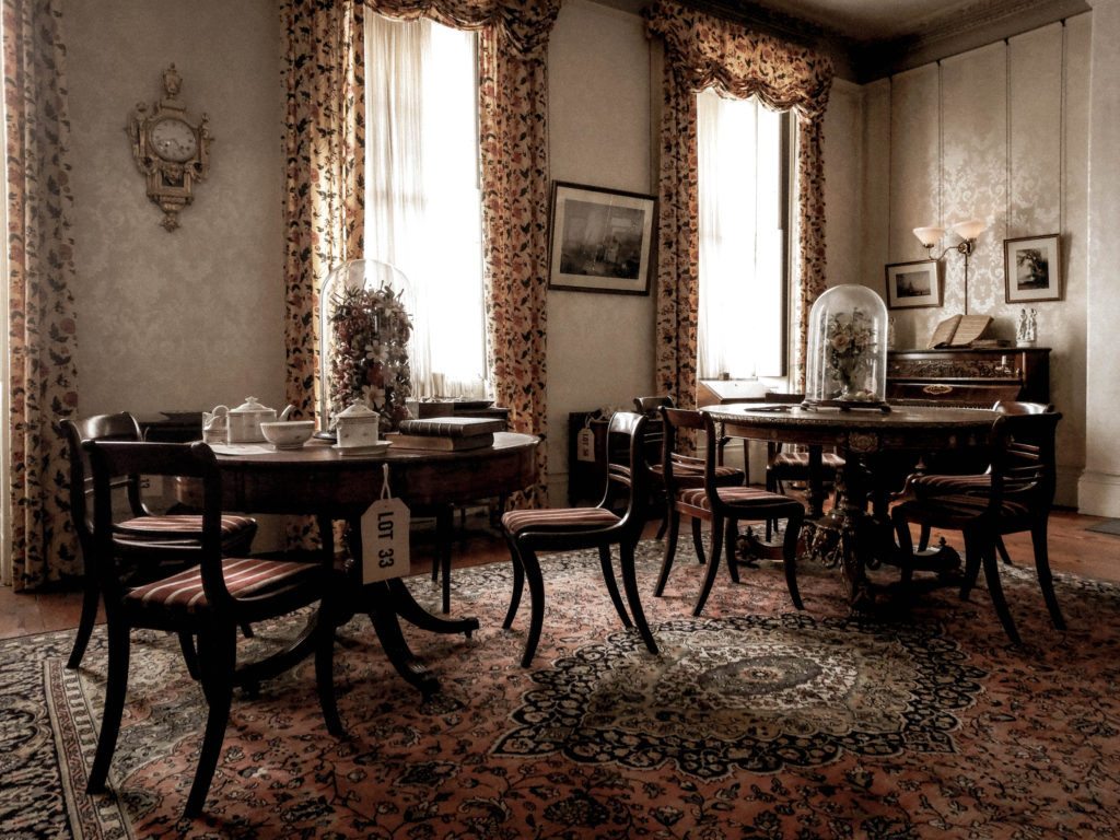
In addition, we got to learn about how rich houses were structured back in the 20th century. For example, we got to learn about the drawing rooms: the drawing room was considered to be the heart of the home. This drawing room from the museum was made by a Jersey man, Mr Philippe Nicolle Senior. He used carpenters from his own shipyards to lay the beautiful wooden floors. They would also caulk the boards with tarred strings since they had experience from the deck of a ship.


The Drawing Room

For his drawing room, Mr. Philippe was wise investing in the new gas system rather than oil in 1830. The family also beautifully decorated the room with luxury having wallpapers made by the renowned French manufacturer Jean Zuber & Co, established in 1797, maker of the finest hand blocked papers.

The residents also enjoyed music as you can clearly see by the upright piano with a large selection of sheet music housed in a charming burr walnut cabinet. As seen below:

Since our society used to be a patriarchal society, the ladies really appreciated the tables in which to do their needlework. The table includes tea or play-cards, an exceedingly ornate table made by the Hollands with the highest quality marquetry of mahogany, rosewood, satinwood and a manner of exotic woods, occasionally formed into portraits of famous artists of both the modern and ancient worlds.

To entertain the visitors, the room contained a perfect tea set made in the finest porcelain by the New Hall factory. Also, the paper Mache chair and japanned table are excellent examples of the New Hall factory. The chair, inlaid with mother of pearl, is in the latest London fashion.

As you can powerfully observe, we have learnt a lot from our trip to the museum. We learned about migration in Jersey, the contents of the finest rooms and how Jersey has changed over the years.

Therefore, the visit to the museum was very useful and inspirational.

Anthropocene – Evaluation

In my opinion, I think that my Anthropocene project, through the style of altered landscapes, has been successful. This is due to the fact that I believe I have portrayed what man’s impact on the world may visually look like, by presenting the hypothetical situation in which Jersey’s National Park is not protected from mass development. With this my original intention was to show how the geological age in which humans have been around, has had resulted in an unbalanced nature. This starting idea then developed, once researching and analysing photographers Tanja Deman and Felicity Hammond, into the intention to display how the earth’s natural and beautiful landscapes are in danger of urbanisation and industrialisation, due to the incessant greed of man for land, property and possessions. I think my final images well reflect the work of my two chosen photographers as, from a visual standpoint, they all showcase the imposition of urban/industrial structures on rural landscapes. Furthermore, I also believe that my final images reflect Deman and Hammond’s work from a conceptual and contextual view point as well, as I have decided to create these images in order to defend the sanctity nature possesses and hold humans accountable for their actions and attitudes that warrant the destruction of this very thing. In addition, when looking at my final images a viewer may see the potential dystopian like future Jersey may hold if these regulations were non existent, in which our stunning coastlines are reduced to a mere setting of smog and pollution.

Although I believe that my final outcomes for this project are successful, I also think there are some ways in which my work could have become even better. One way this could have been achieved is by taking natural landscapes at more than one location, and potentially visiting another area belonging to Jersey National Park. In addition, by also having a wider range of urban photographs, I may have been able to include more structures within the natural landscape, therefore intensifying the message I was aiming to convey.

Anthropocene – Final Images

Final Image Display

Sequence One

Sequence Two

Sequence Three

I have chosen these final images due to their strong link with Anthropocene and their ability to symbolize the growing industrialization of our world. My initial idea was to create a sequence of three images, each showing a different stage of urbanization in a sort-of storyboard style. Each image demonstrates how increasingly unnatural our world is becoming by revealing more of man’s impact on the surroundings. After carrying out photoshoots inspired by Edward Burtynsky and Andrew Moore I made the decision to edit each image with a harsher blue tint each time, so the final Burtynsky inspired image at the end of the sequence was of a cooler temperature, reflecting the landscapes emotionless atmosphere. Furthermore, the increased editing of each image symbolizes how manufactured and artificial the planet is turning out to be from society’s disregard of nature, with each image growing colder and more unnatural. The composition and leading lines in each image draw the observer’s attention along the sequence in a cyclical pattern, as if the story goes on over and over again, just like man-kind is frequently building modern structures and industrial sites which all aid in harming the atmosphere around us. Contextually, several photographs from my Burtynsky shoot (which have been chosen for my final display) document reclaimed land in Jersey. It is a fact that reclaimed land is highly susceptible to soil liquefaction, which can amplify the amount of damage that occurs to buildings and infrastructure – I decided to capture these landscapes to further my point on humans being the main source of global devastation, we are interfering with nature and creating danger for all, even destroying the industrial structures we have built in the process- ironic.
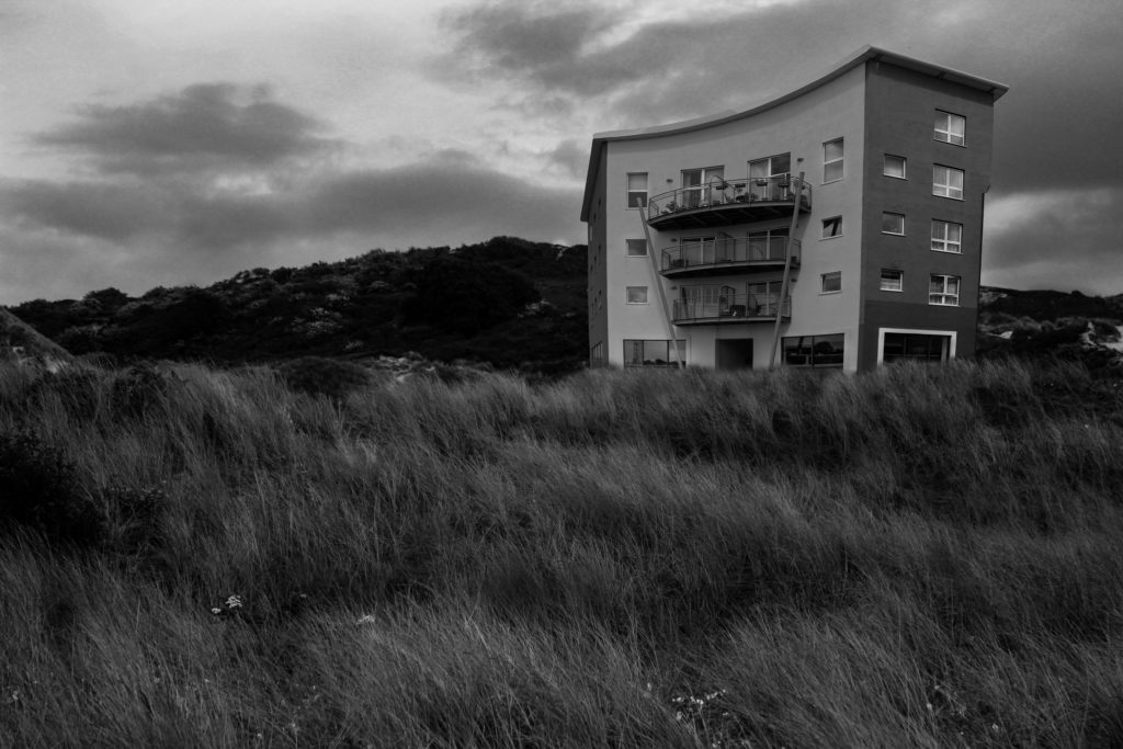
Edward Burtynsky Comparison

I have decided to compare this Edward Burtynsky image to one of my final pieces because of their similarities in composition and their use of the formal elements. Firstly, a clear similarity between them is the capturing of repetition throughout the landscapes, Burtynsky has photographed an area with circular structures reflected in uniform rows. I believe he was attempting to mirror how unvarying our planets architecture, and even societies themselves, are. Repetition is plainly captured in my image in the form of rectangular shapes from buildings, windows and structures – showing the increased artificial landscapes through geometric echoes. I wanted to reflect Burtynsky’s repetitive technique, however slightly differently to demonstrate the way different communities deal with Anthropocene, seeing whether they fight against it or let it take over. Also, the basic and elemental nature of these shapes shows how trivial these modernized areas in the world are. Additionally, another similarity between these photographs is their straight horizon lines which act as an indication for their wide depth of field. The leading line in Burtynsky’s image slowly reveals a disappearing background as the horizon becomes misty and unclear, this could possibly symbolize how man-kind is forgetting, or not choosing to see, their destruction and wrecking of the natural world – as if industrialization is all that can be seen going into the future. In my image there is also a clear straight leading line across the horizon, however in the background there is a hint of hope within the capturing of a natural environment where trees poke through the urbanized surroundings. The comparison between these two uses of leading lines demonstrates how there is still hope for our landscapes future, however if we don’t act now, that hope will disappear. A key difference between these images is the cameras point of view, while there is the similarity of them both being captured from above, Burtynsky’s birds-eye-view shows a greater span of land. Furthermore, due to my editing choice to connote a more derelict and cold atmosphere through turning down my image’s temperature, the colour palette in Burtynsky’s photo is slightly more muted then mine – nevertheless both still produce a sense of sadness, connoting the robotic and artificial mood of the setting.

Andrew Moore Comparison

I chose to compare this image by Andrew Moore to one of my final photographs due to their similarities in texture, composition and differences in colour/temperature. Firstly, one similarity between these images is their busy, rough texture which is created by the repeated leaves and brambles entwined around the greenhouses. In both images this texture connotes ideas of discomfort and restriction, symbolizing how nature is being forced into a corner to try and survive from man-kind’s destruction. Additionally, Moore’s image has a similar composition to my own as both are captured at an eye-level point of view with the main subject taking up the span of the entire frame. The scarceness of negative space in these photographs demonstrates how desperate nature is to withstand industrialization and retaliate against man-kind’s interference. Moreover, this creates a short depth of field as little can be seen beyond the overgrown structures, connoting how little time is left for nature to overcome this destruction. Furthermore, another similarity is the image’s use of shape, both mine and Moore’s photos capture triangular structures which are being consumed by the natural shapes of nature. The juxtaposition between these geometric and organic shapes reveals to the observer how the effects of human interference with the planets natural landscapes is causing nature to use force against what we have created, connoting the theme of man Vs nature. Nevertheless, there are also several differences between my image and Andrew Moore’s, for example they both hold different temperatures. Moore’s photograph has more warm tones of orange and yellow allowing us to guess the time of year is autumn and that the image has been taken later on in the day. The warmth of Moore’s photo could possibly symbolize global warming, showing the danger in industrialization, however the saturation of the tones also demonstrates how nature still finds a way to be beautiful even after all the carnage it’s been through. Contrastingly, my image holds much colder tones to represent the cold-heartedness of society – I wanted to symbolize how man-kind has made these landscapes feel, their atmosphere changed by the impendence of humans.

Review And Reflection

My aims and intentions for this Anthropocene inspired project were to demonstrate how man made structure were increasingly impacting our natural environment. I planned on capturing landscapes around Jersey in three different stages; the first highlighting the beautiful natural areas in fields and woodlands, the second showing areas of Jersey where nature can still be seen however man’s impact is taking effect and the third exhibiting the cluttered industrial landscapes of our island. While working on this project I discovered the relevance of camera point of view in images, I found it important to capture my photographs from specific locations and angles to represent the message of impending industrialization that I wanted to portray. One of the biggest obstacles I overcame during this project was my lack of confidence in my editing process, I found it difficult to portray my idea uniquely through editing and became stuck for ideas. However, I quickly overcame this obstacle by brainstorming and experimenting on Lightroom to discover how temperature effected the atmosphere of my images, I really love how the increase in coldness over each image symbolizes the heartlessness of the destruction of nature and the urbanization of landscapes. I would say my greatest strength during this project was my ability to create a storyline through a sequence of images, I believe I successfully connoted the growing industrialization of our world and used my time wisely to experiment and analyse my final images in comparison to the photographers I took inspiration from.

Anthropocene – Final Products and Editing

Edits in The Style of Felicity Hammond

Edit 1

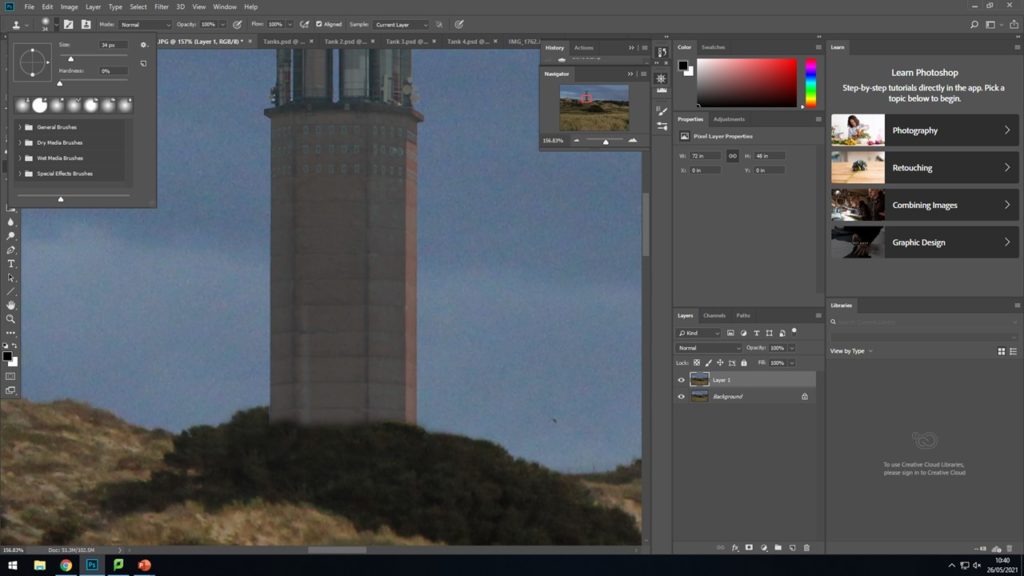
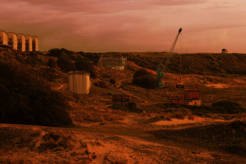
In order to produce this altered landscape edit, in the style of Felicity Hammond and through the lens of Anthropocene, I started off cutting out all of the structures I needed to use for that edit, from my urban landscape photo-shoot. After I had done this, I dragged the buildings onto my chosen photograph from my natural landscape photo-shoot one at a time. With each structure I adjusted the hue/saturation, brightness and contrast, and colour balance, to make sure the tones in that layer would match the tones and colours of the natural landscape, in order to make them fit in more with the landscape. Once I had done this, I then adjusted the perspective of the structure, meaning the angle of the layer would correspond with the angle at which I took the natural landscape from. Next I used the clone stamp tool to make sure the structure is embedded within the landscape, in the grass. Finally after doing this same process for the other three buildings I included in this edit, I added a solid orange colour as a layer and placed it over the flattened image, and selected the overlay option. This was done to cause the edit to look more similar to Hammond’s work. Then I also added a slight gradient overlay, starting from the bottom of the image.

Edit 2

For this next edit I followed the same editing process as the image above, however using a different structures and a different base natural landscape.

Edits in The Style of Tanja Deman

Edit 1

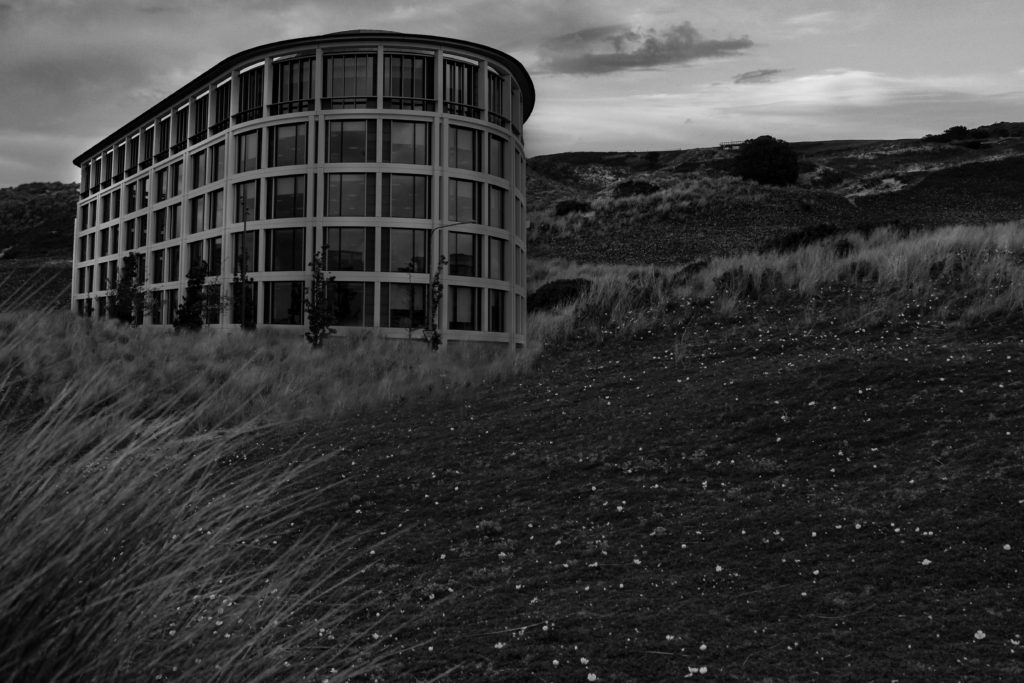
In order to create this altered landscape, in the style of Tanja Deman, I started off by cutting out the one structure I would need for this edit, from my urban landscape photo-shoot. With this edit I only used one building to replicate Deman’s work, as she usually has the focus on one structure instead of multiple. After this I then dragged the cut out image onto my chosen photograph, from my natural landscape photo-shoot. Next, I tried to match the tones and colours of both layers by adjusting the hue/saturation, brightness and contrast, and the colour balance. Once I had done this, I used the clone stamp tool to make it look as if the building was embedded in the grass. Then, after I flattened the image, I converted the image into black and white, whilst also adjusting the shadows and highlights. Finally, I used the dodge and burn tools to add slight adjustments, and highlight the side of the building that would have been facing the sun, if it were there .

Edit 2

For this edit, also in the style of Tanja Deman, I followed the same editing process as the image above, although this time using a different structure and landscape.

Anthropecene Evaluation

My original intentions where to shoot more landscape images with a wider perspective. Although I did manage to complete this for a few images, my focus shifted more towards a more close up look at Anthropocene landscapes and more abstract methods of capturing the argument between man and nature.

I believe the process of researching and reacting to Anthropocene in a creative and technical manner as a whole was sacksful as I gained a lot of knowledge about the topic and developed my skills in terms of how to react to it. I believe I gathered and edited a successful range of images which react to the topic well.

Anthropocene Final Display

A3

I chose the above three images as they link really well with Anthropocene.

The owl sleeping in the barn window fits really well as the natural lighting beaming through the window romanticises the creature and the leaves behind it and the bubble wrap floating in front of its face represents man’s impact on wildlife. The owl is also framed really well in the window.

I chose the other two images because of how they represent ideas of industrialism and how their colour scheme reacts well to George Marazakis’ work.

A4

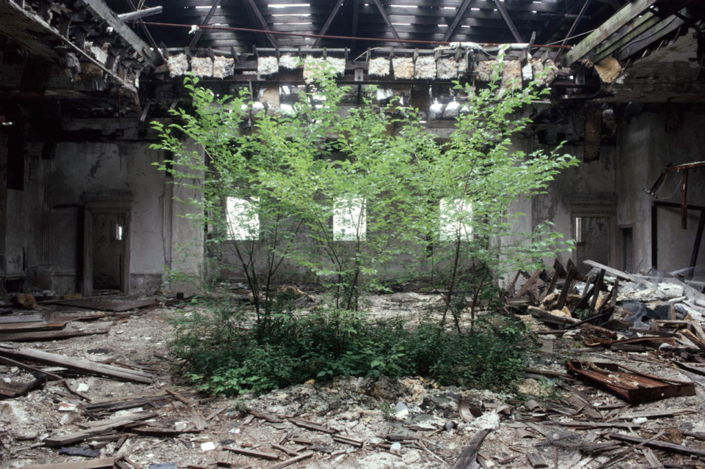
The above three images relate well with this project. The deralict land rover with the trees growing around it reacts well to Camilo Jose Vergara’s work and it features the idea of nature fighting back against man.

The two other images relate well to George’s work as they feature a vast landscape with subtle clues of man’s ‘disease’ on the natural environment.

A5

I chose the above three images as they all represent Anthropocene well. The second image is framed well and has a lot of leading lines which makes it an impactful image to represent the idea of deforestation.

The graveyard represents the death of humanity and the idea that nature will always flourish with the vibrant leaves enveloping the bleak gravestones.

Framing and Manipulation

I chose to form a triptych out of the images above as they all present the same theme of man’s destruction and all have a similar colour basis of a greyscale juxtaposing with a deep, vibrant green/emerald colour.

Anthropocene – Altered Landscape experimentation

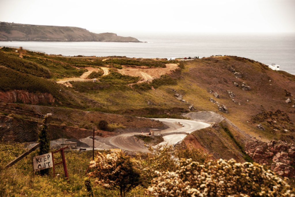
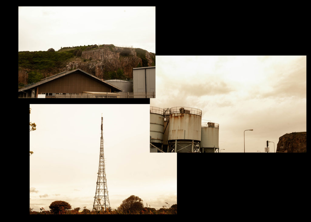
Here I have Started to experiment with the editing process, in which I will use to create a piece similar to Felicity Hammond’s, by creating a rough edit of industrialism in the natural landscape. Below is the initial collage that I will use to try out different methods of editing, with my aim to create work similar to Hammond’s ‘In Defence of Industry’ series.

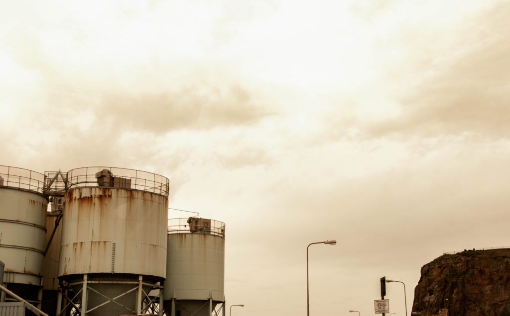
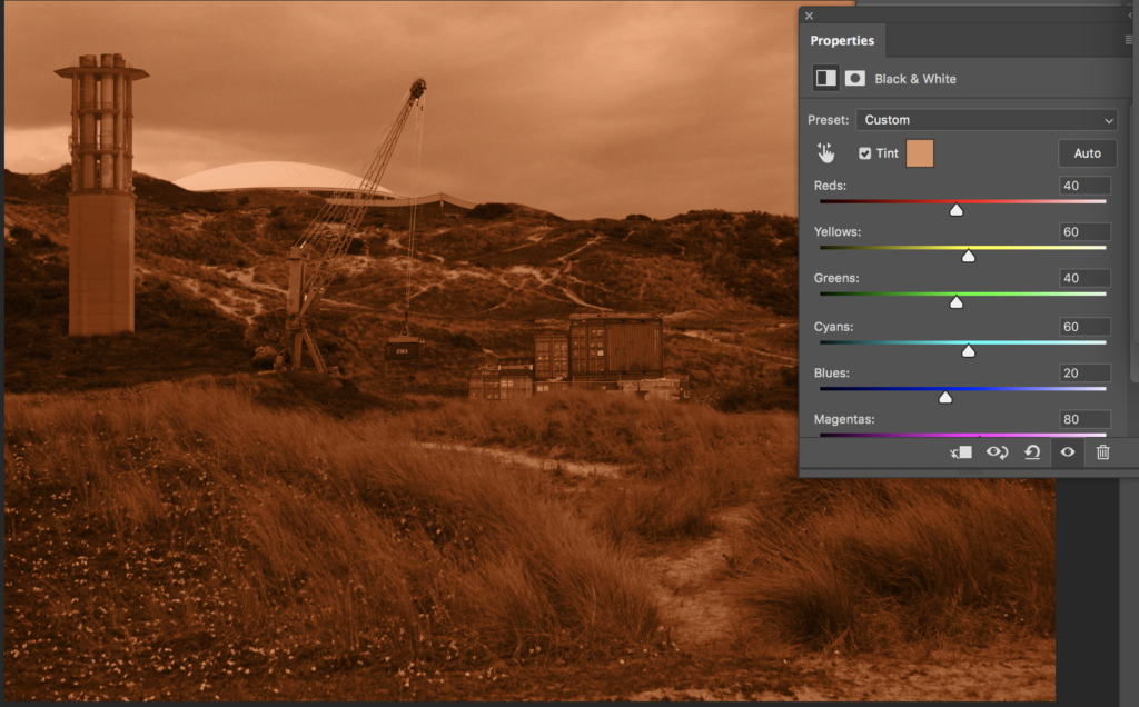
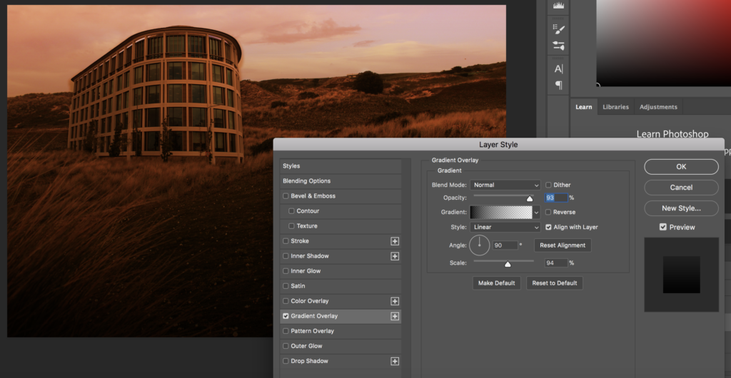
After putting a together a quick example of what my final piece may look like, I then attempted a few different ways of creating an orange tint over the photograph, again replicating Hammond’s work. Firstly, I edited the image first into black and white, to allow for a sepia style tint to be applied over the top of the image. I also attempted to achieve this orange hue by placing a solid colour as a layer over the edit, and then selecting overlay as a blending option. This style allowed for some of the colours in the image to show through as well, without it being all one tone. Finally, I tried including a light gradient overlay, to darken the bottom half of the image, which I believe could allow the viewers eyes to be eased into the altered landscape.

In addition to this, I also tried to experiment with editing in the style of Tanja Deman’s work, focusing on one single urban structure. I put together this rough edit to try to replicate her style, in which the urban structure largely contrasts with the surrounding nature. By doing this I am also allowing myself to have a clear idea of how I will produce my final products within the controlled conditions.

Initially, I started off by converting my altered landscape into black and white, adjusted the levels of the tones of colour, due to the fact that all of Deman’s work are presented in black and white. However, I then added an orange tint and gradient overlay, trying to see what it would look like if I were to combine the two photographer’s styles of altered landscapes. This produced what appeared to look like a slightly apocalyptic landscape. However, In my controlled conditions I will keep these type of edits in black and white, as it links more closely to the photographer.