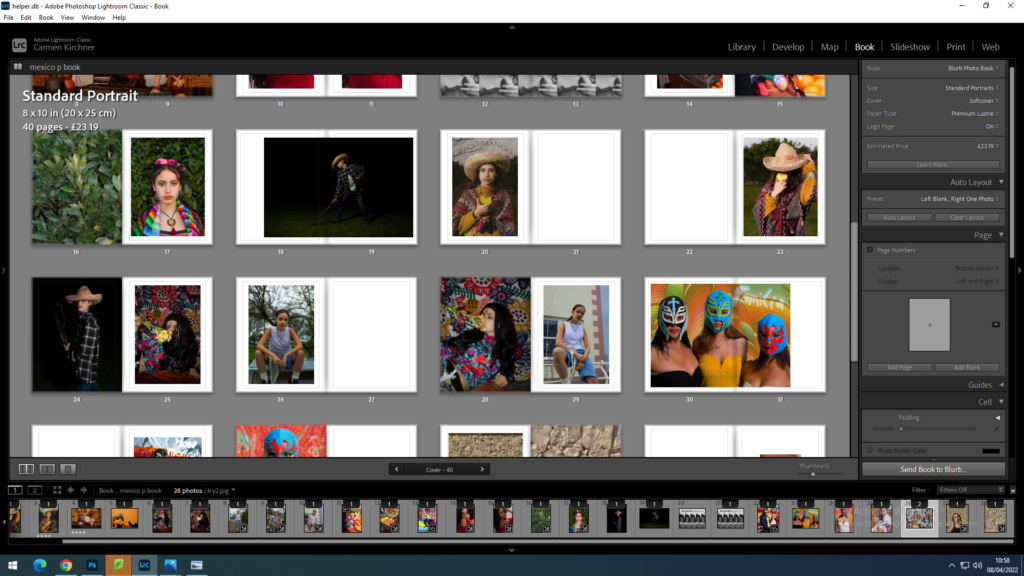
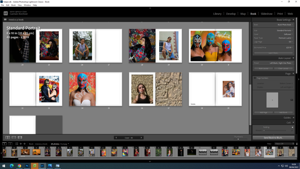
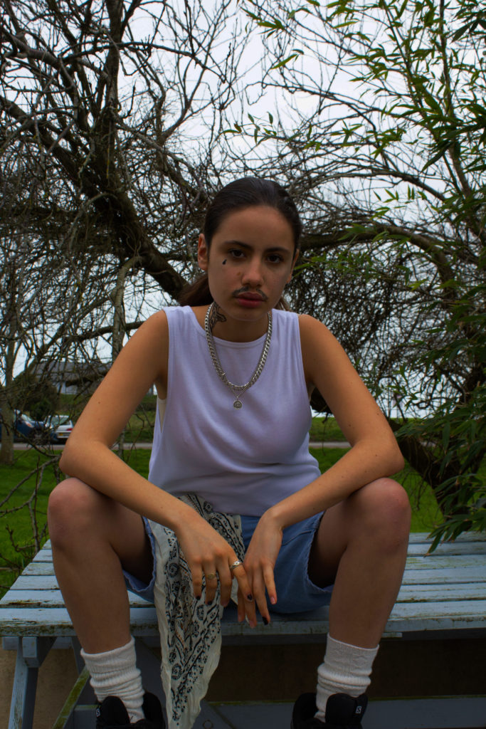
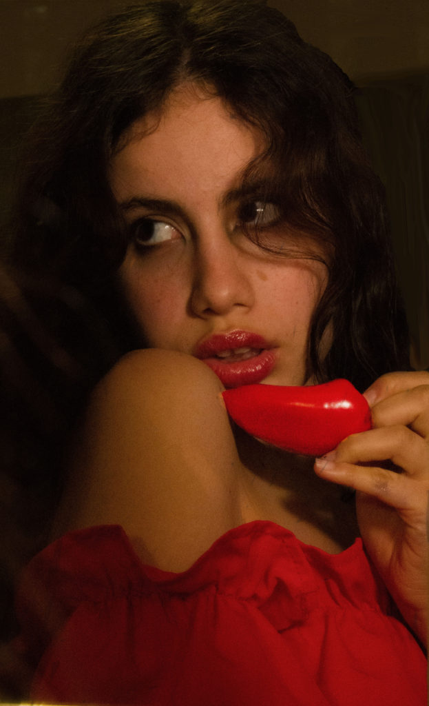
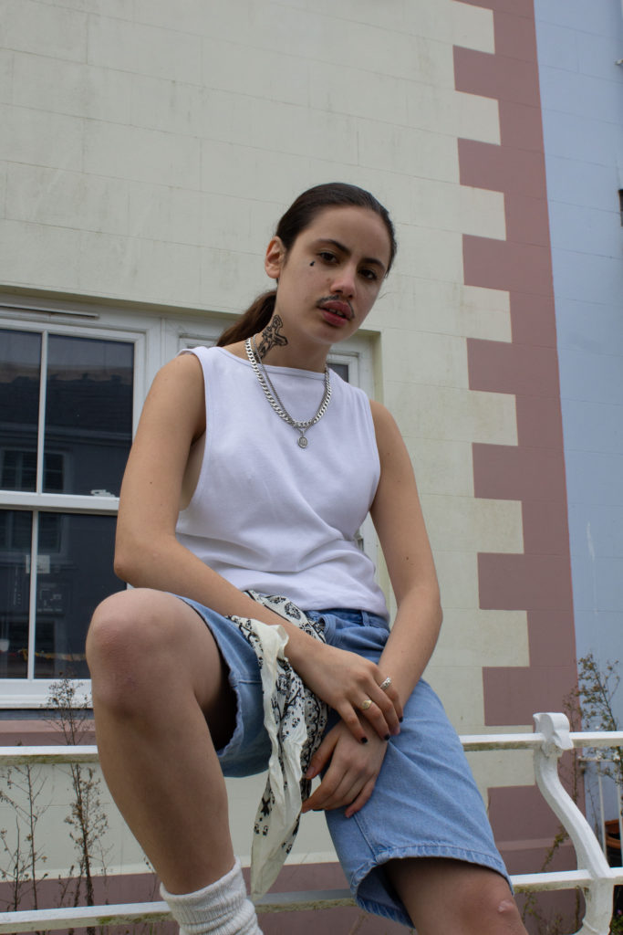
My book is a standard portrait size, which is soft cover and the paper type is premium gloss. I wanted my cover to have a Mexican graphic, so I searched for a Mexican pattern on the internet and after a few selections, I chose this image. On the first page you can see in the middle my Title “Not so cholo”.Cholo is a young man who belongs to a gang, with characteristics in the way he dresses and expresses himself; They usually live in northern Mexico or on the border with the United States. It translates as “not so cholo” what I want to interpret with this title is that it is not because we are from a place that we are officially the stereotypes that are presented from that country “I am not as cholo as you think I am”. It is also a play on words in Spanish with the saying “No tan solo” which means not very lonely. The next page is an image of me dressed as a Mexican gang member, my inspiration was of course how we present them in the media. I put my landscape portraits on a full page because obviously the proportions would be better. The sixth image is me diffracted into a drunk Mexican and I juxtaposed it with a drawing of the Mexican lottery called El Borracho, a game that is played a lot in Mexico.Some of my images are juxtaposed with just the same background for an aesthetic detail. My final image is an image of me and my mom because I want to thank you for making me a part and showing me this culture. I want to honor it and show that those ridiculous stereotypes are just offensive and don’t really represent us.
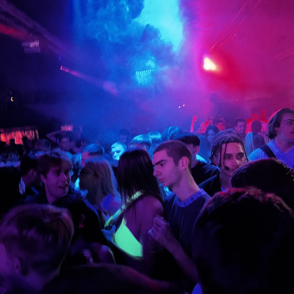
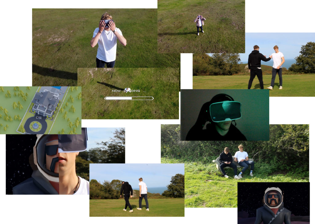
Below are the images that I will be using for my photobook. All of my images were taken in Drum and Bass events that were upheld in Jersey and the UK. Some of these images where highly edited in the way that the photo has been fully manipulated. Whereas the others are pictures which have not been edited at all.
Write a book specification and describe in detail what your book will be about in terms of narrative, concept and design with reference to the same elements of bookmaking as above.
Narrative: What is your story?
Describe in 3 words?
Drum and Bass
A sentence
Showing outsiders the drum and bass culture from an insider’s perspective.
A paragraph
As an individual who is in the culture of the drum and bass scene. I want to be able to portray the drum and bass culture to outsiders, who don’t understand the drum and bass culture. Furthermore, giving a deeper understanding on drum and bass on what it is and how this culture is even relevant.
Design: consider the following
How you want your book to feel
I want a softcover on the outside and for the book to be glossy so it looks similar to a magazine.
Paper and Ink
I want the ink and paper to be glossy so that the bright colours in my images really stand for people to view.
Format, Size and orientation
My book is going to be a small square with the dimensions of: 7 x 7 in (18cm x 18cm).
Binding and cover
I am going to want the cover to have an image of a crowd of people. This is because I want people to get an understanding on what type of book they are looking at.
Title
My title is going to be called “The Sesh”. This is because some people will understand the slang term and some won’t. For those who don’t understand it, hopefully after looking at the book they will know what it means.
Design and layout
Single full bleed images
Single images non full bleed black border
three images on one page
Editing and sequencing
I want to sequence my images how people usually end up going through a night out, from the start to the end of a night out.
Images and Text
Above is the front and back cover of my photobook. To make it, I put the title “The Sesh” in the middle bottom of the book and included my name and title on the spine. The front and back cover on my book have a full bleed spread of an image of a crowd at one of the drum and bass events. I had to zoom the image out abit in order for it to sit perfectly across the front and back cover.
Above is the finalised layout of my photo book with images of the photo shoot i had taken, with finalised images selected across a sequence. During the creation of this photo book, I have experimented with different page layouts. For example, instead of having one photo on a page, I put three images laid out with two small ones on top and a bigger picture going across the bottom of the same page. In my opinion, this final photo book layout is the best due to the way the pictures are put together on each individual page.
Above is one of the first images that was edited/ manipulated in order to make the image look hallucinogenic. This appears to be an effective edit because I was able to manipulate the picture, in a way which people would believe that’s what it would look like to consume drugs at a drum and bass event. Moreover, this image would give outsiders an idea on the atmosphere to expect at these events being; loud, bright and wavy etc…
The next edited/ manipulated image was only changed from its original colour to black and white. This image is a golden gem to me because the picture was taken in a way where the flash stayed on with the persons face with the camera having a wide aperture. Therefore, the image looks edited however it isn’t and that is amazing because even if I wanted to recreate the image I couldn’t, making it a 1 of 1. Furthermore, the image once again could give off the impression of distortion/ hallucination. Giving people a further understanding on what the experience could be like at these drum and bass events.
Finally, this is an image captured at one of the drum and bass events attended to get images. This image is strong I believe because it wasn’t edited, making the picture fall under the subclass of realism. Moreover, the image is engaging as I was able to capture the coloured smoke in the background of the image. This was effective as it made it engagging to viewers. Finally, the image being realistic is great for outsiders looking in because they are able to see an authentic image of what happens in these drum and bass events. From the atmosphere, emotions, facial expressions, clothing etc…
Above is an image that demonstrates the different types of options you can select in order to layout your pictures. This was great as I was able to move my layouts around to whatever I preferred.
The Outcome
The outcome from the photobook project is a book which reflects the culture of the drum and bass community. It shows what the potential experience of a night out to a drum and bass event could be like, from the start, to the end of the night. Moreover, the book is also meant to show “outsiders” who aren’t involved with the drum and bass community, showing what the community is about, cancelling out any stereotypes that people might assume within the drum and bass culture. For example, because of the what the music sounds like, people assume that people are aggressive at these events, causing fights between the crowd. However, as an insider to this culture, I can say that the people in the crowd are very in tuned with the music. Meaning that everyone is happy and not bothered by any pushing or shoving in the crowd. This is because, people accept that they are in a tight space which is the reason as to why pushing and shoving occurs occasionally on accident. Moreover, everyone in the crows is there for the same purpose which brings the community together as people share similar interests in music and clothing. Furthermore, the occuring themes of garments are sunglasses, bucket hats, costumes/ coordinated outfits and bumbags. Some of these garments such as sunglasses and bumbags, are mainly used so that people can carry drugs with and not have people look into there eyes for suspicion. Drugs are heavily influenced in this culture due to that fact that the audience are mainly young adults. Also, because people want to enhance their experience for a better time, memories and having moments of euphoria.
what? what stereotype should I put in Mise en scene : gangs in movies ; La Mexicana ; Gardner and ”spicy” Latina
how? Pay attention to details like the clothes, the accessories, make-up, background, lights, the mood… to create the Mise en scene.
when? March
where? I want each photo to be a different story so for me it would be more suitable if I do each photo in a distinct location, They mostly be in house but I want to be spontaneous so anywhere that reminds of Mexico or I think is a perfect place for one of my stories would be great.
Cindy Sherman
Edit
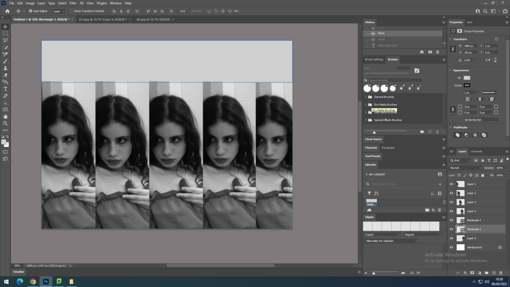
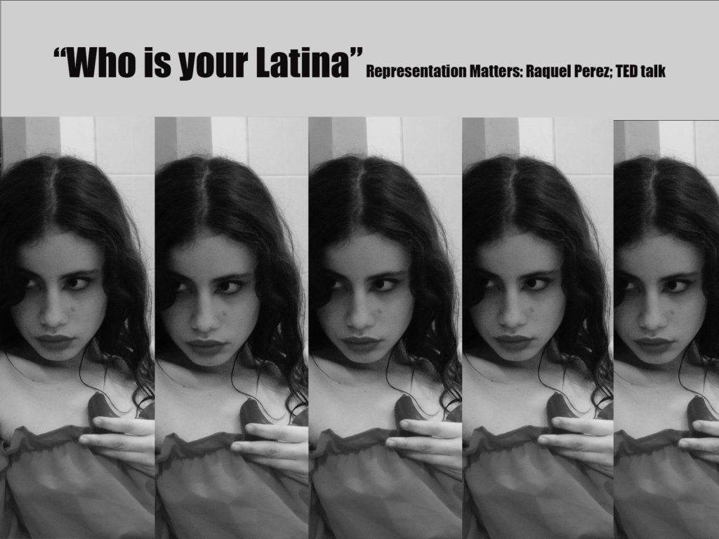
For my project I wanted to do some research on the consequences of Latinos stereotypes. I watched a TED by Raquel Perez which is about the representation of Latinos in society. She talks about how frustrating it is when you are not Latina ”enough” because we don’t know the language enough, the colour of our skin is not tan enough. Because we don’t look like the Latino stereotype that we see on the TV therefore we must not be. I decided to edit one of my images and called it “who is your Latina”. The meaning behind the title is to question society how or who do we have to be to be considered Latina. To edit my image is use photoshop, I started by selecting my image. I copy, pasted my image to another white plain image. I had to cut it so it fit proportionally and paste the same image five times. I wanted to put the title at the top of my collage so I selected a rectangle above. I then used the eye dropper tool which helps you to have a sample of a colour of your image. Finally I wrote the title and flattened the image.
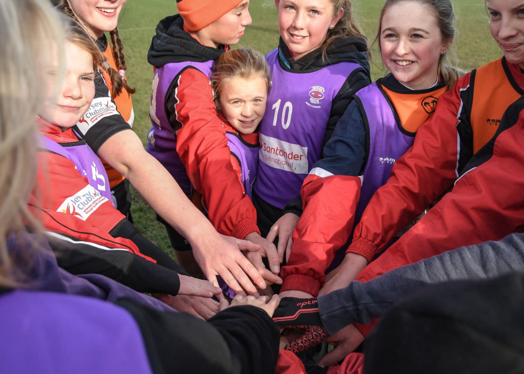
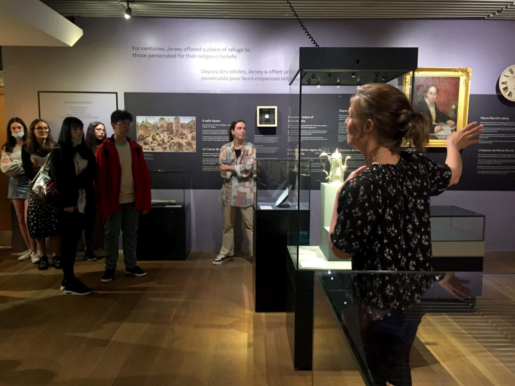
The images seen on the pages of this newspaper supplement are extracted from a variety of projects and final outcomes produced over a two-year academic programme of study by a group of A-Level photography students at Hautlieu School. In their final year the themes of Identity and Community offered a specific focus and through a series of creative challenges students developed a body of work that were inspired, partly from visiting heritage institutions to learn about aspects of Jersey’s unique history of immigration and exploring migrant communities and neighbourhoods in St Helier in a series of photo-walks. In the classroom additional inspiration was provided from workshops on NFTs (non-fungible token) and digital art, embroidery and textile art, animation and film-making, zine and photobook design led by professional artists, designers and teachers.
As part of the research and contextual studies students were asked to engage with some of the key questions raised by the Government of Jersey’s Island Identity project and explore through their own photographic studies how they interpret and identify distinctive qualities of island life. What can we learn from looking at a set of photographs produced by young islanders? At first sight they show us a seemingly random set of images of places, people and objects – some familiar, others surprising. On closer inspection each image is a visual sign and also a conundrum. For example, a fish stuffed in a plastic bottle may ask us to consider more closely our marine environment, commercial fishing or food consumption. As a combined sequence of images they represent different views that in many ways comment on a wider discussion on some of the primary objectives explored in the Island Identity project, such as ‘how we see ourselves’ and ‘how others see us.’
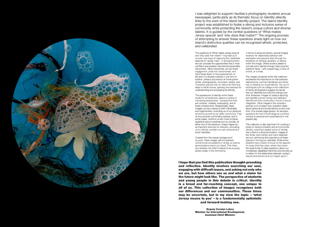
The newspaper was kindly sponsored by Deputy Carolyn Labey, Minister for International Development and Assistant Chief Minister who in her foreword shares her personal thoughts on what makes Jersey special to her in context of the Island Identity project led by her department. She says, ‘identity involves searching our soul, engaging with difficult issues, and asking not only who we are, but how others see us and what a vision for the future might look like. The perspective of students and young people in this debate is critical. Identity is a broad and far-reaching concept, one unique to all of us. This collection of images recognises both our differences and our commonalties. These times may be uncertain, but in my view the topic – ‘what Jersey means to you’ – is a fundamentally optimistic and forward-looking one.’
The Identity and Community newspaper is the fourth supplement produced in collaboration between Hautlieu School Photography Department and Jersey Evening Post. In 2018 the first issue was The Future of St Helier and last year the themes of Love & Rebellion explored experiences of isolation and lockdown during the coronavirus pandemic. Photographer and teacher Martin Toft, comments: ‘The question of ‘what makes Jersey special’ matters a great deal to every islander and as visual signs, the images printed on these pages are an attempt – not so much to provide answers – but rather asking questions about the essence of this island we call home, and how it actively will overcome current challenges in shaping a prosperous future for all.’
Evaluation
My Images
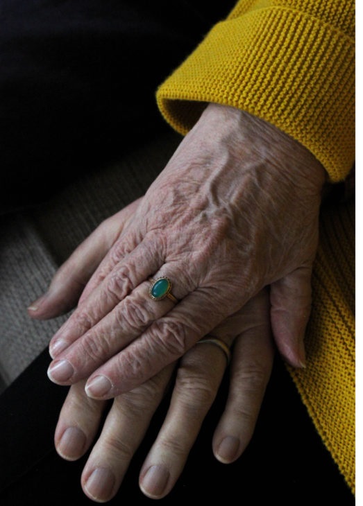
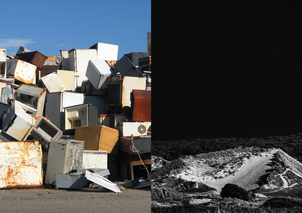
I found the experience of being a part of this newspaper very interesting, with being able to figure out which of my images would look best and experimenting with the layout, and which photographs look best as a small series. The images of mine that have been displayed in the newspaper include the small image on the bottom left, which displays a landscape that shows industrial structures edited into St. Ouens sand dunes, from my Anthropocene project. As well as this a full bleed image of my grandparents hands taken from my personal study project is featured as well as a double page spread of stitched photographs from the same project. It was a really exciting opportunity having my images displayed in a public place and having more people view my work. I think that the series of stitched images work best in the newspaper as it links to island identity in the sense that it touches on how my family moved to Jersey from England, which is similar to many other people who live on the island. Overall, I am very proud of the outcome of this newspaper.
The images seen on the pages of this newspaper supplement are extracted from a variety of projects and final outcomes produced over a two-year academic programme of study by a group of A-Level photography students at Hautlieu School. In their final year the themes of Identity and Community offered a specific focus and through a series of creative challenges students developed a body of work that were inspired, partly from visiting heritage institutions to learn about aspects of Jersey’s unique history of immigration and exploring migrant communities and neighbourhoods in St Helier in a series of photo-walks. In the classroom additional inspiration was provided from workshops on NFTs (non-fungible token) and digital art, embroidery and textile art, animation and film-making, zine and photobook design led by professional artists, designers and teachers.
As part of the research and contextual studies students were asked to engage with some of the key questions raised by the Government of Jersey’s Island Identity project and explore through their own photographic studies how they interpret and identify distinctive qualities of island life. What can we learn from looking at a set of photographs produced by young islanders? At first sight they show us a seemingly random set of images of places, people and objects – some familiar, others surprising. On closer inspection each image is a visual sign and also a conundrum. For example, a fish stuffed in a plastic bottle may ask us to consider more closely our marine environment, commercial fishing or food consumption. As a combined sequence of images they represent different views that in many ways comment on a wider discussion on some of the primary objectives explored in the Island Identity project, such as ‘how we see ourselves’ and ‘how others see us.’
The newspaper was kindly sponsored by Deputy Carolyn Labey, Minister for International Development and Assistant Chief Minister who in her foreword shares her personal thoughts on what makes Jersey special to her in context of the Island Identity project led by her department. She says, ‘identity involves searching our soul, engaging with difficult issues, and asking not only who we are, but how others see us and what a vision for the future might look like. The perspective of students and young people in this debate is critical. Identity is a broad and far-reaching concept, one unique to all of us. This collection of images recognises both our differences and our commonalties. These times may be uncertain, but in my view the topic – ‘what Jersey means to you’ – is a fundamentally optimistic and forward-looking one.’
The Identity and Community newspaper is the fourth supplement produced in collaboration between Hautlieu School Photography Department and Jersey Evening Post. In 2018 the first issue was The Future of St Helier and last year the themes of Love & Rebellion explored experiences of isolation and lockdown during the coronavirus pandemic. Photographer and teacher Martin Toft, comments: ‘The question of ‘what makes Jersey special’ matters a great deal to every islander and as visual signs, the images printed on these pages are an attempt – not so much to provide answers – but rather asking questions about the essence of this island we call home, and how it actively will overcome current challenges in shaping a prosperous future for all.’
Various workshops and school trips for inspirations, recording and experimenting with new images and ideas of making
My featured images:
My images are used on the front and back cover, which I am happy about even though there is text and a watermark over it, and it is still visually strong.
This is a double page spread containing my images, they contrast each other which is why they are displayed next to each other.
The two images above are used to contrast other students work.
Overall, I am happy with the amount of work I have in the newspaper.
The images I have selected for my final prints contain a mixture of reworked archival and newly produced images. I believe that these pieces best capture the essence of my photobook and the narrative as a whole. This is to highlight the intent behind producing family photographs and memories, commenting on the fact that many of these images conceal or fail to express the reality of the people in the frame, and deconstructing the message behind them.
Virtual Gallery
With my final images, I used artsteps.com to create a virtual gallery in which it is possible to have a 360 view of the gallery space. Here, I used more of my images from my photobook that are not from my final prints to create a more full looking gallery space.
Using Adobe Lightroom, I imported all of my final images from my personal study project for my photobook. Here I uploaded the images onto different pages and experimented with the layout of them, seeing which images worked best on opposite pages and complimented each other. I adjusted the size of the photographs on these pages, working out which images worked best as full bleeds and which looked better with a white border. From this I found that a full bleed portrait image next to a portrait with a white border looked best for my layout, with some double page spread full bleeds for landscape images. Although, on some pages I tried placing a landscape and portrait alongside each other and found it looked best when the landscape overlapped to pages displaying the portrait, or with two landscapes stacked on top of one another on one page, opposite to the portrait. In addition to this, I also experimented with the order of the pages and their ability to aid the narrative, as well as presented a balanced feel to the book. With this I found that the double page spread of my stitched family portrait, was a good anchor for the central page of my photos.
Final Layout
Photobook final layout
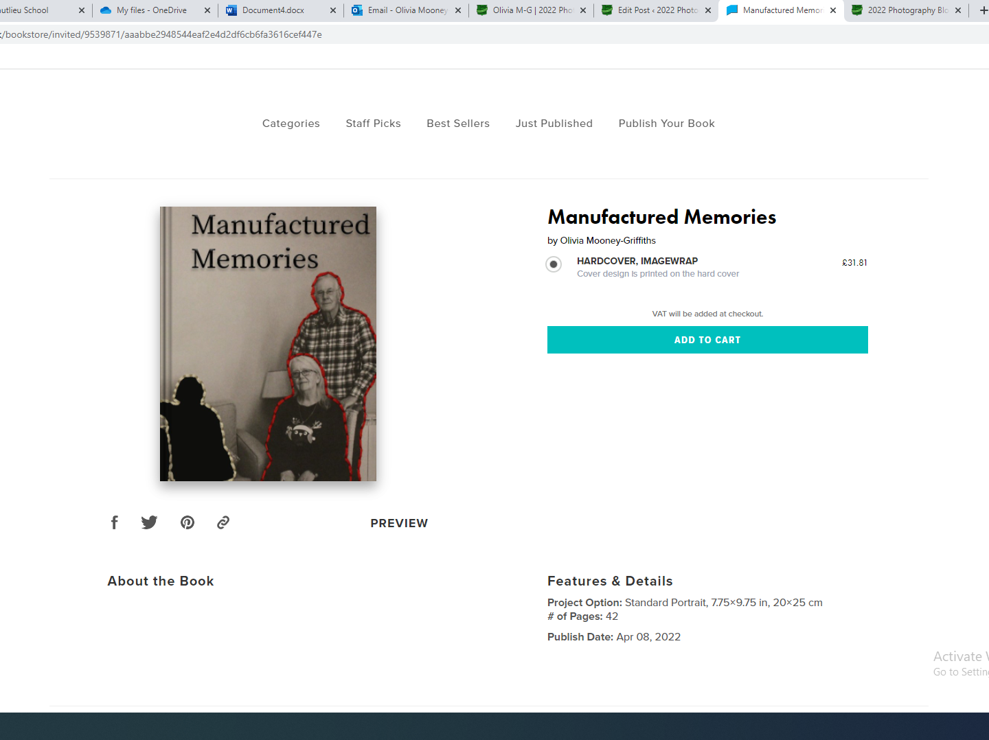
This is my final layout for my photobook named ‘Manufactured memories’ which includes over thirty images comprised of a montages, archival images and newly produced images, as well as my essay at the back of the book. I believe that this project went well, as I think I have produced a good amount of images that relate to the task of a personal study, as it is about my family, specifically my grandparents. In addition, I am happy with my layout and proud of the photobook I have produced.
Front and back cover
For my front and back cover I used an image wrap of the photograph that will be central in my photobook. However for the cover I made the rest of my family, except from my grandparents, into silhouettes in Photoshop. I did this by using the quick select tool as well as the paintbrush tool to carefully fill in the areas I had stitched in white around. I believe this best represents the contents of my books as it displays the method of reworking images that will be presented throughout my book as well as highlighting who the book is focused on, this being my grandparents. The title manufactured memories was inspired from a quote by Joerg Colberg, featured in my essay, and describes the nature of most family photography and how my photobook aims to deconstruct this.
Pages 1-11
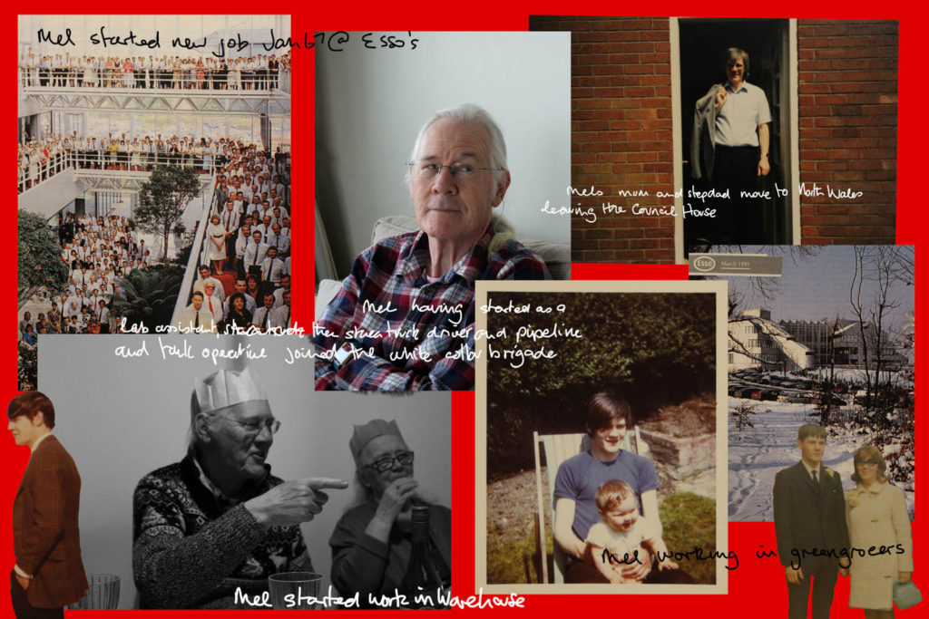
For these first pages, I decided to leave one page at the start of the book blank, allowing for my photographs to start on a double page and be equally distributed throughout the rest of the book. The first double page showcases two simple portraits of my grandparents, which were taken separately however work well together as it appears that they are looking at one another. The following page contains a candid image of my grandad taken at a family Christmas dinner, alongside a digitally edited archive image of him in his former workplace, with everyone’s but his face covered. On the third page I decided to place a close up of my grandparents hands and their rings next to a full bleed of an image of them both, in which I have stitched into and around them. The next pages display two landscape images overlapping, one being one of my own newly produced images, with county outlines stitched into them, and the other an archive image of my mum and my aunt taken during their moving of house. The 10th and 11th page are taken up by a full bleed, double page spread of a digital collage made featuring images and text relating to my grandad, on a bold red background.
Pages 12-23
The pages after this present a full bleed, digitally altered image of my great-grandparents, concealing the upper halves of their bodies, next to one of my own images of my mum and step-dad. Following this is a digitally altered archive image of my grandad at his former workplace, surrounded by multiple emails regarding his retirement. The next two pages feature three images, two being candids from Christmas dinner, and the other a digitally edited archive image of my grandparents, with hexagons and the Manchester worker bee surrounding them. The central page of my photographs contains a full bleed, double page spread of a family portrait I have stitched into. After this is another three image page with two landscapes on one side, one being a stitched into family portrait and another a Christmas dinner candid, alongside a newly produced portrait of my grandparents, also with hexagons and the Manchester worker bee surrounding them, however this time stitched in. Following these pages are a digitally altered image of my grandma with text in her own handwriting surrounding her, with her old college ID and certificate for her nursery course next to it.
Pages 24-35
Next is a full bleed, archival portrait of my grandparents, mum and aunt, with an outline of my grandparents stitched in, alongside a Christmas dinner candid. Following this is another full bleed, double spread collage, this time featuring images, text and documents about my grandma. After this is a digitally edited, archival image of my families old house they moved into after my grandad’s new job, next to an archival image of my mum and aunt standing in the doorway of the house they were moving out of. The next pages display another close up of my grandparents hands, this time featuring another ring my grandad gifted to her, with a full bleed, stitched into portrait I have taken next to it. Following this is a landscape image of my aunt and her son (my cousin), next to an archive image of my grandma, mum, aunt and my sister as a child. The final photographic pages in my book showcase a full bleed, digitally altered, archival image of my grandma who is surrounded by a repeated sentence in her own handwriting, followed by a new portrait taken of my grandma, aunt and mum.
After all of my images, I have included my essay regarding this project, with my influences, analysis’ and intentions. This piece of text is also supported by images from other artists and quotes from other literary sources, which are referenced within my bibliography. I added this in by copying and pasting my essay in paragraphs, fitting the images it references around the text.
Once completing the layout and design for my photobook I then uploaded it to the website blurb which will allow me to order the photobook and print it for me.