Category Archives: Independent

Filters

Author:
Category:

the history of photography

The Arab scholar Ibn Al-Haytham (945–1040) is generally credited as being the first person to study how we see; he invented the camera obscura to demonstrate how light can be used to project an image onto a flat surface. Earlier references to the camera obscura have been found in Chinese texts dating to about 400 B.C., and in the writings of Aristotle around 330 B.C. By the mid-1600s, artists began using the camera obscura to help them draw and paint elaborate real-world images with the help of finely crafted lenses. Magic lanterns, the predecessor of the modern projector, also began to appear at this time. Using the same optical principles as the camera obscura, the magic lantern allowed people to project images, usually painted on glass slides, onto large surfaces. They soon became a popular form of mass entertainment.

In 1826, French scientist Joseph Nicephore Niepce developed the first photographic image with a camera obscura. Niepce placed an engraving onto a metal plate coated in bitumen and then exposed it to light. The shadowy areas of the engraving blocked light, but the whiter areas permitted light to react with the chemicals on the plate. When Niepce placed the metal plate in a solvent, gradually an image appeared. These heliographs, or sun prints as they were sometimes called, are considered the first photographic images. However, Niepce’s process required eight hours of light exposure to create an image that would soon fade away.
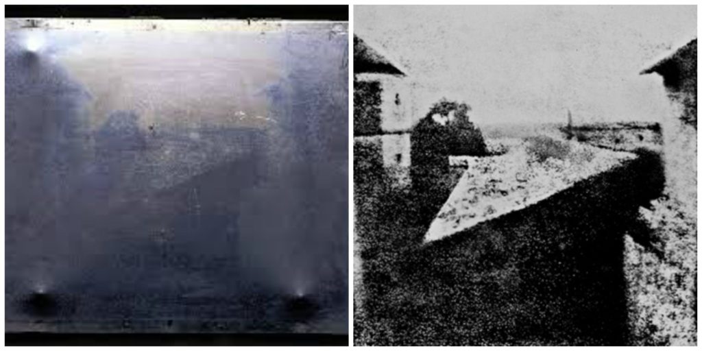
View From The Window at Le Gras | Joseph Nicéphore Niépce

In 1829, Louis Daguerre formed a partnership with Niepce to improve the process Niepce had developed. In 1839, following several years of experimentation and Niepce’s death, Daguerre developed a more convenient and effective method of photography and named it after himself. Daguerre’s daguerreotype process started by fixing the images onto a sheet of silver-plated copper. He then polished the silver and coated it in iodine, creating a surface that was sensitive to light. Then he put the plate in a camera and exposed it for a few minutes. After the image was painted by light, Daguerre bathed the plate in a solution of silver chloride. This process created a lasting image that would not change if exposed to light.  The daguerreotype gained popularity quickly in Europe and the U.S. By 1850, there were over 70 daguerreotype studios in New York City alone.
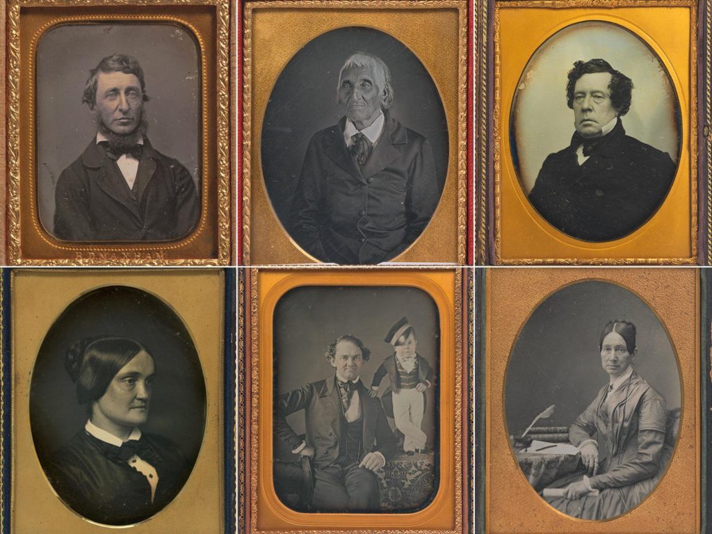
Daguerreotypes

One drawback to daguerreotypes, however, was that they could not be reproduced; each one was a unique image. The ability to create multiple prints came about from the work of Henry Fox Talbot, an English botanist and mathematician. Talbot sensitized paper to light using a silver-salt solution. He then exposed the paper to light. The background became black, and the subject was shown in different shades of grey. This was a negative image. From the paper negative, Talbot made contact prints, reversing the light and shadows to create a detailed picture. In 1841, he perfected this paper-negative process and called it a calotype, Greek for “beautiful picture.”

In 1889, photographer and industrialist George Eastman invented film with a base that was flexible and could be rolled. The 35 mm film most people know today was invented by Kodak in 1913 for the early motion picture industry. In the mid-1920s, the German camera maker Leica used this technology to create the first still camera that used the 35 mm format. The drawback to nitrate-based film was that it was flammable and tended to decay over time. Kodak and other manufacturers began switching to a celluloid base, which was fireproof and more durable. Most films produced up to the 1970s were based on this technology. Since the 1960s, polyester polymers have been used for gelatin-based films.

Having perfected roll film, George Eastman also invented the box-shaped camera that was simple enough for consumers to use. Once the film was used up, the photographer mailed the camera with the film still in it to the Kodak factory, where the film was removed from the camera, processed, and printed. The camera was then reloaded with film and returned. Over the next several decades, major manufacturers such as Kodak in the U.S., Leica in Germany, and Canon and Nikon in Japan would all introduce or develop the major camera formats still in use today. Nikon and Canon would make the interchangeable lens popular and the built-in light meter commonplace.

Apple later introduced its smartphone camera with its first iPhone in 2007, and other companies followed, such as Google and Samsung. By 2013, smartphones with cameras were outselling digital cameras by more than 10-to-1. In 2019, more than 1.5 billion smartphones were sold to consumers, compared with about 550,000 digital cameras over roughly the same period.

Personal Project – Statement Of Intent + Mood Board/Mind Map

MOOD BOARD+ MIND MAP

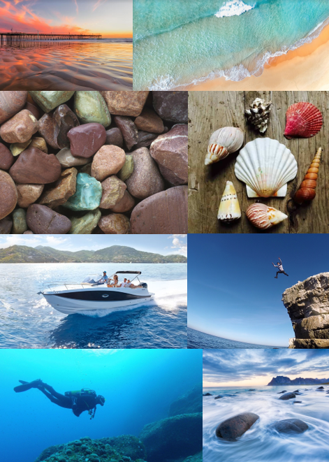
I made a mind map and mood board for the topic that I chose fo my personal study is on, which is Bouley Bay. This is because I live close to it, and I feel that there is a lot of history that be explore and because it is a landscape that has a wide variety of features I can use lots of photographic techniques to capture the bay.

STATE OF INTENT

My idea is to make a photobook in which I explore the area Bouley Bay, overall I want to capture the activity, views, and close ups of key feature such as rocks, shells, heritage, the hill climb, and the bay. I could also look into the history of the bay and the Jersey Folklore, involving the Black Dog.

It is important to me as I grew up in that area, and have many memories of it. And I hope to capture it in the same way in which remember it.

I wish to develop my project by exploring the bay and collecting lots of objects to photograph in a studio, and also to take long exposure, aerial, and underwater of the bay, as I have been inspired by many photographers, such as, Martin J Patterson (@ mjplandscapes on Instagram), Jaun Munoz (@ drjuanmdc on Instagram), and David Aguilar (@ davidaguilar_photo). Using these images I can look into topics such as, beach pollution, environment and beach life. Hanna-Katrina Jędrosz and Barron Bixler have studied environments, so it would be interesting to analyse them and their work.

FIRST PHOTO SHOOT PLAN

My first photoshoot, I will go down to Bouley at Sunset when it’s not cloudy and high-tide, and take long exposure photos using a tripod, and some neutral density filters.

Reviewing And Reflecting

My pervious work over Year 12 and Year 13, that showcases some of my best images and interesting photographic techniques

Formal Elements

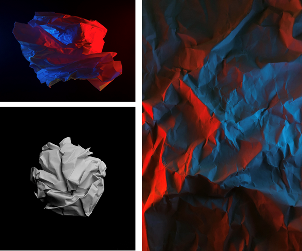
My first project I started was based on the formal elements using formalism, where I scrunched up and teared up paper into shapes such as, balls, holes, and different textures, then took photos of the paper. I set up multiple different lighting environments to shoot in.

Firstly, I used 1 light source, which was the camera flash, for the image of the paper ball I also made the exposure darker to emphasis the contrast between the highlights and the shadows which made creases in the ball more noticeable, additionally it made the black paper background even darker so that you couldn’t see any of the marks on the paper. This is using minimalism to direct the focus of the image to the main focal point.

In the other photos I used 2 phones to emit different coloured lights, which made the colours clash as the paper as at different heights as it was crumpled up.

In Photoshop, I didn’t really do much adjustments image were very basic. All I adjusted was the contrast and saturation, to boost the colours, or the opposite to make it black and white by setting the saturation to 0.

Surface and Colour

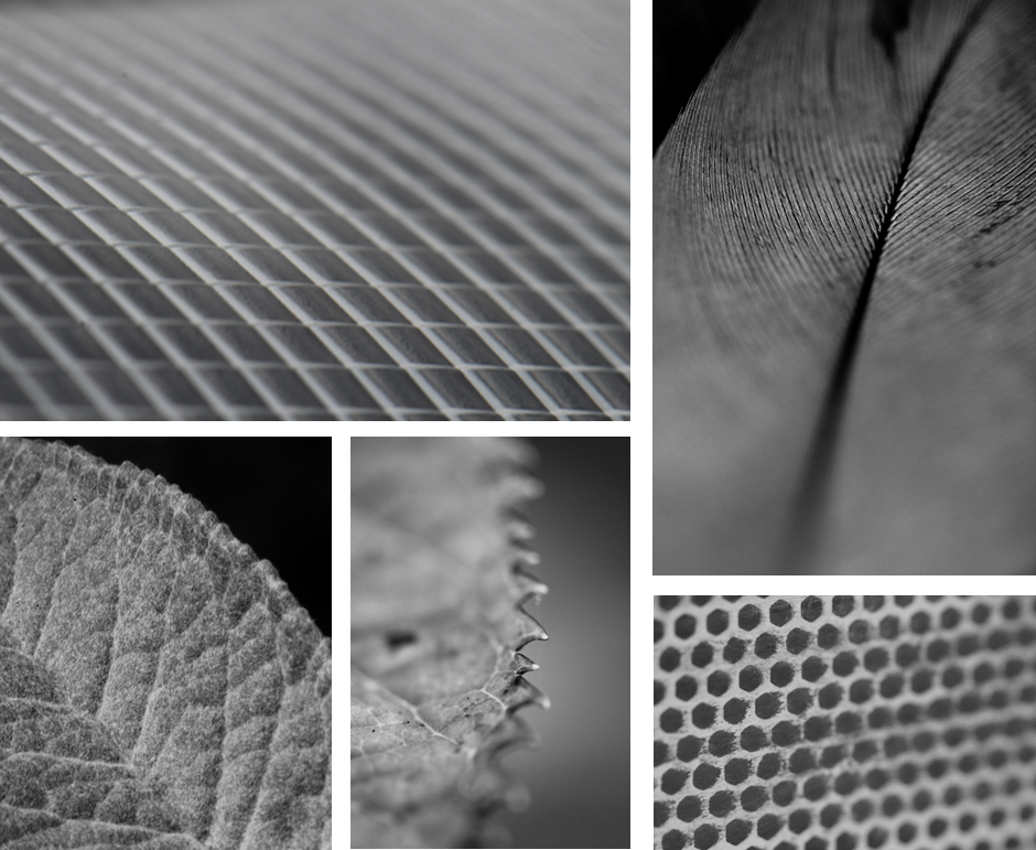
In this topic I used serval different camera lens to gain a different perspective. However, most of these image were shot using a macro lens.

This allowed me to achieved a really close up shot were you can clearly see the pattern and the repetition of shapes and the different textures of the subject. Additionally, I was able to use a shallow depth of field, which created a focus onto key features by blurring the edges.

Having these images in black and white helps remove any distraction of colour and helps the viewer focus on other aspects of the photo, such as the subject, the textures, shapes and patterns, and the composition.

Abstract

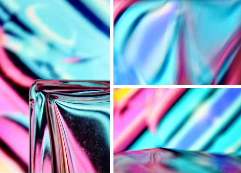
To create these images I played a colourful video on my laptop and shot the images through different glasses, eg, wine glasses and perfume bottles to distort the video, which created a unique and abstract effect. I also used the glass to make reflections to act like a mirror.

To also create some of these images I changed my camera to manual focus and made it super blurry, then I took photos of different glasses in front of the screen, using the same method.

Minimalism – (Artist Reference / Kevin Saint Grey)

Kevin Saint Grey is a photographer I studied who is a primarily black and white LA based photographer with a minimalist approach to his subjects which creates a drastic contrast. He shoots mostly landscape and architecture, and his work distinguishes itself for the serendipity of black and white, “humanness” and silent images. He accomplishes this by using techniques such as, symmetry and long-exposure, and he manages to get amazing, creative photographs, by using camera movements while exploring unique angles while shooting architecture.

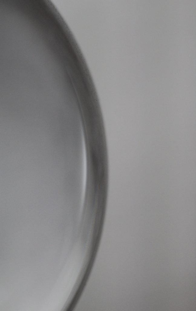
This is one favourite minimalistic images I took, it is of a glass lamp stand. I made it so the full object is not in view as it creates a minimalistic effect, that features the curve of the sphere, and the light which reflects off of it.

I submitted this image to a photography competition hosted by the Jersey Arts Centre on their Facebook page, and it won “Best minimalistic photo of the day.”

Portrait/Close Up

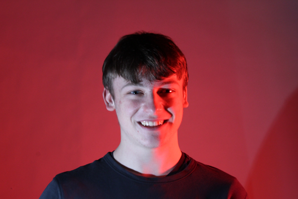
This image has an empty alt attribute; its file name is image-1.png

I have used the photography studio when taking portrait photos. This allowed me to experiment with different lighting colours, set-ups, etc.

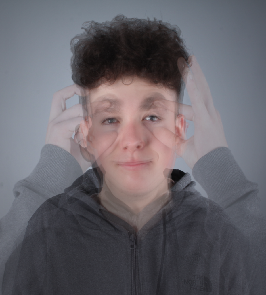
This image has an empty alt attribute; its file name is multiexposure-925x1024.png

I have created a photomontage using post-processing techniques in Photoshop by using layers after lining all the images up, which created a multi-exposure image.

This image has an empty alt attribute; its file name is smallamxeye-1024x639.jpg

The eye contact with the camera makes it a stronger image as there is more of a direct and emotional atmosphere between the viewer and the image.

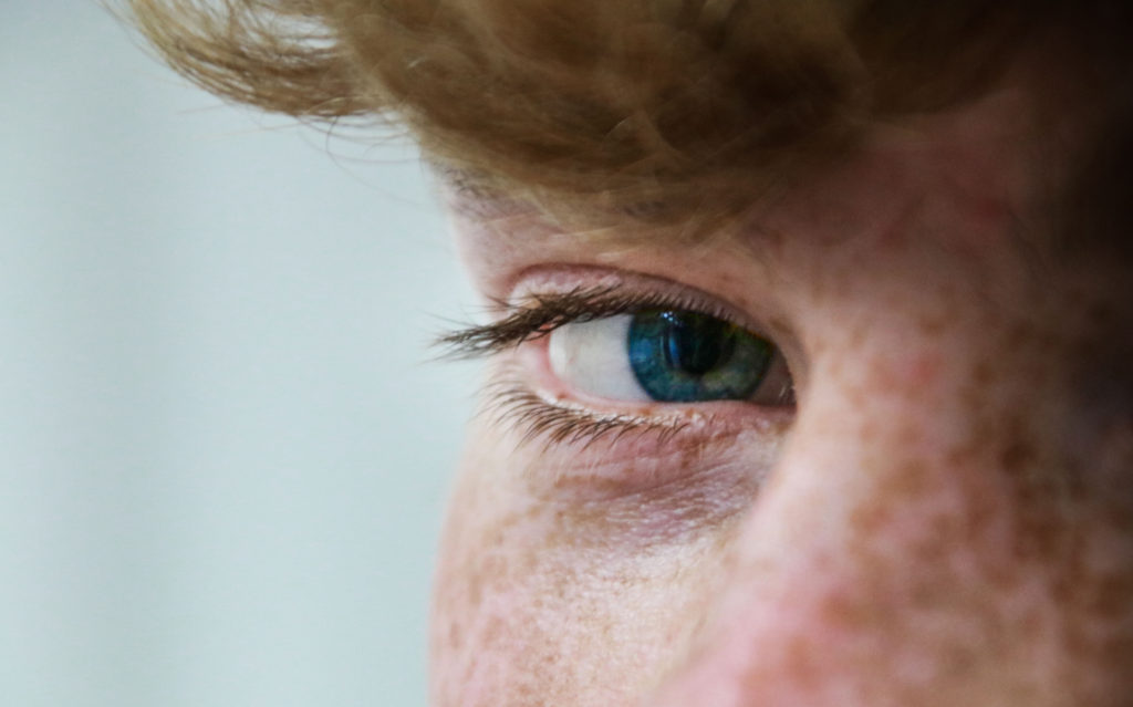
This image has an empty alt attribute; its file name is UCeye-2-min-1024x683.jpg

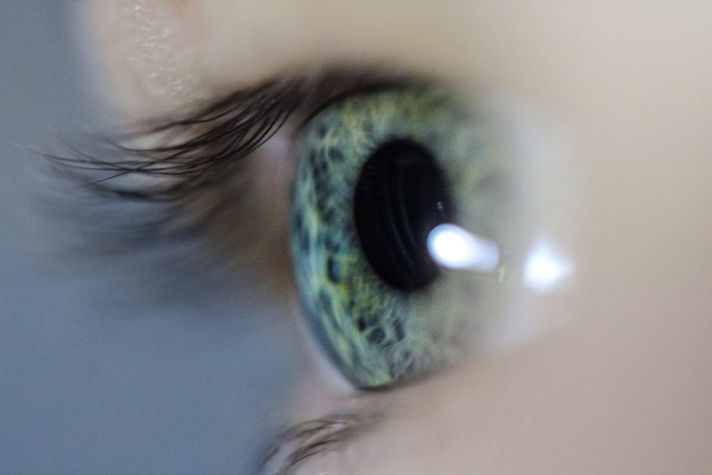
Since I used a macro lens I was able to create a shallow depth of field. This made it so the eye and part of the eye lashes were focused, and the rest wasn’t, which draws more attention to the eye itself. Macro photography is one of my favourite ways to shoot however, it one of the hardest to get right, as its only manual focus. This means you have to move closer/further away from the object or adjust the focal length.

Landscape

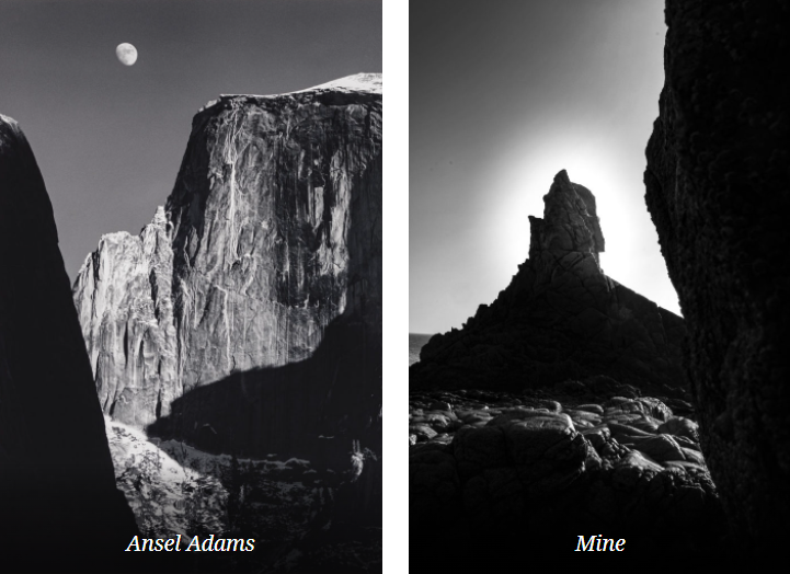
The landscape project was heavily inspired by Ansel Adams. Ansel Easton Adams was an American landscape photographer and environmentalist known for his black-and-white images of the American West. Also, he is considered the most important landscape photographer of the 20th century.

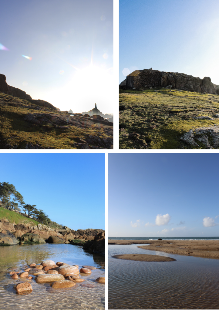
Both images are of natural landscapes, which display rock formations and both cover the whole of tonal zone system, going from 0, being black through to 10 being white, displaying different shades. This really puts emphasis on the highlights as it creates a high harmonious contrast.

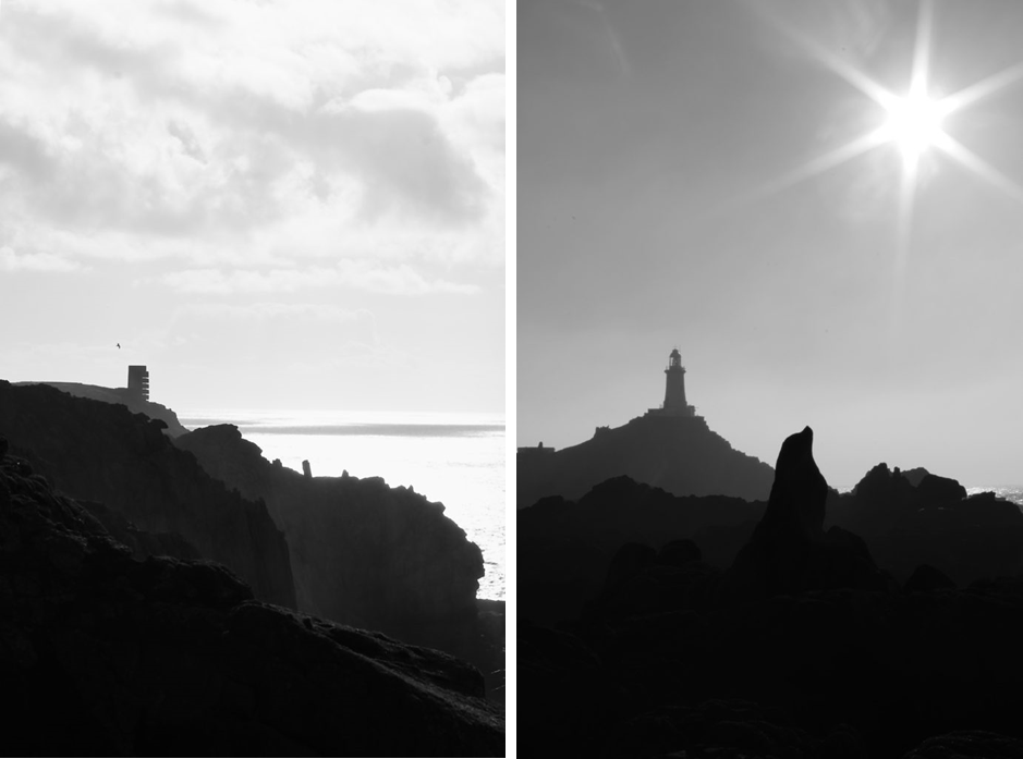
These two images demonstrate the 3 levels of tonal values, is what makes this image stand out. It consists of the blacks in the foreground, with the grey behind it, then finally to the light-grey figures in the background which the lighthouse is apart of. Overall the harsh contrast between the sky and the rocks juxtapose each other against light and dark. I achieved the star effect caused by the sun, by using a high f-stop value, eg. f-32.

I used multi-bracket exposure to capture these images. The camera takes 3 photos, 1 over exposed, 1 normally, and 1 under exposure image. I edited it in Photoshops Camera Raw Filter after Photoshop merged the 3 images to create a HDR image. (High Dynamic Range.)

This image has an empty alt attribute; its file name is image-52-722x1024.png

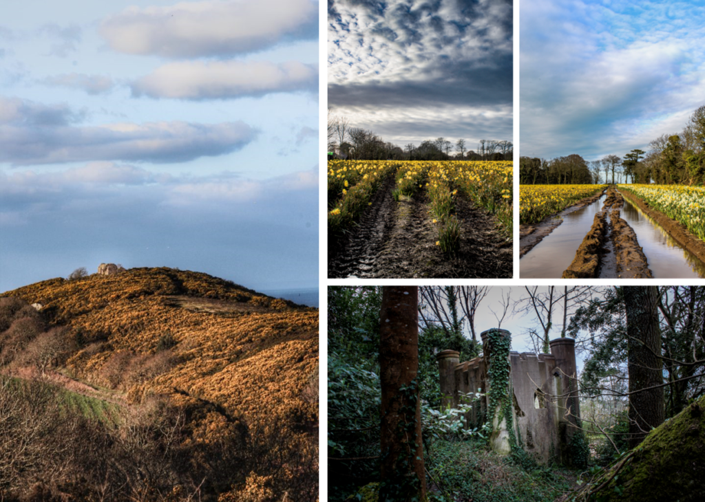
These 4 images are more generic landscape photos, however do include unique aspects such as lens flares and reflections from the water.

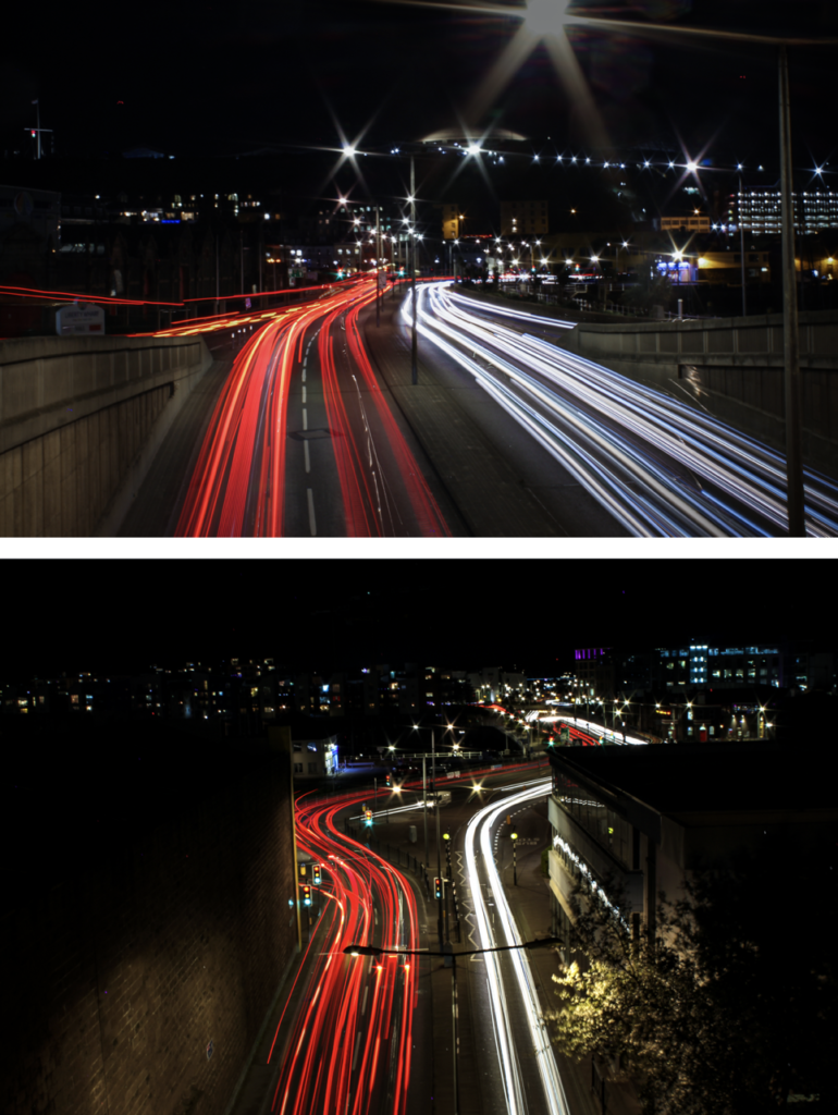
This are some of the urban landscape photos I took at night in town, using long exposure. Since the exposure time was so long I had to use a tripod so that the camera was stable to create a clear image. Long exposure is one of my favourite photography techniques, as it creates unique images every time.

This image has an empty alt attribute; its file name is image-15-770x1024.png

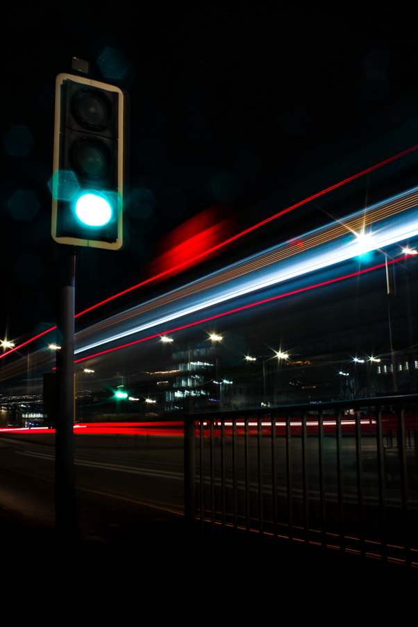
This is my favourite image from the whole urban landscape topic. It captures a bus driving past a traffic light. However it did take many attempts to capture this shot, which is part of the fun.

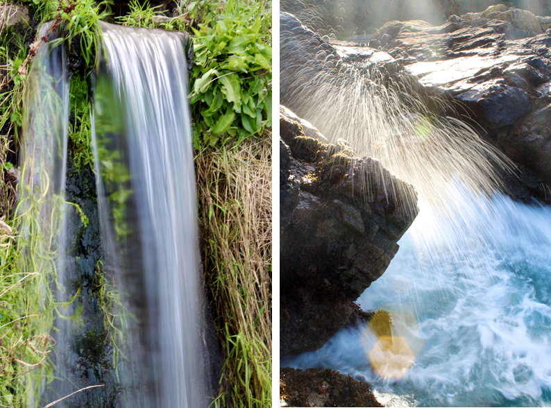
Long Exposure – Water Photo Shoot

On the topic of long exposure these are 2 strong images that where apart of another topic, that I really like.

Street Photography/ Candid Photography

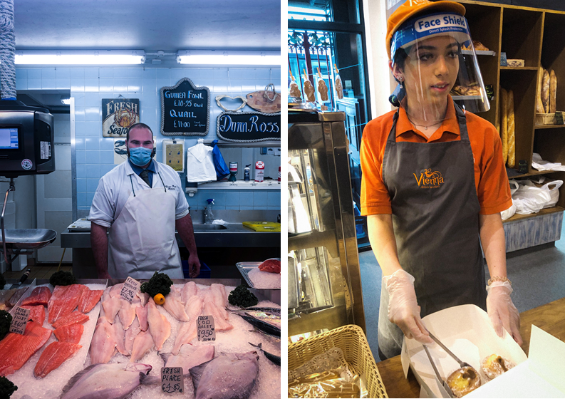
These 2 images were tableaux (set up/knew they were being photographed) Overall, I didn’t really like asking people if it was ok to take their pictures. However, it did allow me to capture the subjects closer compared to the photos below.

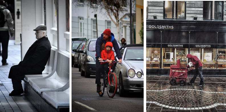
Where as, these 2 images aren’t set up and captures peoples natural state, emotion, and pose. Therefore, i fell that they poses more of a story.

Anthropocene

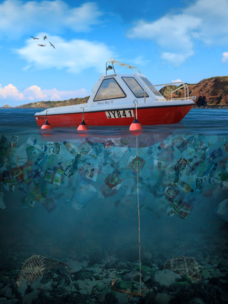
For my Anthropocene project I split it into 2 sections. The first was space, and the second was plastic water pollution.

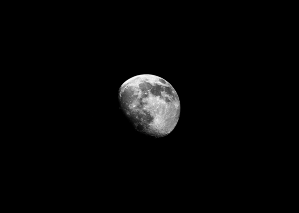
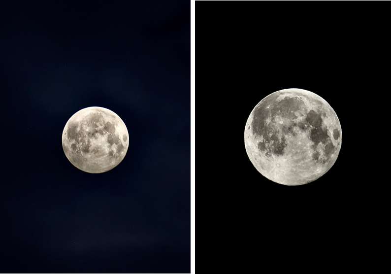
These were some of my favourite photos I got of the full moon at 4 AM. I used a telephoto lens and a tripod to capture the moon.

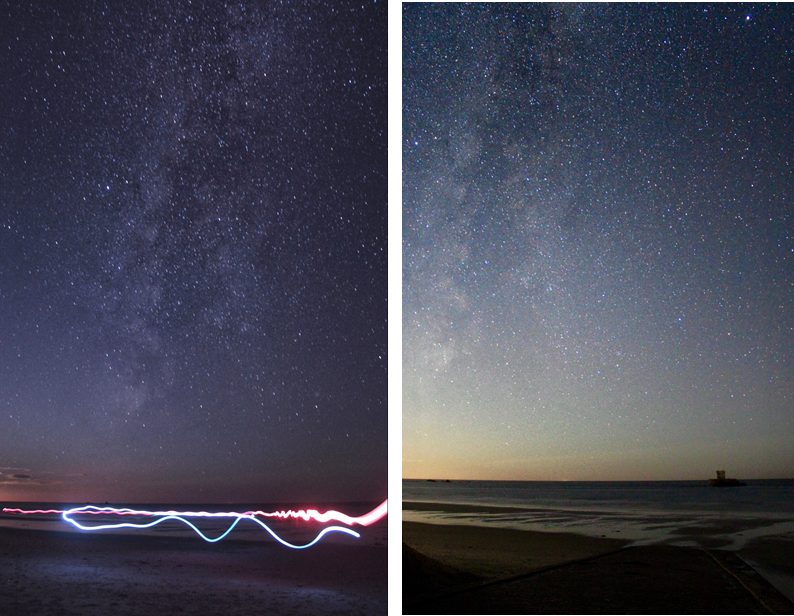
These are my attempts astrophotography, I went to the west of the island at 12-1 AM and used a 18mm lens, with a low aperture using a long shutter speed of 20 seconds to capture the stars. Before I took the photo I had to manually focus the camera on the north star, this is so that the stars would in focus. Overall, these turned out good, however it wasn’t the right season, so I could do better when the milky way is more visible.

This is my best final piece which I made in Photoshop, using my own images to create a concept image using photo manipulation of plastic water pollution in Jersey. This took approximately 7.5 hours, using over 500+ layers inside photoshop, where I documented the process on my blog. I have lots of experience in photoshop and a great knowledge of the software.

Identify and Community Photoshoots Best Images

These images were taken whilst I was walking around town. This is one of my favourite ways to photography unique and different things in a new place/area.

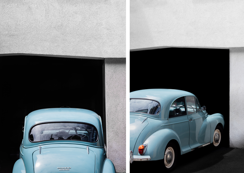
In these images there was a metal chain across the car. This was very distracting so I removed it in Photoshop which improved the image. I also made the black background darker to remove the small details to create an old, minimalistic style.

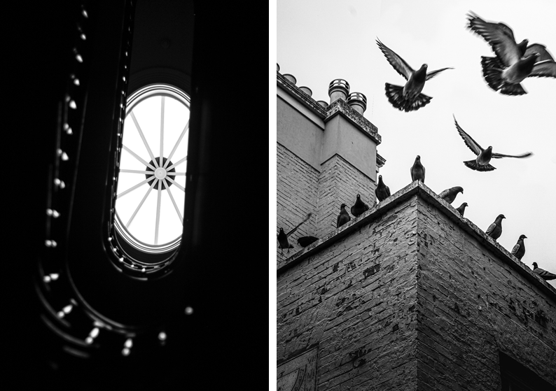
These images work well in black and white. The image on the left demonstrates depth of field and unique angles, however the right image captures motion of flying pigeons.

These images use framing to create a focus on the key features and remove distractions around the outside of the image.

Contextual studies – Stephen Shore

I started off by selecting 3 Stephen Shore quotes that I think I could include in my image analyse of one of Stephen Shores images. The first quote I found online, and the other two were from an interview that was on a PowerPoint resource.

1.

“I don’t have to have a single point of emphasis in the picture. It can be complex, because it’s so detailed that the viewer can take time and read it, and look at something here, and look at something there, and they can pay attention to a lot more.”

2.

But even in that strange world, you were definitely making “Stephen Shore” pictures: intersections, shop fronts.

That’s true. Most of the pictures do have little indications that it’s a movie set. A contemporary car in the background or some scaffolding. But even the decision to shoot in colour meant that I was making photographs that couldn’t have been made in the period setting of the movie, It’s an anachronism. There are streets in New York that still look like those streets, but the décor and dressing are anachronistic, too. It was great fun.

3.

Can you describe what you had been doing?

In making Uncommon Places, I was walking down the street and watching all the relationships changing watching objects in the foreground change in relation to the background, thinking about how space is going to be seen in monocular vision on a picture plane. What happened for me was that, right away and throughout the work, structural issues and questions came to my mind. I had to solve those questions, and in the process of solving them other questions would arise. But it wasn’t as it I was sitting around thinking about them.

Analysis

Stephen Shore’s ‘Uncommon Places’ (book) finds the beauty in the most mundane. His sprawling vision of America has become a contemporary classic, a landmark of visual Americana, influencing a generation of photographers to take to the highway.

Stephen Shore: Uncommon Places | The Independent Photographer

This photo demonstrates how Shore finds interesting and unusual places by walking around, this is his usual method he uses to find places to photograph, as he was asked in an interview, “Can you describe what you had been doing?”, and Shore replied with “I was walking down the street and watching all the relationships changing watching objects in the foreground change in relation to the background, thinking about how space is going to be seen in monocular vision on a picture plane.” This shows how Shore think about how the image will look through the view finder before setting his camera equipment up. Photo walks are very important for photographers, as they’re not only perfect for meeting other camera enthusiasts, but also for honing your skills as a photographer, learning new ideas, and experiencing different places through your camera’s viewfinder.

Walking around and exploring allows Shore to capture images of shop fronts and intersections, which have been named the, “Stephen Shore” image. the interviewer asked Shore how he creates the classic image, that comes out so perfect. Shore states, “Most of the pictures do have little indications that it’s a movie set. A contemporary car in the background or some scaffolding. But even the decision to shoot in colour meant that I was making photographs that couldn’t have been made in the period setting of the movie, It’s an anachronism.” This shows how Shore uses anachronism to his advantage. Anachronism is a chronological inconsistency in some arrangement, especially a juxtaposition of people, events, and objects from different time periods. For example in this image the colourful cars are lined up perfectly in front of the old, squatting, lit-up movie theatre in the background. This creates a juxtaposition between the colourful cars and the bright movie theatre in contrast to the dull, brown factory looking buildings, which creates a focus on the centre of the image drawing the eye to the theatre, and the people outside which gives life to the image.

The camera position in this photo is across the road from the subject, which is the theatre. This shows how Shore photographs a scene that he finds on his walks. However, Shore has thought about the composition in this image, as Shore uses depth of field to his advantage as the cars in the foreground are blurred which focuses the eye on the main focal point. Shore once said, “I don’t have to have a single point of emphasis in the picture. It can be complex, because it’s so detailed that the viewer can take time and read it, and look at something here, and look at something there, and they can pay attention to a lot more.” This image is a good example of how Shore creates the composition of an image. However, there is a main emphasis point, which is the theatre, and it is surrounded by several sub focus points, which is the cars. The surrounding buildings and lamp posts on the street, and more detail to describe the atmosphere of the scene. The choice of shooting in the early evening makes the darker buildings less noticeable, which creates a contrast with the light, white theatre building. The light blue sky is a similar colour to the blue accents on the theatre, which creates a balance in colours between dark red, light blue and white. These colours are also the same colour palette as the American flag, this is important as Shore is an American photographer and perhaps he wanted to represent himself and glorify the American lifestyle.

Island Identity – Communities

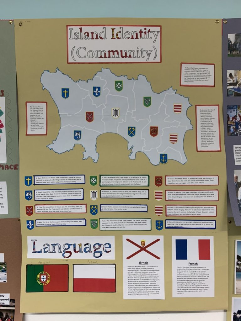
In groups of two (Ollie and I) we had to produce a poster that reflects on one of the key areas of Jersey Identity, we were given “Communities” to explore.

This is our poster, our main focus was the different communities in each parishes, and how each parish is slightly different which is depicted on there way of life. For example, St. Helier is very built up and Trinity is more rural and less busy.

The notes around the outside inform the reader about the how, the Honorary Police is one of the oldest police forces in existence, and embodies the best Peelian principles of policing by consent. The Parish Hall Enquiry system has been celebrated as a highly effective model for restorative justice, with minor offences dealt with at a community level in a way that does not necessarily criminalise first-time offenders. Meanwhile, the twice annual Branchage and the Visite Royale are both examples of important historic rituals that form part of Jersey’s Identity.

Under the map, there’s information about how the parishes got their name, with the correlating symbol on the map and next to the information. For example, St. Helier and how the blue symbolising the sea, and the axes symbolising the martyrdom of Helier at the hands of Saxon pirates in 555 AD.

Finally, the part under the map is based on the different languages in Jersey such as, English, French, Portuguese, and Polish. However, the main section is about the language Jèrriais, as it is in the DNA of Jersey. It’s a crucial historical aspect of our identity. To quote Professor of Linguistics Paul Birt, ‘There are few languages I know with such a richness of expression, some of her idioms are poetry… Jèrriais belongs to Jersey, and without it Jersey would, I believe, stop being Jersey.’ However, if we can agree that we should not allow Jèrriais to die, then we must fund its revival properly. Jèrriais should be an integral part of our Island Identity, promoted by Government, the States, businesses and organisations, and can be used as a unique selling point to those beyond our shores, also helping to differentiate us further from neighbouring countries. Teaching it in schools can embed a sense identification, pride and citizenship in Jersey school children, regardless of background.

French is also one of the crucial components of Jersey’s cultural heritage and identity. It is important for its own sake as the language of our nearest neighbour, and as a stepping stone to Jèrriais comprehension. Additionally, all of the road names are in French, like, Rue Due Mielles.

Personal Investigation – Reviewing and Reflecting

1. Describe which themes, medium (photography, film), approaches (documentary, tableaux, conceptual), artists (incl contextual references to art history, movements and isms) and photographic skills, processes, techniques and methods (incl learning new software) inspired you the most and why.

2. Include examples of both previous and current experiments and imagery to illustrate your thinking.

3. Produce a new mind-map and mood-board based around how you interpret one/ or both theme(s) of IDENTITY & COMMUNITY using new artists inspirations and visual references etc. Reflect on the Island Identity project and also consider themes more broadly (see below)

Inspirations throughout the course;

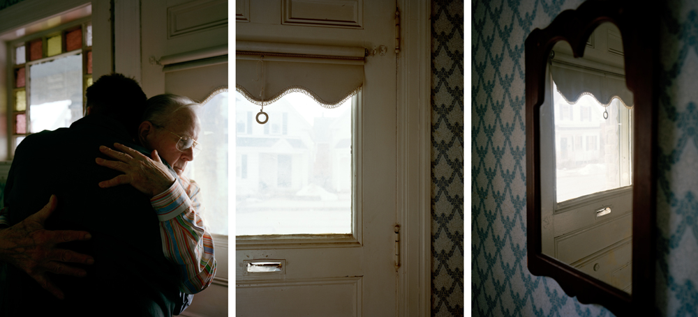
During the photography course, in both year 12 and 13, we have learnt a considerable amount of photographic techniques around portraiture, landscapes and abstract images. My favourite medium to use is taking still shots on a camera, although I have enjoyed learning about film making and taking moving shots I believe my skills lie more in the world of static photography. I believe I do well in portraying a certain storyline or narrative with my images, it is something I wish to continue in my personal investigation – I was very inspired by the work I created in response to photographer David Hilliard during my Identity and Place project. I enjoy the way he captures naturalism in his images, they connote a sense of normality and honesty that I really loved recreating. I have taken lots of inspiration from the documentary technique of photography, I believe it allows the observer to understand the subject more within their storyline. I really enjoy using natural lighting in my images, I have used it during the course a lot more than artificial lighting and am therefore more confident photographing with it.

More on how Hilliard inspired me.

My Response to Hilliard

Additionally, I was inspired by our year 12 abstract photography project, specifically studying repetition, pattern and rhythm. The photographer Ernst Haas was one I really enjoyed looking at, I enjoyed his use of repeating lines and shapes to create movement and rhythm in his images. I gained inspiration from the abstract unit as I loved experimenting with how different shapes and patterns could represent meaning and themes – I want to continue learning about how I can manipulate an image in terms of geometric aestheticism, using symmetry and repetition to connote ideas of memories being re-lived. I also really enjoyed studying Saul Leiter during the abstract unit, his use of colour and distorted aperture settings were really interesting to experiment with. I found inspiration with how Leiter captured windows and reflections in his images, I like how the abstract elements are still recognisable as everyday sights and objects – a sense of normality is something I really hope to experiment with further in the course. Additionally, I was influenced strongly by colour during my Saul Leiter study, I wanted to exaggerate the bold colours I captured to create an expression of freedom and non-naturalism. Previously in the course I focused on black and white photography, however during this project I enjoyed working with colour and emphasising different emotions through tones and hues.

During the photography course I have enjoyed learning about different software, such as Adobe Photoshop, Lightroom, Premier Pro and InDesign. Creating a Zine during the course has inspired me to produce a photobook for my final assessment. I believe having a physical copy of my work, where I can layout sequences of images with narratives and meaning, allows me to better use my imagination. I have been influenced throughout the course by several different artists, photographers and creative individuals that demonstrate ideas through different mediums – I look forward to experimenting further with the compositional elements of photography in this Identity project. The three areas of study that I have mentioned and shown evidence of above have been my most enjoyable parts of the course – I have been inspired by creating meaning and speaking out on prominent topics during year 12 and 13, this is something I wish to continue working on during my new project.

artist refernces

JIM GOLDBERG

Jim Goldberg is an American artist and photographer, whose work reflects long-term, in-depth collaborations with neglected, ignored, or otherwise outside-the-mainstream populations. Among the many awards Goldberg has received are three National Endowment of the Arts Fellowships in Photography, a Guggenheim Fellowship, the Henri Cartier-Bresson Award, and the Deutsche Börse Photography Prize. His project Raised By Wolves (1985-1995) focuses on two young runaway protagonists, Tweeky Dave and Echo. Their personalities, their histories, and their dreams were given equal attention, and were often presented in their own words. The sensitivity with which Goldberg approached these particular subjects reflects the affection they held for one another, a feeling which is not much shown to the homeless. Goldberg began speaking with and photographing Raised By Wolves’ subjects in 1985, and started assembling the book itself in 1991. Raised By Wolves is Goldberg’s most shambolic instalment, mirroring the experiences of its subjects. The book is made up of photographs, fragments of conversations, hand-written notes and drawings, home movie stills, Xeroxes of government correspondence, and more.

CAROLLE BENITAH

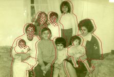
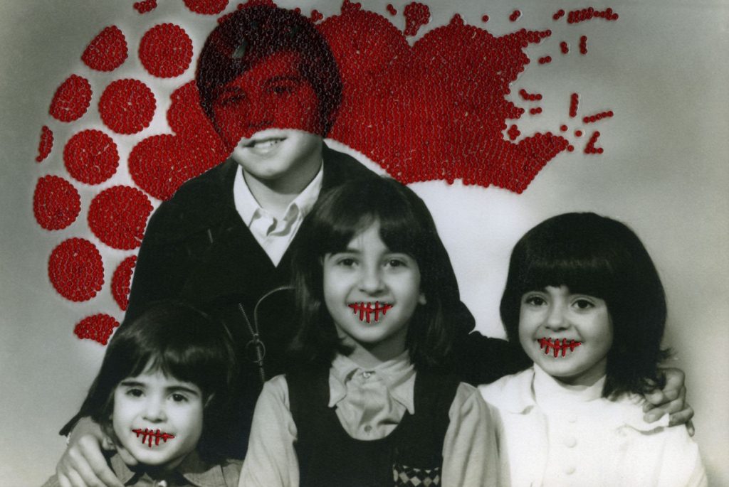
French Moroccan photographer Carolle Benitah, who worked for ten years as a fashion designer before turning to photography in 2001, explores memory, family and the passage of time.  Often pairing old family snapshots with handmade accents, such as embroidery, beading and ink drawings, Benitah seeks to reinterpret her own history as daughter, wife, and mother. The work of Carolle Benitah has been published in magazines such as Leica World, Shots Magazine, Photos Nouvelles, Spot, Center for Photography Houston, Foto Noviny, and Lens Culture, among others. The series Photos Souvenirs explores the memories of her Moroccan childhood and teenage years by reworking old family snapshots. In what the Benitah describes as “excavations,” photos are unearthed from albums, categorised, scanned, transposed onto new paper, and finally hand beaded and embroidered. This final step, accomplished with red, black, or gold thread and wire and glass beads is a revelatory act for the artist;  ‘To embroider my photograph, I make holes in the paper. With each stitch, I stick the needle through the paper. Each hole is a putting to death of my demons. It is like an exorcism. I stab the paper until I don’t hurt anymore.’

statement of intent

Write a Statement of Intent that clearly contextualises;
What you want to explore?
Why it matters to you?
How you wish to develop your project?
When and where you intend to begin your study?

For my personal study project, I will be exploring the theme of IDENTITY, more specifically the idea of childhood and adolescence. Identity is defined as the characteristics determining who or what a person or thing is. I have chosen this theme because I think it is the more interesting option, and I think that I will be able to better explore different mediums of photography, including studio portraiture (tableaux) and more candid, real life photography, as well as still life and object photography. Additionally, I think that I will be able to create a more meaningful project, as it will be relative to real people and their lives. My personal study will focus on myself and my group of friends , and our transition from children to teenagers. My aim is to capture as many candid images as possible, in order to show our lives as they truly are and to give the viewer a realistic perspective. I will also be incorporating old childhood photos and objects as a way of showing our transition through different types of photography. I have taken inspiration from various photographers, mainly Jim Goldberg and his project ‘Raised By Wolves’. This project captured by interest because of its real and uncensored images, which was an imperative part of Goldberg’s mission to give his audience an inside look into the underground culture of New York City. My aim is to create a photobook for my final presentation, which will be filled with my images, both old childhood photos and the new ones I will have captured during this project.

identity moodboard

For my personal study project, I will be focusing on the theme of IDENTITY, more specifically youth culture and the transition from childhood to adolescence. I have chosen this theme because I think that I will be able to produce a wide and interesting range of images, varying from tableaux and studio portraits to more candid and street photography.