Category Archives: Controlled Conditions

Filters

Author:
Category:

Indentity and Place-SHOOT 2

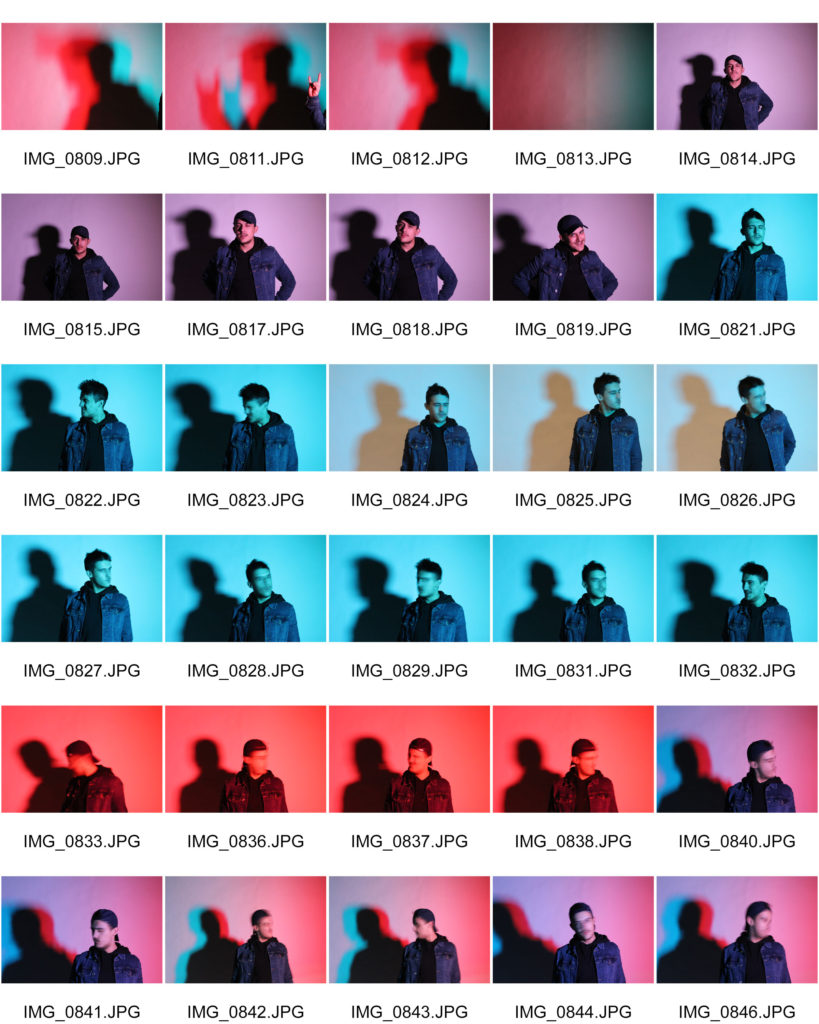
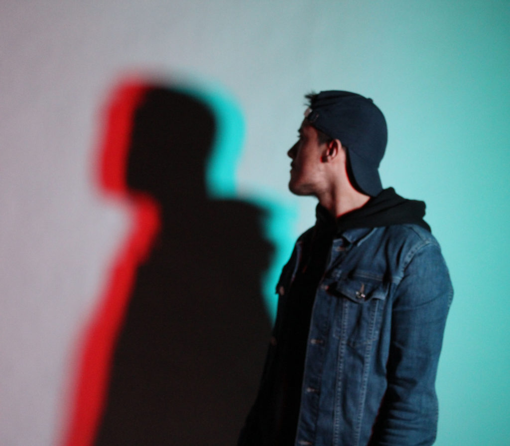
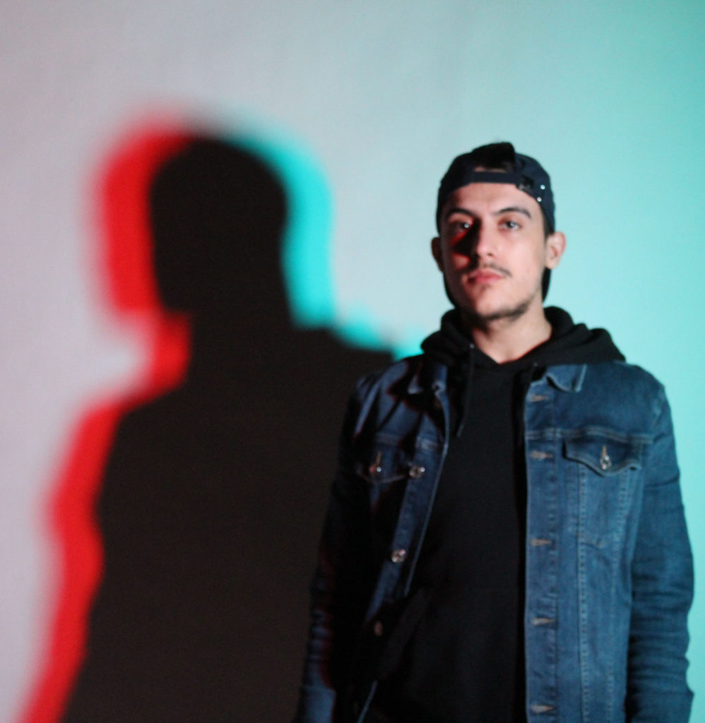
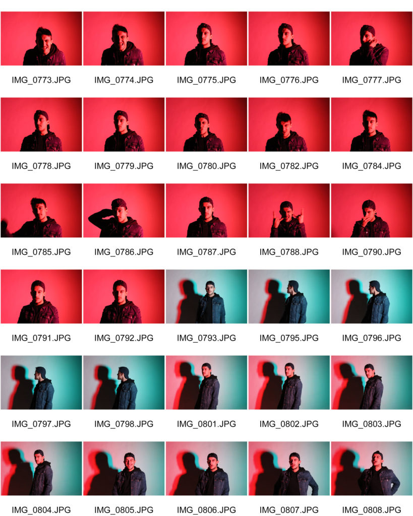
For this photoshoot I went into the studio and used the Gels to cover the key light which then created the coloured background. I wanted to use the gels to show the contrast in views on metal music. Society has put a label on metal as being an angry genre and everyone who listens to it is scary and angry. This isn’t the case. You don’t need to have a specific personality to listen to a type of music, you can be whoever you want.

Plan:

Who: Tiago

Where: Studio (school)

How: Gels over key light, slow shutter speed

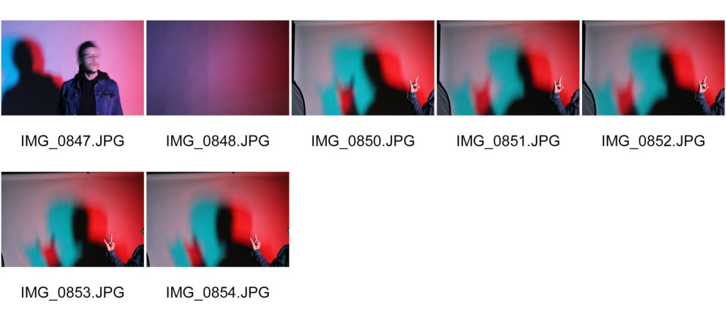
Contact sheets:

Images:

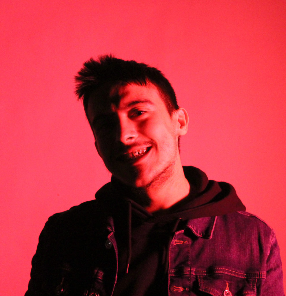
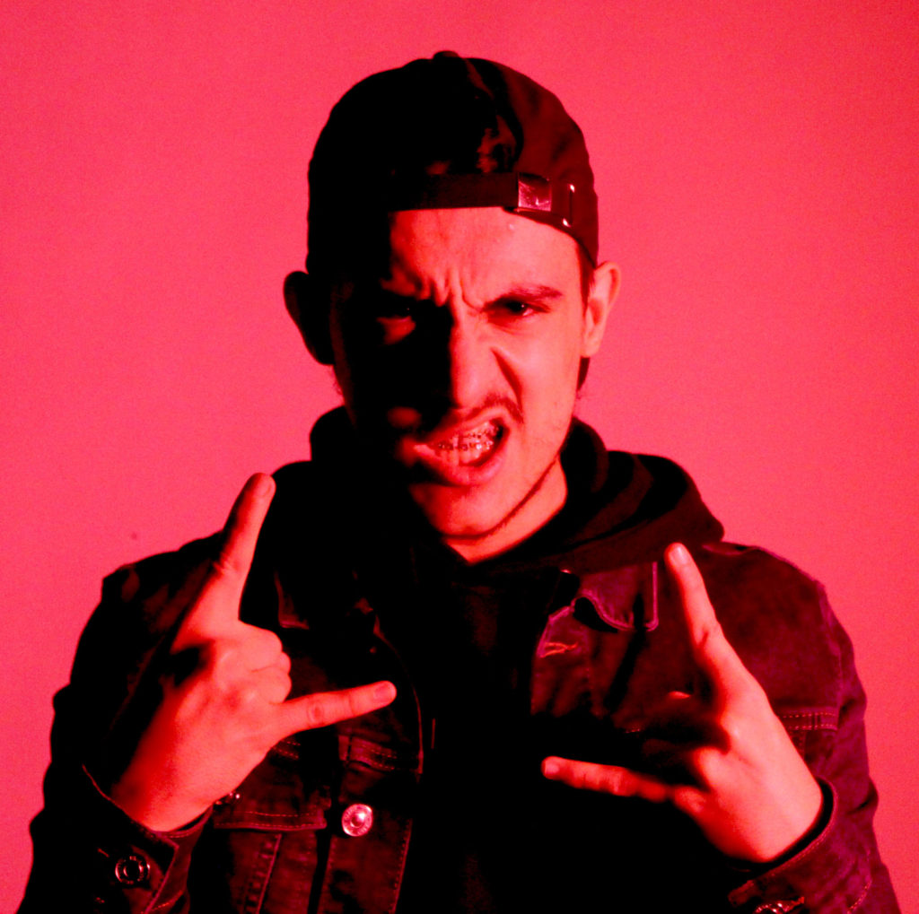
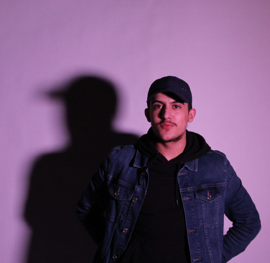
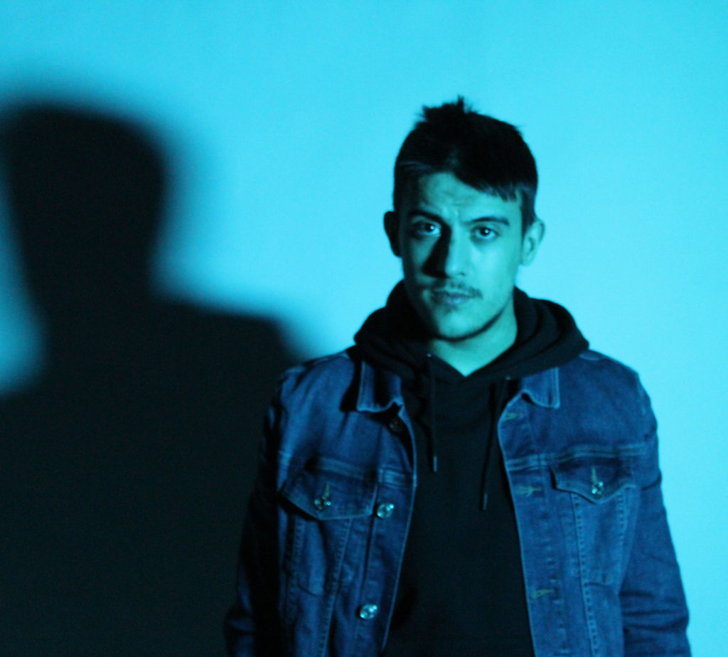
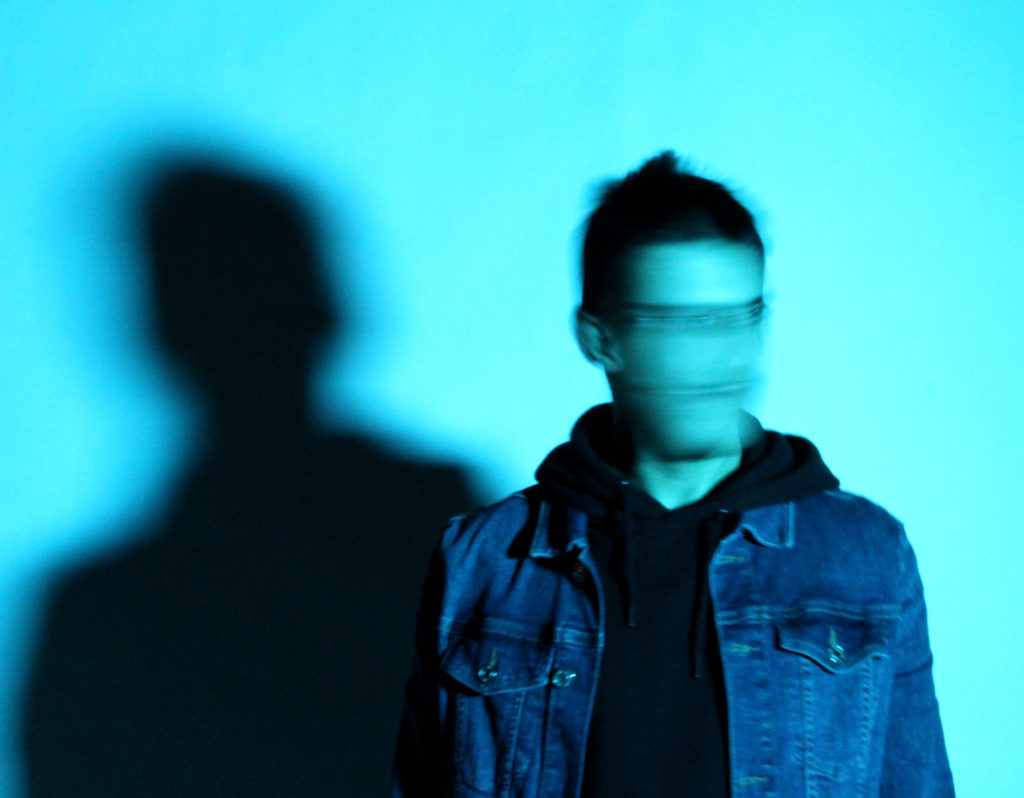
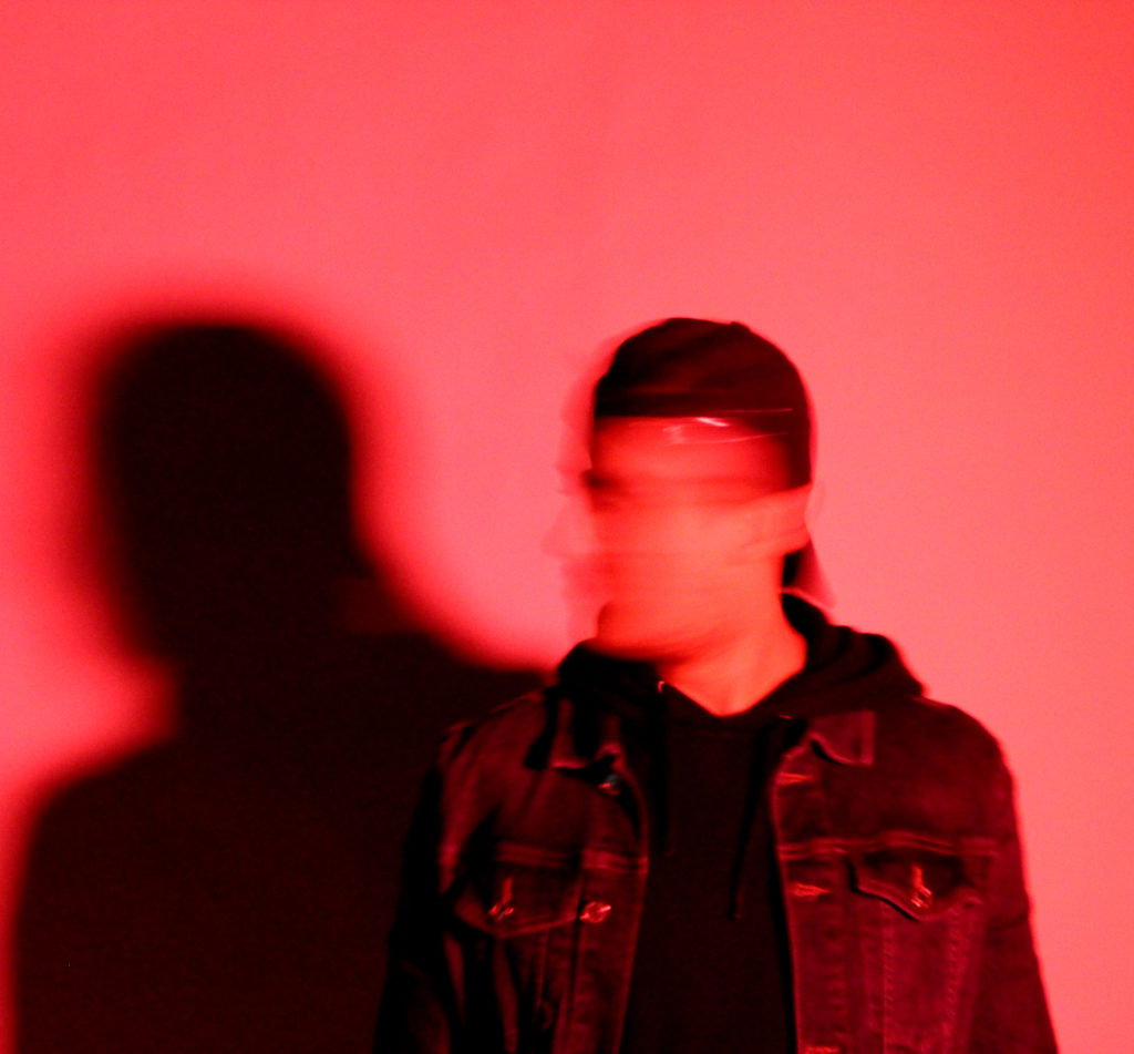
I took these images to represent the fact that people can look one way but not act the way you would expect.

The shadow represents the fact that your personality and your music taste make who you are.

Images:

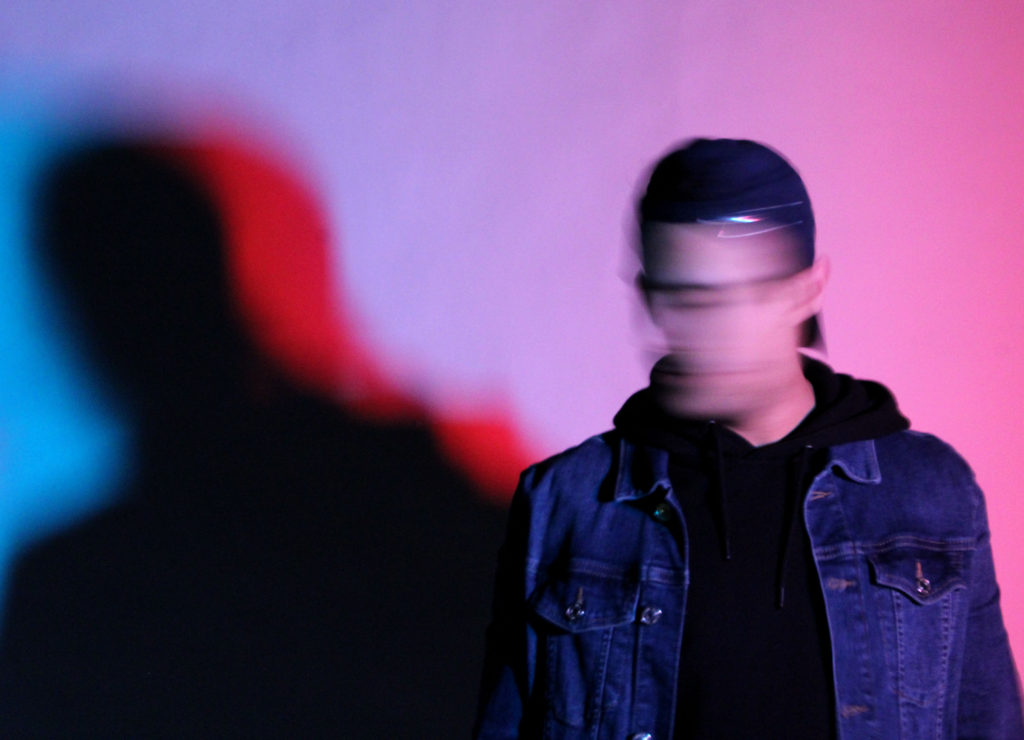
For these images I used a slow shutter speed, which created a blurred effect, as the model moved their head when the image was being taken. I think that this is effective because it relates to the fact that someone can have a very quite and shy personality but can listen to metal music which can be very loud and aggressive.

I used the gels over the key light to show the contrast in the way that society views people’s personality and judges what they should listen to just based on one aspect of their life.

I used the blue gel to highlight the personality of the person. I chose blue because it’s a cool tone which isn’t too intimidating and can be seen as a calm colour. I used a red gel to represent the metal music because red can be seen as dangerous and aggressive, which is the stereotype of metal. I also overlapped the gels creating a purple colour to show that you can listen to what you want and be who you would like. There is also a glitch effect created on the background which shows the viewer that if you aren’t what people expect, then people don’t know how to react properly.

The blurred effect creates a smooth look to the image and the facial features blend into the background. The blend could also link to the fact that the lyrics of the music are often emotional but the singer doesn’t sing them to a melodic background. Just because the background is different, it doesn’t mean that the song is angry, most of the time the lyrics are stating how fragile someone is.

I wanted to keep the shadow in on the background as it represents the judgement you face from other people when you listen to the different types of metal. I’ve left it in all my images because no matter what you do you will be judged in some way.

Comparison to Honaker:

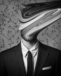
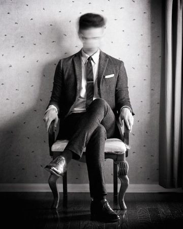
I was inspired by this image by Edward Honaker and I wanted to adopt the same methods he chose to show his viewers that he wasn’t feeling happy anymore. However I wanted to keep it in colour to represent that we don’t all fit in society’s stereotype.

Identity and place- shoot 1

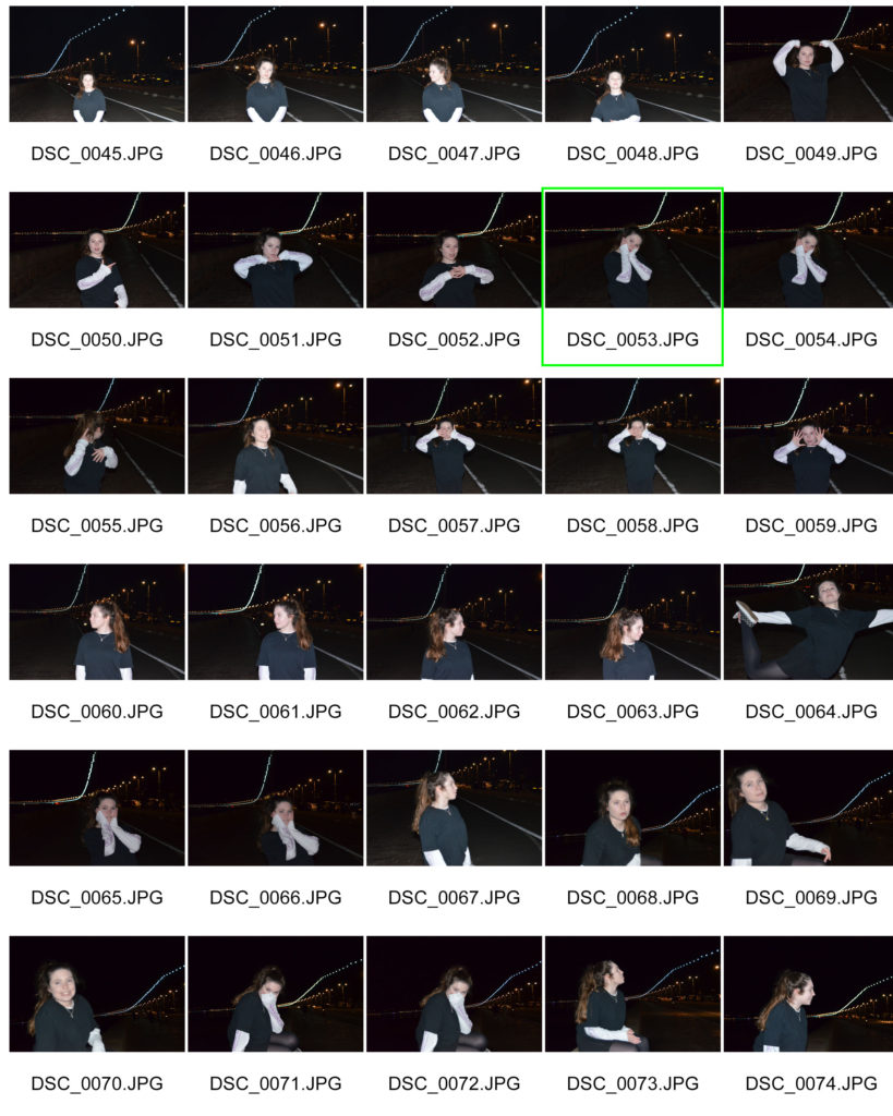
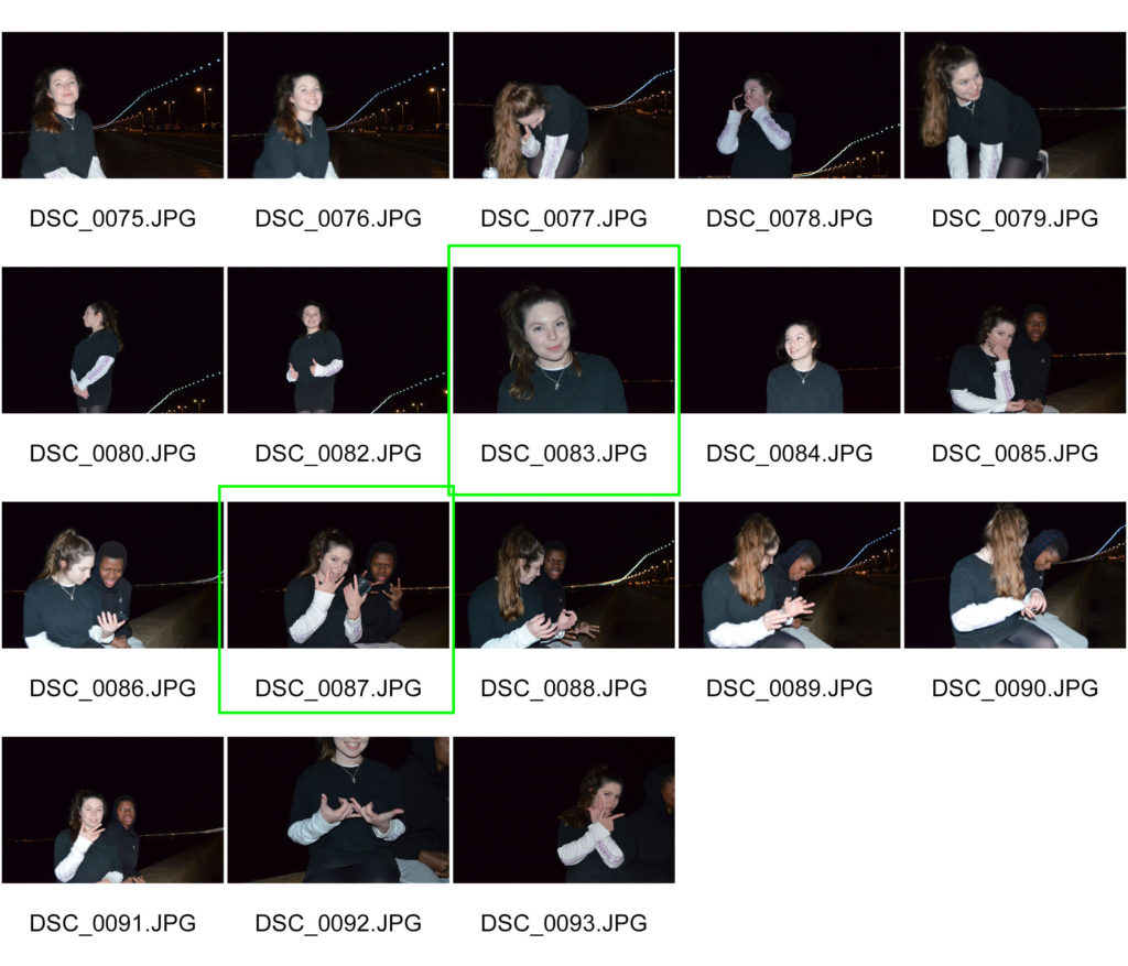
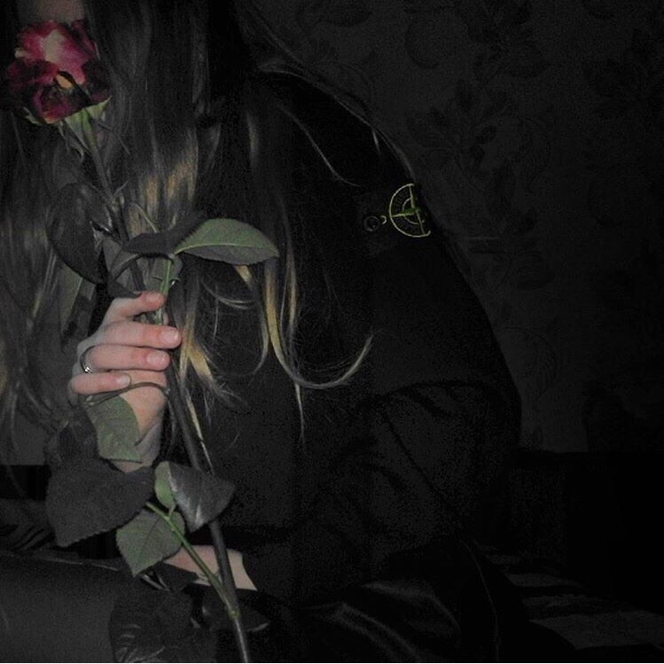
For this shoot I wanted to make the most of the lights that are hung up on the sea front between St Helier and St Aubin as I thought it would work well with my inspiration of the grunge/rock aesthetic.

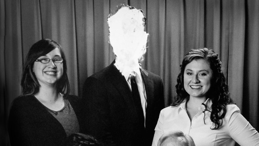
I also wanted to incorporate my inspiration from Edward Honaker and edit the model’s face to show that there isn’t a ‘look’ you need to have to listen to rock and metal music.

Plan:

Who: Amelia

Where: The Avenue, St Helier

When: Evening

How: Fast shutter speed, long exposure, flash.

Contact sheets

Final Images

I wanted to highlight the fact that, for me, music helps me escape reality and the real world for a few minutes/hours. These images, I think, show that the best.

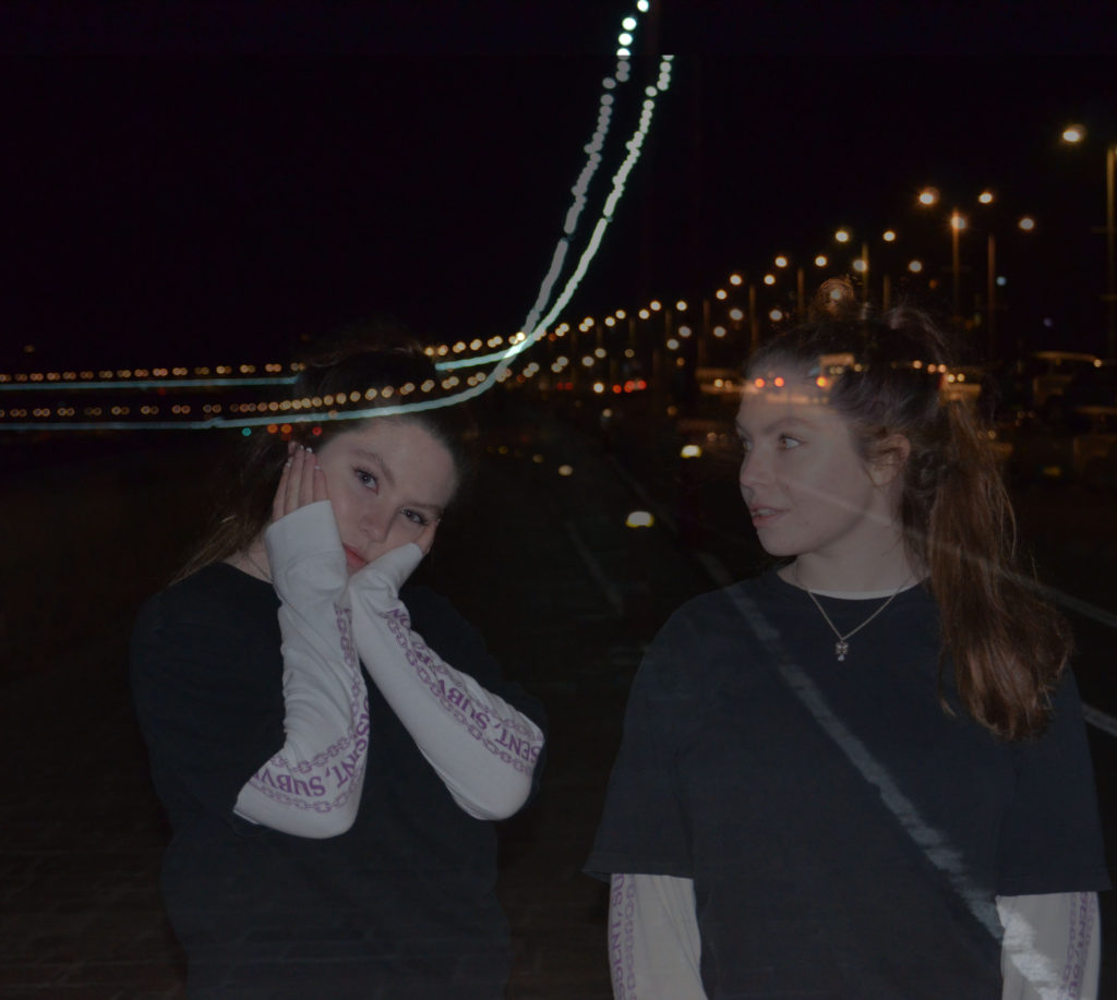
The first image was taken using a long exposure and then moving the camera to create a blurred effect with the light and the model moving to a different part of the image. The viewer could see it as a journey from reality to your own world.

It could also represent the time passing; or the fact that the person who is listening to music is listening to songs from different eras in times like the 70s, 80s,90s etc.

I took this image just as it was getting dark and the sky had a purple hue which contrasts well to the bright lights that are hung on the side of the street.

The second image is a representation of the fact that we are not the same person when we are around different people. The girl on the left represents how society views you, and the girl on the right is the real you who has to see the world perceive you as someone else.

The girl on the right is more translucent, this shows that society won’t view you as you unless you change your appearance or personality. The ghost like figure emphasises that society views her in the wrong way.

This is an issue in the metal community because many women are told that they are show offs, fakers and are only doing things for attention. Society views the metal community as male dominated. This is because of the sexist views that sadly are in our world, women can be seen as weak and therefore many people believe that we wouldn’t be listening to music with screaming and aggression.

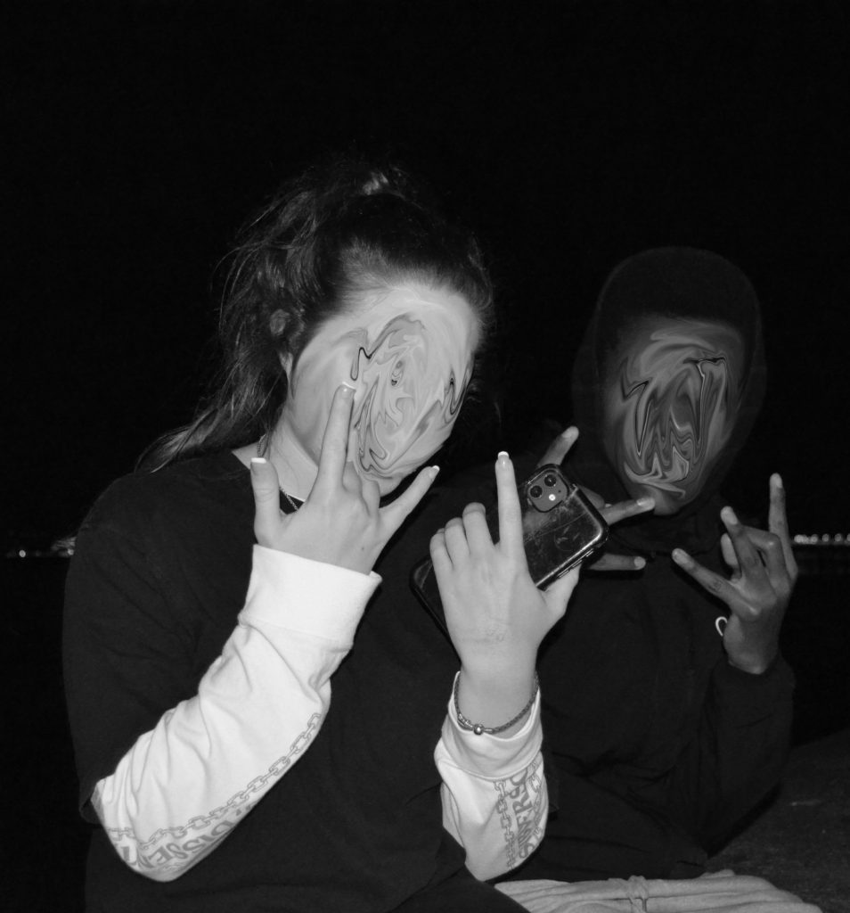
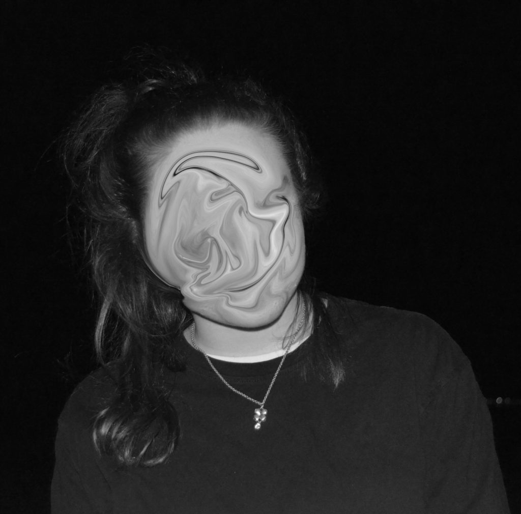
For this shoot I wanted to emphasise the fact that you do not need to look a certain type of way to listen to metal. To highlight this, I created a whirlpool effect on the models’ faces so that no one would know what they truly looked like. I also cut out the face of the model on my final image. I left some skin on the forehead to emphasise the fact that no matter how hard you try, you will never be able to erase the true version of you no matter how hard you try.

The whirlpool effect was inspired by Edward Honaker.

EDWARD HONAKER

identity and place:

Inspiration:

Explanation:

My inspiration is metal music and the views society has on the genre and people who listen to it. Both types of music have helped me get through some tough times throughout my life, including me coming out and moving to Jersey. However they aren’t a popular genre of music as many people can only hear screaming and not the meaning of the songs and lyrics.

Music has allowed me to express myself and meet new people who I can now call some of my closest friends. Many people think of metal and think of aggression and anger; most of the songs are about the artist’s friends, family, partners or even their views on society and the way we are told what is and isn’t normal/ correct.

Identity and Place -Claude Cahun/Edward Honaker case study

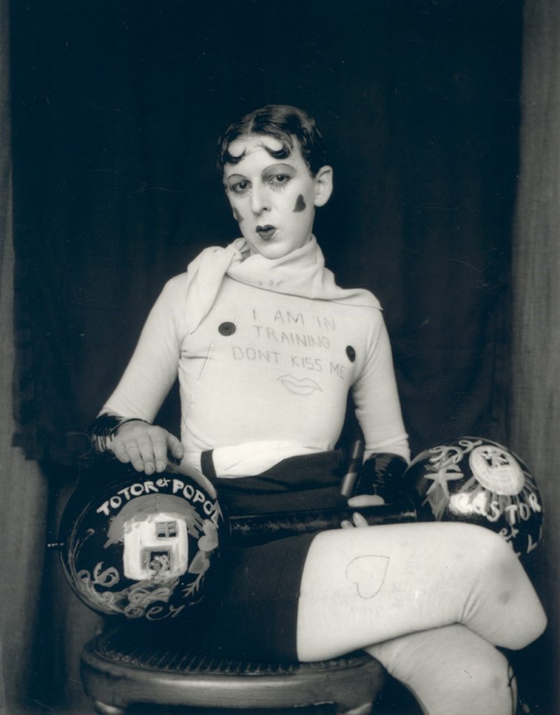
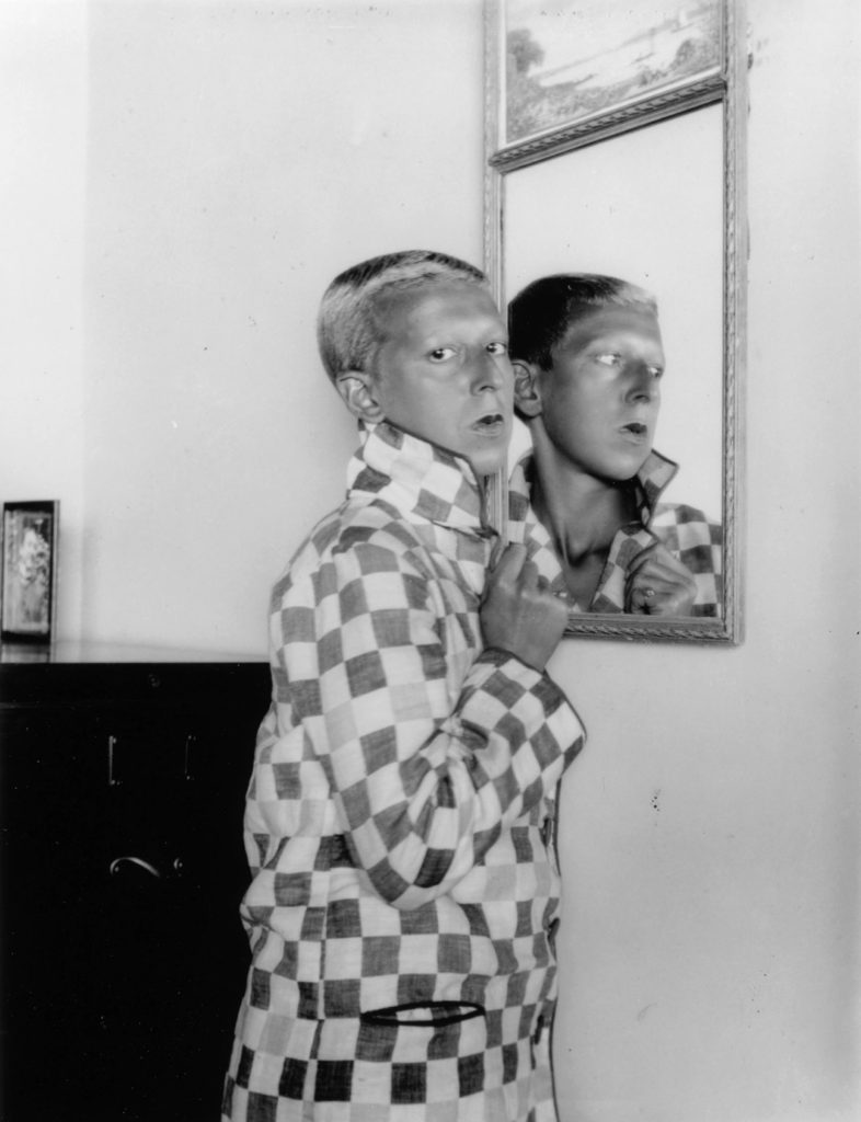
Claude was a French lesbian photographer born in 1894. She moved to Jersey in 1937 and became active as propagandists and resistance workers during the second world war when the Nazis took over the Channel Islands.

She was sentenced to death in 1945 however it was never carried out due to the Liberation of the Channel Islands from Nazi power. Cahun used photography to express herself and her political views.

Image Analysis

Claude Cahun

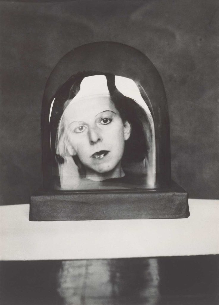
The lighting in this image is very dark with areas of very bright light that could be coming from a window and reflecting on the glass of the subject in the image, which then reflects on the black surface underneath . The darkness of the image allows the viewer to focus on the image of the woman in the dome and the actual dome itself. The brightness on the glass allows the woman to look three dimensional and could allow the viewer to sense the mood of the image.

The fact that the image is in black and white allows the viewer to focus on the contrasts in the image. The image in the dome has mainly dark colours which allows the viewer to see them as a happy person however the black background of the image emphasises the fact that her past was quite dark and she was treated poorly in the prison she was sent to in 1944.

The glass dome could highlight the fact that you are only a tiny fraction of the population of the world; you must live your life the way you want, and the way you believe is correct.

The texture of the image is smooth until the dome which allows the viewer to focus straight onto the centre of the image and on Cahun herself.

Edward Honaker

Edward Honaker is a photographer now in his mid-twenties . When he was younger, he used photography to express himself while he was suffering badly from depression.

His images highlight some of the lowest feelings he has had, with the reoccurring theme of feeling like the odd one out and feeling like he didn’t belong in this society/world.

I chose Honaker to inspire me for my work because music is the way i choose to escape reality and the world just like he used photography to take his mind off the depressive thoughts in his head.

Image Analysis

Edward Honaker

This image allows the viewer to understand that Honaker’s brain is never still. His body may seem calm and relaxed however his mind is constantly working, or in his case his brain keeps haunting him. The image also expresses the fact that he doesn’t feel like he belongs. He’s sat in an empty room wearing a suit, this could represent the social anxiety he has or even the fact that he feels all alone in the world with no one there to support him.

Honaker used a slow shutter speed and moved his head to create a blurred effect; this allows the viewer to further understand Honaker’s thoughts and feelings. The dark tones throughout the whole image further represents the fact that Honaker struggles to see the light in the world. It could also represent the fact that he believes the people around him see him as a sad and angry person.

The image is in black and white which allows the viewer to notice how Honaker, in this stage of his mental health, is unable to see any light/colour in his life.

The wallpaper behind the man could represent the fact that there is no moment of silence for him. He feels like he is permanently getting judged.

There is a lot of different textures in the image which allows the viewer to try and understand what the main focus of the image is.

Comparison of images:

Both of these images are self portraits. Cahun’s is showing the viewer who she is with confidence and showing that she is proud of who she is and doesn’t care what your opinion of her is. Honaker’s however, is the opposite. The image represents the fact that he no longer knows who he is and therefore can no longer recognise himself in the mirror. Both these images send a strong message to the viewer however, the messages contradict each other.

Although both images are in black and white, Honaker’s is clearly a lot darker than Cahun’s. Honaker’s has a shadow covering the mirror representing the depression that has taken over his mind and body. He is unable to look at anything without the dark thoughts taking over his brain.

Cahun’s image is very light with the only dark object being a cabinet behind him. This could represent the fact that Cahun has put all the negative thoughts to the back of her mind and is focusing on the good things in her life and the excitement of what the future holds.

Honaker has blurred out his face which allows the viewer to understand that this disease has created a new person and rather than being able to find the happiness and beauty in his life, the disease has made him isolate from the world and only focus on the negatives. This links to the shadow, representing the depression, creeping over him and slowly removing the happiness from his life.

In Cahun’s image, the reflection is looking back. This could represent the fact that Cahun is looking into the past, now proud of how far she has come in the years of injustice and pain.

Both photographers use a mirror as the main focus of the image which showing that the reflection in that mirror isn’t always the same as what is shown on the surface.

Mexican identity

Plan

What:
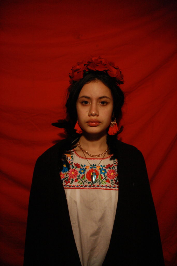
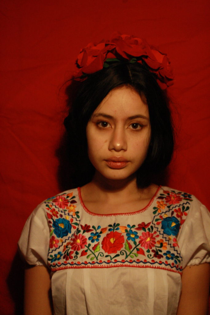
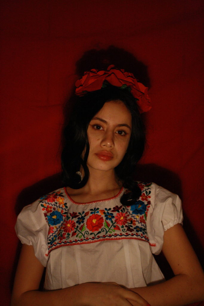
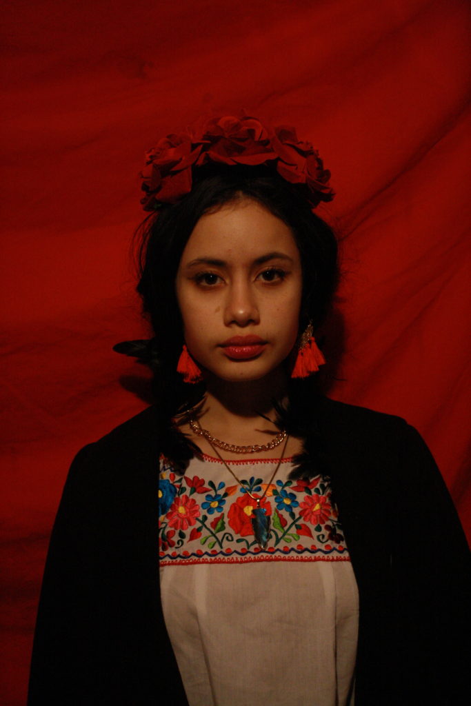
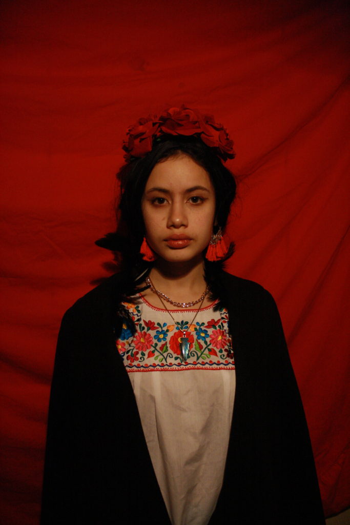
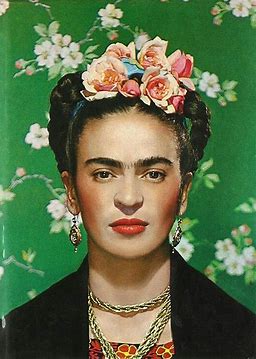
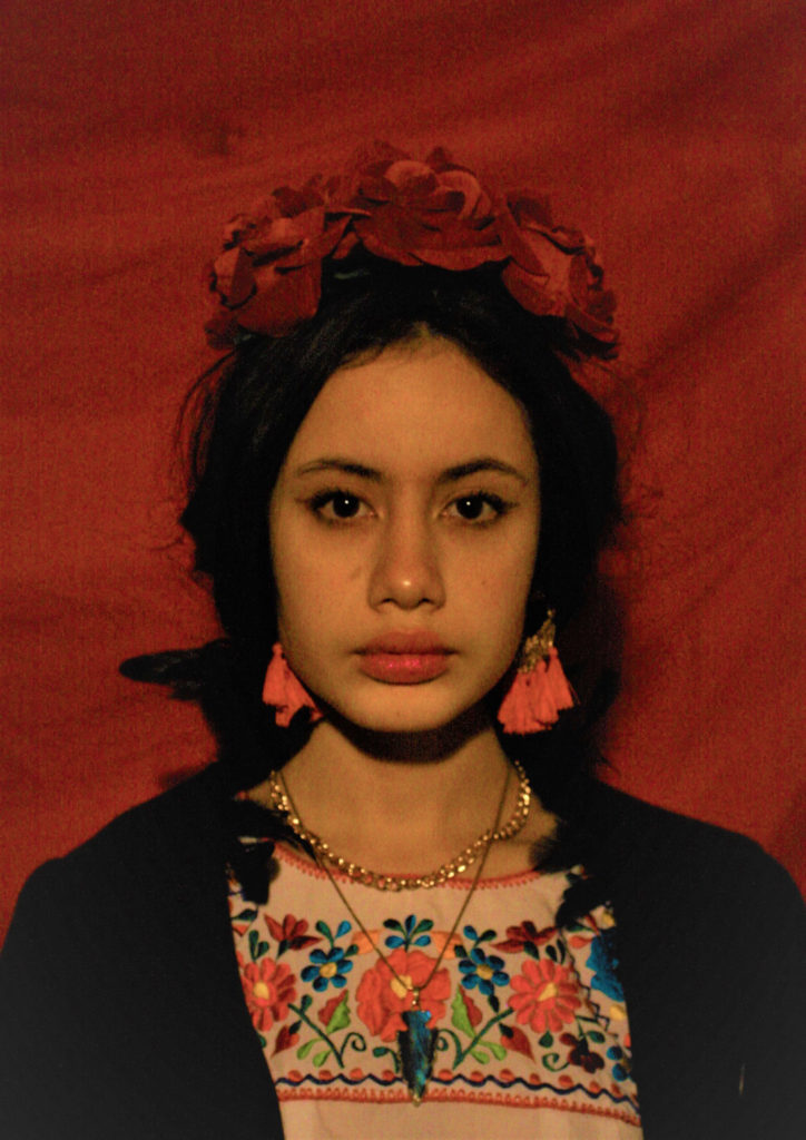
A reecreation (with my personal touch) of the cover of Vogue magazine where Frida Kahlo appeared in 1938

When:
Wednesday 20th of January

Where:
The place was not the most important so I decided to do it at home and as a background a red sheet to add color to the image.

Why:

To represent this iconic person who is part of my culture

Contact Sheets

First Selection

Comparison


This image is more similar than my second shoot. I am placed in the middle of my image like that of Frida Kahlo. Our facial expression is a bit the same, we stare at the camera with a monotonous look a little empty. you can see a slight smile in the corner. What I love about Frida’s facial expression is that she looks confident even she poses in the room, she knows what she is doing. This expression is unique. Let’s go to the small details now, as we can see is that the backgrounds are not the same colour. Is done on purpose. The background of the photo of Frida Kahlo is green a colour that is part of the Mexican flag and the other two colours are white and red so I decided to put a red background to “continue the flag”. Even if we have almost the same outfit, there are some small details that are not the same example: the flowers that I wear are big and red while hers are small and pink those little flowers that are even on the bottom. Frida Kahlo has a traditional Mexican hairstyle while I have a more modern one. It is these little details like that that make the photo something beautiful.

Identity: Rania Matar Photo Shoot

Photo Shoot Plan

WhoIn the photo I am going to have me as the main subject because it is about me and my identity and i want the focus to be me. To take the photo I will be using self timer as it will be easier than trying to direct someone else to take the photo and it can be a self portrait. 
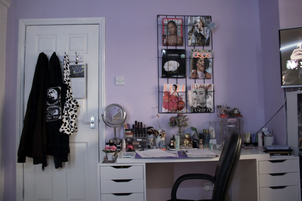
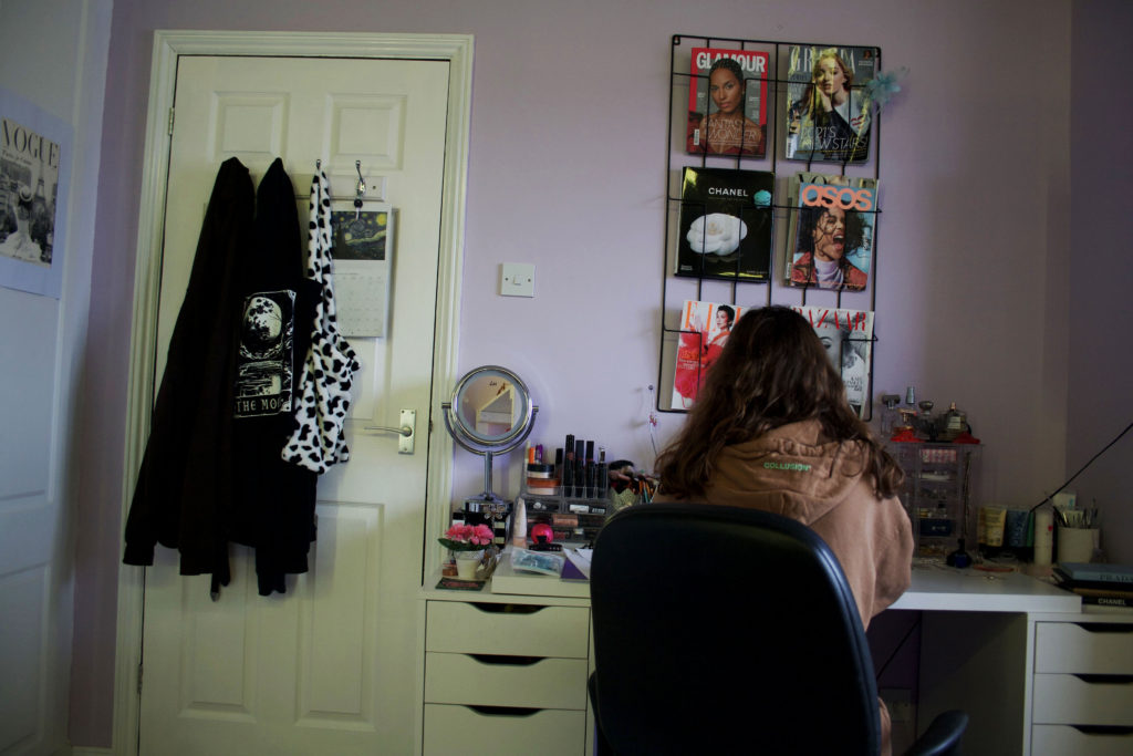
WhatI will be sat either in the middle section of the photo or slightly to the side surrounded by objects and my room reflecting different things about me.
WhyI want to take these pictures because I think identity is more than who you are as a person and can be reflected in objects, the objects also tell a story as they are strong messages that describe who I am as a person, what hobbies and interests I have and preferences.
WhereThe location will be my room because I think that someone’s room or personal space, such as an office, can describe a lot about someone because usually it reflects them directly as they spend most time in there meaning that it is their own world, surrounding themselves with things they want to be surrounded with and personalising every part to themselves.
WhenI will be taking the photos during the day so that I can use natural light, however on a day where there is no sun and the sky is grey because I do not want the picture to be really warm as I think that would impact the mood of the image and I want the objects in the room to set the mood because I am trying to describe me through them.
HowI will be using a digital camera and self timer so that I can take them myself.

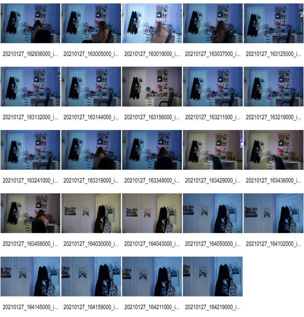
Contact Sheet

First I set up my camera so that you would be able to see most of the half of my room with the most ‘personality’ focusing on the busiest part of my room. I set my camera on the TV (Time Value) setting so that I could ensure the image would be sharp and crisp by focusing on the shutter speed. I used the natural grey light from outside and white LED lighting to make the image bright and light. I then changed the LED lighting on a warmer setting because I did not like how cold the image was. I then decided to focus on the ISO settings as I realised that the shutter speed was not the issue and was more about the lighting.

Final Outcomes

Photo-shoot 2

Photo-Shoot Plan

Who – A male 17 year old – My boyfriend.

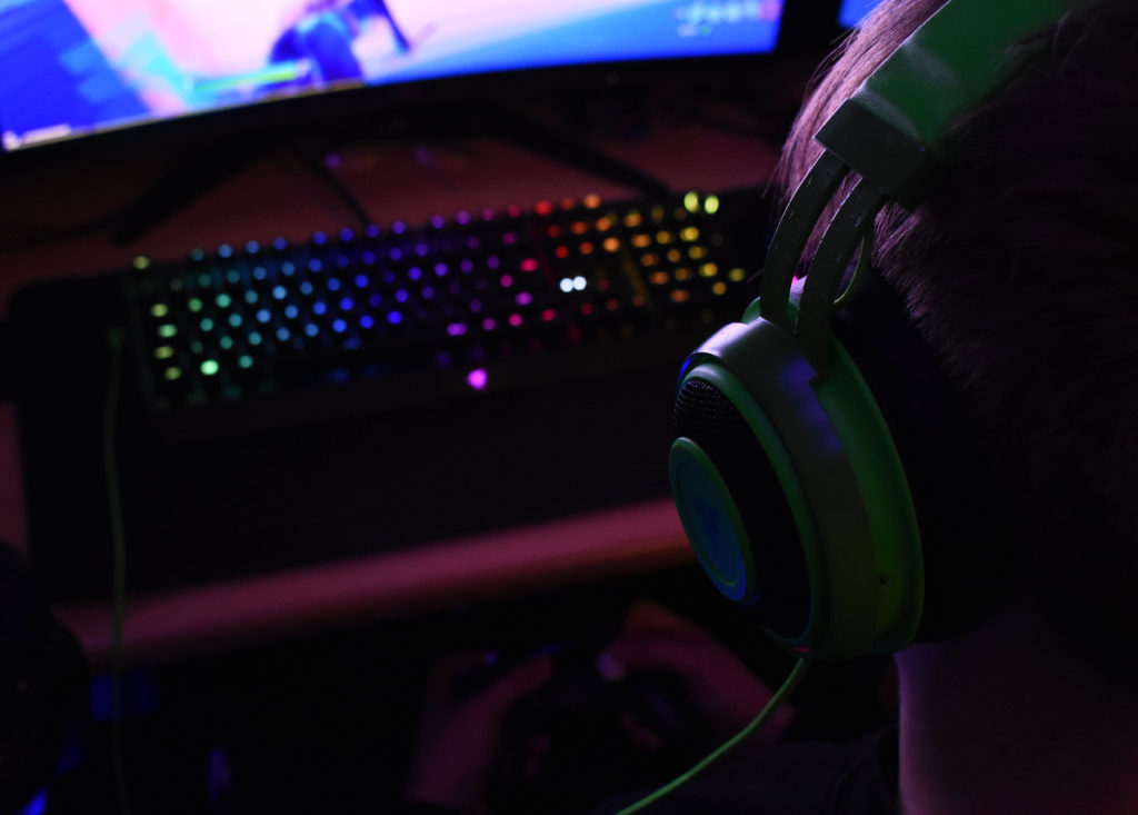
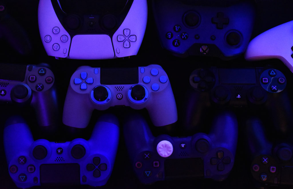
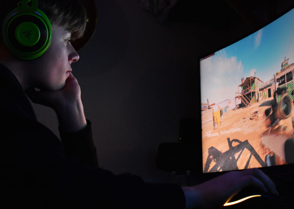
What – A photo-shoot of my boyfriend gaming, in his car and on his motorbike.

Why – This photo-shoot is taken to capture a teenage boys lifestyle that society stereotypes to be. It shows what his identity is likely to be and what he (his age group) are known to do in their life.

Where – At my house and on the street roads of St. Brelade.

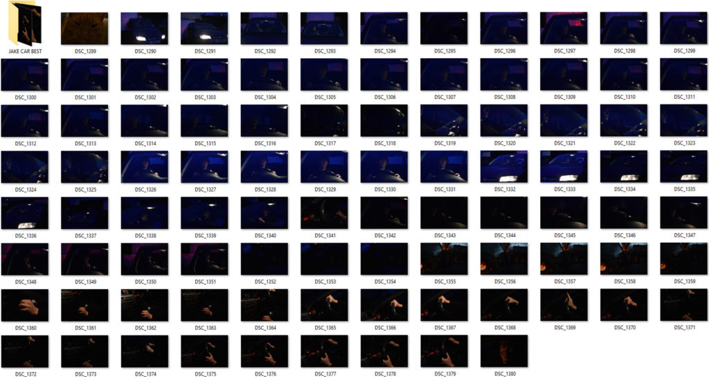
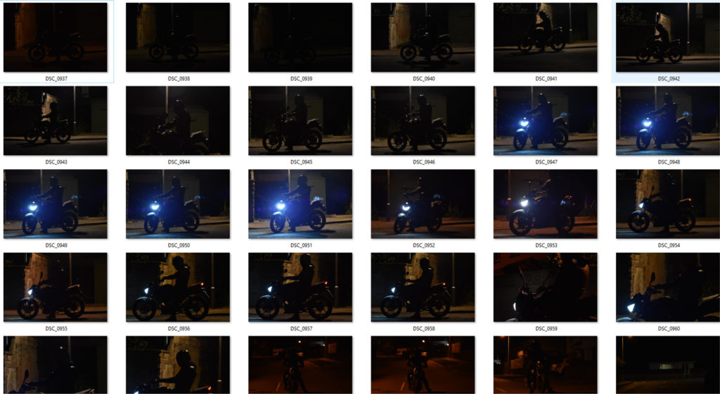
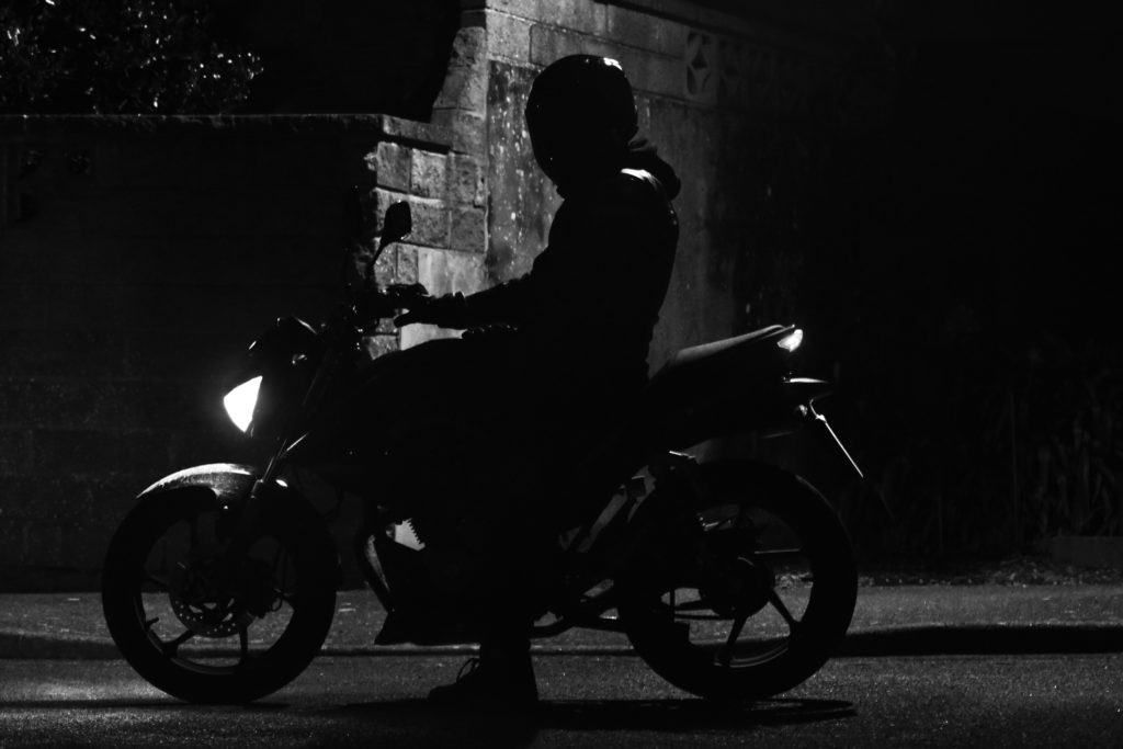
How was the photo taken – For the gaming photos , using LED lights for a glow effect and a spot light to create more light in the room was how the photos are seen. Camera settings were used at a low exposure and 400/600 ISO was used. For the car images, a light inside the car was used to mainly pin point the objective that I was photographing. A high ISO – 1600/3400 was used to actually see the image as it was low light in the day as well as a low exposure – 1/50 – 1/40. For the motorbike photos the same camera settings applied as it was low light in the day. A single street light was used to create a silhouette figure of the bike and my model. (all black).

When – Late evening / 22nd and 23rd of January

Contact Sheets

Car contact sheet
Gaming contact sheet
Motorbike contact sheet

Editing Techniques Shown

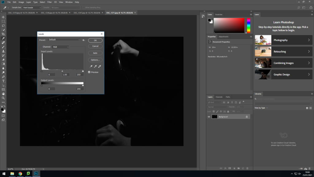
For both motorbike and car images I changed them into black and white photographs. I increased the contrast levels and either increased or decreased the level of black or white depending on how much you could see the image. I also used the dodge tool to emphasis the light features in the face for the car photos and the highlights of the motorbike.

Changing the vibrance level of the picture increased the glow that was coming off the LED lights in the background outside of the image. The light coming off the monitor in front of his face projected a white glow on the front of his face which I lowered in highlights and shadows in adjustments in photoshop.

Best/Final Outcomes

These gaming images relate to this teenage boys identity as gaming is a big part of his life. Its something he loves and enjoys doing. Modern day teen boys are known for there love f the online gaming world. Where hours and days would be spent online. This hobby may be his safe place, a place where he enjoys himself with no worries. The bright colours found all around the images represent his love and passion for gaming and how it fills a hole in his identity. The concentrating expression on the face in the portraits above gives off the impression that he is completely zoned out, as if no one is around him.

These photographs were taken at very low light in the day, nearly no light at all. Using only a single spot light in the car , editing on photoshop was needed to be done to see the images clearly. These photographs have an old style to them, as if they were taken in the 1960’s. The light parts of the face and hand are the main features that contribute to the photo for making it look the was it looks. The body of the boy blends in with the blackness of the background and the rest of the car to emphasis his facial expression. The seriousness of his face and the way only one hand tightly grips the wheel of not just the car but the motorbike too, implies his love for vehicles and what he feels almost proud of.

Linking To A Photographer

This old fashioned look with these dull black and white photos links to Bruce Davidson’s work. This is seen below…

The Renowned, Unknown Bruce Davidson - The New York Times
Image By Bruce Davidson
Image By Me

These two images placed together seem to have the same sort of lighting as light in Bruce’s work hits mainly the face and coat of the lady and man on the bus. Both images seem to have the same tonal range of black and white as well as sharp lines found between contrasting parts of the images between black and white.

Apart from the images physically linking together, Bruce Davidson over the years of work has taken photos of teen life in the mid/late 19 hundreds. This links to my work as the whole concept of the photo-shoot is to show a moderns teen boy’s life and what his personal identity is.

EVALUATE AND CRITIQUE

If I was to do this photo-shoot again with the car and bike theme I would use more natural light to bring out the dark areas to make it more of a modern day photo rather than replicating an old style of work from years ago. I might have used more colour in my work to connect to my models lifestyle and his identity to others and himself.

Final Presentation

The above are my final displays I decided on.

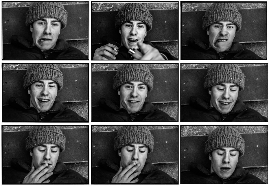
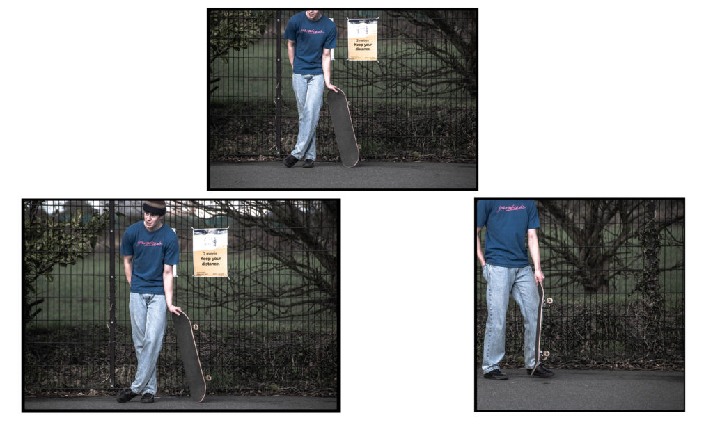
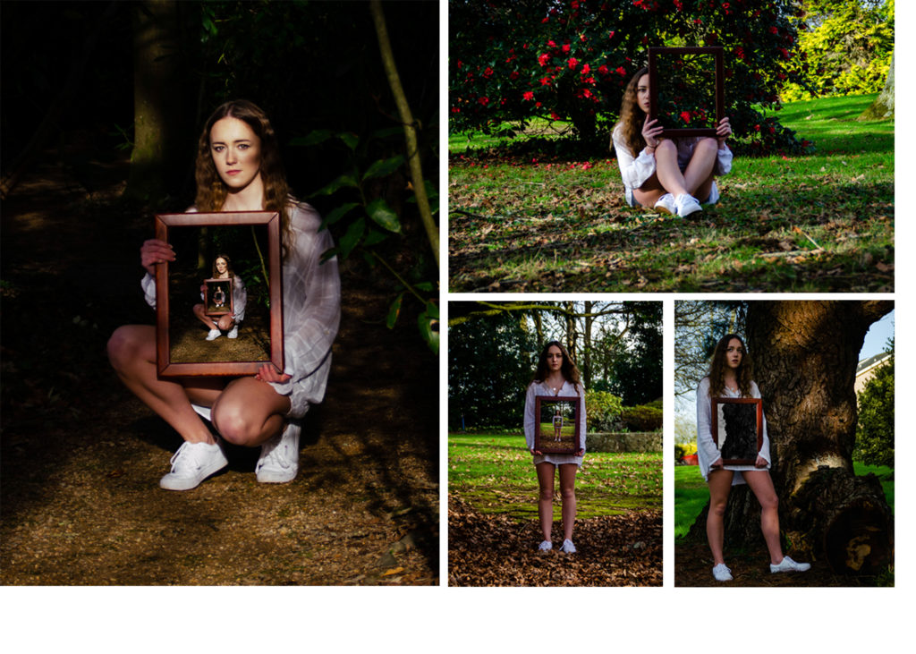
I grouped some similar images into diptychs and triptychs according to colour scheme, physical similarities. I also used similar bordering and presentation methods that J Grant Brittain uses.

The following is an image comparison between one of my pieces and one of J Grant Brittain’s pieces.

The above images both focus on the identity of the subject by portraying their personality through capturing their facial expressions. Both images are desaturated and have high contrast to accentuate shadows around the face and therefore accentuating the facial features of the subjects. Both images are collaged into sets of 9 coinciding images. Both images feature a mixture of compositions where the subject interacts with the lens and some where the subject ignores the camera.

Grants image is shot with fluorescent lighting in a professional environment whereas my composition is shot with natural lighting in a less professional environment. This also creates difference in the texture of the images, mine has a rougher texture whereas Grants image has a smoother texture to it.

This image has an empty alt attribute; its file name is DSC_0084-1-1024x753.jpg

For the above composition I shot the skateboarder in front of an urban graffiti background in a skatepark, I focused on showcasing his culture and style like J Grant Brittain. The gaze and side angle shot creates a sense of confidence, control and passion the skateboarder portrays to his environment.

I shot the image in black and white and used high contrast and clarity to accentuate the features of the subject for example the area around his eye feature high contrast and clarity which captures that emotion in his eyes. The high clarity and contrast also gives the image a sharp and rough texture.

I used a wide aperture to obtain a sharp focus on the subjects face and separate him from the background and create a slight bokeh effect. I used the grid on my camera to frame my subjects head in the centre of the shot.

In conclusion I believe I captured the identity through his cultural passion for skateboarding well with stylistic, J Grant Brittain type images and presented them in an artistic way.